
Contact Form 7 is one of the most widely used form plugins in WordPress, but styling those forms inside a Divi layout has not always been straightforward. The form logic lives in Contact Form 7, while the design usually depends on theme styles or custom CSS.
Divi 5 closes that gap with the new Contact Form 7 Styler module. You can keep building and managing forms in Contact Form 7, then display and style those forms visually inside the Divi Builder.
That means your existing CF7 forms can use Divi’s design system: field styling, labels, placeholders, buttons, messages, focus states, checked states, Design Variables, and Presets.
- 1 What Is Contact Form 7?
- 2 Why Contact Form 7 Styling Can Be Difficult In Divi
- 3 What The Contact Form 7 Styler Module Does
- 4 When To Use The Contact Form 7 Styler Module
- 5 Before You Add The Module
- 6 How To Use The Contact Form 7 Styler Module In Divi 5
- 7 Design Focus, Checked, And Hover States
- 8 Other Styling Options Worth Exploring
- 9 Save Your CF7 Styles As Presets
- 10 How Design Variables, Option Group Presets, And Element Presets Work Together
- 11 Best Practices For CF7 Styling In Divi 5
- 12 Try The Contact Form 7 Module In Divi 5 Today!
What Is Contact Form 7?
Contact Form 7 is a long-running WordPress form plugin with more than 10 million active installations. It gives site owners a lightweight way to create contact forms, place them with a block or shortcode, and manage submission behavior from the WordPress dashboard.
You create the form structure inside Contact Form 7. That includes fields, labels, mail settings, validation messages, and integrations such as spam protection or third-party services when configured.
The plugin is popular because it is flexible, familiar, and widely supported. Many WordPress sites already use it, which makes rebuilding every form in another form module unnecessary for many redesign projects.
Why Contact Form 7 Styling Can Be Difficult In Divi
Contact Form 7 renders forms using its own markup. That works well for getting a form onto a page, but the output is not automatically part of Divi’s visual design system.
Without a Divi module built for CF7, styling often means writing custom CSS. You inspect the form, find the right selectors, write the rules, and then maintain that code when your design changes.
That creates a split workflow. Divi handles the rest of the page visually, but the form lives in a separate styling layer. If your brand colors, spacing, borders, or button styles change, the CF7 form may not follow unless the CSS is updated too.
What The Contact Form 7 Styler Module Does
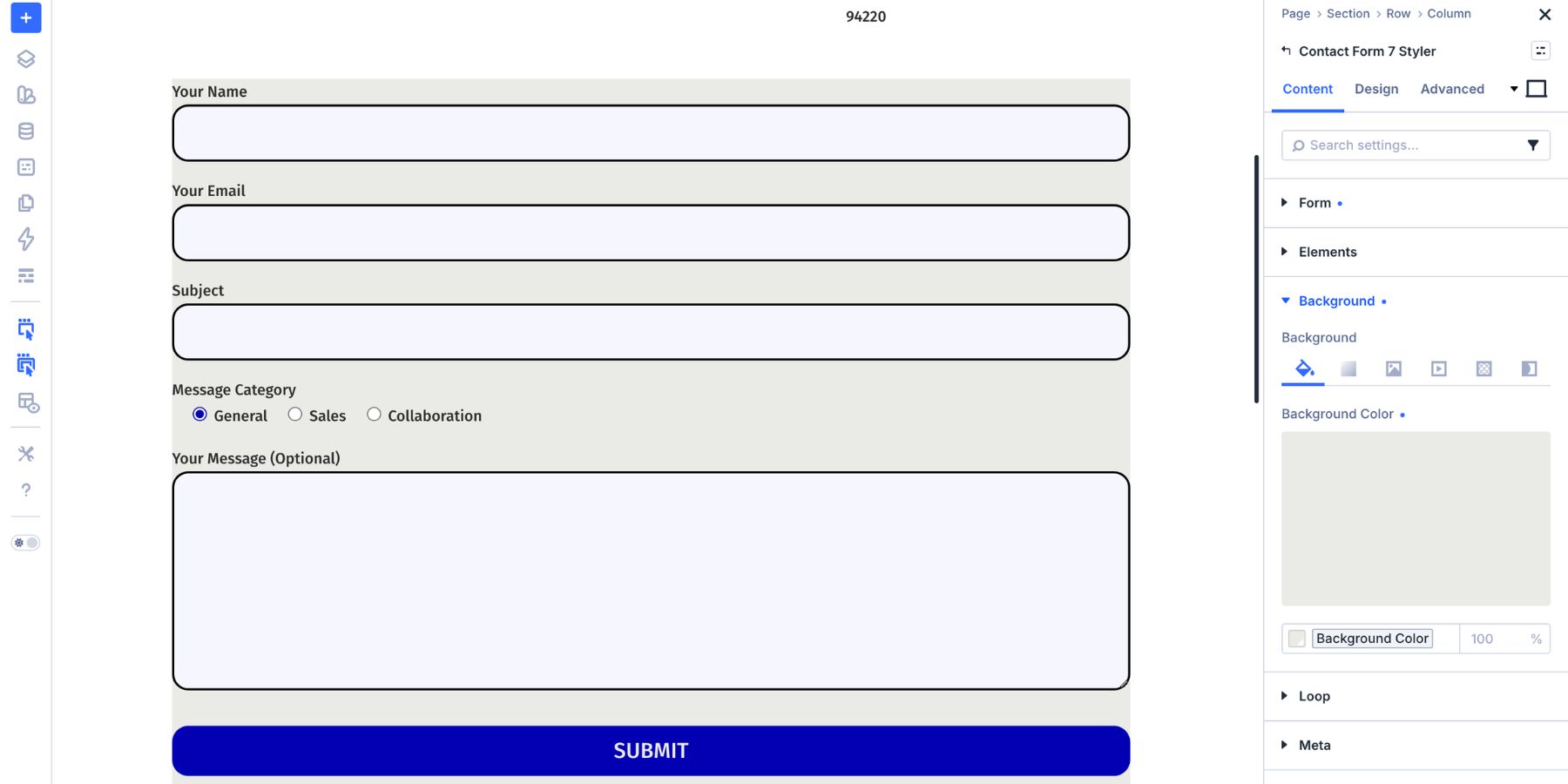
The Contact Form 7 Styler module lets you display any Contact Form 7 form inside the Divi Builder and style it like a native Divi form module.
The form still belongs to Contact Form 7. You still manage the fields, mail settings, validation behavior, and integrations inside the Contact Form 7 plugin. Divi controls how the form looks on the page. The module only appears when Contact Form 7 is installed and activated on the site. Once the plugin is active and at least one form exists, the module can display that form from a dropdown in the Content tab.
From there, Divi’s design controls become available for the rendered form. You can style inputs, labels, checkboxes, radio buttons, the submit button, success messages, validation messages, the module container, spacing, borders, shadows, filters, transforms, and animations.
When To Use The Contact Form 7 Styler Module
Use the Contact Form 7 Styler module when a site already relies on Contact Form 7 and you want those forms to match the rest of the Divi design.
It is especially useful when:
- You are redesigning a WordPress site that already uses Contact Form 7.
- You want to keep existing CF7 form settings, mail routing, and integrations.
- You want to style CF7 forms visually instead of writing CSS for each form.
- You want form fields, buttons, and messages to use Divi Design Variables.
- You want reusable form styles through Option Group Presets and Element Presets.
If you are starting from scratch and only need a simple contact form, Divi’s native Contact Form module may still be enough. If Contact Form 7 already handles the form workflow, the Styler module lets you keep that backend setup while bringing the design into Divi.
Before You Add The Module
Before opening Divi, check the form inside Contact Form 7.
Make sure the fields are correct, required fields are intentional, mail settings are configured, and the messages make sense for visitors. Divi can style the form, but Contact Form 7 still controls the form structure and submission behavior.
Also check the form labels. Clear visible labels are better than relying only on placeholder text, especially for accessibility and usability.
How To Use The Contact Form 7 Styler Module In Divi 5
Now let’s add the module and style the form.
Step 1: Add The Contact Form 7 Styler Module
Open the page in the Visual Builder and go to the section where the form should appear. Add a Row, then click the gray plus icon inside the Row to open the module picker.
Search for Contact Form 7 Styler and add the module.
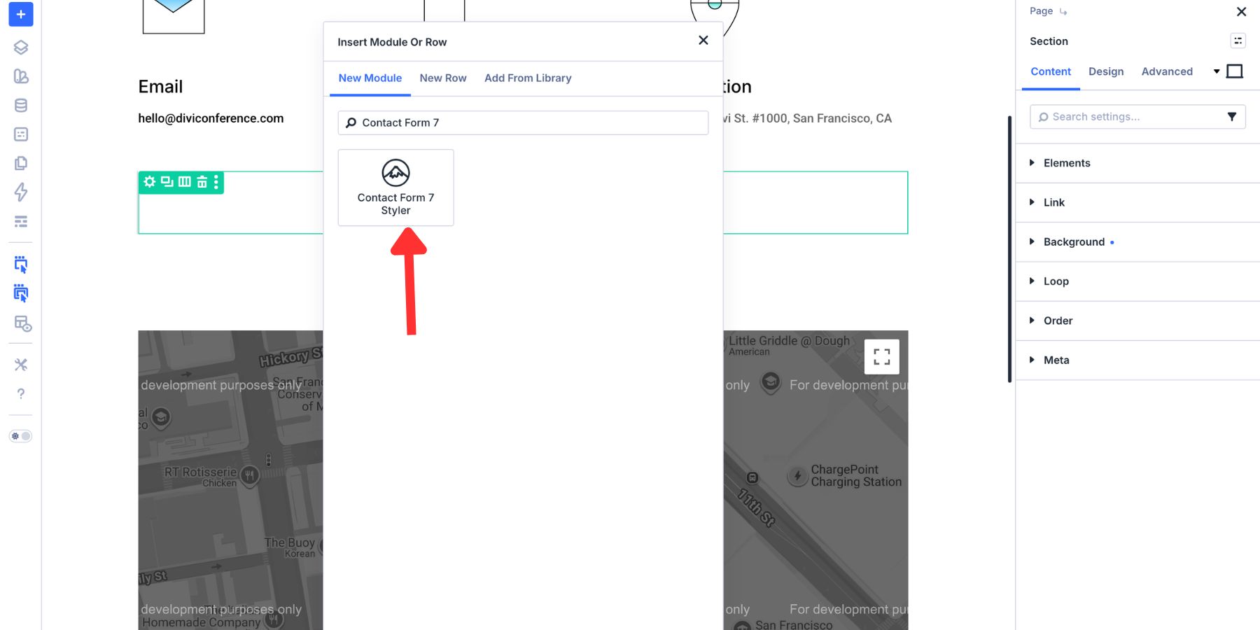
Open the module’s Content tab and choose a form from the Form dropdown. The selected Contact Form 7 form appears directly inside the Visual Builder.
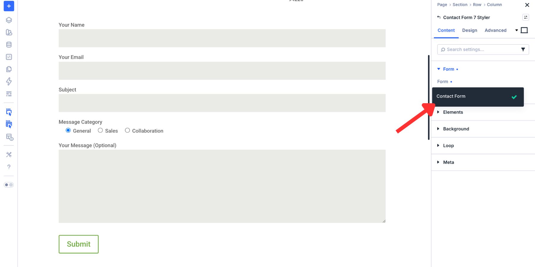
If the dropdown is empty, confirm that Contact Form 7 is installed, activated, and has at least one published form.
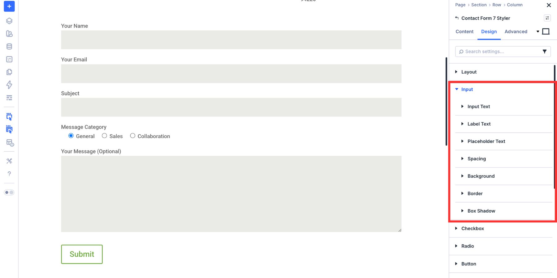
Step 2: Style The Input Fields
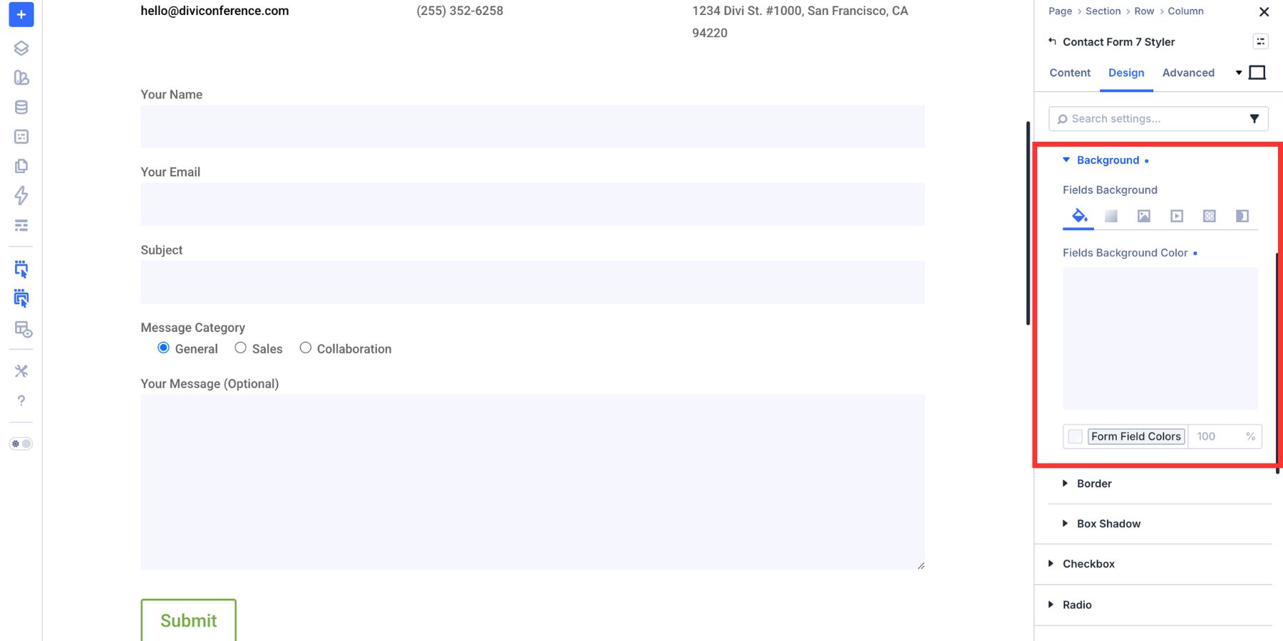
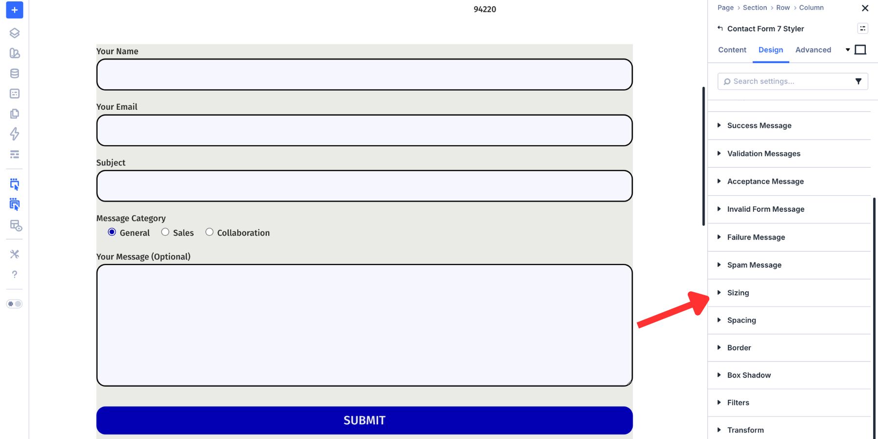
Open the module’s Design tab and expand the Input option group. This is where you style text fields, email fields, number fields, textareas, and select fields.
Start with the field background. A light fill helps each field stand out without making the form feel heavy.
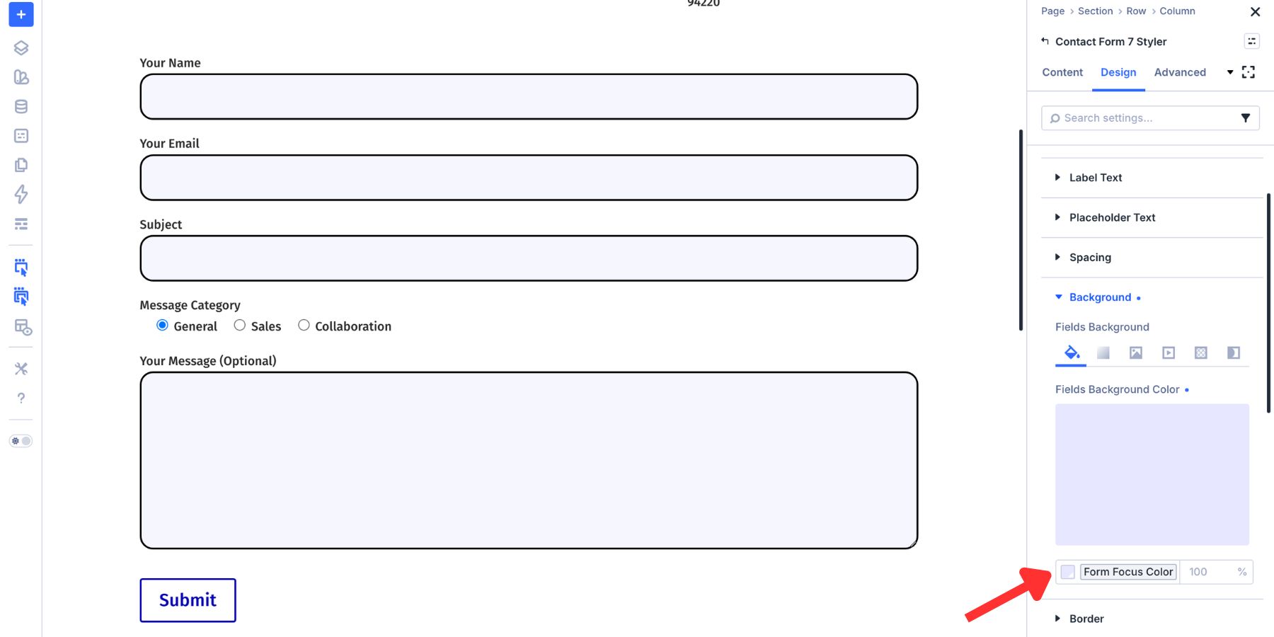
Instead of using static hex values, use Design Variables for field colors, text colors, borders, spacing, and radius values. If you need a broader color system, use the Variable Generator to create tints, shades, tones, and transparent variants from your brand color.
Use a light background variable for the input fill.
Next, style the input text. These controls affect the text visitors type into the field.
Set the font, size, weight, and color so the typed text is easy to read. Check the contrast between the text color and the field background, especially if you use a tinted background.
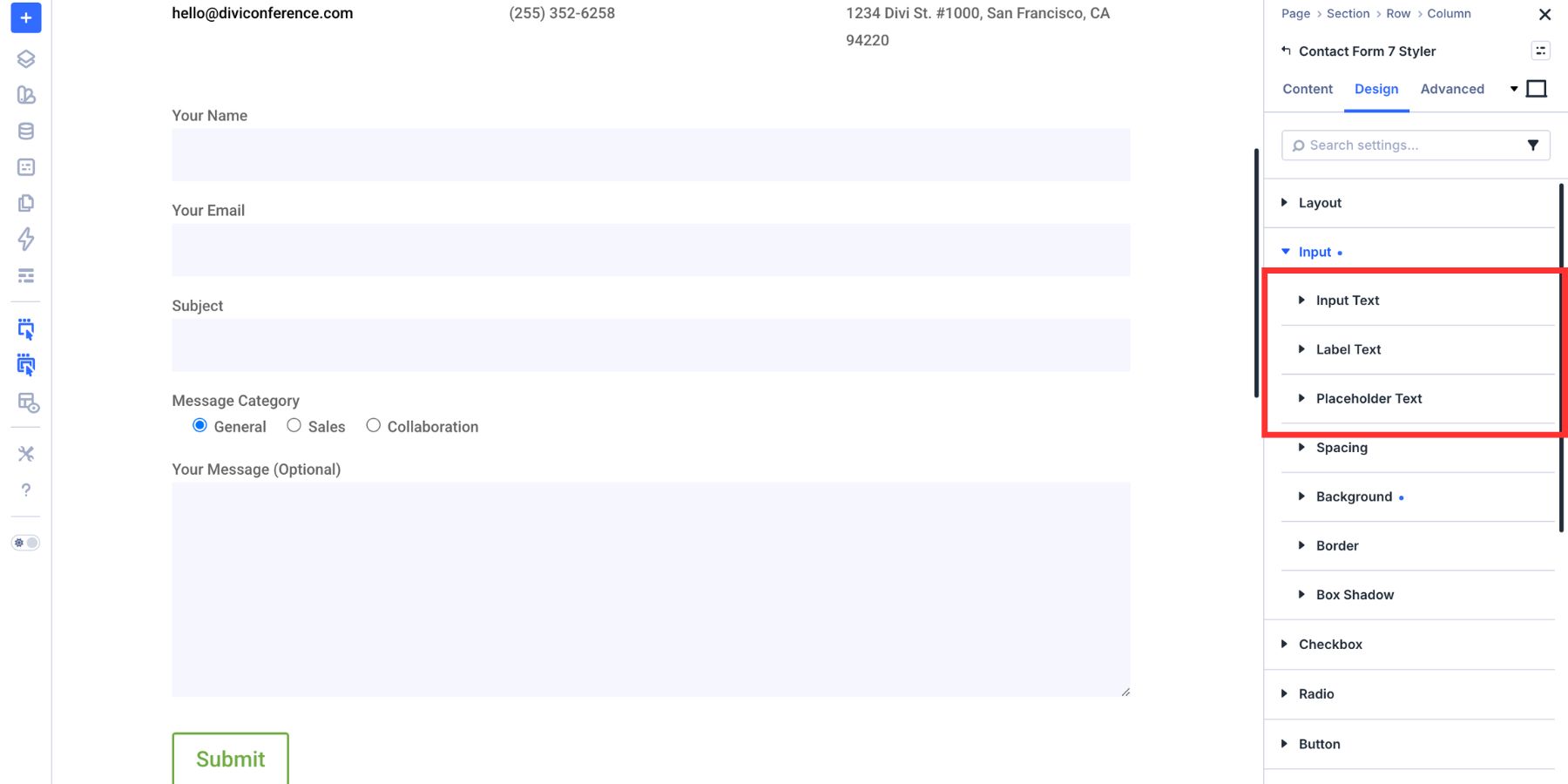
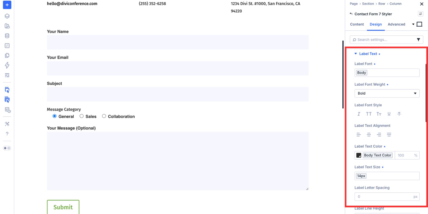
Step 3: Style Labels And Placeholder Text
Still inside the Input group, use the label and placeholder controls to make the form easier to scan. Label text should be clear and readable. A slightly stronger font weight can help labels stand out in longer forms.
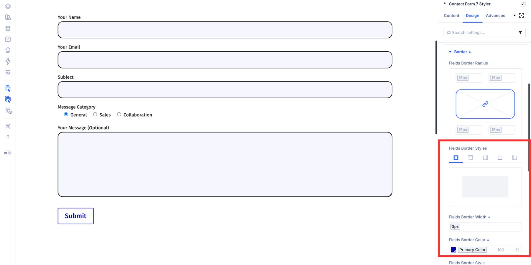
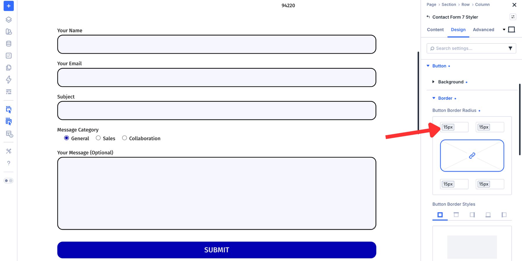
Placeholder text should be secondary. It can provide an example, but it should not replace a real label for important fields. Now adjust field spacing and borders. Spacing controls how open or compact the form feels. Border settings control field width, style, color, radius, and opacity.
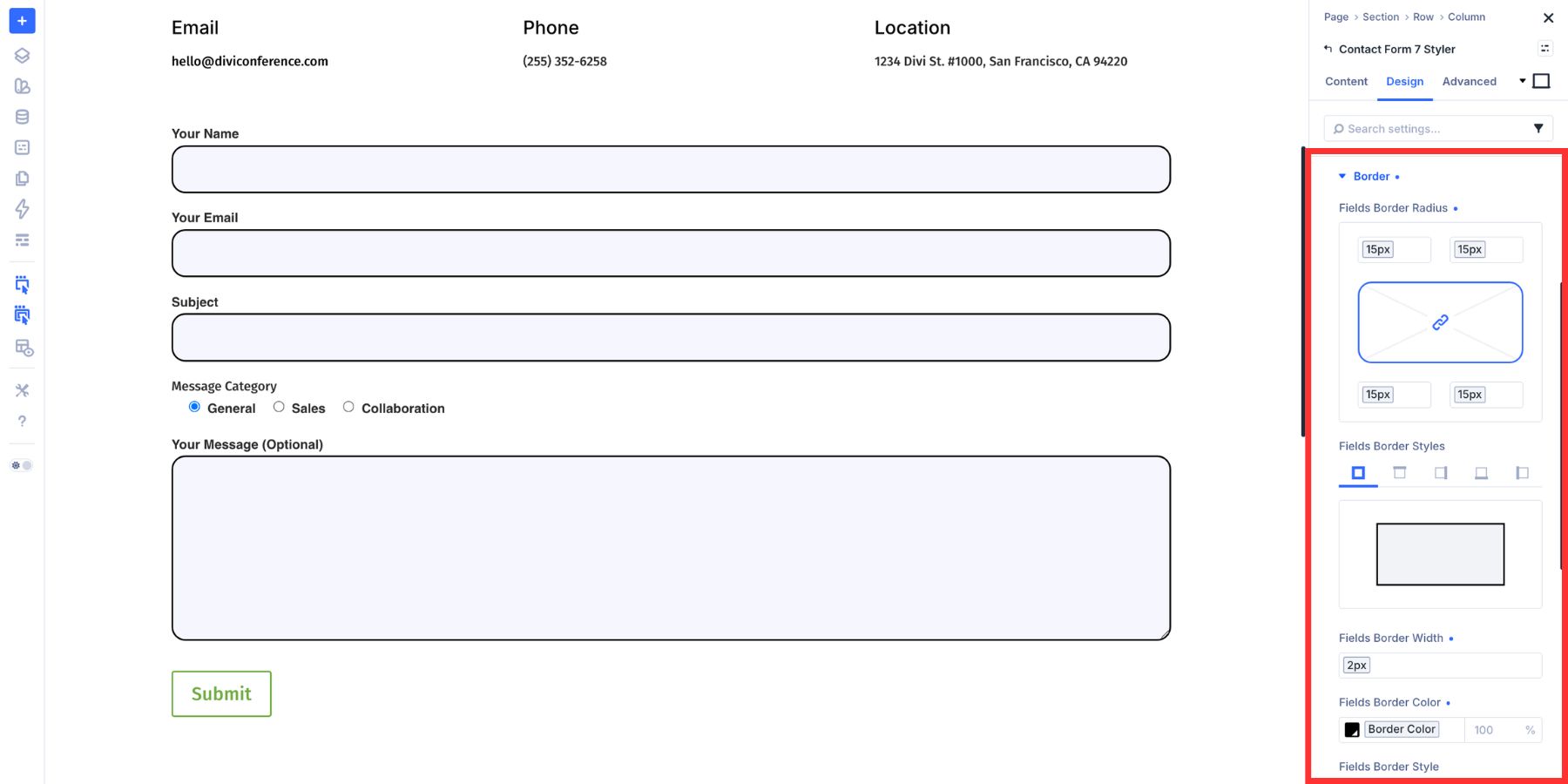
Use variables for border colors, border widths, and radius values when possible. That keeps the form connected to the same visual system used across the rest of the site.
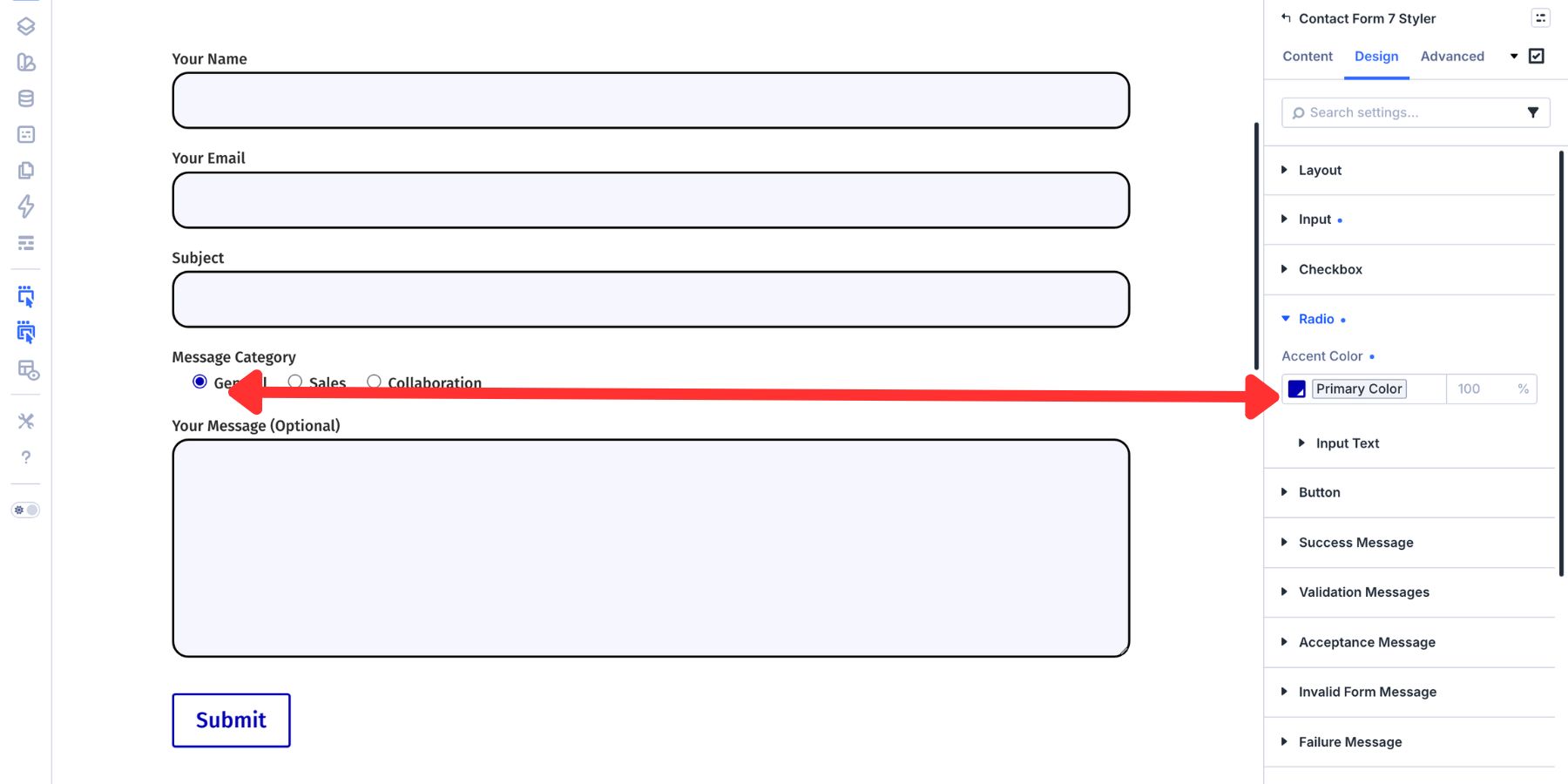
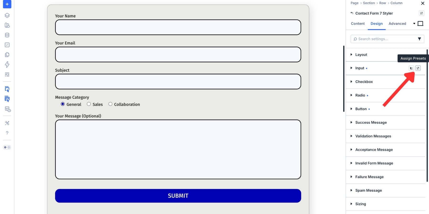
If your Contact Form 7 form includes checkboxes or radio buttons, style them from their own option groups. Open Design > Checkbox or Design > Radio. These groups include controls for size, spacing, typography, color, border radius, and selected indicators.
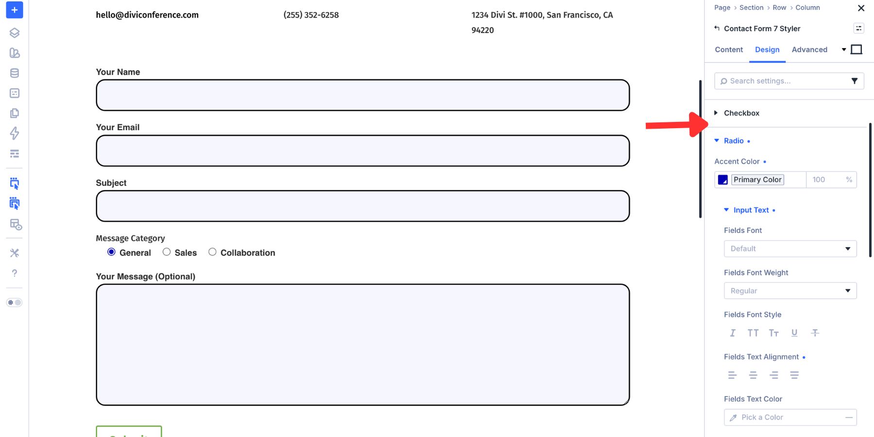
Use the same color logic as your input fields. Neutral states should feel calm. Checked states should be clear enough that users can instantly tell what they selected.
Step 5: Style Form Messages
The Contact Form 7 Styler module includes separate design groups for common CF7 messages. You can style:
- Success Message
- Validation Messages
- Acceptance Message
- Invalid Form Message
- Failure Message
- Spam Message
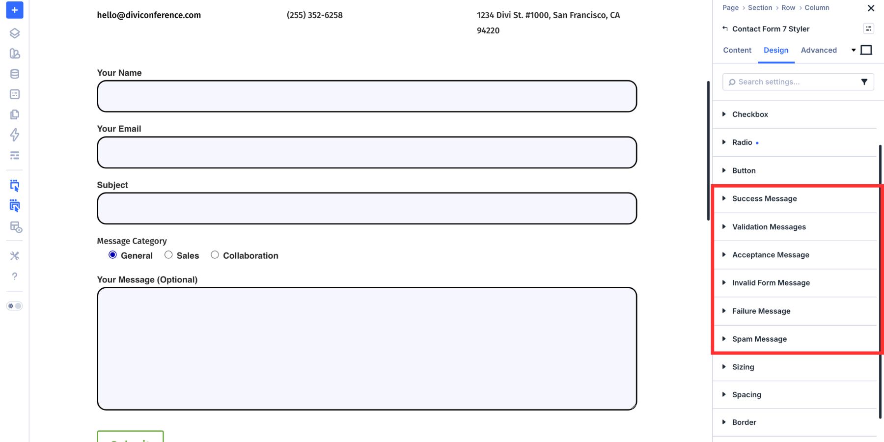
Each message type can have its own typography and color styling. A success message should look different from an error message, but the overall typography should still feel consistent with the form.
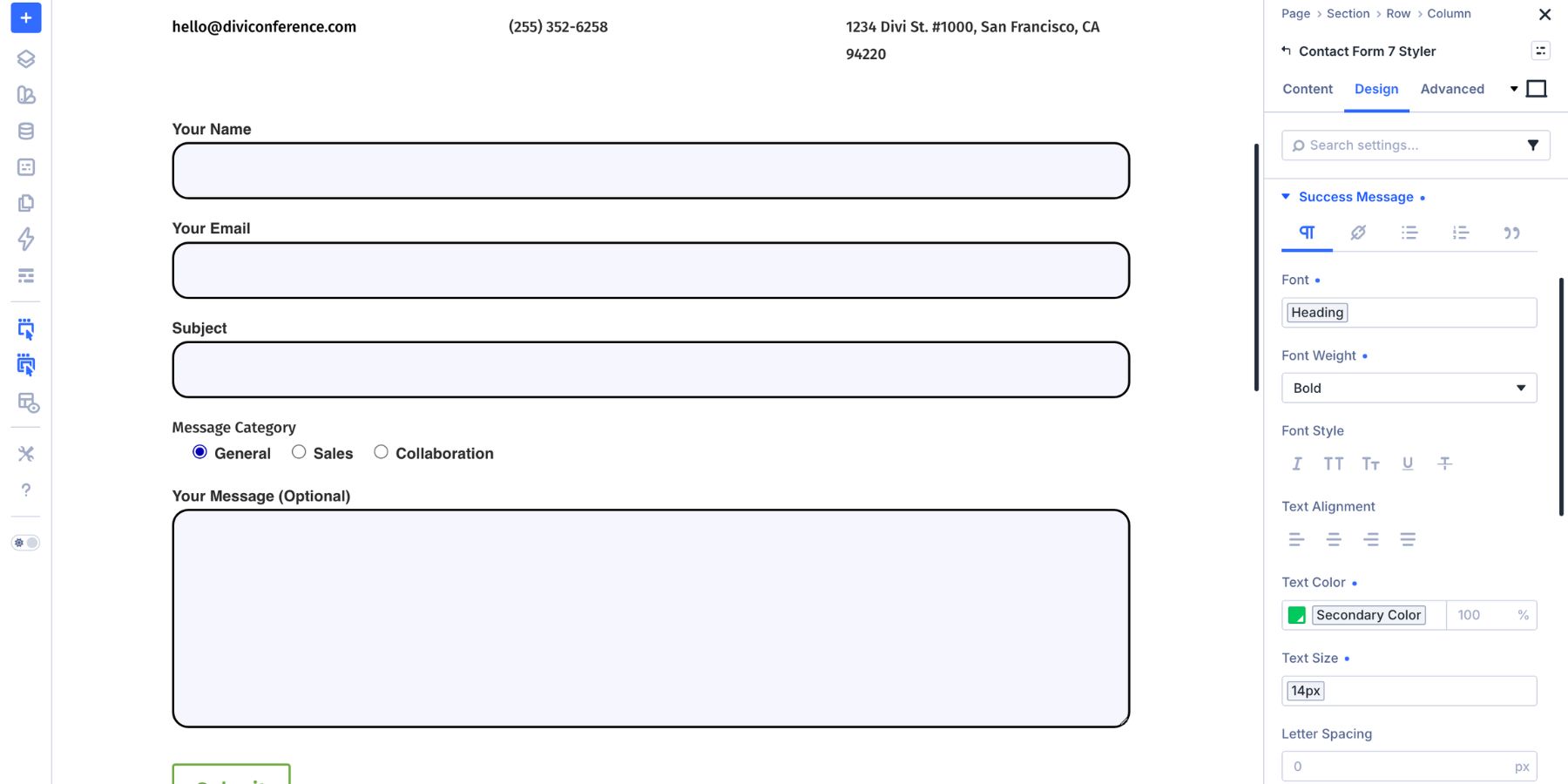
Color carries meaning here. Green can work for success, and red can work for errors, but do not rely on color alone. Make the message text clear enough that users understand what happened and what to do next.
Also, review the message copy inside Contact Form 7. Divi controls the visual style, but the message content still comes from the plugin. A message like We’ve received your message and will be in touch soon is usually more helpful than a generic confirmation.
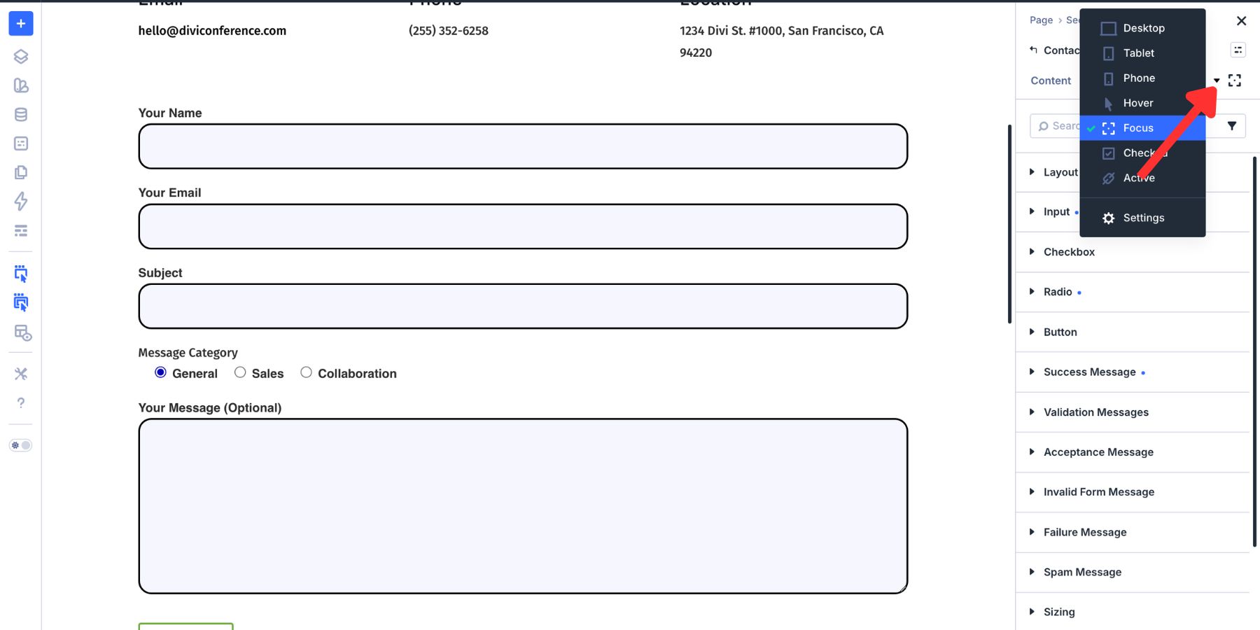
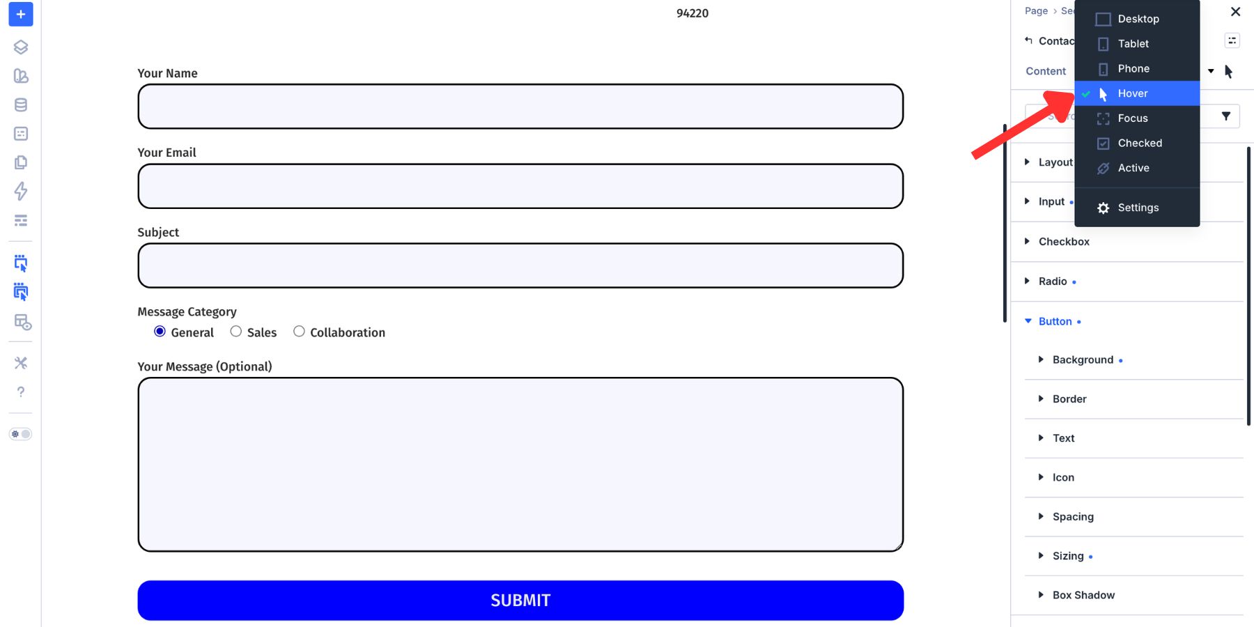
Design Focus, Checked, And Hover States
The resting state is only one part of a form. A good form also needs clear interaction states so visitors know what is active, selected, or clickable. Divi 5 supports form-related pseudo-class editing modes such as Focus and Checked. You can switch states from the mode selector in the settings panel.
Style The Focus State
Switch to Focus, then adjust the Input group. Changes made in Focus mode apply when a visitor clicks or tabs into a field. Use a subtle background change to make the active field easier to spot.
Then style the focus border. A stronger border color, slightly thicker border width, or both can make the active field clearer for keyboard and mouse users.
Choose a focus style that is visible against both the input background and the surrounding page background. Test it on the live page by tabbing through the form with your keyboard.
Style The Checked State
Switch the state selector to Checked, then open the Checkbox or Radio group. Checked styles apply only when an option is selected. The selected state should be visually distinct from the resting state.
Use your primary brand color, or a high-contrast accent, for the selected indicator. This helps checked options feel connected to the rest of the form’s interaction language.
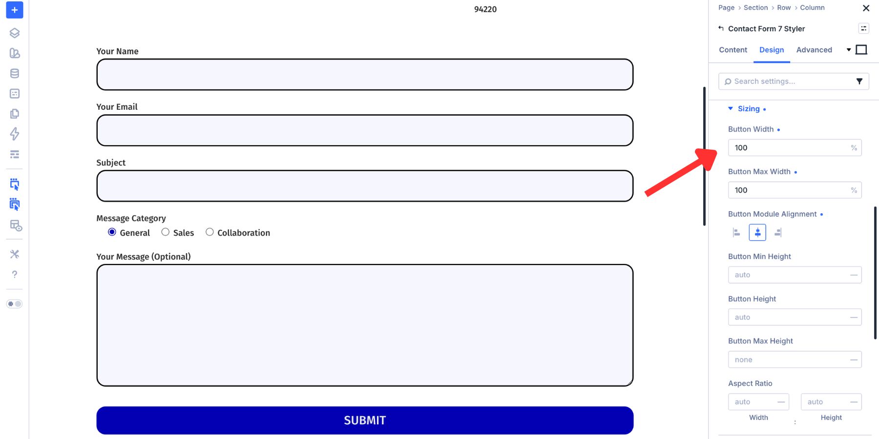
The submit button has its own design controls. You can adjust background color, text styling, width, padding, border, border radius, and hover state. Use a button color that contrasts clearly with the form so the primary action is obvious.
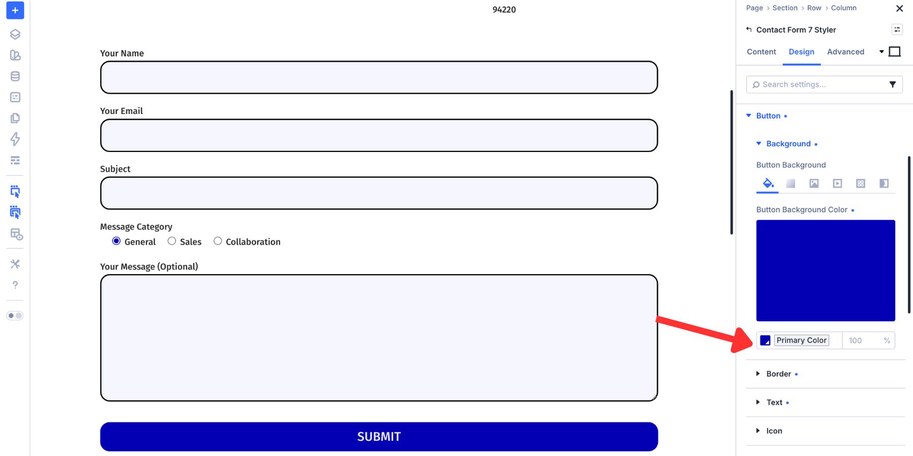
Match the button radius to the input field radius so the button and fields feel like part of the same component system.
Set the button width to 100% if you want the form action to span the same width as the fields.
Now switch to the Hover state for the button.
Use a slightly darker, lighter, or more saturated version of the button color to show that the button is interactive.

This gives the form a complete state system: resting fields, focused fields, checked options, and hover-ready buttons.
Other Styling Options Worth Exploring
The core form design lives in the Input, Checkbox, Radio, Button, and message groups. The module also includes broader design controls for the full module container.
Module Background, Sizing, And Spacing
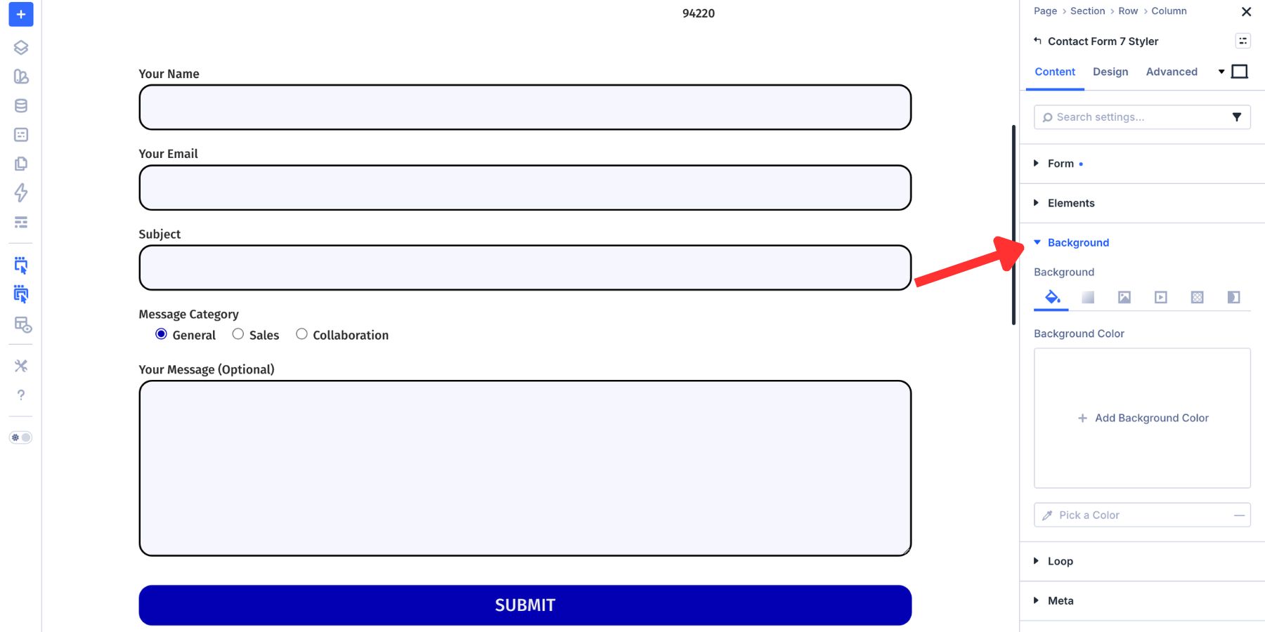
The module background is in the Content tab. You can apply a solid color, gradient, image, pattern, or video background to the full module container.
Most forms do not need a container background. It becomes useful when the form sits on a similar page background and needs its own visual area.
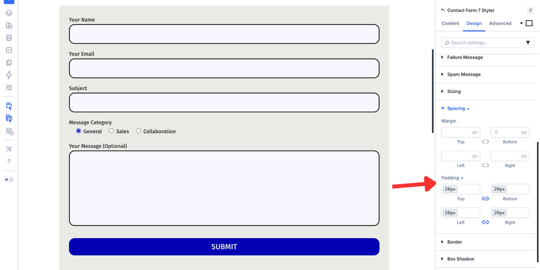
In the Design tab, use Sizing to control the module width. If a form sits inside a wide row, set a max width so the fields stay readable.
Use Spacing for outer margin and inner padding. Padding is especially important when the module has a background color, border, or shadow.
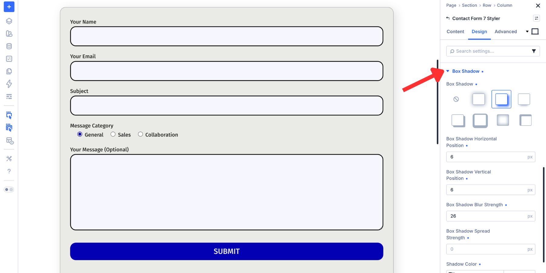
Border And Box Shadow
The module-level Border group controls the outer edge of the full form module. This is separate from the field borders inside the Input group.
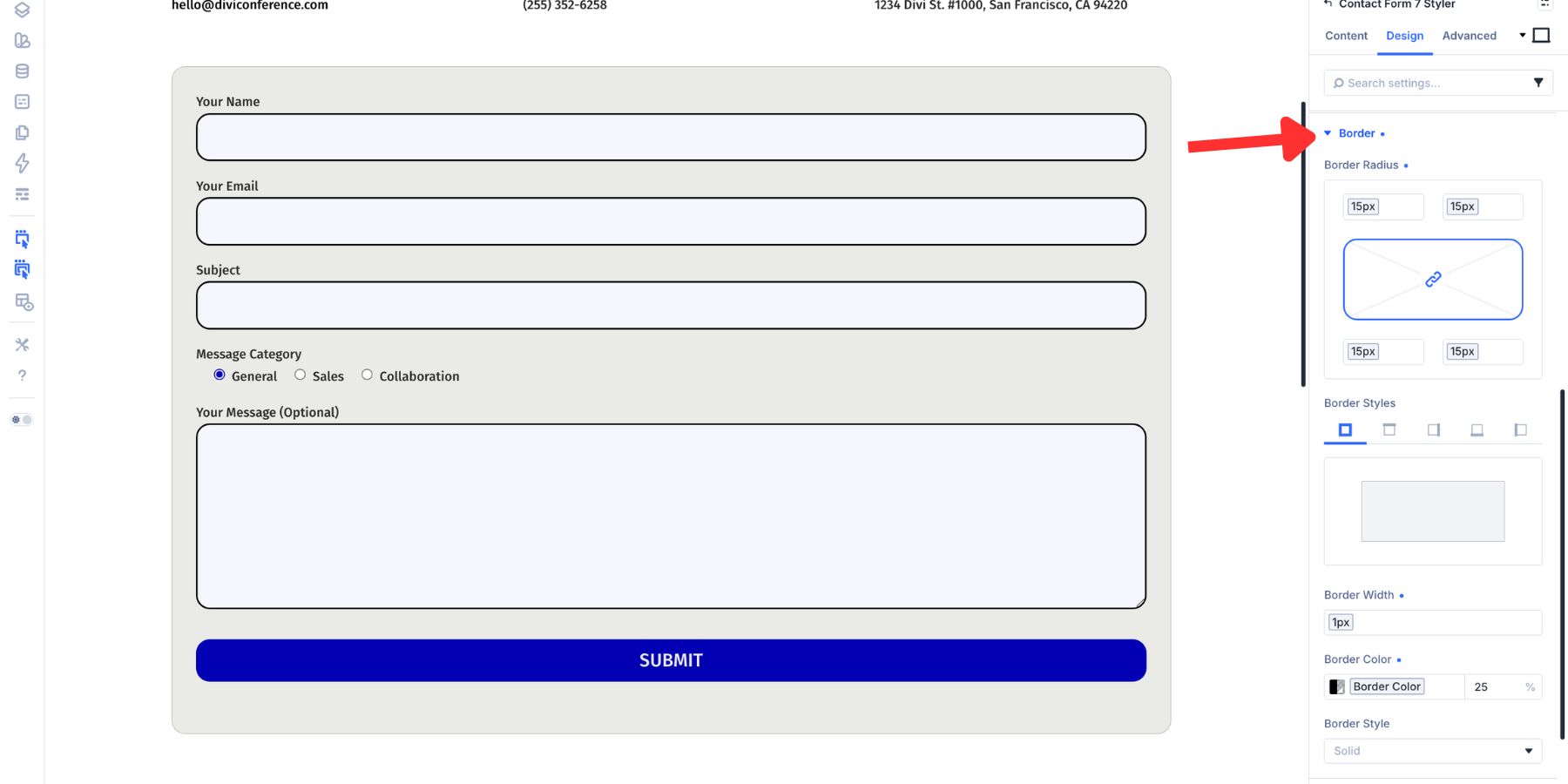
A subtle border can help the form read as a defined card or panel. Box Shadow adds depth behind the module container. Use it carefully. A soft shadow can separate the form from the page, but a heavy shadow can make the form feel disconnected.
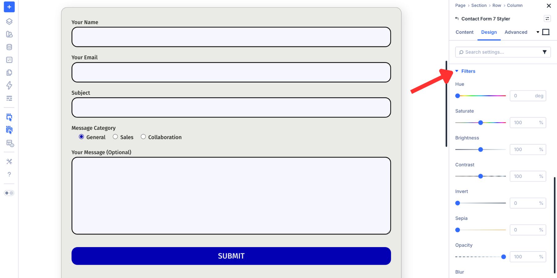
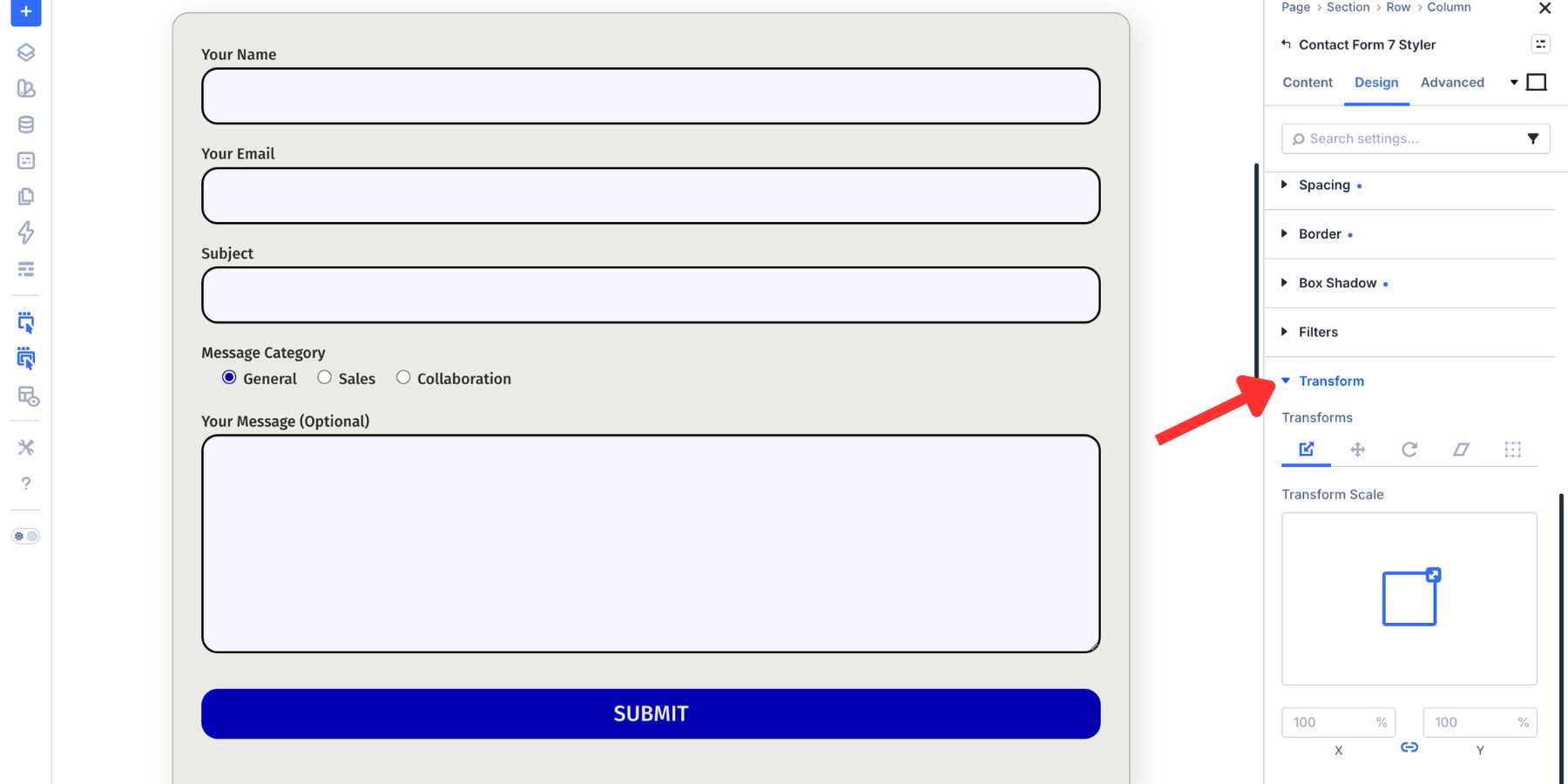
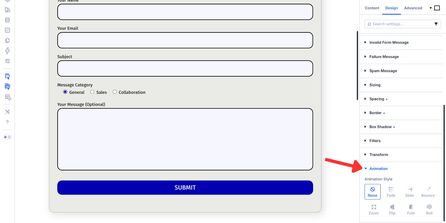
Filters, Transform, And Animation
Filters let you adjust hue, saturation, brightness, contrast, invert, sepia, opacity, and blend mode for the module.
Transform controls scaling, rotation, skewing, and translation. Most contact forms do not need dramatic transforms, but the controls are available when a layout calls for them.
Animation controls entrance effects such as fade, slide, zoom, bounce, and roll. Keep form animations short and subtle so the form appears quickly and does not distract from the submission task.
Save Your CF7 Styles As Presets
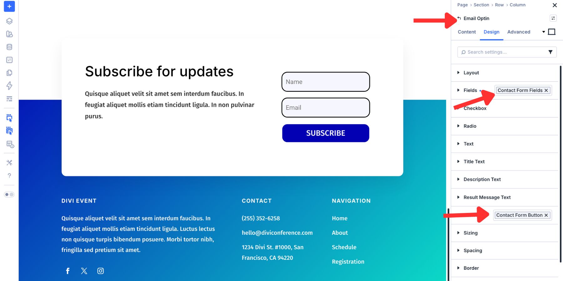
Once the form looks right, save the design so you do not have to rebuild it on every form. Divi 5 gives you two useful preset layers: Option Group Presets and Element Presets.
Use Option Group Presets For Reusable Style Groups
An Option Group Preset saves one group of settings as a reusable style. For forms, useful groups include Input, Checkbox, Radio, Button, Border, Sizing, and Spacing. To create one, hover over an option group header in the Design tab.
Click the preset icon, choose New Preset From Current Styles, give it a clear name, and save it.
Good preset names describe the role of the style. Examples include:
- Form Input Default
- Form Button Primary
- Checkbox Brand
- Form Card Spacing
Option Group Presets are not limited to the module where they were created. A Border preset, Spacing preset, or Button preset can be reused anywhere a compatible option group appears.
That means a form input style created in the CF7 Styler can help shape other form-based modules too.
Use Element Presets For Complete CF7 Form Designs
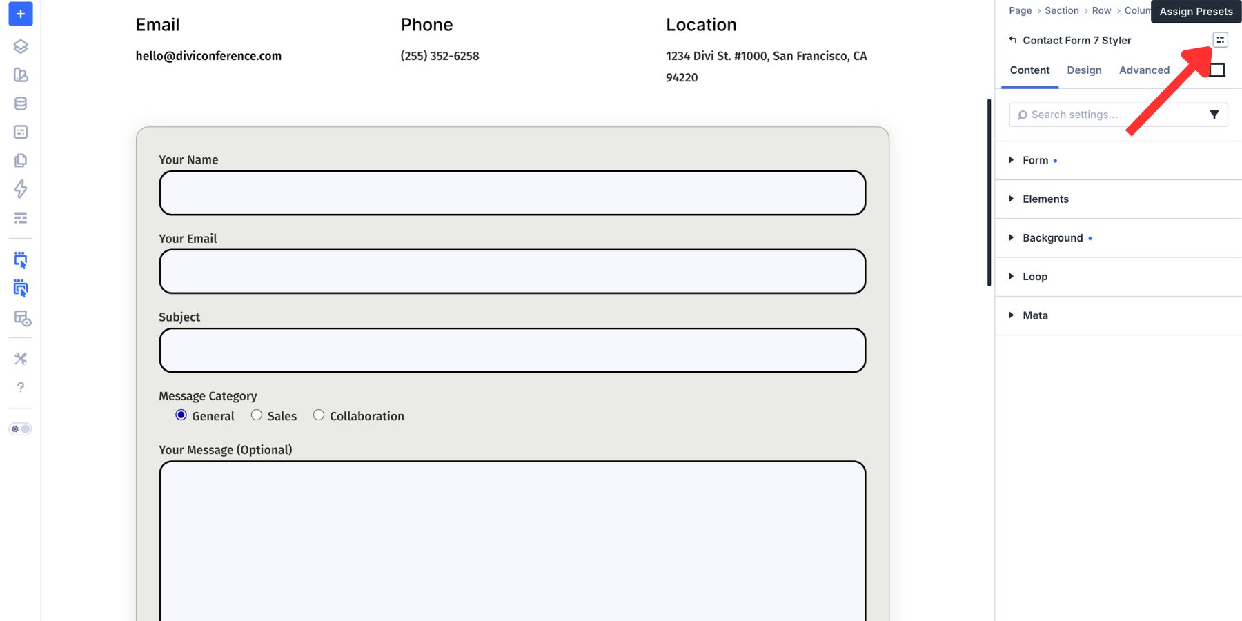
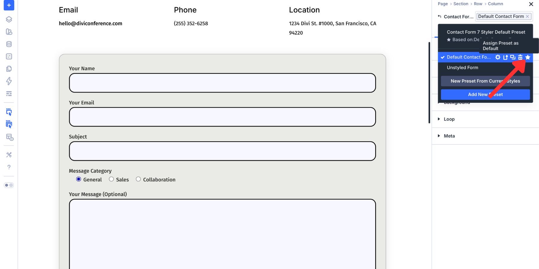
An Element Preset saves the full module design. For the Contact Form 7 Styler module, that can include field styles, labels, spacing, typography, button design, messages, focus states, and checked states. Once the module looks right, open the preset dropdown at the top of the settings panel.
Choose New Preset From Current Styles and give the preset a clear name, such as Primary CF7 Form or Contact Form Card.
To reuse it, add another Contact Form 7 Styler module and choose the preset.
You can also set the Element Preset as the default for future Contact Form 7 Styler modules.
Element Presets work at the module level. A CF7 Styler Element Preset applies to Contact Form 7 Styler modules, while other form modules need their own Element Presets. Option Group Presets can still provide the shared design language underneath.
How Design Variables, Option Group Presets, And Element Presets Work Together
The strongest workflow uses three layers together.
- Design Variables store reusable values, such as colors, fonts, spacing, and radius values.
- Option Group Presets package those values into reusable style groups, such as inputs, buttons, borders, and spacing.
- Element Presets bundle those groups into a complete module design.
For example, a primary color variable can be used inside a Button Option Group Preset. That Button preset can be included in a CF7 Styler Element Preset. Every CF7 Styler module using that Element Preset can then follow the same button design.
If the brand color changes later, update the Design Variable. Any preset or module that references that variable can be updated. That is the difference between styling one form and building a reusable form design system.
Best Practices For CF7 Styling In Divi 5
Use these checks before publishing your styled form:
- Keep form setup in Contact Form 7: Fields, mail settings, validation, and integrations still belong in CF7.
- Use visible labels: Do not rely only on placeholder text for important field names.
- Check contrast: Test field text, labels, placeholders, buttons, and messages against their backgrounds.
- Style focus states: Keyboard users should always be able to see which field is active.
- Style checked states: Selected checkboxes and radio buttons should be obvious.
- Review message copy: Success and error messages should explain what happened in plain language.
- Use Design Variables: Avoid hardcoding colors and spacing values when the design should stay connected.
- Save presets: Use Option Group Presets and Element Presets so future forms start from the same design system.
Try The Contact Form 7 Module In Divi 5 Today!
Contact Form 7 handles the form structure and submission workflow. Divi 5 now gives you a visual way to make those forms match the rest of your site. With the Contact Form 7 Styler module, you can select an existing CF7 form, style it inside the Visual Builder, customize interaction states, and save the result as reusable presets.
You no longer need to treat CF7 forms as design outliers. Keep the form logic in Contact Form 7, bring the styling into Divi, and connect the result to your broader Divi 5 design system.


Leave A Reply