

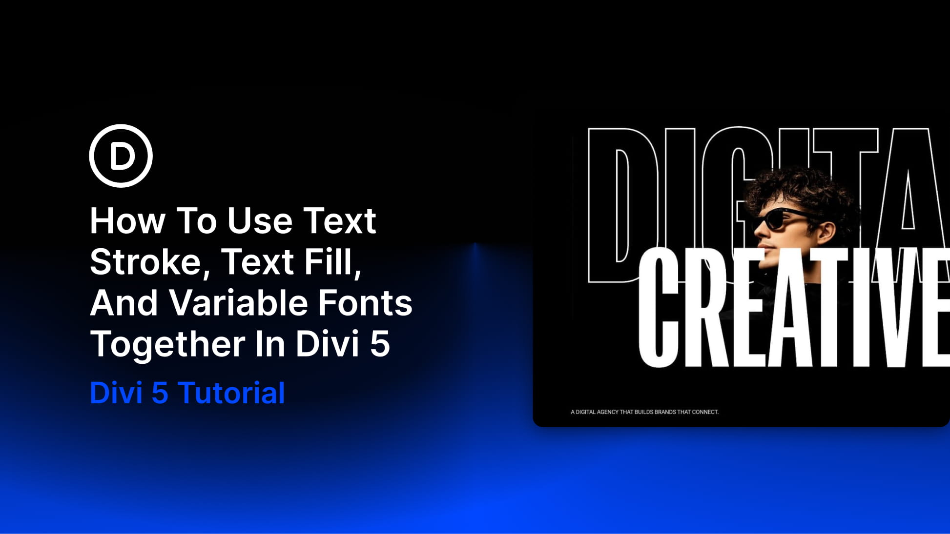
Variable fonts, Text Fill, and Text Stroke are three different typography controls in Divi 5. The font controls the shape of the letters. The fill controls what appears inside them. The stroke controls the edge.
You can use each one on its own, but they become more powerful when you combine them. A variable font can make a heading thick enough for a gradient to show clearly. A transparent fill and stroke can turn a word into a hollow outline. A wide, heavy letterform can hold an image pattern without losing readability.
There is no single recipe. Each design below uses the same three ingredients differently. The first layers outlined and solid text around a cutout photo. The second uses a gradient-filled number with a light stroke. The third fills a full-width heading band with an image pattern.
Along the way, we’ll look at how variable font axes, Text Fill, Text Stroke, Gradient Variables, and presets work together so you can build more intentional typography effects directly inside Divi 5.
Understanding Variable Fonts, Text Fill, And Text Stroke
These settings live in the Design tab of text-based modules and text option groups, including Text, Heading Text, and Title Text. Variable font controls appear near the font selection when the selected font supports them. Fill and stroke settings appear in the text effects area of the same text group.
We covered each fill type in our guide to Divi 5’s text fill options. In this tutorial, we’ll focus on how the settings affect each other once you start combining them.
Variable Fonts
Apply a supported variable font to an element, and Divi 5 shows the axes available for that font. Each axis changes part of the letterform.
Weight controls how heavy the strokes are. Width controls how narrow or expanded the letters feel. Depending on the font, you may also see axes such as Slant, Grade, Thin Stroke, Thick Stroke, or other font-specific controls.
For this tutorial, the important part is the surface area inside each letter. Heavier and wider settings usually give fills more room to show. Lighter and narrower settings leave less room for gradients, images, and strokes to work.
The open areas inside letters like e, a, o, and g are called counters. If a stroke is too thick or a font weight is too tight, those counters can start to close up. Keep that in mind as we build the examples.
Text Fill
Text Fill controls what appears inside the letter shape.
Set Fill Type to Gradient, and the letters are filled with a gradient. Set it to Image, and the letters become a mask for an image. Set it to Transparent, and the inside of the letters becomes see-through, which works well when paired with a stroke for outlined text.
The fill only has the inside of the letter to work with. A heavy heading gives the fill a wide surface. A light heading gives it a thin strip. That is why a gradient can look rich inside a bold heading but almost flat inside a thin one.
Text Stroke
Text Stroke draws a line around the edge of the letters. The most important controls are Stroke Width, Stroke Color, and Stroke Position.
Stroke Position matters because it changes how much of the fill stays visible. A centered stroke sits partly inside the letter and partly outside it. The inner part covers some of the fill. An outside stroke protects more of the fill because the outline sits beyond the letter shape.
For example, a centered 3px stroke can work nicely on a large, heavy heading because there is still plenty of fill visible inside the letters. On a smaller or lighter heading, that same stroke can take over too much of the letter and make the fill harder to see.
When you want a stroke to define the edge without cutting into a gradient or image fill, use an outside stroke position where available. When you want the stroke to feel more integrated with the letterform, a centered stroke can still work, especially at large sizes.
How The Three Affect Each Other
The font decides the letter shape. The fill sits inside that shape. The stroke defines the edge. That order matters. Set the variable font axes first so the letters have the right weight, width, and counters. Then choose the fill. Then decide whether the stroke should be subtle, bold, centered, or outside.
A gradient needs enough letter surface to show movement. An image fill needs enough surface to show detail. A stroke needs enough letter width to avoid crowding the fill. Once you understand that relationship, you can combine the settings more freely and still keep the heading readable.
Design 1: A Layered Hero With Outlined And Solid Text
The first design puts two headings on top of each other. The back word is hollow, using a transparent fill and a white stroke. The front word is solid white and sits over the cutout photo.

This combination works because each layer has a different job. The outlined word creates the scale and structure of the hero. The cutout photo adds depth. The solid word carries the main message. Nothing here needs a gradient or image fill. The effect comes from the font axes, one transparent fill, one stroke, and careful stacking.
Step 1. Set Up The Section And Row
Add a new section and open its settings. Under Background, set the section background to your dark base color. If you already use Color Variables, pull in the dark color from your palette instead of typing the value manually. The rest of the design uses white text and a white outline, so the hero needs a dark surface behind it.
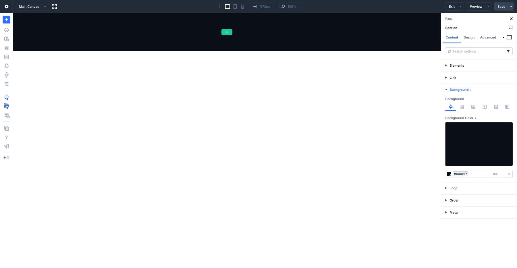
Next, set the section height. Under Sizing, set Min Height to 100vh so the hero fills the screen. Then open Spacing and set Padding Top to 0px so the large outlined heading can sit closer to the top edge.
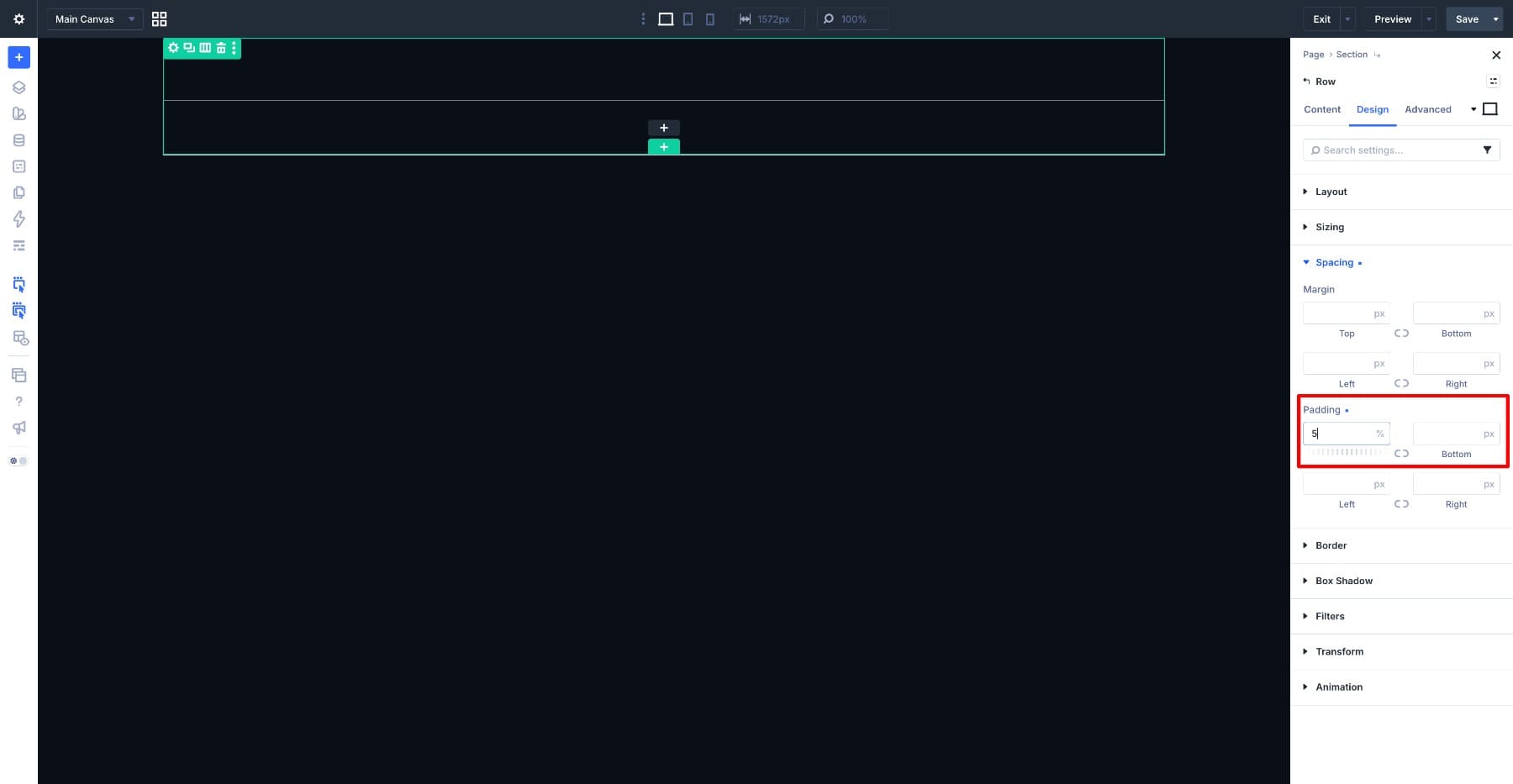
Add a one-column row inside the section and open the row settings. Under Spacing, set Padding Top to 5%. This gives the heading some space without creating a fixed gap that feels too large or too small on different screens.
Step 2. Add The Outlined Heading
Add a Heading module to the row and type DIGITAL. This is the back layer of the hero. It needs to be large enough to anchor the section, narrow enough to fit across the layout, and thick enough for the stroke to stay open and readable.
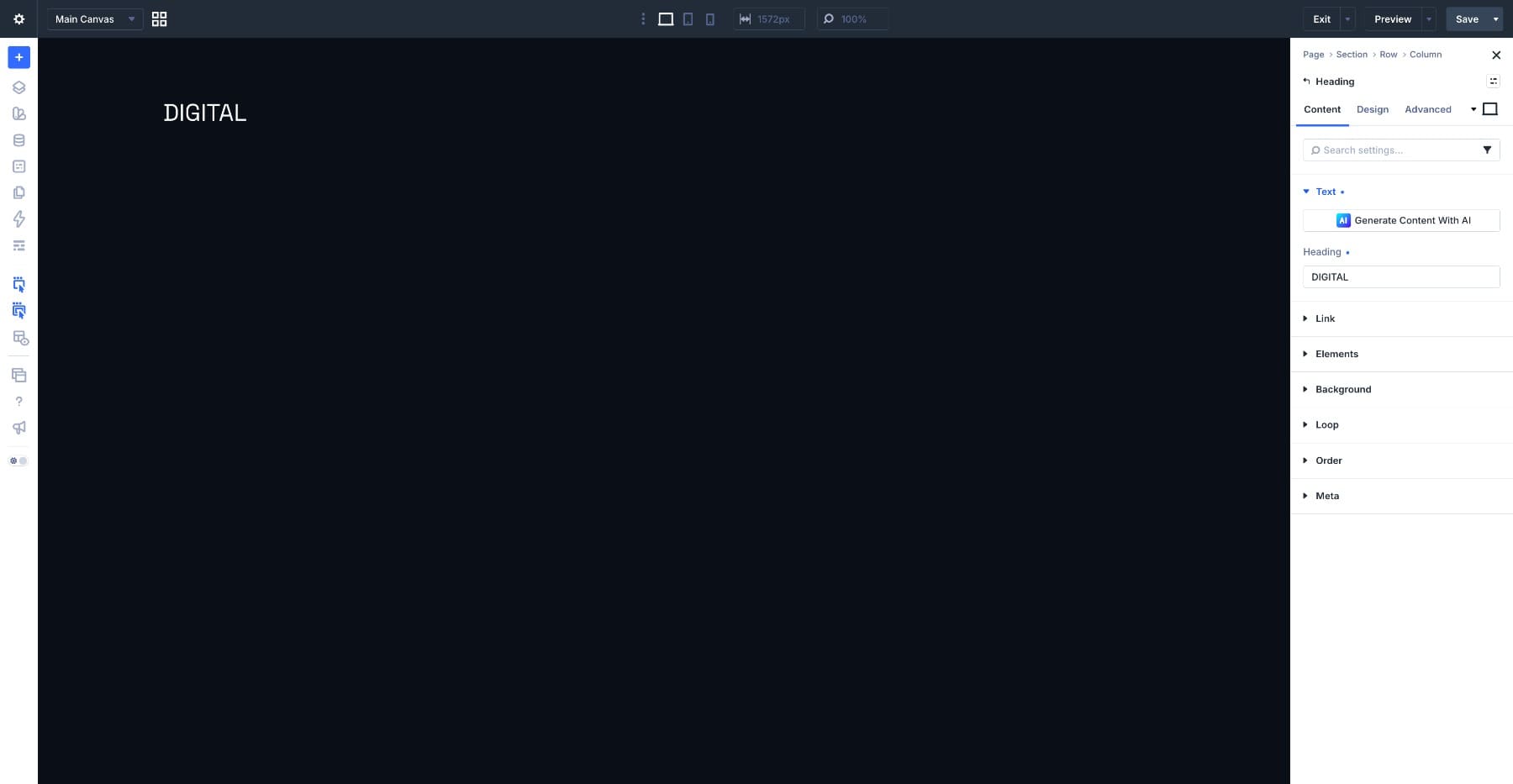
Open the Design tab and go to Heading Text. Set the Heading Level to H1 and choose Roboto Flex as the Heading Font. Roboto Flex works well here because it gives you several useful axes. Use these settings:
- Variable Font Weight: 592
- Variable Font Width: 38
- Variable Font Grade: 56
- Variable Font Thin Stroke: 69
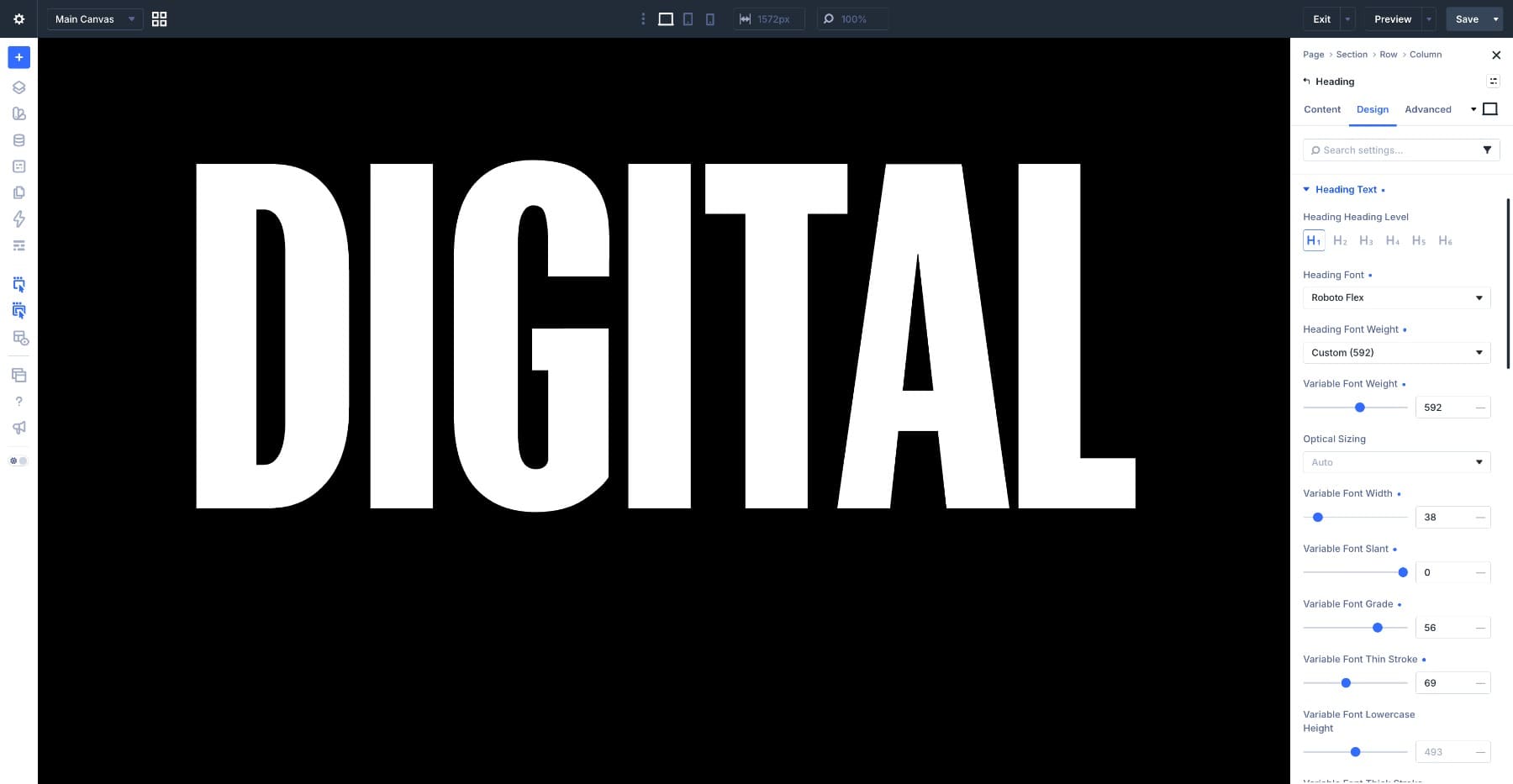
The narrow width lets a seven-letter word stretch across the section without overflowing. Grade and Thin Stroke give the letterforms enough body to support a thick outline.
Now set the size. Use clamp(11rem, 40vw, 38rem) for Heading Text Size. This lets the heading scale with the viewport while keeping it from becoming too small or too large. Set Heading Letter Spacing to 5px and Heading Text Alignment to center.
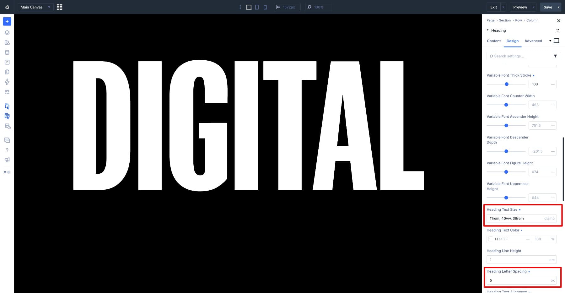
Now turn the word into an outline. Set Heading Fill Type to Transparent. Then set Heading Stroke Width to 8px and Heading Stroke Color to #FFFFFF.
The transparent fill makes the inside of the word see-through, while the stroke draws the letter edges. Because the variable font settings give the letters enough structure, the 8px stroke stays readable instead of closing up the counters.
If your stroke starts to crowd the inside of the letters, either lower the stroke width, increase the font weight, increase width slightly, or move the stroke outside if that option fits the design. Next, set the stacking order. Open the column settings, go to Design > Position, and set Z Index to 0. Then open the outlined Heading module, go to Position, and set its Z Index to 1.
The outlined word now has its place in the stack. The image and the solid heading will sit above it.
Step 3. Place The Cutout Photo Over The Outline
Add an Image module below the outlined heading and upload your cutout photo. Use an image with the background already removed so the subject can sit between the two text layers cleanly.
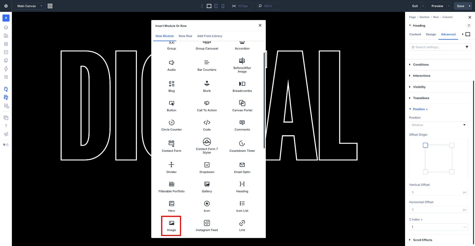
Open the Design tab and go to Sizing. Set Width to 100% so the image fills the column. Then open Spacing and set Padding Bottom to 300px. This keeps enough space below the cutout for the solid heading layer.
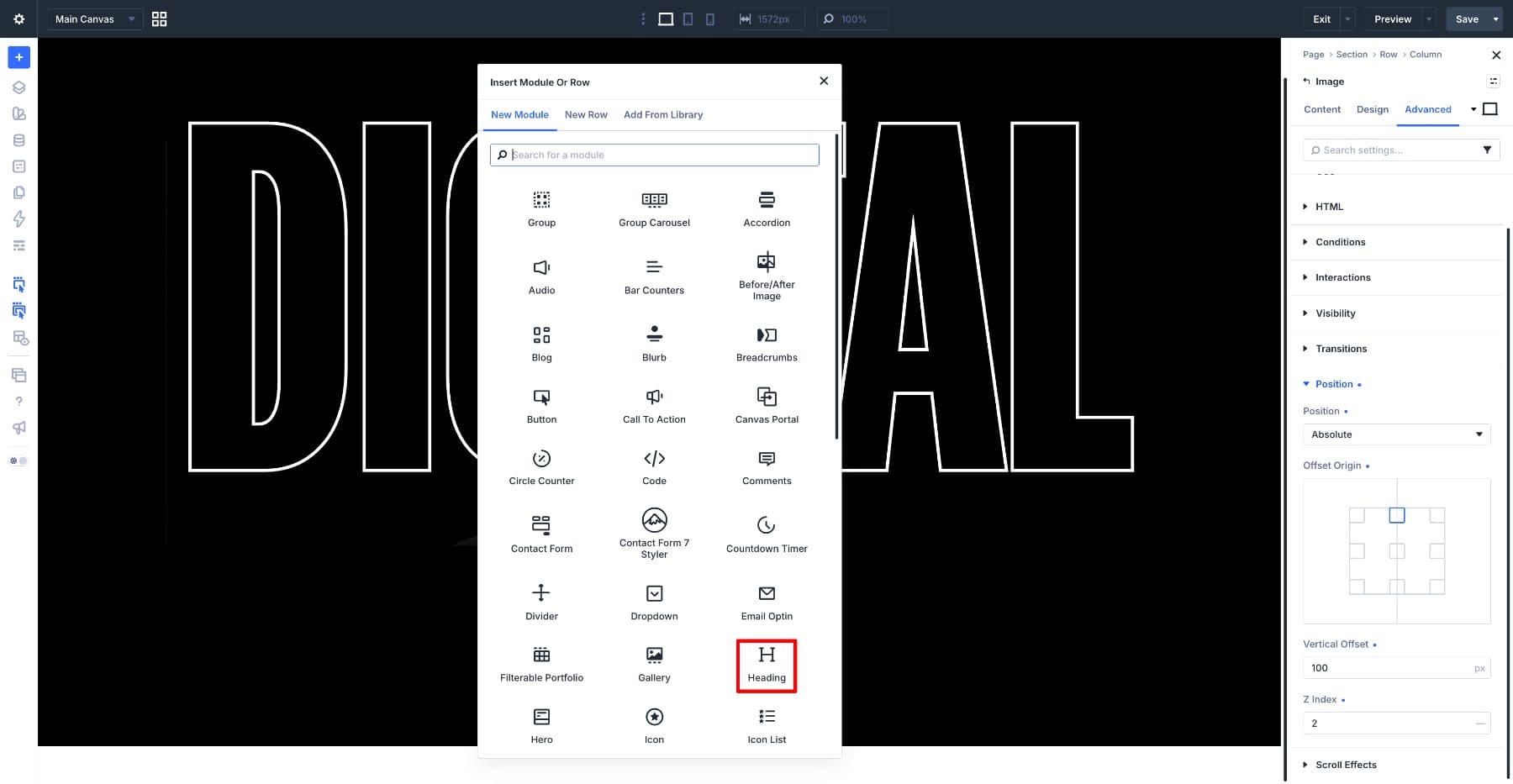
Now lift the image out of the normal layout flow. Go to Position and set Position to Absolute. Set Vertical Offset to 100px, then adjust the value until the subject sits where you want it inside the outlined word.
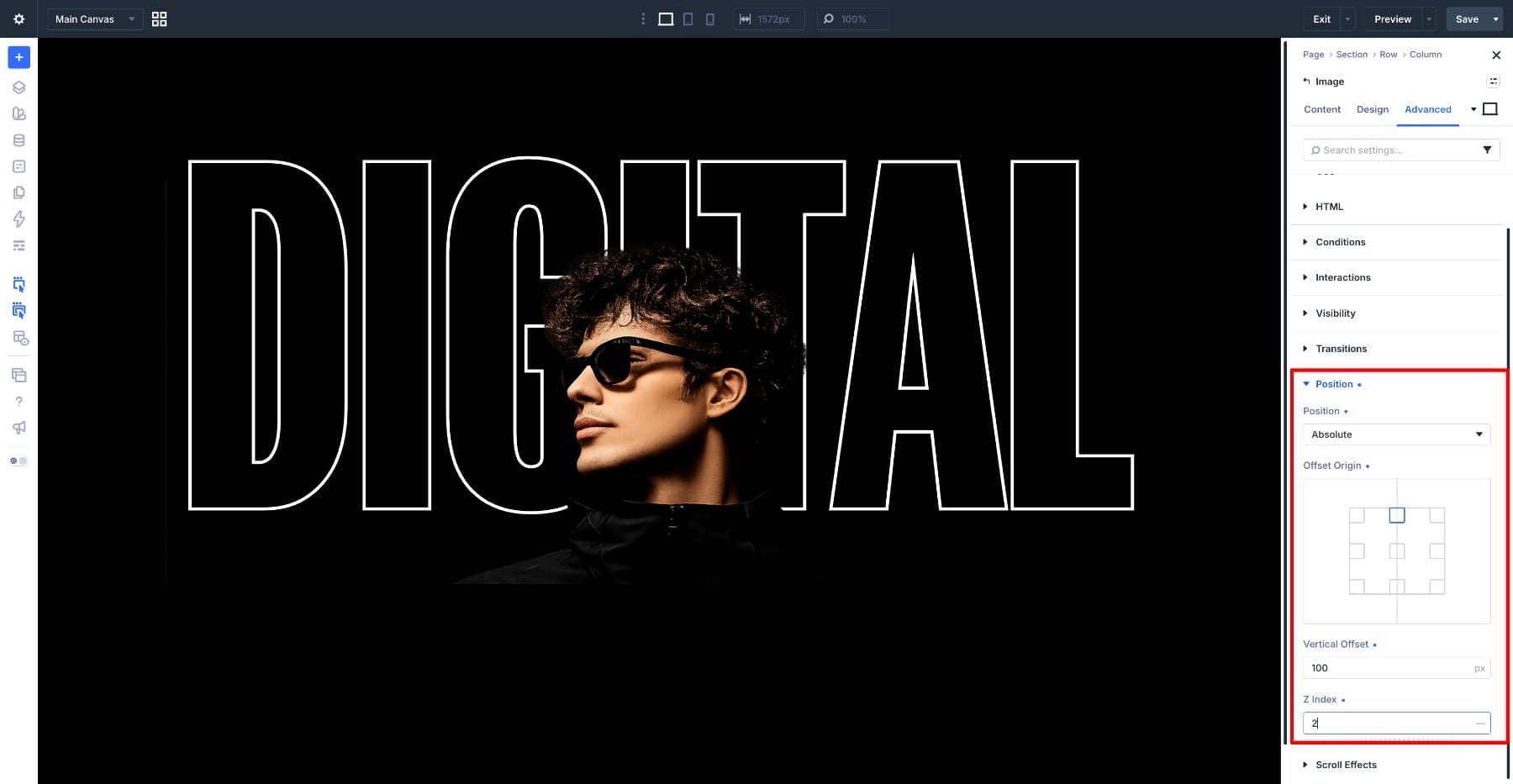
Set the image Z Index to 2. The outlined heading is on 1, so the photo now sits above it. The outline remains visible behind the subject and disappears wherever the image overlaps it.
Step 4. Add The Solid Heading
Add a second Heading module below the image and type CREATIVE. This is the front layer. It uses the same font as the outlined word, but different axis values so the two words feel related without looking identical.
Open the Design tab and go to Heading Text. Set the Heading Level to H2 and set the Heading Font to Roboto Flex. Use these variable font settings:
- Variable Font Weight: 550
- Variable Font Width: 25
- Variable Font Grade: -63
- Variable Font Thin Stroke: 69
- Variable Font Thick Stroke: 103
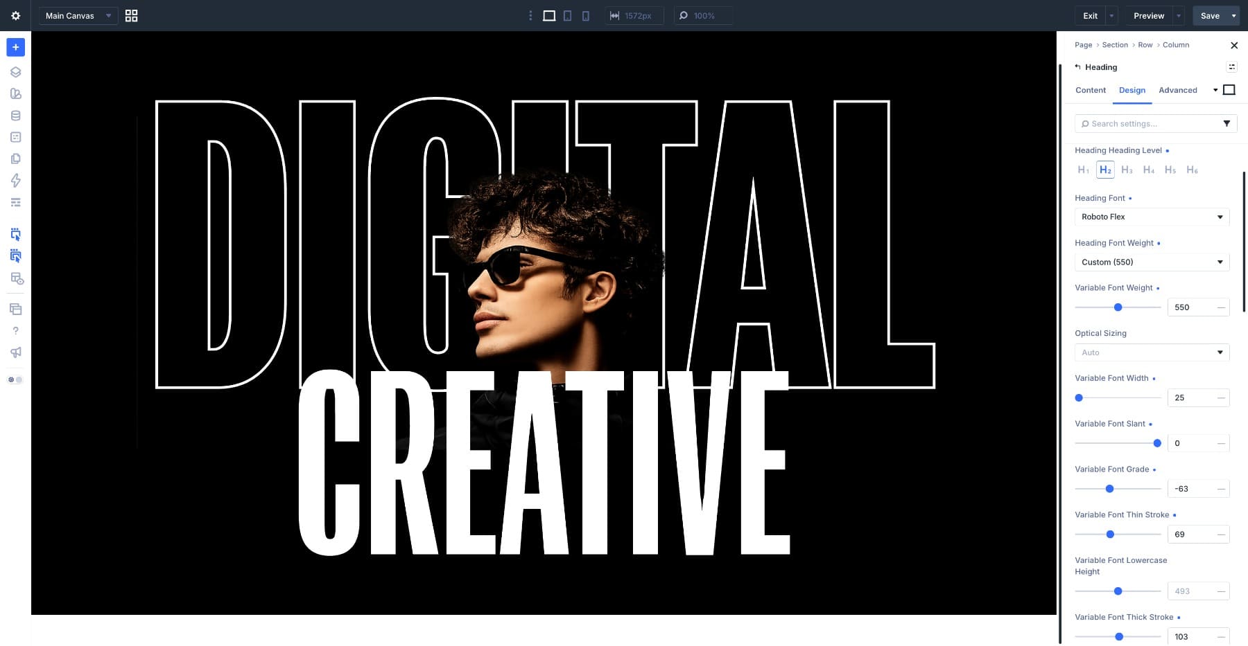
The width is narrower than the outlined word so the longer word can still fit across the section. Grade moves in the opposite direction from the outlined heading, trimming the letters slightly without changing the overall width as much as weight would.
Set Heading Text Size to clamp(11rem, 25vw, 34rem), Heading Line Height to 1em, and Heading Letter Spacing to 5px. Set Heading Text Alignment to center and Heading Text Color to #FFFFFF.
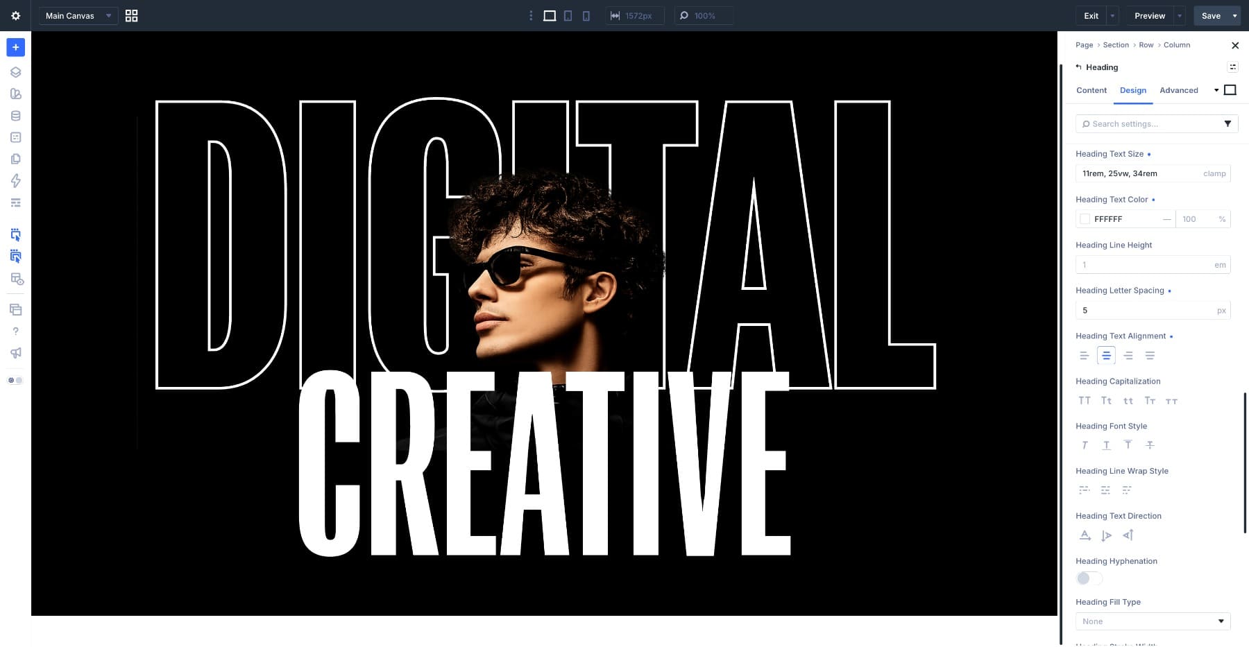
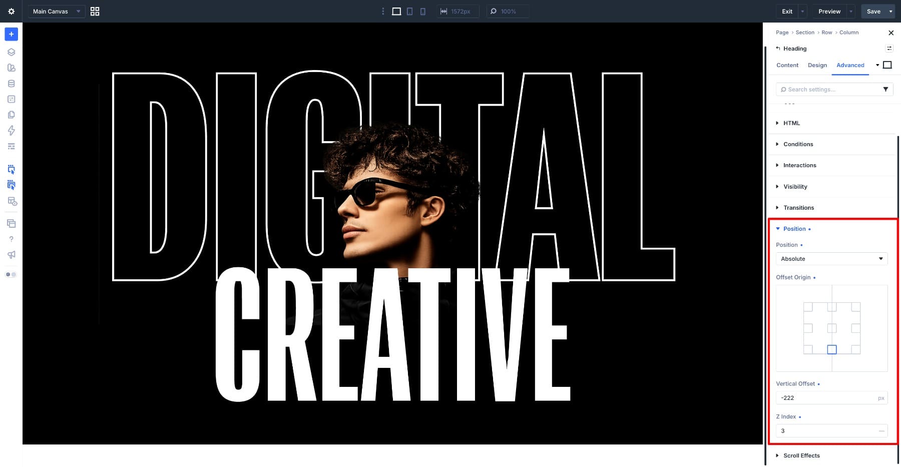
Leave Heading Fill Type on None and do not add a stroke. The front word should stay simple because the back word is already carrying the outline effect. Now place it in the stack. Go to Position and set Position to Relative. Set Z Index to 3 so it sits above both the outlined word and the photo.
Set Vertical Offset to -222px to pull the word into the lower half of the outlined heading. Adjust that value based on your final image position and text size.
Step 5. Add The Tagline And Link Row
The main type effect is finished. Now add the supporting text and link. Add a new row below the hero row and choose a two-column structure. If the row conflicts with the layered content above it, add top margin until the spacing feels balanced.
Place a Text module in the left column for the tagline and a second Text module in the right column for the link. Set the right column text to right alignment so it sits at the opposite edge of the section.
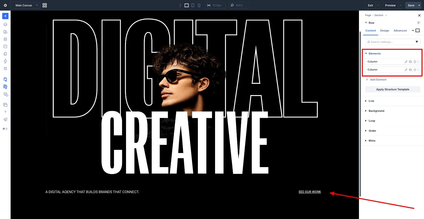
Keep these supporting text elements simple. Use small uppercase text, white color, and no fill or stroke. If you already have presets for small text and links, apply those instead of styling the modules manually.
Step 6. Check The Smaller Screens
Most of this design is responsive by design. The headings use clamp(), the section uses vh, the row padding uses a percentage, and the image width is set to 100%. The fixed pixel values need review.
Switch to tablet and phone views and check the Vertical Offset on the CREATIVE heading. The desktop value may place the heading too high or too low once the text scales down. Set responsive values for tablet and phone until the overlap looks intentional at each breakpoint.
The image module’s Vertical Offset and Padding Bottom may need the same treatment.
Then check the bottom row. On desktop, the tagline and link sit across from each other. On phone, the columns stack, and the space between the heading and tagline can get too tight. Add responsive top margin to the row on phone if the layout needs more breathing room.
Two More Heading Variations With Gradient And Image Fill
The next two designs use the same three settings in different combinations.
The first fills a large number with a gradient and adds a light stroke. The second fills a full-width heading band with an image pattern. Both rely on variable font axes first, because the fill only works when the letters are wide and heavy enough to show it.
Variation 1: A Gradient Fill On An Oversized Number
Numbers are a strong surface for gradient fills. Digits like 2, 5, and 0 create wide shapes, so the gradient has room to move across the letterform instead of getting squeezed into a narrow stroke.
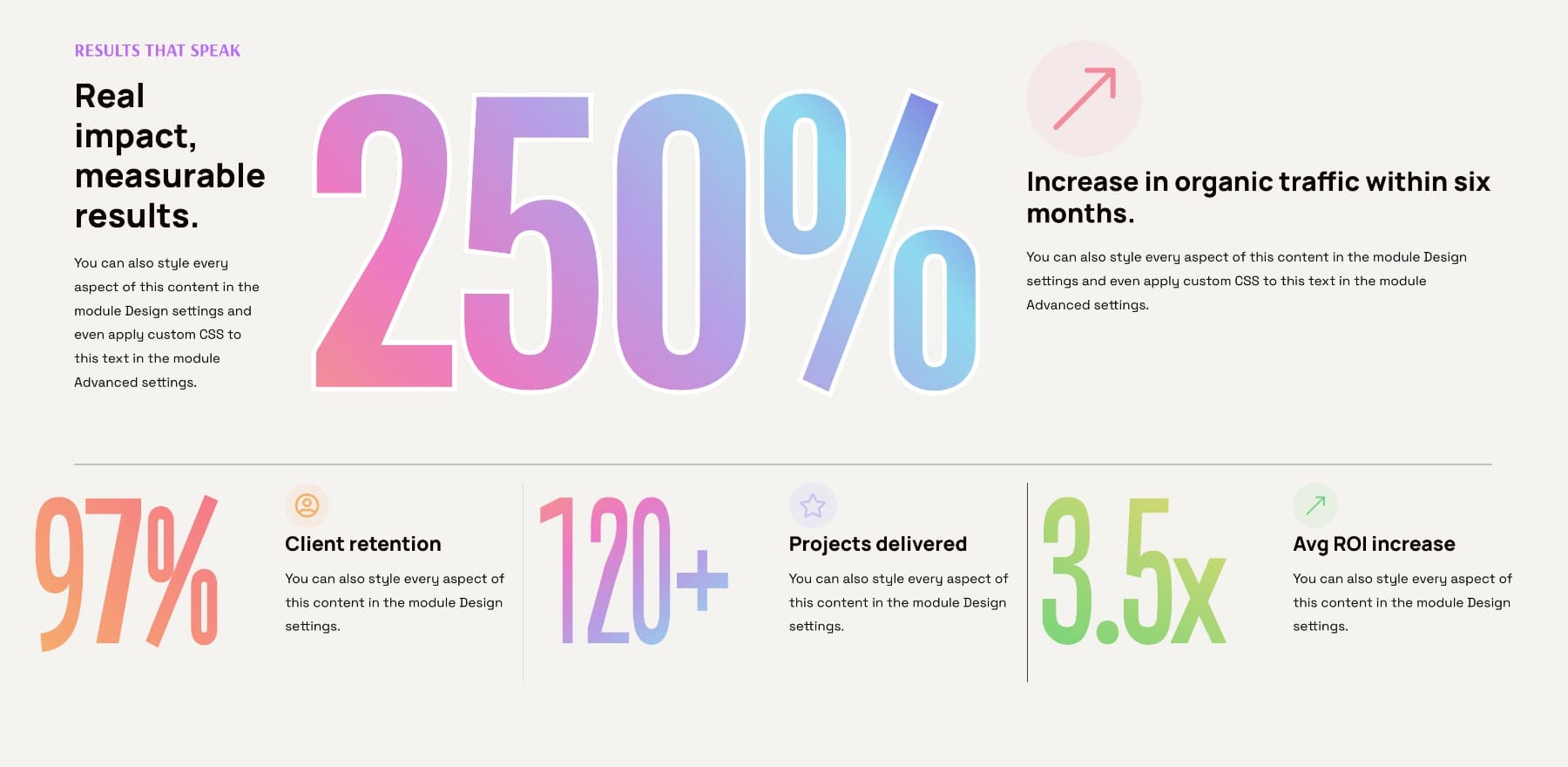
Before styling the number, build the gradient once and save it as a variable.
Open any gradient field, create the gradient you want, then right-click the gradient field and choose Convert To Variable. Give it a role-based name such as Brand Gradient. The gradient now lives in the Variable Manager and can be reused anywhere gradients are supported, including text fills.
The layout uses two rows.
The first row has three columns, with the middle column set wider so the large number has enough room. The left column holds the section heading and supporting text. The middle column holds the large number. The right column holds the icon and description.
The second row has three equal columns. Each column contains a nested two-column row so a smaller number can sit beside its label and text.
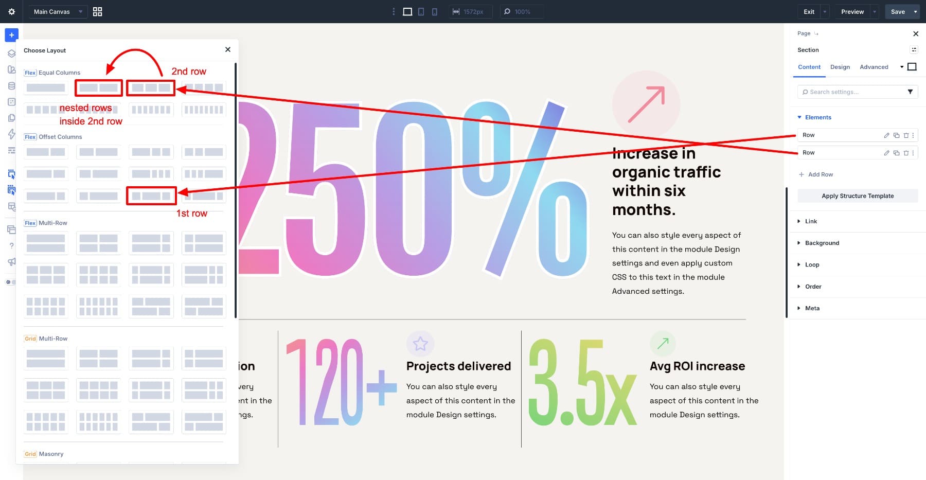
Each number is a Heading module with Fill Type set to Gradient. The large number uses the saved Brand Gradient variable and a thin white stroke. The smaller numbers use gradient fills without strokes so the fill stays visible at their smaller size.
For the large number, use a Heading module set in Roboto Flex with these settings:
- Variable Font Weight: 615
- Variable Font Width: 49
- Heading Text Size: 500px
- Heading Fill Type: Gradient
- Heading Gradient Fill: Brand Gradient
- Heading Stroke Width: 6px
- Heading Stroke Color: #FFFFFF
The weight and width make the 6px stroke workable. If the number were lighter or narrower, the stroke would take too much space away from the gradient. Since the number is large and heavy, the fill still has enough room to show the blend.
For the smaller numbers, use gradient fills without stroke. At smaller sizes, even a thin outline can crowd the fill and make the gradient harder to read.
One detail to remember: the gradient maps to the text box, and the letters act like windows onto it. A wide text box shows more of the gradient. A narrow one compresses the visible part of the blend. If two gradient-filled numbers look different, check both the gradient settings and the size of the module box.
Variation 2: A Pattern Fill On A Full-Width Band
The last design runs one large line of text across the full width of the section and fills the letters with an image pattern. This kind of band works well as a footer-style closing mark, campaign signoff, or visual divider.
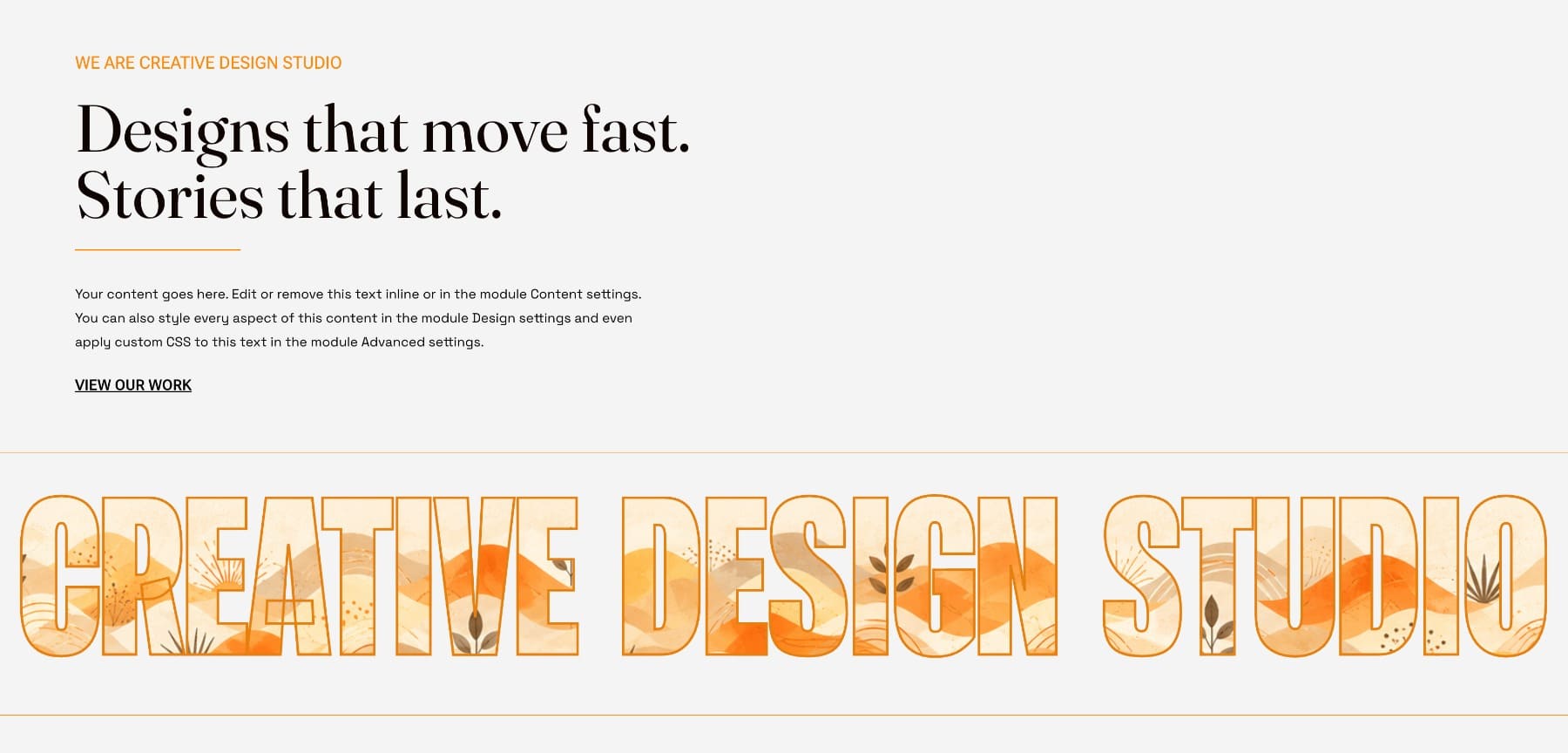
The layout uses two rows. The first row holds the closing content on the left: an eyebrow, heading, short paragraph, and link. The second row is a one-column row holding the full-width heading band. Remove extra section padding around the band so the letters can run closer to the section edges.
The band is a Heading module set in Roboto Flex. Use these settings:
- Variable Font Weight: 766
- Variable Font Width: 25
- Variable Font Grade: -200
- Heading Text Size: 14vw
- Heading Fill Type: Image
- Image Fill Position: Top Left
- Heading Stroke Width: 3px
- Heading Stroke Color: #e68110
The width axis does most of the layout work. At 25, the letters are narrow enough to fit across the section. The weight at 766 keeps each letter thick enough to show the pattern. Drop the weight too far and the image fill becomes thin strips of color. Increase the width too much and the band may no longer fit cleanly across the section.
A pattern works better here than a detailed photograph. A photo often has one strong focal area and a lot of quieter areas, which means some letters may show the interesting part while others show filler. A repeating pattern gives every letter a similar level of detail.
The stroke helps hold the edges together. Since the pattern has light areas and the background is also light, a 3px orange outline keeps the word readable no matter which part of the pattern appears inside each letter.
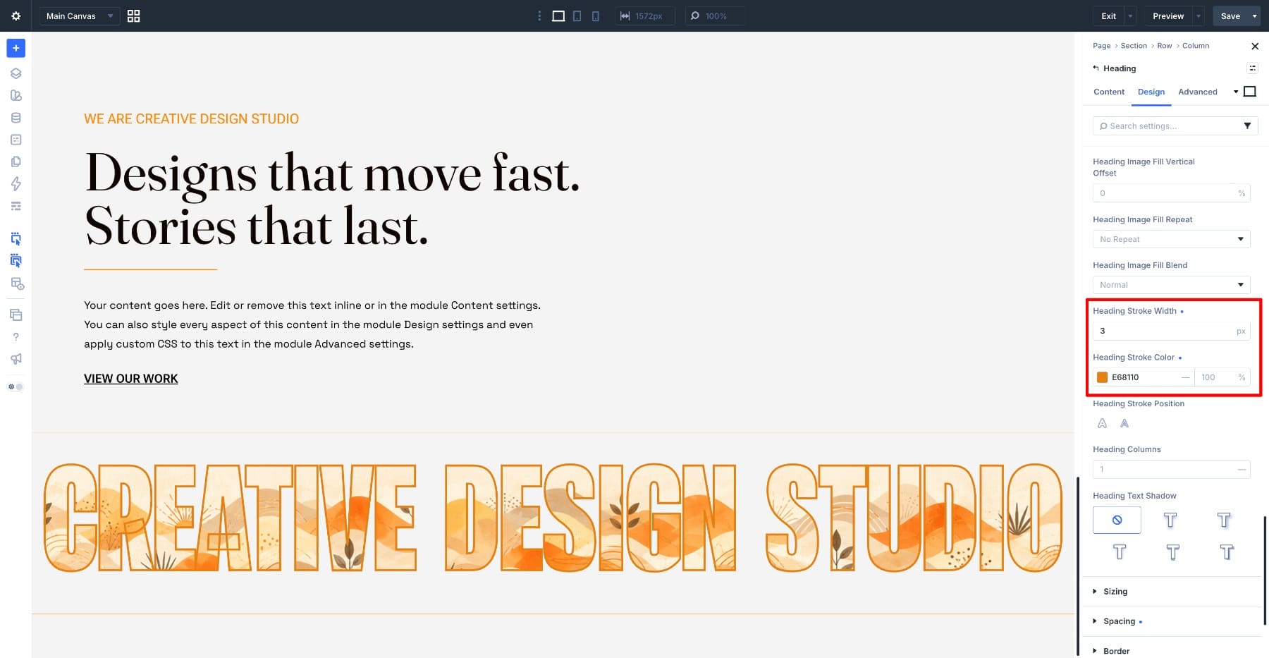
If the stroke starts to hide too much of the image fill, reduce the stroke width or move the stroke outside. If the image fill starts to lose its detail, increase the font weight or choose a pattern with stronger contrast.
Save The Treatment As A Preset
The gradient number uses several settings: a specific font, axis values, a large text size, a gradient fill, a saved Gradient Variable, and a stroke. Instead of rebuilding that combination every time, save it as a preset. Open the Heading module that holds the large number. Hover near the top of the settings panel, click the Preset icon, choose New Preset From Current Styles, and name it something clear, such as Gradient Number.
The preset now stores the styling decisions for that Heading module, including the variable font settings, text size, gradient fill, and stroke. Apply Gradient Number to another Heading module and the same treatment appears immediately.
If the gradient fill uses the Brand Gradient variable, the preset keeps that variable connection. Edit the gradient variable later and every heading using that variable can update with it.
You can also separate responsibilities with presets. Let one preset handle the typography effect, and let your existing spacing, color, or layout presets handle the surrounding structure. That keeps the effect reusable without making every heading on the site behave exactly the same way.
Get Creative With Text Inside Divi 5
Variable fonts, Text Fill, and Text Stroke in Divi 5 work best when you think of them as a sequence.
First, use the variable font axes to shape the letters. Make them heavy enough, wide enough, narrow enough, soft enough, or condensed enough for the design. Then choose the fill that belongs inside those letters: solid color, gradient, image, or transparent. Finally, add a stroke when the edge needs definition.
Each example in this tutorial applied the same idea in different ways. The layered hero used transparent fill and a white outline. The oversized number used a gradient fill with a light stroke. The full-width band used an image pattern with an orange outline.
Once you understand how the font shape, fill, and stroke affect each other, you can create your own combinations without relying on fixed formulas.






Leave A Reply