
Divi 5 is taking shape, and each step toward a full release packs even more possibilities than the last. Our team is officially in bug-bash mode and making sure what’s currently available is as stable as possible. Even as that hardening continues, we’ve released a few features that continue to show how Divi 5 is built for the future of website building.
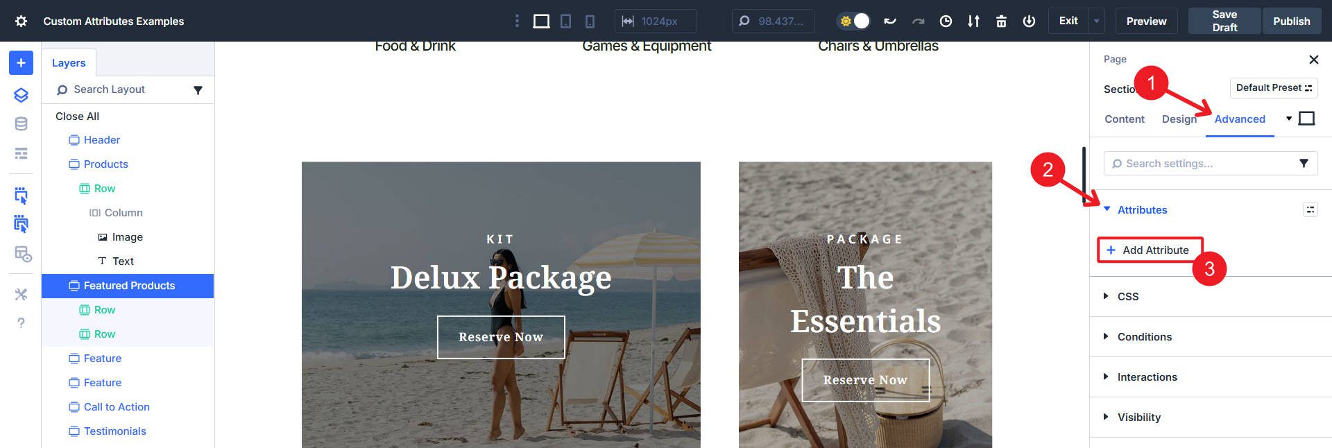
Custom Attributes is one of those features. It might look like a tiny Option Group in the Advanced tab (that’s what it is), but it packs a lot of punch. Instead of only assigning classes and IDs, you can now assign any valid HTML attribute and attach it to the right part of any Module.
If you don’t know what that means, we’ll have some examples and explainers below to clarify. This is an excellent first step in Divi’s improving Accessibility — it only gets better from here.
Custom Attributes For All Divi Elements
It’s important to note that the attributes you can now assign are not Divi-specific. These are HTML attributes that are standard for all websites. Instead of the UI gatekeeping which ones you can apply (and where), this new feature allows you to do what you need to do, on the element (or sub-element) you need to do it on.
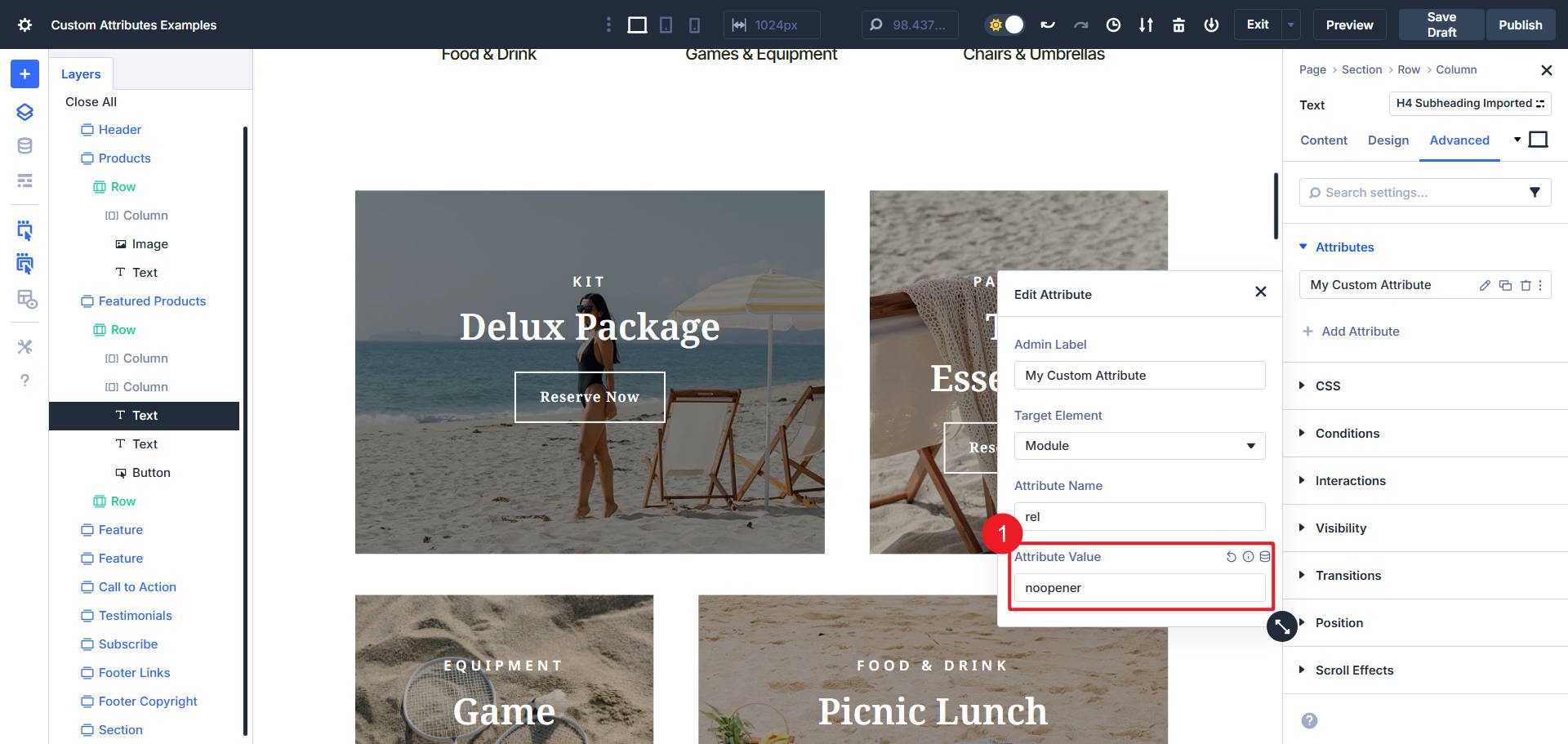
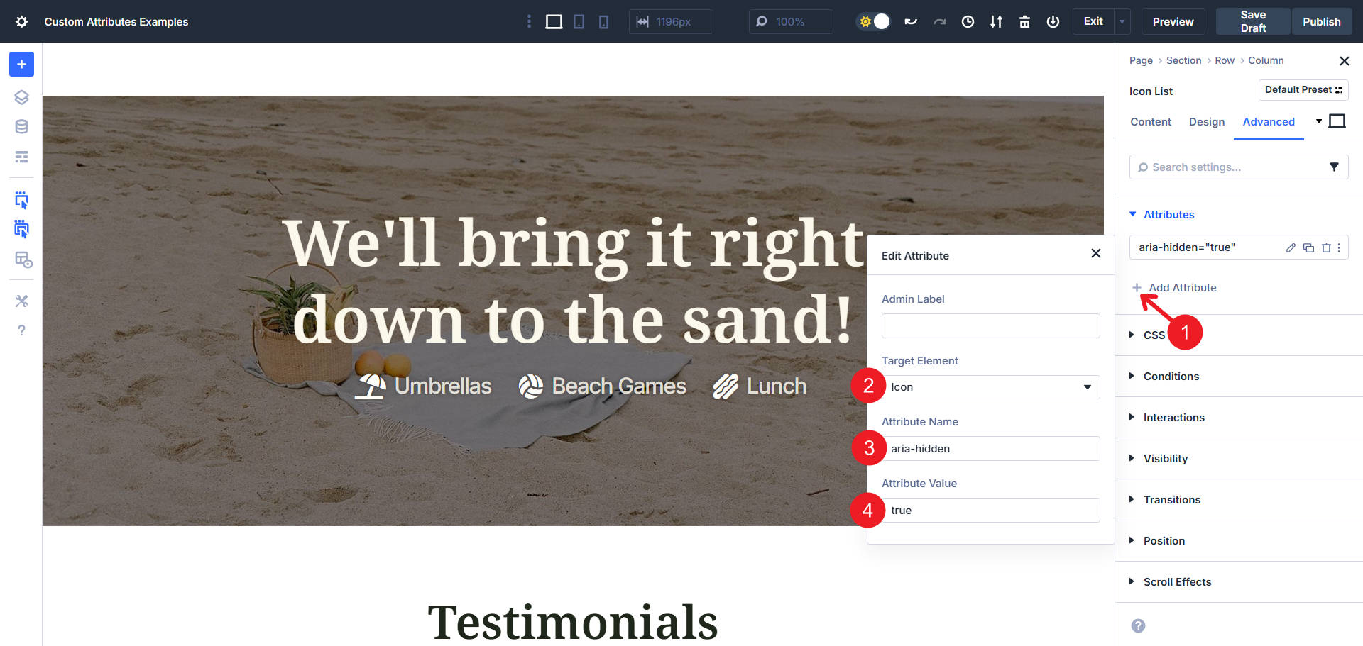
The new Attributes Option Group is located exactly where CSS Class and ID used to be. To access it, click on the Module you want to enrich, go to its Advanced tab, and then “Add Attribute”.
Migration note: If you’ve used the legacy Class & ID settings in earlier versions, those values are automatically migrated into the new Attributes group. So if you’re wondering where your classes and IDs went, you’ll find them listed there; no data is lost.
You have a few fields to fill out when you add a new one. The Admin Label is just an easy way to name your setting so you can easily recognize it later.
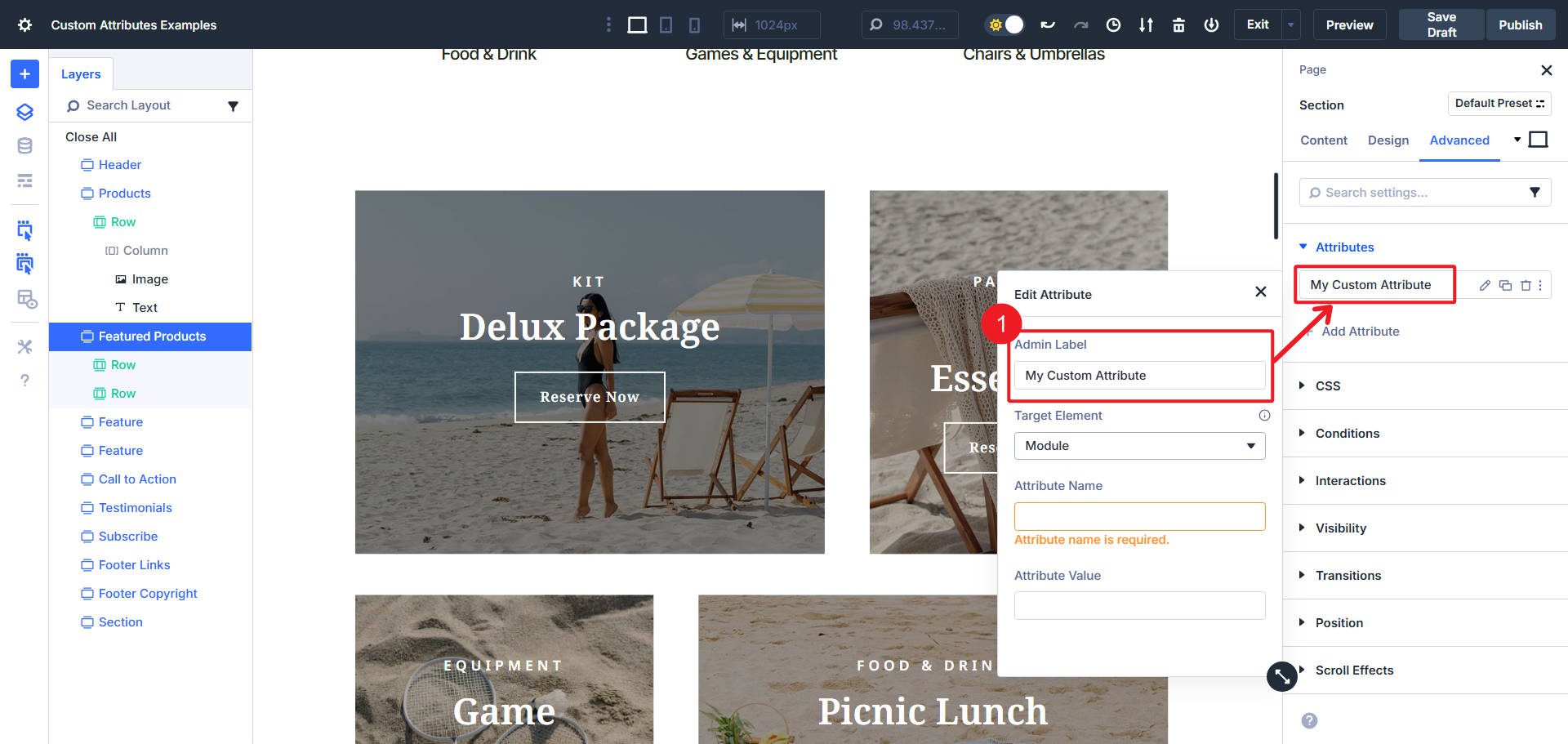
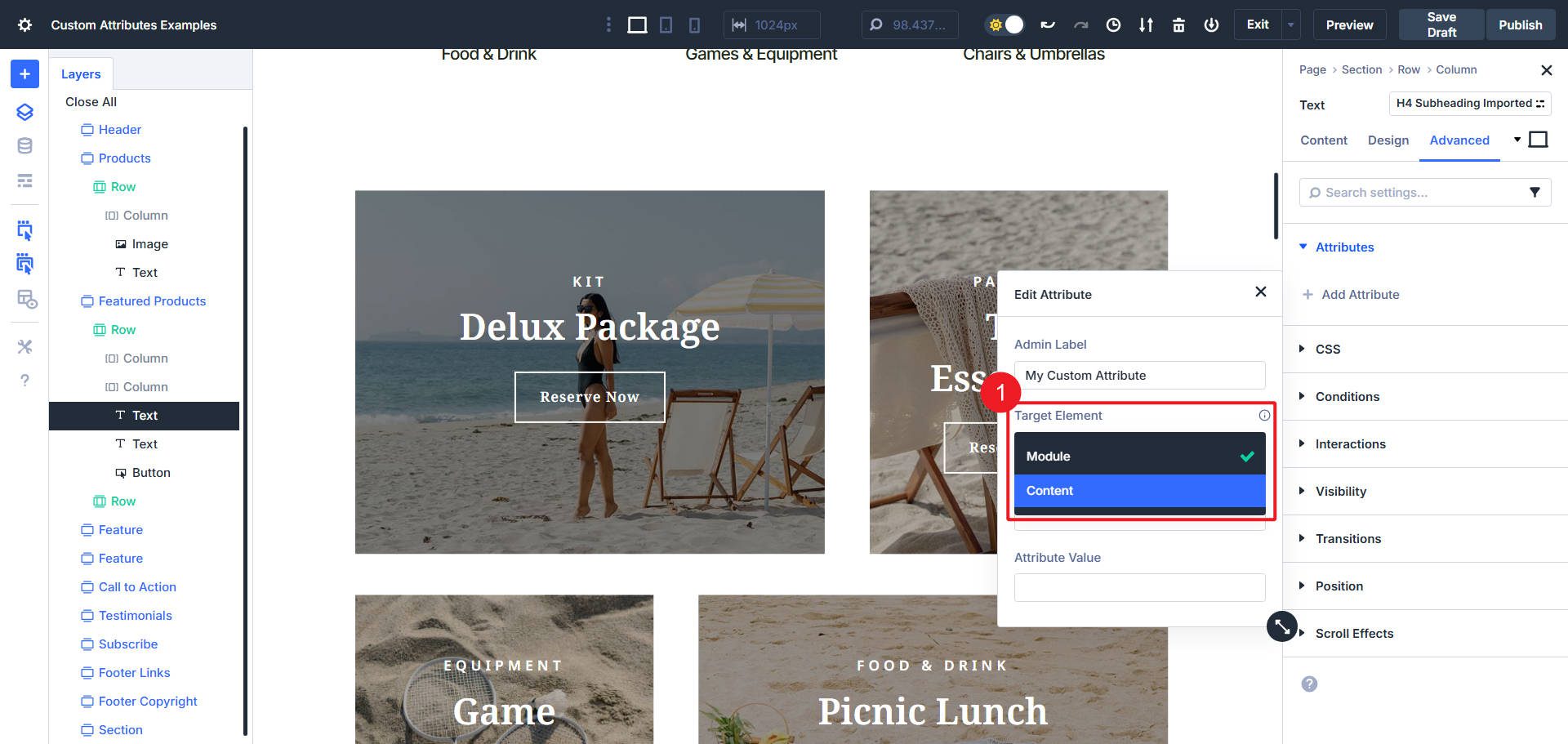
The Target Element lets you select the Module itself or, in many cases, any relevant sub-element of that Module. So, for instance, with the Icon List Module, you can select the whole Module, the Icon, or the List Item. With a Text Module, you can target the content or the whole Module. This means that when using CSS Classes, you can apply them with precision.
Next, you have the Attribute Name and its corresponding Value. The name is the attribute type, and the value is its unique setting. There are numerous valid names, which we’ll get into in the next section.
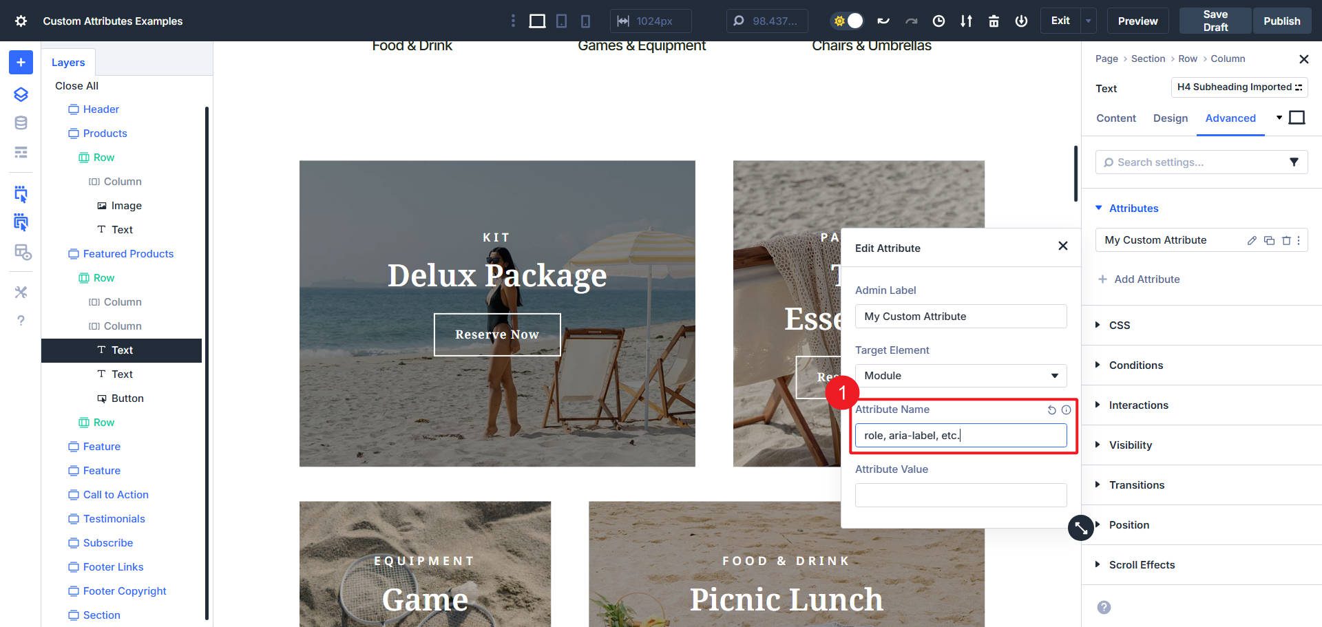
Most valid Attribute Names also have valid Attribute Values. Some attributes allow for custom-named or worded values. It just depends on which attribute you are using.
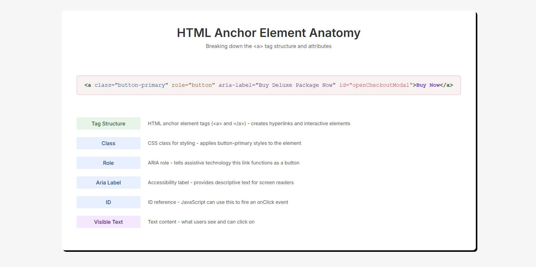
Usually, when an Attribute is set in HTML, it looks like this with the name and an equal sign, with the value in quotes:
Lastly, these Custom Attributes can belong to an Option Group Preset, so it is possible to save configurations of multiple attributes inside it.
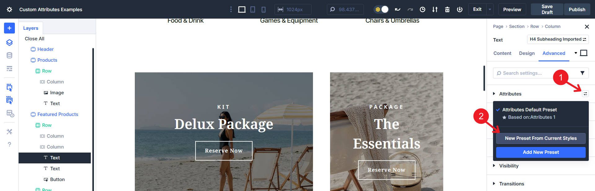
So, when you create a similar element later, you can apply the same accessibility and semantic underpinnings.
Custom Attributes You Can Use
The web uses a lot of attributes. And each type is used for particular reasons.
What Are HTML Attributes?
Attributes are a semantic way of describing your HTML elements that is understandable and machine-readable. Many HTML attributes also come with unique features in the browser. Attributes can also be used to help assistive technologies describe custom elements on your page to make it more accessible.
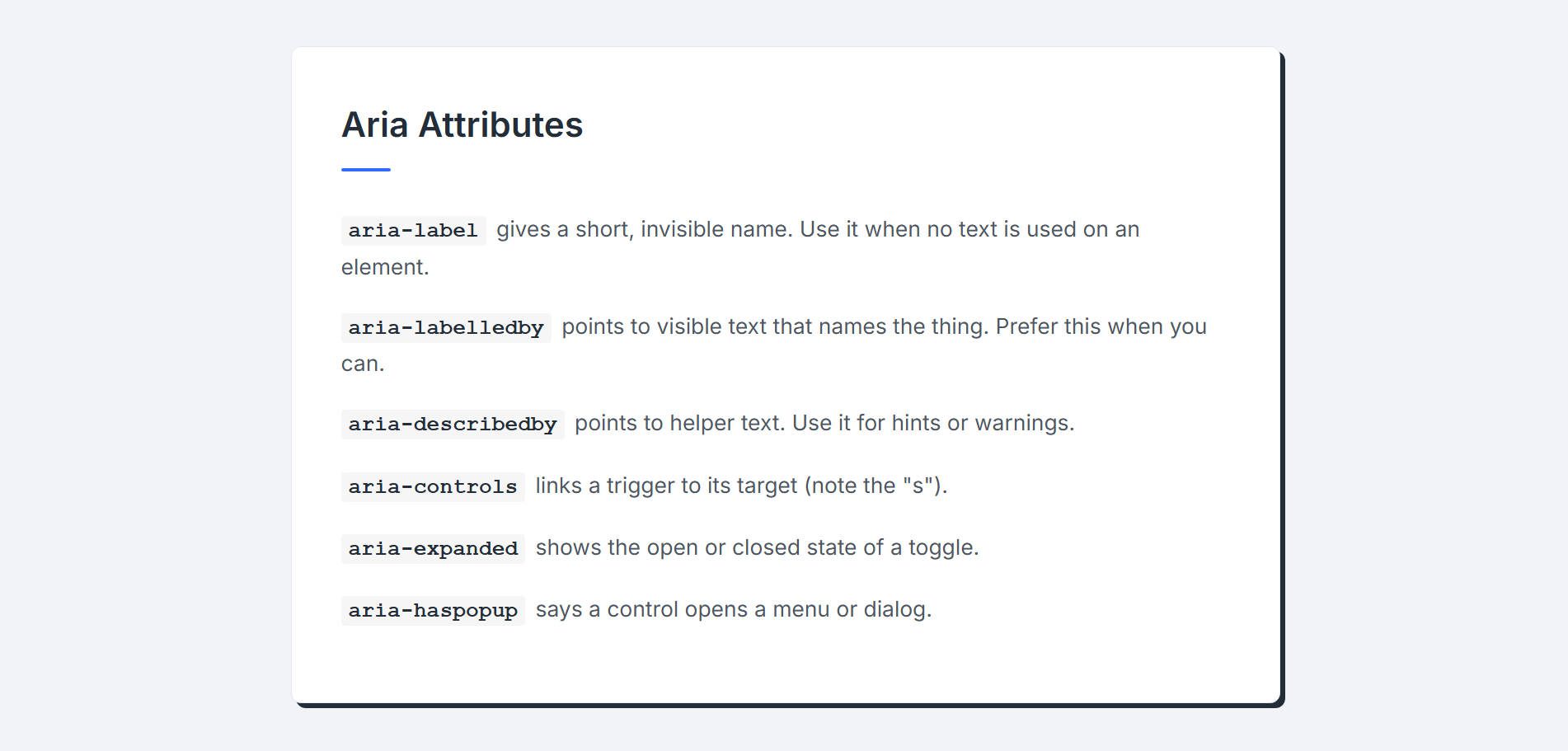
Aria Attributes
ARIA labels tell assistive technologies what a thing is and what it is used for. They can also explain the relationship of one item to another.
- aria-label gives a short, invisible name. Use it when no text is used on an element.
- aria-labelledby points to visible text that names the thing. Prefer this when you can.
- aria-describedby points to helper text. Use it for hints or warnings.
- aria-controls links a trigger to its target (note the “s”).
ARIA labels can also expose states.
- aria-expanded shows the open or closed state of a toggle.
- aria-haspopup indicates a popup is available.
You do not want to overuse ARIA labels, but definitely use them when the HTML on your page cannot express the behavior to assistive technologies.
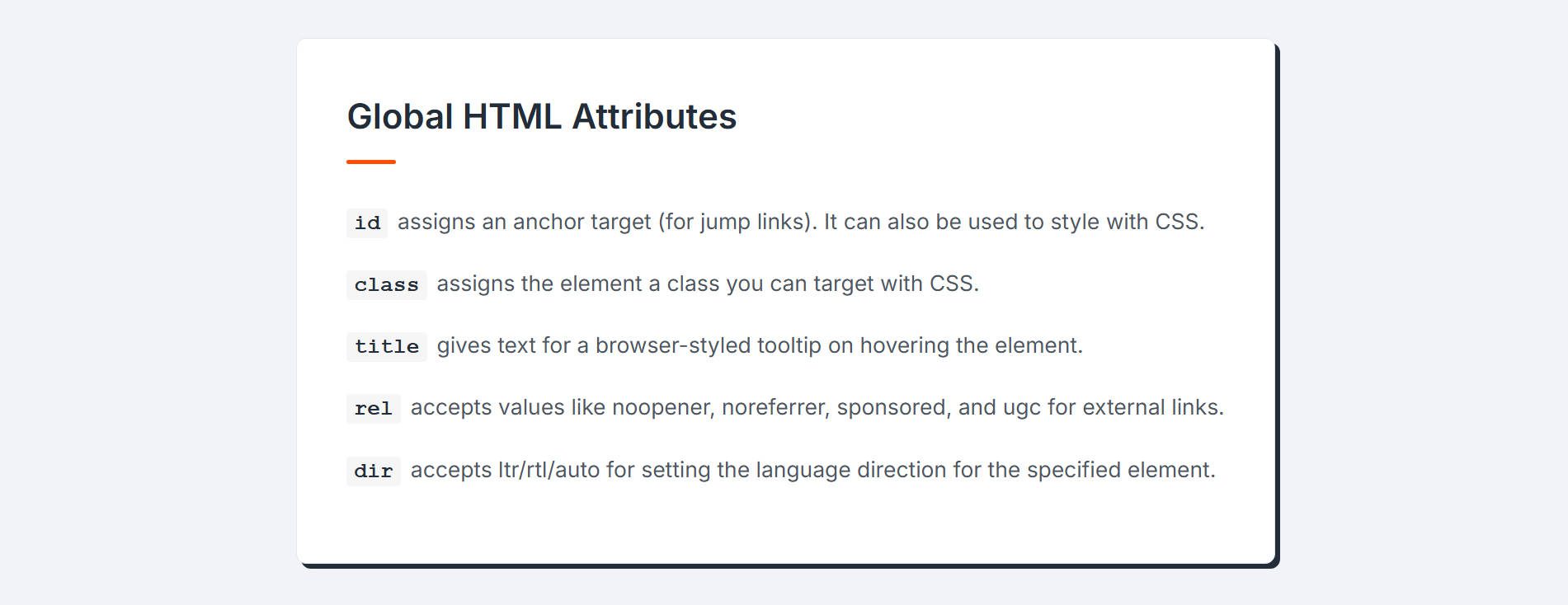
Global HTML Attributes
- id assigns an anchor target (for jump links). It can also be used to style with CSS. IDs are also needed for using aria-controls.
- class assigns the element a class you can target with CSS.
- title gives text for a browser-styled tooltip on hovering the element with the title (not as accessible as role=”tooltip”).
- rel accepts the following values: noopener, noreferrer, sponsored, and ugc. Use it with external links (for SEO and security purposes).
- rel is also for setting elements to preconnect, prefetch, and preload, but that is for another time.
- dir accepts ltr/rtl/auto for setting the language direction for the specified element.
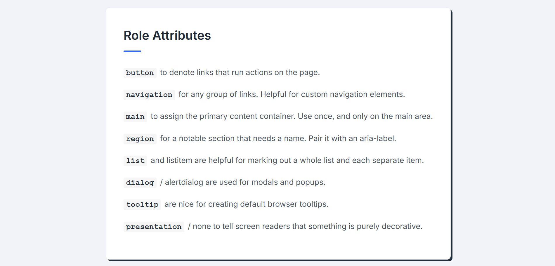
Role Attributes
Role attributes explain what type of thing something is, especially when the HTML element tag is a generic element (like <div> or <span>). Use them to add meaning when a wrapper is a plain div.
- button to denote links that run actions on the page.
- navigation for any group of links. Helpful if you create a menu navigation from a repeater loop instead of using the Menu Module.
- main to assign the primary content container. Use once, and only on the main area. Divi automatically adds this in many cases, so confirm that you need it before you use it.
- region for a notable section that needs a name. Pair it with an aria-label like “Featured Courses”.
- list and listitem are helpful for marking out a whole list and each separate item in that list.
- dialog / alertdialog are used for modals and popups.
- tooltip are nice for creating default browser tooltips.
- presentation / none to tell screen readers that something is purely decorative.
To use any of these, set the Attribute name as “role” and the Attribute value as the bolded words above.
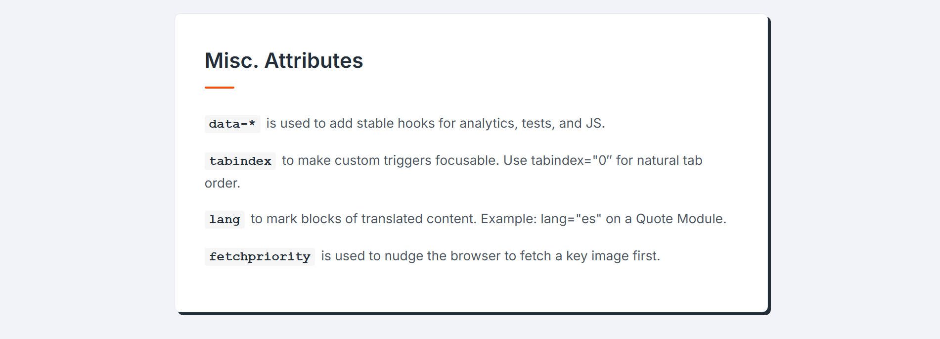
Misc. Attributes
These are a few other attributes you can use to add specificity to your designs. Of course, there are many more, but this is a good start.
- data-* is used to add stable hooks for analytics, tests, and JS.
- tabindex to make custom triggers focusable. Use tabindex=”0″ for natural tab order.
- lang to mark blocks of translated content. Example: lang=”es” on a Quote Module.
- fetchpriority is used to nudge the browser to fetch a key image first. Use only if you know what you’re doing.
Useful Attributes To Use In Your Divi Builds
These aren’t the only proper ways to use Custom Attributes, but they are a good first place to start. We’ll cover a few frequently used Divi Modules and how we can add some Custom Attributes to improve semantic presentation and accessibility.
Links and Buttons are pivotal for a healthy internet. Adding select attributes to them makes a big difference to these simple elements’ usability (and sometimes even function).
Standard Links
Divi’s Button Modules are defined semantically as a <a> link. No Custom Attribute is needed if you use a Button Module to send a user to another page. Even if your link is an anchor link (e.g., #testimonials) or has the “download” attribute, you will keep the Button Module as a link.
Buttons Are For On-Page Actions
However, if the Button Module is used to perform an action on the page (it does not navigate to another section/page/site), it should be marked as a button. If you are running JS from an onClick Event or using a Button Module to open a pop-up using Interactions, you need to add a button role to it. This is important for Contact Form and Opt-in Modules, where the buttons perform an action and don’t navigate the user elsewhere.
Go to its Settings > Advanced tab and under Attributes, Add New:
- Target Element: Module, Attribute Name: “role”, and Attribute Value: “button”
This will denote the Button Module, not as a link, but as a button.
Download Link
Another helpful thing you can now do is set a Button Module with the “download” attribute. This tells a browser to download the linked file instead of opening it. The link will need to go to a supported file (like .pdf) and not a standard webpage. Don’t add the role=”button” to this, but rather add this attribute:
- Target Element: Module, Attribute Name: “download”, and Attribute Value: *leave blank*
- Target Element: Module, Attribute Name: “aria-label”, and Attribute Value: “Download Fiscal Year Report (PDF)” or whatever describes the document being downloaded
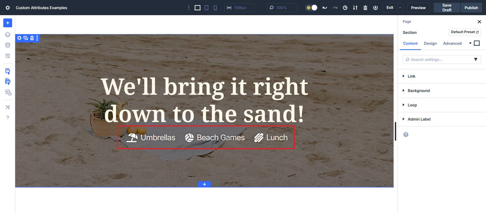
2. Attributes To Add To Icon List Module Items
The problem is that a screen reader will try to announce the icon before the text, which creates a confusing experience (“Icon Name,” then “Text Content”). If the icon were a checkmark, they’d hear “check mark” before every single item, which becomes repetitive and annoying. In this case, it might read, “Umbrella Umbrella, Volleyball Beach Games, Hotdog Lunch,” even though the icons are more decorative than descriptive.
Since the icon is almost always decorative in a list like this, the best practice is to hide it from assistive technology. If you add this attribute to the parent Icon List Module, it’ll apply to all the List Items. If you apply it to a single List Item, then it does not affect the other list items.
- Target Element: Icon, Attribute Name: “aria-hidden”, and Attribute Value: “true”
This attribute tells screen readers to ignore the icon completely. The user will simply hear the clean, intended text of the list item, creating a much better experience. This is a helpful attribute to add to any Divi Module that includes a decorative icon.
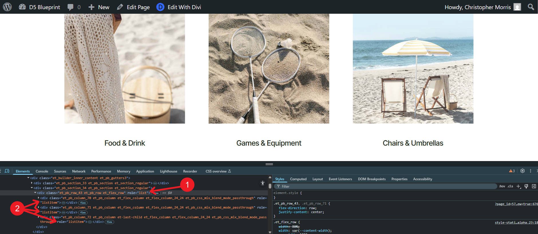
3. Attributes To Add To Your Loops
Loops often render cards inside generic wrappers (like a <div>). Screen readers will not know that its contents are a list of cards/items. Adding list roles fixes that and helps users understand the relationship of the items in the loop.
Add attributes to the Parent Container of the Looped Module/Container.
- Target Element: Looped Container — Attribute Name: “role” — Attribute Value: “list”
This tells users that what comes inside it is a list of items that share a context. Then, you can go to the element that is set to Loop. On that Looped element, add this attribute:
- Target Element: Looped Element — Attribute Name: “role” — Attribute Value: “listitem”
This shows that each item inside your loop is in the same list.
As you can see from the page’s HTML, we now have a semantic list with list items without changing the associated HTML element tag.
Try Adding Custom Attributes In Divi 5 Today
Divi already uses quite a bit of Semantic HTML. Verify exactly what is being used on your page before making improvements with custom attributes. From there, start with landmark roles to give your page the most semantic context.
If you find yourself adding the same custom attributes to similar types of elements, you can create Option Group Presets of these and then easily assign them as needed. All in all, this feature offers a lot. It shows that Divi 5 is becoming a more flexible and powerful builder, giving users every option to create great websites.
To try Custom Attributes yourself, use the latest release of Divi 5. Test it on a new website, or try our Demo to get started quickly.


I had already tried this exact idea before coming across the blog. The main issue is that when we add those attributes as a preset and then apply them to future elements, they don’t appear in the actual source code. Instead, they show up in an encoded format, which makes them unusable for proper output or SEO purposes.
I’ll test that out some more and report it as a bug if I notice the same thing. Thanks Iman
Thank you for this really interesting article.
This may seem obvious to a developer or Divi professional, but I think it’s complicated for someone who isn’t a Divi professional and is creating their own site.
However, it’s true that this feature has become essential.
Did you fix the issue that an attribute set on the preset level will get overridden by an entirely different attribute on the module level?
Let’s say I have a preset and I define a CSS class.
I then use a different alt tag for the module that is using the preset.
The CSS class is getting lost because instead of merging the attributes (one class attribute, one alt tag attribute), Divi simply replaces all attributes for the module and ignores what was defined in the preset.