
Divi and its built-in options allow you to use one particular design setting for multiple purposes, which in turn helps spark creativity. Today, we’re going to use section dividers in a unique way to elegantly hide your website’s copy. This is a great way to add extra interaction to your page without the need for custom code. We’ll recreate a beautiful example from scratch and you’ll be able to download the example’s JSON file for free as well.
Let’s get to it!
- 1 Preview
- 2 Download the Layout for FREE
- 3 Download For Free
-
4
Let’s Start Recreating!
- 4.1 Add Section #1
- 4.2 Add New Row
- 4.3 Add Text Module to Column
- 4.4 Add Divider Module to Column
- 4.5 Add Section #2
- 4.6 Add New Row
- 4.7 Add Text Module #1 to Column
- 4.8 Add Divider Module to Column
- 4.9 Add Text Module to Column
- 4.10 Add Button Module to Column
- 4.11 Additional Section Settings
- 4.12 Clone Section Twice
- 4.13 Modify Duplicate #1
- 4.14 Modify Duplicate #2
- 5 Preview
- 6 Final Thoughts
Preview
Before we dive into the tutorial, let’s take a quick look at the outcome across different screen sizes.
Desktop
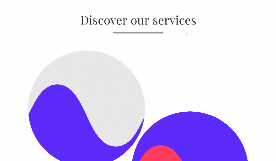
Mobile

Download the Layout for FREE
To lay your hands on the free layout, you will first need to download it using the button below. To gain access to the download you will need to subscribe to our newsletter by using the form below. As a new subscriber, you will receive even more Divi goodness and a free Divi Layout pack every Monday! If you’re already on the list, simply enter your email address below and click download. You will not be “resubscribed” or receive extra emails.

Let’s Start Recreating!
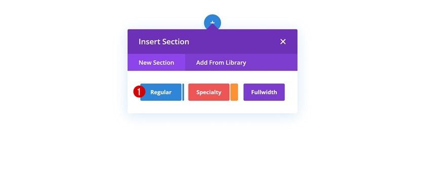
Add Section #1
The first thing you’ll need to do is add a new regular section to the page you’re working on.
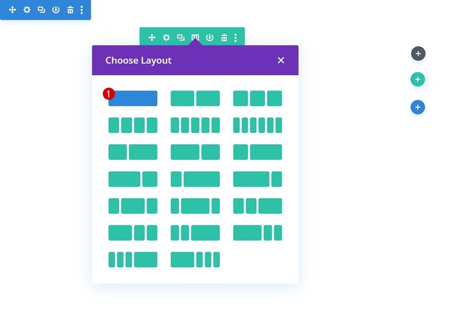
Add New Row
Column Structure
Continue by adding a new row using the following column structure:
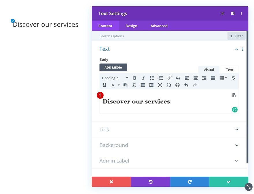
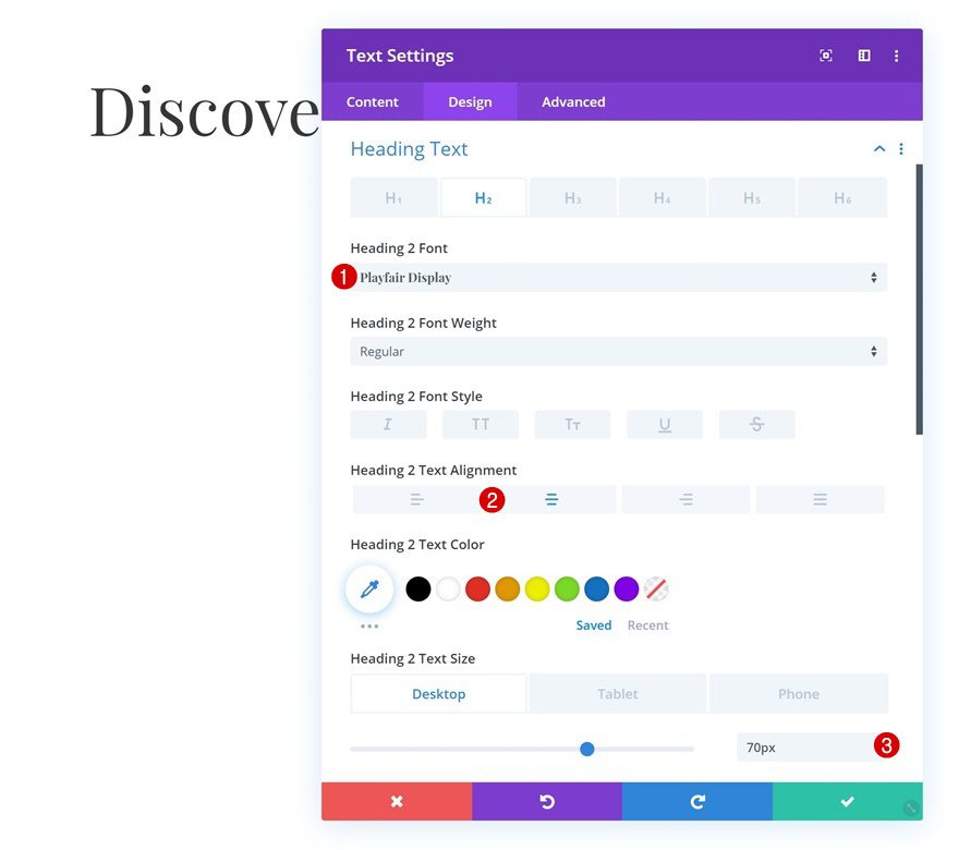
Add Text Module to Column
Add H2 Content
The first module we need in this row is a Text Module with some H2 content.
H2 Text Settings
Move on to the design tab and change the H2 text settings.
- Heading 2 Font: Playfair Display
- Heading 2 Font Weight: Regular
- Heading 2 Text Alignment: Center
- Heading 2 Text Size: 70px (Desktop), 40px (Tablet), 30px (Phone)
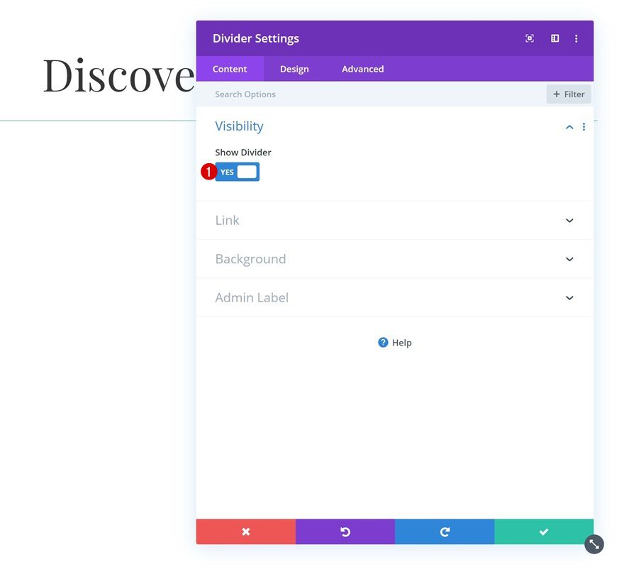
Add Divider Module to Column
Visibility
The second and last module we need in this row is a Divider Module. Make sure the ‘Show Divider’ option is enabled.
- Show Divider: Yes
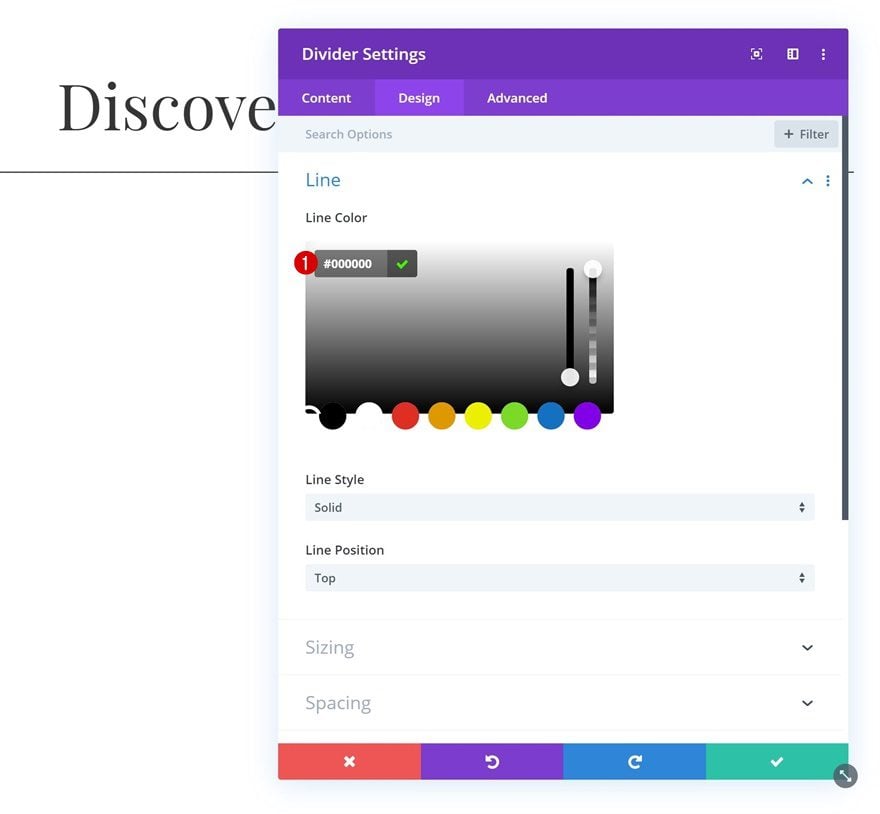
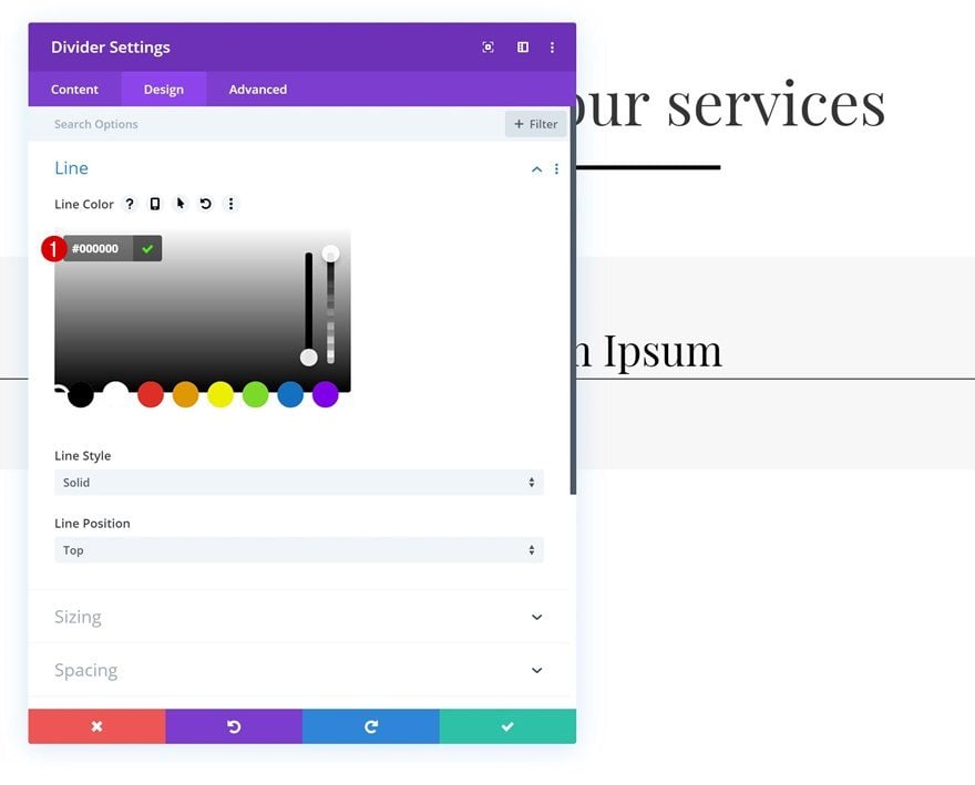
Line
We’re also changing the line color in the design tab.
- Line Color: #000000
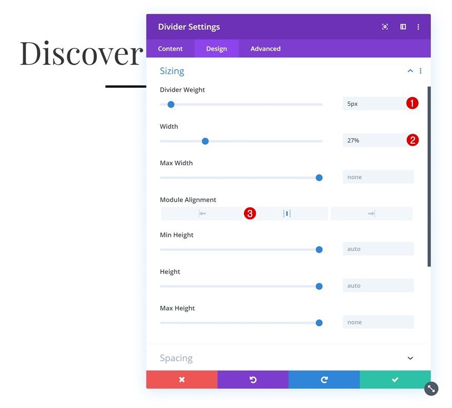
Sizing
Move on to the sizing settings and apply the following settings:
- Divider Weight: 5px
- Width: 27%
- Module Alignment: Center
Add Section #2
Background Color
Add the second regular section to your page, open the section settings and change the background color.
- Background Color: #f7f7f7
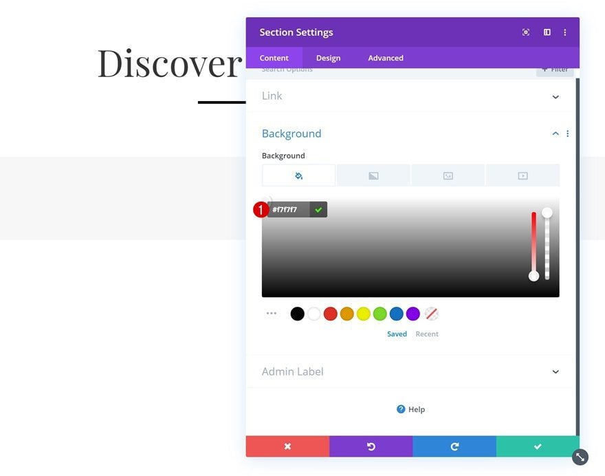
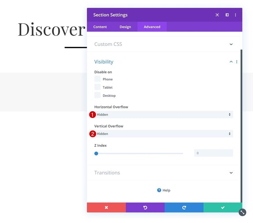
Overflow
Make sure you hide the section overflow in the advanced tab as well. This will make sure nothing surpasses the section container.
- Horizontal Overflow: Hidden
- Vertical Overflow: Hidden
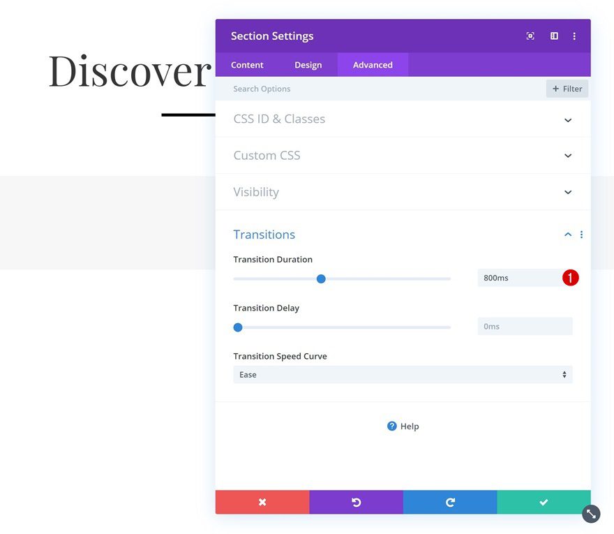
Transitions
Later on this post, we’ll create a hover transition. To make sure this runs smoothly, we’ll increase the transition duration in the advanced tab.
- Transition Duration: 800ms
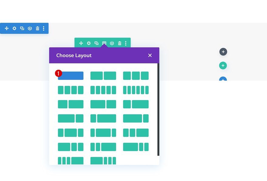
Add New Row
Column Structure
Continue by adding a new row using the following column structure:
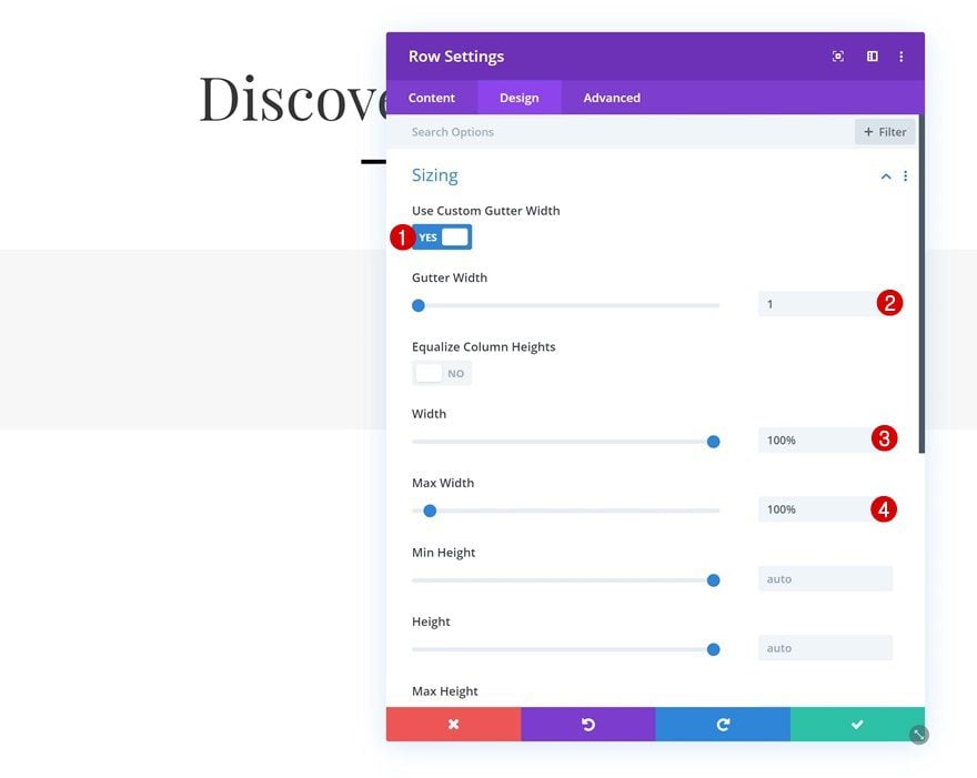
Sizing
Without adding any modules yet, open the row settings and allow the row to take up the entire width of the section container by applying the following settings:
- Use Custom Gutter Width: Yes
- Gutter Width: 1
- Width: 100%
- Max Width: 100%
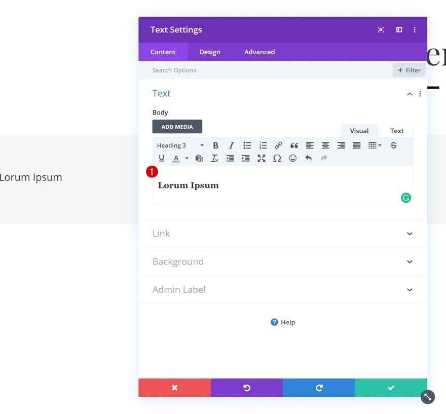
Add Text Module #1 to Column
Add H3 Content
Time to start adding modules, starting with a Text Module. Enter some H3 content of your choice.
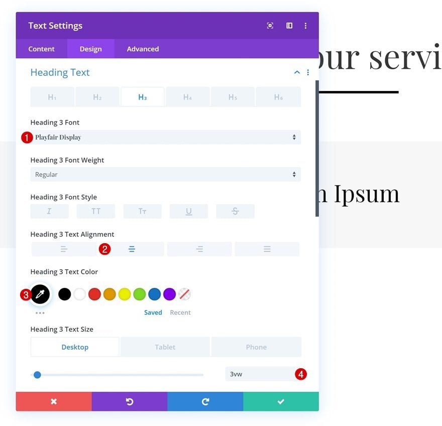
H3 Text Settings
Move on to the design tab and change the H3 text settings.
- Heading 3 Font: Playfair Display
- Heading 3 Text Alignment: Center
- Heading 3 Text Color: #000000
- Heading 3 Text Size: 3vw (Desktop), 6vw (Tablet), 7vw (Phone)
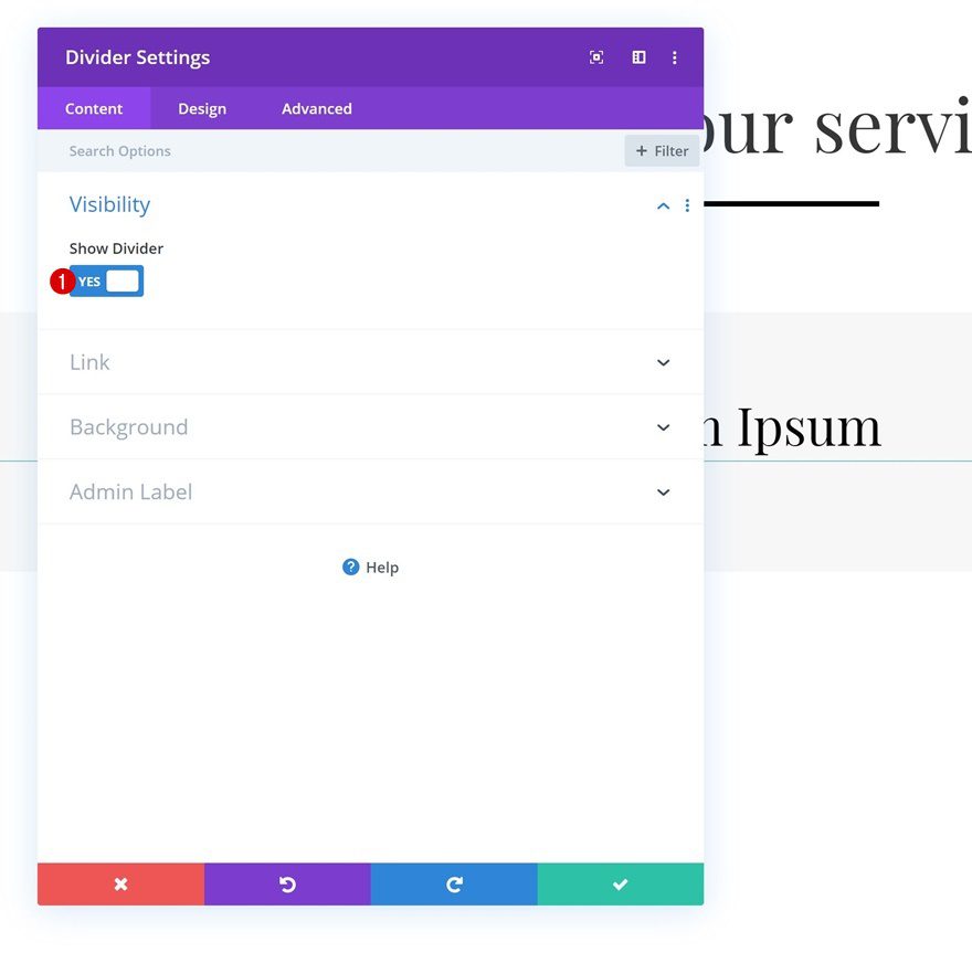
Add Divider Module to Column
Visibility
The second module we need in this row is a Divider Module. Make sure the ‘Show Divider’ option is enabled.
- Show Divider: Yes
Line
Change the color of the divider as well.
- Line Color: #000000
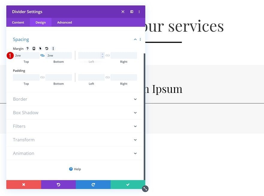
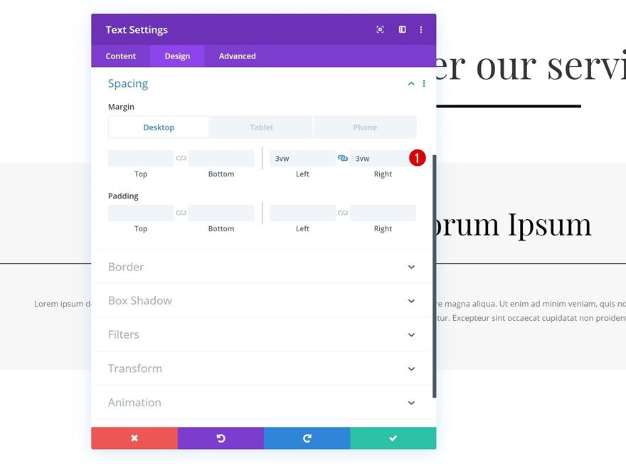
Spacing
And add some custom top and bottom margin to create space.
- Top Margin: 2vw
- Bottom Margin: 2vw
Add Text Module to Column
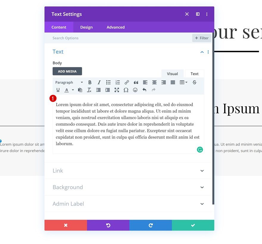
Add Content
The next module we need is another Text Module. Add some paragraph content of your choice.
Text Settings
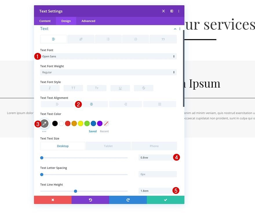
Move on to the design tab and change the text settings.
- Text Font: Open Sans
- Text Alignment: Center
- Text Color: #777777
- Text Size: 0.8vw (Desktop), 1.7vw (Tablet), 2.2vw (Phone)
- Text Line Height: 1.8em
Spacing
Add some custom margin values next.
- Left Margin: 3vw (Desktop), 7vw (Tablet), 10vw (Phone)
- Right Margin: 3vw (Desktop), 7vw (Tablet & Phone)
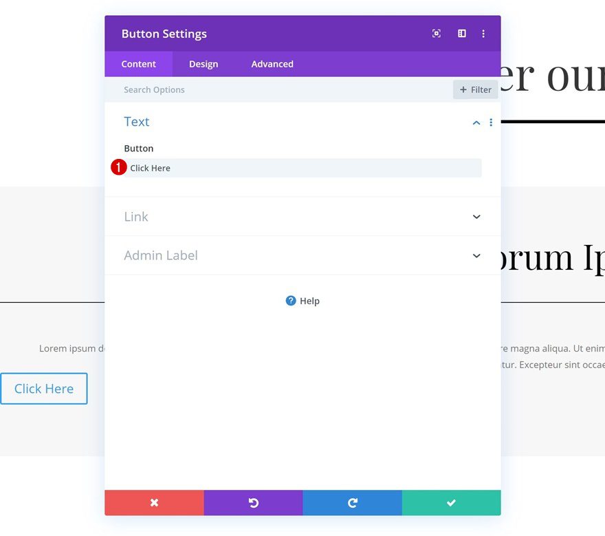
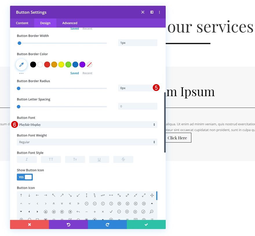
Add Copy
The next and last module we need in this row is a Button Module. Enter some copy of your choice.
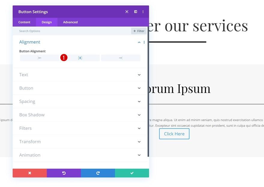
Alignment
Change the button alignment in the design tab.
- Button Alignment: Center
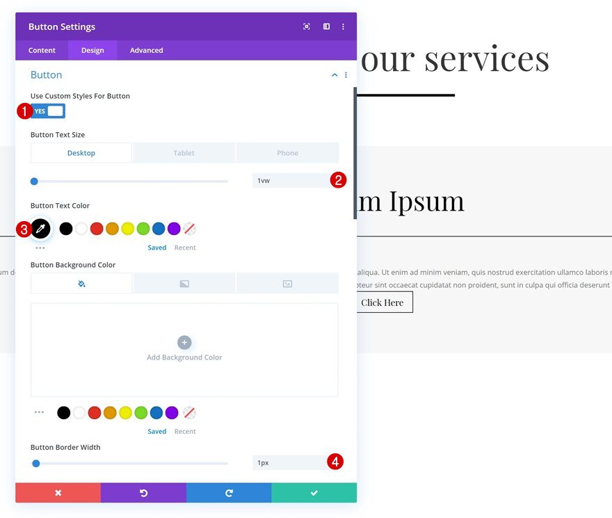
Button Settings
Continue by styling the button settings.
- Use Custom Styles For Button: Yes
- Button Text Size: 1vw (Desktop), 2vw (Tablet), 3vw (Phone)
- Button Text Color: #000000
- Button Border Width: 1px
- Button Border Radius: 0px
- Button Font: Playfair Display
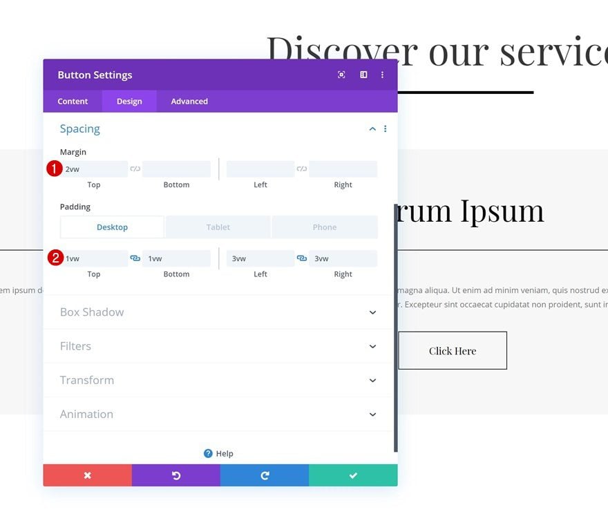
Spacing
And add some custom spacing values as well.
- Top Margin: 2vw
- Top Padding: 1vw
- Bottom Padding: 1vw
- Left Padding: 3vw (Desktop), 6vw (Tablet), 8vw (Phone)
- Right Padding: 3vw (Desktop), 6vw (Tablet), 8vw (Phone)
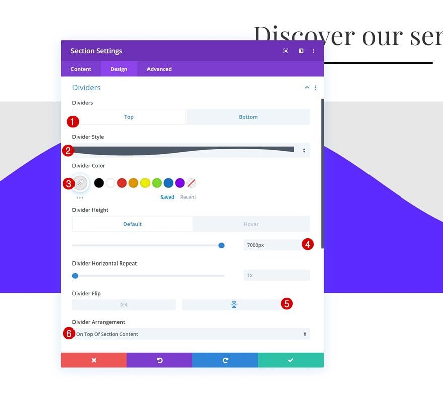
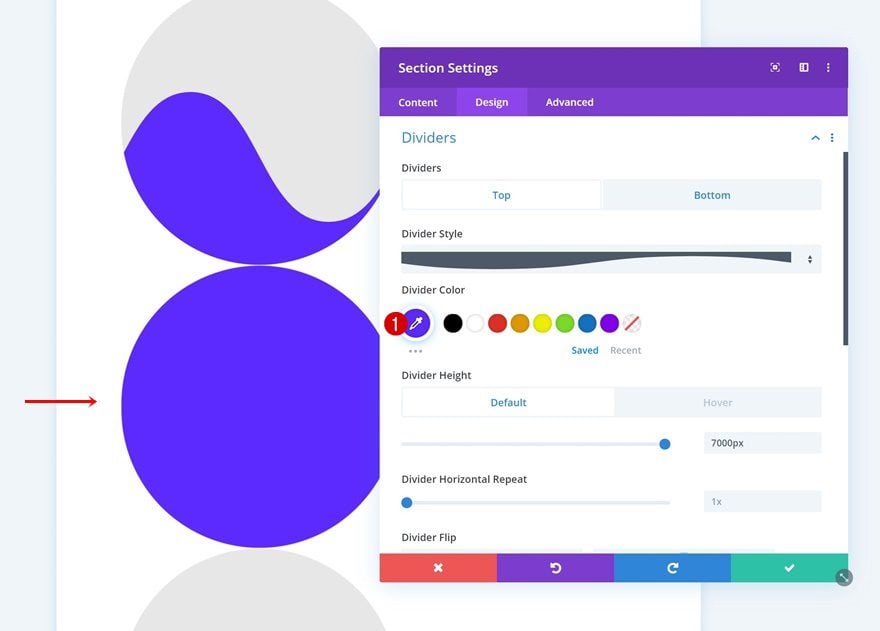
Additional Section Settings
Default Top Divider
Once you’re done adding all the modules to the section, it’s time to go through some additional section settings. Open the section settings, go to the design tab and add the following top divider:
- Divider Style: Find in List
- Divider Color: #e8e8e8
- Divider Height: 7000px
- Divider Flip: Vertical
- Divider Arrangement: On Top Of Section Content
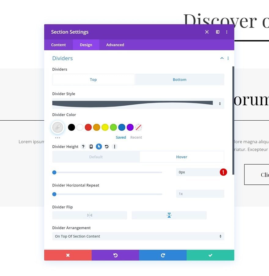
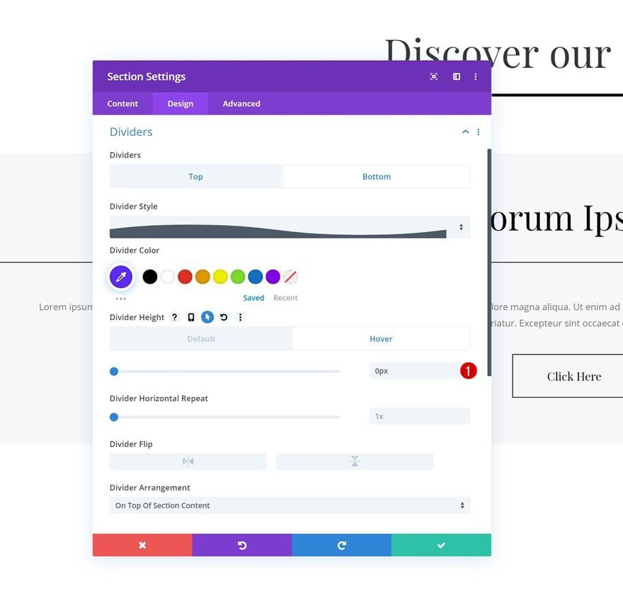
Hover Top Divider
Change the divider height on hover.
- Divider Height: 0px
Bottom Divider
Add a bottom divider as well.
- Divider Style: Find in List
- Divider Color: #5c26ff
- Divider Height: 600px
- Divider Arrangement: On Top of Section Content
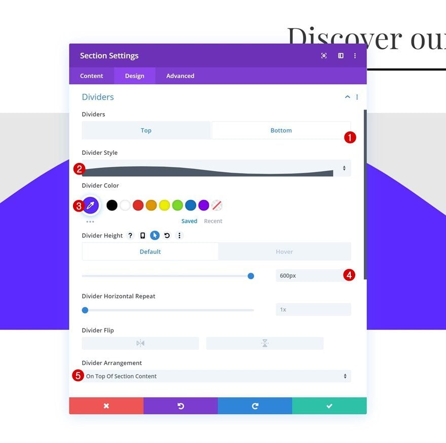
Hover Bottom Divider
And remove the divider height on hover.
- Divider Height: 0px
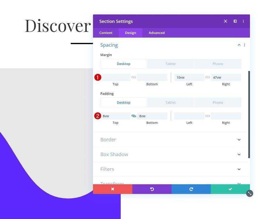
Spacing
As you can notice in the preview of this post, we’re turning this section in a circle. To do that, we’ll first need to add some custom margin and padding values across different screen sizes:
- Left Margin: 10vw (Desktop), 11vw (Tablet), 0vw (Phone)
- Right Margin: 47vw (Desktop), 11vw (Tablet), 0vw (Phone)
- Top Padding: 8vw (Desktop), 15vw (Tablet), 16vw (Phone)
- Bottom Padding: 8vw (Desktop), 15vw (Tablet), 16vw (Phone)
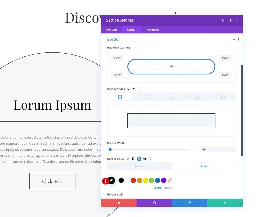
Border
Continue by adding ’50vw’ to each one of the corners to transform the section into a circle. We’re also adding a border using the following settings:
- Border Width: 1px
- Border Color: rgba(255,255,255,0)
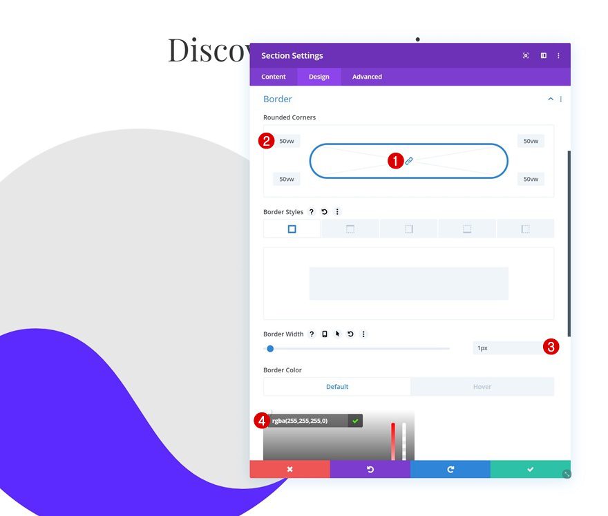
Hover Border
Change the border color on hover.
- Border Color: #000000
Clone Section Twice
Once you’ve completed all section settings, you can go ahead and clone the section twice.
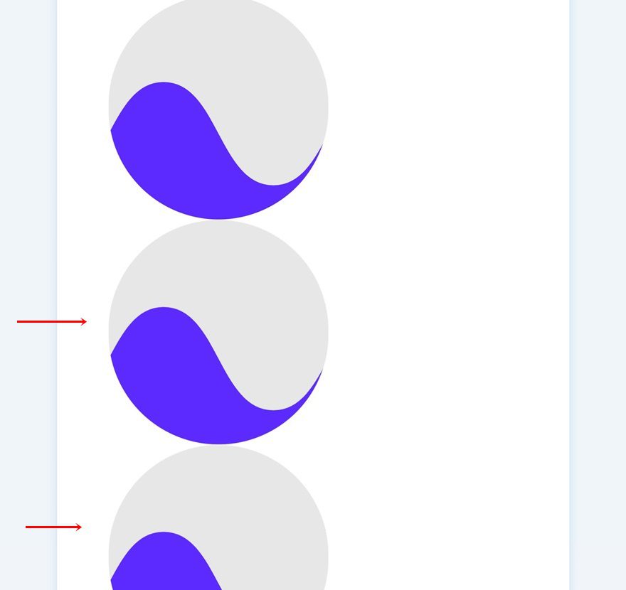
Modify Duplicate #1
Change Top Divider Color
We’re going to modify both section duplicates, starting with the first one. Open the section settings and change the top divider color.
- Divider Color: #5c26ff
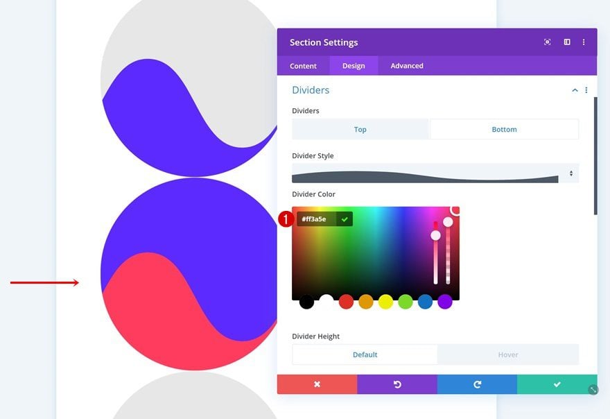
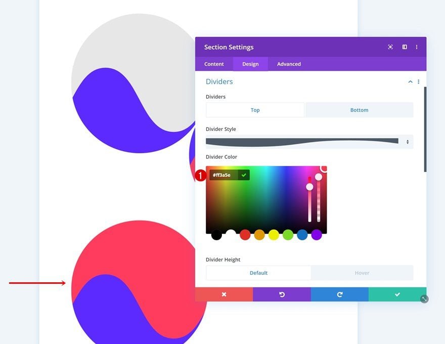
Change Bottom Divider Color
Modify the bottom divider color as well.
- Divider Color: #ff3a5e
Change Spacing
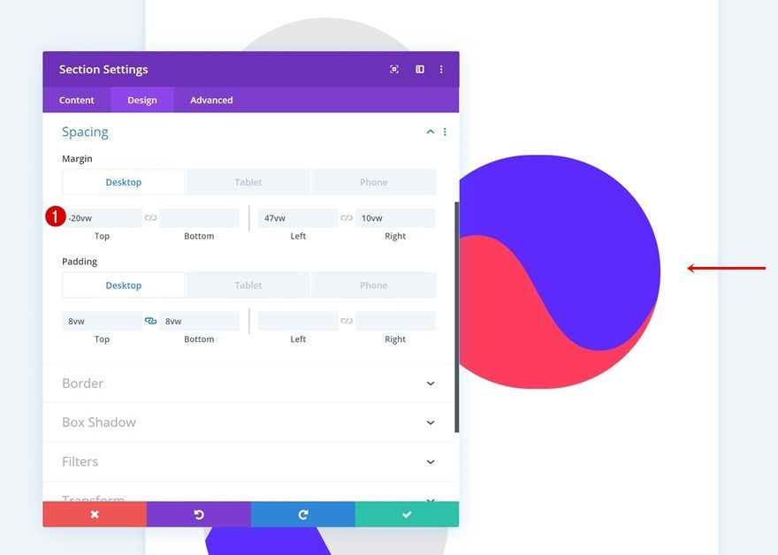
Then, go to the spacing settings and make sure the following values apply:
- Top Margin: -20vw (Desktop), 0vw (Tablet & Phone)
- Left Margin: 47vw (Desktop), 11vw (Tablet), 0vw (Phone)
- Right Margin: 10vw (Desktop), 11vw (Tablet), 0vw (Phone)
Modify Duplicate #2
Change Top Divider Color
Open the settings of the second duplicate and change the top divider color.
- Divider Color: #ff3a5e
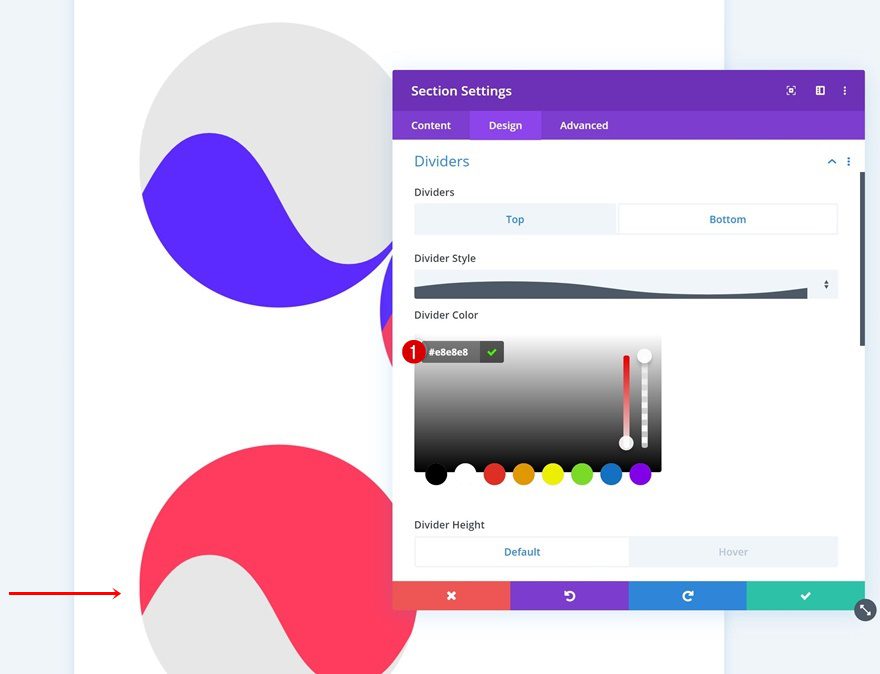
Change Bottom Divider Color
Change the bottom divider color as well.
- Divider Color: #e8e8e8
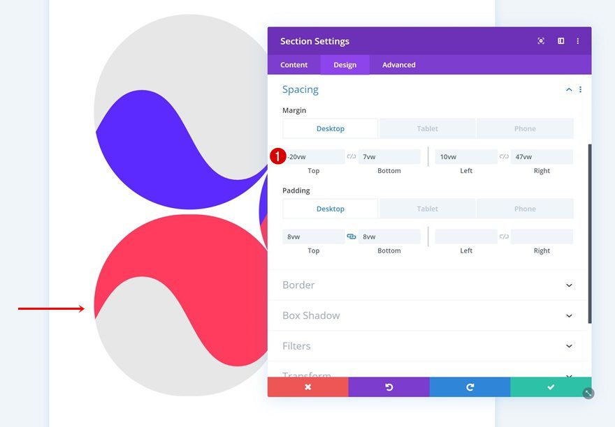
Change Spacing
And modify the spacing values here too.
- Top Margin: -20vw (Desktop), 0vw (Tablet & Phone)
- Bottom Margin: 7vw
- Left Margin: 10vw (Desktop), 11vw (Tablet), 0vw (Phone)
- Right Margin: 47vw (Desktop), 11vw (Tablet), 0vw (Phone)
Preview
Now that we’ve gone through all the steps, let’s take a final look at the outcome across different screen sizes.
Desktop
Mobile
Final Thoughts
In this post, we’ve shown you how to elegantly hide your copy below sections dividers. This is a great way to use some of Divi’s intuitive built-in options in another way than you’re used to. We hope this tutorial inspires you to create your own alternative designs using this technique as well. If you have any questions or suggestions, make sure you leave a comment in the comment section below!
If you’re eager to learn more about Divi and get more Divi freebies, make sure you subscribe to our email newsletter and YouTube channel so you’ll always be one of the first people to know and get benefits from this free content.


Unless we have an Heading over the circle to indicate content is revealed on hover, I think this could be a UI issue. But I like the direction this is going in. Very creative. 🙂
I like this a lot!!
If I were to add anything it would be a H tag overlaying the circles to describe what is under the circle.
As far as SEO; this is not for such content but for a wow factor on the page. Use it to highlight secondary content.
I would want this as Section that allowed two Rows; one for the circle and one for text.
Can this be updated for more flexibility and then a new JSON download?
and I would add varying sizes. These are huge.
That was sort of my first impression as well. Cool graphics/animations but…Maybe I’ll try to download it and test it in case it’s more user friendly that the preview above. Cheers.
This is a very good idea and I so much love it
For most use case I agree with the above comments above except, I do see a place for this kind of creativity. I noticed on a large monitor that the values for the dividers where not quite right and I was seeing the Pepsi logo which was kind of cool. So anyone working for Pepsi, this would be a nice animation. For the bigger display I added a media query and moved to the height values to 100vh for the top divider and 85vh to the bottom to get rid of the Pepsi effect.
Donjete, I notice that you go for the 0.8vh for text sizes. On large monitors this is hard work for my older eyes as it looks tiny!
I agree with Jason. It is however a neat effect. And for the love of God would you please put the blog link back at the top of your site.
Although these have nice animations they are horrible on the User Experience. Why hide valuable content unnecessarily? Don’t force your users to hover over your design to “discover” content which should be in plain sight.
This only really works well if it is done as a animation on scolling to the section, not on hover. You shouldn’t hide valuable content. Could be fun if it was images behind the dividers, say to show Farm animals for a children’s website. Otherwise this isn’t very useful.
I am going to agree with Jason as well.
That was sort of my first impression as well. Cool graphics/animations but…Maybe I’ll try to download it and test it in case it’s more user friendly that the preview above. Cheers.
Agreed. I also don’t believe this is a good SEO practice.