
It’s that time again for our monthly Divi Showcase where we take a look at 10 Awesome Divi websites made by our community members. Each month we showcase the best Divi websites that were submitted from our community and today we want to share with you the top ten websites for the month of September. Throughout the post, I’ll point out some of my favorite design features that draw me to each of the websites.
I hope you like them!
Divi Design Showcase: New Submissions from September 2019
1. The Wandering Bride
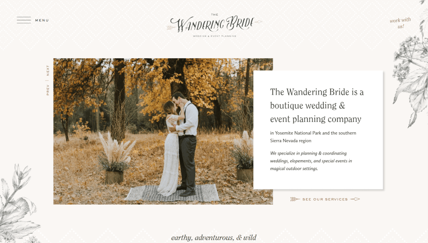
This site was submitted by Kelsey Specter. It frames the layout with floral artwork. The header places the hamburger menu on the left and a CTA on the right. A slider shows photos of the settings and includes vertically placed navigation. A text module overlaps this and provides information about the company with a styled link under it to see the services. Under this is a section with a tagline in an elegant font. A section with About information includes an image that overlaps the previous section. Testimonials are shown in a full-width section with the name to one side. I like the CTA at the bottom that follows the same design as the rest of the site and includes a text module that words like a card. A custom footer includes an embedded Instagram feed.
2. RHN CPA

This site was submitted by Guillaume Bourdages. The first thing I noticed was the menu. The header elements are blocked in and it includes a CTA, but what stands out is the mega menu. Hovering over a menu item displays a full-width section with an image to one side, a description with a button, and several columns of text links. The hero section shows a full-screen image with a tagline in large print with a description and CTA. Scrolling shows a large graphic with a CTA. I like the Locations section that shows photos as cards with the name in the overlay. Several full-screen sections have images to one side and information on the other. Testimonials are displayed within a full-screen slider. It also has a styled contact section and a custom footer with an image.
3. Airisa
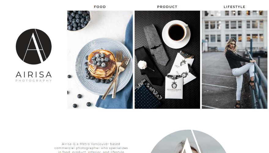
This site was submitted by Kristy Hill. This one has a simple and unique layout. The hero section is divided into four columns. The first displays the logo. The next three display images for the categories. The category names appear above them. Clicking on the name or image takes you to a gallery for that category. The next section provides information about the photographer and includes a circled image with a text mask. Following this is an embedded Instagram feed and then the logo with social follow buttons. The gallery pages show the images in a mosaic and include filters that look like a secondary menu under the primary menu.
4. Aranzer
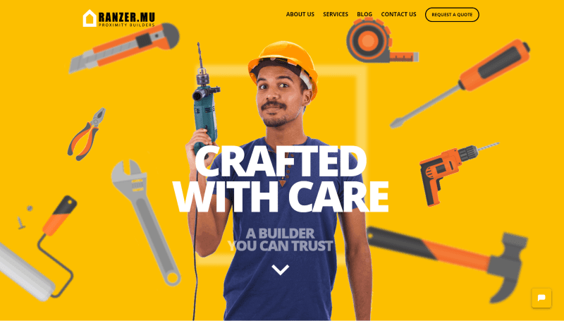
This site was submitted by Aranzer Construction. The hero section displays images and graphics in multiple layers that follow the mouse cursor as you move around the screen. A Learn About Us section includes information and a button that links to the About page and shows the process of working with them using numbered blurbs. Another section of blurbs shows the benefits of using the company. The section for services shows a CTA and images of work. It also includes a CTA to request a quote just above a custom footer. A request CTA also appears in the menu. The Blog page shows a post slider of the latest articles. The Services page shows lots of overlapping images in an alternating layout.
5. Latitude Park
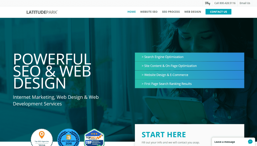
This site was submitted by Rusty Rich. The hero section includes a background image and a gradient overlay that includes a tagline with extra-large text on one side and a list of links on the other with gradient backgrounds for each one. Badges and a form overlap the hero section and provide information about the company. A section of blurbs works as CTAs. A project section shows examples of work using images and titles. Testimonials are shown in a three-column section over a solid blue background that matches the text throughout the site. A scheduling CTA is placed over a background image in parallax. The blog section shows the last three posts in simple cards that include blue titles. The pages make excellent use of color and pricing tables.
6. Sarah Antwerpes
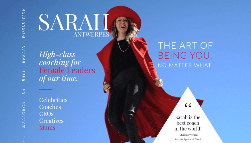
This site was submitted by Christian Mauerer. This one has an interesting magazine design. The hero section displays a full-screen image with the site’s title and taglines surrounding the image, locations are listed vertically, and a triangle creates an inset testimonial. Scrolling reveals the menu and a section with media logos where clients are featured, a button, a testimonial, and an image of the site owner. The next section shows an image with a large title printed vertically and a quote from the owner. Several sections include large titles and lots of images in multi-column layouts or overlapping each other, and CTAs. I like the testimonial section with the framed images, drop-caps, text that creates a true-parallax background, and a button to read more.
7. Ultratek Solutions
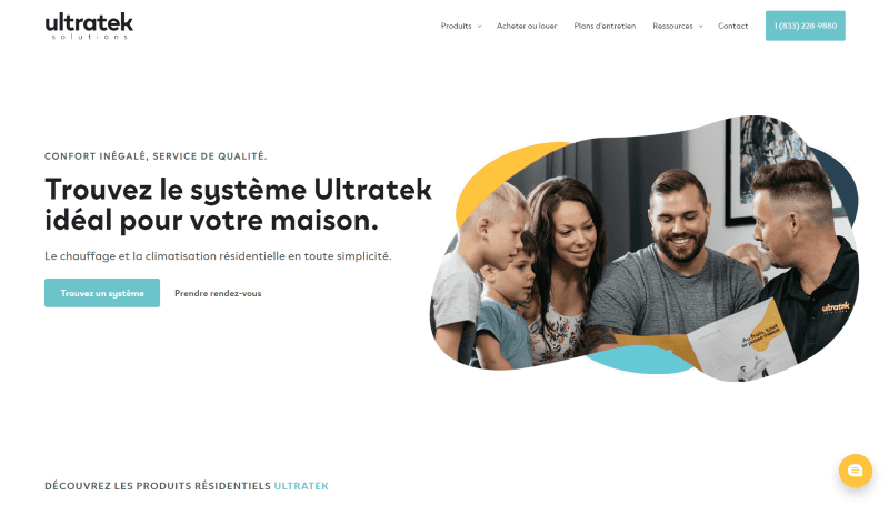
This site was submitted by Etienne de La Ruche. The hero section displays a CTA to one side and an image on the other with a styled shape with three styled color shapes behind it. A product section shows products with a box shadow and effects that add a border on hover. Two larger images include a colored border to one side and text in the overlay that matches the border. Company logos are shown in a slim section with a box shadow. Several sections include CTAs with text modules and blurbs. I like the section at the bottom with an image that includes a box shadow that overlaps a text module with a splotch of color to one corner that overlaps the section above it. I also like the drop-down menu items that add a color bar to one side on hover.
8. Mepack-cz
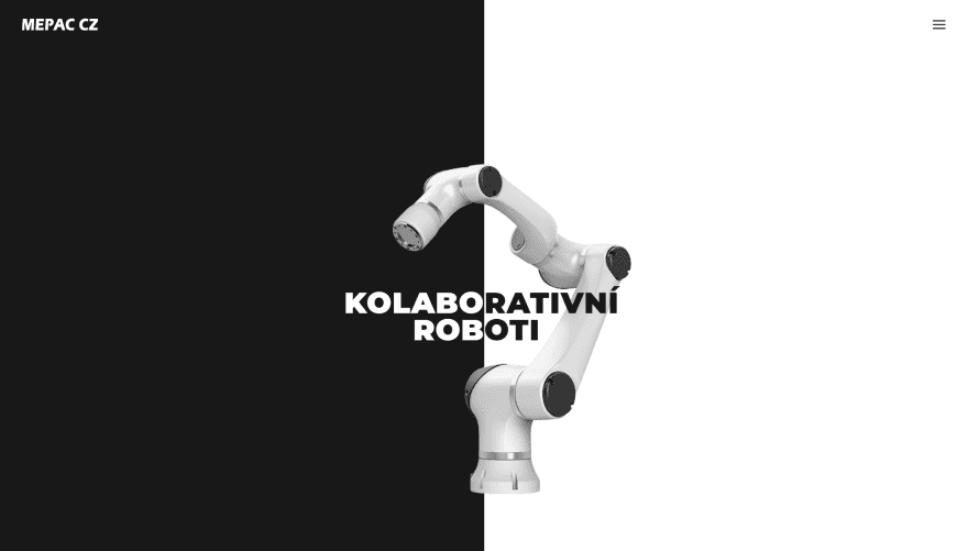
This site was submitted by Tomáš Orliczek. The screen is split into two colors all the way down the page, with black on the left and white on the right. The hero section displays a 6-axis robot in the center with the product name over the image. The text that appears on the black side is in white and the text that appears on the white side is in black. The next section displays another robot in the center with blurbs on both sides and text modules in the center over the image for descriptions. Another robot hangs from this one (GLaDOS style) and leads to the footer with social media icons, which also appear at the top of the menu when the hamburger icon is clicked. The products page shows each of the robots with black and white backgrounds that alternate. The product pages show the robot with its controller on one side with specs on the other.
9. Goal Master Fitness
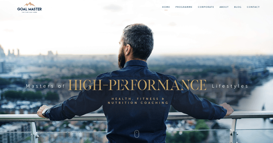
This site was submitted by Steve Lavine. The hero section shows a full-screen background image with text in the overlay. The text uses interesting interlocking letters. The logo changes on scroll. The next section displays three images to help information about the purpose of the site. An About section displays information with a button on one side and an embedded video in the other with a line separating them. Full-width testimonials follow this and include a circled image with a border styled to match the site. I like the section that shows the four pillars of success. It displays blurbs with icons at the top and images at the bottom, over a background image that leads into the next section. A timeline is created with images on one side and bullets on the other in an alternating layout. The logo appears in the middle and the color is filled in as you go. Several images link to the various pages.
10. Atrify
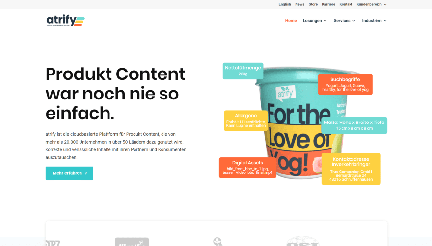
This site was submitted by Tobias Drevenstedt. It uses lots of color elements and animations throughout the site. The hero section shows a CTA on one side and an image on the other. Several text modules sit over the image and provide specs and other information about the product. A logo slider overlaps this and the next section, which includes an interesting graphic for services. Information is provided within styled toggles. I like the next CTA, with its dark background and color to one corner. The color is also used within the CTA’s button. I also like the blurbs for solutions. The include grayed-out graphics that animate and change to color on hover. Services are showing within toggles that include color to one side. Categories for the services use multi-colored icons. I also like the Industries section with its styled filter.
In Conclusion
That’s our 10 best community Divi website submissions for the month of September. These sites look amazing and as always we want to thank everyone for your submissions!
If you’d like your own design considered please feel free to email our editor at nathan at elegant themes dot com. Be sure to make the subject of the email “DIVI SITE SUBMISSION”.
We’d also like to hear from you in the comments! Tell us what you like about these websites and if there is anything they’ve done you want us to teach on the blog.
Featured image via Doppelganger4 / shutterstock.com


Wow! Ultratek is breathtaking! So beautiful! Outstanding!
Why always the same type of submissions?
Why not ecommerce solutions, integrations with other CMS, custom DIVI work, etc.?
Submited few sites, never got answer, and with elegant themes from their start.
We have featured ecommerce sites and all kinds of setups. But if we don’t have a lot of those it’s only because those are not the sites folks are submitting with designs good enough to be featured.
Ok, Nathan. Too bad, over 7-8 years i have been with Elegant themes….
Those are some excellent selections! I liked all of these sites, but I thought that the Sarah Antwerpes site really stands out. It’s checking all the boxes of what the site / client was probably going for (feeling feminine, elegant, etc.), so kudos to the designer! 🙂
Thanks Oliver, I am the designer – happy to chat – I’m from Germany, too btw.
Yeeeha!
The website describing robots is the most stylish.
Good work!
Wow, that black and white site of Tomáš Orliczek immediately grabbed my eye. Clean, quick-loading — it is really engaging!
Airisa – what a truly beautiful site, visually delicious.
Aranzer – so cool and fun.
Great job guys.