
It’s that time again for our monthly Divi Showcase, where we take a look at ten amazing Divi websites made by our community members. Each month we showcase the best Divi websites that were submitted from our community and today we want to share with you the top ten websites for the month of January. Throughout the post, I’ll point out some of my favorite design features that draw me to each of the websites.
I hope you like them!
Divi Design Showcase: New Submissions from January 2021
1. Vale Industries
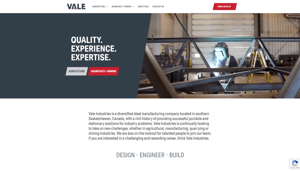
This site was submitted by DJ Wheeler. It has an industrial look and feels with several shades of gray for the section backgrounds, backgrounds of blurbs and testimonials, and even a dark gray for text. Red highlights for buttons and dot navigation stand out. The logo ties the colors together. The hero section draws attention to the topics with a CTA on one side and a video on the other. Buttons are parallelograms. The CTA in the menu changes to black on hover and opens another button with a gray background that matches the color of the CTA’s text. Topics are shown with large blurbs. A full-width image in true parallax shows an example worksite. Other pages follow a similar design. The colors and clean layout work great for this industrial site.
2. Arca Interactive
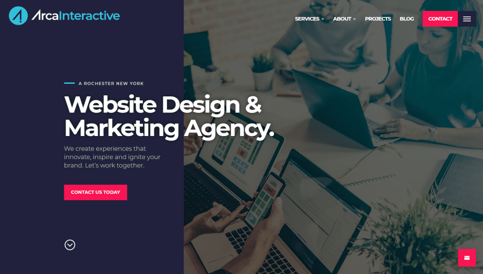
This site was submitted by Justin Arcara. It has lots of purple, red, and blue throughout the site. Most sections include two-column backgrounds. The hero section displays a two-column design with a CTA on one side and an image on the other. Both are overlapped with a title and description. Blurbs describe services with two-color icons. Several sections include images or other elements that scroll differently from the background. Recent projects scroll the title horizontally and display the projects with images. Testimonials include an image on one side and text on the other, with logos overlapping them. It also includes a styled back-to-top button with a sticky email link. This site makes excellent use of large text, large icons, colors, and layout elements.
3. Trafoos
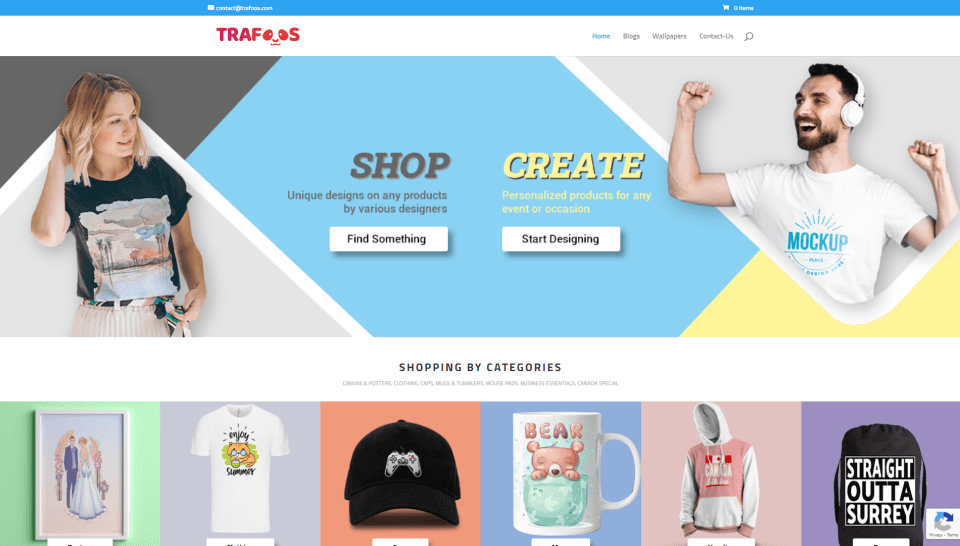
This site was submitted by Samant Jaitli. It uses soft colors in the backgrounds and the product backgrounds throughout the site. Many of the buttons and cards include box shadows to stand out. A countdown timer shows when special prices will end. The hero section displays colors from the site with an angled pattern and images embedded within the pattern on both sides and two CTAs in the center. A section for designing your own shirt displays the steps with icons. Each of the product categories includes colored blocks to the left side to introduce the category. I also like the contact section. It displays information in two columns with a different background color for each column and cartoon graphics that match the site. This site makes great use of color.
4. UX Design Stories
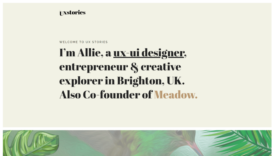
This site was submitted by Allie Walters. It uses a simple design with extra-large text for titles. The hero section displays a section with a large font over a tan background. A link in the description is a darker shade of tan and stands out well. Several sections include full-width background images in true parallax. The overlay shows a short description with a link to see more. A section behind the scenes shows images of the workflow process. The project pages show a video and detailed information about the project. Details are broken down into smaller sections that step through the project. It shows more detail than I’ve seen on the typical project page and it shows it in the simplest and cleanest way possible.
5. TPress Studio
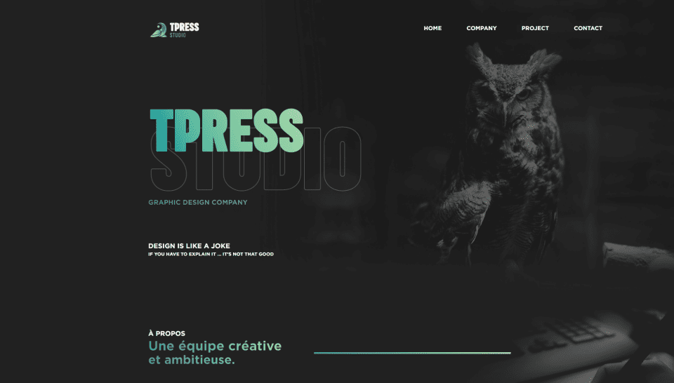
This site was submitted by Alexis Presti. This site has a one-page design that uses a dark gray background with white text and text with a green gradient. Some of the body text is a light gray. I usually find white text on a black background hard on my eyes, but this color combination works well and keeps the text readable. The hero section and following section display a background image that blends into the background. The blend is so smooth that it’s difficult to tell where the image ends. This helps give the layout an elegant feel. The text in the hero section uses block text with a green gradient over outlined text for the title. Similar text with a gradient is used for titles and includes matching dividers, buttons, and icons. I love the use of gray and gradients throughout this site.
6. My Columbus Realtor
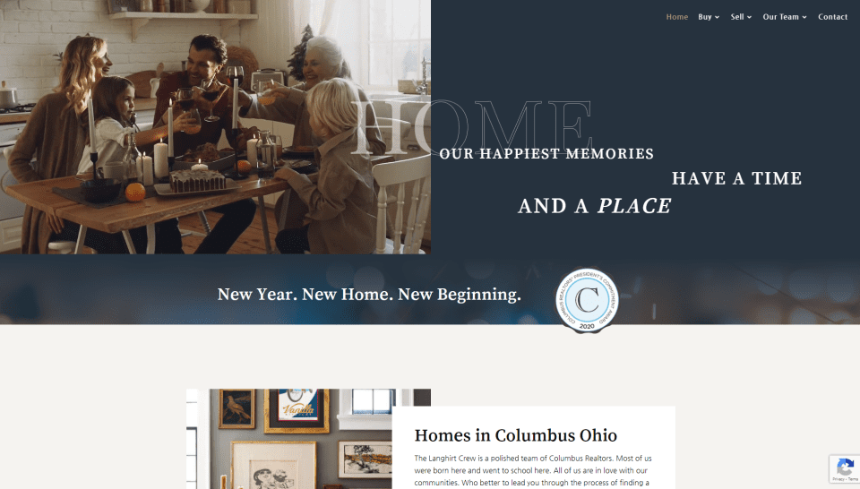
This site was submitted by Greg Ventresca. It uses lots of gray for the image overlays and light tan backgrounds throughout the site. The hero section displays a video on the left side over a gray background that blends into an image. The title overlaps both sides and displays the text differently for each side. Several CTA’s overlap images or include images that overlap background elements. One of the images is placed both in the background and foreground, creating an interesting CTA. Properties are embedded into the layout and include images with box shadows. Several pages include custom icons that stand out from the gray backgrounds. The colors and images work well with the layout and fit the target audience perfectly.
7. Dragonfly Ave
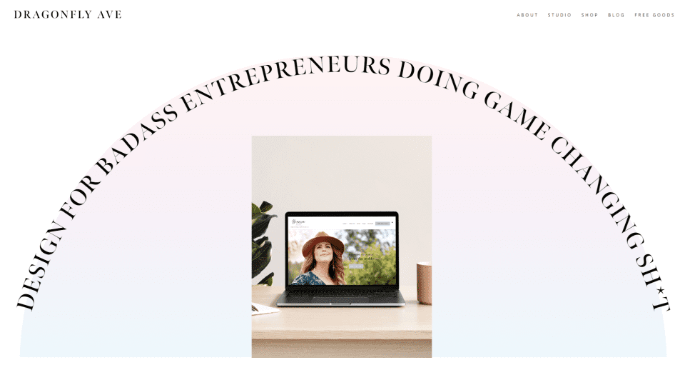
This site was submitted by Marci Angeles. It uses a clean layout with lots of soft colored background gradients and thin or double lines to create borders. The hero section displays a message in all-caps in an arch. The text overlaps the background gradient, which creates the arch. A slider changes images in the center of the arch. Services are shown within images of different shapes. Several of the elements display the background gradient in different ways including a verticle shape behind a border, a horizontal shape with rounded edges for testimonials, and a ticker that scrolls a message. Alternating CTAs show an image on one side and text on the other using variations of the background colors. The back-to-top button is cursive text printed sideways. I love the dragonfly preloader and mouse cursor.
8. NEVERMVM
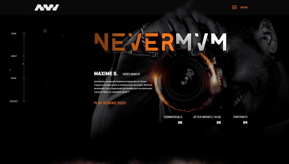
This site was submitted by Dylan Boulkhras. It uses a black background with bold orange text that stands out to give the design a sharp look. A sticky menu stays on the left side and displays a line with circles connecting the pages. The hero section shows a background image on one side with a title, description, a link, and number counters in the foreground. The menu displays in full screen and includes the same background photo. A section with an embedded video shows a background image that looks like it’s divided from the background with smoke. Several sections are numbered and include bold titles. Projects display within blurbs that include fast-changing images that zoom on hover and orange icons. This site makes excellent use of color.
9. Panda Remiremont
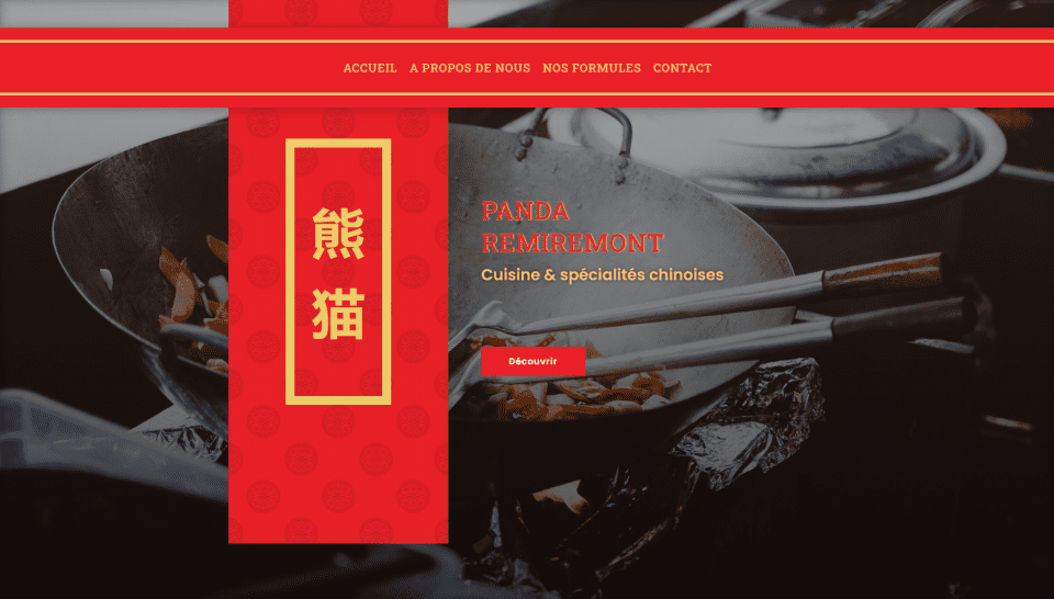
This site was submitted by Panda Remiremont. This is a one-page layout that uses Chinese design elements with text, color, and graphics throughout. The hero section displays a menu that sits below the top of the screen, floating above the full-screen background and graphic elements. A large graphic includes Chinese text on one side and a CTA on the other. Similar graphics with Chinese text appears within several of the sections. Large text with an oriental design is used for the titles. Prices are shown with text modules over a styled background that looks like a Chinese food menu. I like the section for contact information. It includes a booking CTA with an image on one side and contact information on the other. A booking form overlaps this and includes a styled border. I love the background artwork in this one.
10. Allianz Brno
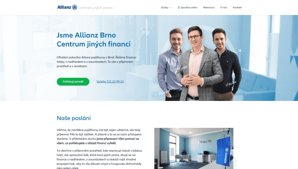
This site was submitted by Michal Teska. It has lots of white space with green and blue highlights that perfectly fit the genre. The hero section displays a full-width image with a CTA on one side and the team on the other side. Team members and locations are labeled with a font that looks to be hand-written. Information about services is provided with simple blurbs. Following this is a section of larger blurbs with circled icons that change color on hover. The blurbs also display a border on hover. The icons overlap the borders. I like the team section. It displays team circular images with thick borders. The team members’ images continue outside the circle. The image changes on hover to show the team member smiling. The embedded map is also interesting. It’s light and blends with the background on one side. Contact information overlaps the map.
Wrapping Up
That’s our 10 best community Divi website submissions for the month of January. These sites look amazing and as always we want to thank everyone for your submissions!
If you’d like your own design considered please feel free to email our editor at nathan at elegant themes dot com. Be sure to make the subject of the email “DIVI SITE SUBMISSION”.
We’d also like to hear from you in the comments! Tell us what you like about these websites and if there is anything they’ve done you want us to teach on the blog.
Featured Image via Andrew Rybalko / shutterstock.com


Your pop up blocks my view. Annoying!