
It’s time again for our monthly Divi Showcase where we take a look at 10 awesome Divi websites made by our community members. Each month we showcase the best Divi websites that were submitted from our community and today we want to share with you the top ten websites for the month of January. Throughout the post, I’ll point out some of my favorite design features that draw me to each of the websites.
I hope you like them!
Divi Design Showcase: New Submissions from January 2019
1. Swyft
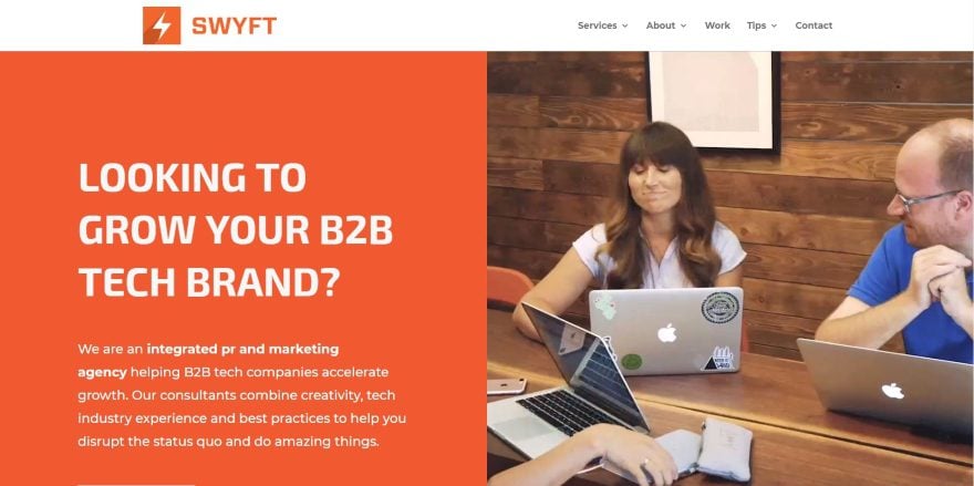
This site was submitted by Suzie Tawney. Orange is the branded color and it’s prominent throughout the site. It uses an interesting split-screen with information on one side in orange and white and a video on the other. Large blurbs show the services with multi-colored graphics and a title. Hovering changes the background to orange. A slider includes an orange overlay and a styled section divider. I found the blog section especially interesting. It includes a patterned section background an orange background for the row. Both the blog and the row have a box shadow to stand apart from the background. The blog page includes overlapping cards that alternate down the page.
2. Empire Engineering
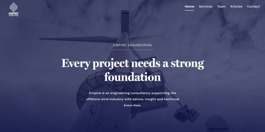
This site was submitted by Ross Pope. This site uses dark blue as the branded color, starting with a full-screen image with a blue overlay that blends into the next section. Services are shown within blurbs. They include the dark blue backgrounds with white text and icons, and they have a zoom hover effect. I like the Why section that shows the company’s strong points in a list of blurbs. The blog section shows the latest posts in a single column with a background that blends into a top-down view of the ocean. Each of the pages continues this design. I especially like the Services page with bullet-points in boxes that overlap the images.
3. Umbrella Tax Solutions
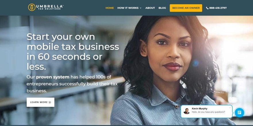
This site was submitted by Mani O’Brien. The site uses a dark blue with yellow, white, and blue highlights throughout the design. It starts with a full-screen image with description and CTA and then provides a full-width newsletter CTA with an e-book incentive. The sign-up form is prominent enough so the site doesn’t require a popup. Information is shown within large blurbs that include a top border design and multi-colored icons. This same design is also used for services. An interesting circled graphic shows how it works. I especially like the testimonial section that shows a full-width image with a person on one side and the testimonial on the other over the background.
4. Win Water
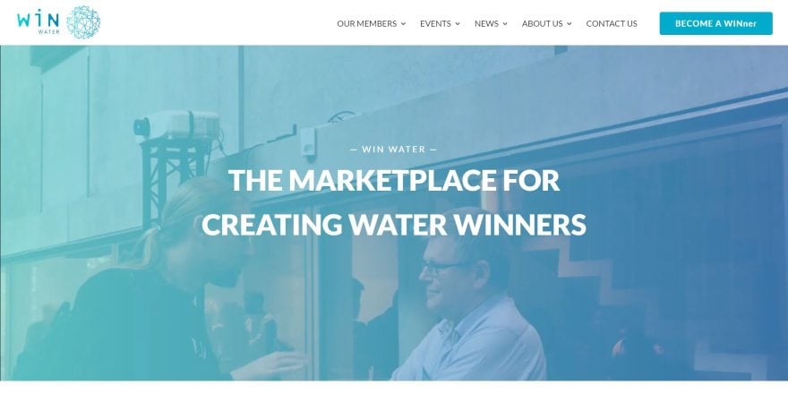
This site was submitted by Victor Duse. This website uses a light blue-green for the branded color, usually as a gradient of the two, within highlights and overlays. The hero section plays a video behind the gradient. Information is shown within blurbs using icons of a wired globe that’s colored with the blue-green gradient. I like the testimonial slider that shows a blurred background image and the testimonial over it. The blog section displays posts with an elegant hover effect. The stats section is interesting. It shows three large numbers with each in a different color and on different heights. Images of water are used within backgrounds and include the blue-green colors within the images.
5. Helke Wieners
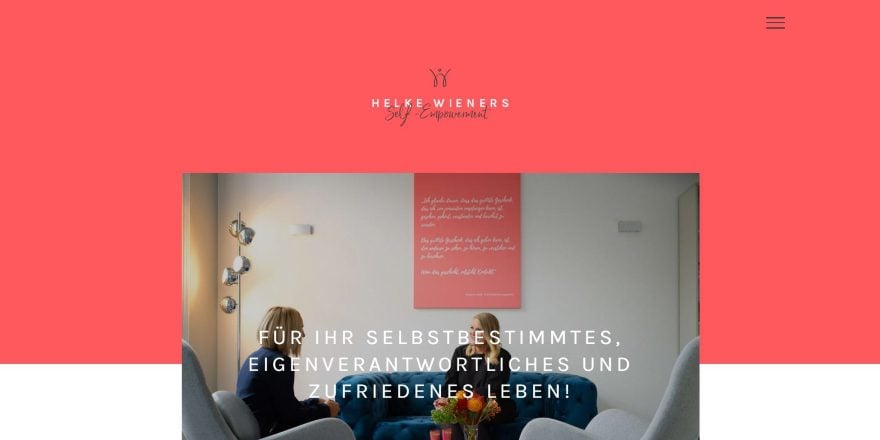
This site was submitted by Oliver Gehrmann. This website uses a color called Wild Watermelon for backgrounds, menus, and highlights. The hero section shows the logo above an image that overlaps the next section. Headings use an elegant scripted font. Several sections show text and images in two columns with text to one side and the image on the other, and alternating as you scroll. A full-screen slider shows related images. A Contact section works as a CTA. The newsletter signup uses the branded color for its background. The menu is simple but unique. It shows a hamburger icon, but when you click on it the menu shows in the header as normal. The site makes excellent use of color and whitespace.
6. Frukto
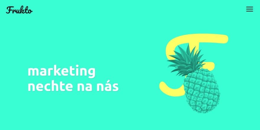
This site was submitted by Michal Teska. This is a one-page site that uses fruity-tropical shades of blue, green, red, and yellow as branded colors and uses them within backgrounds and highlights. It also uses images of tropical fruit within each of the sections in the same colors as the backgrounds. Each section is full-screen and shows the images in true parallax. Opposing colors are used for graphics, bullets, and dividers. Services are shown within toggles. The footer shows the contact info and even includes a small banana graphic for a back-to-top button. This is a clean and simple design that makes great use of color and whitespace.
7. Pirela Consultancy
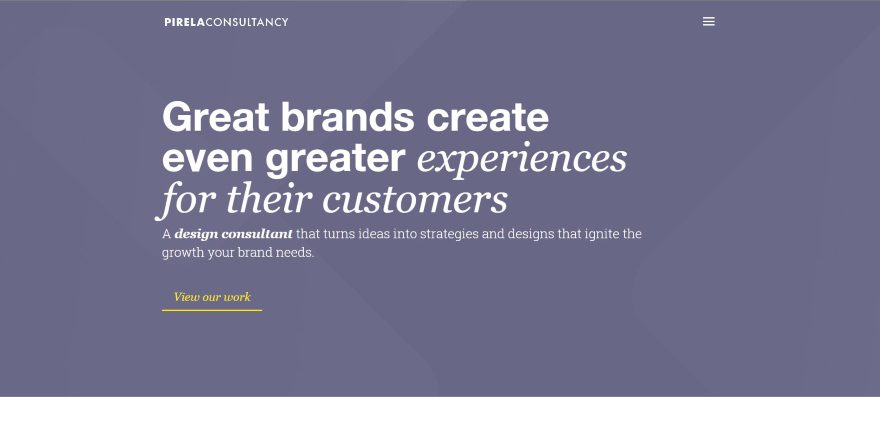
This site was submitted by Leopoldo Pirela. It uses a bluish-purple color, green, and yellow in its branding for backgrounds, overlays, and highlights starting with the purplish pattern in the header’s background. Featured projects are shown as three images that reveal information on hover. Testimonials are shown within a full-screen slider. Thoughts and tips are shown in green blurbs that show relevant icons. I love the CTA in this site. It shows a book with information and a download button over a dark green background pattern. The footer shows the same purple background pattern as the header and provides the contact link and social follow buttons. I love the alternating layout of the Services page.
8. Mauri
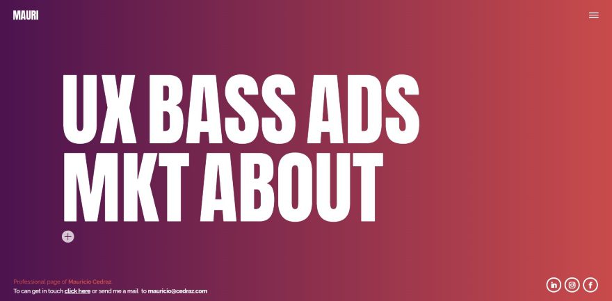
This site was submitted by Mauricio Cedraz. The landing page is a single full-screen with a purple/red gradient background with large text that’s just off-center. The text is actually links and animates on hover, which flips the text and changes the colors- with one letter facing backward in a different color than the rest. Clicking on any of the text takes you to a page. Under the text is a single toggle with a welcome message. The page also includes the menu icon, contact links, and social follow buttons. The other pages use a similar design, but some have multi-column layouts with images over backgrounds with gradients. The colors are bold. I love the use of color and the large text in the header and menu.
9. One Foot Over
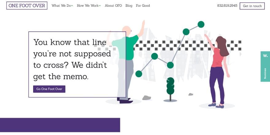
This site was submitted by Stephen Brent May. It uses purple and green for its branded colors within the text, highlights, graphics, and backgrounds. The hero section displays a box with information and a button that overlaps the flat-design background graphic. The next section shows two rows with a two-column section with a mobile graphic in the branded colors with company info in the other column. The rows alternate their layout. I love the next section which shows company information over a patterned background with a purple gradient. Another purple background is used as a CTA and within the footer. Services are displayed within blurbs using multi-colored icons.
10. Extempra
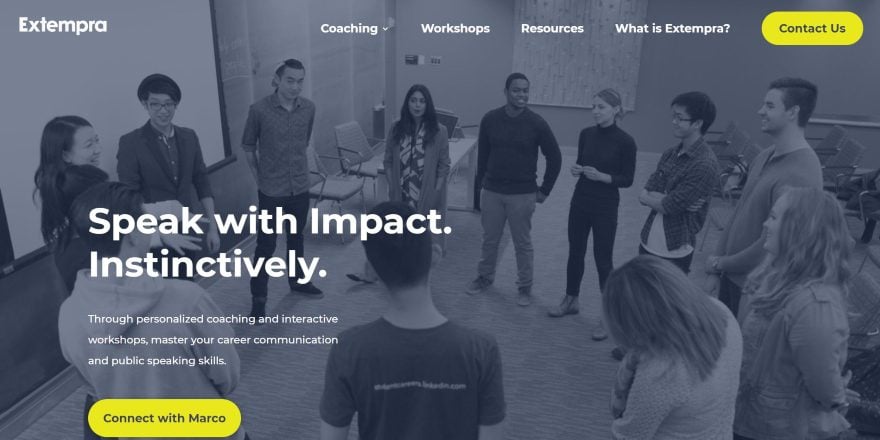
This site was submitted by Chetan Gupta. It uses several branded colors including a blue that’s close to teal within text and overlays, bright yellow for highlights, a bold yellow within backgrounds, and a purple overlay for the header. I especially like the Programs section that shows two images with blue overlays that includes the title, text, and buttons. The overlays make the images and the text pop. Testimonials are shown within a slider that overlaps two sections. The blog section shows posts with rounded corners and box shadows. The other pages use a similar layout with full-screen headers, overlapping sections, and bold color. The blog uses a 1-column, 2-column, and 3-column layout for the blog posts and makes great use of featured images.
Conclusion
That’s our 10 best community Divi website submissions for the month of January. These sites look amazing and as always we want to thank everyone for your submissions!
If you’d like your own design considered please feel free to email our editor at nathan at elegant themes dot com. Be sure to make the subject of the email “DIVI SITE SUBMISSION”.
We’d also like to hear from you in the comments! Tell us what you like about these websites and if there is anything they’ve done you want us to teach on the blog.
Featured Image via hobbit / shutterstock.com


I dig the SWYFT site. Nice combination of creative design styles and elements.
Thank you so much!
Thanks, Britt! I appreciate that.
I think I need to submit one of my sites! Liked the ones this time very much.
Love the Empire Engineering site !
Thanks! 🙂
Loooved Mauricio’s website. Great representation of a talented artist!
Awesome! How do you go about submitting a site for upcoming months showcase? Thx
2nd paragraph in the “Conclusion” section. 😉
Frukto is very creative!!!
All the sites look great…I can’t pick a favorite this month.
Loving the Swyft website. Nice work there Suzie.
<- There's just something about the colour Orange 😉
Thank you so much!
How can i use these websites for my clints..
Great, I know that DIVI Theme is the best theme for all type of websites. I always want to use DIVI theme on my own website.
Thanks DIVI….
Really nice and diverse collection. There are elements on all sites that I dig, and the designs work well to showcase the respective brands they’re communicating. Nice job everyone. 🙂
Love Frukto, so fresh !
Thank you, I appreciate it!
The sites look great. Hard to pick a favorite. There are elements in each of them that I like. I like these monthly posts because they give me ideas for working with the Divi theme.