
It’s that time again for our monthly Divi Showcase where we take a look at 10 amazing Divi websites made by our community members. Every month we showcase the best Divi websites that were submitted from our community and today we want to share with you the top ten websites for the month of February (okay, we’re actually in March, but only a little). Throughout the post I’ll point out some of my favorite design features from each of the websites.
I hope you like them!
Divi Design Showcase: New Submissions from February 2018
1. The Little Virtual Assistant
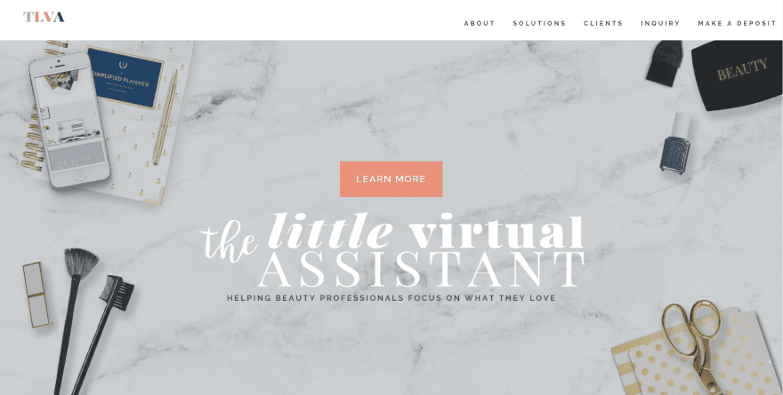
This site was submitted by Toni Patterson. This is a one-page design that includes lots of layout elements that make it stand out from the crowd. I especially like the section with three columns that’s made up of two columns of left justified text and one with an image to create a nice magazine look. Several two-column sections display in image in one side with true parallax. One two-column section includes video to one side. The site makes excellent use of color, dividers, and parallax.
2. Tamarind
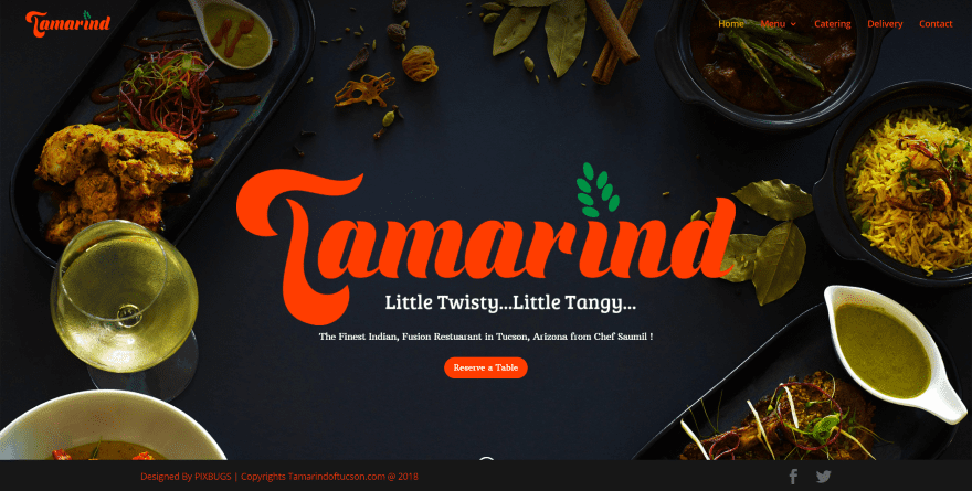
This site was submitted by Design Tutors. This is a restaurant website complete with food menus, galleries, and reservations through a contact form. The food menu pages separate the sections with full-width images in parallax and display food within lists. The layouts make great use of full-width images and two-column sections. The site includes lots of animations as you scroll and a custom back-to-top button. Navigation is simple and the photos are gorgeous.
3. StarfishWP
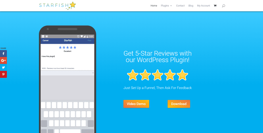
This site was submitted by Tevya. The site uses bright colors with gradients and plenty of styled section dividers and scrolling animations. The bright colors perfectly match the ocean theme of the site’s name. The multi-column layout includes lots of blurbs, overlapping sections, hover animations, and styled elements. The blog uses a sharp three column design with a blue background and beautiful colors and images that continue the ocean theme. The header includes a call to action bar. The site makes great use of color.
4. Vin Walker
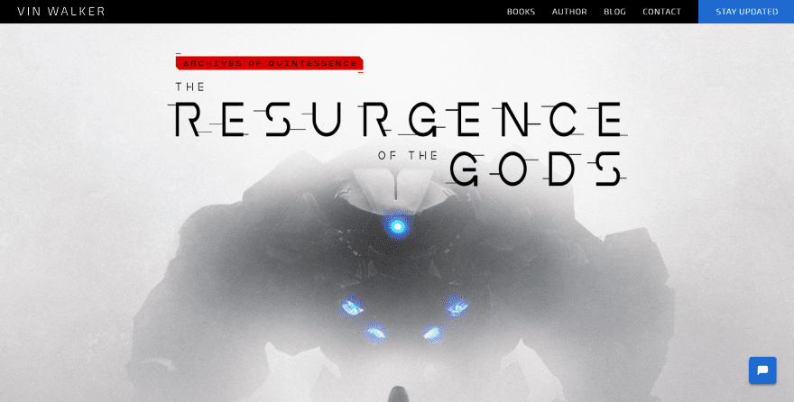
This site was submitted by Vin Walker. This website includes large images and fonts to match the style of the author’s books. The layout uses full-screen images, book covers, descriptions, and an about section with large professional photography and social media buttons. The colors match the professionalism of the photography. I love the drop caps that take three lines. It includes a call to action in the menu. The blog uses a filter, search, and nice card design with hover animation.
5. Flair Designs
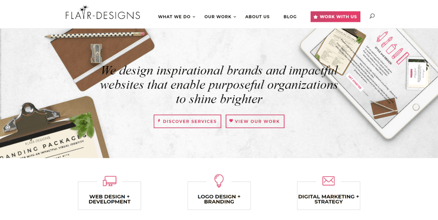
This site was submitted by Laura Versteeg. It uses a vivid scarlet red to create a highlight with gradient throughout the website that fits perfectly with the clean layout. It includes lots of CTA’s with hover animation. It even includes a CTA in the menu. Projects are displayed within a filterable portfolio grid. Project pages display the websites within a computer monitor and as a full layout to show the complete design. I also like the elegant background color in the header and behind the newsletter signup form.
6. Forhm Interiors
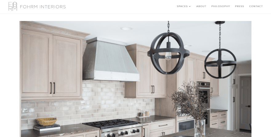
This site was submitted by Laura Versteeg. The home page keeps it simple with only a full-screen slider and header and footer navigation with a light background and fonts that are not too dark for the design- giving the layout a clean and elegant look. The Spaces menu includes pages for each of the areas, which display images in multi-column galleries. I like the way the Press page shows magazines and other media where the owner was featured and the Contact page with integrated Instagram feed. The photography in this site is amazing.
7. Supply Chain Academy
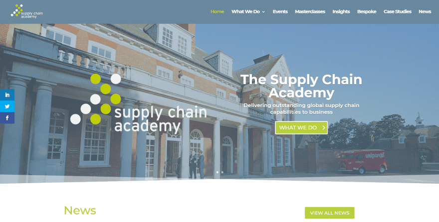
This site was submitted by Andy Dennis. This website creates a professional look through a clean design with a full-width slider, blog section, CTA’s for services, embedded videos within cards that include descriptions, and loading animation. Green highlights are used throughout for text and buttons to match the logo. The blog posts within the blog section include different border styling for the top and bottom of the blog card. Classes display interesting overlays with hover animation. The Case Studies page displays images and text in an alternating layout with buttons.
8. Cen Cal Sports
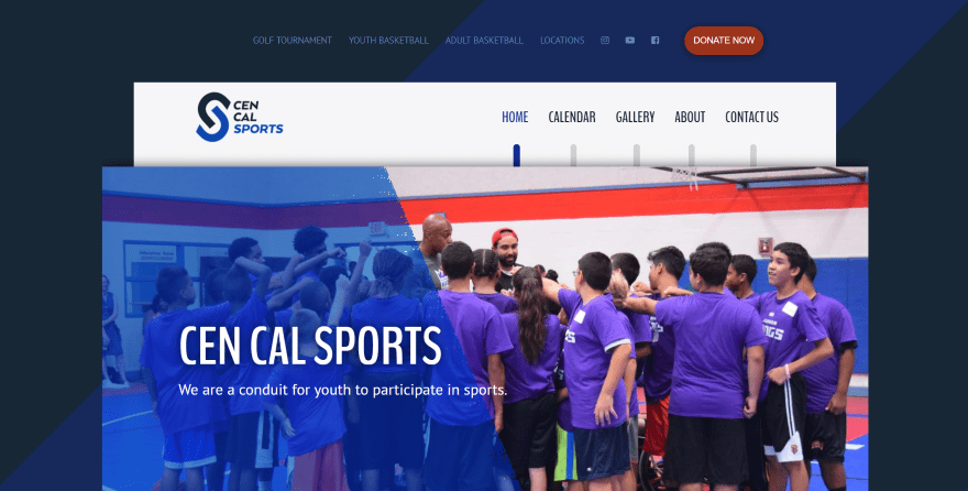
This site was submitted by Aaron Marquez. This website has a unique boxed design. The background displays a dark blue with blue diagonal stripe that remains in place on scroll. I like the navigation menu with its vertical line that changes color on hover. The top menu includes social buttons and a donation CTA. Each of the sections includes an image with an overlay that covers a portion of the image and buttons to pages. Events are displayed with a Google Calendar Events plugin. The filterable gallery images open a gallery box where you can share images, open them in a modal, and navigate through the galleries.
9. Growth IP
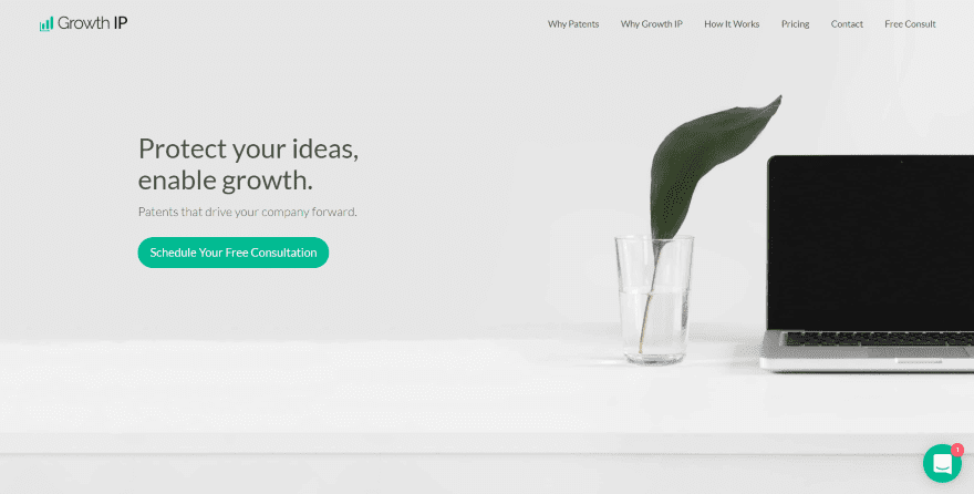
This site was submitted by Brian Lao. This is a one-page website that uses a clean design with lots of white space, giving the site an elegant look. The green highlights work perfectly for the investments genre. Almost everything animates on hover. Benefits are displayed as cards with two-color icons which darken and animate on hover. All of the contact info is clickable including a message chat button. The site is simple, clean, and professional.
10. Beacons of Change
![]()
This site was submitted by Shmuel Spiegelman. The site makes interesting use of the zoom feature on load, making the header image stand out. It uses large text that looks great with the single column sections and patterned backgrounds. Several colors are used for fonts, as well as several font families, and each of them blend together perfectly. An interesting effect displays circular images that overlap each other. This site has one of the prettiest blog designs I’ve seen- the featured image is placed to one side with an excerpt overlapping which includes the titles, author’s image, and category. The posts alternate from one side to the other and it includes a load more button.
In Closing
Well, that’s our 10 best community Divi website submissions for February. These sites look great and as always we want to thank everyone for your submissions!
If you’d like your own design considered please feel free to email our editor at nathan at elegant themes dot com. Be sure to make the subject of the email “DIVI SITE SUBMISSION”.
We’d also like to hear from you in the comments! Tell us what you like about these websites and if there is anything they’ve done you want us to teach on the blog.
Featured Image via artist / shutterstock.com


Hi! How to submit a site for this showcase?
Remarkable: 6 out of these 10 don’t have SSL installed.
I guess we can create anything we want with Divi!
Wow! Thank you for featuring our design on Starfish!
Yes! Number 8 is awesome! The best!
HMMMM #4 and #9 sure do have the same looking person in each site.
I thought #8 was the best of the bunch.
Sorry #2… Just because you can do transitions on sections does not mean you have YOU have to OVER do it…
The guys in #4 and #9 look different…
How/where does one submit their website for consideration?
I visited first three sites and impressed now i will try to visit all mentioned sites and try to learn.east and west divi theme is best??