
In this post, I’ll show you 5 creative Divi button module designs you can easily achieve with Divi’s Button Module. The button module is one of the most popular of all the Divi modules because buttons are so important for leading visitors to your desired objectives throughout a website. Therefore, it’s very important that we as designers and developers make these buttons appealing and eye-catching.
Let’s dig in!
Sneak Peek
Here is a quick look at the buttons we’ll build in this tutorial.

Let’s get to the tutorial, shall we?
What You Need to Get Started

To get started, you will need to do the following:
- If you haven’t yet, install and activate the Divi Theme.
- Create a new page in WordPress and use the Divi Builder to edit the page on the front end (visual builder).
- Choose the option “Build From Scratch”.
After that, you will have a blank canvas to start designing in Divi.
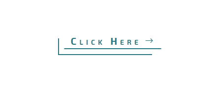
To start, create a new section with a one column row and add a button module to the row.
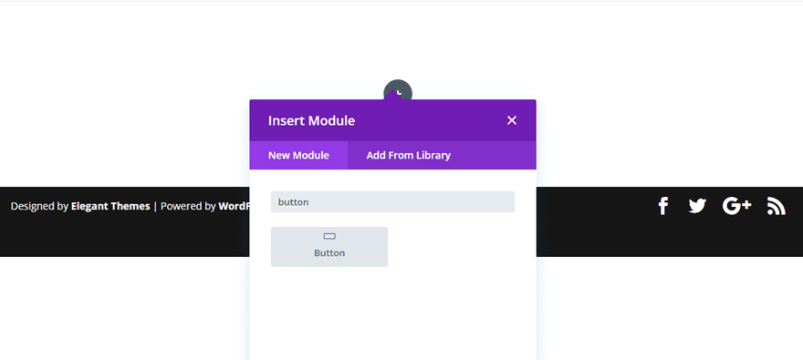
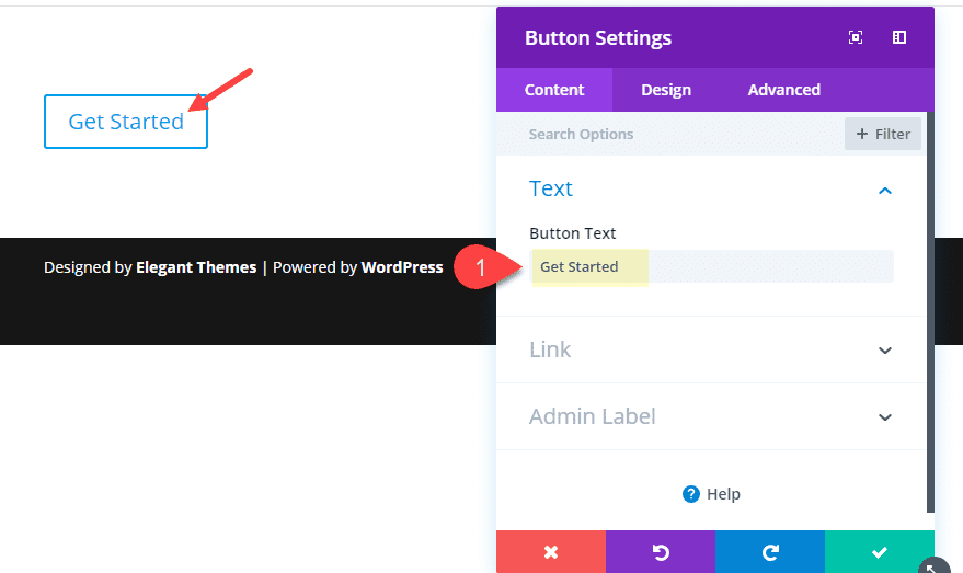
Then change the default content text of the button to read “Get Started” (or whatever you want actually).
Now its time to jump over to the design settings and update the following:
Use Custom Styles for Button: YES
Button Text Color: #ffffff
Button Background Color: #324376
Border Width: 0px
Button Letter Spacing: 0.2em
Button Font: Fira Sans
Font Style: TT (uppercase), U (underlined)
Underline Color: rgba(255,255,255,0.2)
Underline Style: double
Button Icon: see screenshot
Button Icon Color: #ff4751
Button Icon Placement: Left
Custom Padding: 40px Left, 20px Right
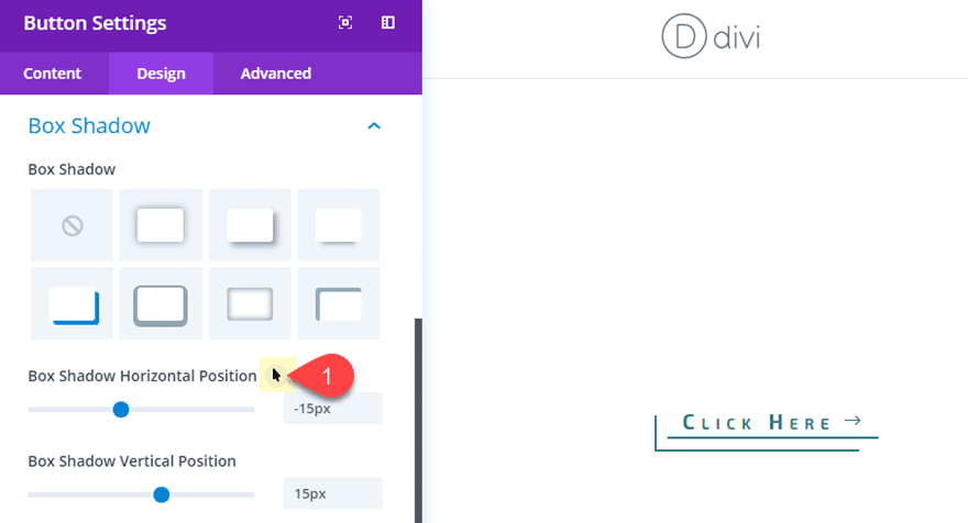
Box Shadow: see screenshot
Box Shadow Horizontal Position: 22px
Box Shadow Vertical Position: 0px
Shadow Color: #ff4751
(The custom left padding of 40px creates a fixed space that is being filled with the box shadow to sit flush against the left arrow button icon.)
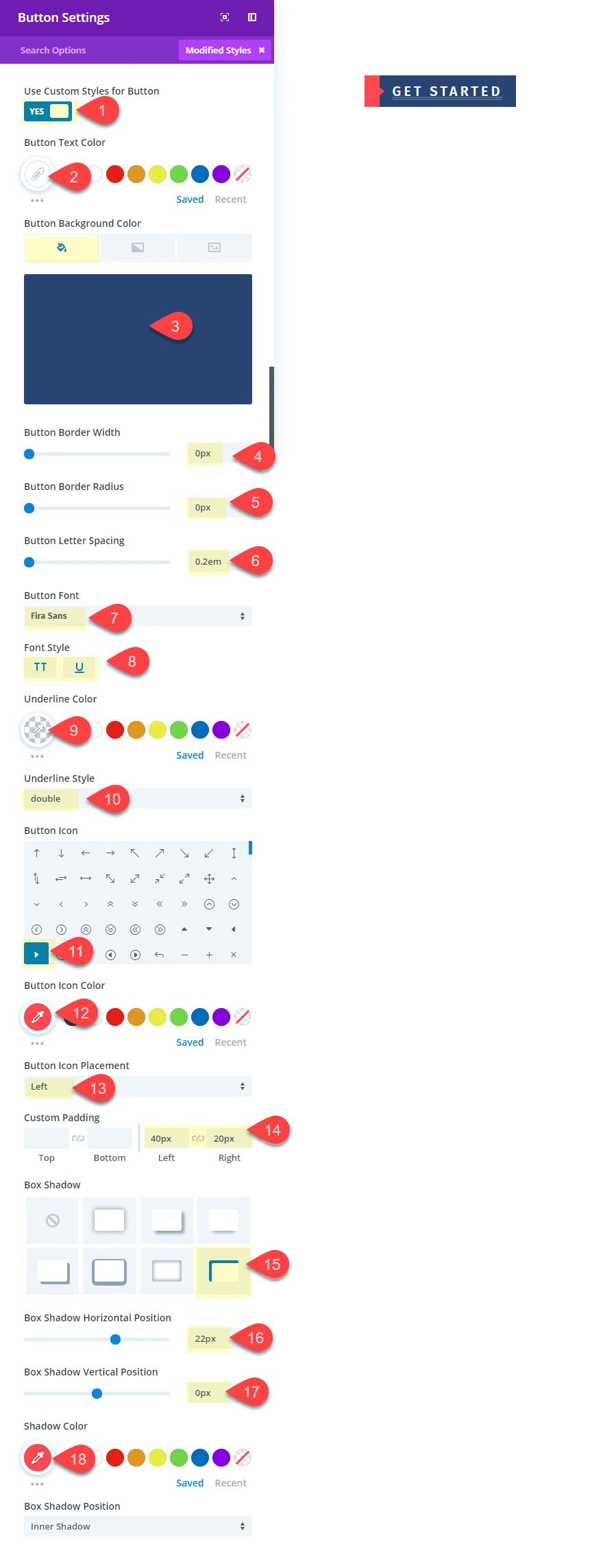
Since the left box shadow is flush against the start of the arrow icon, this creates a nice arrow border effect. If for some reason it doesnt sit flush against the icon, you can adjust the horizontal position as needed. The beauty of this design is that the left arrow border will remain in place even when adding different amounts of button text.
Here is the final result.
This next button style has more of a technical and minimalist feel. The lines are created using a box shadow and a background gradient separated by a transparent border. I’ve also added a hover effect that moves the box shadow to the right which in turn moves the bottom line slightly to the right for a subtle interaction.
To start, create a new section with a one column row and add a button module to the row.
Update the button text content to whatever you want. I’m leaving the default “click here” for this example. Then update the design settings as follows:
- Use Custom Styles for Button: YES
- Button Text color: #3b7986
- Button Background Gradient Left Color: rgba(255,255,255,0)
- Button Background Gradient Right Color: #3b7986
- Gradient Direction: 180deg
- Start Position: 96%
- End Position: 0%
- Button Border Width: 10px
- Button Border color: rgba(0,0,0,0)
- Button Border Radius: 0px
- Button Letter Spacing: 6px
- Button Font: Exo 2
- Font Weight: Bold
- Font Style: Tt (small caps)
- Button Icon: Right Arrow (see screenshot)
- Only Show Icon on Hover for Button: NO
- Custom Padding: 0px Bottom
- Box Shadow: see screenshot
- Box Shadow Horizontal Position: -15px
- Box Shadow Vertical Positon: 15px
- Box Shadow Spread Strength: -13px
- Shadow Color: #3b7986
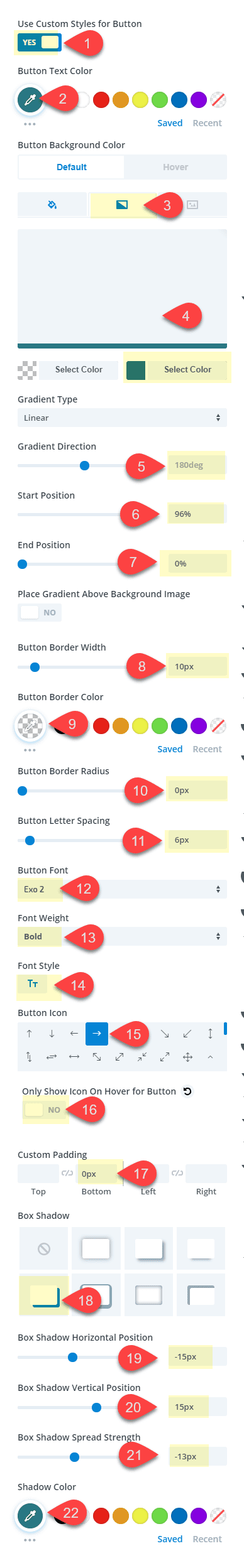
You may need to set the background color to #ffffff on hover as well since this is the default setting for the button.
The key to this design is the background color gradient and the box shadow. By setting the background color gradient starting point to 96%, this creates a line that is 4% width at the bottom of the button. Then once we position and color the box shadow, we have another line element that wraps the button nicely. Plus, the right arrow icon works well with the line design elements as well.
Here is the final design.

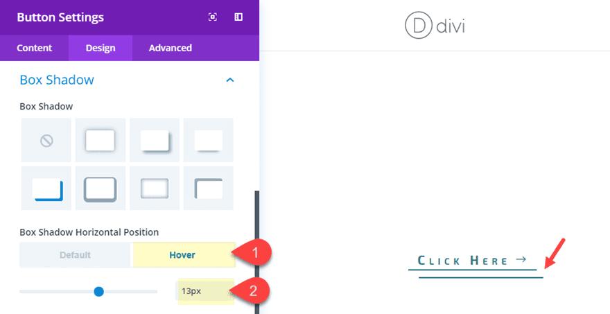
To add the hover effect that moves the box shadow, go back to the design settings and hover over the option “Box Shadow Horizontal Position”. You will see an arrow icon popup right next to the text. Click on it to open the hover options for that particular setting.
Then click on the hover tab and change the value to 13px.
You will see the hover effect previewed in the visual builder.
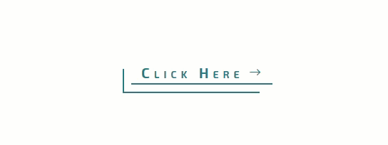
Here is what the hover effect looks like:
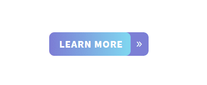
This next button design adds a box shadow to frame the right button icon that remains in an absolute position. On hover the button extends to the right creating the effect that you are pulling a tab.
To create the button, first, create a new section with a one-column row and then add a button module to the row.
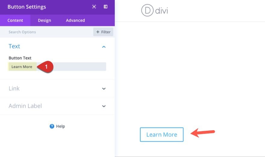
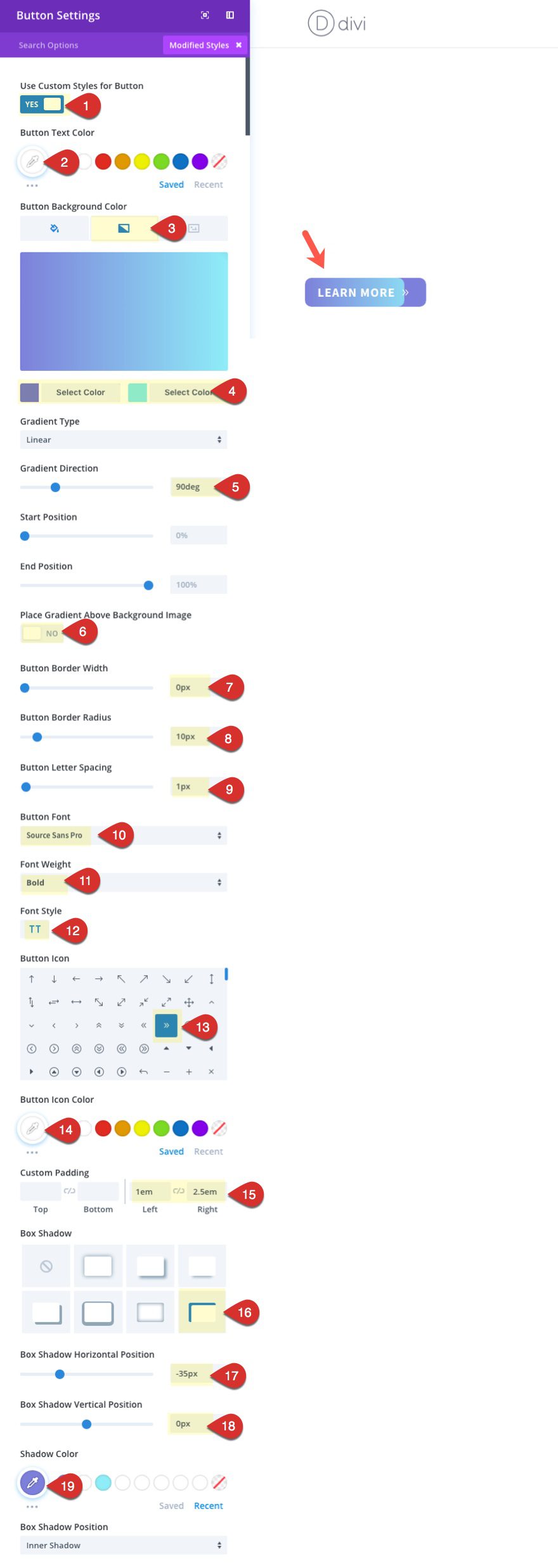
Open the button module settings and update the button text under the content tab to whatever you want (I’m going to use the text “Learn More”).
Then jump over to the design tab and update the following:
Use Custom Styles for Button: YES
Button Text Color: #ffffff
Button Background Gradient Left Color: #7D80DA
Button Background Gradient Right Color: #8EEDF7
Gradient Direction: 90deg
Button Border Width: 0px
Button Border Radius: 10px
Button Letter Spacing: 1px
Button Font: Source Sans Pro
Font Weight: Bold
Font Style: TT
Button Icon: See Screenshot
Button Icon Color: #ffffff
Custom Padding: 1em Left, 2.5em Right
Box Shadow: See Screenshot
Box Shadow Horizontal Position: -35px
Box Shadow Vertical Position: 0px
Shadow Color: #7d80da
The key to this design is the box shadow on the right that will frame the icon. But right now the icon needs to be positioned to fit inside the gradient area. To do this, we need to add some custom CSS.
Go to the Advanced tab and enter the following CSS inside the After input box:
position: absolute;
right: 5%;
This CSS targets the location of the icon and gives it an absolute position 5% from the right edge of the button.
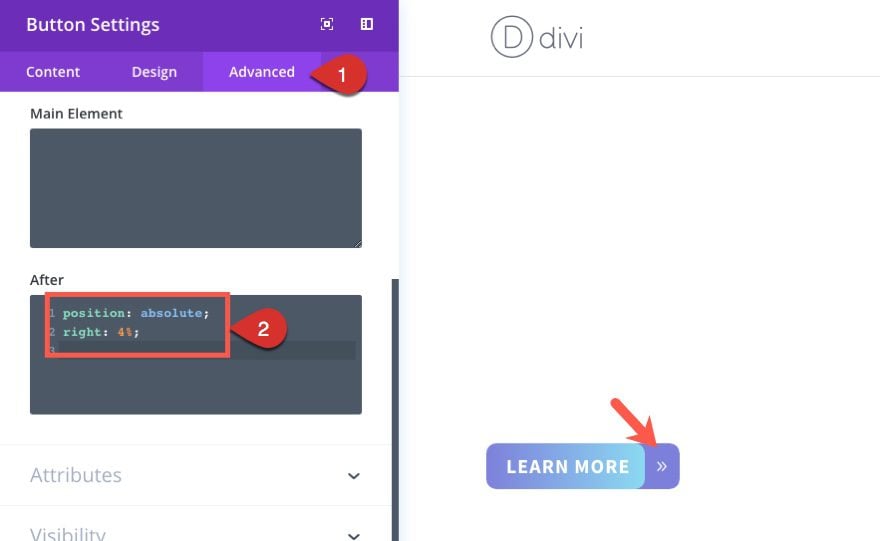
Check out the design so far.

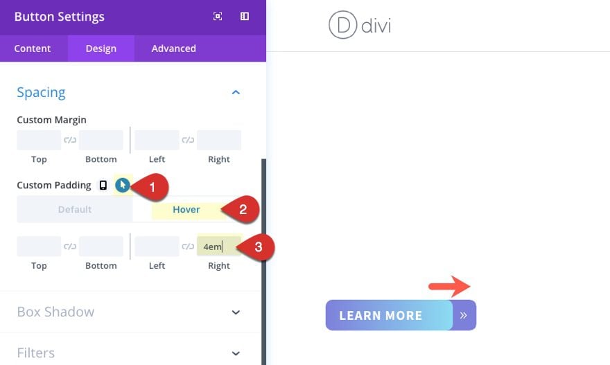
Now to add the hover effect, we just need to update the right padding option under the hover tab. To do this, open the button settings and open the hover options by hovering over the custom padding element and clicking the cursor icon that pops up. Then select the hover tab and enter the following:
Custom Padding: 4em Right
Now let’s check out the final result.

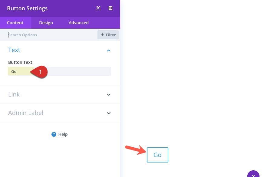
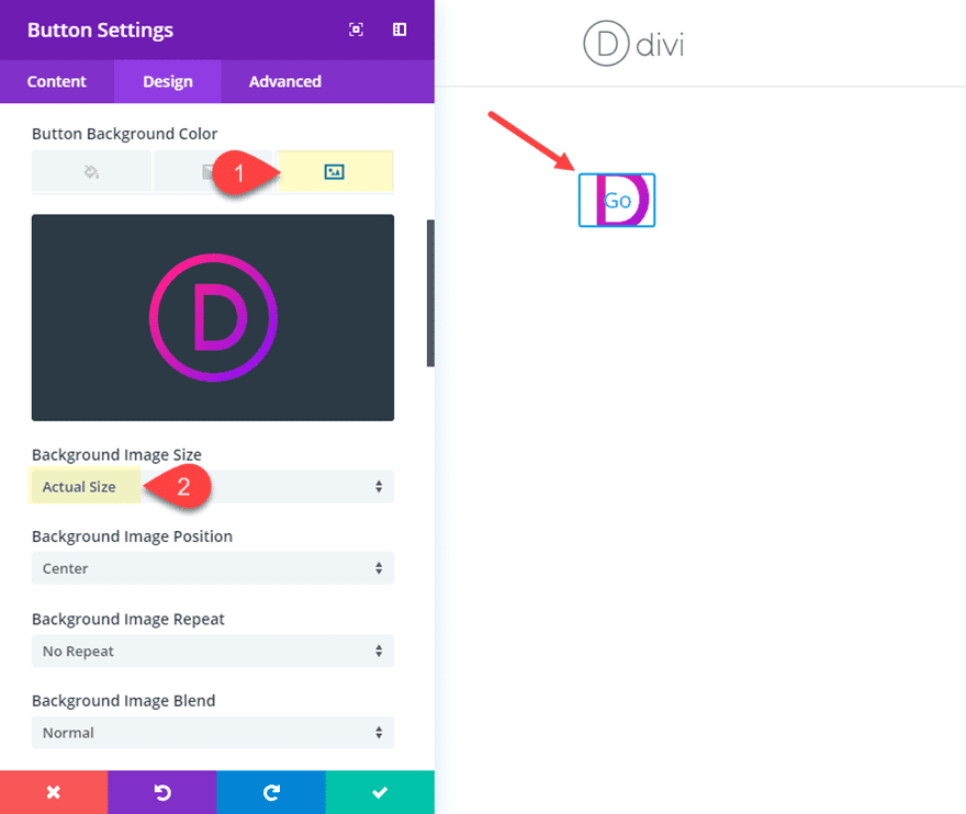
For the next design, we are going to transform a circle icon/image into a clickable button with a cool hover effect that shows a short call to action.
To get things started, create a new section with a one column row and add a button module to the row.
Then open the button design settings. Under the content tab, add the word “Go” for the button text.
Then go to the design settings and select to use the the custom button styles. First add the circle image as a background image for the button. In order for this to design to work, make sure you use a png image of a logo or icon that is a perfect circle and that the image dimensions are the same height and width. The image I’m using is a png that is 118px by 118px. Grab it here if you want:
Once you add the background image, make sure the background image size is set to “Actual Size.” This will make sure the image retains it’s original dimensions (118px by 118px).
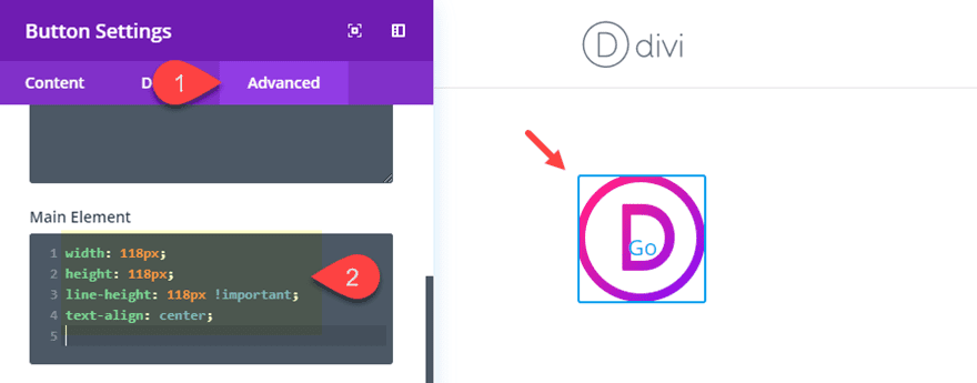
Next we want to size our button to be the exact dimensions of our cirlce image. To do this, jump over to the Advanced tab and enter the following custom CSS in the Main Element:
width: 118px;
height: 118px;
line-height: 118px !important;
text-align: center;
Notice that the css sets the width, height, and line-height all to the same value of 118px. This is the same width and height of our image. Now the image fits perfectly in the button. The line-height is set to 118px so that the text inside the button will be vertically centered within the button (its not perfectly centered yet because there is still some padding we need to get rid of that is throwing it off). And the text-align: center makes sure the text inside the button stays centered even when the button module is left or right aligned.
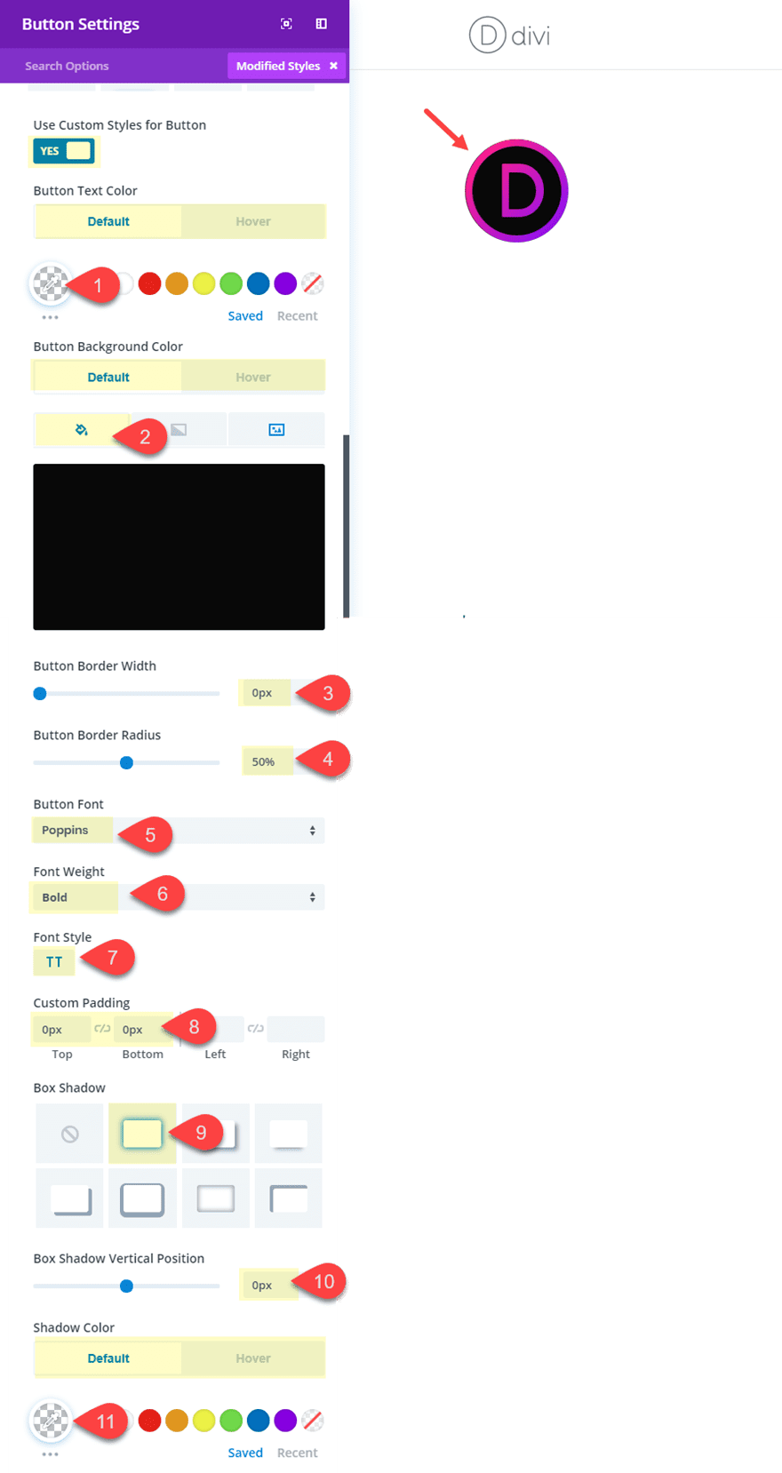
Now all we need to do is finish up with some design settings that will complete the design. Go the design tab and update the following:
Button Text Color (default): rgba(0,0,0,0)
Button Text Color (hover): #ffffff
(This hides the button text by default and shows it in white on hover)
Background Color (default): #121212
Background Color (hover): #da00f2
(This shows a black background behind the image by default and then a bright pink background color on hover.)
Button Border Width: 0px
Button Radius: 50%;
(Setting the button radius to 50% will change the button into a circle shape because the height and width of the button has been set to 118px in custom css.)
Button Font: Poppins
Font Weight: Bold
Font Style: TT
Show Button Icon: NO (having a button icon will throw off the centered text)
Custom Padding: 0px Top, 0px Bottom
(It is important to take out the top and bottom padding so that the line-height we set in custom css will make the text vertically centered.)
Box Shadow: see screenshot
Box Shadow Vertical Position: 0px
Shadow Color (default): rgba(0,0,0,0)
Shadow Color (hover): rgba(0,0,0,0.68)
(This will show a slight box shadow around the circle on hover for an additional popout effect.)
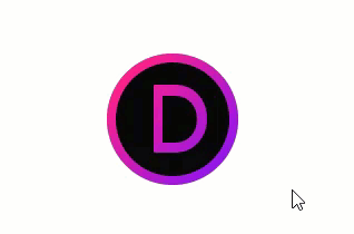
Here is the final design with the hover effect.
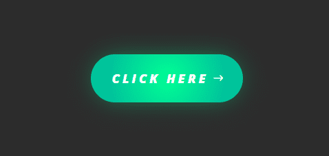
This last design is pretty straightforward and simple to do. All it takes is a creative use of background gradient colors and box shadow colors. The hover effect simply increases the size of the box-shadow to give more of a glow effect.
To get started, create a new section with a one-column row and add a button module to the row. Before you update the button module, open the section settings and give the section a dark background color (#333333).
Now open the button settings.
You can leave the default button text “Click Here”. Then update the following design settings:
Button Alignment: Center
Use Custom Styles for Button: YES
Button Text Size: 18px
Button text color: #ffffff
Button Background Gradient Left Color: #00ff8c
Button Background Gradient Right Color: #15c39a
Gradient Type: Radial
Radial Direction: Center
End Position: 75%
(Setting the gradient type to Radial will give the gradient a circle shape that expands outward. Make sure the lighter color shows in the middle of the gradient to create the glow effect.)
Button Border Width: 0px
Button Border Radius: 100px
Button Letter Spacing (default): 4px
Button Letter Spacing (hover): 5px
(Increasing the letter spacing on hover will slightly expand the entire button for a nice effect)
Font Weight: Ultra Bold
Font Style: I, TT
Button Icon: right arrow (see screenshot)
Custom Padding: 20px Top, 20px bottom, 30px left, 50px right
(you need more right padding to account for the right arrow button icon)
Box Shadow: see screenshot
Box Shadow Vertical Position: 0px
Box Shadow Blur Strength (default): 64px
Box Shadow Blur Strength (hover): 100px
Box Shadow Spread Strength: -12px
Shadow Color: rgba(0,255,140,0.66)
(The box shadow add to the glow effect when you match the shadow color with the color of the button. Increasing the blur strength on hover will also magnify the glow of the button)
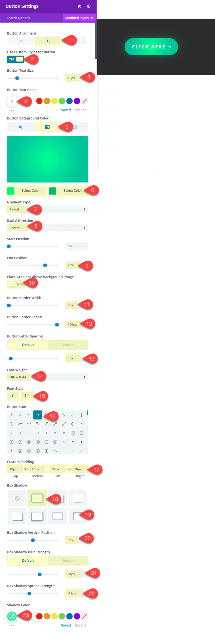
Check out the final design with the hover effect.

To learn about inspiration on button styles, check out some of these other articles:
- How to create icon font button with Divi
- Design a Unique Full Screen Divi Layout with an Animated Scroll Button
- How to Style Your Monarch Social Buttons to Match Your Site’s Design
- 7 Keys to Creating an Irresistable Subscribe Button
Final Thoughts
I hope these examples have inspired you to maximize the Divi Button Module in creative new ways! Because a call to action is so important to your website, it is always good to have a variety of ideas in our toolbox to create some unique button options. Feel free to use these ideas to come up with some amazing button styles of your own!
I look forward to hearing from you in the comments.
Cheers!


Thanks for this article. Two questions for you…
1. In my version of Divi (3.17.6) the custom button style options does not provide a “default” and “hover” option, as per most of your screen shots above (for button background and text etc). I cannot see any way to change the hover options without using custom css. What am I missing?
2. What css would you use to change the button text on hover or is there a way to do this within the button module already?
Thanks in advance.
Thank you very much for the new button designs; we were just talking about this within our staff meeting!
It would be excellent if a json export file was included with these tutorials.
+1 yes
+43,507 yes
Great buttons! For the first button style, is there a way to ensure that the arrow stays vertically centered if the button text breaks into two lines? I’ve got a site with some longer button text that goes to two lines on smaller screens, and that ends up putting the arrow too far down.
Not off the top of my head unfortunately. However, you could try adjust the line-height and padding of the button on mobile. That should help. Thanks!
Awesome post thanks 🙂 I have been struggling to make nice looking buttons…this opened up a whole new area of button configurations 🙂 Just a quick question – the settings you used for the purple sliding button – will it work across all browsers?
Ryan,
Yes, the button should work on all browsers. Thanks!
Well the hover effects work in all browsers?
oooooohhhhh…. I like the first design.
It is my favorite as well :). Thanks Richard.
Please @Jason Champagne tell me step by step how to add 2 buttons (left & right) in FULLWIDHT IMAGE Section. I am beginner and I don’t see any options how to do it. Thank you very much in advance!
I recommend that you contact the Support Team by opening a chat with the pink floating message icon at the bottom right of the website. They’ll be happy to assist you on this.