Icon buttons have become essential to the world of web design. Icons provide concise visual calls to action that work great for mobile devices because they don’t take up a lot of space. They also work well as toggle or popup buttons that users intuitively recognize without the need for text.
In today’s tutorial, we will be showing you how to design icon buttons with Divi. Creating an icon button in Divi is quite simple and fun to do. Using the Icon Module, we can choose from hundreds of icons and use countless built-in Divi Builder design options to create just about any kind of icon button you can think of. Hopefully, this article will help empower you to start building some amazing icon buttons for your next project.
Let’s get started!
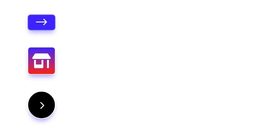
Sneak Peek
Here is a quick look at the icon buttons we’ll build in this tutorial.
Download the Layout for FREE
To lay your hands on the layout from this tutorial, you will first need to download it using the button below. To gain access to the download you will need to subscribe to our newsletter by using the form below. As a new subscriber, you will receive even more Divi goodness and a free Divi Layout pack every Monday! If you’re already on the list, simply enter your email address below and click download. You will not be “resubscribed” or receive extra emails.

To import the section layout to your Divi Library, navigate to the Divi Library.
Click the Import button.
In the portability popup, select the import tab and choose the download file from your computer.
Then click the import button.

Once done, the section layout will be available in the Divi Builder.
Let’s get to the tutorial, shall we?
What You Need to Get Started

To get started, you will need to do the following:
- If you haven’t yet, install and activate the Divi Theme.
- Create a new page in WordPress and use the Divi Builder to edit the page on the front end (visual builder).
- Choose the option “Build From Scratch”.
After that, you will have a blank canvas to start designing in Divi.
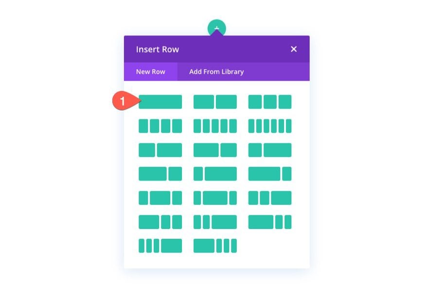
To begin, let’s add a one-column row to the default regular section.
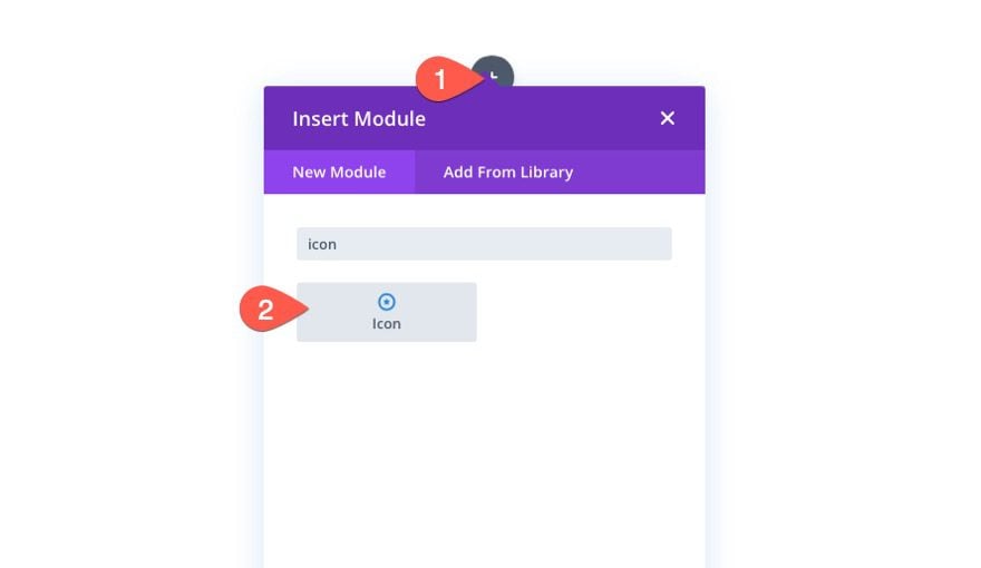
Then add a new icon module to the column.
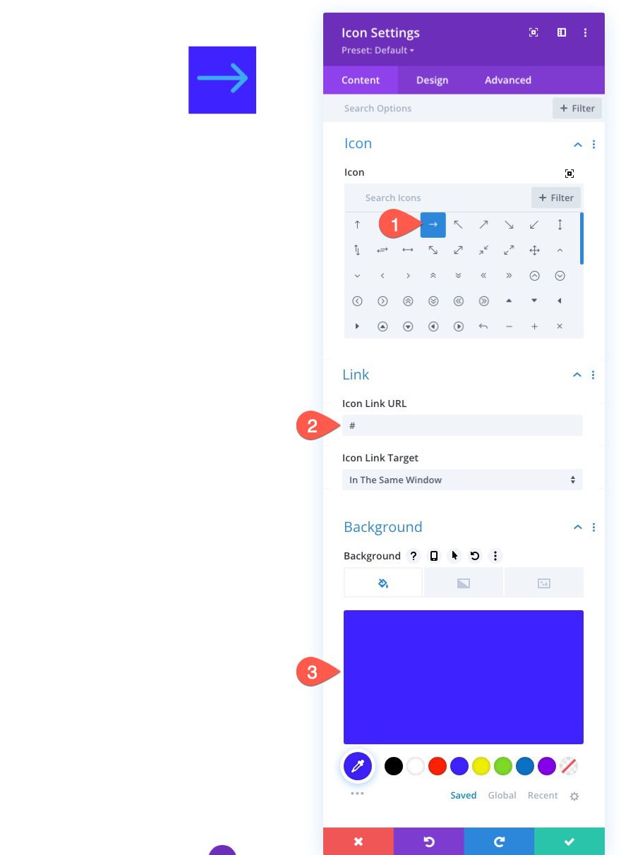
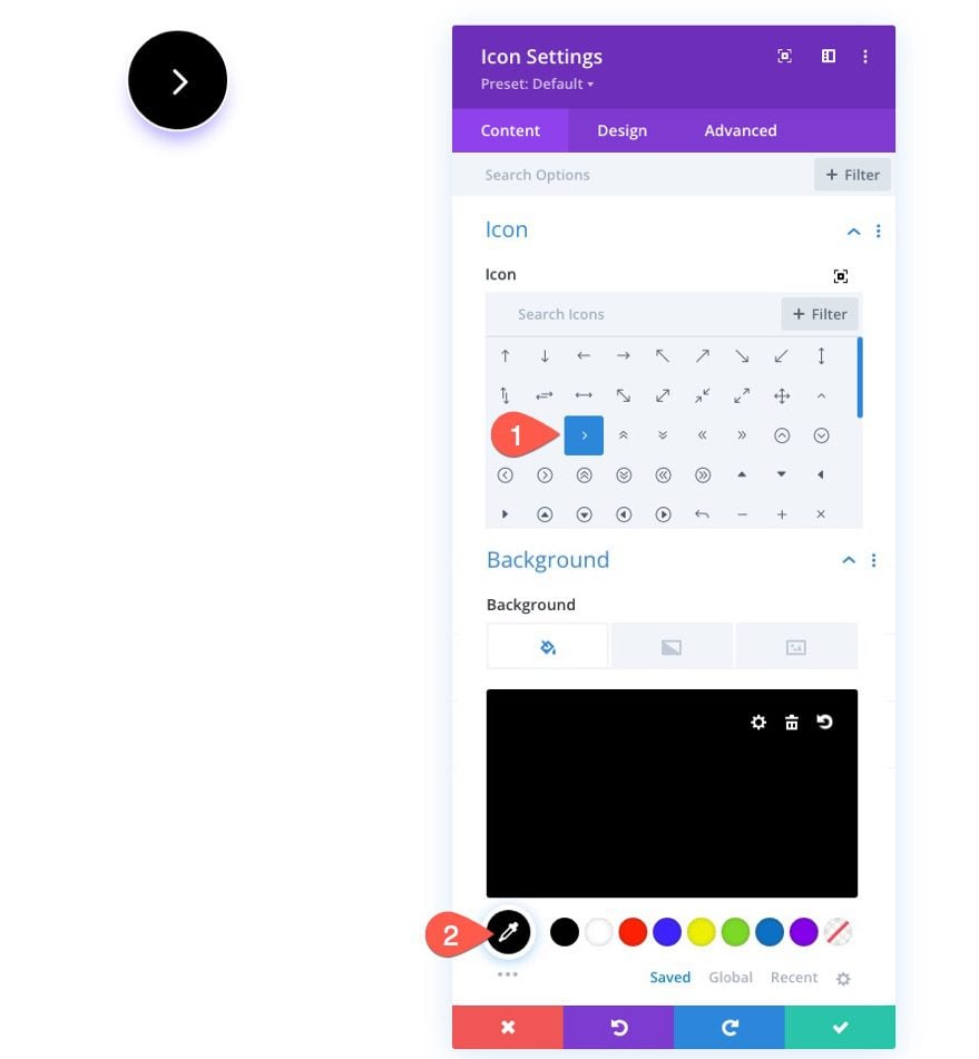
Icon, Link URL, and Background Color
Under the content tab of the icon settings modal, update the following:
- Icon: Right Arrow (see screenshot)
- Icon Link URL: # (just a filler for now)
- Background Color: #3e22ff
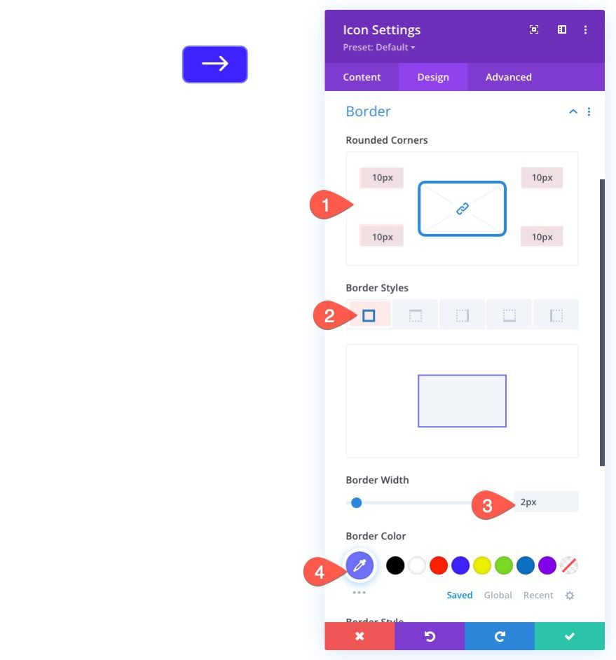
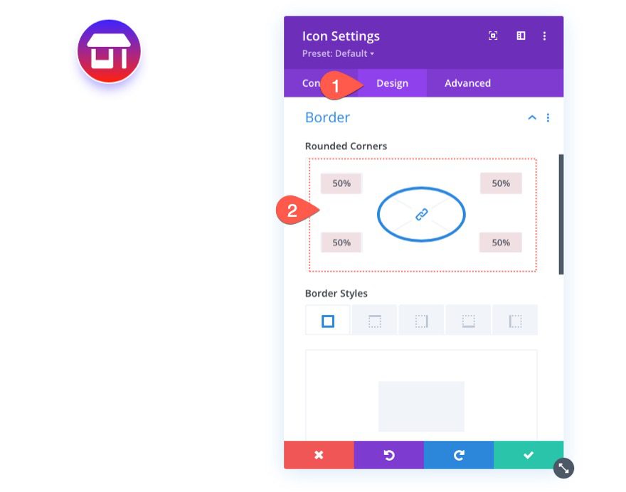
Border and Border Radius
Under the design tab, update the following:
- Rounded Corners: 10px
- Border Width: 2px
- Border Color: #7272ff
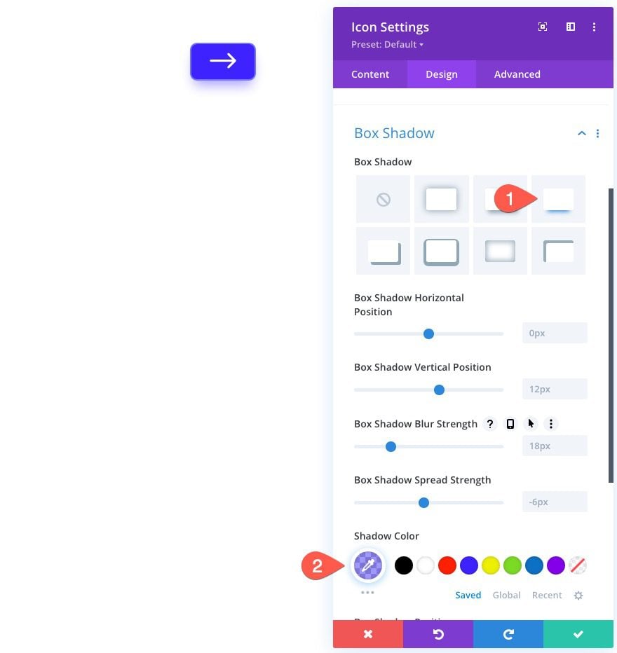
Box Shadow
- Box Shadow: See screenshot
- Shadow Color: rgba(62,34,255,0.48)
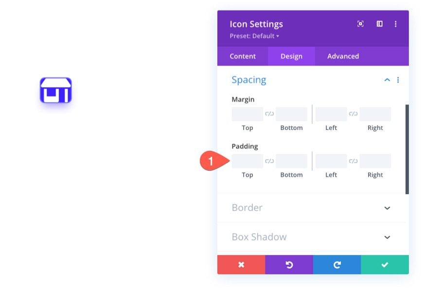
Matching Clickable Space with Icon Button Size
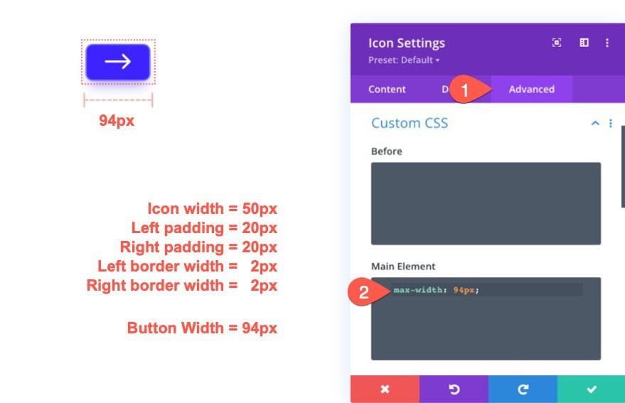
Currently, the icon module will span the full width of the parent container (or column). This means the clickable space is larger than the actual icon button. To match the clickable space with the size of the icon button, we can give the module a max width that is the same as the icon button width. The icon button width can be determined by adding the icon width, the left and right padding, and the left and right border width. In this example, the total button width is 94px.
Under the advanced tab, add the following custom CSS the Main Element:
max-width: 94px
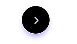
Here is the result.

To create our square icon button, duplicate the row containing the first icon button we just created. This will give us a duplicate button in the duplicate row to work with.
Give the Icon the Same Height and Width while keeping it Centered
The large collection of icons available to use in the Icon module include both Divi icons and Fontawesome Icons. However, not all of the icons will have an equal height and width. This makes it a little more difficult to determine the exact width and height of the icon button. We could make adjustments to the padding to get the dimensions just right, but this is a bit cumbersome and could limit some of the hover options for the icon. For example, adding padding to the icon module will create space around the icon. So, if you create a hover option to change the icon color on hover, the icon color wouldn’t change when hovering over the space (or padding) around the icon. It would change only when hovering over the icon itself.
In order to create a perfectly square button that engages the icon on hover, we can add some custom CSS to set a height and width for the icon as well as center the icon using the CSS Flex property.
Here’s how to do it.
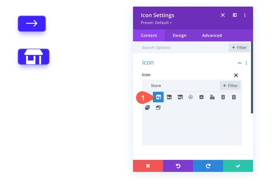
First, open the settings for the duplicate icon. Then update the icon with a new one from the icon picker.
Take out the padding for the icon module. This won’t be needed since we will be setting a height and width for the icon.
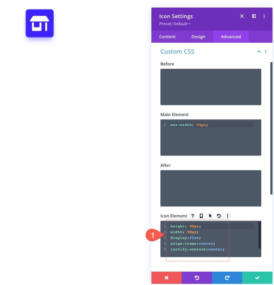
Under the advanced tab, add the following custom CSS to the Icon Element:
height: 90px
width: 90px
display: flex;
align-items: center;
justify-content: center;
Now the icon button will have an equal height and width of 90px which will make it a perfect square. Plus the flex property aligns the icon in the center of the module. This allows you to update the icon size within the icon module with ease.
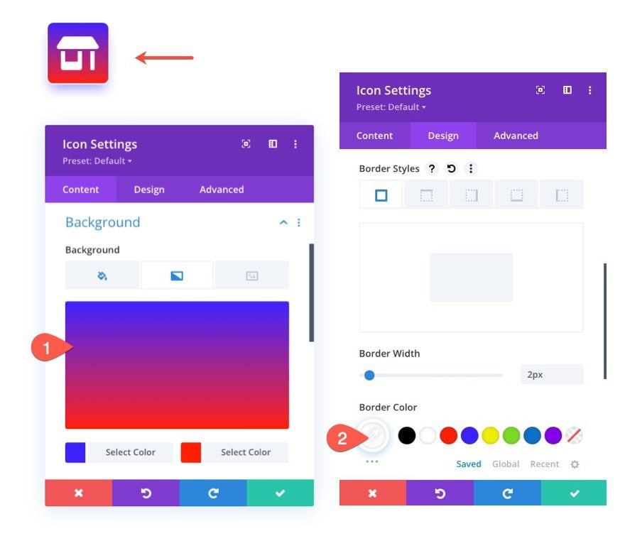
To finish off this button, let’s give it a background gradient and a white border color as follows:
- Background Gradient Left Color: #3e22ff
- Background Gradient Right color: #ff2000
- Border Color: #fff
Here is the final result.

Once the icon button is a perfect square, making it circular is simple. But before I show you this easy trick, let’s duplicate the previous row to kickstart the build of our circular icon button.
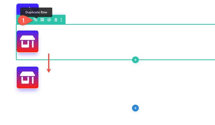
Now open the settings for our new duplicate icon and, under the design tab, update the border radius (or rounded corners) as follows:
- Rounded Corners: 50%
And just like that, we have a circular icon button!
To change up the design a bit, let’s give the icon module a different icon and background color as follows:
- Icon: see screenshot
- Background Color: #121212
Here is the result.
One popular trend is to use icons to build an icon menu which usually consists of multiple buttons positioned side-by-side. To do this we can use the flex property. Here’s how it’s done.
First, add a new one-column row to the page.
Open the row settings and update the gutter width to 1.
- Gutter Width: 1
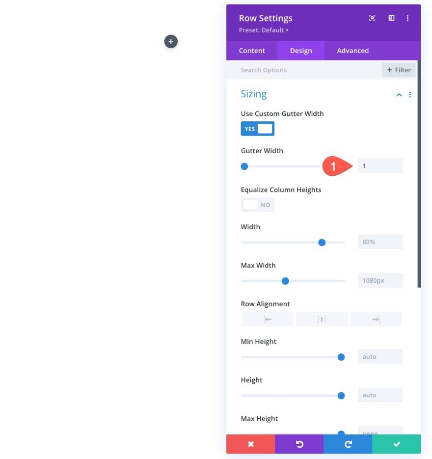
Next, open the settings for the column inside the row and add the following custom CSS to the column main element:
display:flex;
align-items:center;
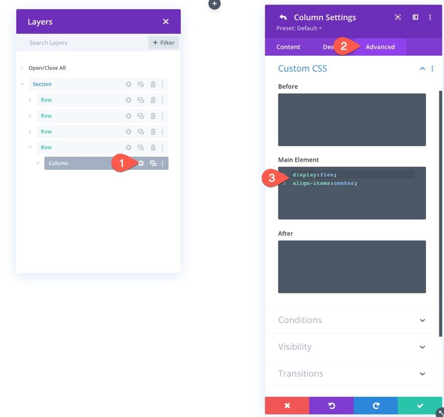
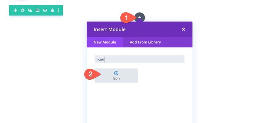
Add a new icon module to the column.
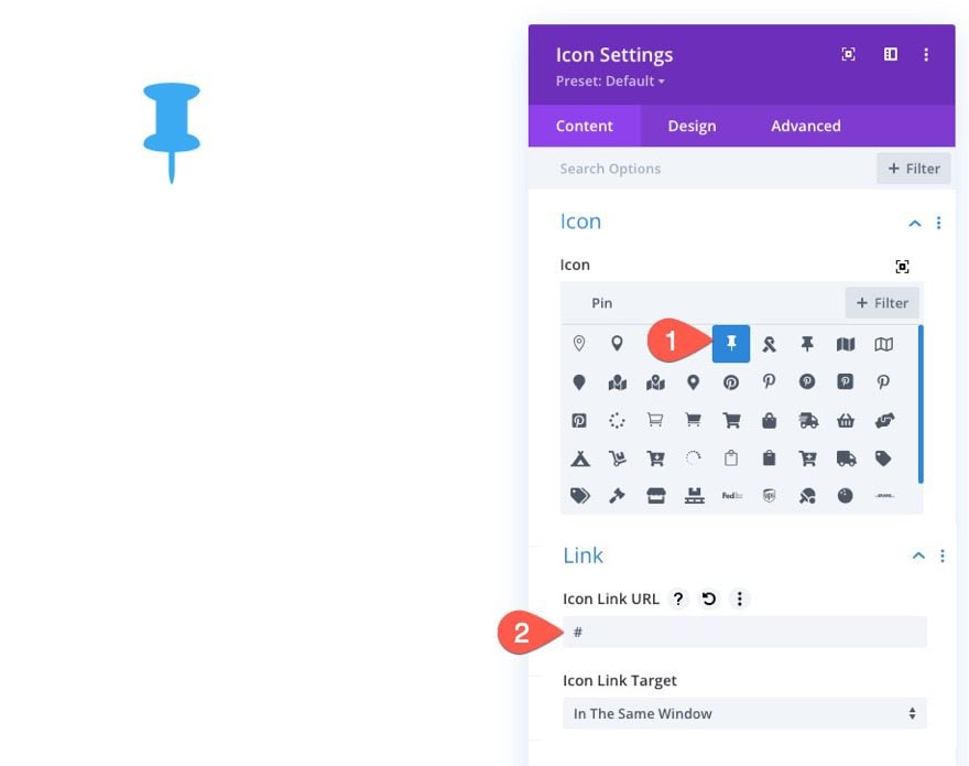
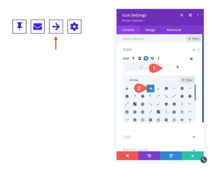
Under the content tab of the icon settings, select an icon and add an icon link URL.
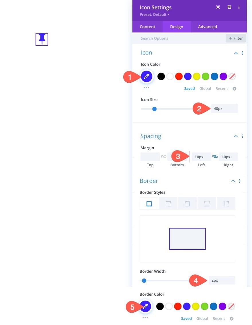
Under the design tab, update the following:
- Icon Color: #3e22ff
- Icon Size: 40px
- Margin: 10px left, 10px right
- Border width: 2px
- Border Color: #3e22ff
NOTE: The margin will create space between the adjacent buttons once we add more later on.
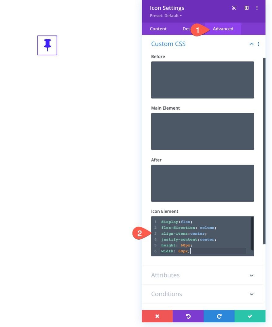
Under the advanced tab, add the follow custom CSS to the Icon Element (like we did previously for the square icon button):
display: flex;
align-items: center;
justify-content: center;
height: 60px;
width: 60px;
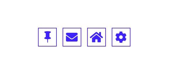
Now whenever we add new icon buttons, they will appear side-by-side. To demonstrate this, let’s duplicate the existing icon button three times to create a total of four icon buttons in the horizontal menu.
After that, we can go back and update the icons as needed.
Here is the result.
It is hard to talk about designing icon buttons without mentioning hover effects. They’re just too much fun to ignore. I won’t bore you with all the possibilities available with Divi’s built-in hover options, but I will mention a few to get those creative juices flowing.
Changing Background Color and Icon Color on Hover
Changing the colors of the button is a popular and effective hover effect. For example, we can change the background color and the icon color simultaneously when the user hovers over the button.
To do this, open the icon module settings and activate the hover options for the background color and choose a different color for the hover state. Then you can do the same for the icon. In this example, we are changing the background color from white to blue as well as changing the icon from blue to white.
Changing Icon on Hover
Another hover effect you might like is changing the icon to a different one altogether. To do this, you can choose a different icon for the hover state when choosing an icon in the icon settings.
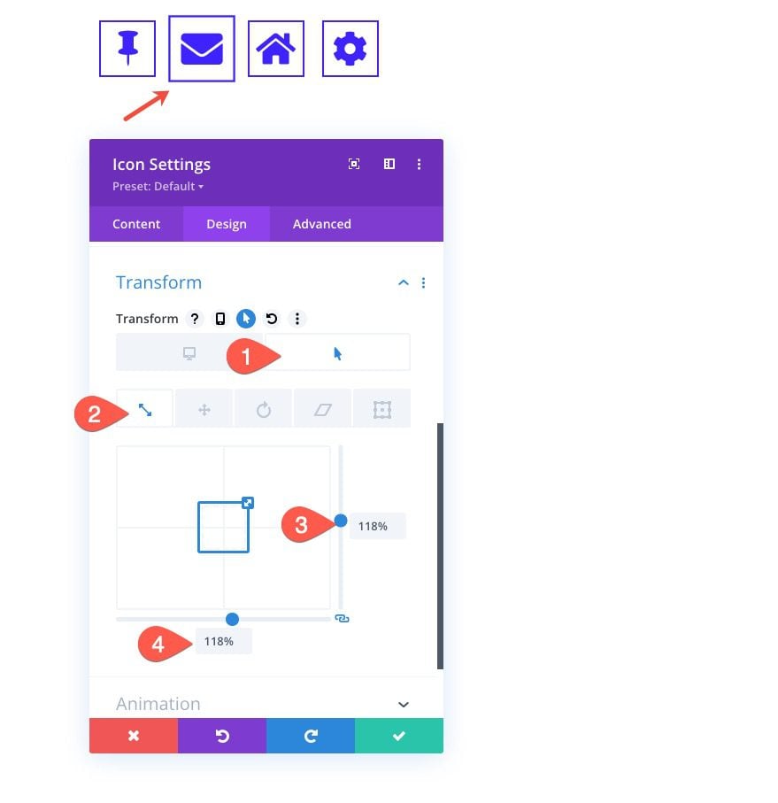
Scale Icon Button on Hover
One hover effect that is hard to ignore is the scaling hover effect. This makes the icon button expand or become larger in size. The best way to add this type of hover effect is to use Divi’s transform options. This will allow the button to grow without affecting the elements surrounding it.
To add a scale hover effect to the icon button, open the icon settings and, under the design tab, find the transform options. Activate the hover options and then assign the following transform scale to the hover state:
- Transform Scale Y: 118%
- Transform Scale X: 118%
This will increase the size of the icon button by 18% when the user hovers over it.
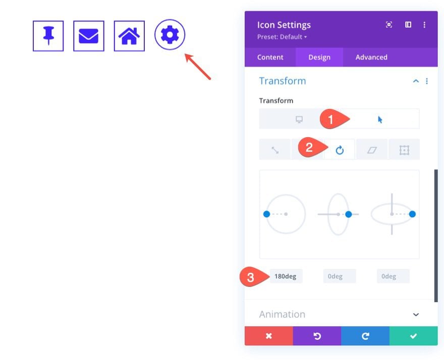
Rotate Icon Button on Hover
Rotating things on hover is always a fun micro-interaction. To rotate an icon button on hover, we can use the transform rotate option. But before that, let’s make the button circular so that only the icon appears to rotate.
To make the icon circular, assuming the button is a square, simply update the rounded corners setting to 50% on all four corners.
Then update the transform options to include a the following transform rotate value in the hover state:
- Transform Rotate Z: 180deg
Let’s take a look at our 4 hover effects in action.
Final Result
Let’s take a look at the final results from our tutorial.
Here are our three icon buttons (standard, square, and circular).
And here is the icon button horizontal menu with hover effects.
Final Thoughts
Knowing how to design icon buttons for a website is essential. And, as we’ve seen in this tutorial, it’s not that hard with Divi. Divi’s icon module has a bunch of built-in options that open the door for creative icon button designs. Hopefully, the techniques from this article will help unlock some of the magic for your own icon button designs.
I look forward to hearing from you in the comments.
Cheers!


Cool ! Can you update the new logo of Patreon, thanks
We’re delighted to hear you find the Icon Module cool. As for the new Patreon logo. Currently, Divi is running Font Awesome version 5. This means that the new Patreon logo, which is available in Font Awesome version 6, isn’t supported yet. However, we’re looking forward to upgrading to version 6 in the future, which will expand the range of available icons, including the latest ones like the new Patreon logo. Stay tuned for updates!
awesome. is it also possible to upload an own svg. i need an imperfect circle 😀
After reading your post, I got an idea of how to optimize icon buttons. Thanks for sharing the article with us.
Awesome!
Ive always had problems with designing icons!!
thank you so much for this useful tutorial <3
Awesome! Glad you liked it, AmirM.
Hello Jason! The tutorial is amazing! !
However, in the text be sure to modify the class of the columns so that it does not the same as the class within the source code.
Thank you for your work.
Greetings!
When it comes to designing any WordPress base website I really prefer elegant themes. As it provides more flexibility and a very simple way to customize templates to suit my needs. These icon settings will definitely use for upcoming projects.
I hate it when a tutuorial goes off the rail right from th beginning.
I downloaded the file, imported to divi library , opened a new page and module and I have no icon module option.
Thanks guys!
Got my hopes up for nothing.
Did you update to Version 4.14.1? I did and I can see the icon module.
Two of the three times I’ve tried to use the new expanded icon selection, I ran into problems because they don’t play nicely with third-party plug-ins. The worst is not knowing if this will be fixed soon or if I should just give up on using Divi icons.
thank you very much for the very interesting tutorial 😉
A question and if we want to add a tooltip to the flyover, case of a menu for example (item with long texts)
Hope to read you