")
Layout Packs provide a fast head start, but they rarely align with your brand out of the box. Swapping colors, fonts, and images across dozens of modules means you’re suddenly an hour deep into work you thought would take ten minutes.
Divi 5’s Inspector streamlines the entire process. Right-click any section, see everything inside it, and edit colors, fonts, and media from one panel. This tutorial walks through rebranding a layout pack landing page using only the Inspector panel.
What Is Divi 5’s Inspector?
The Inspector is a toolbar in Divi 5 (you can also find it using the Inspector icon in the left sidebar) that displays everything happening inside a container.
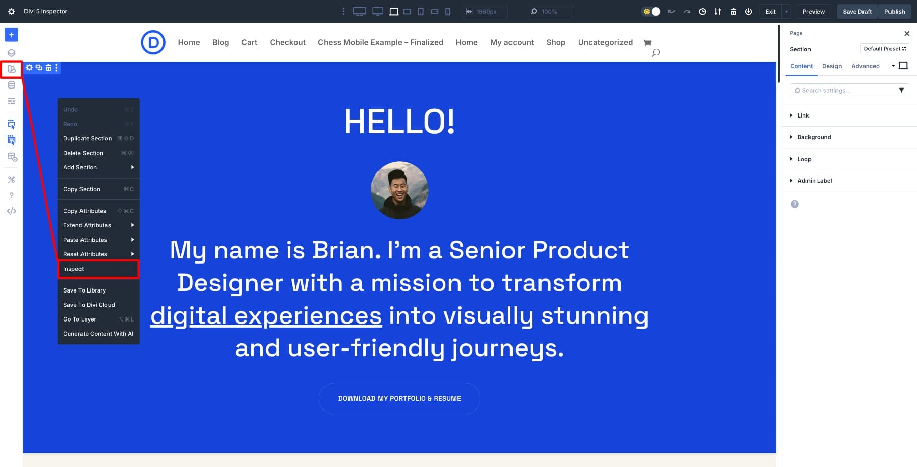
Right-click any section, and a panel opens with a complete breakdown of the design and content inside that element and all its children.
Colors are listed, and fonts appear with their families, weights, and sizes. You’ll also see images and media as thumbnails that you can click to replace. Spacing values, such as padding and margin, are grouped under number values. Even the presets applied to modules show up here. You see everything in one view instead of hunting through individual modules.
The real advantage is bulk editing. When you change a color in the Inspector, every instance of that color within the inspected scope updates at once. The same applies to fonts, images, and spacing. You make one targeted change, and it cascades through everything in view.
You can close the Inspector, right-click a different section, and inspect that one next. You can also navigate the page and inspect new elements as you move. Each time you inspect something new, the panel updates to show exactly what styles are used in that area, so you can edit what you see without guessing.
Notice the setting options in the Inspector panel changing as we switch between elements? This is how you audit a layout and fix it from one place.
Learn Everything About Divi 5’s Inspector
How The Inspector Helps Customize Layouts Faster
The Inspector works great when combined with Divi 5’s other features. Inspect a section to see what’s being used, then edit those styles using Design Variables or Option Group Presets. This way, your changes aren’t just isolated to one section; they become part of a reusable system.
For example, when you swap a color in the Inspector and save it as a Design Variable, that color becomes available across your entire site. Apply an Option Group Preset to standardize button styles, and the Inspector will show you exactly where those presets are being used, allowing you to adjust them in bulk. The first page you customize establishes your brand system. Every page after that goes faster because you’re working with variables and presets you’ve already defined, not starting from scratch each time.
How To Customize Layout Styles
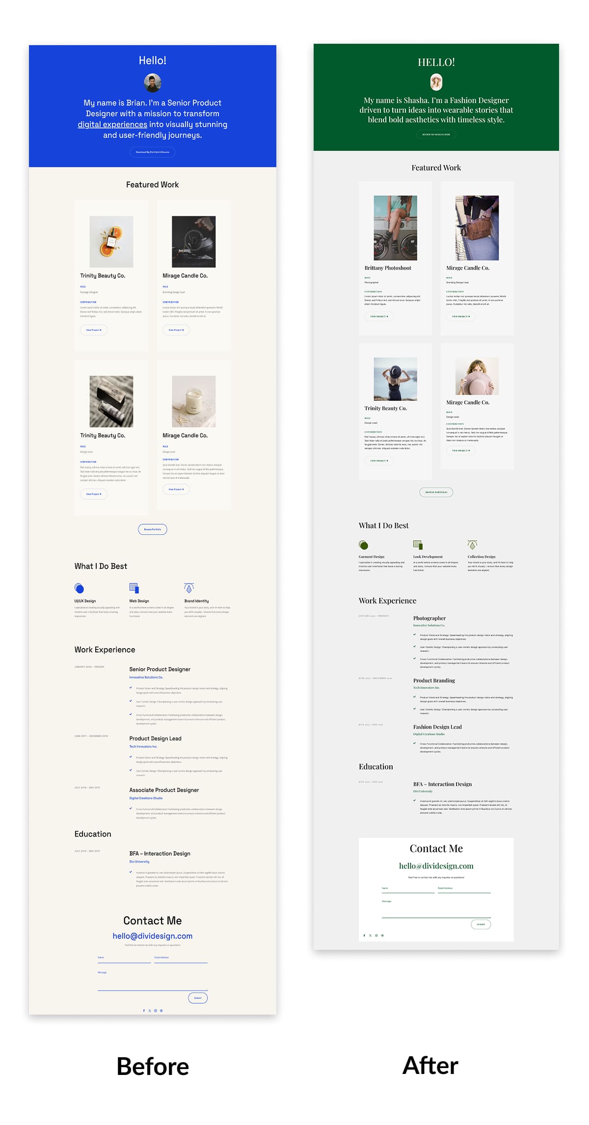
Now that you know how the Inspector works, let’s use it to rebrand a layout pack landing page. For this example, we’ll work with the Design Portfolio layout pack page that uses default colors, fonts, and images straight out of the box.
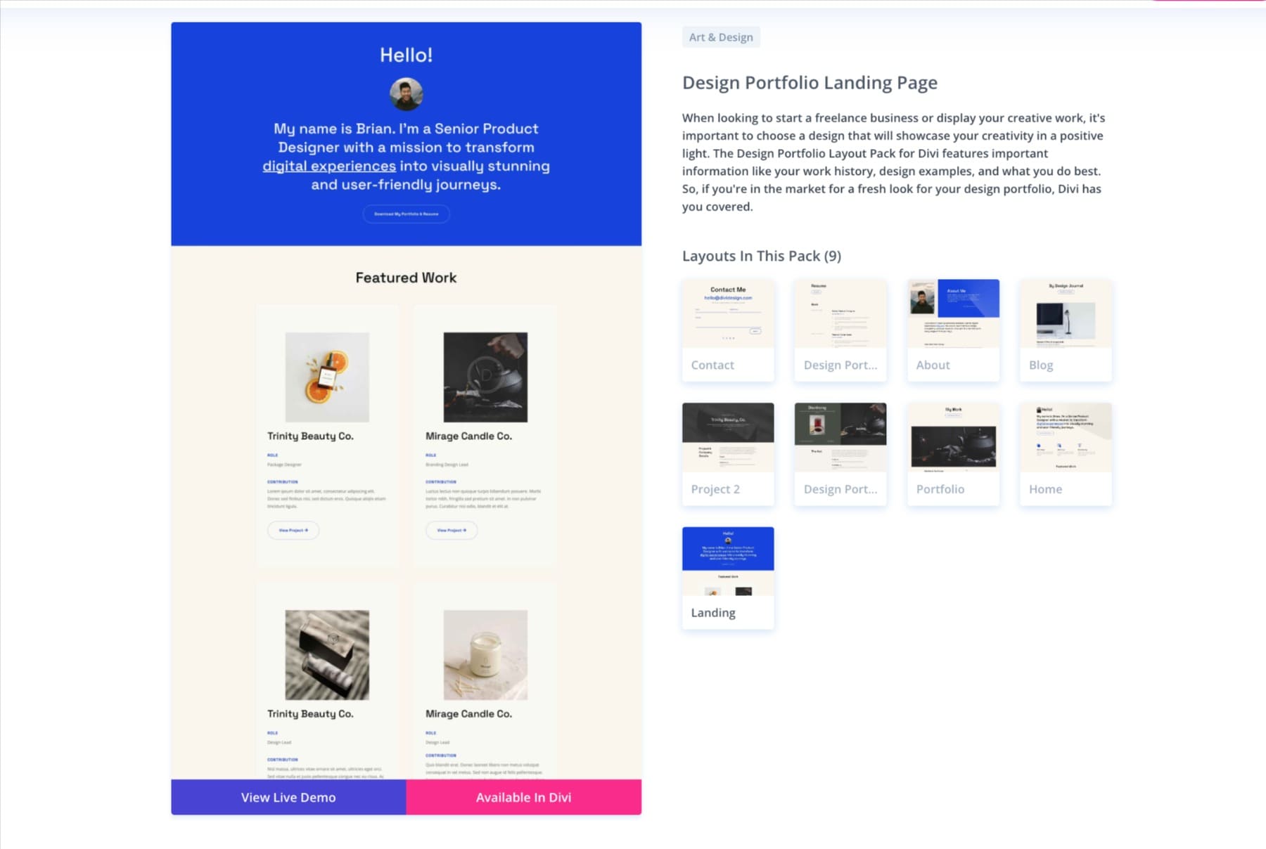
The landing page features a hero section, several body sections with key features, and a footer. Everything is styled with the pack’s original design. We’ll inspect section by section, swap the styles for our brand, and observe the changes cascade through all the child modules without needing to open them individually. Here’s the step-by-step process.
1. Audit The Page First
Before editing, spend a minute scanning the layout to ensure it is accurate. The goal is to understand what the original design is built on: its color palette, fonts, and repeated visual patterns. Without the Inspector, this would require manually checking every module to adjust settings. With it, you get a complete inventory in seconds.
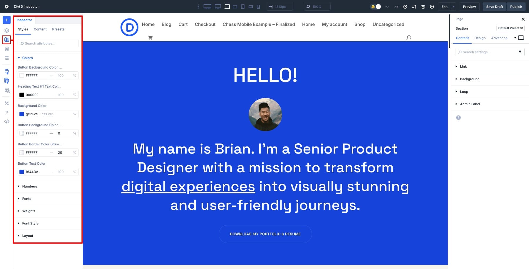
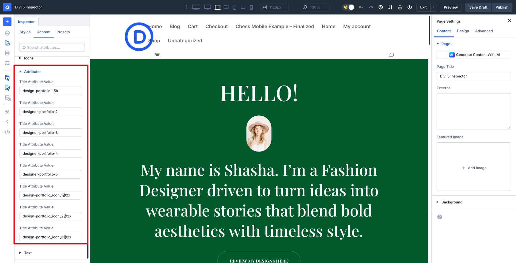
Start with the hero section and open the Inspector. At the top of the panel, you’ll see tabs (Styles, Content, & Presets) further divided into Colors, Fonts, Weights, Content, Numbers, and more. Each tab gives you a different perspective on what’s actually being used in that section and its child modules.
To audit quickly, you need to switch between tabs. Here’s how:
Colors
This tab lists every color actively used in the inspected scope, displayed as swatches with their corresponding hex codes. You’ll see the main accent color on buttons, the background color behind text blocks, and any overlay tints on images.
If the same hex appears multiple times across different modules, it’s only shown once. That’s useful because you can change it once and update every instance simultaneously. Hovering over a color shows all the instances where it’s used.
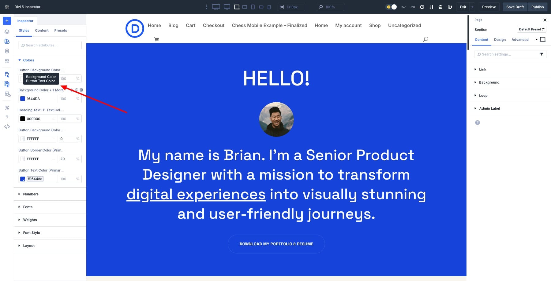
Look for the primary accent color. In this case, it’s #1644DA.
Fonts
This tab shows all the fonts used in the inspected area. Here, we can see that Space Grotesk is used in all headings.
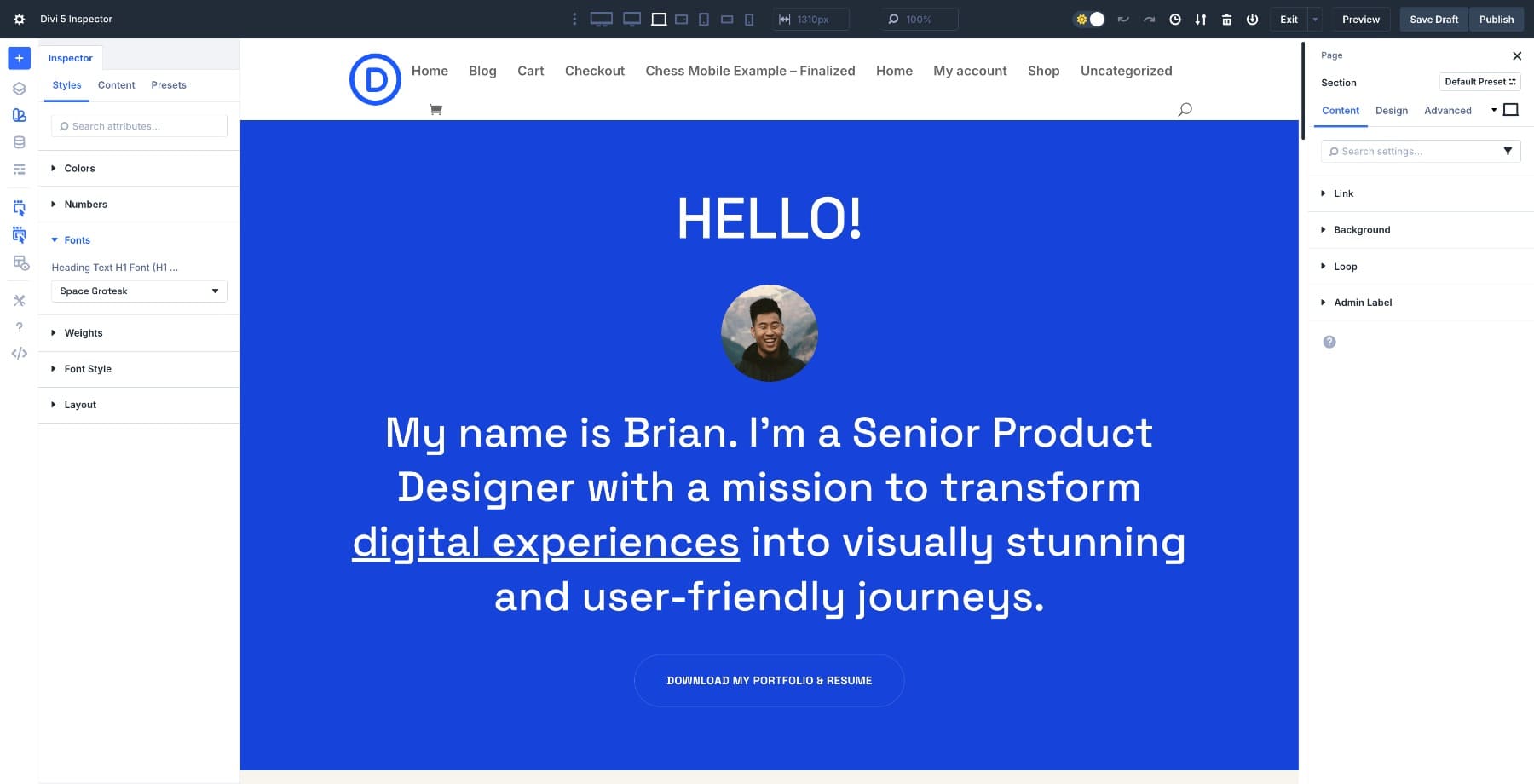
Similarly, switch to Numbers, Weights, and Font Style to audit the current font styles. For example, all the headings use medium weights, but buttons use bold weights. Then switch to the Content tab, where you’ll find Media, Text, and Attributes columns with currently used elements.
This audit gives you a clear picture of what you’re working with. You’ll know which colors to replace, which fonts to swap, and which images need updating. It also shows you the scope of your edits. You’re ready to start editing once you’ve reviewed what’s listed.
2. Rebrand The Hero Section
Now that you’ve audited the hero section, it’s time to customize it. We’ll swap the accent color, replace the hero image, update the heading font, and edit placeholder content, all from the Inspector panel.
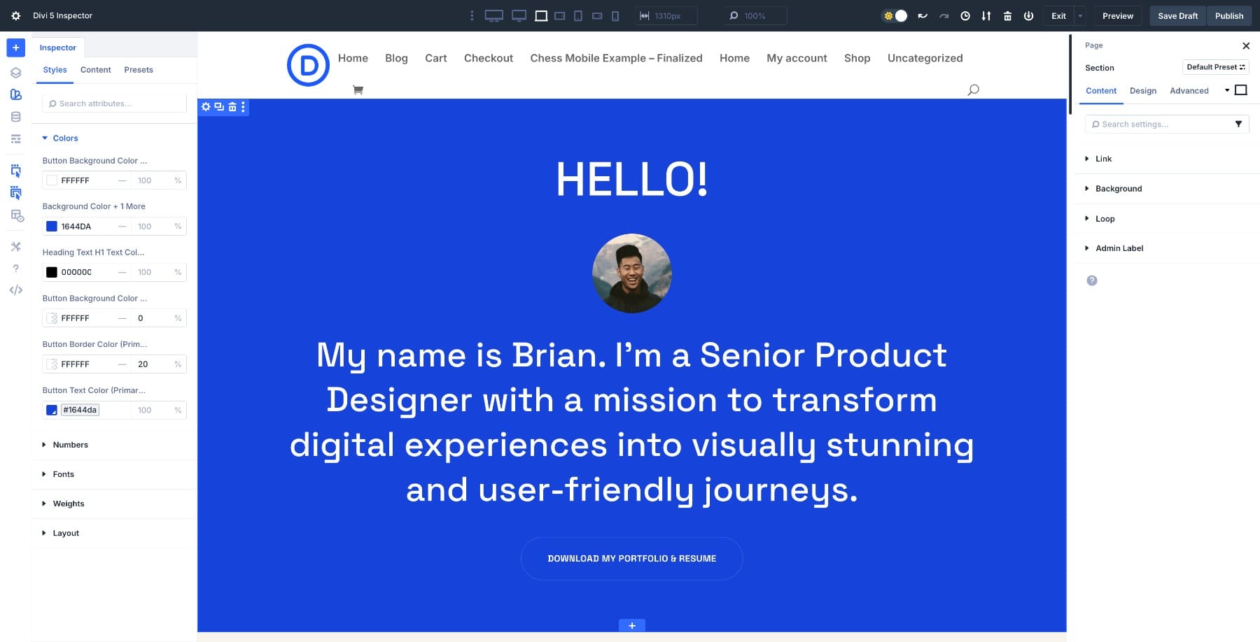
Change The Accent Color
In the Colors tab, the dominant accent color is #1644DA, which is used consistently across buttons, icons, and headings. Click the color swatch. A color picker opens. Enter your brand’s hex code or choose a new color visually.
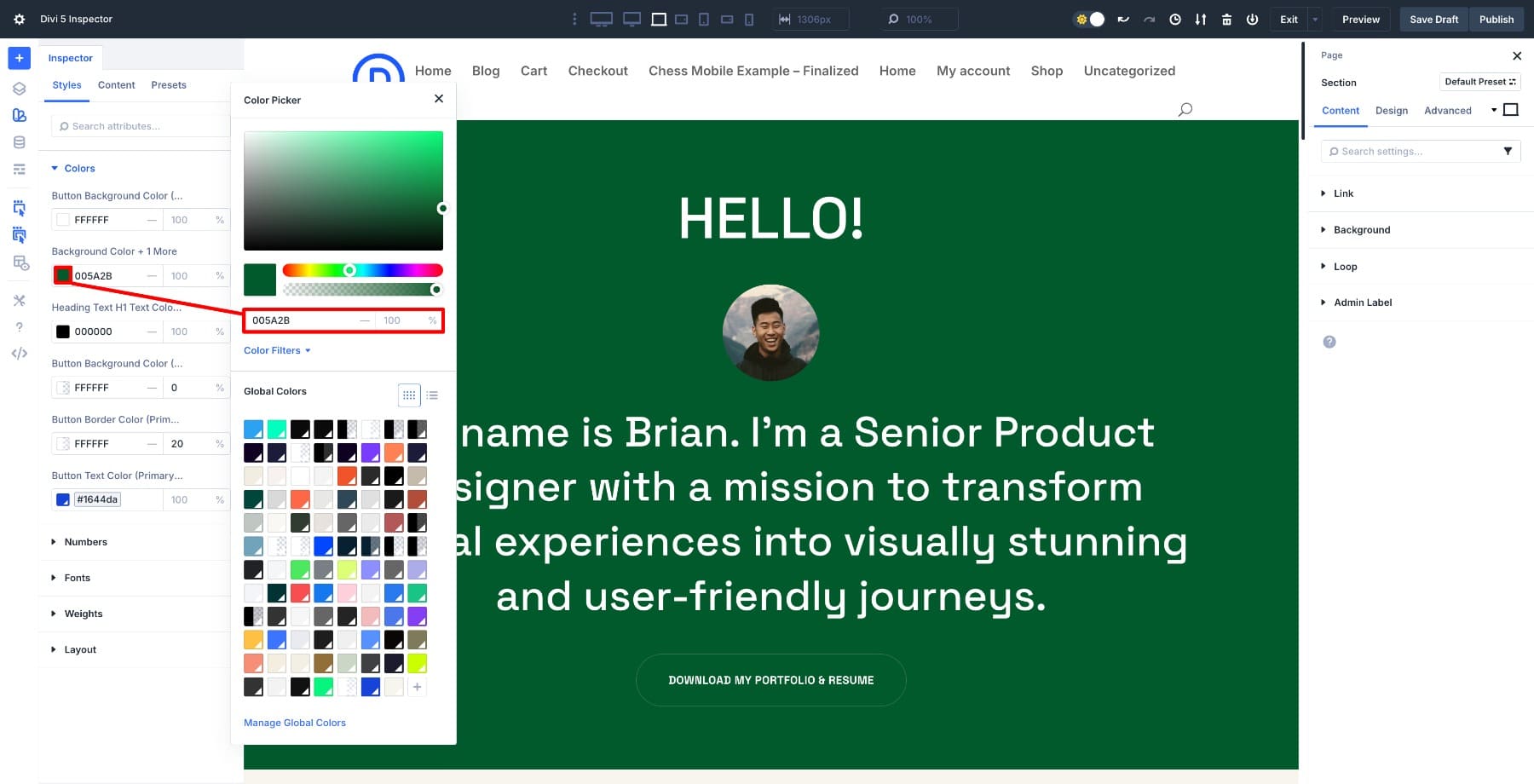
As soon as you apply the change, every instance of that color in the hero section updates instantly.
Modify Font Styles
In the Styles tab, click into Fonts. Find the heading font. Click the font name, and a dropdown appears with all available fonts. Select your brand’s heading font.
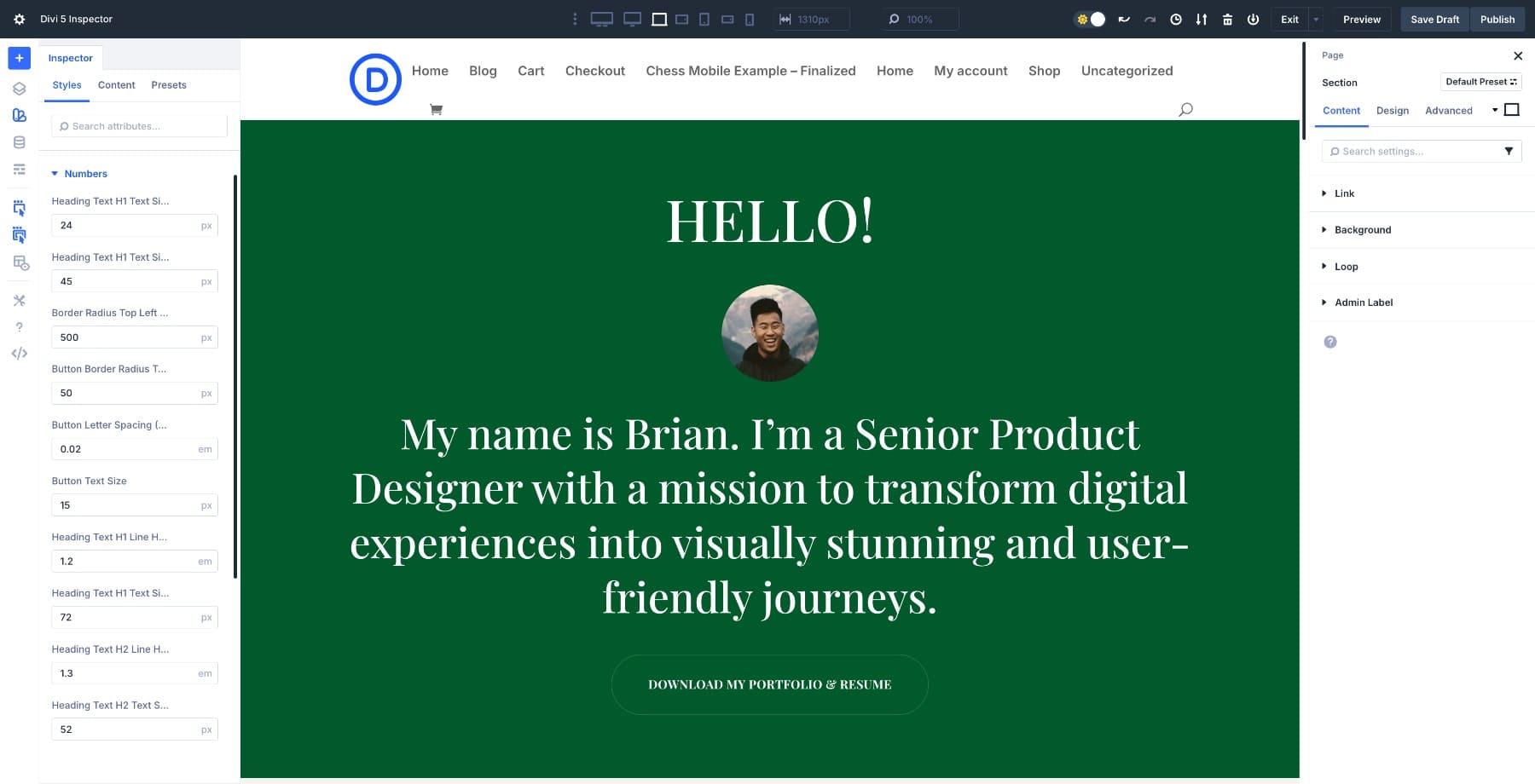
Notice how we changed the font once and updated all its instances (in H1, H2, and the button)? Next, we increased the button text size in the Numbers column and modified the font weight in the Weights column.
Replace Content
Switch to the Content tab, then click in the Media column. The hero image will appear as a thumbnail. Click it, and the media library will open. You can upload your branded image or select one from your library.
Under the Text column, you’ll see all the text content for headings, subheadings, and buttons used in the hero section. You can type or paste your new content directly from here.
Your hero section is now branded. Follow the same workflow in the next sections.
3. Move Section By Section
Once the hero is done, close the Inspector and move down the page. Right-click the next section and inspect it. You’ll see a new set of colors, fonts, and media specific to that section. Work from top to bottom so your edits stay organized and intentional.
Each section might use slightly different styles, but the Inspector shows you exactly what’s there before you change anything. This keeps your workflow clean and prevents you from missing rogue styles buried in nested modules.
As you move through the page, you’ll start to notice patterns. Some sections might already reflect changes you made earlier because styles cascaded down from parent elements. For example, when I updated the hero section’s heading color, the footer also reflected those new colors.
Other sections might introduce a new accent color or font variation that wasn’t in the hero. When you spot something unexpected, check if it’s intentional (like a callout box meant to stand out) or just an inconsistency from the original layout pack. The Inspector makes these differences visible before you accidentally overwrite something that should stay unique.
The first two or three sections take the most time because you’re still learning what the layout uses. After that, the work speeds up. You’ll recognize which styles repeat, which ones are outliers, and where you can make bulk changes confidently.
4. Replace Stock Media And Content
As you move through the page, you’ll encounter placeholder images and generic copy. The Content tab in the Inspector allows you to swap between them without opening individual modules. Click any image thumbnail in the Media column to replace it with one from the Media Library.
Click any text block in the Text column to edit headlines, CTAs, or body copy inline. This is especially useful in sections with repeating content patterns, such as feature grids or testimonial blocks, where you’d otherwise have to open the same module type repeatedly.
Additionally, utilize the Attributes column to enhance the usability of your pages.
By the time you reach the footer, most of your brand styles are already in place, and many of the colors and fonts you changed earlier will have carried over. Inspect the footer to review what’s left. Look for any lingering placeholder text in copyright lines, menu links, default social media icons, or logos that still need to be swapped.
Make those final adjustments, then step back and review the full page. Scan for any inconsistencies you might have missed before you wrap up the rebrand.
Pro Tip: Save Your Design Variables
While you change colors and fonts in the Inspector, save them as Design Variables instead of using static values. This creates a design framework that makes replicating styles to other pages almost instant. Values saved as global variables become part of a reusable system that appears across your entire site.
Go to the Variable Manager icon and choose Colors. Scroll down to Add Global Color and save your color as a variable.
You can save fonts, numbers, links, text, and other variables for global access the same way. Once saved, these variables form a framework you can apply to any page in your layout pack.
Now, open another page from the same layout pack (such as the About page). Inspect the hero section, click a color, and select your saved variable from the dropdown instead of entering a new hex code.
The color updates instantly match your brand. Repeat this for fonts and other styles. You’re not re-customizing from scratch. You’re applying a design system you already built on the first page. This keeps your layout pack consistent and cuts your workflow time in half.
Try Divi 5’s Inspector Today
The Inspector in Divi 5 changes how you customize layout packs. Audit a section to see what’s being used, make your edits from one panel, and watch those changes ripple through every module inside it. The first page takes some time because you’re establishing your brand system.
Once those styles are saved as Design Variables, the remaining pages take a fraction of the time. Try the Inspector workflow on your next layout pack and watch how quickly it comes together.


Are layout packs DIVI 5 compatible?
They can be migrated to Divi 5 (if they aren’t already). However, D4 layouts do not use D5 features. So, using the inspector like this can help spruce up older layouts so they can use new features (like Design Variables, Advanced CSS units, Grid/Flex layouts, HSL colors).