
Divi’s new column structures have undeniably added a ton more built-in design possibilities to Divi. To show you how unique you can get with Divi and its versatile column structures, we’re going to show you how to create a unique “our process” section using Divi’s built-in options only. On top of that, we’ll also add a subtle hover effect that appears when hovering one of the steps in the process. These sections are great for explaining how you do what you do to your clients or prospective clients.
Let’s get to it!
- 1 Preview
-
2
Add New Section
- 2.1 Background Color
- 2.2 Spacing
- 2.3 Visibility
- 2.4 Add Row #1
- 2.5 Clone Row #1 Twice
- 2.6 Add Blurb Module to First Colum of Row #1
- 2.7 Clone Blurb Module & Place in Uneven Columns (Both Row #1 & #3)
- 2.8 Add Horizontal Divider to Second Column of Row #1
- 2.9 Clone Horizontal Divider & Place in Even Columns (Both Row #1 & #3)
- 2.10 Add Vertical Divider to First Column of Row #2
- 2.11 Clone Vertical Divider & Place Duplicate in Column 5 of Row #2
- 2.12 Add Title Text Module to Column 3 of Row #2
- 3 Create Alternative for Tablet & Phone
- 4 Preview
- 5 Final Thoughts
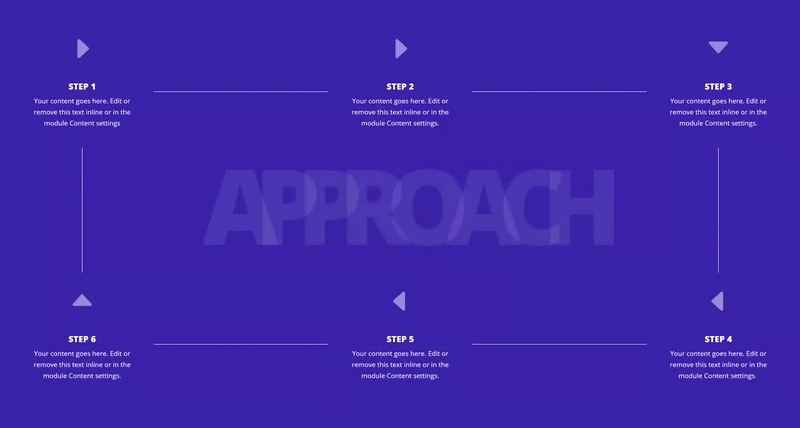
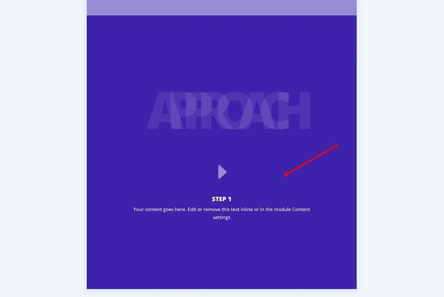
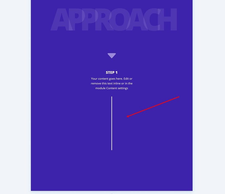
Preview
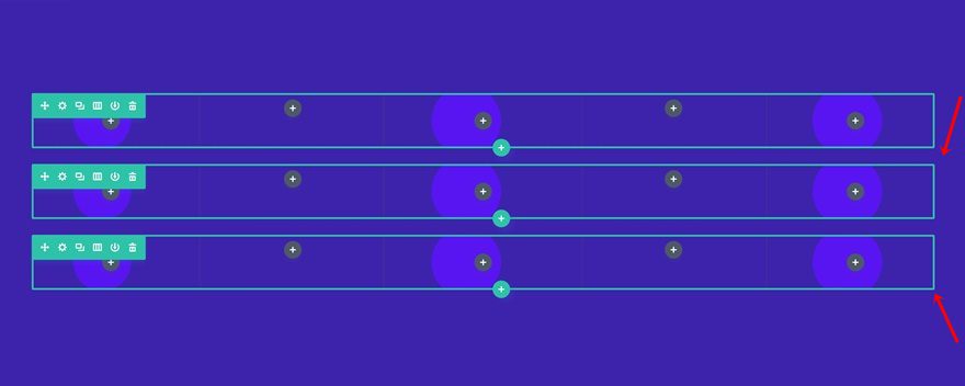
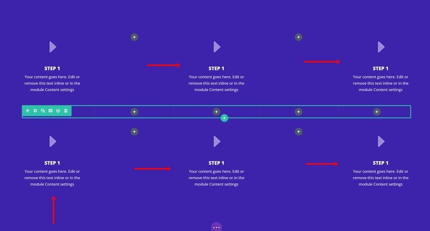
Before we dive into the tutorial, let’s take a look at the outcome you can expect from this tutorial.
Add New Section
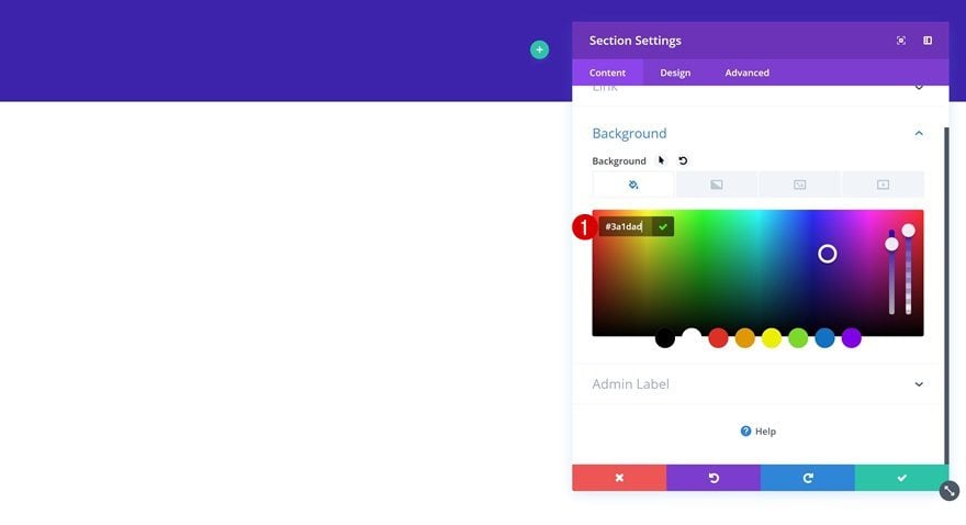
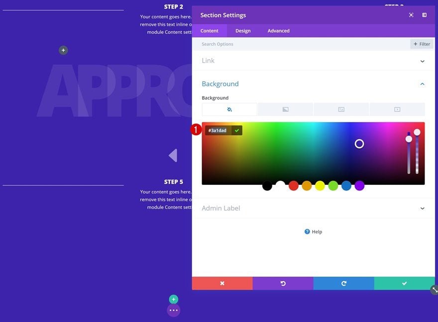
Background Color
Add a standard section to a new or existing page and use the following background color for it:
- Background Color: #3a1dad
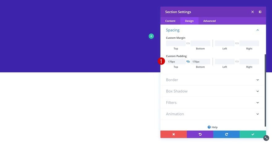
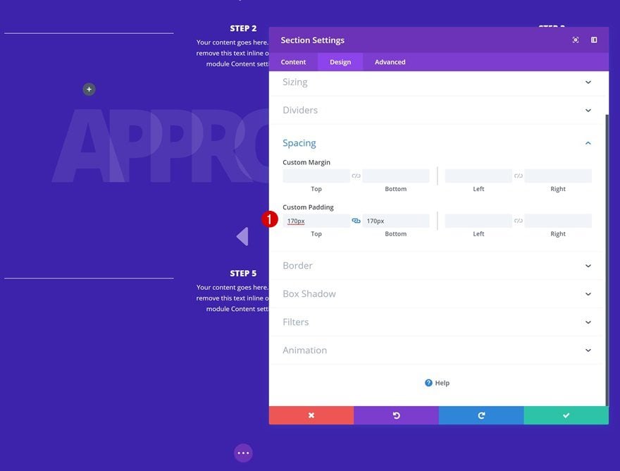
Spacing
Go to the spacing settings next and add some custom top and bottom padding.
- Top Padding: 170px
- Bottom Padding: 170px
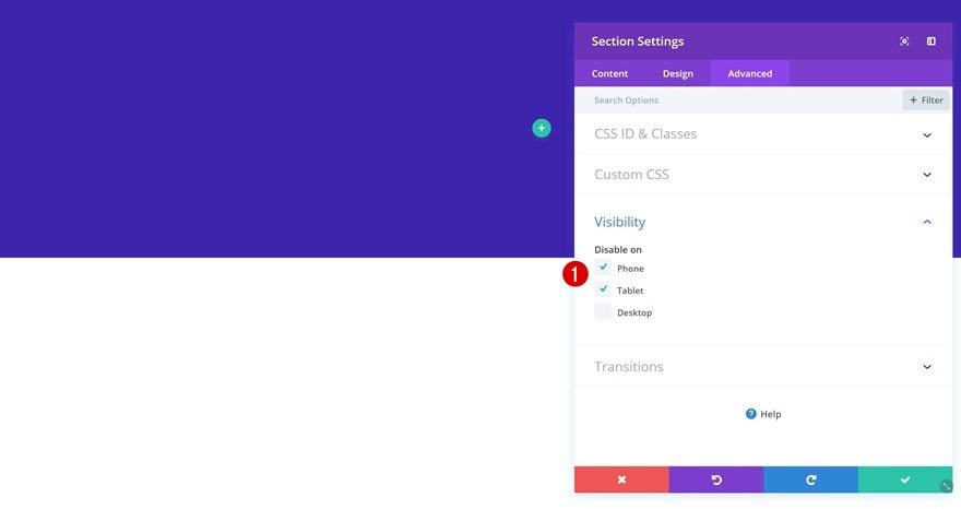
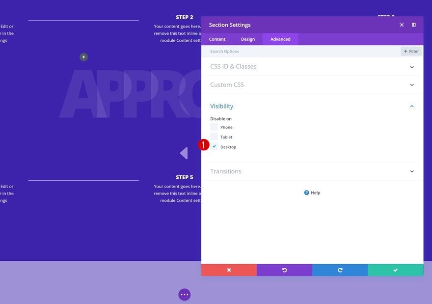
Visibility
We’re creating an alternative on smaller screen sizes but we’ll start off creating the desktop version. That’s why were disabling this section on phone and tablet in the visibility settings.
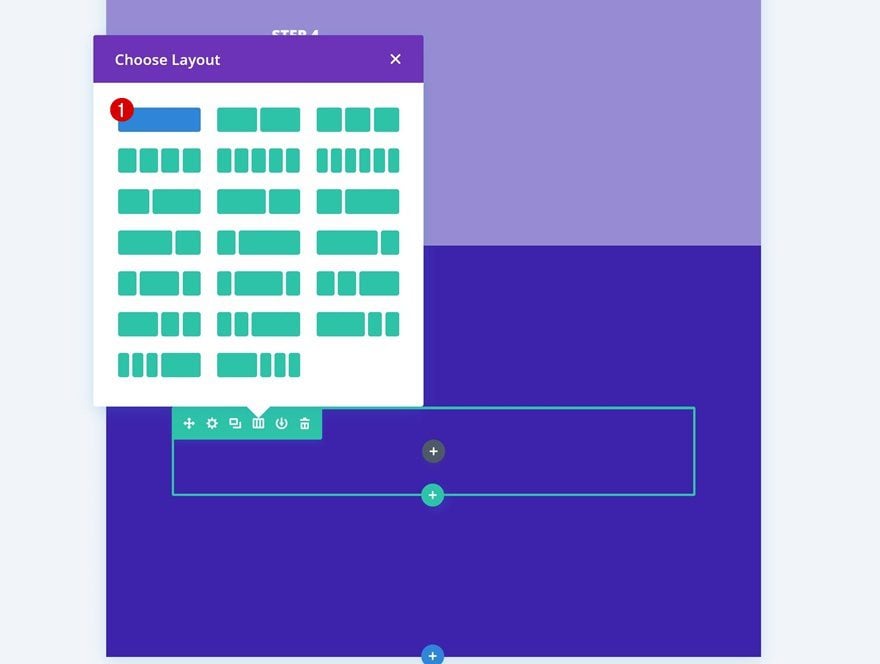
Add Row #1
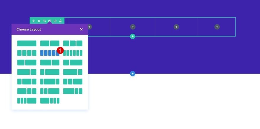
Column Structure
Once you’re done modifying the section settings, continue by adding a new row using the following column structure:
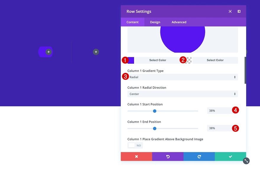
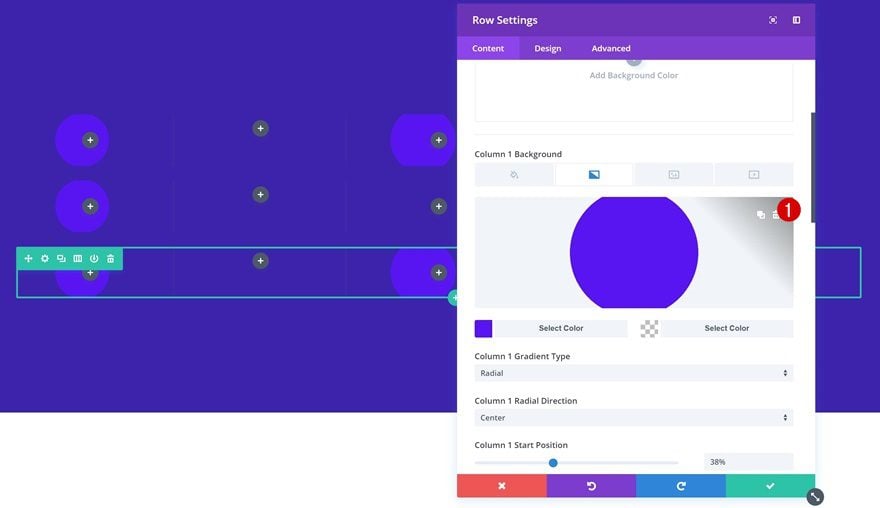
Add Gradient Background to Column 1, 3 & 5
To create a nice hover effect, we’re going to add a gradient background to column 1, 3 & 5. These are the columns that’ll each hold a process step. We’ll use the two remaining columns to connect the steps to one another. Each one of the three columns we mentioned will need the same gradient background:
- Color 1: #580cf2
- Color 2: rgba(41,196,169,0)
- Column 1 Gradient Type: Radial
- Column 1 Start Position: 38%
- Column 1 End Position: 38%
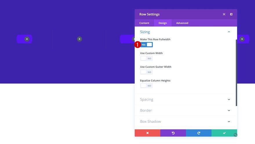
Sizing
Once you’re done adding the gradient backgrounds, go to the sizing settings and enable the fullwidth option.
- Make This Row Fullwidth: Yes
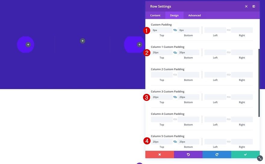
Spacing
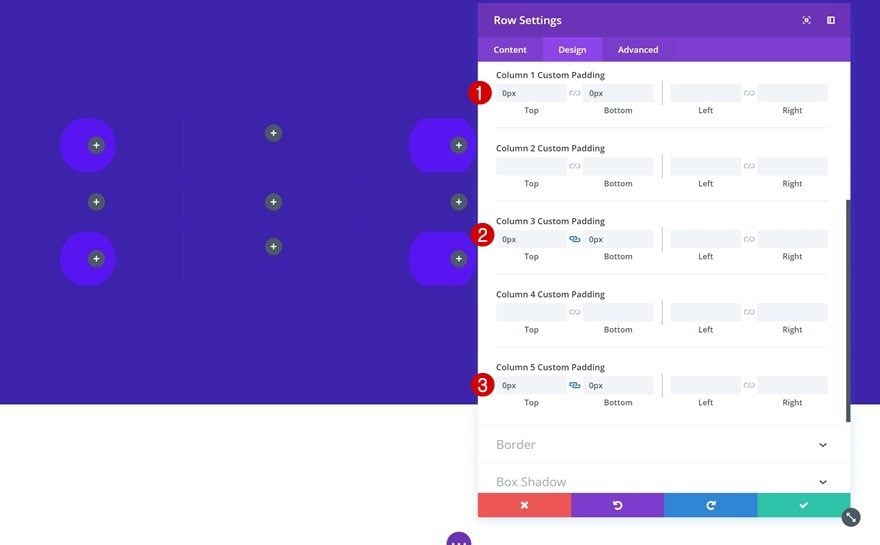
We’ll also need some custom padding values for the entire row and the column that are dedicated to holding process steps.
- Top Padding: 0px
- Bottom Padding: 0px
- Column 1 Top Padding: 20px
- Column 1 Bottom Padding: 20px
- Column 3 Top Padding: 20px
- Column 3 Bottom Padding: 20px
- Column 5 Top Padding: 20px
- Column 5 Bottom Padding: 20px
Clone Row #1 Twice
Before adding any modules, we’re going to clone the row twice. This will help us save time in the upcoming steps.
Modify First Duplicate
Remove Column Gradient Backgrounds
Open the second row in your section (the first duplicate) and remove all the column gradient backgrounds that have been applied to it. We won’t be needing those since the second row will not hold any process steps, only a title and vertical dividers that’ll connect the steps.
Remove Column Spacing
Likewise, remove all the column custom padding that has been applied to column 1, 3 & 5.
- Top Padding: 0px
- Bottom Padding: 0px
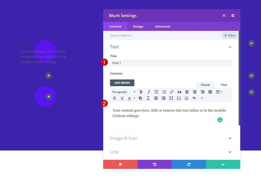
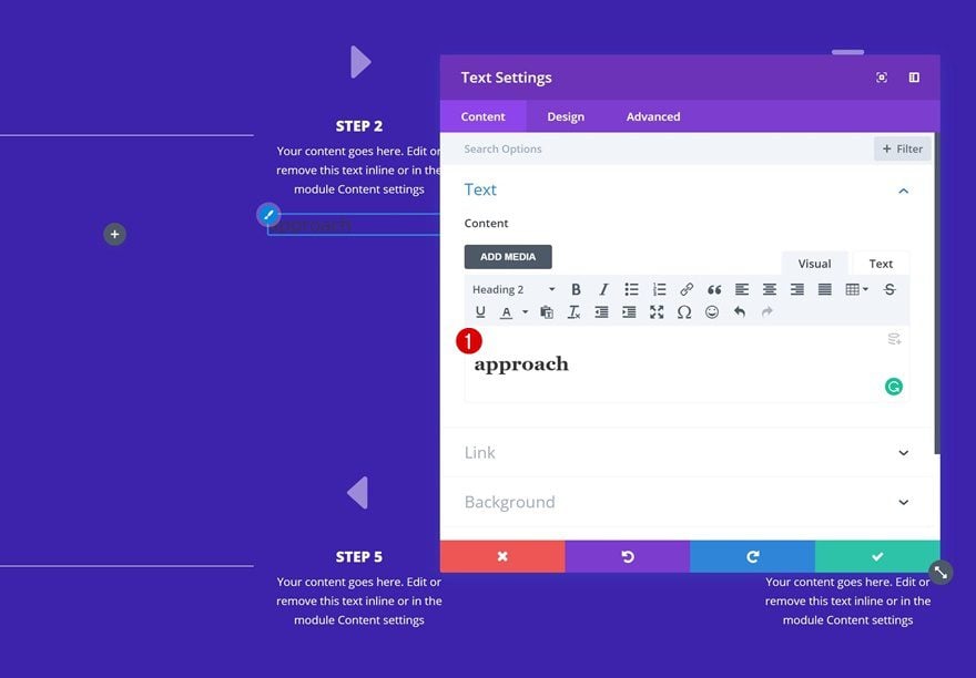
Add Blurb Module to First Colum of Row #1
Add Content
Time to start adding the modules! We’ll start with a Blurb Module in column 1 of the first row. This Blurb Module will hold the content of our first step so go ahead and add some text of your choice.
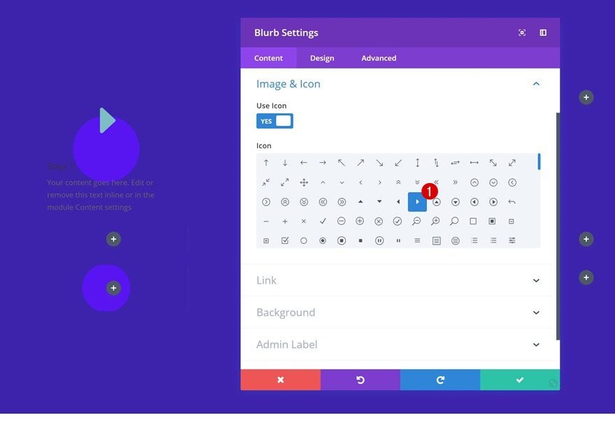
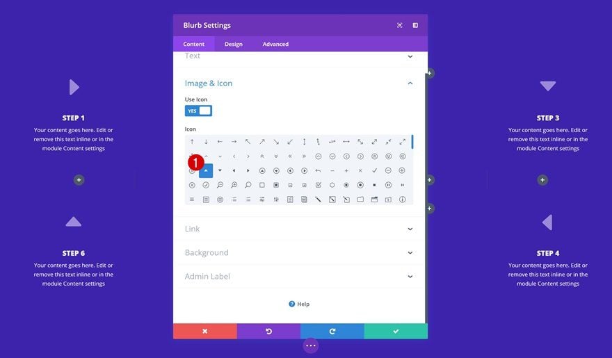
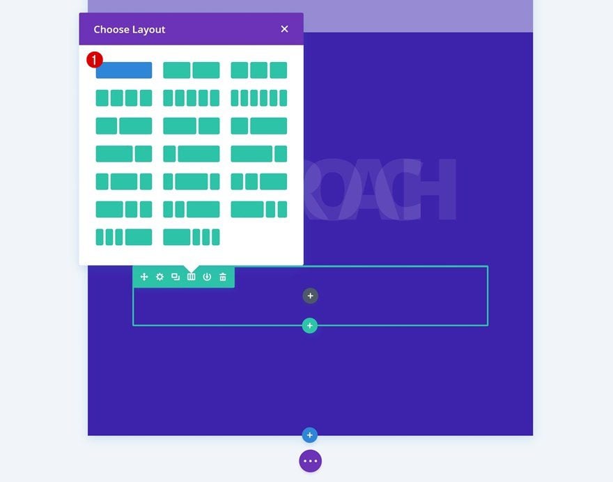
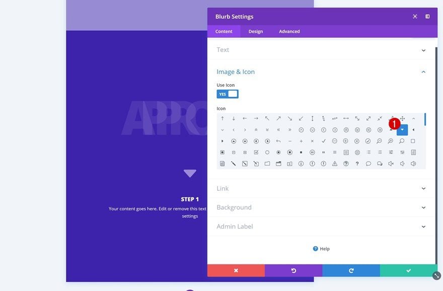
Choose Icon
We’re also using the following icon that’ll indicate where to look for the next step:
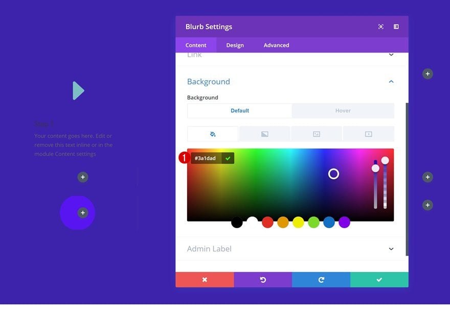
Default Background Color
Then, add a default background color to the Blurb Module. This background color is the same as the one we’ve used for the section. It hides the column gradient background we’ve added in the previous part of this tutorial.
- Background Color: #3a1dad
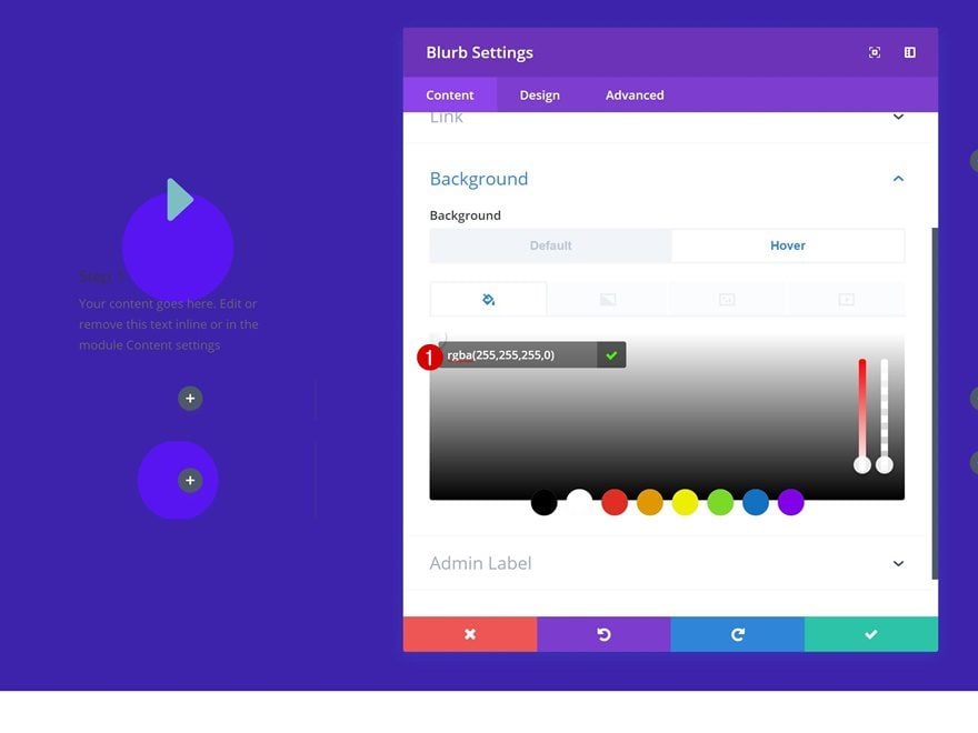
Hover Background Color
However, we want the column gradient background to show up on hover. That’s why we’re changing the background color on hover to a completely transparent one.
- Background Color: rgba(255,255,255,0)
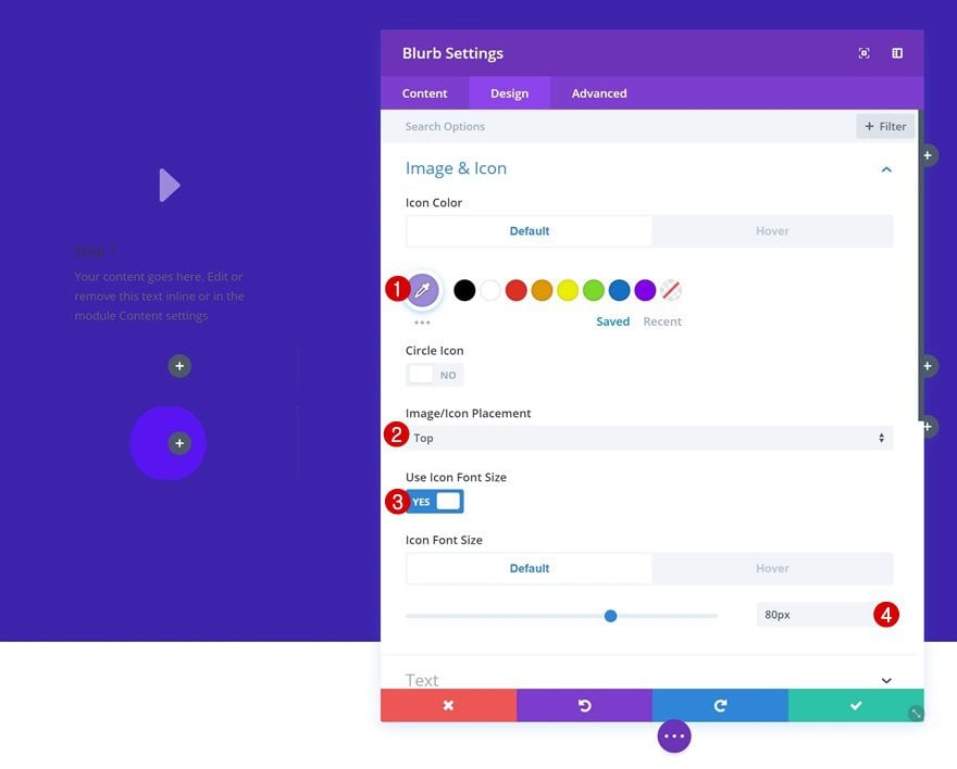
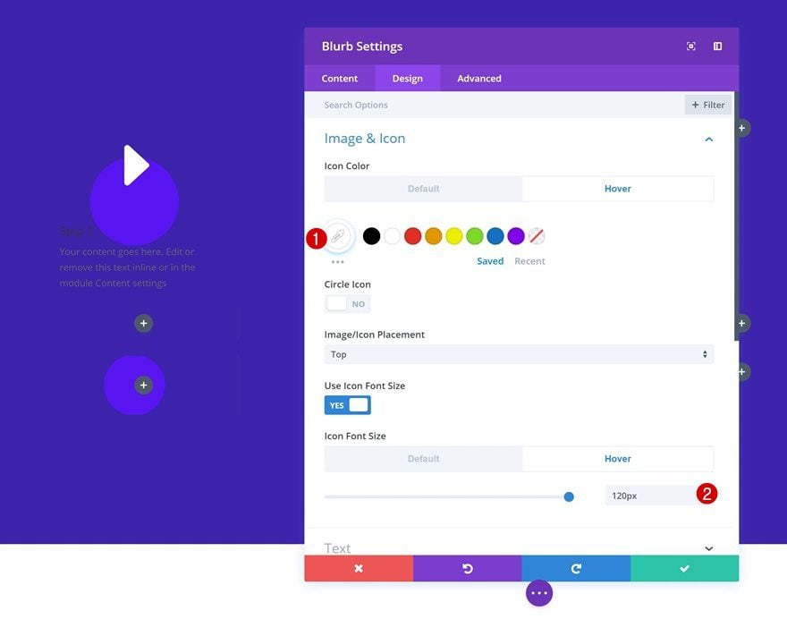
Default Icon Settings
Continue by going to the icon settings and making some changes.
- Icon Color: #9d8ad8
- Icon Placement: Top
- Use Icon Font Size: Yes
- Icon Font Size: 80px
Hover Icon Settings
Apply a different icon color and font size on hover.
- Icon Color: #ffffff
- Icon Font Size: 120px
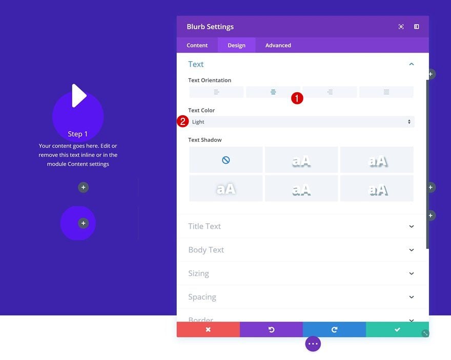
Text Settings
Next, go to the text settings and make some changes.
- Text Orientation: Center
- Text Color: Light
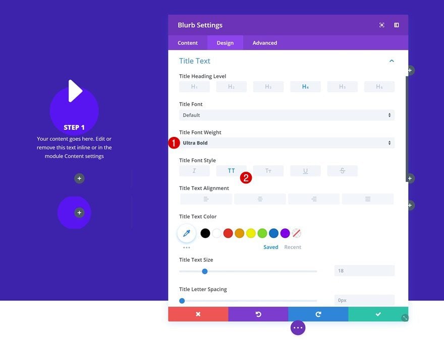
Title Text Settings
The title text settings need to be modified as well.
- Title Font Weight: Ultra Bold
- Title Font Style: Uppercase
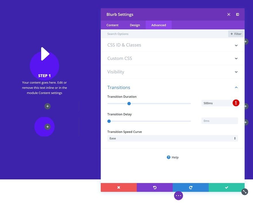
Transitions
To create a smooth transition, we’ll increase the transition duration.
- Transition Duration: 500ms
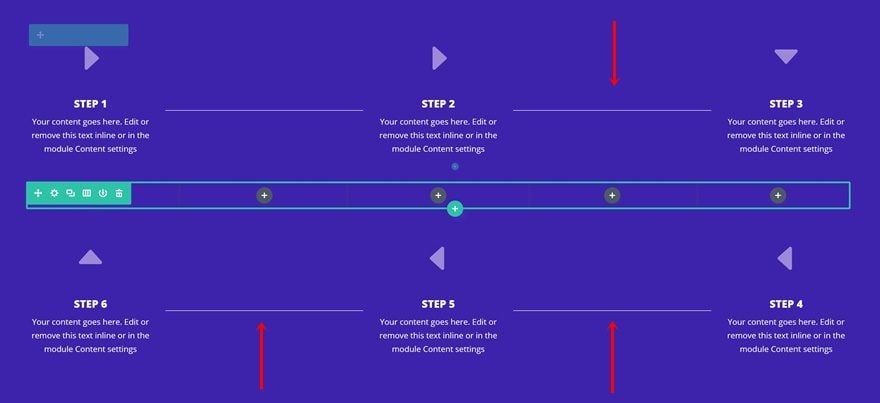
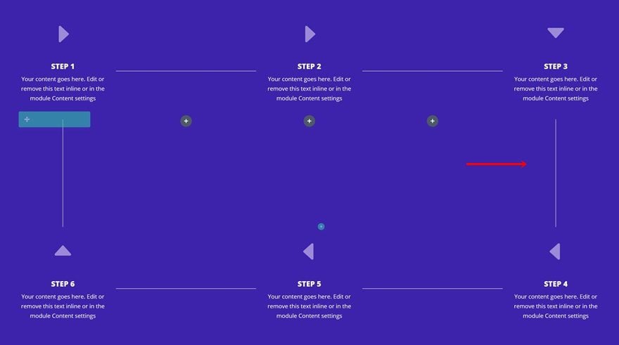
Clone Blurb Module & Place in Uneven Columns (Both Row #1 & #3)
Now that we’ve created the first Blurb Module step, we can clone it 5 times and place the duplicates in the columns marked in the print screen below.
Change Content & Icon of Each Duplicate
Of course, you’ll have to change the content of each one of the duplicates along with the icon to make sure the process is making sense.
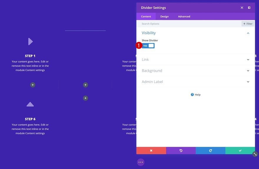
Add Horizontal Divider to Second Column of Row #1
Visibility
The second module we’ll need to add is a Divider Module. We’re using this module to connect all Blurb Module steps to one another. Go ahead and add one to the second column of the first row.
- Show Divider: Yes
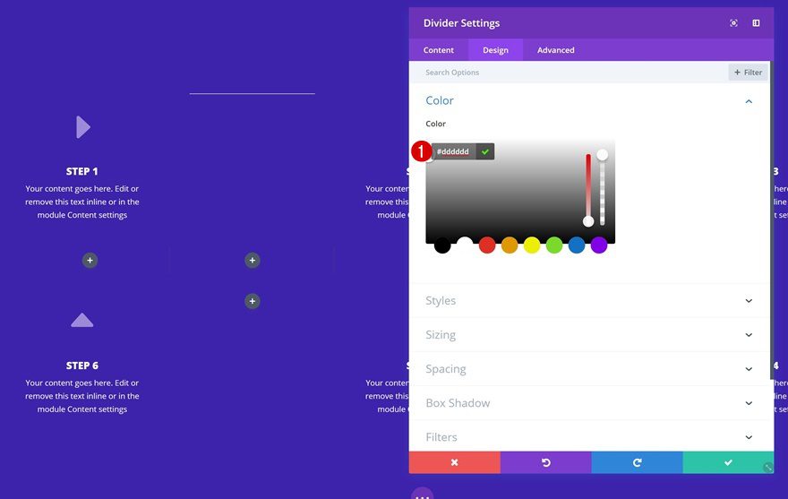
Divider Color
Change the divider color next.
- Color: #dddddd
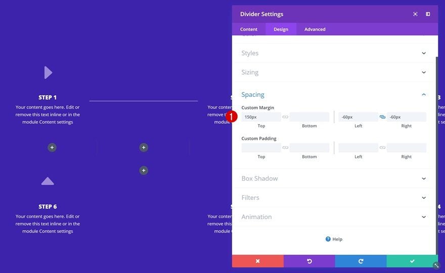
Spacing
To align the Divider Module vertically, we’ll use some top margin. We’ll also increase the width of the module by using some negative left and right margin.
- Top Margin: 150px
- Left Margin: -60px
- Right: -60px
Clone Horizontal Divider & Place in Even Columns (Both Row #1 & #3)
Clone the Divider Module and place it in the columns that are marked in the print screen below:
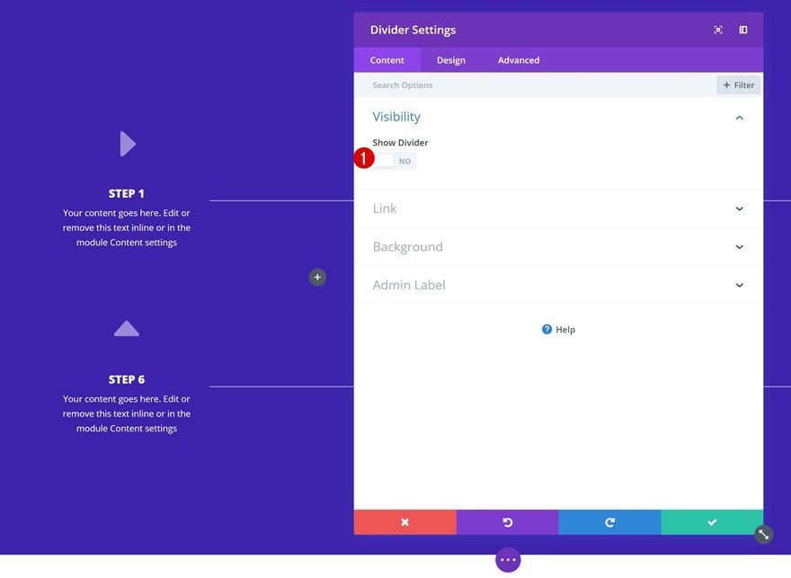
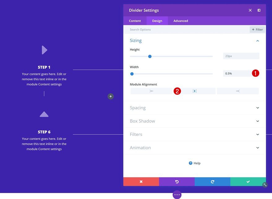
Add Vertical Divider to First Column of Row #2
Visibility
We’ll need a vertical divider as well. To create one, we’ll add a new Divider Module to column 1 of the second row but we’ll make sure the ‘Show Divider’ option is disabled.
- Show Divider: No
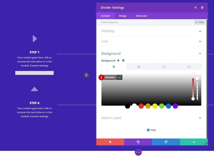
Background Color
Add a background color to the module next.
- Background Color: #dddddd
Sizing
And change the Sizing settings next. Once you do, you’ll notice a vertical divider fall into place.
- Width: 0.5%
- Module Alignment: Center
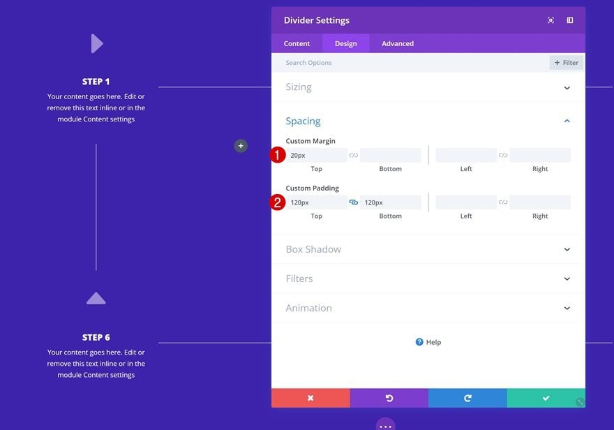
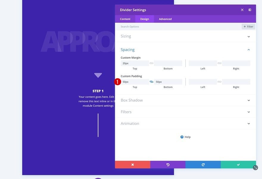
Spacing
To increase the height of the vertical divider, we’ll use some custom spacing values.
- Top Margin: 20px
- Top Padding: 120px
- Bottom Padding: 120px
Clone Vertical Divider & Place Duplicate in Column 5 of Row #2
Clone the vertical divider you’ve created and place it in the last column of the second row.
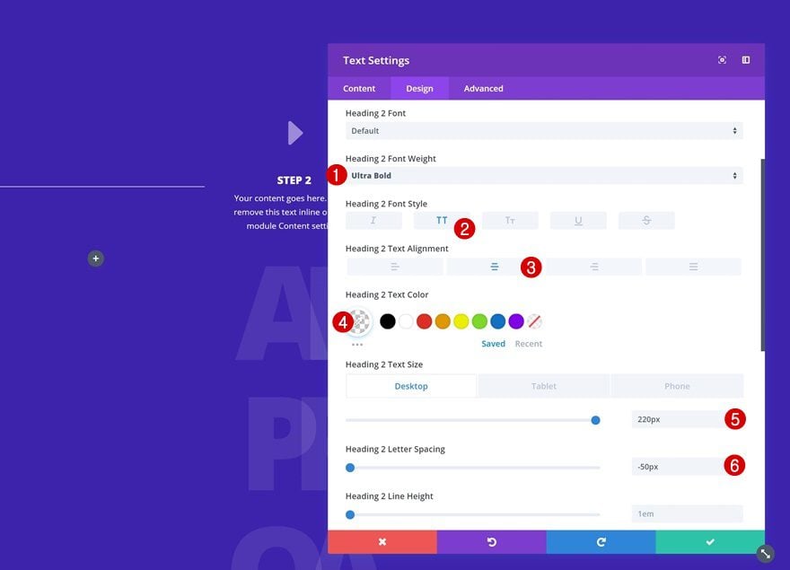
Add Title Text Module to Column 3 of Row #2
Add Content
The last module we’ll need is a title Text Module. Add this module to the third column of the second row with some content of choice.
Heading Text Settings
Go to heading text settings and make some changes to the appearance of your title.
- Heading 2 Font Weight: Ultra Bold
- Heading 2 Text Alignment: Center
- Heading 2 Text Color: rgba(255,255,255,0.09)
- Heading 2 Text Size: 220px (Desktop), 150px (Tablet), 100px (Phone)
- Heading 2 Letter Spacing: -50px (Desktop), -30px (Tablet), -25px (Phone)
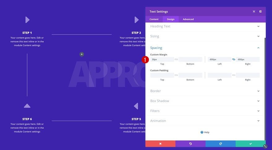
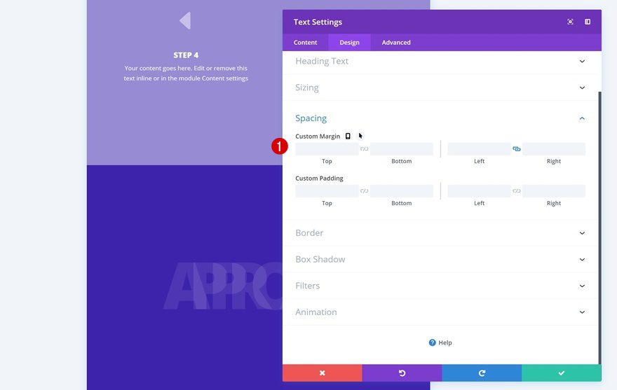
Spacing
Lastly, add some custom spacing values to allow the title Text Module to fall into place.
- Top Margin: 30px
- Left Margin: -800px
- Right Margin: -800px
Create Alternative for Tablet & Phone
Add New Section
Background Color
As mentioned at the beginning of this post, we’re going to create an alternative for smaller screen sizes. Go ahead and add a new regular section using the same background color as the previous one.
- Background Color: #3a1dad
Spacing
Add some custom top and bottom padding values.
- Top Padding: 170px
- Bottom Padding: 170px
Visibility
And hide the section on desktop in the visibility settings.
Add Row #1
Column Structure
Instead of using a 6-column row, as we did for the desktop section, we’re using one column only.
Clone Title Text Module of Previous Section & Place in Row #1
Clone the title Text Module of your desktop section and place the duplicate in your new row.
Remove Spacing
Continue by removing the spacing settings of this module.
Add Row #2
Column Structure
Then, add another row with one column.
Clone Blurb Module of Previous Section & Place in Row #2
Clone one of the Blurb Module steps in the desktop section and place the duplicate in your new row.
Change Icon
Change the icon into the one that points downwards.
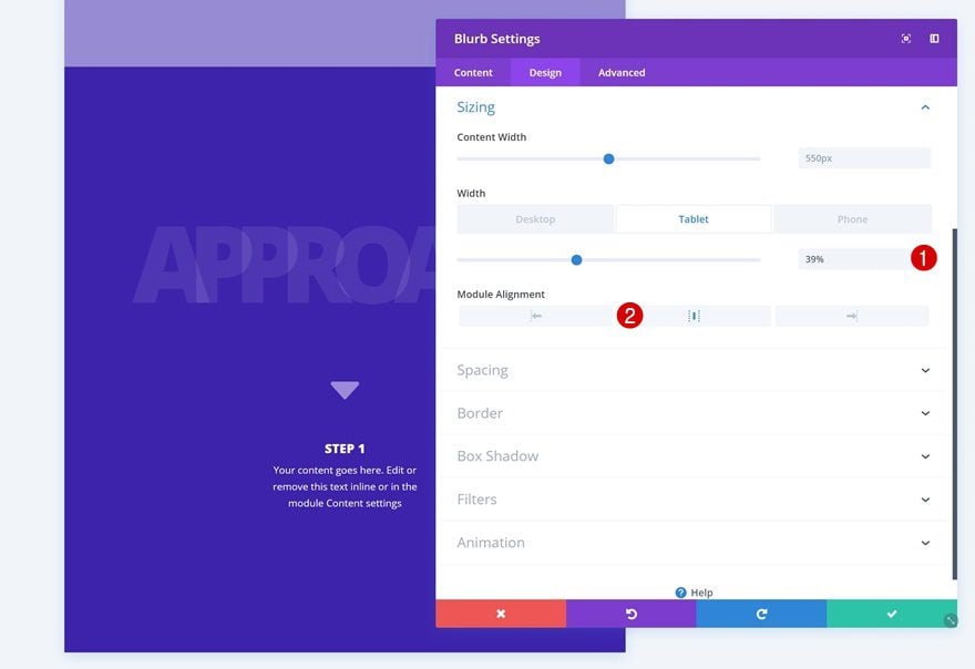
Change Sizing
Change the sizing settings next.
- Width: 39% (Tablet), 59% (Phone)
- Module Alignment: Center
Clone Vertical Divider of Previous Section & Place in Row #2
We’re using the vertical divider of the previous section here as well. Go ahead and clone it and place the duplicate right below the Blurb Module.
Change Spacing
Change the spacing settings of this module to make decrease its height.
- Top Padding: 50px
- Bottom Padding: 50px
Clone Both Modules as Many Times You Want
You can clone both these modules as many times as you want to showcase all the process steps on smaller screen sizes.
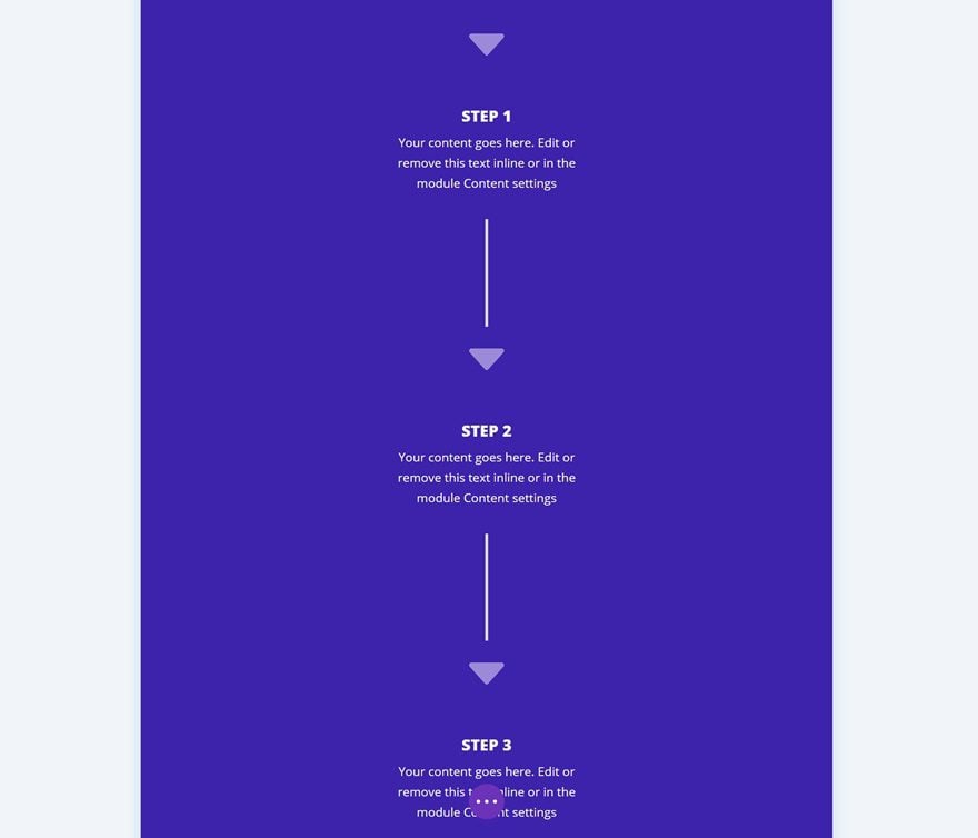
Preview
Now that we’ve gone through all steps, let’s take a final look at the outcome.
Final Thoughts
In this post, we’ve shown you how to creatively use Divi’s column structures to create a stunning and unique process section. On top of that, we’ve also added a subtle hover effect to each one of the process steps that appears once you hover an element. Feel free to play around with this design to create your own unique alternative. If you have any questions or suggestions, make sure you leave a comment in the comment section below!


I’m having trouble- I’m not able to use gradient effects (or image, or any of the other background types) on hover. It will only allow me to add a color. I CAN use gradients on the default side. What would be causing this??
Great! Like it very much. Thanks for sharing.
I followed all the steps (might want to add opacity setting for title text in the middle – that one threw me for a sec) and it worked out great!
Wonderful Article… Please keep up the best work!
I didn’t know that reducing the width of the divider creates a vertical line. Did I miss that information somewhere in the past?
Groovy idea!
This is great – thanks.