
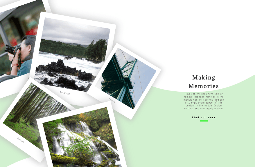
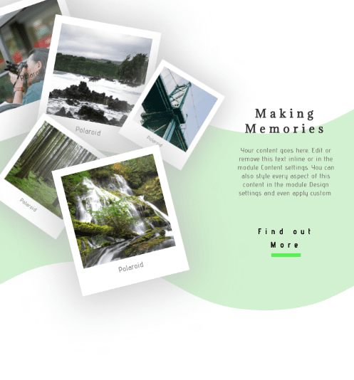
Creative hero sections make websites memorable and special. This polaroid hero section design evokes a sense of vintage wanderlust. By using column transform options, the polaroids can be arranged in any way you want, as if they were spread on a table.
You can recreate this polaroid hero section design with your own square images. You’ll be able to download the JSON file for free as well!
Let’s get to it.
- 1 Preview
- 2 Download The Polaroid Hero Section Design for FREE
- 3 Download For Free
-
4
Let’s Start Recreating
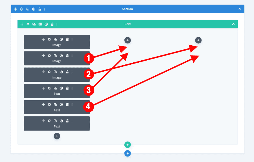
- 4.1 Add New Section
- 4.2 Add New Row
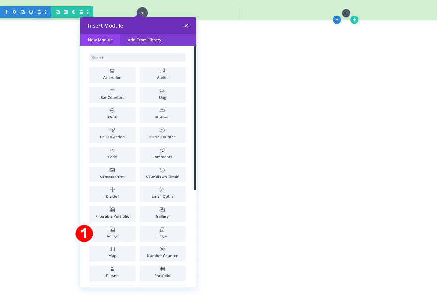
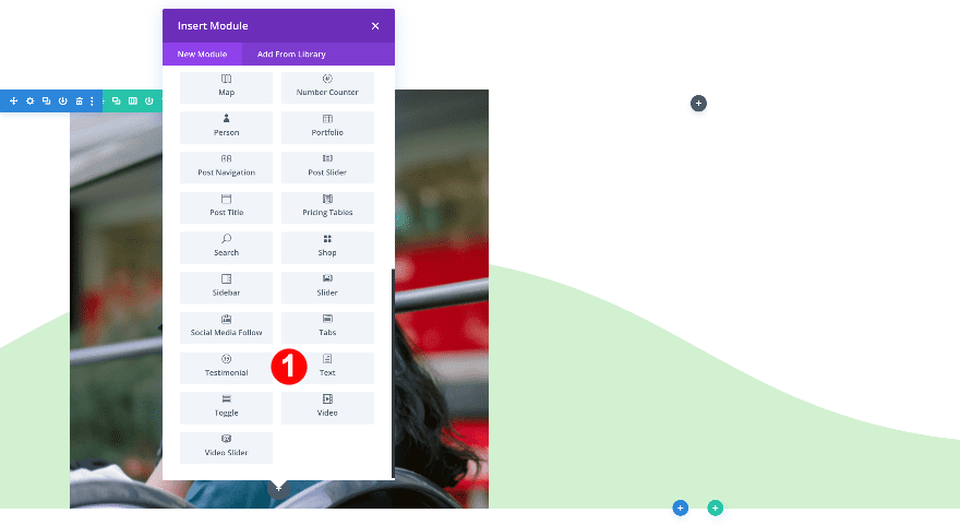
- 4.3 Add Image Module to Column 1
- 4.4 Add Text Module to Column 1
- 4.5 Clone Modules Twice & Place Duplicates in Remaining Columns
- 4.6 Column 1 Settings
- 4.7 Add New Section
- 4.8 Add New Row
- 4.9 Add Image Modules
- 4.10 Add Text Modules
- 4.11 Add Text Module to Column 3
- 4.12 Add Button Module to Column 3
- 4.13 Add Divider Module to Column 3
- 5 Preview
- 6 It’s a Wrap!
Preview
Desktop
Mobile
Download The Polaroid Hero Section Design for FREE
To lay your hands on the free polaroid hero section design, you will first need to download it using the button below. To gain access to the download you will need to subscribe to our newsletter by using the form below. As a new subscriber, you will receive even more Divi goodness and a free Divi Layout pack every Monday! If you’re already on the list, simply enter your email address below and click download. You will not be “resubscribed” or receive extra emails.

Subscribe To Our Youtube Channel
Let’s Start Recreating
Add New Section
Start by adding a new section to the page you’re working on.
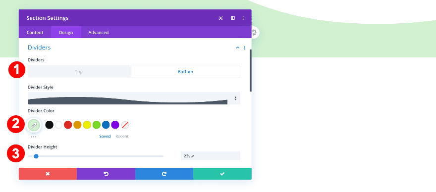
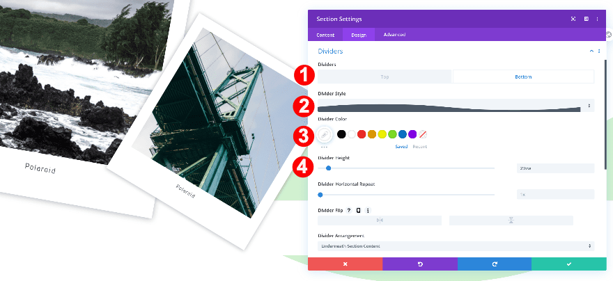
Bottom Divider
Add a mint green bottom divider.
- Divider Placement: Bottom
- Divider Style: #12
- Divider Color: Mint Green #d2f2d0
- Divider Height: 23vw
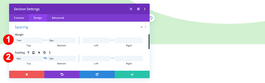
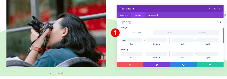
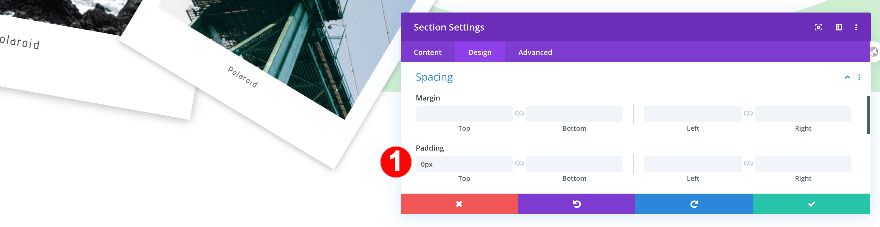
Spacing
Adjust the section’s spacing.
- Top Margin: 7vw
- Bottom Margin: 0px
- Top and Bottom Padding: 0px
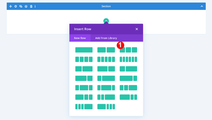
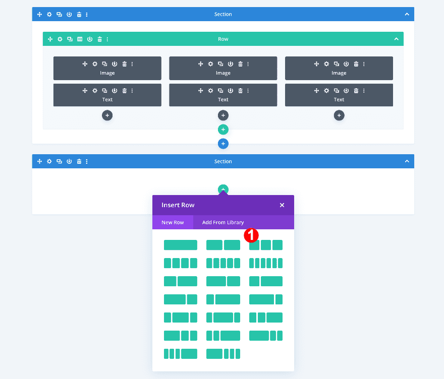
Add New Row
Column Structure
Continue by adding a new row to your section. Choose the following column structure:
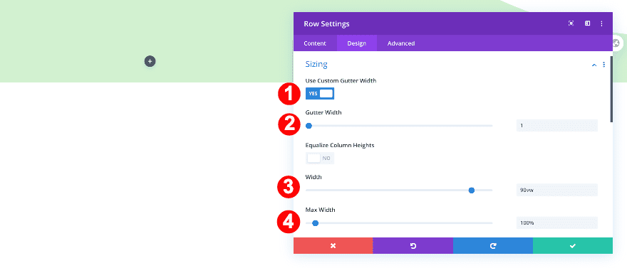
Sizing
Now, adjust the row’s sizing.
- Use Custom Gutter Width: Yes
- Gutter Width: 1
- Width: 90vw
- Max Width: 100%
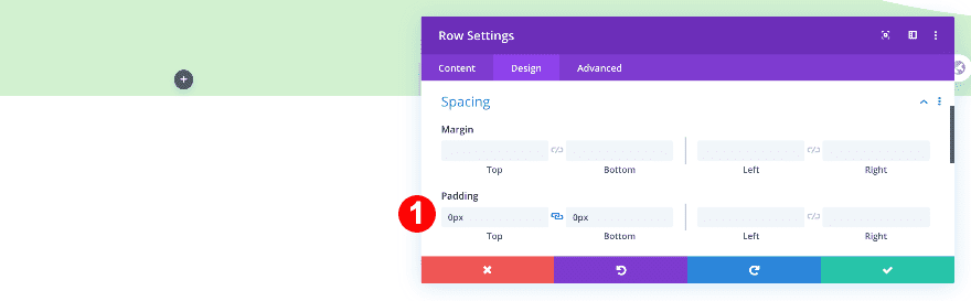
Spacing
Next, adjust the top and bottom padding in the spacing settings.
- Top and Bottom Padding: 0px
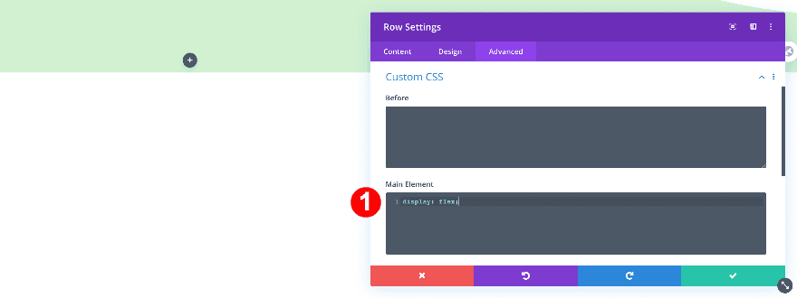
Display
Add one line of CSS code to the row’s main element to keep columns next to each other on smaller screen sizes.
- Custom CSS – Main Element: display: flex;
display: flex;
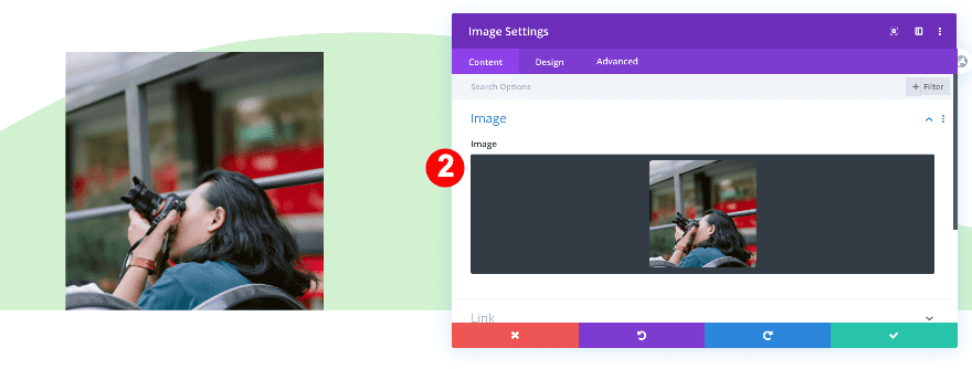
Add Image Module to Column 1
Upload Square Image
Add an image module to column 1 and upload a square image.
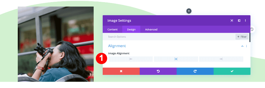
Alignment
Now, adjust the module alignment.
- Module Alignment: Center
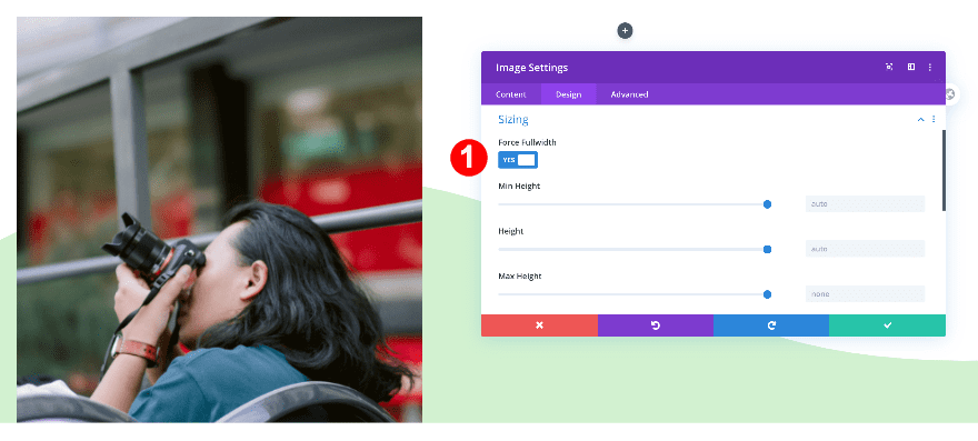
Sizing
Then, make the module fullwidth.
- Force Fullwidth: Yes
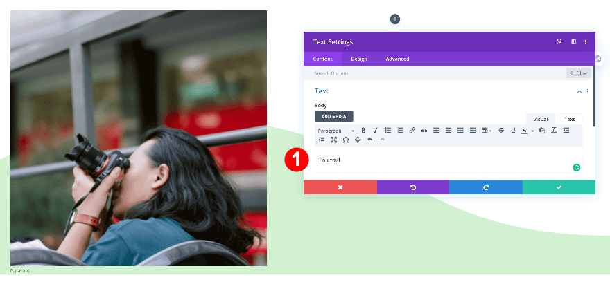
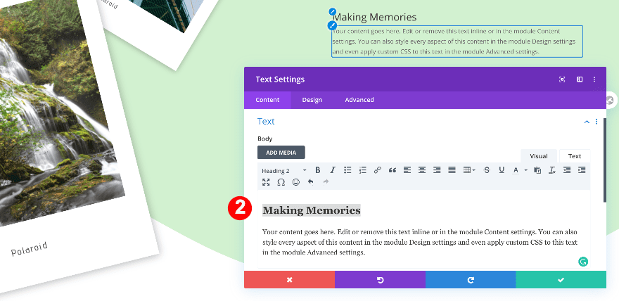
Add Text Module to Column 1
Add Content
Add a text module and insert some content. We’ll use the word “polaroid.”
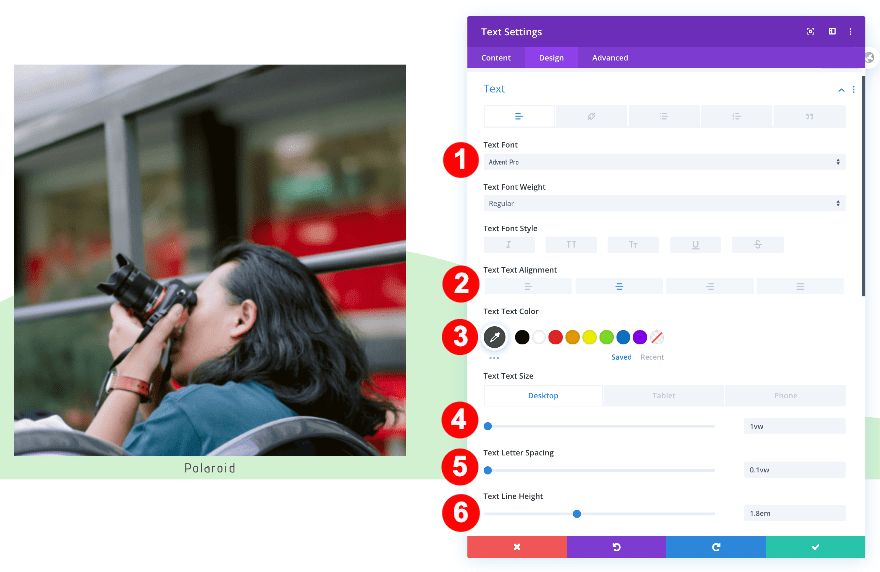
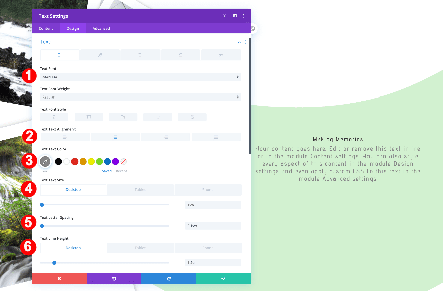
Text
Style the text font.
- Text Font: Advent Pro
- Text Alignment: Center
- Text Color: Very Dark Grey #474747
- Text Size:
- Desktop: 1vw
- Tablet + Phone: 2vw
- Text Letter Spacing: 0.1vw
- Text Line Height: 1.8em
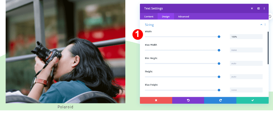
Sizing
Use ‘100%’ for the width in the sizing settings.
- Width: 100%
Spacing
Now adjust the spacing.
- Top Margin: 1vw
Clone Modules Twice & Place Duplicates in Remaining Columns
Change Image & Copy of Duplicates
Change the images in each duplicate image module. If your design calls for it, change the text content as well.
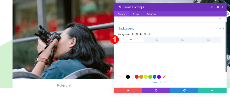
Column 1 Settings
Background
Continue by opening the column 1 settings of the row. Set the background to white to create the polaroid effect.
- Background Color: White #ffffff
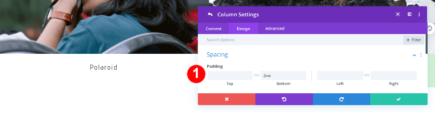
Spacing
Add some bottom padding to create the wider polaroid bottom border.
- Bottom Padding: 2vw
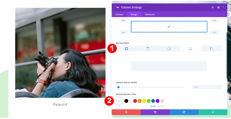
Border
Add a border to finish the polaroid visual.
- 4-Side Border Width: 1vw
- Top Border Width: 2vw
- Right Border Width: 2vw
- Bottom Border Width: 1vw
- Left Border Width: 2vw
- Border Color: White #ffffff
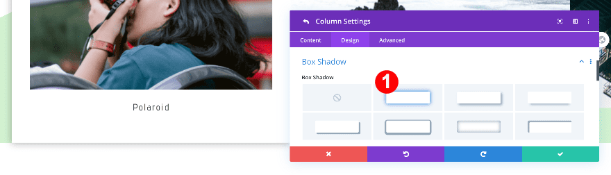
Box Shadow
Complete the column 1 settings by adding a subtle box shadow.
- Box Shadow: #1
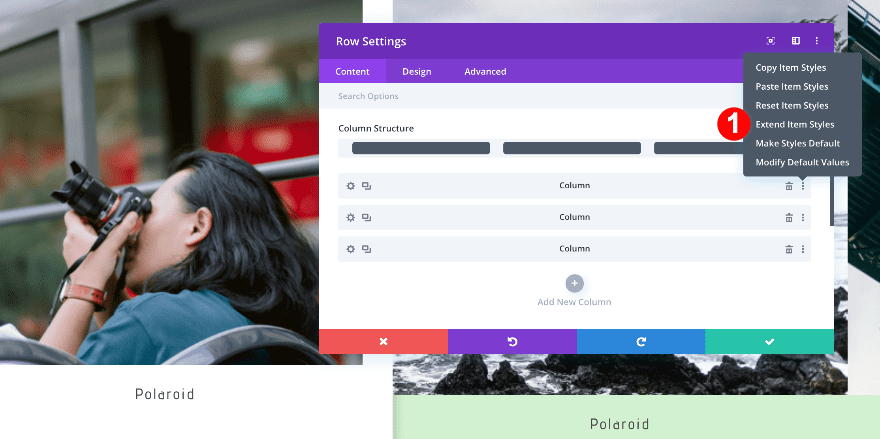
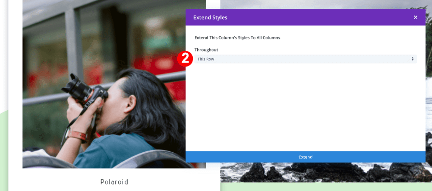
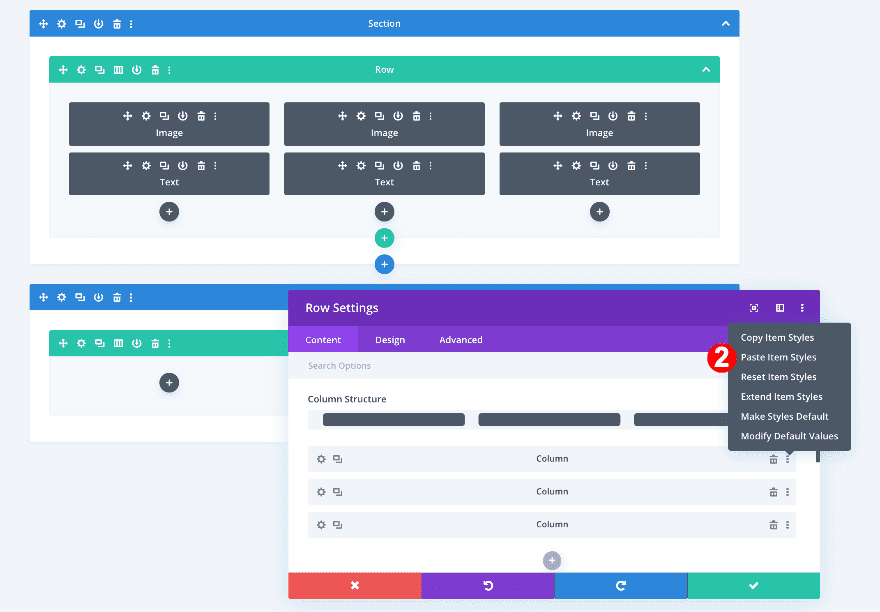
Extend Column 1 Settings
Use the extend styles option to extend the column settings.
- Go back to the main row settings window and click on the three dots to the right of the first column tab.
- Select ‘extend item styles’ and select ‘throughout this row.’
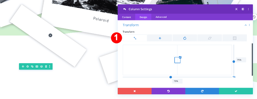
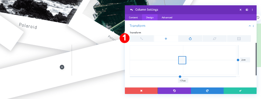
Column 1 Transform Styles
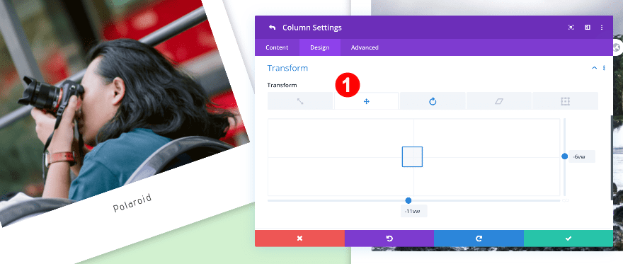
Now, adjust the transform settings in the first column.
- Transform Translate: x-axis -11vw, y-axis -6vw
- Transform Rotate: 341 deg, 1st option
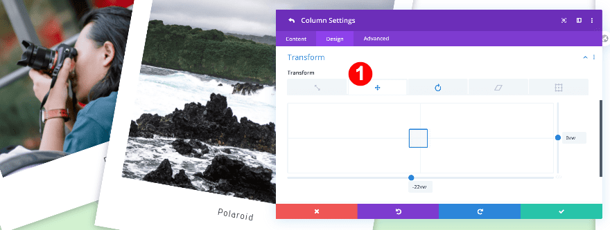
Column 2 Transform Styles
Next, adjust the transform settings for the second column.
- Transform Translate: x-axis -22w, y-axis 0vw
- Transform Rotate: 10 deg, 1st option
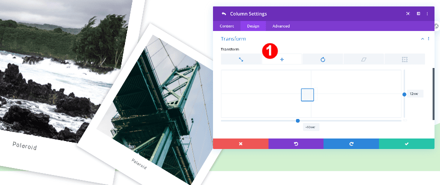
Column 3 Transform Styles
Finally, adjust the transform settings for column three.
- Transform Scale: 68% both axes
- Transform Translate: x-axis -46w, y-axis 12vw
- Transform Rotate: 31 deg, 1st option
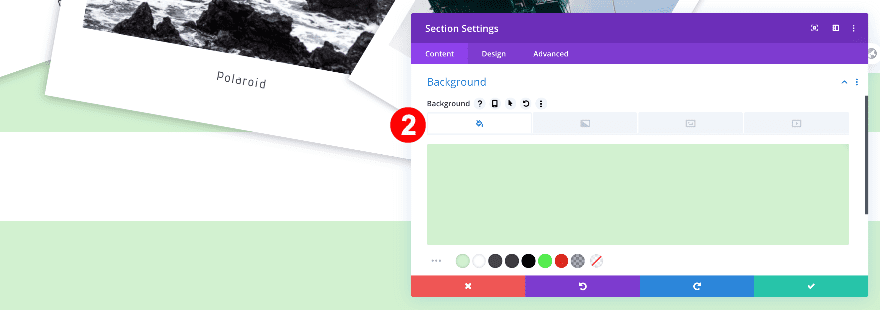
Add New Section
Background
Add a new section and apply a mint green background to the section.
- Background Color: Mint Green #d2f2d0

Bottom Divider
Give the section a bottom divider.
- Divider Placement: Bottom
- Divider Style: #12
- Divider Color: White #ffffff
- Divider Height: 23vw
Spacing
Remove the default top padding.
- Top Padding: 0px
Add New Row
Column Structure
Continue by adding a new row with 3 columns.
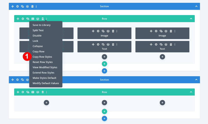
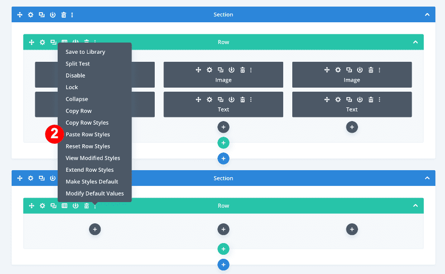
Copy and Paste Row Styles
Using the wireframe view, copy and paste the row styles from the first section
- First, click on the three dots to the right of the row menu inside the first section. Select ‘copy row styles’.
- Then, click on the three dots on the right of the row menu in the second section. Select ‘paste row styles’.
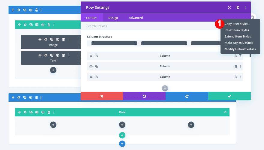
Copy and Paste Column Settings
Now, copy the column settings in the first row and paste them onto columns 1 and 2 in the new row.
- First, open the row settings in the first row.
- Second, click on the three dots on the right side of the first column tab and select ‘copy item styles’.
- Then, scroll down to the new row and open the settings tab.
- Finally, click on the three dots on the right side of the first column and select ‘paste item styles’.
Column 1 Transform Styles
Now, adjust the transform styles in column 1.
- Transform Scale: 75% both axes
- Transform Translate: x-axis -8w, y-axis -14vw
- Transform Rotate: 35 deg 1st option
Column 2 Transform Styles
Then, modify the transform styles in column 2.
- Transform Translate: x-axis -17w, y-axis 2vw
- Transform Rotate: 346 deg 1st option
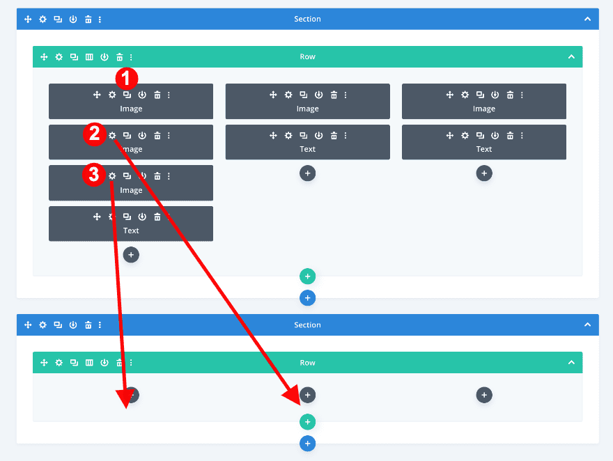
Add Image Modules
Duplicate and Drag Image Modules
Now, go back to wireframe view to duplicate and drag two image modules.
- First, duplicate the first image module in the first section twice.
- Then, drag them to the first and second columns of the second section.
- Change the image in each module for a new square image.
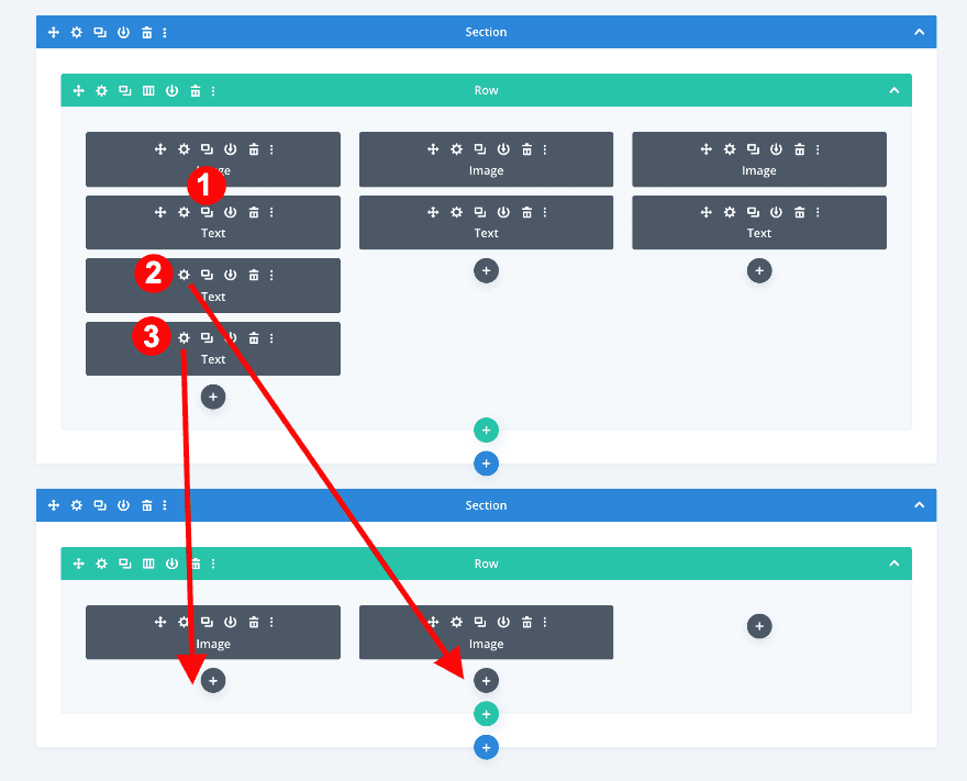
Add Text Modules
Duplicate and Drag Text Modules
After the images, do the same with the text modules. Duplicate from the first section and drag into the second section.
- In the wireframe view, duplicate the text module from the first column in the first section twice.
- Now, drag the new text modules to columns 1 and 2 in the second section.
- If you wish to change the content, do so now.
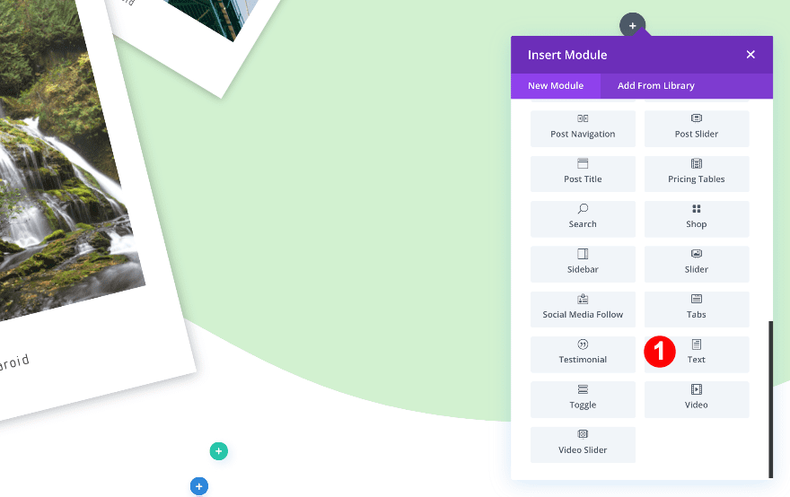
Add Text Module to Column 3
Add Content
Click on the plus symbol in the third column and add a text module. Insert some H2 and paragraph content.
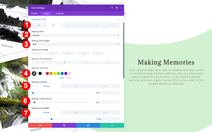
Text
Style the text as follows.
- Text Font: Advent Pro
- Text Alignment: Center
- Text Color: Dark Grey #848484
- Text Size:
- Desktop: 1vw
- Tablet + Phone: 1.9vw
- Text Letter Spacing: 0.1vw
- Text Line Height:
- Desktop: 1.2em
- Tablet + Phone: 1.3em
Heading Text
Now, style the H2 text.
- Heading: H2
- H2 Font: Adamina
- H2 Font Weight: Bold
- H2 Font Color: Very Dark Grey #444444
- H2 Font Size:
- Desktop: 2vw
- Tablet + Phone: 3vw
- H2 Letter Spacing: 4px
- H2 Line Height:
- Desktop: 1.7vw
- Tablet + Phone: 1.5vw
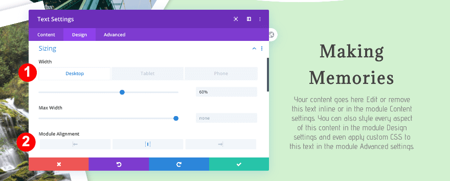
Sizing
Then, adjust the sizing.
- Width:
- Desktop: 60%
- Tablet: 91%
- Phone: 100%
- Module Alignment: Center
Spacing
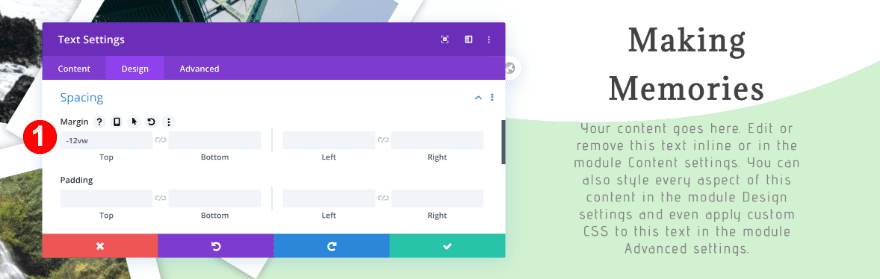
Finally, adjust the spacing.
- Top Margin: -12vw
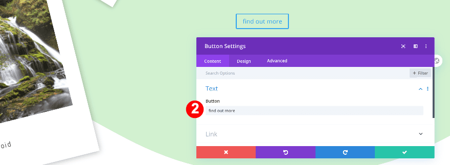
Add Copy
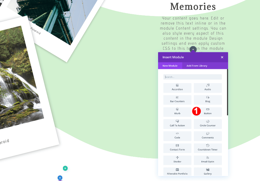
Click on the plus symbol below the text and add a button module. Add some copy to the button.
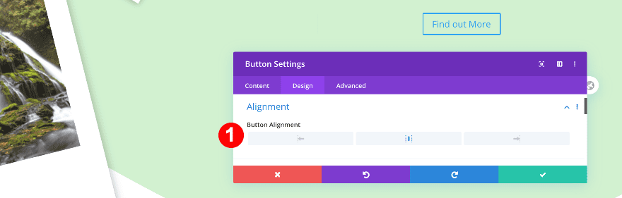
Alignment
Change the button alignment.
- Alignment: Center
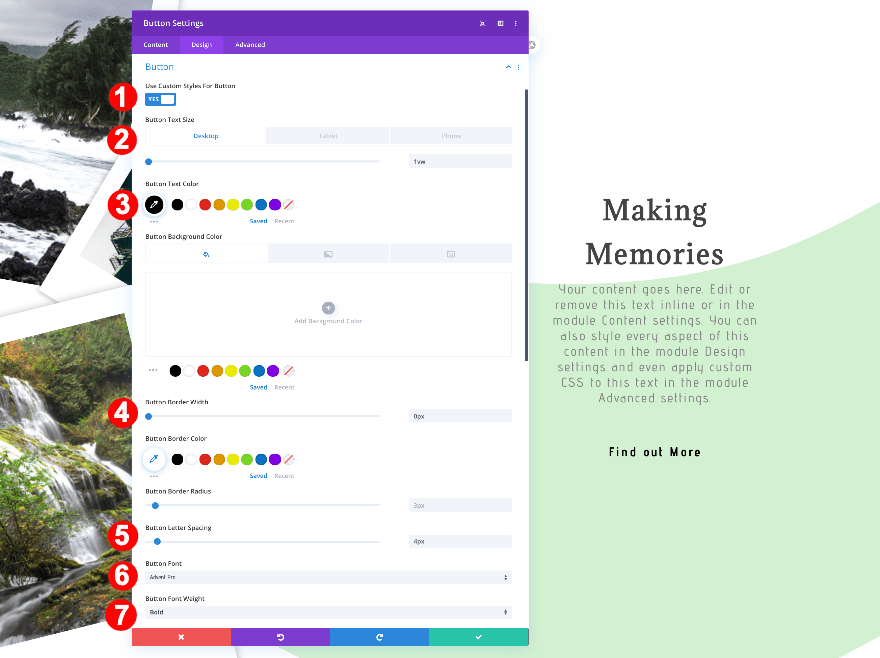
Custom Button Styles
Style the button accordingly.
- Button Text Size:
- Desktop: 1vw
- Tablet: 2.4vw
- Phone: 2.3vw
- Button Border Width: 0px
- Button Text Color: Black #000000
- Button Letter Spacing: 4px
- Button Font: Advent Pro
- Button Font Weight: Bold
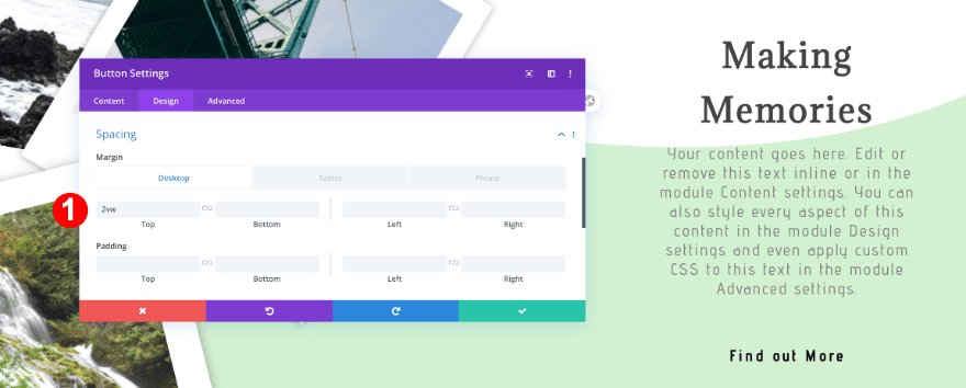
Spacing
Apply a top margin value.
- Top Margin: 2vw
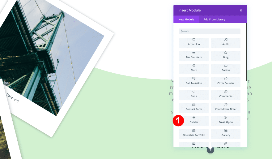
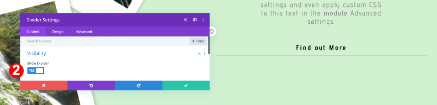
Add Divider Module to Column 3
Visibility
Below the button, add a divider and style the as follows.
- Visibility: Yes
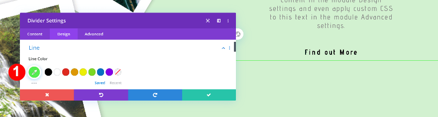
Line
Give the divider a bright green color.
- Line Color: #55f252
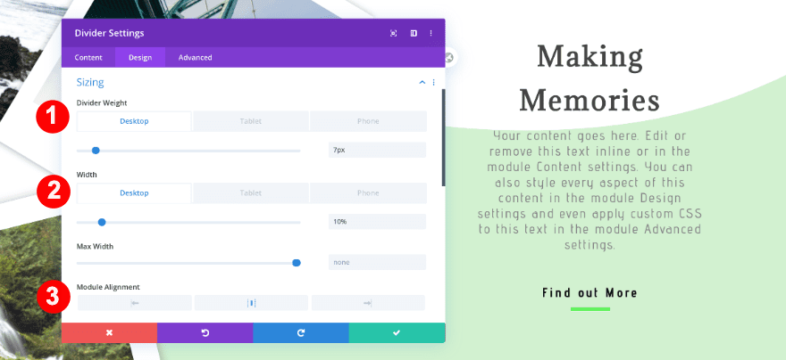
Sizing
Change the sizing settings of the divider and you’re done!
- Divider Weight
- Desktop: 7px
- Tablet + Phone: 4px
- Width:
- Desktop: 10%
- Tablet + Phone: 30%
- Module Alignment: Center
Preview
Let’s take a look again at the finished design of the polaroid hero section across different screen sizes.
Desktop
Mobile
It’s a Wrap!
In this post, we showed you how to recreate a polaroid hero section using Divi’s transform options. This is a great way to showcase multiple images in your page’s hero section. We hope this design will inspire your own creative hero section designs! If you have any questions, make sure you leave a comment in the comment section below.


Hi I uploaded it to Divi Layouts and it has not type, no category so I can’t use it at all. How to fix please.
I saved it again with another name and now it is a layout type.
Hi Stephanie
I tried that but it still didn’t work. The name still keeps coming back as “divi-polaroid-hero-section-layout”.
I even downloaded it again and changed the name before importing.
Can you please tell me what you changed it too? Thanks
Hello,
Fantastic post.
I have a problem. I have made a small variation. When I want to give the action to the button you have to hit the button several times to go to the page I want. Especially in google chrome, in opera. In Mozilla it does not happen so much. In mobile version no problem.
Why does this happen?
Thanks
Hi,
I love the idea of this. I tried it and only the first section shows on our first screen (you have to scroll down to see the second section). I used the downloadable layout and only edited text/pix, so I’m not sure what I did wrong. Any thoughts?
Thanks,
Eric
Anyone also seeing that the section “fills” two pages (have to scroll down to see second half of hero section)? Were you able to fix it?
Thanks,
Eric
I enjoyed reading your article. Thanks for for the wonderful article.
Hello,
Fantastic post.
I have a problem. I have made a small variation. When I want to give the action to the button you have to hit the button several times to go to the page I want. Especially in google chrome, in opera. In Mozilla it does not happen so much. In mobile version no problem.
Why does this happen?
Thanks