
If you are a nonprofit organization and depend on online donations for your income, then most likely you’ve thought a lot about your donation page. This article will help you understand what makes for a great donation landing page and how to make it happen with Divi and GiveWP (a popular donation plugin).
Why Create a Landing Page for Donations?
Contrary to e-commerce and products, it’s not highly likely that you’ll have visitors that just find you on Google and suddenly donate. Consumers don’t need a strong relationship with the merchant in order to feel comfortable to purchase a product from them. But donors are not the same. Donors want to know your organization well. They want to know that you’ll use their money wisely and prudently. Most likely they are going to read all around your site for months before they finally click on that “Donate” button in your menu.
If that’s the case, why create a landing page at all? Why not just put a form anywhere and wait? The answer is simple: because your relationship with your donors matters.
In all likelihood, 90% of the effort of getting a donor to actually donate is done outside of the landing page. They might want to volunteer their time with your organization for a while before donating. They might read your blog or watch your videos for months before wanting to donate. Your relationship with them is going to take a long time; so when the point of donation comes, you don’t want to waste that opportunity. That’s why, when they finally decide to give you their money, you want to show them your best material and make the experience comfortable.
Landing pages are a great way to consolidate the most compelling information about your Cause or Campaign into one easily digestible format that leads your visitor directly to the donation form at the end. When they land on that page, they should see nothing but things that re-affirm all the things they’ve been learning about you over their past months of volunteering and reading.
Your donation page is a big opportunity to solidify a longterm relationship with your donors. Don’t waste it with a simple form.
How is a Donation Landing Page Different?
If you’re a regular reader of the Elegant Themes Blog, you’ve probably read many articles about landing pages. There’s no shortage of tutorials on effective landing pages throughout the internet either. Unfortunately, the large majority of those articles and tutorials are focused primarily on product landing pages.
While the end-result of a donation landing page is virtually the same as a product landing page (that a user gives money to an organization), the strategy you employ for a donation landing page is very different.
A product landing page is trying to sell the potential customer and convince them to make a purchase. In contrast, a donation landing page doesn’t promise any physical return. A donation landing page isn’t going to convince the potential donor about the merits of any “product.”
Instead, a donation landing page does the following:
- It tells a story of a need which appeals to the potential donors humanity
- It validates that need with unbiased external information
- It gives the potential donor an easy way to donate on-page without redirect
Creating Your Donation Landing Page
Now that we understand the purpose of landing pages and our strategy for a donation landing page, let’s make it happen.
Here’s a screenshot of a basic landing page that I created with the Divi Builder:
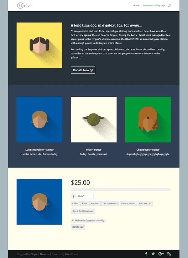
While our content strategy for this landing page is very different than a product page, the basic principles of conversion design still apply. We still want to encapsulate the view of the visitor, create visual contrast, provide social proof, and a sense of urgency as well. These principles are fairly universal. The difference is the tone and the visual with which you present your case or story.
In my example, I open immediately with the story. I have an image that should provide an emotional response and my story explains the need clearly.
I then validate our Cause with testimonials from real donors. If your Organization is driven by particular data-points, you might choose to use those here instead of testimonials. Both serve the same purpose though of providing “social proof.”
Right before my donation form, I give a last plea that describes the urgency. If donors understand that daily donations are put to daily benefit of the cause then urgency is clear.
I’ll discuss the donation form later, but the central purpose of the donation form is to get out of the way. I say this often, but it basically means that if your form takes up half of your whole page and attracts a ton of attention, then you’re doing something wrong. Keep the donation form as simple and minimalist as possible so that it’s as easy as possible for your donors to donate. That’s the goal.
Now we just have to actually build it. This is really the fun part because the Divi Theme and Builder does all the heavy lifting for us.
Naturally, your theme is going to be configured for your site, so I won’t go into the particulars of my theme configuration. The one thing I want to highlight though is just some important aspects to keep in mind:
1. No Sidebars. You don’t want to give your donors any excuse to go navigating somewhere else. Once they land on the landing page, you want to remove all distractions. I go into detail on this idea here.
2. No sticky Menus. This is the same principle as no sidebars. You want to encourage your reader to read straight down the page to the form, so keep the navigation out of sight.
3. The Boxed layout. I know full-width layout are (still) attractive, but in this case the vertical sides (on desktop) really help encourage the eye down the page. They reinforce that there’s MORE to see down below.
All of these options are very simple to implement with the Divi Theme with just a few clicks via the Customizer.
Now to build the actual page with Divi Builder. I started by using the “Landing Page” template straight from the built-in Divi Library.
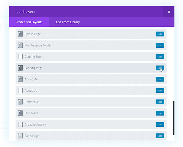
It’s a simple but effective template that serves our purpose perfectly. It comes out-of-the-box with the Conversion Design in mind.
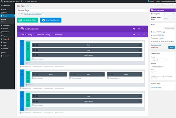
With that template in place, it’s just a matter of dropping in the content then choosing and cropping powerful images and perhaps doing some basic margin and padding adjustments. Since these particulars will be different for each landing page I won’t go into the design specifics here. Instead, I’ll save the detailed instructions for the Give form below.
Using Give with the Divi Builder
It just takes four steps to get your form embedded into your new donation landing page. The first step is to install and activate Give by going to Plugins > Add New and searching “Give.”
The second step is to setup your payment gateway. Give comes with PayPal Standard for free. All it takes to configure it is to go to Donations > Settings > Payment Gateways and enter your email address in the settings field.
The third step is to go to Donations > Add Form. Once you’re there you have quite a few options, but you can literally just give your form a title and hit Publish and you’re done.
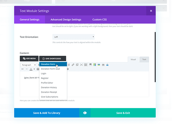
The fourth step is to go to your donation landing page and edit it via the backend. I know the front-end Divi Builder is really slick. But one thing currently missing in the frontend is the ability to inherit custom buttons to the editor that many plugins — including Give — utilize. Go into your last panel, to a Text Module, and above the editor you’ll see a button that says “Give Shortcodes.” That will allow you to insert your Give form directly into the editor.
In my case, I added another compelling image to the left of the form. It’s a good option because it also helps the form keep a good maximum width which is a cleaner look.
Hit Publish and you’re done!
Customizing Your Give Form
While the default Give options work just fine, everyone wants to tweak their forms to be exactly how they’d like. Give has plenty of options and settings for customizations. But it also inherits the Divi styles well and can be easily customized with custom CSS.
That said, the form in my example has no custom CSS at all. Here are a few things I did configured for added conversion helpfulness though:
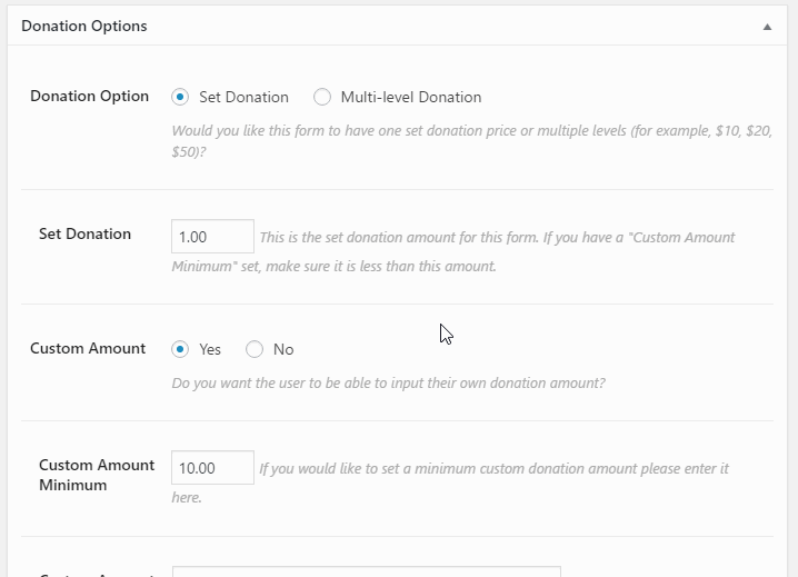
1. Donation Goal: Donors like to know that there is a goal in mind. They want to see how much their contribution is going to help toward that goal. This subtle visual cue can mean a lot to some donors.
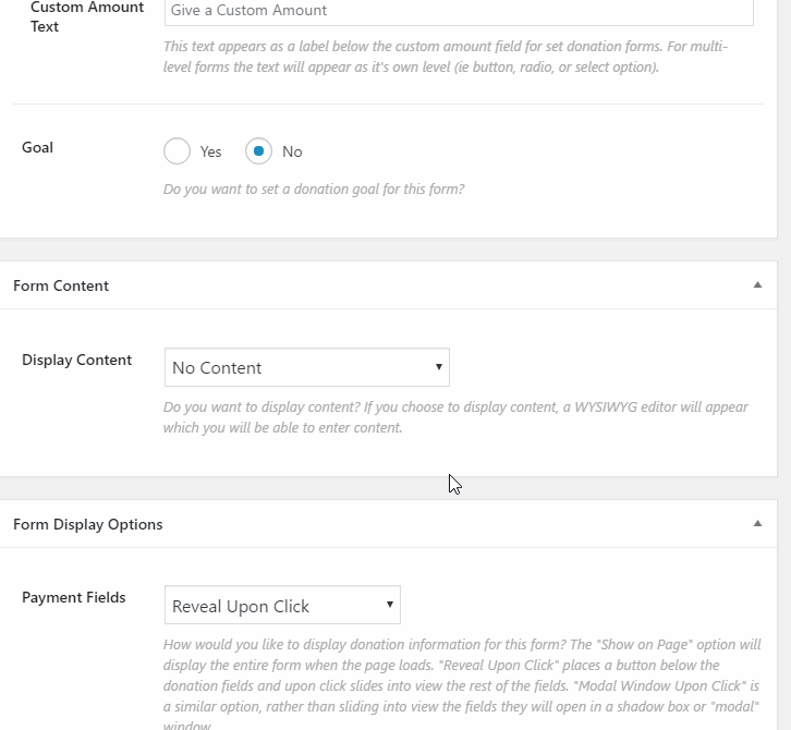
2. Multi-level suggestions: If you just provided a simple amount field, it’s possible you might just get $5 donations continually. By providing the donors with suggested amounts and some way to understand how that amount pertains to their goal you affirm and encourage their generosity.
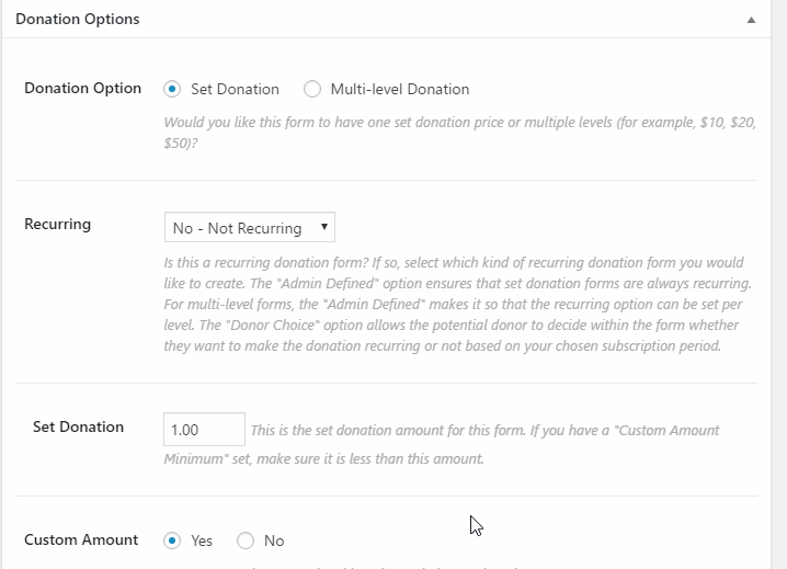
3. Recurring Donations: This particular form supports Recurring Donations via the premium Recurring Donations Give Add-on. Many non-profits have found that allowing your donors to give on a regular basis greatly increases the total amount they give over the course of the year. This is particularly true of those on limited budgets. They’d prefer to stretch their giving out over the course of a year than one larger sum.
Next Steps
Because Divi enables you to make these types of pages anywhere throughout your site, and you can embed as Give form you want into those pages, it’s very easy to do a simple one-off campaign to test how effective a landing page might be.
I’d encourage you to take this opportunity to implement a landing page for your next donation campaign or drive, and compare the results with your previous drives where you only had a simple form. I believe you’ll be very happy with the results.


I use WP Give – but there seems to be a conflict between Give and Divi since Give has the new builder.
Hi
I’ve just discovered this, like the look of it and working on a sample donation page for a potential client.
1. Does this work with any payment gateway, or only Paypal? I’ve gone through the settings, and can’t find somewhere to add additional payment gateways.
2. A question above relates to the cost of the Give Plugin, but I don’t see anything about costs. Is this misleading, or am I missing something. Will it cost me to use this, if I’m already registered with Elegant Themes?
Thanks a lot
David
“3. The Boxed layout. I know full-width layout are (still) attractive, but in this case the vertical sides (on desktop) really help encourage the eye down the page. They reinforce that there’s MORE to see down below.”
The first two points are more obvious, but I had never thought about a boxed layout encouraging you to move down the page. Great point, and I will have to try out a landing page with a boxed layout in the future!
Perfect timing, finalizing my Divi/Give Donations page and will act on the tweaks you have suggested – thank you!
tick tock! Just started a charity site too! This is great!
Perfect timing…. however, it’d be nice to see what the finished product would like 🙂
Yeah, would love the layout download 🙂
Hi Christina, the page with the little Star Wars icons is the page I created. See the screenshot above. Also feel free to check out our Give Stories ( https://givewp.com/give-stories/ ) or our Case Studies ( https://givewp.com/case-studies/ ). Thanks!
HI Matt, thank you so much. This is an incredibly helpful post. We use a third party vendor for donations and it is very expensive. Would it be possible to see any live sites that use your Give plugin? would love to do a test drive to see it from the donor’s perspective. thanks so much!
Give isn’t the only plugin around (and not the cheapest either) – the plugins add up), and there’s plenty of free or low cost services around if you need to guarantee your donation page is always online.
Hi Vicki, a central place to see a small handful of our sites is via our Give Stories ( https://givewp.com/give-stories/ ) or our Case Studies ( https://givewp.com/case-studies/ ). Thanks
The timing is perfect for me too!
I am going to start a project that needs a donation landing page.
Thanks 🙂
Great Article. Currently working on a few non-profit websites. Great timing!
The timing of this post could not be better.
Just started a project with a non-profit yesterday.
Thank you!