
Flat web design is popular because of its core values. It focuses on usability and prioritizes user experience first. That, in combination with a slick and modern design, makes a good flat website. Every design element on a flat website should be well thought out before it’s added to a page. It should also focus on being simple yet beautiful and engaging at the same time. Not to forget, it should grab your visitors attention and make them curious about finding out what your company is all about.
In this post, we’re going to share some techniques on creating flat web design with Divi. This is the third post in the post series where we handle 4 different website styles and how to achieve them using Divi:
- Clean & Abstract
- Minimal
- Flat
- Bold & Colorful
Let’s get to it!
- 1 1. Keep the Hero Section Clean & Understandable
- 2 2. Emphasize Box Structures
- 3 3. Choose 3 Bright Colors
- 4 4. Use Very Subtle Gradient Color Combinations
- 5 5. Combine One Standard with One Elegant Font Family
- 6 6. Play with Heights
- 7 Preview
- 8 Let’s Start Creating: Add Standard Section #1
- 9 Add Standard Section #2
- 10 Preview
- 11 Final Thoughts
1. Keep the Hero Section Clean & Understandable
As mentioned in the intro of this post, usability is a very important aspect of the flat web design style. It allows you to get to the point and share relevant information with visitors without overburdening them. At the same time, you make use of a gorgeous layout that matches your company’s branding.
There are many ways to create flat web designs but the thing I noticed almost everywhere is the simplicity of the hero section. And simple design definitely doesn’t mean boring. It means you don’t need to beat around the bush. You can get to the point without having to exaggerate the design you’re creating to try to impress visitors.

2. Emphasize Box Structures
Another thing that is typical about flat web design styles is the use of box structures. If you know your way around Divi, you know that you can find box structures basically everywhere within the builder. They give a certain structure to your website and allow you to build a framework in advance.
Within flat designs, box structures are usually emphasized. This allows people to navigate easily and find what they are looking for in just a matter of time.
3. Choose 3 Bright Colors
We’ve mentioned using box structures and a simple hero section up until now. In theory, that sounds boring, right? To balance that usability factor on your website, you can bring it to life by using a bright color palette. You can go with two or three bright colors that will personalize your website and make it match with your company’s values.
4. Use Very Subtle Gradient Color Combinations
Another thing that can help you break the cycle is using very subtle gradient color combinations. Use the same color but a different shade for both gradient colors. One of them needs to be brighter while the other one has a deeper feel to it. They will not immediately strike as a gradient to people but it will help give your website a bit more depth and detail.
5. Combine One Standard with One Elegant Font Family
Usually, many websites use a more elegant font family for titles and a standard one for body text. Why not switch things up? This will definitely make a change. Plus, people often tend to skip descriptions and only read titles. If that’s the case, you want your titles to be as easy to read as possible, right? A great combination of font families is using Arial for titles and Georgia for body text. Georgia is still very readable, just a bit fancier, and it gives that needed contrast to your website.
6. Play with Heights
The last one of the tips is playing around with the height of the design elements on your pages. You’d be surprised how much that can contribute to the overall look and feel of your website. You’re still maintaining the box structure that’s recommended for flat designs, but at the same time, you’re also giving your visitors interaction.
Preview
We’ve seen several techniques in the previous part of the post, now it’s time to put the tips into practice. We’ll create the following stunning result step by step:
Let’s Start Creating: Add Standard Section #1
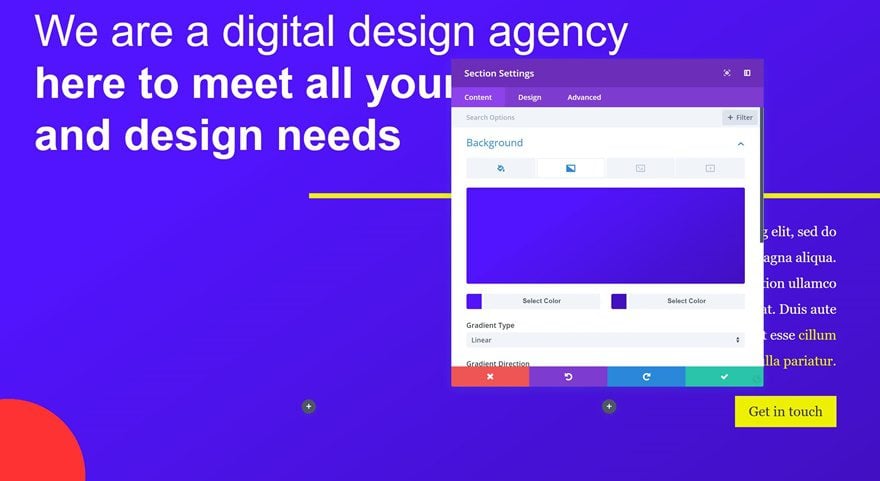
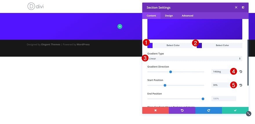
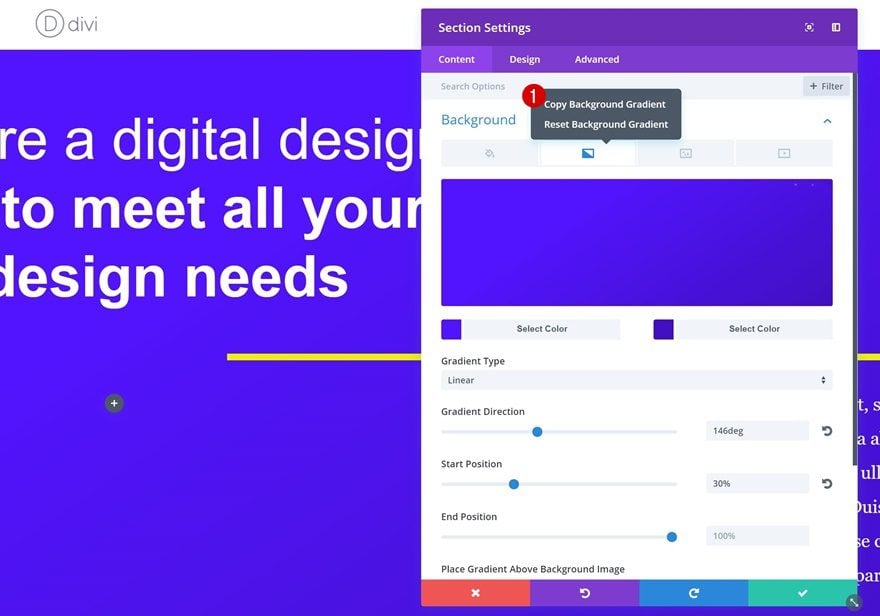
Section Settings
Gradient Background
Start by creating a new page and adding a section that page. Without adding any rows yet, open the section settings. We’re using a subtle gradient background with the following settings:
- Color 1: #5214ff
- Color 2: #420fc1
- Gradient Type: Linear
- Gradient Direction: 146deg
- Start Position: 30%
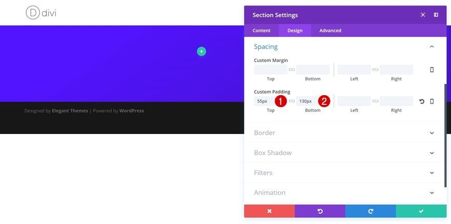
Spacing
We’re adding some top and bottom padding to our section as well:
- Top Padding: 55px
- Bottom Padding: 130px
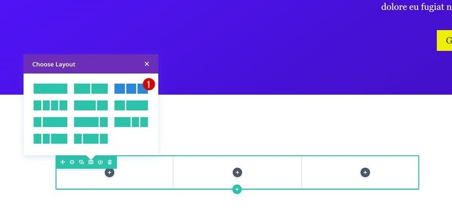
Add Row #1
Row Settings
Column Structure
Continue by adding your first row. This section will, in total, consist of three different rows. For the first row, we’re using the following column structure: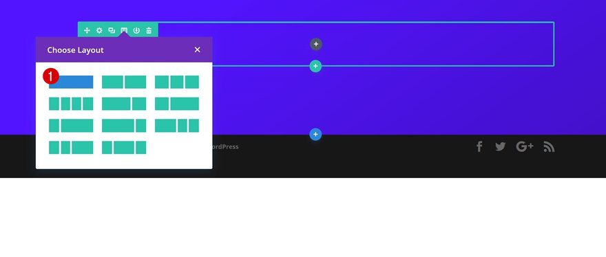
Sizing
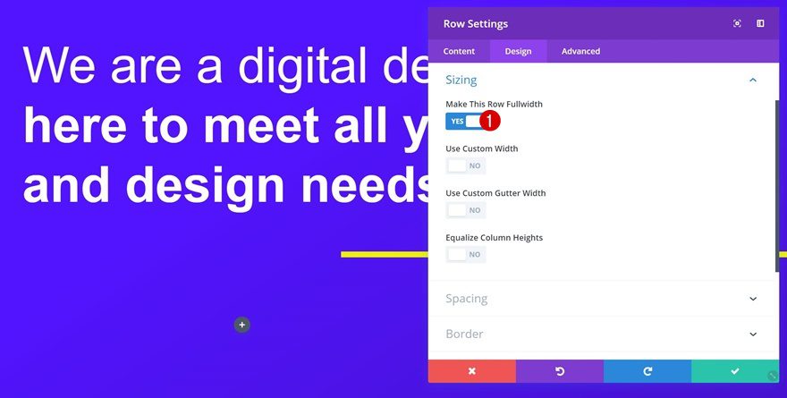
Open the row settings right away and enable the ‘Make This Row Fullwidth’ option in the Sizing settings.
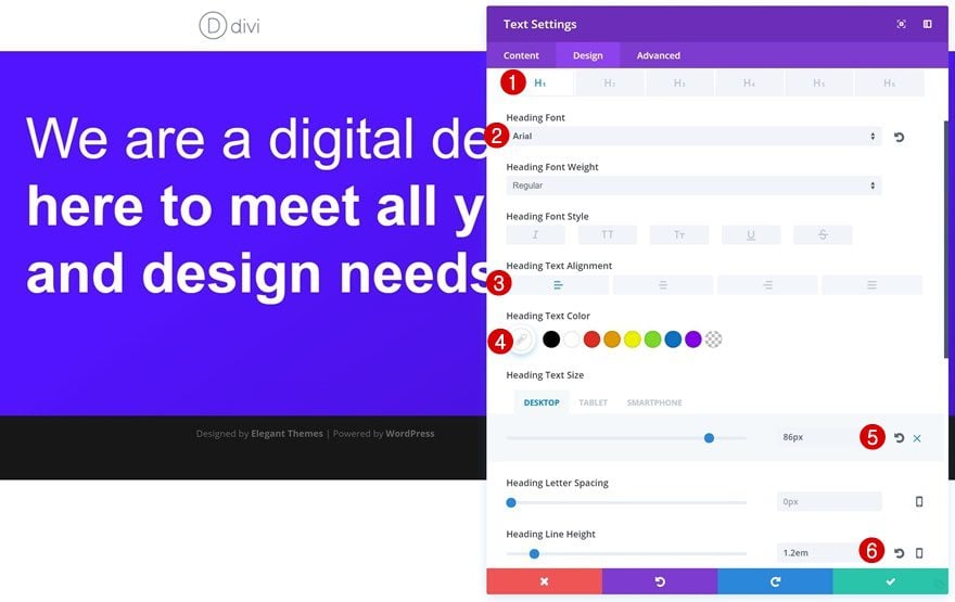
Add a Title Text Module
H1 Text Settings
We’ll only need to add one H1 Text Module to this row. After you’ve added your content (and made sure it’s H1), open your H1 text settings and apply the following changes:
- Heading Font: Arial
- Heading Text Alignment: Left
- Heading Text Color: #FFFFFF
- Heading Text Size: 86px (Desktop), 65px (Tablet), 45px (Phone)
- Heading Line Height: 1.2em
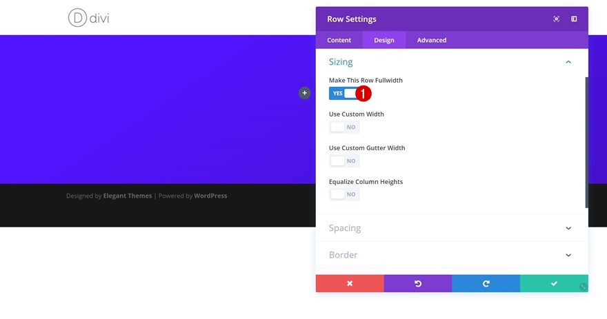
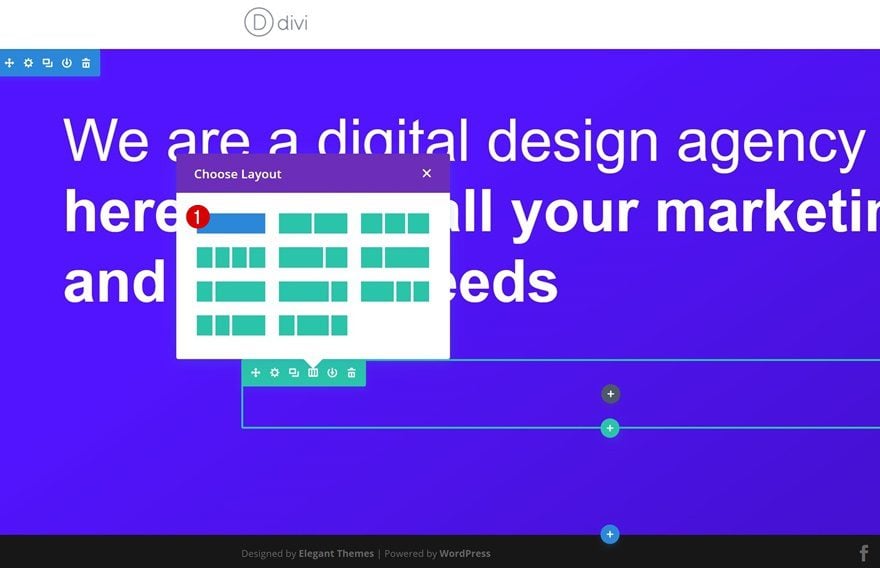
Add Row #2
Row Settings
Column Structure
Let’s move on to the next row. We’re, again, using a row with one column only.
Sizing
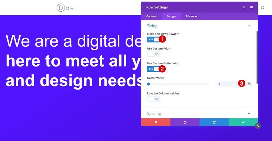
Before adding any modules, open your row settings and apply the following Sizing settings:
- Make This Row Fullwidth: Yes
- Use Custom Gutter Width: Yes
- Gutter Width: 1
Add a Divider Module
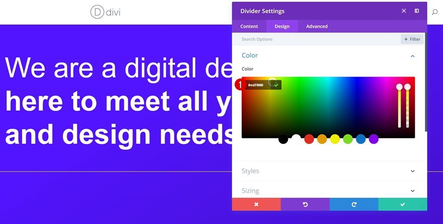
Color
Proceed by adding a Divider Module to your column. We’re using ‘#edf000’ as the divider color.
Sizing
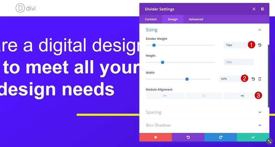
We’re going to adjust the Sizing settings of our Divider Module next:
- Divider Weight: 10px
- Width: 64%
- Module Alignment: Right
Add Row #3
Row Settings
Column Structure
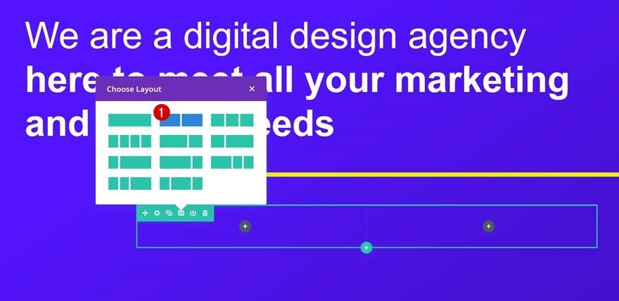
Last but not least, add a row with two columns.
Sizing
Open the row settings and enable the ‘Make This Row Fullwidth’ option in the Sizing settings.
Spacing
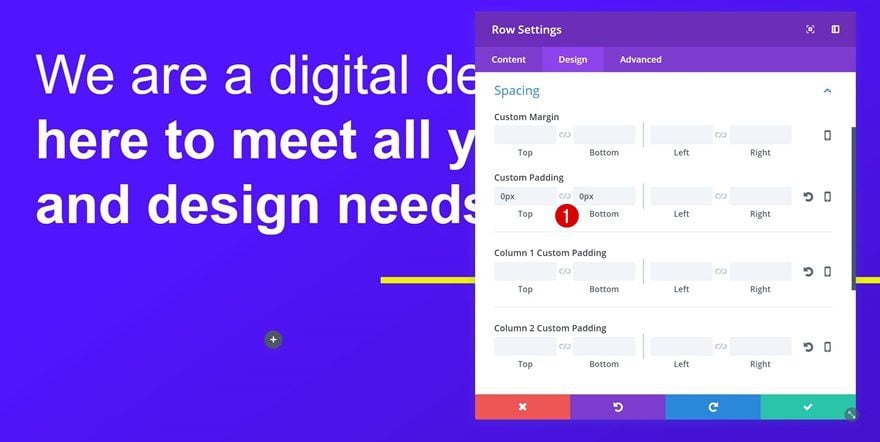
Remove the row custom padding by adding ‘0px’ to the top and bottom padding.
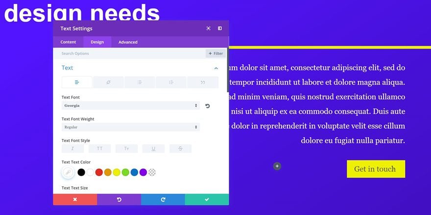
Add a Description Text Module to Column 2
Text Settings
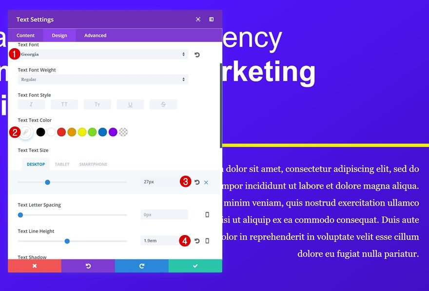
Continue by adding a description Text Module to the second column using the following text settings:
- Text Font: Georgia
- Text Color: #FFFFFF
- Text Size: 27px (Desktop), 22px (Tablet), 18px (Phone)
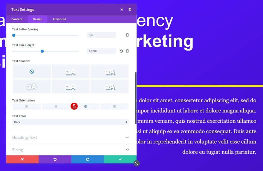
- Text Line Height: 1.9em
- Text Alignment: Right
Add a Button Module to Column 2
Button Alignment
Align your row to the right within the Alignment settings of your Text Module as well.
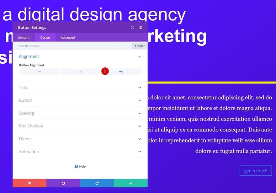
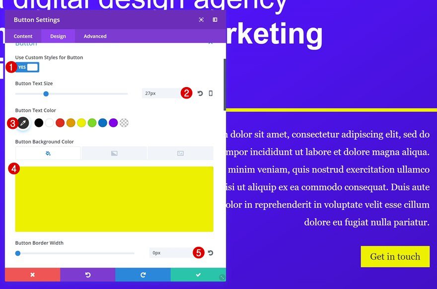
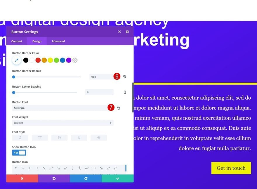
Button Settings
The next and last module we’ll need to add to our hero section is a Button Module. Once you add the copy, apply the following button settings to it:
- Use Custom Styles for Button: Yes
- Button Text Size: 27px
- Button Text Color: #303030
- Button Background Color: #edf000
- Button Border Width: 0px
- Button Border Radius: 0px
- Button Font: Georgia
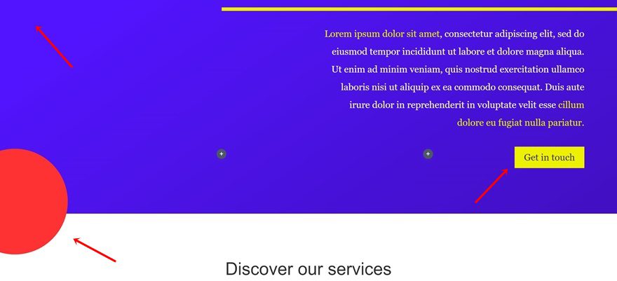
Add Standard Section #2
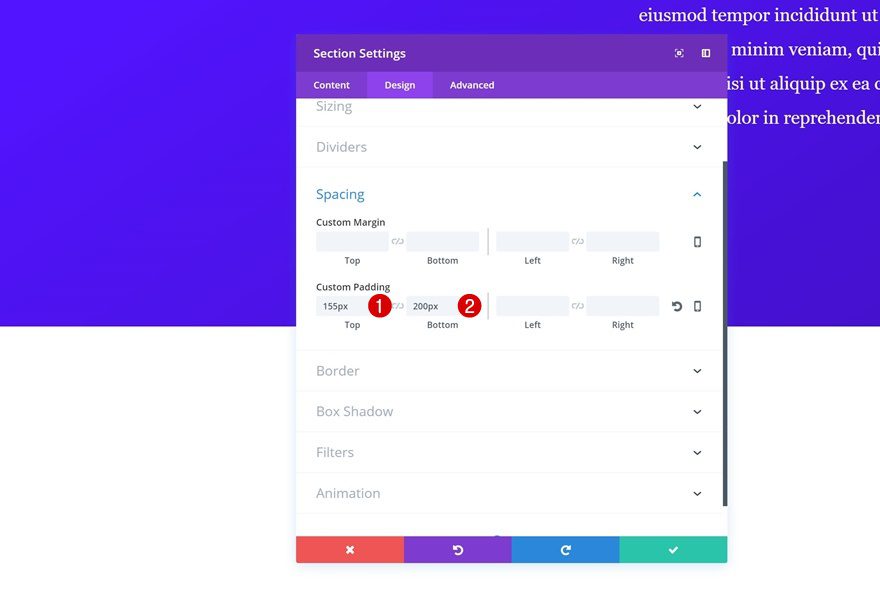
Section Settings
Spacing
We can move on to our second section! Open the section settings and use the following padding:
- Top Padding: 155px
- Bottom Padding: 200px
Add Row #1
Row Settings
Column Structure
The first row we’ll add will contain our red circle. Choose the following column structure for your row:
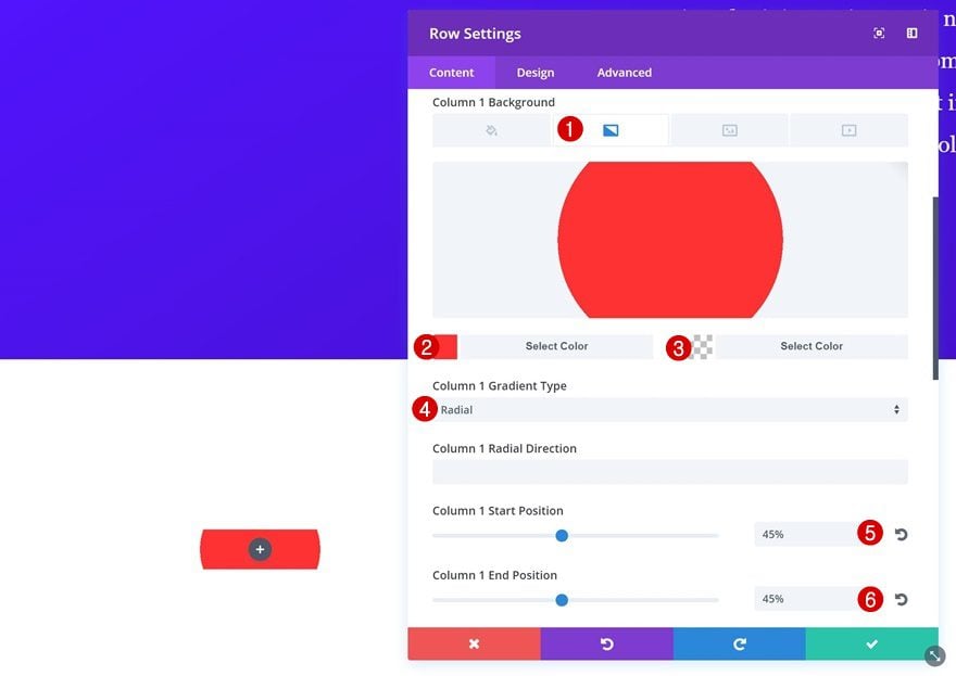
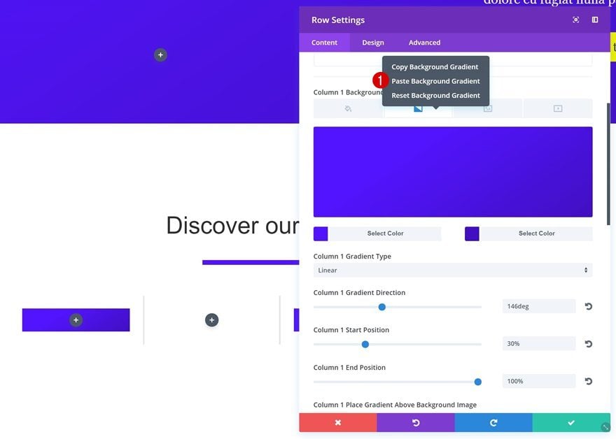
Column 1 Gradient Background
Instead of uploading an Image Module, we’re going to make use of a column 1 radial gradient background. We’re using the red color in our color palette in combination with an entirely transparent color.
- Color 1: #ff3233
- Color 2: rgba(255,255,255,0)
- Column 1 Gradient Type: Radial
- Column 1 Start Position: 45%
- Column 1 End Position: 45%
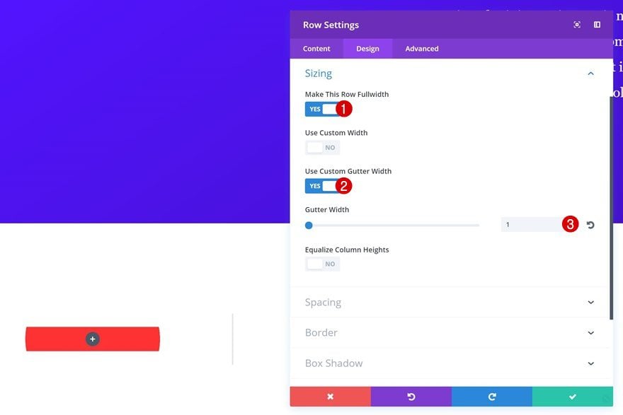
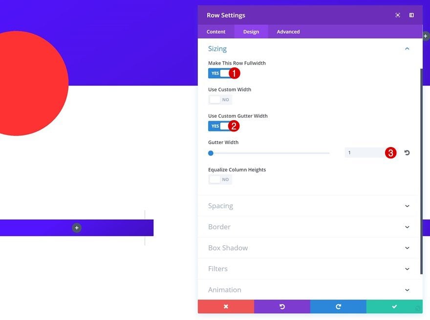
Sizing
Continue by changing your Sizing settings:
- Make This Row Fullwidth: Yes
- Use Custom Gutter Width: Yes
- Gutter Width: 1
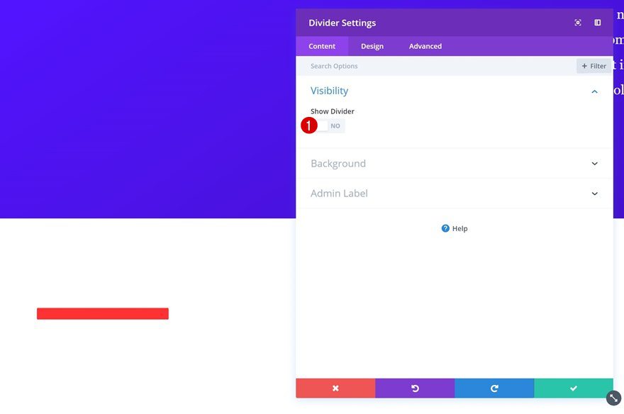
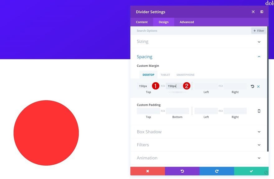
Add a Divider Module
Hide Divider
To make sure our column background shows up, we’re going to add a Divider Module to the first column. However, we don’t want the divider to show up. That’s why we’ll disable the ‘Show Divider’ option.
Spacing
And to make the colum gradient background show through, we’ll add the following margin to the Divider Module:
- Top: 150px (Desktop), 200px (Tablet & Phone)
- Bottom: 150px (Desktop), 200px (Tablet & Phone)
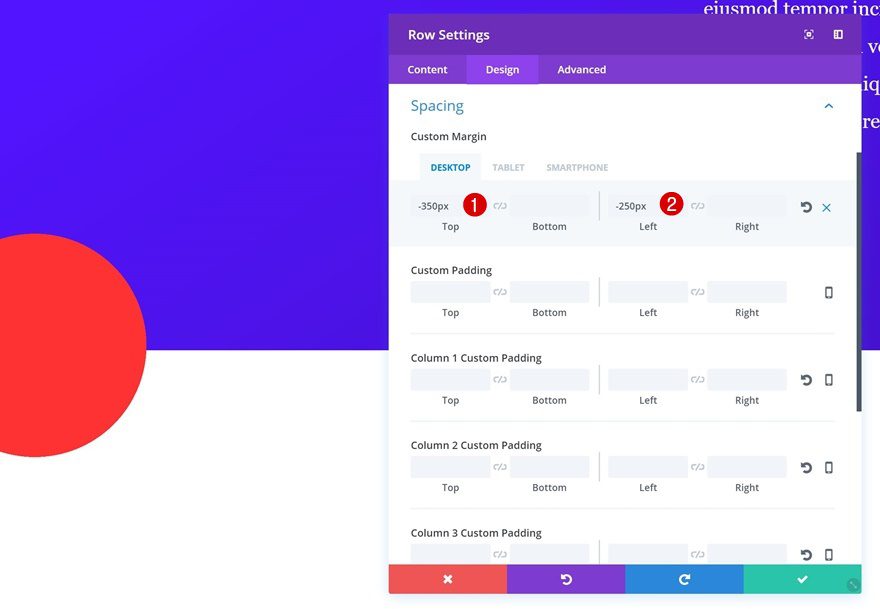
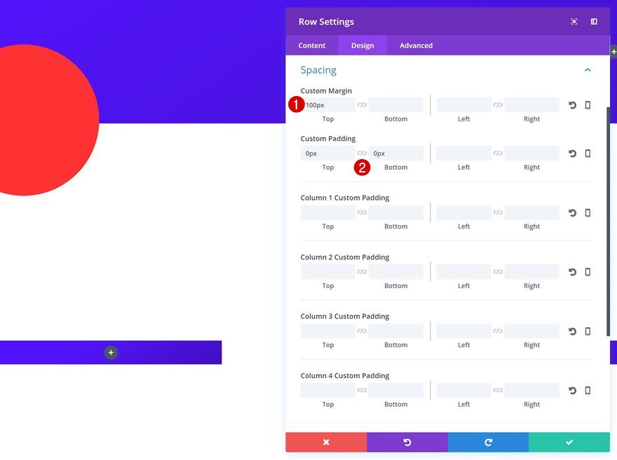
Return to Row Settings
Add Spacing
We’re going to make this red circle overlap both sections on our page. To do that, we’ll reopen the row settings and add some negative margin:
- Top Margin: -350px (Desktop), -400px (Tablet & Phone)
- Left Margin: -250px (Desktop & Phone), -400px (Tablet)
Add Row #2
Row Settings
Column Structure
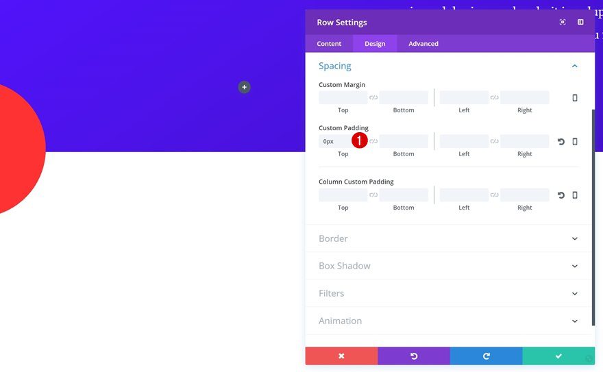
Let’s move on to our second row. This row will contain a title Text Module and divider. Choose the following column structure:
Spacing
Reduce the space that this row creates by using ‘0px’ for the top padding.
Add a Title Text Module
H2 Text Settings
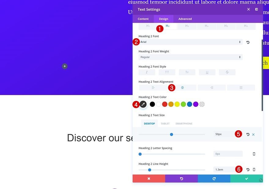
We can now add our modules. Start by adding a new H2 Text Module with the following text settings:
- Heading 2 Font: Arial
- Heading 2 Text Alignment: Center
- Heading Text Color: #303030
- Heading 2 Text Size: 50px (Desktop), 45px (Tablet), 32px (Phone)
- Heading 2 Line Height: 1.3em
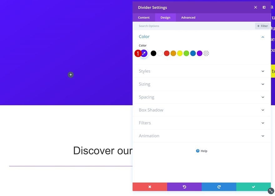
Add a Divider Module
Color
Right below the Text Module, add a Divider Module. This time, we do want the divider to show. Give it the ‘#5214ff’ color code.
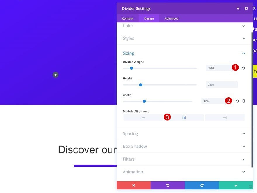
Sizing
Change the Sizing settings of your Divider Module next:
- Divider Weight: 10px
- Width: 30%
- Module Alignment: Center
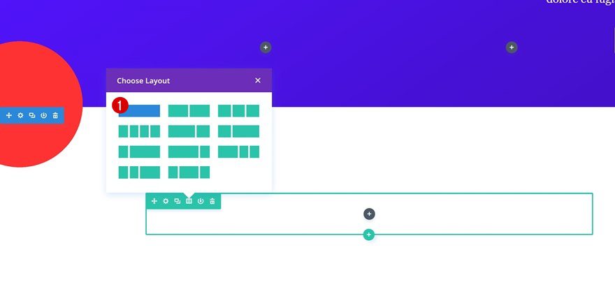
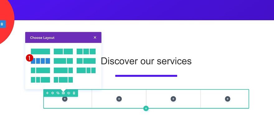
Add Row #3
Row Settings
Column Structure
It’s time to create our final row using four columns.
Copy Section Gradient Background
We’re going to use the same gradient background as we did for the hero section. So, to save ourselves some time, we’re simply going to copy those settings.
Paste Gradient Background in Column 1 & 3
And paste them in column one and three.
Sizing
Go to the Sizing settings next and make your row take up the entire width of the screen.
- Make This Row Fullwidth: Yes
- Use Custom Gutter Width: Yes
- Gutter Width: 1
Spacing
We’ll also change the Spacing settings:
- Top Margin: 100px
- Top & Bottom Padding: 0px
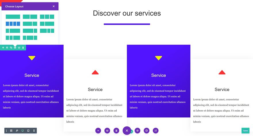
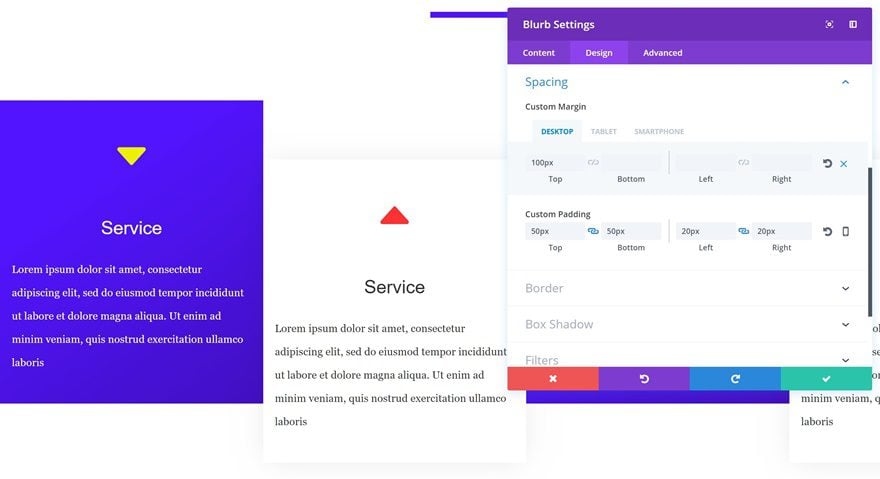
Add a Blurb Module
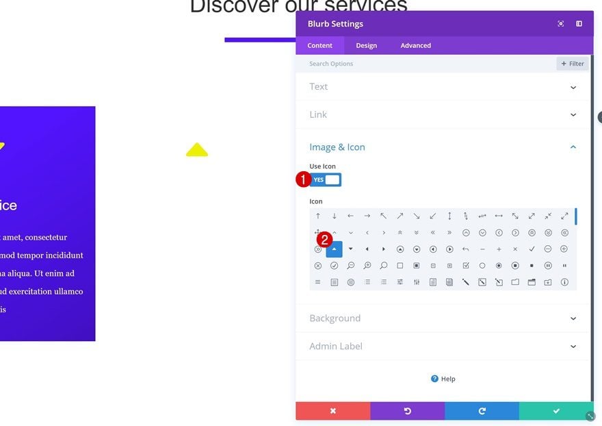
Select Icon
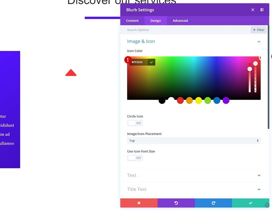
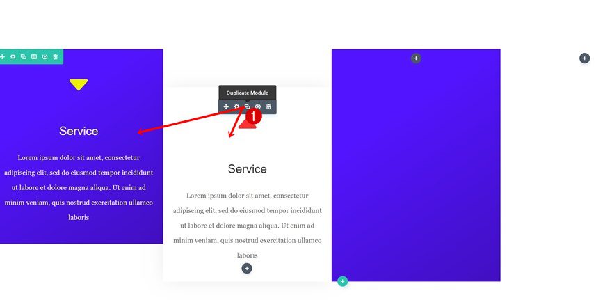
Now that we’re done with the row settings, we can start adding our modules! We’ll need four Blurb Modules, one for each column. Instead of creating them separately, we’re going to creating one and duplicate it afterwards. Once you add your blurb content, go ahead and select an icon of your choice.
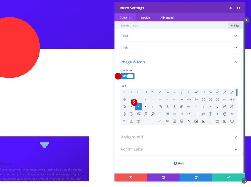
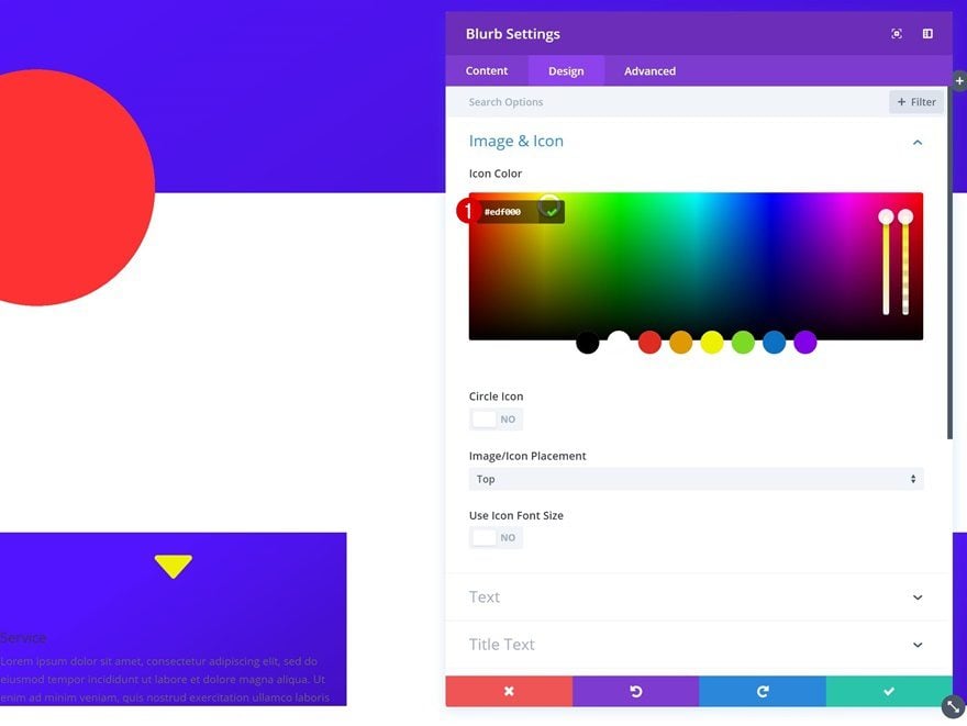
Icon Settings
Open your icon settings next and use the ‘#edf000’ icon color.
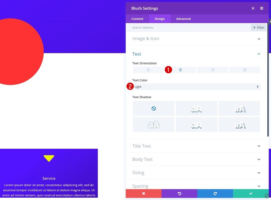
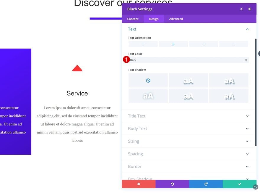
Text Settings
Continue by using the following text settings:
- Text Orientation: Center
- Text Color: Light
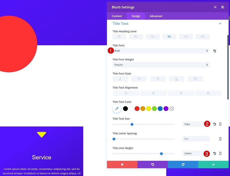
Title Text Settings
Open the title text settings next and make some changes:
- Title Font: Arial
- Title Text Size: 31px
- Title Line Height: 2.6em
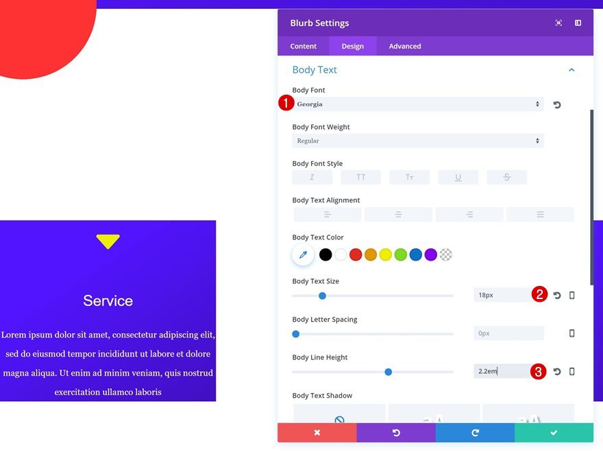
Body Text Settings
Likewise, we’re going to make the body text match the layout we’re creating:
- Body Font: Georgia
- Body Text Size: 18px
- Body Line Height: 2.2em
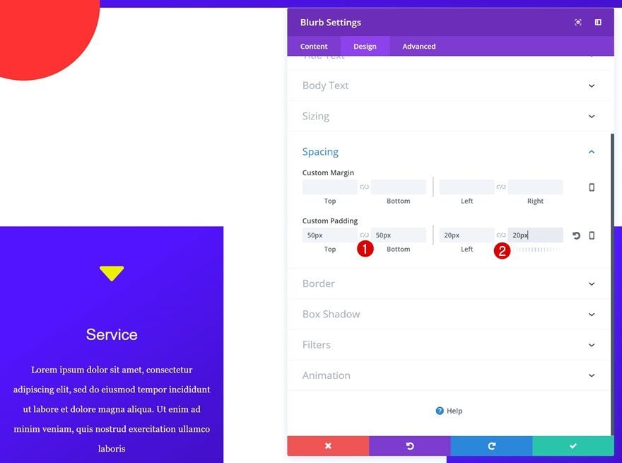
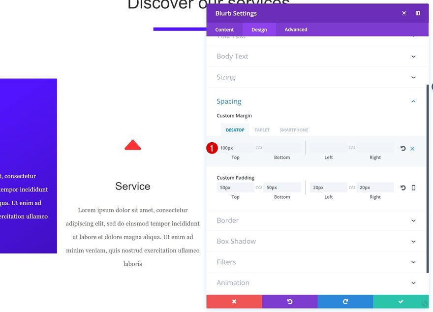
Spacing
And lastly, to give your Blurb Module some space to breathe, add the following custom padding:
- Top & Bottom Padding: 50px
- Left & Right Padding: 20px
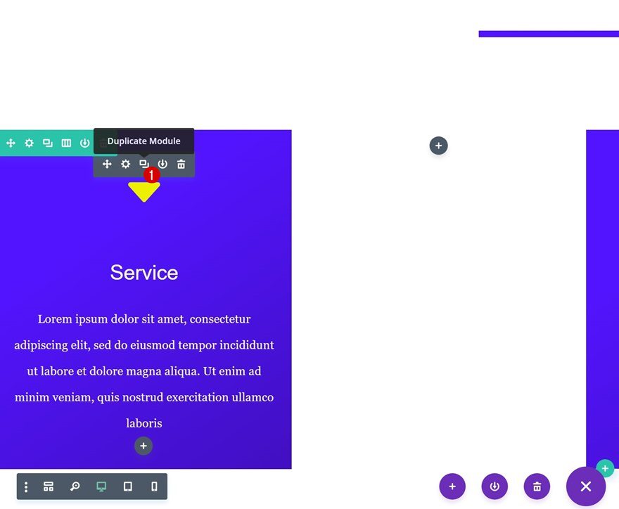
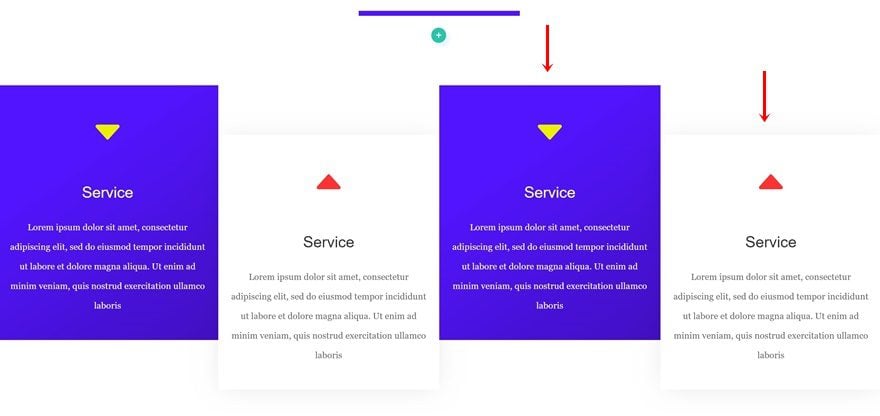
Clone & Change Blurb Module
Clone Blurb Module & Place in Column 2
Clone the Blurb Module you’ve just created and place the duplicate in the second column.
Change Icon
The first thing you’ll need to change is the icon.
Change Icon Color
Change the icon color into ‘#ff3233’ as well.
Change Text Color
Since we’re dealing with a white background color, you’ll need to change the text color into ‘Dark’ within the text settings.
Spacing
We’re playing around with the height of Blurb Modules to make everything pop out a bit more. To do that, open the spacing settings and use the following top margin values:
- Top Margin: 100px (Desktop), 0px (Tablet & Phone)
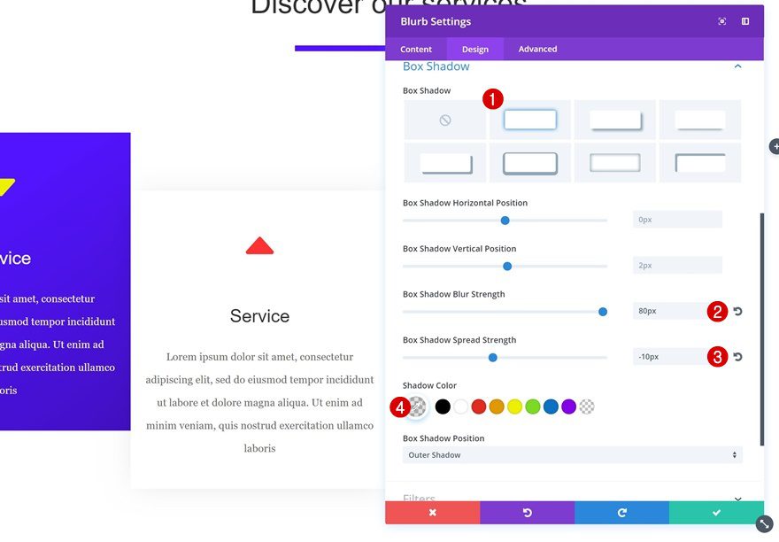
Box Shadow
To top it off, we’ll add a very subtle shadow as well:
- Box Shadow Blur Strength: 80px
- Box Shadow Spread Strength: -10px
- Shadow Color: rgba(0,0,0,0.11)
Clone Both Blurb Modules & Place in Remaining Columns
Clone Modules
We now have our two Blurb Modules which we’ll reuse for the remaining columns. Clone each one of them once.
Place in Column 3 & 4
Place the duplicate Blurb Modules in their corresponding column and you’re done!
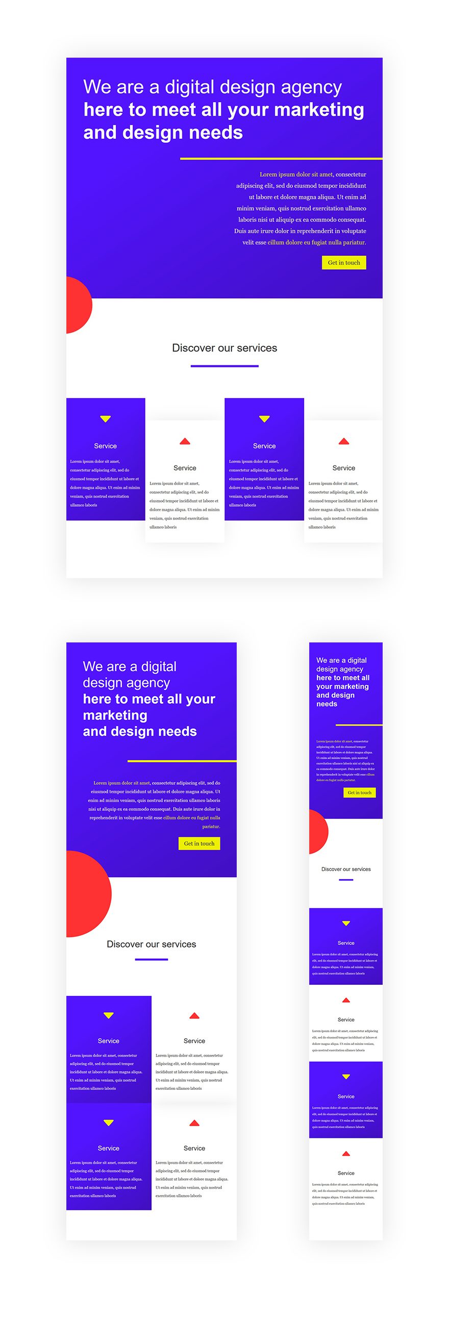
Preview
Now that we’ve gone through all steps, let’s take one final look at the end result on different screen sizes.
Final Thoughts
In this post, we’ve shared some tips and techniques on creating flat web design with Divi. Flat web design is very popular nowadays because it allows visitors to easily navigate through pages and process information quicker. If you have any questions or suggestions, make sure you leave a comment in the comment section below!


Nice and simple and clean design with lots of colors.
Thanks
I am unable to find the others. Any tip how to locate it?Tks
I am unable to find here the others posts. Any tip to find them?
Great post!!! So many cool tips for specific technical aspects… it’d be awesome if these blog posts could be tagged in certain topics so they show up at the tutorial section ♥
Is it WordPress theme?
Really great post, about making af flat design. Is it possible to download the design?
Great post!
This article definitely spoke to me. It matches my design style. I like to keep things simple for user experience but at the same time I’m not afraid to use colors and fonts. I’m not afraid to experiment but still keeping a simplistic approach.
I need to read the other post regarding styles…
I love this stuff. Please keep it up. Great way to learn how to use Divi. Much appreciated.
Can you make this design downloadable? ?
Can we do an article on Brutalism design and DIVI