
Showcase stats, skills, and more with Divi’s Circle Counter Module. Utilizing this module helps break up the monotony that can be present on pages that contain a lot of numerical data. The Circle Counter Module gives you a beautiful and visually-compelling way to display a single data point. Upon page load, the module has an eye-catching animation that showcases data in an exciting way. Say goodbye to boring tables on your web pages! In today’s blog post, we’ll learn how to style Divi’s Circle Counter Module, with the help of some of the free layout packs that come with Divi.
- 1 Examples of How-to Style Divi’s Circle Counter Module
- 2 Preparing to Style Divi’s Circle Counter Module
- 3 Style One ft. the Divi Streamer Layout Pack
- 4 Design Two with the Divi Chocolatier Layout Pack
- 5 Style Three with the Divi Jewelry Designer Layout Pack
- 6 Design Four ft. Divi Hostel
- 7 Final Example: Divi Toy Store
- 8 Final Thoughts
Examples of How-to Style Divi’s Circle Counter Module
We’ll use a variety of layout packs throughout this tutorial. Each layout pack is from a different sector. This will showcase that there are many instances where the Circle Counter Module can be put to use.
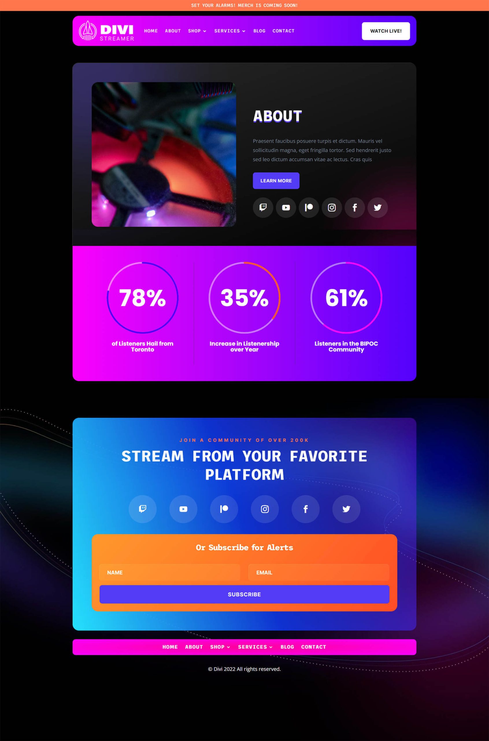
Option One: Divi Streamer
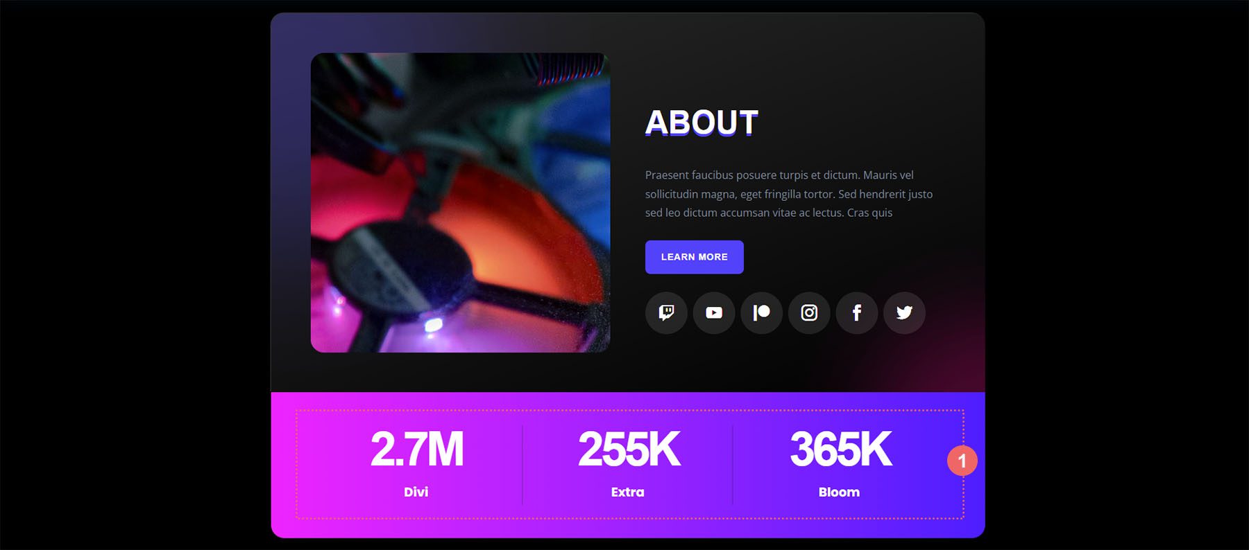
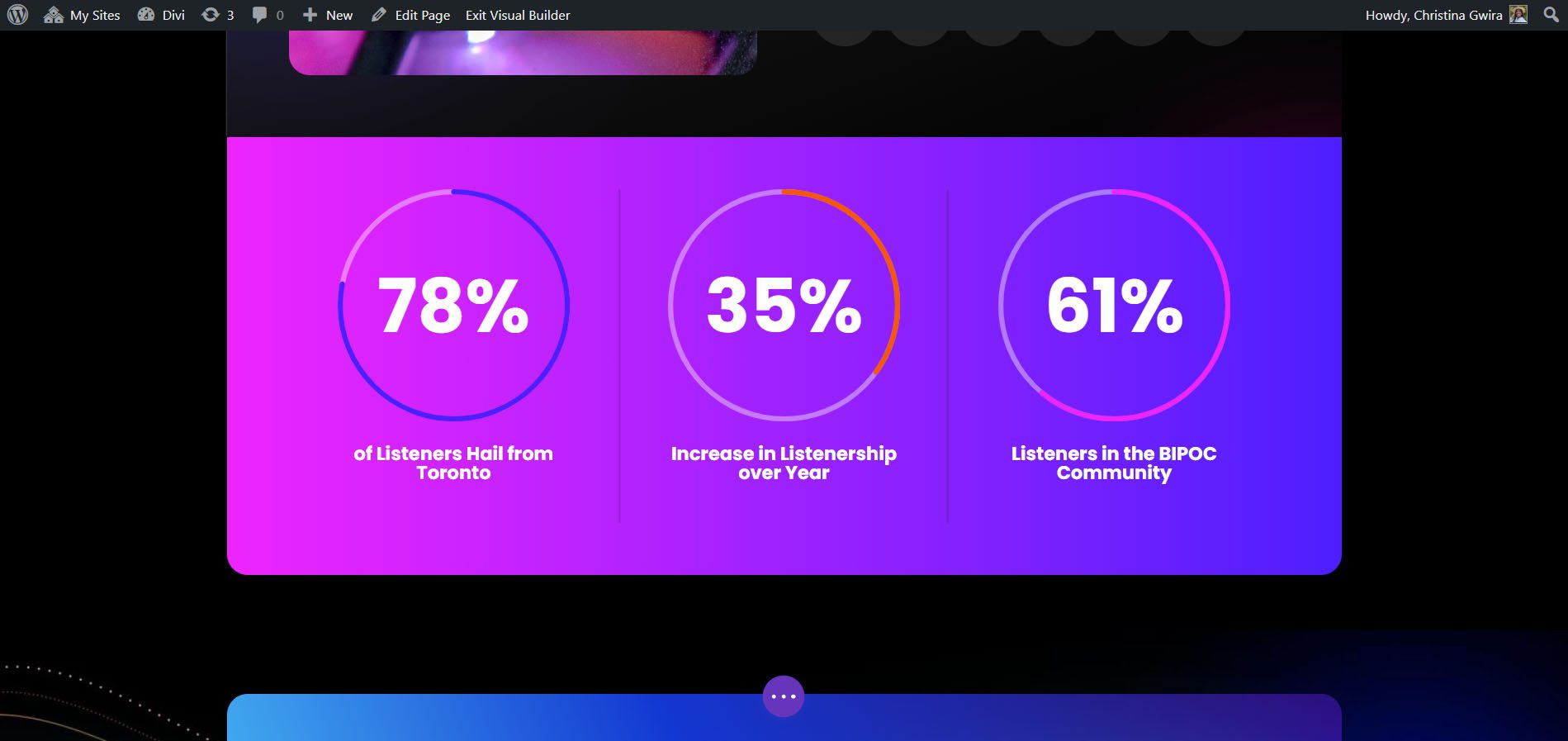
With this layout pack, we used the Circle Counter Module to showcase the demographic stats of the Divi Streamer.
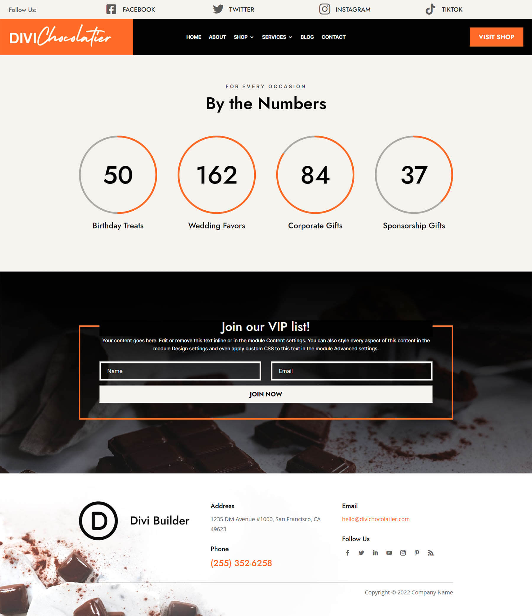
Style Two: Divi Chocolatier
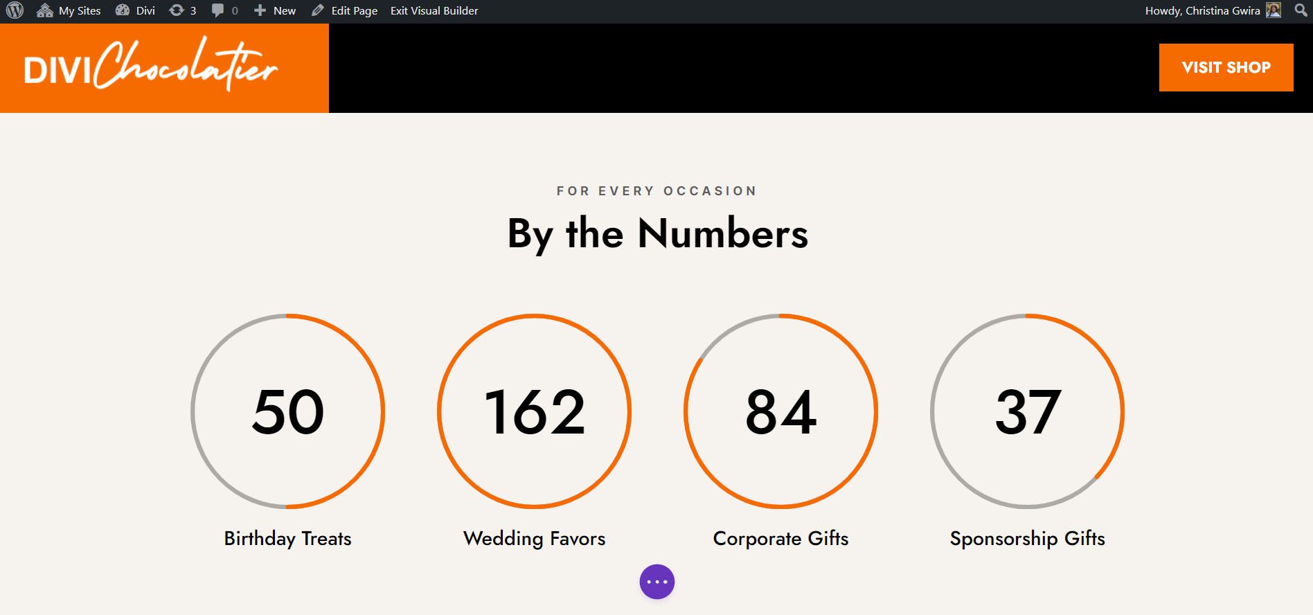
For a chocolatier, we used the modules to showcase the number of orders that had come into the business.
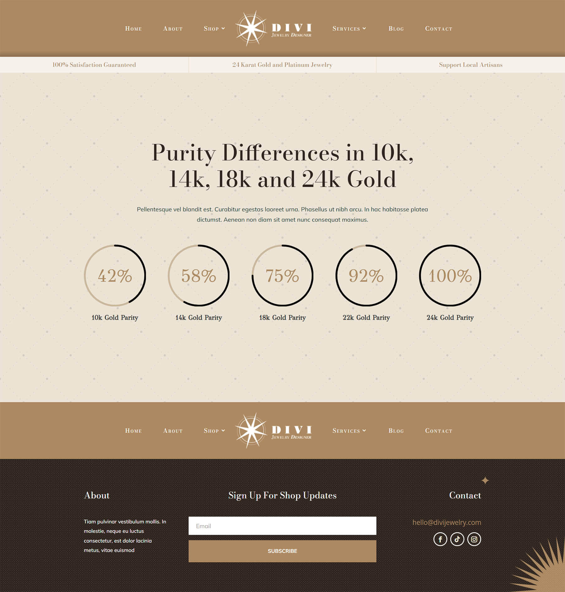
Design Three: Divi Jewelry Designer
In this case, we used the Circle Counter module to present information to the viewer.
Look Four: Divi Hostel
Measuring the “happiness quotient” among guests with an animated module just makes sense.
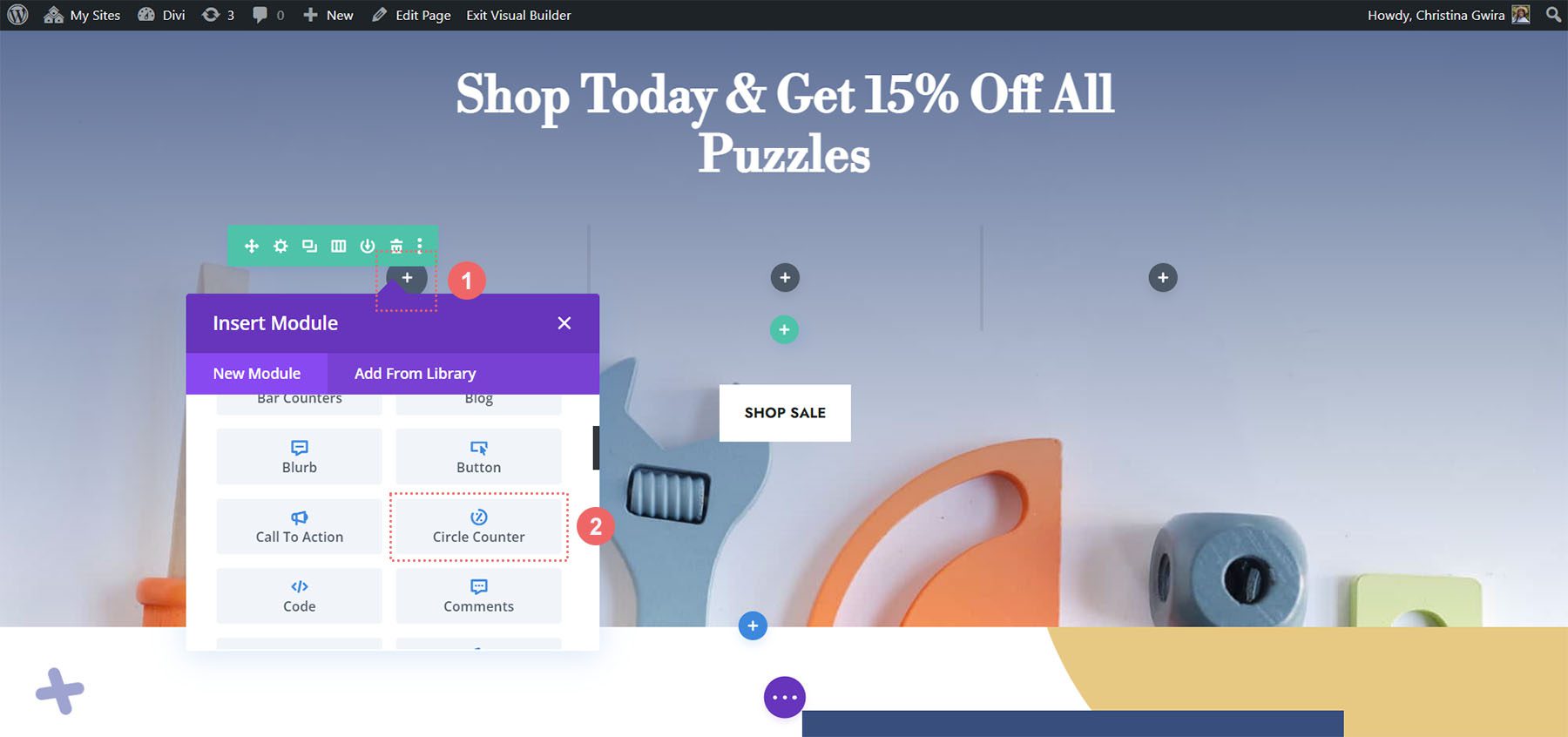
Demo Five: Divi Toy Store
We use Circle Modules here to promote a sale on an online store.
Preparing to Style Divi’s Circle Counter Module
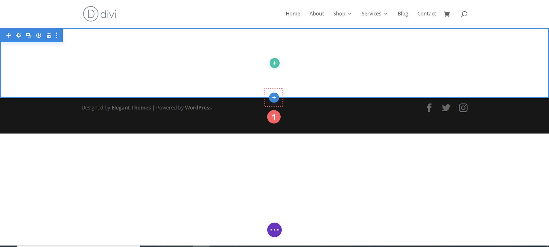
Before we begin to style Divi’s Circle Counter Module, we need to first create a separate section that will house these modules. Whether you are adding this section to a new page or an existing page, you will need to do the same preparation. Prior to styling, decide which data points you would like to showcase in the Circle Counter Module. Next, you will need to create a section for your modules. Thirdly, you will need to decide how many columns will be within the row. This is why you’ll need to know which data points will be populating the data for your Circle Counter Module. Your data points will influence the number of columns that you will be using. Once this is set up, you will then add your Circle Counter Module to each column.
Creating Your Section
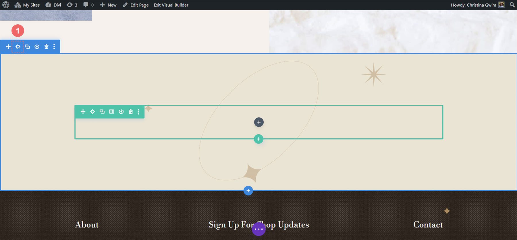
First, click on the blue plus icon. This will add a new section to your page.
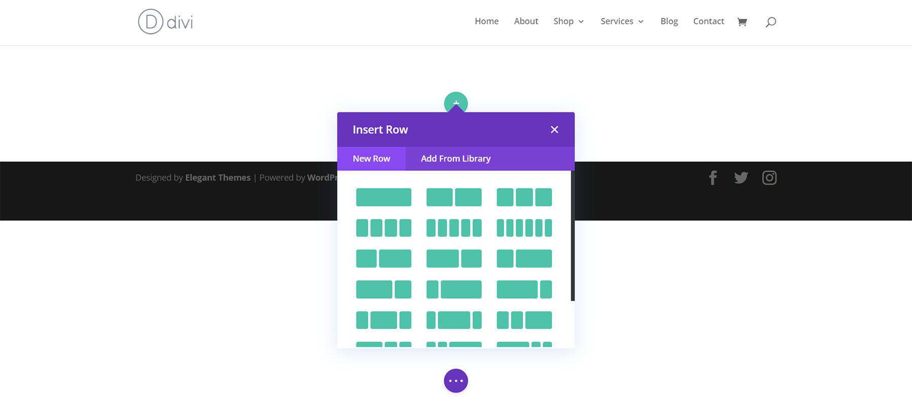
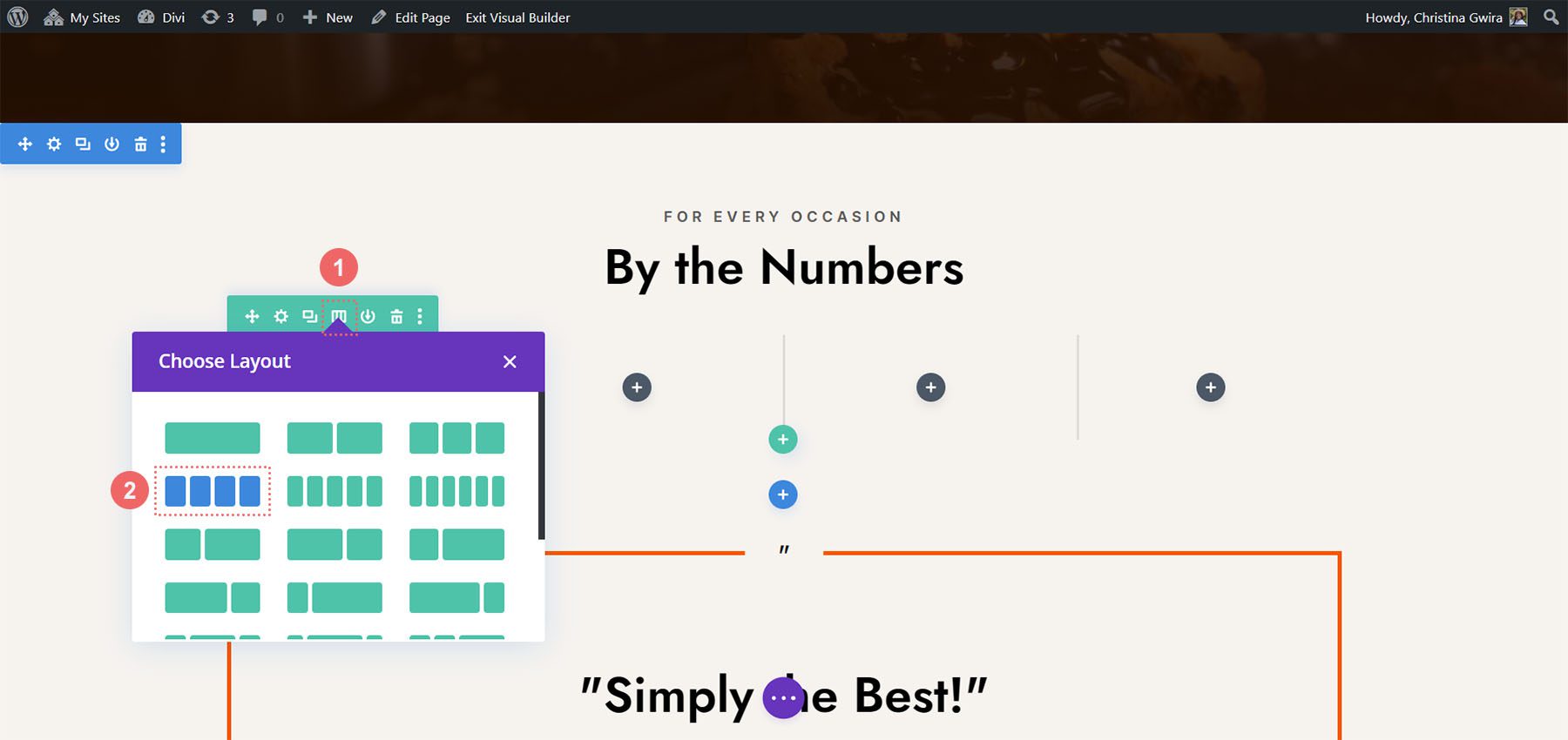
Selecting Your Columns
Next, you will use the green plus icon to add a row with the number of columns that you’ll be using. Each column will hold one Circle Counter Module.
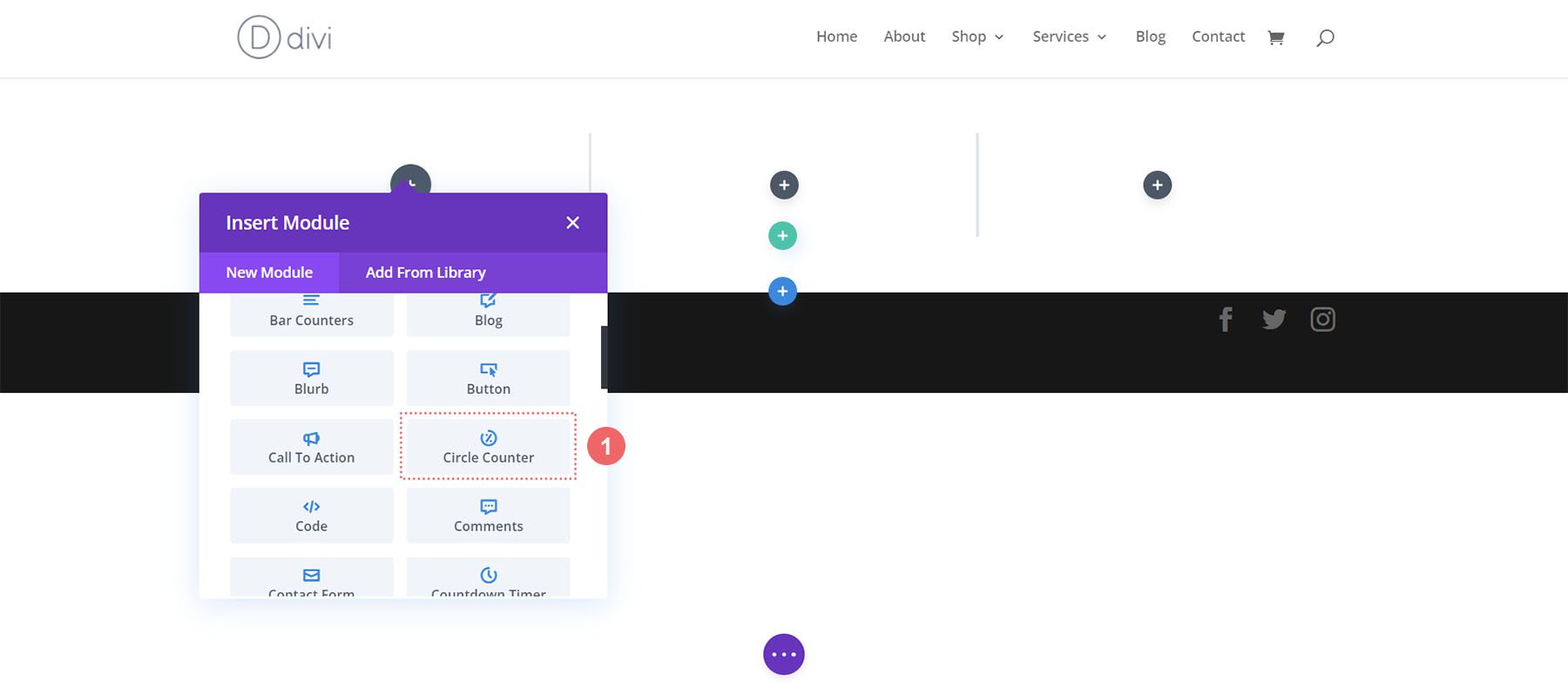
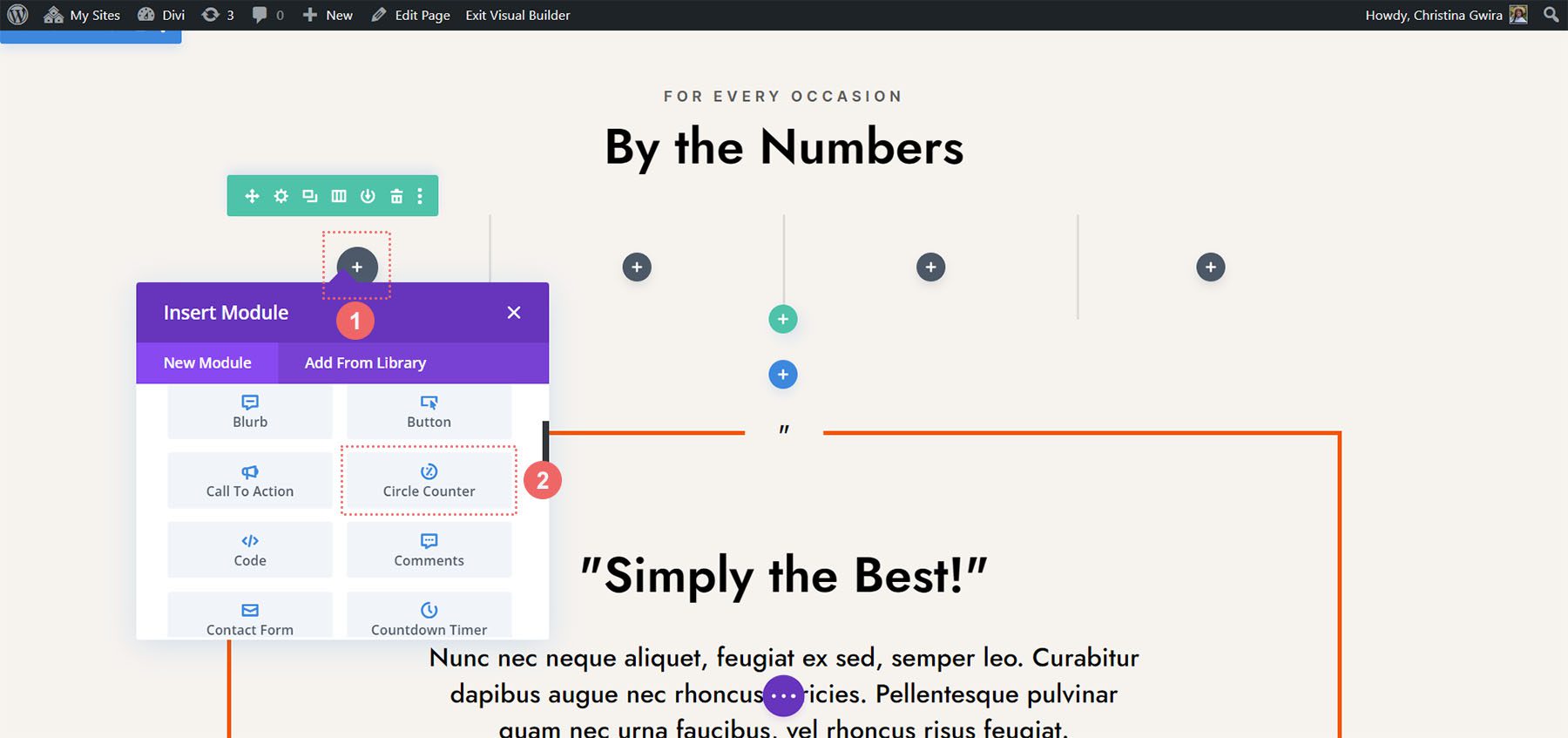
Add Circle Counter Modules
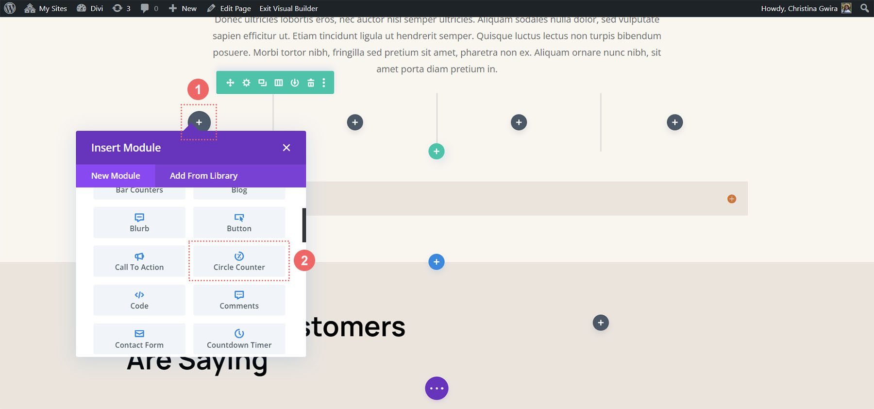
Once you have your columns created, click on the gray plus icon. This will open the Modules Modal. From here, select the Circle Counter Module.
For consistency, I would recommend styling one Circle Counter Module at a time. Then, use Divi’s right-click menu to duplicate each Circle Counter Module and modify the data point within.
Now that we have the fundamentals down pat, let’s start styling the module.
Style One ft. the Divi Streamer Layout Pack
You can follow this blog post to see which layout from the Divi Streamer Layout Pack suits your needs best. For this tutorial, we’re going to modify the About Section within the landing page layout.
Prepare the Section
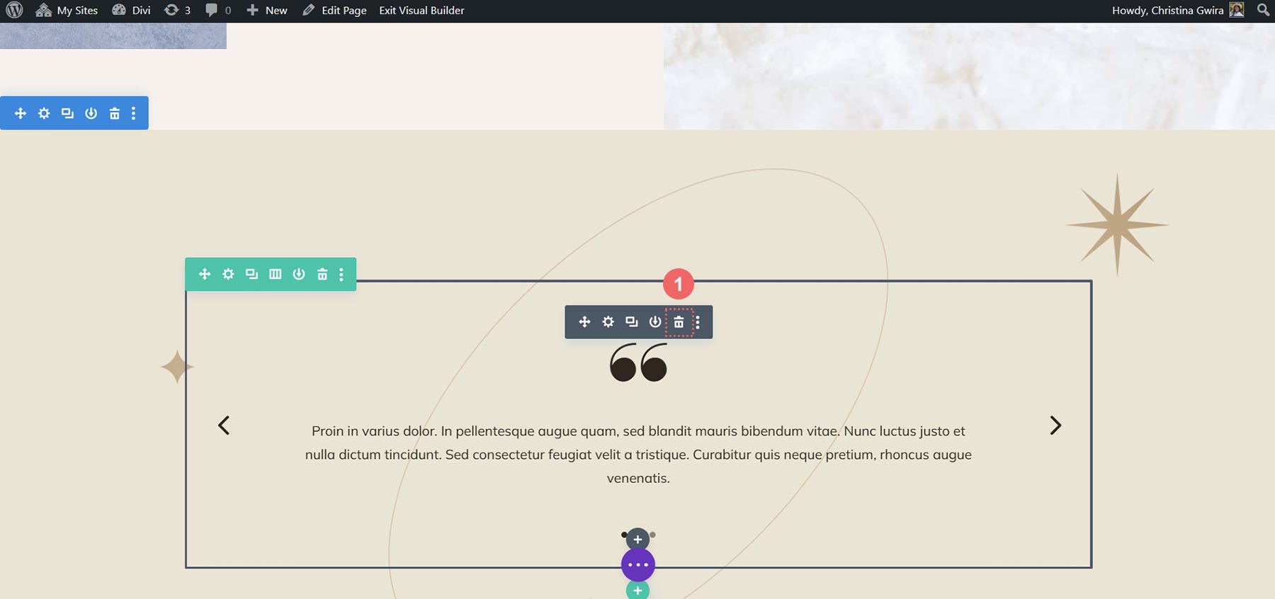
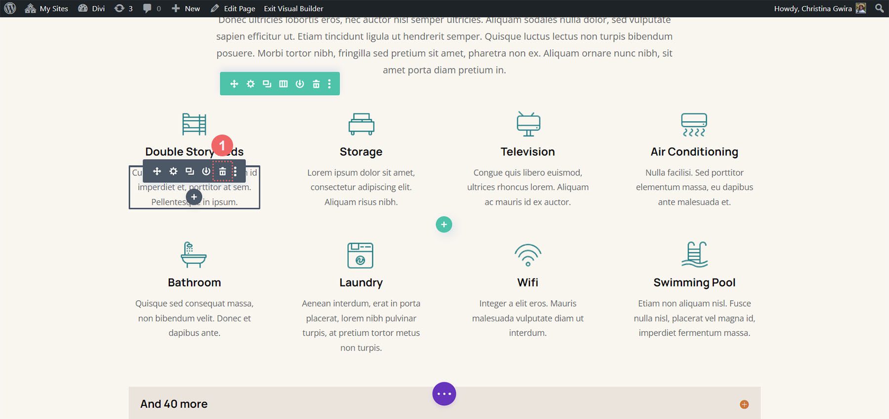
First, let’s delete the Number Counter Modules that are currently in this section. Hover over the module, and from the gray popout menu that appears, click the trash can icon.
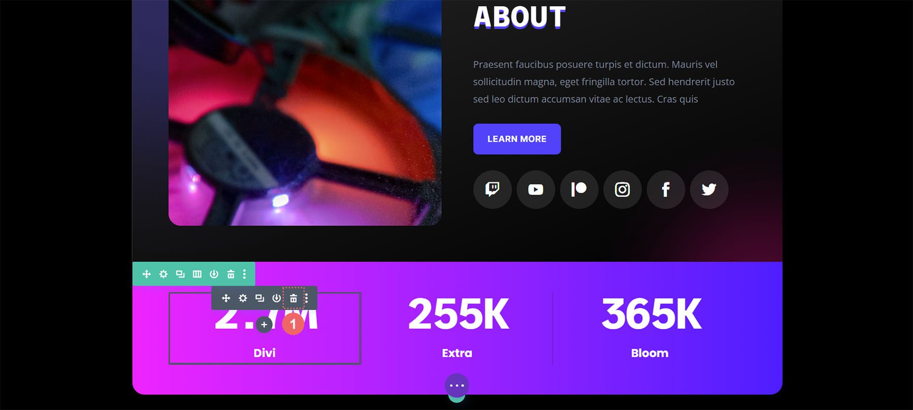
Repeat this for the other Number Counter Module within the section.
Add Circle Counter Module
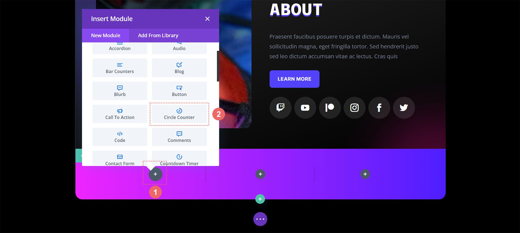
Next, click on the gray plus icon to add a Circle Counter Module to the first column of your row. Next, click on the Circle Counter icon to add one of the modules to the column.
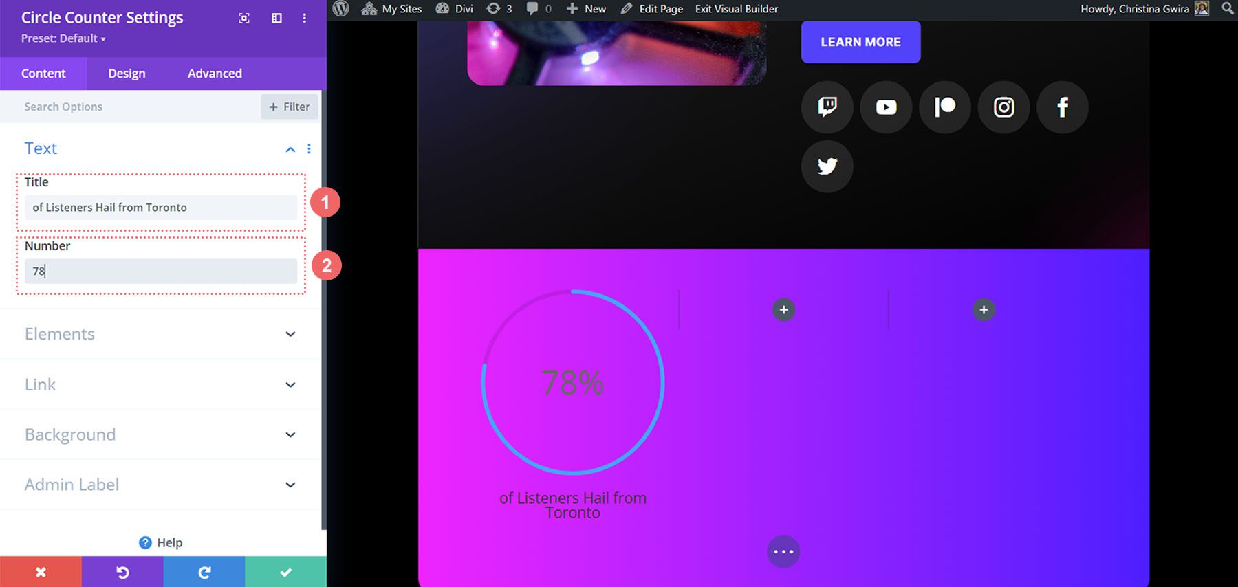
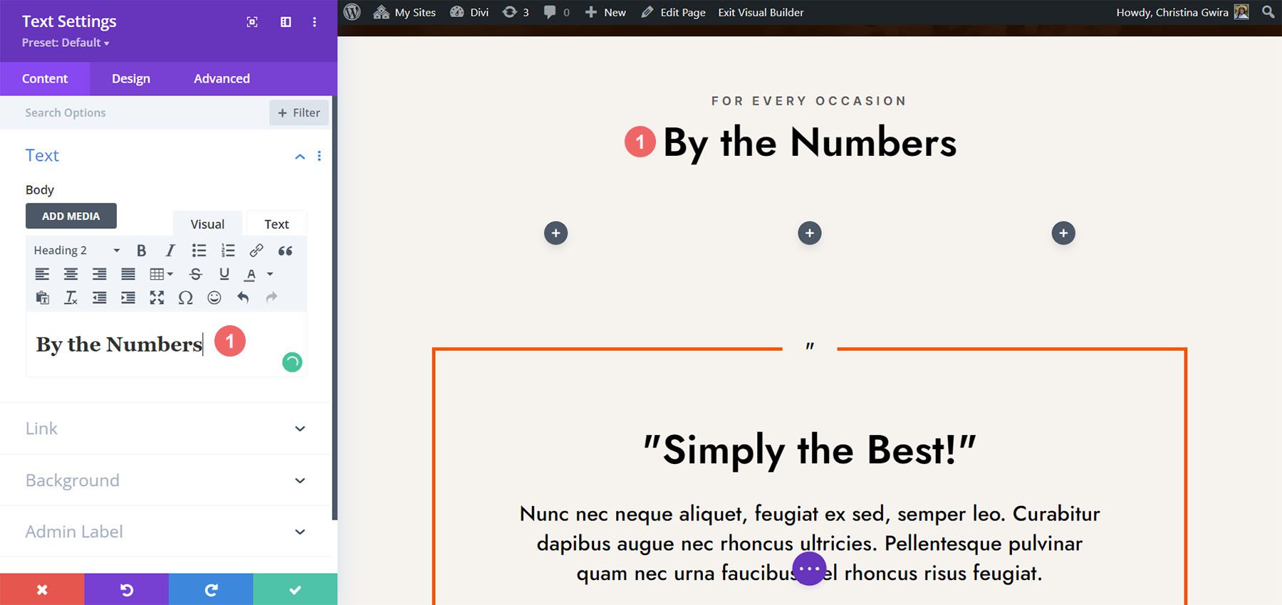
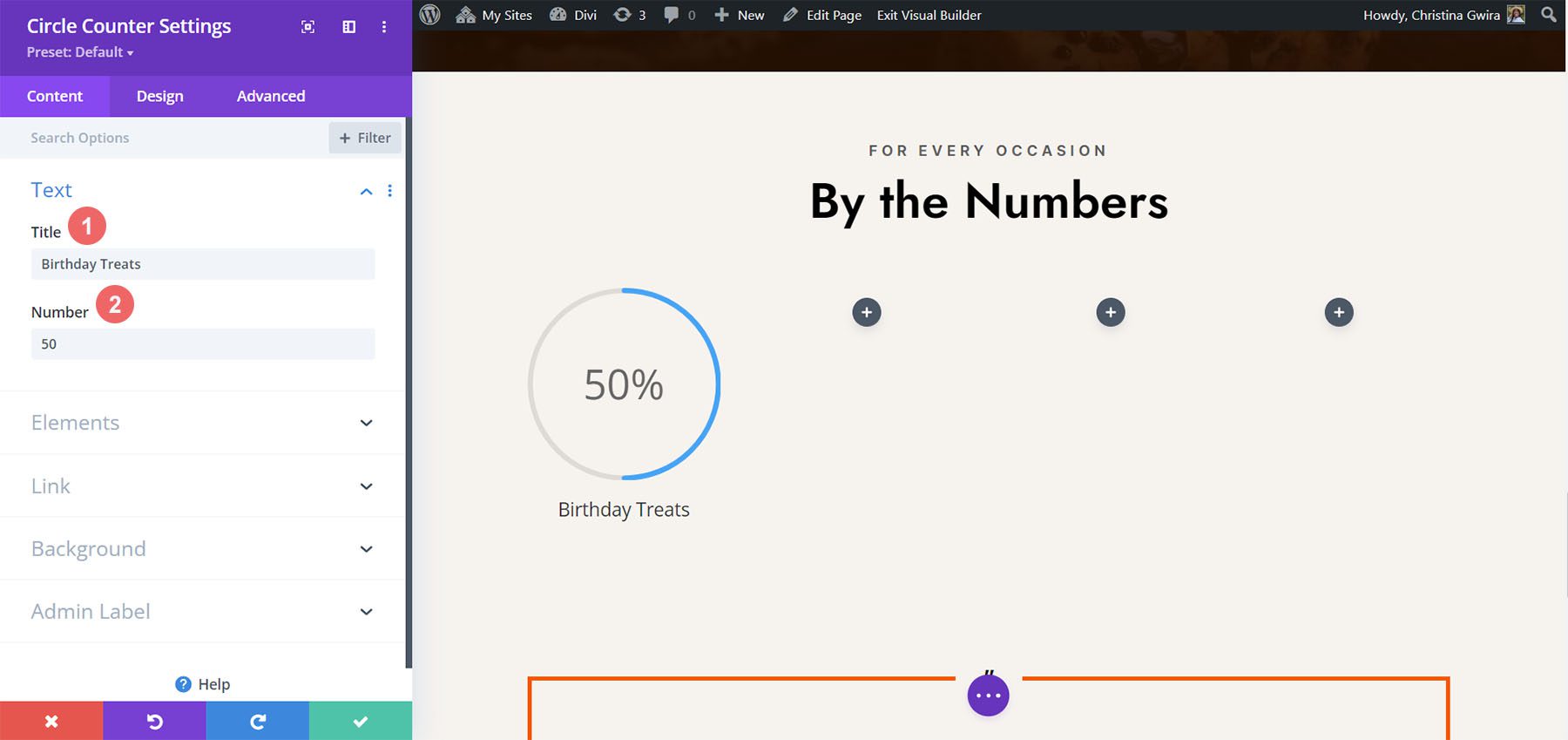
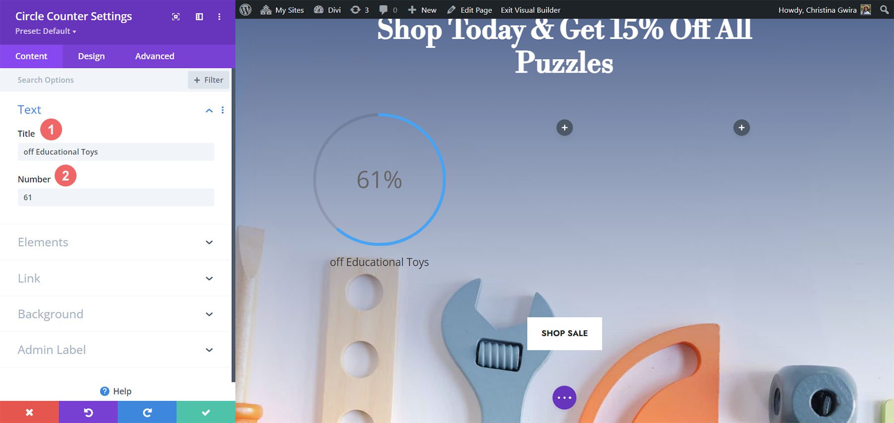
Adding Your Content
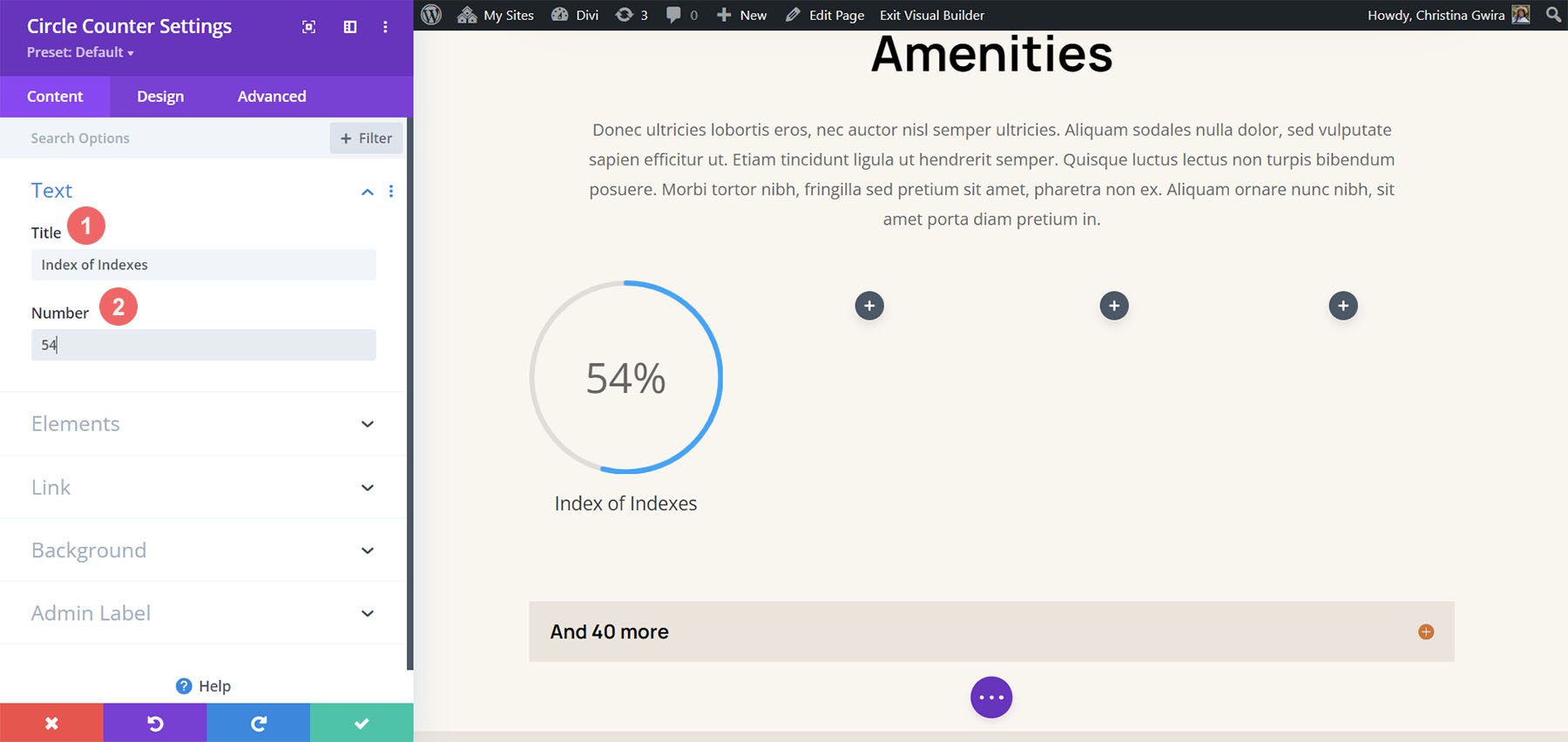
Once your first Circle Counter Module has been added, you’ll now need to enter your data point. In the Content tab of the module, enter a description for your data point. In our case, we’ll be showcasing a percentage of users who are from Toronto. So, we enter our text and the number 78 (without the percent sign!)
Style the Circle Counter Module
We now will move to the Design tab. As our section is part of the Divi Streamer Layout Pack, we’ll use the font, text, and colors that are a part of the pack to influence the styling of our module.
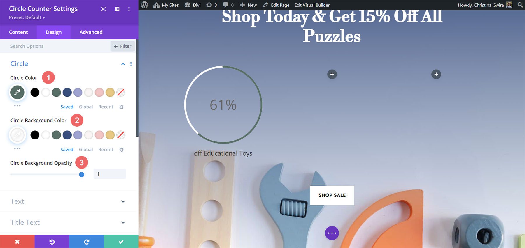
Styling the Circle Graph
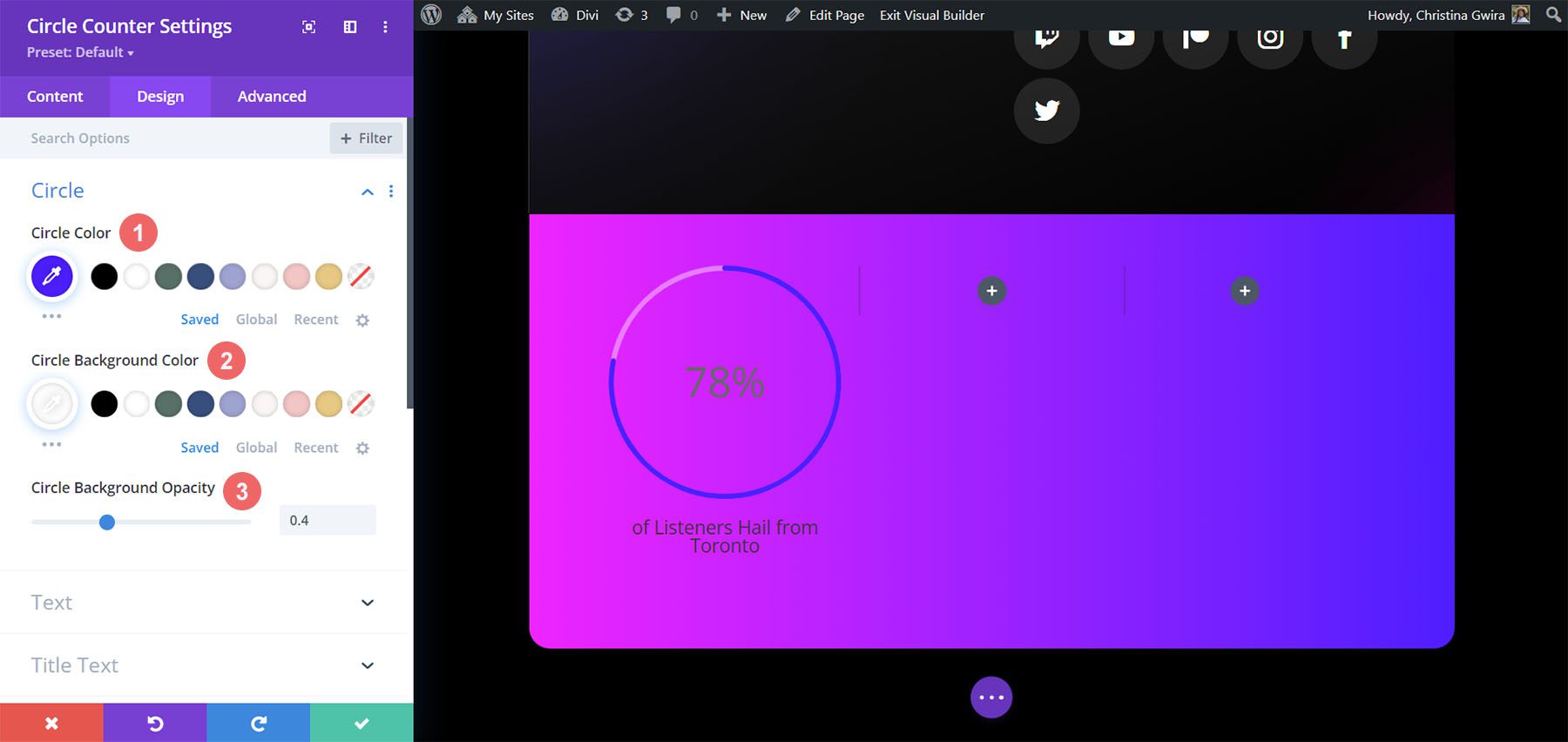
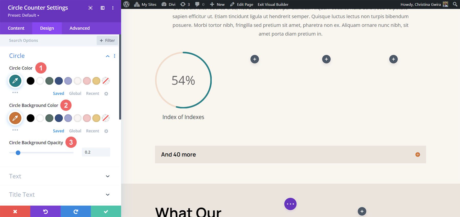
Let’s start first by clicking on the Circle tab to decide on the colors used for the circle part of the module.
Circle Design Settings:
- Circle Color: #5200ff
- Circle Background Color: #ffffff
- Circle Background Opacity: 0.4
Styling the Title Text
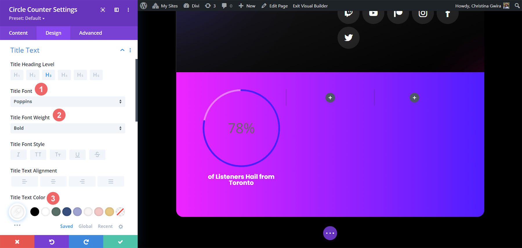
Following styling the circle graph, we’ll move on to the Title Text of the module. Click on the Title Text tab, then use the following settings to add some life to the title text of our Circle Counter Module.
Title Text Settings:
- Title Font: Poppins
- Title Font Weight: Bold
- Title Font Color: #ffffff
Adding Style to the Number Text
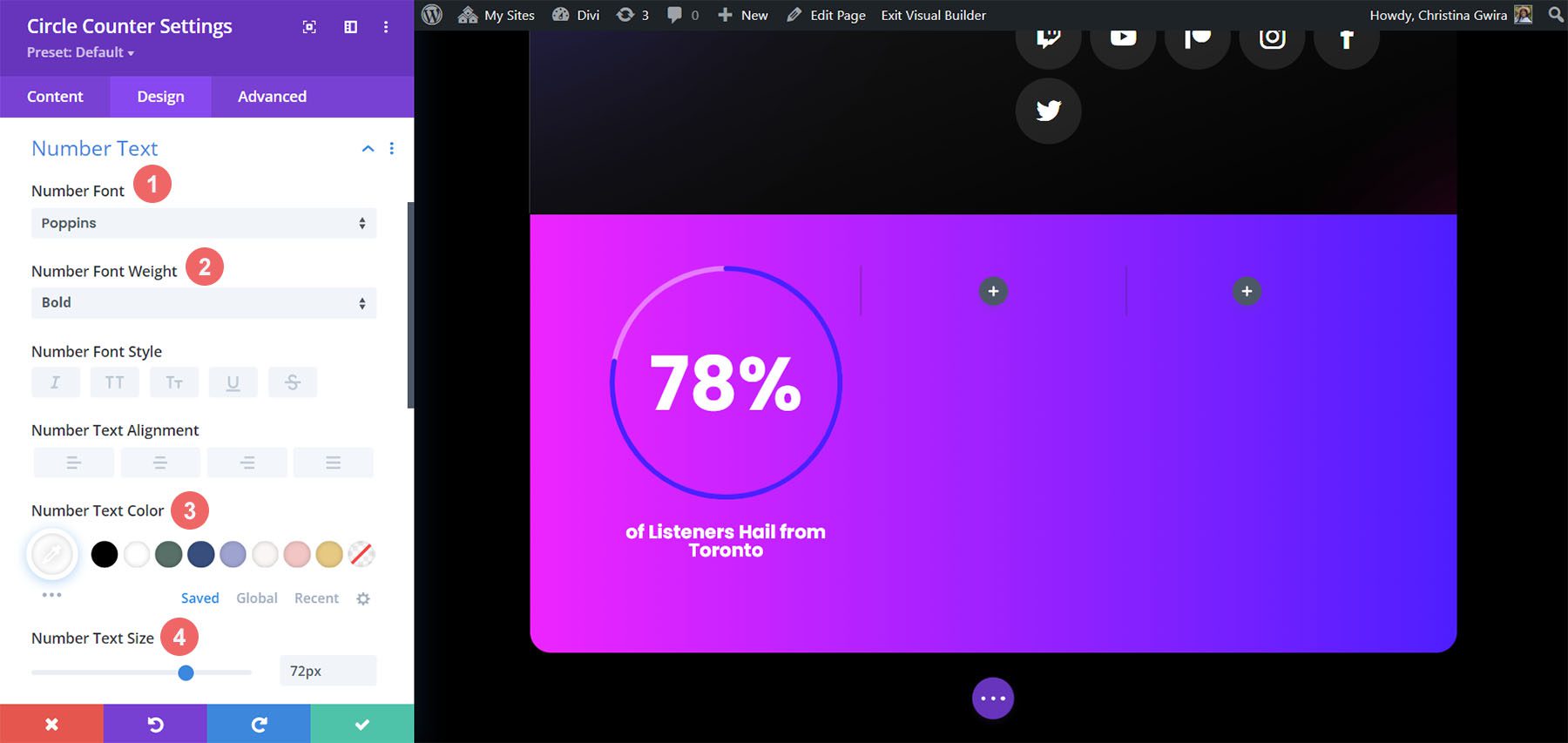
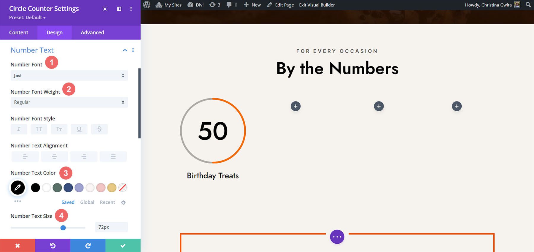
Last but not least, we’ll be fixing the numbers within the Circle Counter Module. For this, we click on the Number Text tab. Then, we’ll use the following settings to style. Notice, we pulled inspiration from the layout pack, but also the Number Counter Modules that were there before.
Number Text Settings:
- Number Font: Poppins
- Number Font Weight: Bold
- Number Text Color: #ffffff
- Number Text Size: 72pt
Once you have ended these final edits, click on the green check mark at the bottom of the modal box. This will save your changes.
Copy and Update Module
With styling complete, we can now duplicate this module. We will modify it with our other data points and their corresponding titles. To do this, hover over the module. This will bring up the modules settings menu popup. Click the copy icon. Then, move the module to the other columns in your row.
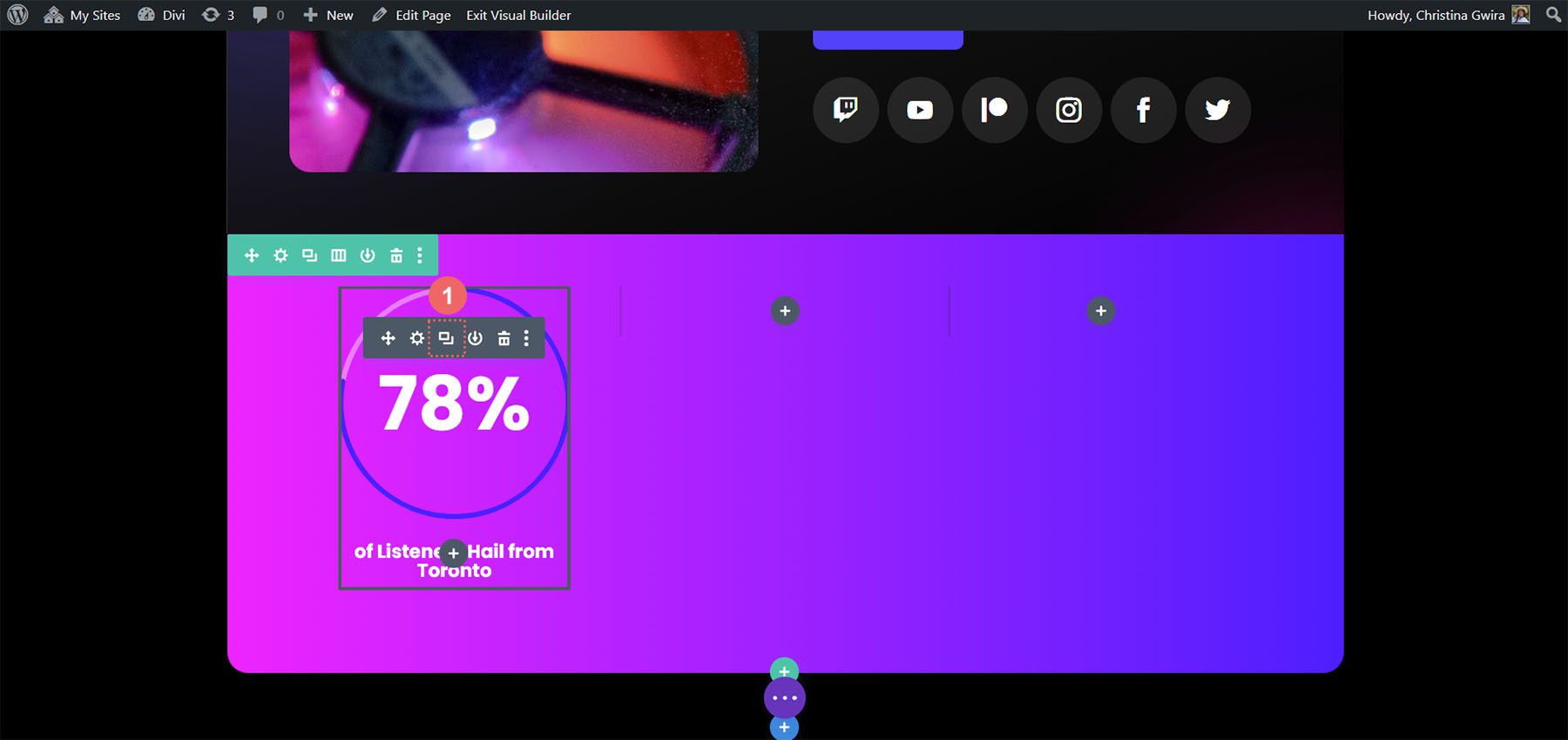
In our case, in addition to updating the title and the data for the module, we also changed the colors to match the layout pack.
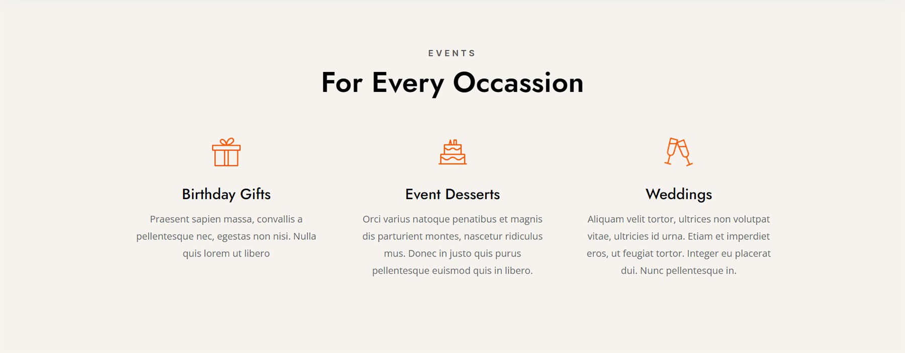
Design Two with the Divi Chocolatier Layout Pack
Follow the Divi Chocolatier Layout Pack blog post to find out how to install the layout onto your website. We’ll be modifying the events sections on the home page layout. Let’s add some Circle Counter Modules to show data on how many orders have been collected.
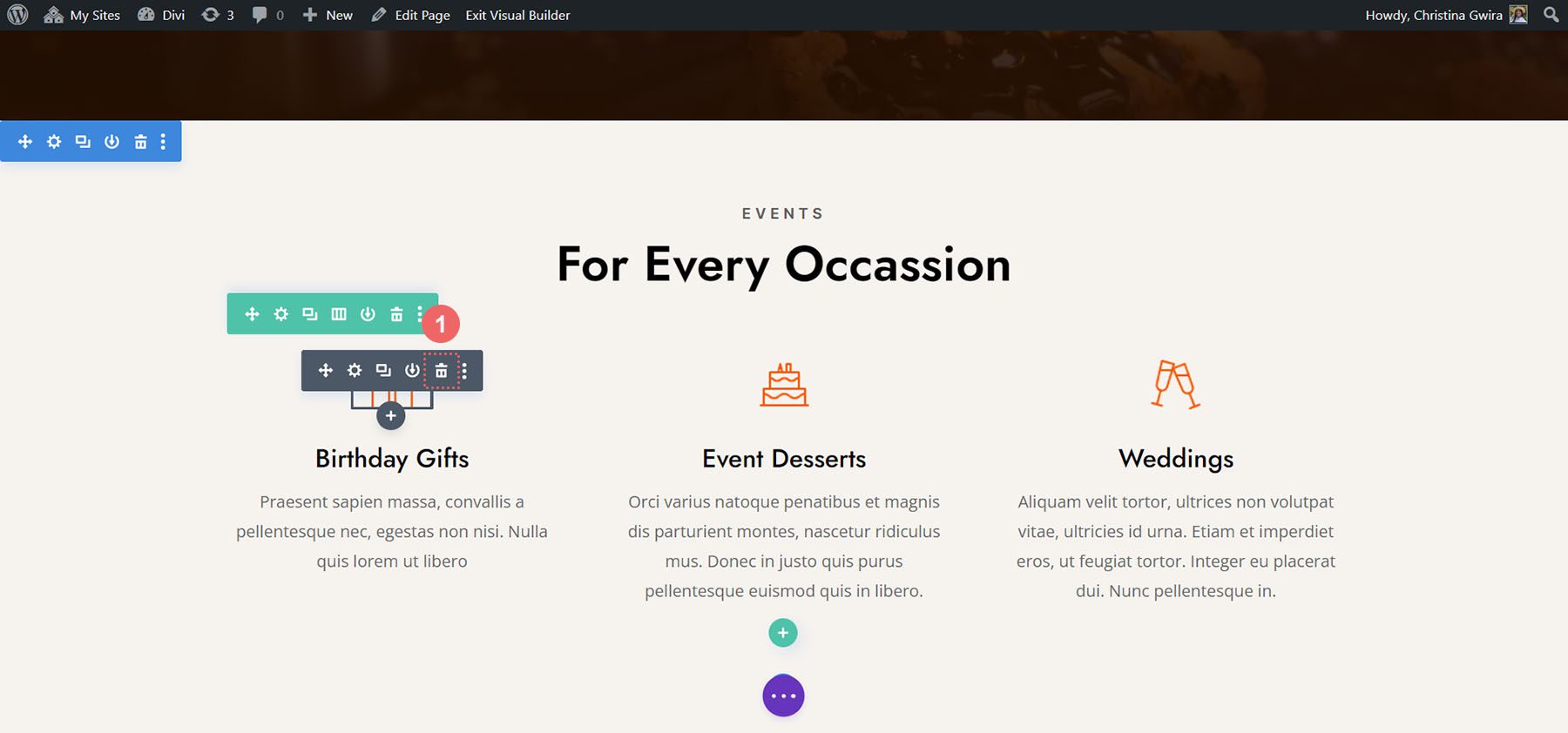
Remove Current Content
Firstly, we want to remove the current modules. While the Text and Image Modules here look great, they’re quite static. By using the Circle Counter Modules, we’ll add some excitement and animation to this section. Hover over each module and click the trash can icon. The icon will appear in the module settings popout menu.
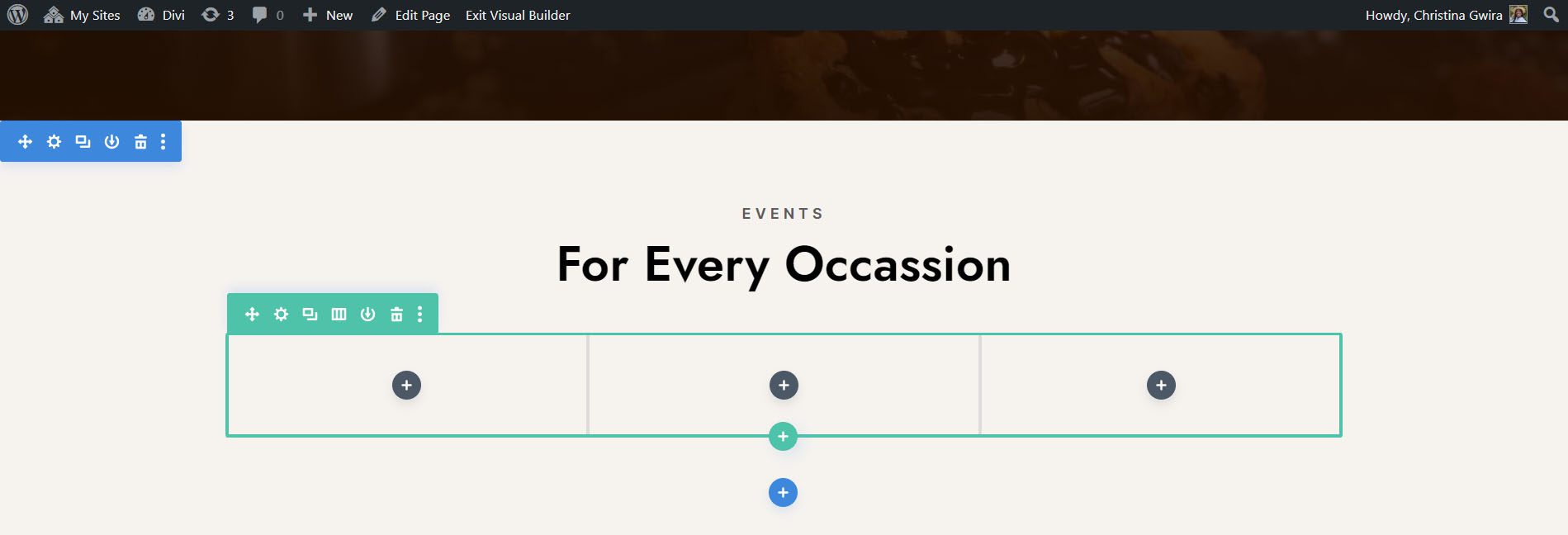
We’ll end up with an empty 3-column row.
Update Titles
You may also want to consider updating the text modules for the titles to something that is more aligned with the upcoming content for the section. To do so, hover over the text modules, and click on the gear icon to edit the module text.
Add Circle Modules
Before we add our Circle Counter Modules, we’re going to change the column number for our row. Hover over the row, and click on the grid icon. This will bring a popup where we can select the number of columns we need. For this design, we’ll be visualizing four pieces of data. So, we’ll choose to add four columns to this row. Click on the four-column icon.
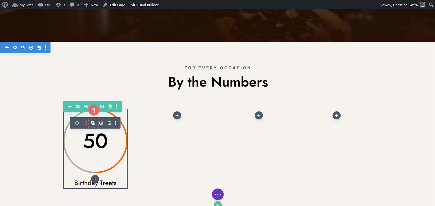
Now, we’ll add the Circle Counter Modules to the first column by clicking on the gray plus sign icon. Then, when the module popup appears, we click on the Circle Counter icon to add our first Circle Counter Module.
Add Data to Circle Modules
With our first module in place, we can begin to style and add content to it. Firstly, let’s add our title for this module. Next, we’ll add our data point.
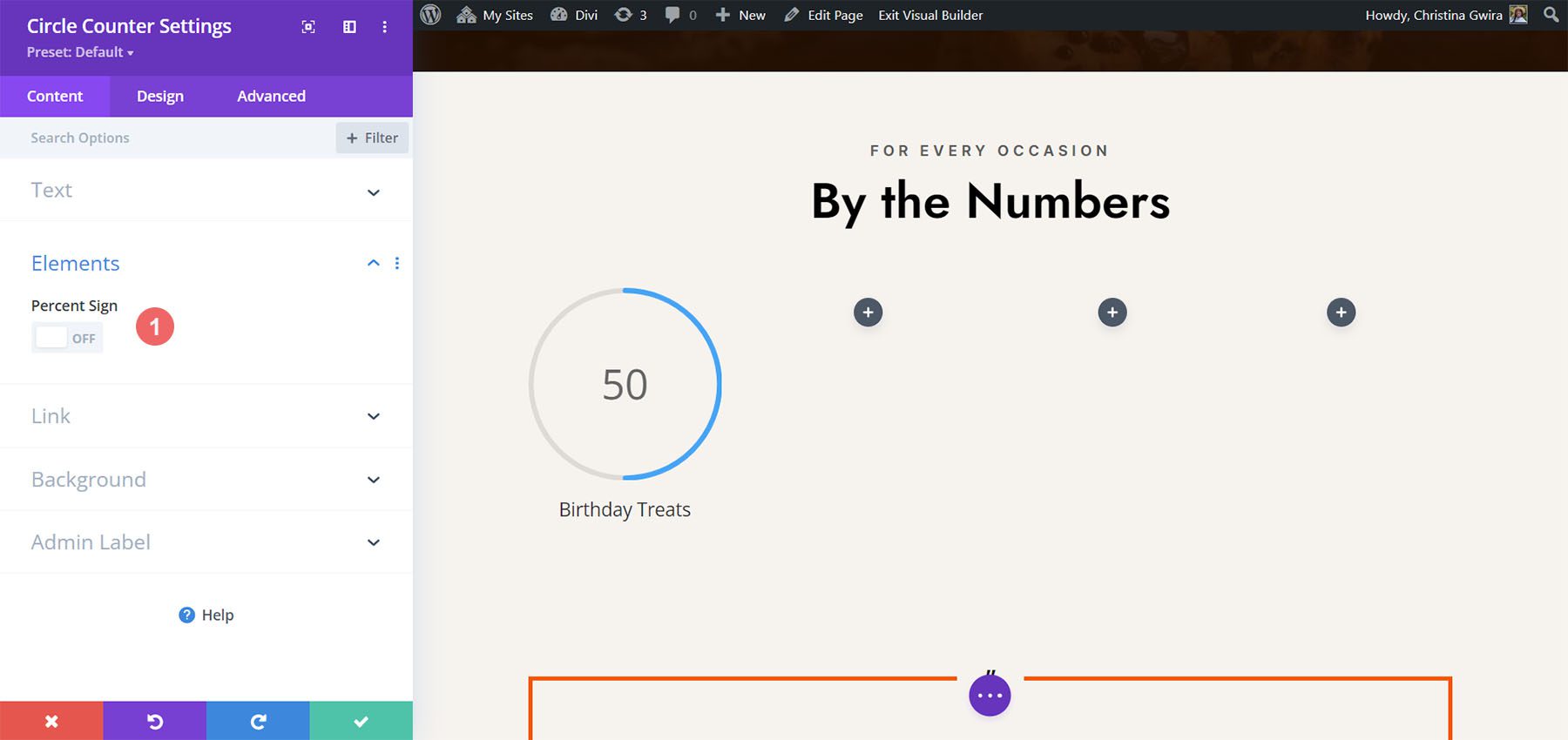
For this design, we’ll remove the percent sign that comes with the module by default. To do this, we click on the Elements tab. Next, we uncheck the toggle next to the Percent Sign option.
Now, we can style this module.
Styling the Circle Counter Module
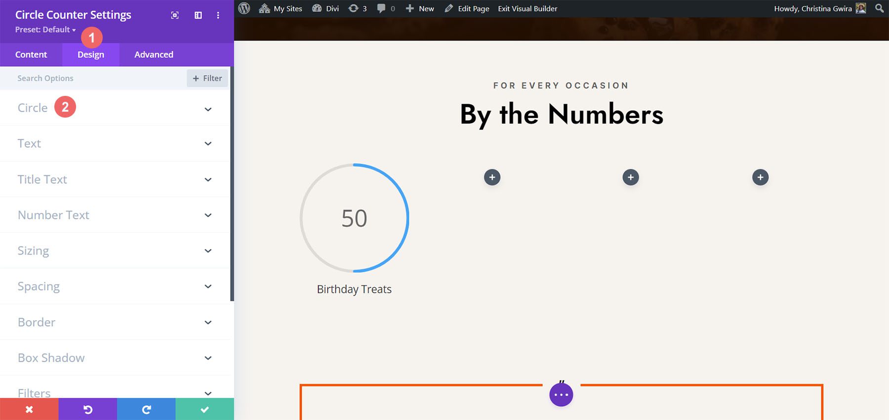
To begin, we switch to the Design tab of the module.
Adding Branding to the Circle Graph
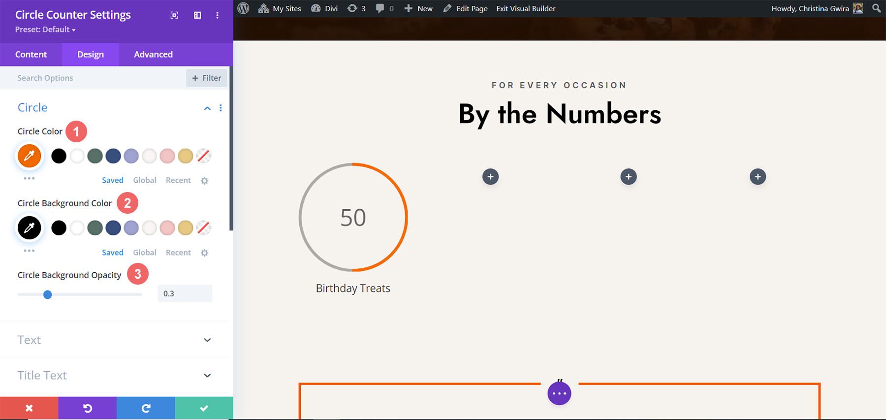
Next, we click on the Circle toggle to access the design settings for the circle graph aspect of the module. We’ll use the following settings to style it:
Circle Design Settings:
- Circle Color: #ff6a28
- Circle Background Color: #000000
- Circle Background Opacity: 0.3
Stylizing the Title Text
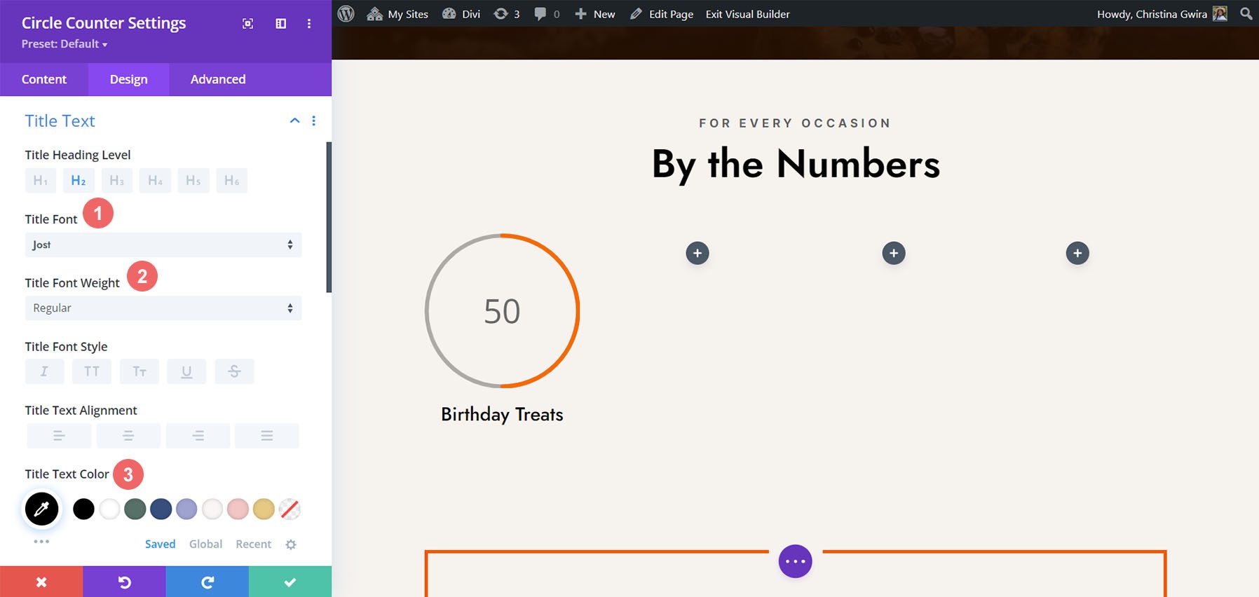
For the title text, we’ll use the following settings after clicking on the Title Text tab:
Title Text Settings:
- Title Font: Jost
- Title Font Weight: Regular
- Title Text Color: #000000
Designing the Number Text.
We’re going to use the same font and color for the number text. However, we’re going to change the size. We have more room within the Circle Counter Module since we are not using the percent sign. We’ll use this to our advantage in our design. Click on the Number Text tab, and enter the following settings:
Number Text Settings:
- Number Font: Jost
- Number Font Weight: Regular
- Number Text Color: #000000
- Number Text Size: 72px
Duplicate and Finish
Now that we have our first Circle Counter Module designed, we can go ahead and duplicate it.
We’ll move the duplicates into their own row, and update the content within to reveal our finished product.
Style Three with the Divi Jewelry Designer Layout Pack
For this design, we used the Divi Jewelry Designer Layout Pack as our starting point. We wanted to add an educational section to the product page of this layout, and will be using the Circle Counter Module to showcase this information. We’ll convert the testimonial section at the bottom of the page into this.
Remove Modules
As with our previous work, we need to go in and delete the current modules within this section.
Update Section and Row Design and Structure
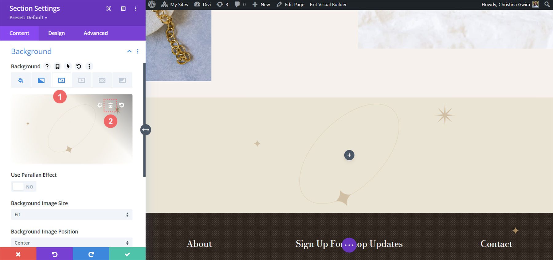
For this layout pack, we also want to change the section’s background to add some interest. Click on the gear icon within the blue settings menu of the section.
First, let’s remove the background image. Click on the Background tab. Then, click on the image icon. Finally, click on the trash can icon to remove the background image.
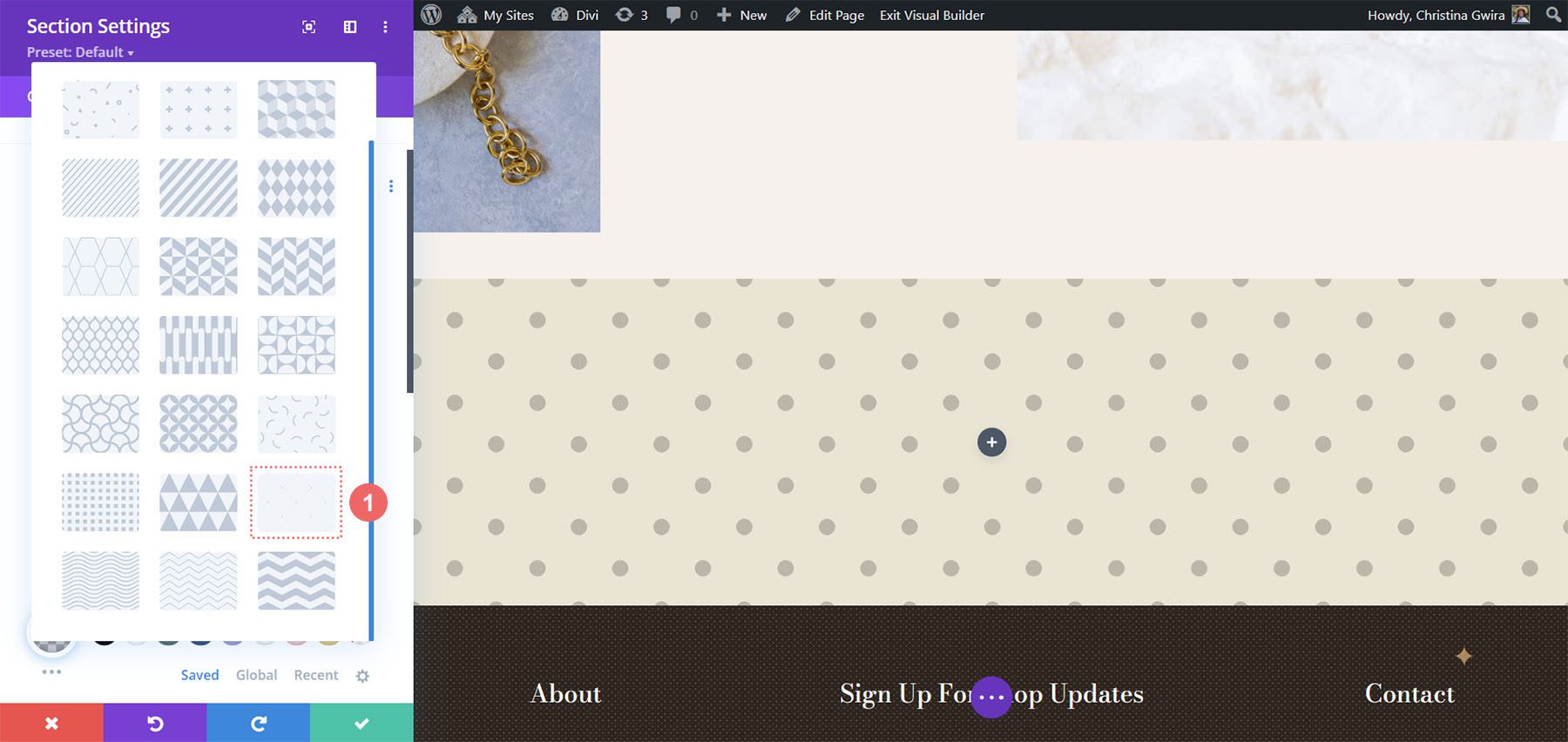
We want to leave the background gradient and color. Now, let’s add a background pattern to the section. Click on the Background Pattern icon. Then, click the plus icon to add a Background Pattern.
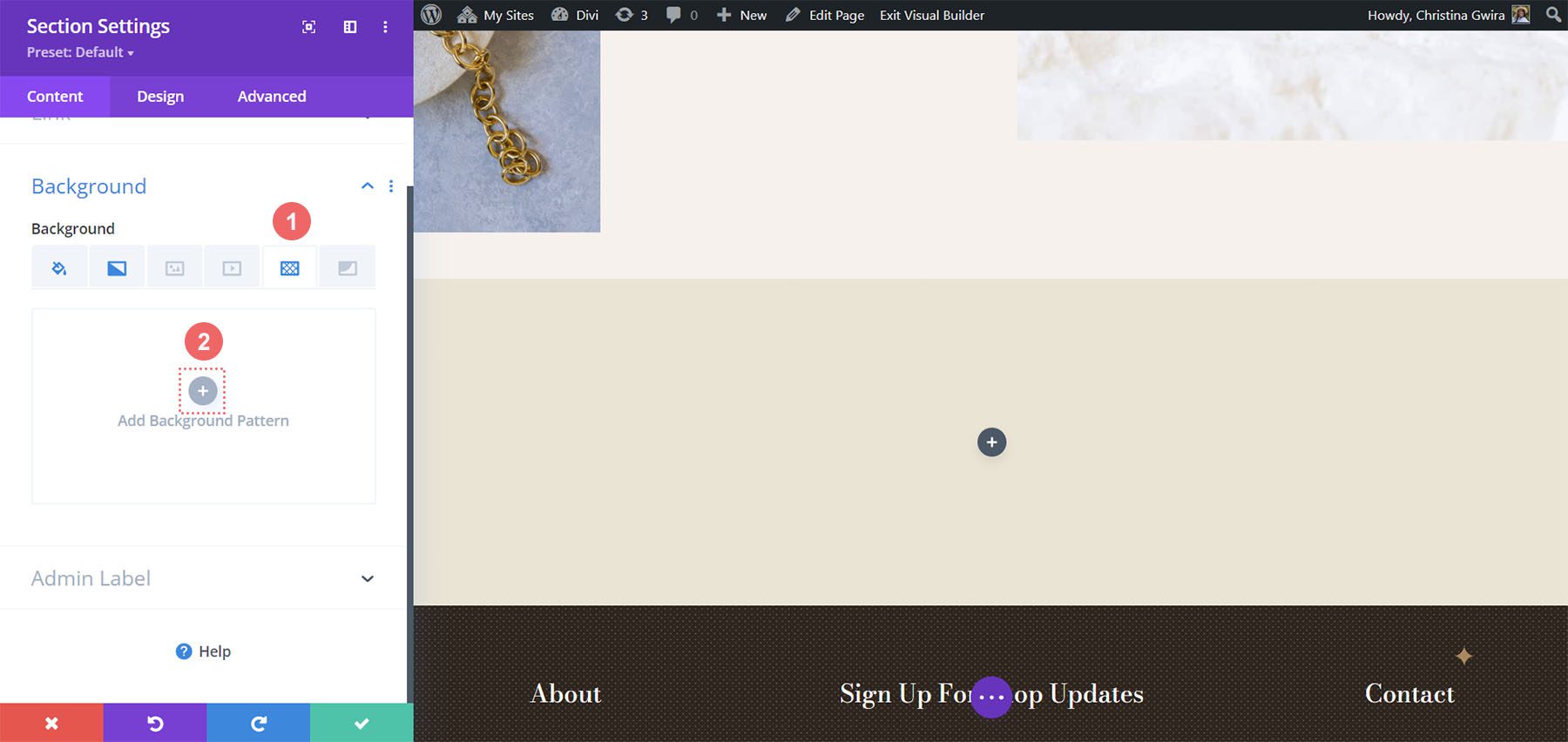
We’ll use the following background pattern.
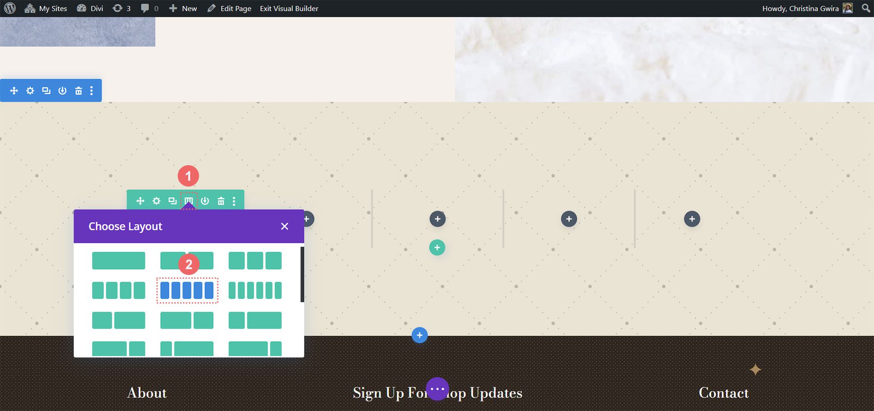
Click the green check icon to save your settings for the section. We’re now going to change the column count of our row. For this design, we’re going to have five columns for our Circle Counter Modules.
Add Circle Module
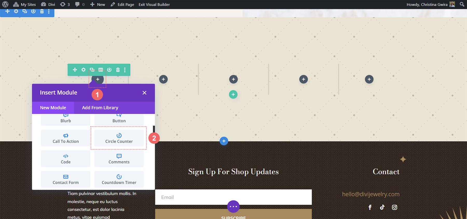
With the columns and sections created, click on the gray plus icon to add our Circle Counter Module.
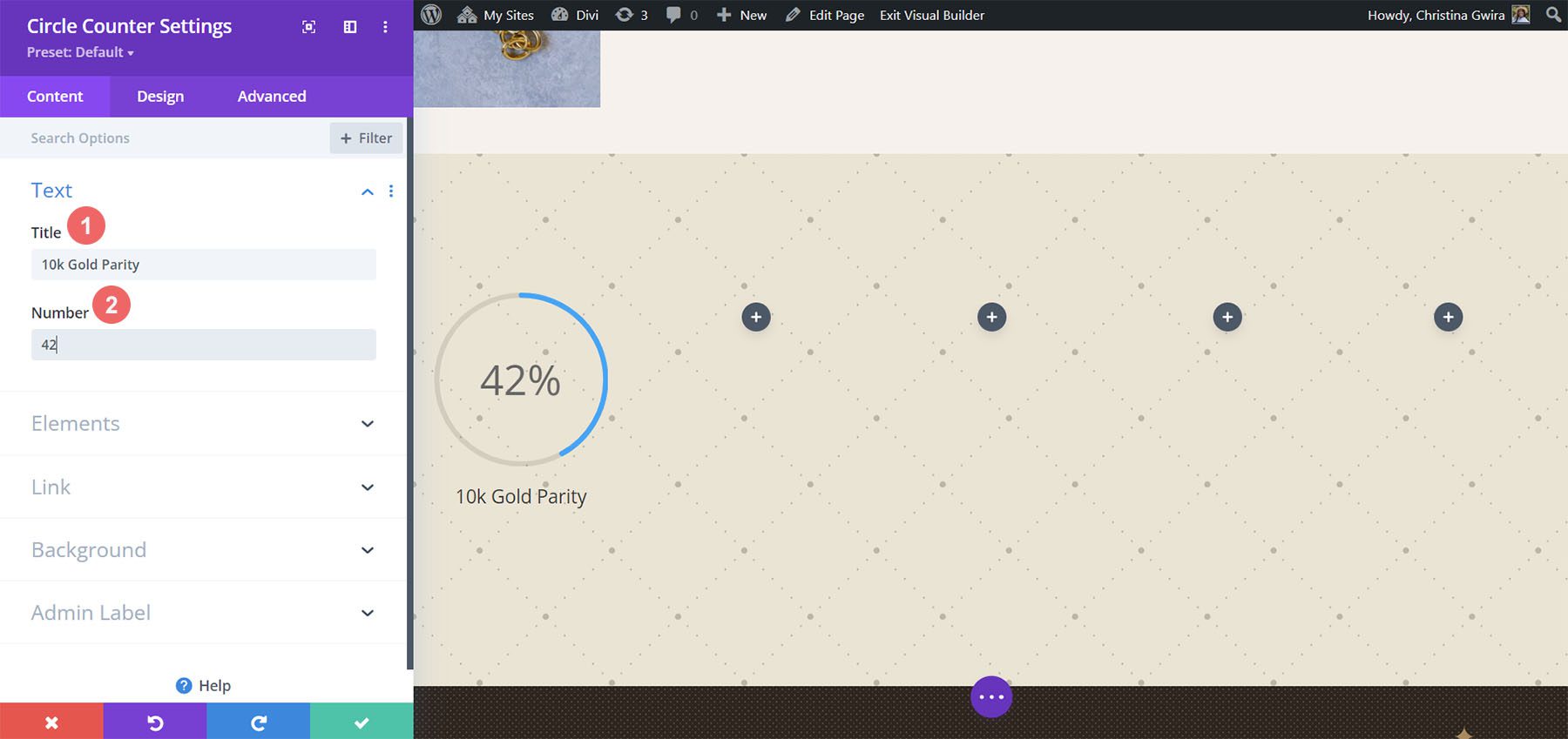
With the module added to the column, as before, we add in our content. We’ll use the percent sign in this design.
Style Your Circle Counters
Now, we’re going to begin to style our counters.
Stylizing the Circle Graph
We first start with the circle portion of our counter. The following settings will be used:
Circle Design Settings:
- Circle Color: #000000
- Circle Background Color: #ac8961
- Circle Background Opacity: 0.5
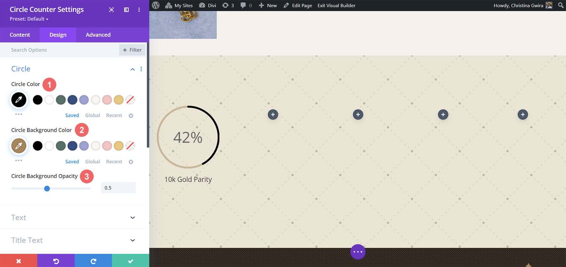
Notice how we changed the background opacity for this design. We went with a similar beige color, but increased the opacity to add an air of luxury to our design.
Adding Style to the Title Text
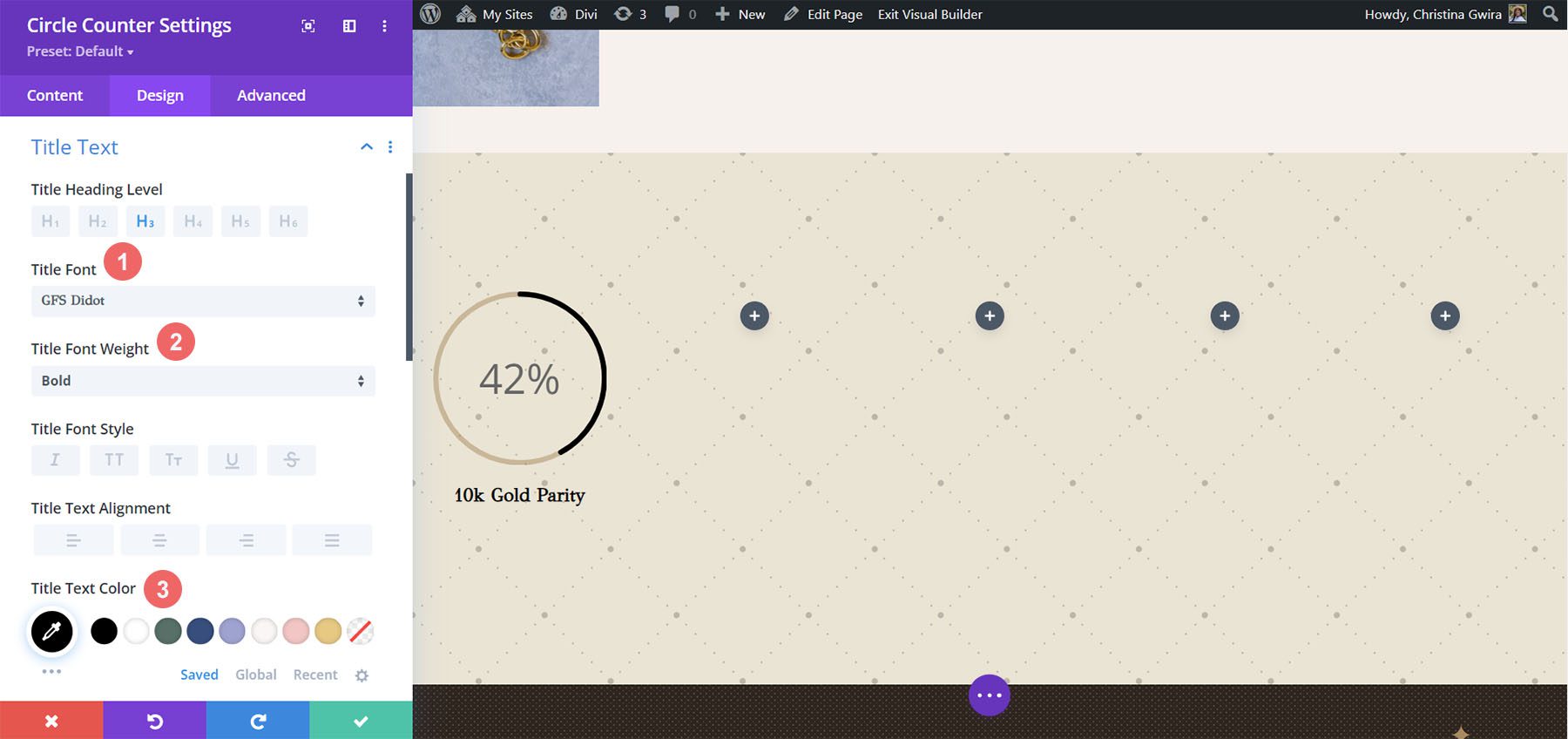
For the title text, we’ll use the same font family that is used throughout the layout pack. You can find the settings by clicking on the Title Text tab. Below, find the settings that were used to style the title text:
Title Text Settings:
- Title Text Font: GFS Didot
- Title Font Weight: Bold
- Title Text Color: #000000
Styling the Number Text
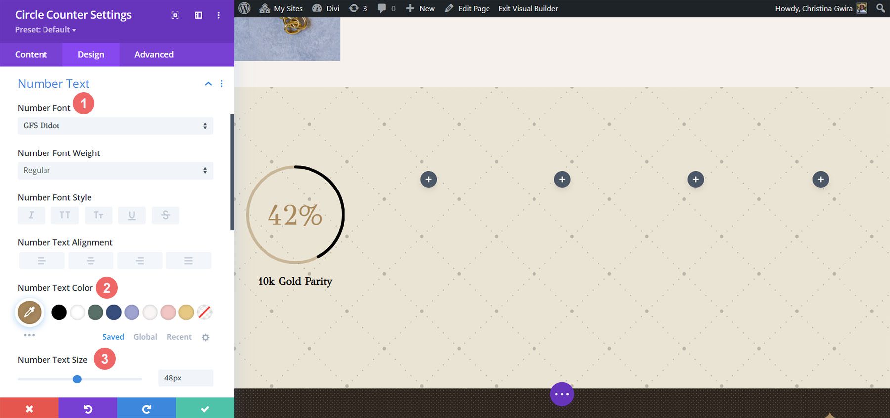
For the number text, we’ll use a gold color to call back to the colors used within the branding of this layout pack. We click on the Number Text tab to enter the settings which we’ll use below:
Number Text Styling:
- Number Font: GFS Didot
- Number Text Color: #ac8961
- Number Text Size: 48px
Saving and Duplicating Our Work
Once we’ve entered in all these settings, we now click on the green check mark at the bottom of the settings box. This will save all our hard work. Now, we can duplicate the module, as we did in previous styles, and edit the content with the remaining data.
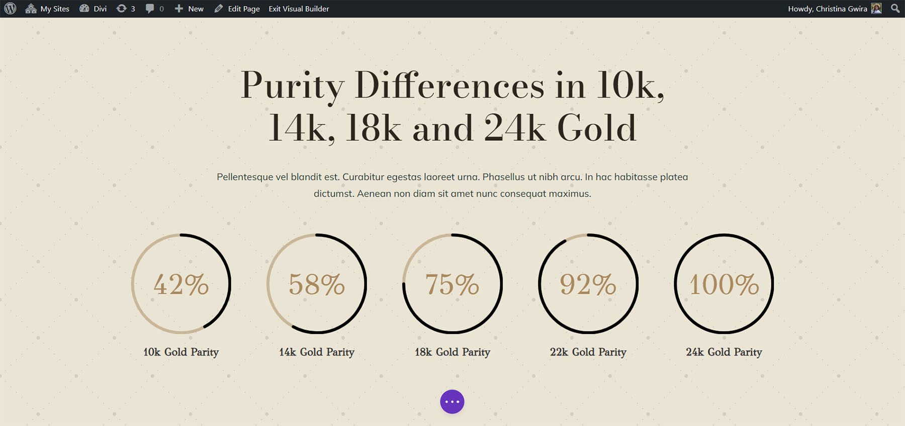
We also added some Text Modules in another row above our Circle Modules to add context to our data points.
Onto the next design!
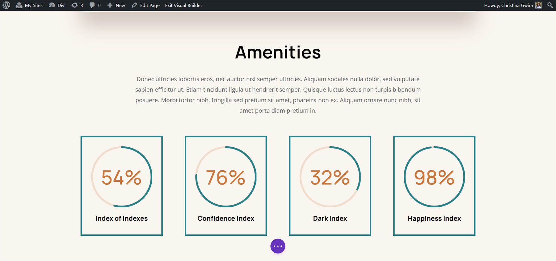
Design Four ft. Divi Hostel
We’ll use the Divi Hostel Layout Pack for our fourth design of this post. Specifically, we’ll modify the amenities section within the landing page template.

Remove Modules from the Section
To prepare for our circle module, we need to remove the modules that are within the section.
We want to have four columns for our circle modules, so we’ll leave the row structure as it is.
Add Circle Module
Click on the gray plus icon to add the Circle Counter Module to the first column of the row.
Add Content
Once in the Content tab of the module settings, add in your title and data point.
Start Designing the Circle Counter Module
Switch to the Design tab to start styling your Circle Counter Module. We’ll start with the circle graph.
Styling the Circle of the Circle Counter Module
We’ll use the following settings to style the circle graph of the module:
Circle Design Settings:
- Circle Color: #008186
- Circle Background Color: #d37643
- Circle Background Opacity: 0.2
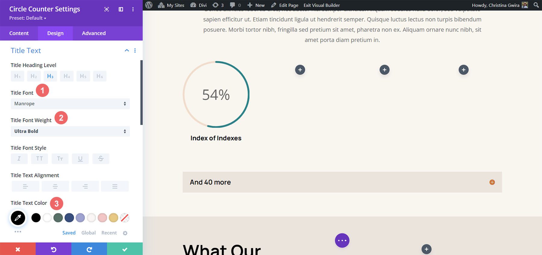
Title Text Styling
Next, we’ll move on to styling the Title Text of the module. We’ll use the following settings:
Title Text Settings:
- Title Text Font: Manrope
- Title Font Weight: Ultra Bold
- Title Text Color: #000000
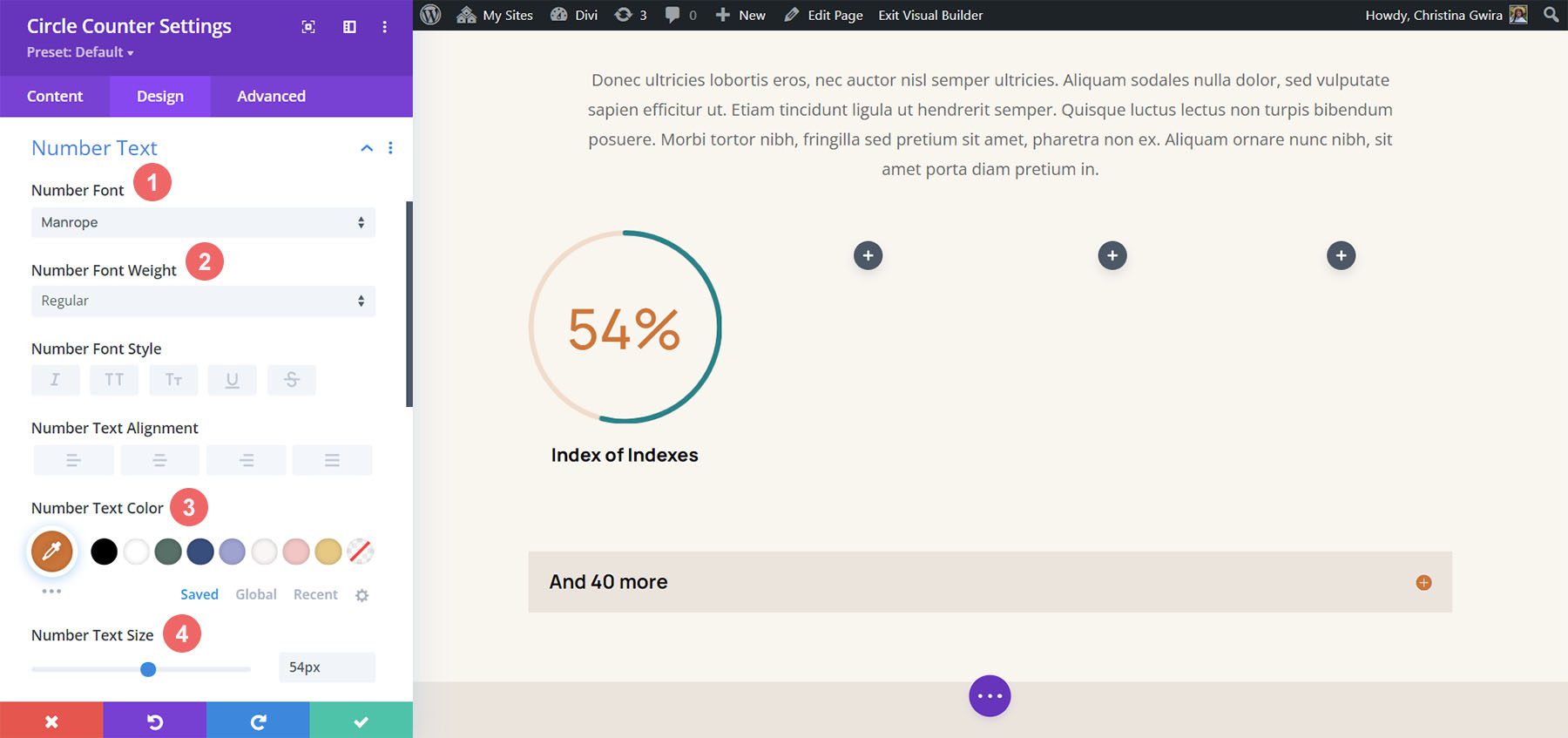
Number Text Styles
Finally, we’ll style the number within our Circle Counter Module. The settings that we’ll use are here:
Number Text Styling:
- Number Font: Manrope
- Number Font: Regular
- Number Text Color: #d37643
- Number Text Size: 54px
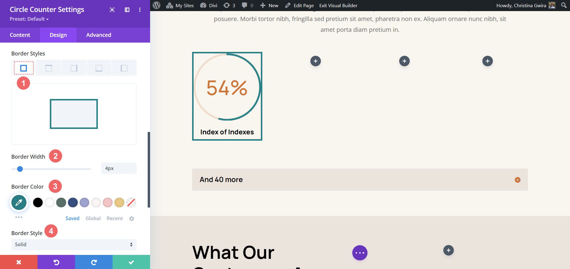
Add Border and Padding
Let’s add a border and some spacing to the module to add some interest to the Circle Counter Module. Within the Circle Counter Settings Design tab, click on the Border tab. There, here are the settings to use:
Border Settings:
- Borders: All borders
- Border Width: 4px
- Border Color: #008186
- Border Style: Solid
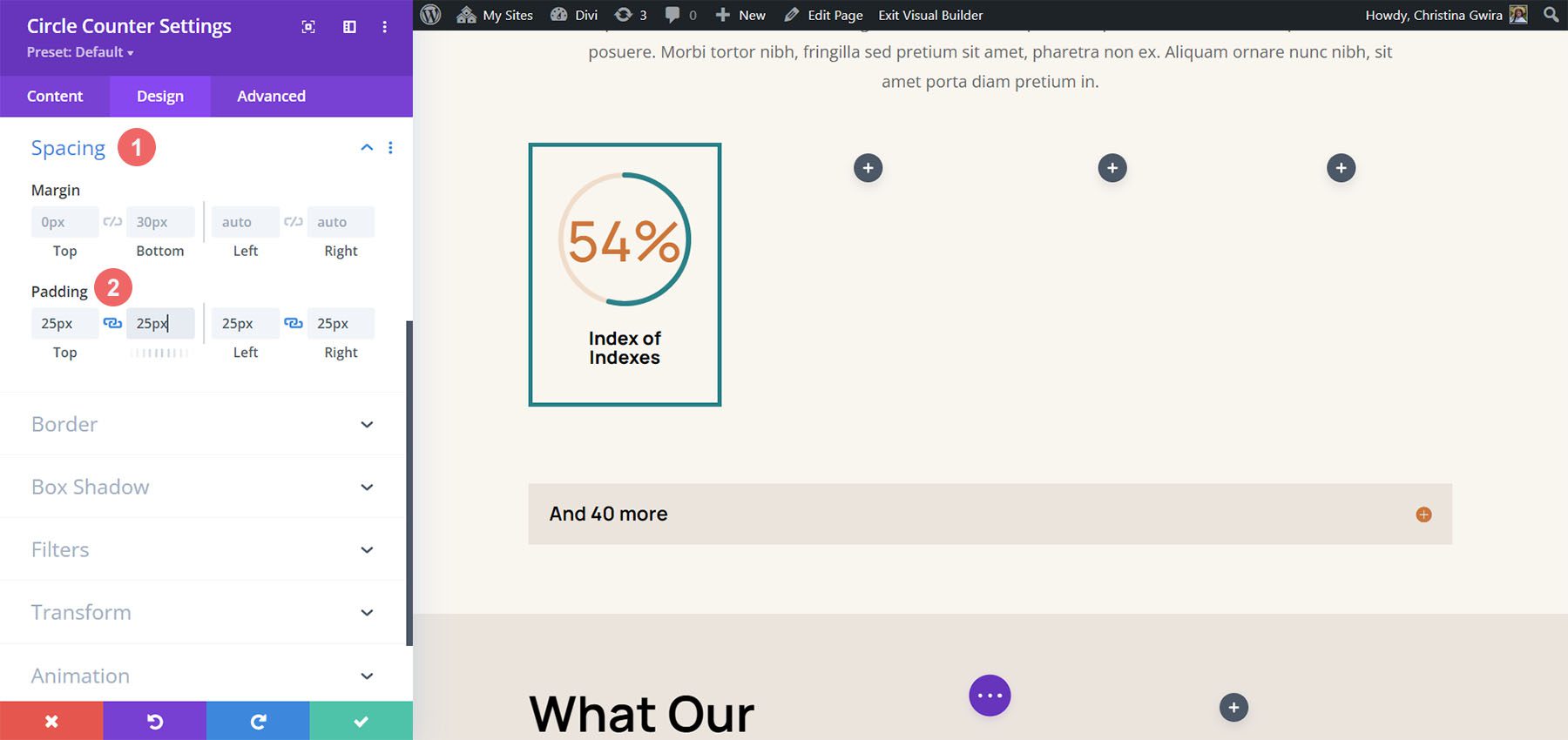
As you can see, we need to add some padding to the module so that the borders don’t stick to the modules. First, we click on the Spacing tab. Next, we’ll use a 25px padding for all the sides.
Duplicate and Update Your Module
To save time, we’ll use the right-click menu to duplicate our finished work for the other columns. Right-click on the finished Circle Counter Module, and click the copy icon. Update the content as needed for your needs.
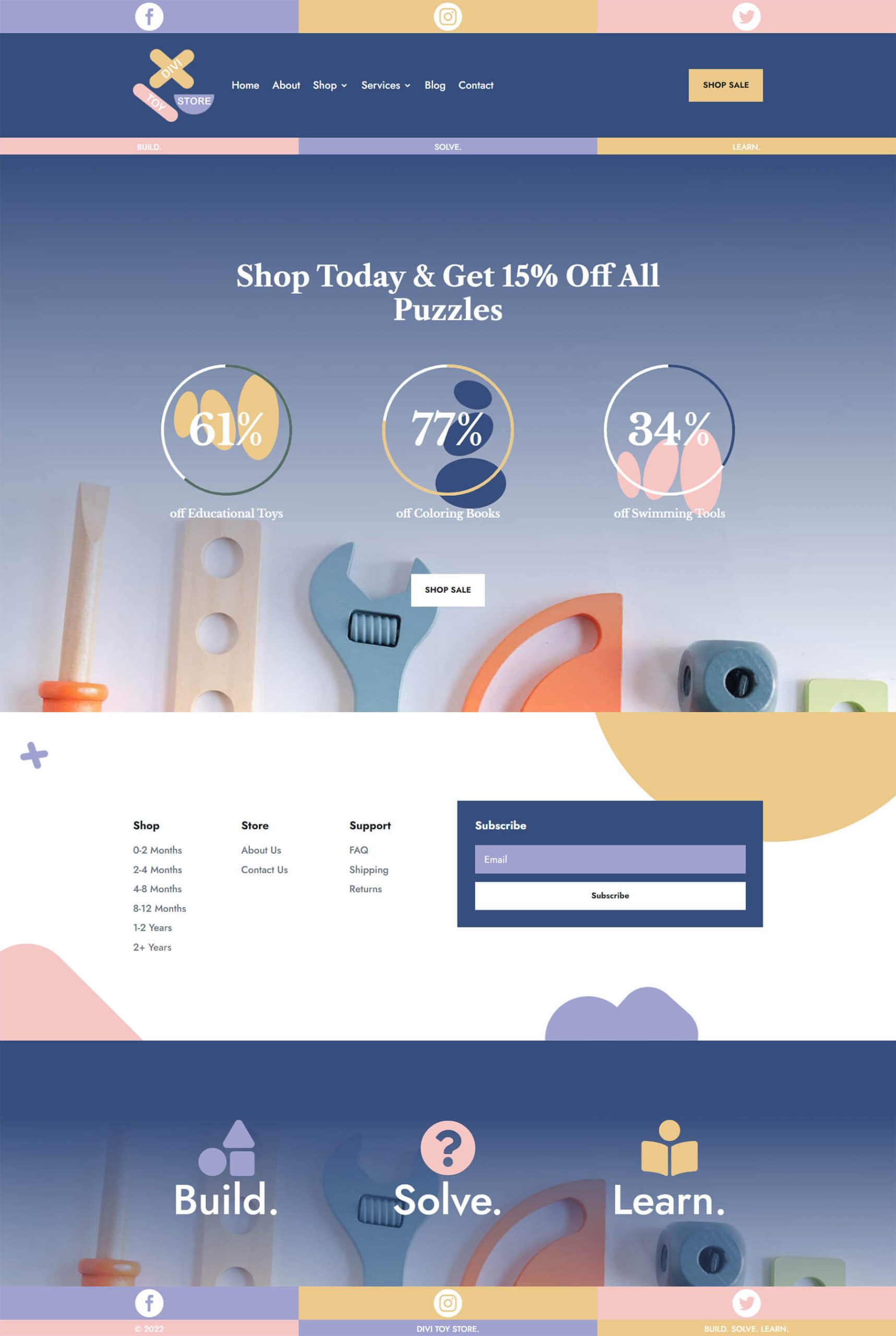
Final Example: Divi Toy Store
For our last example of styling Divi’s Circle Counter Module, we’ll use the Toy Store Layout Pack. We’ll be modifying the home layout within the pack, specifically, the call to action section at the bottom of the page.

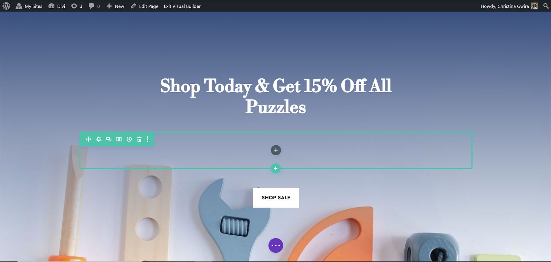
Add Rows to Section
Unlike our previous examples, we’ll add two rows to this section. This row will be where we’ll add our Circle Counter Modules. To add a new row, hover over the row, and click on the green plus icon. Do this twice.
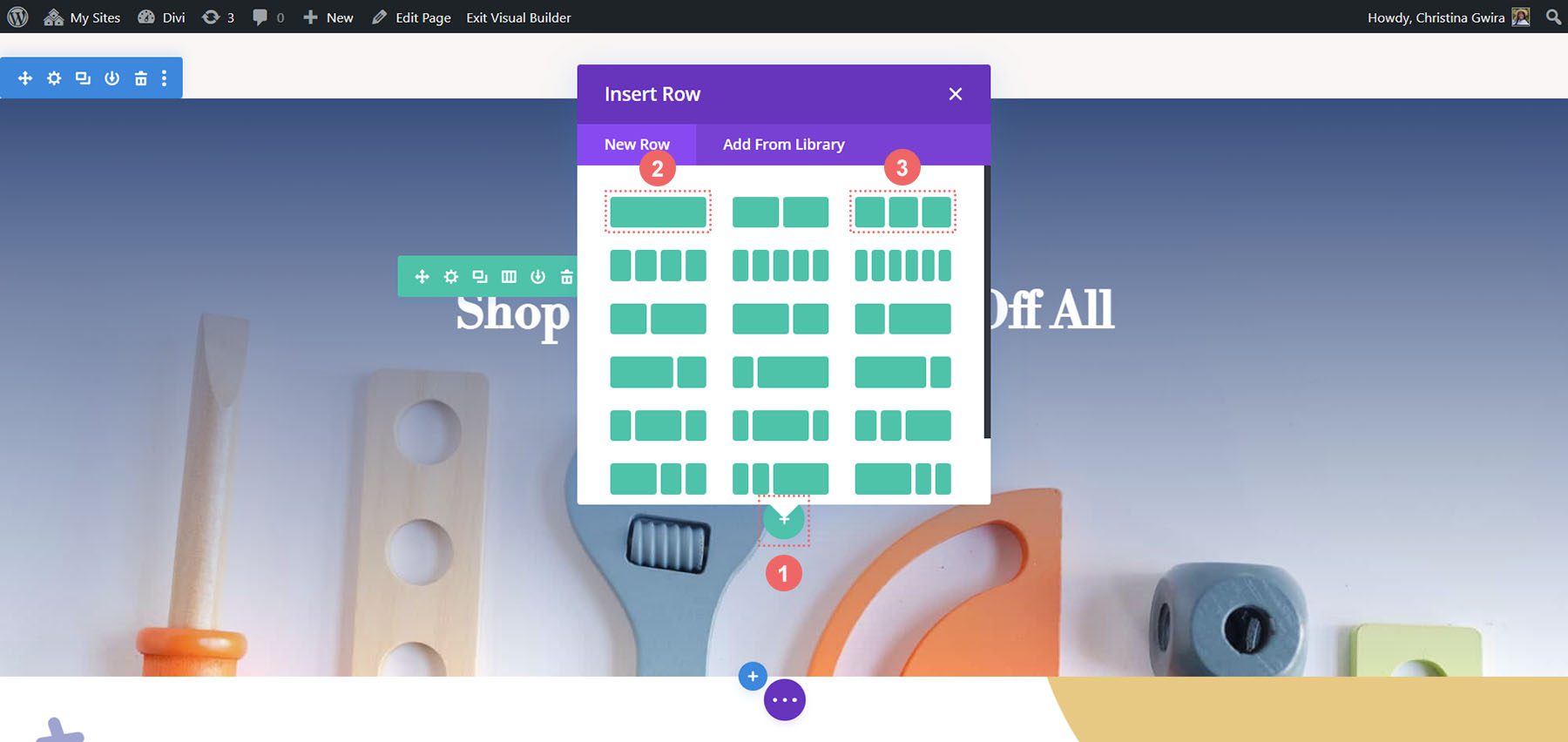
Then, move the Button Module from the first to the third row. So, we’ll have three rows within this section now: the first row will hold the call-to-action, the section will remain empty (for now), and the third row will have the button.
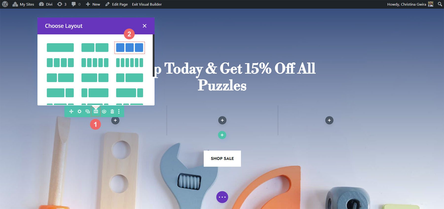
Change Column Structure and Add Module
Now, let’s change the structure of the row that will house our Circle Counter Module. To do this, hover over the grid icon on the green row menu. Select the 3-column structure,we’ll add three modules to this row.
In the first columns, we’re going to add the Circle Counter Module by clicking on the gray plus icon, then clicking the Circle Counter Module icon.
Add Content to Circle Counter Module
Now, we’re going to add our content and data to our Circle Counter Module.
Style the Circle Counter Module
As with our previous examples, we move to the Design tab to style the title text, number text, and more. However, we’ll be doing something a little differently to round out this tutorial.
Styling the Circle Counter
We’ll start by styling our circle counter with the following settings:
Circle Design Settings:
- Circle Color: #557068
- Circle Background Color: #ffffff
- Circle Background Opacity: 1
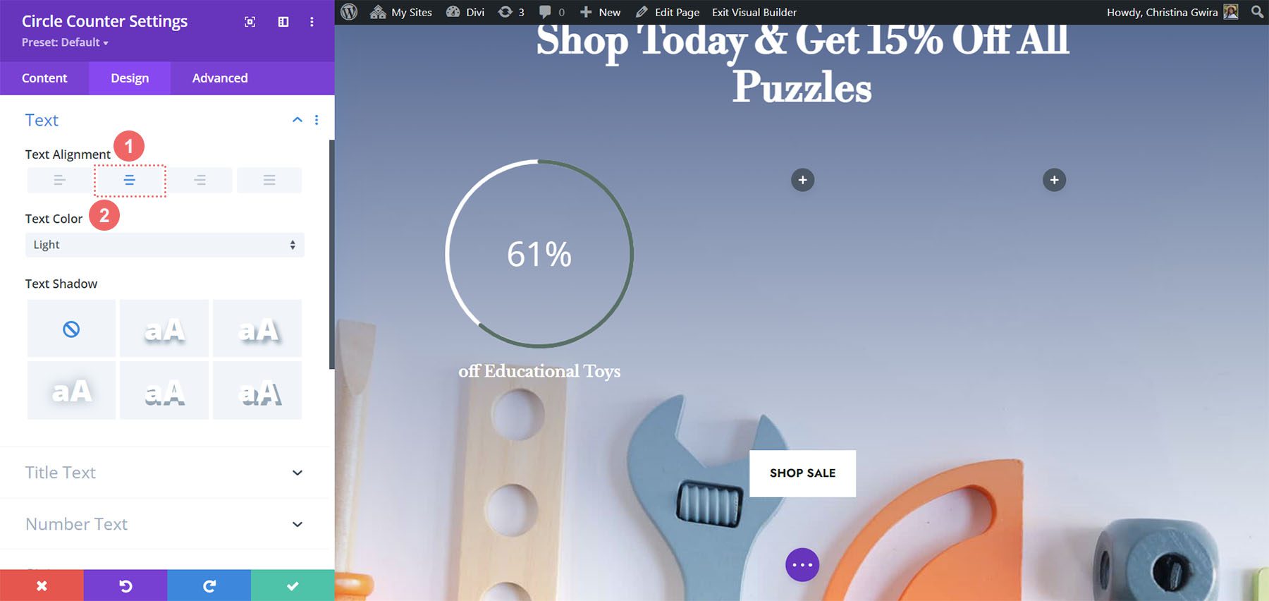
Notice how we’re using no transparency for the circle’s background opacity. For this design, we’ll click on the Text tab, and select Light as the text color. This will make the title and the number will be white, or the color you’ve set as the light font color for the page.
Text Design Settings:
- Text Alignment: Center
- Text Color: Light
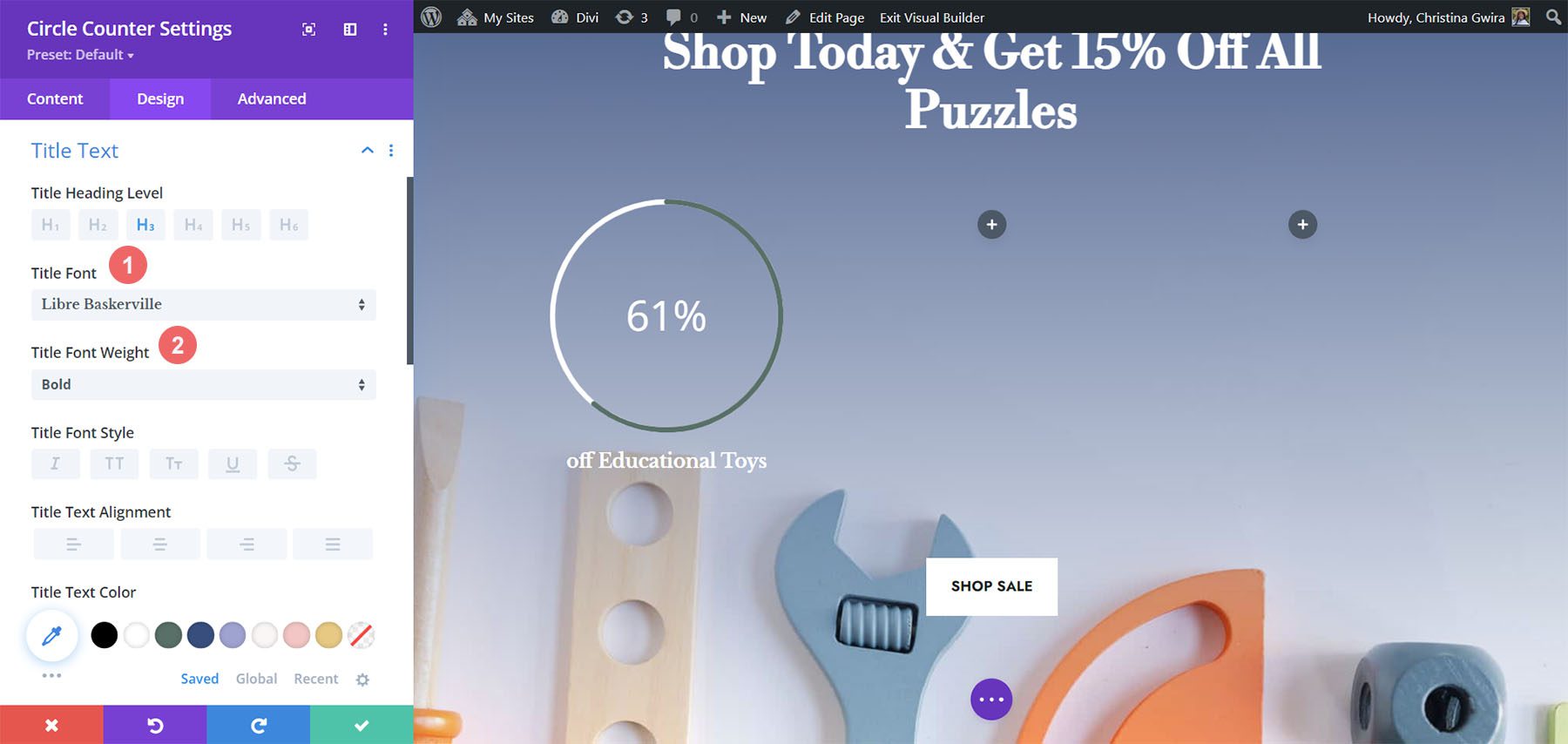
Adding Style to the Title Text
For the Title Text styling, we’ll use the same font used through the Divi Toy Store Layout Pack. Here are the settings to use:
Title Text Settings:
- Title Font: Libre Baskerville
- Title Font Weight: Bold
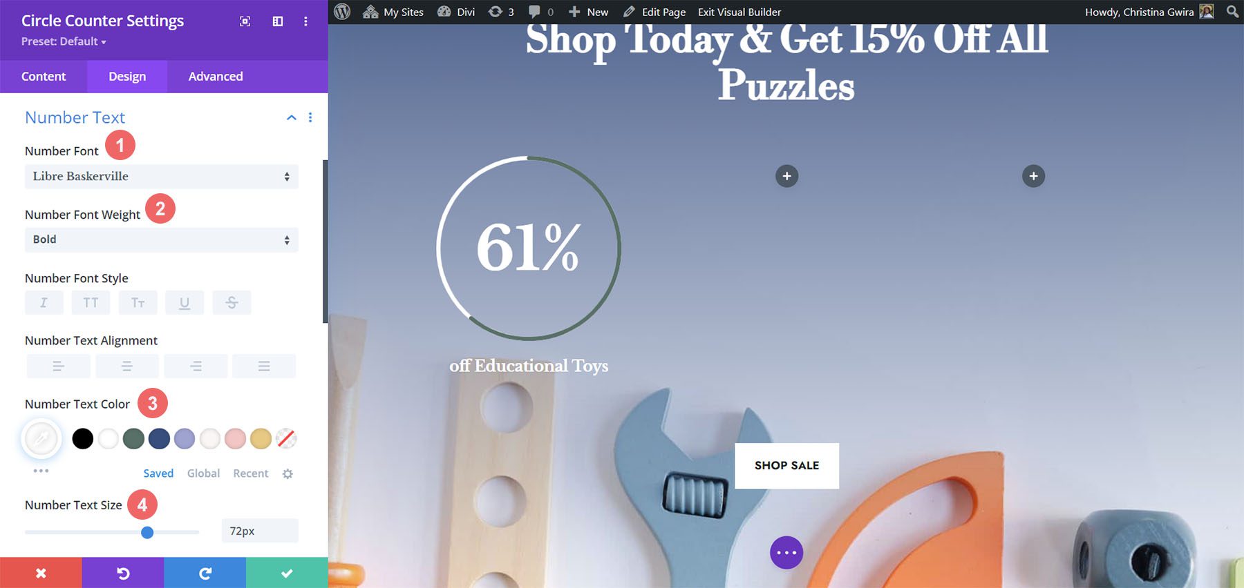
Styling the Number Text
For the number text, we’ll use the following settings:
Number Text Settings:
- Number Font: Libre Baskerville
- Number Font Weight: Bold
- Number Text Color: #ffffff
- Number Text Size: 72px
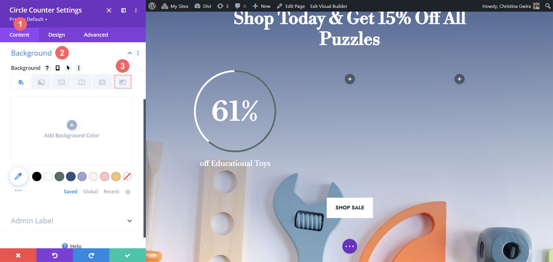
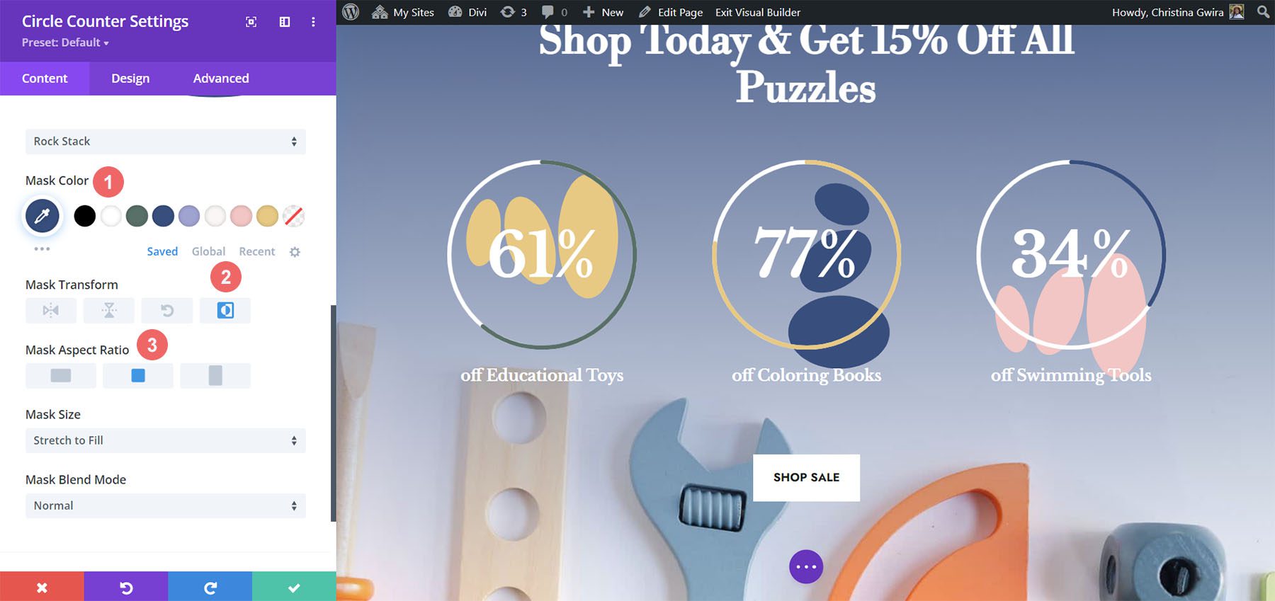
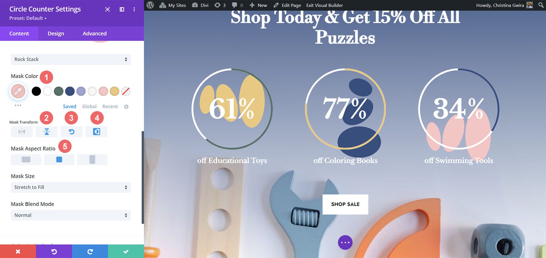
Adding Accents to Circle Counter Module
To finish this tutorial, we’re going to go back to the Content tab. We’re then going to click on the Background tab for us to add some accents to our Circle Counter Module. We’re then going to move to the Background Mask icon.
Styling the Background Mask for the Circle Counter Module
For the Background Mask, we’ll use the following settings to add an accent to your Circle Counter Module
Background Mask Settings:
- Background Mask Design: Rock Stack
- Mask Color: #eac989
- Mask Transform: Rotate, Invert
- Mask Aspect Ratio: Square
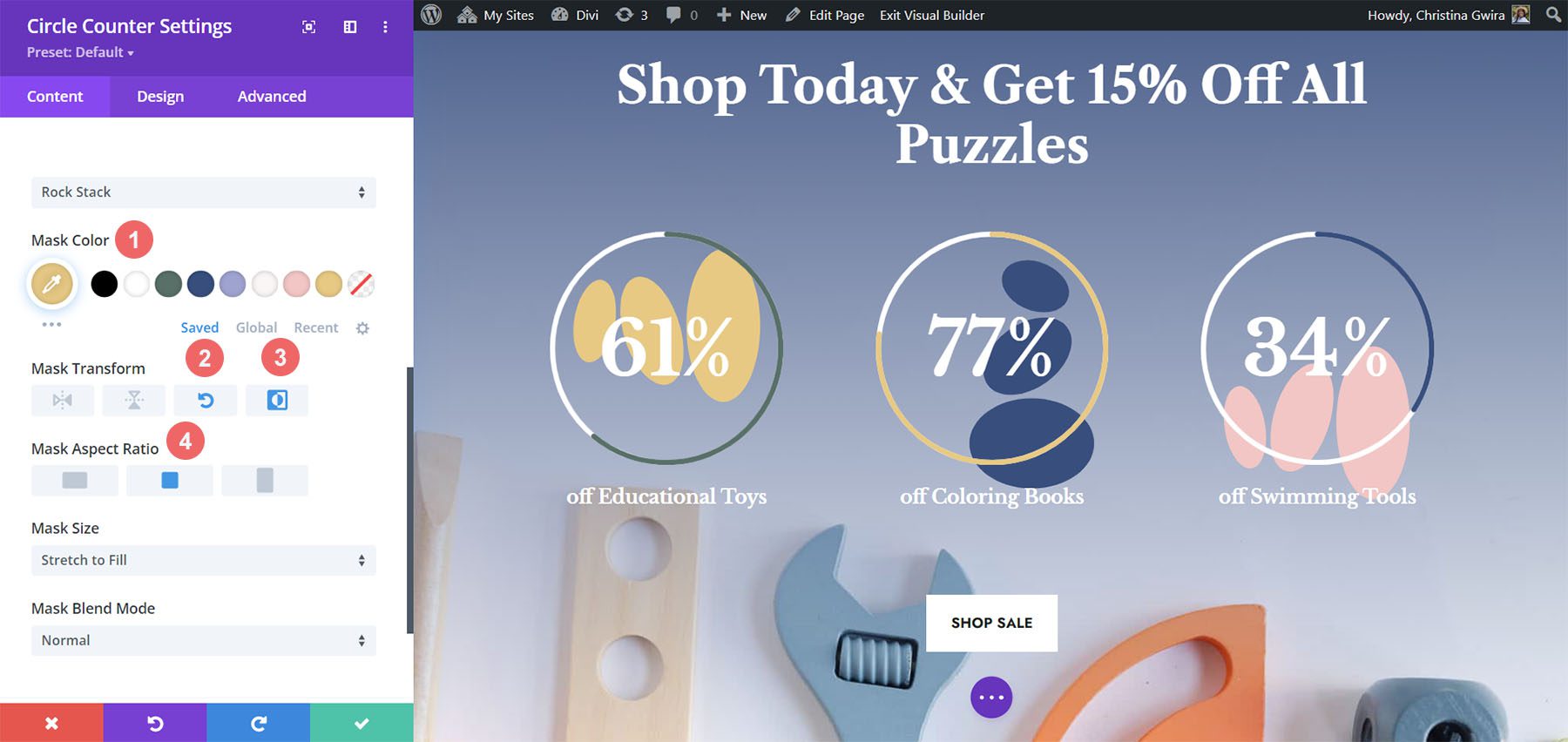
For the second module, we use the following settings:
Background Mask Settings (Module 2):
- Background Mask Design: Rock Stack
- Mask Color: #354e7c
- Mask Transform: Invert
- Mask Aspect Ratio: Square
For the last module, these are the settings to use:
Background Mask Settings (Module 3):
- Background Mask Design: Rock Stack
- Mask Color: #f6c6c5
- Mask Transform: Flip Horizontal, Rotate, Invert
- Mask Aspect Ratio: Square
With all the accents in place, this is what the final product looks like:

Final Thoughts
With some guidance and great data, you can change the way in which your users will interact with the content on your site. Using the Circle Counter Module helps to add some interest into your page while showcasing information about your product or service in an eye-catching way. We look forward to seeing you implement some of these tutorials on your site. If you are inspired, let us know in the comments section down below!


Leave A Reply