
We often forget that text – or more specifically, typeface – is an integral part of web design. In fact, your font choice can make or break your entire website. It doesn’t really matter how beautiful or easy to navigate your site is if visitors struggle to read its content.
This is why it’s smart to choose one of the easiest fonts to read for the majority of the text in your web design projects. In this post, we’ll talk about what makes a typeface legible and share ten popular options to consider for your next site.
Let’s jump in!
What Makes a Font Easy to Read?
There are several factors that come into play when determining how easy a font is to read. The three basic concerns are:
- Serifs. These are the small strokes or feet that come off of the main lines of each character in certain typefaces. You can refer to the “elegant” in our logo for an example. It’s generally accepted that sans-serif fonts (fonts without serifs, like the one you’re reading now) are easier to read on screens. However, as you’ll see in our list below, there are some exceptions to this rule.
- Spacing. More specifically, kerning, tracking, and leading. These terms refer to how close individual characters, words, and lines are to one another in a font. If the spacing is too tight, the characters become difficult to discern. If it’s too spread out, it can be hard to put the right letters together to form words.
- Font size. What size you set your text to could make a readable font hard to make out. Additionally, there are some fonts that adapt better to smaller sizes than others.
In addition to these guiding factors, there are a couple of other principles to keep in mind. You should generally avoid script and decorative fonts, except maybe for titles or other special text. It’s strongly recommended never to use them for body text. These typefaces tend to become harder to read at smaller sizes and when used for long blocks of text.
Additionally, keep your font’s color in mind. It’s important for your text and background to have enough contrast to make it easier for color blind and visually impaired users to make the words out. However, it’s also widely accepted that ‘reversed’ type (light-colored text on a dark background) is more difficult for everyone to read.
What Is the Easiest Font to Read? (10 Top Options)
Our list of the most readable fonts includes a variety of styles suitable for different use cases in web design. Some of these typefaces may be immediately familiar to you, as they’ve been popular for years. Others are newer and feature elements specifically chosen to meet the needs of modern digital readers.
Let’s start with some old favorites.
1. Arial
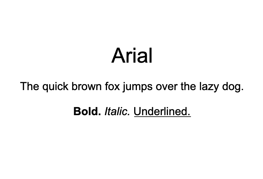
Arial is the standard font for many word processors, such as Microsoft Word and Google Docs. It’s a clean, contemporary, sans-serif typeface that works extremely well for body text.
Due to its popularity and familiarity, Arial easily adapts to just about any style. It’s truly timeless. Another perk of it being so widespread is that you likely won’t have trouble accessing it for use in your designs.
2. Helvetica
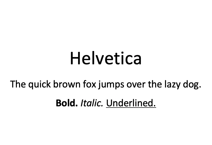
Another old-school sans-serif typeface you may want to consider is Helvetica. It’s unobtrusive, providing easy-to-read body text that won’t detract from the other aspects of your site’s design.
In fact, this font was purposefully designed to be lacking in personality. Although it’s one of the most popular typefaces in the world, it’s also highly contentious. Designers tend to love it or hate it.
3. Georgia
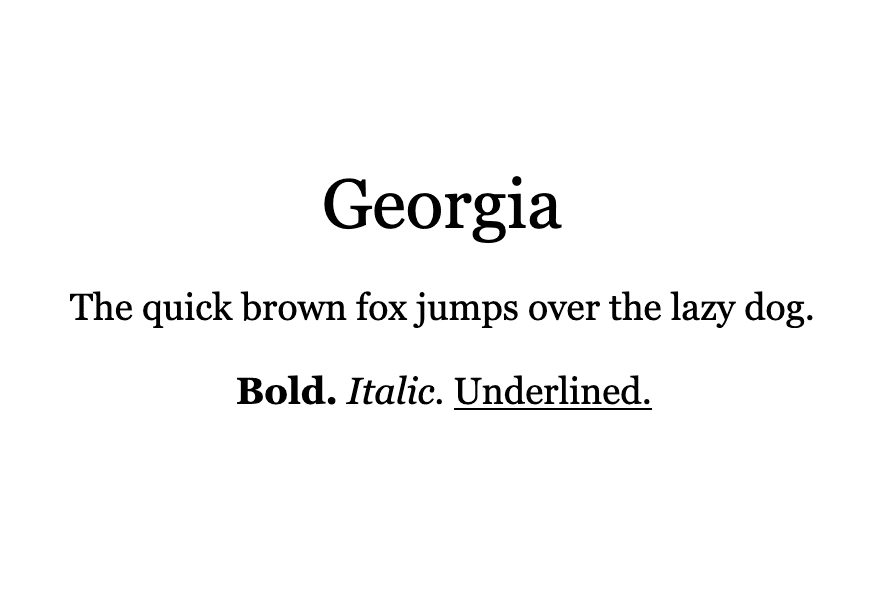
One of the few serif fonts on our list is Georgia. This typeface stands out for it’s classy, ‘old-timey’ feel that’s perfect if you want to inject a little character into your site design.
Georgia pairs nicely with many sans-serif fonts for use in headings and titles. This is an excellent solution if you like the look of a serif font but want to make sure smaller text remains clean and easy to read.
That said, Georgia has been optimized for readability on screens of all sizes. If you’re in love with this charming typeface, don’t be afraid to experiment with it as a body text font.
4. Merriweather
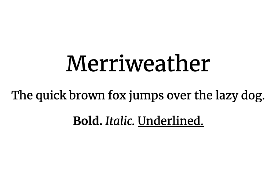
Another option for designers who aren’t impressed with sans-serif fonts is Merriweather. This Google font features slightly condensed letters that leave plenty of space between characters for on-screen legibility. It does its job so well that long-time WordPress users will remember it being used in previous default themes.
Merriweather pairs nicely with several other fonts on this list, such as Montserrat and Open Sans. As such, use it as a bold statement type in your headings, then let a simpler font take the reins in your body text.
5. Montserrat
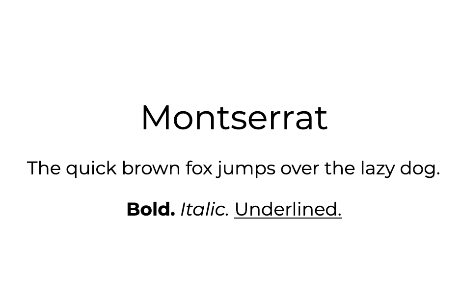
Montserrat has its origins in urban signage. In 2017 it was redrawn with a lighter weight to make it easier to read when used in long blocks of text.
If you love the clean lines of Arial and Helvetica but want a typeface with a bit more intrigue, Montserrat is worth considering. It’s perfect for blogs looking to introduce a bit more personality while minimizing eye strain during long reads.
6. Futura
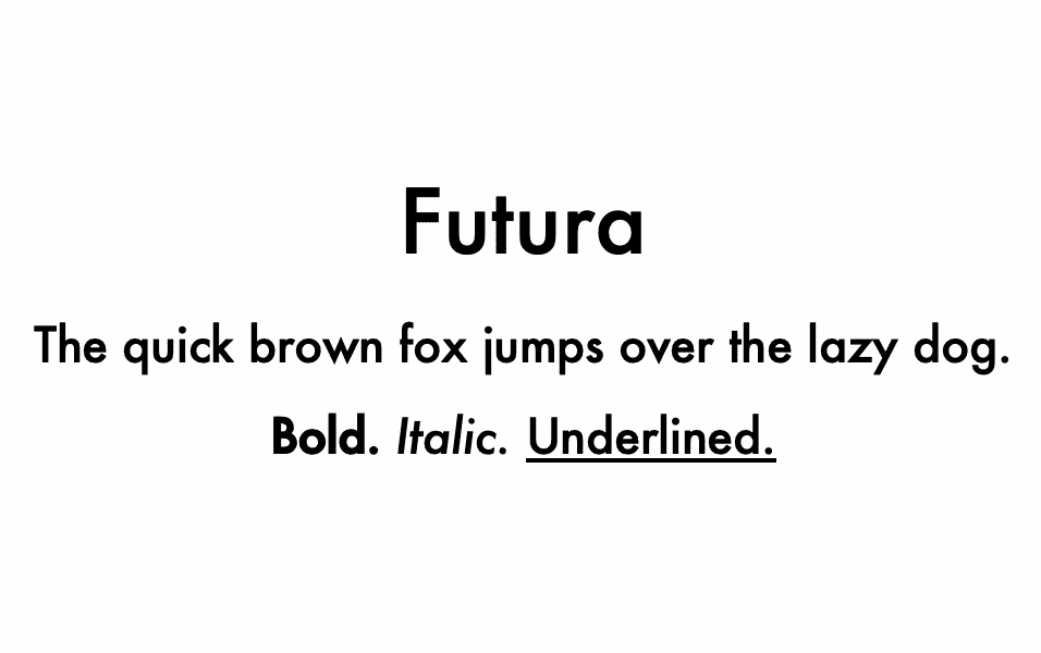
Another popular Helvetica alternative is Futura, which brings an edgy, modern feel to your text. It’s meticulously geometric and manages to convey a lot of feeling without extra flourishes.
Futura is perfect for startups or any brand that wants to appear forward-thinking and innovative. You can pair it with a lighter sans-serif font to create attention-grabbing headings or use it as a no-frills body typeface. It’s also popular as a logotype.
7. Open Sans
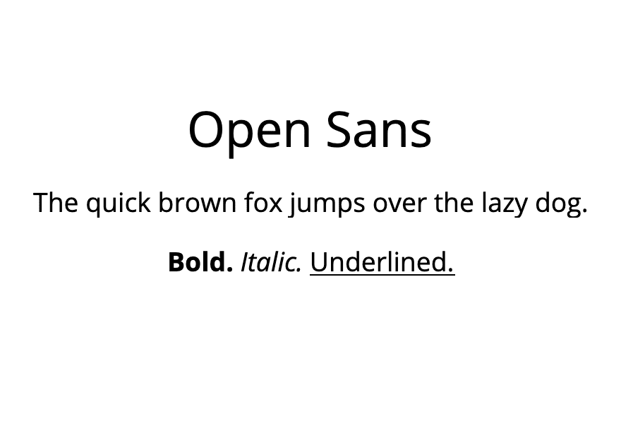
The ‘open’ in this font’s name refers to the negative space in many of its round letter forms. However, many people feel this feature gives the type a friendly or ‘open’ feel as well, making for a welcoming style and tone.
Open Sans is an ideal body text font and pairs nicely with some of the stronger personalities on this list, such as Merriweather or Futura. It’s also been optimized for legibility on all devices, making it an excellent choice if you have a lot of long-form content and expect a large volume of mobile users.
8. Lato
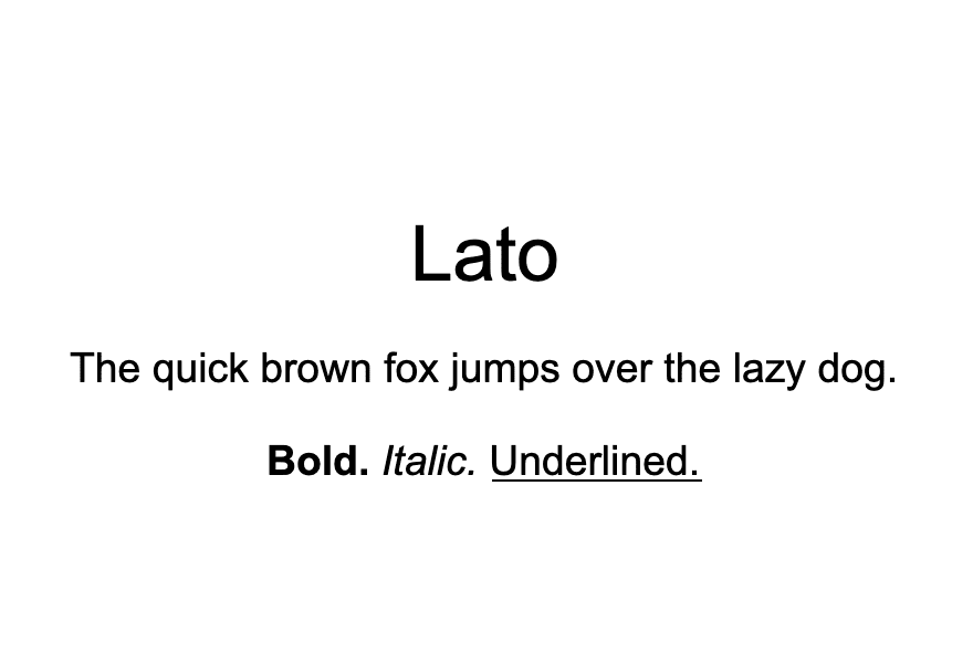
Originally designed for a corporate client, Lato is the perfect subtle typeface for your business site. Sleek and serious, this font looks professional without coming across as too stuffy.
To dress your design up a bit, use Lato for your site’s body text and pair it with a serif font for your headings and titles. This will get the job done and keep your blog posts or product descriptions readable while still letting your brand identity shine through.
9. Tisa
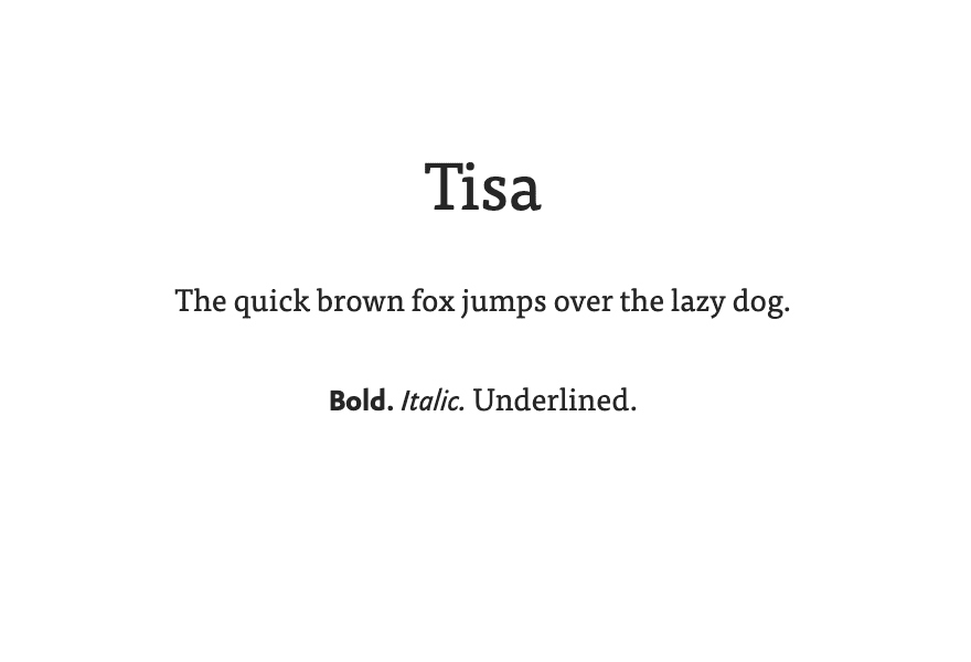
Tisa is a newer font popular among graphic and web designers. Although it features distinct serifs, its careful spacing keeps text readable even on smaller screens.
This font is highly adaptable and can work well in any context. It’s ideal if you’re looking for a serif that isn’t quite as forward as Georgia or Merriweather.
10. Quicksand
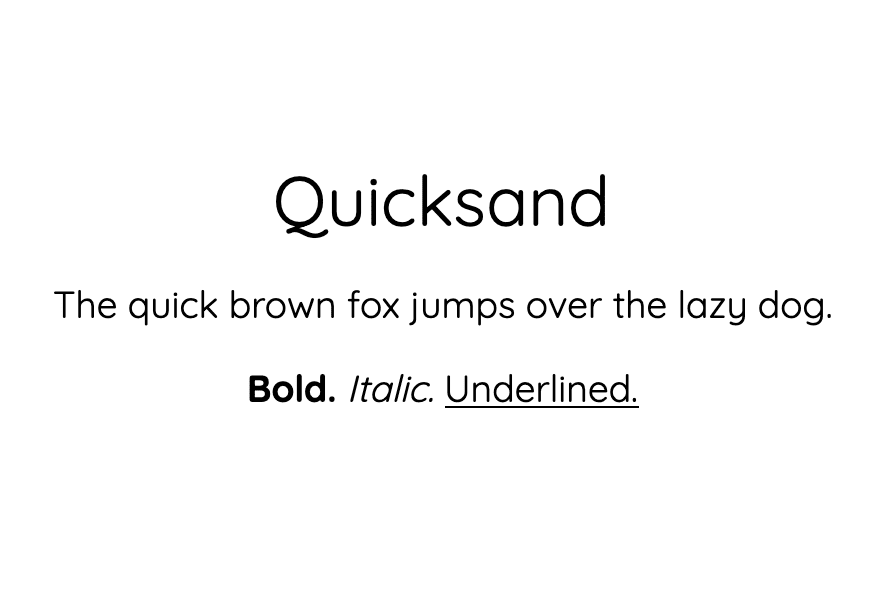
Our last pick brings a quirky personality as well as mobile optimization to the table. Quicksand was designed in 2008 as a display font for mobile devices, but has since become popular in many other use cases as well.
Its clear spacing and geometric forms make Quicksand legible even as small sizes. It plays nicely with flashy serif fonts such as Merriweather as well as solid sans-serifs such as Futura, giving you a lot of flexibility when pairing it with other typefaces.
Conclusion
Choosing the right fonts for your web design projects is crucial. Understanding which typefaces are the easiest to read can give you a leg up in this area and help you ensure your web content is legible for future users.
In this article, we’ve took a look at ten of the easiest to read fonts for web content. Merriweather and Futura are favorites for headings and titles, while a more subtle choice such as Quicksand or Open Sans might be preferable for body text.
Do you have any questions about choosing a readable font for your website? Let us known in the comments section below!
Article image by Oberon / Shutterstock.com


Arial is the best font to use as it default font too, also plays an important role as we see in point of SEO, as seo is depends on user experience so must use Arial only.
I think this post wasn’t researched at all. Arial, Really?
You didn’t even mention Lexend, which has been co-developed by Google and Thomas Jockin to be the easiest font to read (They did many scientific studies with it as well)
Hi there – thanks for bringing Lexend to our attention! Appreciate the suggestion.
You’re welcome Will 🙂
Nice list, however, Arial font in the list could have been avoided. I was also looking for recommendations on ideal font-size and font-weight, especially for mobile devices.
Thanks for an interesting article. I tried different fonts but finally settled with Poppins on my blog.
Thanks, Deepak! The general consensus from what I’ve seen is that 16px is the minimum font size you should use for mobile. There’s not as much information out there on font weight, but I would avoid lighter options and stick with regular (normal) or maybe medium or demi-bold.
Appreciate the recommendation as well.
Roboto font is also easy to load WordPress, I think this font also Update in your post.
Appreciate the recommendation, Prasad!
The image for Helvetica is incorrect as well as the example image for Lato … they are both different fonts, but certainly NOT the font you indicated. Hope you can fix that.
I noticed that too and didn’t want to comment if someone else comment about it. Glad I’m not the only person that noticed 🙂
Thanks, Rob, we’re working on this!
Hi there. Your font size is too small for reading mobile device. Please increase the size if it’s possible.
Hi Hossein. I personally don’t have any say over Elegant Themes’ web design, so there’s not really anything I can do for you here. I do know that the editorial team reads comments, though, so your concerns should be noted.
I always understood that beauty is in the eye of the beholder. For me, and I am therefore the beholder, I really like Montserrat and although not featured here I’m also fond of Raleway which I use a lot in my web designs.
Many thanks for this post Will – an interesting read.
Thanks for the suggestion, Brian! Glad you liked the post.
Any thoughts on OpenDyslexic and its variations (Alto, Mono, 1, 2, 3)? I’m asking out of curiosity, not for web design but for personal use. I’d like a font that reduces eye strain, that I can use in a Chrome extension to modify existing web pages. I know Comic Sans is a top choice for readability (not for style!) but I can’t stand it.
I have heard from Dyslexic friends that it depends on what type of Dyslexia one has. About 50% (from my experience) say those fonts are really great, and 50% say that they don’t help. Worth a shot! There are Chrome/Browser extensions that replace fonts with those on every page load.
OMG ! Obviously this post is written by someone who knows NOTHING about typography.
Anyone who includes Arial would be laughed at. Futura is nothing even close to Helvetica, and quite the contrary it’s not a readable typeface, exactly because it’s too geometric and it’s discouraged from being used for any long passages of text. Merriweather is recommended generally for headlines not for long passages of text where readability is concerned. Lato image is wrong. Quicksand is a “display” font why is it even included in a readability list. Open Sans is a knock-off of Frutiger and its too default looking.
And why does underlined style has such significance? Are we going back to typewriter days?
This post is cringeworthy!
I don’t understand why Arial was included, as Arial is an ugly Helvetica knock-off. Microsoft was too cheap to license Helvetica, in contrast to Apple, who licensed Helvetica.
Thanks for your input, Rob. I included Arial in this list because it has all the markers of a readable font and is widespread and an easy go-to for people who perhaps aren’t experienced designers, but want to make sure their web content is legible. For better or worse and despite its origins, it remains a popular font and I felt it warranted a spot in this post.
That said, I appreciate your insight – and I’m sure readers who make it to the comments section will, too. Many people have strong opinions about font choice and I think it’s valuable to be able to hear many of them when making decisions about which one(s) to use.
I think Tahoma should also be in the list. It is sans-serif but way more readable.
PS: Screenshot of Lato is incorrect.
Thanks for your recommendation (and correction), Gaurav!