")
Carousels are a design element that almost every site needs, whether it’s for products, testimonials, or client logos. In the past, Divi users often relied on third-party plugins or custom code to achieve their desired results.
With Divi 5, that’s no longer the case. The new Group Carousel module enables you to build fully customizable carousels directly within the builder, eliminating the need for extra plugins.
Why Build Carousels Without Plugins
Slider plugins can be powerful, but every extra one you install brings more code to load and increases the chances of something breaking. With the carousel now built into Divi, you get four big wins right away:
- Faster To Load: No extra plugin scripts weighing things down. Your pages stay lighter and snappier, which matters most on mobile where seconds count.
- Updates Stay Simple: You don’t have to worry about updates every time WordPress updates. Since the carousel resides within Divi, everything updates simultaneously, making it less likely to break.
- Design That Fits: Outside plugins often fight your theme’s design system. With Divi’s native module, you’re using the same tools you already use for fonts, colors, and spacing, so the carousel feels like part of your site, not an add-on.
- Future Proof: Plugins can disappear overnight. Because this module is part of Divi itself, you know it will stay supported and keep evolving along with the builder.
Meet The Group Carousel Module In Divi 5
Divi 5’s Group Carousel module gives you a way to build smooth, flexible carousels right inside the builder.
The real advantage is that every slide works like a container for other Divi modules, so you’re not stuck with a single template. You can design them however you want.
Each slide is more than a placeholder for an image. You can drop in a gallery to showcase products, pair a heading with text to highlight a testimonial, or add buttons and icons for calls to action. For more involved layouts, slides can even hold full modules such as blurbs, cards, or pricing tables.
The Carousel Settings put key controls at your fingertips.
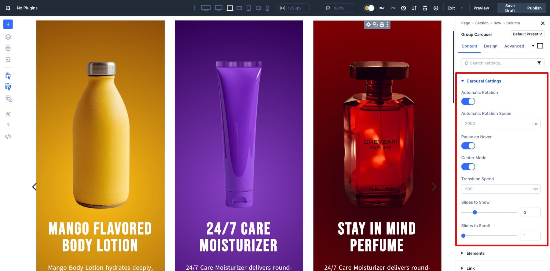
- Navigation Options: Show arrows, dots, both, or keep it clean with none.
- Slides To Show: Decide how many slides appear at once, with separate values for desktop, tablet, and mobile.
- Transition Settings: Enable Automatic Rotation, set the Transition Speed, and fine-tune animations.
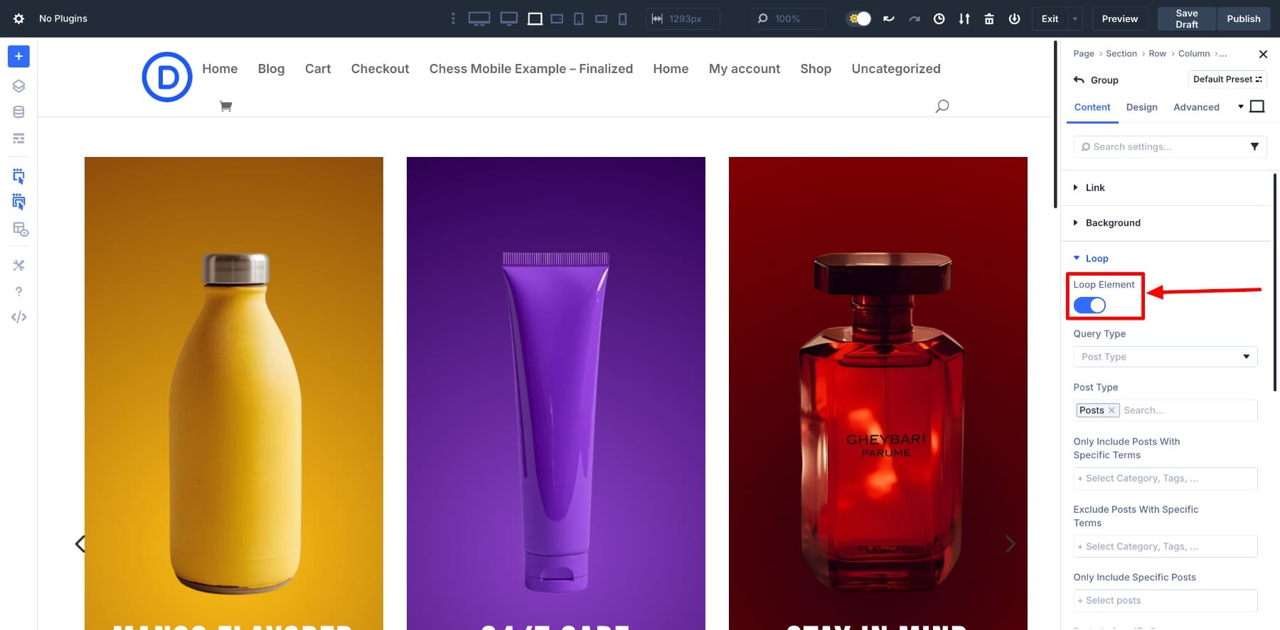
It also connects directly with Divi 5’s Loop Builder, so you can pull in posts, products, or custom fields. New content automatically appears in the carousel, making it ideal for blogs, shops, or portfolios that require ongoing updates without manual edits.
Styling stays consistent since the module uses the same design controls as the rest of Divi. Colors, typography, spacing, and effects all follow the same system of variables and presets, so changes ripple across your site with one edit. And because it’s built on Divi 5’s new foundation, the carousel runs lean: fast to load, smooth on mobile, and free from the drag you often get with third-party plugins.
Learn Everything About Divi 5’s Group Carousel Module
Creating A Carousel Without Plugins In Divi 5 (Step-By-Step)
Before we get into the steps, here’s what we’ll build: a product carousel designed entirely with Divi’s native controls. Each slide features an image, text, and a button, showcasing items in a clean, scrollable layout.
1. Add The Group Carousel Module
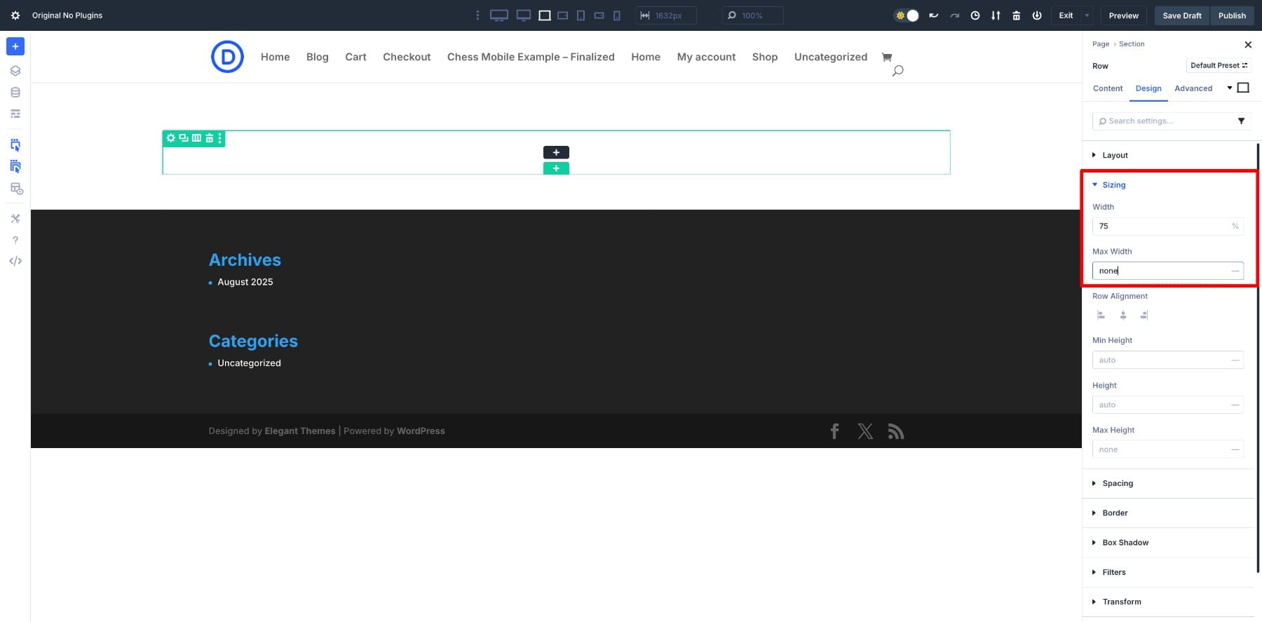
Start by adding a new Row to your layout. For a hero-style product carousel, set the Row’s Width to 75% and Max Width to none so it doesn’t stretch too wide across the screen.
Next, clear out the default padding that Divi adds to columns. Removing that space around the edges gives you a clean base to build on.
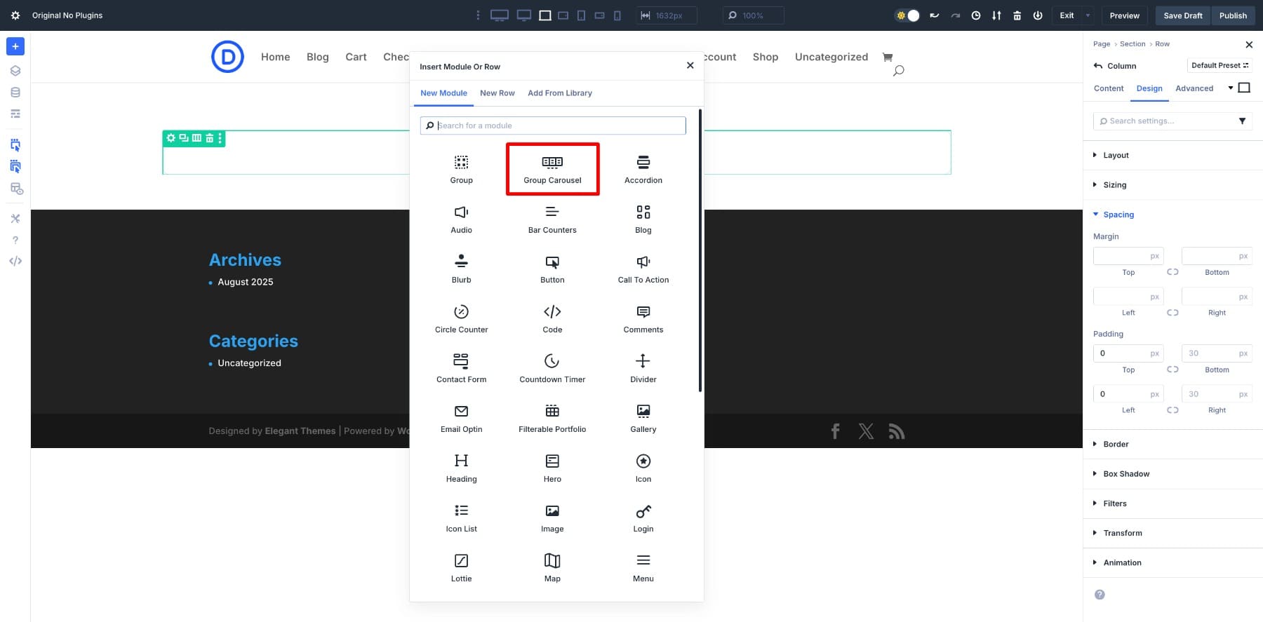
Once that’s done, open the module list and drop in the Group Carousel module.
2. Modify The Group Carousel Settings
Next, let’s customize the behavior of our carousel. Open the Carousel Settings in the Content tab.
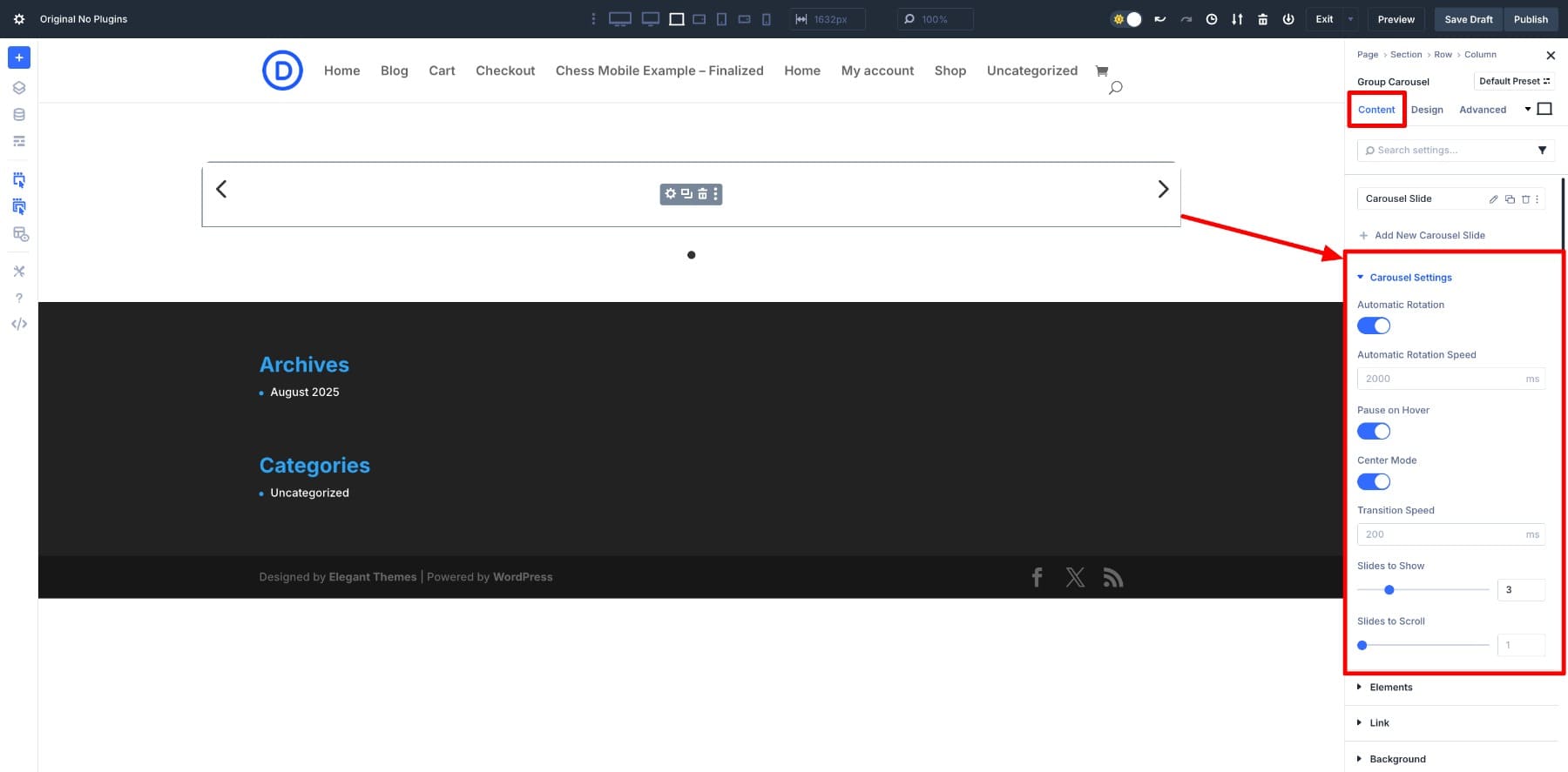
Here’s how to shape it for a product showcase:
- Autoplay: Enable this option to have the carousel scroll through products automatically.
- Pause on Hover: Allow visitors to pause the motion simply by hovering over a slide.
- Center Mode: Keep the active product centered, with a glimpse of the next and previous slides on each side.
- Slides to Show: Set this to 3 so three product cards display at a time.
- Slides to Scroll: Keep this at 1 so the cards move forward one step at a time.
For smaller screens, adjust the responsive settings to show one card on tablets and phones. Hover over the Slides to Scroll field and click Edit Responsive Modes to fine-tune.
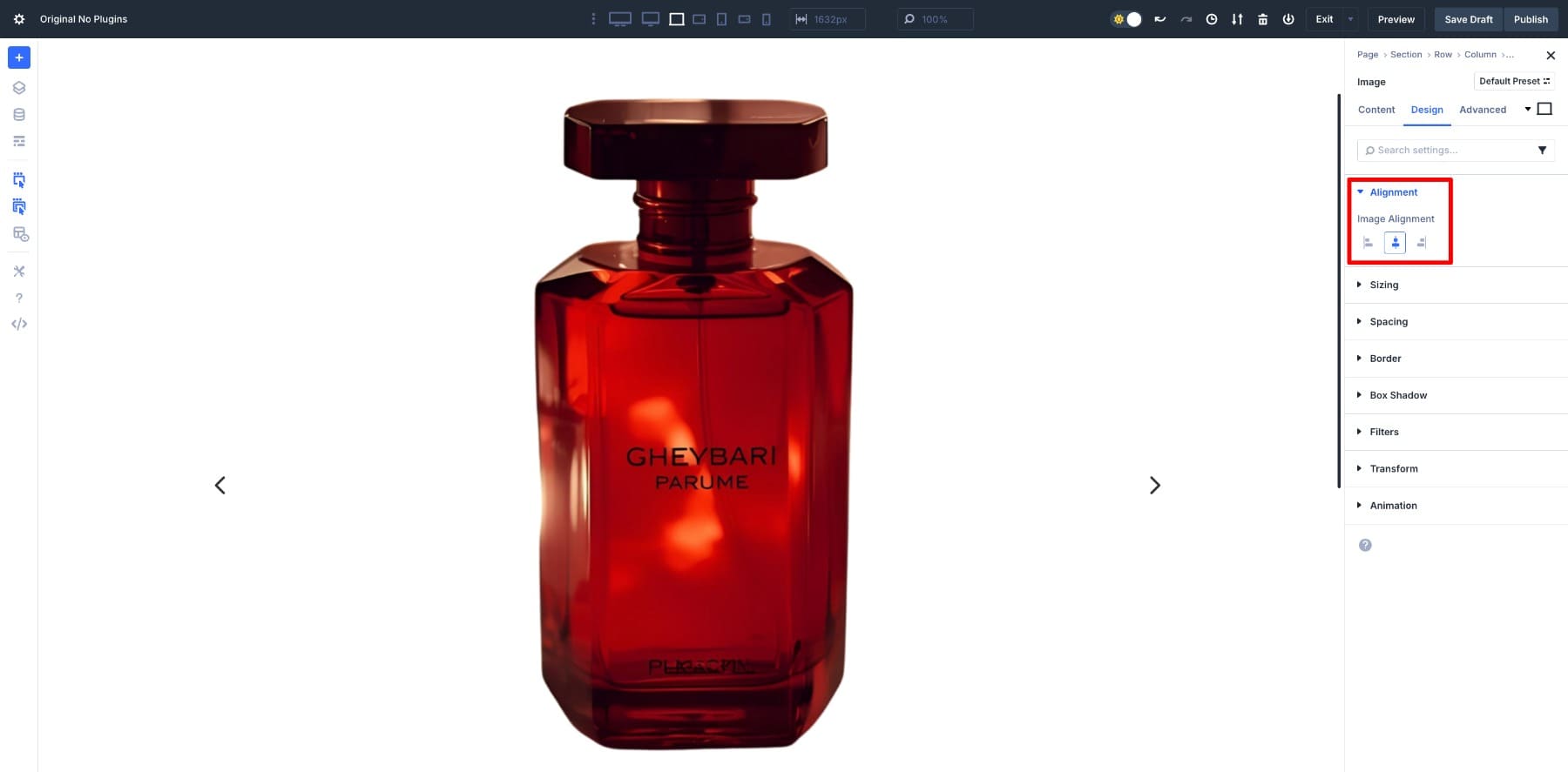
3. Design The First Slide
With the carousel behavior set, it’s time to design the first product slide. Slides can hold any combination of Divi modules, but we’ll start simple with an image, a heading, and a button.
Click the black plus (+) icon inside a Group and add the three modules: Image, Heading, and Button.
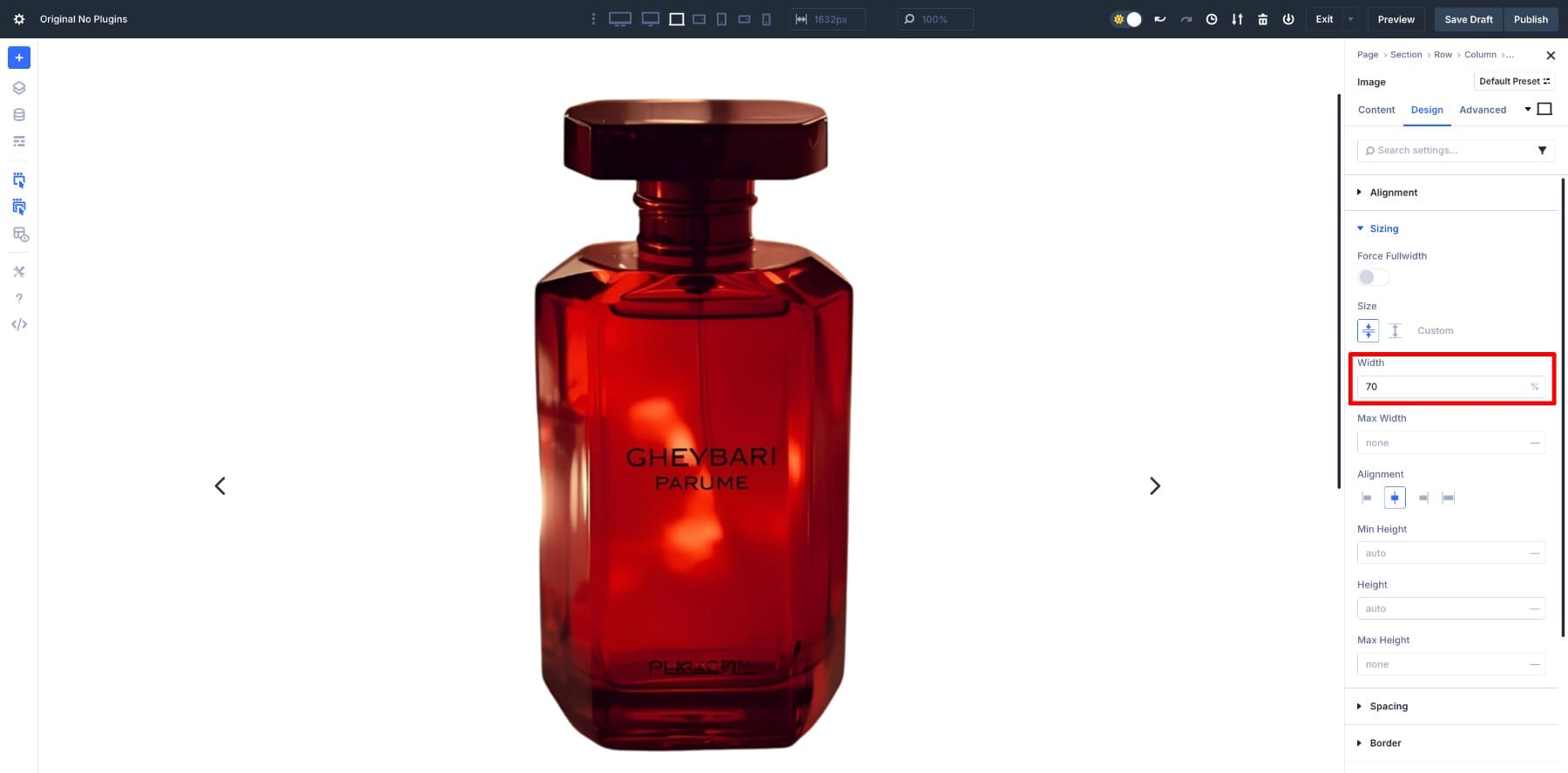
Start with the image. Set the Alignment to center.
And adjust the Width to 70% so it doesn’t feel oversized.
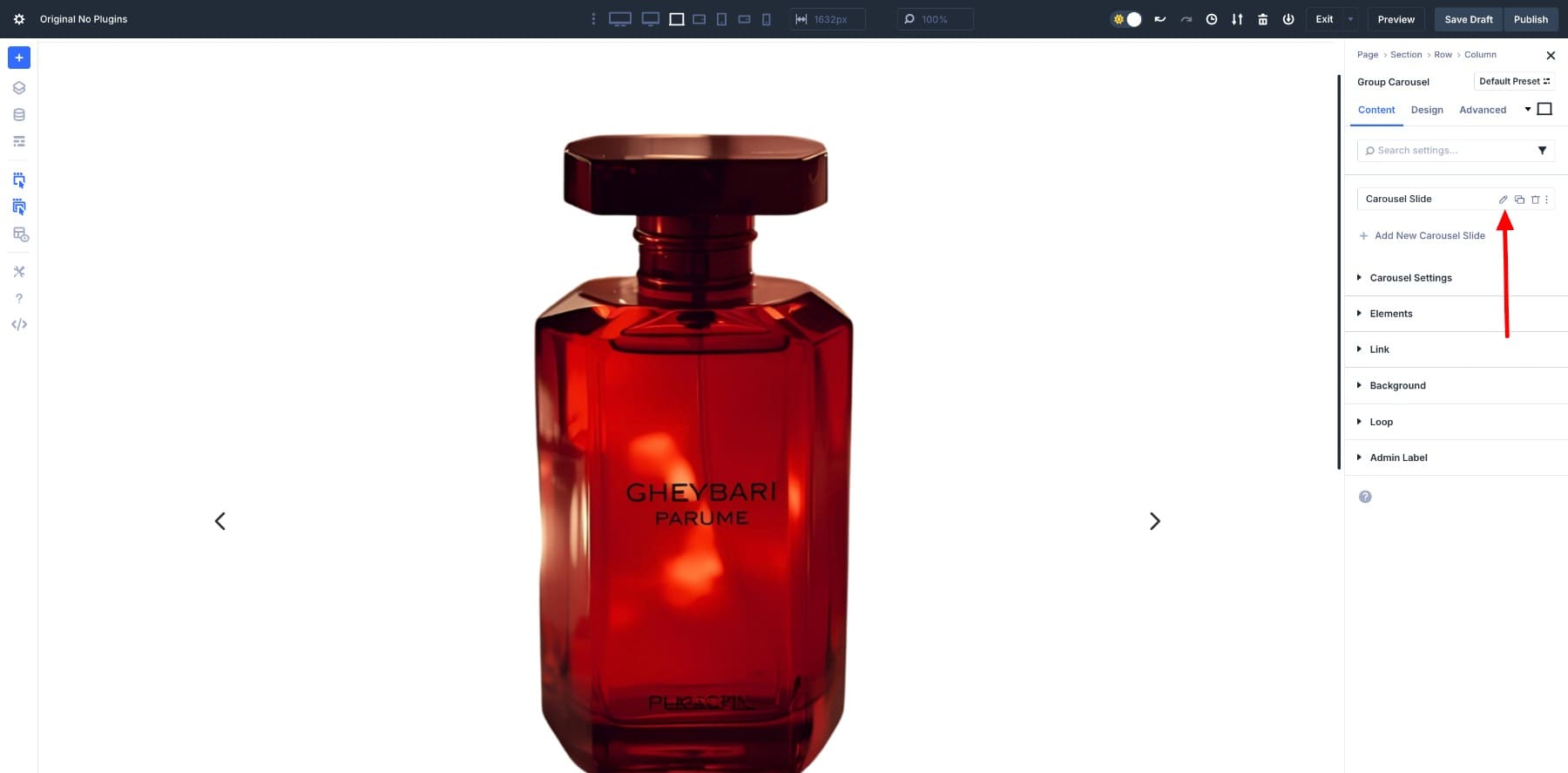
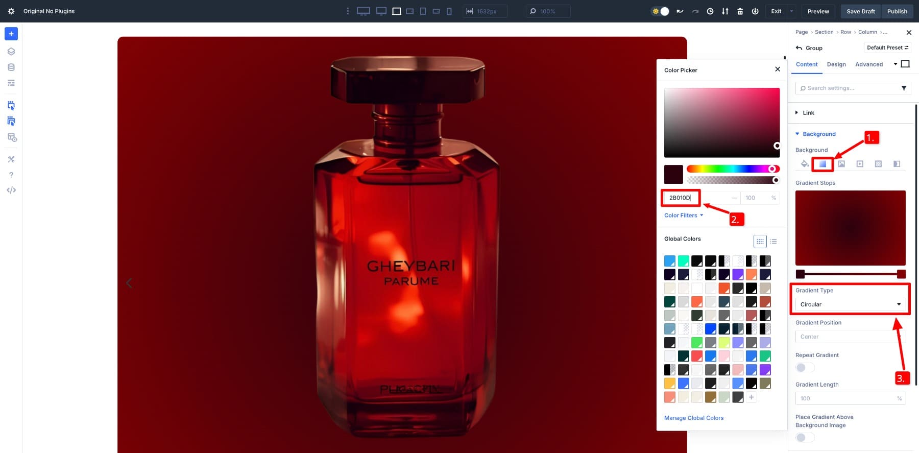
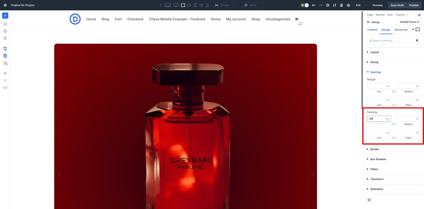
Next, give the slide a background to make the heading and button stand out. In the Group Carousel settings, select Carousel Slide and click the pencil icon.
Under Background > Gradient, choose your colors. For this design, the gradient uses #2B010D and #820002 with a Circular type.
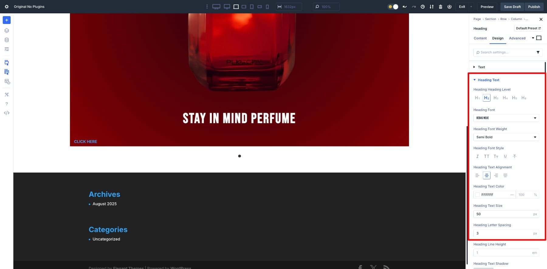
Now move to the heading. I’ve set the font to Bebas Neue, Semi Bold weight, 50px size, and 3px letter spacing for a strong, clean look.
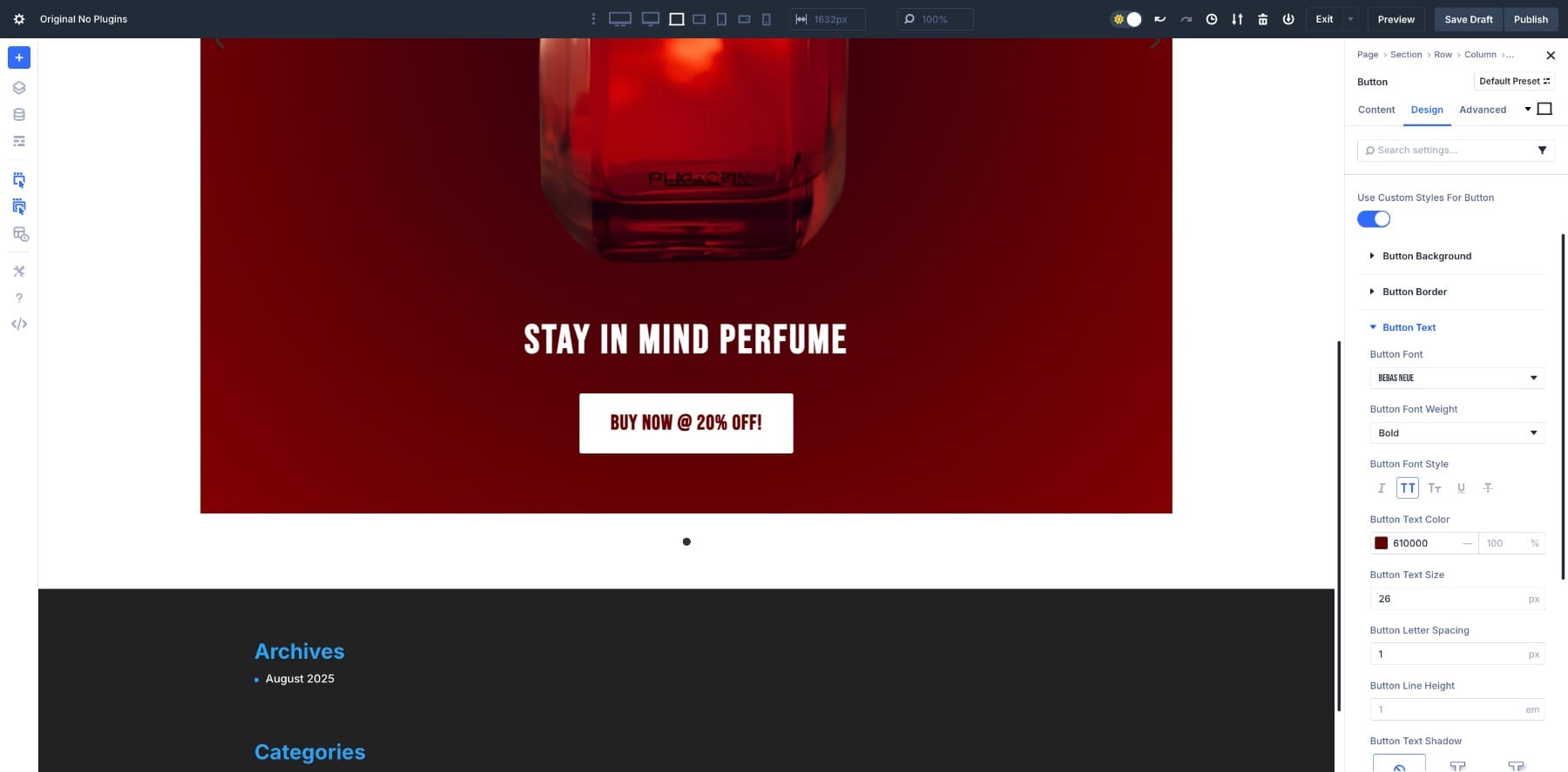
Finally, customize the button. Keep the background white, use Bebas Neue again at 26px, and center align it.
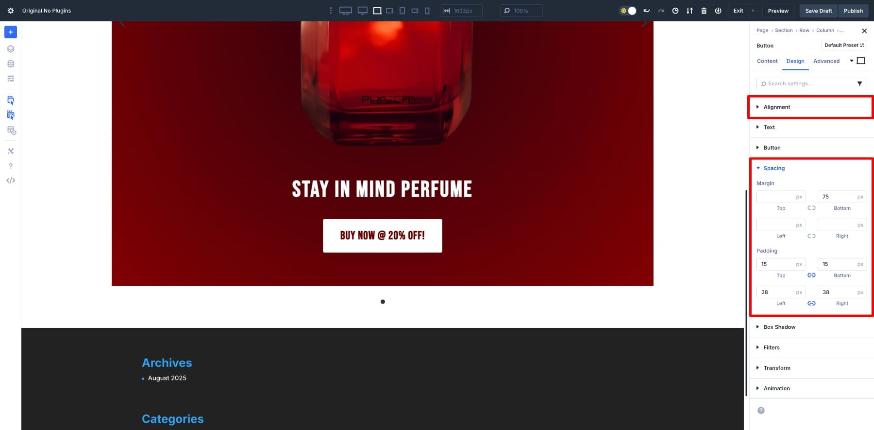
Add padding values of 15px and 38px, plus a 75px bottom margin to give it breathing room.
To finish, add 50px of top padding to the Group so there’s space above the image.
4. Design Other Slides
Once the first product card is styled, duplicate the slide for as many products as you want to showcase.
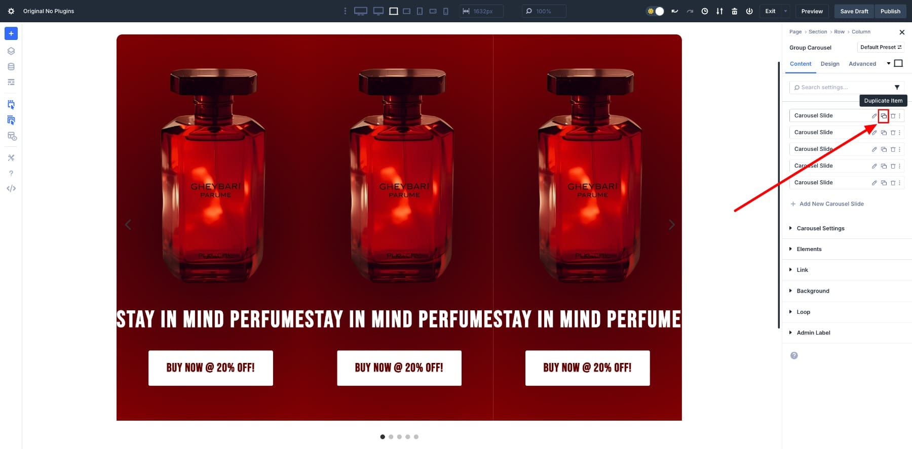
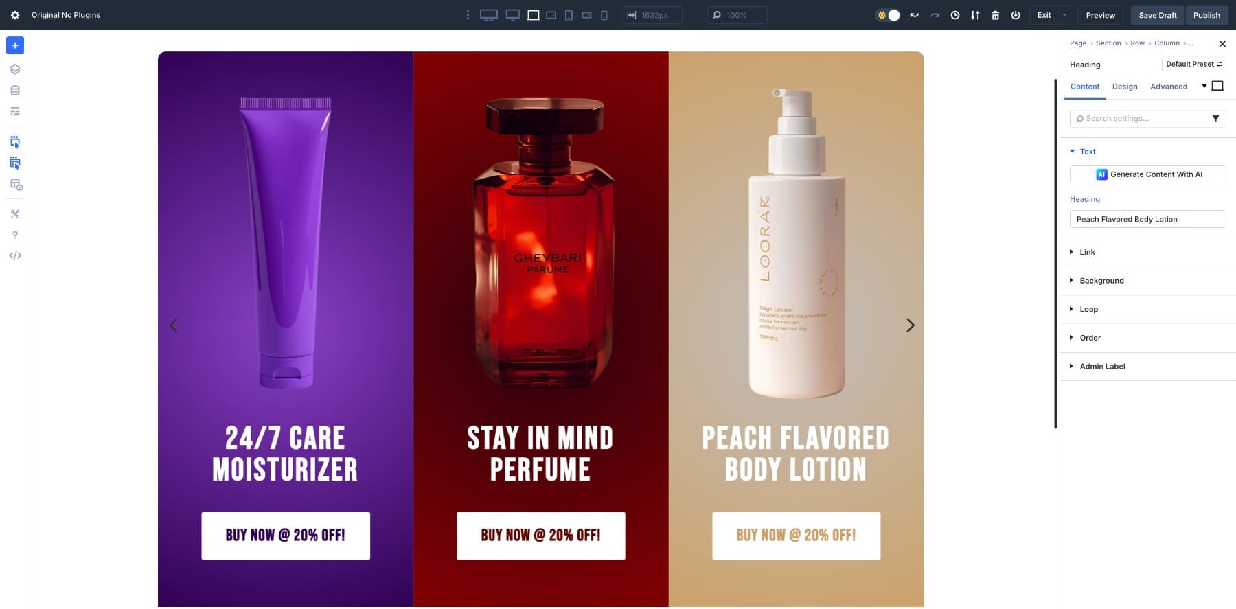
After duplicating, swap out the images and background colors for each slide to keep the design varied.
Do the same with the content; replace the text and buttons so each card reflects the right product.
At this stage, the slides may look a bit cramped. To open things up, add a 40px left margin to each Group slide. This creates enough breathing room between them.
You can also give each slide a softer edge by adding a 20px Border radius. The rounded corners help smooth out the overall look.
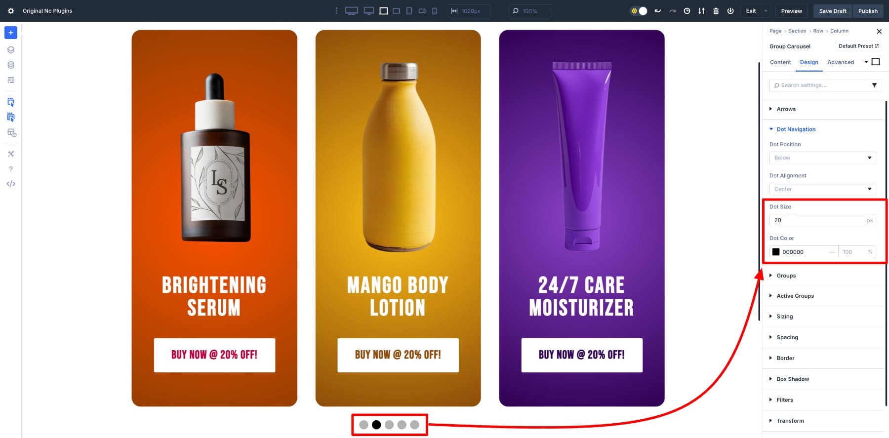
Navigation makes the carousel easier to use, so it’s worth tailoring to your design. In this build, the Arrows are turned off while Dot Navigation stays on. You can control these options in the Elements tab.
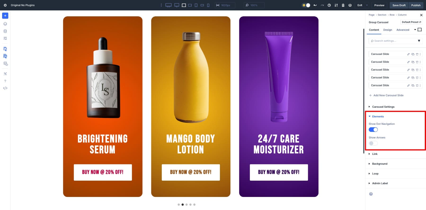
For better visibility, increase the dot size. Head to Design > Dot Navigation and adjust the sizing until it feels balanced with the rest of the layout.
6. Customize Responsive Settings
We already set different values for Slides to Show using the Responsive editor, but it’s good to refine the design for smaller screens. Use the Responsive editor again to check how the carousel looks on tablets and phones, then tweak spacing and sizing as needed.
When everything looks good, preview the design. For the demo here, the Row width is set to 100% and Slides to Show is bumped up to 5, so you can see the full set of slides in action.
Real World Examples You Can Build
You don’t have to stop at product carousels. The same module can be adapted in different ways depending on what you want to highlight. Here are a few ideas to get you thinking:
1. Logo Brand Bar To Build Credibility
A logo carousel is probably the simplest use case, but also one of the most effective. Drop client or partner logos into a scrolling row and you instantly show visitors they’re in good company.
It occupies very little space yet does a great deal of trust-building. Perfect for homepages or service pages.
Reviews stacked in a column often get skimmed or ignored. A testimonial carousel makes each one feel like its own highlight.
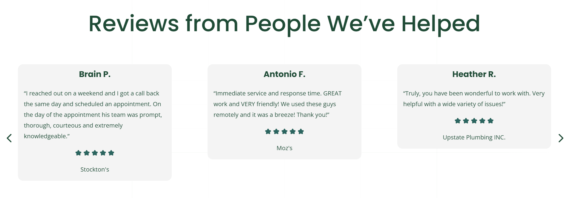
Add a short quote, a name, and possibly a photo, and arrange them in a clean layout. Place this on a homepage or a landing page and it backs up your offer with real voices right where decisions are made.
3. Full-Width Header Carousel
Want something bold? Go full-screen. Each slide can carry a background image, a headline, and a call-to-action button.
It’s a strong way to open a site, or to run seasonal promotions and campaign launches where you need the design to grab attention from the very first scroll.
4. Team Members On A Career Page
This one works well on career pages. Each slide can feature a photo, name, role, and a short bio or fun fact.
Instead of a static grid, a moving carousel gives the page a friendlier, more personal feel. It’s a simple touch that makes company culture visible and shows potential hires the people behind the brand.
Build Custom Carousels With Divi 5 Today
Divi 5’s Group Carousel module gives you the freedom to design sliders directly in the builder — no plugins, no extra code. From product cards to testimonials, logos, or even full-width headers, the same steps can adapt to whatever you need.
Because it’s part of Divi, your carousels stay fast, consistent with your design system, and easy to update as your content grows. Build it once, adjust the styling to fit your brand, and let the module handle the rest.


Leave A Reply