

We see fonts around the web, and view lists about the trending font combinations to use in 2015. They’re great for inspiration, and are useful for non-designers to follow.
But do we know what makes fonts great? Or what makes them trendy? Or what makes them ugly?
We got to interview design and typography experts who were able to give us some advice and resources on the topic of web fonts. Personally, I think it’s extremely useful, in the website industry, to understand principles of font selections and font combinations. That way, if you’re designing your own site, or don’t have a background in design, you can follow guidelines to ensure your website typography is still effective.
Remember, with design, we’re not focused only on ‘looks.’ We don’t want to make choices only because of aesthetics, or the “I like it” motive. Aesthetics are important, but with typography and design, there are usually reasons that the aesthetics are appealing or not appealing. On the one hand it’s personal preference, but on the other hand, with fonts, it’s also legibility.
If there is one takeaway you can get out of this article, that would be it: legibility. Does your font choice make it easy to read your content? If it doesn’t, you’ve probably chosen the wrong font.
Let’s delve into some web font principles to follow in 2015 (and for all time!).
Finding and Picking a Web Font
Resources for finding good fonts
Many of us now use Google Web Fonts and font-face embeds in CSS for our website designs. We wrote about how to use Google Fonts on your WordPress site here. This is not the only option, however. Examples of other sources for web fonts (both paid and free) include:
http://www.typewolf.com/open-source-web-fonts
https://typekit.com
http://www.fontsquirrel.com/
http://www.veer.com/products/fonts/
http://www.fontbureau.com/webfonts/
https://edgewebfonts.adobe.com/fonts
And here is a list of traditionally “web safe” fonts you can use without a font embed in CSS, since most browsers come with the ability to display these fonts by default:
http://www.w3schools.com/cssref/css_websafe_fonts.asp
Yes, there are other free fonts available online. While they may be tempting, they are often not made well and can contain flaws (as I’ve been told). If you are looking for something free, it’s best to stick with a service like Google Fonts. In general they are regarded as reliable in quality.
(Note: There are assumptions that Google pays their type artists a flat fee for their submissions, though this is hard to verify if you dig into it. See this article, this article, this article and possibly a hint at their payment model in a patent here. If anyone has a reliable source for us, let us know in the comments!)
Also, watch out for licensing! While you can use a tool like Font Squirrel to turn almost any typeface into an embeddable font, the font creators or owners (like Microsoft or Adobe) do not always permit this. Sometimes you may use fonts in imagery or in print, but not in your CSS.
- 1 Define typeface options for the personality of your web project
- 2 When in doubt, stick with this ‘no-fail’ policy when choosing a web font
- 3 Technicalities Behind Font Usage
- 4 Pairing Web Fonts Properly
- 5 Stepping ‘Outside the Box’ with Web Font Combinations
- 6 Staying Trendy and Up-to-Date with Web Fonts
- 7 To Conclude: Web Fonts are a Skill
Define typeface options for the personality of your web project
At first glance, you may be overwhelmed by the options of web fonts available. Don’t let yourself be paralyzed by choice. Start with the personality and mood you are going for. This was described by Christina Paone of Paone Creative in our interview, and is agreed upon by many experts on the web. For example, Douglass Bonneville on Smashing Magazine and Ian Yates on Tuts+ (in the Web Design section).
Here is how Ian Yates explains the effect that personality can have on a font choice:
Fonts, like people, have personalities. And fonts’ personalities, just like those of people, can sometimes clash. Think of your fonts as table guests at a wedding reception; one entertainer is usually enough as too many strong personalities can make the atmosphere awkward, like an episode of Big Brother.
Make sure that there is some charisma in the group though; eight people with little to say just results in a toe-curling wait for the speeches.
Let’s pause for a moment and play a game. Can you interpret personality in the following font samples? Let us know what you read in the font imagery alone, regardless of the readable text. Do the font personalities match the words being spoken? Tell us in the comments!

Photo credit: Alhovik / Shutterstock.com

Photo credit: Wiktoria Pawlak / Shutterstock.com
Photo credit: Wiktoria Pawlak / Shutterstock.com
Typography.com has an excellent resource for understanding how fonts can have personality, and spells it out quite clearly with some examples of their own. As they say, their resource is “built around H&FJ’s Highly Scientific First Principle of Combining Fonts: keep one thing consistent, and let one thing vary.” This is an important principle we’ll discuss soon with Christina’s advice.
Finally, if you’re looking for a laugh on the way fonts have personality, check out this video from College Humour titled, Font Conference (credit to Christina for sending it to me).
So, if you’re designing a quirky site, go with a quirky personality and mood. Keep things light with sans serif or handwriting fonts. If you’re trying to emit a mood of seriousness and authority, consider serif fonts, since they are traditionally associated with that type of writing. (This is not to say that all sans-serif fonts are light hearted and all serif fonts are somber. Far from it! Don’t be font prejudiced! Your instinct will tell you what to use, and these are general statements.)
“No math or formula will work here,” explains Christina. “Every font has a personality and a story. If you are a type nerd like me you can probably look at a font and create a character profile for it instantly. I see fonts like a kid sees cartoon characters.
…Some characters are very clear
- Serifs are the traditional type.
- Sans serifs are the more modern.
- Italics are uneasy and bolds are certain.”
When in doubt, stick with this ‘no-fail’ policy when choosing a web font
If you are stuck, or just not sure of your choice, Christina gives this advice, so you don’t get lost in the endless search for a ‘good’ font choice:
Choose fonts that are timeless. It’s tempting to use bold or popular new fonts but these fonts will get old fast.
Choose a font with a full set of weights. This means the font set should contain a regular, a bold and an italic at a minimum. Many fonts come with more options such as lighter and heavier weights.
Choose one font to set the personality. Choose a second font (for a font pairing) that will create stability.
Technicalities Behind Font Usage
This likely isn’t the most fun part of design (depending on who you talk to). But it has to be done to achieve maximum greatness on a website. If you gloss over things like retina display or the difference in font measurements between print and computers, you can end up with a design that wasn’t quite the ‘look’ you were trying to achieve. It also makes a design look ‘lazy.’ So be sure to do your testing homework after selecting your fonts (which we explain below).
You can’t rely on Photoshop for this aspect. As Christina explains,
Web fonts can appear altered in Photoshop so set your styles in the browser. A really great tool for testing fonts online is Typecast. When using their templates they will also start you with a suggested font sizes, line height, letter spacing and more. Then you are invited to adjust it as needed. The bonus to their tools is that you can download all the CSS associated to your template. This is the best tool I know of for styling fonts for web.
You might have to go back the drawing board after the following steps, but it’ll be worth it in the end.
Font pixel testing across screens, devices and mediums
Christina also brings up an important point about doing research on the way fonts can appear different, and essentially change your intent, on various devices:
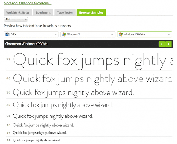
Once you have chosen a font based on personality make sure your fonts are legible on all screen types. A retina display vs. your mothers ancient PC will display the same font very differently. You need to test your chosen weight to make sure it is legible and maintains that personality you chose it for.
There are tools online that will let you test for this. One of them is Adobe Typekit. In this example you can see the thin weight of Brandon Grotesque starts to pixelate very badly at smaller sizes.
Don’t forget the drastic change font weights can have
This point can be overlooked very easily – not just with the overall design, but also with the way your font weights look in different formats. It’s not always the same on every screen or medium, as we have seen above.
So, to start, as Christina explains, “font weight comes down to personality of the site. Use a lighter weight for a modern arid look. Use a heavy weight for impact.”
But then you need to check to see what your font weights will look like on browsers versus in Photoshop, and versus in print. You will notice a difference, so watch out for that!
Another thing to look out for is the font weights that were made to go with the font family. You will notice on Google Fonts that you can choose to embed fonts at certain font weights, and not all fonts come with the same numbering in this regard.
Here is an example of font weights that come available with the Roboto font on Google Fonts:
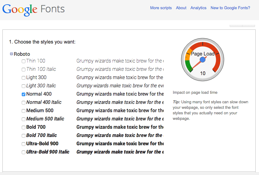
In this situation, if you tried to force the Roboto font to use a font-weight of 200 or 600, which are not in its style set, those weights would come out looking just not right on your browser. I see this a lot on websites, and as developers and web designers, we need to check our CSS to ensure we are not using mere “bold” as a font weight, or an inaccurate font-weight number. It affects the browser display of the font.
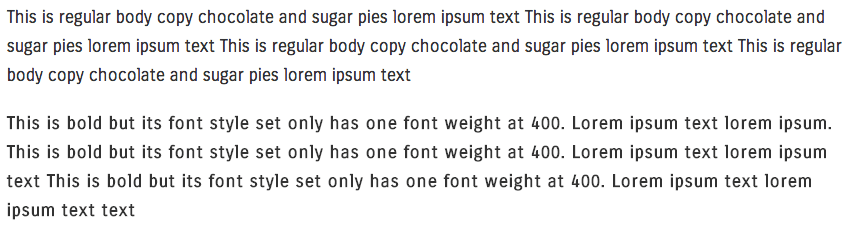
A working example is with the limitation that the font Carrois Gothic presents, since it only comes with one font-weight, which is 400.
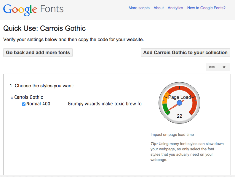
If you use this as your body text (remember, the “work horse” as Christina describes it), you won’t ever be able to use bold text properly. See how the distinction is minimal between the normal 400 weight, and the browser trying to ‘force’ a “bold” weight on the font in CSS. The “bold” also shows up kind of ‘fuzzy’ (for lack of a better description):
Calculating and refining your letter spacing
While this may not be something you learn at the beginning of your exploration into typography, it’s good to be aware of it nonetheless. Letter spacing can now be changed quite easily on the web with simple CSS. That can be a blessing and a curse. If you do it right, it can make a great difference in your web design standards. If used incorrectly, it can also make things look strange and unreadable.
According to Christina,
Letter spacing and line height is a design principle that must be studied and mastered. Some will argue that there is no mathematical formula – that it is a feeling or sense of balance. It all comes down to the golden ratio (but that is a topic of its own).
I would suggest that you base your design on math but be sure to fine tune the results for your specific project. Here is a really cool tool that uses math to give you a starting point. However first view the results in Georgia, then change the font to Baskerville. You can see how 2 serif fonts read very different with the same line height and line width.
One thing to remember is that on the web you are restricted to pixel-by-pixel design. In traditional print settings you can style with decimals. Online you have to set line height and letter spaces with pixels and this can sometimes be awkward. Do your best to find a good fit or else choose a new font.
Pairing Web Fonts Properly
More often than not, you’re going to need to combine fonts on your website design. It’s rare to see just one type of font family, font weight, or font style on a website, and that’s for good reason.
Fonts help distinguish parts of your website so users can understand the importance of and hierarchy in your design. You want users to know that a heading is a heading, and not the same as your body copy. So of course, you change your font settings in CSS to communicate that. Douglas Bonneville calls this designing a “role-based scheme.”
In fact, HTML is set up this way, providing tags for H1, H2, H3 and so on (with the “H” standing for “Heading”). HTML also has other tags for our use in typography, such as <blockquote> (which we wrote about here) and <p> (which is for “paragraph”).
But you don’t want a lot of distinction when separating the meaning of your web page elements. If you use too many font families on your website to do this, you lose your readers’ attention.
As Christina explains,
A perfect font pairing goes unnoticed. The goal is to try to find fonts that look like they are from the same family. A perfect match utilizes one font for contrast and one font for support. The two fonts should never compete for attention.
Every font has a personality so let’s compare fonts to people. A great pairing would be a parent and their kid. They both look the same and have hierarchy in the family tree. A bad pairing would be two cousins because they look the same and act on the same level.
Here are two very simple steps to follow when pairing fonts together, explained by Christina,
Step One: Find fonts with similar traits yet still look different (so that they don’t compete). Here are some similar traits for you to consider (choose one to focus on):
- Are they both narrow (condensed)?
- Are they both open or round?
- Are they both square or geometric?
The easiest way to achieve a good pairing is to use fonts from the same family. A great combination is Roboto and Roboto Slab.
Step Two: Create contrast and hierarchy. Choose one font from the pair to use on headlines. This font will set the tone and personality of the page. Use the second for body copy – this font is your work-horse.
Here are some more tips and pre-paired web fonts you can use, thanks to my friend and UI expert, Alex Chang:
10 More Great Google Font Combinations You Can Copy
10 Useful Google Font Combinations for Your Next Site
Eight tips for combining typefaces
Eight ways to combine typefaces
Should you use suggested pairings from the Google Fonts website? Christina suggests not doing that, since they’re not always the most professional-looking pairings. Instead, take those recommendations as inspiration for creating your own combinations.
Stepping ‘Outside the Box’ with Web Font Combinations
Ok, so now that you’ve got some foundational principles for picking out fonts, it’s time to learn how to break the rules a little bit. Remember, breaking the rules requires knowing the rules, so don’t skip straight to this step. Take the time to get comfortable with recognizing and identifying good font choices as we’ve described above.
Here are examples of rules you can learn how to ‘break’ in typography:
‘A serif and a sans-serif should always go together’
This is true, and is a failsafe, but isn’t always the most widening experience when learning to play around with typography.
As Christina helps us understand,
This is an old typographers technique – it’s what they teach you in school. Rules like this set a foundation. It’s up to the designer to choose the perfect time to break the rule. That is what makes design interesting.
If you are a novice this is a great rule to use. It will help you set a pair that looks related but allows for some contrast.
As you become more comfortable at choosing fonts you can start to break the rule. Here is an example of a site where we use 2 serif fonts to enhance the feeling and personality.

This site is using IM Fell DW Pica and Sorts Mill Goudy. You can see Christina chose them carefully. They don’t compete, and they follow the same patterns and principles that were outlined in Christina’s steps for combining fonts above.
‘Only use two fonts in a design’
Again, this is also true, but at the same time can be kind of boring in design. But again, Christina explains that you sometimes need more than two fonts (though no more than three, please folks):
“For some cases you might need a third font to add interest. Here is an example of a site where the headline and body copy fonts were not enough. We used a custom ‘art’ font for special icons and graphics to add interest.”
Fonts used in this design were Duke, Courgette and Gudea.
Adding a third font is also a great time to pick a display font. How do you identify a display font?
Christina explains,
Display fonts have the most personality. They can be super creative or very trendy. A display font usually only has one variation (e.g.: just regular and not italics or weight variations). This means they have a single purpose. They are not versatile and should not be used as a primary brand or site font.
… They’re great to add personality to your site. Use them for headlines or special buttons. They are great to use in image-based artwork as well.
Staying Trendy and Up-to-Date with Web Fonts
Some fonts are timeless, while others are not. It’s important to stay up to date with font trends to keep your designs ‘with the times.’ This is when trusting a designer is also key. It’s hard to do that when, as a client, you might be used to Microsoft Word options, as Christina explains.
Personally, I often get asked to reduce font sizes on websites, even when the fonts aren’t really that big. I think this is an old fashioned concept that doesn’t consider the user or modern screen display sizes. It’s always better if your text is easy to access. Remember, we care about legibility more than taste for taste’s sake.
To Conclude: Web Fonts are a Skill
Hopefully we’ve impressed upon you that choosing fonts is just as important to your brand and website as writing good content, or choosing a good developer. The effect of typography can go a long way in sending your message to your website visitors. It has an unspoken language, as we’ve seen above when interpreting font personalities. Don’t let it slide, and trust a designer’s judgment and training on this matter if you’re not confident you can do it on your own.
So, let’s let 2015 be the year of understanding web font typography, even if you’re not a designer! Let’s make the web a better place with better font choices!
Oh, and you may be wondering…
Who is Christina Paone anyway?
Christina has been a great reference point for this article, and was quoted many times, so you might be wondering who she is. She has been illustrating and playing with type for over 10 years. She started with a foundation in formal design and typography training at University. Currently she operates an independent studio, Paone Creative, where she builds inspiring WordPress websites and brand identities. The studio has been providing clients with optimal type styling for 5 years now. She says typography is her passion both at work and as a personal hobby. You can follow Christina on Twitter and Instagram. She also has a great Pinterest board dedicated to typography that she updates regularly.
Also check out:
Our article related to this topic, about web design trends to look out for in 2015.
Fonts that are available with most of our themes here at Elegant Themes.
And, since this is the Internet, I know what you’re all waiting to ask and talk about: what about comic sans? For that, I simply hand the floor over to VSauce on YouTube, who made a video on this topic that explains it well… or, well enough, ha ha.
Article image thumbnail by: Epsicons / Shutterstock.com


Great post Joyce. It’s really something incredible. Web designers should be more familiar with the new web design techniques as well as the latest texts of fonts to use for a change. Also, I found this one http://www.lionleaf.com/blog/using-web-fonts-with-the-google-fonts-api/ and it gives positive results as well but I like your ideas better. Do different types of fonts used in a site works on a responsive and non-responsive web design with no problem?
I drank 2 cup tea during reading this… How you wrote that large?
thanks – I great resource!
Great post – accessibility is another key consideration when choosing fonts too.
Great article @thoughtsofjoyce – Thanks for sharing my perspective on web typography! The additional resources you added make this a great post to reference.
There have been many great articles here all year, and this is probably one of the top 5! Great work, and from one typography enthusiast to another, your thoroughness is appreciated!
hey you guys are awesome many many thnx for such kinds of post
Great post, Joyce .. thank you
Congratulations for this excellent text! Full of good information for certain decisions on design projects. Precious tips!