

Welcome to Day 41 of our Divi 100 Marathon. Keep tuning in for 100 days in a row of awesome Divi resources as we count down to the amazing release of Divi 3.0 on the final day of the series!
In today’s post we’re going to be showcasing the work of various Divi freelancers, studios, and customers who have re-designed websites using Divi to improve a wide range of design and usability features. We’ve received many more submissions for posts like this one and we look forward to showcasing a lot more community work in the future. For today though, we hope you enjoy the five examples below.
- 1 5 Stunning Divi Site Makeovers And What Makes Them Super Effective
- 2 1. The Barker Team Realtors Divi Makeover by In Transit Studios
- 3 2. The National Infantry Museum Divi Makeover by Monterey Premiere
- 4 3. The Eddie Judd Photography Divi Makeover by Melissa Love
- 5 4. Hixon Divi Makeover
- 6 5. Advanced Skin Treatment Divi Makeover by Leslie Bernal
- 7 Tomorrow: A Brand New, Free Divi Layout Pack
- 8 Divi 100 Day 41
- 9 The Countdown To Divi 3.0
5 Stunning Divi Site Makeovers And What Makes Them Super Effective
All of the websites below have been re-designed by members of the Divi community for clients who had previously either not been using Divi or in some cases not even using WordPress. We think the before and after images really speak to the dramatic change that using Divi can have on a website.
1. The Barker Team Realtors Divi Makeover by In Transit Studios
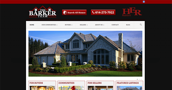
The Barker Realtors Site Before the Divi Re-Design
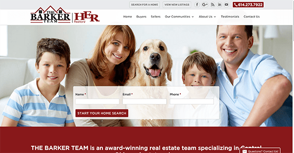
The Barker Realtors Site After the Divi Re-Design
About the re-design:
“The Barker Team had an outdated, unresponsive, dark website that did not represent their services well. We got to know their team, their personalized service and found out what separated them from their completion. That all translated into the new website design that we created with Divi. We developed a fresh, modern, bright, responsive website with all new functionality. They wanted a site that they could better manage and one that would be more engaging with past and present clients. With the Divi blog and project options, we were able to create a full set of custom post options so the client could post blogs, new listings, success stories and more. Divi made it easy for us to meet all our clients needs and to give them a custom WordPress site that they’ll be able to use and manage for years to come.”
–Josh Hall, In Transit Studios
2. The National Infantry Museum Divi Makeover by Monterey Premiere
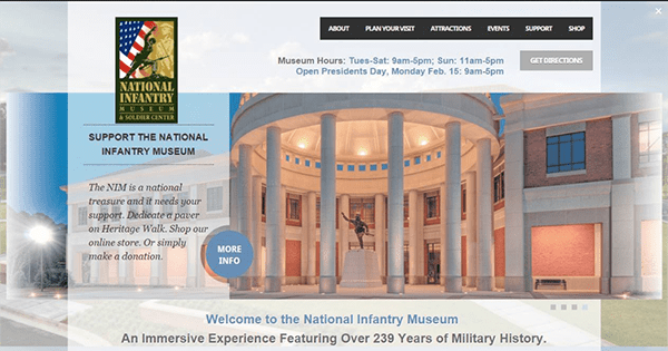
The National Infantry Museum Website Before the Divi Re-Design.
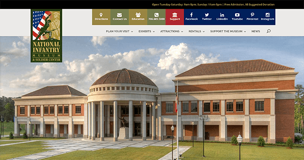
The National Infantry Museum Website After the Divi Re-Design.
About the re-design:
In this design Geno and his co-designer Andrea Walker brought the National Infantry Museum website onto Divi with the goal of simplifying the design elements on the various pages, optimizing them for a more elegant experience, while also making the site responsive and mobile friendly.
Geno Quiroz, Monterey Premeire
3. The Eddie Judd Photography Divi Makeover by Melissa Love
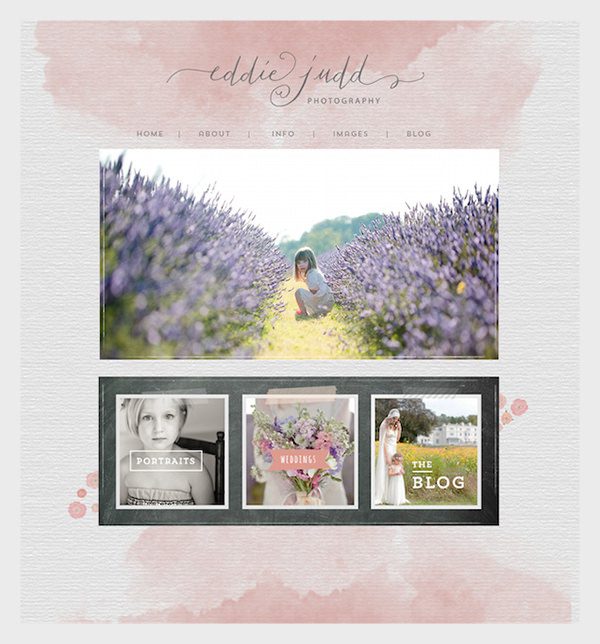
Eddie Judd’s Photography Website Before the Divi Re-Design.
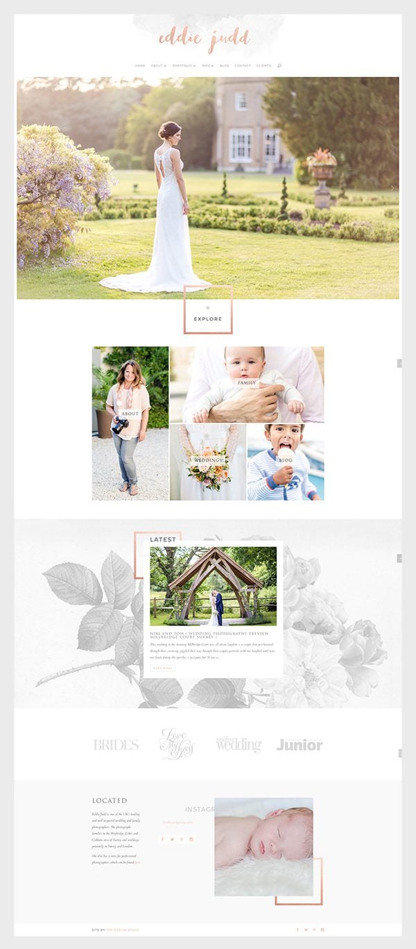
Eddie Judd’s Photography Website After the Divi Re-Design.
About the re-design:
“Eddie’s previous was a mix of hand-made charm and vintage ‘real item’ style, featuring blackboard textures and tape strips. It was time to move on.
We decided to retain the hand-lettered logo and watercolour wash, but brought the rest of the site bang up-to-date, by introducing a monochrome floral texture, a pop of bright color.
The finishing touch was using the Divi module margin settings to offset heading and images to give a contemporary editorial feel.”
–Melissa Love, The Design Space
4. Hixon Divi Makeover
The Hixon Website Before the Divi Re-Design.
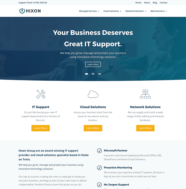
The Hixon Website After the Divi Re-Design
About the re-design:
“As a Small Business based in the UK we started using Divi after trying various WordPress premium themes each with their own annoying issues, Divi was like a breath of fresh air with its advanced features and the most intuitive page builder I have ever used.
Just a few of the reasons we use Divi and you should too…
– Intuitive Page Builder
– 30+ High Quality Pre Built Modules
– Fantastic Support (Elegant Themes)
– Import / Export Templates & Settings
– Great Value for Money
– Fully Responsive
– Easily Customised using CSS and Advanced Settings.
As a business technology solutions provider we needed our website to be simple for users to navigate and use and Divi provided us with this out of the box, all we did was add content and make a few CSS tweaks to make it look individual.”
–Jonathan Lawton, Managing Director | Hixon Group
5. Advanced Skin Treatment Divi Makeover by Leslie Bernal
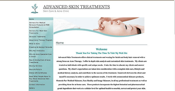
The Advanced Skin Treatment Website Before the Divi Re-Design.

The Advanced Skin Treatment Website After the Divi Re-Design.
About the re-design:
“My client Kellie Campbell was using a paid service that catered to skincare professionals to make her website. It packed the hosting and design of the site into one bundle like a template builder, but she had little control over the design layout. It also wasn’t responsive and didn’t take into account the changing visual trends in web development. I used Divi to do a complete overhaul and made her site more visually engaging and interesting. She loved starting fresh with a brighter color scheme and I used Divi’s fullwidth features to take advantage of the screen real estate and made it a more modern and professional looking website.”
–Leslie Bernal, A Girl And Her Mac
Tomorrow: A Brand New, Free Divi Layout Pack
Well that’s all for today’s Divi 100 post, come back tomorrow for the start of a new week of Divi freebies. Mario has the first of two layout packs to give away tomorrow so you won’t want to miss it.
Be sure to subscribe to our email newsletter and YouTube channel so that you never miss a big announcement, useful tip, or Divi freebie!
Article thumbnail image by Kit8.net / shutterstock.com
Divi 100 Day 41
The Countdown To Divi 3.0
This post is part of our Divi 100 marathon. Follow along as we post free Divi resources for 100 days in a row! This 100-day countdown will end with the game-changing release of Divi 3.0, including our brand new visual editor built from the ground up using React. Divi 3.0 will change the way you build websites with the Divi Builder forever!
Let the countdown begin.


Well, themes with examples i love the Eddie Judd Photography page
it’s so amazing and elegant!
I am really impressed too with Leslie Bernal’s redo – quite a change! Did you do the redesigned logo etc.. as well? Great job!
Am I the only person who prefers the OLD Eddie Judd site?
Museum’s and Photography websites looked unique before. Now they lost their charm and look like yet another mass template copy . lost in the crowd.
I like the old Eddie Judd better too.
I designed that one too and both Eddie and I liked it a lot but she was definitely ready for a change to a responsive site with a more contemporary edge to the brand 🙂
Can someone tell me how to get the black back goons ground for numbers on the DIVI count down counter?
Thank you so much for the wonderful examples!
I wonder how they did the floating logo effect (on scrolling, the big logo disappears upwards and replaced by header logo) on the National Infantry Museum. Can anyone give me any directions?
Hi Elad. Glad you like it. I wrote a tutorial awhile back on how to achieve this effect.You can check it out here. http://quiroz.co/swap-horizontal-logo-with-vertical-logo-on-scroll/
Hi Geno
Wow, this is great! Thanks a lot 🙂
Hey Elad, they sell a plugin on their website for $5 bucks. i purchased it and going to play with it today
Thanks Ben!
But who are they and which site?
I searched a little in the site’s code to see what CSS attributes were used:
transition: all 0.4s ease-in-out;
transition-property: all;
transition-duration: 0.4s;
transition-timing-function: ease-in-out;
transition-delay: initial;
So I guess I have to understand this. I just couldn’t find the scrolling trigger. And again If someone can give directions I would be thankful 🙂
here’s the plugin: https://montereypremier.com/shop/divi-plugins/divi-logo-swap/
you’ll probably have to do use custom css though
Thanks Ben!
I will give it a try
I was interested in seeing how this was done as well please.
On The National Infantry Museum Divi Makeover by Monterey Premiere how did they get the menu sections like that? it’s really nice
HI Ben. Thanks for the kind words. I have written a couple of free tutorials on how to achieve a similar effect really easily. And with a few modifications you can recreate the effect.
http://quiroz.co/add-cool-square-social-media-buttons-in-divis-top-header/
http://quiroz.co/adding-extra-fields-and-icons-to-the-top-header/
Hi Nathan,
I have sent you an email with a new screenshot attached as we had an issue with a stylesheet when you took the screenshot above
Great post, thank you!
Can I make a request? I’m reading a lot of these Divi 100 posts and keep getting frustrated that there’s no link button to click to read the next post. I either have to Ctrl-Tab the posts I’m interested in from the main blog page or click back and scroll back through the options. A “next post” button sure would make things easier!
One thing I noticed about the The Barker Team Realtors website is that while they used a child theme, they still used the old method of importing the parent theme stylesheet using @import, rather than what is now apparently considered best practice of enqueuing the parent theme stylesheet by “adding a wp_enqueue_scripts action and use wp_enqueue_style() in your child theme’s functions.php.”
So I am asking if this new method is indeed the new common practice for most people? How aware are people of this?
https://codex.wordpress.org/Child_Themes
Well, those are some lovely makeovers! I particularly liked the Eddie Judd Photography page. It looks so calm and yet so elegant!
Thanks Jacob. It’s one of my favs that I’ve worked on.
Those websites looked good before the changes imo, but i guess after the re-design they are more responsive to mobile devices and any screen size.
It would be even more useful if you explained the techniques used
We certainly do a lot of that. Check the previous day’s post for a good example. This post is more about Divi design inspiration and showcasing community work.
Lovely makeover! Love the Bakers an National Infantry site. In the Infrantry Divi makeover site, how did Geno create the logo to switch in easily? Cool amazing effect!
Thanks Barni. I wrote a free tutorial on how to achieve that effect. You can check it out here. http://quiroz.co/swap-horizontal-logo-with-vertical-logo-on-scroll/
I’d like to know that too, please!
In eddiejuddphotography.com site, how have they achieved the slider ? Which module have they used for slider? Is this the slider module or have they tweaked it with css?
Okay, I’m really puzzled. All I see is five sites that have changed to an identical approach:
— big hero image
— updated navigation
Full stop. How is that “5 stunning Divi makeovers”?
Fair enough for Elegant to promote their themes, but let’s have some reality check on the hype. Please.
Thanks.
– Brian
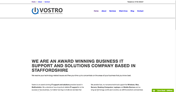
Thanks for featuring my site, if anyone wants further info about anything we have done on the Vostro site please feel free to reach out to me on here or Twitter @vostro_it.
Hey Jonathan, I really loved your re-design; changed it’s feel completely to the point where I had to go look a few times! Quite a successful redo! Out of all of the redos, I think this was the most dramatic – thanks for offering to share, I’ll be hitting you up soon on that one! =)
We also changed from “PINBOARD” WP-Theme to DIVI some weeks ago.
These are so awesome! Great showcase 🙂
These are so awesome! Great showcase 🙂
Thanks for the post. These sites are really cool and shows what can be done with divi. Waiting for DIVI 3.0. I like the work of Geno. If only I could design a site like these ones.
How did the Barker site get the click to call button? I’ve looked everywhere on how to create that.
First off they are using a child theme..
That gives them the top section the way it is…
That telephone area has the same code used as the default DIVI theme to display it, but uses different CSS code so we have a larger phone icon, text, and the red background.
Thanks for showing these great designs. I notice that some of the elements you have talked about in other 100 days to DIVI 3.0 are being used in these sites, such as using a negative margin. That post was a real AHA moment for me.
Man, I wish the redesign we did for SandraHolze.com would have been featured here. It got quite a lot of positive feedback on the various facebook groups.
Still a cool list, though, thanks for sharing.
Very nice designs! I would love to see some Divi quick tips on how to style the main navigation menu with different colors for each menu item like on Geno’s site, and also how to get a background image to appear in the header as on Melissa’s site. Great work!
Thanks Tony. I wrote up a couple of tutorials awhile back to help you achieve a similar effect. With a little more customization, you will be well on your way to re-creating the effect.
http://quiroz.co/adding-extra-fields-and-icons-to-the-top-header/
http://quiroz.co/add-cool-square-social-media-buttons-in-divis-top-header/
Hey Tony. The background image on the header was simply a large logo, hidden on scroll. I had to write a little CSS to remove the padding and control the logo size at various breakpoints. I have tried adding background images to the header area, but this seems to work the best.
Okay Tony and all this is one way to get the GENO look in the menu for your site.
I installed the Font Awesome for Divi Builder 2.2 plugin which is a FREE plugin
went to setting and clicked enabled on the first two items.
Goto the menu area:
Create a custom link:
For the navigation label:
Directions
Also you are going to have to have CSS classes enabled:
put in a special css class so you can give the background a color.
CSS you need:
#top-menu li {text-align:center; margin-right: -4px;}
The website does list this CSS though:
#et-secondary-nav li.khaki, #et-secondary-nav li.green, #et-secondary-nav li.blue, #et-secondary-nav li.red, #et-secondary-nav li.social
{margin-right: -4px;
text-align: center;
height: 75px;
width: 87px;
padding: 17px 5px;
}
.khaki {
background-color: #998542;
}
eddiejuddphotography.com home page in a nutshell
Large logo
Menu
Smartslider 3 plugin
Single Column section that overlays the slider
Code module used for WP-Tiles plugin
Section with background image. Post module showing off one post
4 column section with one image in each section
1/4 1/4 1/2 column
One for text, one for the social media, one for the instagram
Site by the design space and the social media icons.
Thanks Nathan 🙂
It would be even more useful if you explained the techniques used
Thanks
Hi Mohammed. I built the Eddie Judd Photography site and I’d be happy to share. It’s a custom child theme, built out first in Photoshop. I like to customize every aspect of the site, from the read more buttons, to the responsive grid on the home page, so that it doesn’t look like Divi.
In this case, we applied custom CSS to all of the titles to offset them, to every background image to contain it size-wise and stop it repeating as well as giving the blog area a thoroughly un-Divi look. There are too many finishing touches to list individually but I think detail makes all the difference.
Melissa… oh my gosh, you did a beautiful job on Eddie’s site!!! Very inspiring! 😉
Thanks so much! Definitely one of my favs to do.
Hi Melissa,
Amazing work on the website. Can you please give some information about the slider on the main page? Which plugin have you used ?And what is the slider dimension? Please help
Regards,
Bhargav
Hi Melissa,
How did you get the sections, like EXPLORE, to overlap the other sections?
I used negative margin settings to move those sections over the other ones. It’s really easy now that you can find margin settings in the Advanced tab sections of most modules.
Hi Melissa,
How did you go about doing the about/family/weddings/blog section with Divi? Did it start off as a module, is it a custom code block?
That is a really nifty plugin called WP Tiles but I have just built an identical grid using only Divi Call To Action buttons on this site, by adjusting the top and bottom padding of the modules.
http://thedesignspacedemo.co/flora-divi/
The About page:
Big logo
Menu
1/2 column with background image then photo of eddie
1/2 column full of text
Single column with some text
video module
Text module to say instagram
Then code module to display instagram
Site by the design space and social icons.
For the Family and wedding section.
It Uses “The Grid” plugin which you can purchase from themeforest.
For the Blog page:
The top section under the menu is a Three column design
One for the blog title with the backgrond image.
One to display the social media icons
One to display a menu that has though categories.
I hope this helps.
It depends on the site here… Vostro is more like the default install of DIVI then any of the five sites listed.
eddiejuddphotography.com is also basic DIVI here. The only thing special here is the images and colors used.
Then you have thebarkerteamrealtors.com which uses a child theme here so the footer and header are just right.
nationalinfantrymuseum.org has a special black section on top. The colored menu has some special included code to get it just right.
clearsolutionsacne.com also uses a child theme here. You also have a basic install of DIVI here. Some CSS changes for the menu. The homepage uses a 3 column full width section.
Richard thank you a lot!
I wish I could have shown this to a client of mine who hired his daughter’s web builder instead of me. What they got was a design in which the header and the right half of the page never changed, only the lower left third changes as you move through the site. It is old fashioned, old-style, pixelated, over-colorized, and ADHD-unfriendly.
The text is 10 point with 14 point leading and bold.
The subheads are 20 point, 4 lines, all caps, and chartreuse.
Oh, and it was poorly written.
Not to mention that my client paid them twice as much as I was charging.
Oh, and my client wants me to go through and fix the words but not touch the design. The backend is so old-style it’s depressing to try to work on it.
But thanks for this article. I got some great insight that I will use for my OTHER clients!
Not sure if firing the client is the best idea, as you’d be losing potential work. Sometimes you just have to suck it up and play the long game. He could give you more work at a later date. Willing to miss out on that?
Same here after spoke to some of my customer they decided to gave the job to some relatives. Websites are always poor in any aspect. some of them call me back to fix the website. A funny thin when they ask me how much am going to charge for the service they said ” I already pay x ammount” meaning they only want to payout a small ammount because the website is alredy there. Usually I have to redo the whole thing. I charge my regular fee and they end up paying twice for a website. This happen up and down day in and day out in this kind of business.
Make it 4. Fire the client.
Yep. Fire the client. There’s no way this has a good outcome for you…
I’m with Patrick! Do you really want to be associated, even minimally, with such poor design? There are nice ways of ditching clients like this and not burning bridges.
Simple…Fire the client!