Using Divi Hover Options
Apply hover states to the content settings, design settings, and advanced settings of virtually any Divi design element (sections, rows, columns, and modules).
Divi Hover Options are available for pretty much any content or element you add to a page in Divi. You can add hover effects to text, icons, links, images and more within a module. Or you can add hover effects to entire modules, columns, rows, and/or sections. This allows creativity to soar, enabling designers to create fun, interactive elements on their Divi websites. Customizing hover options is easy, and are accessible anywhere in the Visual Builder.
In this doc, we’ll cover:
- What’s Possible with Hover Options
- Accessing Hover Options
- Using Hover Options
- Hover Options Are Element Specific
- Tips & Best Best Practices for Using Hover Options
- Example Hover Effects
- FAQs
- Continue Learning
What’s Possible With Hover Options in Divi
You can apply hover states to the content settings, design settings, and advanced settings of virtually any Divi design element (sections, rows, columns, and modules).
Changing Content on Hover
It’s possible to change your page content on hover (elements like text, images, buttons, blurs, and more). In the video below you’ll see an image change on hover and the text of the button on hover.
Changing Design Styles on Hover
You’re also able to change design settings on hover like background colors, font styles, filters, transformations, and more. Check out the video below to see an example of what’s possible.
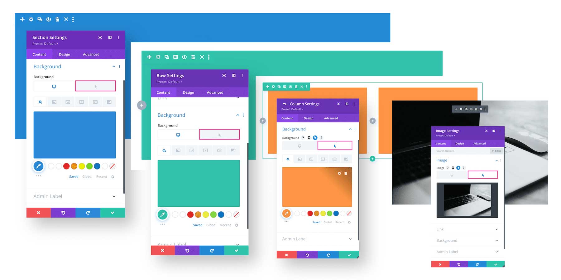
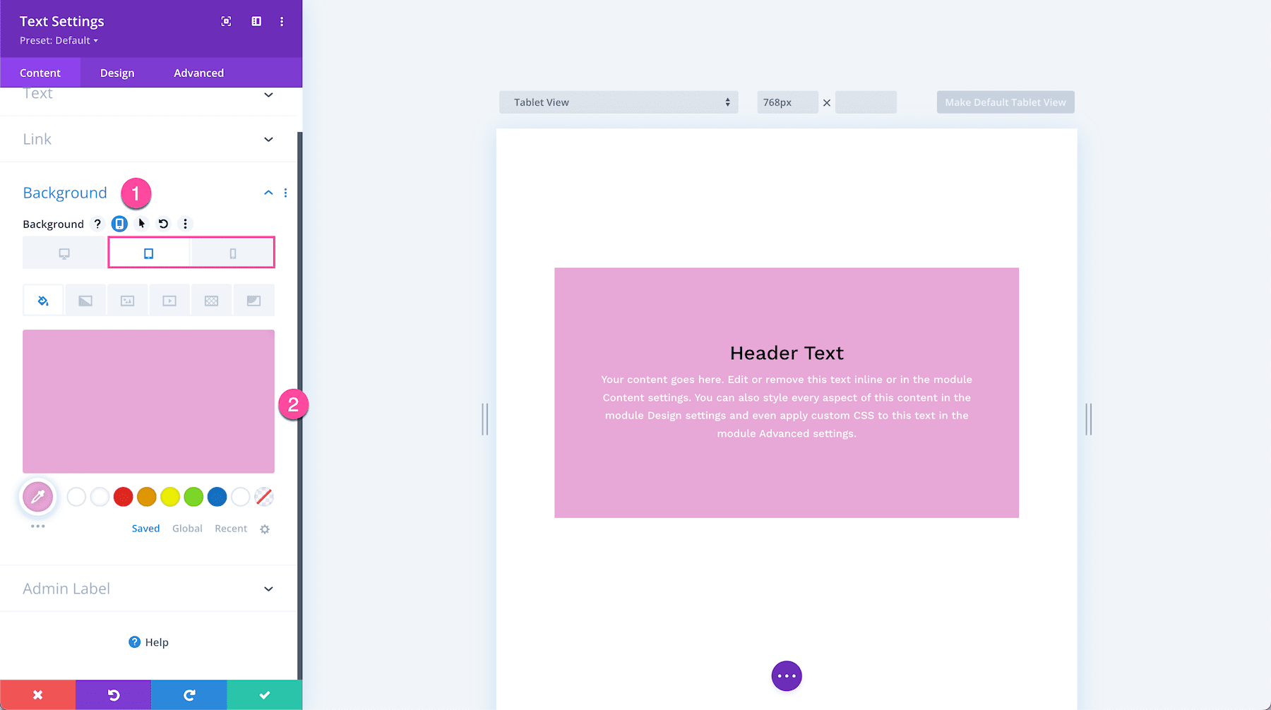
Accessing Divi Hover Options
Hover options are available in virtually all of Divi’s design elements! This includes sections, rows, columns, and modules. Hover options can be accessed in the same place you access regular customization options in the settings modal. This means that you can customize an elements background design for both the default desktop view and the hover state all in one place.
Hover Options Are Available On All Divi Elements
Hover options are available in all sections, rows, columns, and modules.
How To Access Hover Options
To access hover options, hover over the element you’re working on and click the gear icon to bring up that element’s settings.
Then, navigate to the setting you would like to apply a hover effect on. Hover over it and click the hover icon.
Then, click on the hover icon tab. Note: If an option doesn’t have the cursor icon available, it doesn’t support hover option capabilities.
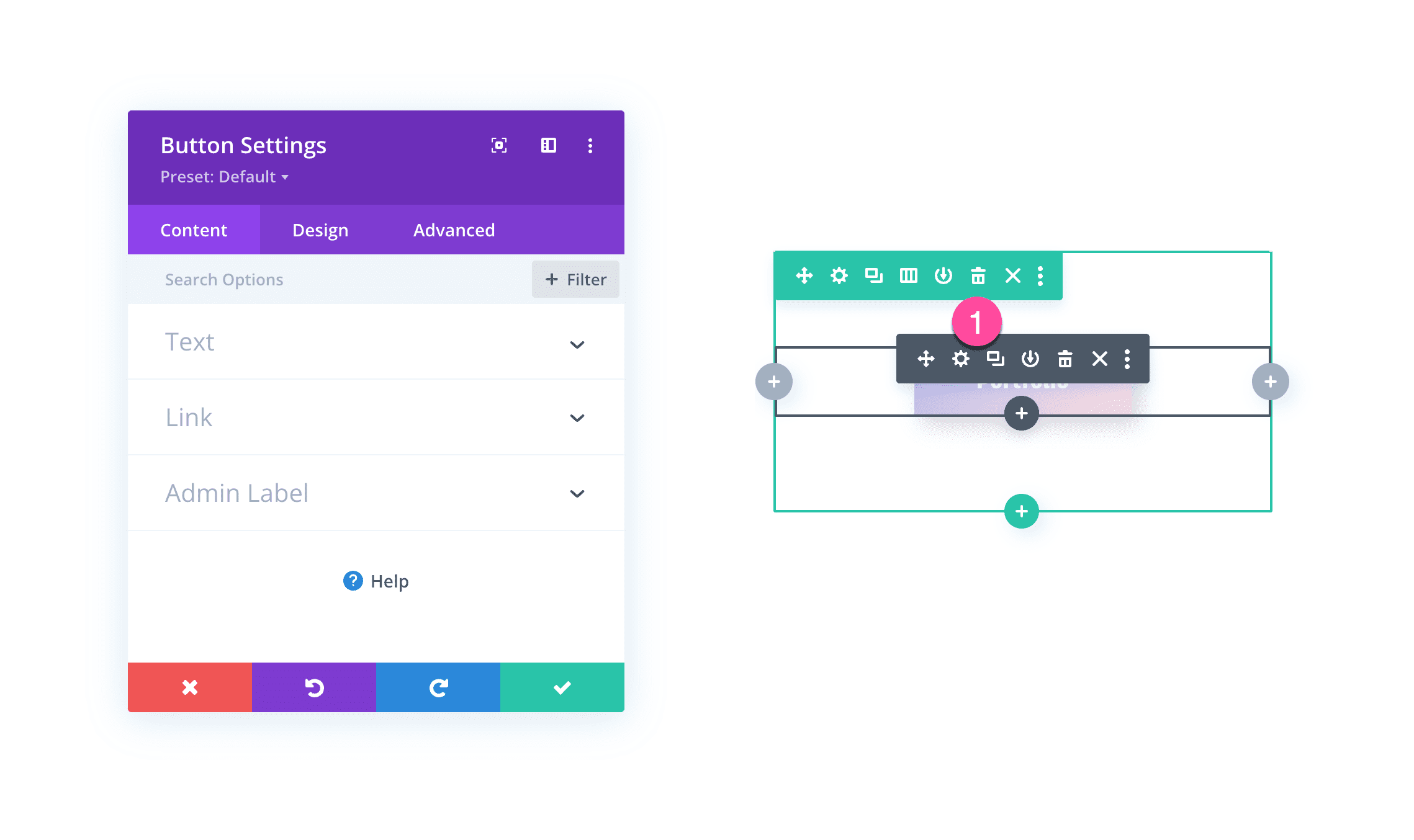
Accessing Content Hover Options
In this example, let’s change the button text on hover so hat the button behaves like this on hover:
First, hover over the button module and click the gear icon to bring up the module settings.
Navigate to the Content tab and click into the Text settings group.
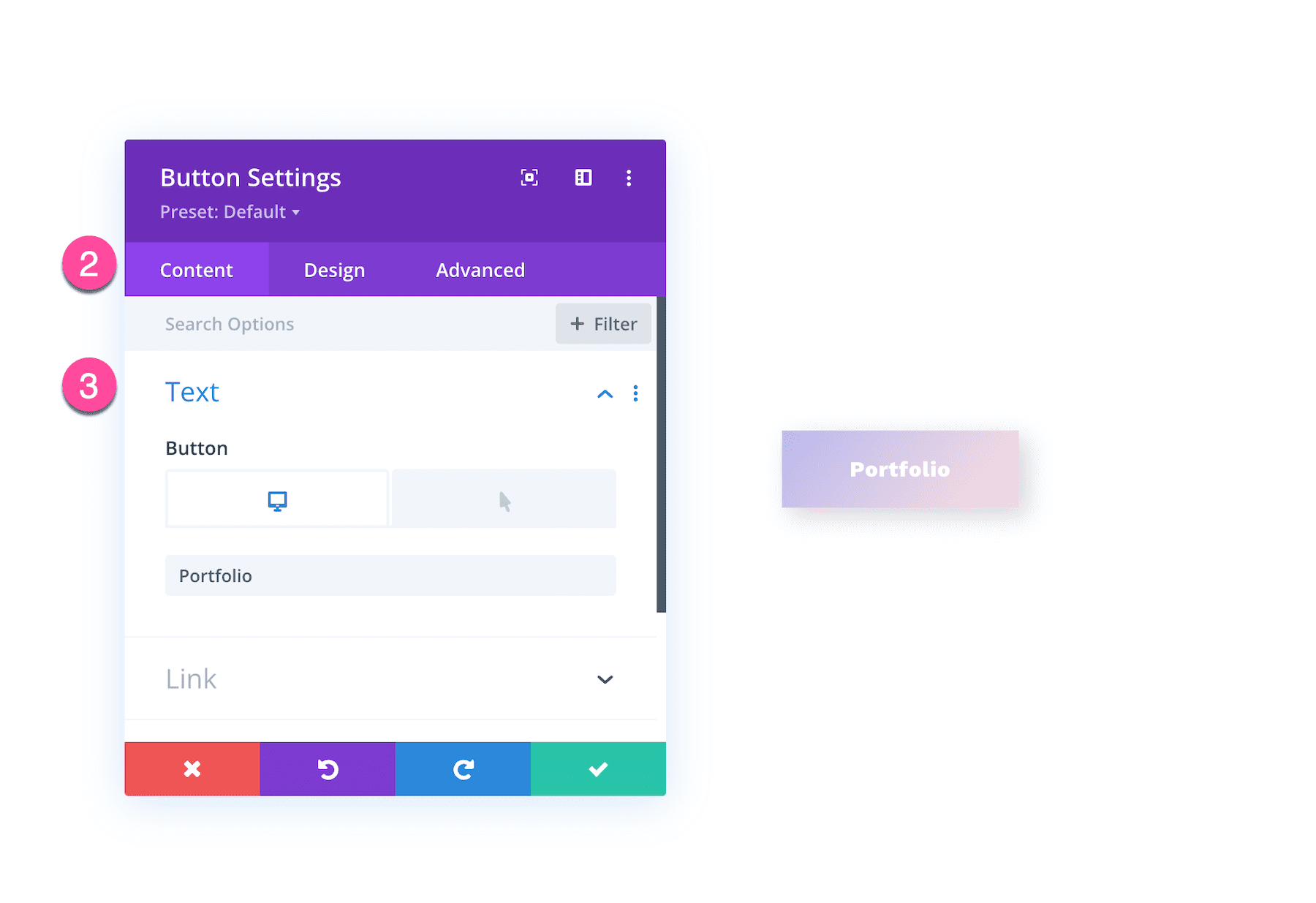
Hover over Text and click the hover icon to bring up the hover tab.
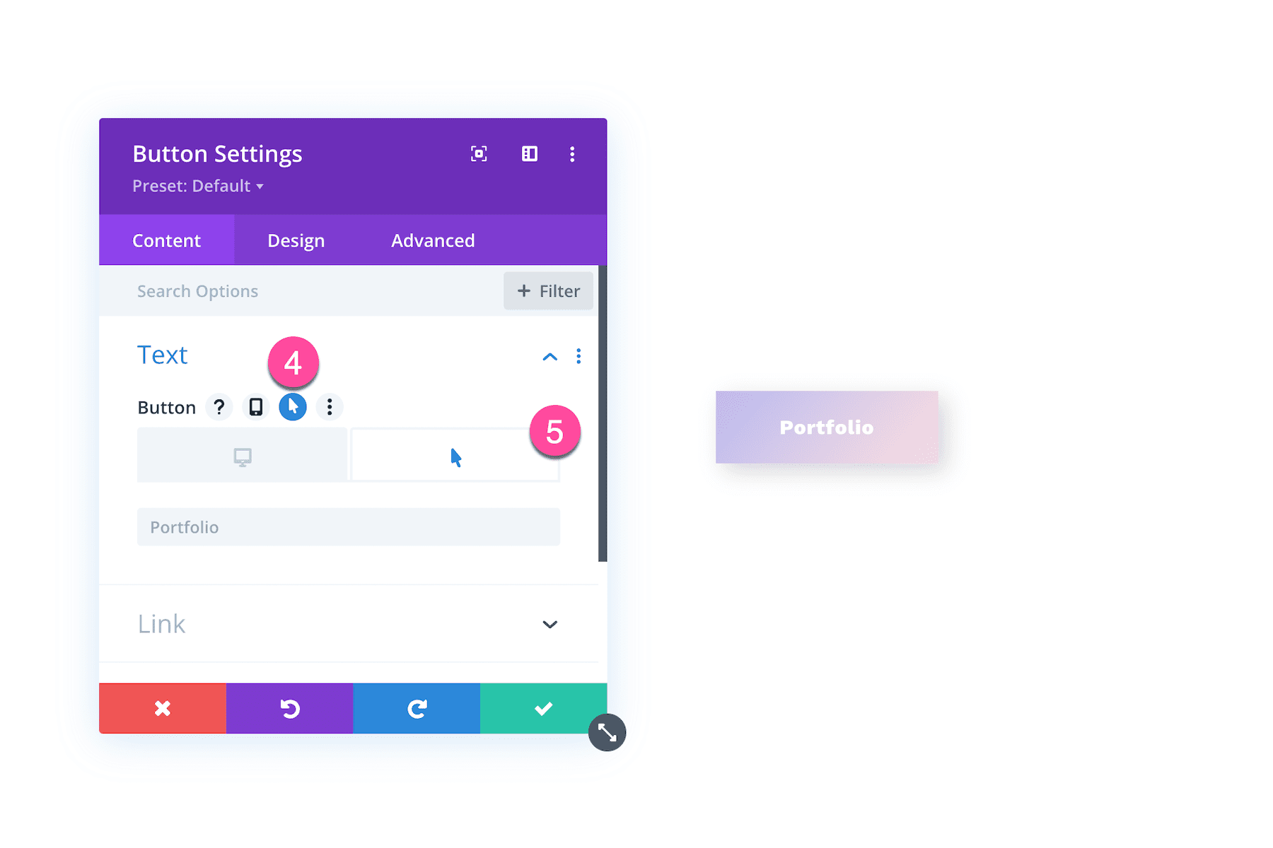
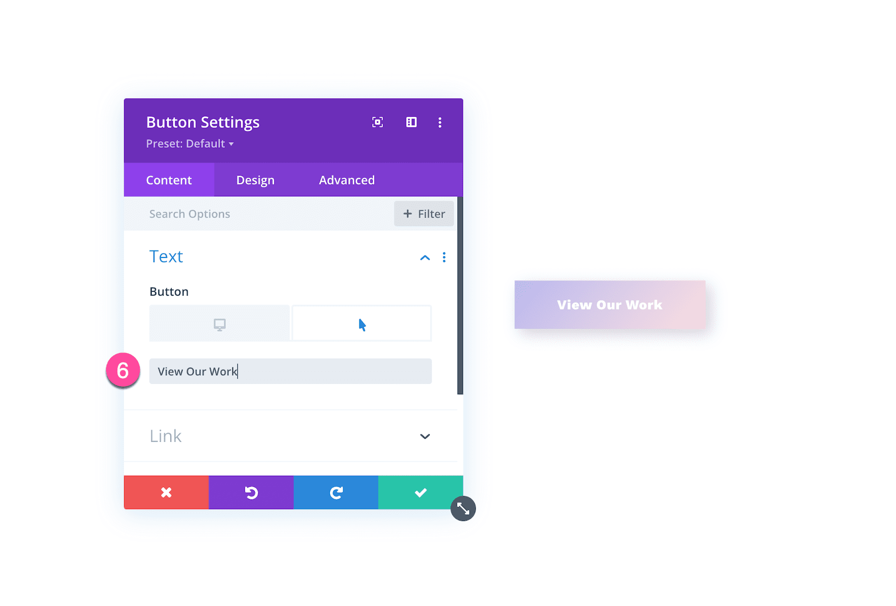
Then click on the hover tab and enter the text you want displayed on hover.
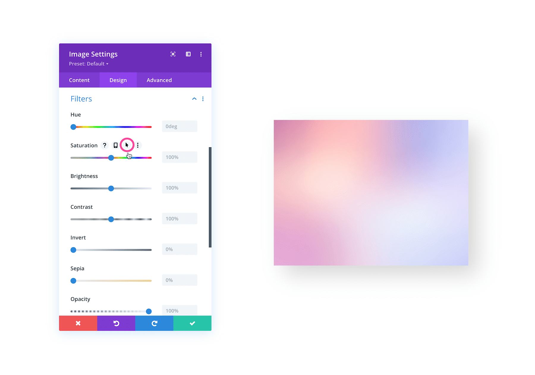
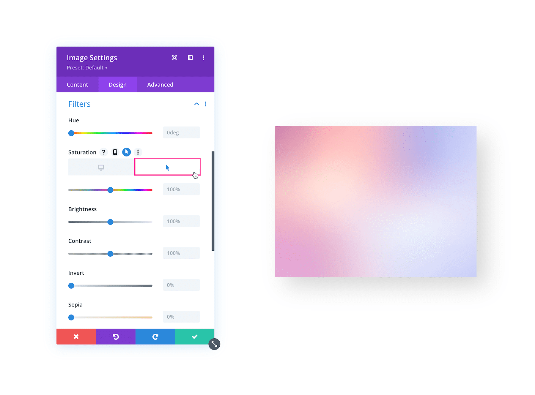
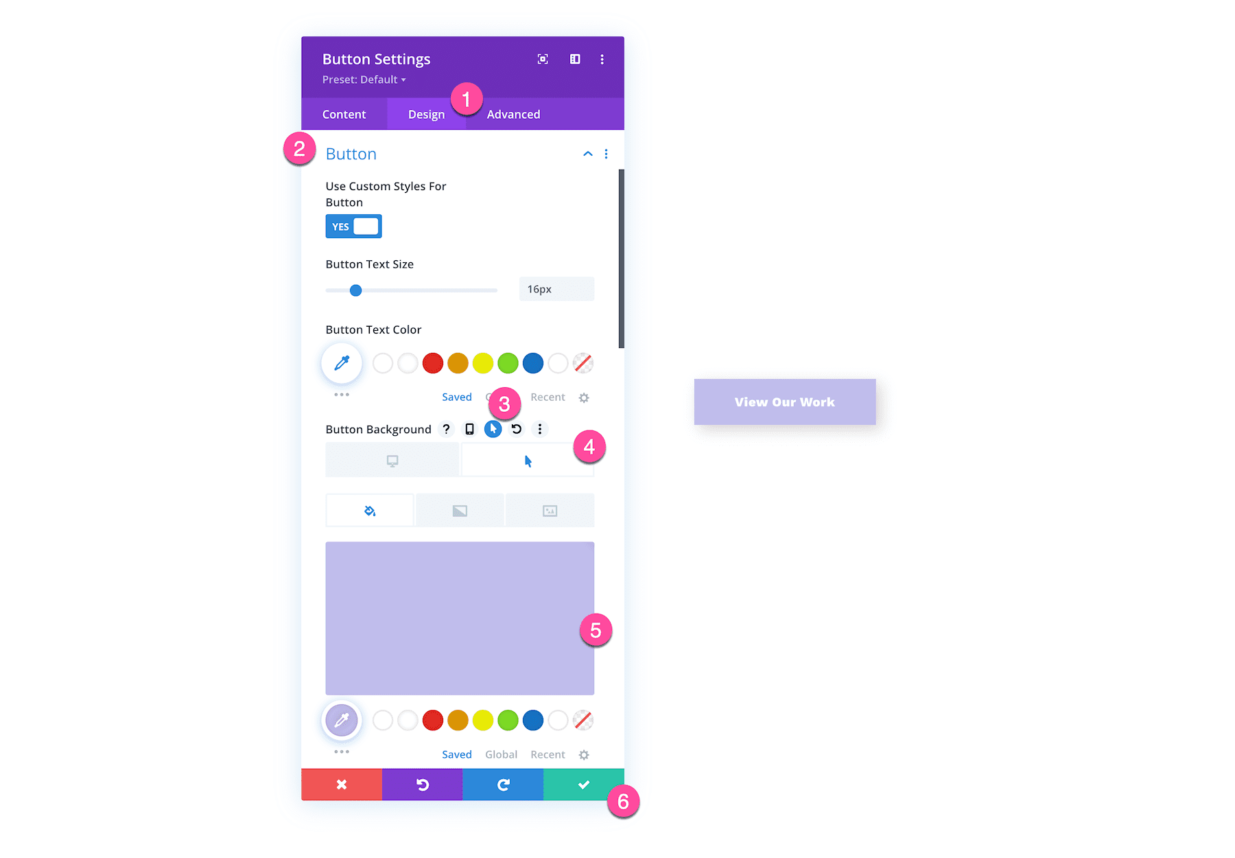
Accessing Design Hover Options
For this example, let’s change the button background color on hover.
- Click on the Design tab.
- Open up the Button settings groups
- Click on the hover icon and into the hover tab.
- Select the background color you want to display on hover.
- Click the green check button at the bottom of the module to save your changes.
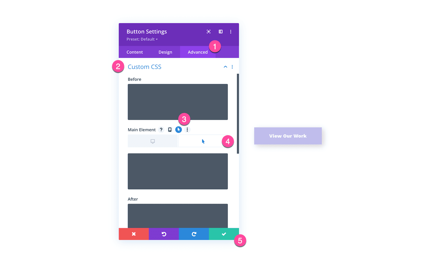
Accessing Advanced Hover Options
To add custom CSS on hover to the button module:
- Click on the Advanced tab.
- Click the CSS settings group.
- Hover over the box you want to put CSS in and click the hover icon and into the hover tab. Paste your CSS.
- Click the green check button to save your edits.
Using Hover Options In Divi (Examples)
While hover effects are available in all Divi elements, you’ll likely use them mostly within modules.
Here are a few examples of how you can use hover options!
How To Change a Background Color on Hover for a Blurb Module
To change a blurb’s background color on hover, follow these steps.
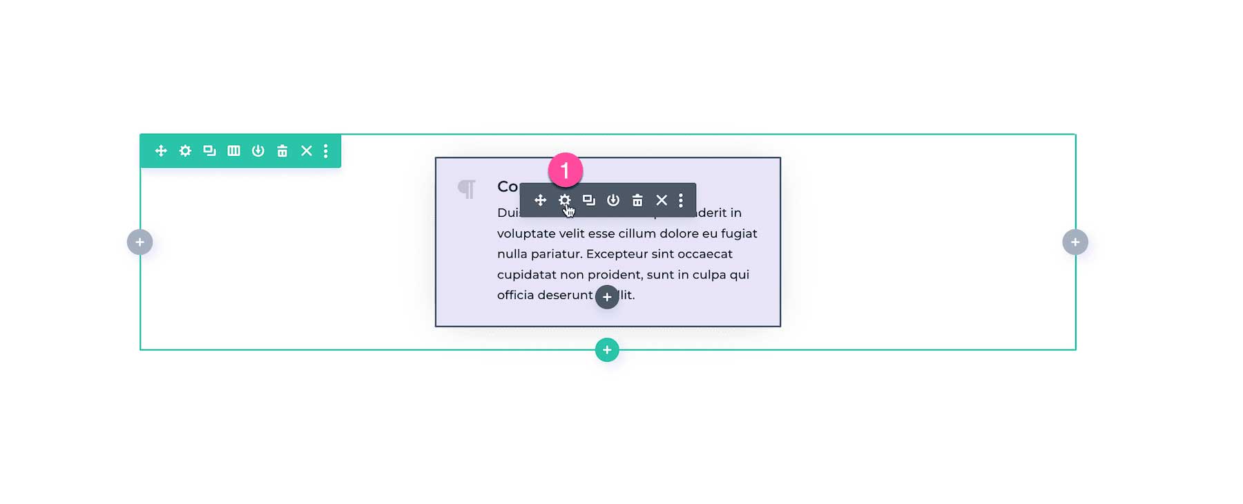
Hover over the blurb module and click the gear icon to bring up the module settings.
Click on the Content tab and open the Background settings group.
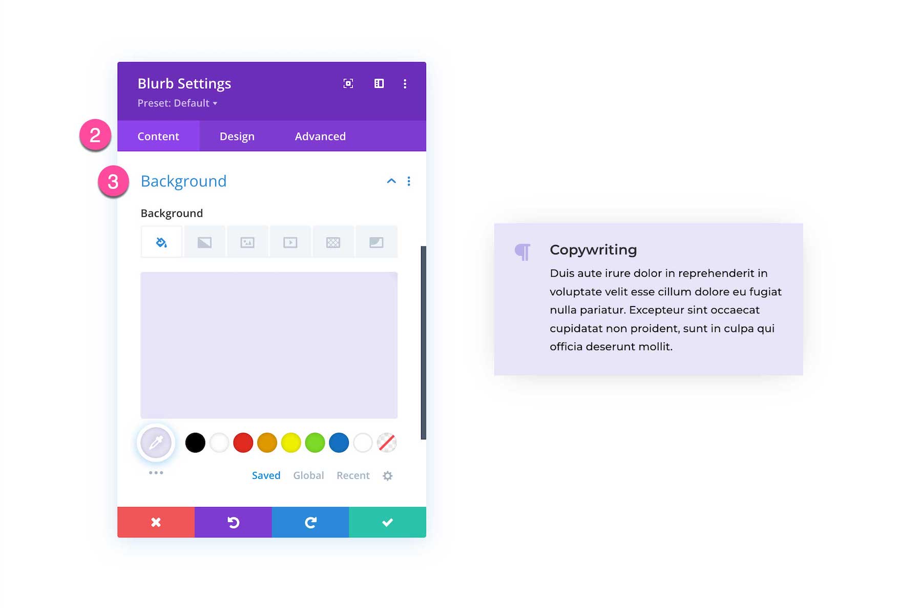
Hover over the background and click the hover icon and click into the hover tab.
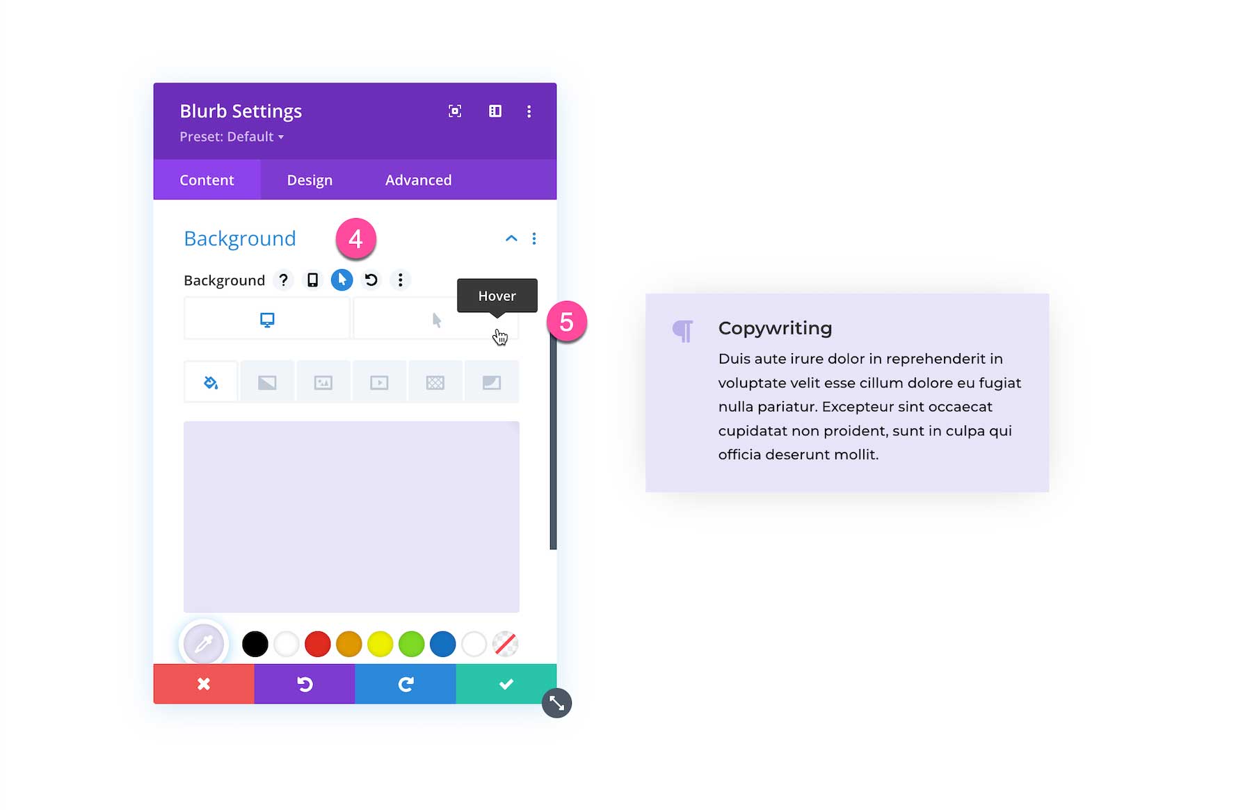
Set the hover background color.
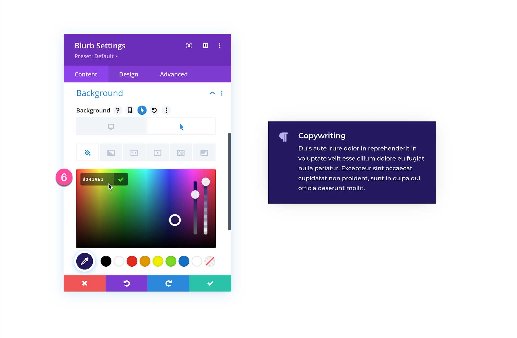
Click the green check button to save your edits.
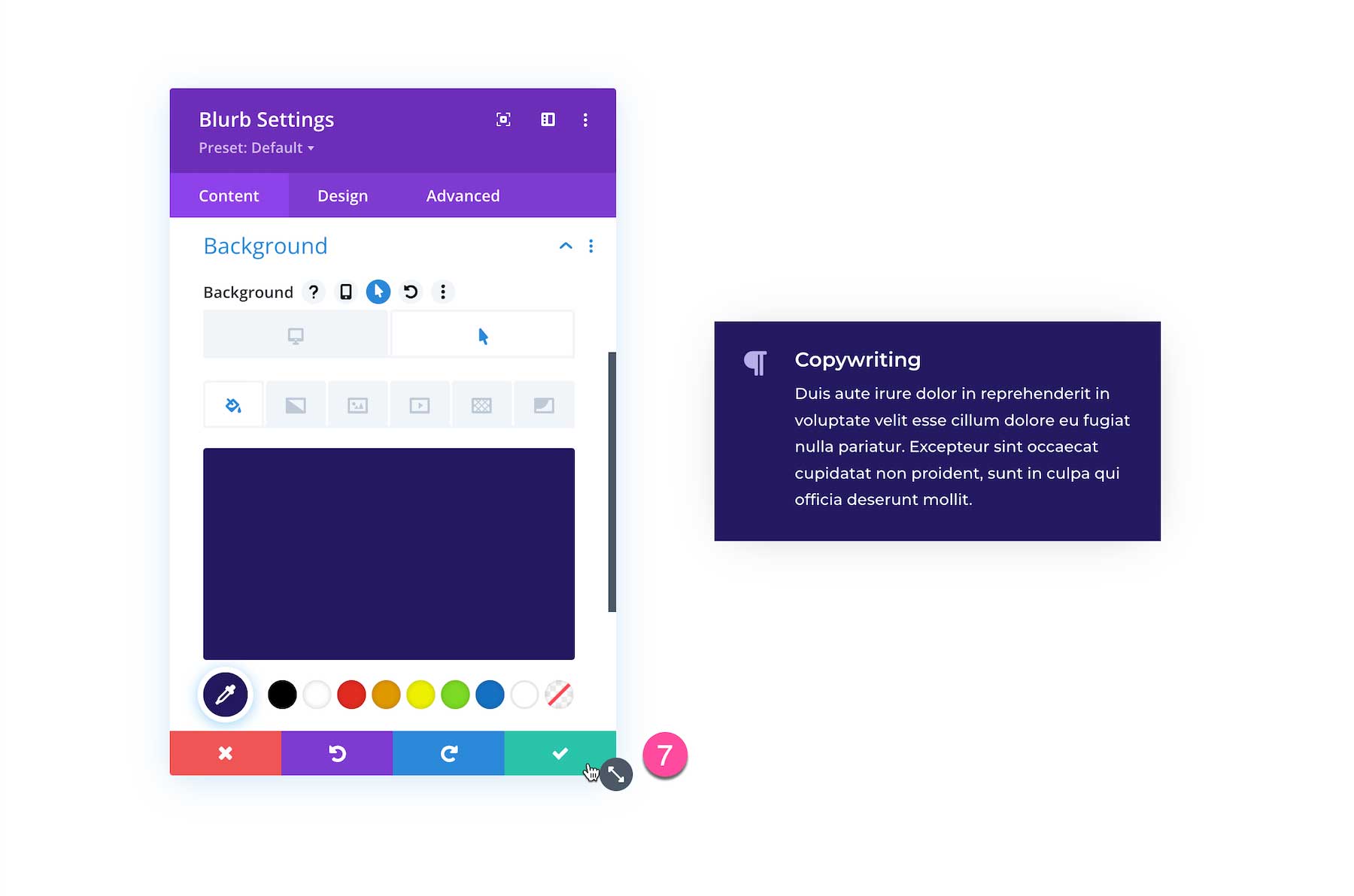
And here’s the result!
How to Change the Blurb Image or Icon On Hover
To change the blurb icon on hover, follow these steps:
- Navigate to the Content tab.
- Click into the Image & Icon settings group.
- Hover over the Icon to bring up the hover icon.
- Click into the hover tab.
- Choose the icon you want to display on hover.
- Save your edits.
And here’s the result!
How to Change Blurb Body Text Color On Hover
- Click in to the Design tab.
- Open the Body Text settings group.
- Navigate to the Text Color and hover over it and click the hover icon.
- Click in to the hover tab.
- Set the text color to #ffffff.
- Click the green check button to save your edits.
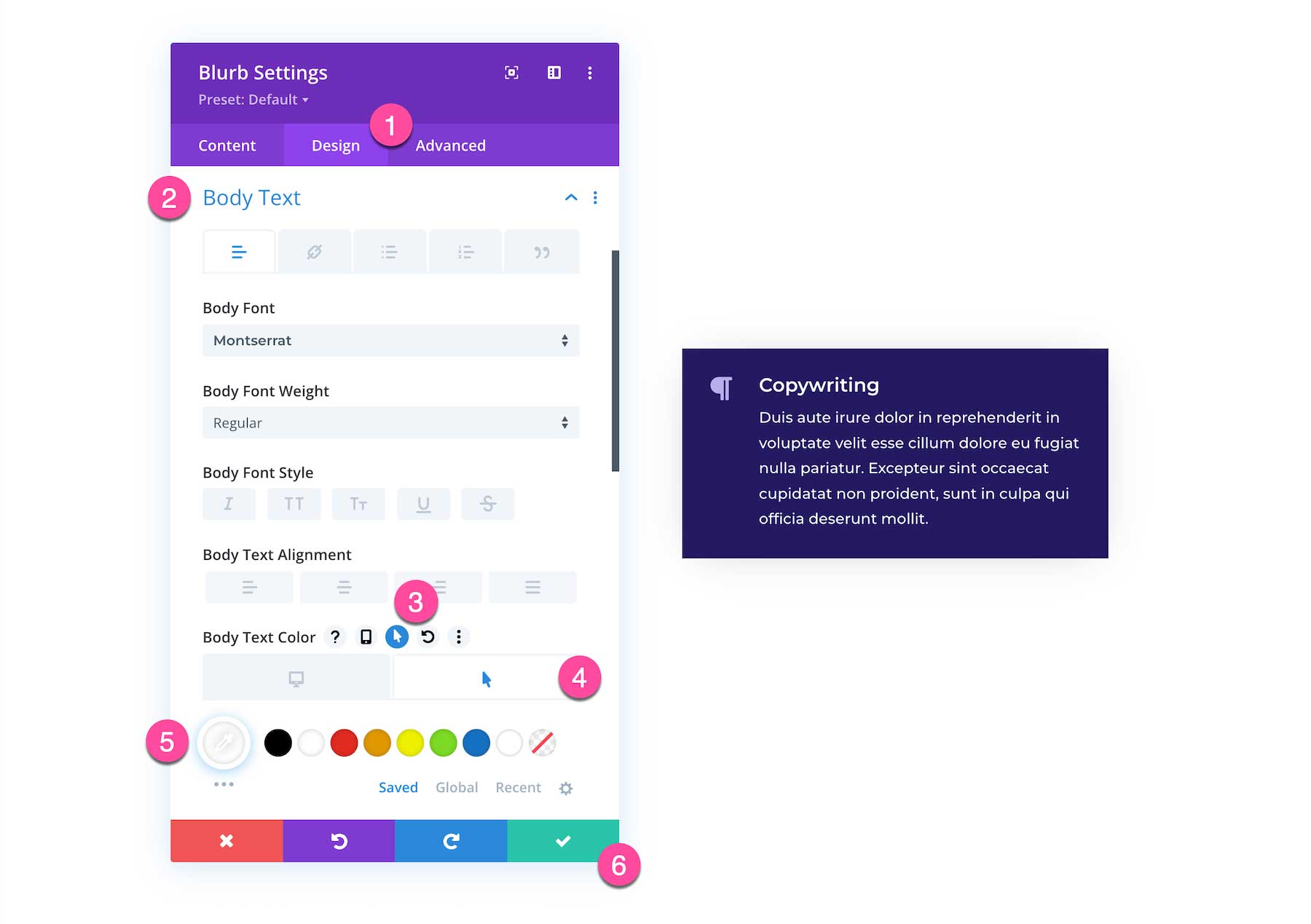
Here is the final result.
Using Hover Options in Sections, Rows, and Columns
Hover options are available within sections, rows, and columns too.
Change a Column’s Background Color
In the example below let’s change a column’s background color on hover.
Open up the row settings and click the gear icon next to the column to bring up the column settings.
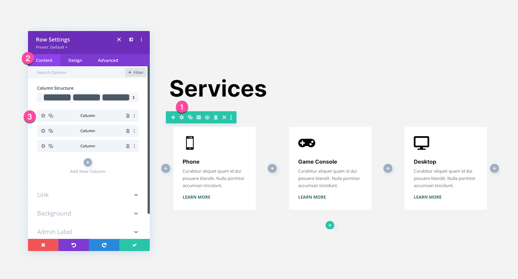
Navigate to the Background settings group and click to expand it.
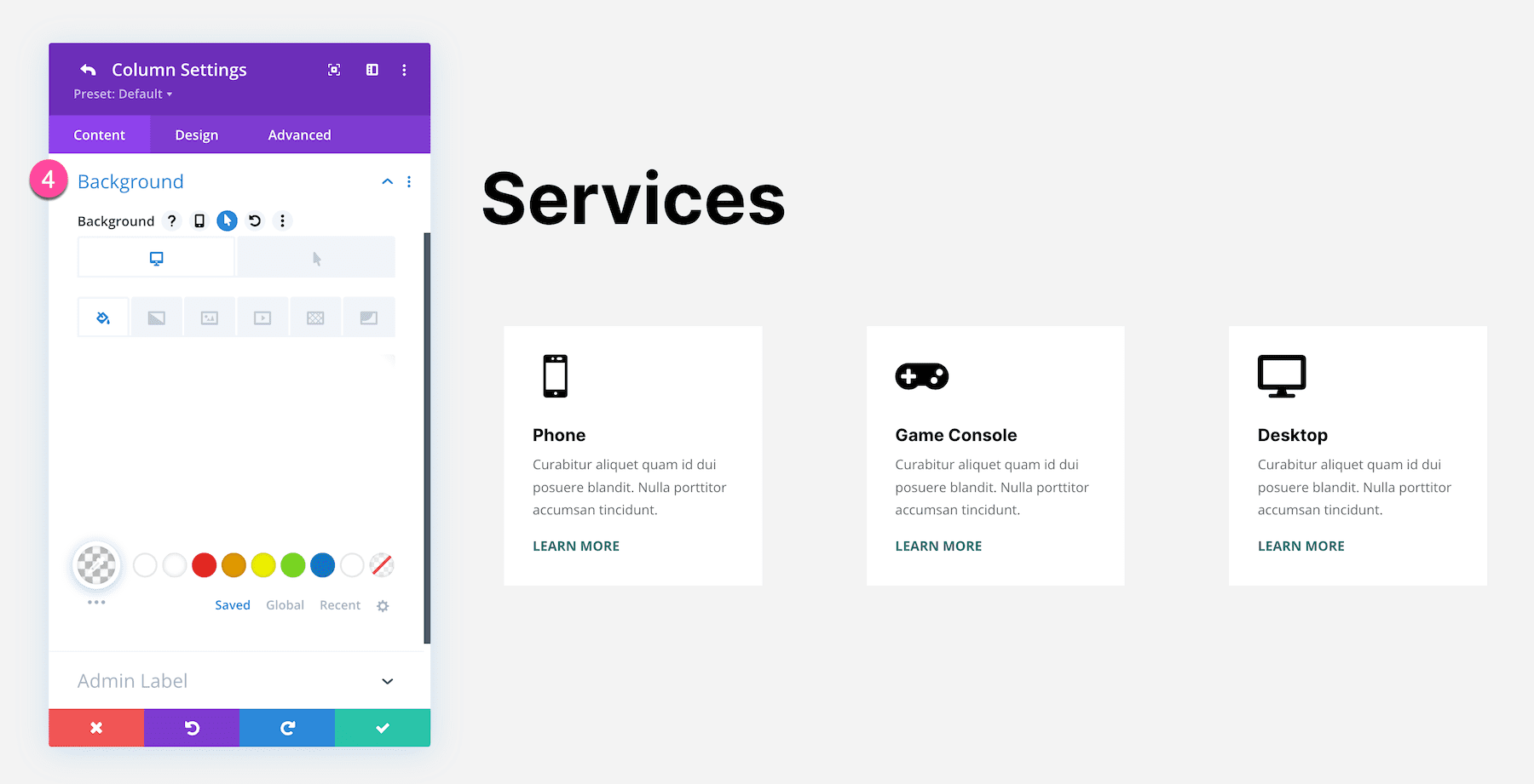
Hover over the Background, click the hover icon, and click into the hover tab. Then add the background color. Make sure to save your edits!
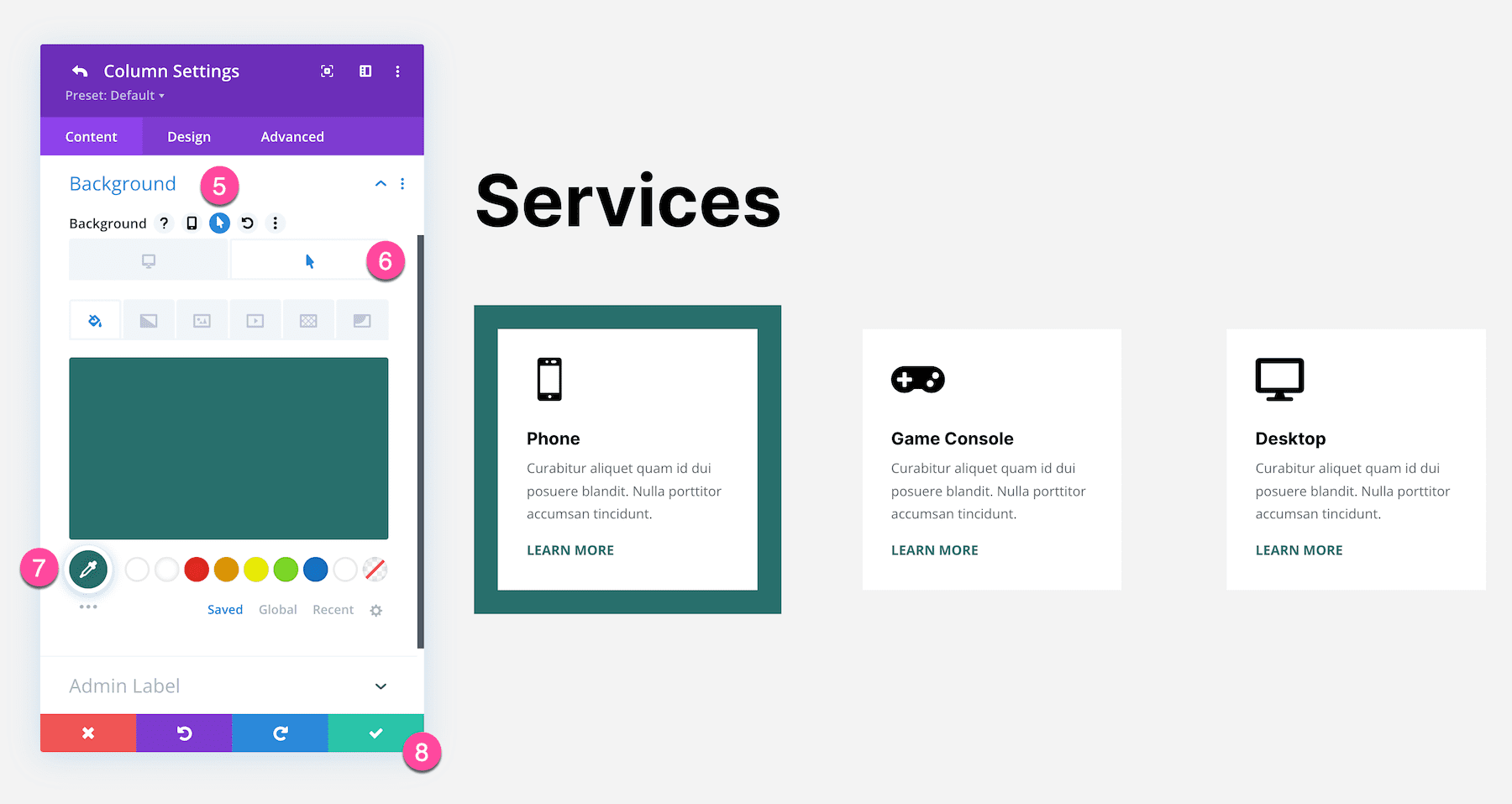
And here is the final result!
Changing Hover States in Sections and Rows
You’re also able to change content, design, and advanced options on hover with Sections and Rows too. Use the same steps above to access those.
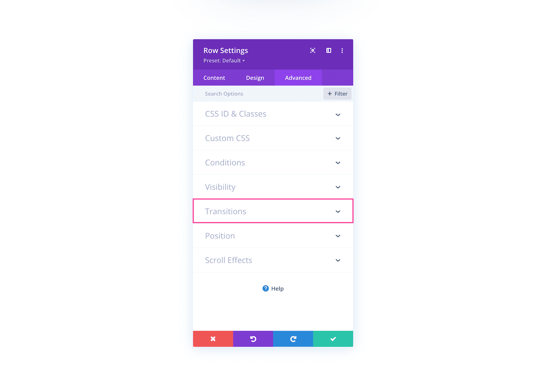
How to Control Transition Duration of Hover Effects
When hover effects are applied to an element there is a default speed and duration that they happen. You can tweak the hover effect’s speed and duration by navigating to Advanced > Transitions and adjusting the controls available there. You can adjust the duration, delay, and speed curve of the hover effect.
Transition settings are located in the advanced tab of modules, columns, rows, and sections.
By combining hover options and transition effects, you can change the way your hover effects behave. You can control the duration of the transition by adjusting the duration slider. Additionally, you can set a delay for your transition if you’d like it to start before or after another transition effect. Lastly, there is an option to set the speed curve using several different options.
For example, a 50px white border is applied to an image on hover. The transition duration is set to 300ms with no delay and the transition speed curve is set to Ease.
Taking the same example as above, we’ll adjust the transition duration to 0ms, with no delay, and the transition speed curve set to Linear. See how much faster and snappier it is? Tweaking these settings allows you to create truly custom transitions that achieve your desired effect.
Using Transform Options With Hover Options
Combining Transform Options with Hover Options gives you the power to create even more dynamic designs. Below is an example of some of the effects you can achieve when combining these two options.
To learn how to recreate this demo, check out this blog post. To learn more about Transform Options, check out our Transform Options Documentation.
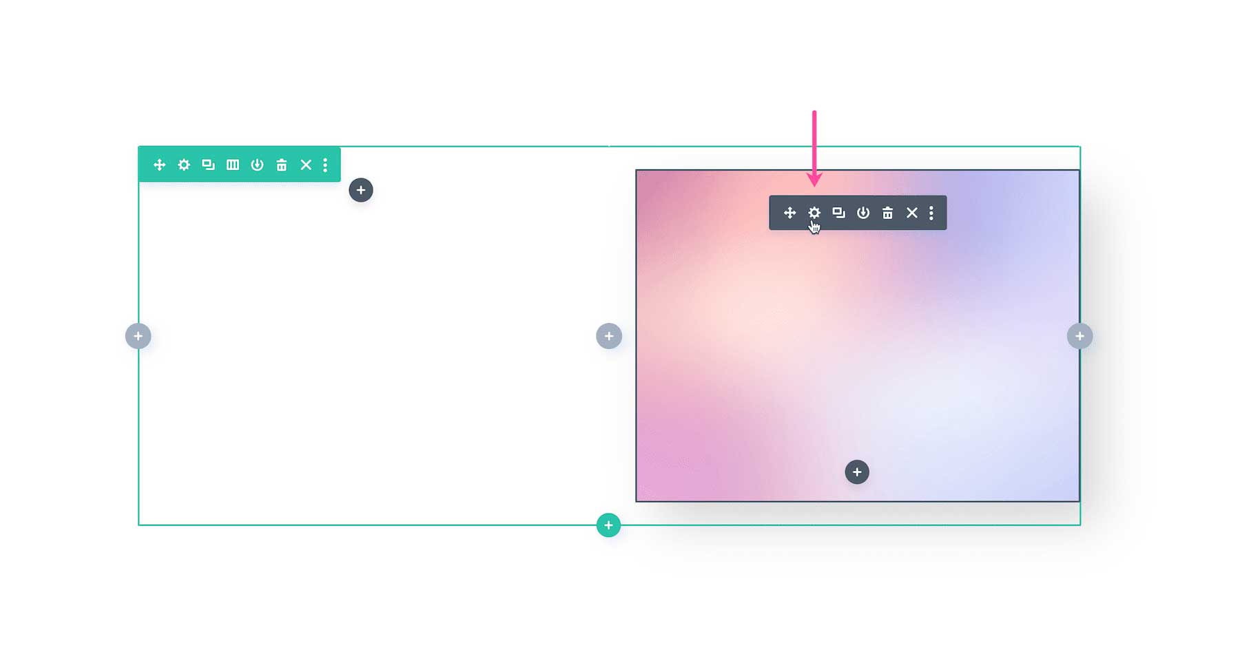
Hover Options Are Element Specific
Hover options are activated when hovering over the space of a specific Divi element. Hover space refers to the entire element and the space within it.
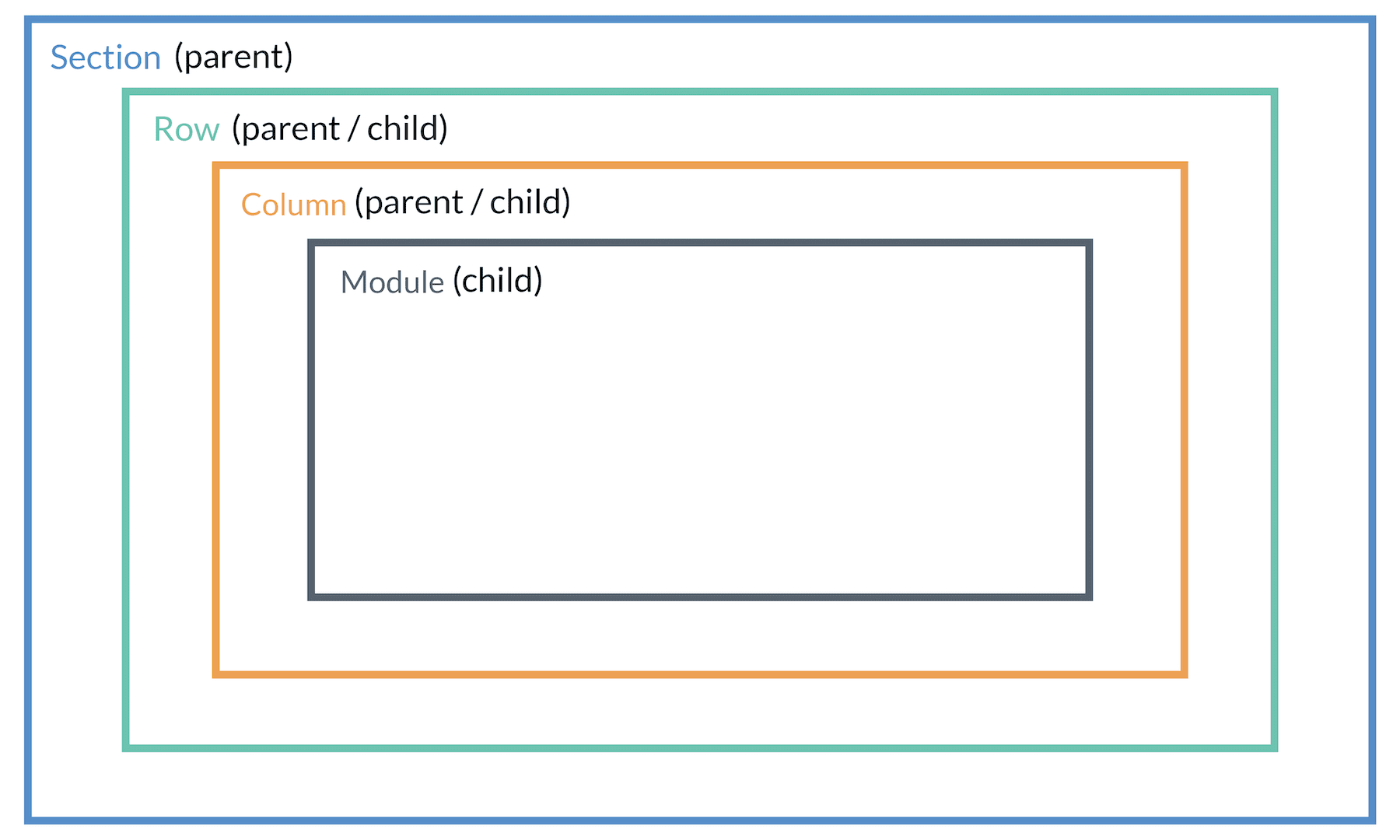
Parent / Child Element Hierarchy
When applying hover effects in Divi it’s important to remember the hierarchy of Divi’s sections, rows, columns, and modules. Sections contain rows, rows contain columns, and columns contain modules. These are called parent and child elements. Child elements are nested inside parent elements and are affected by any design styling you apply to the parent element.
Hover Options Are Set At The Element Level
To understand how Divi hover options work, it’s important to note that hover options are set at the element level. Each Divi element has its own hover space which is basically the size of the element itself. Here is an illustration of the hover space for each building block element in Divi.
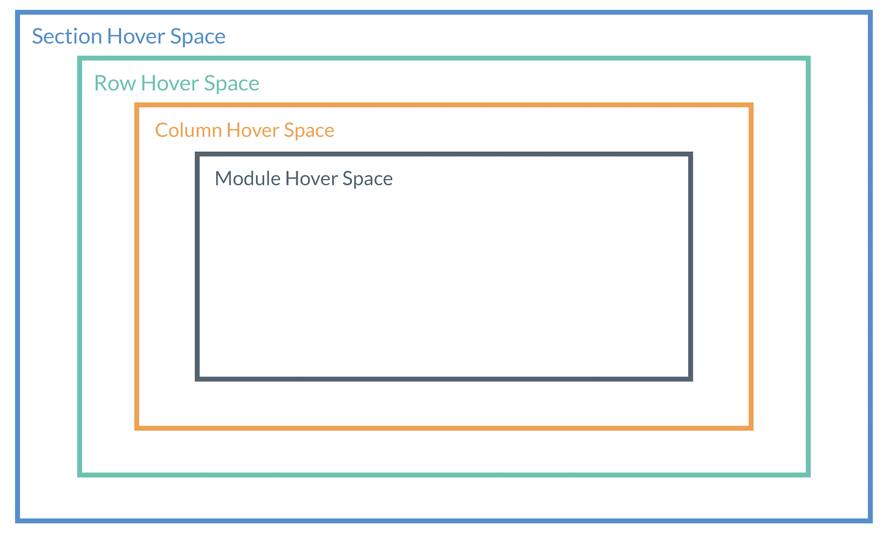
Each of these elements has built-in hover options that are activated when hovering over that element or any of the child elements it contains.
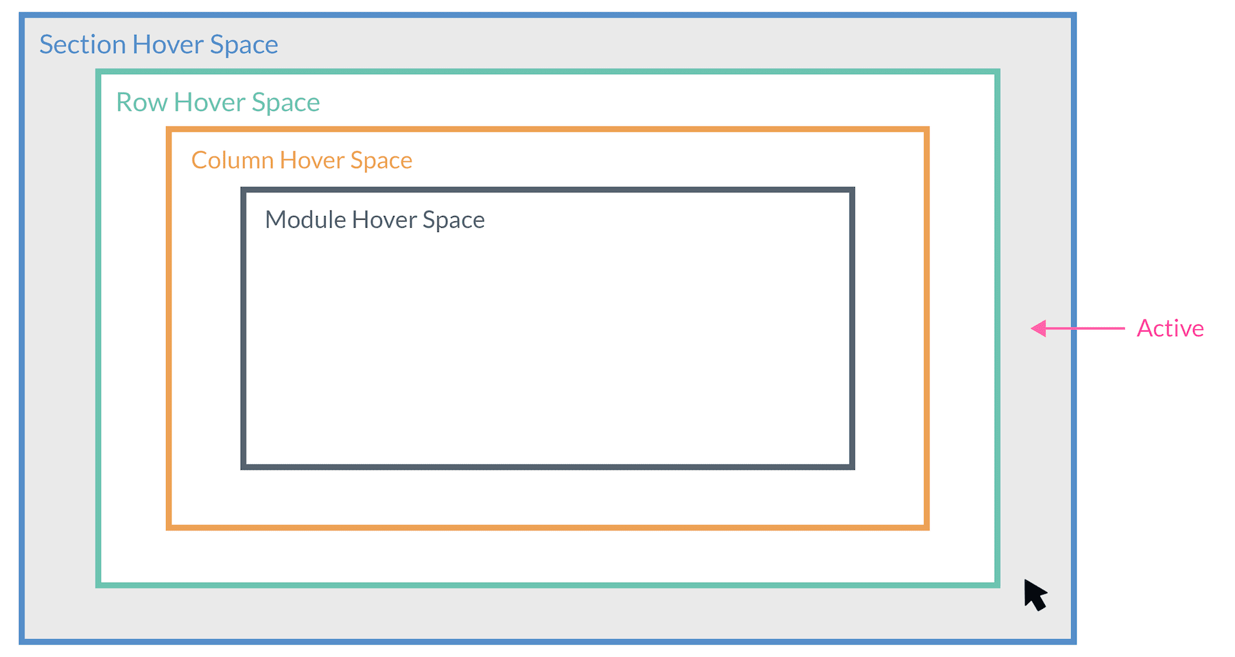
So, for example, if you have added hover options to a section, only those hover options will become active whenever you hover over the section.
If you hover over the row inside the section, you will activate any hover options added to the row. But because the row is a child of the section, you will also activate the section hover options as well.
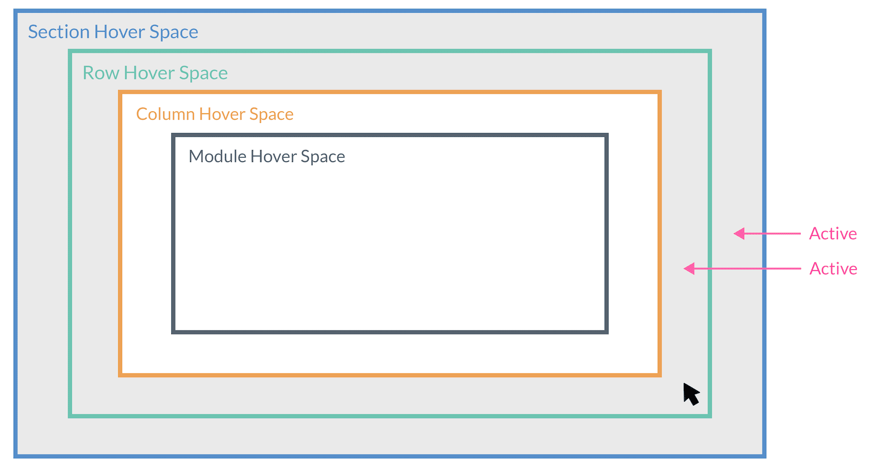
Hovering over the column within the row will activate any hover options added to the column and its parent row and section.
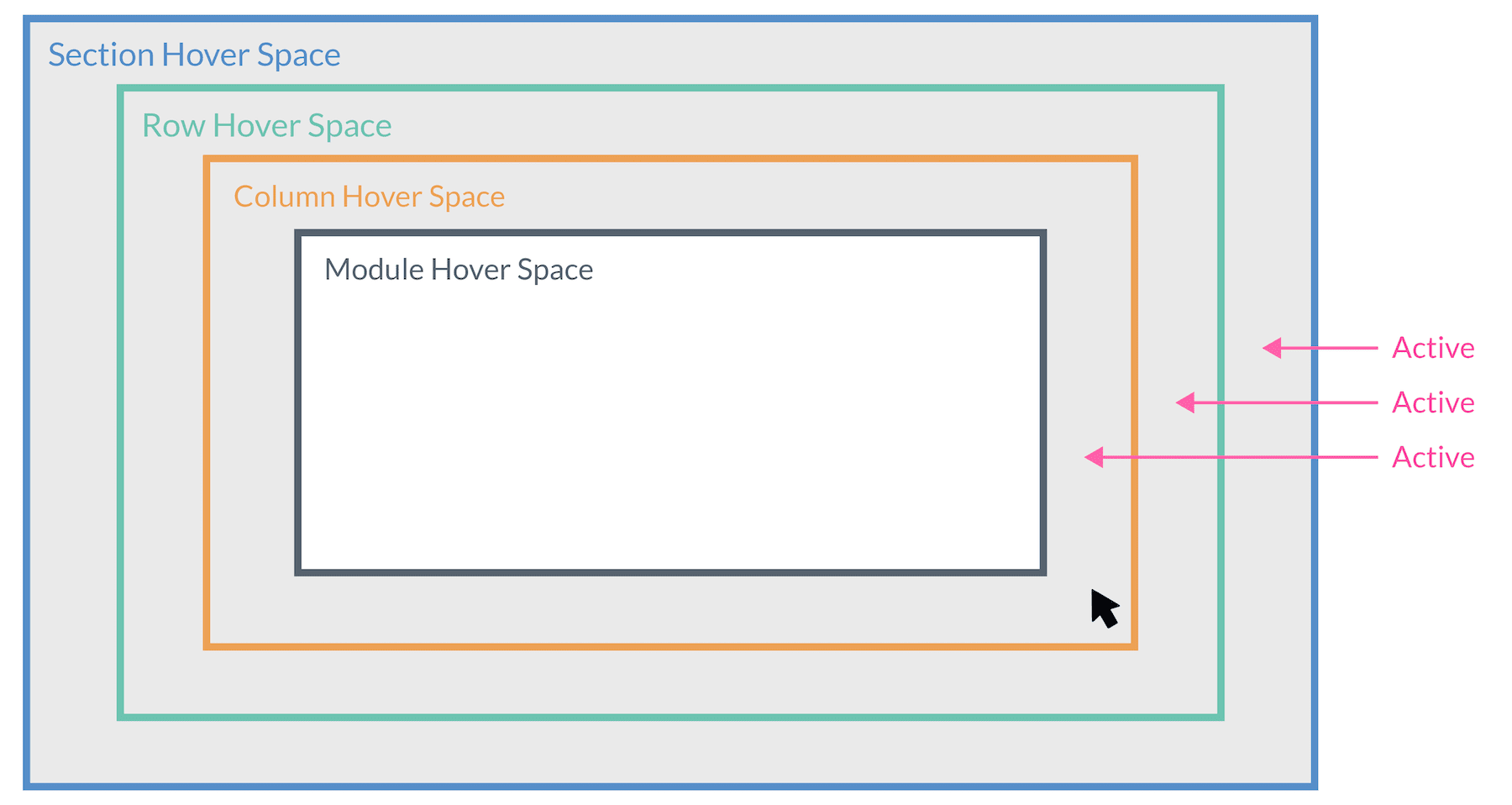
Hovering over the module within the column will activate any hover options added to the module as well as its parent elements that have hover options (column, row, and section).
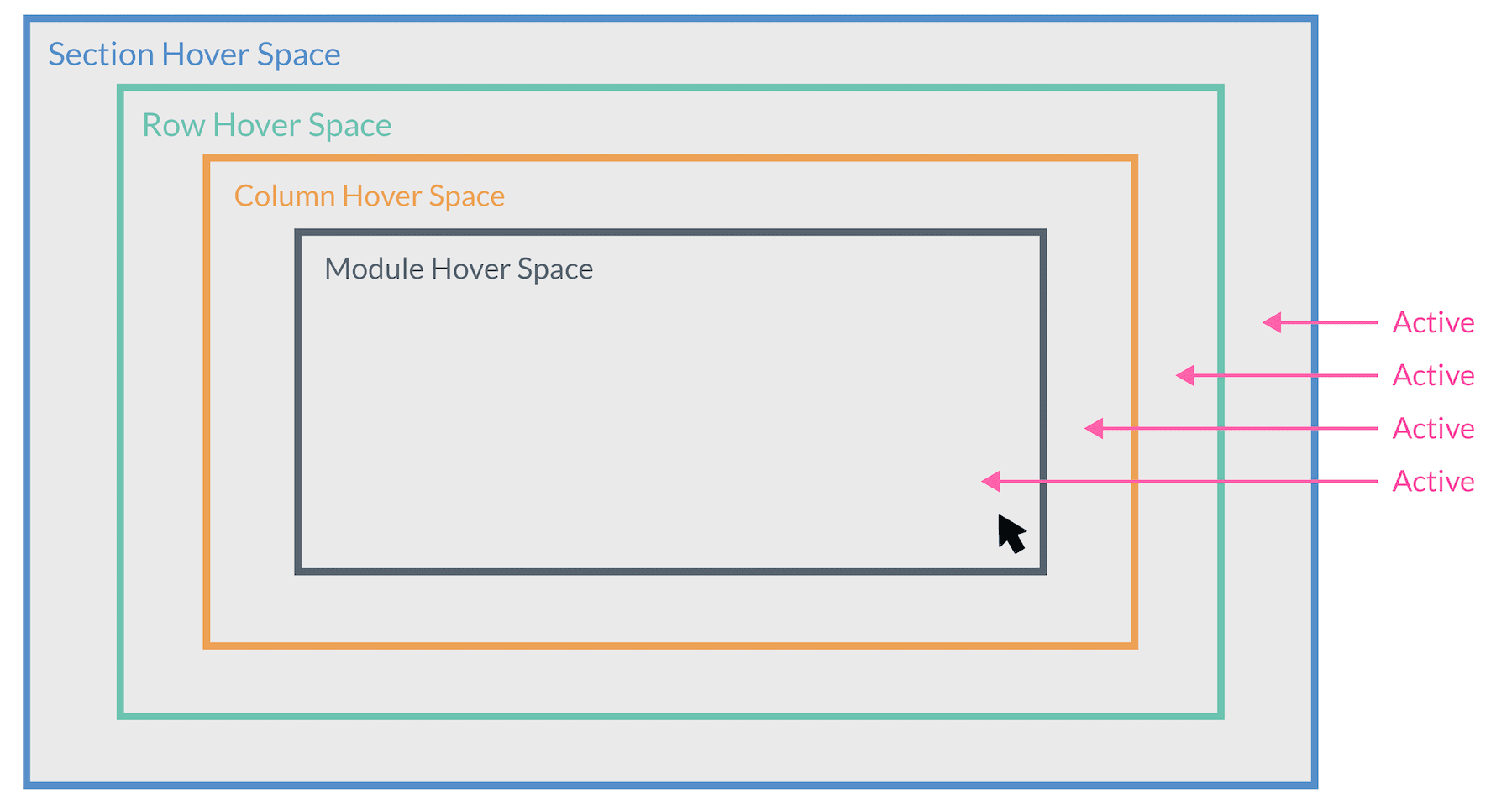
Basically, when you hover over a module that will also trigger its parent elements’ hover effects. However, when you hover over just a section, it will not trigger the module hover effects.
Use Case Examples for Divi Hover Options
Let’s take a look at some practical use case examples of where you would use hover options.
Apply Hover Effect to Icon Buttons and Social Media Follow Buttons
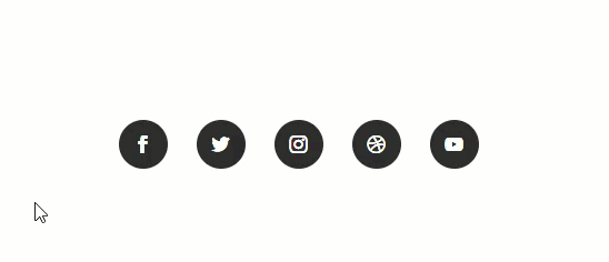
It is always a good idea to use hover options on buttons to encourage users to click. With Divi, you can add simple and creative hover effects to icon buttons. This also includes social media follow buttons as well. Check out this tutorial on how to create unique social media follow button hover effects in Divi.
Add Hover Effects To Images and Image Galleries
With Divi’s hover effect, you can easily change the design of your images on hover in creative ways. This is great for images and image galleries that allow the user to see a alternative image design (like a black and white version of the image) on hover. Plus, you can combine this hover effect with clickable lightbox functionality as well.
Use Hover Options to Show or Hide Content?
By adjusting the opacity of your elements, you can show or hide elements on hover. Modules such as buttons, images, social media, or even full sections of content can be manipulated to create stunning effects with hovers.
This is perfect for a call to action or for showcasing featured products.
For more, check out how to change content on hover to create unique CTAs in Divi.
Applying Hover Options to Multiple Elements Activated Simultaneously
Hover options are applied to each individual element, however, it is possible to create simultaneous hover effects when hovering over child elements. For example, if you make sure all elements span the full width of their parent container, this would allow them to all share the same hover space. Now, whenever hovering over an element it will activate the hover effects for each element simultaneously.
Below is a row, column, and module that all share the same hover space. Therefore, hovering over their shared area will activate each of their hover options simultaneously.
For more, check out how to trigger hover effects on elements simultaneously in Divi.
You can also get creative with combining hover effects on multiple elements to reveal content in clever ways. For example, you can create pop-out service descriptions when hovering over a multiple column row in Divi.

Using Blur On Hover To Highlight Content
Additionally, you can combine hover options and visibility settings to achieve some pretty cool effects. For example, when using a blurb module you can spotlight the blurb module by blurring out the rest of the content on the page on hover.
For more, check out How to Highlight a Hovered Blurb Module by Blurring the Other Ones with Divi.
FAQ: Divi Hover Options
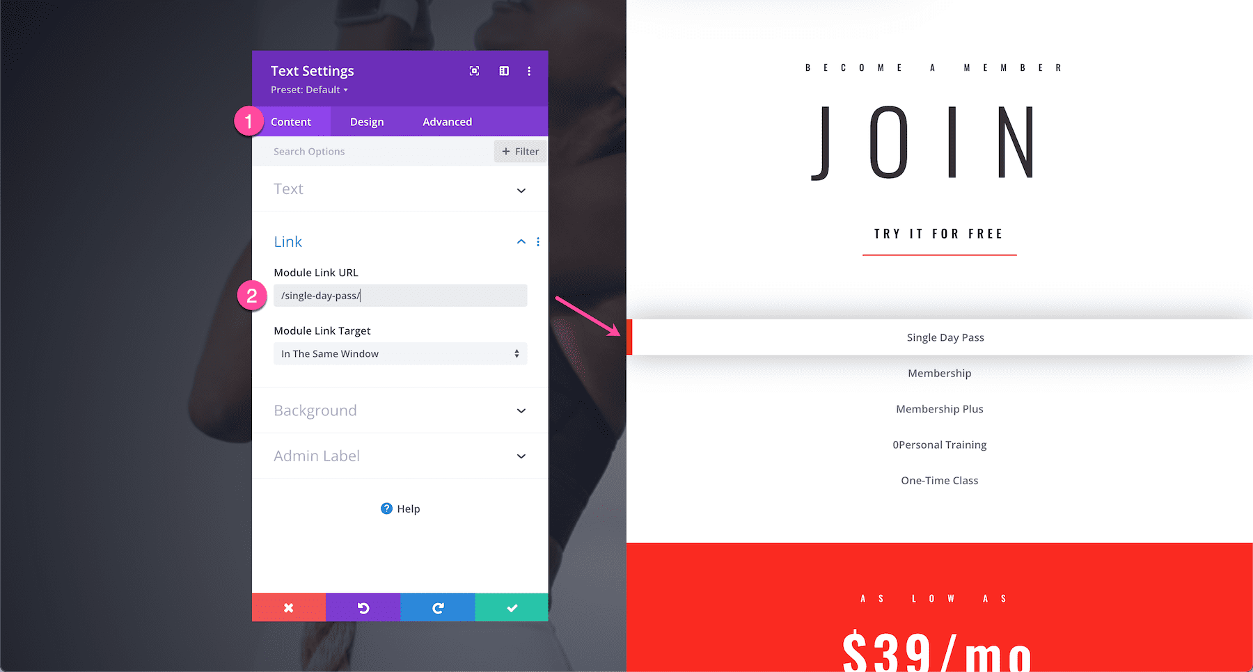
How do I turn an element with hover effects into a clickable link?
Turning an element into a clickable link (whether that be a section, row, column, or module) is easy in Divi. Simply open up the element’s settings navigate to Content > Link and paste the URL there.
Should I Use Hover Options on Mobile?
There really is no “hover” capability on mobile devices. The closest thing to hover is touch. In most mobile browsers, hover effects will be triggered on touch. Although this can be useful for certain functionality like toggles or revealing content on touch, it is not recommended as a best practice. This is especially true when using hover effects on links and buttons on mobile. If you have a hover effect on a clickable link, users may need to click on the element twice (once to trigger the hover effect and then another to click the link). That is why in most cases it would be better to disable hover effects on mobile devices.
How Do I Disable Hover Options on Mobile?
If some of your hover effects reveal hidden content on hover, then that could be a problem on mobile devices since they don’t have hovering capabilities. To solve this issue, we recommend setting your mobile design styles to match your hover state design styles so that hidden content is visible on mobile devices.
For example, below we have text that appears on hover, however, we’ll need that text to be visible on mobile without the need to hover over it (since hovering on mobile isn’t really a thing).
To remedy this situation, let’s go into the mobile design settings for the background color and text color and make them match with the hover state styles so that this content is displayed on mobile devices without having to hover.
Will Hiding and Showing Content on Hover Affect SEO?
No. It’s important to understand that your content is still there, you are only adjusting the transparency of them. Therefore, Google and other search engines will be able to see them in the code. You can rest assured that using Divi’s hover effects will not affect on your site’s SEO.
Tips & Best Practices For Hover Options
There’s no limit to Divi’s Hover Options, however, there are a few things to keep in mind when you are deploying them.
Be Purposeful When Using Hover Options
Changing the style of an element on hover will prompt the user with some type of further engagement or call to action (like clicking on the element). That’s why in most cases hover effects are used on buttons because most people will think that the hover effect means it is clickable. Thankfully, Divi allows you to add a link URL to any element to make it clickable in addition to hover options added. Of course, you can also do other purposeful hover effects like revealing additional content which will engage the user to read more about a feature. But, in most cases, it’s best to avoid adding hover effects strictly for the sake of design. This may affect user experience in a negative way, leaving them confused about the purpose of the hover effect.
Hover Options are great for Desktop, but not Mobile
It’s generally a good idea to only apply hover effects on desktop views. While hover effects can be applied to mobile devices, it’s discouraged because users will usually have to double tap to see the effect. This can be confusing and frustrating to your site’s visitors, or they may miss the effects altogether. Good use of animation is encouraged, but keep the user’s experience in mind when using them.
Use Hover Options to Highlight an Element
Using hover effects to highlight an important area of your site is a great idea to draw your visitor’s attention. Any micro-animation hover effect on a link or button will help users understand it is clickable. You may also consider using a hover effect to change an important line of text or a call-to-action module.
When deciding which elements to use hover effects on, consider your options carefully. Modules such as buttons, call to actions, and blurbs are all great options to help get your message across. Another idea would be to use hover options on columns containing important information. Differing background colors on hover is an excellent way to highlight content.
Don’t Overdo Hover Options
While animation and interactive elements are a great way to boost user engagement, be careful not to overdo it. Using too much animation or visual effects can confuse visitors. This can potentially cause them to miss your message all together. Keep effects to a minimum and only highlight the most important areas of your pages.
Tips for Transform Hover Options
When using transform options on hover, consider avoiding transform translate to move an element on hover. This will cause jumping in some cases when the cursor falls outside the element during the hover effect. Using transform scale (in addition to translate and/or rotate) to increase the size of the element is a good way to achieve the look you are going for without distracting your users with jumpy, unpredictable results.
Transition hover options are perfect for icons or icon buttons because you can add microinteractions to them (like scale or rotate) to make them more engaging.
Transform rotate works best on circular elements. To make any element circular, simply set the rounded corners option values to 50% on all four corners.
Continue Learning
Hover options can help you create stunning layouts in Divi. To learn how to create some of the effects we feature in our post, check out these great tutorials to sharpen your design skills while learning how to use Divi’s hover options.
- How to Add Hover Social Icons to Team Member Images with Divi
- How to Reveal Content on Hover with Expanding Corner Tabs in Divi (FREE Download)
- How to Combine Hover Effects with CSS Parallax Backgrounds in Divi
- How to Trigger Hover Effects for a Module, Column, and Row Simultaneously
- How to Create an Eye-Catching CTA in Divi with a Few Simple Hover Effects
- How to Change Content on Hover to Create Unique CTAs in Divi (3 Ways)