
One of the best things about building a site with Divi is that each building block is packed with design options. Every module, column, row, and section contains design settings for both the default and the hover state. This opens the door for triggering multiple hover effects when combining this elements together.
In this tutorial, I’m going to show you how to simultaneously trigger hover effects for a module, column and row. The trick is to make sure all of the elements share the same size and hover space. But once you have the elements in place, you can get extremely creative with your hover effects and designs.
Let’s get started.
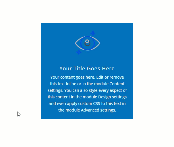
Sneak Peek
Here is a quick example of how triggering hover effects of different Divi elements simultaneously looks.
Download the Design Example for FREE
To lay your hands on the design from this tutorial, you will first need to download it using the button below. To gain access to the download you will need to subscribe to our newsletter by using the form below. As a new subscriber, you will receive even more Divi goodness and a free Divi Layout pack every Monday! If you’re already on the list, simply enter your email address below and click download. You will not be “resubscribed” or receive extra emails.

To import the layout to your page, simply extract the zip file and drag the json file into the Divi Builder.
Subscribe To Our Youtube Channel
Let’s get to the tutorial, shall we?
Understanding How to Trigger Hover States on Multiple Divi Elements Simultaneously.
Each element in Divi (section, row, or module) has its own hover space which is basically the size of the element itself.
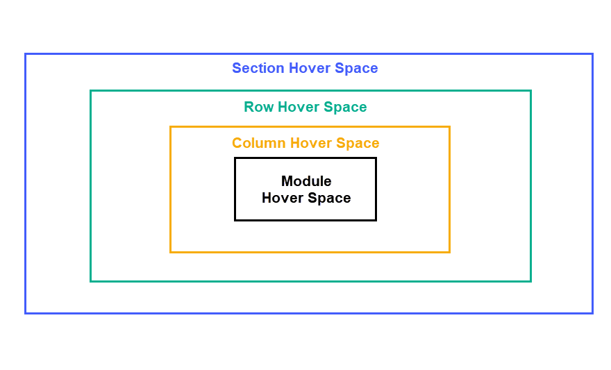
Each of these elements have built-in hover options that are activated when hovering over that element or any of the child elements it contains.
So, for example, if you have added hover options to a section, those hover options will become active whenever you hover of the section.
Then if you hover over the row hover space inside the section, you will activate the hover options of both the row and the section. This is because the row is a child element of the section.
Whenever you hover over a column, you activate the hover state of the column, the row, and the section.
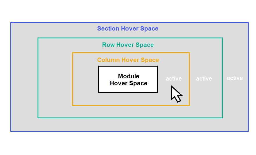
And lastly, whenever you hover over a module, you trigger hover states for the module and all its parent elements (column, row, and section).
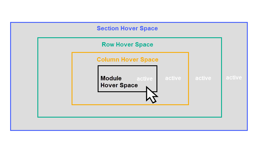
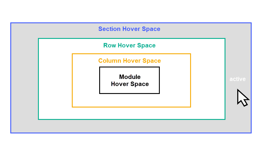
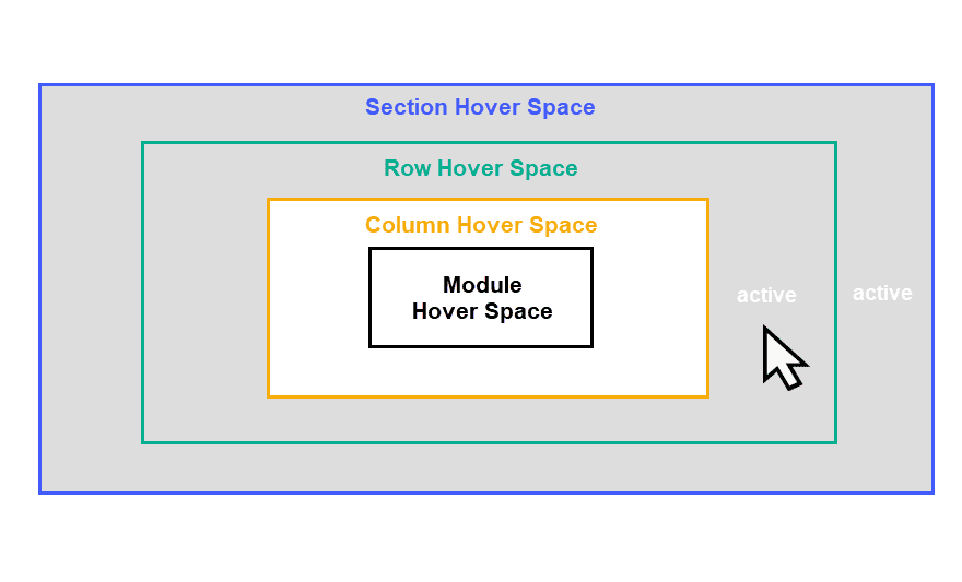
By default, each of these elements will have spacing (padding) that create gaps in the hover space which allows the user the ability to hover each element selectively. But, if you take out the spacing between each element, you will be able to trigger the hover states for all elements simultaneously.
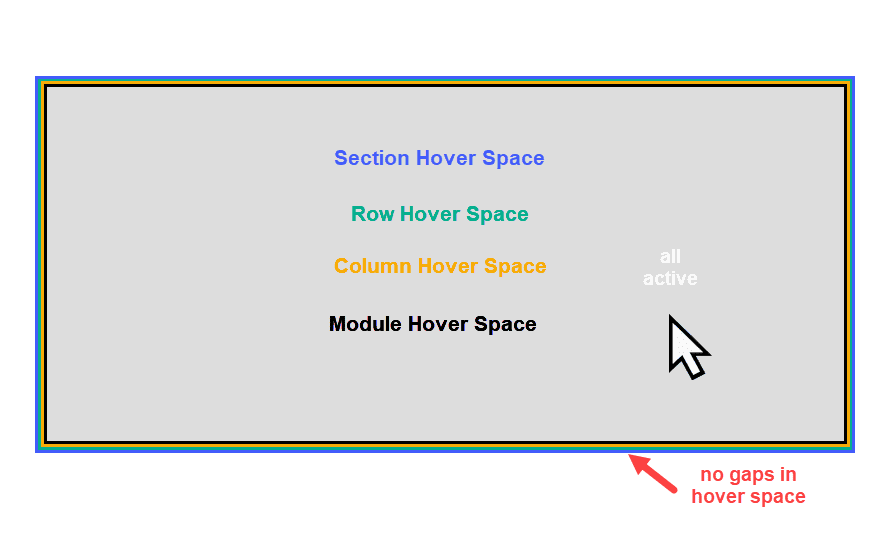
This opens the door for many hover effect combinations that can happen simultaneously as you combine the hover options for each element and activate them on a shared hover space.
An Example of Combining Hover Effects
Here is an example of how this works with Divi.
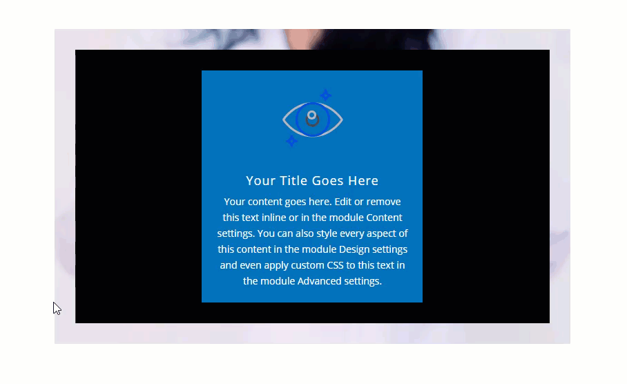
In the example below, we have a row with a background image. On hover, we have a delayed box shadow that shows up as a kind of border design element.
Inside the row, we have a column that has been filled with a black box shadow. On hover, the column’s box shadow is decreased gradually to reveal the row background image.
Inside the column, we have a blurb module that has a blue background. On hover, the blue background is changed to a semi-transparent blue color so that you can see the background image.
Since there is spacing between each element, we can see the specific hover effect of each element as we hover over each individual hover space.
But, if we take out the spacing and give the row a custom width, all of the elements will share the same hover space. Or to say it another way, the module takes up the entire space of the column and row. So when we hover over the module, the hover effects for the module, column, and row are activated simultaneously.
Transition Delays Work Great with This Setup
Bear in mind that, in the example above, there are transition delays on the row and column hover effects which really highlight the functionality of this concept well. If we were trying to add a similar combination of hover effects to the module only, we would not be able to take advantage of applying different transition delays and durations to each hover effect individually.
Recreating the Design Example in Divi
To give you some instruction on how this plays out in the real world of Divi, let’s recreate the example described above.
What You Need to Get Started
To get started, you will need to have the following:
- The Divi Theme installed and active
- A new page created to build from scratch on the front end (visual builder)
- Images to be used for mock content
After that, you will have a blank canvas to start designing in Divi.
Adding the Section and Row
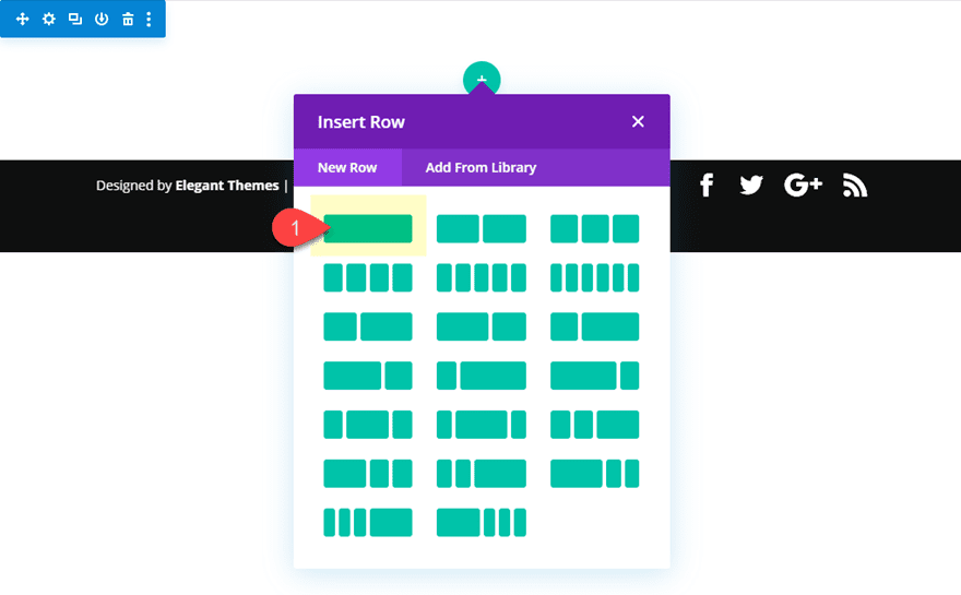
The first thing you need to do is create a regular section with a one-column row.
Update Row and Column Settings
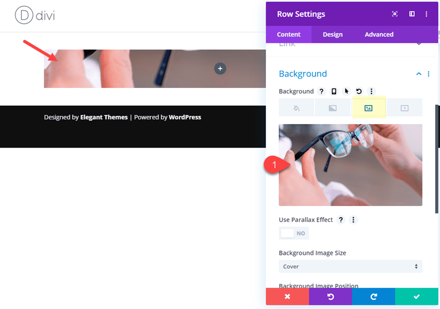
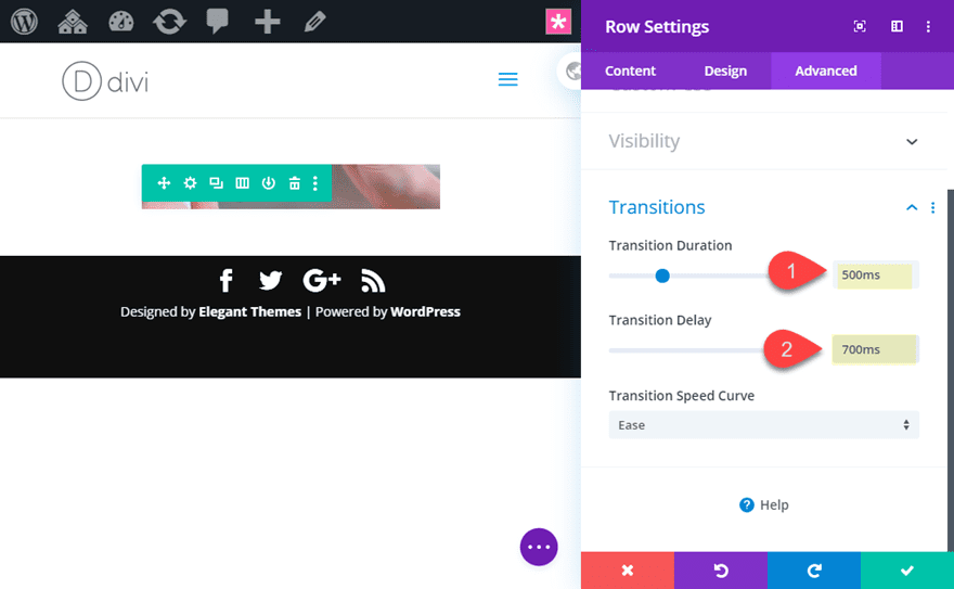
Next, open the row settings and give the row a background image.
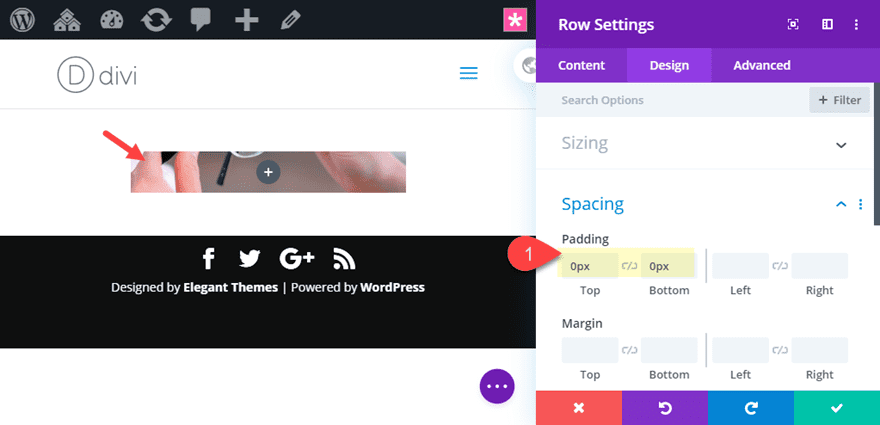
Then we need to take out the default padding so that there is no gap in the hover space between the row and the column.
- Padding: 0px top, 0px bottom
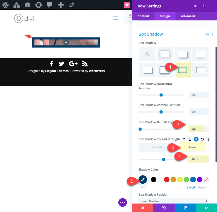
Then add the following box shadow to the row on hover.
- Box Shadow: see screenshot
- Box Shadow Blur Strength: 0px
- Box shadow Spread Strength: 0px (desktop), 10px (hover)
- Shadow Color: #063c68
Next update the transition options with a duration and a delay as follows:
- Transition Duration: 500ms
- Transition Delay: 700ms
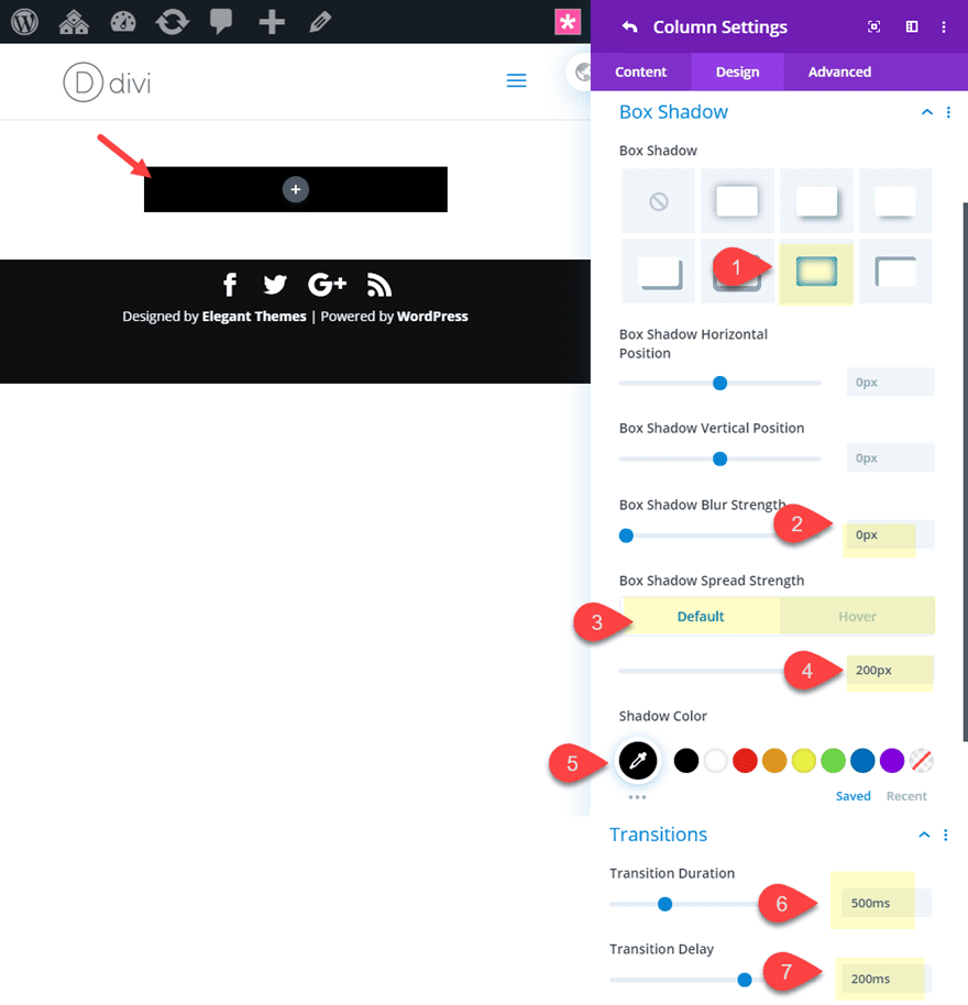
Now open the column settings and update the following:
- Box Shadow: see screenshot
- Box Shadow Blur Strength: 0px
- Box shadow Spread Strength: 200px (desktop), 0px (hover)
- Shadow Color: #000000
- Transition Duration: 500ms
- Transition Delay: 200ms
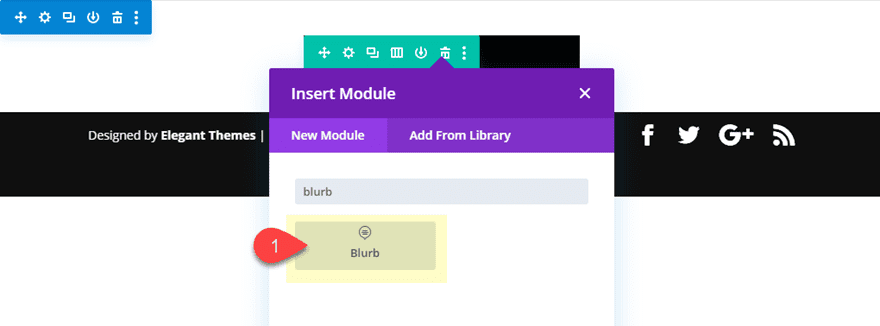
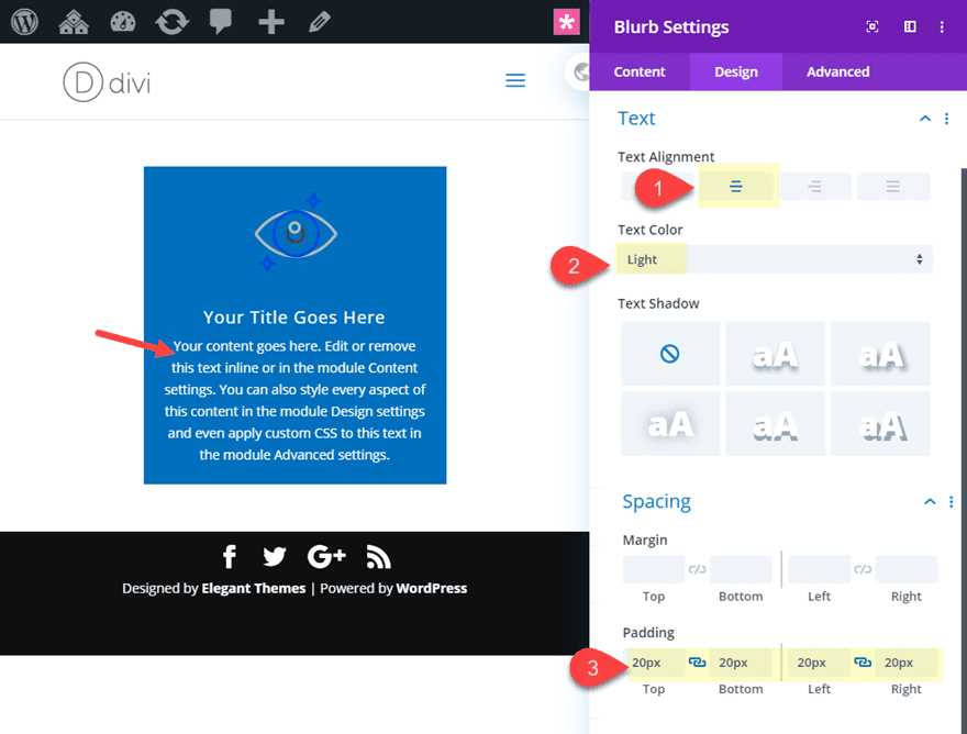
Add the Blurb Module
Now add a blurb module to the row.
Then update the blurb as follows:
- Image: [insert blurb image]
- Background Color: #0c71c3
- Background Color (hover): rgba(12,113,195,0.35)
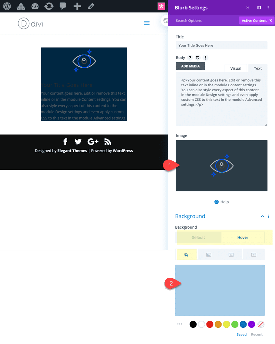
- Text Alignment: center
- Text Color: Light
- Padding: 20px top, 20px bottom, 20px left, 20px right
Final Result
Check out the final result.
Final Thoughts and Tips
Understanding how to trigger hover states for multiple Divi elements simultaneously opens some exciting design possibilities. The example in this post highlights only a few of many hover effect combinations that are possible when you combine the hover states of a module, column, and row. Plus, we didn’t even explore the possibilities that come with combining the section hover options which would give you even more hover options. As you explore these hover effects on your own, here are a few tips and ideas to help along the way.
- Use Box Shadow instead of Borders – Borders actually add additional space to an element so this might cause unwanted hover gaps. Box Shadows add a design element that doesn’t add actual space.
- Explore Background Transition Hover Effects – Each Divi element has background hover options that can be combined for layers of creative hover effects.
- Use Transform Hover Options – Transform hover options can add a creative element such as scaling and rotating elements on hover. However, it may be challenging to rotate multiple elements on hover since it will cause jumping.
- Take advantage of transition options – Adding different transition durations and delays on each element’s hover state can create unique hover animations.
I hope this tutorial will inspire you to explore some amazing hover effect combinations in Divi.
I look forward to hearing from you in the comments.
Cheers!


Will this work with three boxes in the same row from left to right?
very Informative Post. I was thinking that Hover can use only on the URL tab but after this post, I tried on my website page column and row.
Thanks for Sharing with us.