")
Divi and its built-in hover options makes it easy to change the content of any module on hover. We can change background images, colors, and even text on hover. This opens the door for creative ways to grab the attention of users and boost those calls to action for better conversions.
Today, we’ll be showing you how to change content on hover in Divi for some unique calls to action. We’ll show clever ways to change button text (and icons) on hover. We’ll show how to elegantly change the title and button text within a call to action module on hover. And, we’ll even throw in some custom CSS to add some unique transition effects as well (like switching and flipping a button icon).
Check it out!
- 1 Sneak Peek
- 2 Download the Layout for FREE
- 3 Download For Free
- 4 What You Need to Get Started
- 5 #1 How to Change Content on Hover for Buttons
- 6 #2 How to Change Backgrounds and Body Content on Text Modules
- 7 #3 How to Change Content on Hover for Multiple Elements with the Call to Action Module
- 8 Final Thoughts
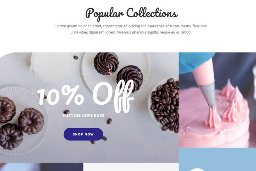
Sneak Peek
Here is a quick look at the three designs we will be creating today.

#2 How to Change Backgrounds and Body Content on Text Modules
#3 How to Change Content on Hover for Multiple Elements with the Call to Action Module
Download the Layout for FREE
To lay your hands on the designs from this tutorial, you will first need to download it using the button below. To gain access to the download you will need to subscribe to our newsletter by using the form below. As a new subscriber, you will receive even more Divi goodness and a free Divi Layout pack every Monday! If you’re already on the list, simply enter your email address below and click download. You will not be “resubscribed” or receive extra emails.

To import the layout to your page, simply extract the zip file and drag the json file into the Divi Builder.
Let’s get to the tutorial shall we?
What You Need to Get Started
To get started, you will need to do the following:
- If you haven’t yet, install and activate the Divi Theme installed (or the Divi Builder Plugin if not using the Divi Theme).
- Create a new page in WordPress and use the Divi Builder to edit the page on the front end (visual builder).
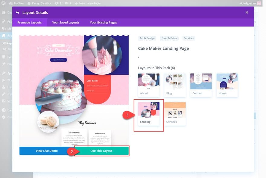
- Load the Cake Maker Landing Page premade layout to the page. We will be using this layout for our designs. You can load the layout by selecting “Choose a Premade Layout” when prompted on deploying the Divi Builder. Or you can select the “Load from Library” plus icon from the settings menu within the Divi Builder. For more info on how to load the premade layout to your page, watch our video.
After that, you are ready to start designing in Divi.
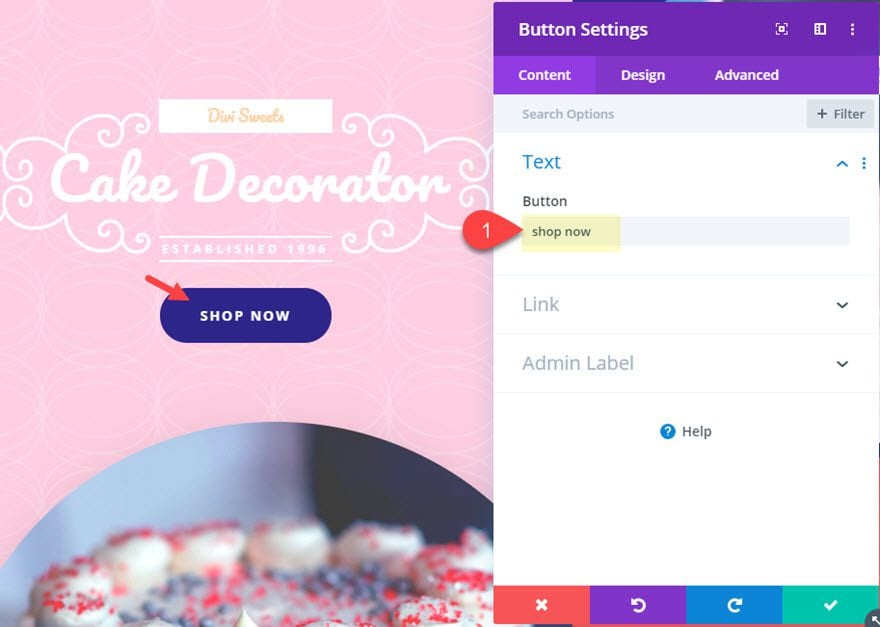
Once you have the Cake Maker Landing Page premade layout loaded to your page, find the main button CTA at the top header of the page and open the button module design settings.
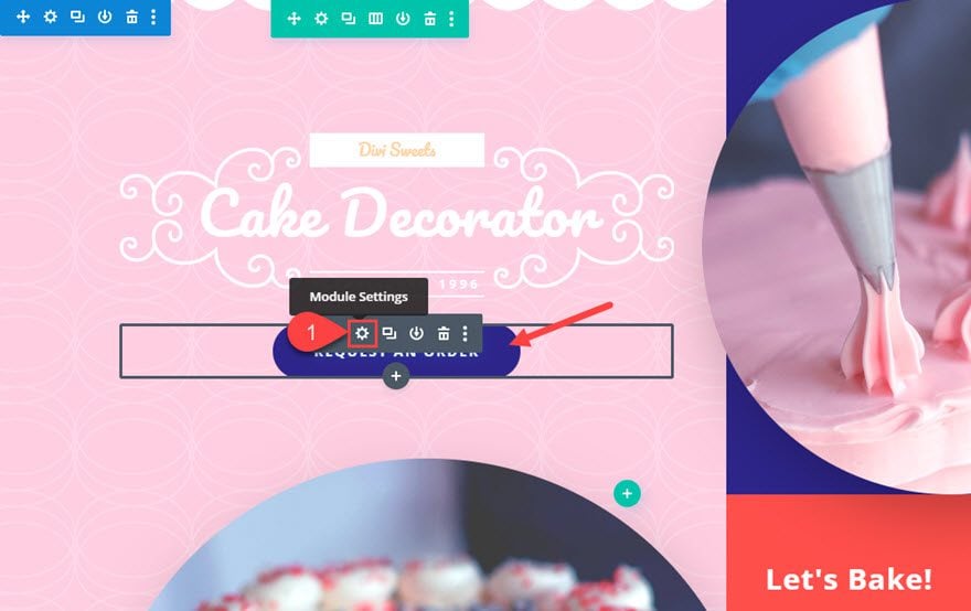
Under the content tab, update the button text as follows:
Button Text: “Shop Now”
Then deploy the hover option for the button text and enter the replacement button text under the hover tab as follows:
Button Text (hover): “Let’s Go”
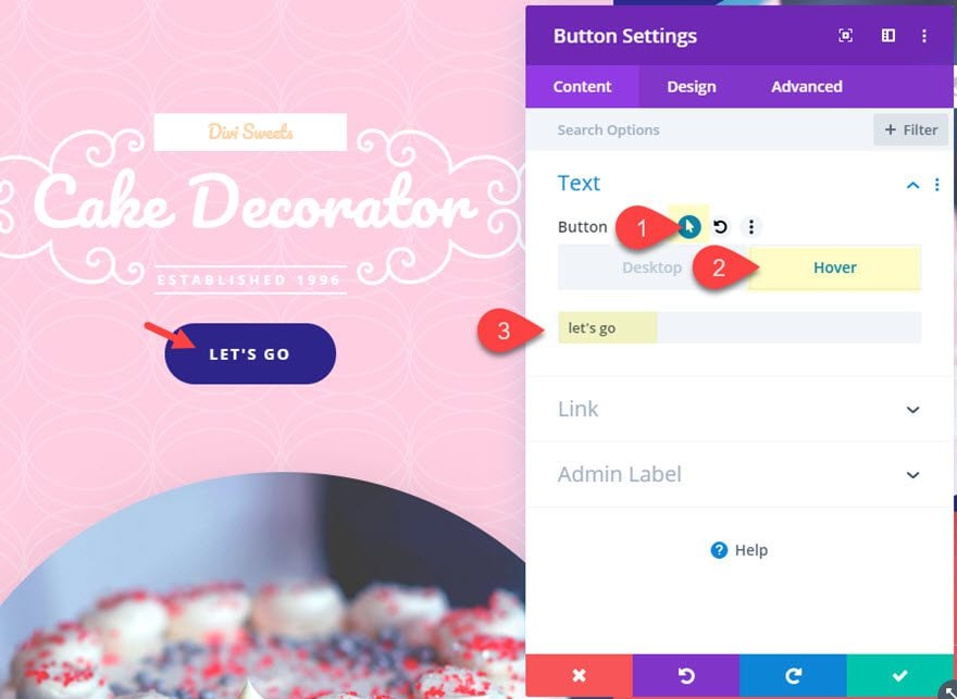
The text under the hover button text will replace the default button text when hovering over the button.

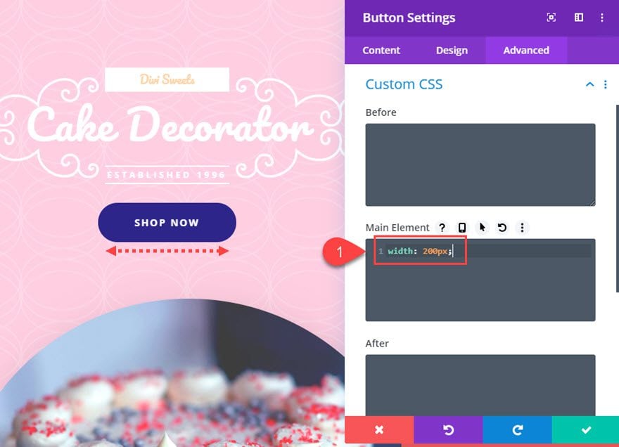
However the button is inline-block so the width of the button/link will change according to the amount of content (letters or spaces) the button contains. This doesn’t work well for this hover effect because with smaller replacement text, the button will grow smaller in width and create jumping or glitching when hovering over the edge of the button. To fix this, we need to apply a set width to the button. This is easy with a single snippet of CSS. Add the following CSS to the Main Element of the button module.
width: 200px;
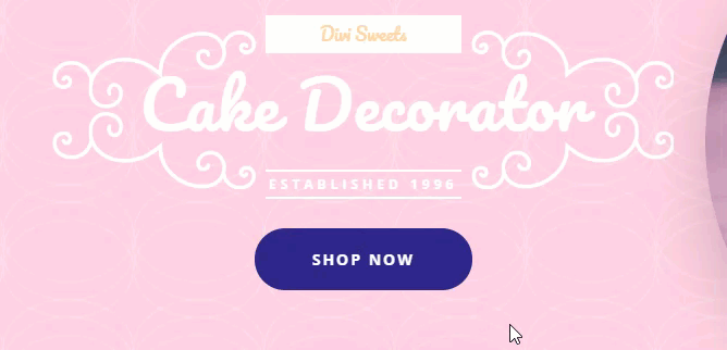
Here is the result.
Additional Changes and Hover Effects
In addition to changing the content on hover, we can also spice up our button with a different hover effect combinations.
Right now the button icon is a right arrow that is deployed on hover. This works really well with the hover button text “Let’s Go”.
Flipping the Button Icon on Hover
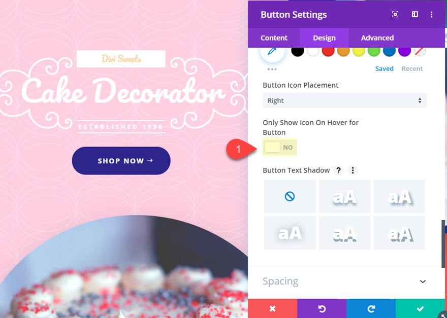
But you can add a nice flip hover effect for the button icon as well. To do this, first make the icon appear always (not just on hover) by updating the following:
Only Show Icon on Hover for Button: NO
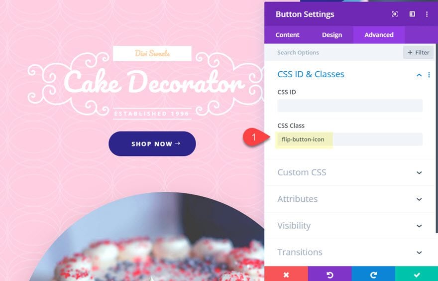
Then add a CSS Class to the button module as follows:
CSS Class: flip-button-icon
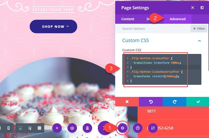
Then open the page settings and add the following custom CSS.
.flip-button-icon:after {
  transition: transform 500ms;
}
.flip-button-icon:hover:after {
  transform: rotateX(360deg);
}
Here is the result.

Changing the Button Icon on Hover
You can also completely change the button icon on hover. All you really need is a small snippet of CSS to replace the content of :after pseudo element where the icon resides.
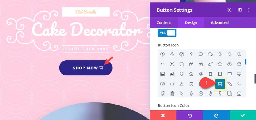
Before we add the css, first let’s choose a different button icon to show initially, then we can change it to the right arrow with CSS.
Update the Button Icon with the cart icon since our CTA is “Show Now”.
Then go to the advanced tab and update the current CSS transform property with a 180 degree rotation instead of 360 degrees. And add a new unicode for the content that displays the left arrow (“\23”).
The new snippet will look like this:
.flip-button-icon:hover:after {
  transform: rotateY(180deg);
  content: "\23";
}
Since we will be rotating the icon 180 degrees as well, this will show a right arrow as a replacement of the cart icon when hovering over the button.
Final Result
This is the final result.
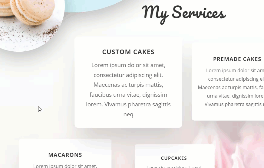
#2 How to Change Backgrounds and Body Content on Text Modules
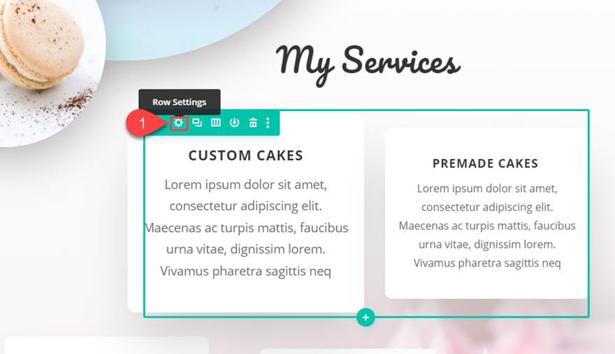
For this next design, make your way down the page layout to the “My Services” section. There open the row settings for the top row with the two text modules.
Update Column Settings
Under the row settings, open the settings for Column 1 and add a background image on hover to the column.
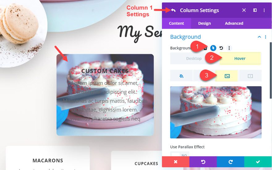
This will replace the white background that is there by default.
Also, add a gradient above the background image on hover as well.
Background Gradient Left Color: rgba(255,255,255,0)
Background Gradient Right Color: rgba(46,41,142,0.75)
Start Position: 30%
Place Gradient Above Background Image: YES
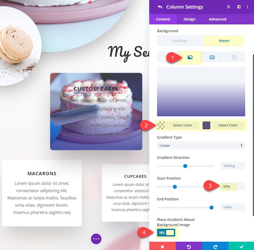
This will provide a nice overlay that will make the replacement text on hover more readable.
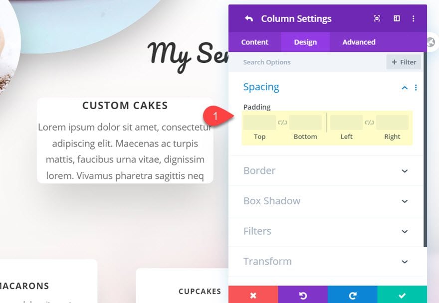
After that, take out the custom padding for the column by restoring it to the default setting.
Customize the Text Module in Column 1
Once the column is updated, save the settings and open the text module settings for the text module in column 1. Then update the text module body content on hover with the following:
<h3>Custom Cakes</h3>
<a href="#">Order Now</a>
This is a nice way to add a call to action with a link on hover.
Next, update the background as follows:
Background Color: #ffffff;
Background Color (hover): rgba(255,255,255,0);
This adds a nice transition element to reveal the background image in the column gradually.
Next update the following design settings:
Height: 260px
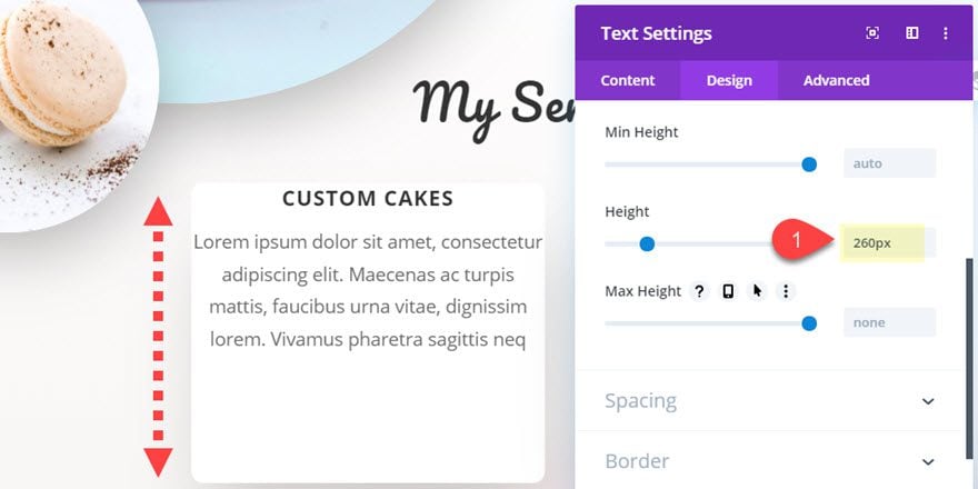
Padding: 30px top, 30px left, 30px right
Padding (hover): 90px top
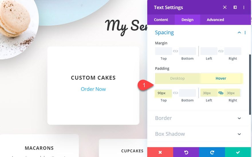
This will create a nice transition effect that brings the text down gradually when hovering over the text module.
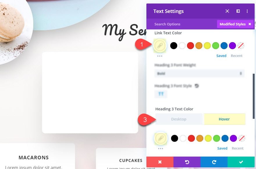
Next, update the text colors to white as follows:
Link Text Color: #ffffff
Heading 3 Text Color (hover): #ffffff
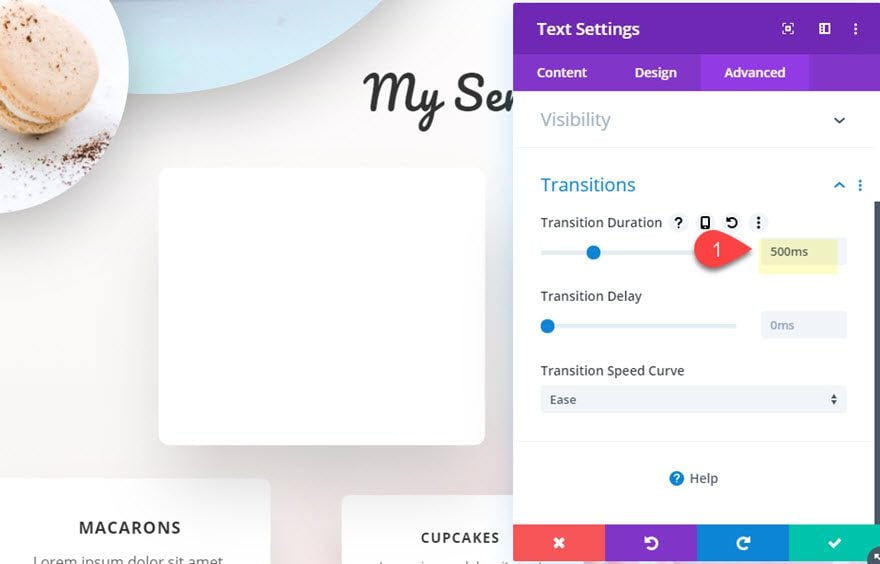
To slow down the transition of the hover effects, update the transition duration as follows:
Transition Duration: 500ms
Final Result
Now check out the final result.
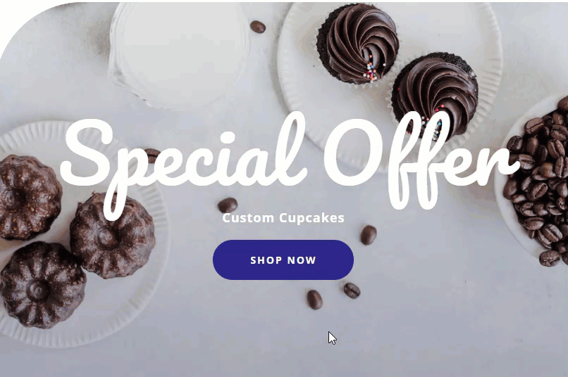
#3 How to Change Content on Hover for Multiple Elements with the Call to Action Module
For this next design, we are going to use a call to action module that changes multiple content elements on hover. To do this, make your way down the page to the Popular Collections section.
Add New Call To Action Module
Then add a new call to action module under the “shop now” button in the top row of the specialty section.
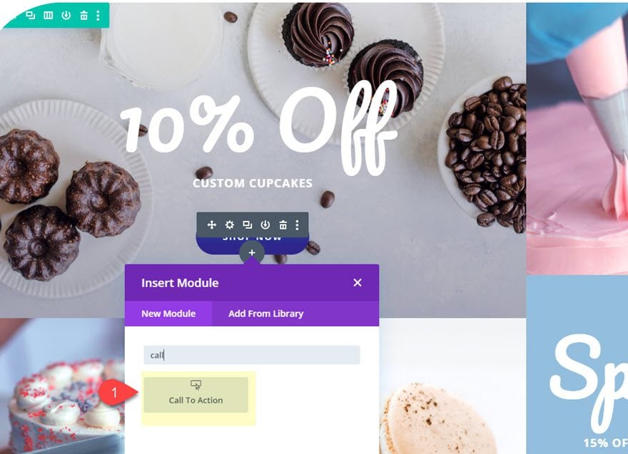
Update CTA with Changing Content on Hover
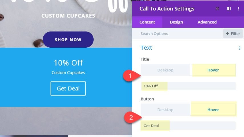
Next, update the call to action content as follows:
Title: “Special Offer”
Title (hover): “10% Off”
Button text: “Shop Now”
Button text (hover): “Get Deal”
Body: “Custom Cupcakes”
Button Link URL: #
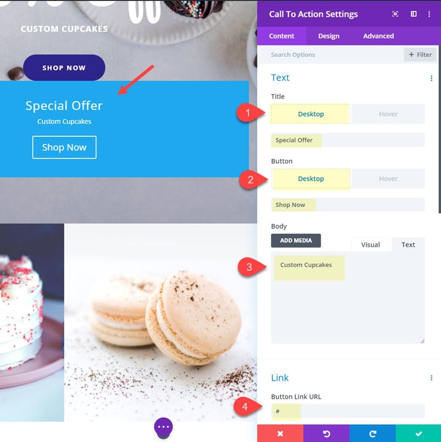
Save setting for now.
We are going to get a jump on designing the button for our CTA. To do this, open the button settings for the button module above the CTA module that came with the premade layout. Then click the triple dot icon on the button option group and select “copy button styles”.
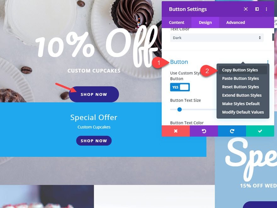
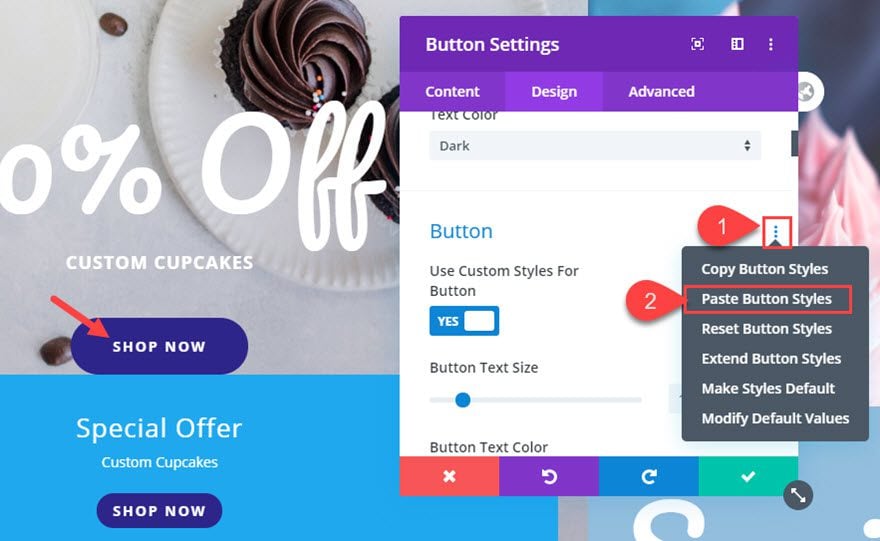
Then open the other options menu on the call to action module we are designing and select “Paste Button Styles”.
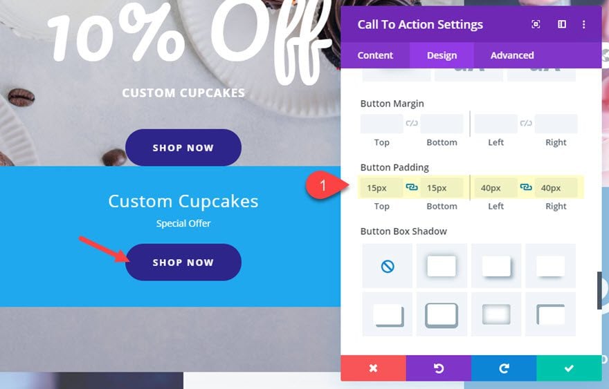
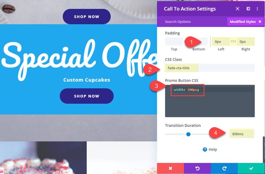
Then open the call to action module settings and update the button padding:
Button Padding: 15px top, 15px bottom, 40px left, 40px right
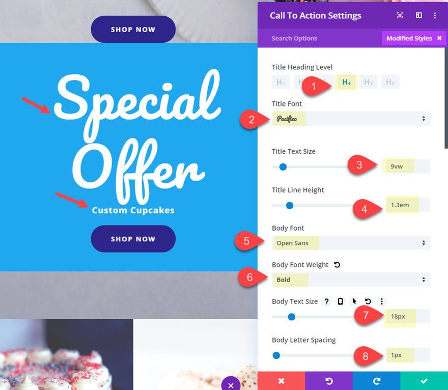
Update Text Styles
After that, update the title and body text design.
Title Heading Level: H4
Title Font: Pacifico
Title Text Size: 9vw
Title Line Height: 1.3em
Body Font: Open Sans
Body Font Weight: Bold
Body Text Size: 18px
Body Letter Spacing: 1px
Final Settings
Next, update the padding.
Padding: 0px left, 0px right
Then give the module a custom CSS Class.
CSS Class: fade-cta-title
Make the cta button full width by adding the following custom CSS to the Promo Button CSS input box.
And update the transition duration.
Transition Duration: 800ms
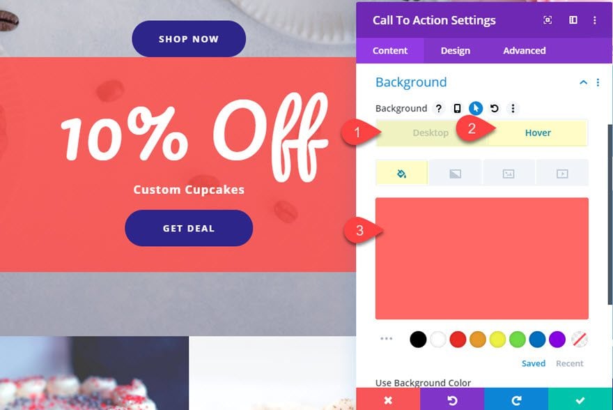
Finally, update the background color so that is transparent by default and changes color on hover.
Background Color: none (delete)
Background Color (hover): rgba(247,78,72,0.86)
Next, delete the two modules in the row above our Call to Action module so that it replaces the original cta from the layout.
Result So Far
Here is the result so far. Notice how the title text and the button text changes when hovering over the call to action module.

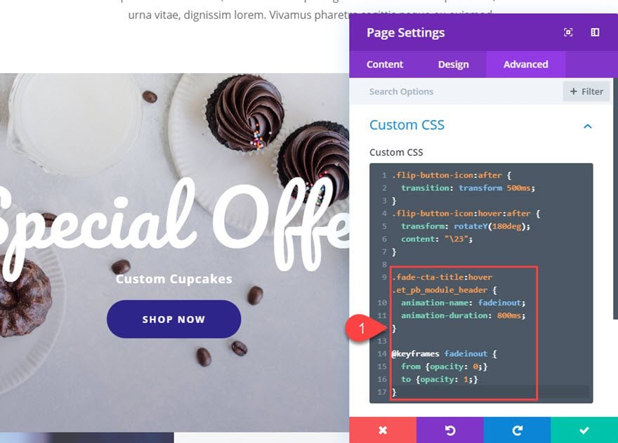
Softening the Content Change with Animation
If we want to soften the transition of the big title in the CTA, we can add a simple animation with CSS. Since we already added the CSS Class the module, all we need to do is open the page settings modal and add the following custom CSS:
.fade-cta-title:hover .et_pb_module_header {
  animation-name: fadeinout;
  animation-duration: 800ms;
}

@keyframes fadeinout {
  from {opacity: 0;}
  to {opacity: 1;}
}
Final Result
Now let’s check out the final result.
And here it is on mobile.

Final Thoughts
In this tutorial, we’ve shown 3 examples of how to effectively change content on hover in Divi. The built-in hover options for content really do make this an easy process. And with a few snippets of CSS you can add some unique transitions to set the design apart. Hopefully, this will allow you to boost the calls to action on your own site for more conversions and engagement.
Want more? We have a ton of great posts that will help take your CTA’s to the next level.
I look forward to hearing from you in the comments.
Cheers!


Hi..just want to ask I didn’t seem to find the hover option on the text section for button module as shown on the first tutorial. Any ideas how to overcome this problem?
I really like no 3 layouts with the discount. This is a good eye-catcher for customers.
Awesome!
Sweet, Jason! Beautiful! Love it! Thanks a lot for the download.
Thanks Elisandro. It is my pleasure. Glad you liked it.
Good ideas on how to create some animation for my hover options.
Thanks Bob. Have fun exploring those ideas.
Little nit to pick with the title: the plural of CTA is CTAs. It is not correct to use an apostrophe to form the plural, no matter how often one sees it.
Now that does look nice.