Divi’s Social Media Follow module allows you to easily style and add those important links to your social networks anywhere on your website. And if you want to get your hands dirty with some of Divi’s powerful built-in hover effects, you can design some creative hover effects for your social media follow buttons as well.
In this tutorial, I’m going to show you some unique social media follow button hover effects that just may surprise you.
Check it out!
Sneak Peek
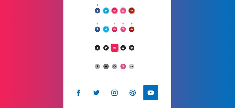
Here is a sneak peek at the hover effects we will create.
Borders to Dots

Dots to Borders

Bouncing Shadows 1

Bouncing Shadows 2
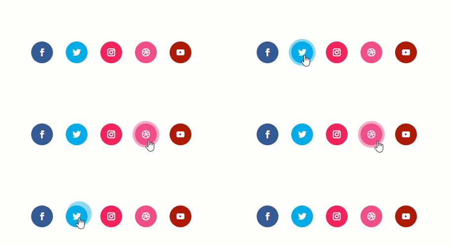
Start Building Part 1 Hover Effects
Part 2: Changing Color, Size, and Shape on Hover
Changing Size and Color
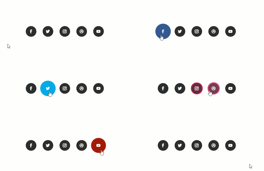
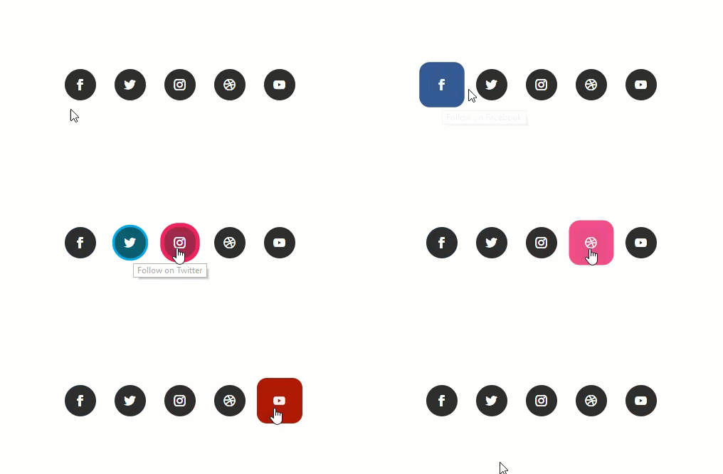
Changing Size, Color and Shape
Start Building Part 2 Hover Effects
Part 3: Filter Effects
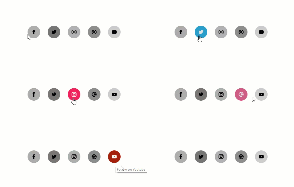
Start Building Part 3 Hover Effect
Part 4: Large Icons with Screen Blend and Filter Effects
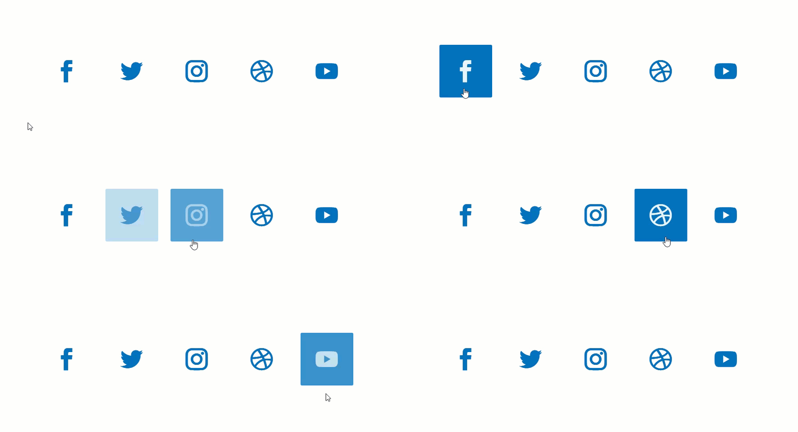
Start Building Part 4 Hover Effect
Getting Started
Subscribe To Our Youtube Channel
To get things rolling for this tutorial, all you really need is the Divi Theme installed and active. Then create a new page and give your page a title. Then click to use the Divi Builder and select the option to Use a Premade Layout. From the Load from Library popup modal, select the App Developer Layout Pack. Then click to use the In order to jumpstart the design of our social media follow buttons, we are going to use the App Developer Home Page layout.
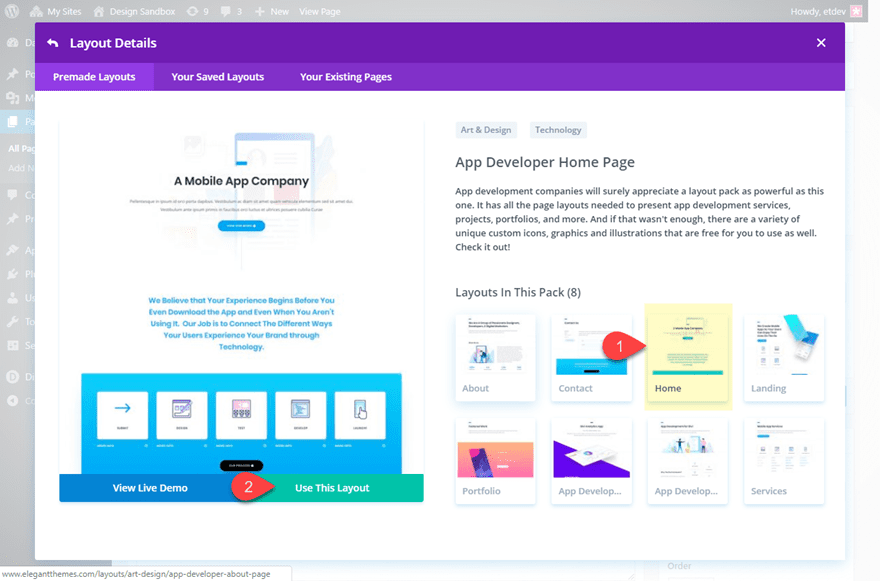
Publish your page and click the button to Build on the Front End.
Now delete all the sections of the page except the section containing the social media follow buttons at the bottom of the page.

This will serve as a started template for creating our hover effects.
Let’s save the section to the Divi Library so that we can add a fresh version of these social media follow button designs when needed.
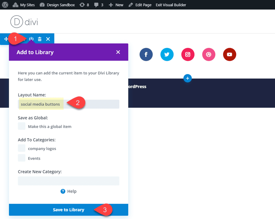
You could also duplicate the section multiple times on your page as well. This will allow you to create different hover effects starting with the premade section.
Now you are ready to start creating the hover effects.
Let’s get started.
Borders to Dots
For this hover effect, we are going to add a box shadow around the button that shrinks and hovers above the button on hover. To do this, open the social media follow module and click to open the settings of the facebook social network.
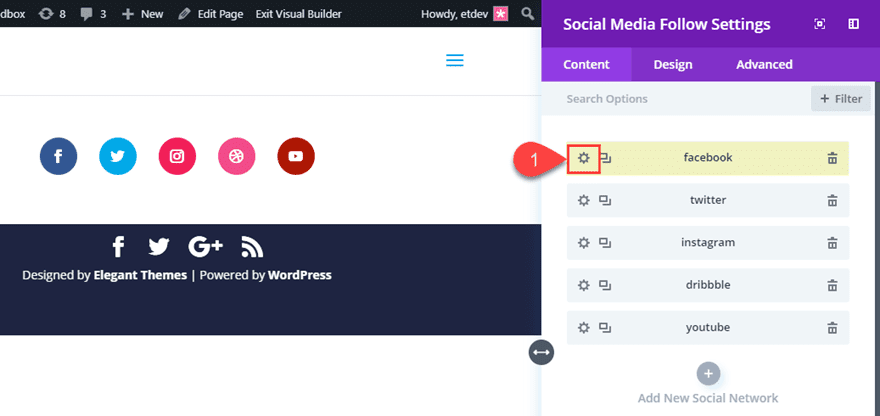
Then copy the background color being used for the icon to your clipboard (#3b5998). This color will be used for the box shadow.
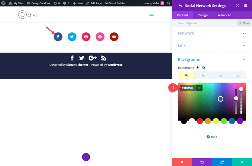
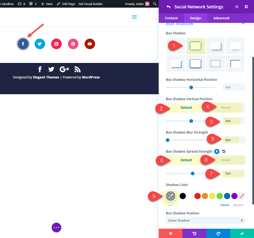
Now open the design tab and update the following:
Box Shadow: see screenshot
Box Shadow Vertical Position: 0px (default), -46px (hover)
Box Shadow Blur Strength: 0px
Box Shadow Spread Strength: 5px (default), -16px (hover)
For the shadow color, paste in the background color (#3b5998) and decrease the opacity by 50%. This will give you a lighter version of the button background color.
Shadow Color: rgba(59,89,152,0.5)
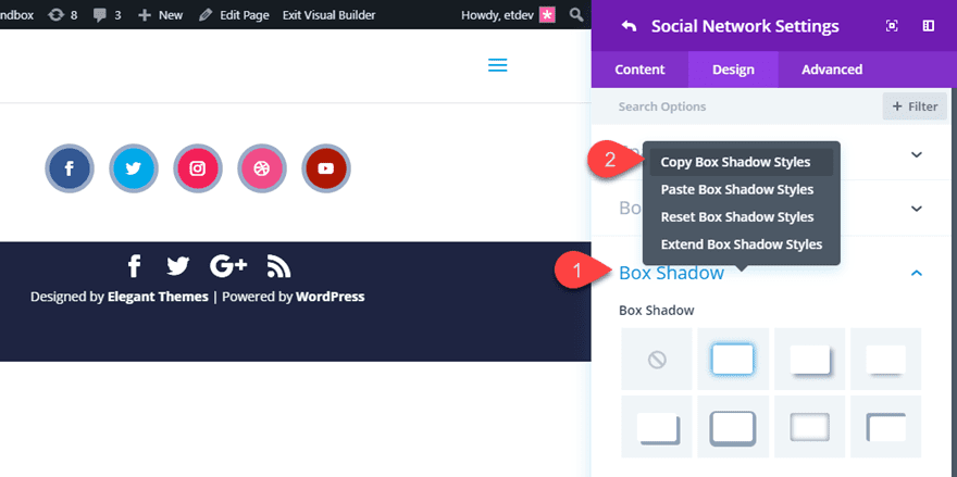
Now right click on the Box Shadow style category and select Copy Box Shadow Styles.
Save the settings for the facebook social network and then right click on each of the social networks and select Paste Item Styles for each one. This will apply the same box shadow styles to the rest of the buttons.
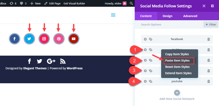
However, you will still need to update the color of the box shadow that is specific to each one. To do that, repeat the same process that we did for the Facebook social network. Open the specific social network settings, copy the background color being used, paste it in as the new box shadow color and then decrease the opacity by 50%.
Here are the box shadow colors for each of the remaining social networks:
Twitter Box Shadow Color: rgba(0,172,237,0.5)
Instagram Box Shadow Color: rgba(234,44,89,0.5)
Dribble Box Shadow Color: rgba(234,76,141,0.5)
Youtube Box Shadow Color: rgba(168,36,0,0.5)
Once the box shadow colors are updated, check out the final result.

Dots to Borders
You can easily reverse the hover effect by switching out default and hover values for the box shadow vertical position and spread strength.
Duplicate the section (if you want to keep the “borders to dots” design) and then open the social media follow module settings. Then open the settings for the Facebook social network and update the following:
Box Shadow Vertical Position: -46px (default), 0px (hover)
Box Shadow Spread Strength: -16px (default), 5px (hover)
You will need to update these new box shadow settings for each of the remaining social networks. You can do this manually or you can use right click to copy the Box Shadow Vertical position and spread strength and then paste them to each of the networks.
Once done, your final design will look like this.

Bouncing Shadows Effect
For the next version of this design and hover effect, we are going to have the box shadow (dot) of each of the buttons start in the same location by default. This will create a kind of bouncing effect.
To start, you can duplicate the “dots to borders” design we previously built. Open the social media follow module settings and then open the facebook social network settings. Update the following box shadow styles:
Box Shadow Horizontal Position: 140px (default), 0px (hover)
Box Shadow Vertical Position: -70px (default), 0px (hover)
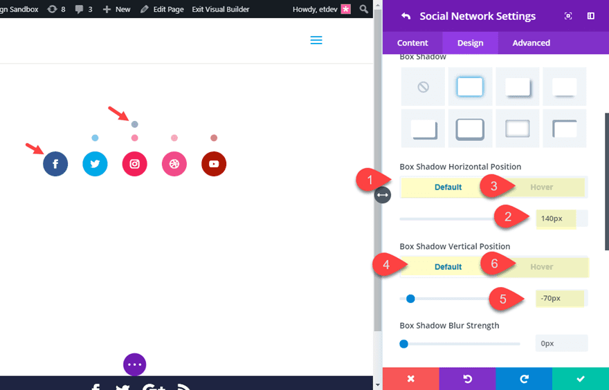
For the Twitter social network, update the following:
Box Shadow Horizontal Position: 70px (default), 0px (hover)
Box Shadow Vertical Position: -70px (default), 0px (hover)
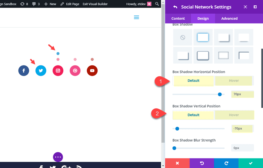
For the Instagram social network, update the following:
Box Shadow Horizontal Position: 70px (default), 0px (hover)
Box Shadow Vertical Position: -70px (default), 0px (hover)
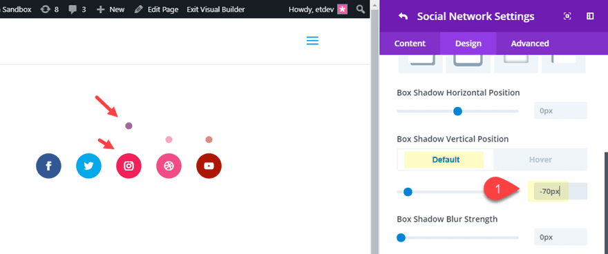
For the Dribble social network, update the following:
Box Shadow Horizontal Position: -70px (default), 0px (hover)
Box Shadow Vertical Position: -70px (default), 0px (hover)
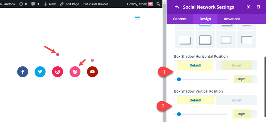
For the Youtube social network, update the following:
Box Shadow Horizontal Position: -140px (default), 0px (hover)
Box Shadow Vertical Position: -70px (default), 0px (hover)
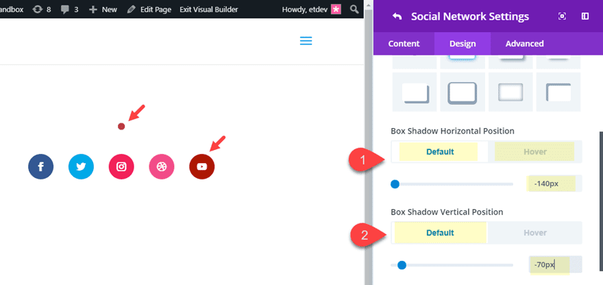
Check out the final result.

If you don’t want the dot to show initially, you can set the default box shadow color to transparent and then add a box shadow color on hover. This would give you a design that looks like the following:

#2 Changing Color, Size, and Shape on Hover
For this next series of hover effects, I’m going to show you how to easily change the color, size, and or shape of the social media buttons on hover. To get started, make sure you are using a fresh version of the social media follow button section from the App Developer Home Page layout. If you saved it to your Divi Library, now would be a good time to add it to your page.
Changing Color
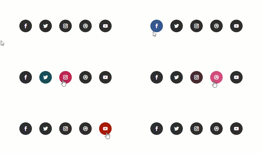
Changing the color of a social media button on hover is pretty straightforward. For this example, let’s start with a dark gray background color by default that turns into the social network color.
To do this, open the Social Media Follow module and then open the Facebook Network settings. Update the following:
Background Color: #333333 (default), #3b5998 (hover)
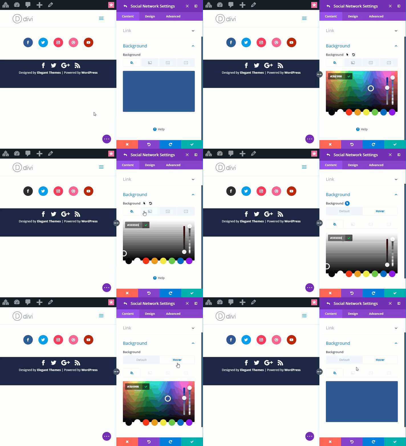
Then continue this process to update the remaining four social network background colors as follows:
Twitter background color: #333333 (default), #00aced (hover)
Instagram background color: #333333 (default), #ea2c59 (hover)
Dribble background color: #333333 (default), #ea4c8d (hover)
Youtube background color: #333333 (default), a82400 (hover)
Here is the result.
Changing Size
To change the size of the button, we can add a box shadow on hover. This allows the button to grow larger without adding any actual space to the button that would push the adjacent buttons away on hover.
To do this open the Facebook network settings and add the following box shadow styles:
Box Shadow: see screenshot
Box Shadow Vertical Position: 0px
Box Shadow Blur Strength: 0px
Box Shadow Spread Strength: 0px (default), 10px (hover)
Shadow Color: #3b5998 (this should be the same color as the hover background color of the button)
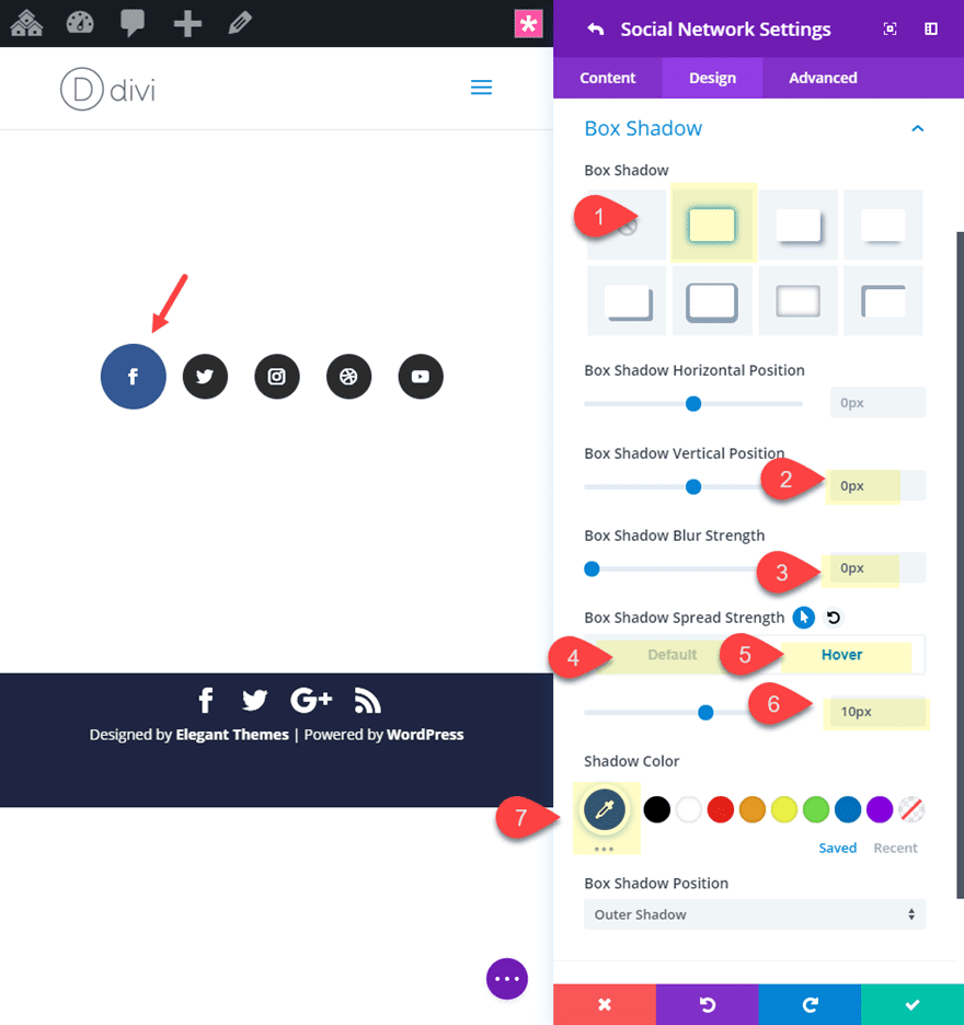
To speed up the process of adding the same box shadow design to the rest of the social network buttons, right click on the box shadow category of the Facebook Network and click “Save Box Shadow Styles”.
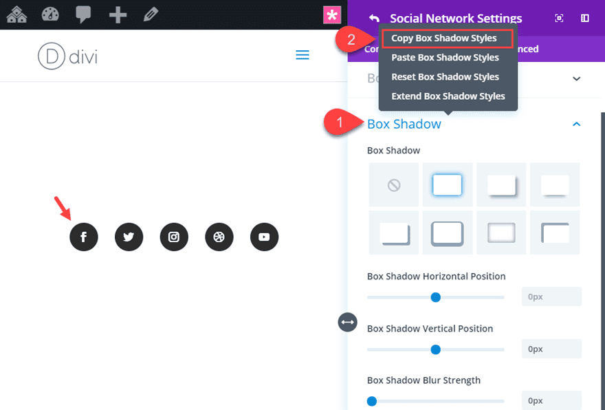
Save the settings and then right click on each of the social networks and select “Paste Item Styles”.
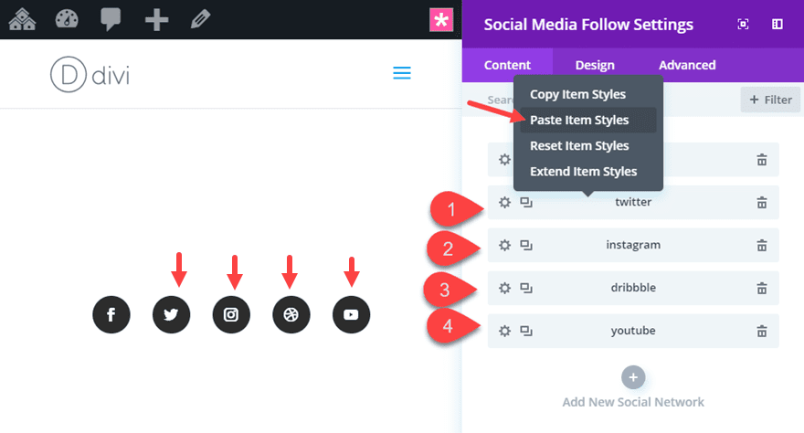
Now all you have left to do is update the box shadow color with the correct social network color that matches its hover background color.
To do this update the following:
Twitter Box Shadow color: #00aced
Instagram Box Shadow color: #ea2c59
Dribble Box Shadow color: #ea4c8d
Youtube Box Shadow color: #a82400
Here is the final result.

Changing Shape
To change the shape of the button on hover, all you need to do is adjust the “Rounded Corners” option. This social media follow module currently has the rounded corners set to 40px making the buttons circular. If we want to change it to square, all you need to do is adjust the rounded corners to 0px on hover.
To do this open the Facebook Network settings and update the following:
Rounded Corners (hover): 4px on all four corners
Then copy the border styles and paste them to each remaining network.
Here is the final design.

#3 Filter Effects
For this next hover effect, I’m going to show you how to use a couple of filter effects to change the colors of the social media buttons on hover. To get started, make sure you are using a fresh version of the social media follow button section from the App Developer Home Page layout. If you saved it to your Divi Library, now would be a good time to add it to your page.
Saturation and Invert Filter effects on hover
Using the saturation and the invert filter effects are a simple and powerful way to change the style of your social media buttons on hover. In this example, I’m going to show you how to combine saturation and invert to create gray buttons with black icons that transition back to their original color on hover.
To do this open the social media follow module settings and then open each of the individual social network settings and update the following filter options:
Saturation: 0% (default), 100% (hover)
Invert: 100% (default), 0% (hover)
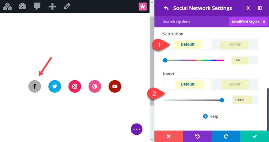
Check out the result.

#4 Large Colored Icons with Screen Blend and Filter Effects
For this final social media button hover design, we are going to start completely from scratch. So create a new section with a one-column row and add a social media follow module to the row.
Then open the social media follow settings and delete the default twitter social network leaving only the facebook social network item.
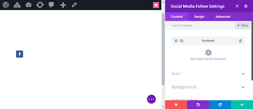
Then update the social media follow settings as follows:
Background Color: #ffffff
Item alignment: center
Blend Mode: Screen
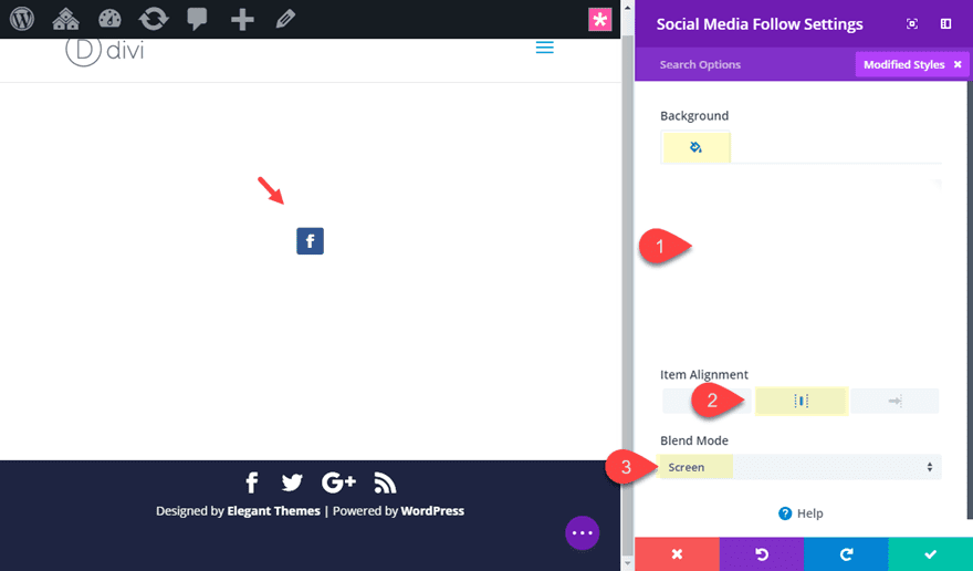
Next, open the Facebook Social network item settings and update the following:
Background Color: #000000
Custom Margin: 10px left, 10px right
Custom Padding: 10px top, 10px bottom, 10px left, 10px right
Saturation: 0% (default), 100% (hover)
Invert: 100% (default), 0% (hover)
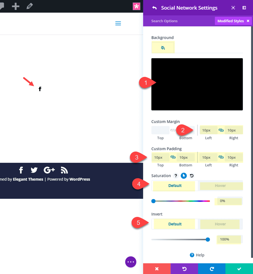
Save settings.
Then duplicate the facebook social network item 4 times so that you have a total of 5 social network buttons.
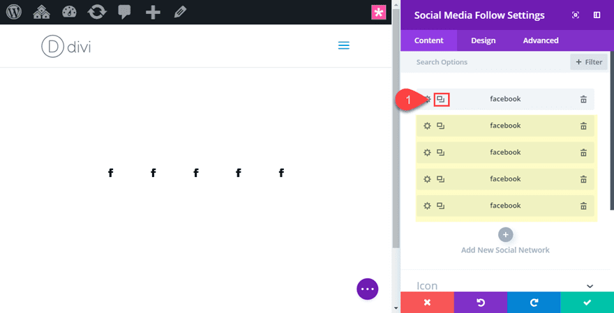
Now open each of the duplicated social network items and update the social network and background color to #000000.
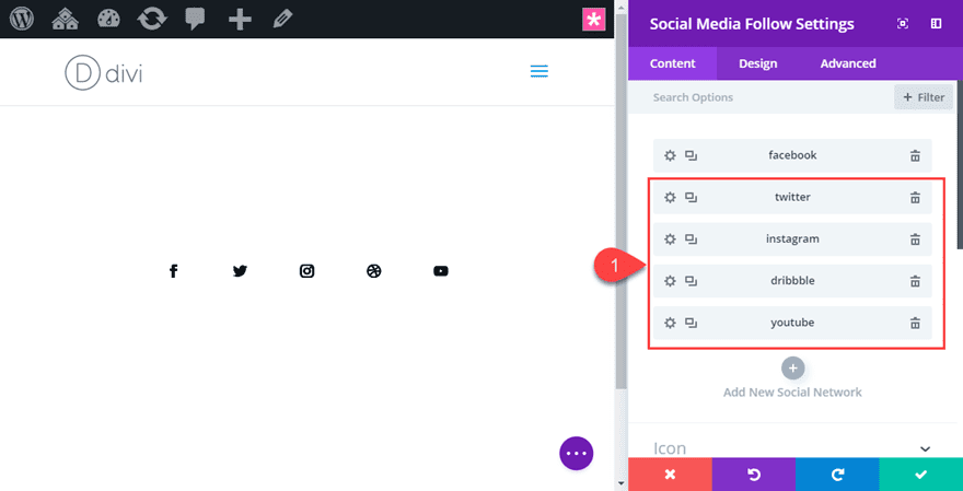
Save settings.
Now because we have the screen blend mode in effect, we can add a background color to the row column that contains our social media follow module. Whatever background color we use will determine the color of our social media icons and hover background color.
To do this, open the row settings and update the following:
Column 1 Background Color: #0c71c3
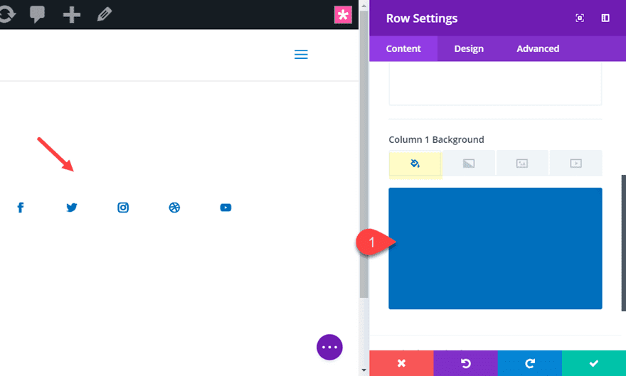
Notice how the icon colors have changed to this background color.
Now check out the result so far.
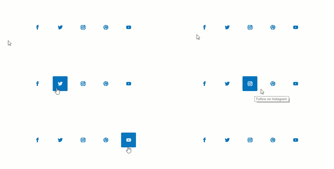
To make the icons/buttons larger, we can use a snippet of Custom CSS. To do this, we must first add a CSS ID to the social media follow module and then add some CSS to our page settings.
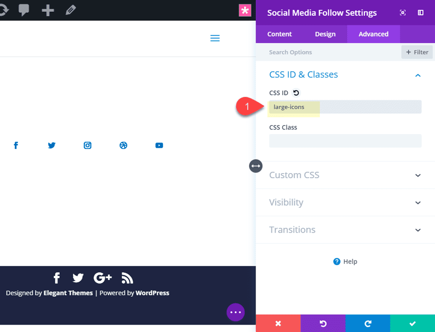
Open the social media follow module and add the following CSS ID under the advanced tab.
CSS ID: large-icons
Next, open up your page settings and add the following custom css.
@media (min-width: 980px){
#large-icons.et_pb_social_media_follow li a.icon::before {
  font-size: 50px;
 line-height: 100px;
  width: 100px;
  height: 100px;
}
}
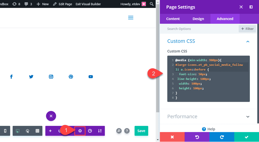
This code increases the size of the icons to 50px and the height and width of the buttons to 100px. The media query makes sure this style only gets applied to desktop.
Check out the final result.

Final Thoughts
I hope these social media follow button hover effects will give you some fresh new ideas on how to capture your visitors with some unique designs. Most of these examples are easy to create especially if you familiarize yourself with how hover effects work within Divi. Until next time, continue to master your Divi skills and create something beautiful for your next project.
I look forward to hearing from you in the comments.
Cheers!



Hi! you share such a useful information. Its very important to know to become an expert blogger.
Thank you, Jason, for a great tutorial, this looks fun to hover.
how about similar styles for social media shares as well, a simple animation like this with monarch will also do
I really impressed with divi’s rocking features. Thanks for sharing wonderful information.
Thats was great and detailed article. It really helps ! Thanks.
Awesome!
This is so attractive to the eye !
Divi plugin is effective and users have great advantages.
Groovy baby!
Thanks, Britt. Always good to hear from you.
wow nice info Man really appreciated.. love to see the new style and hovers
thank you for sharing!!!!!!!!
can i also use it on my website???? is this a copyright clam content ????
Study,
You definitely can use this for your website! Glad you liked it..
nice Blog Sir I read Your All blog thx sir for sharing this news
That’s good, but hover doesn’t work on phones
Normally, the hover effect will execute on touch with mobile phones. But, normally, I reserve hover effects for desktop and disable them on mobile.
Thanks…
so useful for me thanks
Great to hear, hadi.
Fun stuff – thanks Jason.
Very fun indeed 🙂 Thanks!
Nice wirk Jason. Like what you are doing in these hover tutorials.
Thanks, Irishetcher. I appreciate the support. Glad you like them.
I say we have nice looking effects here.
Thanks Richard!