
Subtle interactions and hover effects can be useful for creating an eye-catching CTA (Call to Action). The trick is to use effects that make your CTA more attractive and intuitive so users are more likely to take action. And since the end goal of most CTAs is clicking a link or button, it is important to optimize your CTA in a way that brings those clickable items to the forefront.
In this tutorial, I’m going to show you how to use Divi to optimize the visibility of CTAs using multiple hover effects. I’ll show you how to add section divider backgrounds on hover to stage your CTAs for better contrast and readability. And I’ll show you how to enlarge and move the CTA to the center of the page on hover so that it becomes the main focus. These hover effects will be useful for making any call to action stand out and, hopefully, improve the user experience.
Let’s get started.
Sneak Peek
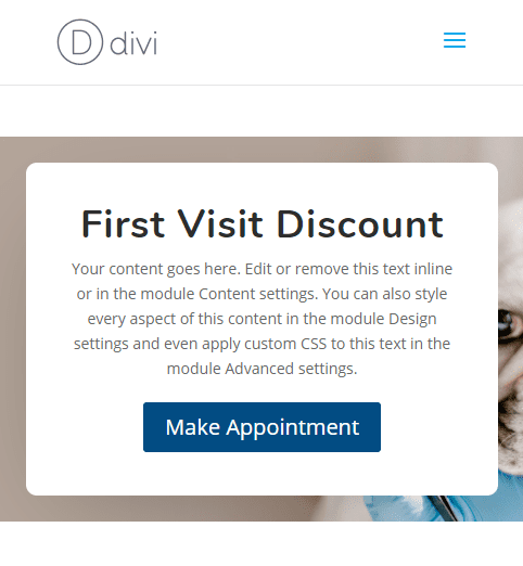
Here is a peek at the eye-catching CTA hover effects we will build in this tutorial.


Download the Eye-Catching CTA Hover Effects Layout for FREE
To lay your hands on the designs from this tutorial, you will first need to download it using the button below. To gain access to the download you will need to subscribe to our newsletter by using the form below. As a new subscriber, you will receive even more Divi goodness and a free Divi Layout pack every Monday! If you’re already on the list, simply enter your email address below and click download. You will not be “resubscribed” or receive extra emails.

Subscribe To Our Youtube Channel
To import the layout to your page, simply extract the zip file and drag the json file into the Divi Builder.
Let’s get to the tutorial shall we?
What You Need to Get Started
To get started, you will need the following:
- The Divi Theme installed and active
- A new page created to build from scratch on the front end (visual builder)
- A background image to be used in the design build. I’ll be using one from the Veterinarian Layout Pack for this tutorial.
After that, you will have a blank canvas to start designing in Divi.
Implementing the Eye-Catching CTA Hover Effects in Divi
For this design example, we will start with a call to action module that is left or right aligned. Then we will bring the module to the center of the page and scale (or enlarge) it when hovering over the row. To make the call to action stand out even more in the row hover state, we will stage it by adding section dividers that will close behind the module for better contrast.
Here’s how to do it.
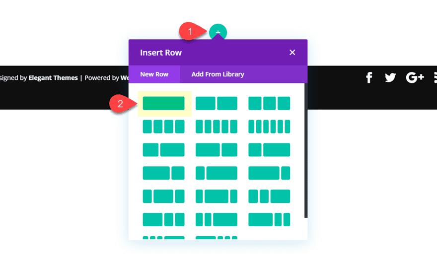
Creating the Section and Row
First, create a regular section with a one-column row.
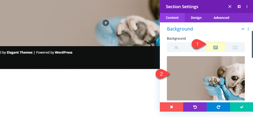
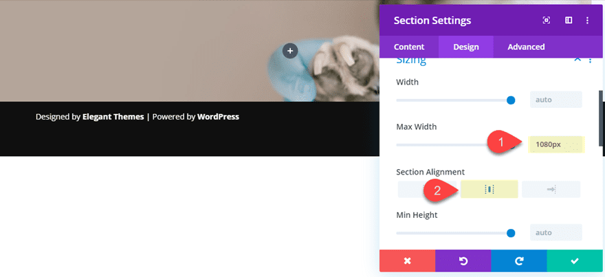
Before adding a module, open the section settings and update the following:
Add a background image with the focal point of the image to the right side so that that it remains visible when adding our module on the left.
- Max Width: 1080px
- Section Alignment: center
That takes care of the section for now. We will circle back to the section settings later to add the section divider hover effects.
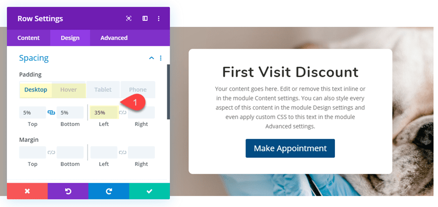
Next, open the row settings and update the following:
- width: 100%
- max width: 100%
- Padding: 5% top, 5% bottom, 35% right
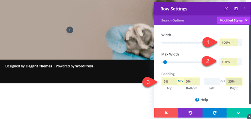
The right padding is key to this design because it pushes the content to the left. We will come back later to add our hover options to move the content of the row back to the center later.
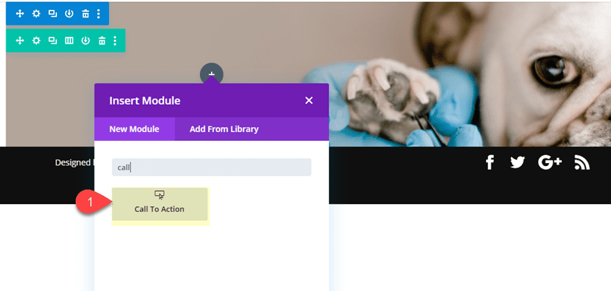
Adding the Call to Action Module
Now we are ready to build the Call to Action Module which will be the main focus of our eye-catching CTA.
Go ahead and add a call to action module to the one column row.
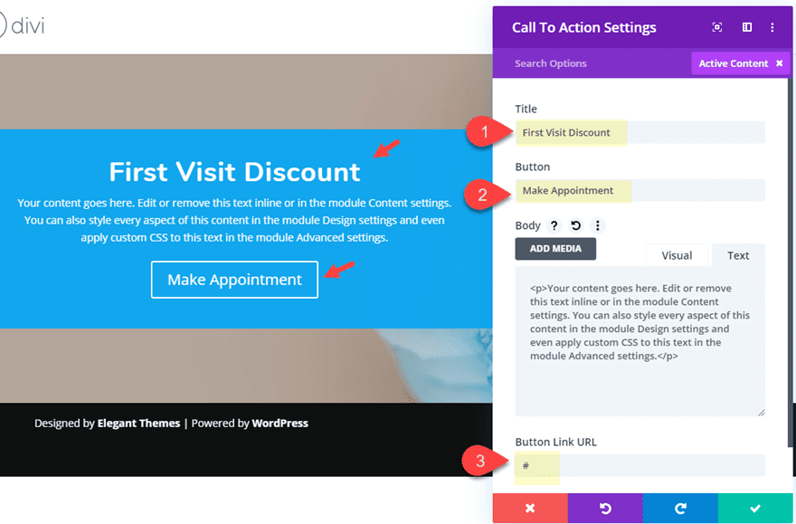
Then update the call to action module settings as follows:
Content
- Title: First Visit Discount
- Button: Make Appointment
- Button Link URL: #
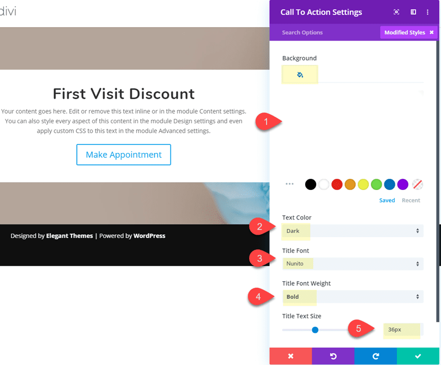
Design
- Background Color: #ffffff
- Text Color: Dark
- Title Font: Nunito
- Title Font Weight: Bold
- Title Text Size: 36px
- Button Text Color: #ffffff
- Button Background Color: #154c87
- Button Border Width: 0px
- Max Width: 500px
- Module Alignment: center
- Round Corners: 10px
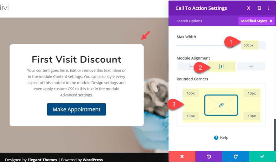
A key feature of this design is the 500px max width. This will make sure the module doesn’t change in width whenever we adjust the right padding of the row on hover later.
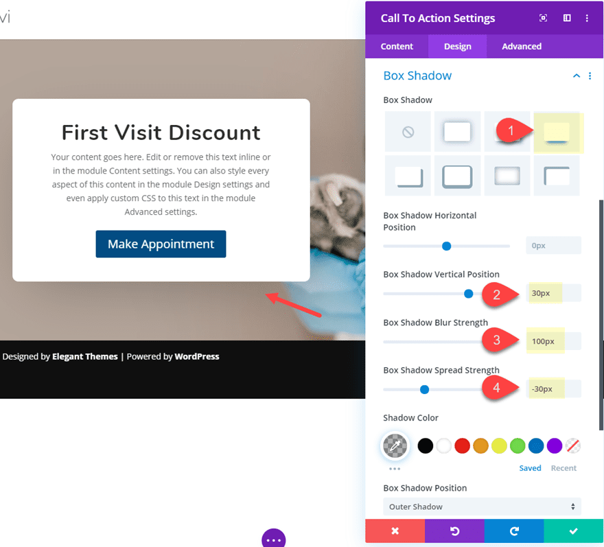
- Box Shadow: see screenshot
- Box Shadow Vertical Position: 30px
- Box Shadow Blur Strength: 100px
- Box Shadow Spread Strength: -30px
Scaling and Centering the Call to Action when Hovering Over the Row
Now we are ready to start adding our eye-catching CTA hover effects. At this point we want to accomplish two things when hovering over the row. First, we want to move the CTA to the center. And then we want to increase the scale of the module (make it larger) to make it even more visible.
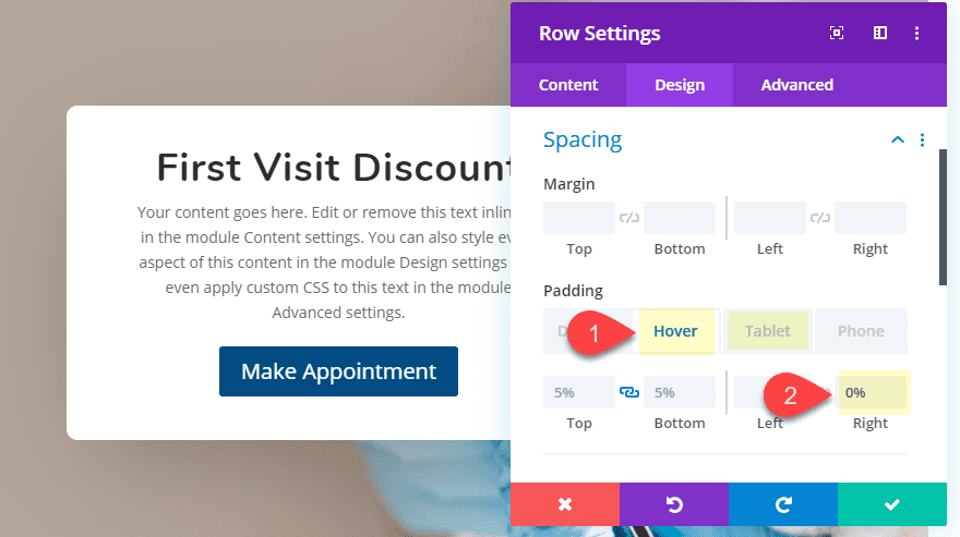
To do this, open the row settings and update the following:
- Padding (hover): 0% right
Then adjust the padding for mobile display:
- Padding (tablet): 0% right
- Padding (phone): 5% left, 5% right
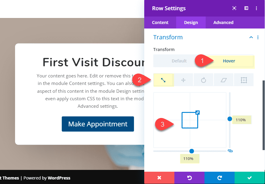
To enlarge the CTA, add the following transform property to the row on hover:
- Transform Scale (hover): 110%
Even though the transform scale property is being applied to the row, this also indirectly applies to all child elements inside the row, including the module. Therefore, the module will scale to 110% when hovering over the row.
Staging the CTA on Hover with Section Dividers
Finally, we are ready to add section dividers to stage the cta when hovering over the section/row. The key here is to make sure the section and row are the same height and width so that the user will simultaneously hover over the section and row without any gaps. So, we need to take out any section padding. Then we need to create a top and bottom section divider that increases in height when hovering over the section.
Here’s what to do.
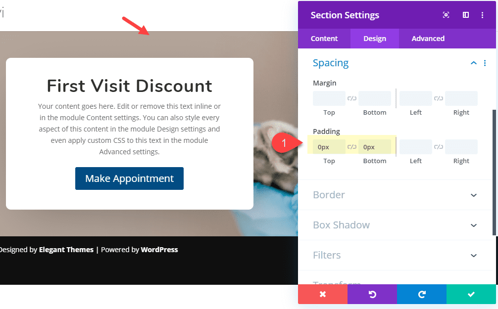
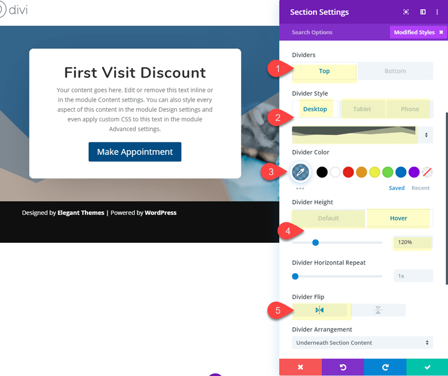
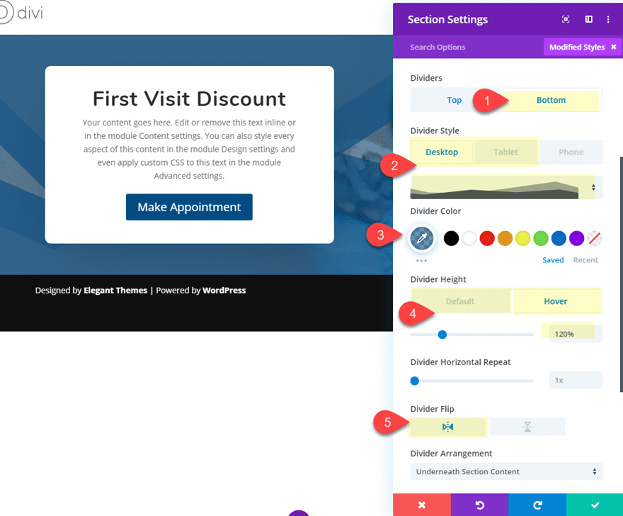
Open the section settings and update the following:
Padding: 0px top, 0px bottom
- Top Divider Style (desktop): see screenshot
- Top Divider Style (tablet and phone): none
- Top Divider Color: rgba(21,76,135,0.61)
- Top Divider Height (default): 0%
- Top Divider Height (hover): 120%
- Top Divider Flip: horizontal
- Bottom Divider Style (desktop): see screenshot
- Bottom Divider Style (tablet and phone): none
- Bottom Divider Color: rgba(21,76,135,0.61)
- Bottom Divider Height (default): 0%
- Bottom Divider Height (hover): 120%
- Bottom Divider Flip: horizontal
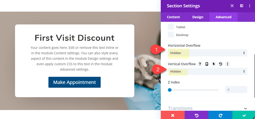
To make sure the dividers don’t show outside of the section, update the vertical and horizontal overflow option to hidden.
- Horizontal Overflow: Hidden
- Vertical Overflow: Hidden
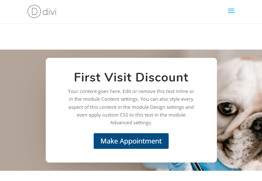
Now let’s check out the final result.
Final Result
And here is the design on tablet and phone.
Changing the Position of the CTA
If you want to change the initial position of the Call to Action Module before the hover state, you can easily update the row spacing.
From the Right Side
Let’s say you want to module to start on the right before hover. Simply update the row settings as follows:
- Padding: 35% Left
- Padding (hover): 0% Left
You will want to update the image to have a left focal point. After that, here is the result.
From the Bottom
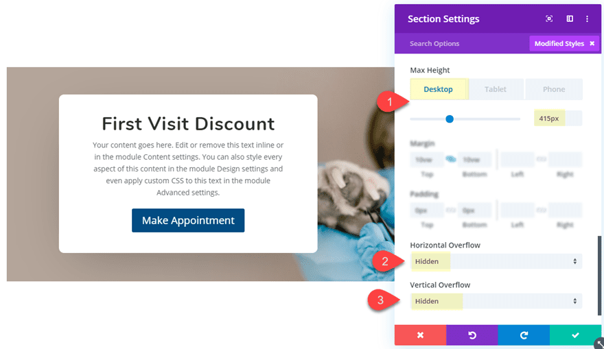
Or, if you want, you can have the CTA popup from the bottom of the row. To do this, you will need to add a fixed height to the section and then bring the module down with some top padding.
Open the section settings and give the section a max height and set the overflow to hidden.
- Max Height (desktop): 415px
- Horizontal Overflow: hidden
- Vertical Overflow: hidden
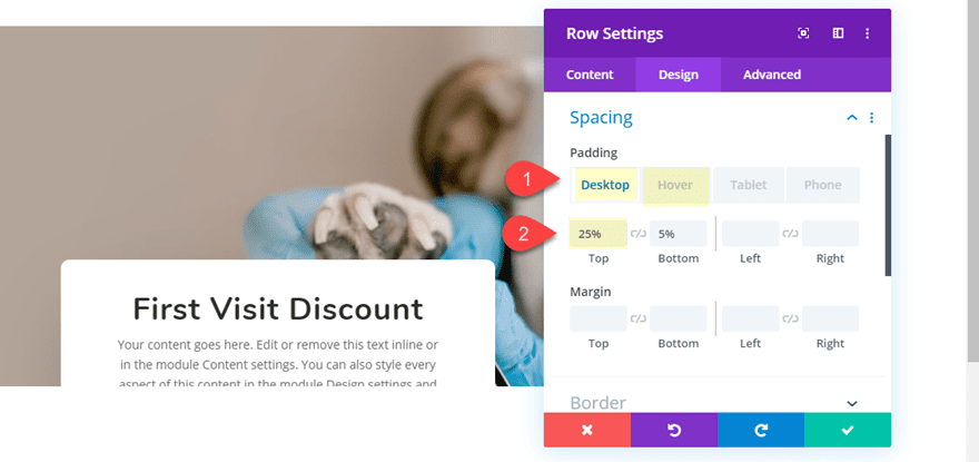
Then open the row settings and update the padding to push the module partially out of view below the section. Then take out the top padding on hover to bring it back up.
- Padding (desktop): 25% top, 5% bottom
- Padding (hover): 5% top
Here is the result…
Final Thoughts
Divi makes it fun and easy to add all kinds of hover effects to your web page designs. The best hover effects are those that are purposeful and actually improve the user experience. The few simple hover effects covered in this post should help create some eye-catching CTAs that look great, improve user experience, and hopefully lead to more conversions.
For more ideas, check out our post on 3 ways you can use hover options to emphasize CTAs in Divi and our post on creating slide-in CTAs.
I look forward to hearing from you in the comments.
Cheers!


Though I have read a lot of blogs, writing a blog on this topic is such a cogent idea. It is really helpful for the newbie who wants more traffic on their webpages. Awesome share!!!