
Every week, we provide you with new and free Divi layout packs which you can use for your next project. For one of the layout packs, we also share a use case that’ll help you take your website to the next level. This week, as part of our ongoing Divi design initiative, we’re going to show you how to creatively use Divi’s hover options to emphasize CTAs throughout your pages. We’re using Divi’s Laundry Service Layout Pack and we’ll handle three different examples of putting your call to action in the spotlight.
Let’s get to it!
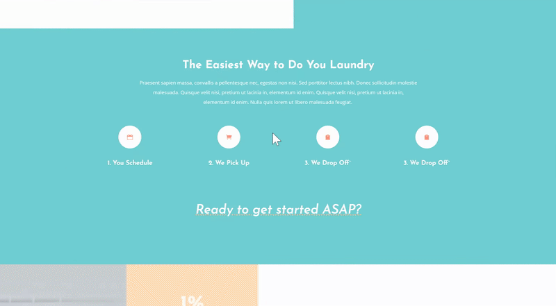
Preview
Before we dive into the tutorial, let’s take a quick look at all three examples we’ll create:
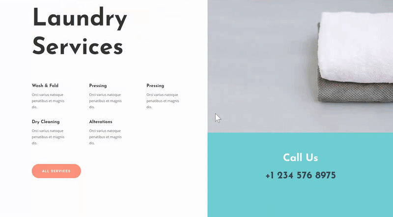
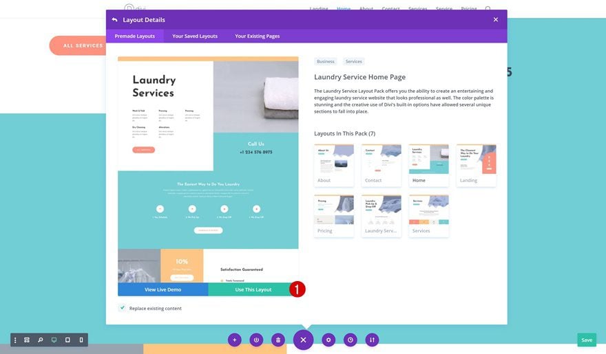
Add New Page Using Laundry Service Homepage Layout
First, start by adding a new page to your website and upload the Laundry Service Homepage. All three examples we’ll create will be based on this layout. Once you get the approach, you can apply these examples to any layout you’re working on.
Creating Example #1: Using Another Element’s Hover to Redirect Attention to CTA

Clone Text Module
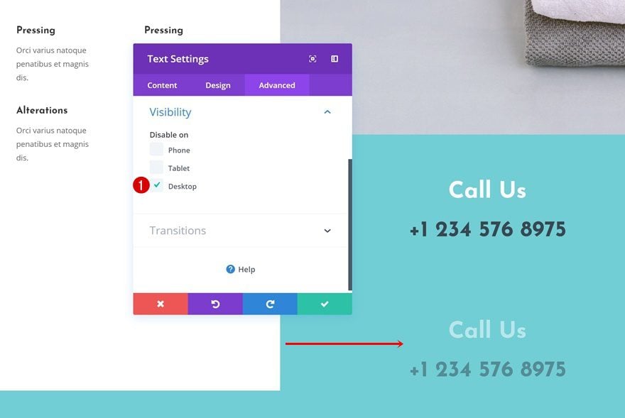
Let’s get started with the first example! We’re transforming an existing Text Module into an incentive on hover. This approach will only look good on desktop, that’s why we’re cloning the initial module to allow it to appear on smaller screen sizes without hover effects.
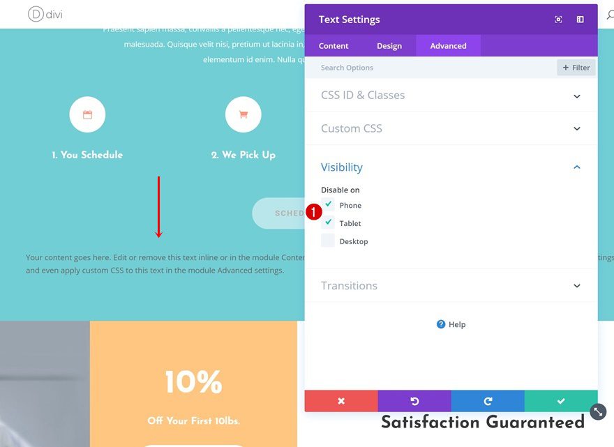
Visibility
Text Module #1
Continue by hiding the first module on tablet and phone.
Text Module #2
And hide the second module on desktop.
Add Hovers Effect to Desktop Text Module
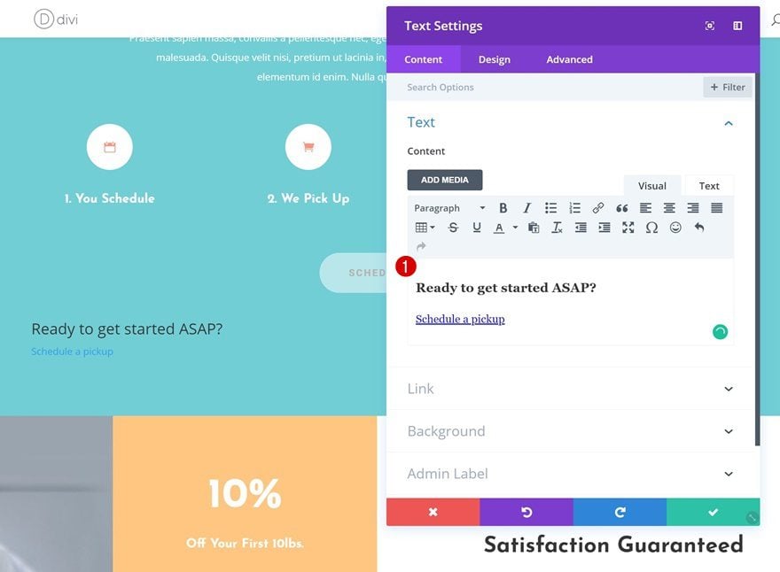
Add Heading 3 Content
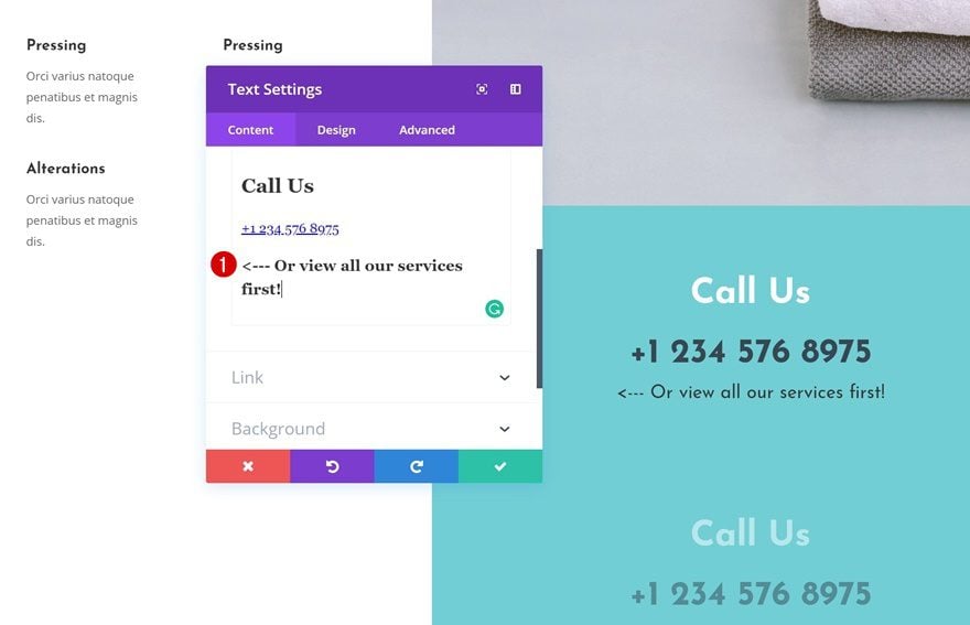
We’re only editing the first Text Module, which will be the one that appears on desktop. Open the module and add some heading 3 content to the content box.
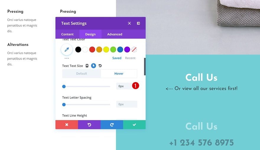
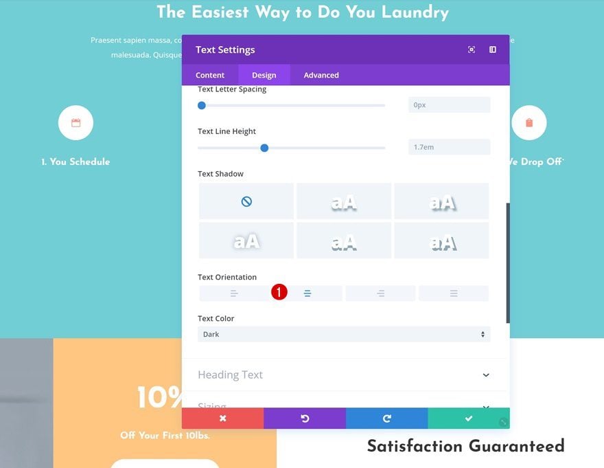
Hover Text Settings
Then, go to the text settings and ‘hide’ the paragraph text of your module by adding 0px to the text size on hover.
- Text Size: 0px
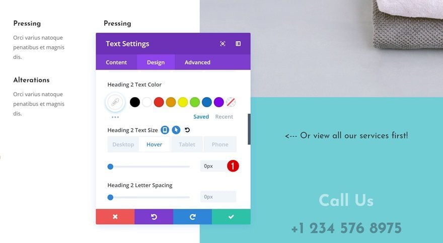
Hover Heading 2 Text Settings
Do the same for the heading 2 text settings on hover.
- Heading 2 Text Size: 0px
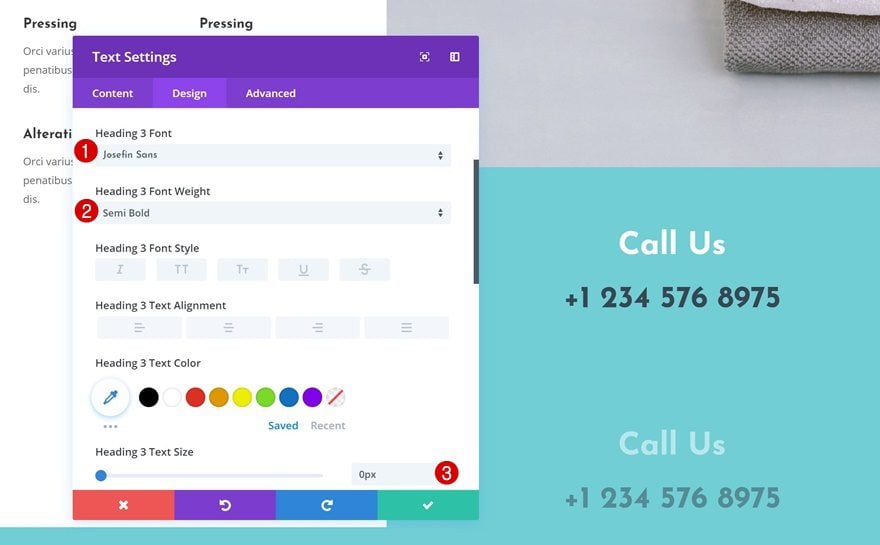
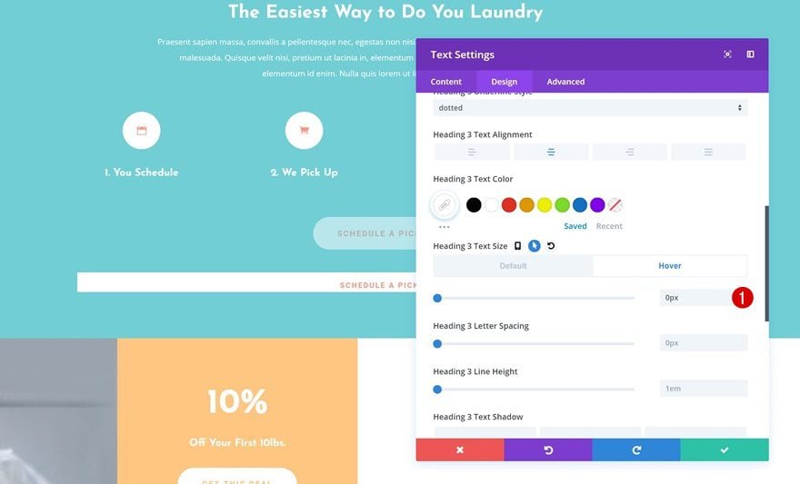
Default Heading 3 Text Settings
Then, go to the heading 3 text settings and make some changes.
- Heading 3 Font: Josefin Sans
- Heading 3 Font Weight: Semi Bold
- Heading 3 Text Size: 0px
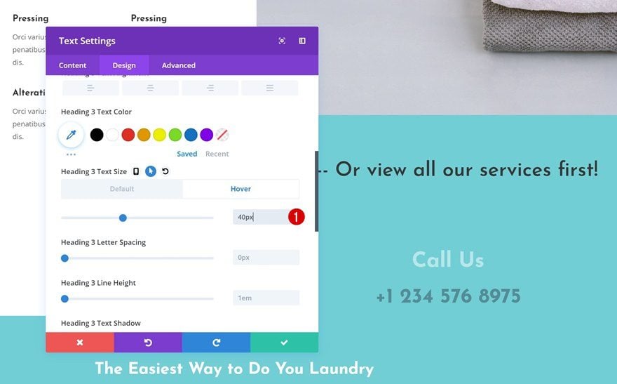
Hover Heading 3 Text Settings
Modify the text size on hover.
- Heading 3 Text Size: 40px
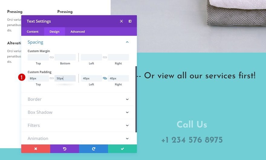
Default Spacing Settings
Next, go to the spacing settings and make sure the following custom padding values apply:
- Top Padding: 80px
- Bottom Padding: 50px
- Left Padding: 40px
- Right Padding: 40px
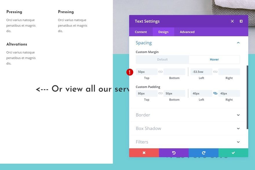
Hover Spacing Settings
Add some custom margin on hover as well.
- Top Margin: 50px
- Left Margin: -53.5vw
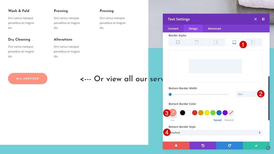
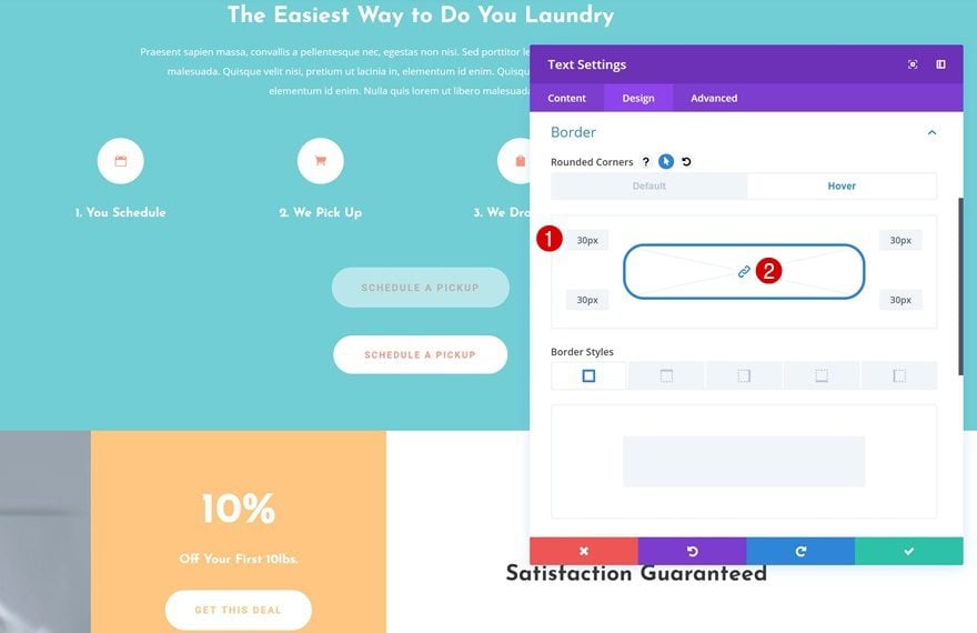
Default Border Settings
We’re also adding a bottom border without a border.
- Bottom Border Width: 0px
- Bottom Border Color: #ff947f
- Bottom Border Style: Dashed
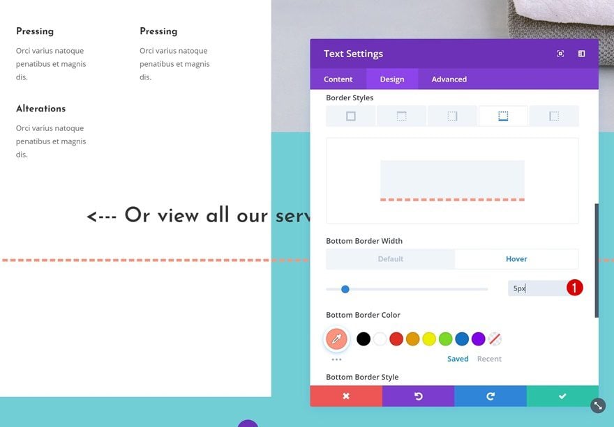
Hover Border Settings
Change the border width on hover.
- Bottom Border Width: 5px
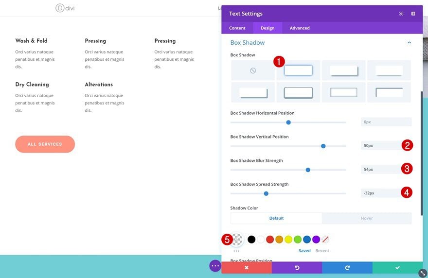
Default Box Shadow Settings
Then, add a box shadow.
- Box Shadow Vertical Position: 50px
- Box Shadow Blur Strength: 54px
- Box Shadow Spread Strength: -32px
- Shadow Color: rgba(255,255,255,0)
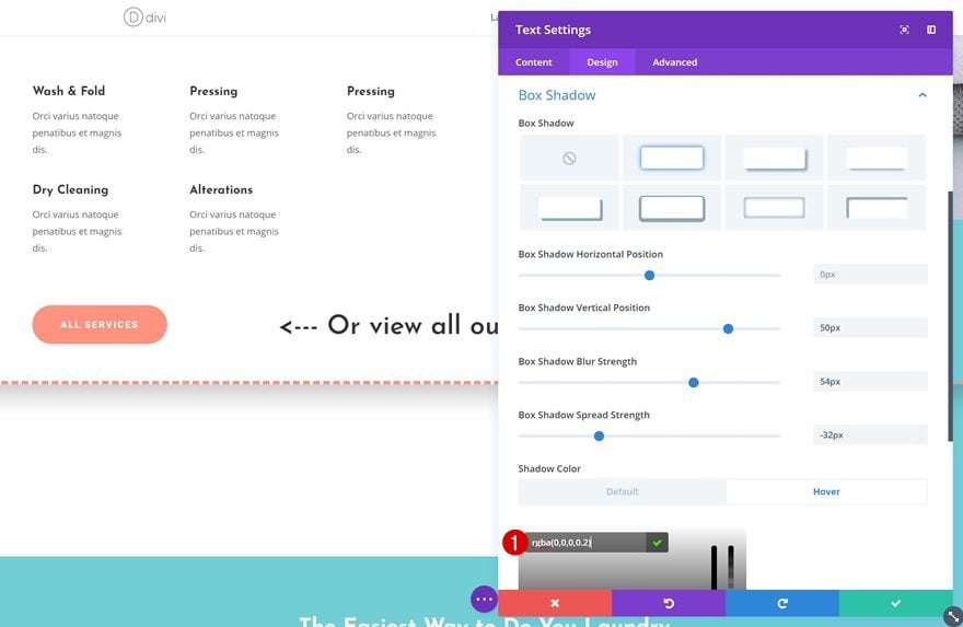
Hover Box Shadow Settings
And change the box shadow color on hover.
- Shadow Color: rgba(0,0,0,0.2)
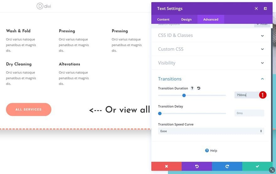
Transitions
To create a smooth transition, increase the transition duration in the transitions settings.
- Transition Duration: 750ms
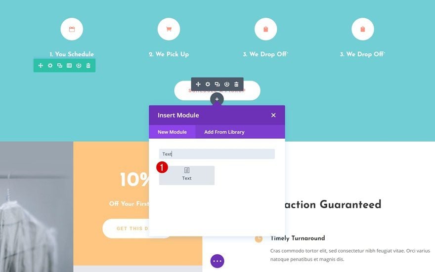
Add New Text Module
Let’s move on to the next example! We’re transforming a Text Module into a Button Module on hover. To do that, start by adding a Text Module to the following spot on your page:
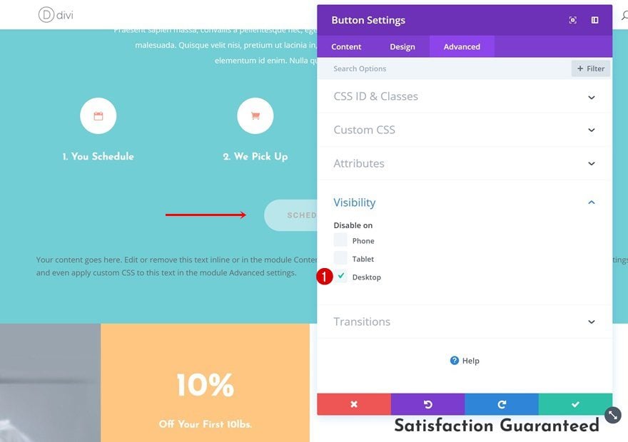
Visibility
Button Module
We’re keeping the Button Module the way it is on smaller screen sizes so go ahead and disable it on desktop only.
Text Module
Do the same thing for the Text Module you’ve just added but instead, hide it on tablet and phone.
Add Hover Effects to Desktop Text Module
Add Content
Now, open the Text Module and add some H3 copy and link copy.
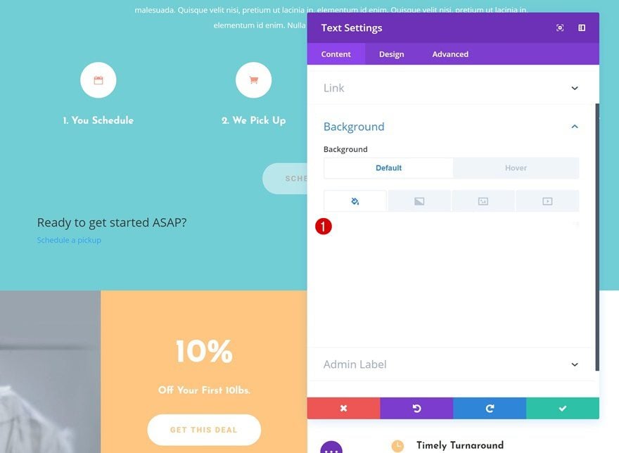
Default Background Color
Continue by adding a completely transparent background color to the module.
- Background Color: rgba(255,255,255,0)
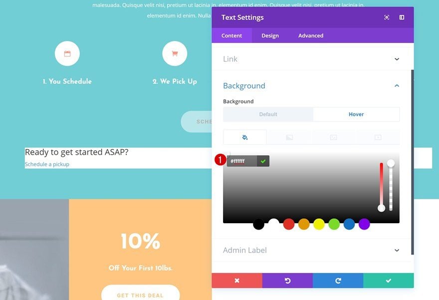
Hover Background Color
And change this background color on hover.
- Background Color: #ffffff
Default Text Settings
Then, go to the text settings and change the text orientation of your module.
- Text Orientation: Center
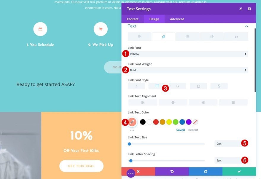
Default Link Text Settings
Make some changes to the appearance of the link text next.
- Link Font: Roboto
- Link Font Weight: Bold
- Link Font Style: Uppercase
- Link Text Color: #ff947f
- Link Text Size: 0px
- Link Letter Spacing: 2px
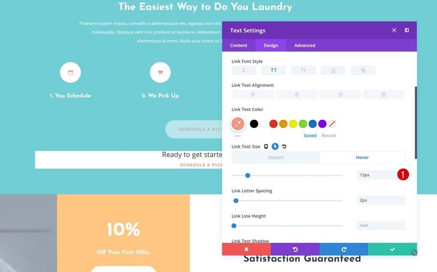
Hover Link Text Settings
And add another value to the link text size on hover.
- Link Text Size: 13px
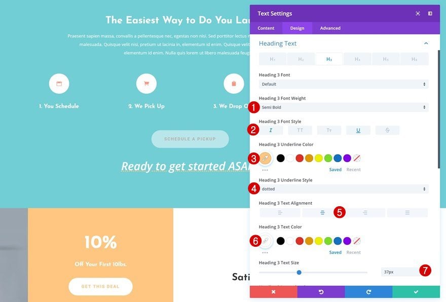
Default Heading 3 Text Settings
We’ll need to change the H3 text settings as well.
- Heading 3 Font Weight: Semi Bold
- Heading 3 Font Style: Italic & Underline
- Heading 3 Underline Color: #ffc882
- Heading 3 Underline Style: Dotted
- Heading 3 Text Alignment: Center
- Heading 3 Text Color: #ffffff
- Heading 3 Text Size: 37px
Hover Heading 3 Text Settings
And we’re changing the H3 text size on hover to hide it once you hover the module.
- Heading 3 Text Size: 0px
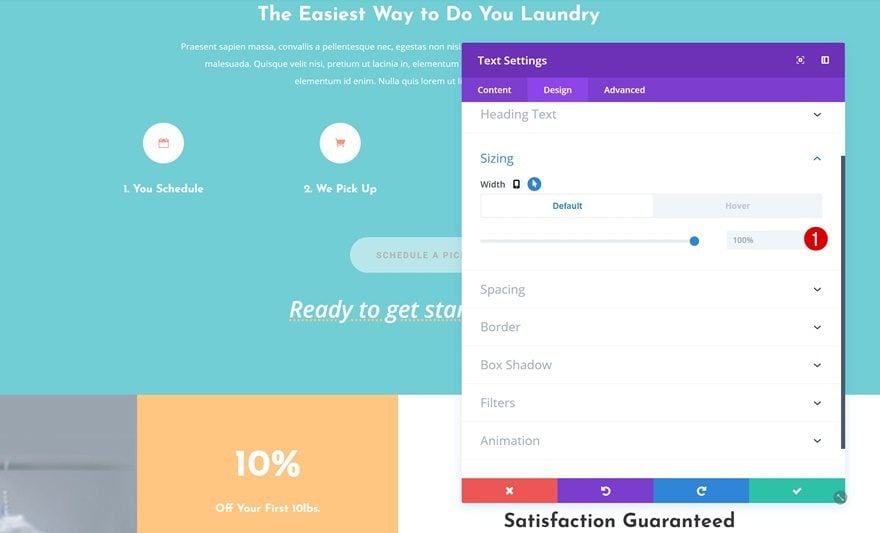
Default Sizing
Next, change the width within the Sizing settings. Make sure that by default, the width remains ‘100%’.
- Width: 100%
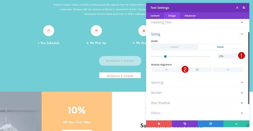
Hover Sizing
To create the button effect, we’ll reduce the width on hover.
- Width: 23%
- Module Alignment: Center
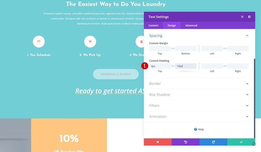
Spacing
We’ll also need some extra padding to create a clean-looking button.
- Top Padding: 5px
- Bottom Padding: 15px
Hover Border
And we’ll add ’30px’ of rounded corners to each one of the corners on hover.
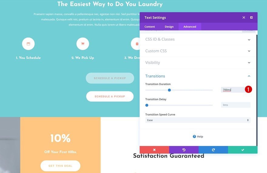
Transitions
Lastly, we’ll make sure we have a smooth transition by using the following transition duration:
- Transition Duration: 700ms
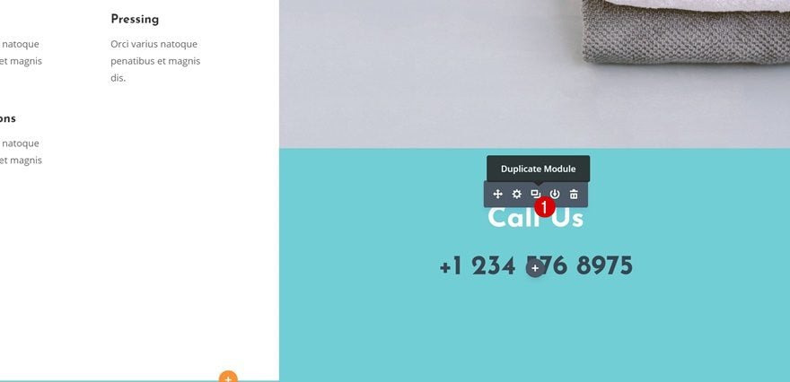
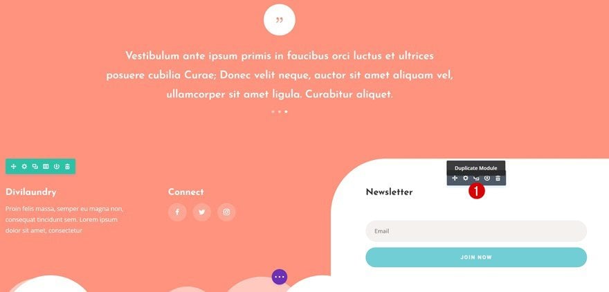
Creating Example #3: Enlarging Email Optin on Hover
Clone Email Optin Module
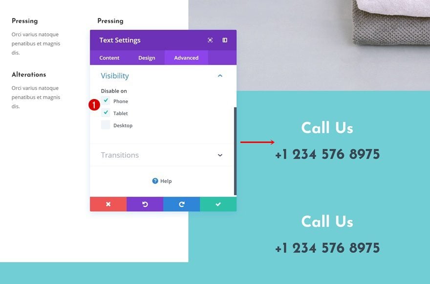
On to the next and last example! When someone hovers the Email Optin Module on desktop, the module will increase in size and make it easier for visitors to join your newsletter. Again, we’re only making this hover effect appear on desktop. That’s why we’re starting off by cloning the module.
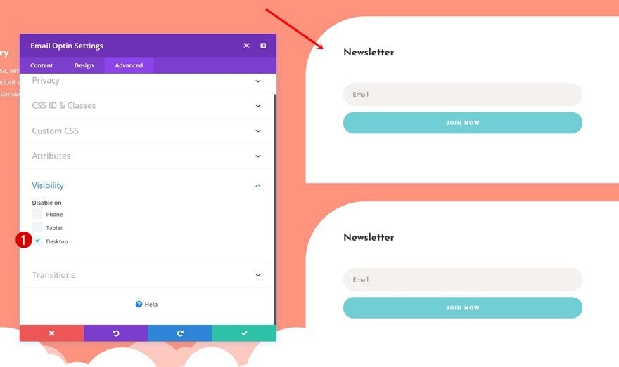
Visibility
Email Optin Module #1
Open the visibility settings of the first Email Optin Module and hide it on desktop.
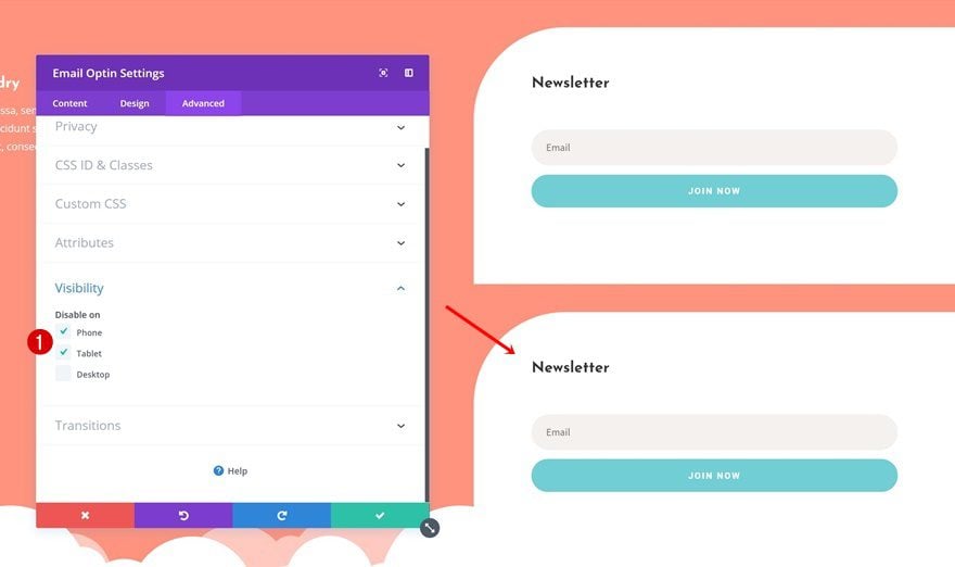
Email Optin Module #2
Do the same for the second module, but instead, hide it on smaller screen sizes. This is the module we’ll be working with.
Add Hover Effects to Desktop Email Optin Module
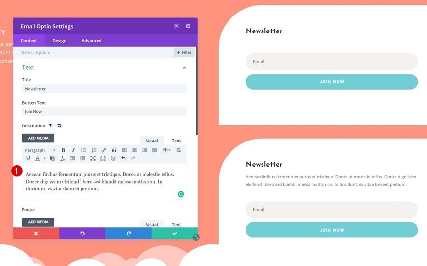
Add Content
Add some extra content to the content box of the second Email Optin Module.
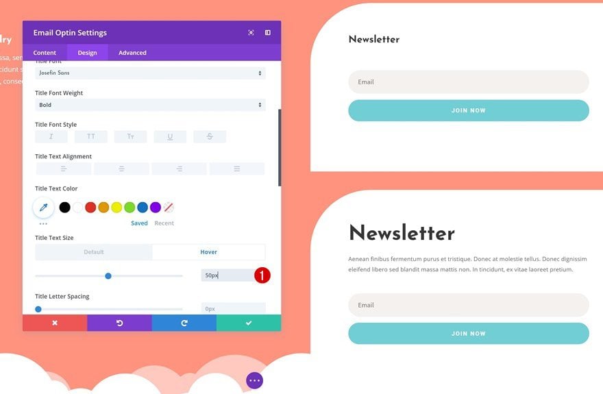
Hover Title Text Settings
Increase the text size of the title text on hover.
- Title Text Size: 50px
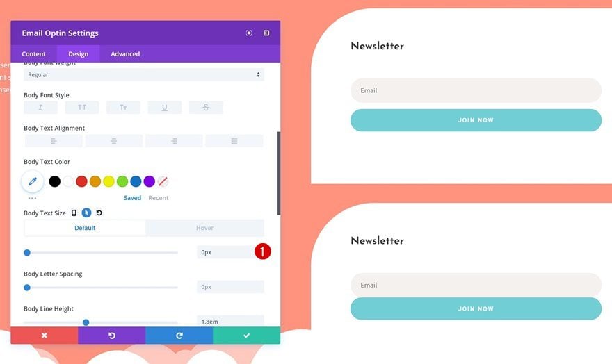
Default Body Text Settings
Next, change the body text size.
- Body Text Size: 0px
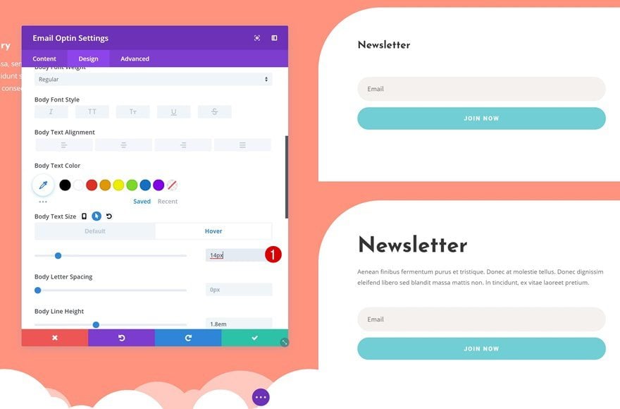
Hover Body Text Settings
And add a different text size on hover.
- Body Text Size: 14px
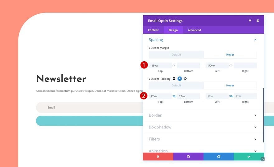
Hover Spacing Settings
Last but not least, we’re going to increase the size of the Email Optin Module by adding different custom margin and padding values on hover.
- Top Margin: -25vw
- Left Margin: -50vw
- Top Padding: 17vw
- Bottom Padding: 17vw
- Left Padding: 12%
- Right Padding: 12%
Preview
Now that we’ve gone through all the steps, let’s take a final look at the end result.
Final Thoughts
In this use case post, we’ve shown you how to creatively put CTAs in the spotlight using Divi’s hover options and the Laundry Service Layout Pack. We’ve handled three different examples that will hopefully stimulate your imagination and help you get your website to the next level. If you have any questions or suggestions, make sure you leave a comment in the comment section below!
Featured Image by Snipergraphics / shutterstock.com


Looking forward to using this great piece of information. Thanks Laura. It’s a very creative idea and makes a lot of difference on the outlook or layout
Thanks for sharing this really impressive hover effect. This is going to be very helpful going forward. It was quite easy to understand and follow the instructions. Very creative!
Thank you very much, it’s really amazing!
Shane,
Fine if you didnt have time to test this yourself yet. Me neither.
Funny you do have the time to comment but not to read this tutorial, otherwise you would’ve known.
Hi Laura, I actually did read the article but I guess I did not come to the definitive conclusion that you came to.
“This approach will only look good on desktop,”
and
“we’re only making this hover effect appear on desktop.”
To me “only look good” is not the same as “will only work on” but perhaps there was another more definitive comment I missed.
So I just thought I would ask.
I’ve noticed several blog post similar to this one showing examples of using the hover feature to display content. Will these examples shown work on mobile devices? My apologies as I have not had time to sit down and test for myself.
Thanks
Awesome!
Very creatrive 🙂
So this is a really cool hover effect. Why is something like this not used in a weekly layout? It will make all of the layouts even more cool. I know for sure that everyone would love to have something like this in a premade layout.
Very good, I loved this. Thank you. 🙂
please make a video… so long instruction… thanks
Donjete you are very talented. Thanks for sharing your ideas.
Me too