
Creating pop out service descriptions on hover can be an effective way to inform and engage users with additional information. Much like a tooltip, these pop out descriptions will reveal more info about your service on hover. But with Divi, you have the full suite of design tools available in the Divi builder to create stunning pop out designs without any additional custom CSS.
In this tutorial, we will show you how easy it is to build pop out service descriptions on your Divi website. The trick is to position your modules in such a way that they will slide behind each other and pop out whenever you adjust the width of the row on hover.
Let’s get started!
Sneak Peek


Download the Layout for FREE
To lay your hands on the designs from this tutorial, you will first need to download it using the button below. To gain access to the download you will need to subscribe to our newsletter by using the form below. As a new subscriber, you will receive even more Divi goodness and a free Divi Layout pack every Monday! If you’re already on the list, simply enter your email address below and click download. You will not be “resubscribed” or receive extra emails.

Subscribe To Our Youtube Channel
To import the layout to your page, simply extract the zip file and drag the json file into the Divi Builder.
Let’s get to the tutorial shall we?
What You Need to Get Started
To get started, you will need to have the following:
- The Divi Theme installed and active
- A new page created to build from scratch on the front end (visual builder)
- Images to be used for mock content. We’ll be using a couple from out Investment Company layout pack for this tutorial.
After that, you will have a blank canvas to start designing in Divi.
Creating the pop out Service Descriptions on Hover with Divi
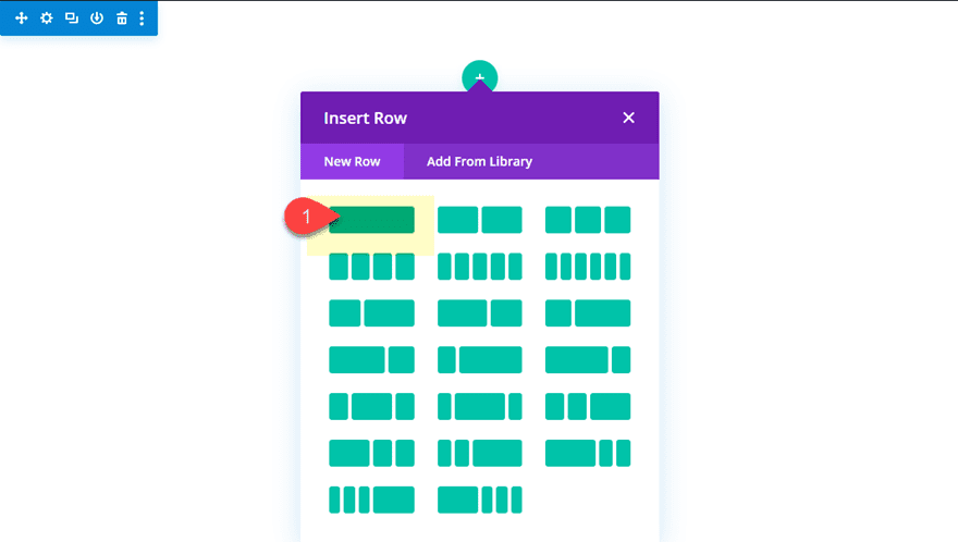
Create the section and row
First, create a new regular section with a one-column row.
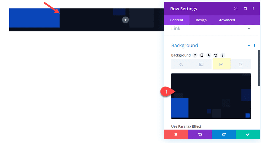
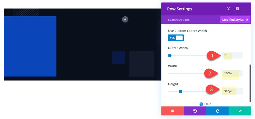
Before you add any modules, update the row settings as follows:
Add a dark background image or dark background color. I’m using an abstract background image from the Investment Company Layout Pack. But if you don’t want to use that one, you can just add a background color of #161c29.
- Gutter Width: 1
- Width: 100%
- Height: 320px (desktop), auto (tablet and phone)\
- Padding: 0px top, 0px bottom
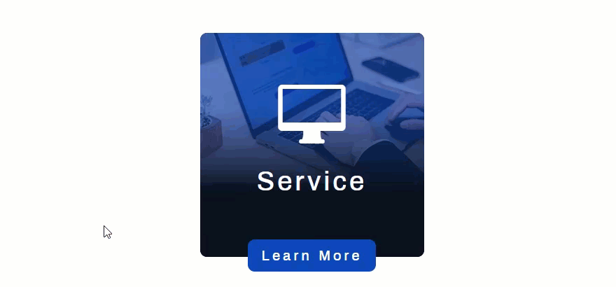
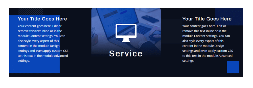
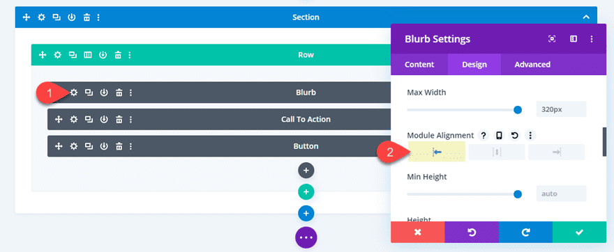
Add a Blurb Module
Next add a blurb module to your row.
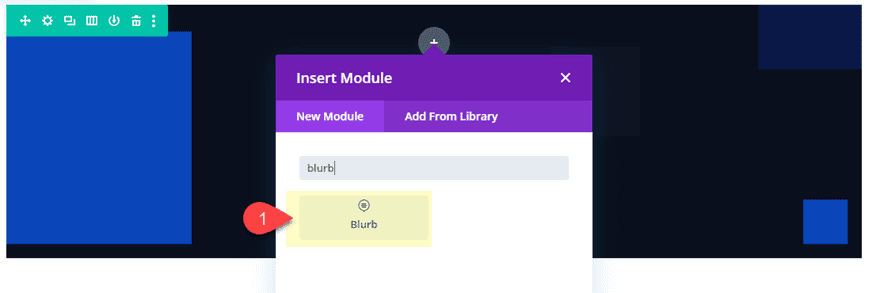
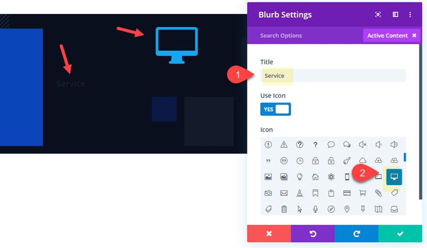
And update the blurb module settings as follows:
- Title: Service
- Icon: see screenshot
Delete the default body content as well.
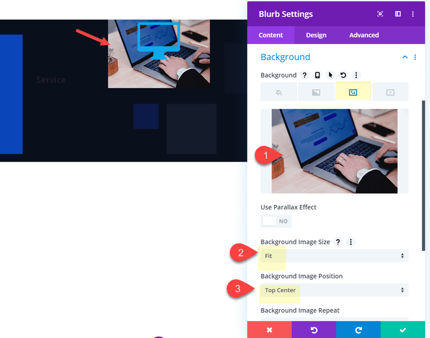
- Background Image: add an image that is about 320px by 215px
- Background Image Size: Fit
- Background Image Position: Top Center
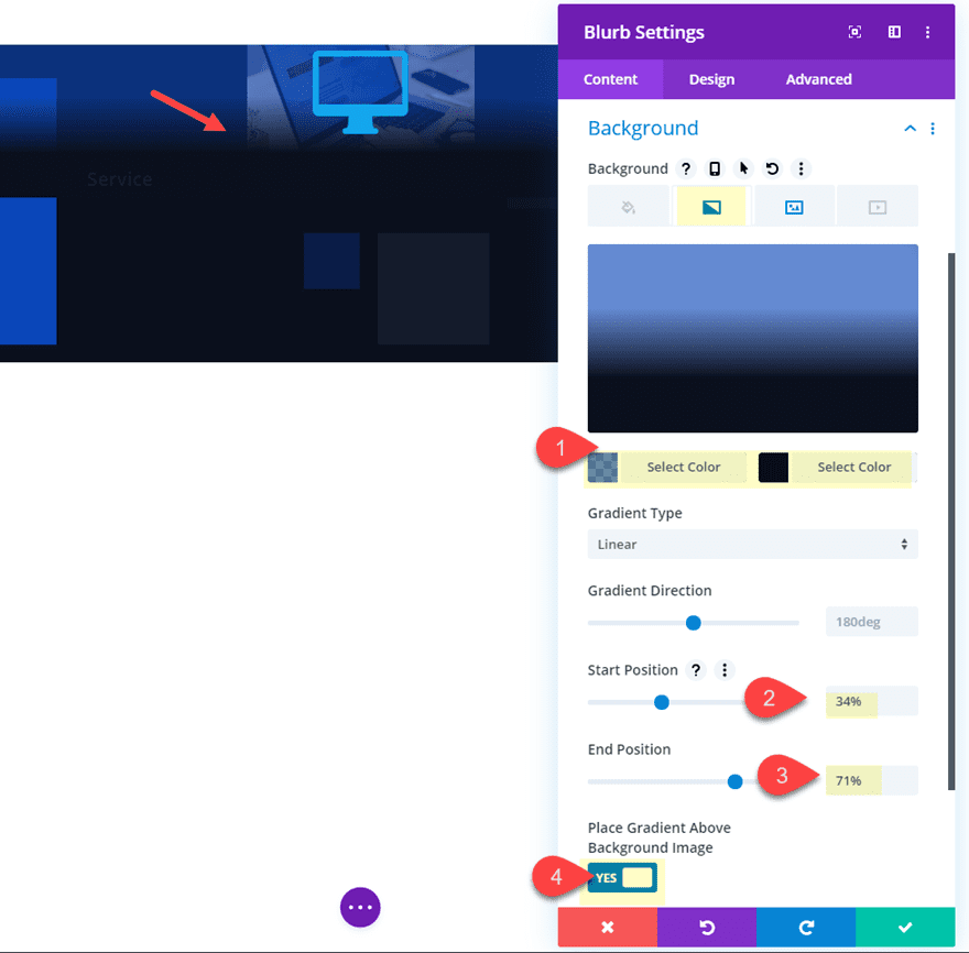
- Background Gradient Left Color: rgba(31,72,192,0.61)
- Background Gradient Right color: #161c29
- Start Position: 34%
- End Position: 71%
- Place Gradient Above Background Image: YES
- Icon Color: #ffffff
- Text Alignment: center
- Title Font: Archivo
- Title Text Color: #ffffff
- Title Text Size: 38px
- title Letter Spacing: 4px
- Max Width: 320px
- Module Alignment: center
- Height: 320px
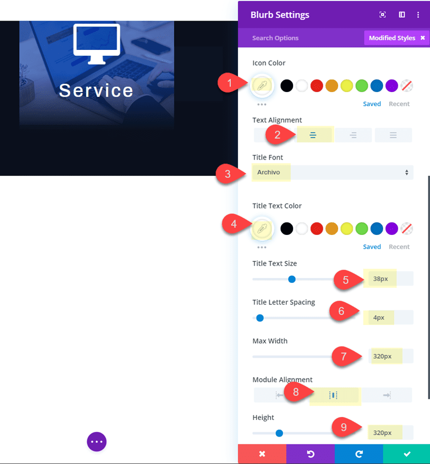
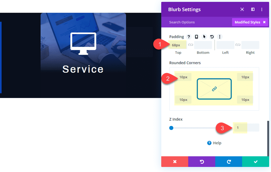
- Padding: 68px top
- Rounded Corners: 10px
- Z Index: 1
Adding the z index 1 value is crucial to making sure the blurb module stays above the other modules that will eventually be stacked behind it.
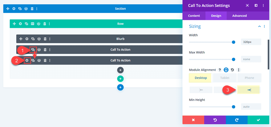
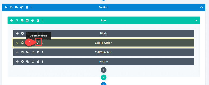
Add a Call to Action Module
Next we need to add a call to action module that will be positioned to the left of the blurb module.
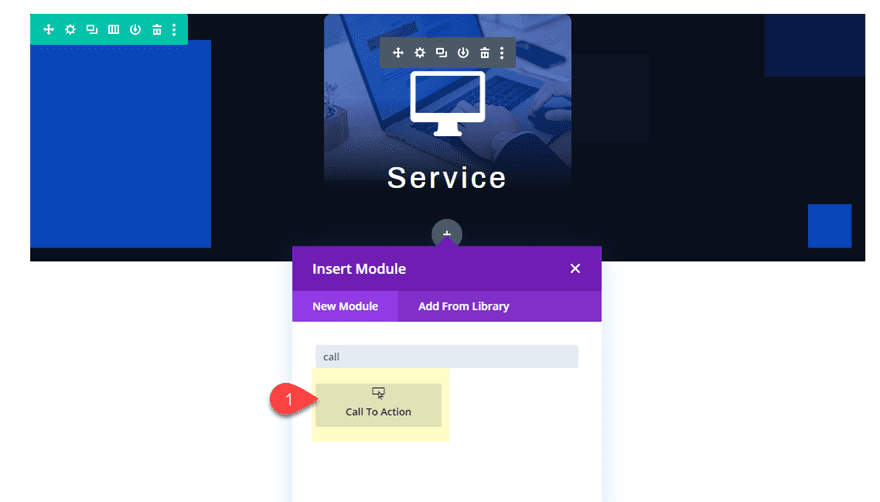
This will be our first of two content areas that will eventually pop out on hover.
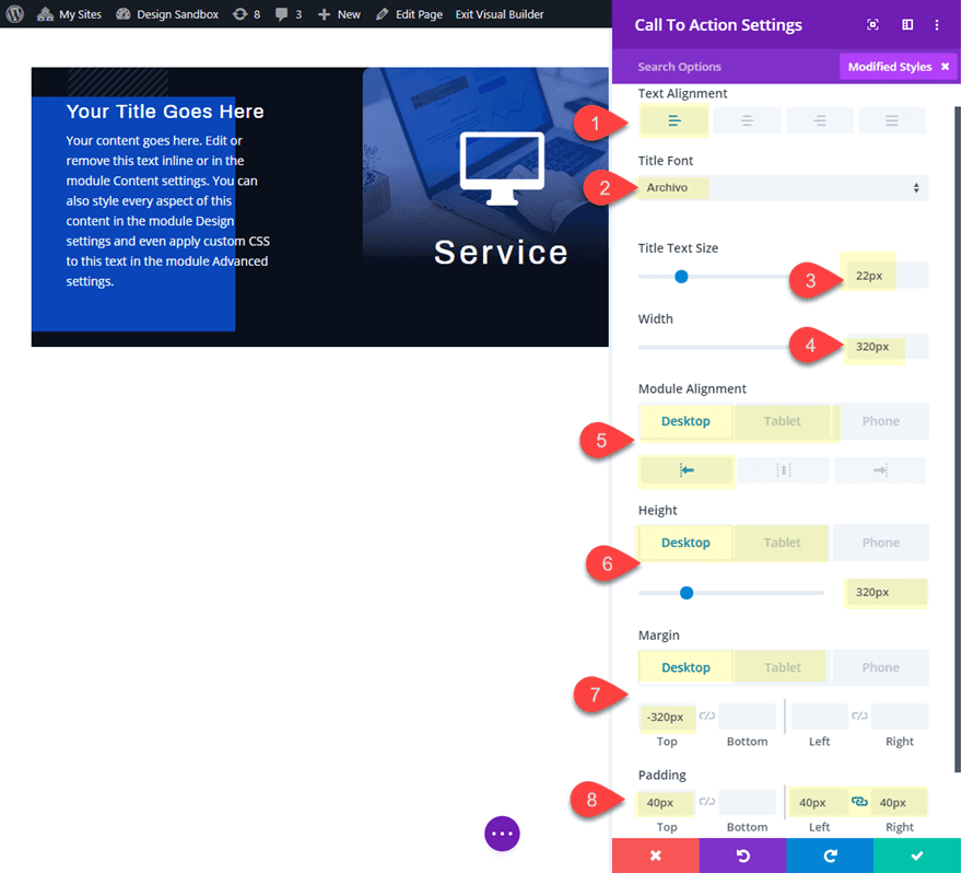
Now we need to take out the default background color and update the design settings as follows:
- Text Alignment: Left
- Title Font: Archivo
- Title text Size: 22px
- Width: 320px
- Module Alignment: Left (desktop), center (tablet and phone)
- Height: 320px (desktop), auto (tablet and phone)
- Margin: -320px (desktop), 0px (tablet and phone)
- Padding: 40px top, 40px left, 40px right
Duplicate the Call to Action Module and Align it to the right
To create the second block of content that will appear on the right of the blurb, we can deploy the wireframe view mode and duplicate the call to action module. Then open the settings of the duplicate and update the module alignment to the right.
Here is what the design should look like so far.
The final element we need to add to our design is the button. You can add a button within either of the call to action modules if you like. But for this design I thought it would be better to add a button that remains visible at the bottom of our row.
To create the button, deploy the wireframe view module and add a button module directly under the second call to action module so that it is the last module in the row/column.
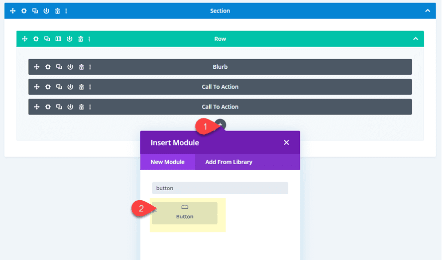
Open up the button module settings and then toggle the desktop view mode so that you edit the button visually.
Add the button text “Learn More”.
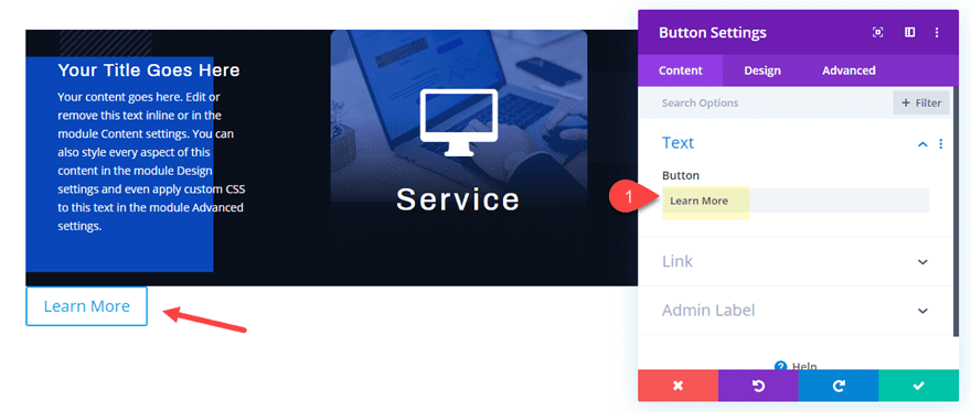
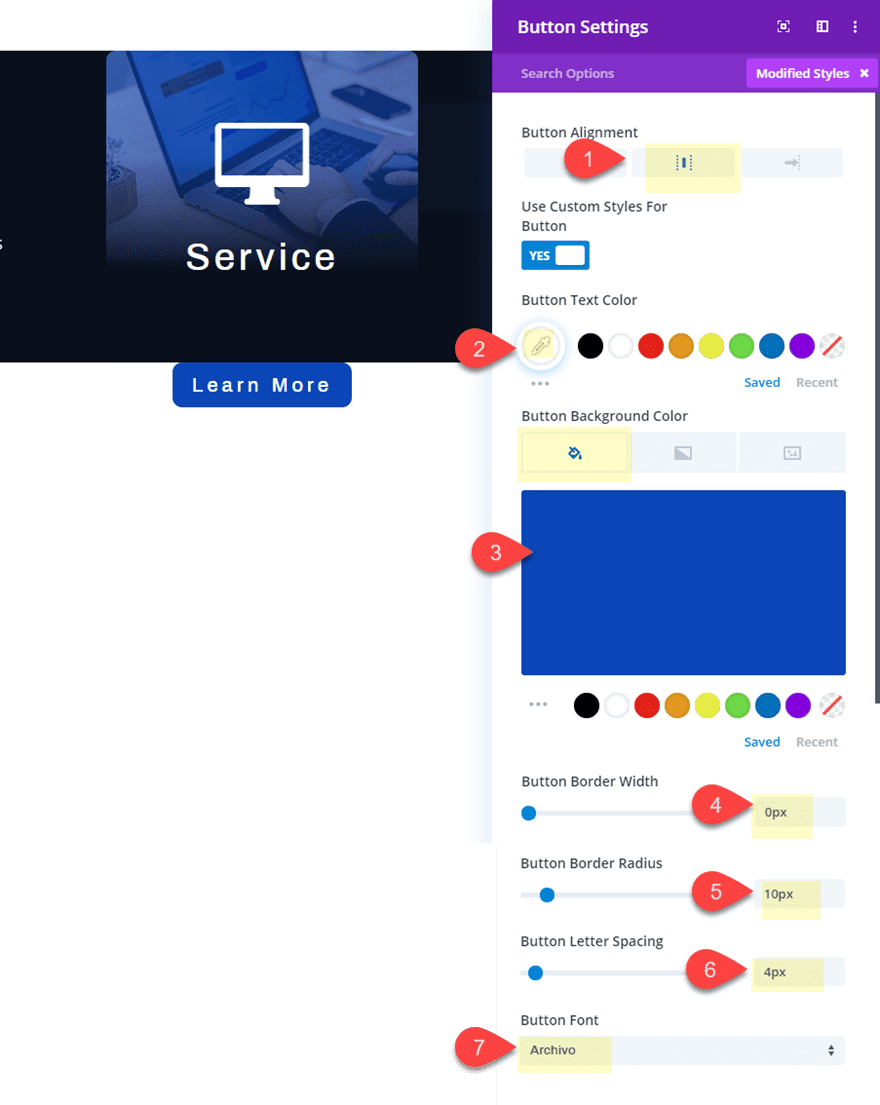
Then update the button style as follows:
- Button Alignment: center
- Button Text Color: #ffffff
- Button Background Color: #1f48c0
- Button Border Width: 0px
- Button Border Radius: 10px
- Button Letter Spacing: 4px
- Button Font: Archivo
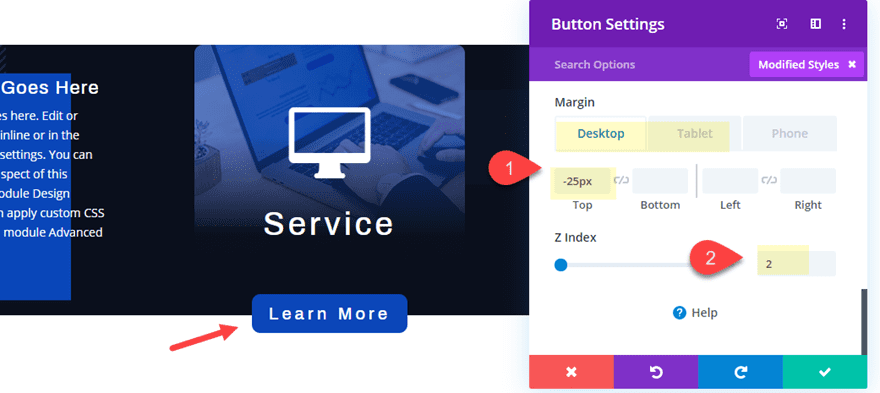
Now all we need to do is position our button.
- Margin (desktop): -25px top
- Margin (tablet and phone): 25px top, 50px bottom
- Z Index: 2
The z index value of 2 will make sure the button stays above the blurb module (which has a z index of 1).
Creating the pop out hover effect
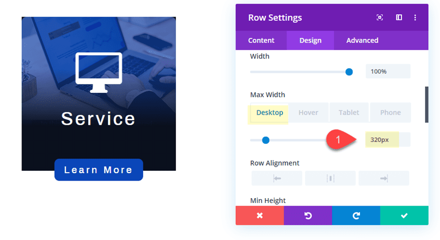
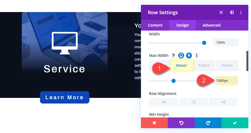
The main hover effect we need to accomplish the pop out service descriptions involves changing the width of the row on hover. To do this we will need to give our row a narrow width by default. This will cause the modules to stack behind each other and remain hidden behind the blurb module. Then we will expand the width of the row on hover in order to expose the two hidden call to action modules.
Open the row settings and update the width as follows:
- Max Width (desktop): 320px
- Max Width (hover): 1080px
- Max Width (tablet and phone) 1080px
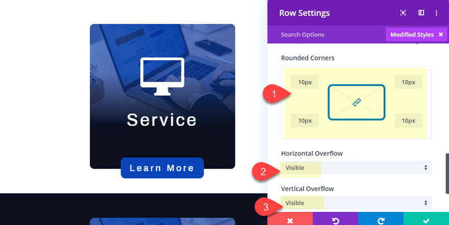
Then for a final touch, add a border radius to the row and update the visibility overflow option to visible so that the button doesn’t get hidden.
- Rounded Corners: 10px
- Horizontal Overflow: visible
- Vertical Overflow: visible
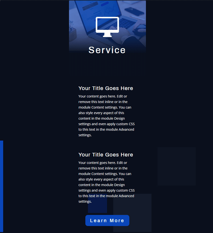
Final Result
Check out the pop out service descriptions so far.
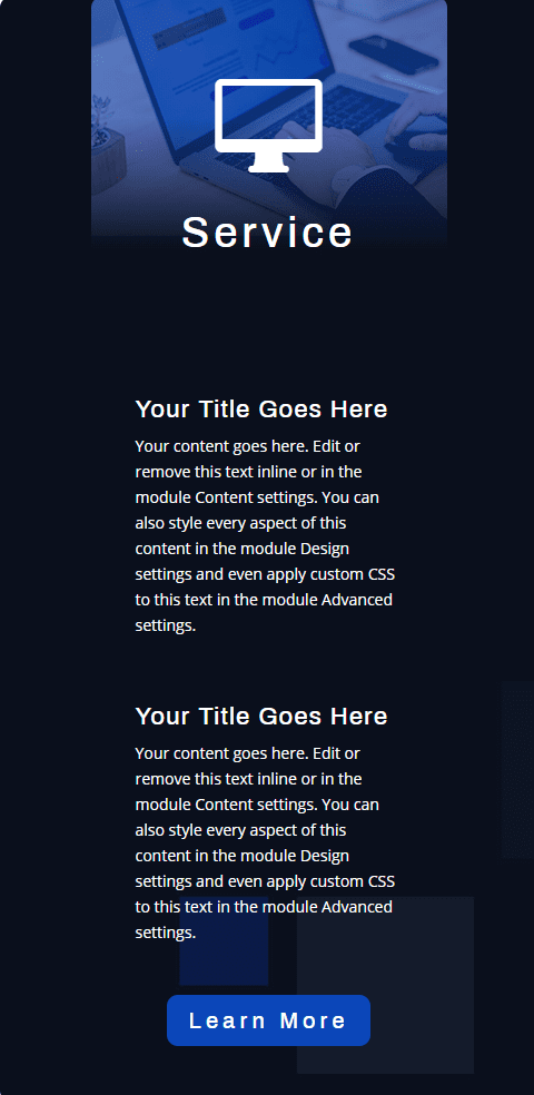
And here it is on tablet and phone display.
More Design Options to Try
It’s always fun to experiment with more design options now that we have the basic setup in place. Here are a few suggestions you can try for your pop out service descriptions.
Adding a Section Background Color
If you want, you can add a background color to the section that matches the background color/image of the row for a unique pop out design.
Go to the row settings and update the following:
- Background Color: #161c29
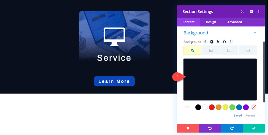
Then check out the result.
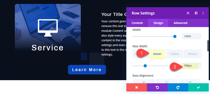
Using Only Two Modules
If you want a more compact pop out using only two modules, you can delete one of the call to action modules and then align the blurb module to the left so that the two will become visible on hover.
To do this, deploy the wireframe view mode. Then delete the first call to action module directly under the blurb module.
After that, update the blurb module with a left module alignment.
- Module Alignment: Left (desktop), Center (tablet)
Finally, decrease the max width of the row on hover to make it more compact. Open the row settings and update the following:
- Max Width (hover): 700px
- Max Width (tablet): 700px
Here is the final result.
And here it is on a white background.
Final Thoughts
Creating pop out service descriptions on hover is a unique way to engage visitors with your content. This functionality works much like a fancy and informative tooltip packed with all the design capabilities of Divi. And it is pretty easy to do. Once you have the modules sized and positioned, all you need to do is adjust the width of the row on hover. Feel free to experiment with different modules and content for even more applications. If anything, I hope this gives you a little more inspiration to do more with Divi.
I look forward to hearing from you in the comments.
Cheers!


Same issue here re-uploading the file. I have tried portability option .. the dots rotate forever, and tried dragging it onto the page, and the portability box rocks up and the dots rotate forever also. I have tried unchecking replace existing content, and tried on a fresh page .. and tried in the middle of other modules. NOPE … !!!! I am really desperate for this layout, as it will solve a styling issue I have with too much, and uneven text on some blurbs I need to position. Can you PLEASE check out why we are unable to use this VERY useful layout. LOVE IT .. wish I could use it. Thanks.
Great tutorial! is it possible to create the same Pop Out Text Reveal Module On Hover effect, but using a two-column row?
I can’t seem to upload the file for this, it says it cannot be uploaded in this context
I can’t seem to upload the file for this, it says it cannot be uploaded in this context
Are you trying to add it to the Divi library? Instead, just drag the json file into the page with the Divi (visual) builder active. Or you can use the portability option.
anyway to make this work with a 2-column row? I’d like to have a grid with 4 clients 2 rows, 2 columns each where it would slide over each or push away
thanks
Does this hurt your SEO? Won’t Google think that your content is hidden by objects?
Or does google recognize that this is the intended function?
Good question. From what I’ve read I don’t think it will be an issue but Google isn’t very clear. I thought this was interesting… https://edgy.app/how-does-google-view-hidden-content
Great guide and relevant to the project I was working on today.
Awesome!