
Eyestrain is a real issue for software developers, and the font they choose to work with plays a big role in that. If they choose a font that’s not designed well enough, the punctuation or characters may be hard to distinguish, which makes them have to concentrate and focus more to make them out, which leads to headaches, eyestrain, and a generally lower productivity rate than ideal. We don’t want that to happen to you, so we are going to showcase some of the top programming fonts that will make it easier for you to stare at a screen for hours on end.
Subscribe To Our Youtube Channel
1. Input
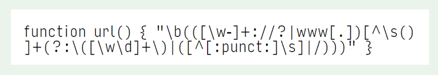
Input is a programming font that was designed from the ground up to make software developers’ lives easier. The site itself says that not only the characters, but also the “punctuation was designed to be large and clear in the context of code.” Going a step further than simply a monospaced font (where every character takes up the same amount of horizontal space), there is a proportionally-spaced, sans-serif version that is designed for coders to be able to avoid any kind of character overlap or oddities in character sizing. Input is a programmer’s font if there ever was one, and you’d be doing yourself a favor by checking it out.
2. Fira Code
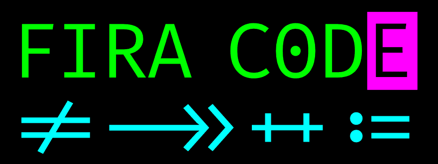
Recommended by tons of programmers because of its inclusion of coding ligatures, Fira Code is good stuff. Fira Code is an offshoot of the Fira Mono font. It’s developed by Mozilla, so you know that it has to be well-made and worth using. Programmers use an absolute mess of symbols and characters that aren’t necessarily letters and numbers, and Fira Code autocorrects them into the equal ligatures so that you no longer have to discern ASCII strings, but instead see the standard symbol. It is a monospaced code, and it’s just beautiful in any editor, but if you want to talk about reducing eyestrain, not having to interpret characters’ meanings as often will certainly do it.
3. Consolas
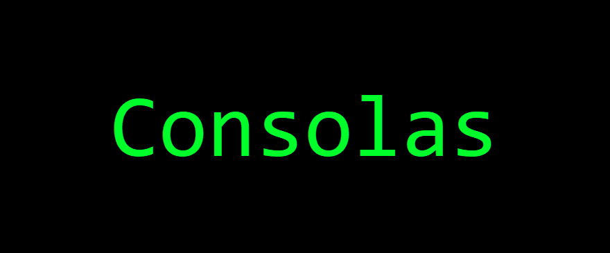
Microsoft got into the programming fonts game with Consolas. Included in all Windows installations, Consolas is a monospaced font that MS developed to be clean, easy on the eyes, and multi-purpose. The MS documentation for Consolas puts it better than we can:
All characters have the same width, like old typewriters, making it a good choice for personal and business correspondence. The improved Windows font display allowed a design with proportions closer to normal text than traditional monospaced fonts like Courier. This allows for more comfortably reading of extended text on screen. OpenType features include hanging or lining numerals; slashed, dotted and normal zeros; and alternative shapes for a number of lowercase letters. The look of text can be tuned to personal taste by varying the number of bars and waves.
4. Source Code Pro
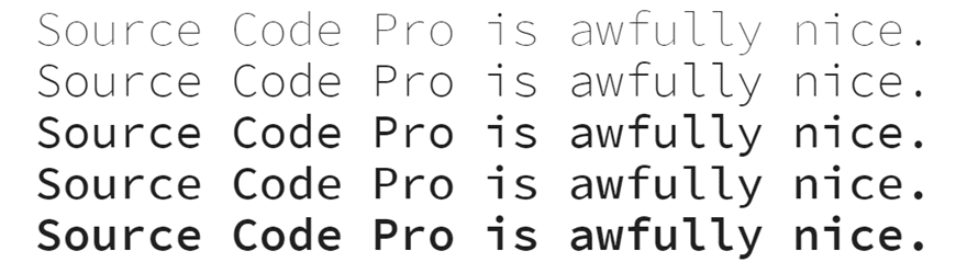
Available through Google Fonts, Source Code Pro is a nice monospaced font that coders turn to pretty often. The medium variation (the fourth one down in the image above) is highly recommended because, well, it’s average in terms of thickness, which makes it incredibly easy to read. If the name wasn’t enough of an indication, this particular font family was designed with programmers in mind, so it being one of the best programming fonts around should hardly come as a surprise to anyone.
5. Monoid
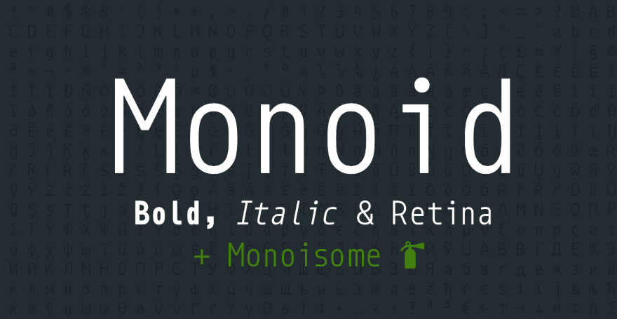
Crisp, clear, and just about perfect, Monoid is a programmer’s dream. While most developers are screen-laden these days, the fact of the matter is that there will be times that you have to work in a low-res environment or with a smaller-than ideal window. Monoid’s got you covered. There’s even a Monoid and Font Awesome integration called Monoisome. That’s kind of neat. Additionally, if you want to know more about what it’s like to work on a font that’s designed specifically for coding, the creator writes a lot about it on Medium.
6. Ubuntu Mono
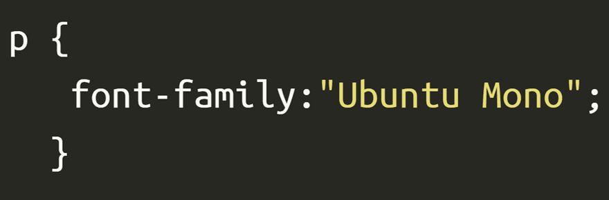
No list of the best programming fonts would be complete without having a Linux system font on the list. Ubuntu Mono is a workhorse of a font that is both incredibly readable, clear and crisp on various resolutions, and honestly, just looks really cool. It works well for body text as well as coding, and staring and it day after day won’t result in eyestrain or headaches. At least, not in our experience. Plus, if you just love Ubuntu but have to work in MacOS or Windows, this gives you a little taste of home.
7. Sudo
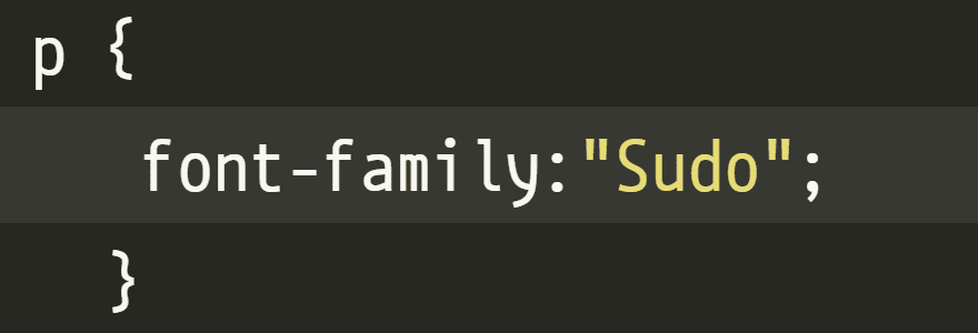
Sudo looks a lot like Ubuntu Mono, only a little more squashed. In fact, though, it’s a hand-made font that Jens Kutílek put together because they wanted a better programming font. In almost every way, Sudo succeeds as a programming font. Even though the spacing is more compact than some font families, the characters are still perfectly legible because it’s still a monospaced font. The numbers and letters are different heights for easier differentiation, too, which is incredibly useful for at-a-glance debugging.
8. Droid Sans
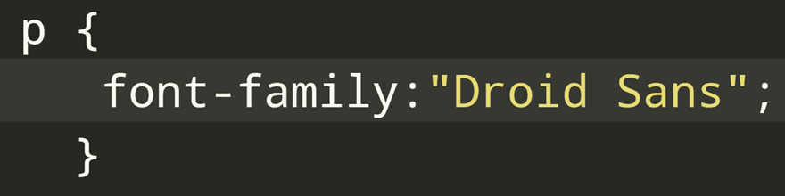
We’ve always been a little partial to Droid Sans. From its first inclusion in Google Fonts, the clean font just looked techy and like it belonged in a terminal. And it still does. The monospaced version of the font family is perfectly at home in any code editor you like, and because it was designed for readability on mobile screens and high-resolution browsers, using it as your daily driver in VS Code is right in its wheelhouse.
9. Roboto
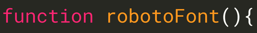
We know what you’re thinking. Roboto? Isn’t that the over-used web font? To which we answer, yep! In fact, that’s precisely the reason it’s one of the best programming languages. The reason you see Roboto on so many websites these days is the same reason you are looking for the best programming font. It doesn’t cause eyestrain to look at for long periods of time, and the characters are discernable and unique so that you don’t have to worry about spending that extra time making out what something says. Just because it’s used for web content doesn’t mean it can’t be used for making the web itself.
10. Press Start 2P
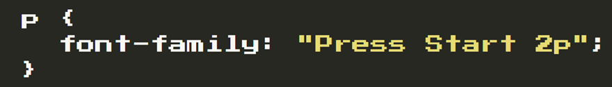
Okay, so maybe Press Start 2p isn’t exactly one of the best programming fonts for daily use. But if you want to give yourself a retro vacation and jump back to the days of making your Commodore 64 jump through hoops, this is a great way to do it. We aren’t sure about the preventing eyestrain with it, but you set the editor to a black background and lime-green text and you have one of the best programming fonts out there. At least for nostalgia and fun.
Which is the Best Programming Font?
Picking a font for your code editor is incredibly personal and no one can really do that for you. With the amazing amount of customization options you have with IDEs and editors these days, choosing the right font and color combination is something you’ll probably be experimenting with regularly. But we’re pretty certain you’ll want to give all these a test drive and see how they handle. We don’t think you can go wrong with any of them.
What is your go-to programming font for software development?
Article featured image by pikepicture / shutterstock.com


I use Anonymous Pro for programming and terminal.
Very nice to know
I don’t see the multitude of programming ligatures in Roboto or Roboto Mono which are present in Fira Code. If the ligatures were added to the Roboto family, that would be perfect in my book as Roboto is somewhat easier for me to read compared to Fira Code. Are the extra ligatures in Roboto? If yes, how does one access them?
Mike
A very good article for choosing the right font and color combination for a programmer which gives less strain to the eyes.
Thanks for sharing
I used in the past Consolas and DejaVu Sans, but when I discovered Fira Code a couple of years ago I switched to it an never changed back.
I’m also a big fan and user of Fira Code. I use this in my Visual Studio Code and can look at code all day, and night, long!
Same here, Fira Code all the way 😀
Nice article, never really thought about the fonts used in programming, in my case just CSS / HTML. It’s a thing, I can see that. But it also brings about a chuckle…
Most of the time I use the Divi ‘Custom CSS’ box to adjust generic styles, but one thing bothers me enormously: talking about eye strain and readability, it’s almost impossible to see what piece of CSS is highlighted when you try to select a line of code. This is not so good usability: default dark background, getting just a little bit darker when selecting text. And I don’t think there is a technical need for that.
Maybe, since you addressed the issue of eye strain, you could bring this up with your colleagues?
Sorry, couldn’t resist. Keep up the good work!
Greetz,
Eric
I agree wholeheartedly with @Eric Coenders. No discussion of avoiding eyestrain would be worth a hoot without addressing CONTRAST and FONT SIZE.
In most editors, we can adjust font size, but (a) it should ALWAYS be editable, and (b) the default should be about 14-point or 18 pixels. This is just the STARTING point in making our programming environment easier on the eyes.
As far as contrast, GOOD GRIEF! Light grey on white or dark grey on darker grey is insanely difficult to see, and contributes to eyestrain boatloads more than choice of font. If development environment developers absolutely HAVE TO kowtow to the “in crowd” and make the environment so horribly difficult to see as a default, at least give us the capability to change the font colors and background and highlight colors so we can actually SEE what we are doing.
Good article, BJ, but if you truly want to address eyestrain, I’d love to see another article addressing font size and contrast.
Totally agree, terrible UI – I often do it outside of Divi and then copy/paste into css boxes so I can see what I’m doing.
Divi is not the only one that guilty of trying to have a fancy design for a code window.
My worst is light grey text on a grey/white background.
With those types of UI, fonts become a moot point.
I’ve been using Inconsolata before I switched over to Operator Mono (Yes I did pay for a font for a change).