
If you’re running a small business, chances are you that have an established presence on the web. Either that or you’re here on Elegant Themes looking for a theme to help you get started.
Picking out a theme is only the first step though. You’re still left with the question of how to layout and present information about your business to visitors so that you have the greatest chance of converting them to a customer or client.
With your homepage being the initial point of entry for your website more often than not, there is no better place to start when it comes to making a good impression.
And that’s exactly what we’re going to cover today – how to build a great homepage for your small business.
Your Homepage Has a Purpose
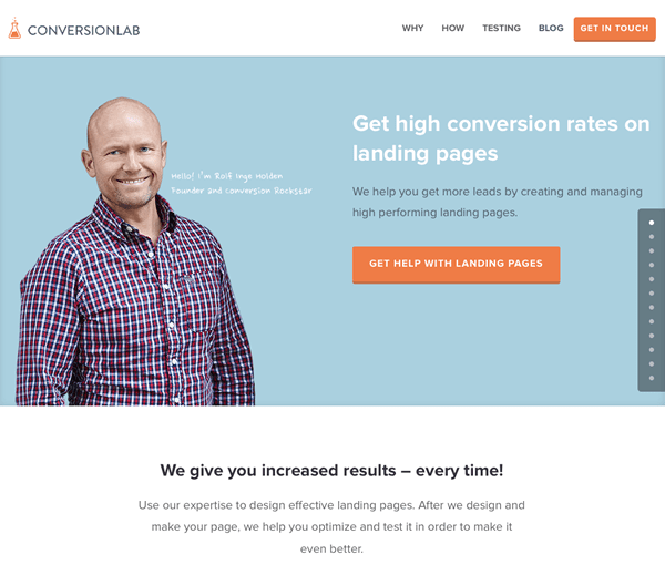
An example of a good homepage – built with Divi
Your homepage is a critical part of your website. Most of the time, it’s the first page people see, it’s the page most likely to be clicked on in the search engine results pages (SERPs), and it’s the page people will look at when deciding if they would like to do business with you. I think you’ll agree, Rolf at ConversionLab makes a great first impression.
Unfortunately, most small business homepages are not built with a purpose in mind.
At least not a purpose tied directly to the growth of the business. Which is funny because if you were meeting one-on-one with a potential client, you’d probably go into the meeting with a very well defined objective. You’d want to make money by selling your product or service.
Why should your website be any different?
Somewhere along the way, the process of building a website has become more about the business owners, rather than the clients or customers. Instead of building a website focused on generating sales, most small businesses focus on:
- Building a website that looks beautiful.
- Building a website that showcases the designer’s creativity.
- Telling customers what you want them to know instead of what they want to know.
Unfortunately, none of those things contributes towards sales, revenue or profits. Why? Because the unfortunate truth is that people don’t want to know what you have to say. They want to know that you have a solution to their problem. Once you do, a funny thing will happen – your website will start attracting more leads and generating new business.
Thankfully, creating a winning homepage is actually not as difficult as you might think, so let’s jump into the details.
A Content First Philosophy
Content? Yes, content. Although this will contradict what you are most familiar with when it comes to web design, a “content first” philosophy is something you should strongly consider. What does that mean exactly?
It means that before you spend even one minute debating the design or layout of your website, make sure that 100% of your content (copy) is ready to go. Despite what you may believe, the copy on your website is equal to, if not more important than the design itself.
Content has the unique ability to stand on its own. It doesn’t matter whether you’re selling legal services or a fancy widget. With the right copy, you can get by with a paper-white background, dark text and a purchase button. However, a beautiful design with no copy is just that, beautiful. It will never sell anything.
Writing Great Copy
There is no secret to writing great copy for your homepage. In fact, it can be boiled down to just three basic steps:
- Figure out who your customers are.
- Understand their problems and challenges.
- Offer a solution to their problem (your value proposition).
Who Are Your Customers
The first step towards creating a great homepage is to understanding who your customers are. The more detail you can gather the easier this process will be. You want to know enough about your ideal customer so that you can write copy which speaks directly to them, as if you were standing in the same room together.
If you’ve ever had to speak or lecture to a large group of people, you’ll probably remember seeing at least one person in the audience who was nodding off. Right? It’s because the information they were receiving was not relevant enough to capture their individual attention. Their need for sleep was more important.
Now, have you ever been talking with someone one-on-one, say in a coffee shop or in the grocery store and had that person fall asleep mid-conversation? I should hope not. Why? Chances are they were personally vested in the conversation – it involved them directly.
You need to treat your website visitors the same way. Speak to them directly as if you’re having a one-on-one conversation. By doing so, you’ll have a greater chance of capturing their undivided attention.
Determining who your customers are means you’ll need to create a buyer persona. While this is an article in itself, you can find a great explanation over at HubSpot. To summarize, a buyer persona would include the following details as a starting point:
- Are they male or female?
- How old are they?
- What is their level of education?
- What is their occupation?
- Are they married and do they have children?
- What social media platforms do they prefer?
- Do they have a list of favorite websites?
- What are their life aspirations?
- What are they afraid of?
- How do they spend their leisure time?
- What is their preferred method of communication?
We’re just scratching the surface here, but you’re probably wondering how you can obtain this information. The most reliable source is directly from your existing customers via a survey or personal conversations. If those methods are not readily available, it might come down to simple research and estimation.
Your buyer personas should be continually evaluated and updated, especially if you were not able to gather your initial information directly from existing customers. Never assume you have all the information that you need.
What Problems Are They Facing
Spend five minutes on Google looking at some local businesses and you’ll notice that most of the time, they’re more interested in telling you about themselves, than explaining how they can help you. This demonstrates one of two things:
- They don’t really know what their customers want or need or;
- The have yet to grasp the importance of developing good, customer centric website copy.
Once you know who your customers are, it’s time to learn about their needs, their wants, and their problems. To put it quite simply, if you don’t know what your customers need, how can you expect to help them?
The easiest way to begin this process is with your customer personas sitting in front of you. Start writing out a list of every possible reason that a customer might decide to do business with you.
- What pain will they be avoiding?
- What worry will they be solving?
- What headache will they be able to avoid?
- What benefit will they receive?
By discovering and understanding the problems your customers face, you’ll have an opportunity to present an appropriate solution.
What Solutions Do You Provide (Your Value Proposition)
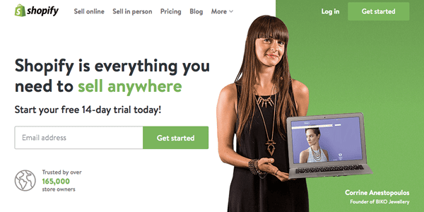
Clear value proposition on the Shopify homepage
More often than not, this is the reason your customers will choose to do business with you. This one piece of information should be placed front and center on your homepage, because it’s more important than anything else. If you can get this one portion of your website dialed in, you’ll be leaps and bounds ahead of most of your competition.
Another way to look at your value proposition is to fill in the blanks for:
“We do X for Y so they can Z”
What problem do you solve? Who do you solve it for? What are a few of the benefits?
Again, simple, clear and concise. Leaving no doubt in your visitor mind.
For example, as a local appliance store you spend time talking to your customers and discover that their number one concern lies in dealing with out-of-warranty repairs. The incidence of repair for many brands is high as is the cost of those repairs. What’s worse, all of the repair shops in your area charge a service fee just to make the trip out to a customer’s house.
Nobody likes paying service fees or having their appliances repaired. How could you address those concerns right out of the gate?
If your appliance store offers an extended warranty and no charge service calls for the first 18 months, that’s something you should focus on. Don’t bury that information at the bottom of your services page in fine print italics.
Tired of paying for service calls?
We deliver top brand appliances. Professionally installed & backed by our exclusive, no-charge service calls and 18 month extended warranty.
By using your homepage to acknowledge your customers’ dislike of service call fees and present a way for them to avoid that pain, you’ll be able to grab their attention right from the outset.
Layout and Structure
The layout and structure of your website should actually be one of the easier aspects of your overall web design process. I say easy because you don’t want to stray too far from what’s expected. Don’t make the process more complicated than it needs to be. Human beings are creatures of habit and as tempting as it may be, you’ll want to avoid being too creative when it comes to your website.
I’m not suggesting that you throw good design out the window. A well thought out color scheme, high-quality photography, and use of common design elements are all important. Just don’t look to reinvent the wheel.
You also don’t need to look much farther than right here on Elegant Themes, because themes like Nimble, Foxy and Divi will allow you to create an attractive layout that includes all of the key elements described below.
Ok, enough preamble, let’s take a top-down look at the most important parts of your homepage:
Logo
In almost all cases, your logo should be located either top left or dead center. It’s not unusual for a lot of time and effort to go into a logo design and as a business owner, it’s something you can self-identify with – you’re proud of what you’re building.
Don’t make the mistake of giving you logo more attention than it deserves. Sure, it’s important from a branding perspective, but in all cases it should be contained to the header of your website and not become a focal point.
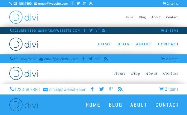
Some of the Divi navigation styles
Navigation is critical to your website and it’s not an area where you want to leave people scratching their heads. Ideally, your navigation should be placed either in the top right, opposite your logo, or directly under your logo in a navigation bar.
Make sure you use text that is highly readable – a common serif or sans-serif font displayed at 15px or greater.
If you are operating a service based business where customers are required to pick up the phone and call you, consider including your phone number as part of your navigation or placed just above it. Visitors to your website rarely have the patience to hunt around your site in search of a phone number, nor should they. And remember, with over 50% of visitors using mobile devices, make sure your phone number is clickable.
Your Value Proposition
Located directly beneath your logo and navigation should be your value proposition. This is quite possibly the most important few lines of text on your website and it’s an area that deserves some serious attention – both initially and through optimization.
In this section of your website, you’ll need to bring together all of the research surrounding your customers and present a simple one to two line statement, along with a few bullet points that explains exactly what you do.
Call To Action
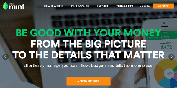
A prominent call to action on the Mint homepage
Your call to action (CTA) is usually placed next to or just under your value proposition and it represents the action you want your visitors to take while on your website. What you don’t want is for visitors to land on your site, browse a few pages and click back to the SERPs.
Your CTA is highly dependent on your business, but it could include:
- Add to Cart
- Click to Call
- Get Started
- Subscribe
- Sign-Up
This one action that you are encouraging visitors to take is essentially responsible for measuring the success or failure of your website. Meaning that if you present your value proposition and a click-to-call button, you should expect that people will take that action. If not, you need to get back to work.
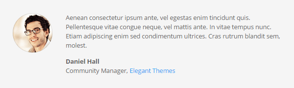
Use testimonials to demonstrate social proof
Once you’ve had a chance to present your primary call to action, there are always going to be some visitors who question whether your company is the one they should be giving their business to. For those people, it’s a good idea to display a few prominent customer testimonials on your homepage.
Don’t overdo it, two to three should be plenty. Focus on providing testimonials that are specific and most likely to speak to your customers concerns or objections.
Note: Consider adding small logo’s or links to associations that your business is a member of. A local Chamber of Commerce, BBB or trade association can add further credibility.
Contact Information
Often referred to as NAP (name, address & phone number), your contact information should be placed in the footer of your website, right where people expect it to be.
If you’re set-up with Google My Business already, you’ll want to make sure that the way you display your address is consistent across all platforms, with Google taking priority.
Nothing More, Nothing Less
I know what you’re thinking. What about all the other information that “I” need to display on my homepage:
- My slider full of images
- My qualifications
- A complete list of services
- My recent blog posts
- My newsletter signup
- My Facebook and Twitter feed
- The list goes on and on
While you might be able to build a case that one or two of these items belong on your homepage, most are not required. Nor do they do anything to help you attract new customers.
If you absolutely must have more information further down on your homepage, consider adding content that expands on the services you provide and the benefits you offer.
If you’re still not sold on the risks of presenting visitors with too many options, be it things to look at or buttons to click, take a read through this article in The New York Times. It discusses how too many choices can lead to paralysis. It also presents a different viewpoint that asks you to consider how choice overload (picking one company over another) might compare to information overload (one company presenting too many options).
Either way, you’ll be left with a clearer understanding that more information or choices on your website rarely translates to increased sales. In fact, it’s quite the opposite.
Optimization
It’s unfortunate that most small business owners are still stuck in the mind-frame of “set it and forget it”. While that worked wonders a decade ago, we now know that ongoing optimization of your website can produce significant improvements in conversion rates. Conversioiner reports that 61% of organizations plan to start A/B testing before the end of 2015.
If you want to maximize the results you’re achieving with your website, commit the necessary time and resources. Your website is never really done. There will always be something that can be tested and improved and you’ll also want to make sure it stays relevant to your target audience.
Conclusion
While designing a great homepage for your small business is not a difficult process, it does take a little bit of work. By far, the most important phase lies in developing a customer persona(s). They are key to everything you do in your business.
Once you know who you are speaking to, it’s simply a case making sure your homepage contains all the required elements. Nothing more, nothing less.
Have you experimented with the layout or copy on your small business website? Have the changes you’ve made had an impact on your results? Please share your thoughts and experiences in the comment section below.
Article thumbnail image by Author Bloomua/ shutterstock.com


Awasome ! I mean one of the most ignored fact. For we blogger we often neglect it. While actually this should be the first step while designing the blog, but unfortunately it is considered very late. Anyways now for me its time to rebuild and redesign.
Thanks
I think that I’m going to be re-designing my homepage after reading this. Thanks for sharing a great advice, and hopefully it won’t be as hard as it looks, at least after a couple of months of practice… xD
Great article Joe, and you are right on about knowing the visitors problems and how your product or service can help them.
I also like your idea of having the content before the actual design profess begins. I build websites for small businesses and sometimes getting content from my clients is like pulling teeth. It would make my job so much easier to have all the content before the design begins. Any ideas about the best way to go about requesting this from the client?
I feel your pain Larry. Its best to list it as a requirement to getting started and make sure the client knows its expected of them before you are ready to start work on the design.
Hi Joe! Great article! Lovely tips, many thanks!
Like one of your other readers, as I am French and offering my therapy services in English too, I would also really appreciate some guidance and tips on how to create an easy to navigate bilingual website using divi.
Many thanks in advance and thanks again for this insightful article on homepage content!!!
Sylba
WPML is the plugin of choice for many people creating multilingual websites with WordPress. Check it out.
Thank you for the post. I use Shopify for my store, but a WordPress blog for my tutorials and inspirational posts. I’ve been trying to decide if I should treat my blog as it’s own site with a home page and call to action or if I should try to make the blog look like it is integrated as close as possible to being a part of the store. My blog is my biggest referrer to my store.
I just bought Divi, so I’m in the process of mapping out what my changes should be before I make the switch from my current theme. Thanks!
Interesting Leslie,
I am curious to know from a Shopify user whether you find the store is easily ranked – as with the third-party platform it is one of many stores on the same medium.
I discovered that building your store with Woocommerce enables you to integrate all pages -being one contiguous site it is much easier to perform SEO and rank the whole site – WordPress being the system underlying the whole deal – plus you don’t have those steep monthly charges!
Just interested as I see a lot of people paying big money for these services, and there is actually a downside to them.
Wow! Wounderful tips on the design of a front end to our business. Thank you very much. It convinced me to be a member of your services. Your generosity in providing tips not only on your own products but also on how to build our web and make it worth the time we spend in building it, convince me that your offer is more than just nice building Tools. You provide, from the outside, a great service. Moreover, even if in USA, the language issue is not very high on the list, it is very important in Québec where we have to provide services in at least two languages (French and English). So, I was delighted, in reading a previous blog, an article where I saw that Divi is available in multi-linguage, even the “developer side”. Bravo! It makes me remember of an old co-worker who wrotes guidelines on how to design a software to be easily multi-language able. I hope you used some of its guidelines. I hope you will add a post on how to build a multi-language web site in using like Divi. As you know, every browser have information about the language the user is using and some web sites get this language information for providing to the user the web site in their preferred language, in an automatic way. It could be interesting to find tips on how to do this with Divi for example.
Thanks again for your guidelines!
Denis
Absolutely spot on. Great work. I would second that huge sliders are going away. I keep telling our clients to make one impactful image that tells the story versus 5 decent images. People don’t watch sliders, use tabs or anything that really requires more than 5 seconds of attention span. So glad to see these design trends dying out.
The best part of the recent Google update is probably that the mobile-friendly rankings adjustment prompted a major decluttering of home pages. It makes it easier to explain to a novice why they don’t need twelve sliders, a parallax effect, and a video intro: “It’s bad for mobile SEO.” Full stop. Moving on.
I’ve run through a lot of iterations on my home page over the years, trying to get things right, and it’s almost entirely a process of abandoning what doesn’t need to be there. Great article, thanks.
Connor
Good point! Hadn’t really thought of that angle.
Straight to the point, creating personas is an awesome way to understand the clients, end users and based on that, the info/content can be tailored. The value proposition is also important, call to action and contact details, well done it made so much sense, thanks so much.
This is a GREAT post. This is pretty much what I sit down and tell all my clients before building their website.
My problem? Why can I do it for everyone else but MYSELF? I can’t tell you how much my clients love my work. Yet, my own site has been sitting for months waiting for me to finish. I send them to my old portfolio site, but that’s not what I should be doing.
Why oh why… I need to hire someone like me for my own stuff. 😀
http://designbykolleen.com
Excellent post, many web devs are going to point their customers to this…
While we were discussing developing a new website, to sell a business software solution, my boss went on and on about how people want to be taken on a journey and told a story. Umm… no they don’t, they want to know why they should be even looking at your website and now you have 4 seconds to convince them. Get right to the “Value Proposition” is the takeaway for sure.
Fully agree with you on that – seems a lot of business owners have their own pet views about what people want from their website-it puzzles me why so many just won’t listen, they expect you to just design their site like it is their suit – they are often a bit arrogant, or stubborn and do not like to seek your opinion. I found it depends on which end of the market you deal with.
Cheers
plas, plas, plas. Nothing else to say. If my clients do fifty per cent of this blog post, they will make me happier man in the world. Why every body want more and more stuff in home page.
I don´t want know their lives, I want solve my problem and if they can help me.
great post, great job guy