

How often do you hear about UI design colors these days? Unless you’re talking to a UI designer, not often. Browse a successful WordPress website, however, and you’ll see different colors that communicate the brand’s message, convey the website’s structure, improve object recognition, and provide loads of other benefits.
Picking the right colors is important for achieving visual consistency in WordPress UI Design. For instance, using light colors for the navigation menu, and using bright colors for the background can make it difficult for a visitor to read menu items. Also, colors with low value contrast can make it challenging for color blind people to make out the images and words on your website.
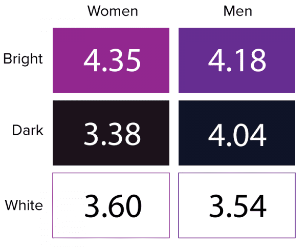
A study by UserTesting found that males and females prefer sites with bright or dark colors, and sites that had a white/minimal interface received the lowest ratings. The results show the impact colors can have on website visitors.
Another study by Ironpaper found that colors increased website recognition by 80 percent. Sites with a lighter color scheme saw 1.3 percent growth whereas sites with dark color schemes saw 2 percent growth.
Picking the Right UI Design Colors for a WordPress Site
When WordPress users integrate UI design colors, the results appear on the backend as well as the admin user panel. Here’s how to pick the right UI colors for your WordPress site:
1. Know Your Demographic
Knowing the demographic of visitors you’re targeting with your WordPress site is an integral part of choosing UI design colors. For instance, your color scheme should be different if your target audience consists of millennials than that of a website whose target audience is females.
Understanding color psychology will enable you to choose a color or two that are relevant to your target audience and in line with your website’s purpose. For example, if your WordPress site targets men as its main audience, UI design colors should include grey, white, black, or blue. Avoid colors like yellow, purple, pink, and orange.

Look at Primer’s website. Black stands out from other colors on the site. The background primarily utilizes the color grey.

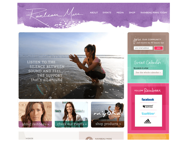
In comparison, Global First Spouses uses the color blue to cater female audiences. Blue is a color that’s liked by both genders. Kissmetrics cited a survey that revealed that blue was the top favorite color of women (35 percent), followed by purple (23 percent), and green (14 percent).
2. Understand the Color Theory to Pick Right Colors
Color theory helps you understand the impact of different colors when they come together for certain reasons. In other words, it represents the interaction of colors via vibrancy and contrast. One of the categories of the color theory is the color wheel, which enables you to choose UI design colors for your WordPress site. Here are some color scheme options available at your disposal.
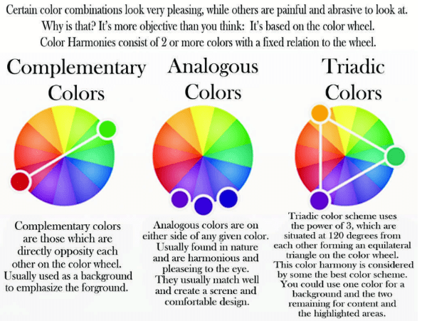
- Analogous scheme: Colors that sooth the eyes and are visible in nature make up this color scheme. The color scheme is suitable for WordPress sites that want to display a calm image. By adding a touch of contrast, it can brighten the appearance of your UI.
- Monochromatic scheme: This scheme involves a base color and other colors that are shades of the base color. It would be suitable on a photography website as it works well to add a color overlay. And because it doesn’t draw attention to itself, it can be used to simplify your content.

The UI design colors of this website integrate a dark background featuring orange accents. The monochromatic scheme works well to display athleticism and a feel of adrenaline.
- Triadic scheme: This color scheme is used to achieve clean aesthetics and contrast for WordPress web design. The color scheme has three lead colors and opposing hues in big quantities. The triadic color scheme works well to outweigh vivid colors and achieve a vibrant appearance.
3. See what Contrast Looks Like
Visitors with low vision need to be able to navigate your website, so it’s important that you include enough contrast in the UI, especially between the background and front elements. You can mix contrast with your UI design colors to see the end result. Here are some tips on how to do that:
Color Saturation & Contrast: Color saturation refers to a color’s intensity. A color that’s 100% saturated is in its brightest, purest form. Utilizing muted or bright colors can be a great way to create a low or high contrast in WordPress web design. Bright colors are used to attract visitors’ attention, when used against black.
This website’s UI design colors showcase contrasting saturation levels that get noticed. Colors are combined with muted saturation levels to create a soft outlook, and the watercolor effect emphasizes it further.
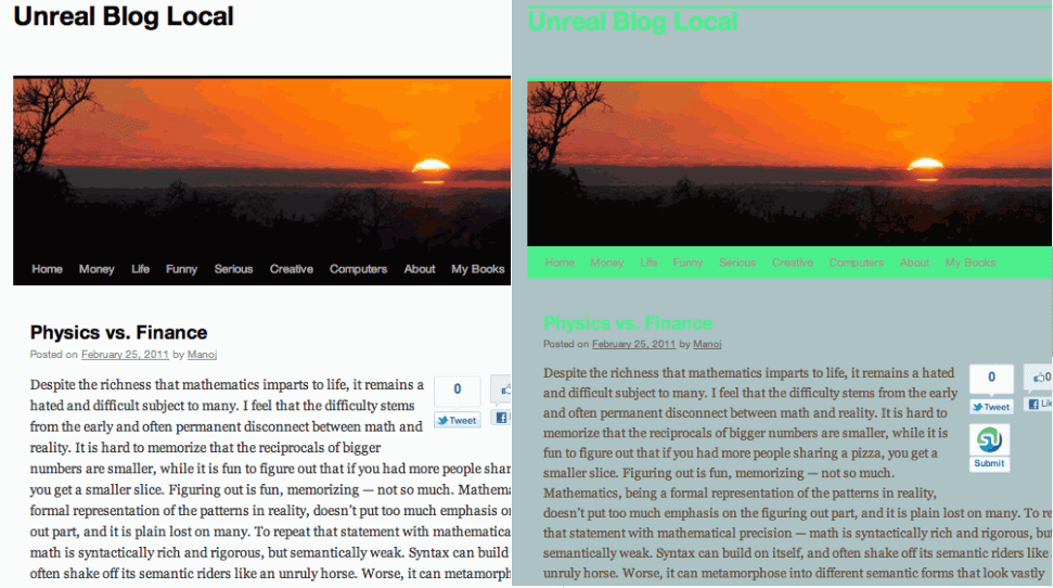
Color Value & Contrast: Color value is the darkness or lightness of a color. 100% white and 100% black are the often used contrasting values. However, you can play off darker and lighter colors of each other to highlight certain elements of your design while adding contrast.

The UI design of this website has a light background featuring dark text. The contrasting values – shades of purple and bright white typography – makes the lead statement easier to read.
Color Temperature & Contrast: Colors can be categorized into groups according to their temperature: neutral, warm, cool. Blue and green are cool, while orange, red, and yellow are considered as warm. Brown, grey, white, and black fall into the neutral category. You can easily create a contrast my mixing temperatures in UI design colors.

Dexcom’s website design has contrasting colors with cool shades of green and black. The main image and the call-to-action, as a result, stand out well. Additionally, because the main color falls in the cool category, the combination with black and a light background gives it a cohesive look.
Depending on the amount of saturation, value, or temperature used in your site design, you can implement just the right contrast to increase your website’s appeal.
4. Use Tools for Help
Different color combinations with hints of shades and tints will evoke different feelings in the visitor’s mind. The best way to choose the right UI design colors is to generate a lot color schemes, and then go with the one has a strong connection with your brand’s mission statement. The following tools will help you generate different color schemes and pick the exact UI design colors you’re imagining for your website:
- COLOURlovers: It gives you more than just an option to search color palettes. You can also read interesting topics and participate in discussions about color with other people. COLOURlovers also has a tool called PhotoCopa, which can be used to generate color schemes from images.
- Material Palette: The online color palette generator was created for Material Design by Google. Users just need to choose 2 colors, after which they’re given a color palette to work with. Colors are identified as primary, light primary, dark primary, divider, accent, primary text, secondary text, and text/icons. One of the colors can be switched off for taking out the contrast.
- Adobe Color CC: Previously called Adobe Kuler, Adobe’s renamed offering lets users experiment with different color schemes. All schemes consist 5 colors. Users can use the same scheme to create variations, compare schemes side by side, and choose which ones to use for their UI design colors.
- Color Explorer: This is an in-depth tool that offers a wide range of features to create, design and customize color palettes. For instance, there is a feature that helps users determine the WCAG visibility of their color selection. Then there’s also a whole suite of palette and picker generation features.
These tools work to fill different needs. They can be used by anyone from a beginner to an expert designer.
WordPress Plugins for UI Design Colors
Plugins are perfect for WordPress users who are new to web design. They enable you to take control of your theme’s appearance, choose colors with an easy-to-use interface, and preview them in real-time before deciding on the best UI design colors.
While some WordPress themes will include a color customization option inside the admin area, plugins can be used to customize any WordPress site. Here are some options to get more color in all areas of your UI:
This plugin shows the current colors from your WordPress theme, and then presents a color picker if you want to replace them. Users can preview or implement changes, with an option to change colors in bulk. Theme Tweaker also generates a dummy child theme, so users can leave their original theme untouched. It’s possible to save your work, and the plugin remembers saved color schemes for unlimited number of themes. The Pro version of Theme Tweaker provides additional features, such as the ability to tweak both the child and parent style files.
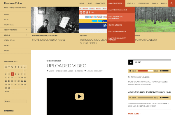
A blessing in disguise for WordPress users on the Twenty Fourteen theme. Fourteen Colors provides two color pickers, which allow users to adjust color choices for
- Footer/Header/Sidebar
- Navigation Menu Hover
- Text Selection
- Search Bar
- Link
- Featured Background Content
- Video/Audio Player
- And More
The plugin adjusts the user’s choice automatically to ensure minimum contrast is needed to keep the WordPress site readable.
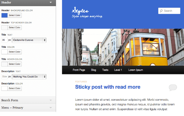
This plugin allows you to customize WordPress fonts and colors. Styles also provides free themes that users can try for live demos. The Theme Customizer sections are available for global styles, and they allow you to customize the default text color, default link colors, header styles, inner area background color, etc. Changes give you instant feedback, so you know what a change looks like before it goes live.
Final Thoughts
Now that you have an overview of UI design colors for WordPress, it’s time to get started. The tips mentioned above will ease the job of finding the right colors, and live preview options will ensure that you see the UI in action and get second opinions before jumping in.
What are your thoughts? Do you have some more tips on picking UI design colors for WordPress users? Feel free to leave comments.
Article thumbnail image by karawan / shutterstock.com


Useful Article and helpful to create a Beautiful WordPress theme website.
Most of the pro bloggers reported about the color of the word press sites. Is color will increase Sites authorities and visitors? If is yes,,, how it is working…..Please given me Reply…
Thank you….
This is a topic, which requires more research and details.
I can remember not long ago everyone was dropping dark backgrounds and cleaning things up, making them minimalistic and everything was white. This article is cool and really hints at how far we’ve come with web design trends.
Even the slightest tweak of the colour contrast can make all the difference. Thanks Dan for those tips.
UI Design Colors plays most significant role to improve website to attract visitors.
Colors are not such an issue to me but the file size and the load time. Does it increase the size of the site and load time if it’s colorful? Does it really matter? For instance, does dark purple on a fullwidth background increase the size of the website page?
I’ve changed the colors of my website many times and wasted so much time on doing it because what I’ve been hearing about colors is that they increase the size of the site and the load time.
Thanks for your input.
changing colours i.e. via style sheet, will not impact on your load time. Things start to slow down if you start adding images and other files.
if you check tools.pingdom.com it provides a waterfall graphic so you can see what elements are taking their time to load etc Its a great free tool to isolate any performance issues.
Thanks Dan, great article. We all put a lot of effort in to how we look and what colours we look book best in the websites we create should be no different.
I have got in to the habit of showing a pantone colour swatch book to potential clients to help them choose. I also show them on a dummy website how much of dramatic difference changing a colour scheme can make, i.e just by changing the colours a trashy site can be made to look elegant.
Why Full width image slider is not responsible
Fantastic job!!!
Thank you, Dan
Have my great respect!
Thanks for the interesting read, I wouldn’t have though that colors schemes would have such an effect. I’d of thought it was more related to a well laid out site, and making a site user friendly.
I’m regretting choosing a light color scheme on my latest project now.
Just to add to the discussion about color schemes. I really like Color Hunt when it comes to finding color schemes that work well.
Fantastic article.
I have been getting your newsletters for a while
And I save many of them. But this one was really awesome, how it not only provides stats to share with clients, also tools to use, but also, re-inforces why elegant has really sharp designs.
Thank you
Art
I’ve found a great source of inspiration at the Canva design school: https://designschool.canva.com/blog/100-color-combinations/
Great find!
Great tools listed. For design, color, font ideas there’s a lot of free information on bamagazine dot com. There’s a special that comes up every so often to get the CD at a discount. Subscribe and you’ll get new posts.
One of the most important things to deside on website, but mostly blogger they choose there theme font randomly and that’s big mistake. Thank you fot that lovely article dear. Keep It Up
Very usefull indeed. There’s a great course on this matter at Udemy called “become a professional graphic designer”. It covers colors amongst others, but the Fonts part was interesting as well.
Just a hint.
Excellent article. I use Adobe Kuler to define color and its contrast colors for website.
Very in-depth info and you can use this to organize – in advance – a discussion & 1-day training with your client in order to know how the company and his members feel the image should be in the market : agressive, soft, adventures, romantic, etc. Brings you sometimes to astonishing situation …
To me nothing beats nature.. If you are attracted to a landscape for example or when you take an outdoor picture that you really like. just make your color palette out of it. A simple flower may reveal treasures of colors from which you can draw a color palette that cannot go wrong by using photoshop, illustrator or the simple google chrome color picker add on etc.
Totally agree Cati. And I’m not sure it’s limited to “nature” photos either. One thing I love doing is going through my favorite art works and pulling color palettes out of them with the same tools.
Color plays an important role in user interface design to achieve better user experience. Designers need to be careful when using colors because it will affect the entire UI design.
Good points but I’m afraid you’re missing a major point that graphic designers learn in school and it should be used in website design as well – whether it’s WordPress or any other way: what is the meaning of different colors, what is their association. And by that I do not mean just “women like bright colors”. Examples for color associations in Western cultures: green is associated with money. Hence, websites of financial institutions are thought as more trusty if there’s green on them. Red means “love” but also danger/stop. etc.
Hi Ledio,
Good point. The article does include a link to color psychology, where the associations are mentioned 🙂
will styles work in divi
I’m not sure. I haven’t tested it. However, you can do everything styles does natively with the controls built into Divi’s theme customizer and/or builder settings. So it’s probably not necessary.
I agree with Christina. I used it to develop my color scheme for my live site. I also admired other colors used by others on their sites. To obtain the hexadecimal number for my own use I used Firefox’s ColorZilla. Even though this was about colors, I use “What Font” to find out font, size and color of font. Very useful.
Thanks for sharing. I wasn’t aware of this tool.
Dan, you deserve “the slow clap” for sharing the Material Palette link. Thanks!
I’m big fan of that site/resource too! I’ll forget about it and then re-discover it only to spend an hour tinkering with it all over again, lol.
Great post! It goes to my favorites.
I will be happy to read about preferred colors for different niches.
Excellent, thanks a lot.
One of the most important things to deside on website, but mostly blogger they choose there theme font randomly and that’s big mistake. Thank you fot that lovely article dear.
Font choices are really important. We’ve covered this topic extensively here on our blog.
http://www.elegantthemes.com/blog/?s=font&x=0&y=0
How to enable top menu items highlighting on a one page website on scroll, like dot navigation on the right side. I searched the forum but couldn’t find a solution there. And I see many people need the same feature. The question is not related to the article but anyway I hope someone will provide the solution. Thanks.
Hi, John – Can you tell me a little more about what you’re looking for? Maybe I can help.
Hi, Michele.
Here is what I mean: https://jsfiddle.net/cse_tushar/Dxtyu/141/ . I tried to integrate this code into Divi but it did not work. I have a single page website and I want the menu items to change their state to active as the page is scrolled, just like in the example I provided. Would be grateful for your help. Thank you.
Did you rewrite the Jquery document so WP can read it? WP can’t read Jquery in this format. This issue will stump most people for hours or days. You may also need to use wp enqueue script to load a newer version of Jquery.
I was trying to integrate the code through Theme Options->Integration, but probably was doing something wrong. Do I have to wp enqueue script if I integrate it via Theme Options->Integration?
Anyway, thank you for your help, David, I needed to solve this issue urgently, so this time I used “Page scroll to id” plugin and it worked well for me.
Sadly it won’t work through the Theme Options panel. You need to add it to your functions.php file and use the enqueue script there. I would suggest using a child theme if you aren’t already. It would be devastating to go through all of the work to get this right, only to have it erased on the next update for your theme. There are tons of tutorials on how to do this. I would offer to help if I had the time, unfortunately, I don’t. Once you know how to do it, it only takes about 20 to 30 minutes to code in a full Jquery script to customize what you’re working on. You may also need to deregister WP’s Jquery. If you notice any errors appearing in the Chrome Developer Tools, that might be a place to start.
Good luck!
You need to work on the CSS for the psuedo class a:active for the links that you are wanting to color. Your settings could be too light and therefore not allow you to see the changes to the active element when you go down the page. Divi tends to use an alpha transparency for their hover and active states. Start there and see if that helps.
To test it, use Google Developer Tools inside of chrome. Click on the link that you want and in the Developer Tools panel, right click on the HTML markup for the corresponding link and select :active and look at the code that comes up in the CSS viewer. You can alter it and test the page by clicking the other links. If it works and takes the changes, add it to your child-theme and you’re done. Good luck! 😀
Color Scheme Designer 3 is an awesome tool, I use it all the time!
I’ll check it out 🙂
Wow! finally
What does it say about my personality that I always gravitate toward black backgrounds?
I really appreciate the info shared in this article. I am COLOR-DUMB and need all the help I can get!
Been waiting on this topic Josh? Anything else you’d like us to cover?