")
You throw your money and resources into a nice fancy website and… you’re not getting the response you were expecting. Or maybe you get a lot of visitors but not the number you were hoping for. Maybe you get tons of traffic, but no one responds to your call to action. What on earth could be wrong? Your web design could be the culprit.
Web design is about communicating with your target audience. This is done through layout and structure using text and imagery. In other words – UI. Done correctly it will draw visitors in and keep them. Done incorrectly, it will send them running.
There can be many reasons your design isn’t working. Here is a list of 10 and what to do to remedy the problem. I admit these examples are old and extreme. I am using exaggerated examples to help get my point across. Most are not this bad in today’s world of web design (in fact, some of these would be difficult to do in WordPress unless you give it some extra effort). Still, there’s a lot to learn here so let’s get right to it.
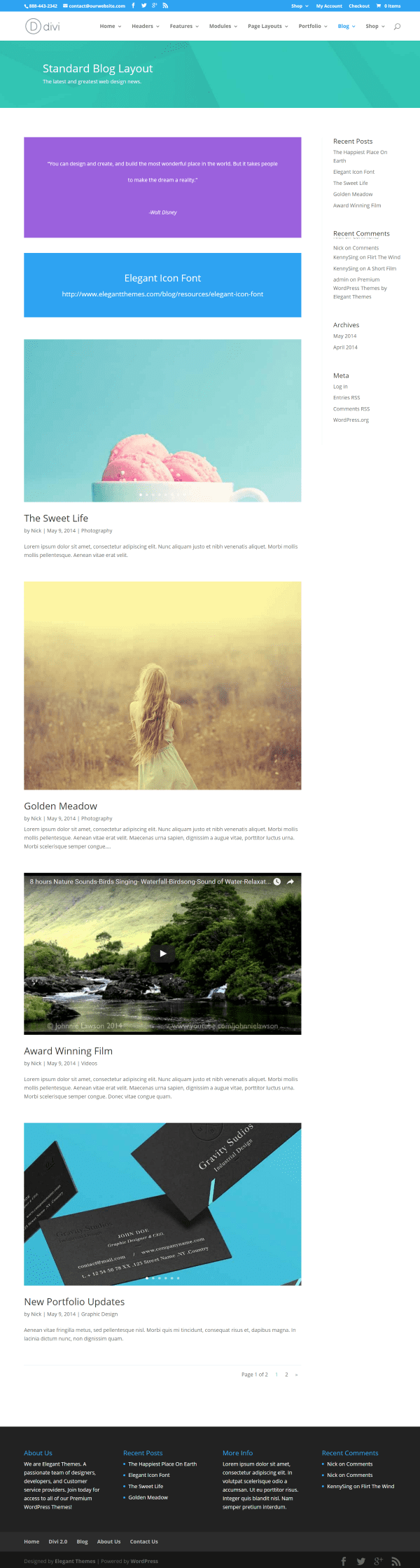
- 1 1. Your Homepage Is Cluttered and Slows Down Your Visitors
- 2 2. Your Layout is Crowded, Cluttered, and Inconsistent
- 3 3. Your Content is Just Text in Large Paragraphs Without Images.
- 4 4. No Call to Action Or Call to Action Is Not Easy To See
- 5 5. Your Design Isn’t Responsive
- 6 6. Your Design is Old
- 7 7. Your Site Focuses on the Bells and Whistles
- 8 8. You Let WordPress Handle Your Navigation.
- 9 9. You Don’t Make It Easy For Your Visitors to Share Your Content
- 10 10. Bad Choice of Color
- 11 Final Thoughts
1. Your Homepage Is Cluttered and Slows Down Your Visitors
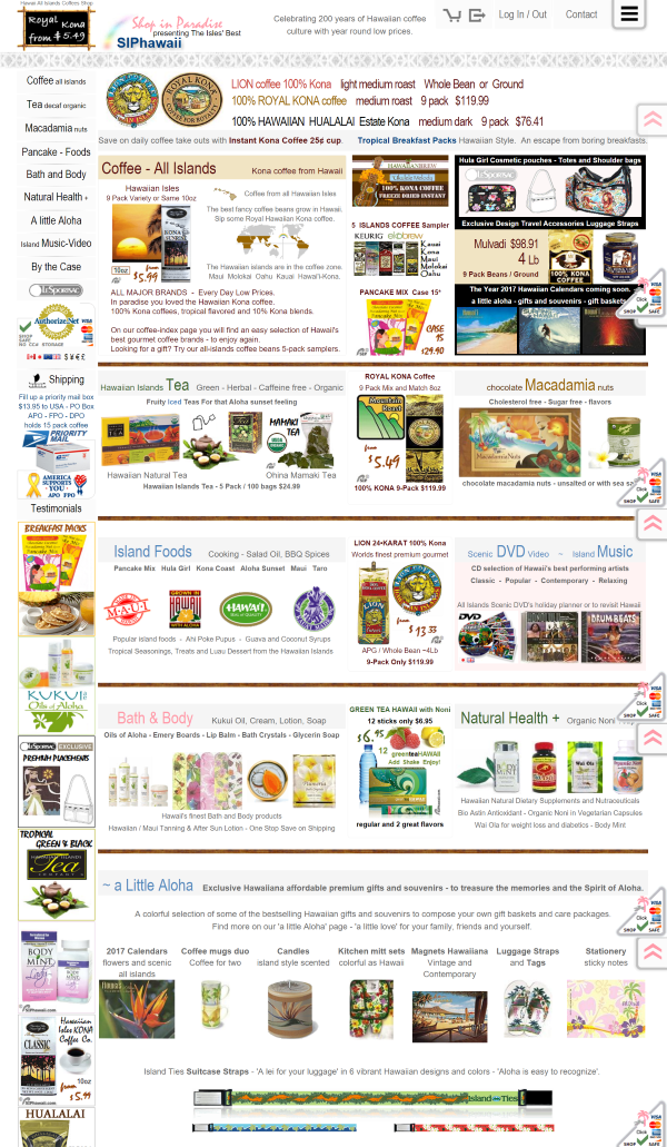
https://siphawaii.com/
It takes less than 10 seconds for a visitor to decide to go or stay. You want them to have easy access to the content they’re looking for.
Webpages can have too many things to click or too many things to look at. Your homepage might have lots of different topics, but if they are thrown together and jumbled, then your readers won’t be able to find what they’re looking for without spending extra effort. What your visitors are looking for might be buried within clutter that’s hard to navigate through.
Have you ever landed on a homepage that was a long list of promises and you had to scroll and scroll just to find a link to the latest article? How about a homepage that has so much on it that you can’t tell what is what? Remember several years ago when everyone had a Flash video on their homepage and you had the choice (sometimes) to skip it? Don’t do that. Years ago readers might have been patient enough to sit through a video before they entered your site but not anymore.
Don’t make your visitors sit through your presentation before they can access your content. These setups add unnecessary clicks, search engines don’t like them, mobile browsers don’t like them, and they have the opposite affect you’re looking for as many visitors will just move on to the next site.
Another thing that can annoy your visitors on your homepage is music and video that plays automatically when the site is loaded. If you want audio or video, allow them to turn it on rather than forcing them to turn it off. If you do need to add a video or presentation make sure to include a skip button so your visitors won’t have to sit through it every time.
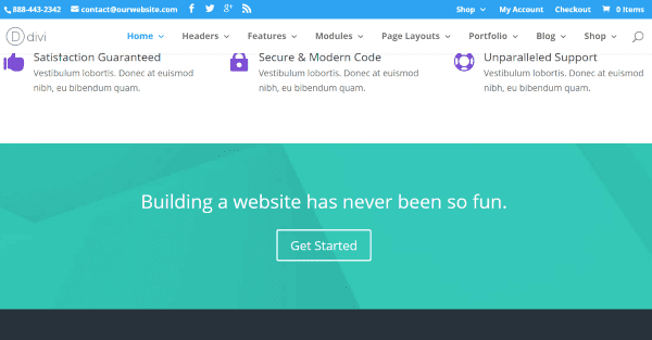
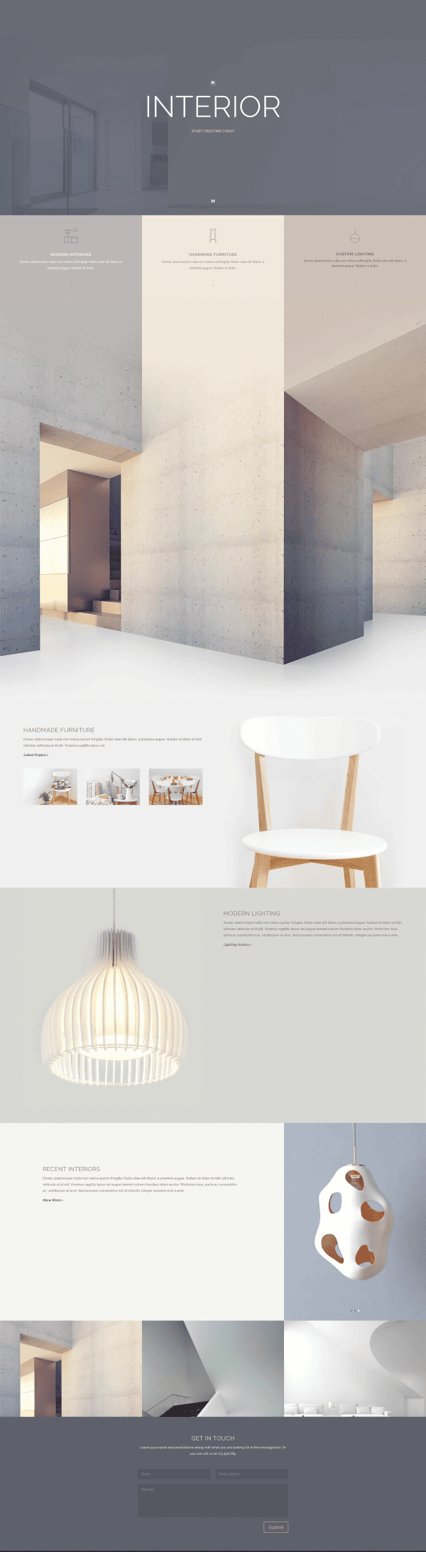
The Extra theme offers plenty of stylish, clutter-free homepage options
So what should you do instead?
- Create a homepage that draws readers in and keeps their attention. Make it simple, and only include the information that needs to be there. Keep it uncluttered. Use it as a quick introduction and give visitors links to what they need. There is no rule that says you have to have everything on one page. Keep your homepage organized. Don’t display every blog post, or even complete blog posts. Divide up the content into smaller bites that go together. Create sections for different categories and label them.
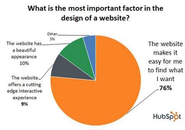
- Focus on UI and UX. Remember, creativity is not the #1 goal. According to Hubspot (downloadable report from homepage), 76% of users say that the most important factor in a website’s design is that they can find what they’re looking for. Usability is more important than pretty.
- Make sure your home page loads quickly. Pages that take too long to load will get a lower ranking in search engines and try the patience of your visitors.
2. Your Layout is Crowded, Cluttered, and Inconsistent
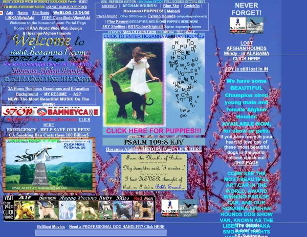
Image source: https://takakusakari.files.wordpress.com/2012/09/bad-page1.jpg
Just like your homepage, the layout for your pages and posts also need to be clean and uncluttered. Don’t place too many ads in the sidebars, headers, and footer. The best place for ads is within the content.
Keep your framework consistent from one page to another. If you have a right sidebar and all of a sudden your visitors are seeing sidebars on both sides with a different color scheme and different header they’re going to think they’ve left your site and went to another. It’s okay to have some variations and differences, but keep the primary design elements tight enough that they know it’s the same website. If you send them to a different site for your store, keep the branding the same – same colors, logo, etc. Inconsistency makes your site seem random.
Divi offers clean layouts with plenty of whitespace.
Don’t forget the white space. Have you ever read text that went all the way to the edge of the screen or the page in a book, or have you seen websites where the design elements were crammed together? It’s distracting and makes the layout too difficult to use.
3. Your Content is Just Text in Large Paragraphs Without Images.
Long paragraphs with no visual breaks or images is visually unappealing. Readers often look for information they can scan quickly. If there’s too much text in one place they might get bored and move on.
You can make your page and post layouts more interesting by using call-outs, quotes, dropcaps, columns, etc. to separate your text and make it scanable. Don’t fall into the “too-long-didn’t-read” pit. Make it easy for them to read. Even in this world of images, text is still important in conveying your message. Use your words concisely. Readers prefer smaller paragraphs that break the text into bite-sized chunks.
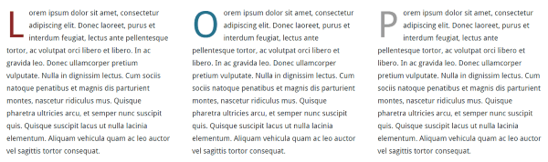
You can say more with pictures than you can with words because they tell a story at a glance. They should look as good as possible while still loading fast for the user. High quality images look professional.
Make sure you use fonts and colors that are easy to read. Use your fonts and colors consistently throughout your website.
4. No Call to Action Or Call to Action Is Not Easy To See
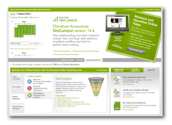
Image source: https://www.2webdesign.com/blog/wp-content/uploads/2014/01/Screen-Shot-2014-01-28-at-3.14.30-PM.png
Have you ever been to a website that you were surprised when you found that they have a newsletter because it was buried so deep that you couldn’t see it? Or found their call to action by accident? You want your call to action to be visible and clear so readers know what response you want from them. Use a clear call to action and be specific. Popups do work for this, but keep in mind there’s a fine balance between making your visitors mad and informing them of your call to action. Don’t forget to entice them to subscribe with something too good to pass up.
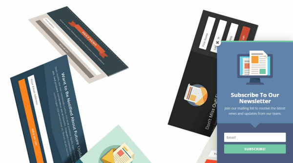
Bloom, in action.
As an example, Bloom is a good tool for creating a call to action. It will give your readers a popup depending on settings that you choose. For example, you can have it to present the call to action after a few seconds on your site, as they go to leave your site, slide or fade in to one corner, etc. Another good option is a call to action module using the Divi Builder.
The Divi Builder can be used to create a CTA as well.
When you create forms for your call to action make them simple and easy to fill out. Unless the form is for a specific purpose that needs the detail don’t ask for more information than you need. Just their name and email is enough. If there are too many fields to fill out visitors might lose interest. Don’t make them work to give you their email addresses. Instead, make it as painless as possible.
5. Your Design Isn’t Responsive
I’m still surprised at the number of websites I go to on my smartphone that don’t format themselves to fit my screen. They require me to zoom in and move the screen from one side to the other to see the content. This is a no-no in today’s online world. This will also affect your search engine rankings because Google penalizes websites that are not responsive.
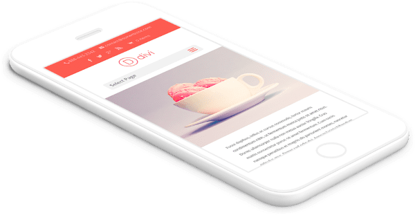
Divi is mobile responsive.
Considering the majority of readers consume Internet content on their mobile devices your design should focus on mobile first. Your site needs to work perfectly on every possible screen size. Make sure to either use a theme that’s responsive or use a plugin that creates a mobile version of your website. Also, test every change on mobile devices and see how they work and look. Make sure navigation is easy.
6. Your Design is Old
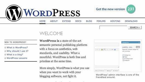
Image source: http://freelancefolder.com/wp-content/uploads/wordpress-old1.jpg
You don’t need to change your design every few months (actually, don’t change your design every few months!), but you do want your website to include modern features. If your site looks more than two years old then it looks much older than that in Internet years. Visitors will immediately conclude that you’re not up to speed on modern trends and your design skills are outdated.
Divi has new designs that will keep your site up with the latest trends.
You don’t need to follow every new trend, but you do need to follow trends that are becoming standard, such as Material Design, minimalism, and sections.
7. Your Site Focuses on the Bells and Whistles
Image source: https://www.waltercedric.com/images/stories/29379a375162_1346F/joomlatags.with.adobe.flash.png
We’ve all seen websites that use the latest design trends – such as parallax scrolling, video sliders, animations, etc. – but they just don’t have any real substance because they lack quality content, or the bells and whistles are overdone and they distract from the content.
Rather than adding content to the bells and whistles, make your content the focus. Use the flashy stuff like salt and spices – just enough to give it flavor. Too much flashiness can be distracting and it won’t make up for mediocre content.
Think of how fun Tetris still is today. It doesn’t need fancy animations to be a fun game. If we modernized it we would still focus on what makes the game great and then add only what was needed where it was needed.
Bad menus make your visitors ask, “What am I even looking at?”
If you allow WordPress to handle your navigation it will add every new category to your primary menu and cause your structure to become cluttered and unruly. This makes it difficult to navigate. If your visitors can’t find what they’re looking for within a few clicks they will give up and move on to the next website that catches their eye.
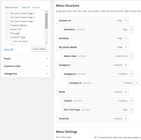
Setting up custom menus in WordPress.
WordPress gives you the tools you need to create your own navigational structure. Go to Appearance and select Menus. You can then drag and drop your menu elements and add categories and links to create your very own menus. Create a logical structure that helps the user quickly find what they want. Keep it clean and simple.
This Divi menu is straightforward and easy to navigate.
Your visitors are some of the best marketing resources you have. A friend tells a friend and it explodes from there. People love being the one that found something before their friends. But what if they’re not sharing your content? You have to help and encourage them. If visitors don’t see sharing buttons they’re not as likely to share your content with their social networks. You need to make it as easy as possible.
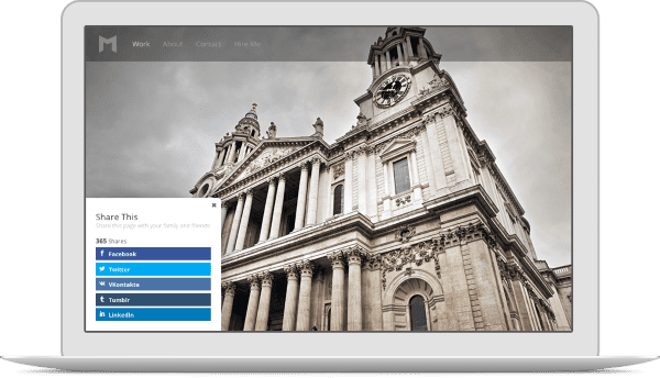
Monarch social sharing to the rescue!
Simplify the process by providing visitors with the sharing buttons they need. Make it easy for them by including sharing buttons on each post, too.
10. Bad Choice of Color

Image source: https://abcomm.files.wordpress.com/2011/04/screen-shot-2011-04-28-at-5-00-16-pm.png
Bad color combinations are hard to read, they make the website seem disconnected because they don’t really go together, and they’re not conducive to a positive response. If you use a different color scheme for each page it’s possible these colors make visitors feel like they’re on a different website. There’s no consistency in the brand.
Colors that are too loud will make your site look unprofessional. The colors need to fit the profession, but they must not be boring. Remember color theory and psychology. Your choice of color will affect the mood of your audience.
You can use the many online tools to help you choose colors that match and even see them in action before using them on your website. Good color tools include:
Paletton
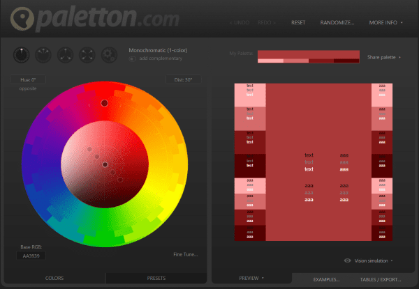
This free online tool lets you select your primary color and it gives you matching colors. It has many features and options and it’s easy to use. It gives you RGB and hex codes for the colors, too.
Adobe Color CC
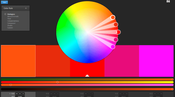
Adobe’s free online color tool lets you choose colors based on factors that you choose. There are lots of options and you can even create your own combinations. It gives you RGB and hex codes.
Web Style Grabber
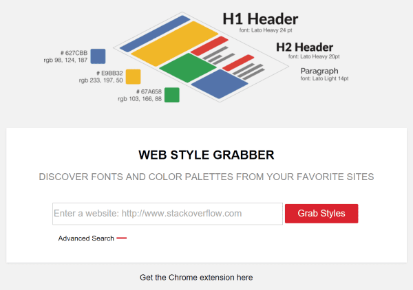
This new online tool gives you the color values and fonts of headers and paragraphs from any website. Just paste in the URL and click Grab Styles. This is a great tool if you want to use the same or similar styles to other websites. It gives you hex and RGB codes.
Final Thoughts
Good web design requires finding the right balance between creativity and functionality. Too much focus on creativity can make the site unusable and too much focus on usability can make the site boring. It’s okay to experiment, but don’t obligate yourself to stick with a design that isn’t working. Analyze your site and makes as many improvements as you can. The results might just surprise you.
I want to hear from you. What reasons have you seen that cause web designs to not work? Do you have anything to add? Let us know in the comments.
Article thumbnail image by LOVE YOU / shutterstock.com


Thank you for providing the easy solutions to all such very common website problems.
Hi
A very good article. Very helpful for those who want to redesign their website of what they should avoid. Thank you very much.
Amazing article. I would start with the point mentioning designing of a website as it makes the impression as and when a visitor is on the page. Select a clean, attractive and responsive design that allows visitors to easily understand the contents of a page. Make sure you use an enterprise web content management service that gives number of tools to choose from for better site designing. Another important aspect is placing of CTA, where it must be clearly visible and a visitor can take the desired action. Page navigation, Loading time and image optimization are the next tasks. With this things in place, the possibility of delivering an effective website increases.
Thanks for the great tips & references to nice online tools for color selections…
Always good to be reminded of what NOT to do.
I really love that #4 uses the example of Sitecatalyst, a huge corporate web analytics product, goes to show that having mountains of data and tools is not the solution. Testing and experience go much further…
you forgot the biggest problem with divi
speed & performance
lots of css and javascript files
inline css when using customizer
Really nice tips… though we do keep these things in mind but very important to keep reminding ourselves not to budge down to client’s pressure and end up doing something like those designs.
A very good article. I am doing redesign my website and contents. This is really helpful of what I should to avoid. Thank you very much.
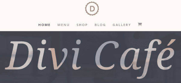
Good post. Am I the only one who can’t stand this new design trend where there are dozens of enormous images and very small amounts of tiny-font-size text in little sections throughout a ridiculously long page? (Yes, I do mean like the Divi Cafe demo site). To me, that makes it painful to use, even though it is attractive at a purely visceral level.
I had a great time reading through this article. Thank you for sharing!
Very well written and exactly what I say to my clients. I focus on marketing, usabilty and SEO results so I’m often shocked at the way people levee the main essence of their content buried in “products” and “services” menus. Just hit me with it at the top level navigation!! ps. #5 responsiveness… I still can’t understand why Elegant Themes hasn’t sorted that on their own site yet. It’s infuriating because there is so much good content on here. The immediate popups always irritate me too, especially considering I’m *already* signed up… and have a developer licence. Pssssh.
Image sizes are very important as they have a direct imoact on loading times and user experience.
[quote]WordPress introduced responsive images in WordPress 4.4. This means that since 4.4, users on smaller screens get to see a smaller image appropriate for their screen.
This feature is great as it not only improves performance of websites on smaller screens, it also saves them money on data plans.
WordPress 4.5 will improve this further more. It will optimize images further to reduce their site upto 50% without any visible quality loss.[/quote]
Such a pity Divi users are out in the cold!
Thanks for confirming that what Divi helps me do with my new website works so well. Much appreciated!
Charlie
Nice article. Speed is such an issue when opening a blog. I have a welcome video that self-starts. I am probably going to be changing that.
Nice article – it is sometimes difficult to convince some, but agree that “the most important factor in a website’s design is that (users) they can find what they’re looking for. Usability is more important than pretty.”
Awesome post. I’ve just realized that this blog is not responsive… quite a surprise to find this out while reading on the subject!
All good points. Some hard for clients to accept.
Sorry, but I read this post on an iPad and did not find an easy way to share it to my business FB page….did I just miss your social share buttons? I saw ones to follow.
Good post. Your example images are hilarious, if very exaggerated compared to most websites. I find it much more likely that a website will not be mobile responsive, or use an out-dated WordPress theme. But this post makes a great case for why anyone who wants an attractive website should start with Divi or Extra.
Fantastic post, Randy! I’m adding this one to my Pocket 🙂
I wanted to add another super amazing color tool that I use for design–all the time. It’s called Color Combos and it’s one of my most favorite design tools. They have a bunch of different tools, such as the “grab colors” tool to generate a detailed list of every color used on a specific URL page. You can search through thousands of color combos created by other users. You can create your own color combinations and save them for future use. I could go on and on, but suffice to say, it’s pretty flippin’ sweet!
Nice post. Yes, web design requires finding the right balance between creativity and functionality. Thank you for sharing your post.
Great post! I just found out today that a PDF on our dev site is not always view-able on phones.
Is the problem with the phone settings or do I need to work on a responsive setting on my end?
The Webstyle grabber seems to work well for colours but not so well for fonts
Absolutely love this post. The sad thing is there are SO many of these out there.
Great tips! I’d like to think you pulled a couple of those images off a Geocities archive from the early 1990s… but unfortunately, they’re probably current.
I’m glad you made the point, too, that beautiful design can be unusable (as a family friend said, of me, when I was first born: “She’s pretty, but what can she DO?”) It’s not all about you – it’s ALL about your customers and readers.
Thank you, great post.
Make it simple…
Makes sense. Thanks for this great post.
Great article, Randy. Lots of good tips and resource suggestions. Thank you. This goes right into my Evernote design notebook.
I’ve been an East Tennessean for a long time. Twenty-five years in Knoxville and now in Chattanooga.
Thanks Martin. I live in Sweetwater – almost exactly between them.
All agreed, however I think a few of these can be challenging for clients to understand. Often I find clients who feel their cerca 2001 design website looks ‘established’ and ‘professional’. I wonder how often the understanding or misunderstanding of the target market plays into these mistakes being made.
P.S. Speaking of responsive design… The image source link on point 7 is over running the bounds of the content area. So this post is currently not fully responsive! Chaos!
Yep. We need to go fully responsive ourselves. It’s crazy how working so hard on client work or your own products you can neglect your own site! Thankfully we’ve got a design update in the works 🙂
Loved the article and illustrations…..Thank you!
Above all, love your themes!
Excellent points, thank you
Web Style Grabber… just made my day. THANKS!
Agreed!! on Web Style Grabber! Nice.
Great article – bookmarking.
Oh, man, some of these examples make me cringe…
They are sooooo bad they are good.
#11 your website is just too slow loading up…
[quote]WordPress introduced responsive images in WordPress 4.4. This means that since 4.4, users on smaller screens get to see a smaller image appropriate for their screen.
This feature is great as it not only improves performance of websites on smaller screens, it also saves them money on data plans.
WordPress 4.5 will improve this further more. It will optimize images further to reduce their site upto 50% without any visible quality loss.[/quote]
Such a pity Divi users are out in the cold!
Nice post and a good reminder of what not to do.