
Tables are a great way to organize data to make it readable. They’re good for displaying addresses, product features, inventory, schedules, statistics, and more. Due to the nature of tables needing space to display data correctly they are difficult to make responsive.
Do tables need to be responsive? What’s the downside? In this article, I show why tables should be responsive and explore a few methods to format them so they display correctly on any screen size. The images are screen captures of Google Chrome Developer Tools (right-click on a page and select Inspect) to view the page as various mobile devices in the free Twenty Seventeen WordPress theme.
Subscribe To Our Youtube Channel
Why Responsive Tables are Important for WordPress Websites
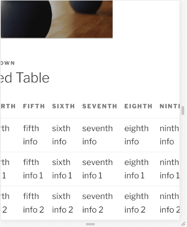
The image above shows what happens when a non-responsive table is viewed on a mobile device. The user is forced to scroll the screen in order to see the data. This moves the entire page as you can see by the header and page title scrolling out of view, which harms the design of the website and isn’t a good user experience.
Like anything else that displays on a screen, tables should be responsive, adjusting themselves to suit the display area so they remain usable and readable. Tables also need to fit within layouts such as those created with Divi or other page-building themes, and with landing page building plugins.
The problem is a table needs a certain amount of space in order to present the data. This space is the minimum space that a table requires to display its data correctly. This means it won’t always be able to adjust to the size of the screen. What it can do however is format itself differently so it remains usable.
HTML Tables
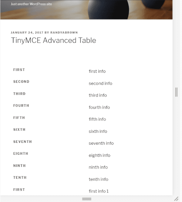
One of the most popular methods for building tables is using HTML. They can be coded by hand or with plugins such as TinyMCE Advanced or similar plugins.
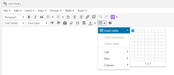
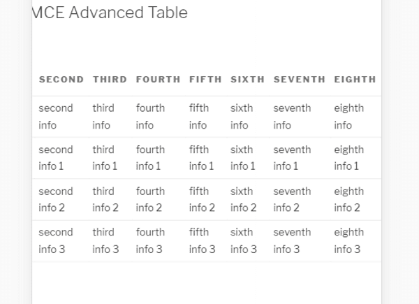
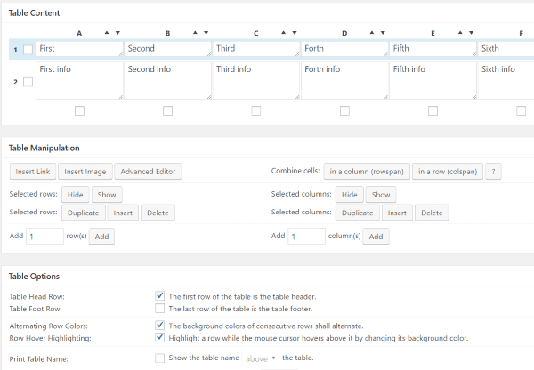
TinyMCE Advanced can create HTML tables easily. Simply highlight the number of columns and rows you want and fill in your information. Small tables, with only a few columns, typically look fine on most devices and screen sizes.
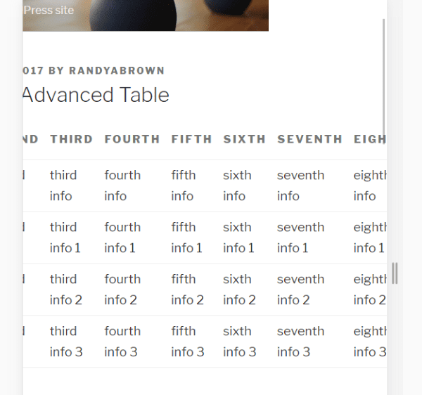
Unfortunately, the tables aren’t responsive. When I view the table on a mobile device or a smaller window part of the table is hidden. Here’s how it looks using Chrome’s developer tools with a mobile device selected. In this view, the user can’t see the data past the seventh cell. This is not a good user experience.
HTML tables can respond to screen sizes but they scrunch the content and overflow past the small screen, causing the readers to drag the browser on mobile screens. This is especially true for tables with lots of data such as long strings of text or images.
How to Create Responsive Tables
There are two ways to make a responsive table: manually using HTML and CSS, and by using plugins. The best option for manual coding is to reformat the table to remain viewable on multiple screen sizes by setting breakpoints. Plugins create this code or format their own tables, depending on the type of plugin you choose. Check here if you are wanting to see the best current table plugins for WordPress.
Reformatting the tables can make them scrollable or stackable. Scrolling is an acceptable method to keep a table readable when it remains within the window without scrolling the entire screen. You can set the breakpoint so that the text never reduces in size or scrunches together. Instead, the table changes to scrollable when the screen hits the breakpoint that you’ve determined.
Manual Adjustments for HTML Tables
This is a table made with HTML. Notice when the table scrolls the page does too. You can see the header and title have moved in this image, interrupting the design of the website. This can be fixed using CSS to set a media breakpoint.
Using CSS
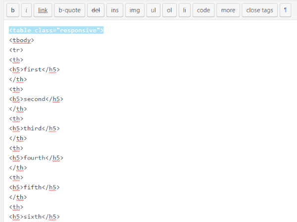
Give your HTML table a class such as ‘responsive’ in the image above (in the Text tab). Next you will add the CSS class called ‘responsive’ to your stylesheet. You can so this by adding it to the stylesheet of a child theme (in the dashboard go to Appearance, Editor, Stylesheet), within the CSS code editor of themes such as Divi (in the dashboard go to Divi, Theme Options, and scroll to the bottom), or within the Additional CSS in the theme customizer.
Paste this code into your CSS location:
@media only screen and (max-width: 840px) {
table.responsive {
margin-bottom: 0;
overflow: hidden;
overflow-x: scroll;
display: block;
white-space: nowrap;
}
}
Adjust the max-width (I’ve chosen 840px) to choose the screen size for the breakpoint.
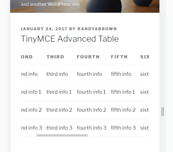
This places the table within a scrollable window. Notice the header remains in place and the table scrolls within the window, keeping the page design intact.
This works fine for those comfortable with HTML and CSS, but it can take time to set up and troubleshoot if there are any problems. A much faster and easier way to make your tables responsive is by using a plugin.
Using Plugins
There are several good plugins for creating responsive tables. With many of the plugins the tables are created separately from the page or post and then inserted using a shortcode. Some of these plugins let you manage your tables, reuse them, and import or export them, while others make your current HTML tables responsive.
Here’s a look at some of the most popular plugins with examples of how they work.
TablePress
TablePress is one of the most popular table plugins with over 500,000 active installs. Out of the box TablePress isn’t responsive. Fortunately there’s an easy solution.
Responsive Tables for TablePress is a premium extension that changes the display modes of a table allowing you to display in flip, scroll, and collapse based on the type of screen your readers are using.
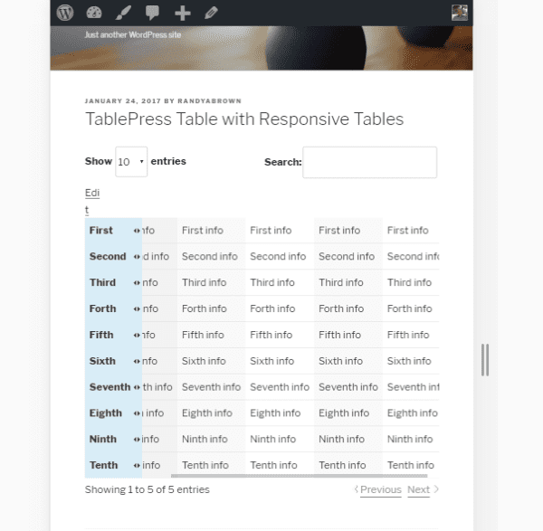
Adding the shortcode for scroll creates a scrollable window to contain the table so the user can see all of the data. Here’s a look at the table on a phone.
The real advantage in this plugin is the flip mode. This mode allows you to specify a breakpoint by choosing a device. This can be used with themes such as Divi that lets you create multiple sections or rows that can be displayed based on the device. Choose between desktop, tablet, phone, or all. In the example above I’ve chosen all.
Easy Table
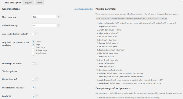
Easy Table is unique in that you place your data as CVS files within table tags in your content and it’s converted into a table automatically. You adjust the attributes and parameters within the options.
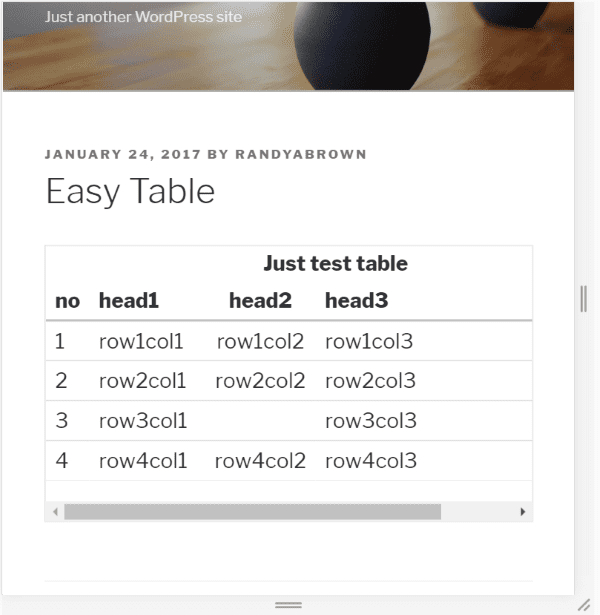
When displayed within a responsive window the table becomes scrollable. It has lots of adjustable parameters to control the formatting.
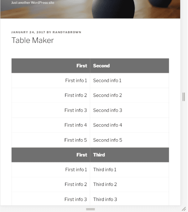
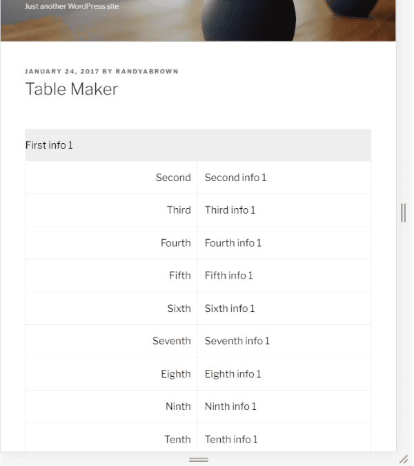
Table Maker
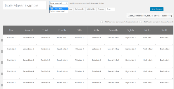
Table Maker is a table-creation tool that lets you choose between stacking the rows or the columns. The tables are created separately and placed within your content using shortcodes.
Here’s how it looks with Column Stack selected.
This example uses Row Stack.
Magic Liquidizer Responsive Table
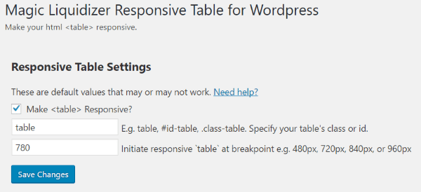
Magic Liquidizer doesn’t build tables. Instead, it works with all HTML tables and lets you set the breakpoint where your tables changes formats. You can specify the tables by using classes or id’s, or use it globally by using the default table setting.
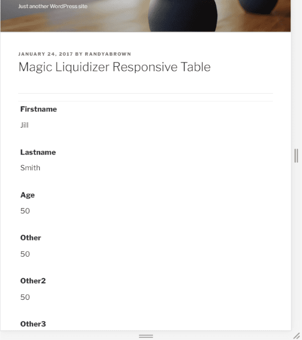
This is a standard HTML table. It automatically stacks the tables vertically.
Automatic Responsive Tables
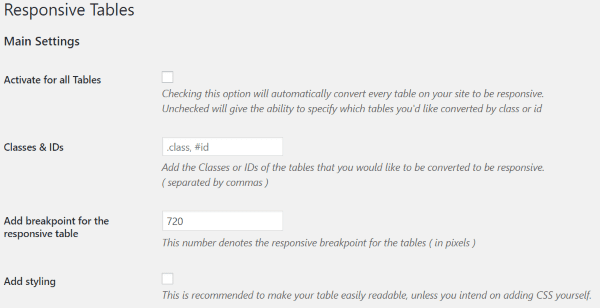
Rather than giving you the tools to create tables, this one works with HTML tables you’ve already created and makes them responsive. You can either create a CSS class to use on any table you want or activate the settings for all tables. You can set the breakpoint to any pixel size you want.
The result is a reformatted table when the pixels hit the number that I set as the breakpoint. I like that this one works on tables that I’ve already created.
Data Tables Generator
Data Tables Generator is a table creator that is responsive by default. Tables can be displayed using the standard shortcode, with php code within the theme files, or display a single cell. It will even perform calculations like a spreadsheet and display charts. It’s probably the most powerful plugin on this list.
It has three responsive modes to choose from:
- Standard
- Automatic column hiding
- Horizontal scroll
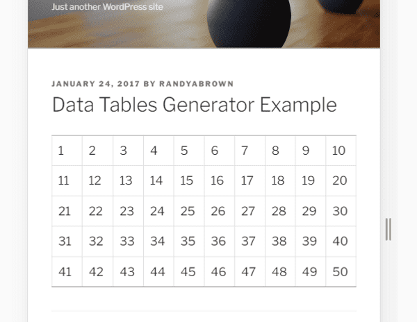
Standard will reduce the size of the table until it hits the breakpoint.
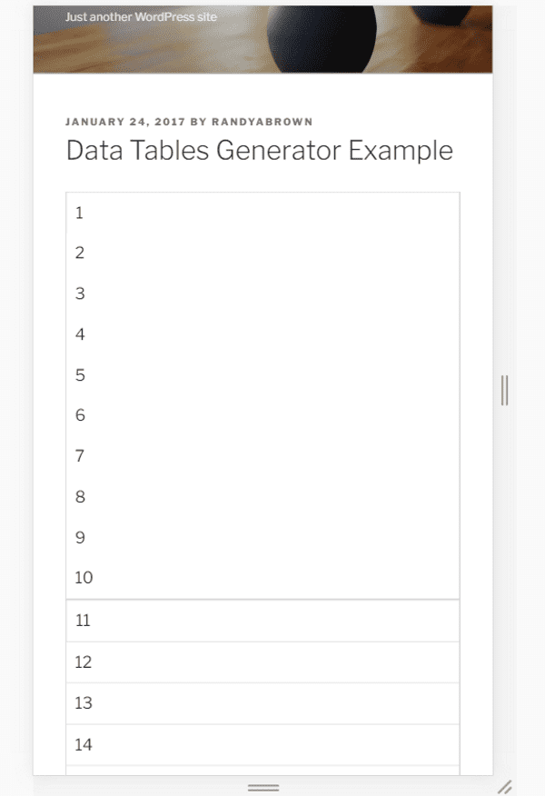
Here’s how it formats the table after it reaches the breakpoint.
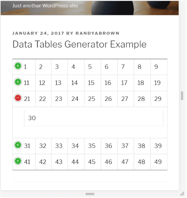
This example uses Automatic Column Hiding. It places the tables within a window that doesn’t scroll. Instead, users can click the green plus to see the content that isn’t displayed.
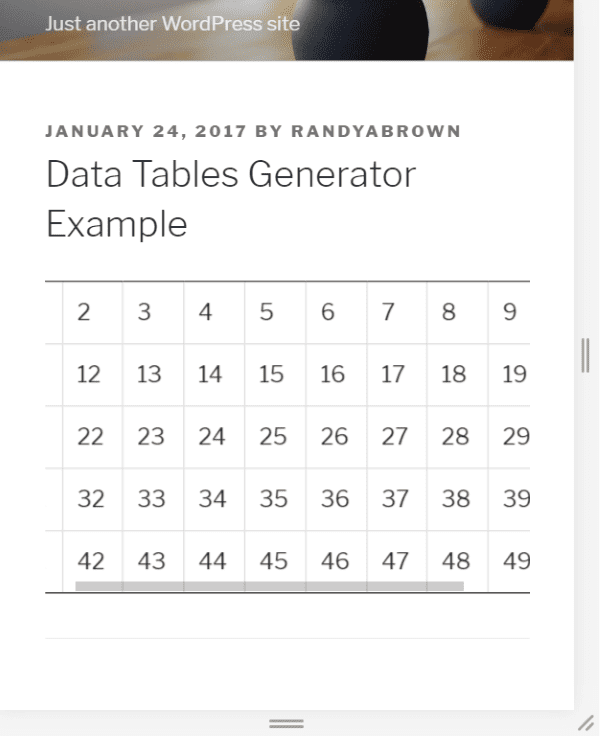
This one uses Horizontal Scroll. It’s good to see this is still an option.
Final Thoughts
Tables are a great way to display data in WordPress websites but making them responsive can be a challenge. Making your tables responsive is just as important as any other web-design element in order to ensure the best user experience for your readers.
Using HTML and CSS, or using one of these six plugins, you can make your tables responsive and readable without doing harm to your website’s design. Between them you’re sure to find the features and layout options you need.
We’d like to hear from you. What is your favorite method to make a table responsive?
Featured Image via Timashov Sergiy / shutterstock.com


Which one is compatible with divi 3.0?
It’s not plugin but Tablesaw is lightweight & awesome.
https://github.com/filamentgroup/tablesaw
You just need to include library and add class name to tables.
Will be useful if Divi/Extra can support table module that can do sorting and comparison other than just price table module.
Awesome, I was looking for this
Thank you so much
Thanks for posting this. I love seeing all these posts on what we can do to modify Divi Themes. But I am wondering if it is possible to include some of these codes into the actual theme?
I know the codes might increase the theme by a lot. BUT it will be helpful for us who don’t have to scour around on this blog to find the code and customize it to each site we own.
Just a suggestion. Keep up the good work!
I’ve used Tablepress with the responsive plug-in but is starting to like
Data Tables Generator. Would not mind wpdatatables but the price is a bit high.
Responsive tables are necessary for neighboring to the users nicely. I am good with wpDataTables. But, this articles made think of gathering the knowledge of FooTable.
Pitty that TablePress isn’t listed: https://tablepress.org/
I use it for several years now and the plugin is responsive since 2014.
I love that I have styling and sorting options (either for all tables or for individual tables) as well.
I do believe that it was the 1st plugin mentioned.
Actually Natascha, TablePress is listed, while I agree that it is a great plugin for table creation, you’ll need to add an extension to make it truly responsive. That is also alluded to in the post.
It would have been easier to see if I had included the image from the plugin page. Sorry about that.
i’m a big fan of TablePress as well! A great free plugin 🙂
Thanks everyone! These plugins look great!
I’m using the wpDataTables plugin – it allows updating of the table contents from the front-end.
wpDataTables is brilliant especially for large amounts of data as it can store entries in the SQL database.
Can also use it to display data from existing tables. Currently using it to show entries captured from Caldera forms.
Another responsive, non-plugin solution using clever CSS is Matt Smith’s “Simple Responsive Table” http://codepen.io/AllThingsSmitty/pen/MyqmdM
How clever is that?
Thanks Mr BadCat!
See FooTable in action here:
http://fooplugins.github.io/FooTable/docs/getting-started.html#examples
Great article Randy! For me the most elegant solution I seen so far has been “Footable” (https://wordpress.org/plugins/footable/).
Unfortunetly, the author has not updated since a couple years 🙁 Hope someone could takeover the plugin.
For Divi theme, I’m a huge fan of foo table . It easy to use, and still looks great and nice 🙂 , even this plugin has not updated since a couple of years.
I had great success with the FooTable Plugin.
Nice 🙂
Very good article
Responsible Tables are very important for making price tables for e-commerce sites. Thanks for sharing such a useful tutorial.