
Divi and its built-in element structure can be used in traditional ways to define and style different sections, rows, columns and modules. But, they can also be used creatively to enhance the design structures on your page. In this tutorial, we’ll show you how to use column outlines to emphasize your Divi design grid. We’ll dedicate an absolute-positioned row to create the beautiful background column outlines and merge it with other rows in our section. You’ll be able to download the JSON file for free as well!
Let’s get to it.
- 1 Preview
- 2 Download The Column Outlines Layout for FREE
- 3 Download For Free
-
4
Let’s Start Recreating!
- 4.1 Add New Section
- 4.2 Add Row #1
- 4.3 Column 1 Settings
- 4.4 Column 2 Settings
- 4.5 Add Text Module #1 to Column 1
- 4.6 Add Text Module #2 to Column 2
- 4.7 Add Button Module to Column 1
- 4.8 Add Image Module to Column 2
- 4.9 Clone Entire Row Twice
- 4.10 Dedicate New Row (at Top of Section) to Column Outlines
- 4.11 All Column Main Element CSS Width
- 4.12 Column 1 Settings
- 4.13 Column 2 Settings
- 4.14 Column 3 Settings
- 4.15 Column 4 Settings
- 4.16 Column 5 Settings
- 4.17 Add Divider Module to Column 1 & 2
- 5 Preview
- 6 Final Thoughts
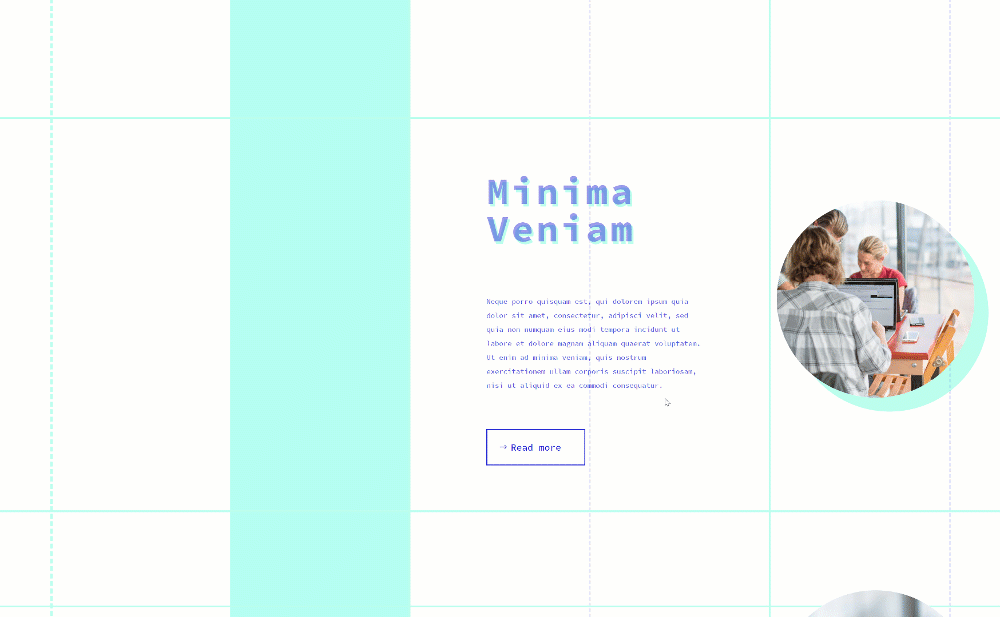
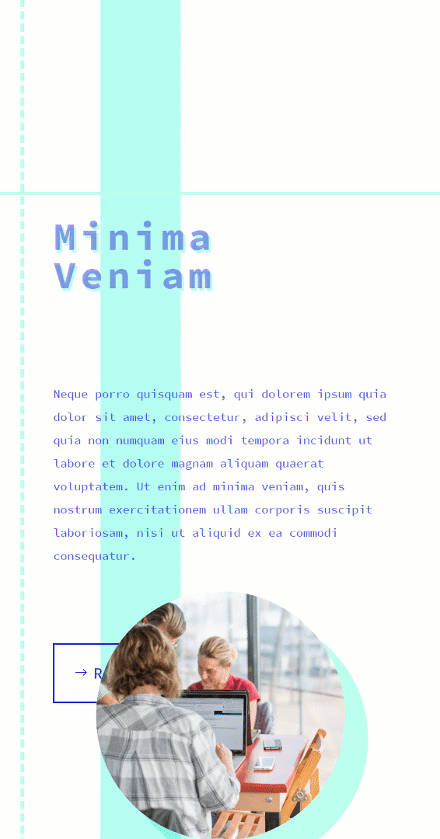
Preview
Before we dive into the tutorial, let’s take a quick look at the outcome across different screen sizes.
Desktop
Mobile
Download The Column Outlines Layout for FREE
To lay your hands on the free column outlines layout, you will first need to download it using the button below. To gain access to the download you will need to subscribe to our newsletter by using the form below. As a new subscriber, you will receive even more Divi goodness and a free Divi Layout pack every Monday! If you’re already on the list, simply enter your email address below and click download. You will not be “resubscribed” or receive extra emails.

Let’s Start Recreating!
Add New Section
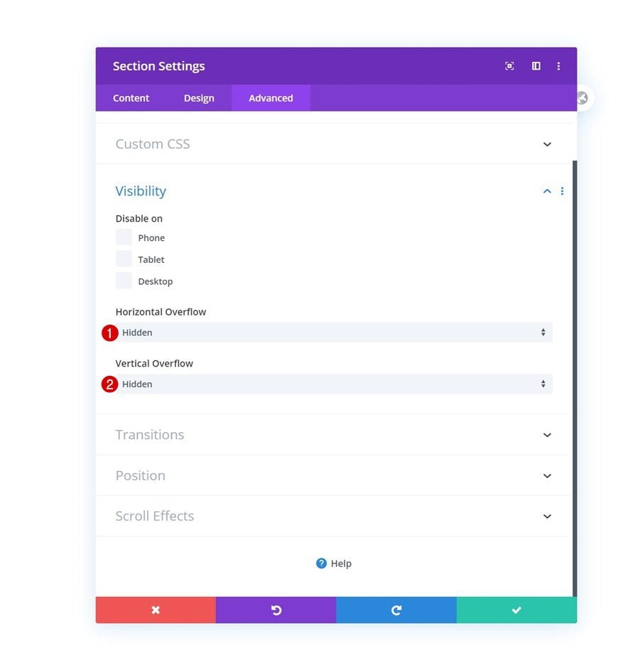
Overflows
Start by adding a new section to the page you’re working on. Open the section settings and set the overflows to hidden. This will help ensure that nothing surpasses the section container, specifically the column outlines we’ll add later on the tutorial.
- Horizontal Overflow: Hidden
- Vertical Overflow: Hidden
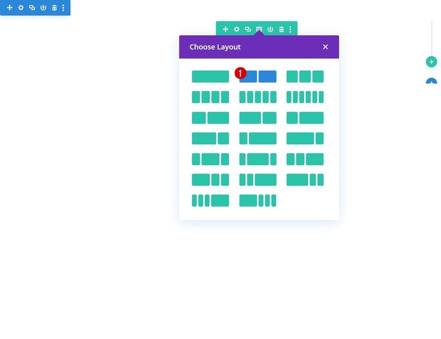
Add Row #1
Column Structure
Continue by adding a new row using the following column structure:
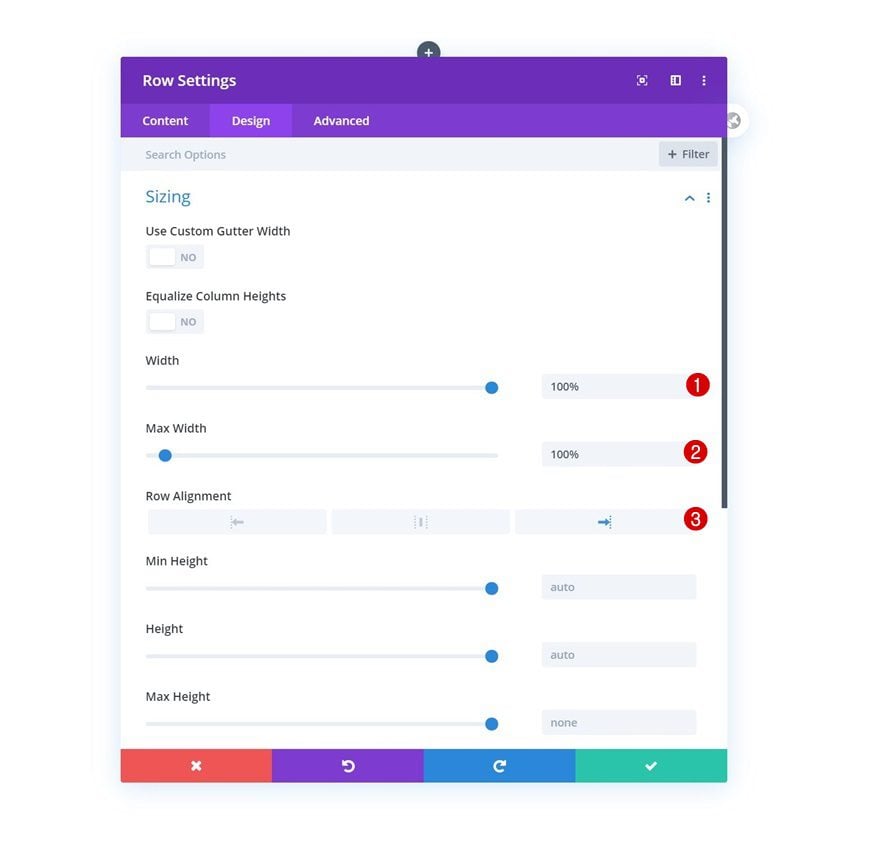
Sizing
Without adding any modules yet, open the row settings and modify the sizing settings as follows:
- Width: 100%
- Max Width: 100%
- Row Alignment: Right
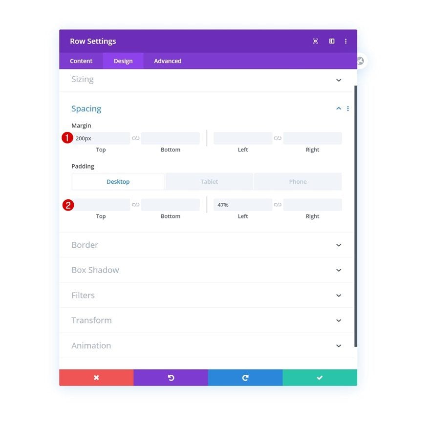
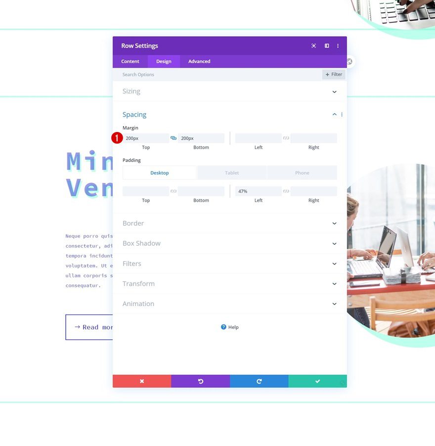
Spacing
Next, we’ll push the row to the right side of the page on desktop using some custom sizing settings.
- Top Margin: 200px
- Left Padding: 47% (Desktop), 6% (Tablet), 10% (Phone)
- Right Padding: 6% (Tablet), 10% (Phone)
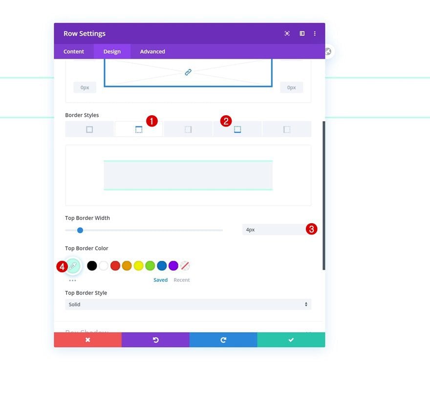
Border
We’ll complete the general row settings by adding a top and bottom border.
- Top & Bottom Border Width: 4px
- Top & Bottom Border Color: #bdffed
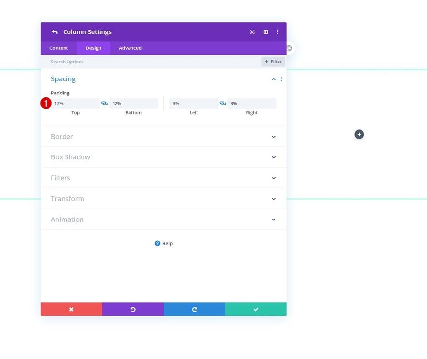
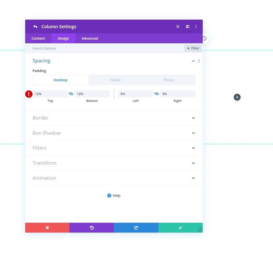
Column 1 Settings
Spacing
Once you’ve completed the general row settings, open the first column’s settings and add some custom spacing values.
- Top Padding: 12%
- Bottom Padding: 12%
- Left Padding: 3%
- Right Padding: 3%
Column 2 Settings
Spacing
Open the second column’s settings next and use the following spacing settings for it:
- Top Padding: 12%
- Bottom Padding: 12%
- Left Padding: 5% (Desktop), 20% (Tablet), 15% (Phone)
- Right Padding: 5% (Desktop), 20% (Tablet), 15% (Phone)
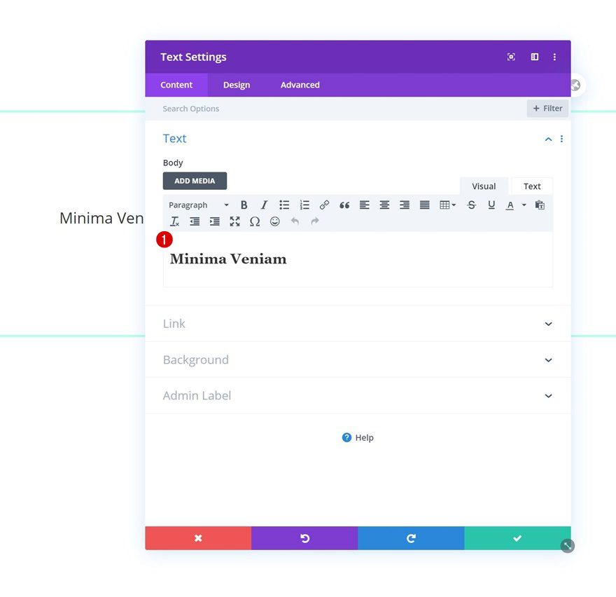
Add Text Module #1 to Column 1
Add H2 Content
Time to add modules, starting with a Text Module containing H2 Content in column 1.
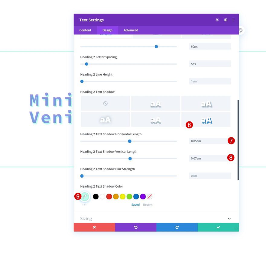
H2 Text Settings
Move on to the module’s design tab and modify the H2 text settings accordingly:
- Heading 2 Font: Source Code Pro
- Heading 2 Font Weight: Bold
- Heading 2 Text Color: rgba(35,38,211,0.46)
- Heading 2 Text Size: 4vw (Desktop), 60px (Tablet), 50px (Phone)
- Heading 2 Letter Spacing: 5px
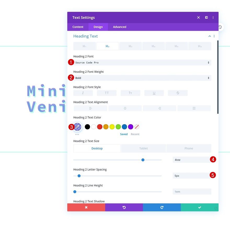
- Heading 2 Text Shadow Horizontal Length: 0.05em
- Heading 2 Text Shadow Vertical Length: 0.07em
- Heading 2 Text Shadow Color: #bdffed
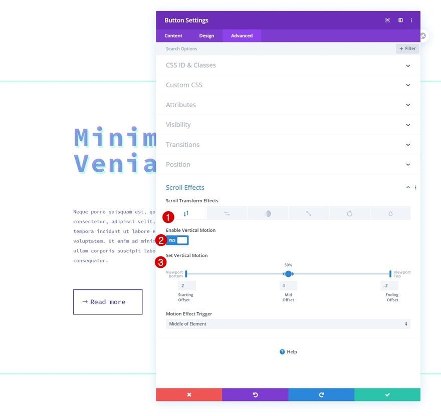
Vertical Motion
We’ll add some vertical motion too.
- Enable Vertical Motion: Yes
- Starting Offset: 2
- Mid Offset: 0
- Ending Offset: -2
- Motion Effect Trigger: Middle of Element
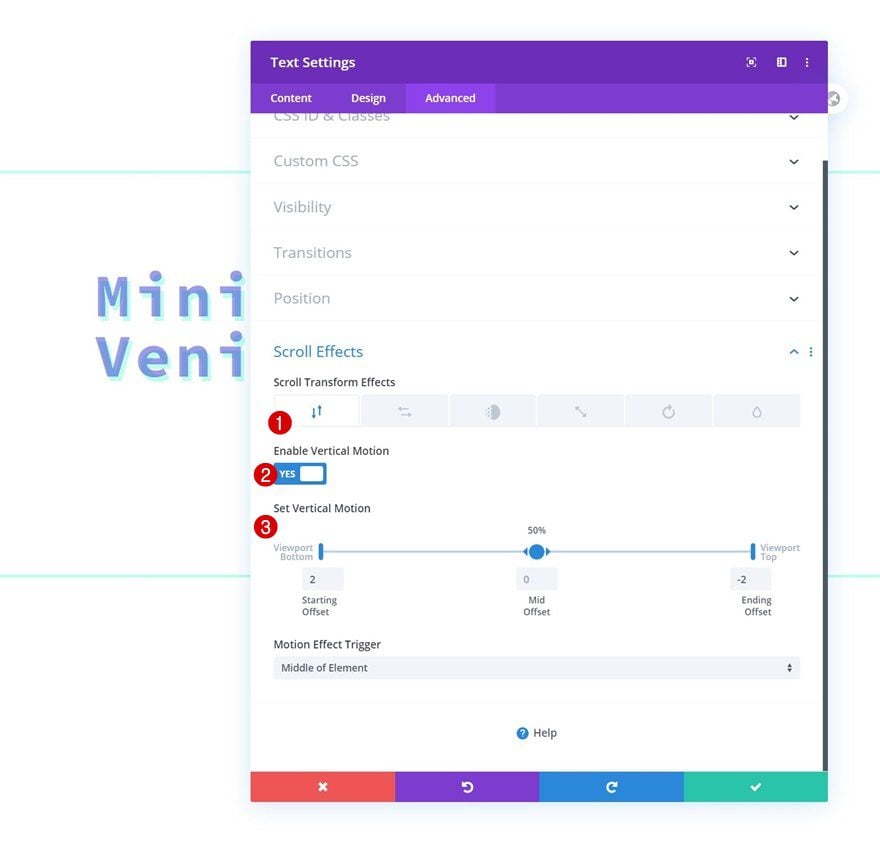
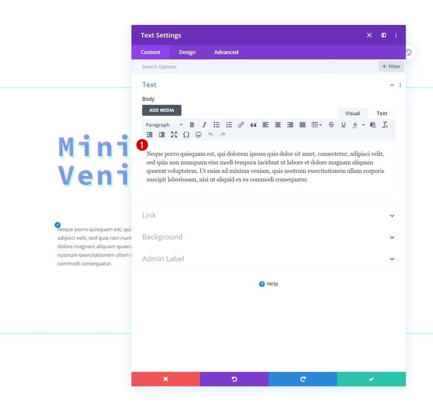
Add Text Module #2 to Column 2
Add Content
Add another Text Module right below the previous one and insert some description content of your choice.
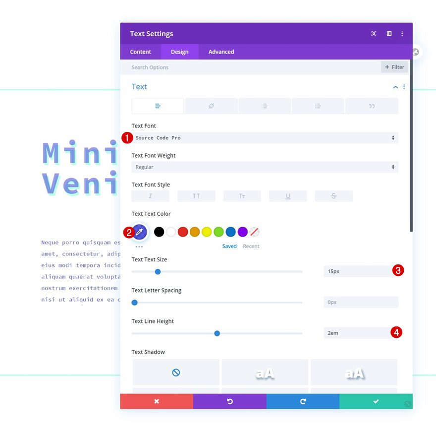
Text Settings
Move on to the module’s design tab and modify the text settings accordingly:
- Text Font: Source Code Pro
- Text Color: rgba(35,38,211,0.76)
- Text Size: 15px
- Text Line Height: 2em
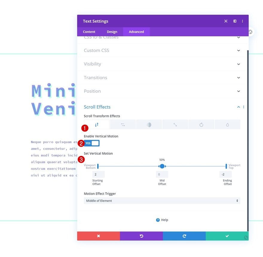
Vertical Motion
We’ll use some vertical motion for this module too.
- Enable Vertical Motion: Yes
- Starting Offset: 2
- Mid Offset: 0
- Ending Offset: -2
- Motion Effect Trigger: Middle of Element
Add Copy
The last module we need in column 1 is a Button Module. Add some copy of your choice.
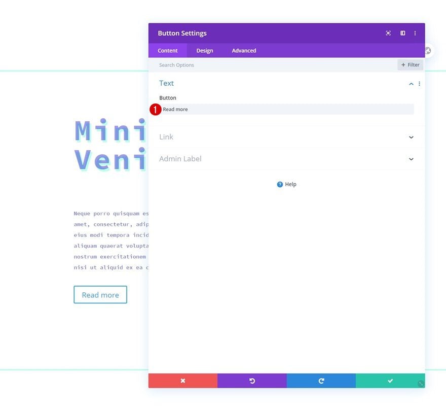
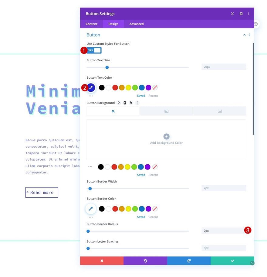
Button Settings
Move on to the module’s design tab and style the button as follows:
- Use Custom Styles For Button: Yes
- Button Text Color: #2326d3
- Button Border Radius: 0px
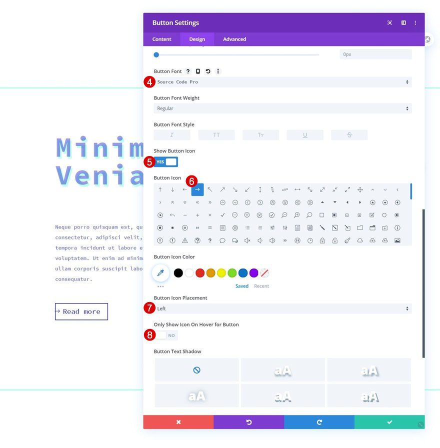
- Button Font: Source Code Pro
- Show Button Icon: Yes
- Button Icon Placement: Left
- Only Show Icon On Hover for Button: No
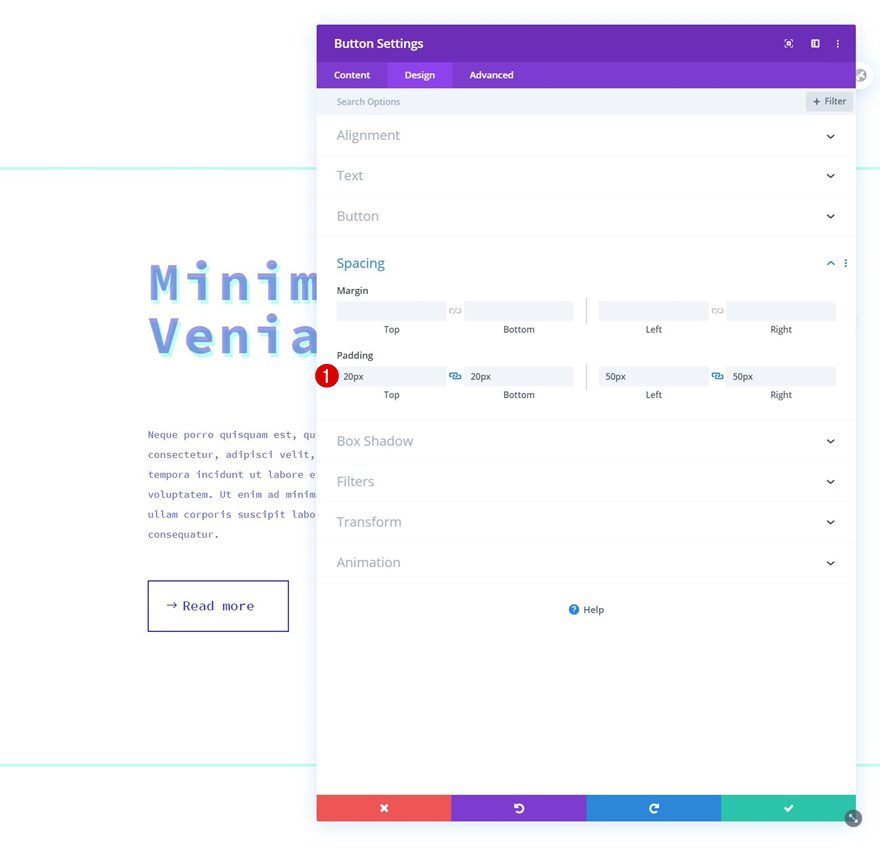
Spacing
Then, add some custom padding values.
- Top Padding: 20px
- Bottom Padding: 20px
- Left Padding: 50px
- Right Padding: 50px
Vertical Motion
And complete the module settings by adding some vertical motion.
- Enable Vertical Motion: Yes
- Starting Offset: 2
- Mid Offset: 0
- Ending Offset: -2
- Motion Effect Trigger: Middle of Element
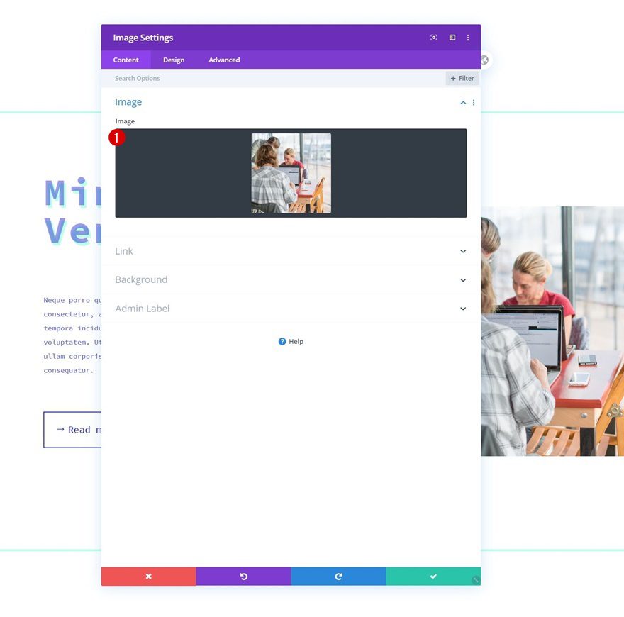
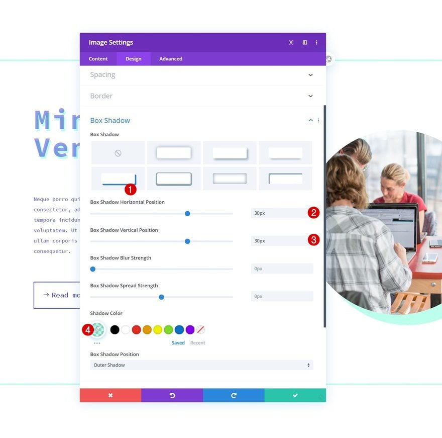
Add Image Module to Column 2
Upload 1:1 Ratio Image
In column 2, the only module we need an Image Module. Upload an image with a 1:1 ratio.
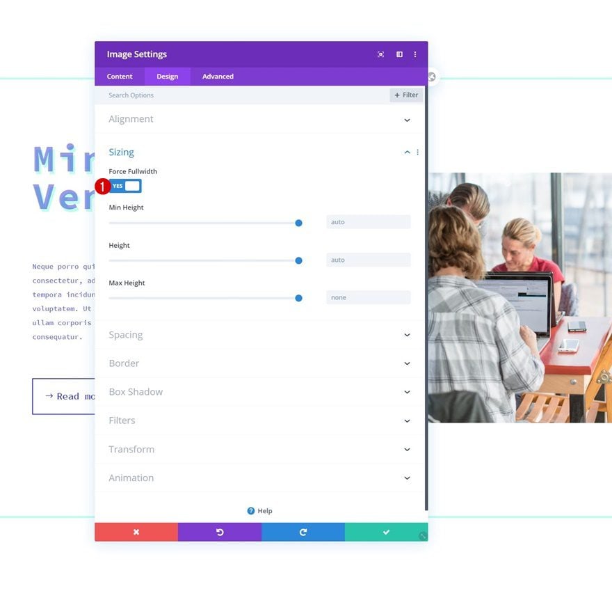
Sizing
Move on to the module’s design tab and force fullwidth on the image.
- Force Fullwidth: Yes
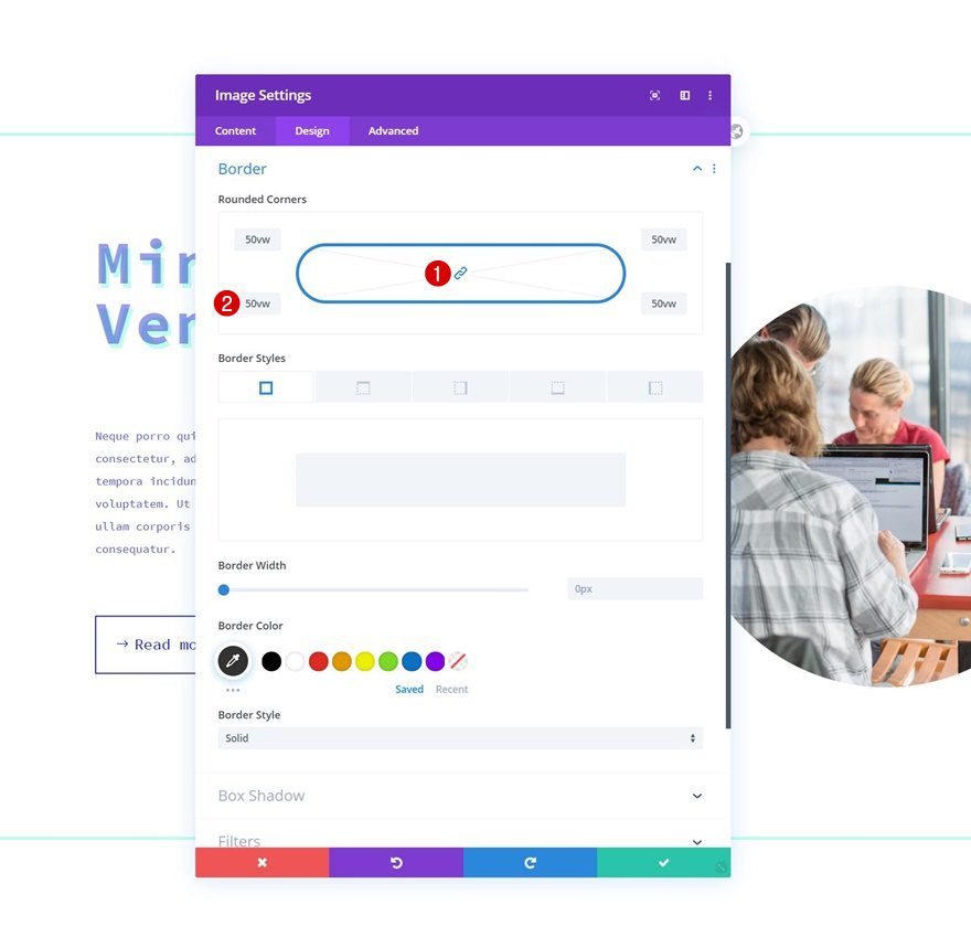
Border
We’ll turn the image into a circle by adding some rounded corners next.
- All Corners: 50vw
Box Shadow
Then, we’ll add a box shadow.
- Box Shadow Horizontal Position: 30px
- Box Shadow Vertical Position: 30px
- Shadow Color: rgba(38,255,197,0.3)
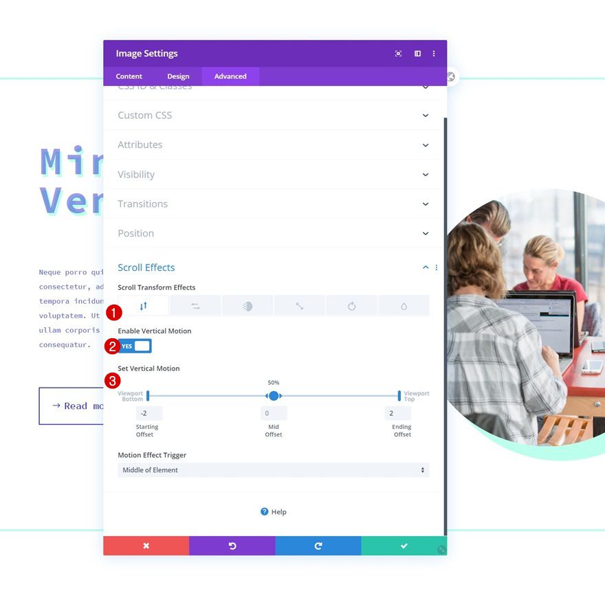
Vertical Motion
And we’ll complete the module settings by adding some vertical motion.
- Enable Vertical Motion: Yes
- Starting Offset: -2
- Mid Offset: 0
- Ending Offset: 2
- Motion Effect Trigger: Middle of Element
Clone Entire Row Twice
Once you’ve completed the first row, you can clone it twice.
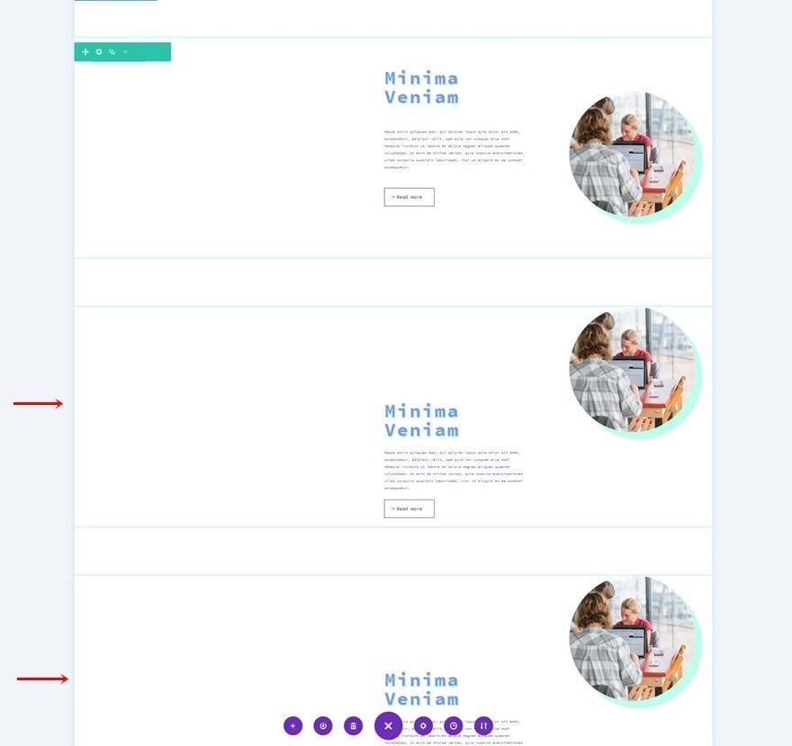
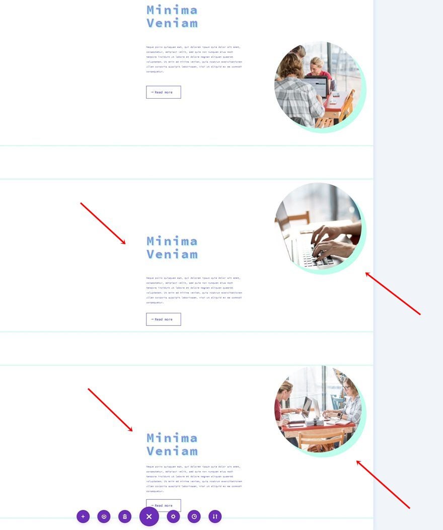
Change All Content & Images
Make sure you change all duplicate content and images.
Add Bottom Margin to Last Row
And open the last row’s settings, go to the spacing settings and add some bottom margin.
- Bottom Margin: 200px
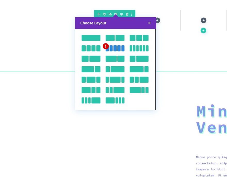
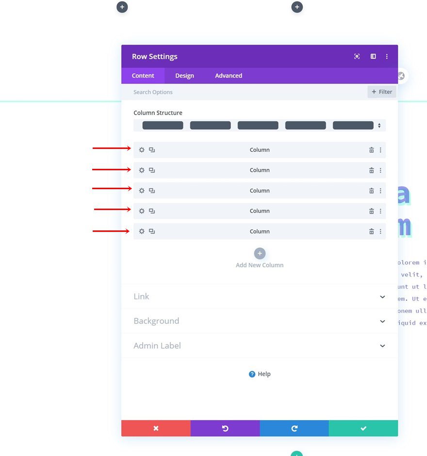
Dedicate New Row (at Top of Section) to Column Outlines
Column Structure
Now that we have the general rows in place, it’s time to add the column outlines. To do that, we’ll add a new row to the top of our section using the following column structure:
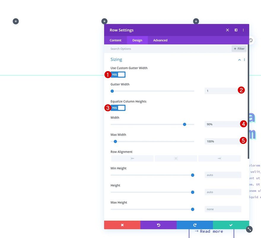
Sizing
Open the row settings, go to the design tab and change the sizing settings as follows:
- Use Custom Gutter Width: Yes
- Gutter Width: 1
- Equalize Column Heights: Yes
- Width: 90%
- Max Width: 100%
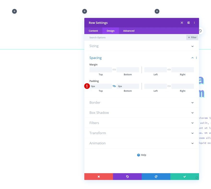
Spacing
We’re removing all default top and bottom padding too.
- Top Padding: 0px
- Bottom Padding: 0px
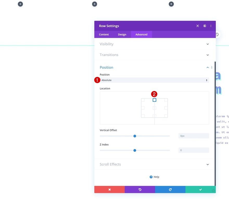
Position
Then, move on to the advanced tab and reposition the entire row. By settings the position to absolute, we’ll remove the container space that’s taken up by the row inside the page.
- Position: Absolute
- Location: Top Center
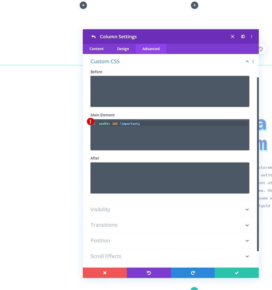
All Column Main Element CSS Width
Once the general row settings are in place, it’s time to start styling the columns. First, add some custom width to each column using one line of CSS Code inside the row’s main element. This will help us keep the column structure on smaller screen sizes.
width: 20% !important;
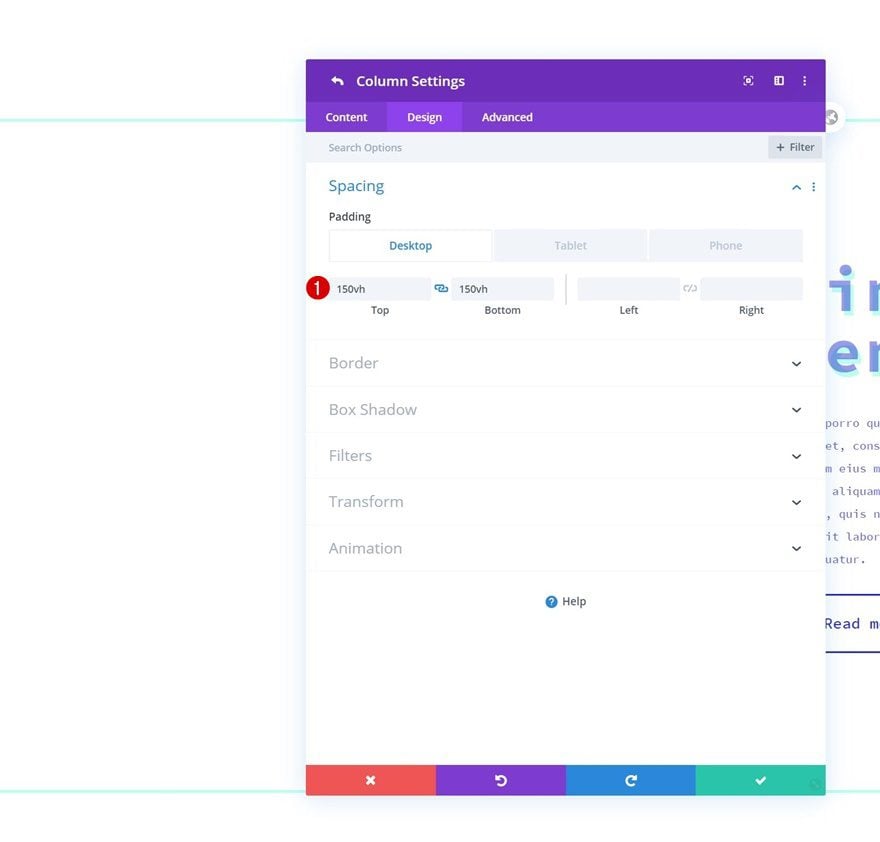
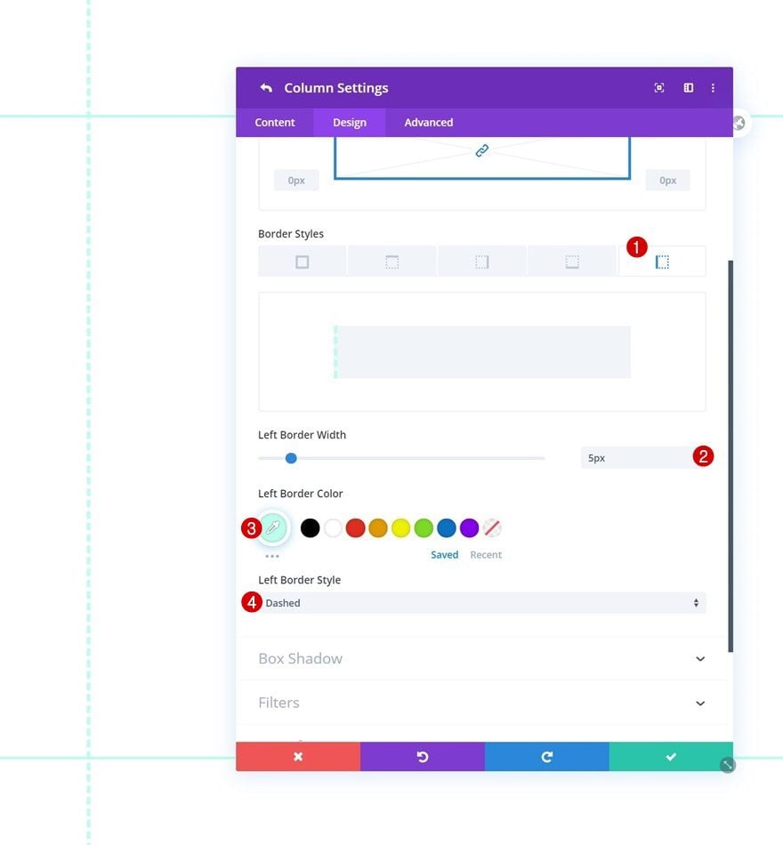
Column 1 Settings
Spacing
Then, open the column 1 settings and modify the padding values across different screen sizes.
- Top Padding: 150vh (Desktop), 250vh (Tablet & Phone)
- Bottom Padding: 150vh (Desktop), 250vh (Tablet & Phone)
Border
Add a left border too.
- Left Border Width: 5px
- Left Border Color: #bdffed
- Left Border Style: Dashed
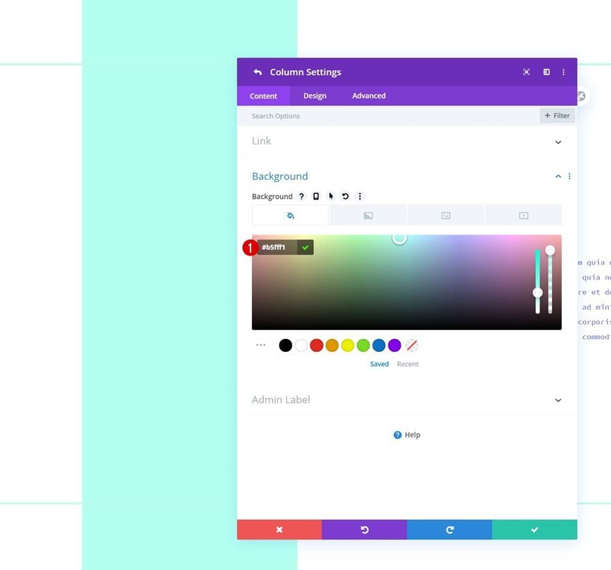
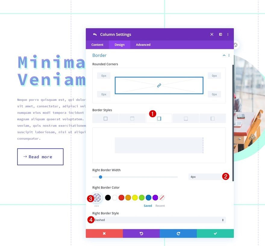
Column 2 Settings
Background Color
Next, we’ll open the column 2 settings and add a background color.
- Background Color: #b5fff1
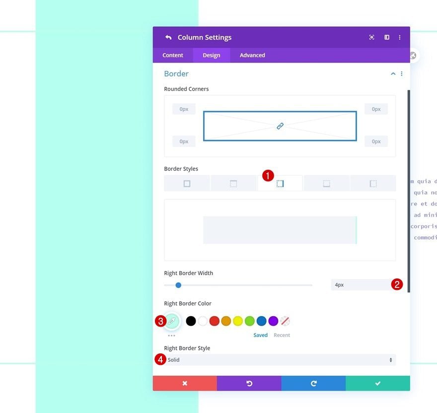
Border
We’ll use a right border too.
- Right Border Width: 4px
- Right Border Color: #bdffed
- Right Border Style: Solid
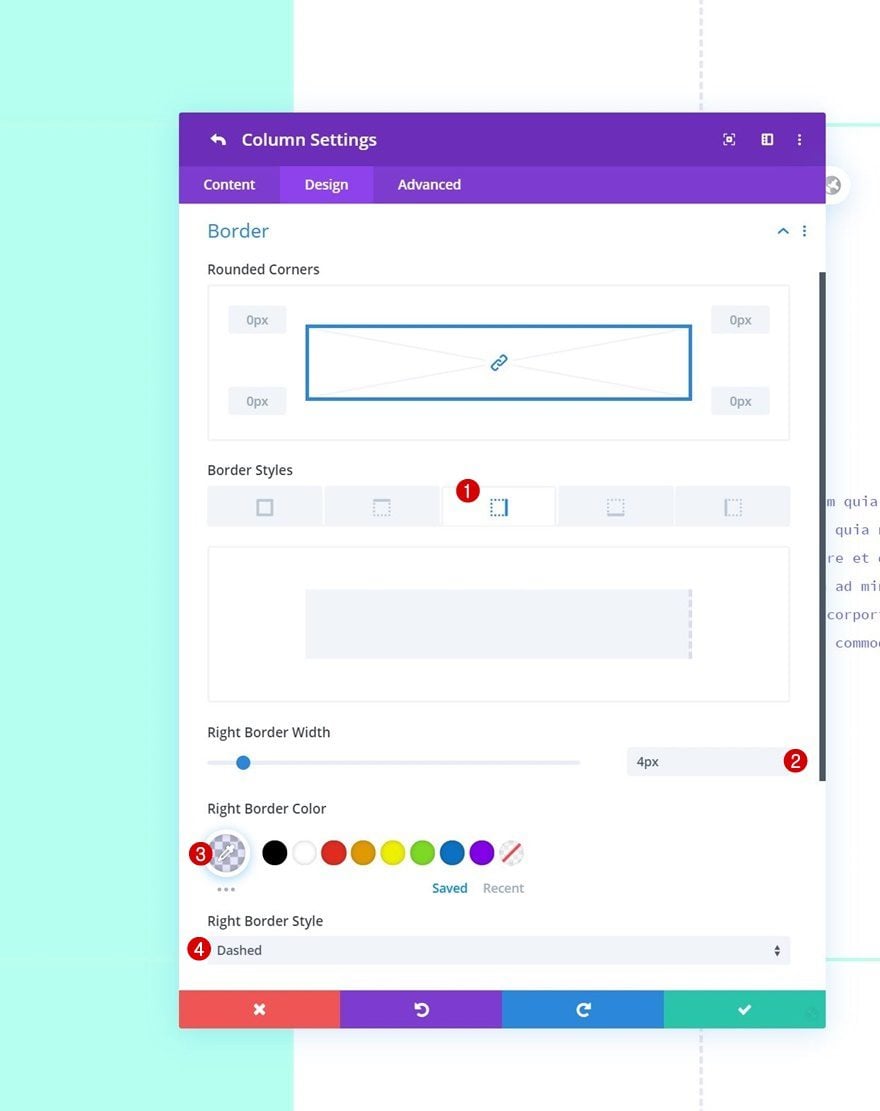
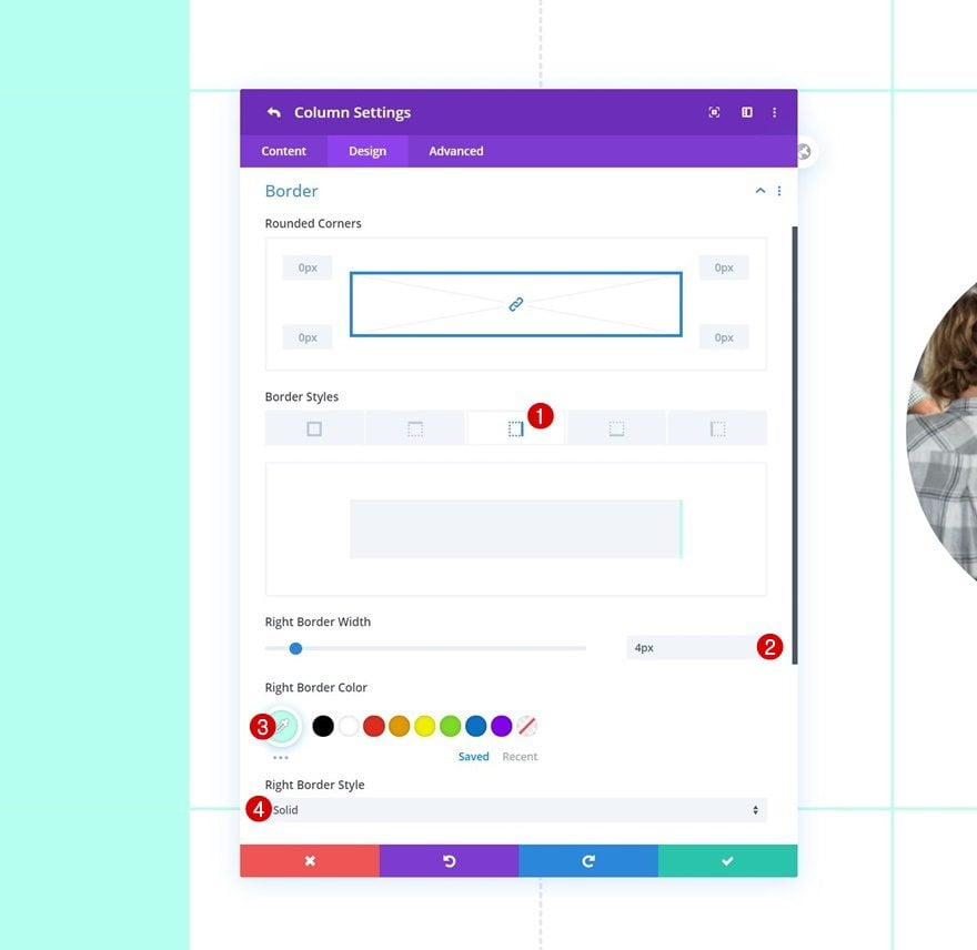
Column 3 Settings
Border
In the third column, we’ll use a right border with the following settings:
- Right Border Width: 4px
- Right Border Color: rgba(35,38,211,0.12)
- Right Border Style: Dashed
Column 4 Settings
Border
Then, we’ll open the column 4 settings and change the border settings accordingly:
- Right Border Width: 4px
- Right Border Color: #bdffed
- Right Border Style: Solid
Column 5 Settings
Border
We’ll complete the column settings by adding a right border to column 5 as well.
- Right Border Width: 4px
- Right Border Color: rgba(35,38,211,0.12)
- Right Border Style: Dashed
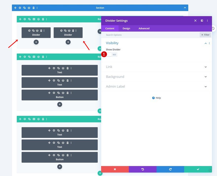
Add Divider Module to Column 1 & 2
Visibility
In the mobile preview at the beginning of this post, you were able to notice a slightly different outcome than on desktop. We’re only allowing the column 1 and 2 column outlines to show up by adding a Divider Module to those specific columns. Make sure you hide both dividers in the visibility settings and you’re done!
- Show Divider: No
Preview
Now that we’ve gone through all the steps, let’s take a final look at the outcome across different screen sizes.
Desktop
Mobile
Final Thoughts
In this post, we’ve shown you how to get creative with Divi’s built-in columns. More specifically, we’ve shown you how to use column outlines to emphasize your Divi design grid. This approach helps create a unique design without the need for additional image editing software. You were able to download the JSON file for free as well! If you have any questions or suggestions, feel free to leave a comment in the comment section below.
If you’re eager to learn more about Divi and get more Divi freebies, make sure you subscribe to our email newsletter and YouTube channel so you’ll always be one of the first people to know and get benefits from this free content.


IMHO This is not a good layout.
This honestly looks disgusting. The underlying info is useful but the example doesn’t sell it.
+1