
Divi and its fullscreen menu presents a great opportunity for custom design. Unlike the other four header styles available in Divi’s Theme Customizer, the fullscreen menu fills the entire screen when active. This makes room for a creative layout for Divi’s menu and header elements.
In today’s post, I’m going to show you how to style your fullscreen menu to give it a more custom feel for your visitors. To accomplish this I will be changing a few options in the theme customizer and adding some custom CSS.
Let’s get started.
The Before and After
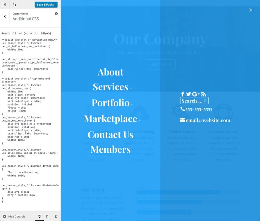
This is what the fullwidth menu looks like by default:

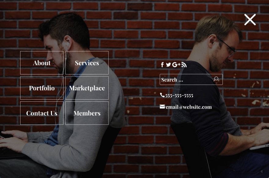
Here is a sneak peek of the new design:
Subscribe To Our Youtube Channel
Getting Started
Before we get started on design, make sure that you have an active primary menu with menu items already added.
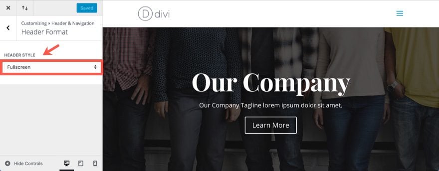
Update settings in the theme customizer
From your WordPress Dashboard, go to Divi > Theme Customizer > Header & Navigation > Header Format. Then select Fullscreen as the Header Style.
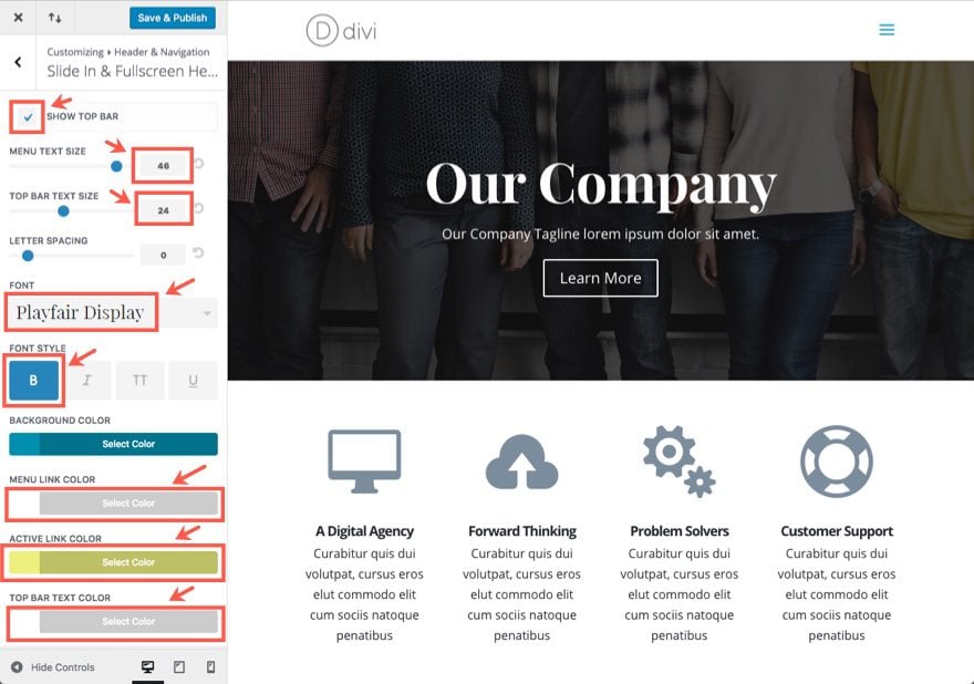
Once the Fullscreen Header style is set, go back to Header & Navigation. Now you will see a new set of options called “Slide In & Fullscreen Header Settings”.
Update the Slide In & Fullscreen Header Settings as follows:
Check the Show Top Bar Option
Menu Text Size: 46px
Top Bar Text Size: 24px
Font: Playfair Display
Font Style: Bold(B)
Menu Link Color: #ffffff
Active Link Color: #edef86
Top Bar Text Color: #ffffff
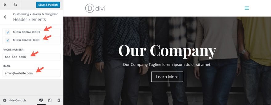
Now go back to Header & Navigation settings and click Header Elements. Under Header Elements, update the following:
Select Show Social Icons
Select Show Search Icon
Phone Number: [enter number]
Email: [enter email]
Once everything is setup, this is what the default layout should look like:
Now let’s add some custom CSS.
Adding Custom CSS
Adding custom CSS in Divi can be done in a few places. Since we are already using the theme customizer, go to Additional CSS. This is where we will be adding our CSS. Of course if you rather add it to your external style.css file in your child theme, go for it.
For those of you pressed for time you can skip down to the completed version of the CSS code that you can copy and paste into your Additional CSS section. Just know that you will still need to go back and add a few elements like the background image to your code.
Now back to adding our CSS.
Since most of the custom CSS is only going to apply to the desktop version of the fullscreen header, we are going to start by adding a media query that targets screen sizes with a minimum width of 980px. Add the following in the Additional CSS section:
@media all and (min-width: 980px){

}
Now let’s change the layout of the fullscreen header a bit by adjusting the position of the navigation menu and the top bar elements so that the navigation will be on the left of the screen and the top bar elements will be stacked vertical on the right of the screen. To make this change, add the following css inside the media query brackets.
/*adjust position of navigation menu*/
.et_header_style_fullscreen .et_pb_fullscreen_nav_container {
	width: 50%;
}

.et_slide_in_menu_container.et_pb_fullscreen_menu_opened.et_pb_fullscreen_menu_animated {
	padding-top: 0px !important;
}

/*adjust position of top bar elements*/
.et_header_style_fullscreen .et_slide_menu_top {
    width: 50%;
    text-align: center;
    display: table !important;
    vertical-align: middle;
    position: initial;
    float: right!important;
    height: 100%;
}
.et_header_style_fullscreen .et_pb_top_menu_inner {
    display: table-cell !important;
    position: relative;
    vertical-align: middle;
    text-align: left!important;
	padding: 0 15%;
	width: 100%;
}

.et_header_style_fullscreen .et_slide_menu_top ul.et-social-icons {
    width: 100%;
}

.et_header_style_fullscreen div#et-info {
	float: none!important;
	width: 100%;
}

.et_header_style_fullscreen div#et-info span {
	display: block;
	margin-bottom: 30px;

}
Next, let’s increase the size of our search bar with the following CSS:
/*make search bar and icon larger*/
.et_header_style_fullscreen .et_slide_menu_top .et-search-form {
	margin-top: 30px !important;
	margin-bottom: 15px;
	width: 100% !important;
	max-width: 300px !important;
	padding: 25px !important;
}
.et_slide_menu_top button#searchsubmit_header{
	width: 50px;
	height: 41px;
}
.et_slide_menu_top button#searchsubmit_header:before {
	font-size: 22px;
}
And let’s add the following CSS to make the menu right aligned:
/*make menu right aligned*/
.et_header_style_fullscreen ul#mobile_menu_slide {
	text-align: right;
	padding: 0 15%;
}
Then let’s make the close menu icon in the top right corner bigger and easier to click:
/*make close menu icon larger*/
.et_pb_fullscreen_menu_animated .mobile_menu_bar:before {
	font-size: 120px;
}
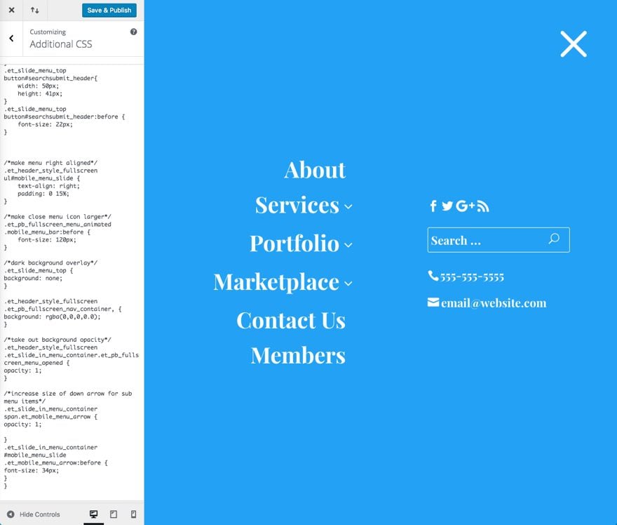
Let’s also take out the background overlay behind the top menu elements and take out the opacity for the background.
/*take out background overlay*/
.et_slide_menu_top {
background: none;
}

/*take out background opacity*/
.et_header_style_fullscreen .et_slide_in_menu_container.et_pb_fullscreen_menu_opened {
opacity: 1;
}
If you have sub menu items, this CSS makes the drop down arrow to the right of the menu item bigger:
/*increase size of down arrow for sub menu items*/
.et_slide_in_menu_container span.et_mobile_menu_arrow {
opacity: 1;

}
.et_slide_in_menu_container #mobile_menu_slide .et_mobile_menu_arrow:before {
font-size: 34px;
}
Let’s check out what we have so far:
Now we are ready to add our background image. Since I want my background image to show on all devices, I’m going to add this CSS outside the media query brackets so that the background doesn’t get hidden on screen sizes with a width less than 980px.
/*add background image*/
body #page-container .et_slide_in_menu_container{
	background: url('INSERT IMAGE URL') center center !important;
	background-size: cover !important;
}
If you don’t already have a background image URL, upload a background image (1920×1080) to the WordPress media gallery and copy the URL.
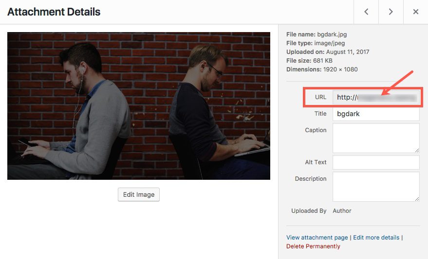
Now replace the text that reads “INSERT IMAGE URL” by pasting your image URL in the code.
Now you are done!
Here is a completed version of the CSS code that you should have added to your Additional CSS (except for the image URL that you need to provide):
@media all and (min-width: 980px){

/*adjust position of navigation menu*/
.et_header_style_fullscreen .et_pb_fullscreen_nav_container {
	width: 50%;
}

.et_slide_in_menu_container.et_pb_fullscreen_menu_opened.et_pb_fullscreen_menu_animated {
	padding-top: 0px !important;
}

/*adjust position of top menu and elements*/
.et_header_style_fullscreen .et_slide_menu_top {
    width: 50%;
    text-align: center;
    display: table !important;
    vertical-align: middle;
    position: initial;
    float: right;
    height: 100%;
}
.et_header_style_fullscreen .et_pb_top_menu_inner {
    display: table-cell !important;
    position: relative;
    vertical-align: middle;
    text-align: left!important;
	padding: 0 15%;
	width: 100%;
}

.et_header_style_fullscreen .et_slide_menu_top ul.et-social-icons {
    width: 100%;
}

.et_header_style_fullscreen div#et-info {
	float: none!important;
	width: 100%;
}

.et_header_style_fullscreen div#et-info span {
	display: block;
	margin-bottom: 30px;

}

/*make search bar and icon larger*/
.et_header_style_fullscreen .et_slide_menu_top .et-search-form {
	margin-top: 30px !important;
	margin-bottom: 15px;
	width: 100% !important;
	max-width: 300px !important;
	padding: 25px !important;
}
.et_slide_menu_top button#searchsubmit_header{
	width: 50px;
	height: 41px;
}
.et_slide_menu_top button#searchsubmit_header:before {
	font-size: 22px;
}

/*make menu right aligned*/
.et_header_style_fullscreen ul#mobile_menu_slide {
	text-align: right;
	padding: 0 15%;
}

/*make close menu icon larger*/
.et_pb_fullscreen_menu_animated .mobile_menu_bar:before {
	font-size: 120px;
}

/*dark background overlay*/
.et_slide_menu_top {
background: none;
}

/*take out background opacity*/
.et_header_style_fullscreen .et_slide_in_menu_container.et_pb_fullscreen_menu_opened {
opacity: 1;
}

/*increase size of down arrow for sub menu items*/
.et_slide_in_menu_container span.et_mobile_menu_arrow {
opacity: 1;

}
.et_slide_in_menu_container #mobile_menu_slide .et_mobile_menu_arrow:before {
font-size: 34px;
}

}

/*add background image*/
body #page-container .et_slide_in_menu_container{
	background: url('http://megamenu.wpengine.com/wp-content/uploads/2017/08/bgdark.jpg') center center !important;
	background-size: cover !important;
}
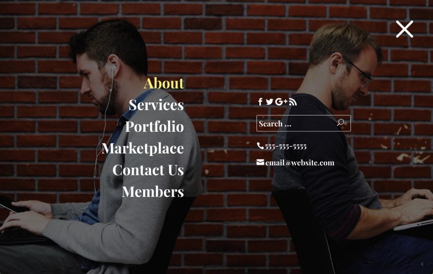
Click Save & Publish
Now Let’s check it out:
To add a grid layout for your menu, add the following CSS below your current code and within the media query brackets:
/*add grid menu links*/
.et_header_style_fullscreen .et_mobile_menu li {
    opacity: 1;
    width: 46%;
    float: left !important;
    margin-right: 2%;
    margin-bottom: 2%;
}

.et_slide_in_menu_container #mobile_menu_slide li a, .et_slide_in_menu_container #mobile_menu_slide li.current-menu-item a {
    padding: 20% 0;
    border: 1px solid #fff;
    color: #fff;
    width: 100%;
    text-align: center;
}
Important Note: You may need to change the menu font size to 30px (or close to that) to make sure your menu items don’t overlap on smaller screen sizes. Also, this layout will not work if your menu has sub menu items.
Keep in mind that if you have sub menu items, the parent menu item will only function as a toggle link to show and hide the sub menu item(s). It will not work as a menu link itself.
Responsive?
This cutomization is responsive and works well on all screen sizes.
The fullscreen header is built with two adjacent table cells that are vertcially aligned. The left table cell contains the menu and the right cell contains the other header elements. Because the content is vertically aligned and the table cells will each occupy 50% (one half) of the screen size at all times, the content will always adjust nicely to any screen size.
If the screen size is less than 980px (tablets and phones), the default Divi layout will kick in and display the menu nicely on mobile.
Final Thoughts
If you are thinking about adding a fullscreen header on your site, I hope this design will be useful inspiration. The symmetry of the header elements and menu items balances things out and brings more attention to the contact information which is important for a lot of clients.
Keep in mind that because this menu is fullscreen, the background image is going to be key. You don’t want an image that will distract from or drown out the important contents of the menu. If you can’t find the perfect image that brings the personality you want, go for an image that simply looks great as a background and is consisent with your design. Or you can simply use the default background color option.
Well, that’s all I have.
Looking forward to hearing from you in the comments.


Thank you very much for all your work! Can you please suggest how can I add a change of the menu text color on hover, make a logo stay in a left corner when the full screen menu opened, and on mobile the menu to stick to the top of the page? Thank you
Hi, If a design has a secondary menu built is it possible it can be shown on this layout as well as the primary menu? or can it be set as along the top of the site and the primary menu in this view? if so, how please, thanks
how do i increase menu text line height and also how do i configure which menu i want to show here?
It’s using the default header so whichever menu you will set as primary is what will show.
excellent post, really everything is very useful, I would like to know how to do that instead of leaving the network icons and the search icon, a small review, or include text or an image … thank you very much
Hi,
very interesting to read. But how can I reach that I have not the Hamburger Symbol in the right corner. I will have there the word “MENU”.
Kind regards Frank
Brilliant thank you! Does anyone have any tips on how to keep the top bar displayed at the top when using the full screen menu? As it is when using the default menu
Thank you very much for your contribution, I was very much served right now that I am doing a job with the menu in full screen. My only observation is if you could lower the tonality of the image automatically with a code or would it have to upload if or if an image with a darker layer? Once again, thank you so much
Mariela
Hello Elegant Themes!
Thank you for all the wonderful new features to the Divi them! I have one question . . . My client want the search icon displayed to the left of the mobile menu and a breadcrumb (18pt) below (see https://www.screencast.com/t/3CChqpglU). Is there a way to do this?
Much Thanks!
Hello guys.
Is there a way to disable the menu version the menu is too big on mobile.
Great blog post btw.
I love hoe it looks on Desktop
Many thanks and regards
Mike,
Did you wrap your CSS in the media query…
@media all and (min-width: 980px){

}
This makes sure your style only applies to the desktop version. It should fall back to the regular mobile menu style on mobile devices.
Thanks.
I don’t know if this is what Mike meant, but I implimented the changes (LOVE them by the way) Even before I added the CSS, when I looked at it on a phone, the menu text was too big. It looked like the menu text of 46 carried over to the phone menu. Since my menu items are 3 words, the 3rd word created a second line. Since the text is so large, the 2 lines mesh into each other. Is there some custom css to change the menu font just on phone size mobile devices?
Hello Team
Thank you for this blog post. Very nice.
I was wondering is there a way to increase the size of the burger menu?
Regards
Mike
I mean the burger menu icon
Yes Mike. Go ahead and try adding this to your Additional CSS.
.mobile_menu_bar:before {
font-size: 50px;
}
Basically, you can change the font size to whatever size your want.
Let me know how it goes.
Wow looking very nice..
Hi Jason,
My social icons are lining up on the left rather than above search as shown in your example, any idea what I am doing wrong.
Thanks
Not sure Alan. Maybe send me a link to your site or ask customer support?
Sweet, I’ll mos def try that out. Thanks!
Looking nice! Great visual! Thanks!
Is there a live demo of this please?
Sorry Neil. We don’t normally setup live demos.
Looks awesome, and thank you for this tutorial 🙂
Could you make on how to style the default mobile menu also, maybe using off-canvas.
I would also like to know, how to have a normal menu: HOME ABOUT SERVICES ETC on desktop, and when using tablet/mobile this menu layout from this blog post.
How would I do this in Divi.
Thanks.
what if i want the submenu parent to open as a separate page(link)
Great ideas Kent. I shall see what I can do. Although I don’t think this layout would work well on mobile devices. I don’t think there would be enough space.
Jason, thank you for your walk through. I will definitely have to try a full page menu after seeing yours. Keep up the good articles.
Thanks Paul. Enjoy!
Very nice for a visual builder theme 🙁
Thanks! Great timing, styling a fullscreen menu is exactly what I’m working on today.
I do wish that different menu styles could be selected for mobile vs desktop. (Ex. Default for desktop, slide in or full screen for mobile)
At any rate, I really appreciate this.
That’s a good point. I will keep that in mind. Thanks!
I would really like that too. Default menu for desktop, fullscreen for mobile. Is there a work around to do that allready?
Very nice. But would be better if you can implement it into the standard theme options instead of having to do so much css.
Thanks Leon. Our goal is to keep improving the theme builder to include more advanced options. Hopefully these kind of posts will help those who are needing/wanting to learn how to use CSS to expand certain elements until those more advanced features are added to the Divi Builder.
Love it! – Thanks for making Divi so versatile!
Thank you for posting this tutorial on the menu. Super helpful. I was wondering too along with this… Is there a way to make the hamburger a little bigger? I was interested in using the hamburger as the main menu on the website as well as with mobile. The current design idea is to use a video loop in the first section of the site and have the hamburger upper right corner. Just want to make it a little bigger for desktop viewing people. Thanks.
Try this Ace…
.mobile_menu_bar:before {
font-size: 50px;
}
Then adjust the font size to whatever you want.
Thanks.