
Divi and its Toggle Module allows you to show additional content on click, without the additional need for jQuery code. Similar to the Accordion Module, Toggle Modules are generally used to share grouped content, such as frequently asked questions. However, you can use them for other things as well–to structure your page for instance. In this tutorial, we’re going to use fullwidth Toggle Modules to create a straightforward page design that behaves on click. The design style we’re handling is bold and clean. You’ll be able to download the JSON file for free as well!
Let’s get to it.
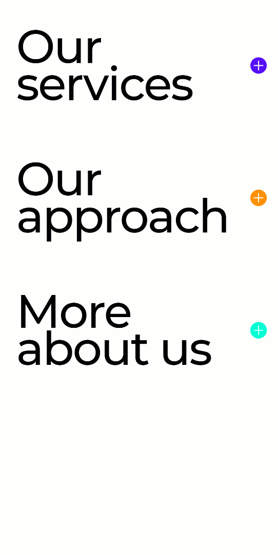
Preview
Before we dive into the tutorial, let’s take a quick look at the outcome across different screen sizes.
Desktop

Mobile
Download The Bold Fullwidth Toggle Layout for FREE
To lay your hands on the free bold fullwidth toggle layout, you will first need to download it using the button below. To gain access to the download you will need to subscribe to our newsletter by using the form below. As a new subscriber, you will receive even more Divi goodness and a free Divi Layout pack every Monday! If you’re already on the list, simply enter your email address below and click download. You will not be “resubscribed” or receive extra emails.

Subscribe To Our Youtube Channel
Let’s Start Recreating
Add New Section
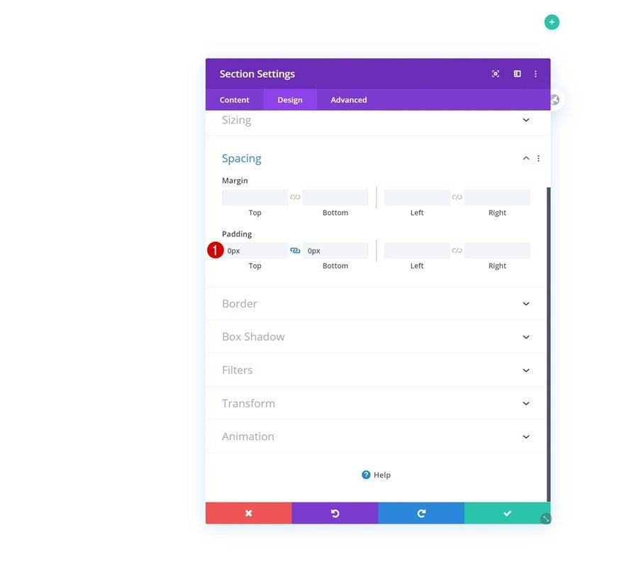
Spacing
Start by creating a new page (or opening an existing one) and adding a regular section to it. The only thing you need to do in the section settings is to remove all default top and bottom padding in the spacing settings.
- Top Padding: 0px
- Bottom Padding: 0px
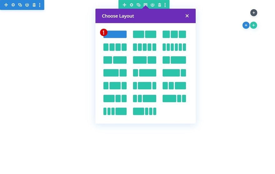
Add New Row
Column Structure
Continue by adding a new row using the following column structure:
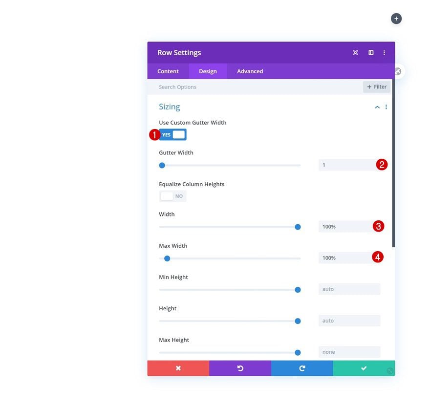
Sizing
Without adding any modules yet, open the row settings and make sure the row touches the left and right side of the section container by modifying the sizing settings. This is an important step in this tutorial; it allows the Toggle Module, which we’ll add later on this tutorial, to become fullwidth.
- Use Custom Gutter Width: Yes
- Gutter Width: 1
- Width: 100%
- Max Width: 100%
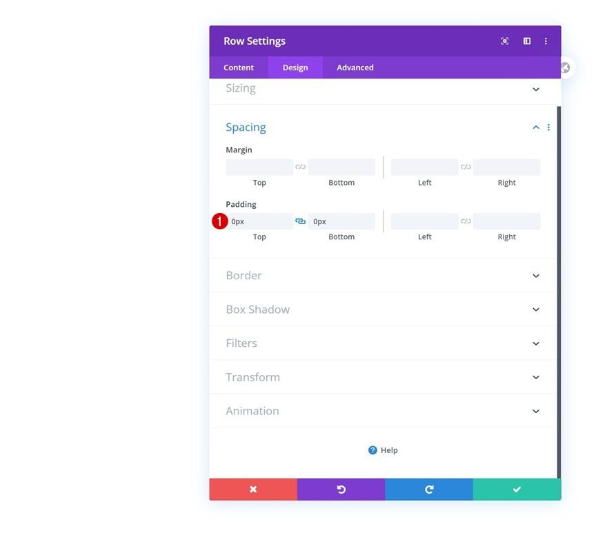
Spacing
We’re removing the row’s default top and bottom padding as well. This will remove all the space between the Toggle Module and the row/column container it’s placed in.
- Top Padding: 0px
- Bottom Padding: 0px
Add Toggle Module to Column
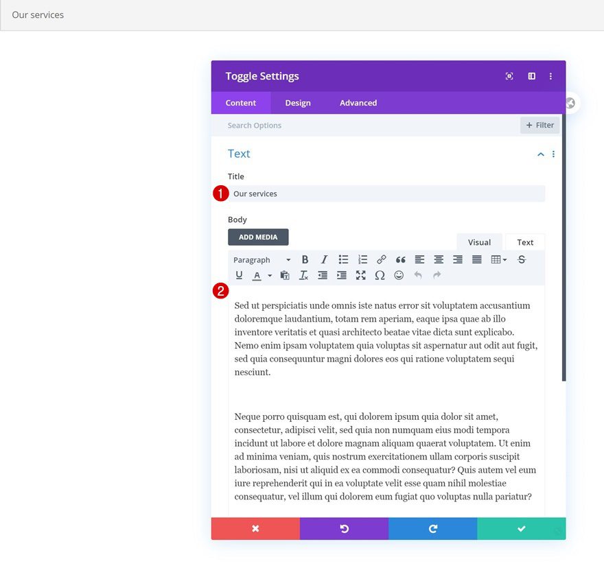
Insert Title & Content
Time to start adding modules! The only module we need in this row is a Toggle Module. We’ll use the title box to add a title and place all the content we want to share in the body content box. Feel free to place whatever you want in the content box; from text to images and more.
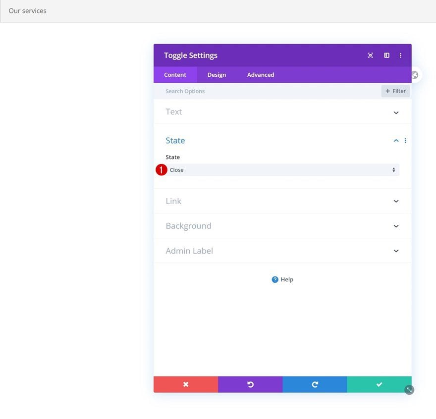
State
We’re using a closed toggle state but feel free to leave it open as well.
- State: Close
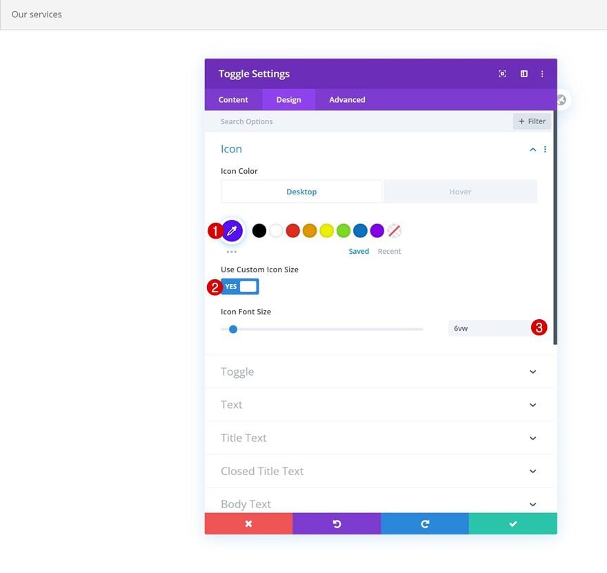
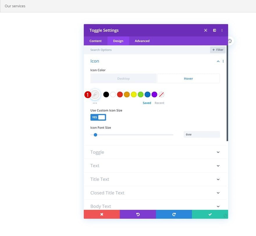
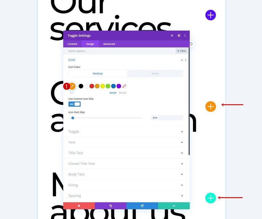
Default Icon Settings
Move on to the design tab and change the module’s icon settings accordingly:
- Icon Color: #570fff
- Use Custom Icon Size: YEs
- Icon Font Size: 6vw
Hover Icon Settings
Modify the icon color on hover.
- Icon Color: #f2f2f2
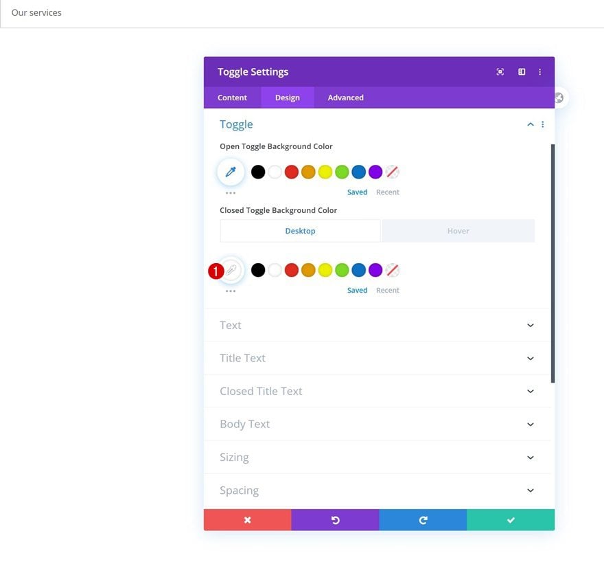
Default Toggle Settings
Change the closed toggle background color next.
- Closed Toggle Background Color: #ffffff
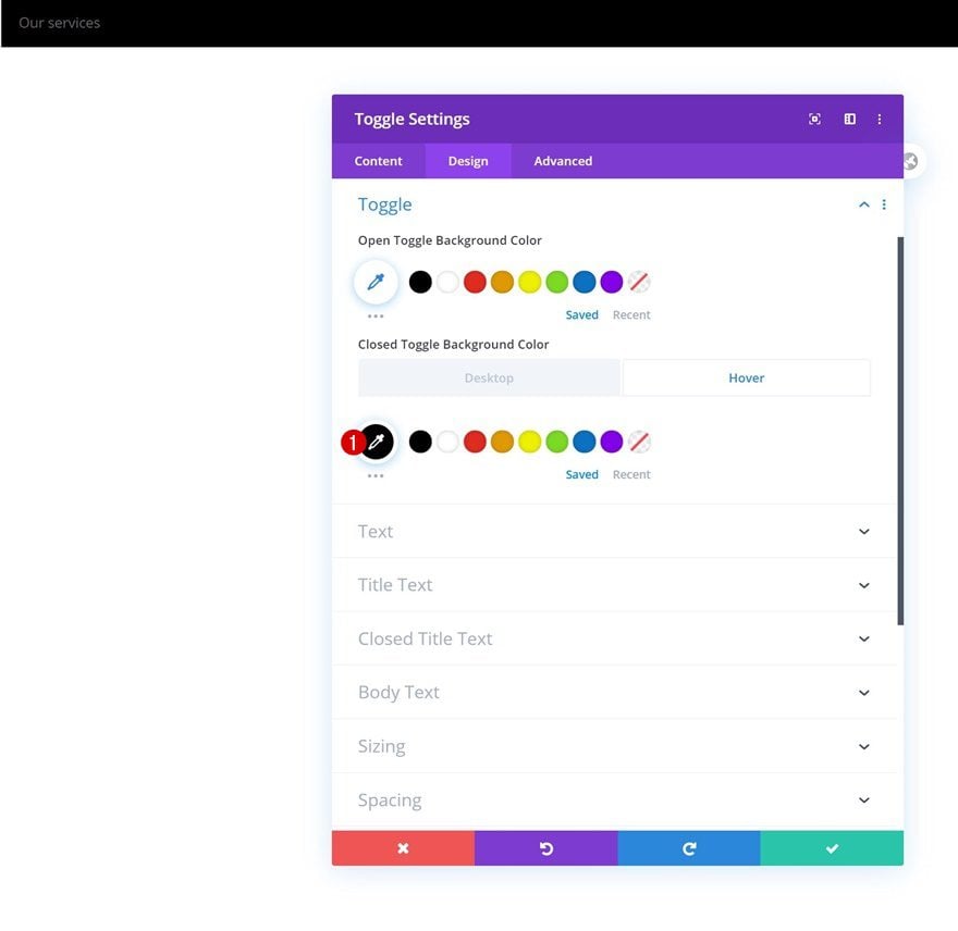
Hover Toggle Settings
And change the color on hover too.
- Closed Toggle Background Color: #000000
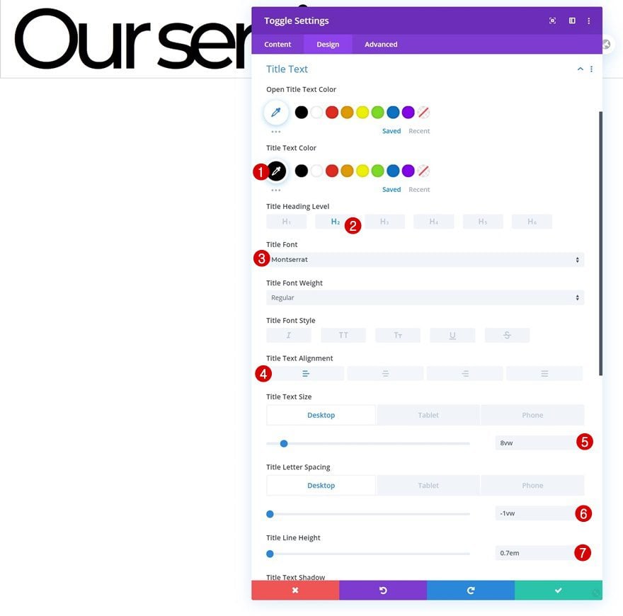
Title Text Settings
Continue by modifying the title text settings as follows:
- Title Text Color: #000000
- Title Heading Level: H2
- Title Font: Montserrat
- Title Text Alignment: Left
- Title Text Size: 8vw (Desktop), 10vw (Tablet & Phone)
- Title Letter Spacing: -1vw (Desktop), -0.5vw (Tablet & Phone)
- Title Line Height: 0.7em
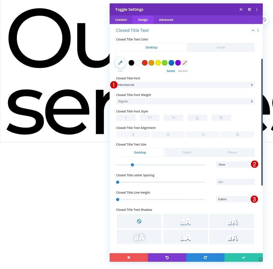
Default Closed Title Text Settings
Then, go to the closed title text settings and modify the settings accordingly:
- Closed Title Font: Montserrat
- Closed Title Text Size: 18vw (Desktop), 16vw (Tablet & Phone)
- Closed Title Line Height: 0.8em
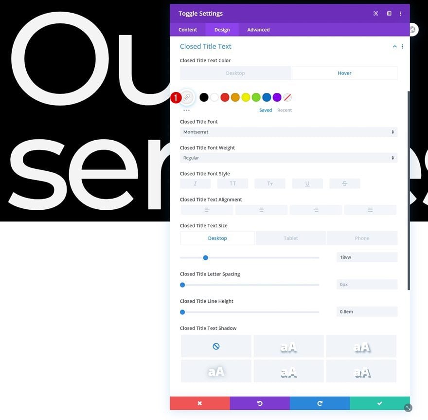
Hover Closed Title Text Settings
Change the closed title text color on hover.
- Closed Title Text Color: #f4f4f4
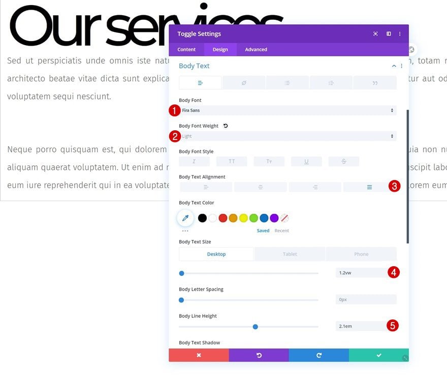
Body Text Settings
Move on to the body text settings and make some changes there too.
- Body Font: Fira Sans
- Body Font Weight: Light
- Body Text Alignment: Justify
- Body Text Size: 1.2vw (Desktop), 2vw (Tablet), 3vw (Phone)
- Body Line Height: 2.1em
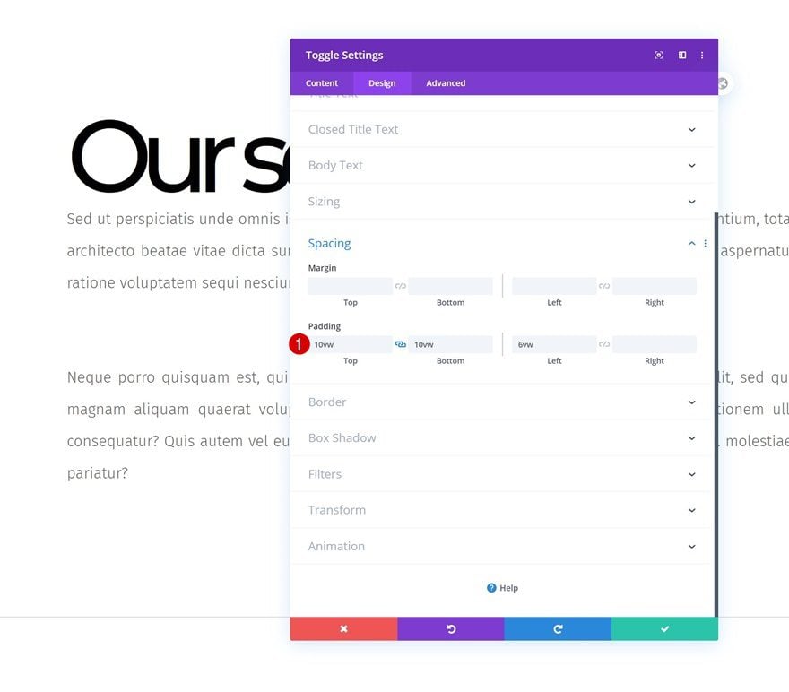
Spacing
Add some custom top, bottom and left padding to the module as well.
- Top Padding: 10vw
- Bottom Padding: 10vw
- Left Padding: 6vw
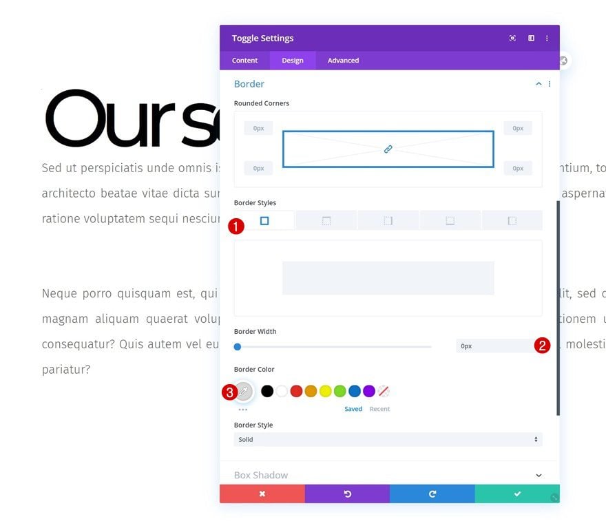
Border
Continue by removing the module’s default border in the border settings.
- Border Width: 0px
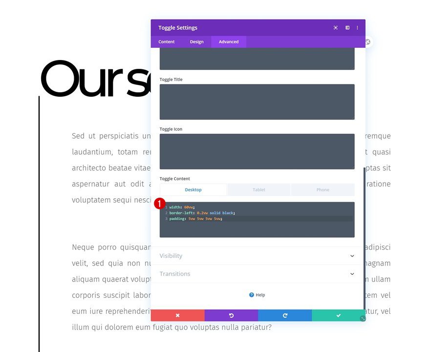
Toggle Content CSS
Complete the Toggle Module’s settings by adding the following lines of CSS code to desktop:
width: 60vw;
border-left: 0.2vw solid black;
padding: 5vw 5vw 5vw 5vw;
Modify the width CSS code line on tablet and phone:
width: 85vw;
Clone Entire Section as Many Times as Wanted
Once you’ve completed the first section, row and Toggle Module, you can clone the entire section up to as many times as you want; depending on how much content you want to show up on your page.
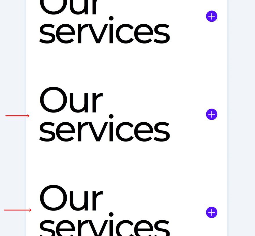
Change Content
Make sure you change all the toggle content in each duplicate Toggle Module.
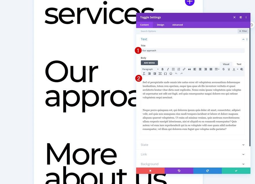
Change Icon Colors
Then, open each Toggle Module individually and change the icon color. The ones we’ve used for this tutorial are mentioned below:
- Icon Color 1: #ff9000
- Icon Color 2: #00ffd4
Preview
Now that we’ve gone through all the steps, let’s take a final look at the outcome across different screen sizes.
Desktop
Mobile
Final Thoughts
In this post, we’ve shown you how to get creative with Divi’s Toggle Module. More specifically; we’ve made them fullwidth and used them to show different section content in a creative way. This tutorial goes to show that you can easily use Divi’s modules outside the box when you’re taking the various containers into consideration. You were able to download the tutorial’s JSON file for free as well! If you have any questions or suggestions, feel free to leave a comment in the comment section below.
If you’re eager to learn more about Divi and get more Divi freebies, make sure you subscribe to our email newsletter and YouTube channel so you’ll always be one of the first people to know and get benefits from this free content.


Hi,
Nice guide.
Question.
Can animation be customized with the Divi toggle as on the autodesk.com cover?