

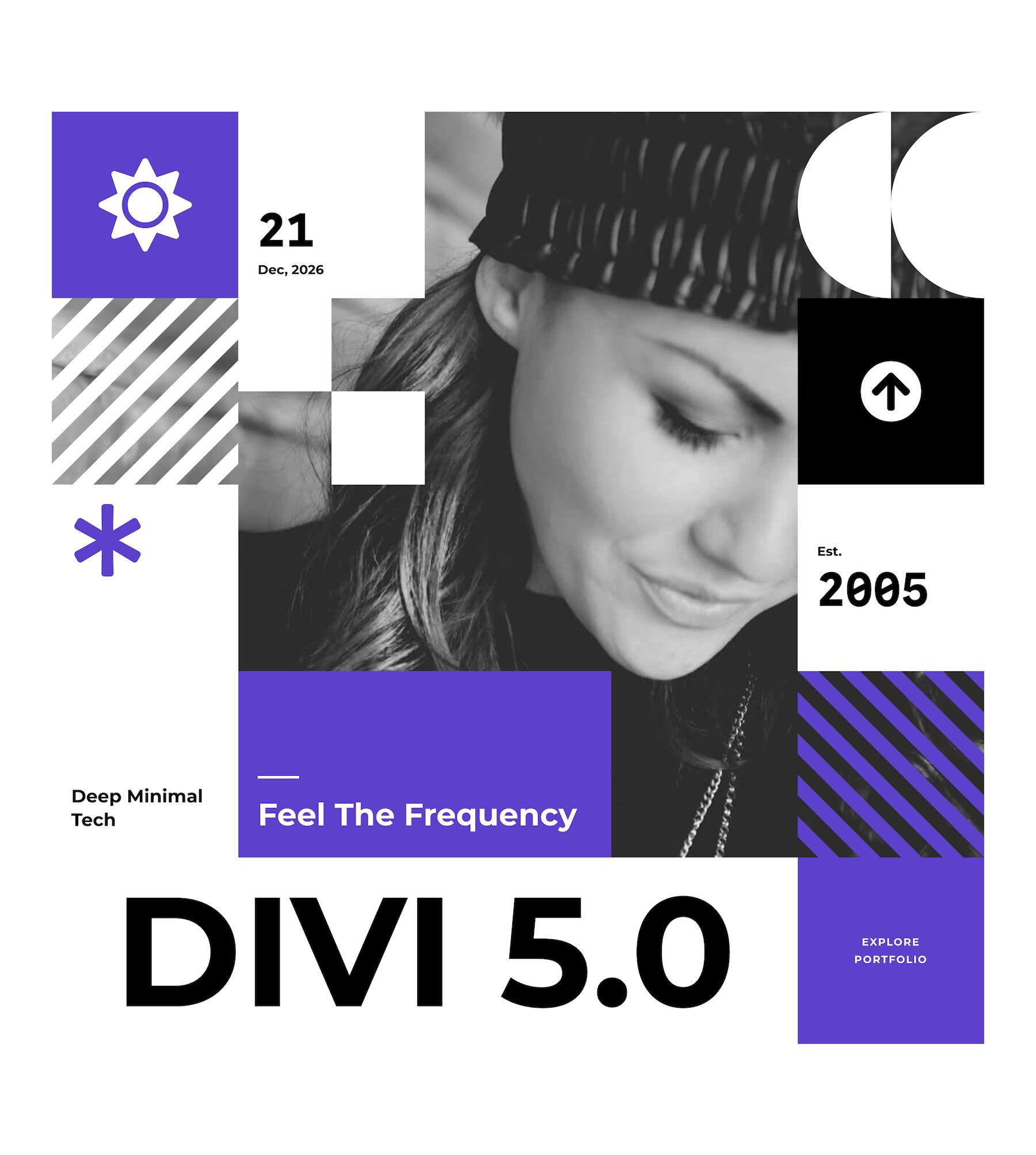
Divi 5 makes it easy to create structured layouts where imagery, text, stats, and supporting content work together as one composition. In this free pack, you’ll get 7 Square Grids for Divi 5 that are perfect for hero sections, agency websites, portfolios, company pages, service sections, project showcases, landing pages, and more.
Each design uses square-based content blocks, imagery, typography, color, negative space, and varied visual hierarchy to turn a simple grid into a polished page section. Import a section, replace the content and images, customize the styling, and you’re ready to go.
Preview
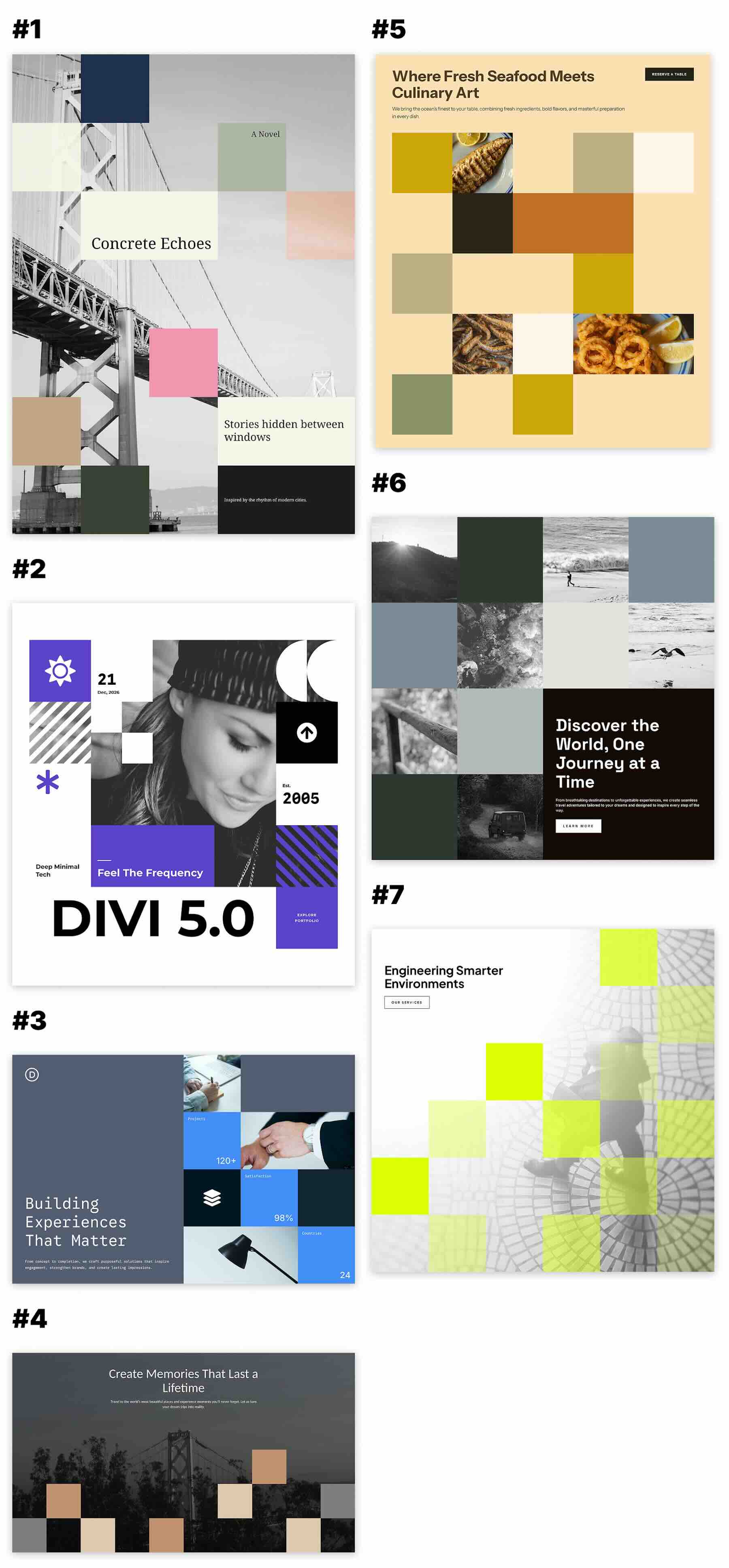
Here’s a quick look at the 7 Square Grids included in the pack. The download is further down the post.
Download 7 Square Grids For Divi 5
Get all 7 sections for free. Import them into your Divi Library and add them to any page in the Visual Builder.

What’s Included (8 Exports)
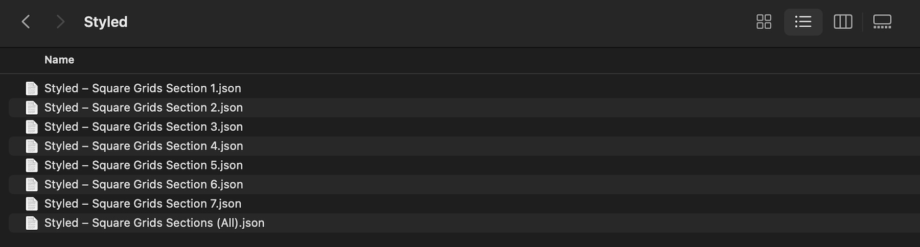
After you download and unzip the file, you’ll find 7 styled Square Grid section exports, plus 1 file containing all layouts.
Styled – Square Grids Section 1 to 7 (7) → Seven fully styled square-based layouts featuring different combinations of imagery, text blocks, stats, color panels, supporting content, and structured grid compositions that you can use as-is or customize.
Styled – Square Grids Sections (All) → Imports all 7 designs into your Divi Library at once.
How To Use The Square Grids
Keep your download folder handy. We’ll import the files, add a Square Grid section to a page, and then replace the placeholder content with your own.
1. Import Sections Into The Divi Library
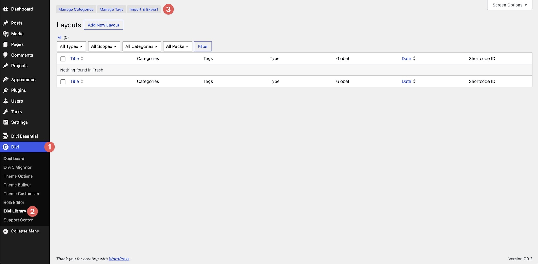
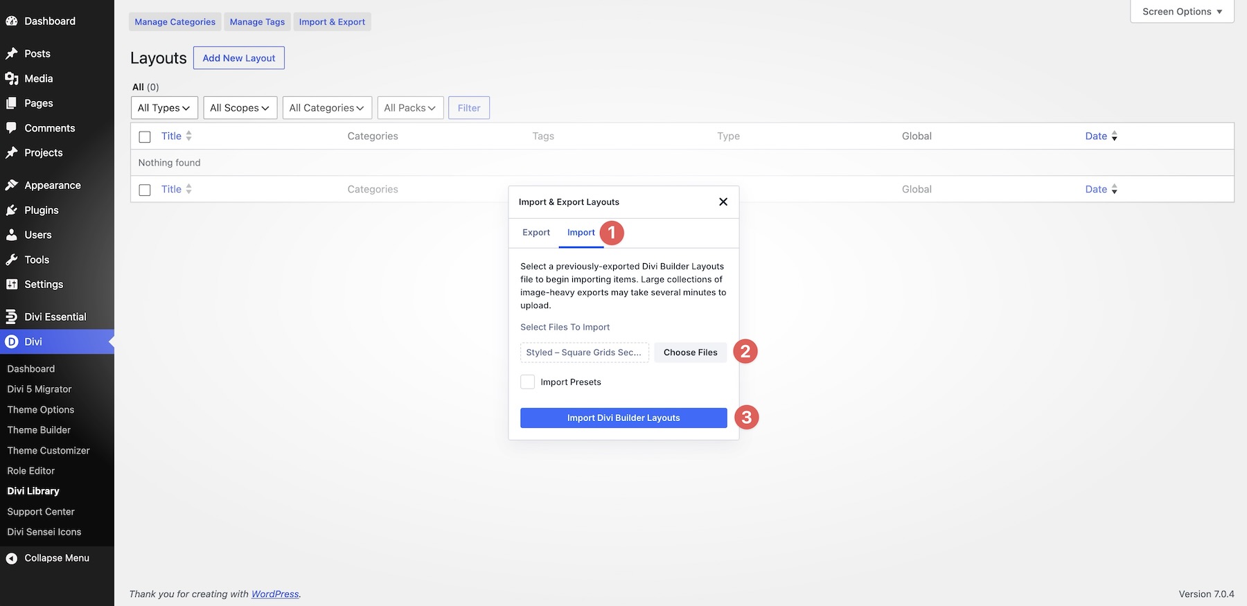
Go to Divi → Divi Library. Click Import & Export at the top of the screen.
In the Import & Export Layouts modal, switch to the Import tab, then click Choose File. Select any individual Styled – Square Grids Section JSON file if you only want one design. To import every layout at once, choose Styled – Square Grids Sections (All).json instead.
Click Import Divi Builder Layouts and wait for the import to complete.
2. Add A Square Grid Section To Any Page
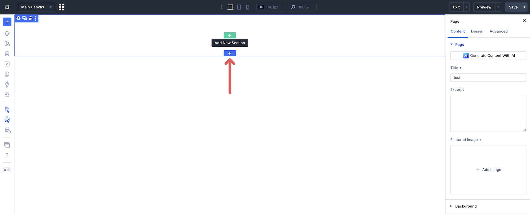
Open a page in the Visual Builder and add a new Section where you want the layout to appear.
Click Add From Library and select one of the Square Grid sections you imported.
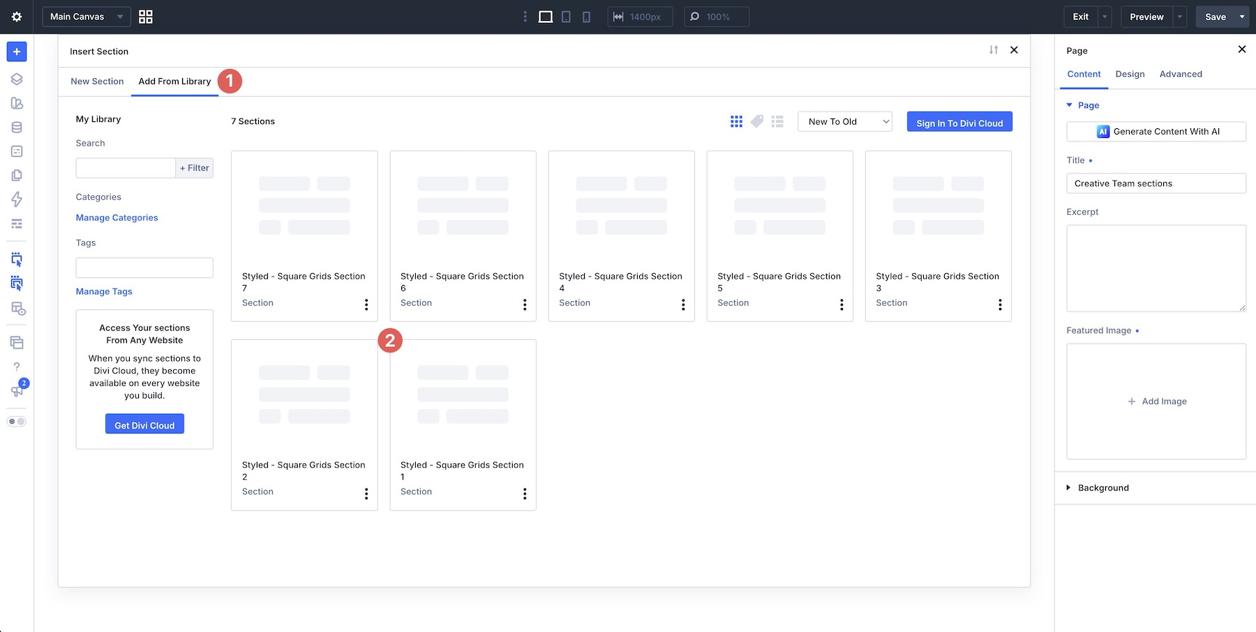
The complete design will be added to the page with its original images, text, colors, spacing, and square-based composition intact.
3. Replace The Content
Start by replacing the placeholder headings, body copy, labels, numbers, project details, calls to action, and other supporting text with your own content.
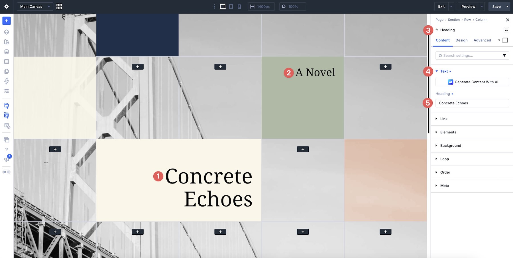
Next, replace the placeholder imagery with your own photos, project visuals, product images, team photos, architectural photography, or other content that fits the section.
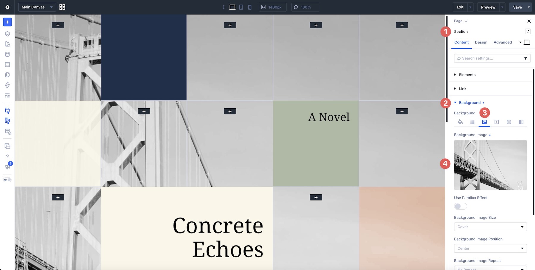
Because these layouts depend on multiple blocks working together, replace the content one area at a time and review the overall composition as you go. This makes it easier to preserve the balance between larger focal areas, smaller supporting blocks, imagery, color, and negative space.
Some layouts combine large text areas with smaller square content blocks, while others use a denser visual grid. Keep the original hierarchy in mind when deciding which content should receive the most emphasis.
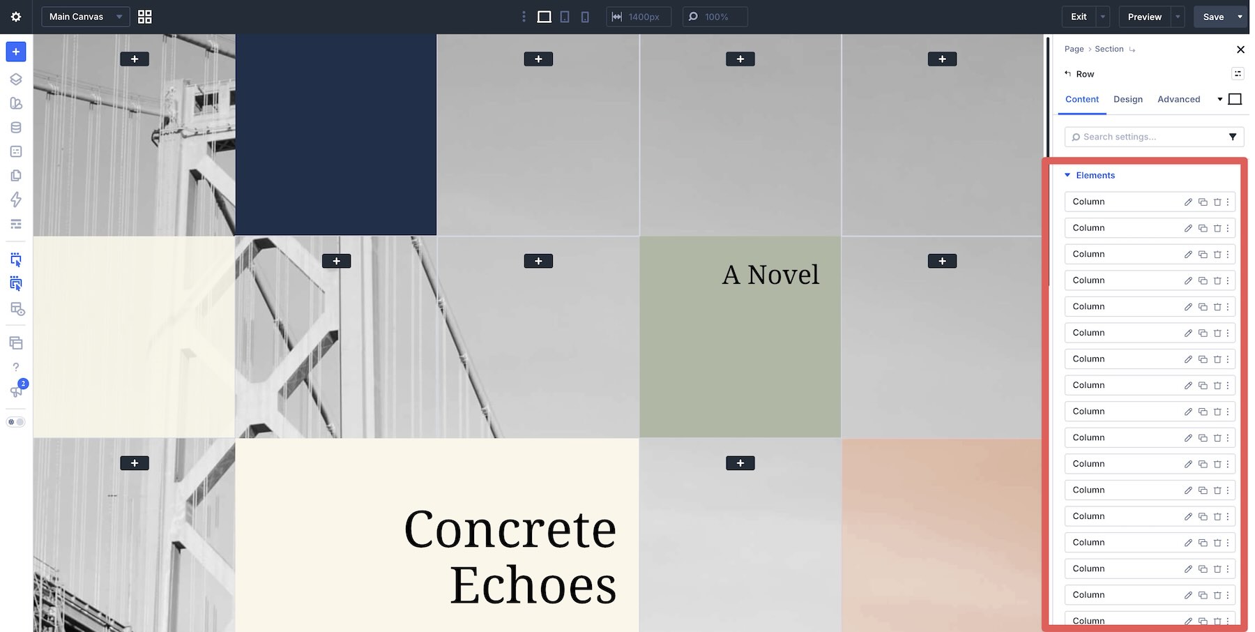
4. Adjust The Grid Content
You can adapt each layout to the amount of content you need. If you want another image, stat, feature, or supporting block, duplicate an existing element and replace its content.
If you need a simpler section, remove unnecessary blocks and adjust the remaining content so the composition still feels balanced.
When adding or removing content, pay attention to the relationship between neighboring blocks. Square grid designs work best when widths, heights, gaps, alignment, and visual weight feel intentional across the whole section.
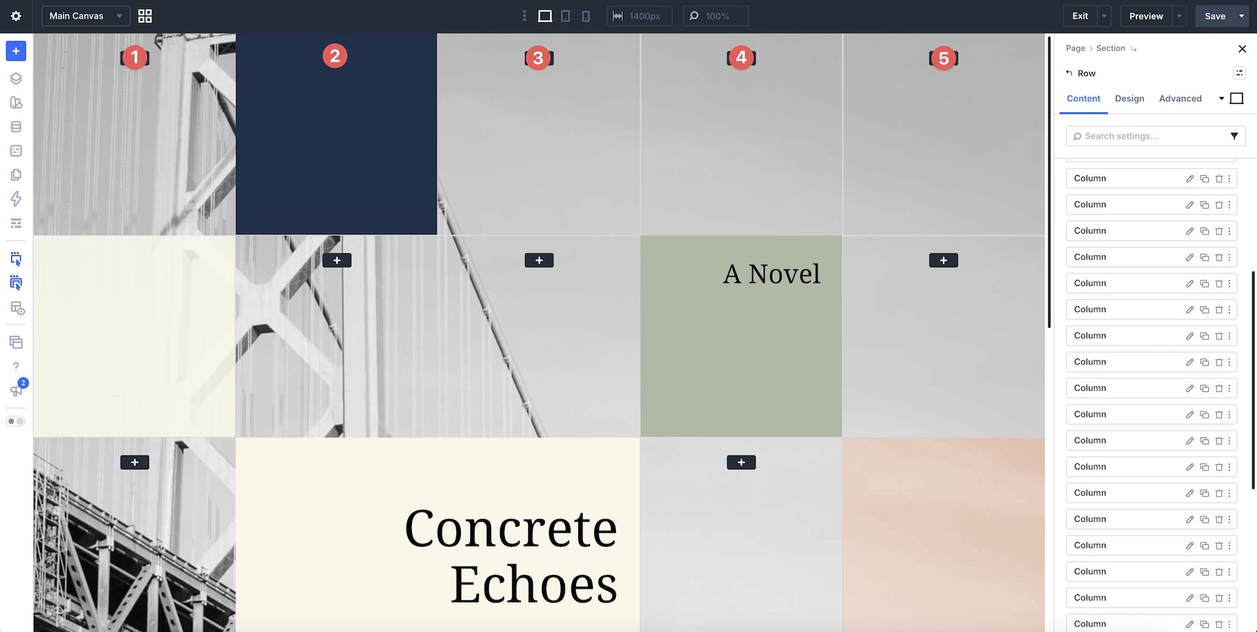
5. Customize The Styling
These Square Grids are already styled, but you can customize them further to match your website. Update backgrounds, colors, typography, imagery, borders, spacing, and other design settings directly in the Visual Builder.
To customize the text, open the relevant Text or Heading module and use the Design tab to adjust Font, Font Weight, Text Size, Text Color, Line Height, Letter Spacing, and alignment.
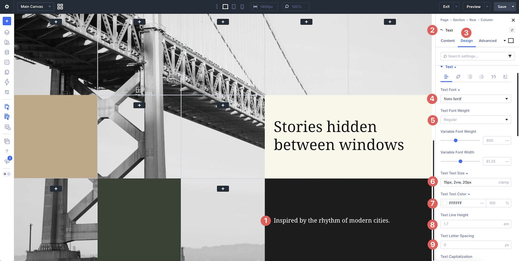
You can also update individual content blocks with different backgrounds, image treatments, borders, or accent colors to bring the layout in line with your brand.
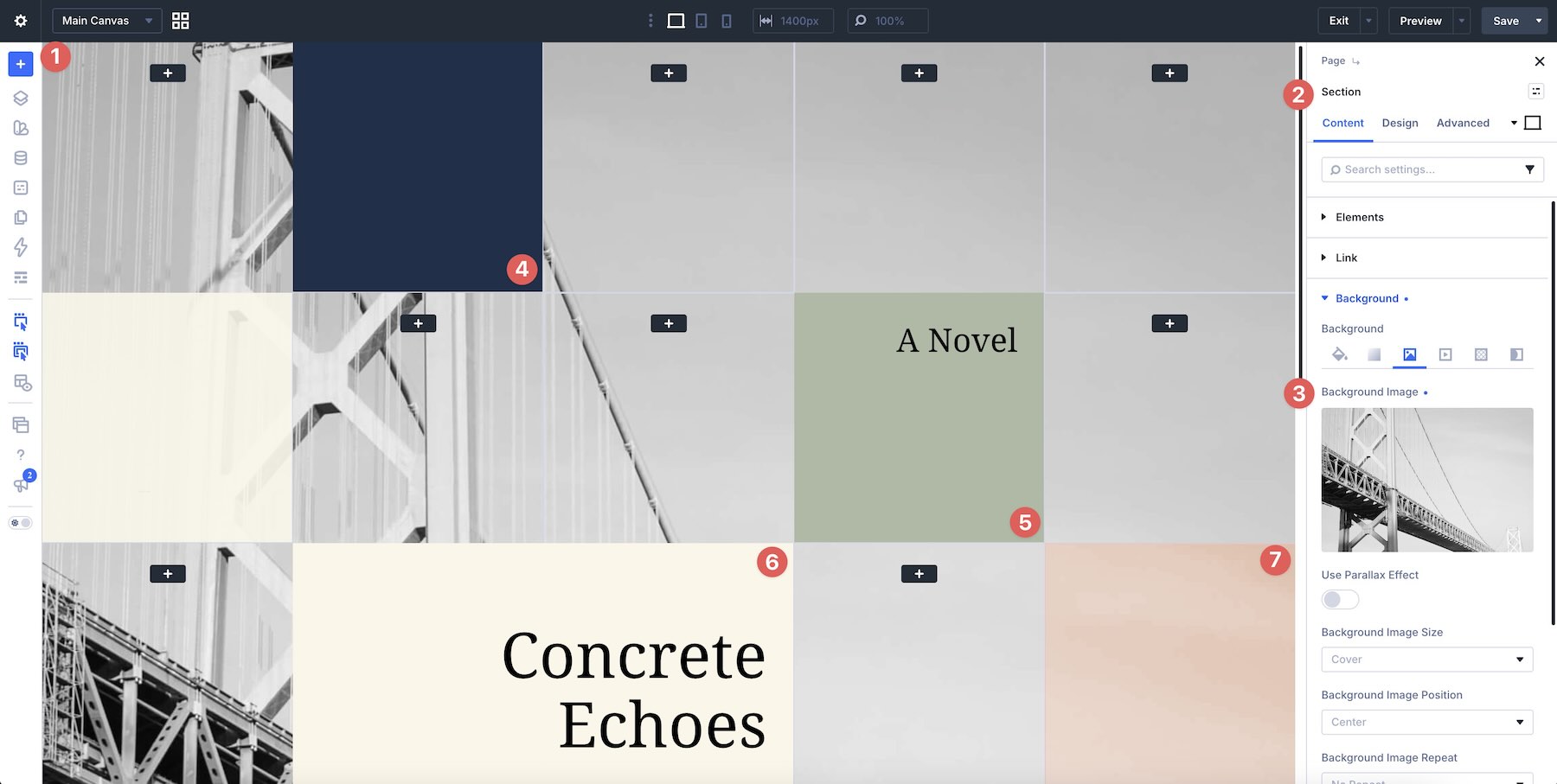
If the original section uses contrasting squares, dark and light blocks, statistics, image tiles, or intentionally empty areas, keep those relationships in mind so the grid retains its visual rhythm after customization.
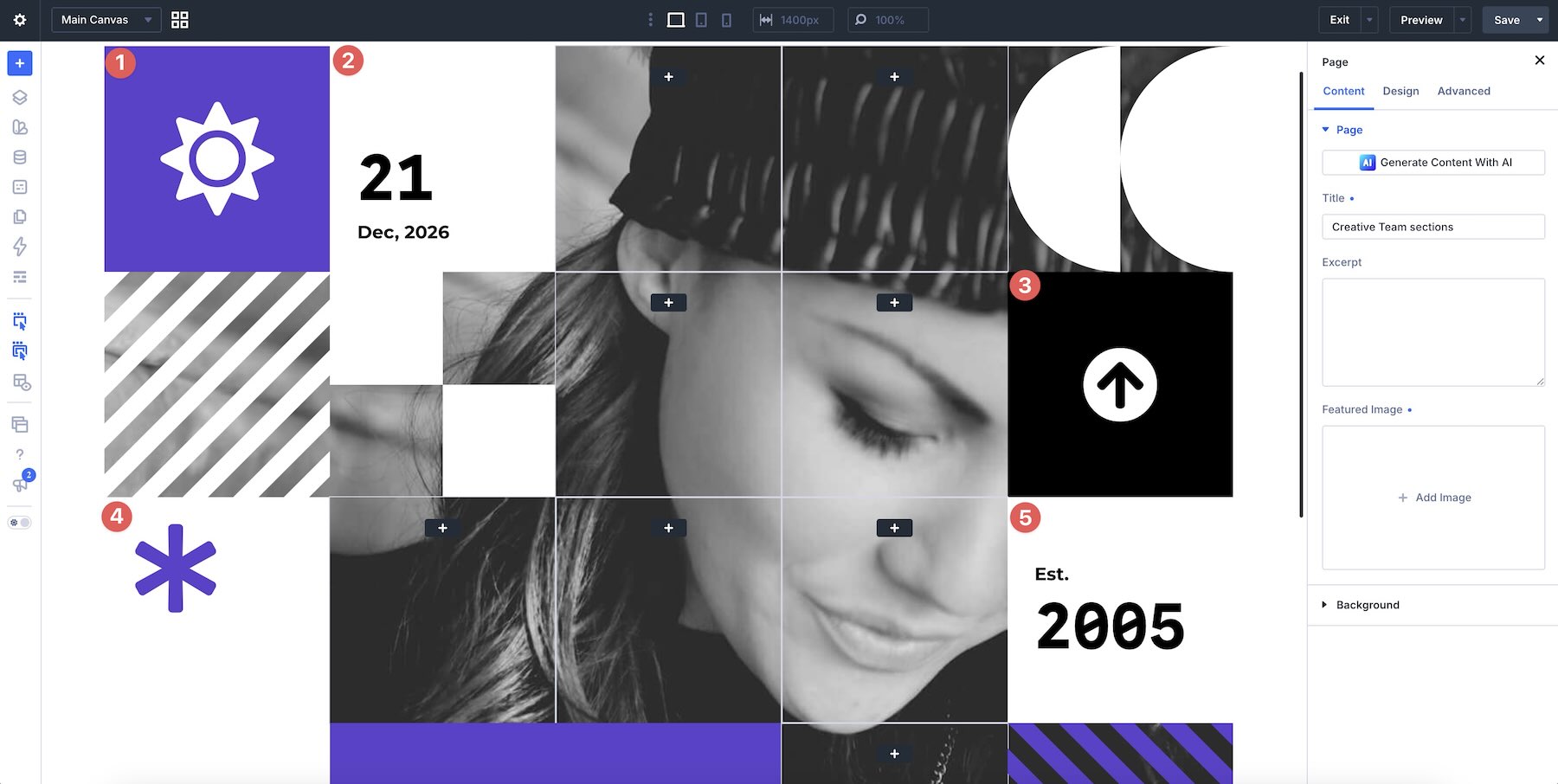
6. Check The Grid On Smaller Screens
Square-based layouts can change noticeably when they adapt to narrower screens. Use Divi’s responsive editing tools to review the design on desktop, tablet, and phone before publishing.
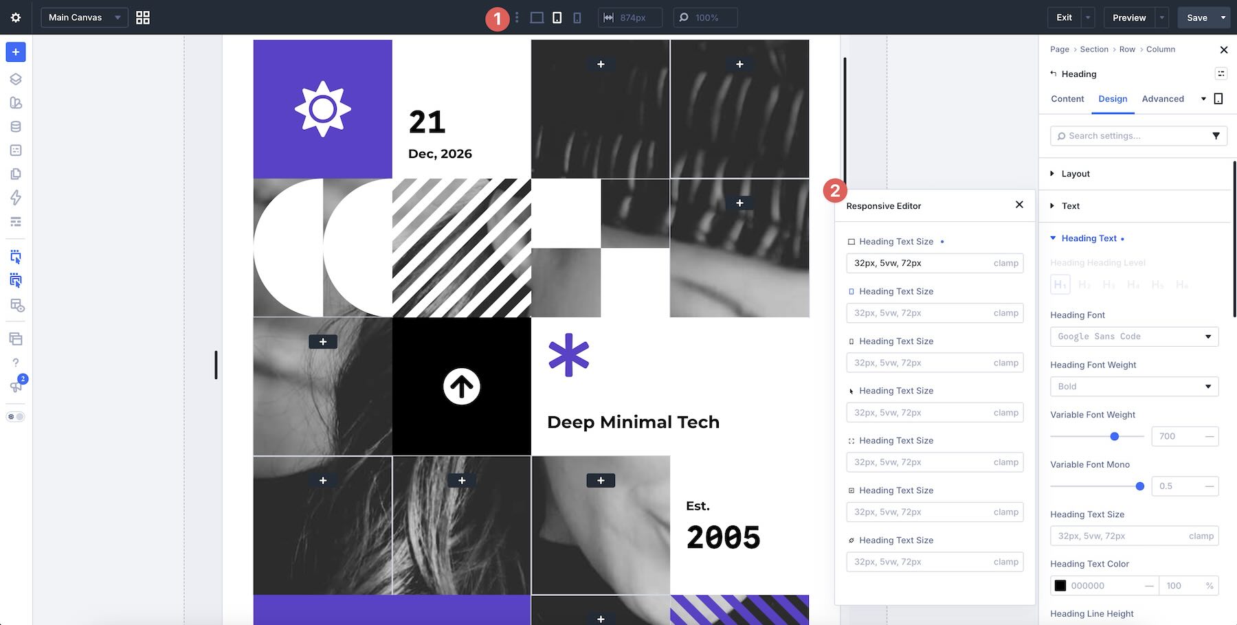
Pay particular attention to stacking order, image crops, block heights, gaps, text size, and alignment.
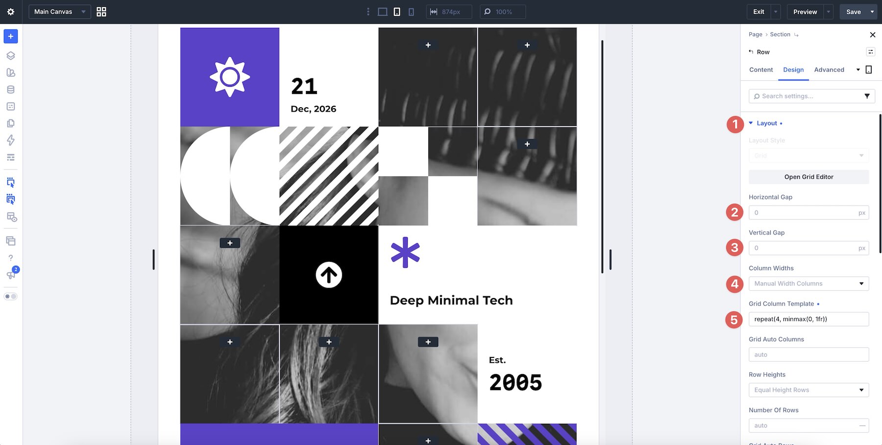
If necessary, adjust spacing, sizing, or the order of individual elements at smaller breakpoints so the layout remains easy to follow and the visual hierarchy still makes sense.
Tips For Effective Square Grid Layouts
Square grids work best when each block has a clear purpose within the larger composition. Use these tips to keep the designs structured, balanced, and easy to scan.
Create A Clear Focal Point
Not every square needs equal visual weight. Let one image, headline, stat, or content area lead the composition, then use the surrounding blocks to support it.
Mix Content Types
Square grids are especially effective when they combine different types of information. Mix imagery with text, numbers, icons, labels, project details, or simple color blocks to create more visual variety.

Keep The Spacing Consistent
Consistent gaps help separate individual blocks while making the full section feel cohesive. If you adjust the spacing, repeat those values throughout the grid wherever possible.

Use Color To Organize The Layout
Background colors can help distinguish stats, text, imagery, and supporting content without adding unnecessary decoration. Use a focused palette so the individual blocks still feel like part of the same system.

Choose Images That Crop Well
Images may appear inside compact square or rectangular areas, so choose visuals with clear focal points. Review the framing after replacing each image to make sure important details remain visible.
Leave Room For Whitespace
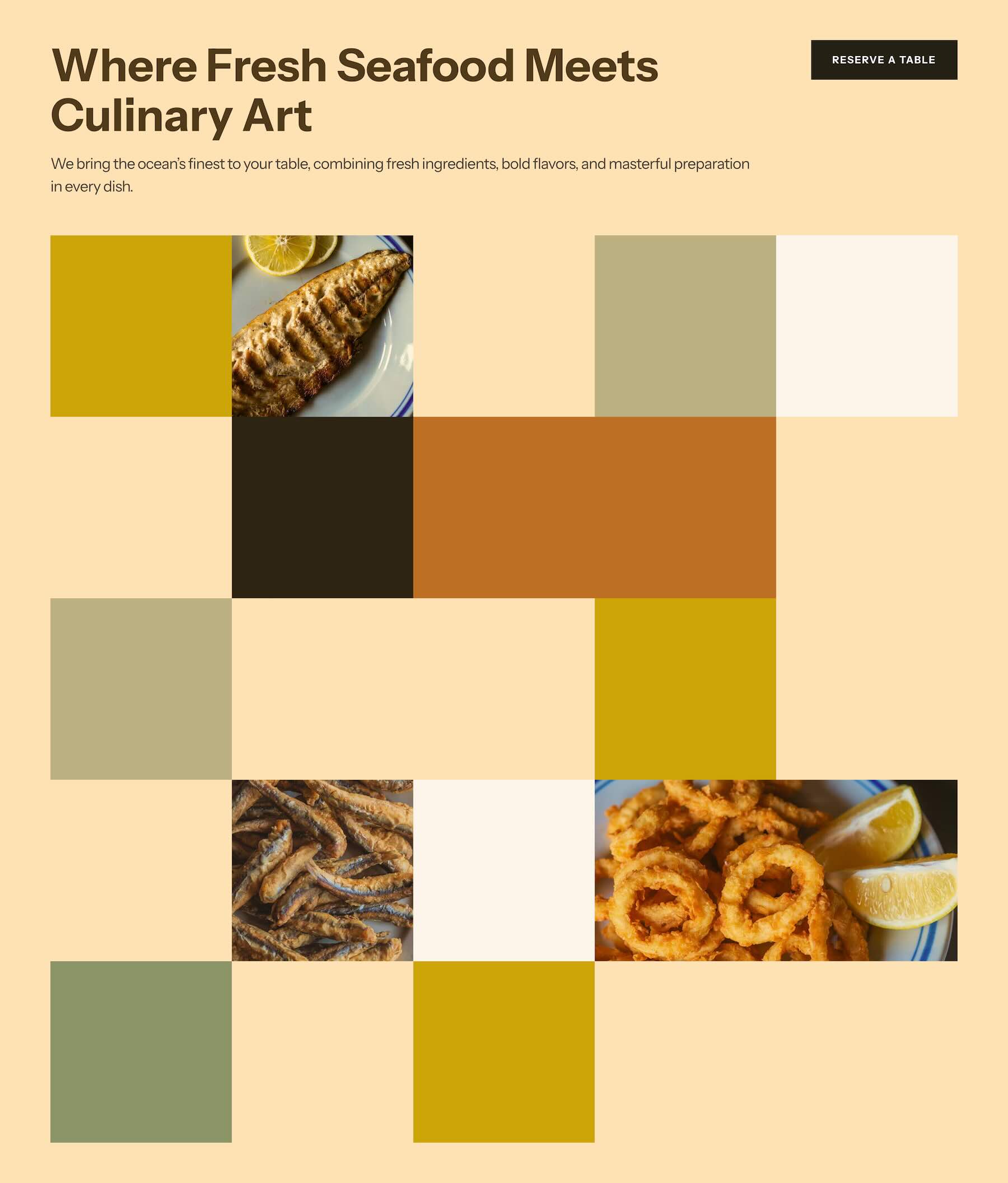
A square grid does not need every available area to feel busy. Simpler blocks and open areas can give detailed images and text more breathing room while making the overall composition easier to scan.

Check The Visual Order On Mobile
When a multi-column grid stacks vertically, the reading order becomes more noticeable. Review the mobile layout and make sure related text, images, stats, and calls to action still appear in a logical sequence.
Start Building In Divi 5 Today!
These 7 Square Grids give you a fast way to create structured, contemporary sections for agency websites, portfolios, business pages, project showcases, services, landing pages, and more. Import your favorite design, swap in your own content, customize the styling, and build a polished grid-based section with Divi 5’s Visual Builder.












Leave A Reply