
Links are the connective tissue of the web. When they are built correctly, they help users move through content, give search engines clearer signals about page relationships, and provide assistive technologies with predictable navigation. When they are built poorly, they can create friction for users and reduce the clarity of your page structure.
Divi 5 gives you two distinct ways to make elements clickable. Most modules include the Link Option Group, which can make an entire module or container clickable. The newer Link Module also uses Divi’s link settings, but it outputs a real <a> element in the markup. That gives you a lighter way to add semantic links without using a Text module or styling a full Button module.
This post looks at how those two approaches differ, where each one makes sense, and why using them together is often the most practical pattern.
The Simple Difference
In Divi 5, “clickable” can mean two different things, and they are not the same.
A semantic link is a real HTML <a> tag. Browsers, screen readers, keyboard navigation, and search engines all recognize it as a link.
A dynamic click area is a larger clickable surface created through Divi’s Link Option Group. It improves usability by letting people click anywhere on a card, column, or module, but it is not the same as outputting a full semantic anchor for that whole area.
That difference matters because the two approaches solve different problems. Dynamic click areas are great for usability. Semantic links are important for structure, accessibility, and crawlable markup. In many real layouts, especially cards and looped designs, the best solution is to use both together.
Understanding HTML Link Semantics
The anchor element, <a>, has been part of HTML from the start. Its purpose is specific: it creates a hyperlink to another resource. When a browser encounters an anchor with an href attribute, it understands that the element points somewhere else.
That matters because links carry more than just click behavior. Screen readers announce anchors as links. Keyboard users can tab to them. Search engines can follow them to discover and understand related pages. Anchor text also helps communicate where that link goes.
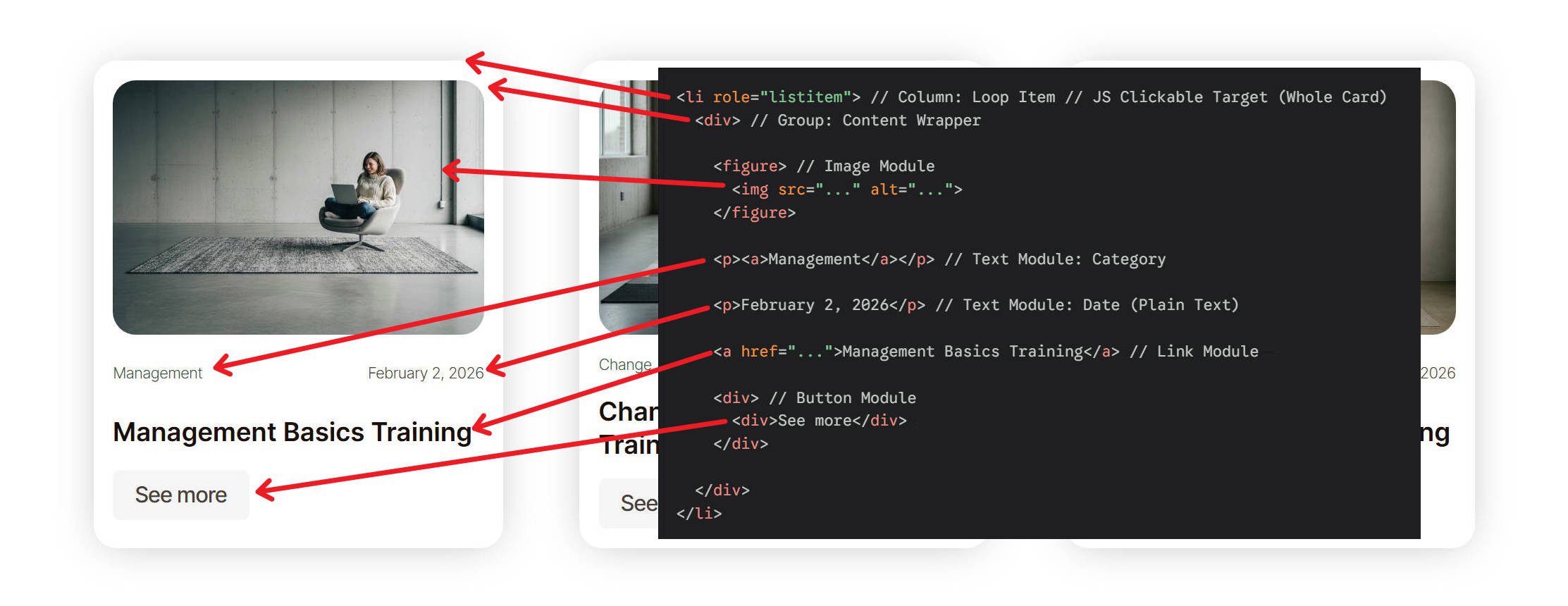
When a clickable area does not include an anchor element, those benefits are less direct. A container that responds to clicks through JavaScript may still feel clickable to a mouse user, but it does not provide the same built-in HTML signal as a real link. In the example below, the full card is clickable, but only the semantic links in the card are actual <a> elements.
Notice the browser status area in the lower-left corner. It only recognizes the semantic links as standard HTML links. While the whole card is clickable, only specific parts of it exist in the markup as anchors. In this example, those anchors are the category link and the post title, which is often the most descriptive anchor text on the card.
How Modules Implement The Link Option Group
The Link Option Group appears in the Content tab of many Divi modules, but the way it is implemented depends on the module. Modules such as the Link Module and Button Module output an actual <a> element. Other modules, including Groups, Columns, Blurbs, Images, and many others, can use the Link Option Group to create a clickable surface without turning the whole module into an anchor in the DOM.
Why use a dynamic click area at all? Because it can improve the user experience. Think about a blog card whose main purpose is to move someone to the full post. If the image, title, and excerpt all point to the same place, making the entire card clickable reduces friction. Users do not have to hunt for the exact linked element.
Divi’s Link Option Group makes this easy on many modules and containers. When you add a URL to a module or container’s Link setting, Divi can make that whole surface clickable.
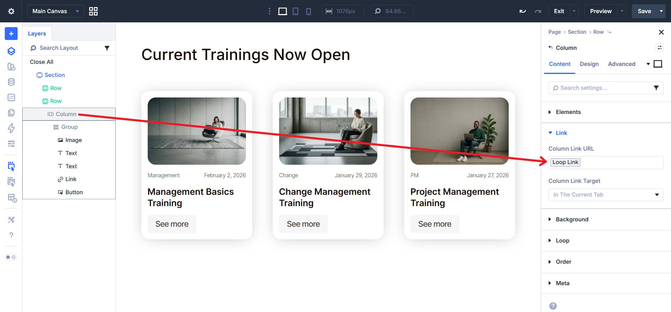
That approach works especially well for cards and looped layouts. A blog card, for example, may use the container-level link as the broad click area while still including more specific semantic links inside it, such as a linked title, category link, or read more link.
Divi also handles this hierarchy intelligently. If a module inside that clickable container already contains its own semantic link, such as a Button Module or Link Module, that inner link can remain the more specific destination when clicked.
The Link Module: Semantic Anchors In Divi 5
Because the Link Module is newer, it is worth calling out what makes it different. The Link Module outputs a real <a> element in your page markup. Unlike the broader click-area behavior used by many other modules, this gives you a native semantic link that browsers, screen readers, and search engines can all recognize directly.
The module accepts link text and a URL, and it includes the design controls you would expect from a Divi module, including padding, background, border radius, and hover styling. That makes it useful for more than plain inline links. You can style it as a lightweight button-like element when you want semantic link output without the extra design overhead of the Button Module.
The Button Module is also semantic when it links to something, since it outputs an anchor by default when used as a link. The difference is mostly about intent and weight. The Link Module is simpler and more flexible when you want a straightforward semantic link that you can style as needed.
When To Use The Link Option Group And Link Module
The choice between the Link Option Group and the Link Module depends on what you are building and what role that link needs to play.
Use The Link Option Group When
You want broad click behavior across an entire module or container. This works especially well for cards, loop items, and other layouts where the whole surface is meant to lead to the same destination. It makes the click target larger and easier to use.
Use The Link Module When
You need a real <a> element in the page markup. That matters when the link itself should be clearly exposed to browsers, assistive technology, and search engines. It also works well when you want a simple, styled link element without using a Button Module.
Use Both Together When
You are building clickable UI cards that need both generous click areas and strong semantic structure. Set the Link Option Group on the outer container, then place a semantic link inside it using a Link Module, a linked Heading, or a Button Module. That gives users the convenience of clicking anywhere while still keeping meaningful anchors in the content structure.
This combined approach is often the most practical one. The container-level link improves usability. The internal anchor preserves semantic clarity.
Start Using Divi 5 Today!
The Link Option Group and the Link Module in Divi 5 solve different problems. The Link Option Group is excellent for larger click targets and smoother UI behavior. The Link Module is valuable when you want a semantic anchor that exists clearly in the markup.
In many real layouts, especially cards and loops, the best solution is not choosing one over the other. It is using both intentionally. Match the method to the job, and your links will work better for users, assistive technologies, and search engines alike.


When adding a simple link. What is recommended if i want to add the most semantic value?, Using a link module? or using a text module with a link?
Both add an <a> attribute to your page’s DOM. Use the Text Module if you need more text than what will be linked. Link Module when all the text is linked.