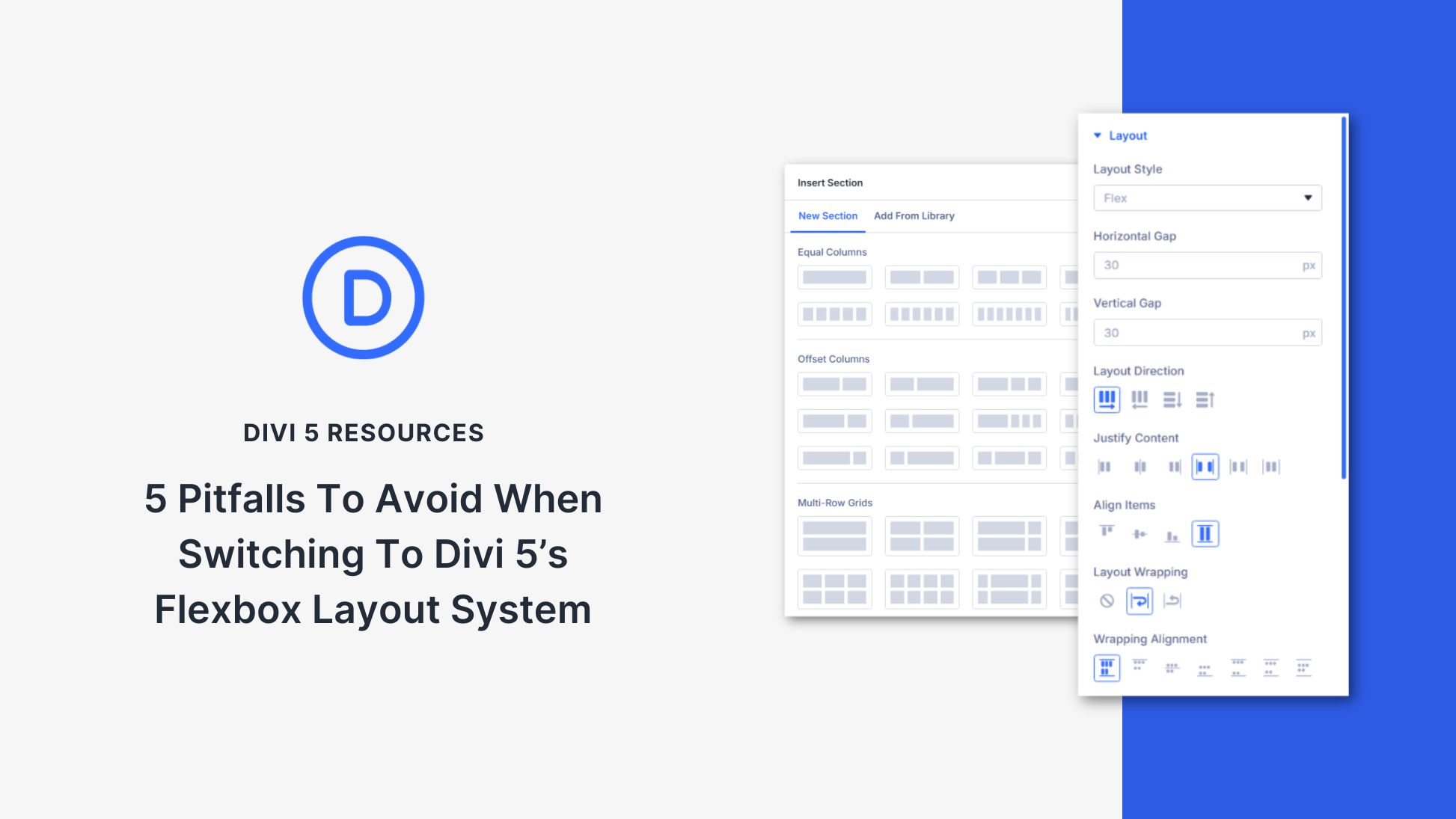
Divi 5 just shipped its all‑new Flexbox‑based layout system. It replaces Divi 4’s old block layout engine and unlocks powerful new controls right in the Visual Builder. Every new row now defaults to Flex layout. Unless you’ve already used CSS Flexbox, this change demands a new design mindset because Flex works differently. If you don’t adjust your habits, you’ll get stuck.
This update gives you visual controls for wrapping, direction, spacing, ordering, and alignment — all built in. No hacky custom CSS. It also comes with pre-configured row shortcuts to build complex row structures with minimal tweaking of Display settings. Some block‑based features, like specialty and full-width sections, are deprecated because Flex now covers all these use cases.
This post goes into the five biggest pitfalls you’ll hit when switching your mental model from Block to Flex in Divi 5.
- 1 Pitfall #1: Forcing Flex Into A Block Mindset
- 2 Pitfall #2: Not Knowing How Flex Shrink & Grow Fit Into Child Element Sizing
- 3 Pitfall #3: Not Breaking The Margin Habit
- 4 Pitfall #4: Underusing Reverse Flow & Ordering Controls
- 5 Pitfall #5: Forgetting To Set Wrap
- 6 Take Your Time To Master Flexbox
- 7 Use Flex With Divi 5 Today
Pitfall #1: Forcing Flex Into A Block Mindset
→ Flex requires a new mental model, not just new controls.
Nobody likes change unless they know they are hitting very real limitations. For many, the old layout system is what they knew and were comfortable with. But it did have its limitations. Those who knew enough about CSS knew that the old system was missing things that Flexbox was designed to remedy. Avoiding the first pitfall requires understanding that Flexbox isn’t just a block layout with extra options.
In Divi 4, modules stacked vertically by default — every element sat below the one before it. You could stack things horizontally with columns, but at that point, you would work with multiple rows + columns inside a section to build a layout. That was predictable and comfortable for many, but it also led to the frustrating reality of not being able to have two buttons side-by-side and other design challenges.
Divi 5 works differently now because new containers (i.e., Sections, Rows, Columns, and groups) are set to “Flex” by default. You get more specific options at the container level for arranging child elements. Flexbox is powerful because it allows for flexible layouts where elements are positioned based on available space and the content within them. More on that in the next pitfall. This allows layouts to adapt to varying screen sizes and content without relying on fixed or absolute positioning. Here’s but one example to compare Flex with Block.
Block layout stacks modules vertically along the block axis. Flexbox lets you choose between row and column as the main axis.
Each setting and option in the UI corresponds directly with the actual CSS properties added to each container.
Pitfall #2: Not Knowing How Flex Shrink & Grow Fit Into Child Element Sizing
→ Without Shrink and Grow, your layouts won’t behave as expected.
With Flex in Divi 5, child modules can have a set width or height. In addition, they can shrink or fill (their width or height) depending on the room inside the container. In this example, Text Modules are set to 45% width, meaning that two modules would fit horizontally as if in the same row. But if we add an odd number of Text Modules, we don’t want there to be empty space. We can set these modules to have Flex Grow, and then when there is available space in a row, these modules will grow to fill.
Divi exposes controls like “Grow to Fill”, “Shrink to Fit”, and custom settings on Child Elements within any Flex container (Child Element > Design > Sizing > Grow to Fill, Shrink to Fit, or Custom).
Setting height and width on child elements feels familiar if you’re used to block layouts. But with Flexbox, Grow and Shrink settings let you combine fixed sizing with responsive behavior — adapting to the available space in each container. It adds complexity, but also unlocks far more flexibility.
Shrink to Fit and Grow to Fill (in addition to flex-basis) are also very handy at helping you create responsive layouts. For block layouts to be responsive often, you would need to set up multiple breakpoints and widths/heights at each of those breakpoints. Flexbox can benefit from unique settings at various breakpoints, but as the name suggests, it is very much flexible. This is especially the case when using clamp() for typography. Using both of those together, along with other relative CSS units, will break your constant need for breakpoints.
Let’s look at another example built with Flexbox.
The Column Container (parent) is set to flex with these settings:
- Horizontal and Vertical Gap: 30px (this could use calc or clamp to be a little better, even)
- Layout Direction: Row Reverse (explanation for this decision in pitfall #4)
- Justify Content: Center
- Align Items: Center
- Flex Wrap: Wrap Reverse (explanation for this decision in pitfall #4)
I then placed three child elements inside the Column. A Heading Module, Divider Module, and a Text Module. Here are the relevant settings for each:
- Heading Module
- Text Size: clamp(2rem, 1.5rem + 2vw, 3rem)
- Width: Auto
- Flex Size: Shrink to Fit
- Divider Module
- Width: Auto
- Flex Size: Shrink to Fit and Grow to Fill
- Text Module
- Text Size: clamp(0.9375rem, 0.75rem + 0.4vw, 1rem)
- Width: Auto
- Flex Size: Shrink to Fit
With a Row Flex Direction, child elements line up horizontally whenever there is room. The Text Module is the widest, so it fills its own row. The Divider Module then grows or shrinks since it has auto-width and both flex-grow and flex-shrink enabled. The Header Module uses only its intrinsic width and stays compact. This setup yields a fully responsive layout without any breakpoints.
Pitfall #3: Not Breaking The Margin Habit
→ Use Gap instead — it’s smarter, cleaner, and made for Flex.
In Divi 4, visual gaps between modules and other elements required margins (vertical gaps via the bottom margin, horizontal gaps via the left/right margin). When the gap was applied to column spacing, Divi 4 had a Gutter setting, but it didn’t take standard CSS values, and it actually used margin to the sides of columns to create the gap. This is the same way that Block Layouts still work. But there’s now a cleaner, more effective approach.
Divi 5’s Flexbox system introduces row and vertical gap controls under Design > Layout > Horizontal and Vertical Gap. These map to CSS gap and row-gap. Vertical gaps apply automatically to each “Flex Row” when items wrap onto a new line. The same is true for Horizontal Gaps: whenever there are child elements next to each other, the gap will be present. These Gap settings also accept any positive CSS unit, so you can use clamp() or calc() to create responsive Gap spacings.
This reduces the need to apply margin values to each and every child element. The Gap setting adapts automatically based on Flex Direction and the number of children in the container to apply any gaps automatically. Margins still have their place, but their need for spacing elements inside a container is reduced.
Pitfall #4: Underusing Reverse Flow & Ordering Controls
→ Visual order and semantic order don’t have to match.
By default, child elements in a Flex container will display in their source order. Flexbox and Divi 5 give you the ability to specify reverse flex directions and order controls to change the visual flow of elements without changing the HTML ordering of elements.
The Reverse direction toggle under Layout Direction lets you reverse the order of elements in either the row or column direction. To look at the layout example from pitfall #2 again, we can see why we’d want this. You can see in the Layers view that the order of child elements is the Heading, then the divider, and finally the Text Module. Semantically, having the Heading (an H2 in this case) at the top of the stack makes sense for screen readers. However, the heading is obvious enough visually, whether first or last, since we are using a visual hierarchy with its text size.
Using Row Reverse as the Flex Direction and Wrap Reverse retains the HTML ordering (important for accessibility) while also allowing me to design things how we envision them.
You can achieve the same using Child Element Ordering, which is found in Divi when clicking on a Child Element’s Settings > Content tab > Order. We can change the order in which only this element will appear. In this example, we achieve the same end result, but with a different setting — one that might make more sense to some.
Pitfall #5: Forgetting To Set Wrap
→ Flex won’t break to new rows unless you tell it to.
We mentioned wrapping earlier, but it deserves its own section. New flex containers default to no wrap. This can have unexpected consequences. For example, if you add four child modules, each at 50% width, you’d expect them to show on two Flex Rows. Your problem is simply that you have to allow your container to wrap.
Divi includes a toggle called Layout Wrapping, which has three states: no-wrap, wrap, and wrap-reverse. You must enable wrap if you want modules to break to new lines at a threshold. That’s how Divi supports multi-row structures inside a single container (Nested or Multiple Rows aren’t the only way to do this now).
Take Your Time To Master Flexbox
Flex in Divi 5 is more powerful than Divi’s previous block-only layout system. However, it requires some learning to understand. Flexbox isn’t a Divi-specific setting, so it’s important that you know the basics of how this CSS tool works. Divi makes it easy to implement since all the settings you can apply in CSS are available directly in the editor. But the concept is very different from Block.
Because of those differences, we highly recommend you spend an hour using an interactive teaching tool to understand Flexbox. One that is easy to use and really does the trick is FlexboxFroggy.com. It takes you through 24 progressively complex challenges, teaching you all the basics. It is way better than doomscrolling for an hour.
Use Flex With Divi 5 Today
Flexbox in Divi 5 is honest. It doesn’t guess what you want. It asks you to decide. But once you decide, flexibility follows. You can build every layout structure responsibly, responsively, and reliably — even infinitely nested — without custom CSS or hacks.


Hi,
I have over 100 Divi Theme Websites. I am really not looking forward to making the change to DIVI 5. It reminds me of the same framework as Elementor. I have several Elementor Sites too. Your new framework looks like Elementor.
If find Elementor too bloated and difficult to control and edit. Please why change your framework when you had such success with it in the past with DIVI. Some of us do edits on our laptops. Your two side bars will be hard to organize and edit on laptop. I have turned off my updates on DIVI. I don’t want the DIVI 5. I will keep my lifetime membership, but Sorry I will not be using DIVI 5 just yet.
The left side bar can be collapsed. The right sidebar can be floated where ever you want in the screen. You have more control over your editing environment in Divi 5 than you do in Divi 4. Also, things are more compact in Divi 5 so they should be easier to see what you need to see on a laptop. Plus is runs much faster and is easier to work with. It’ll just take some time to get used to. Give it a shot on a staging site.
Too much!
Div 5 – It’s all too much for me! The reason I chose Divi was for its simplicity – Divi 5 is too complex in my opinion and is trying to do too much. And certainly too complex for my clients who update their own sites to transition.
Divi 4 works fine for me and my clients as I mostly build small sites.
Just wondering how long Divi 4 will stick around? Are you able to give us an approximate time as to when it will be deprecated?
I do appreciate all the fine work and some of the great new features etc, just not for me I don’t think.
Thanks.
Hi David, for me it’s the opposite. I can’t wait for all the new features and look forward to Divi5 being finally released. I get your point though. Happy building! David
All the features and customization you are able to do in Divi 4 now is and will be doable in Divi 5. Nothing is being removed that makes things harder. You have the option to use Block layouts, just like was the default in Divi 4.
As far as new features, these are essential for modern websites and web design. We’ve published hundreds of articles in the past (for D4) with workarounds using custom CSS, say for changing a container to display:flex. That was too complicated and these new features make these things much easier.
We are also publishing lots and lots of articles here on the blog to help it all make sense. If you get tripped up, there should be a lot of help here. And since Flexbox is standard CSS, you can find information elsewhere that is transferrable to Divi.
Hope that clears up the direction we are taking.
Thanks for your reply Christopher,
I certainly understand why you are doing things and sure there are many improvements and will be great for many people.
Yes, sooooo many articles – I have been trying to keep up with them -which is why I have come to the opinion that there is just too many changes – for my needs.
But you didn’t answer my question which is why I left a comment –
“Just wondering how long Divi 4 will stick around? Are you able to give us an approximate time as to when it will be deprecated?”
As a designer and developer I am stoked about the new improvements.
Divi 5 is now catching up with the biggest developments in webdesign in the past years.
Layouts and CSS can become very complicated these days and I’m glad to see it addressed in a relatively user-friendly way.
It is a huge improvement over writing custom css blocks in your components to achieve these effects.
Sure, there’s a lot of changes. So it might take a while to get used to it, but I am personally very happy with the updates at the moment.
As for your customers / the end-users, I think it could become easier to use the builder.
If set up right, the end user would probably not need to go to the design tab, but at least it’s there if needed.
Up to now (and still in almost any othe pagebuilder) you had to ‘hack’ the design with custom css all over the place (component itself, page, site, theme) which makes it very hard to maintain.
With this level of flexibilty you can create a nice set of preconfigured components which are more versatile and dynamic.
For example, with flexbox, you’ll have much more options to set up a great looking component with a dynamic amount of columns.
I respect what you have to say and is no doubt true A Kools.
Except I know my clients and they hate having to learn new things or do anything that takes up even more of their precious time. And they won’t want to pay for my time to teach them.
So my post is all about trying to find out how long Divi 4 is sticking around – which wasn’t answered.
Div needs to change and get up to speed for sure – no qualms there. I just think too much at one time.
I love the new Divi 5, I’m developing a staging site with it and it’s super nice, it gives you a lot of freedom. I’d like to please ask for some design examples, because I can’t find much resources online with flexbox design inspirations for my specific design style!
Hey, David! 😊
We attempt to address a number questions our customer have had about the Divi 5 flexbox update in our Everything You Need To Know About Divi 5’s Flexbox Layout System article.
It comes with plethora of examples and we highly recommend it! 👍
After the last update, I encountered significant issues on my staging site, and the live websites are also affected. Layouts that previously used the classic block design and had multiple columns are displaying incorrectly in the editor and frontend. Currently, only one column is displayed, spanning the entire width. When I go to the row editor, I can see all columns. When I duplicate them, they are not duplicated, but the original columns reappear. The only disadvantage is that the columns are no longer next to each other, but all appear in full width one below the other. Only when I activate Flexbox and deactivate it again is the original design restored.
Also, I’m not sure, but are you aware of the problems with Flexbox on the search results page? After the Flexbox update, it is displayed incorrectly. To fix this, you need to remove or resave the template settings and assign the template to the search results. If you save the “Custom Body” template and want the search results columns to be displayed at one-third width, the search results will not be displayed as desired.
Good day, sir. 😊
We would very much appreciate if you could reach out to support team, for a closer investigation. You can reach us at https://www.elegantthemes.com/members-area/help/
Thanks in advance!
I completely understand some users’ concerns with the side panels. To solve this I made one small investment – a cheap ultrawide monitor. Practising with this, I found I was able to use Divi 5 really effectively. And after building three websites using the wider display, I now find that D5 is much more intuitive on my laptop.