

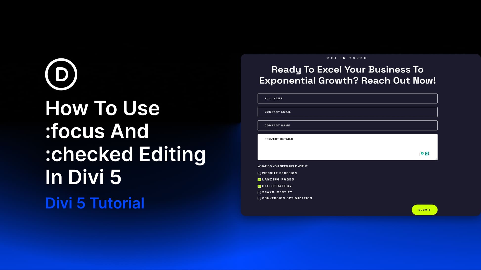
Interactive states can make a form feel more polished, more responsive, and easier to use. The problem is that styling those states usually means writing custom CSS, finding the right selectors, and testing everything on the front end.
Divi 5 changes that with new pseudo-class editing modes for form fields. You can visually customize states like :focus and :checked directly inside the builder, using the same design controls you already use for the default state.
In this tutorial, we’ll build a modern project inquiry form and use both states to add visual feedback across text fields and checkbox selections. A focused field will become easier to track while the visitor types, and checked options will respond clearly when selected.
A Quick Look At :focus And :checked
Before jumping into the build, it helps to understand what these two states do.
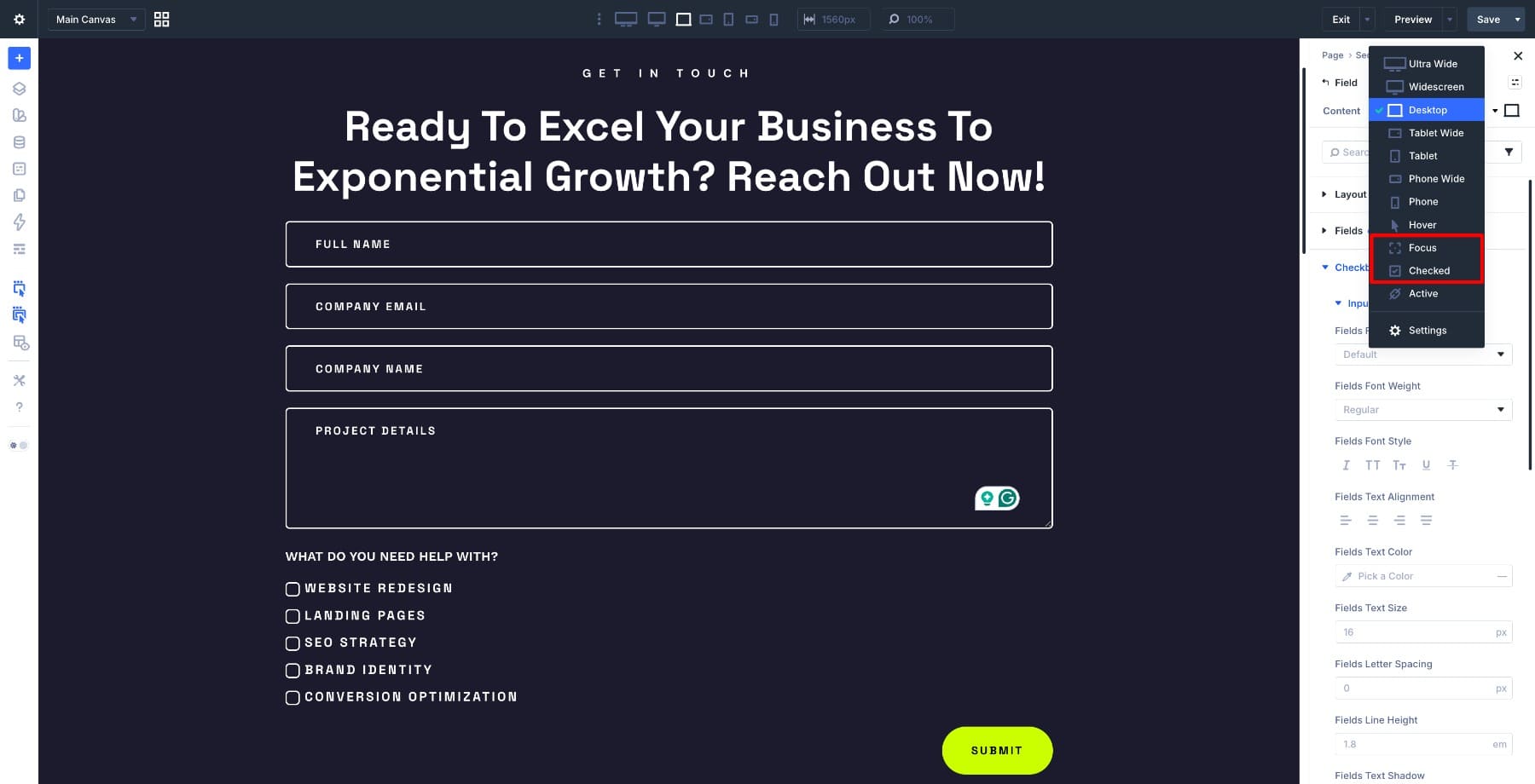
Both live inside Divi 5’s pseudo-class editing modes. You can access them by hovering over a supported design option and clicking the small state icon. From there, you can switch between states such as Default, Hover, Focused, and Checked, depending on the field type and option group you are editing.
:focus State
The :focus state activates when a visitor enters a form field. That can happen by clicking into the field, tapping it on a touch device, or tabbing into it with a keyboard. It stays active while the visitor is interacting with that field.
This matters for usability and accessibility. Visitors should always know which field is active, especially when moving through a form with a keyboard. In this tutorial, we’ll use the focus state to switch active fields to a white background with black text so the current field stands out clearly from the rest of the form.
:checked State
The :checked state applies to selectable fields, such as checkboxes and radio buttons. It activates when a visitor selects an option and clears when that option is deselected.
In our form, each checked service option will grow slightly, become bolder, and use a #CBFF00 background. That gives visitors a clear signal that their selection registered.
Learn Everything About Focused And Checked States In Divi 5
What We’re Building
Here’s a look at the finished form before we start building it.
The form uses a dark default design with strong borders and bold typography. When a visitor clicks, taps, or tabs into a text field, the :focus state switches the field background to white and the text to black. The :checked state handles the service checkboxes, making selected options larger, bolder, and brighter so each choice feels deliberately confirmed.
Build The Contact Form Structure
We’ll set up the form structure first before touching any interaction states. The :focus and :checked states only become useful once the right field types are in place.
1. Add The Main Contact Form Module
Start by adding a single-column Row inside the section and set the Max Width to 950px.
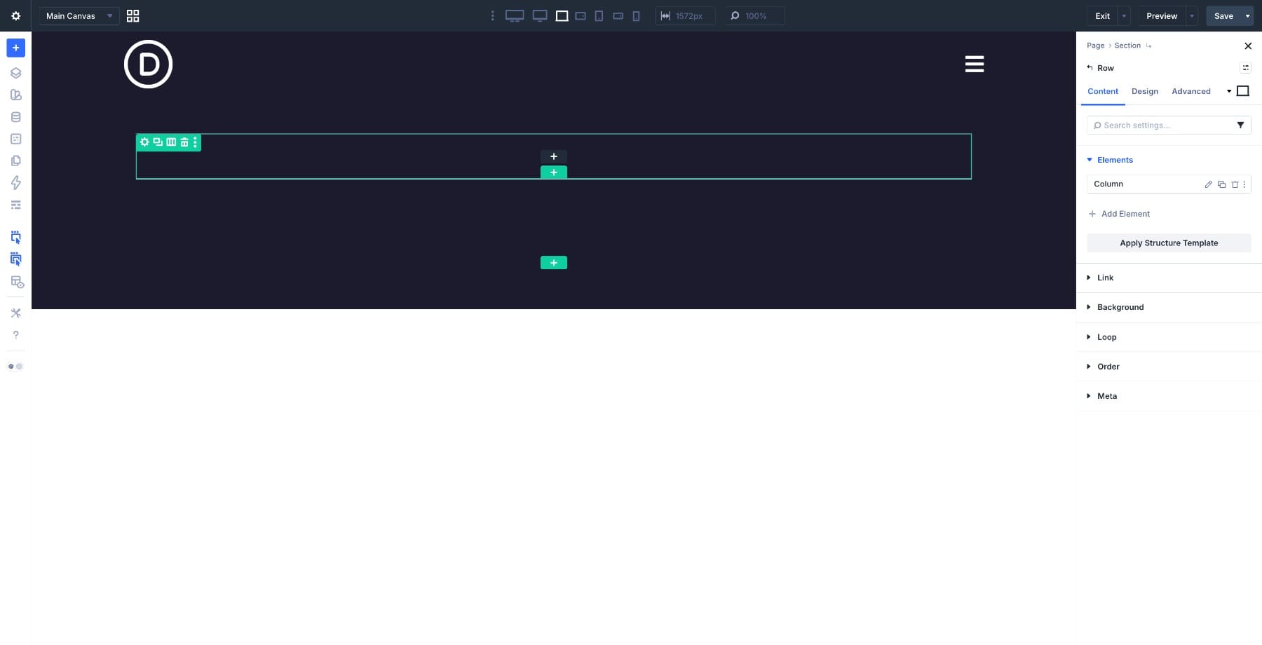
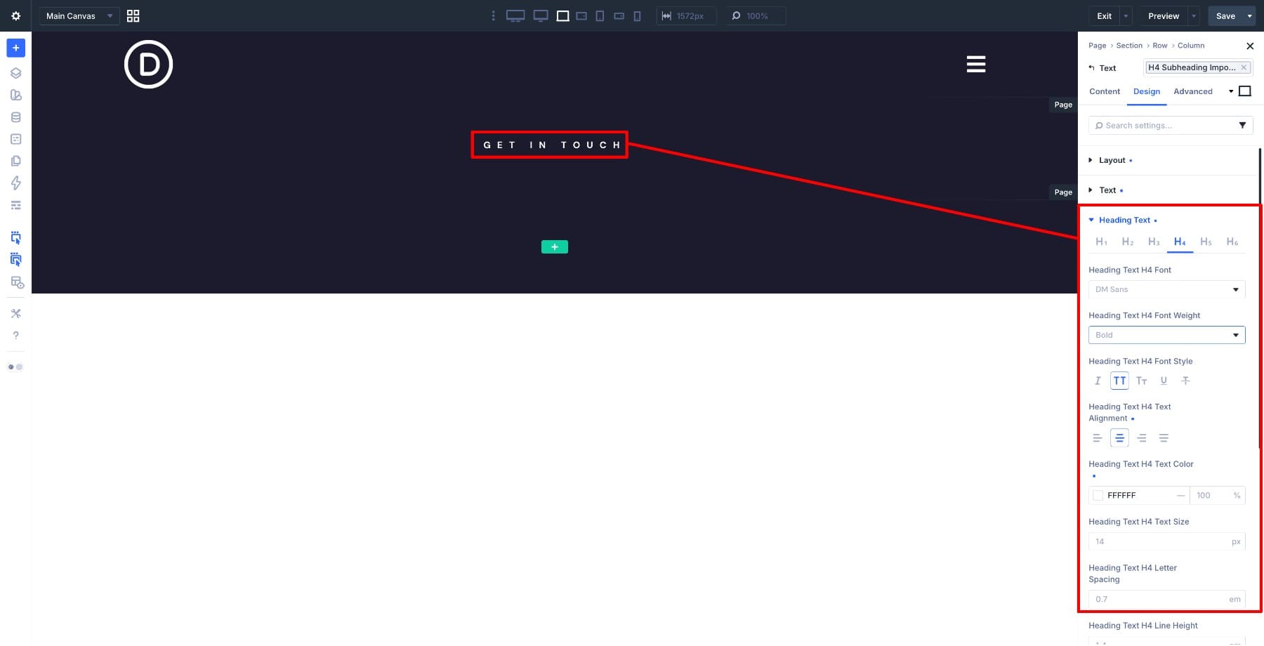
Click the black plus icon and add a Heading Module. Set the text to Get in touch using DM Sans, Bold, All Caps, Center Alignment, #FFFFFF font color, and 14px font size.
Add a second Heading Module directly below for the main title. Use Space Grotesk, Bold, Center Alignment, #FFFFFF font color, and 52px font size.

Now add the Contact Form Module below the headings. Divi will automatically generate a few default fields once the module loads.
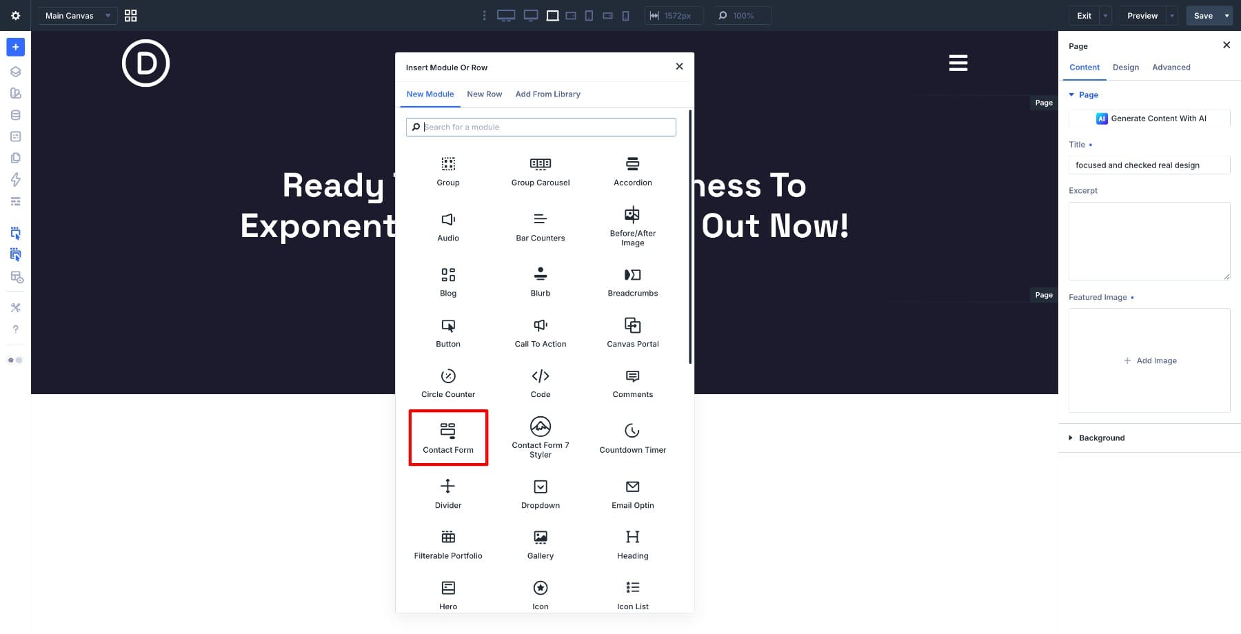
The default fields won’t match our layout yet, so we’ll rename and adjust each one to fit the project inquiry form we’re building.

Open the first field settings and rename the Title to Full Name, keeping the field type set to Input Field.
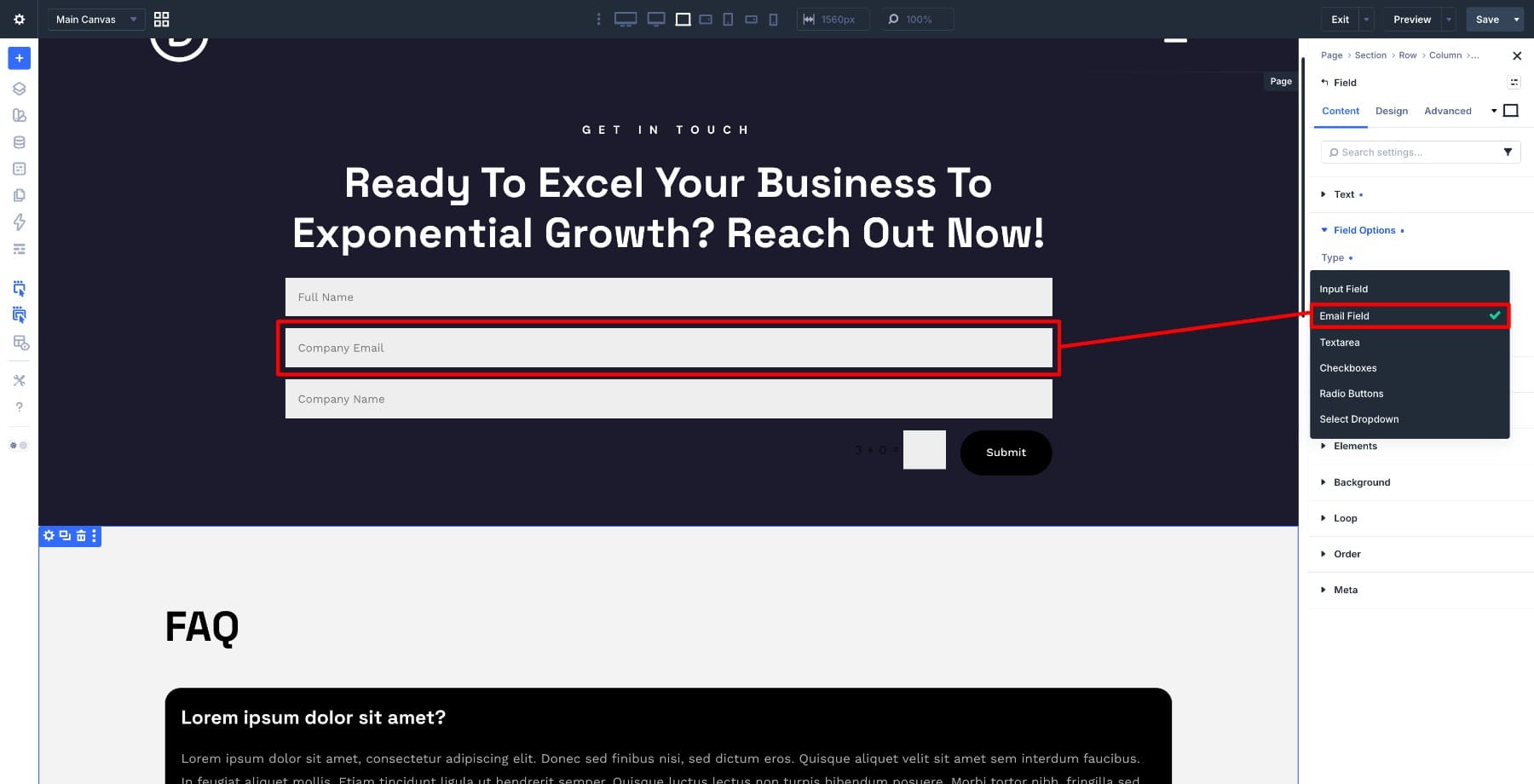
Open the Email field next and rename it to Company Email, keeping the field type set to Email.
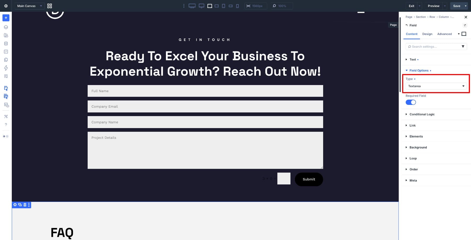
Add one more field for Project Details and set the field type to Textarea so visitors have enough room to describe what they need.
Now add the checkbox field. Inside the Contact Form Elements settings, click Add Element and choose Field. Set the field type to Checkboxes, change the title to What Do You Need Help With?, and add the following options one by one, starting with Website Redesign.
- Landing Pages
- SEO Strategy
- Brand Identity
- Conversion Optimization
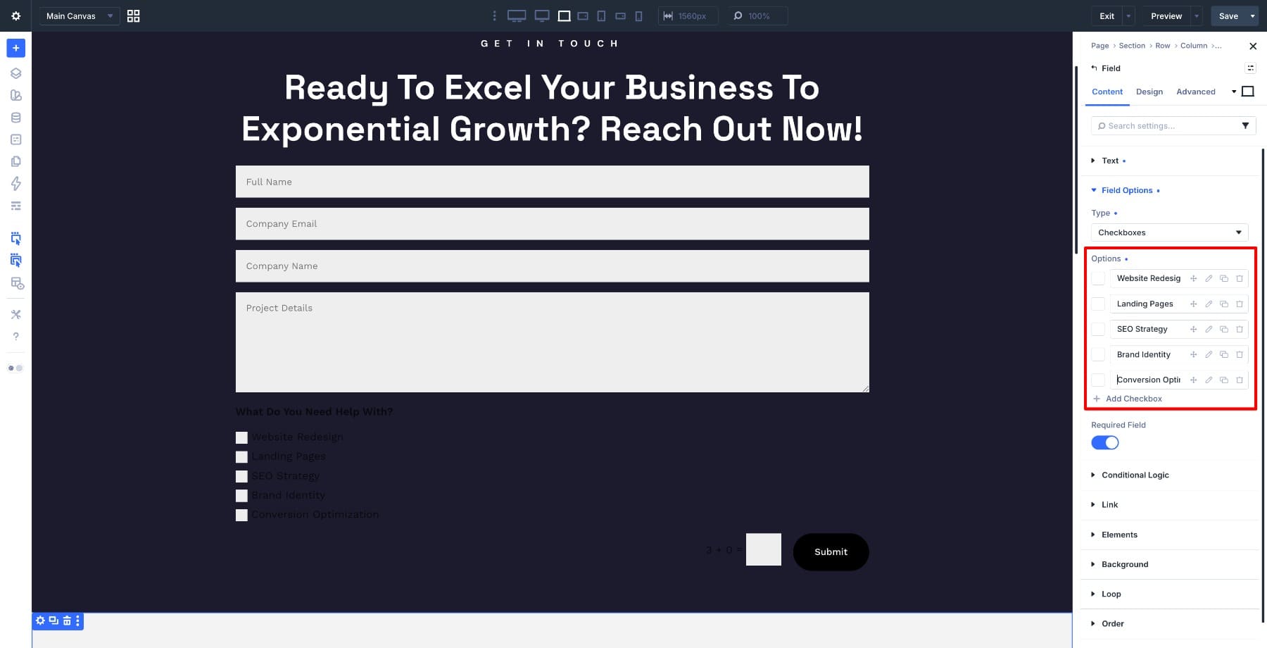
Save the field and return to the main Contact Form settings. The form structure is now ready, with text fields for the :focus state and checkbox options for the :checked state.
2. Style The Default Form Design
With the structure in place, we can style how the form looks before any interaction happens. This default design becomes the baseline that the focused and checked states build on top of.
Open the Contact Form Module settings and move to the Design tab. Open the Fields settings group and set the field background color to #1C1B2D.

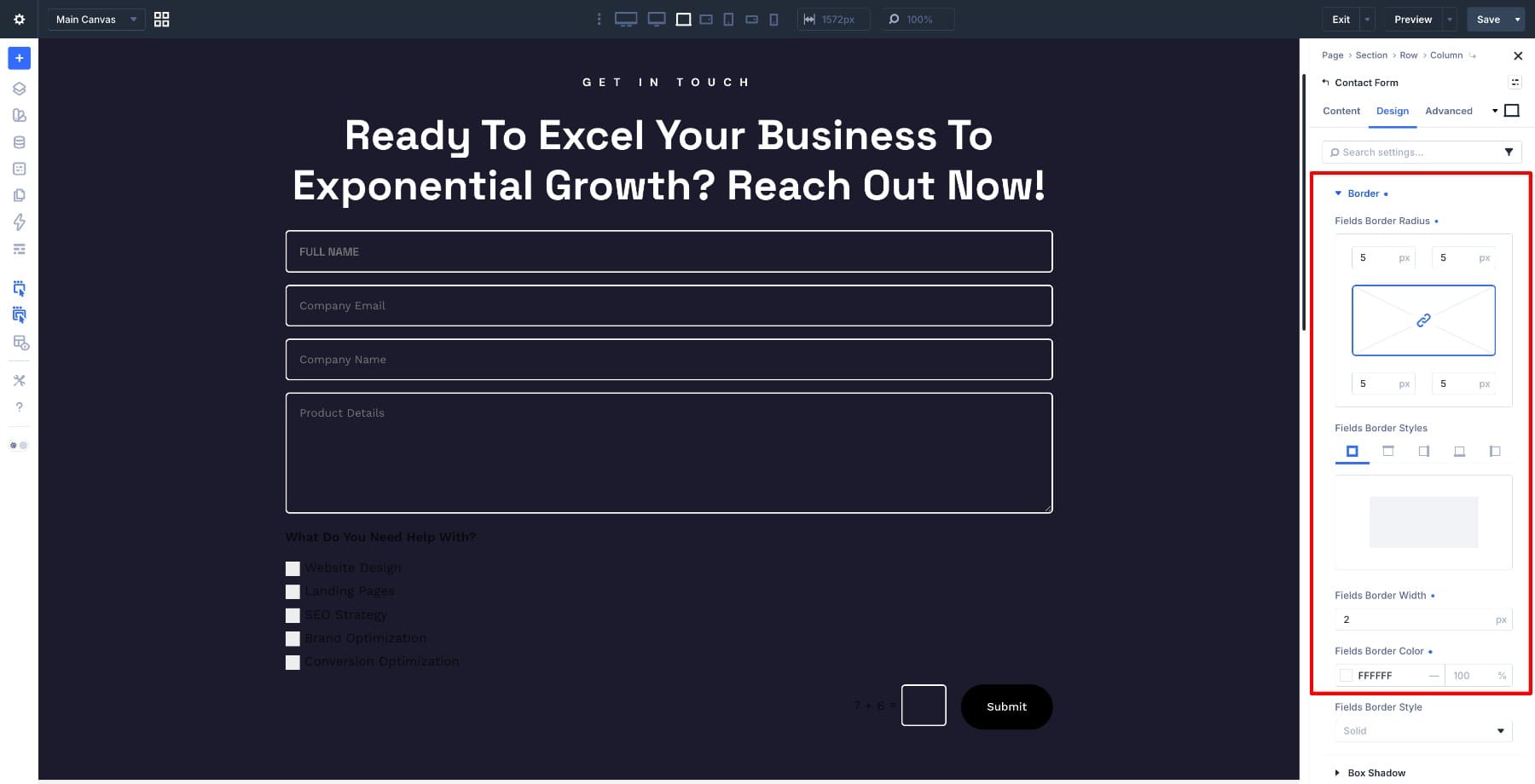
Open the Border settings and set the border width to 5px with a white border color.
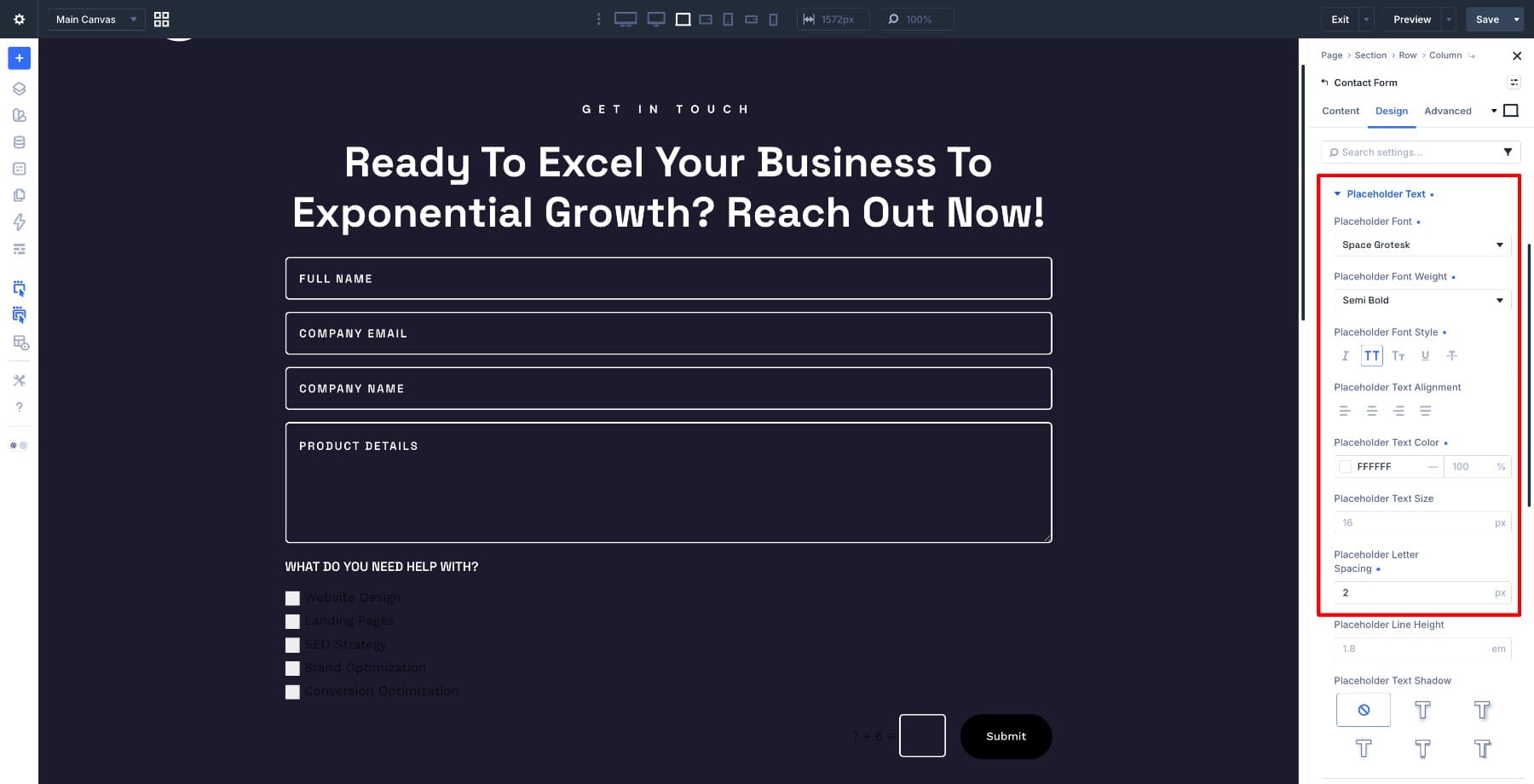
Scroll down to the Placeholder Text settings. Change the font to Space Grotesk, set the font weight to Semi Bold, use white text, and set Letter Spacing to 2px.
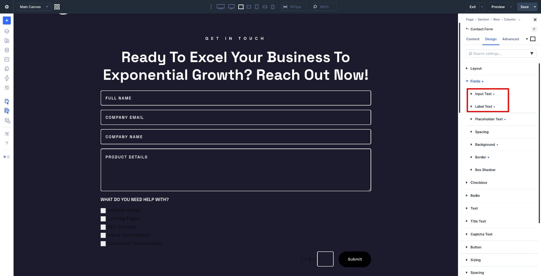
Apply those same typography settings to the Input and Label Text settings so the form reads consistently across fields.
Open the Checkbox settings group and repeat the same baseline styling. Use #1C1B2D for the background, a 5px white border, and Space Grotesk Semi Bold with white text. Keeping the checkboxes visually aligned with the input fields gives the form a cohesive default state before any interaction styling is added.
3. Customize The :focus And :checked States
With the default styling done, we can move into the interactive states. This is where the form starts to feel responsive instead of static.
Customize The :focus State
Switch from the Desktop state to the Focused state using the state selector at the top of the settings panel.
Open Fields > Background and change the color to #FFFFFF.
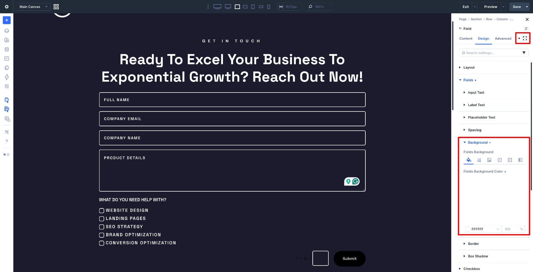
Then open the Input, Placeholder Text, and Label Text settings and change the text color to black.
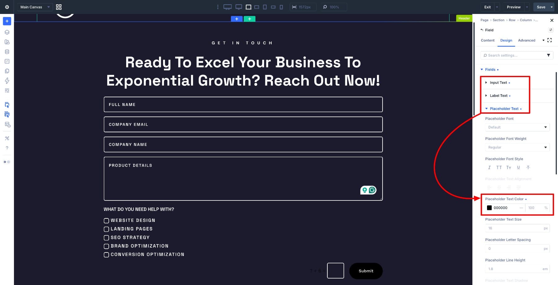
That is all we need to change for the focused state. Everything else, including border size, typography, and spacing, carries over from the default state. This is the main benefit of pseudo-class editing in the builder: you only adjust the properties that need to change during interaction.
Now whenever a visitor clicks, taps, or tabs into a field, that field switches to a white background with black text, making it easy to see exactly where they are in the form.
Customize The :checked State
Click the state icon again and switch to the Checked state.
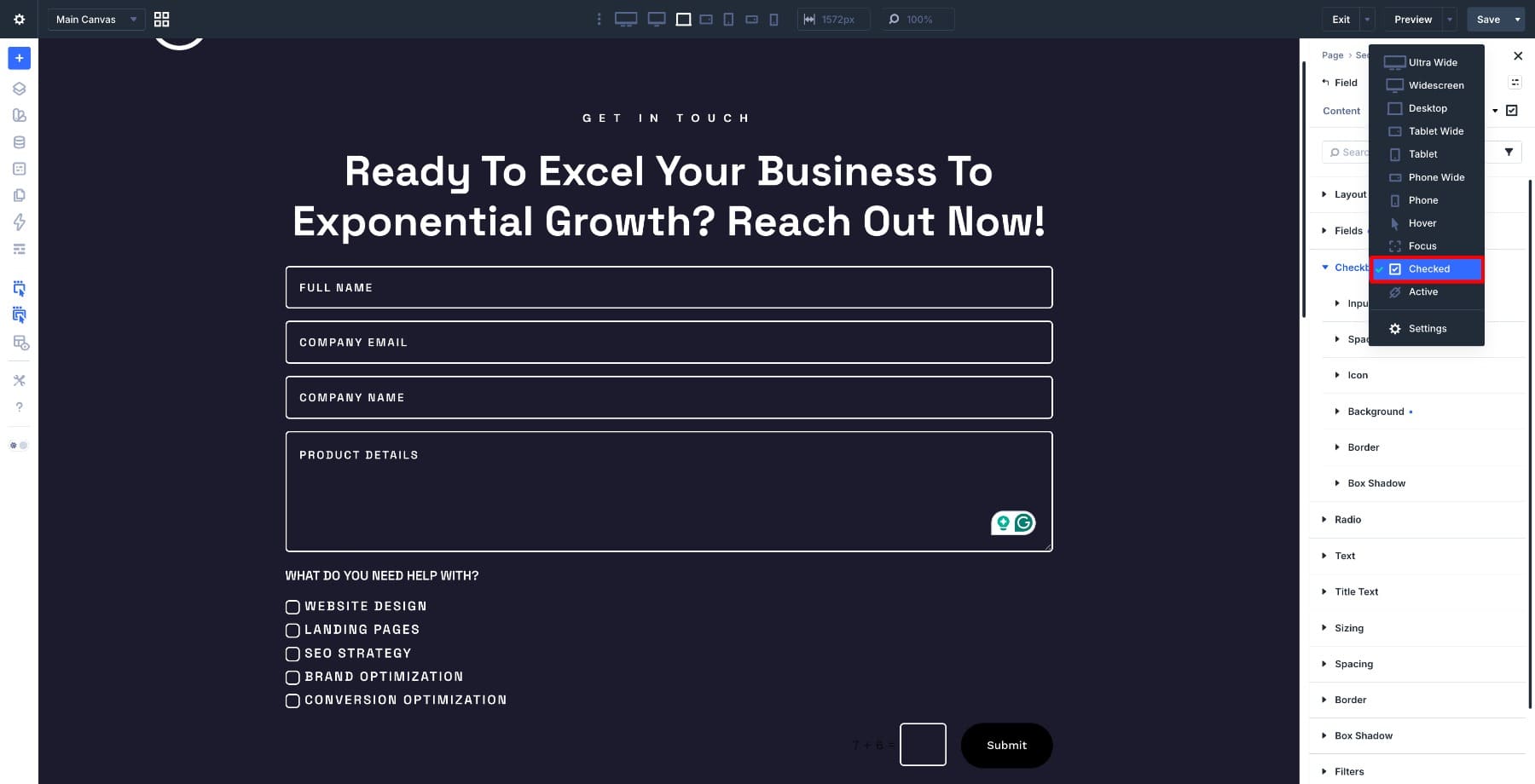
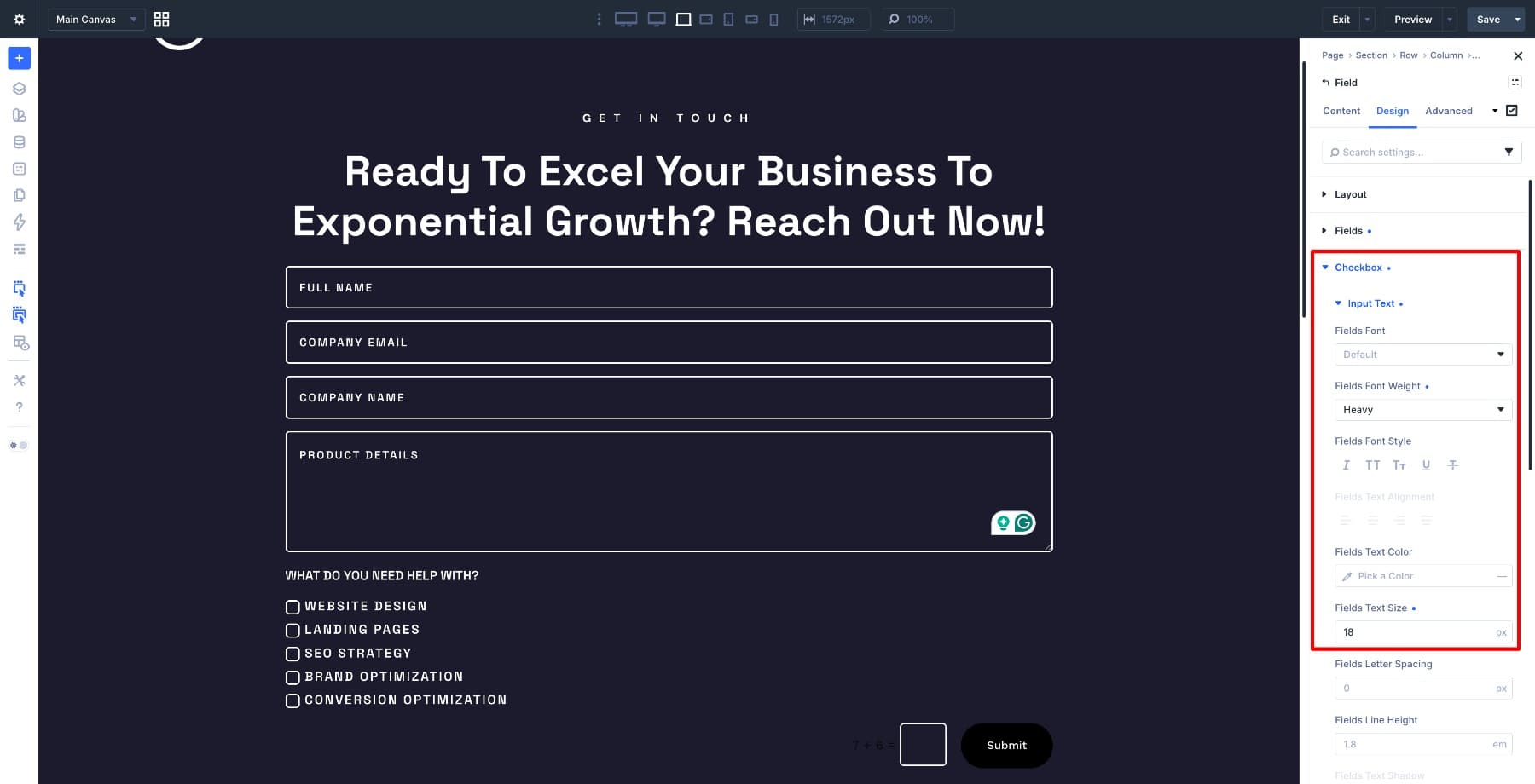
Inside Checkbox > Input Field, increase the font weight to Heavy and raise the text size from 16px to 18px.
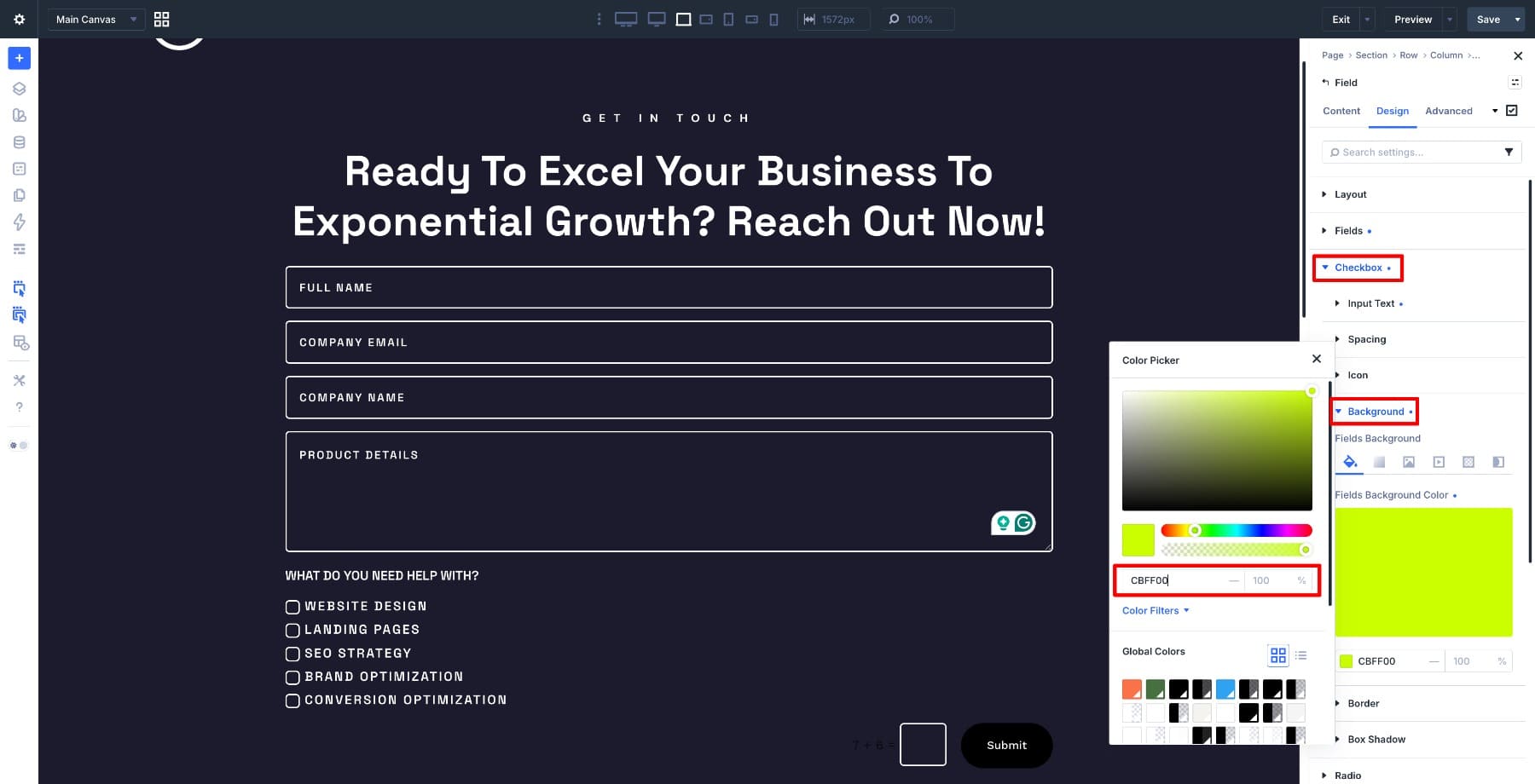
Then open Checkbox > Background and change the color to #CBFF00.
Open the Spacing settings and add 5px padding on all sides. This gives each selected option a little more breathing room so it feels visually distinct from the unchecked items around it.
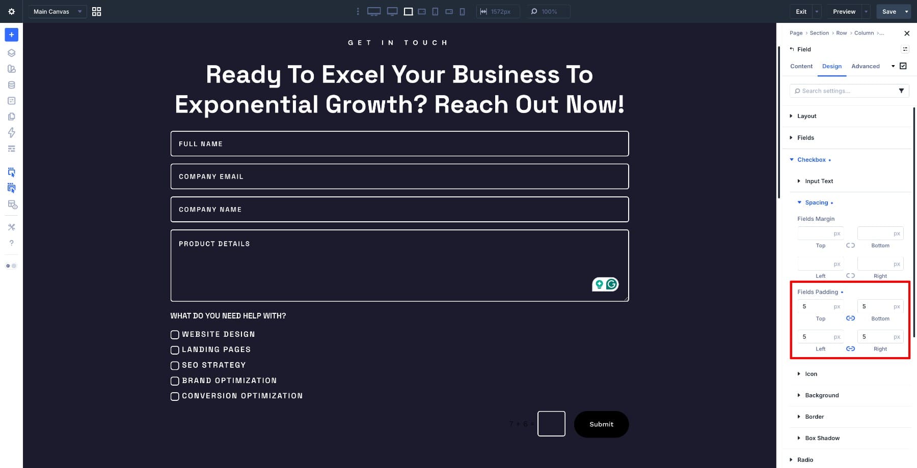
With those changes in place, selecting a service option expands the item slightly, bolds the text, and swaps in the bright accent color. It is a small interaction detail, but it makes the form feel like it is actively responding to the visitor’s choices.
Switch back to the Desktop state before making button changes. Open the Button settings group inside the Contact Form Module and change the button background color to #CBFF00.
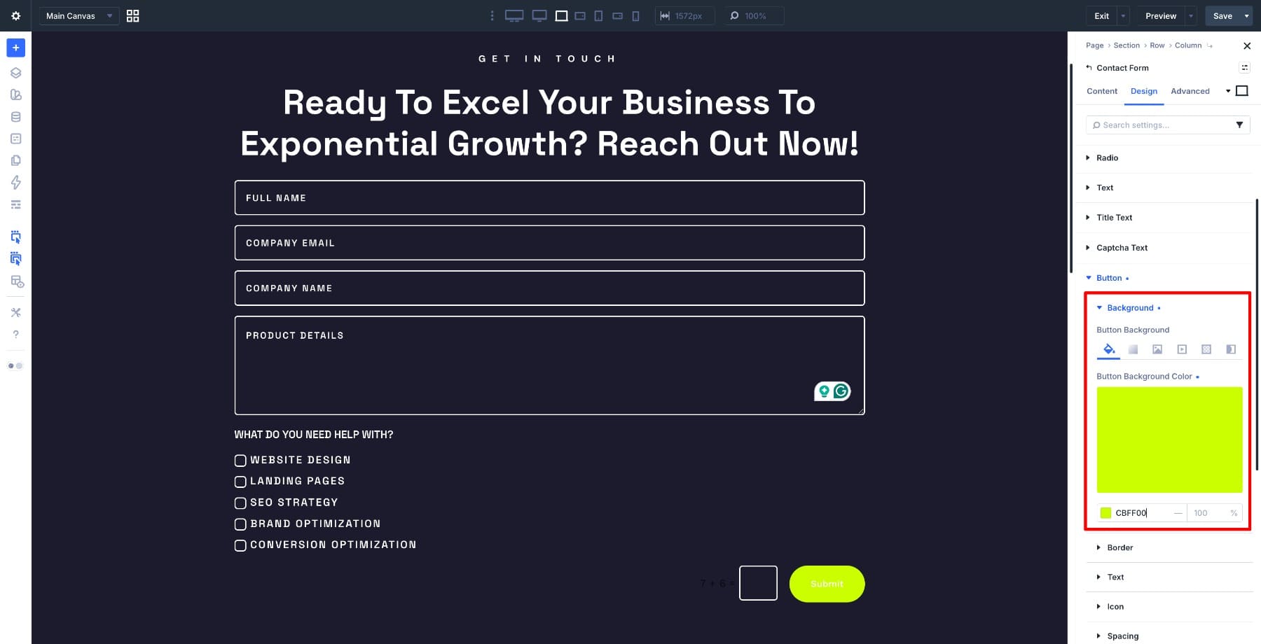
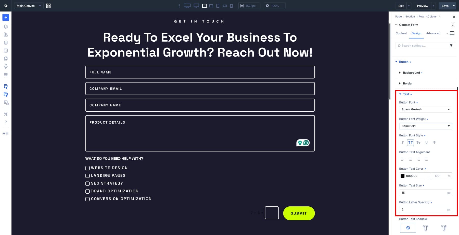
Set the text color to black, change the font to Space Grotesk, and enable All Caps text styling. This keeps the button consistent with the rest of the form and gives the final action enough visual weight to read clearly.
5. Optimize The Form For Responsive Devices
Switch to the responsive preview modes and work through tablet and mobile adjustments. Depending on your layout, you may need to tweak heading sizes, field sizing, spacing, row width, or checkbox spacing to keep the form readable on smaller screens.
Once the layout feels right across breakpoints, test both states in responsive preview mode. Tap into the text fields to confirm the :focus styling still reads clearly, then select and deselect the checkbox options to make sure the :checked styling still feels balanced on smaller screens.
Here’s how the finished form looks across the full flow.
Best Practices For :focus And :checked Editing
The example above uses strong contrast and a bright accent color, but the same workflow can fit many different form styles. The key is to make each state useful, not just decorative.
Use these guidelines when styling form states in Divi 5:
- Keep focus states obvious. A focused field should be easy to see for mouse, touch, and keyboard users.
- Do not remove visual focus feedback. If you change the default focus style, replace it with something equally clear or better.
- Use checked states as confirmation. A selected checkbox or radio option should feel unmistakably selected.
- Change only what needs to change. Let the default state handle the base design, then edit only the background, text, border, spacing, or weight that needs to respond.
- Test keyboard navigation. Tab through the form and make sure the focused field is always visible.
- Test on mobile. A checked state that feels balanced on desktop can become too large or crowded on small screens.
- Save repeated field styles as presets. If you use the same form styling across multiple forms, use form field presets to keep inputs, checkboxes, and radio buttons consistent.
Pseudo-class editing is most powerful when it becomes part of your design system. A focused input, selected checkbox, or chosen radio button should use the same visual logic wherever that form pattern appears.
Use Pseudo-Class Editing In Divi 5 To Style Form Interactions
Styling interactive form states used to mean stepping outside the builder, writing selectors, and checking whether the result worked on the front end. With Divi 5’s pseudo-class editing modes, that detour is no longer necessary. You can style :focus and :checked states visually, in context, and with the same controls you use for the default design.
The form we built here is a straightforward example, but the approach scales to many form layouts. A focused field that clearly lights up, a checkbox that responds when selected, and a submit button that matches the interaction style can make the whole form feel more intentional.
Those details are small, but they change how the form feels to use. And now, they are well within reach directly inside Divi 5.






Leave A Reply