Divi and its built-in options allow you to create endless stunning and unique designs. Whatever type of website you might be building, you can adjust the settings to meet your website’s and visitors’ needs seamlessly. In this post, in particular, we’re going to show you how to make use of the new opacity filter to achieve a beautiful team section for your next project or own website. To bring this tutorial to a good end, you will be needing the following:
- A subtle background image that will be part of your entire row(s)
- Team member pictures that have a subtle background, a width of ‘800px’ and a height of ‘455px’
Result
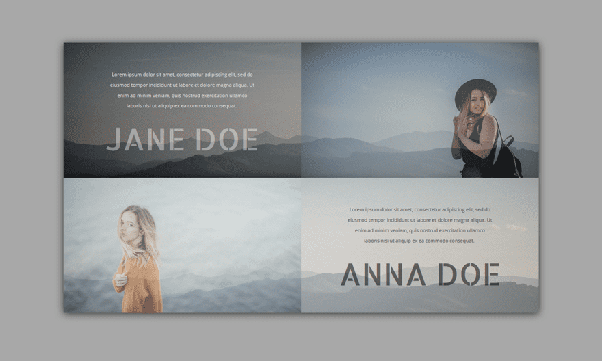
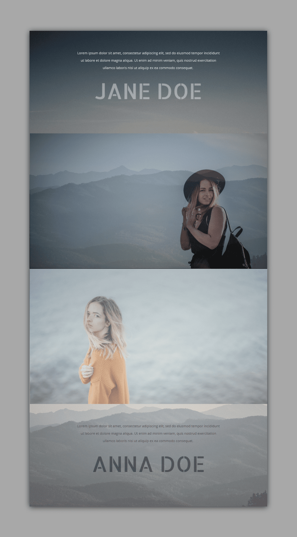
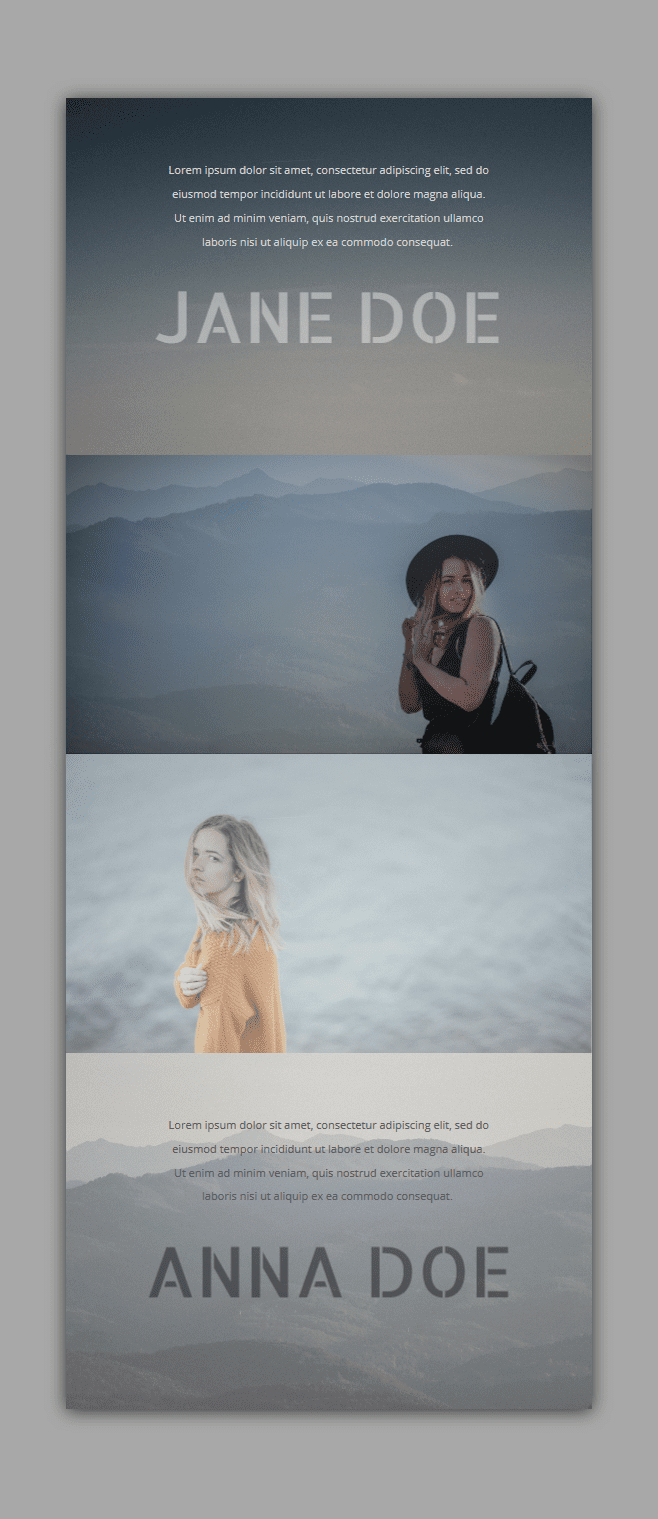
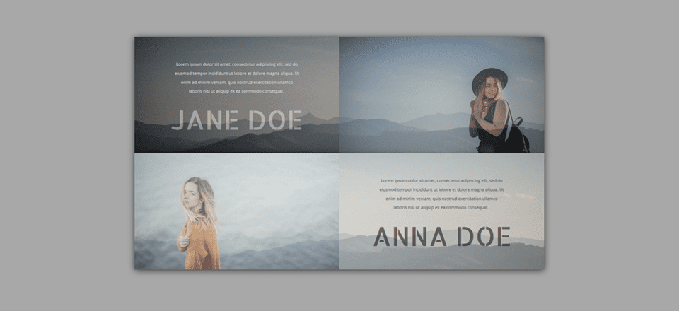
Before we dive into the tutorial, let’s take a look at the example we’ll be showing you how to recreate, step by step.
On Desktop
On Tablet
On Mobile
Add a Standard Section
Background Color
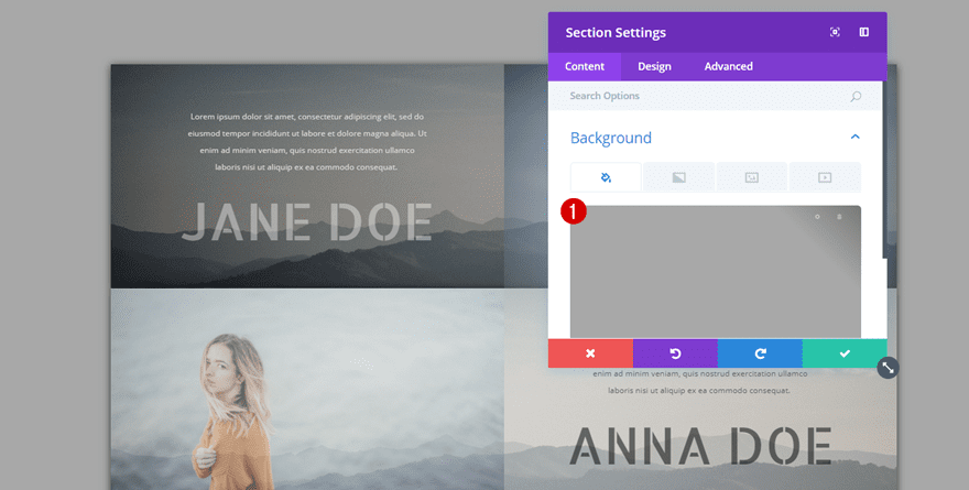
The first thing you’ll need to do is add a new standard section to an existing or new page. Once you’ve added the new section, change the background color into ‘#a8a8a8’ or any other color of choice within the Background subcategory.
Spacing
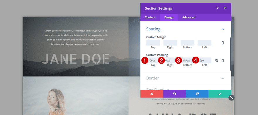
Then, move on to the Design tab of your section and add the following custom padding to the Spacing subcategory:
- Top: 115px
- Right: 0px
- Bottom: 115px
- Left: 0px
Add Row
Column Structure
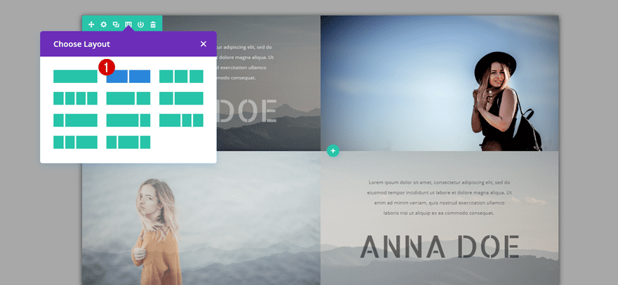
Continue by adding a new row with two equal columns to your section.
Background Color
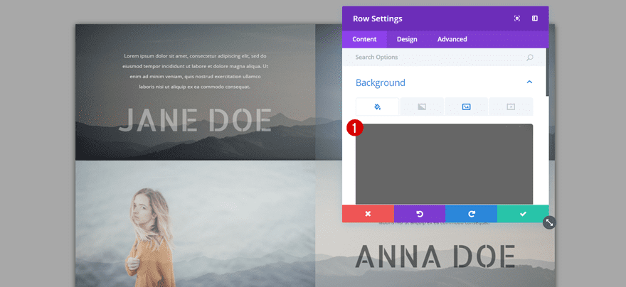
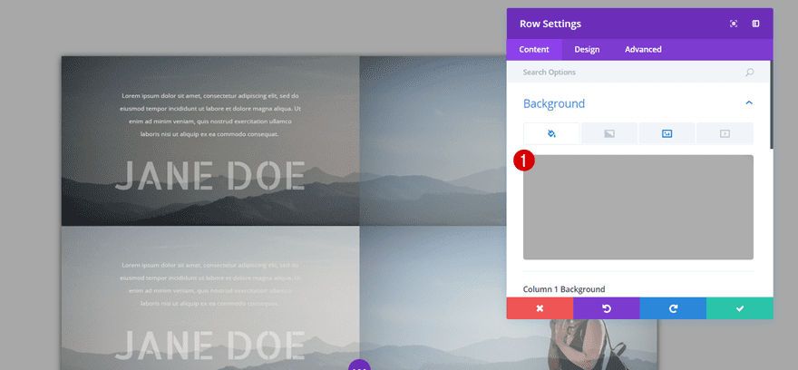
Open the row settings and choose ‘#666666’ as the row background color.
Background Image
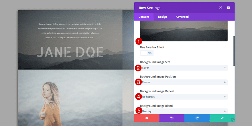
Then, add a subtle gradient background and apply the following settings:
- Background Image Size: Cover
- Background Image Position: Center
- Background Image Repeat: No Repeat
- Background Image Blend: Overlay
Alignment
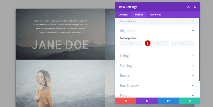
Move on to the Design tab and use a center Row Alignment next.
Sizing
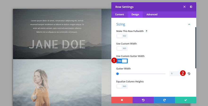
Then, open the Sizing subcategory, enable Custom Gutter Width and use a value of ‘1’ for your row’s Gutter Width.
Spacing
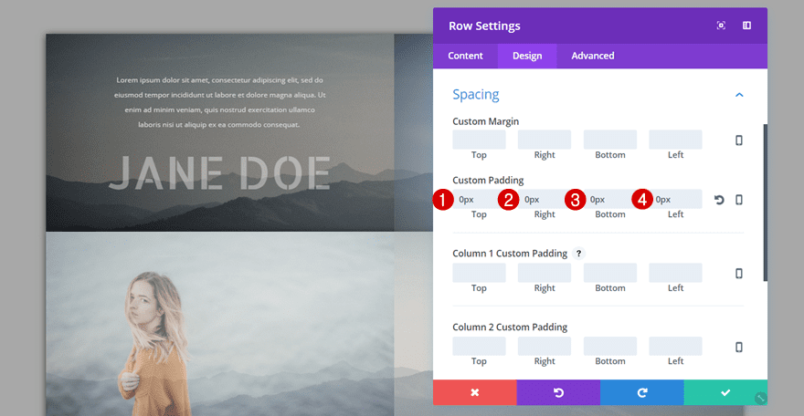
Next, move on to the Spacing subcategory and make sure all the padding options are set to ‘0px’. This will ensure that, once you clone the row further down this post, you won’t have any space between your rows.
Box Shadow
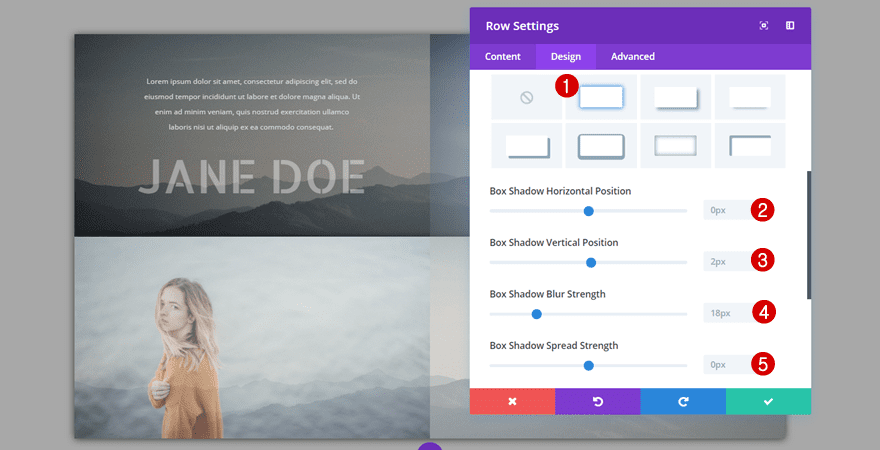
Last but not least, add the following box shadow to your row:
- Box Shadow Horizontal Position: 0px
- Box Shadow Vertical Position: 2px
- Box Shadow Blur Strength: 18px
- Box Shadow Spread Strength: 0px
- Shadow Color: rgba(0,0,0,0.71)
First Text Module
Text Settings
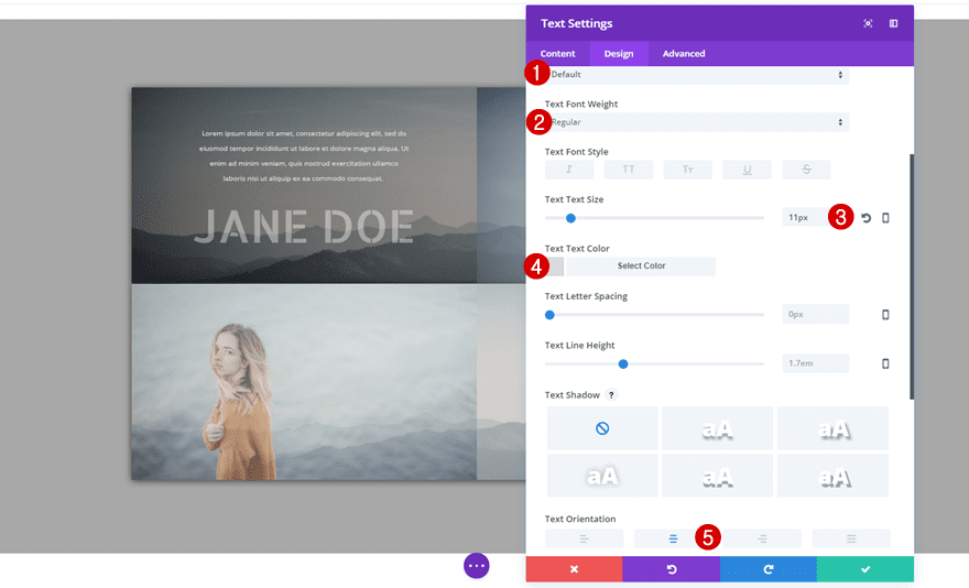
Once you’re done with your row settings, you can start adding the various modules to both columns. Start off by adding a Text Module to the first column with the following text settings:
- Text Font: Default
- Text Font Weight: Regular
- Text Size: 11px
- Text Color: #dbdbdb
- Text Orientation: Center
Sizing
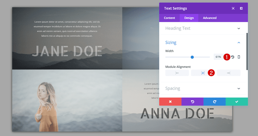
Then, open the Sizing subcategory and make the following changes:
- Width: 61%
- Module Alignment: Center
Spacing
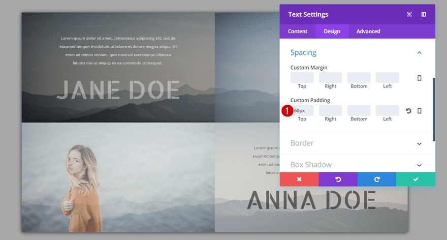
Lastly, add a top padding of ’60px’ to the Spacing subcategory.
Second Text Module
Text Settings
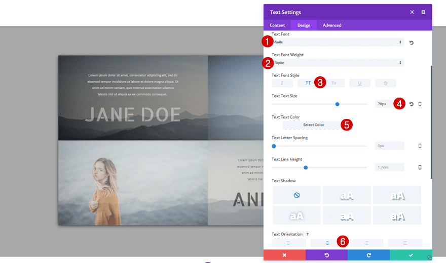
Right below the previous Text Module you’ve created, add another Text Module with the following text settings:
- Text Font: Aladin
- Text Font Weight: Regular
- Text Size: 70px
- Text Color: #FFFFFF
- Text Orientation: Center
Spacing
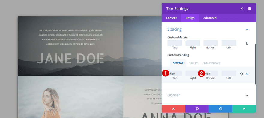
Move on to the Spacing subcategory and use the following custom padding as well:
- Top: 50px
- Bottom: 0px (Desktop), 120px (Tablet & Phone)
Filters
Last but not least, change the opacity filter option in the Filter subcategory to ‘40%’ to make your row background and Image Module melt together.
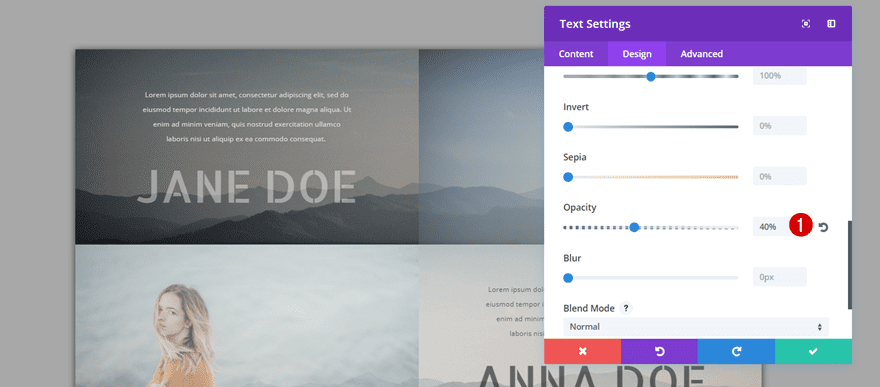
Image Module
Image Dimensions
As mentioned in the intro of this post, we’ll be using specific image dimensions for the team member images that are part of this tutorial. To achieve the exact same result, use a width of ‘800px’ and a height of ‘455px’. Go ahead, add an Image Module to the second column and upload an image of one of your team members.
Filters
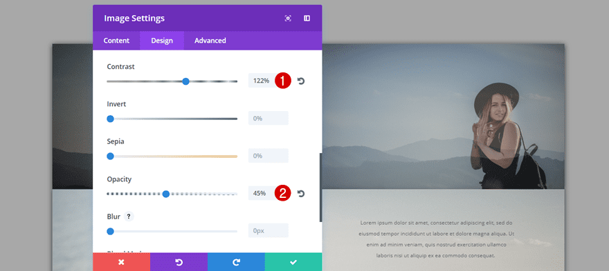
Then, move on to the Design tab and open the Filters subcategory. Play around with the different options you have until you achieve a desired result. In this example, we’ve made the following changes to the Image Module:
- Contrast: 122%
- Opacity: 45%
Clone Row
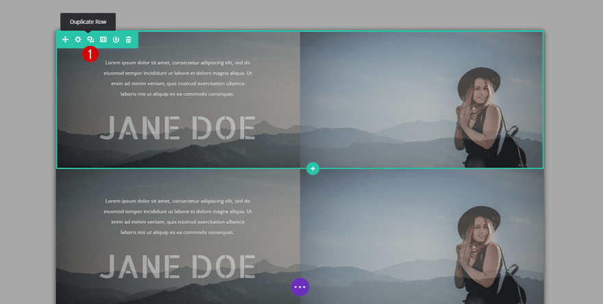
Now, once you’ve finished a row entirely, you can clone it to create the second version of the row.
Change Background Color
The first thing of the cloned row we’ll change is the background color. We’re choosing a slightly lighter background overlay color, ‘#adadad’, to make the rows somewhat different from each other.
Change Position of Modules
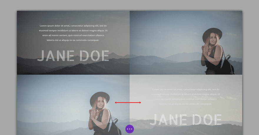
We’re also going to change the position of our modules. Place your Image Module in the first column and both Text Modules in the second column.
Change Image
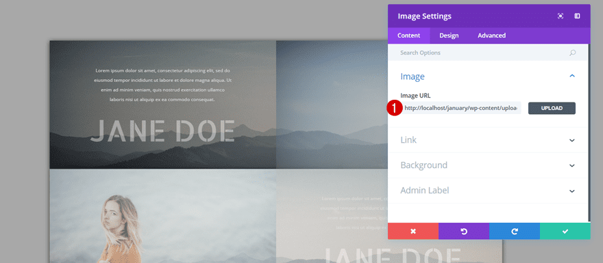
Then, change the image your using for your Image Module. Make sure this image has the same dimensions as your previous image (preferably a width of ‘800px’ and a height of ‘455px’.
Change First Text Module
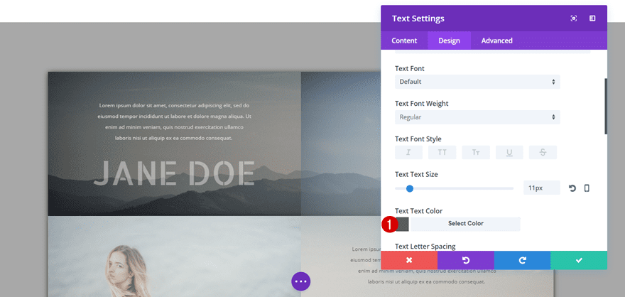
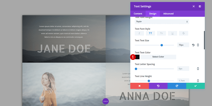
Since we’re using a lighter background overlay for this row, we’ll need to use a darker text color as well so the text remains readable. Change the color of the first Text Module to ‘#5b5b5b’.
Change Second Text Module
The second Text Module needs a darker as well, change it to ‘#000000’. We’re using the darkest color there is to make sure our text is still readable after adding the opacity filter.
Clone Rows as Many Times as Needed
You can now clone both rows as many times as needed to match with the number of team members you want to showcase on your page. The custom padding we’ve added to the row settings will make sure that, no matter how many similar rows you use, it will still look like an entity.
Result
Let’s take a final look at the example we’ve shown you how to recreate in this post.
On Desktop

On Tablet

On Mobile

Final Thoughts
In this post, we’ve shown you how to use Divi’s new opacity filter option to create a stunning team section for your next project or own website. The example we’ve shown you how to recreate has a great balance between written content and visuality. If you have any questions or suggestions; make sure you leave a comment in the comment section below!



Hey guys, It would be great to get these in downloadable form so we could directly upload them to sites we’re working on. Helps us save time, and would be a valuable resource/addition to the Divi Layout Pack offerings. Thanks for everything, keep it up.
-A
Great Stephanie, please share the .json download link.
Great! If anyone wants the .json, I have a download link
Great Stephanie, please share the .json download link.
Good grief you lot. Just follow the directions and you will all have your own ‘demo’…!
You should not even need this post. Open up a new page and play with the settings and try and learn to do some of this stuff for yourself… I still have not got over how many people said they were going to use the web design agency layout for their own ‘design firm’ website. Unbelievable!
A demo please – Or even better a download x
Hi,
Thanks for the awesome layout. it would be very helpful if you people give theses layouts for downloads, it will save a lot of time.
Thanks,
Makarand
It would be nice to see a demo, looked interesting but not interesting enough to make me want to build it without seeing a demo first.
I don’t think the font used is Aladin. So any idea which one it really is?
Nevermind, I found it. It is Allerta Stencil.
Another good trick to do in a column. Would love to see some demo of it.
The continuous improvements to the Divi platform are exciting. I look forward to seeing the designs made by the community in 2018.
Great stuff Donjete.
Great but it it would have been nice with a real demo preview……
Lovely
Only looks great desktop imo.
I think they need to increase the opacity for mobile version. Almost none.
David, can you explain what you mean by “tiling to follow the flow of text block -> image block”? An image example would be helpful also.
Les, fairly straightforward and I completely agree with David. Columns in a row always stack left on top, right on bottom in tablet/mobile. In some cases, such as the above, one would want the second row to stack in the reverse order (right on top) to maintain a consistent flow [text-image-text-image].
A feature such as swap column order on mobile — or in the case of 3+ columns, choosing the order — would be great addition to Divi.
My solution thus far has been to use CSS flex or grid to change the order in which columns stack on mobile.
In this example, you’d have to duplicate the rows, change the order to the desired stacking order and use the visibility options to get a more logical look on mobile.
It’s indeed something I too dislike about Divi’s structure, as it means that because the content is duplicated, the pages’ sizes increase as well.
On top of that, it can become a bother to maintain without resorting to saving the modules as global items, which really shouldn’t be necessary just to make maintenance (fixing typos etc.) easier.
I would tend to introduce flex on the columns to solve this.
I believe the Divi team may be working on adding extra functionality to rows/columns, like Elementor, whereby you can drag a divider to adjust the widths of each column. Elementor has a swap columns option for mobile, so that would be something to be added to Divi.
Having flex to hand though is also useful, as you can do more interesting things with it.
I hear the complaints, and while I appreciate that having all those options at the click of a switch is useful, a) it can take time for a dev team to implement them and b) (as frustrating as this may seem) if you want to have these features you may have to be prepared to dig in and do it your self.
I perhaps agree with your argument about the stacking order on mobile. However it would have been just as easy to dupe that row, swap the modules and disable desktop and tablet using the visibility options, which, and correct me if I’m wrong, is Divi’s option to changing the views on different devices.
However, and more to the point of my concerns, I thought the premise of Donjete’s exercise, was to demonstrate the new opacity filters and not web design. David’s argument was, I think, a cheap shot and totally off topic. I sometimes wonder why guys like him use Divi if it has so many faults
Presumably because he’d like it to be even better. This issue about stacking issues seems pertinent to me in a demo focussed on stacked modules. We all love new glossy features on Divi but perhaps addressing this stacking issue and (my own bugbear) global setting of H1-Hx tags might actually help the developer do their job.
There is probably a commercial/development reasons for this but IWBN if ET actually said so.
yes if u don’t mind the bit of white space it creates underneath because the hidden rows aren’t fully hidden, or the way the divi builder sometimes messes up when you try to live edit a page with hidden sections.
The simple fact is divi looks rubbish on tablets and in most cases on mobile too.
You have no choice but to use css grid and flex if you don’t want a ten mile long page with massive images everywhere.
Good grief Nicholas, you need to start paying attention to more Elegant Theme blogs.
You can completely hide disabled sections. Checkout this link – https://www.elegantthemes.com/blog/theme-releases/divi-feature-update-introducing-the-new-customizable-visual-builder
As for what looks like rubbish on tablets and phones and massive images, isn’t that kind of up to you as a designer to control that?
You don’t need to add another row to achieve text > image / text > image when the desktop view is text > image / image > text.
The way I would do this is duplicate the text on the second row and place it before the second row image but only show on mobile (and hide what is now the second text block on mobile).
This way you are not adding additional rows only one block of text.
Hi Richard,
If there were a demo view, the demo would look good on mobile, IMO.
Cheers
One of the drawbacks of Divi’s Section -> Row -> Module system is that when a page stacks you run into an issue where if you’re using more than two sets your images or text start stacking on top of each other rather than tiling to follow the flow of text block -> image block. Instead you get a text block -> image block -> image block -> text block -> text block and so on. It is one of the most annoying factors of their columns layouts. It is also one of the most commonly requested advancements in the system. You either have to use extra copies of the rows that only appear on tablet or mobile or you have to use a ton of CSS to modify the layout on tablet and mobile. Both methods are total crap for a solution when it comes to good semantic code and web design. Divi is very good and quite powerful, however, it is still very flawed in some areas.