
Every week, we provide you with new and free Divi layout packs which you can use for your next project. For one of the layout packs, we also share a use case that’ll help you take your website to the next level.
This week, as part of our ongoing Divi design initiative, we’re going to show you how to use box shadows as swipe backgrounds on hover. We’ll handle three different examples that look stunning on the Personal Stylist Layout Pack‘ homepage but the possibilities you have are truly endless. We’ll recreate each one of the swipe backgrounds step by step using Divi’s built-in options only.
Let’s get to it!
Preview
Before we dive into the tutorial, and its different examples, let’s take a look at the outcome.
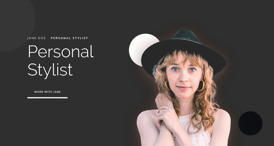
Example #1
Example #2
Example #3
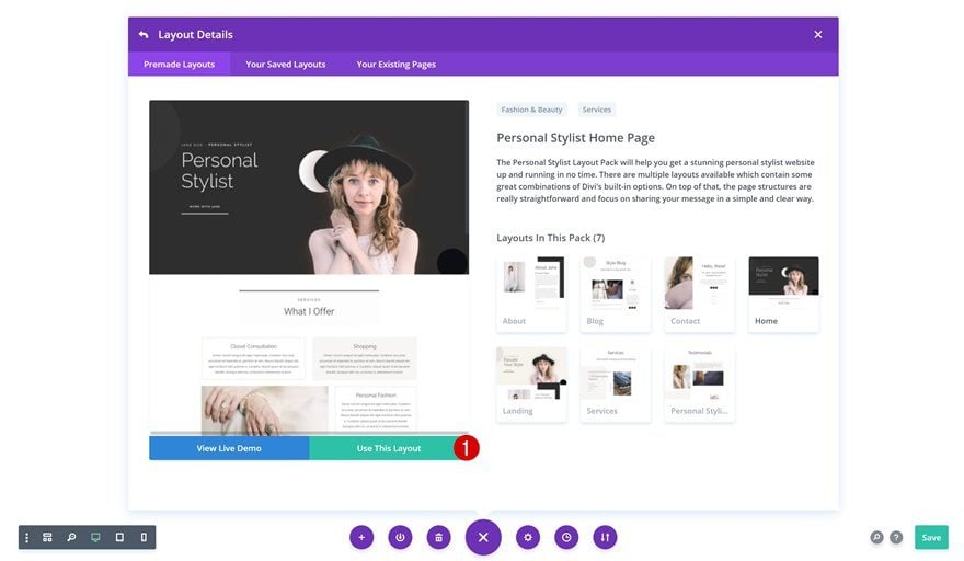
Upload Personal Stylist Layout Pack Homepage to New Page
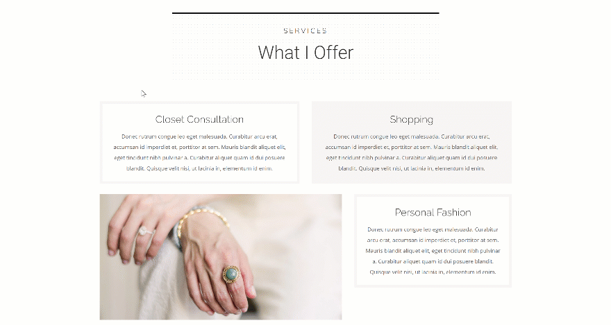
Start off by adding a new page to your website and upload the Personal Stylist homepage layout. Although we’ll use this layout to accomplish all three examples shown above, you can use this approach for any kind of layout or website you’re working on.
Recreate Example #1
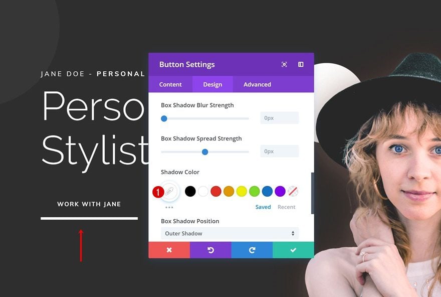
Let’s start recreating the first example! This example helps you highlight the hero section. The first thing you’ll need to do is open the Button Module which you can find in the first column and change the box shadow color. We’re doing this to make sure the color goes well with the pink box shadow we’ll add on hover.
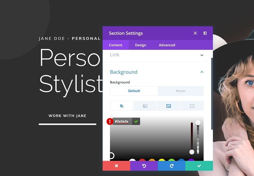
Section Settings
Default Background Color
Continue by opening the section settings. Make sure the default background color remains the same.
- Background Color: #2a2a2a
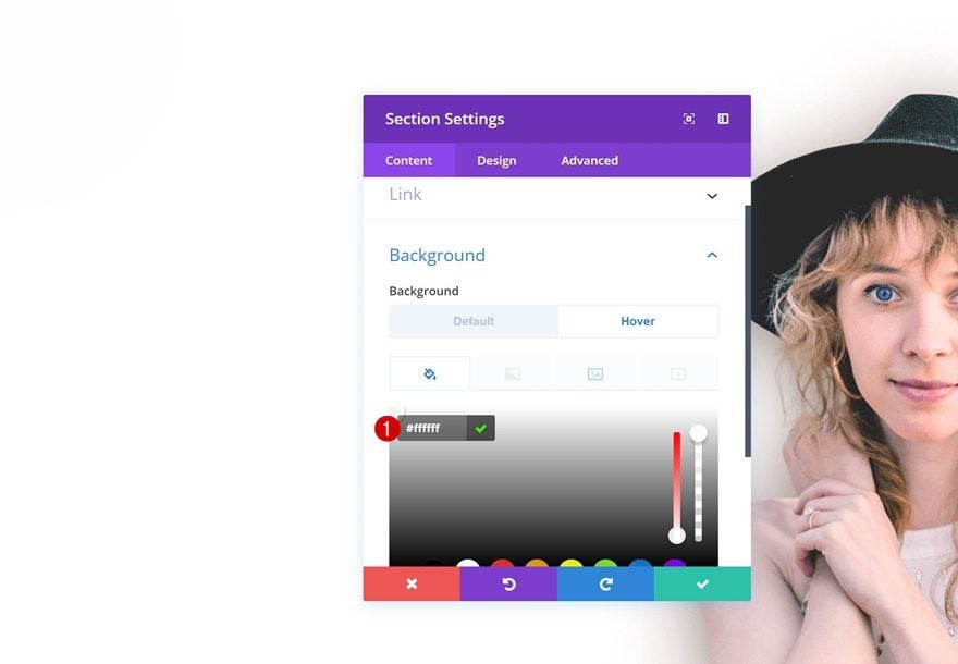
Hover Background Color
Change the background hover.
- Background Color: #ffffff
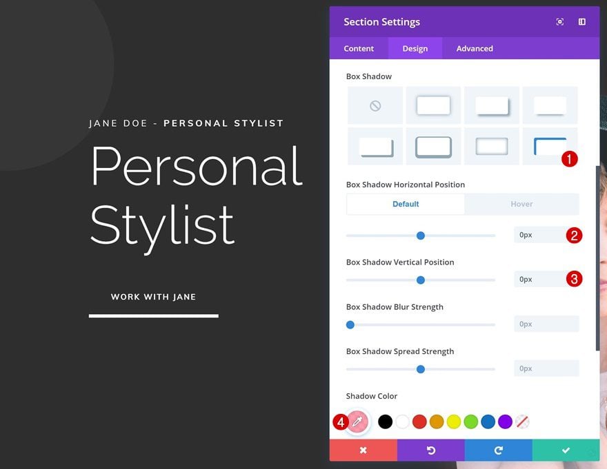
Default Box Shadow
Continue by adding a default Box Shadow to the section.
- Box Shadow Horizontal Position: 0px
- Box Shadow Vertical Position: 0px
- Shadow Color: rgba(255,137,159,0.82)
- Box Shadow Position: Inner Shadow
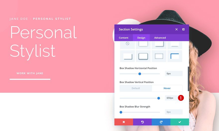
Hover Box Shadow
Change the horizontal position of the box shadow. Add any value of choice.
- Box Shadow Horizontal Position: 800px
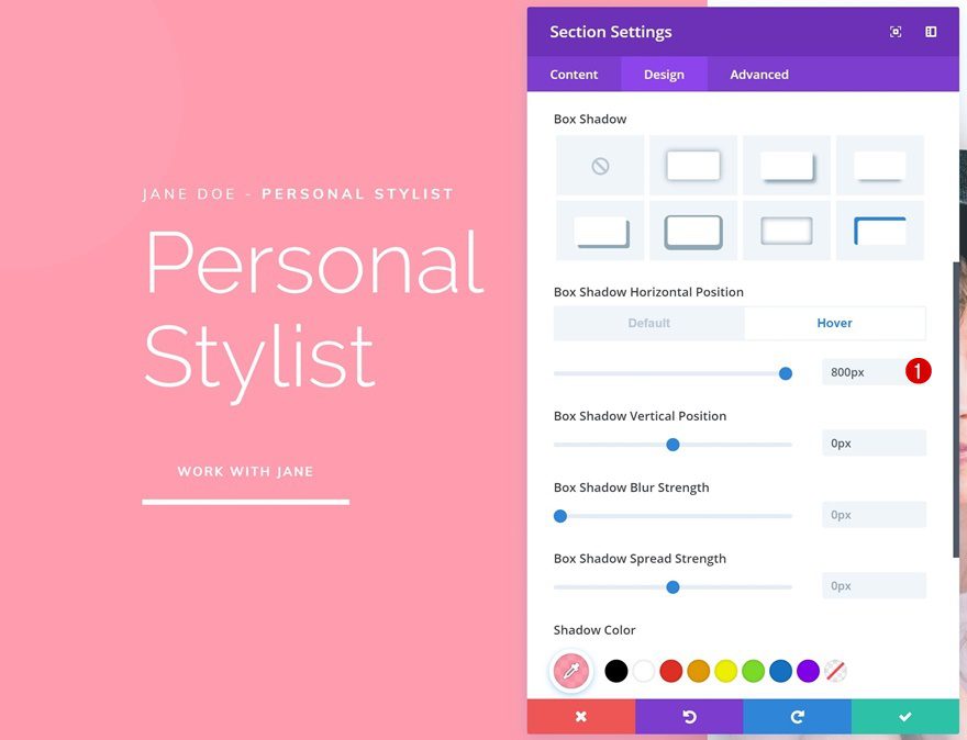
If you want the swipe effect to appear from top to bottom, you can change around the vertical position of the box shadow instead.
- Box Shadow Vertical Position: 650px
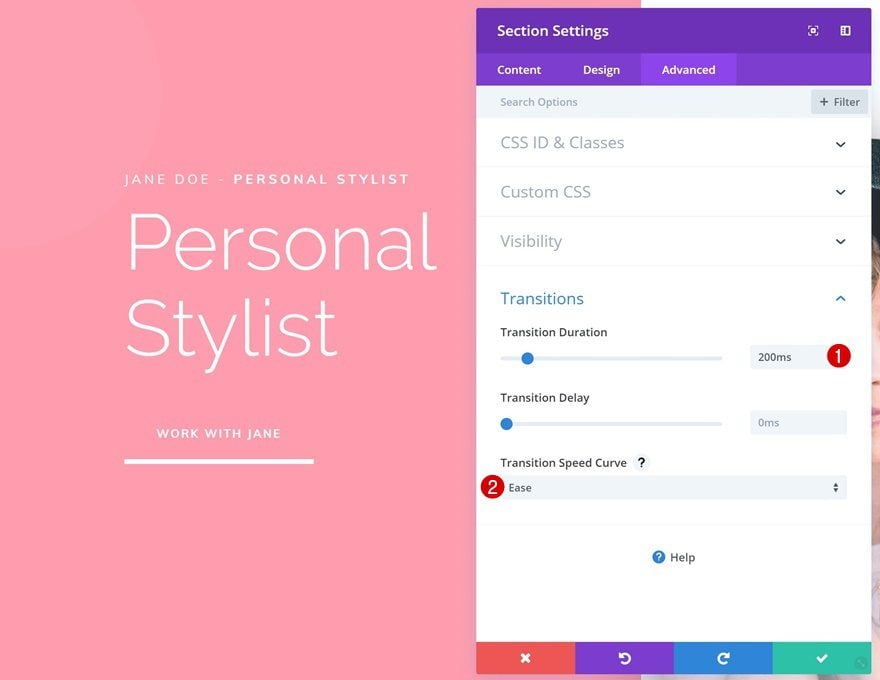
Transitions
Last but not least, decrease the transition duration in the advanced tab to create a quick transition between the background color and box shadow swipe background.
- Transition Duration: 200ms
- Transition Speed Curve: Ease
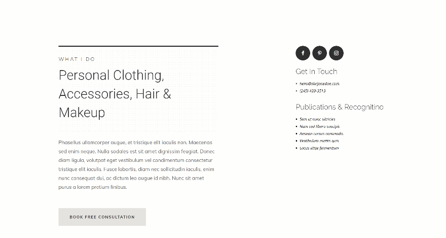
Recreate Example #2
Modify First Text Module
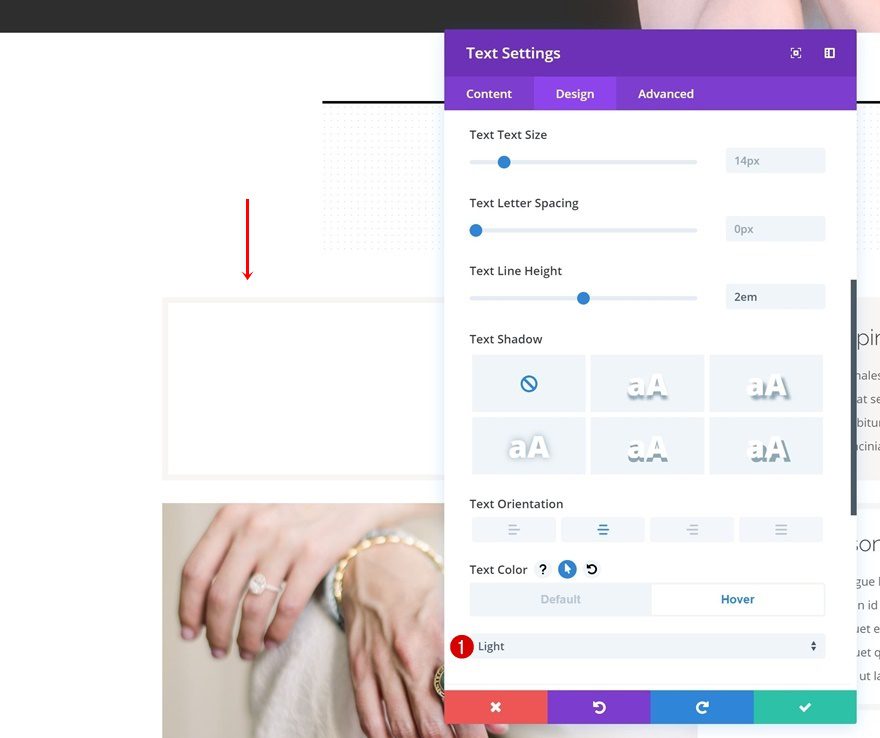
Hover Text Settings
On to the next example! Open the Text Module you can find in the first column and change the text color on hover.
- Text Color: Light
Hover Border
Continue by changing the border color on hover in the design tab.
- Border Color: rgba(255,137,159,0.82)
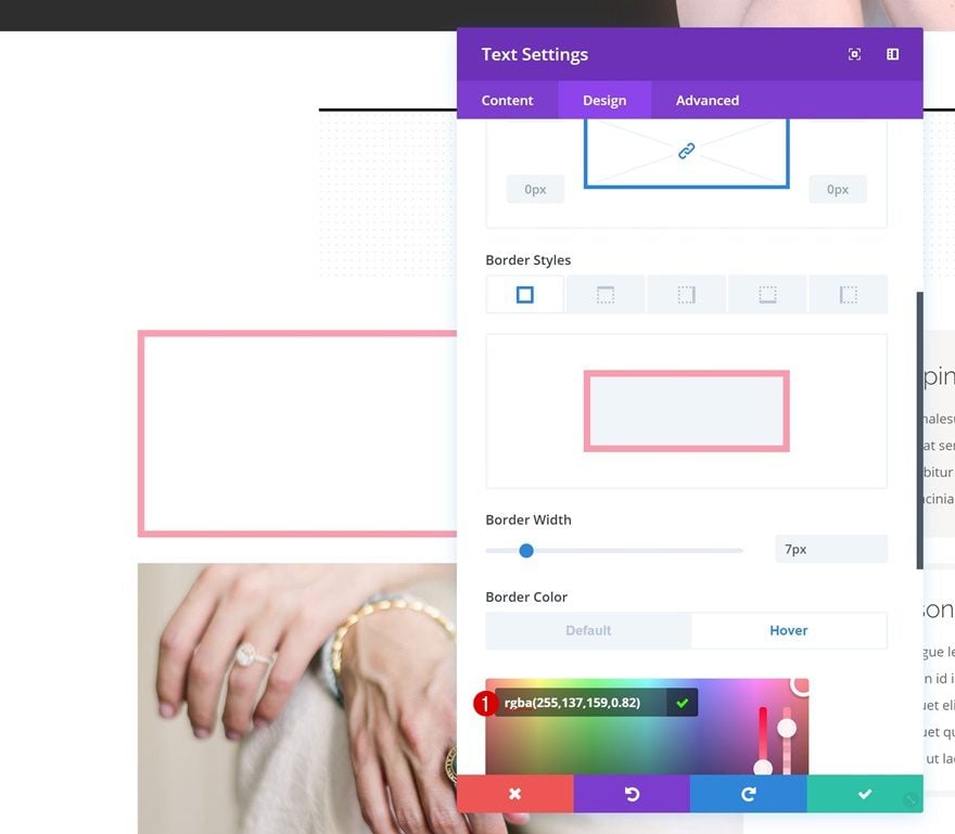
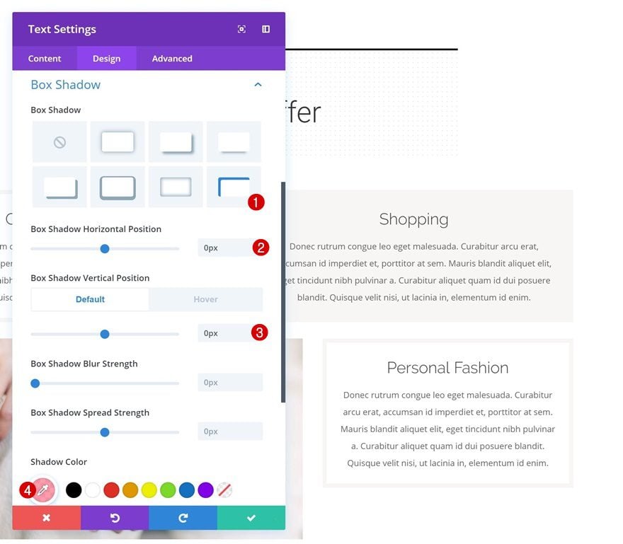
Default Box Shadow
Then, go to the box shadow settings and add a default box shadow.
- Box Shadow Horizontal Position: 0px
- Box Shadow Vertical Position: 0px
- Shadow Color: rgba(255,137,159,0.82)
- Box Shadow Position: Inner Shadow
Hover Box Shadow
Change the horizontal position on hover.
- Box Shadow Horizontal Position: 520px
Transitions
Last but not least, increase the transition duration in the advanced tab to create a smooth transition.
- Transition Duration: 700ms
- Transition Speed Curve: Ease
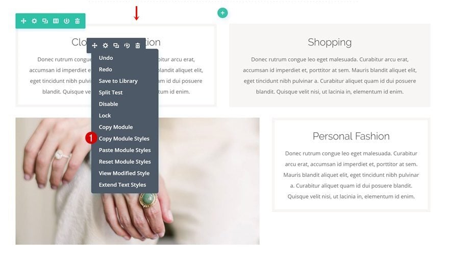
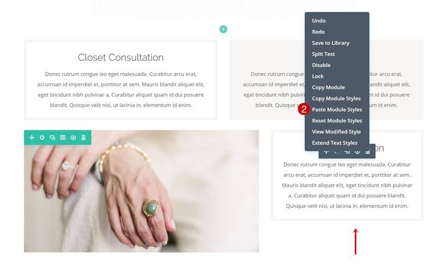
Copy & Paste Module Styles to Third Text Module
We’re using the same module styles for the third Text Module as well. To save time, we’re simply going to copy the module styles of the first Text Module and paste them onto the third Text Module.
Modify Second Text Module
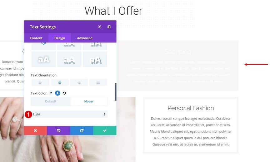
Text Settings
The second Text Module, however, is slightly different. Open the module and go to the text settings. The only thing you’ll need to do there is changing the text color on hover.
- Text Color: Light
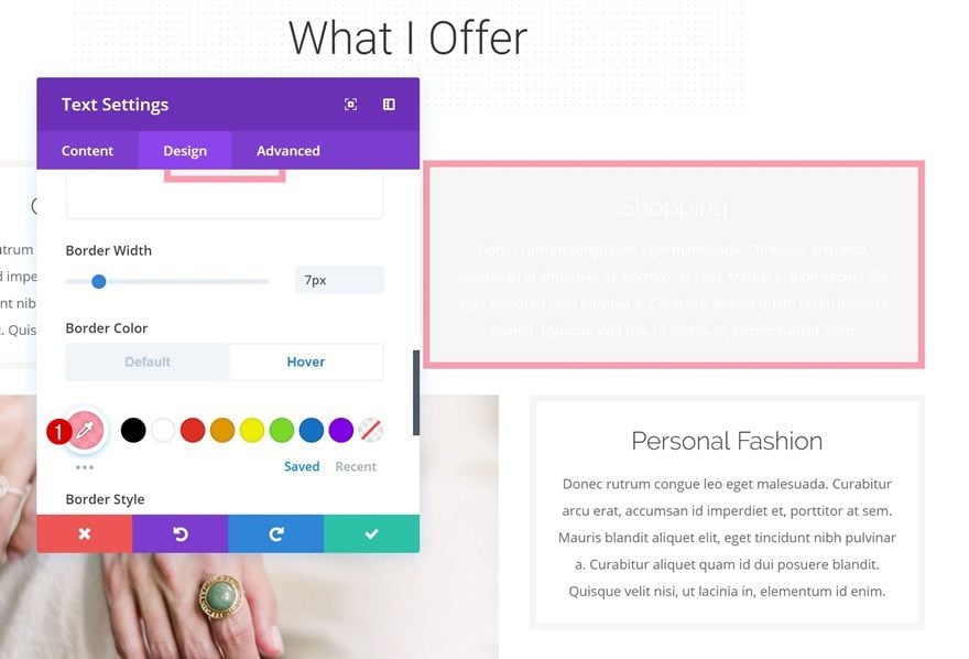
Hover Border
Continue by going to the border settings and changing the border color on hover.
- Border Color: rgba(255,137,159,0.82)
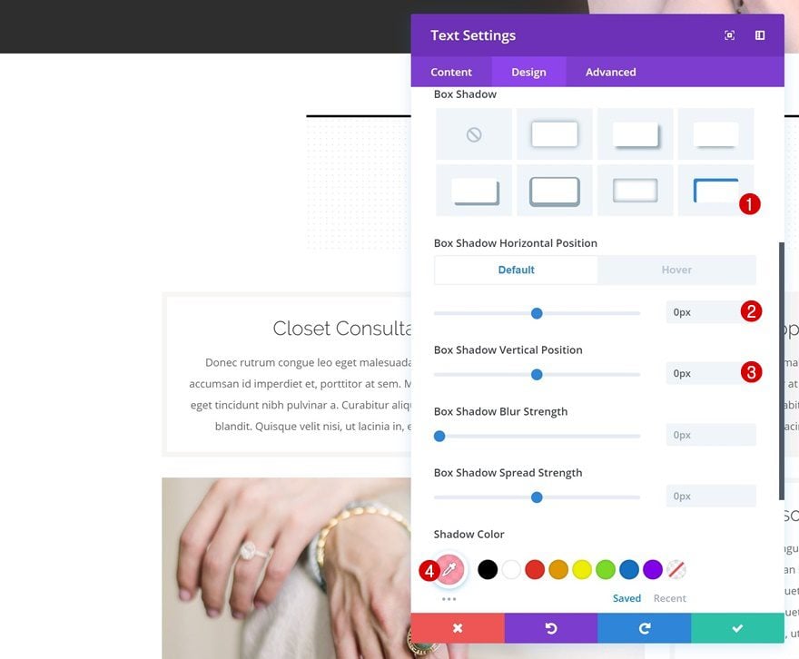
Default Box Shadow
Time to add the swipe background! Start off by adding a default box shadow using the following settings:
- Box Shadow Horizontal Position: 0px
- Box Shadow Vertical Position: 0px
- Shadow Color: rgba(255,137,159,0.82)
- Box Shadow Position: Inner Shadow
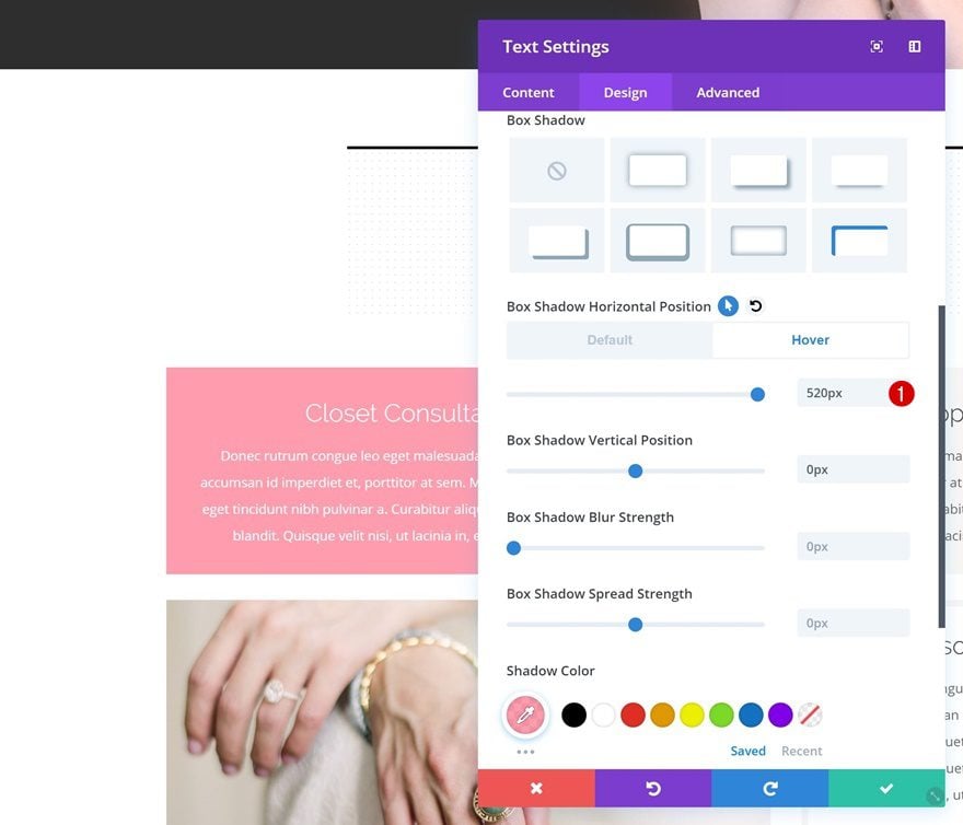
Hover Box Shadow
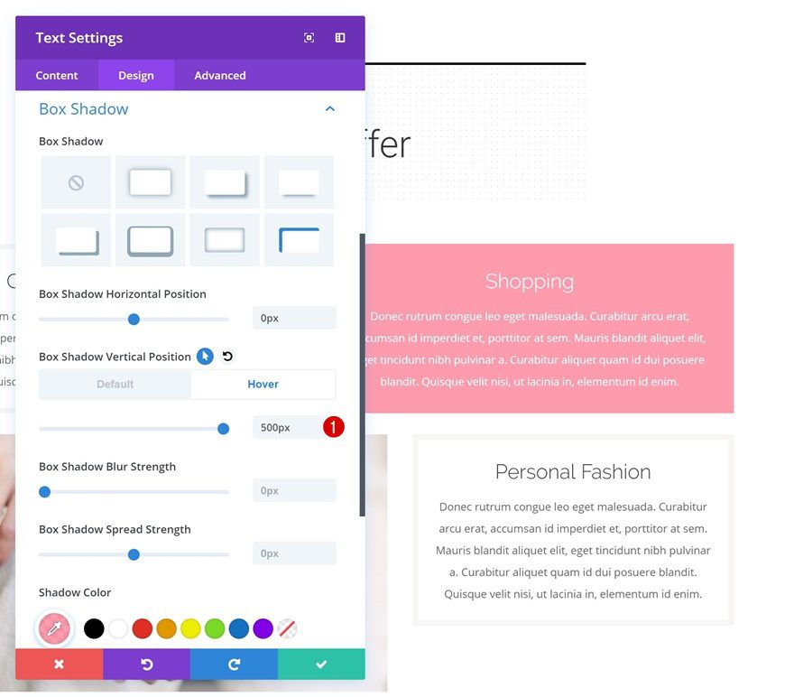
Change the vertical position of the box shadow on hover.
- Box Shadow Vertical Position: 500px
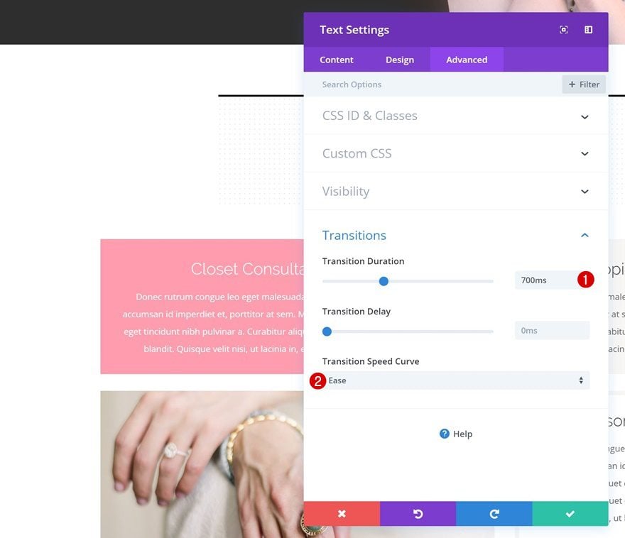
Transitions
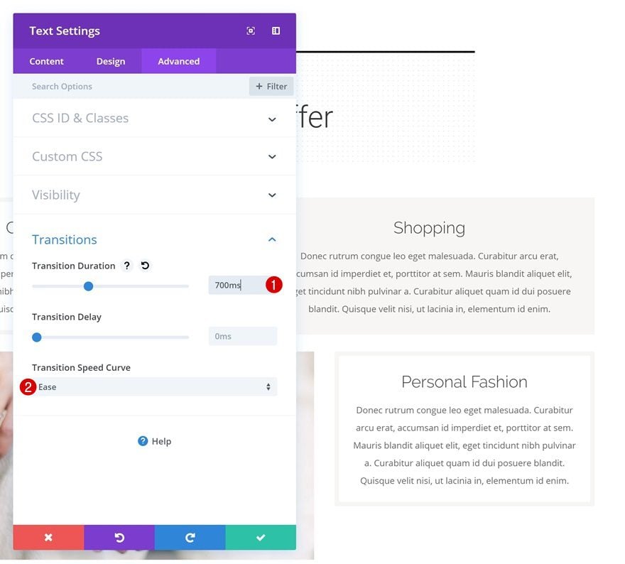
Last but not least, increase the transition duration of this Text Module as well.
- Transition Duration: 700ms
- Transition Speed Curve: Ease
Recreate Example #3
Change Row Settings
Sizing
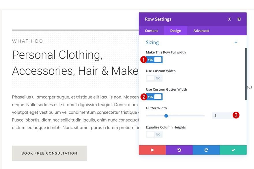
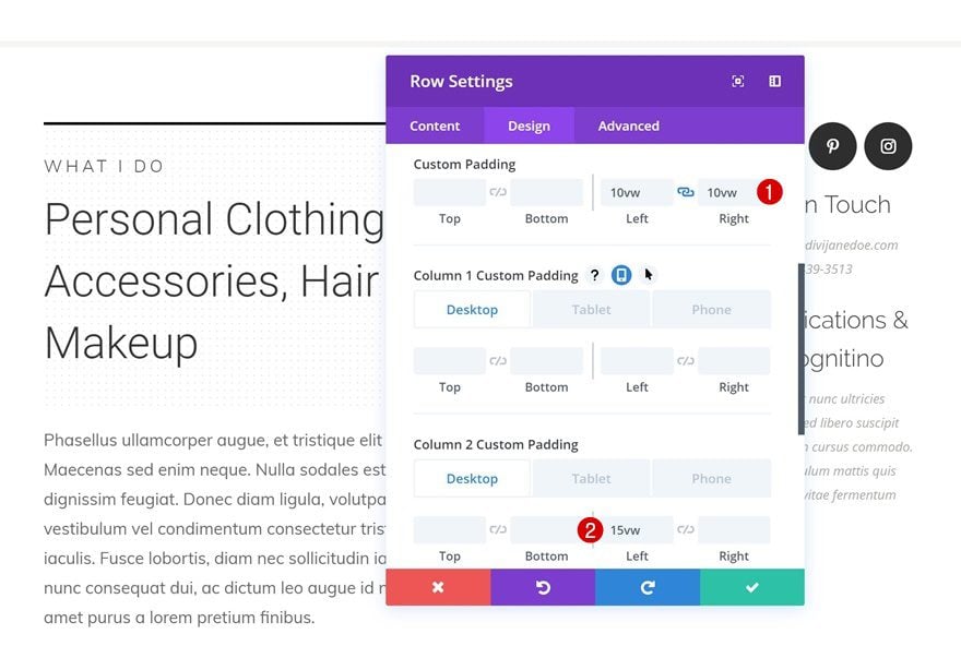
On to the next and last example! Start by opening the row settings and make some changes to the sizing settings.
- Make This Row Fullwidth: Yes
- Use Custom Gutter Width: Yes
- Gutter Width: 2
Spacing
Continue by adding some custom padding to the row as well.
- Left Padding: 10vw
- Right Padding: 10vw
- Column 2 Left Padding: 15vw (Desktop), 0vw (Tablet & Phone)
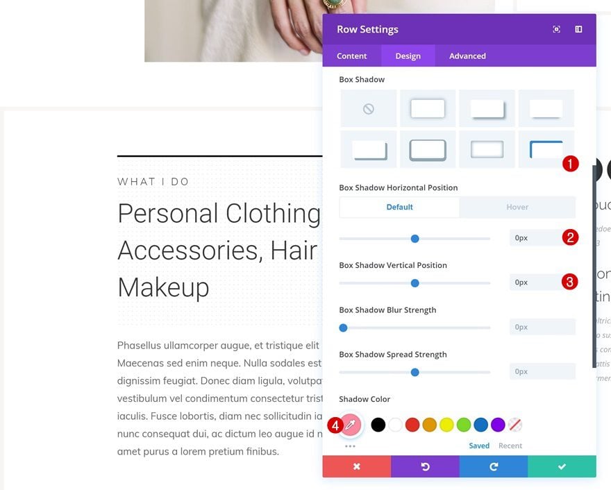
Default Box Shadow
Then, add a default box shadow to the row.
- Box Shadow Horizontal Position: 0px
- Box Shadow Vertical Position: 0px
- Shadow Color: #ff899f
- Box Shadow Position: Inner Shadow
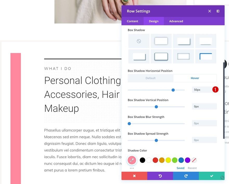
Hover Box Shadow
Change the horizontal position on hover.
- Box Shadow Horizontal Position: 50px
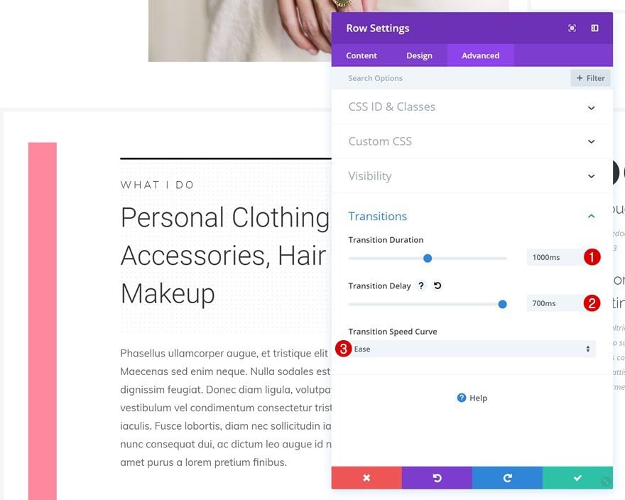
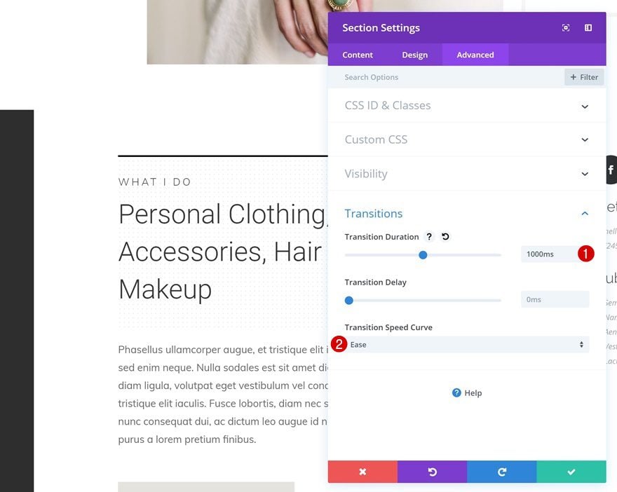
Transitions
We’re also changing the transition duration and transition delay in the advanced tab.
- Transition Duration: 1000ms
- Transition Delay: 700ms
- Transition Speed Curve: Ease
Change Section Settings
Remove Sizing
Once you’re done modifying the row settings, go ahead and open the section settings. Move on to the design tab and reset the width by right-clicking and clicking on reset.
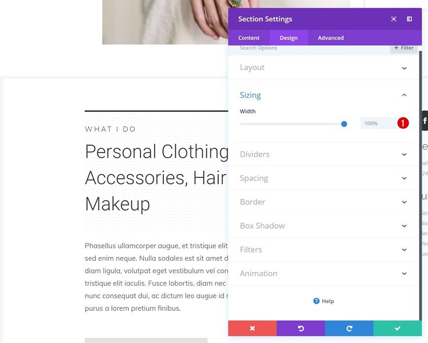
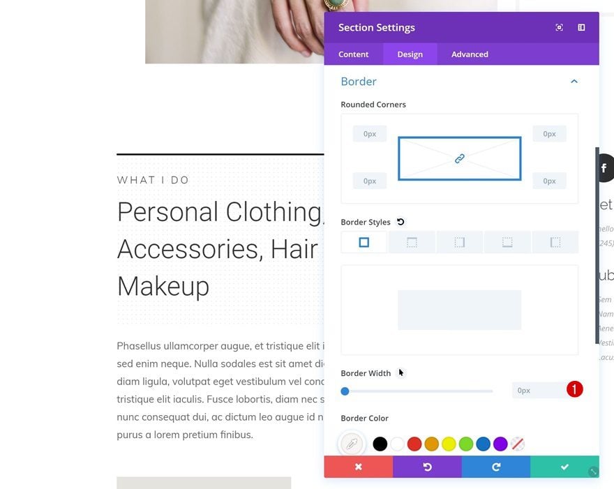
Remove Border
Do the same thing for the border width as well.
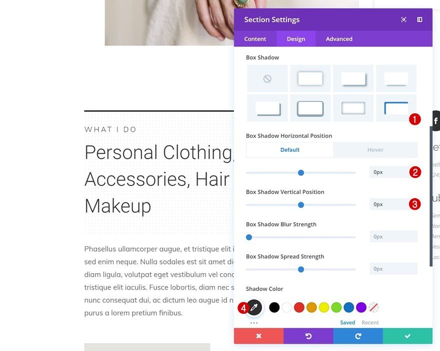
Default Box Shadow
Continue by adding a default box shadow.
- Box Shadow Horizontal Position: 0px
- Box Shadow Vertical Position: 0px
- Shadow Color: #2a2a2a
- Box Shadow Position: Inner Shadow
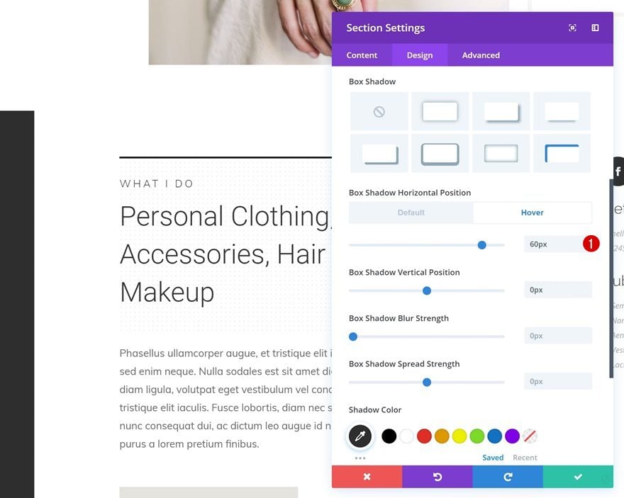
Hover Box Shadow
Change the horizontal position of the box shadow on hover.
- Box Shadow Horizontal Position: 60px
Transitions
And to finish the design, increase the transition duration in the advanced tab.
- Transition Duration: 1000ms
Preview
Now that we’ve gone through all steps, let’s take a final look at the three different examples we’ve recreated step by step.
Example #1
Example #2
Example #3
Final Thoughts
In this post, we’ve shown you how to use box shadows as swipe backgrounds with Divi’s built-in options only. This tutorial is part of our ongoing Divi design initiative where we try to put something extra into your toolbox each and every week. We hope this tutorial inspires you to use box shadows in a unique and creative way. If you have any questions or suggestions, make sure you leave a comment in the comment section below!


these tricks are very simple and useful. we can create beautiful sites with these effects. thanks!
Thanks for nice post i like it..but i need more info
Thanks for sharing information,great article thank you, i need more info…
I really impressed with divi’s rocking features. Thanks for sharing great information.
This is great! hover does not work on phones
Grate job this post is very useful for us thanks for sharing this information
This is by far better than adding just another plugin to do the job! Divi seems to have it all under the bonnet these days 😉
Really nice and useful, thank you!
thanks for sharing
thanks for tutorial 🙂
Thank you for taking the time to share – this is great!
This is a great tip !
Example #2 does not seem to work on Microsoft Edge. Works fine on Chrome though.