
The versatility of Divi and its sticky options goes further than just using the settings for a sticky header. You can use it to trigger changes in your design as well. In this tutorial, for instance, we’ll use Divi’s sticky options to trigger image transition. The image transitions take place as soon as visitors are nearing the image on scroll. We’ll recreate two different examples from scratch, but once you get the approach, you’ll be able to create your own unique image transitions using Divi’s built-in options only. You’ll be able to download the JSON file for free as well!
Let’s get to it!
Preview
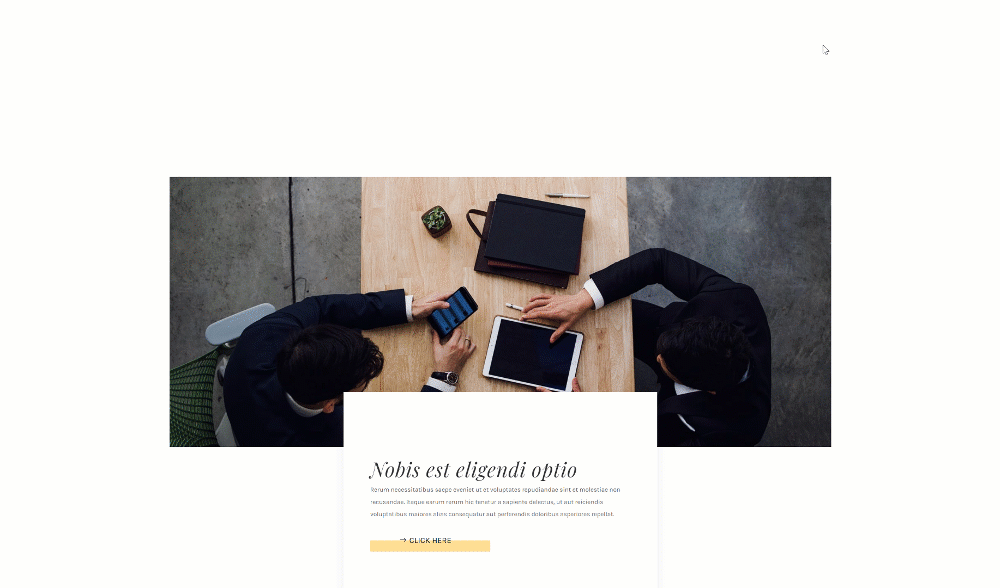
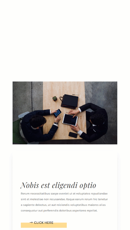
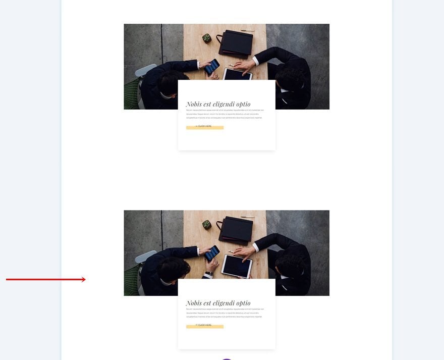
Before we dive into the tutorial, let’s take a final look at the outcome across different screen sizes.
Desktop
Mobile
Download The Layout for FREE
To lay your hands on the free layout, you will first need to download them using the button below. To gain access to the download you will need to subscribe to our newsletter by using the form below. As a new subscriber, you will receive even more Divi goodness and a free Divi Layout pack every Monday! If you’re already on the list, simply enter your email address below and click download. You will not be “resubscribed” or receive extra emails.

1. General Steps
Add Section #1
Spacing
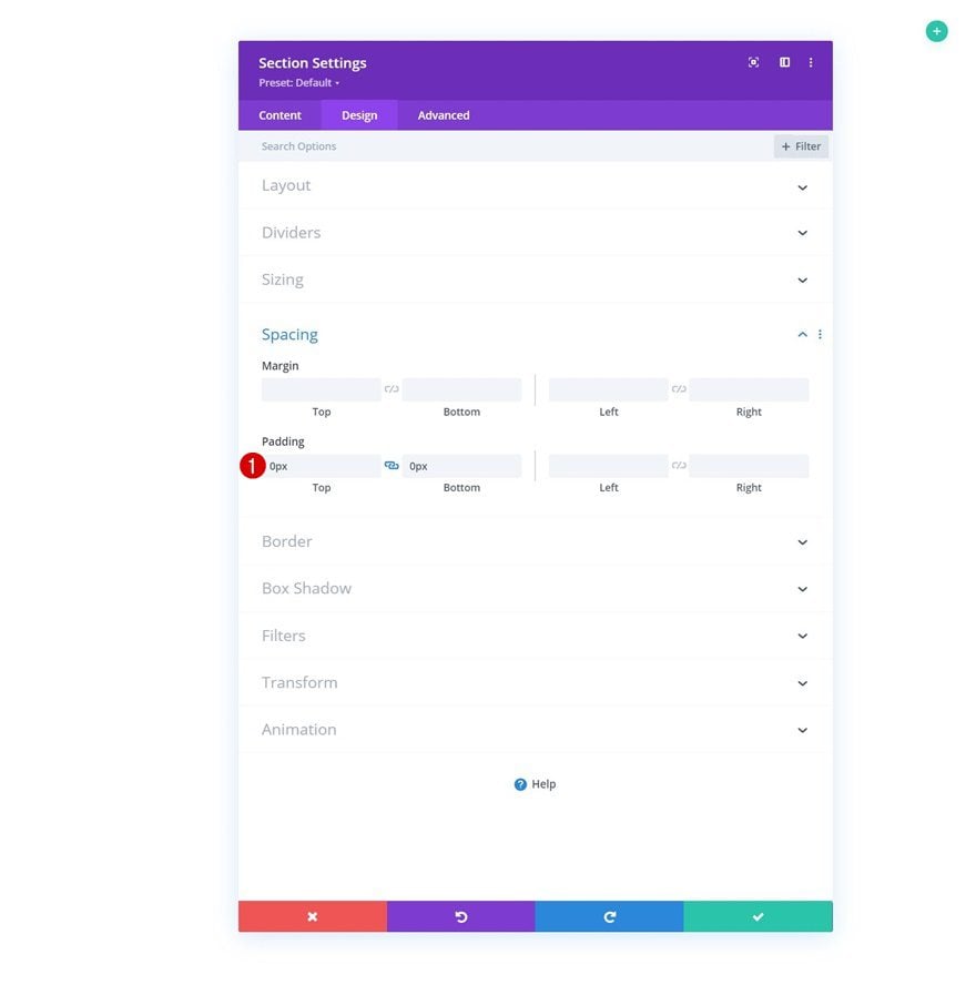
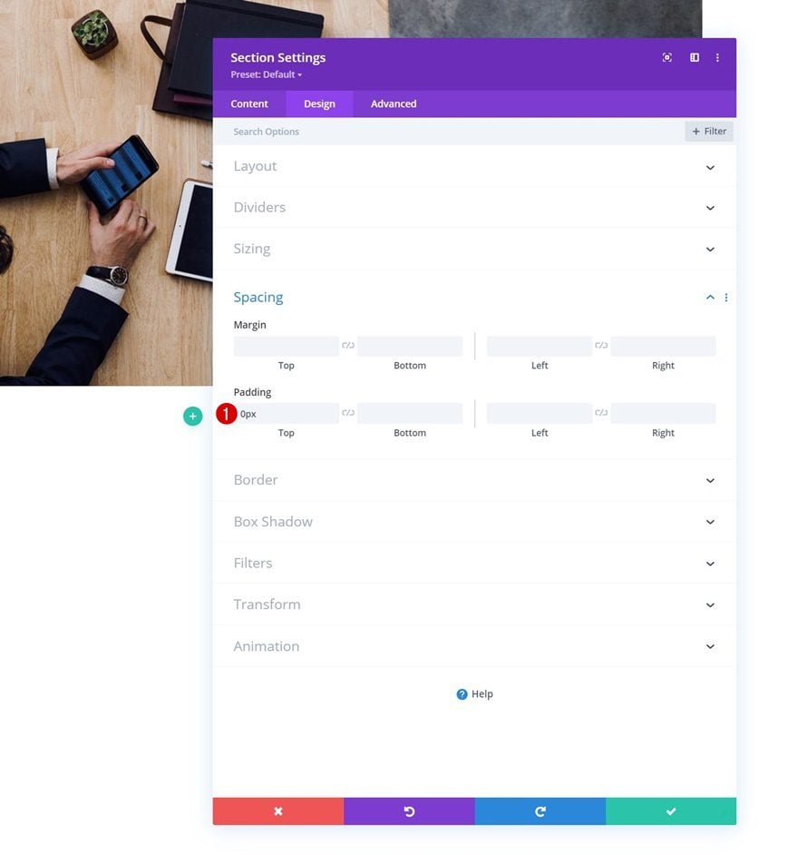
In the first part of the tutorial, we’re going to build the foundation of our design. Once that’s in place, we can focus on applying the right settings to achieve the two examples in the preview of this post. Add a new section to the page you’re working on, move on the section’s design tab and remove all default top and bottom padding.
- Top Padding: 0px
- Bottom Padding: 0px
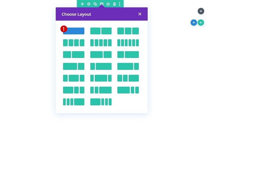
Add New Row
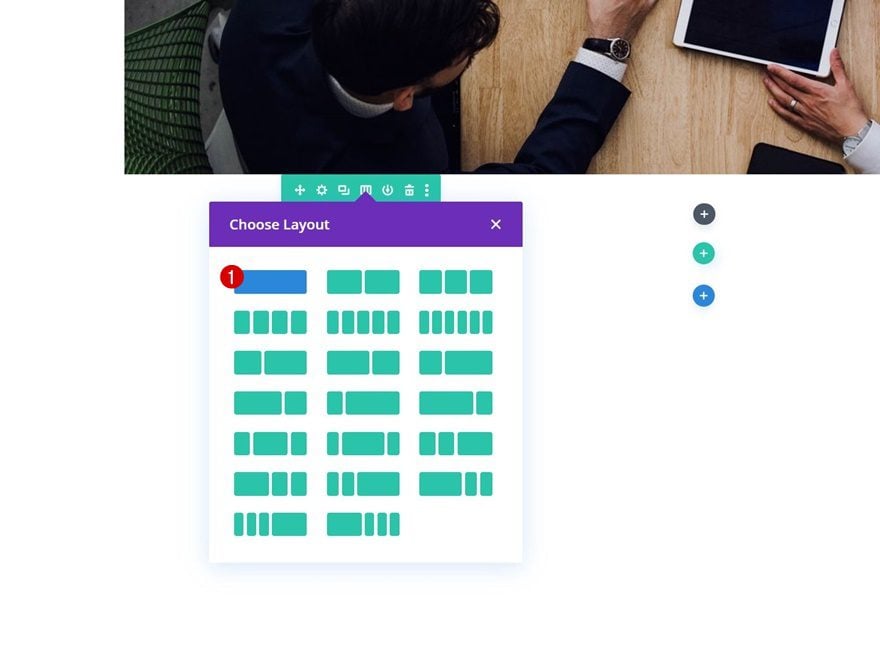
Column Structure
Continue by adding a new row using the following column structure:
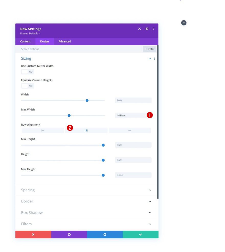
Sizing
Without adding modules yet, open the row settings and modify the sizing settings as follows:
- Max Width: 1480px
- Row Alignment: Center
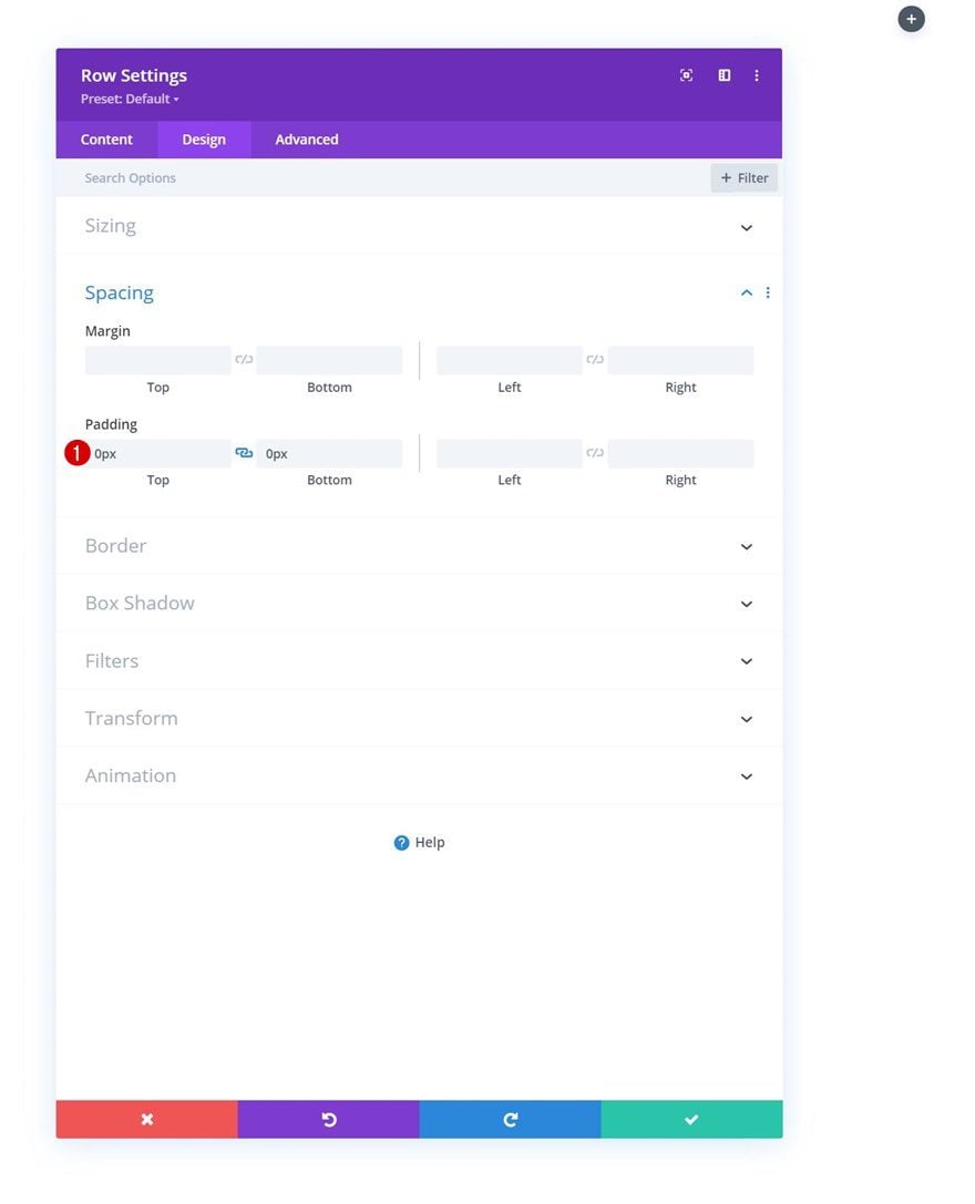
Spacing
Remove all default top and bottom padding next.
- Top Padding: 0px
- Bottom Padding: 0px
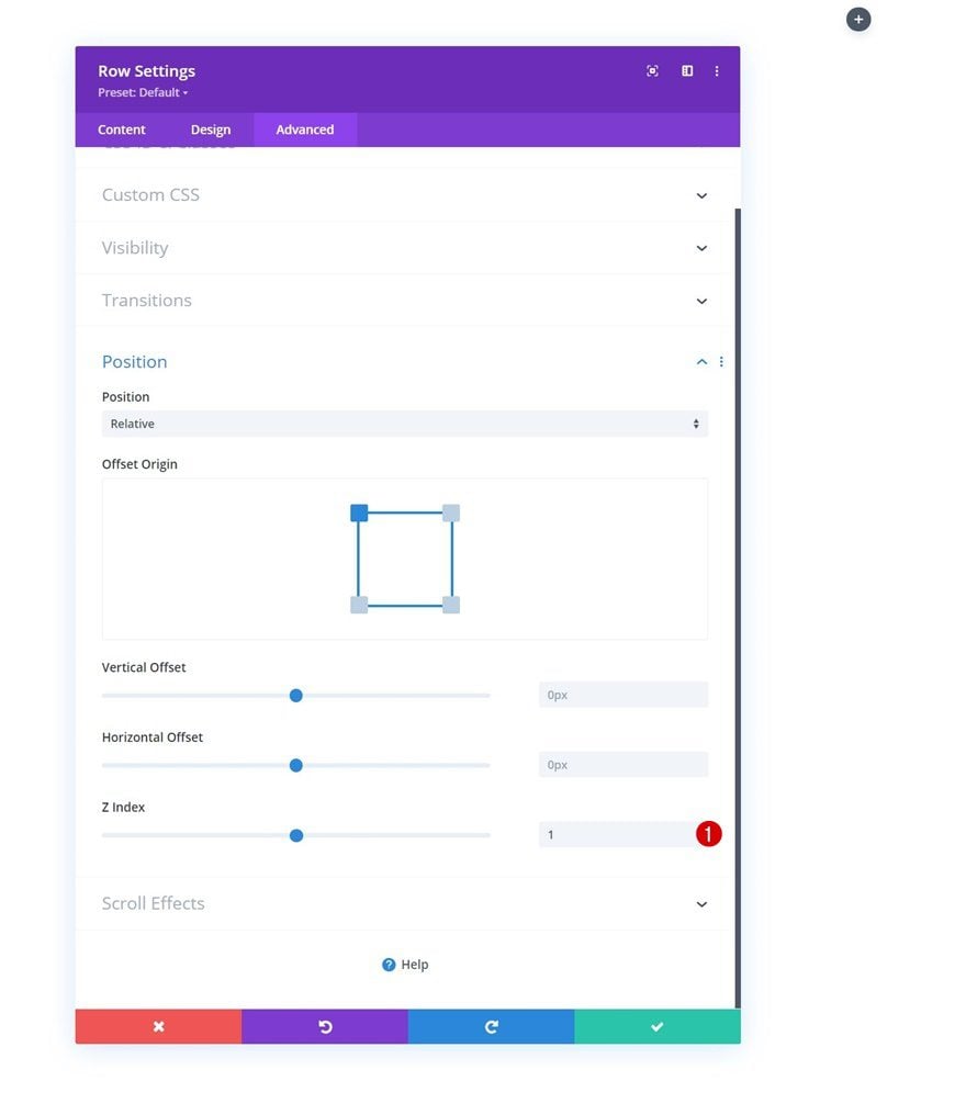
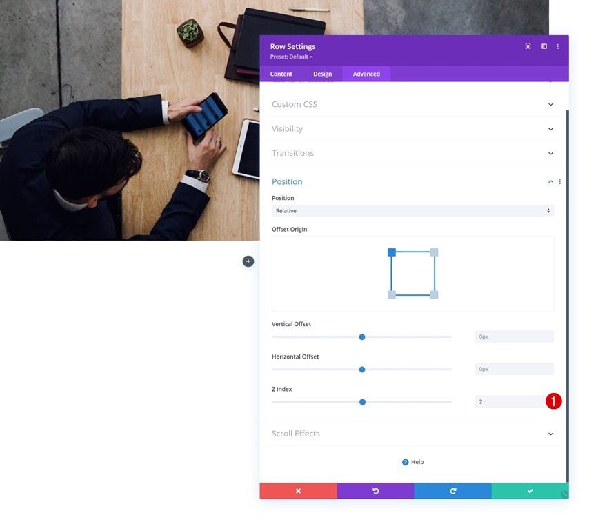
Z Index
And set a z index in the position settings. This will help us ensure that the row remains below the next row we add later on the tutorial.
- Z Index: 1
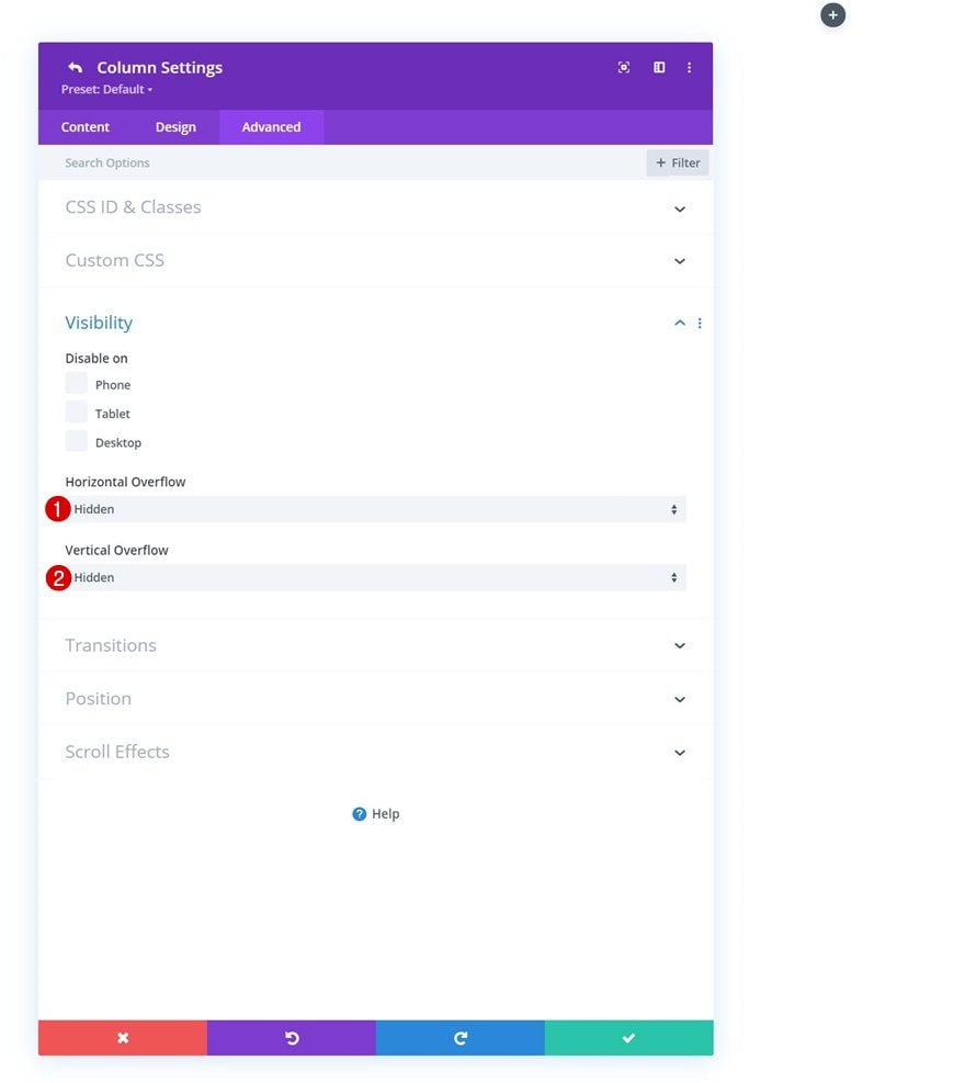
Column Overflows
Next, open the column settings and set the overflows to hidden.
- Horizontal Overflow: Hidden
- Vertical Overflow: Hidden
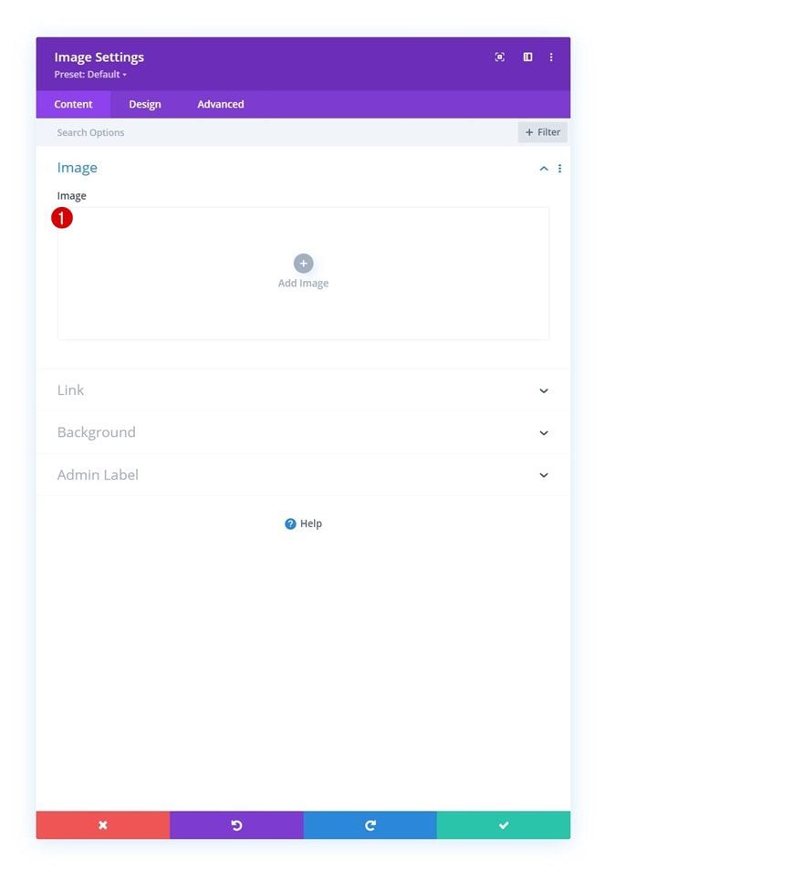
Add Image Module to Column
Leave Image Box Empty
The only module we need in this row is an Image Module. Leave the image box empty.
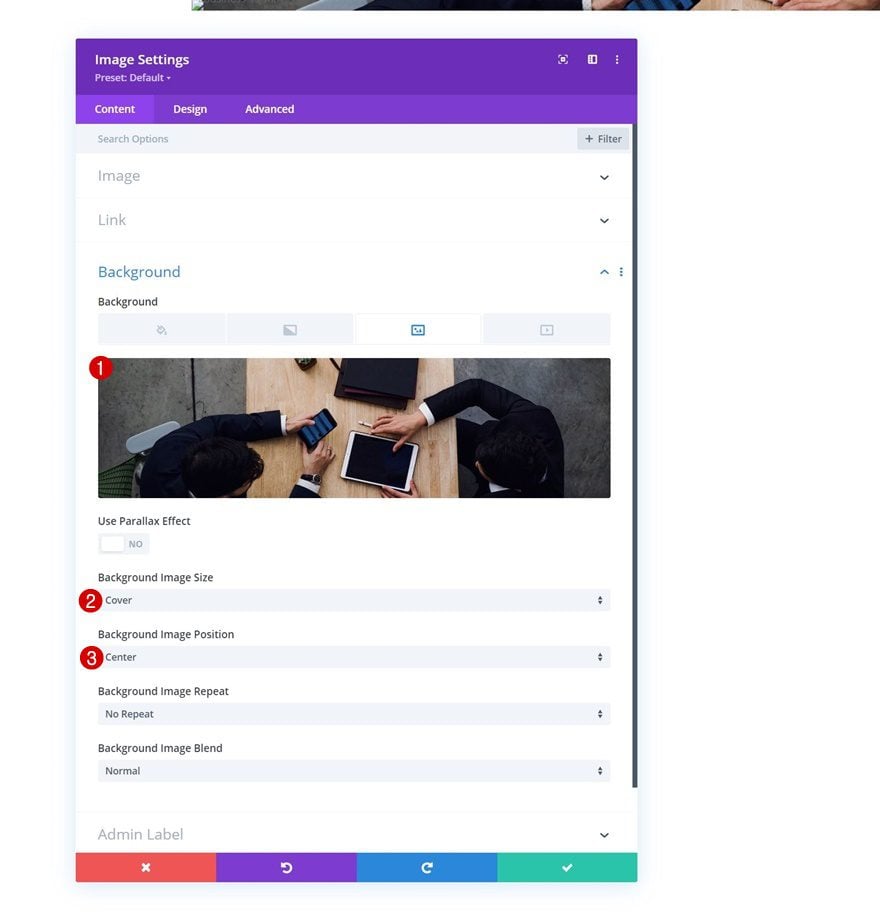
Background Image
And use a background image of your choice instead.
- Background Image Size: Cover
- Background Image Position: Center
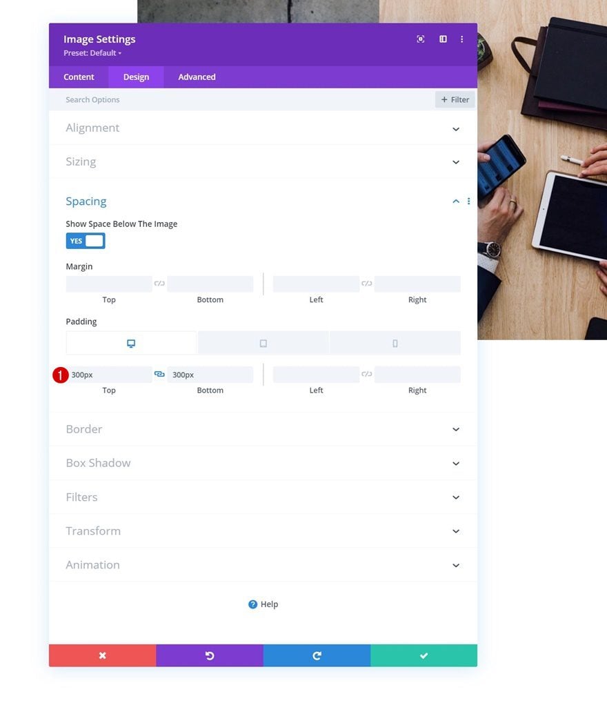
Spacing
To allow the image to show up, we’ll use some custom padding values across different screen sizes.
- Top Padding:
- Desktop: 300px
- Tablet & Phone: 150px
- Bottom Padding:
- Desktop: 300px
- Tablet & Phone: 150px
Add Section #2
Spacing
Add another section right below the previous one. Open the section settings and remove the default top padding in the spacing settings.
- Top Padding: 0px
Add New Row
Column Structure
Continue by adding a new row using the following column structure:
Z Index
Add a z index for this row as well.
- Z Index: 2
Add Call to Action Module to Column
Add Content
In this row, the only module we need is a Call to Action Module. Add the content of your choice.
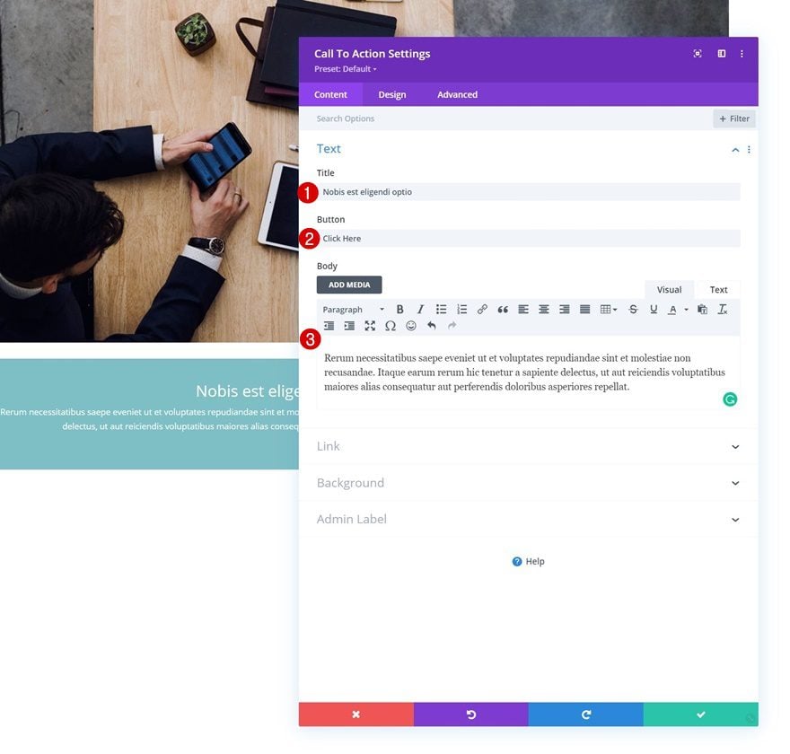
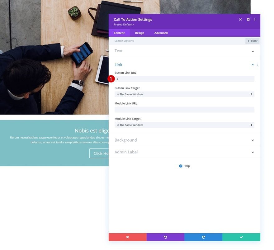
Add Button Link
Along with a button link.
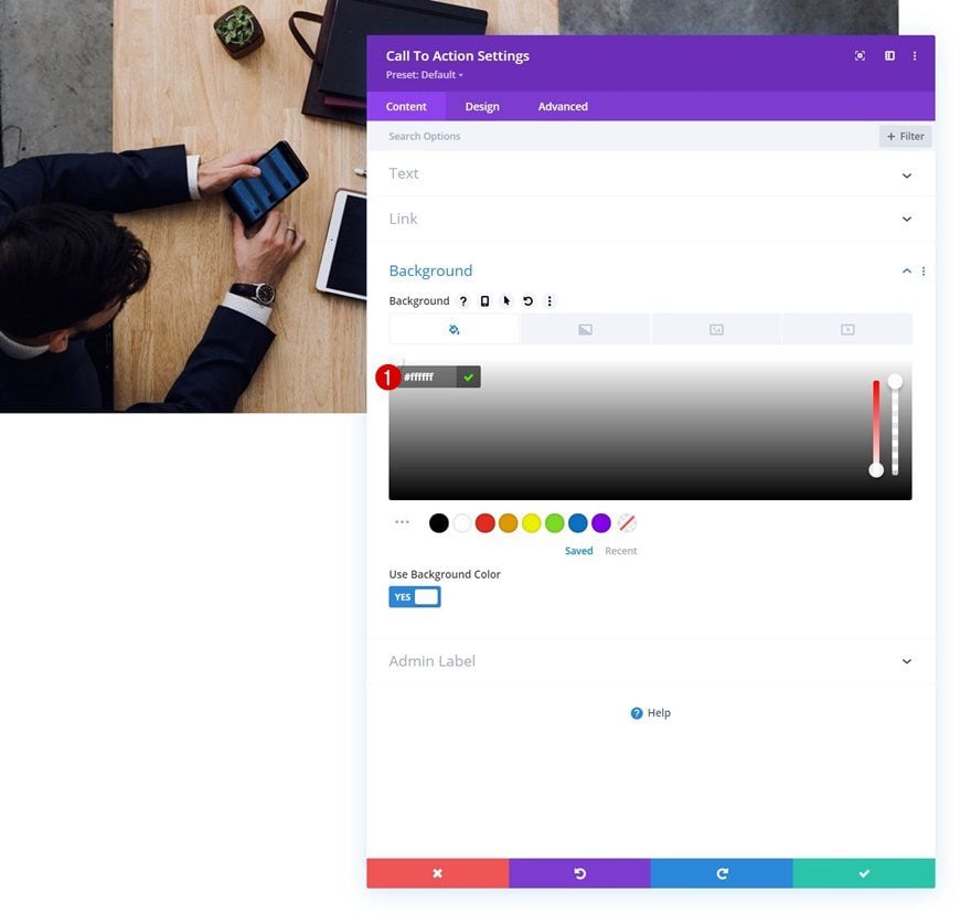
Background Color
Then, add a white background color.
- Background Color: #ffffff
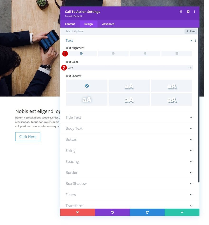
Text Settings
Move on to the design tab and change the text settings.
- Text Alignment: Left
- Text Color: Dark
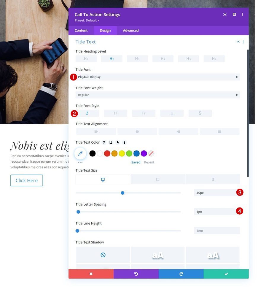
Title Text Settings
Style the title text too.
- Title Font: Playfair Display
- Title Font Style: Italic
- Title Text Size
- Desktop: 45px
- Tablet: 40px
- Phone: 35px
- Title Letter Spacing: 1px
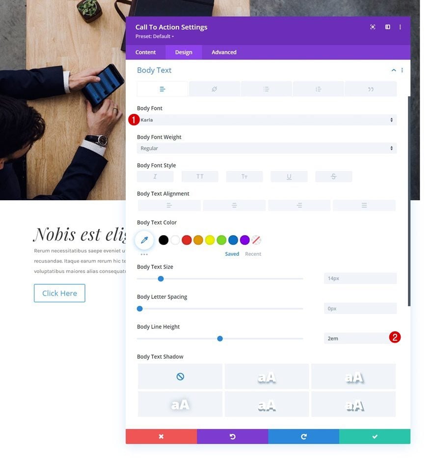
Body Text Settings
As well as the body text.
- Body font: Karla
- Body Line Height: 2em
Button Settings
Then, style the button.
- Use Custom Styles For Button: Yes
- Button Text Size: 18px
- Button Text Color: #000000
- Gradient Color 1: #ffffff
- Gradient Color 2: #ffdc91
- Gradient Type: Linear
- Start Position: 50%
- End Position: 50%
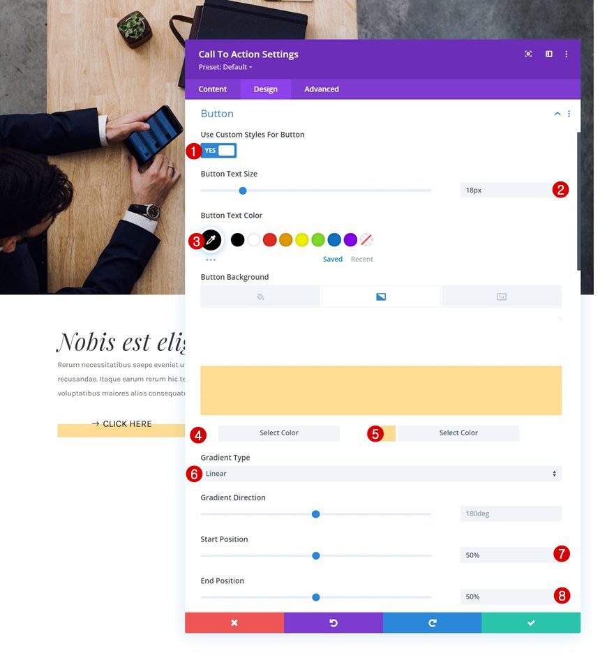
- Button Border Width: 0px
- Button Border Radius: 0px
- Button Font: Karla
- Button Font Style: Uppercase
- Show Button: Yes
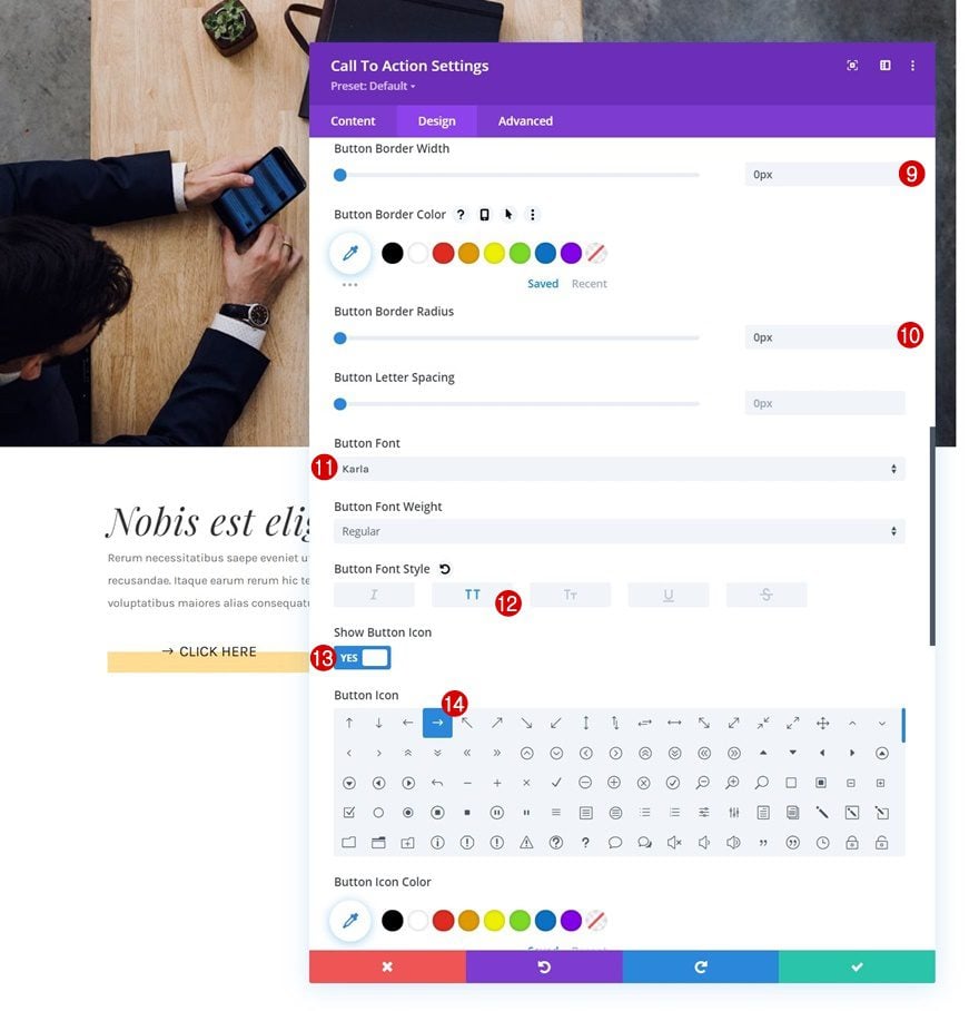
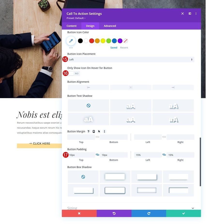
- Button Icon Placement: Left
- Only Show Icon On Hover for Button: No
- Top Padding: 10px
- Bottom Padding: 10px
- Left Padding: 15%
- Right Padding: 15%
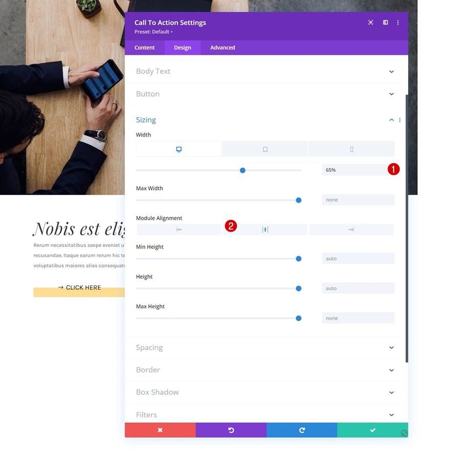
Sizing
We’re modifying the sizing settings across different screen sizes too.
- Width:
- Desktop: 65%
- Tablet: 80%
- Phone: 100%
- Module Alignment: Center
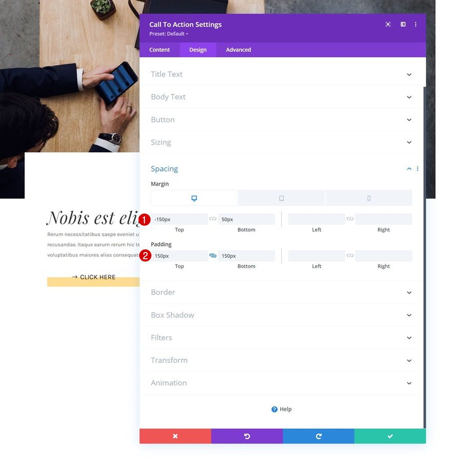
Spacing
Next, we’ll add some custom margin and padding values to the spacing settings.
- Top Margin:
- Desktop: -150px
- Tablet: -50px
- Phone: 0px
- Bottom Margin: 50px
- Top Padding: 150px
- Bottom Padding: 150px
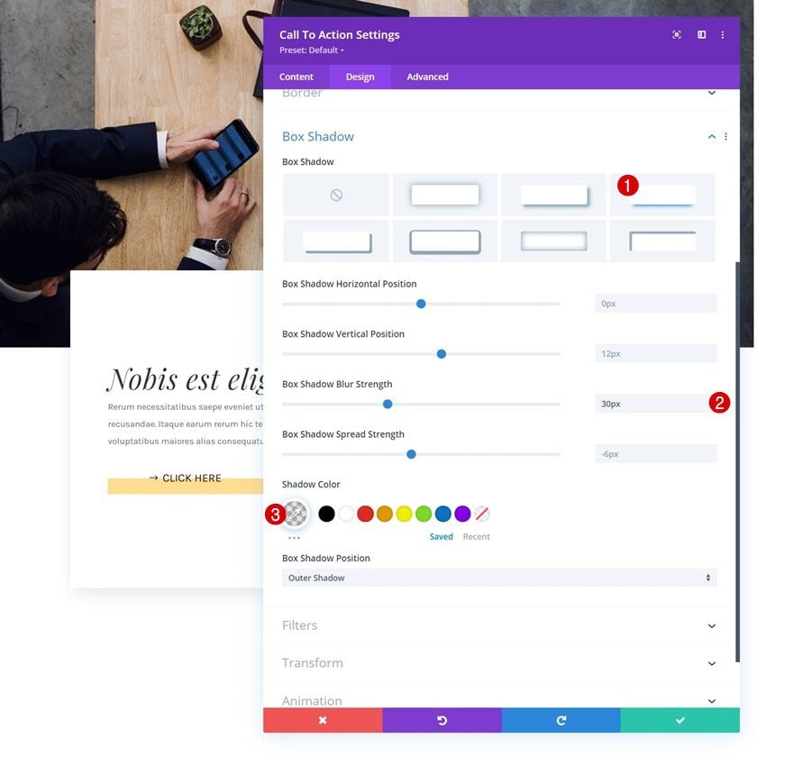
Box Shadow
And we’ll complete the module settings by adding a subtle box shadow.
- Box Shadwo Blur Strength: 30px
- Shadow Color: rgba(0,0,0,0.11)
2. Apply Sticky Effect to Row
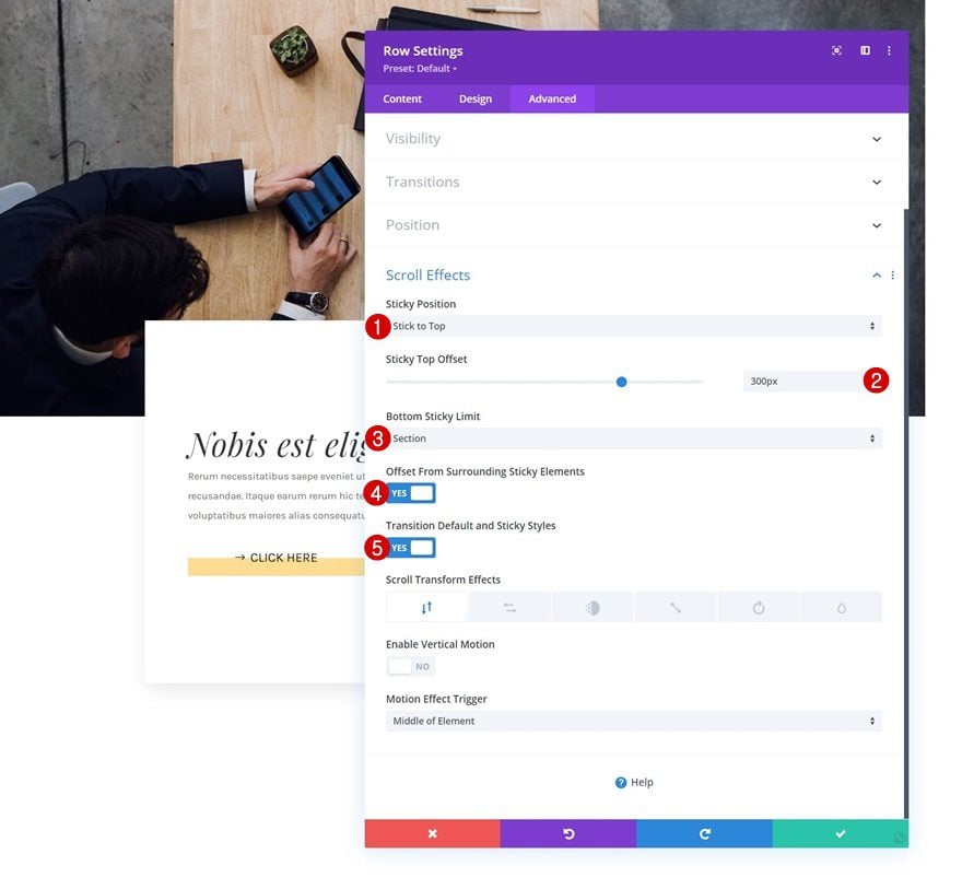
Open Row in Section #1
Now that we’ve set the foundation of our design, it’s time to apply the sticky effect. This sticky effect will help us change styles as people scroll past the element. The element we’ll add our sticky effect to is the row in the first section which contains the image.
Apply Sticky Effect
It’s important to make sure the bottom sticky limit is set to section. The beginning and endpoints of our row are the same as the section’s, which makes sure the row doesn’t actually become sticky, but sticky styles are applied. The sticky top offset determines at what point the transition starts to take place. If this value was zero, for instance, that’d mean the top of the browser would have to touch the top of the row to start the transition. By setting the sticky top offset to “300px”, we create that transition earlier.
- Sticky Position: Stick to Top
- Sticky Top Offset: 300px
- Bottom Sticky Limit: Section
- Offset From Surrounding Sticky Elements: Yes
- Transition Default and Sticky Styles: Yes
Make Sure There’s Top Offset Equal Above First Section
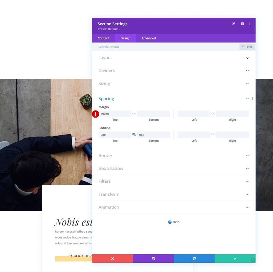
Since we’ve set the sticky top offset to “300px”, we need the space at the top of our page to make that happen. If you’re using this design somewhere midway through your page, you don’t have to worry about this step. However, if you’re using this approach at the top of your page, you’ll either have to modify the sticky top offset or add enough space at the top. We’ll add some top margin to our first section to generate that space.
- Top Margin: 400px
3. Apply Ken Burn Effect to Image Module
Now that our row has been turned sticky, we can start applying sticky styles to the row and all of its child elements. Although the possibilities are endless, we’re showing you two different examples and how to achieve them. To make it easier to play around with the two different examples, we’ll clone both sections once and place them below the first ones.
Example #1
Sticky Row Settings
Box Shadow
To recreate example #1, which you were able to see in the preview of this post, open the row settings and apply the following box shadow settings:
- Box Shadow Vertical Position: 0px
- Box Shadow Spread Strength: 0px
- Shadow Color: rgba(0,0,0,0)
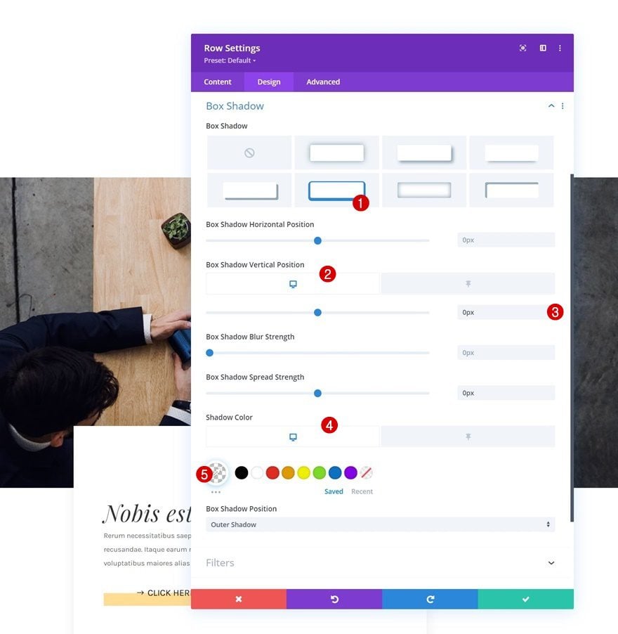
- Sticky Vertical Position: 100px
- Sticky Shadow Color: #ffdc91
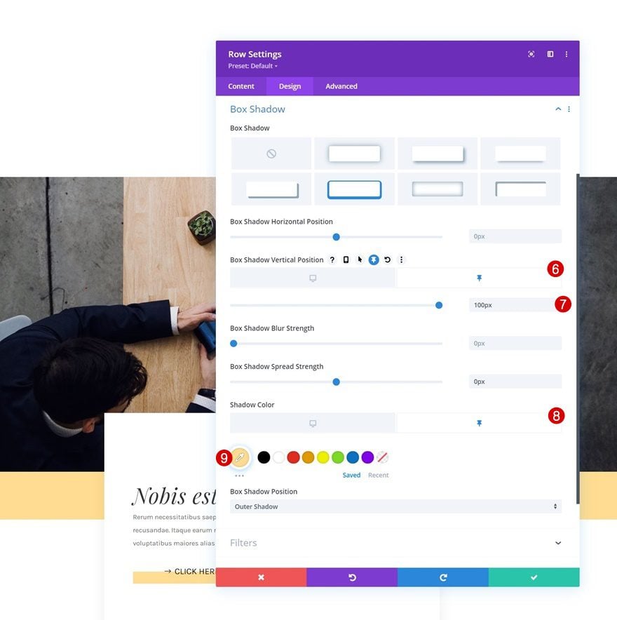
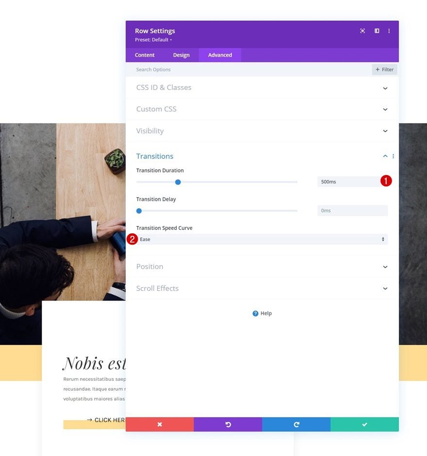
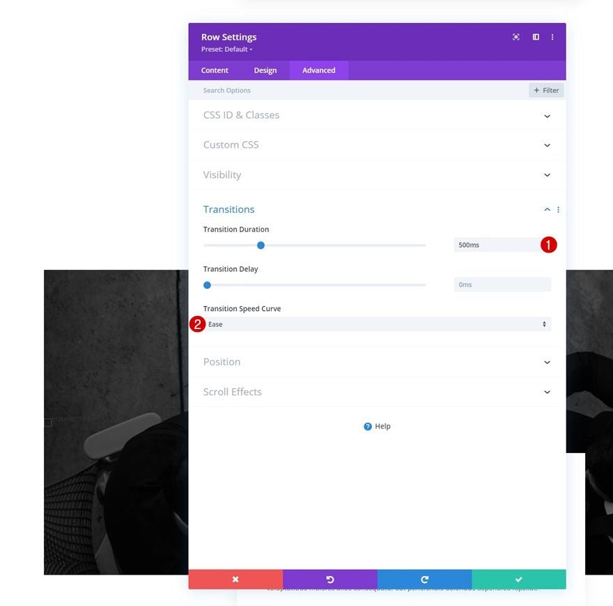
Transition
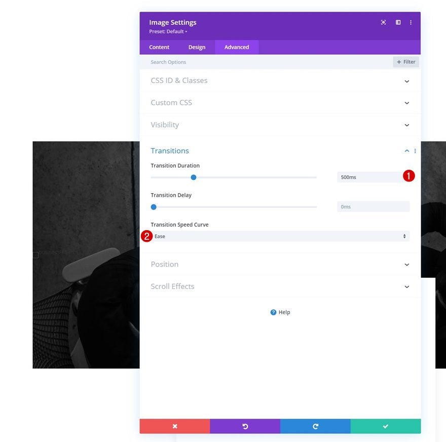
Include a smooth transition in the advanced tab as well.
- Transition Duration: 500ms
- Transition Speed Curve: Ease
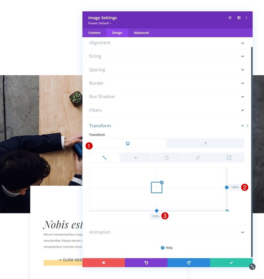
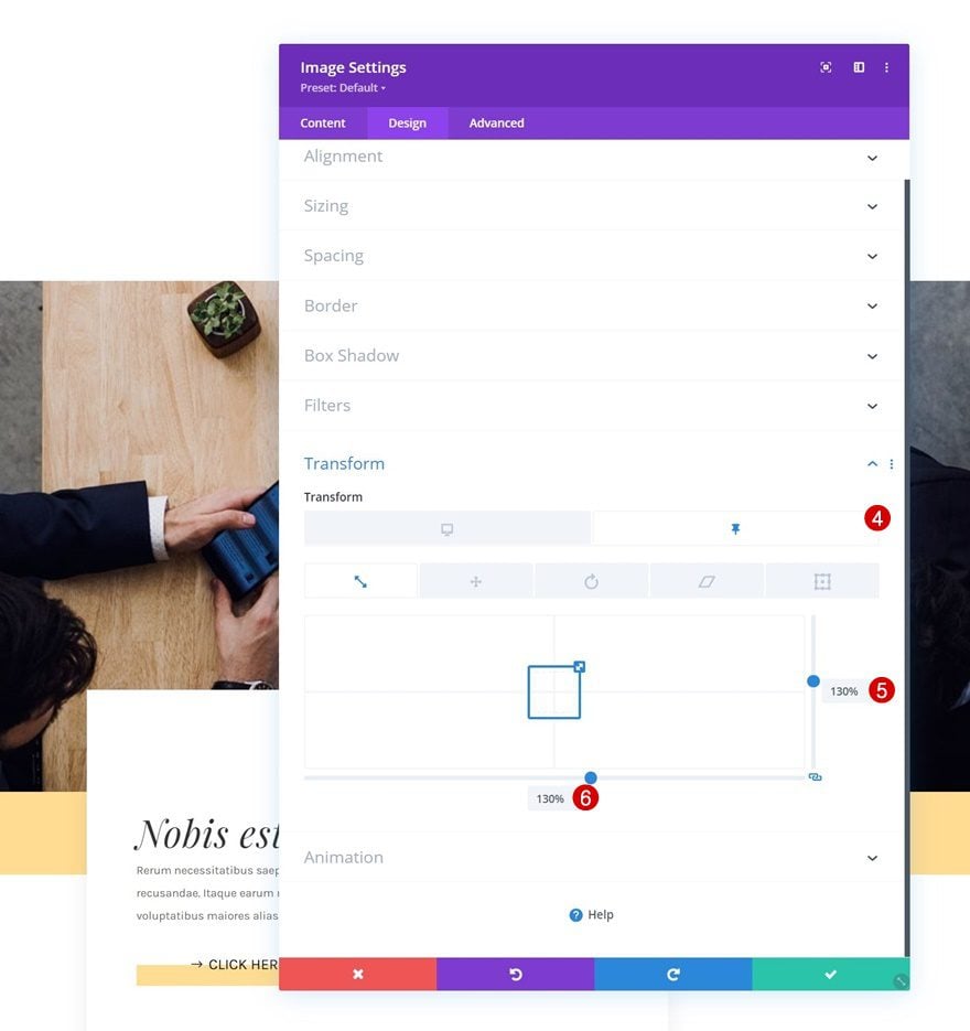
Sticky Image Module Settings
Transform Scale
Next, open the Image Module and apply a transform scale effect in a sticky state.
- Both: 100%
- Sticky both: 130%
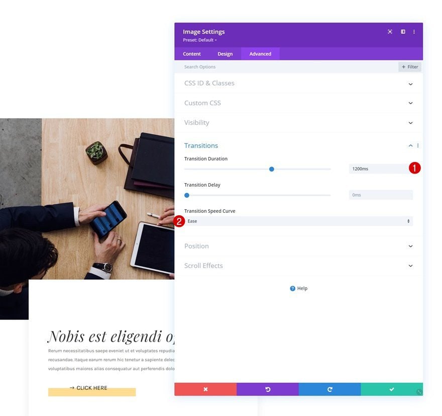
Transition
Ensure a smooth transition by modifying the transition settings of the module accordingly:
- Transition Duration: 1200ms
- Transition Speed Curve: Ease
Example #2
Sticky Row Settings
Transform Translate
On to the second example! Open the row settings and apply the following transform translate settings:
- Right: 20%
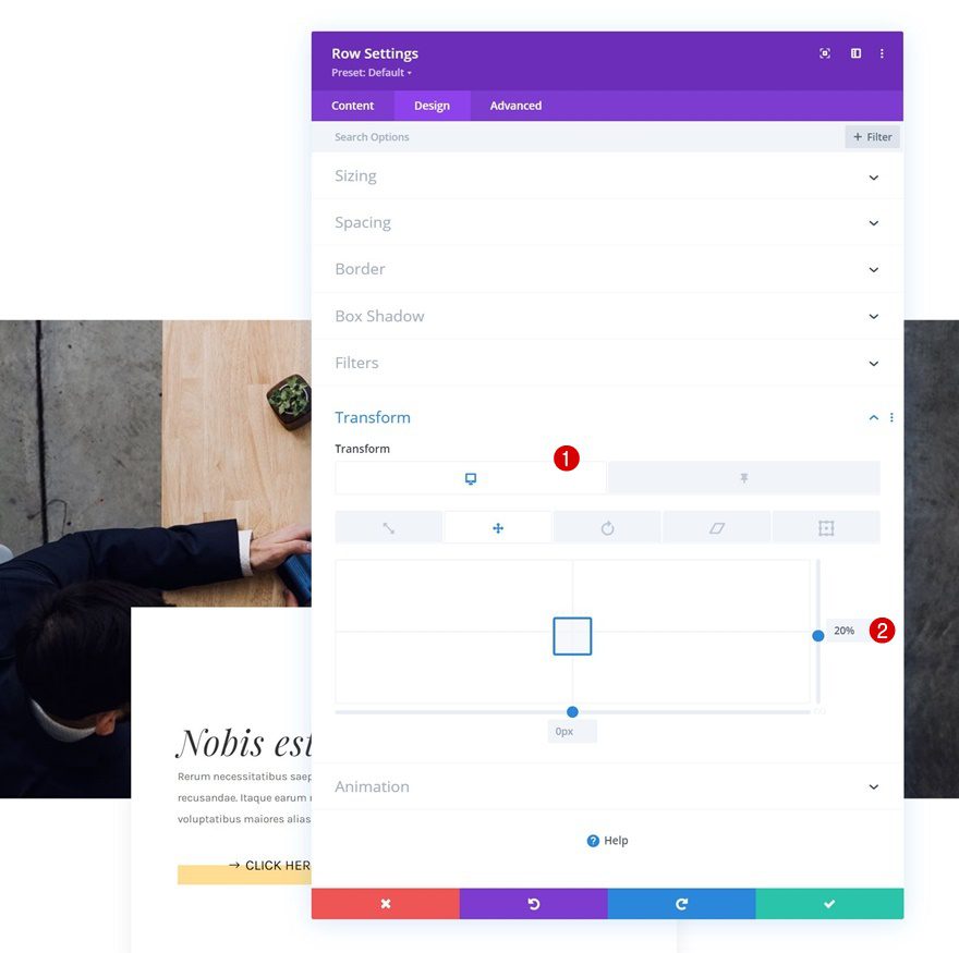
- Sticky Right: 0%
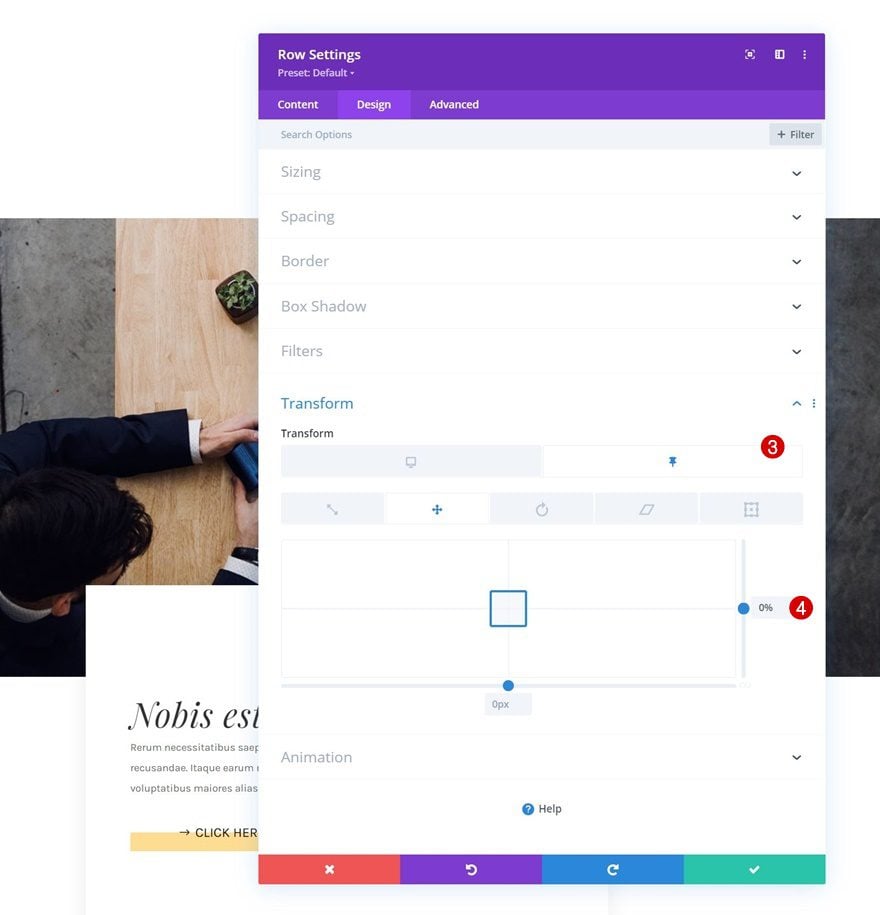
Transition
Modify the row’s transition settings too.
- Transition Duration: 500ms
- Transition Speed Curve: Ease
Sticky Image Module Settings
Filters
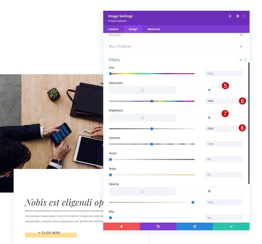
Then, open the Image Module and play around with the filters in default and sticky state.
- Saturation: 0%
- Brightness: 50%
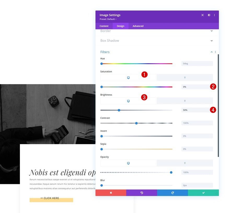
- Sticky Saturation: 100%
- Sticky Brightness: 100%
Transition
Complete the module settings, and this tutorial, by changing the transition settings as follows:
- Transition Duration: 500ms
- Transition Speed Curve: Ease
Preview
Now that we’ve gone through all the steps, let’s take a final look at the outcome across different screen sizes.
Desktop
Mobile
Final Thoughts
In this post, we’ve shown you how to get creative with Divi’s sticky options. More specifically, we’ve shown you how to trigger image transitions. As soon as people scroll past the image, the styles of the image change which results in a beautiful transition. We’ve handled two different examples but the possibilities are endless. You were able to download the JSON file for free as well! If you have any questions or suggestions, feel free to leave a comment in the comment section below.
If you’re eager to learn more about Divi and get more Divi freebies, make sure you subscribe to our email newsletter and YouTube channel so you’ll always be one of the first people to know and get benefits from this free content.


Great write-up here Donjete. Since the first day I came to your blog, its been freebies worth hundreds of dollars from you and I’ve learnt another great deal in this post again. Subs means alot
Very cool and adds elegance to the mobile version
DIVI Page Builder is a masterpiece I love this page builder of yours. Thanks for this tutorial
Mobile version and Desktop version both are looking amazing