")
A call to action is an important part of digital marketing. Whether you are creating a landing page, blog post or mobile app, you can find calls to action everywhere online. As a native Divi module, the Call to Action Module makes it easy to add this important element to your work. Featuring a title, body text, and button, the module gives you ample styling options to make design choices that match your brand. We’ll provide you with Divi call to action style examples that are based on three of our free layout packs. Each layout pack comes with your Divi membership and we release new ones weekly! Let’s take a look at what we’ll recreate in this post:
- 1 Divi Call to Action Style Example: Inspired by Divi Whiskey
- 2 Call to Action Style Example #2: Inspired by Divi Bagel Shop
- 3 Style Example #3: Inspired by Divi Leather Goods
- 4 Setting Up Your Call to Action Section
- 5 Styling the Divi Call to Action Module: Divi Whiskey Inspired
- 6 Divi Call to Action Style Example ft. Divi Bagel Shop
- 7 Divi Leather Goods Inspired Call to Action Module Style Example
- 8 In Conclusion
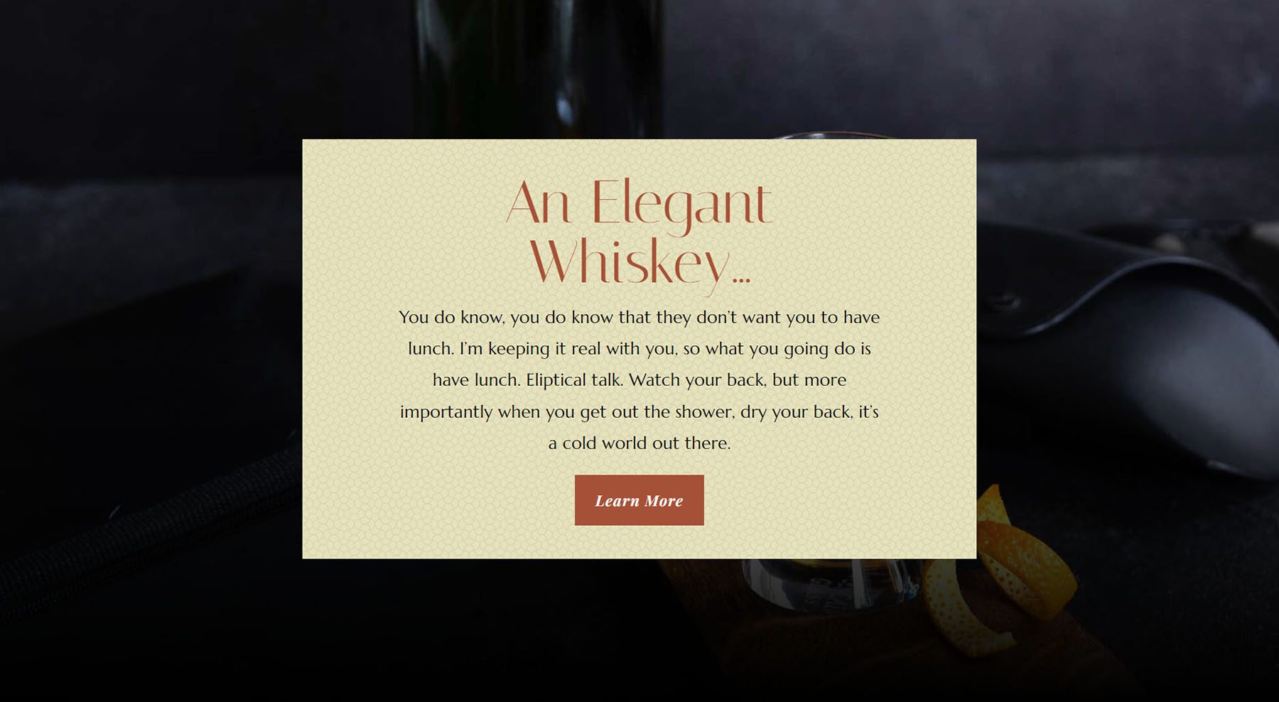
Divi Call to Action Style Example: Inspired by Divi Whiskey
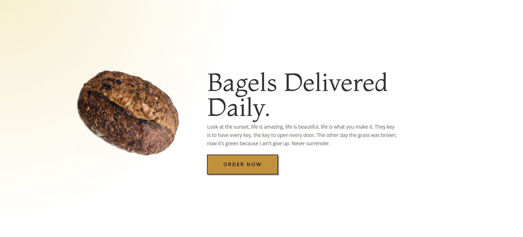
Call to Action Style Example #2: Inspired by Divi Bagel Shop
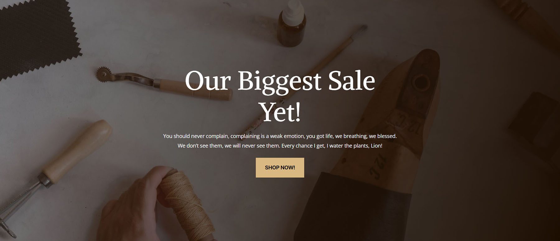
Style Example #3: Inspired by Divi Leather Goods
Setting Up Your Call to Action Section
To begin, let’s create the foundation for our style examples.
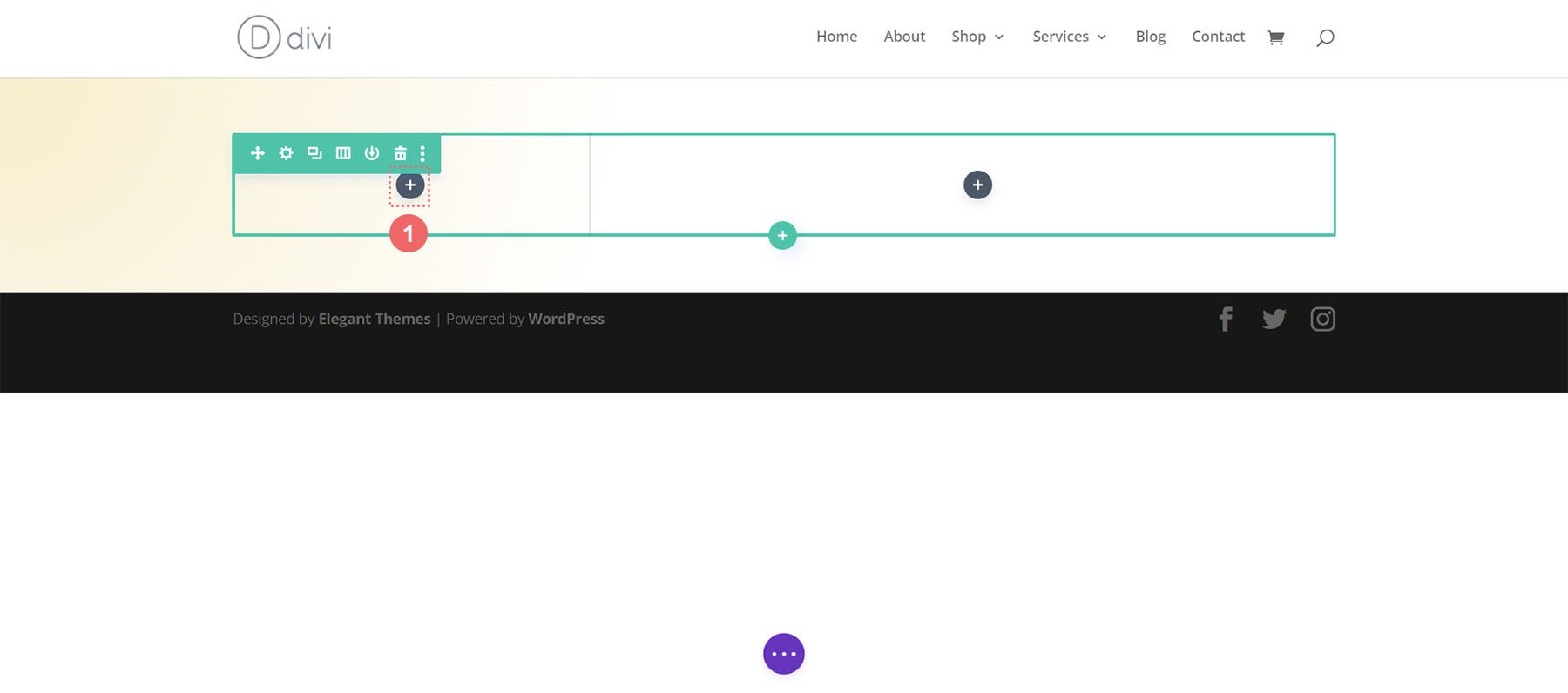
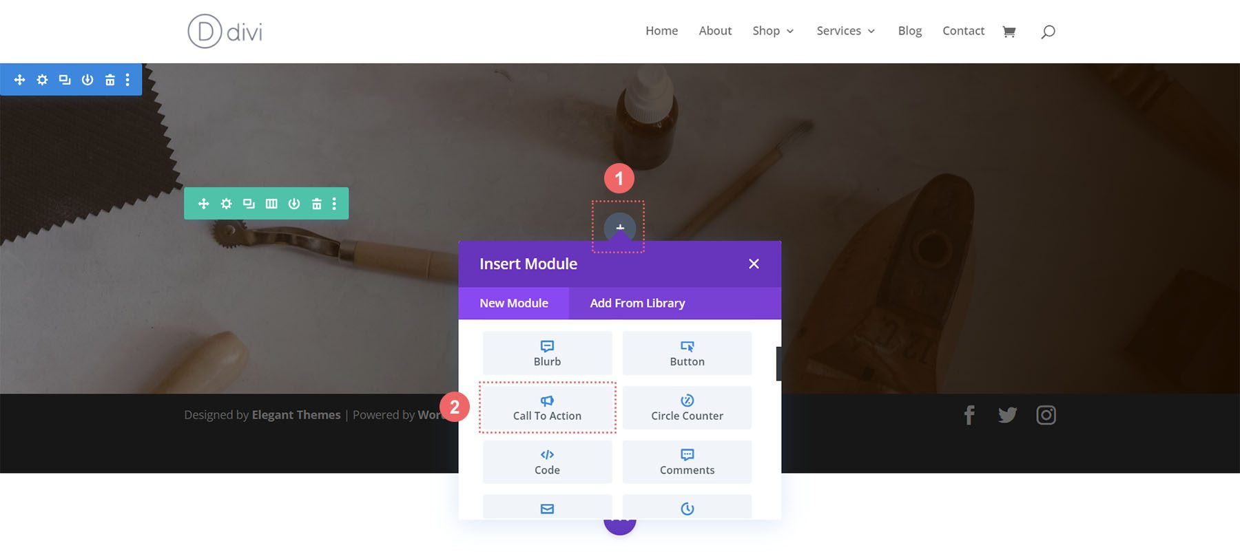
Add Section
Add a new Regular Section to your page by clicking on the blue plus icon.
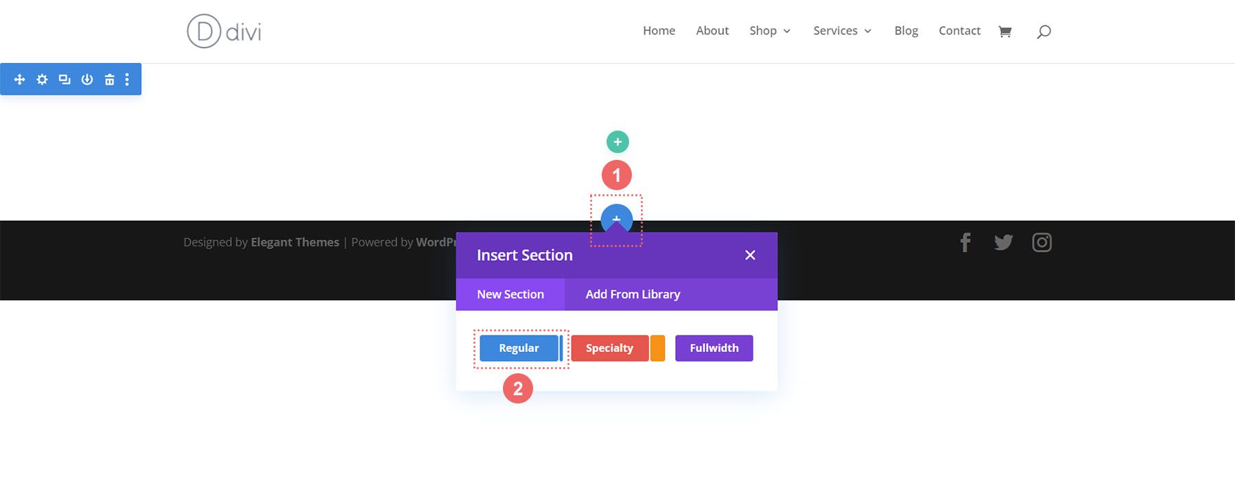
Select One Column Row
Once your section is added, select the one-column icon to add a row with one column to your section.
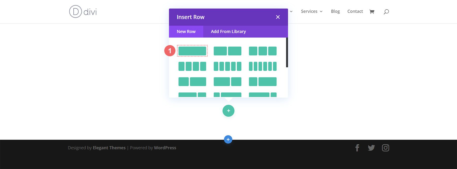
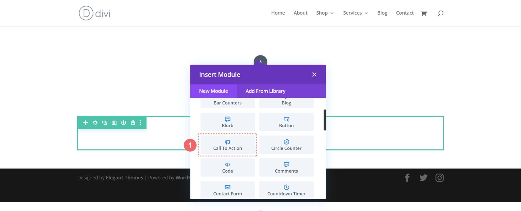
Select Call to Action Module
Click on the Call to Action icon to add the module to your row.
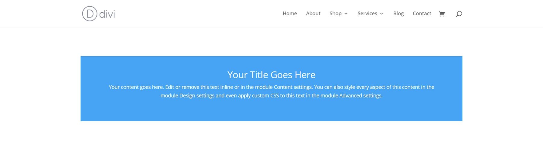
Now, we are ready to style our module!
Styling the Divi Call to Action Module: Divi Whiskey Inspired
Our first Divi call to action style example is inspired by our Divi Whiskey Layout Pack.
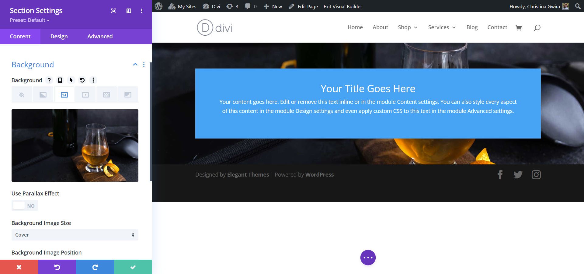
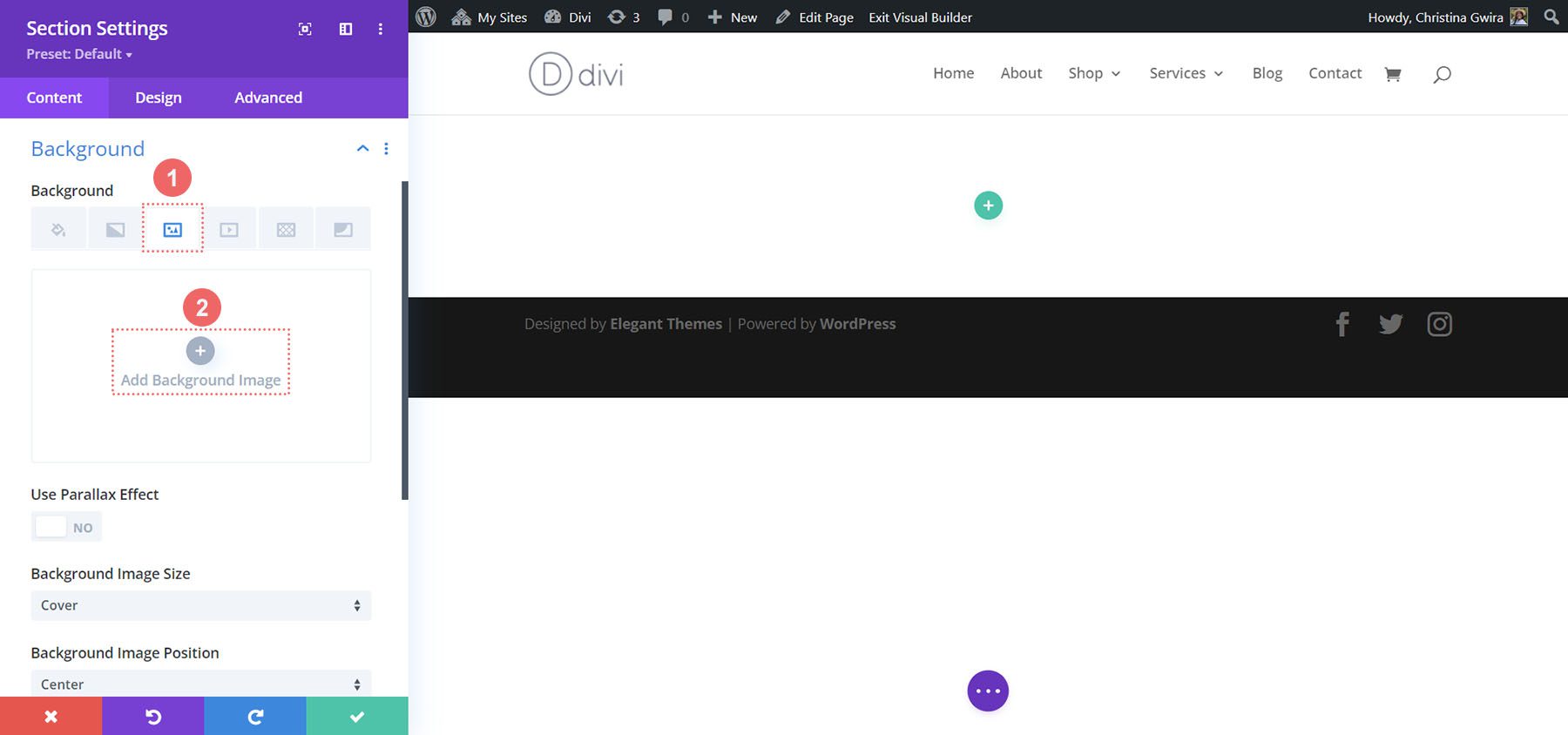
Add Background to Section
For our background, we will upload an image found within the layout pack as the base of our background design. Click on the Background Image icon. Then, click on the Add Background Image icon.
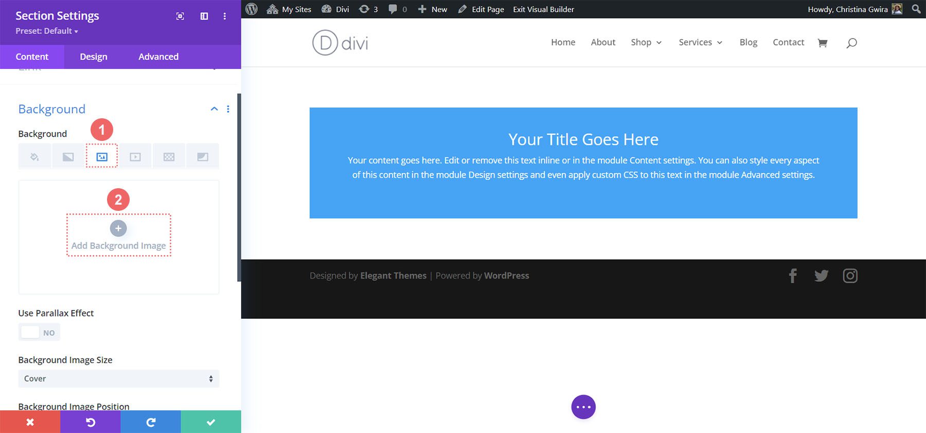
Upload the image to your site. We’ll use the default background image settings for the photo we updated.
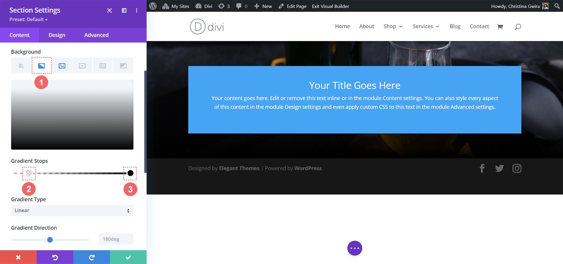
Add Background Gradient
Next, we’ll add a background gradient on top of our background image. We’ll use the following settings:
Background Gradient Settings:
- Gradient Stop 1: rgba(0,0,0,0) (at 12%)
- Gradient Stop 2: #000000 (at 100%)
- Gradient Type: Linear
- Gradient Direction: 180deg
- Place Gradient Above Background Image: Yes
Add Padding
Following setting up the background, click on the Design tab. Firstly, we will scroll down to the Spacing tab. Secondly, we’ll use 150px to add some generous padding to the section.
Spacing Settings:
- Top Padding: 150px
- Bottom Padding: 150px
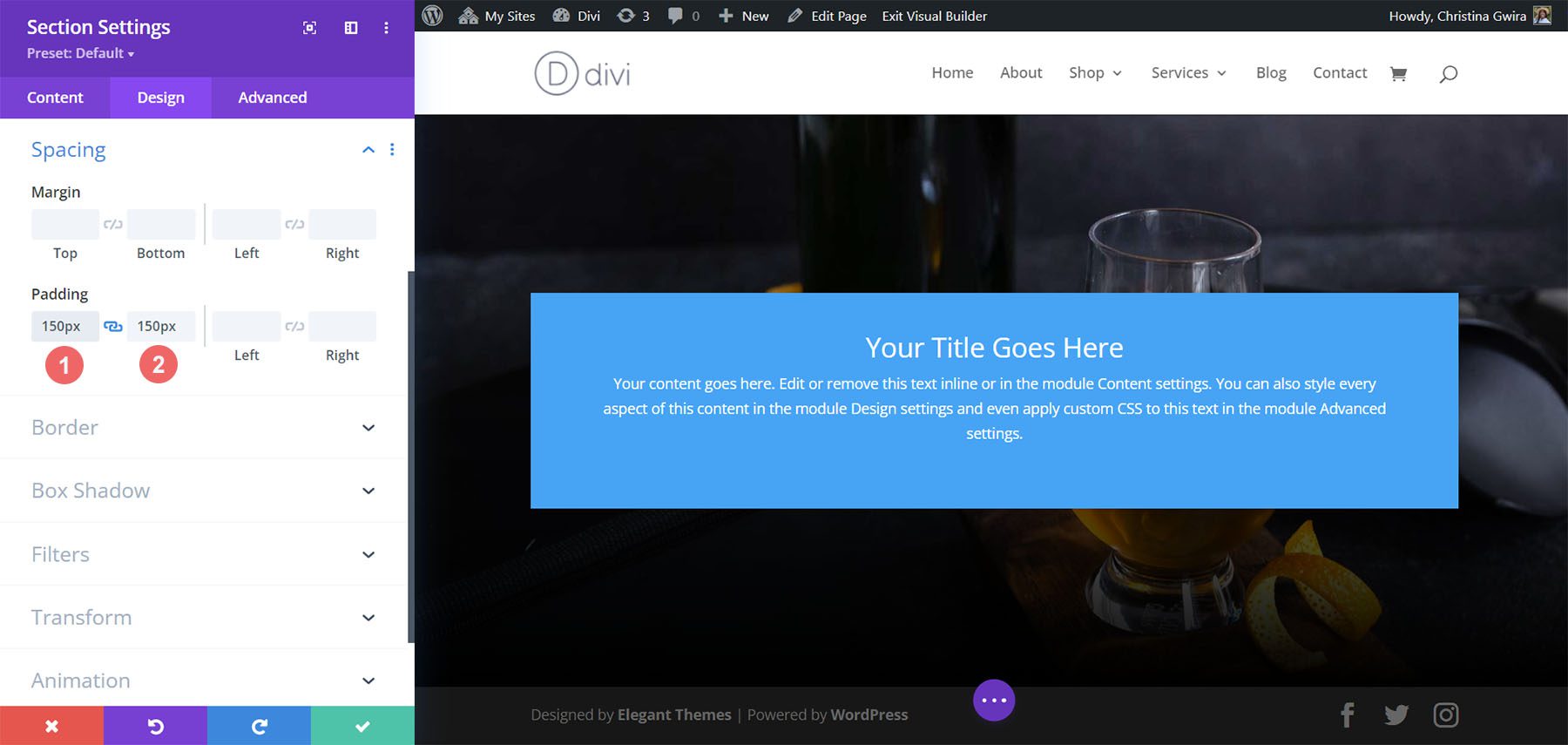
Click on the green check icon at the bottom of the Section Settings to save your settings for the section.
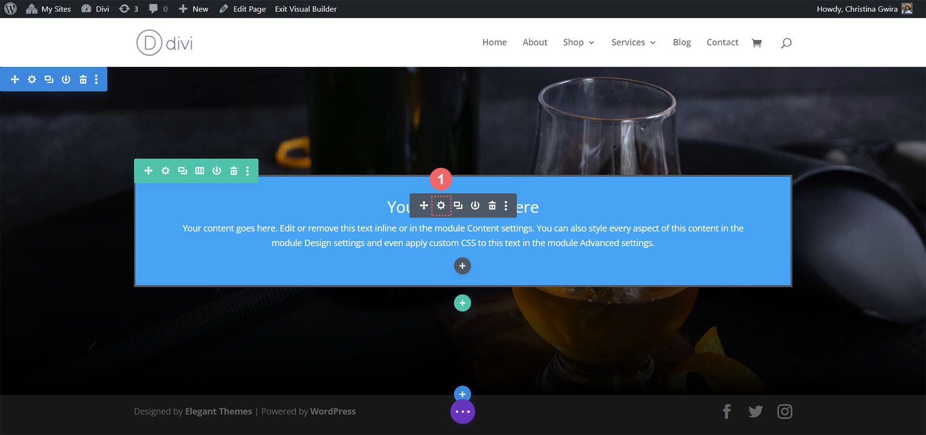
Styling the Call to Action Module
For the Call to Action Module, click on the gear icon to enter the module settings.
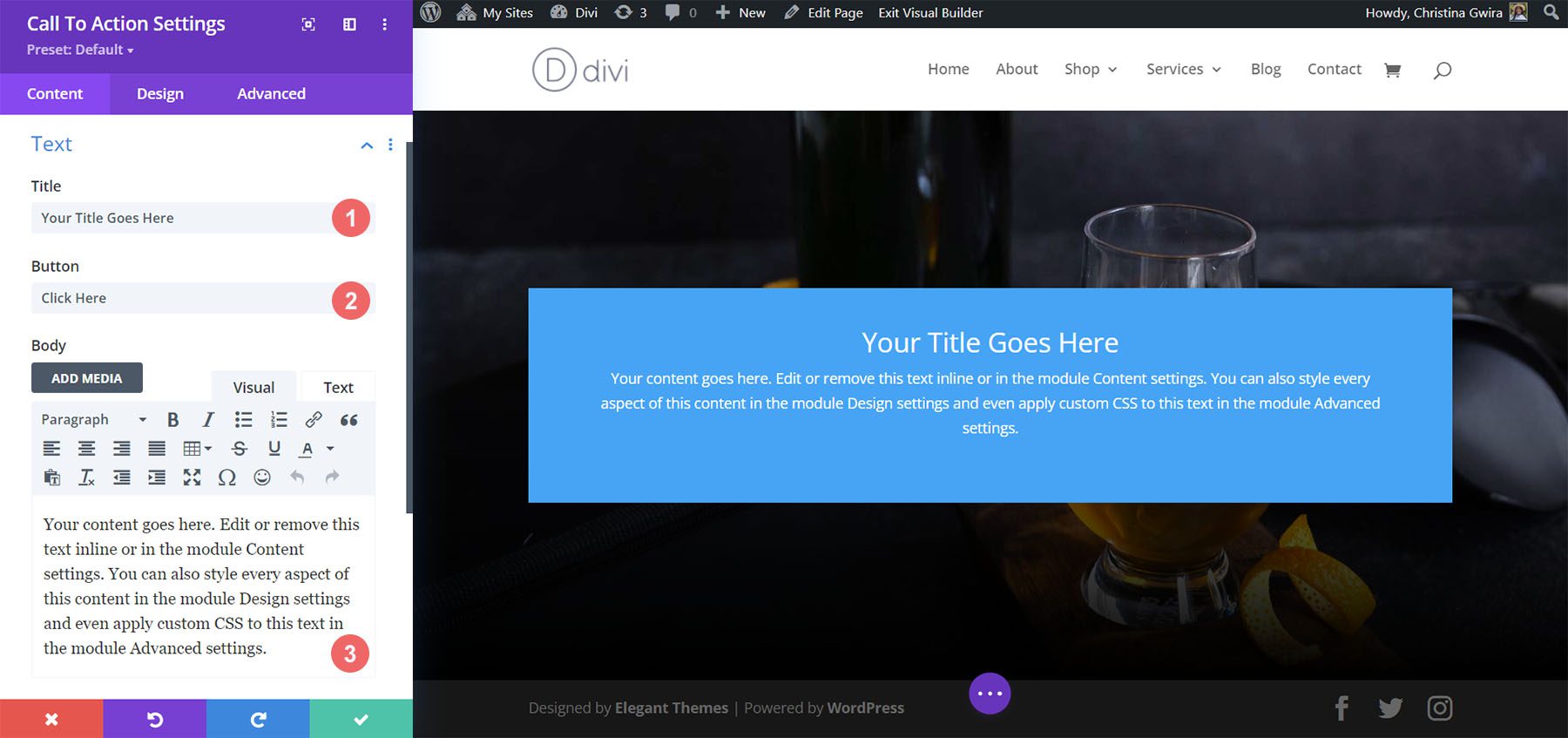
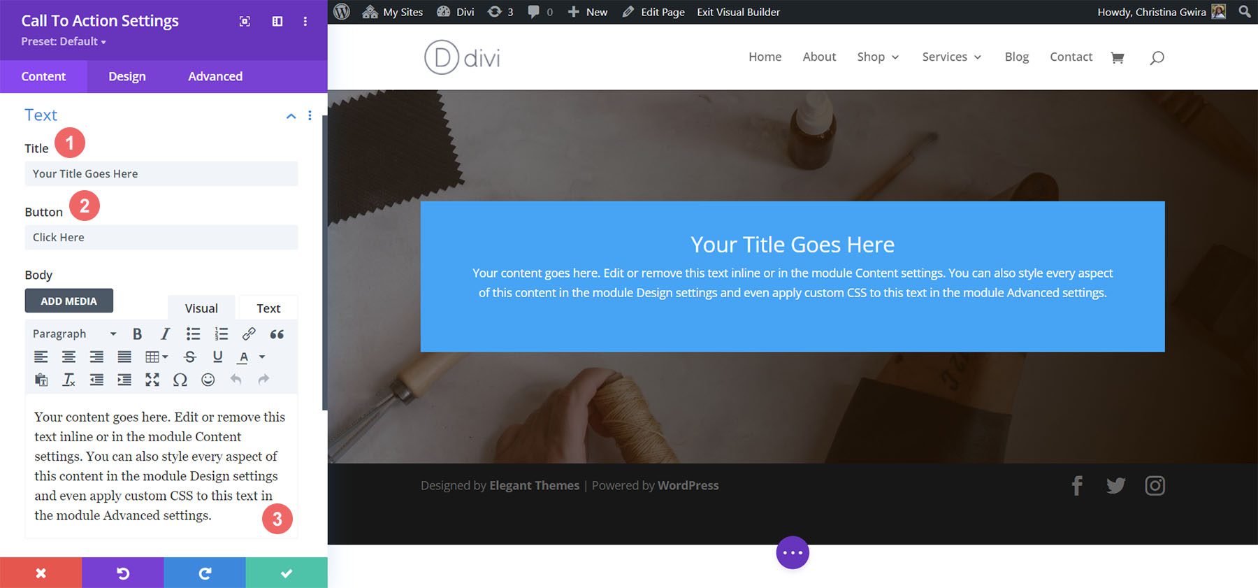
Add Content
To begin, enter the content that you’d like to show in the module. Click on the Content Tab, and add your title, button text, and body text for your Call to Action Module.
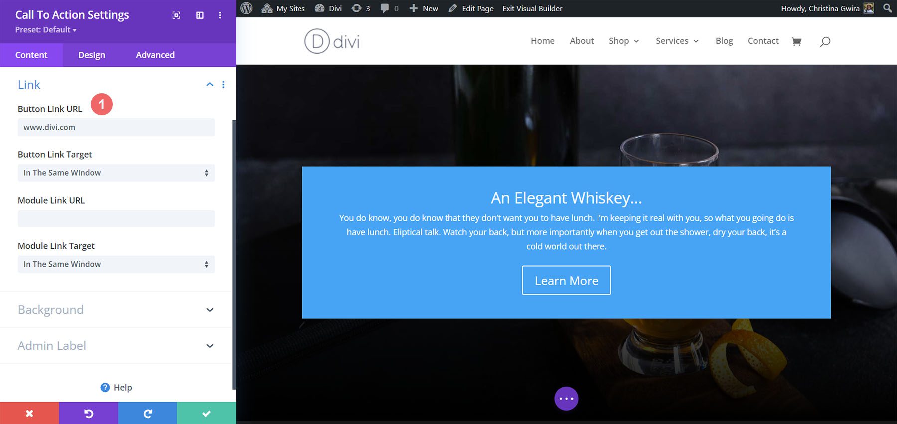
Input Link
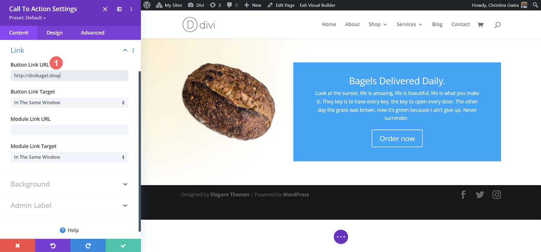
For you to see your button in your module, you need to add a link to the Call to Action Module. Add your link URL.
Style Call to Action Background
After we’ve added our content, we are now going to style the background of the module itself.
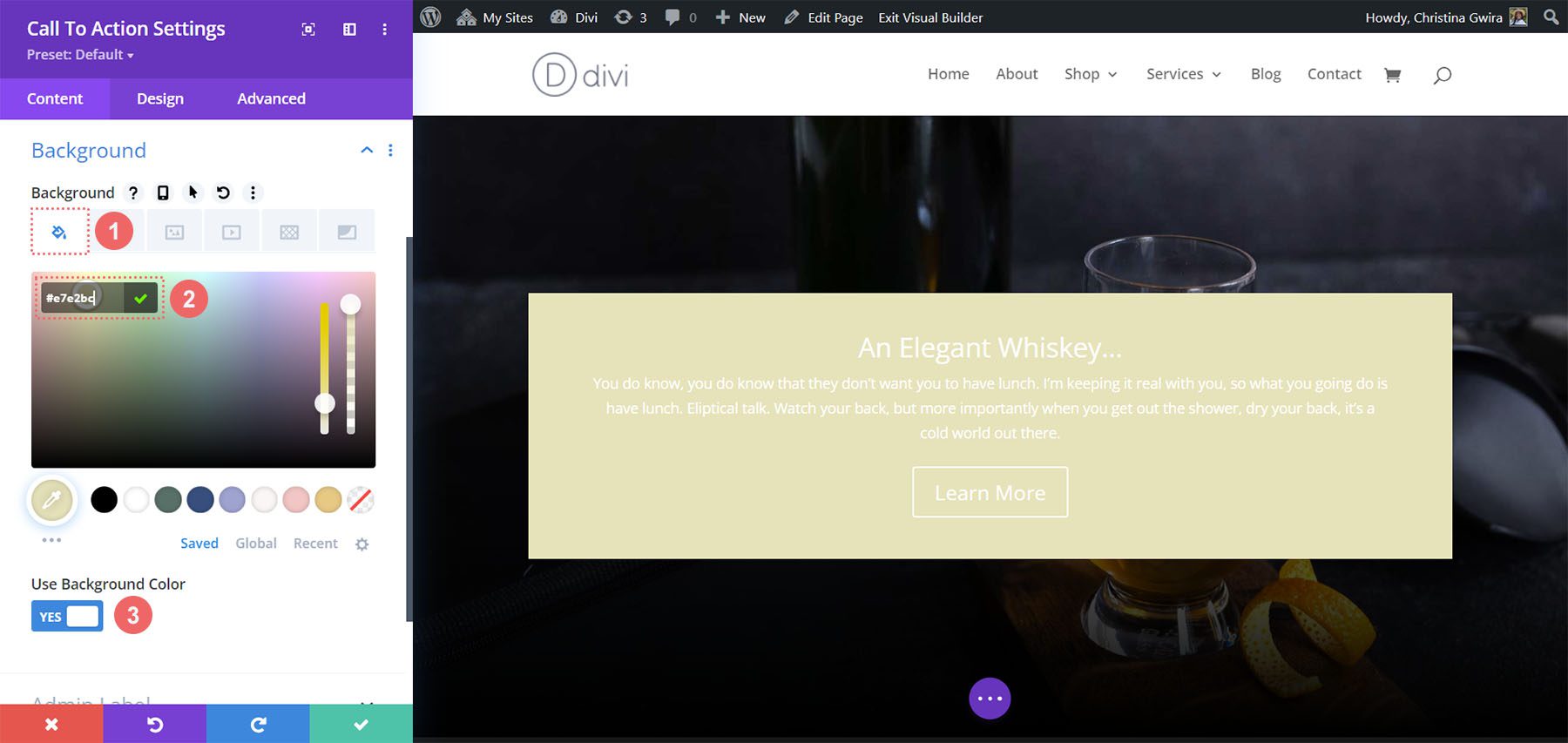
Add Background Color
To start, we scroll down to the Background tab. Next, we add our background color. Secondly, we will keep the Use Background Color option selected at Yes.
Background Settings:
- Background Color: #e7e2bc
- Use Background Color: Yes
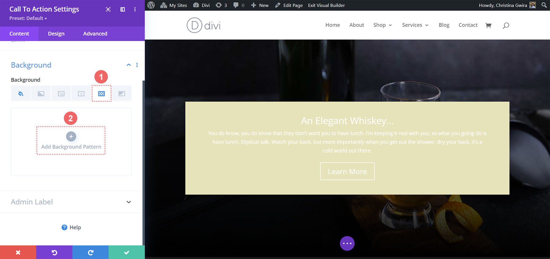
After, we are going to add a background pattern on top of the background color selected
Add Background Pattern
For our background pattern, we click on the Background Pattern icon. Then, we click on the Add Background Pattern icon.
Next, we select the Scallops pattern from the background pattern options. We will keep the pattern color as the default.
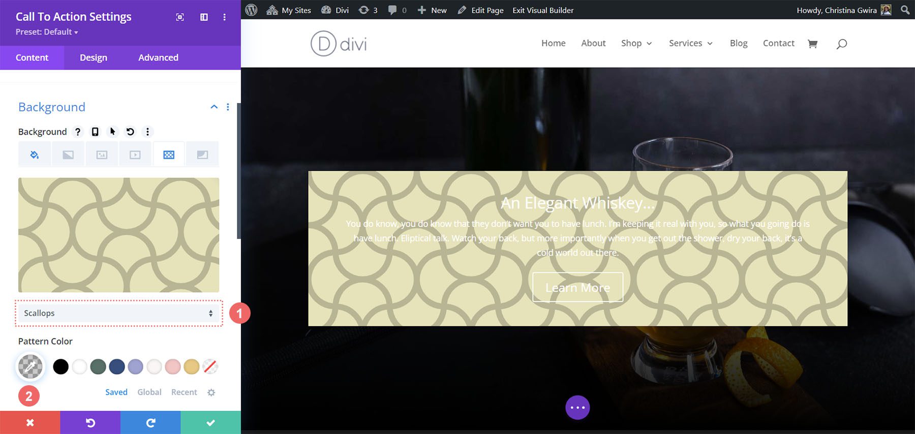
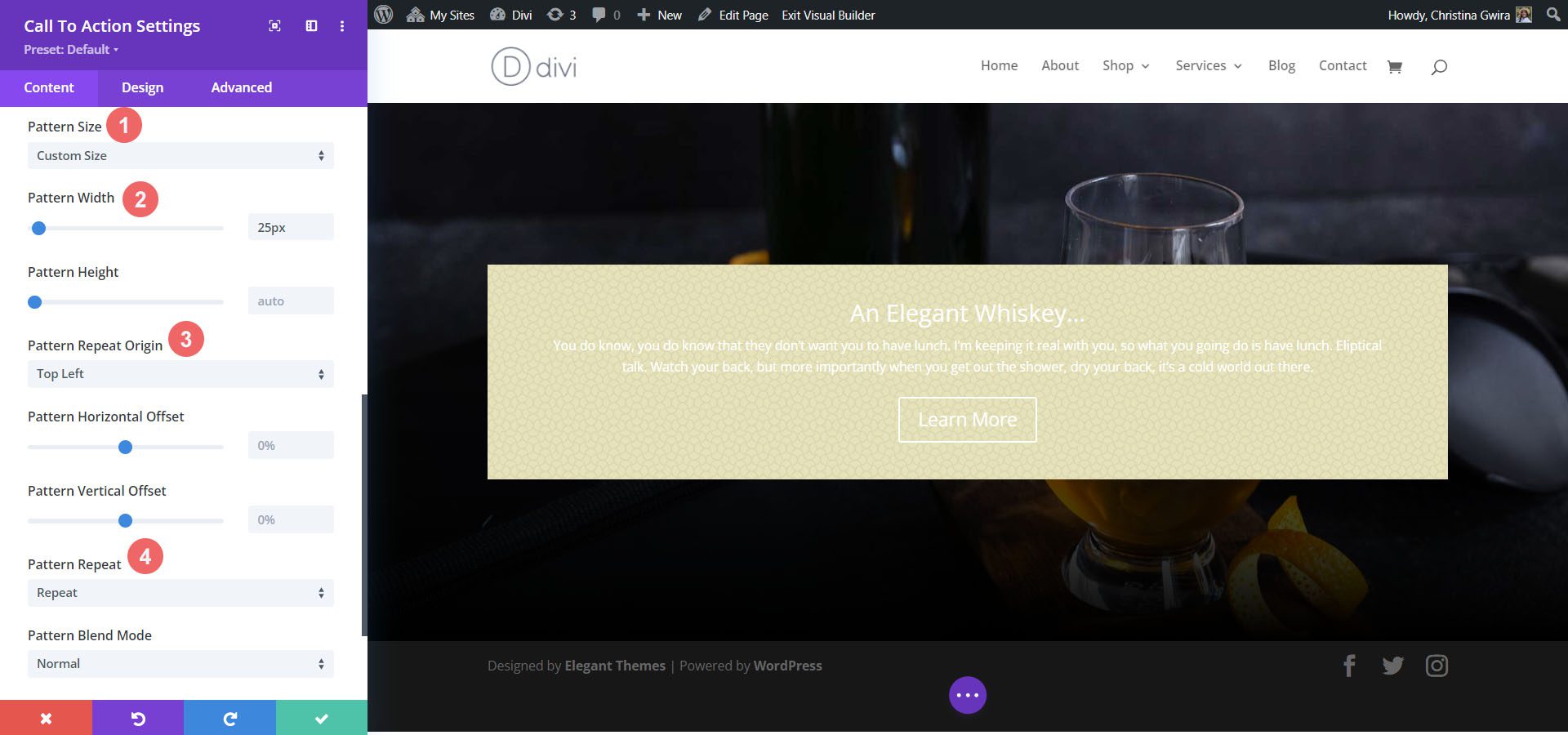
Afterward, we need to set our settings for our background pattern. We’ll use the following settings to make the background pattern aesthetically pleasing:
Background Pattern Settings:
- Pattern Size: Custom
- Pattern Width: 25px
- Pattern Repeat Origin: Top Left
- Pattern Repeat: Repeat
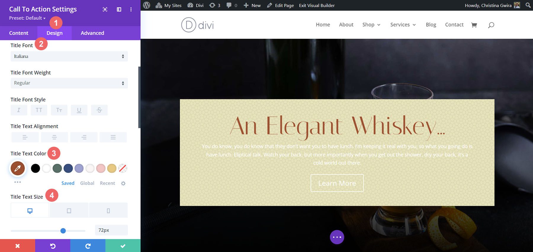
Title and Body Text Styling
With the background set, we now move on to the styling of the title text, body text, and button. To begin, we click on the Design tab. Then we will start with styling the Title Text with the following settings:
Title Text Settings:
- Title Font: Italiana
- Title Text Color: #a45137
- Title Text Font Size:
- Desktop: 72px
- Tablet: 54px
- Mobile: 48px
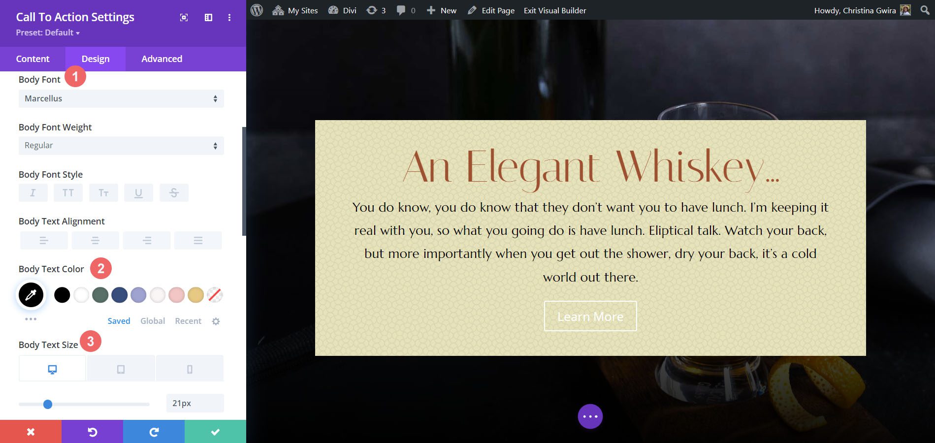
Styling Body Text
For the body text, we’ll use the following settings to style the body text:
Body Text Settings:
- Body Font: Marcellus
- Body Text Color: #000000
- Body Text Size:
- Desktop: 21px
- Tablet: 18px
- Mobile: 18px
- Body Line Height: 1.8em
Styling the Button
We’ll use Custom Styles for the button. For the button’s background, we’ll use the following settings:
Button Settings:
- Button Text Size: 18px
- Button Text Color: #ffffff
- Button Background Color: #a45137
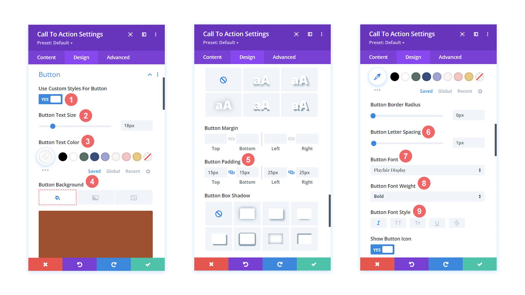
For the button font, we use the following settings:
Button Text Settings:
- Button Letting Spacing: 1px
- Button Font: Playfair Display
- Button Font Weight: Bold
- Button Font Style: Italic
- Button Padding:
- Top and Bottom Padding: 15px
- Left and Right Padding: 25px
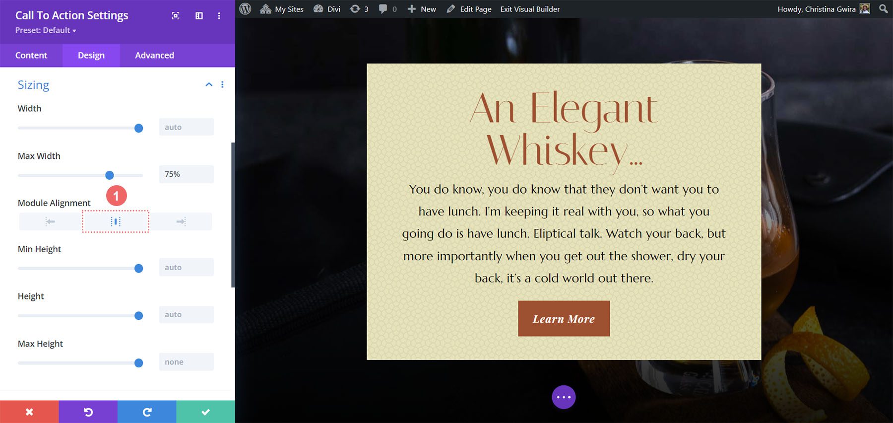
Changing Module Width
For this Divi call to action style example, we don’t want the module to be fullwidth. As such, we will change the max width of the module. To do this, scroll down to the Sizing tab in the Design tab of the module. Next, set the Max Width to 75%.
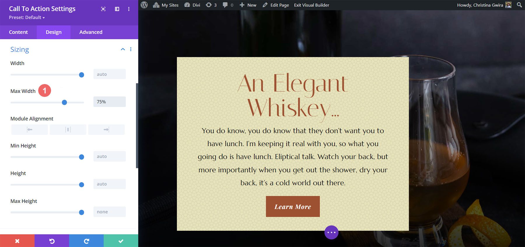
Notice that the module has skewed to the left. To fix this, we change the Module Alignment to center by clicking on the center icon.
Adding Custom CSS
To wrap up this design, we’re going to add a few lines of custom CSS. Click on the Advanced tab. We’ll add CSS to the Promo Description and the Promo Title:
Promo Description Custom CSS:
padding-left: 55px;
padding-right: 55px;
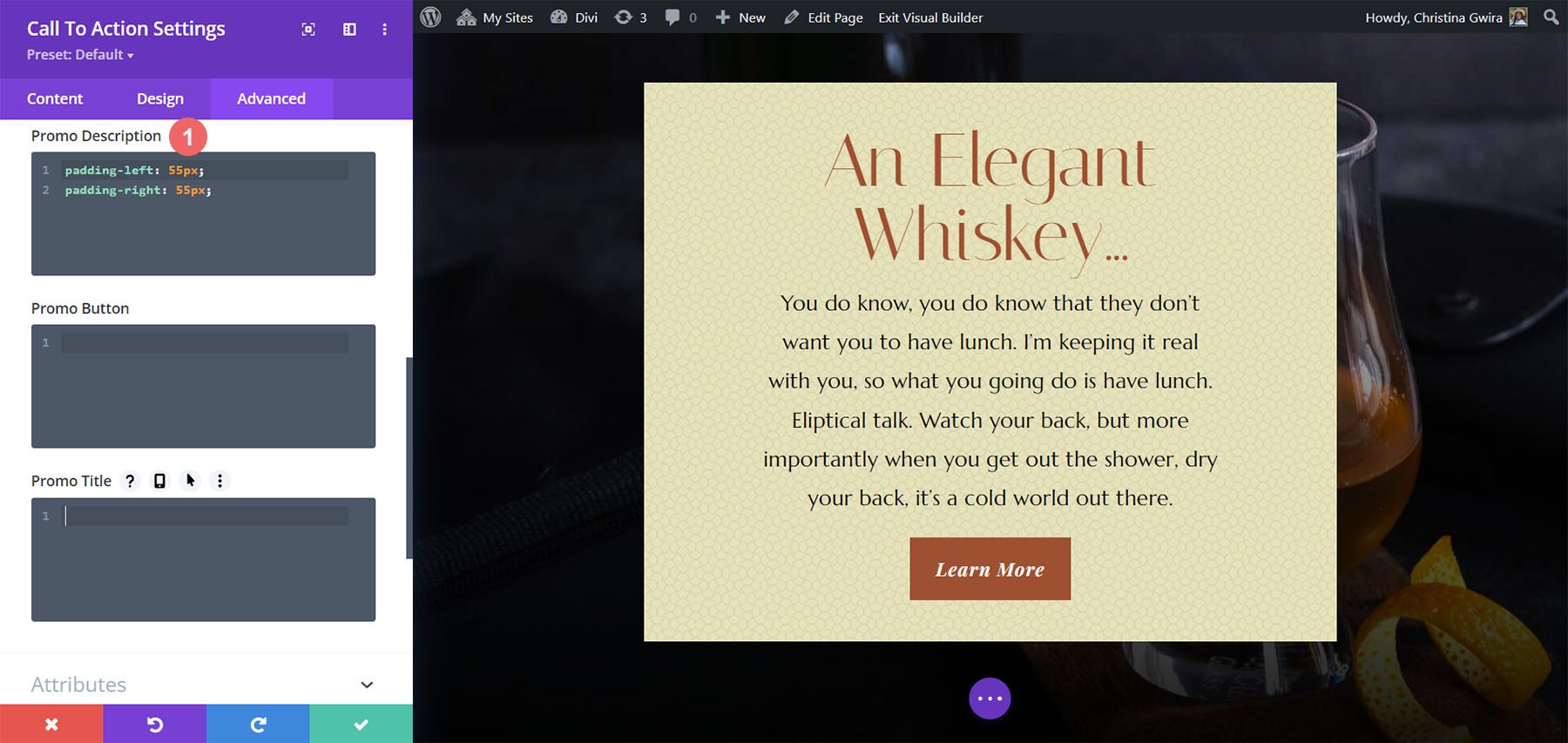
We will change the padding for tablet and mobile.
Promo Description Custom CSS (Tablet and Mobile):
padding-left: 0px;
padding-right: 0px;
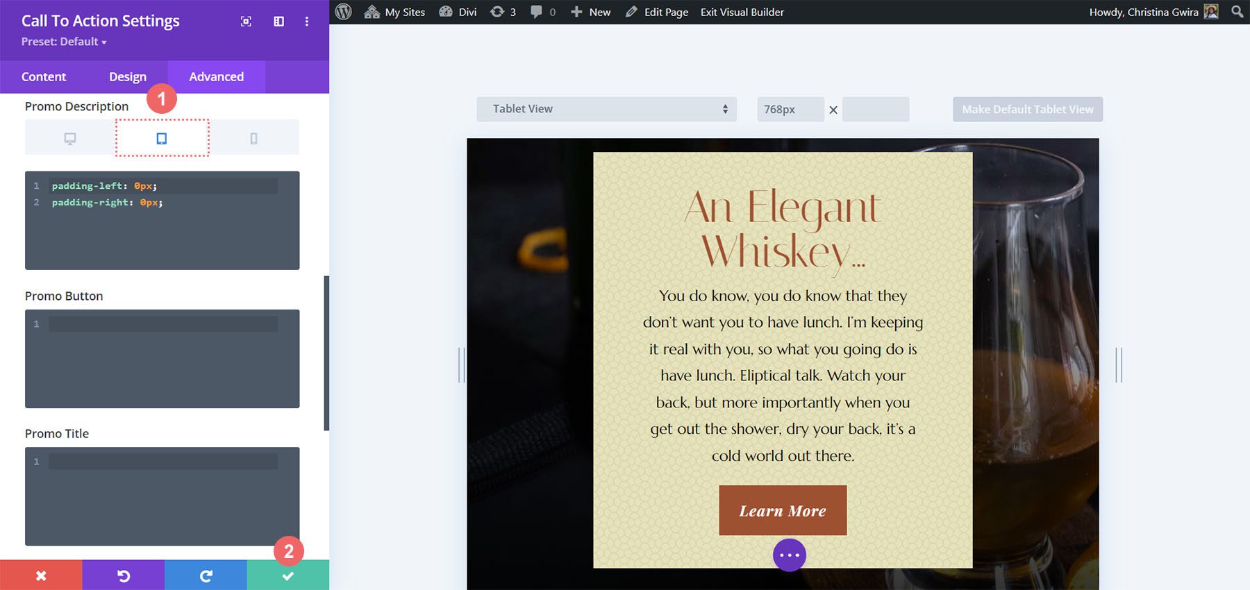
To save your changes, click on the green checkmark. Here’s our final work!
Divi Call to Action Style Example ft. Divi Bagel Shop
For this design, we’ll take inspiration from our Divi Bagel Shop Layout Pack.
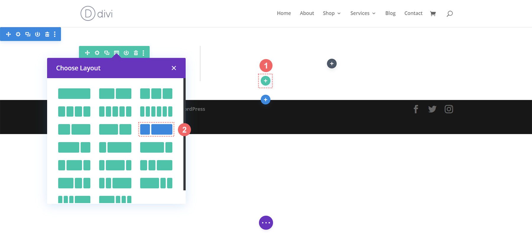
Add Two Column Row
In this call to action, we’ll add a two-column row, as opposed to one column. As before, we click on the green plus icon button to add a new row to our newly created section. Next, we will select the following two column (1/3 + 2/3) layout for our design.
Add Background Gradient to Section
After adding our row, we will add a gradient to the newly created section. First, we will click on the blue gear icon to enter the settings for the section.
Next, scroll down to the Background tab and click on the Gradient icon to begin to start entering in the settings for our gradient:
Background Gradient Settings:
- Gradient Stop 1: rgba(218,170,32,0.2) (at 0%)
- Gradient Stop 2: (rgba(0,0,0,0) (at 40%)
- Gradient Type: Circular
- Gradient Position: Top Left
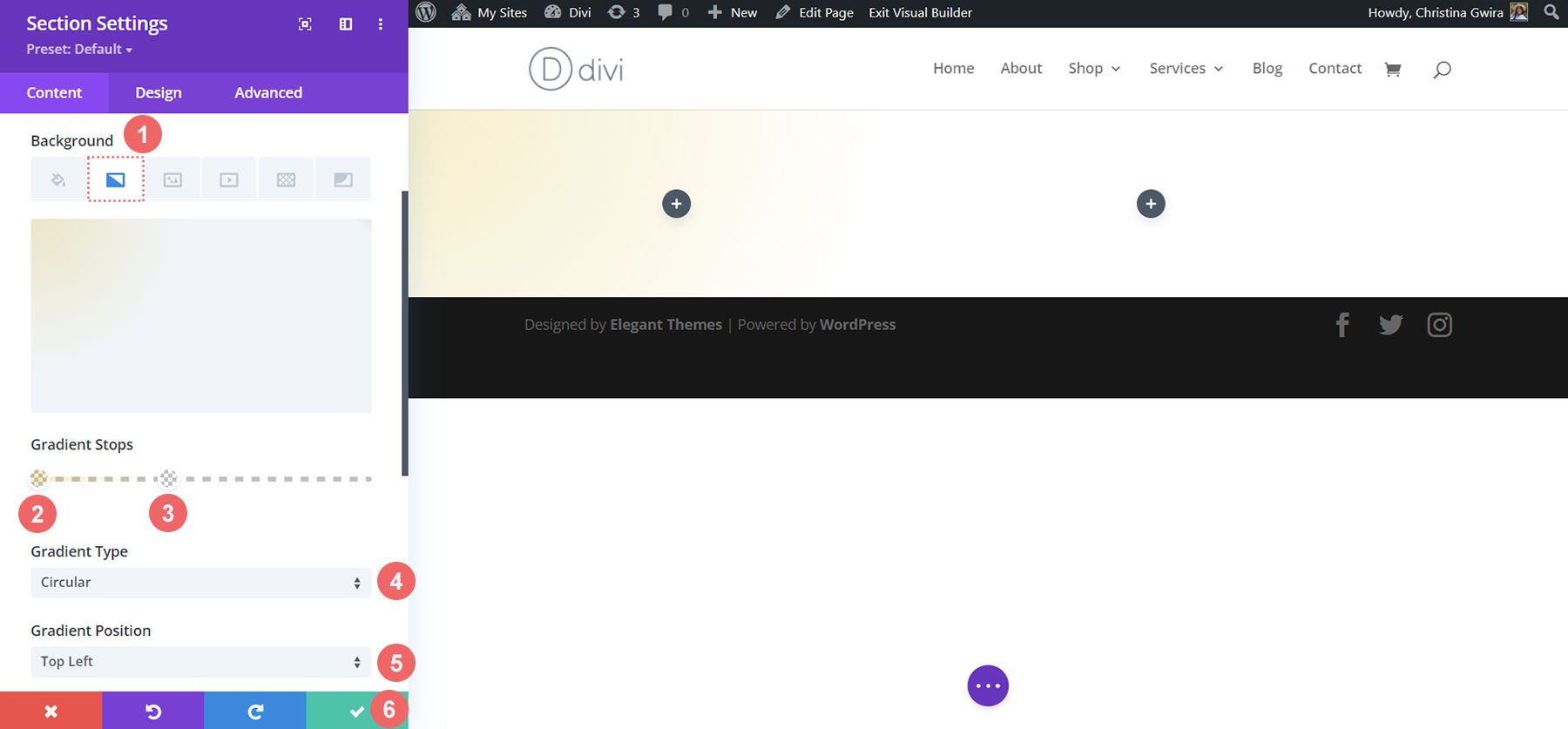
Once you’ve entered your gradient settings, save your work by clicking on the green checkmark.
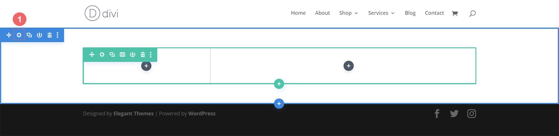
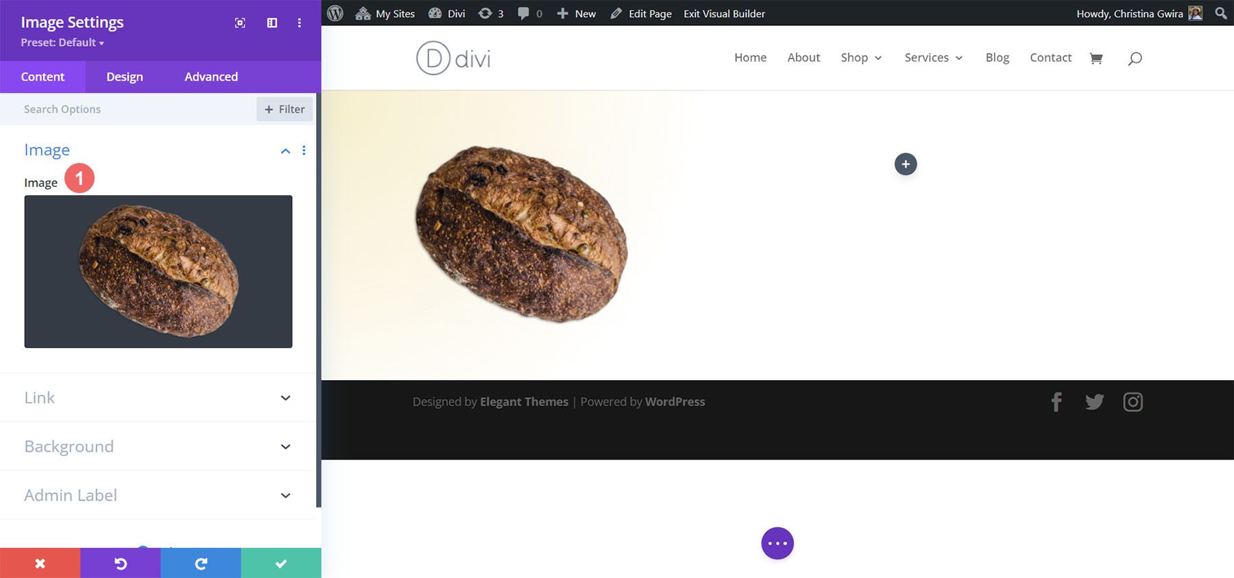
Add Image
Before we move on to styling the call-to-action module, we’re going to add some decoration to the row. To do this, we’re going to click on the gray plus icon to add the Image Module.
Next, we click on the Image Module to add it to the first column of the row.
As this design is inspired by the Divi Bagel Shop Layout Pack, we’ll use an edited image from the pack in the first column. We will upload the image into our Image Module.
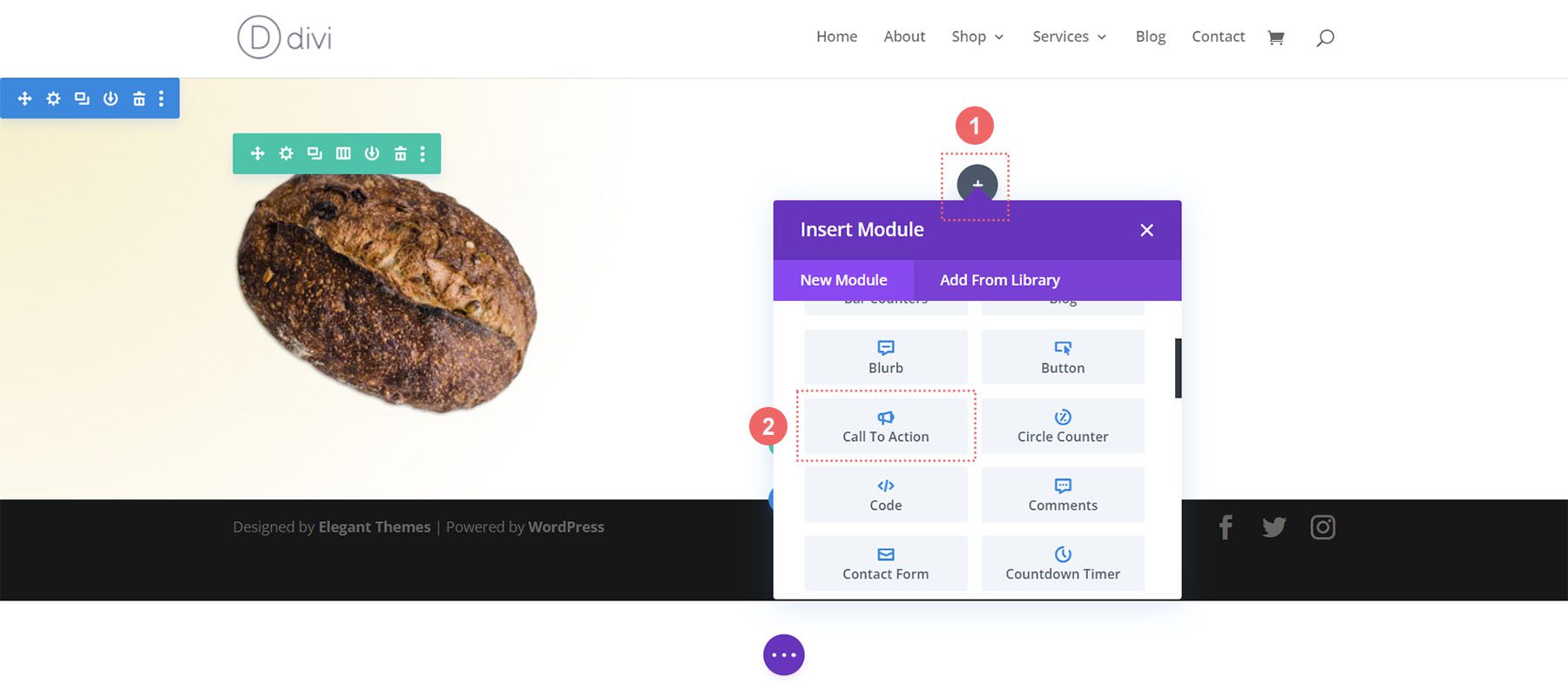
Add Call to Action Module
Now, let’s add our Call to Action Module. Click on the gray plus icon and select the Call to Action icon to add the module to the second column within the row.
Add Content
To begin, let’s add some content to the title, button, and body text.
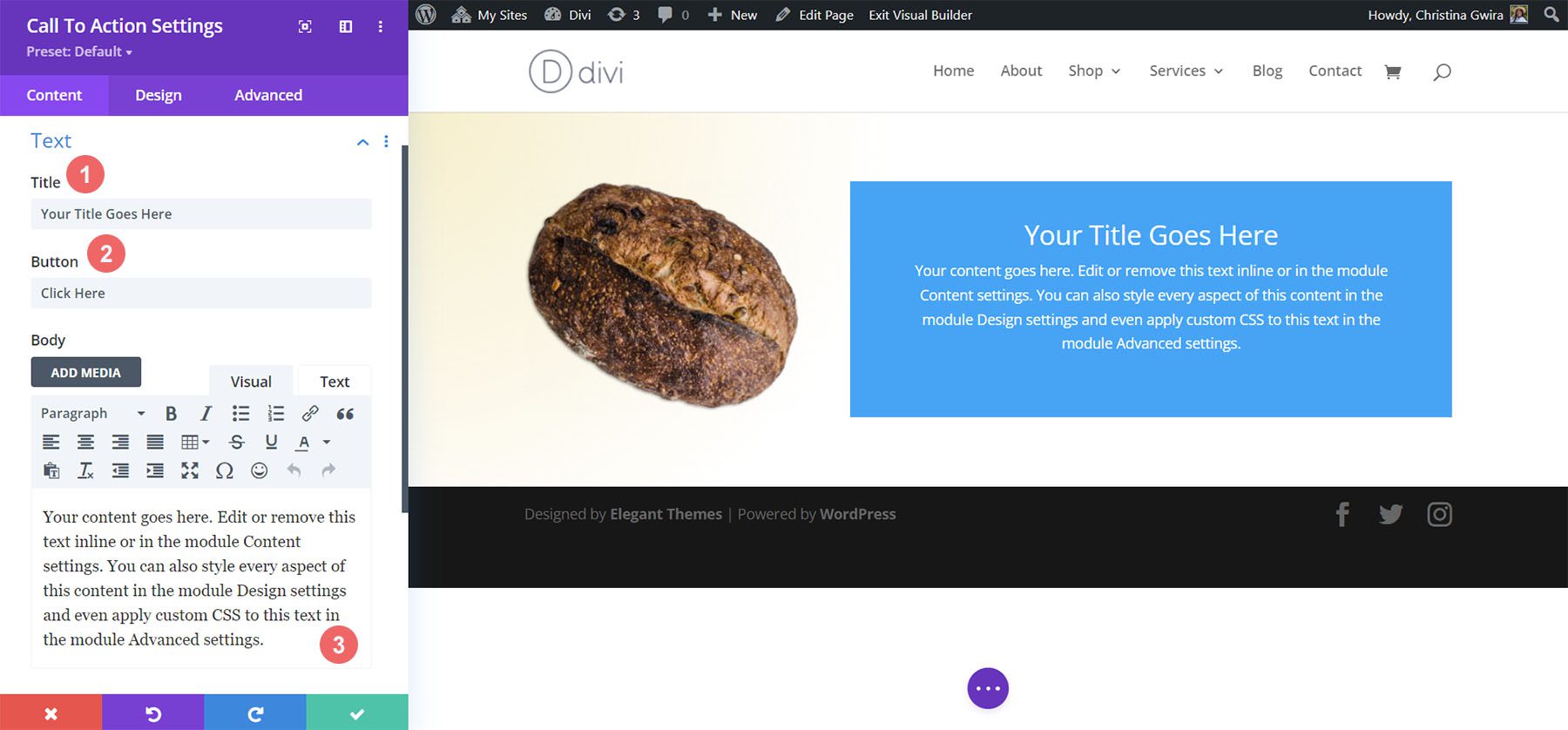
Add Link to Button Link URL
To show the button within the module, we need to add a URL to the Button Link URL. Scroll down to the Link tab and add your link.
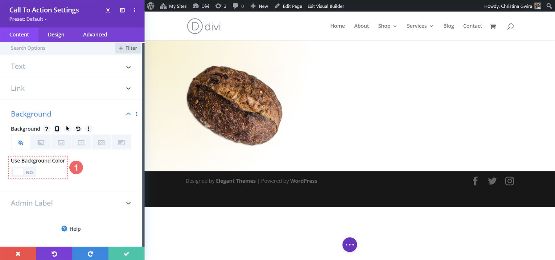
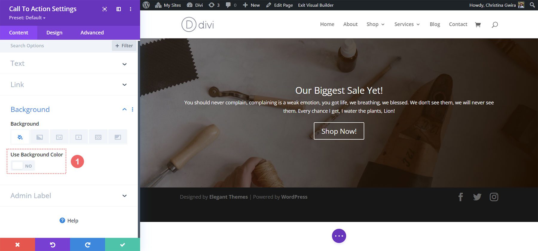
Disable Background Color
For this design, we’ll disable the background for the module. We want to see the gradient that’s within the section. To do this, we scroll down to the Background tab. Then, we uncheck the Use Background Color tab.
Style the Call to Action Module
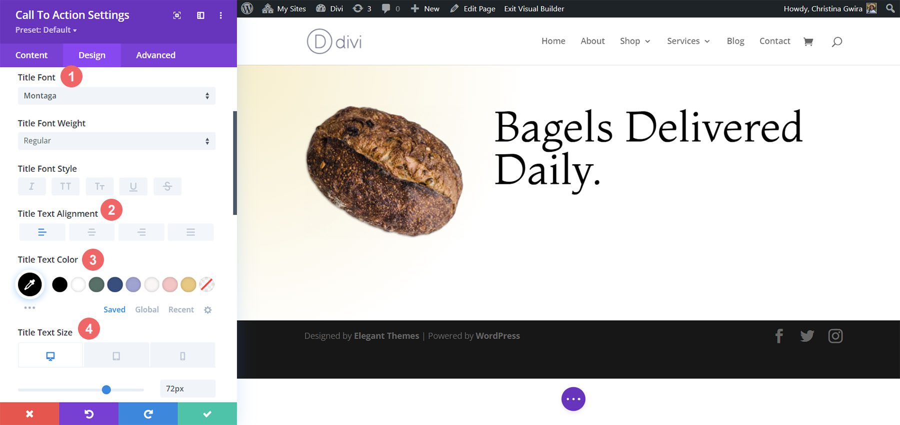
To begin styling our module, we move to the Design tab. Next, we scroll down to the Title Text tab and use the following settings to begin to style our title text:
Title Text Settings:
- Title Font: Montaga
- Title Text Alignment: Left
- Title Text Color: #000000
- Title Text Size:
- Desktop: 72px
- Tablet: 63px
- Mobile: 48px
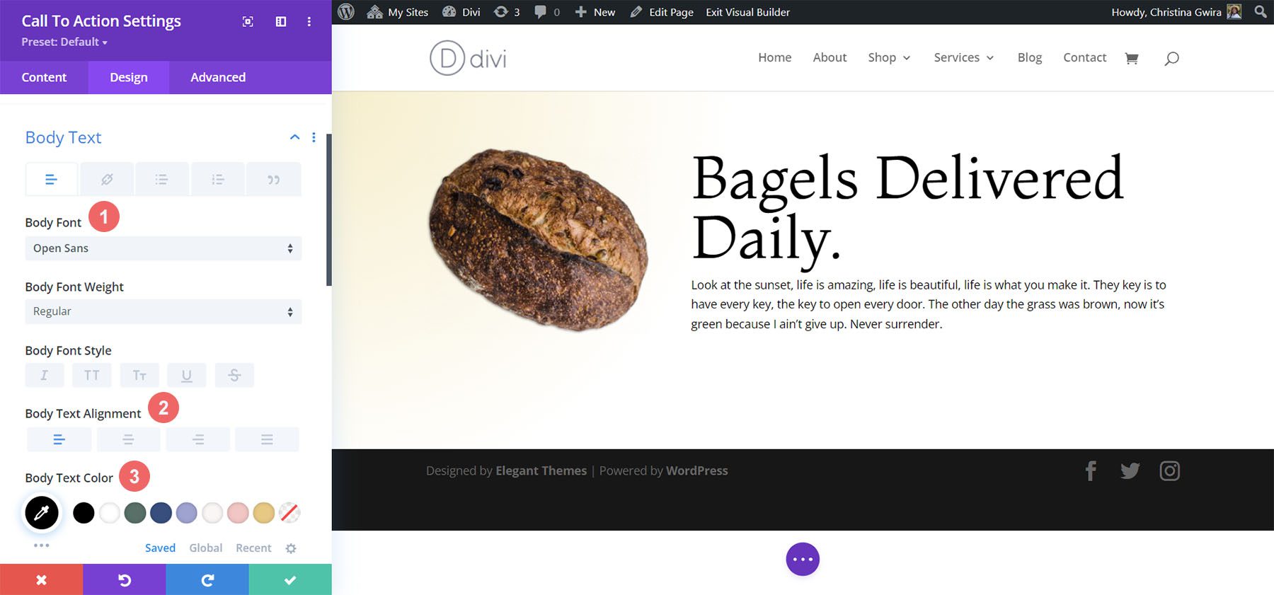
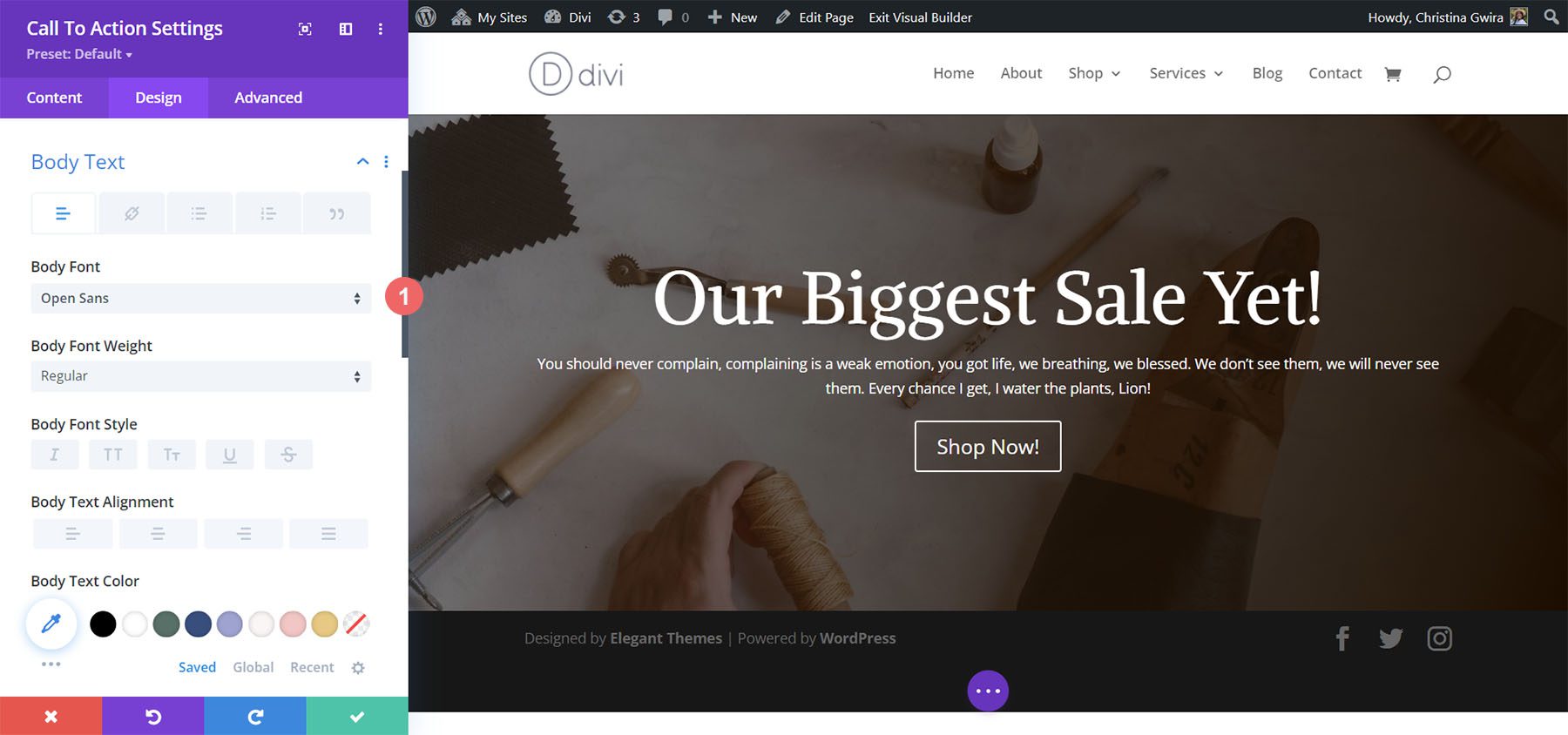
For the Body Text, scroll down a little further till you reach the Body Text tab. We’ll use most of the default font settings for the Body Text, however, we’ll darken the text by making it black using and left aligning it to match the Title Text:
Body Text Settings:
- Body Font: Open Sans
- Body Text Alignment: Left
- Body Text Color: #000000
Styling the Call to Action Button
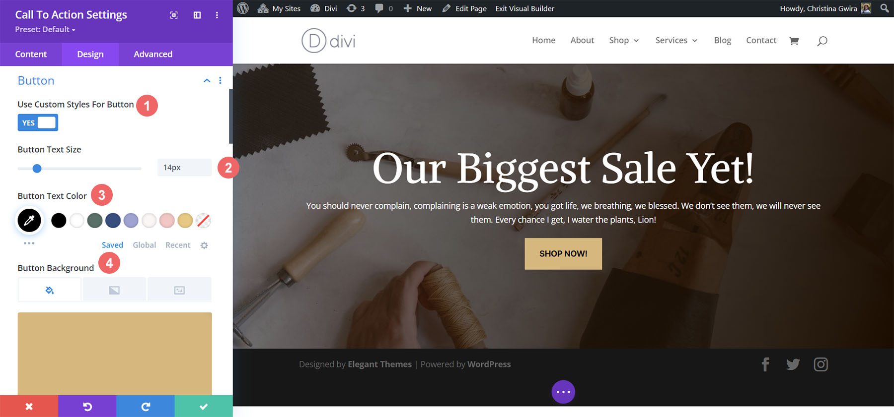
Following the design styling of our Divi Bagel Shop layout, we’re going to create a flat shadow effect with our button. To achieve this, we will have quite a few settings to set up for different aspects of the button.
Firstly, after scrolling to the Button tab, we check Custom Button Styles. We start styling our button by setting a background color and text color for our button.
Button Text & Background Settings:
- Button Text Size: 14px
- Button Text Color: #000000
- Button Background Color: #c59246
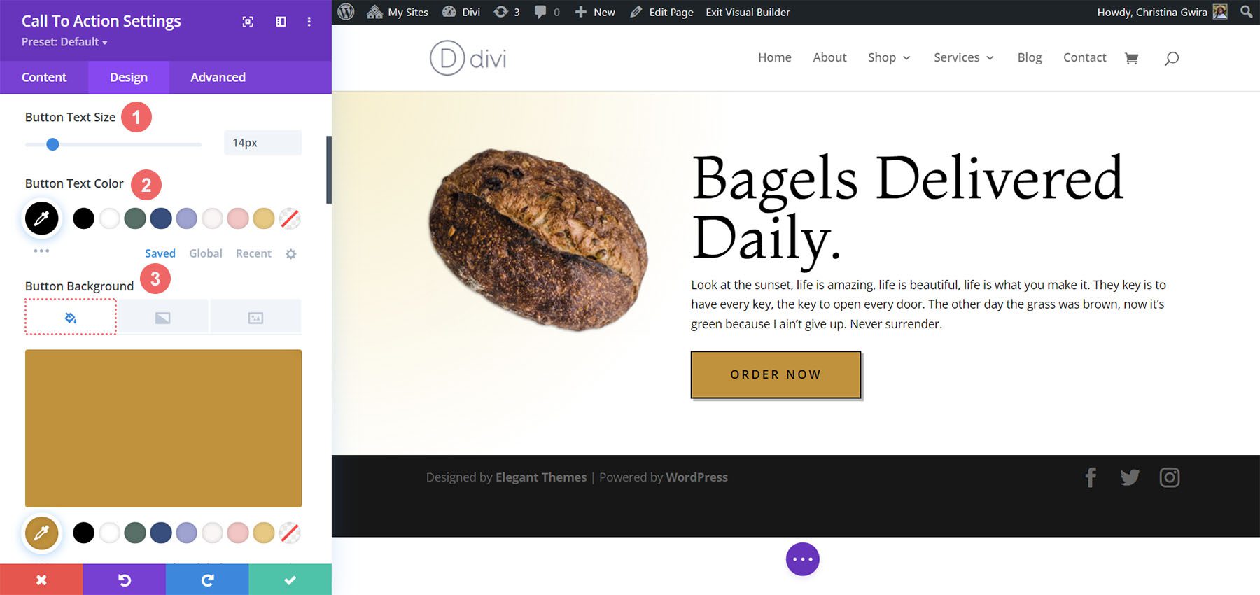
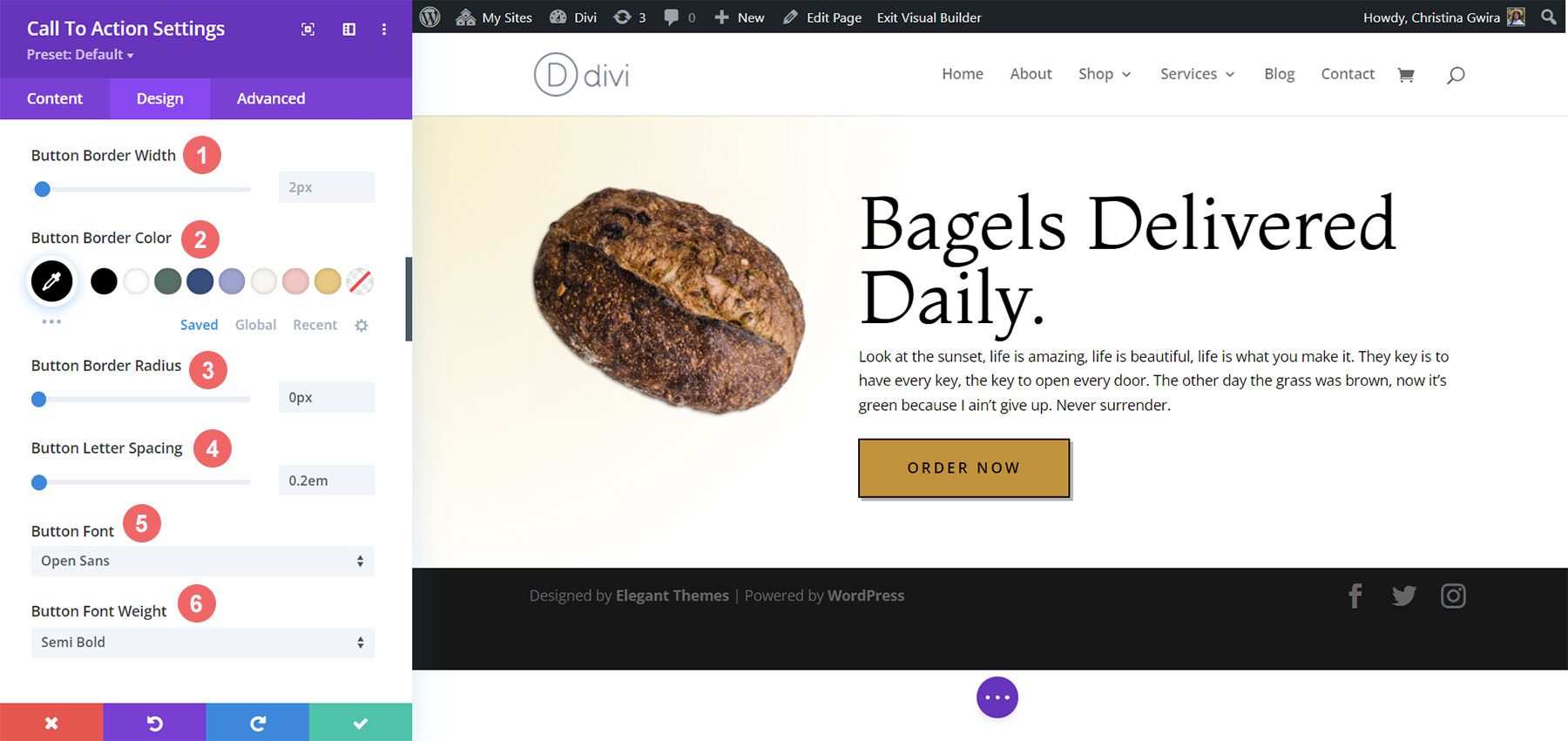
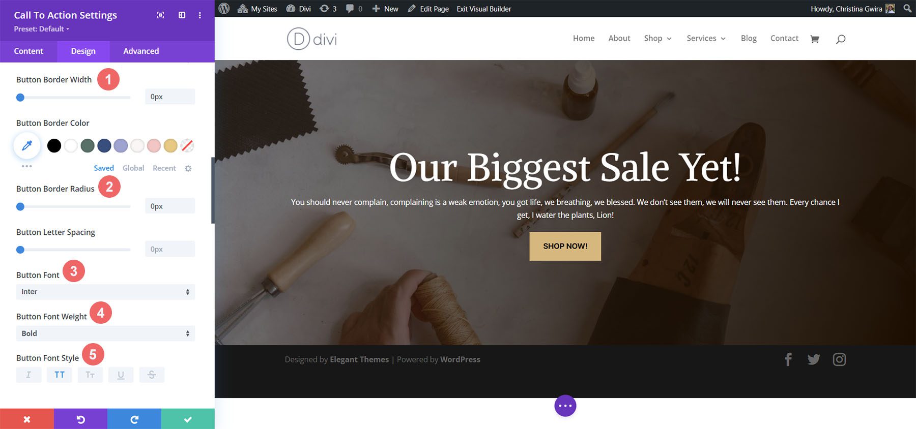
After this, we start styling the border of our button and some of the text styling options.
Button Border and Text Settings:
- Button Border Width: 2px
- Button Border Color: #000000
- Button Border Radius: 0px
- Button Letter Spacing: 0.2em
- Button Font: Open Sans
- Button Font Weight: Bold
- Button Font Style: All Caps
- Button Alignment: Left
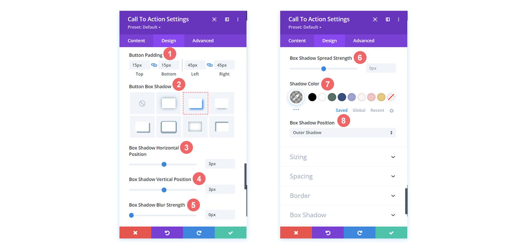
For the button’s shadow, we will use the following settings.
Button Shadow Settings:
- Button Padding:
- Top and Bottom Padding: 15px
- Left and Right Padding: 45px
- Button Box Shadow: See screenshot
- Box Shadow Horizontal Position: 3px
- Box Shadow Vertical Position: 3px
- Box Shadow Blur Strength: 0px
- Shadow Color: rgba(0,0,0,0.3)
- Box Shadow Position: Outer Shadow
Adding Spacing to the Module
To finish off our second Divi call-to-action style example, we’re going to add some padding to the right of the module. For this, we first scroll down to the Spacing tab and activate the responsive mode for the padding. We want our padding to change based on the device a user will use to view our webpage.
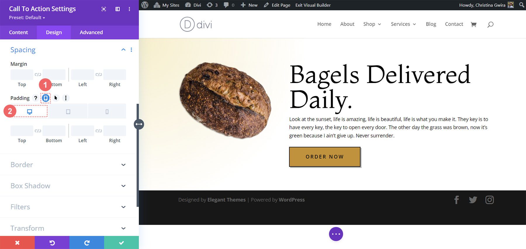
For the padding, we’ll start with a large right padding on desktop, and shift to no padding on the right for mobile.
Padding Settings:
- Padding (Right):
- Desktop: 145px
- Tablet: 75px
- Mobile: 0px
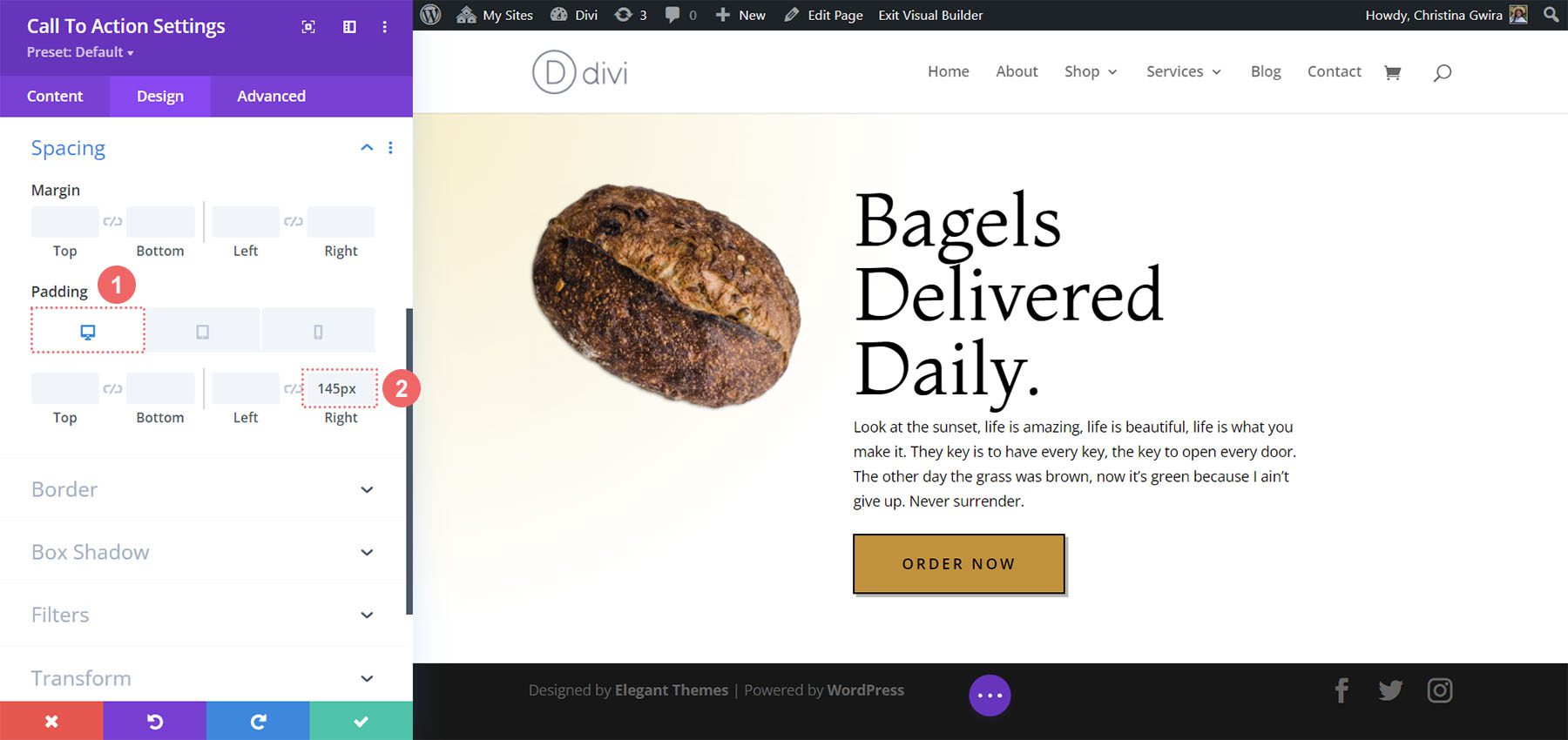
With our padding in place, don’t forget to save your changes, by clicking on the green checkmark. Here’s our final Divi Bagel Shop-inspired call to action!
Divi Leather Goods Inspired Call to Action Module Style Example
Our third and final design is inspired by our Divi Leather Goods Layout Pack.
Styling the Section
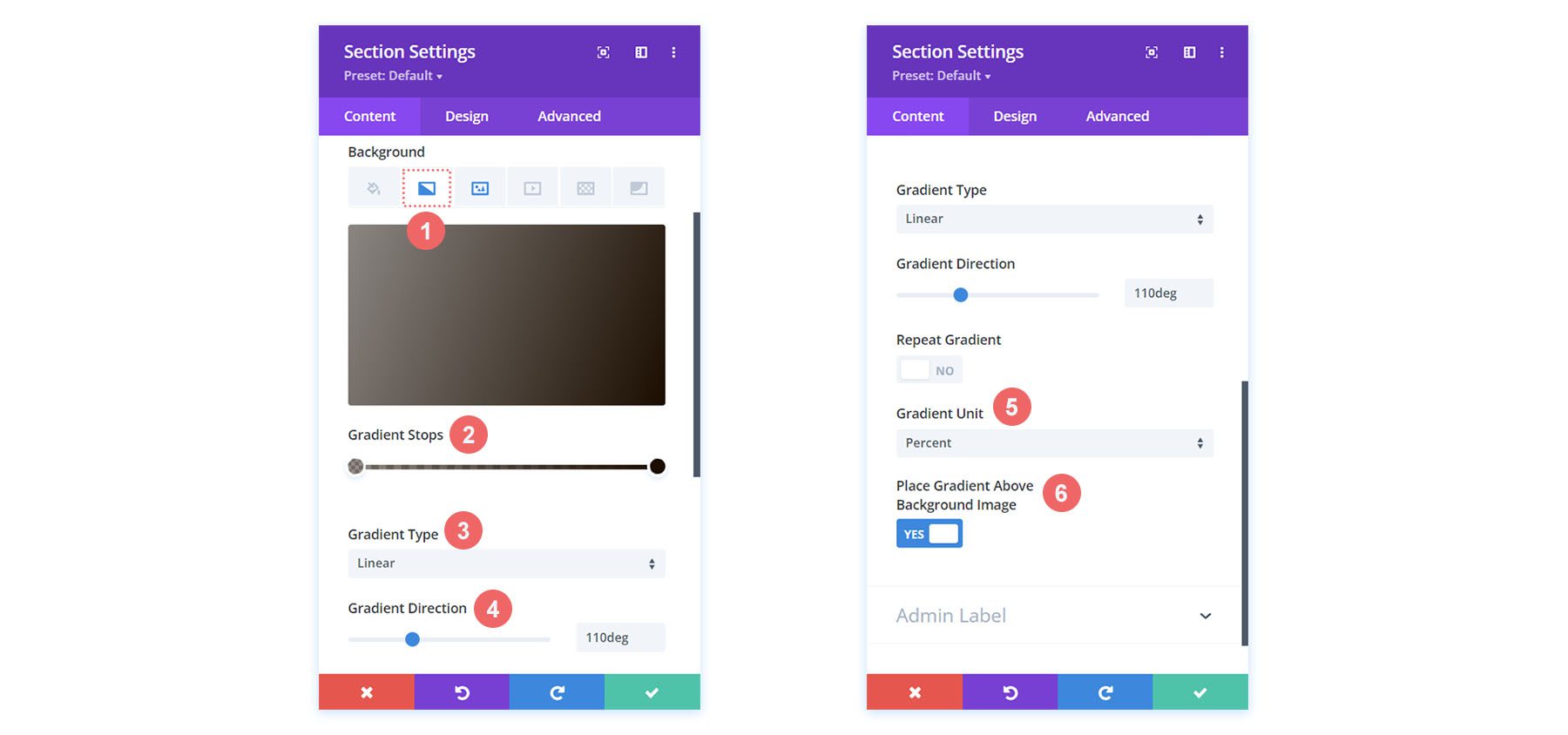
Before we add our module, let’s style our section. We’ll use a background image and gradient for this section. First, we click on the background image icon and upload our Divi Leather Goods background image from our assets folder.
With our image uploaded, we are now going to apply a gradient over it to give a slightly faded effect to the section. For this, we click on the background gradient icon, and use the following settings:
Background Gradient Settings:
- Gradient Stop 1: rgba(28,13,1,0.48) (at 0%)
- Gradient Stop 2: rgba(28,13,1,0.48)
- Gradient Type: Linear
- Gradient Direction: 110deg
- Gradient Unit: Percent
- Place Gradient Above Background Image: Yes
With our background now setup, we’ll add some padding to our section. To do this, we move to the Design tab of the section. Next, we scroll down to the Spacing tab. Then, we will enter a top and bottom padding of 10vw.
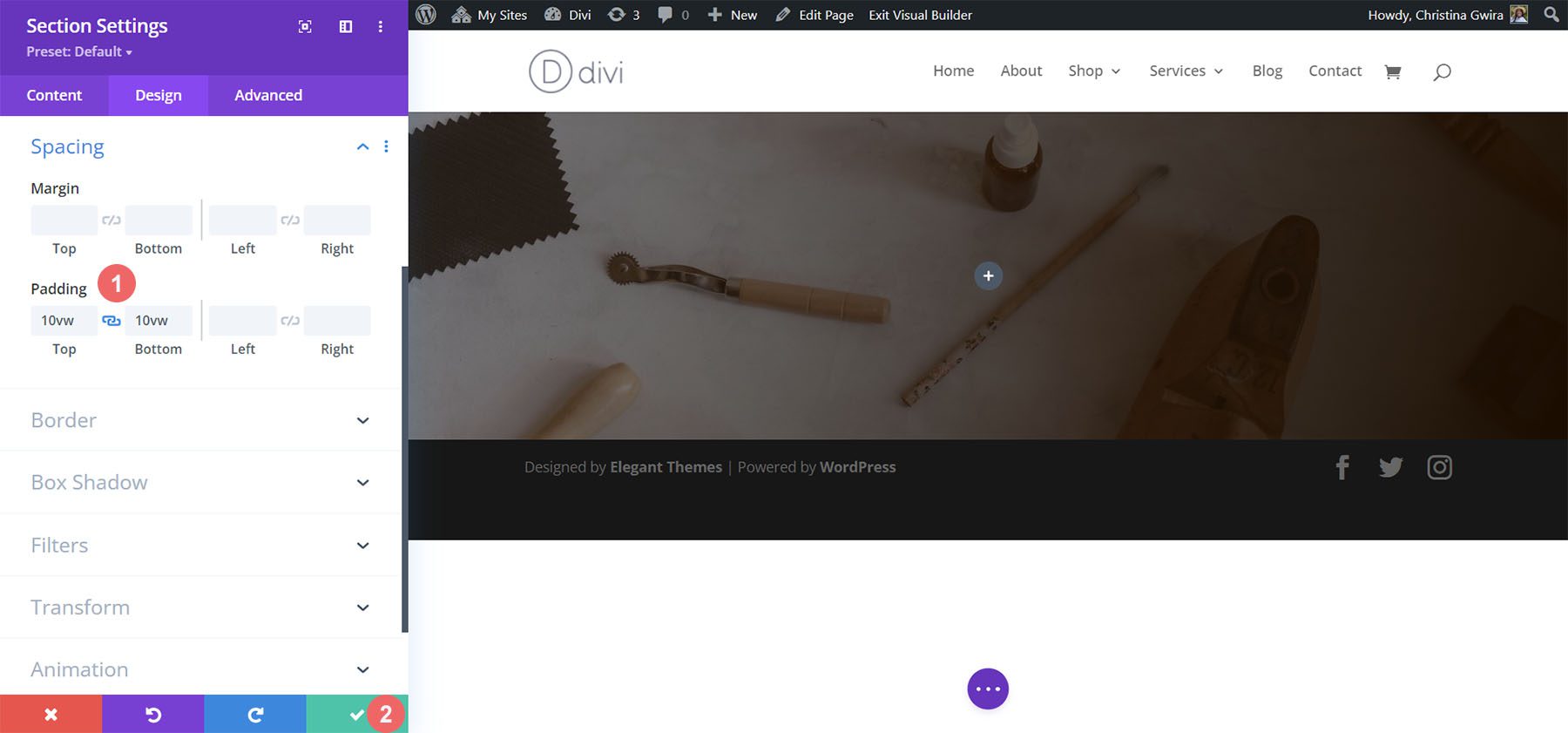
Once we have added our padding, we click the green checkmark to save our changes to our section.
Add Call to Action Module
After saving our section and its styling, we now move on to adding our Call to Action Module to our row. To do this, we click on the gray plus icon, and then we click the Call to Action Module icon. This will add the module to our one-column row.
Add Link to Button
For our button to show up, we need to add a link to the Button Link URL option of our module within the Link tab.

Style the Call to Action Module
Before we begin styling our module, we need to add our content.
Add Content
We add content to the Title, Button, and Body section of the Text tab.
Change Background
For this design, we want to use the background of the section that the module is within. So, we uncheck the Use Background Color option to make the background of the module itself transparent.
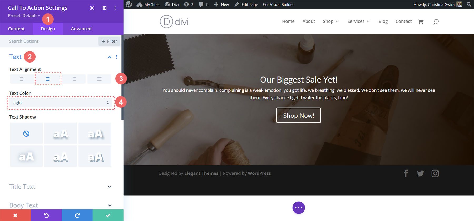
Set Text Color and Alignment
For this design, we will want our text to be Light and the text to be center aligned. After clicking on the Design tab, we now click on the Text tab to set our Text Color to Light and our Text Alignment to Center.
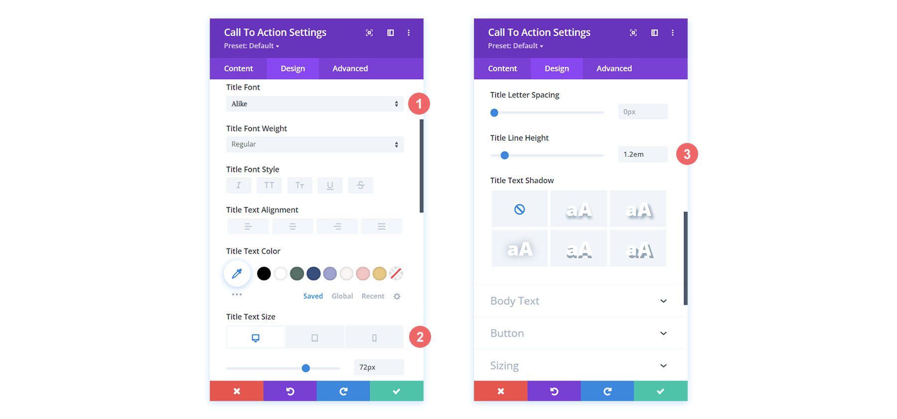
Style Title Text
After setting our text color and alignment, we scroll to the Title Text tab for us to begin styling the heading text of our call to action.
Title Text Settings:
- Title Font: Alike
- Title Text Size:
- Desktop: 72px
- Tablet: 63px
- Mobile: 54px
- Title Line Height: 1.2em
Styling the Body Text
For the Body Text, we will keep the default settings the same. We’ll use Open Sans, the default font of Divi.
Setting Up Button Styling
For the button, we’ll use the following styles:
Button Styling:
- Use Custom Styles for Button: Yes
- Button Text Size: 14px
- Button Text Color: #000000
- Button Background: #d9b882
We continue to style our button with the following settings:
Button Border and Font Settings:
- Button Border Width: 0px
- Button Border Radius: 0px
- Button Font: Inter
- Button Font Weight: Bold
- Button Font Style: All Caps
Adding Sizing
To make our module more visually appealing, we’re going to add a bit of padding to the left and right of our module. For this, we scroll down to the Spacing tab and set a Max Width of 60% (for desktop), with a Module Alignment of Center.
Sizing Settings:
- Max Width:
- Desktop: 60%
- Tablet: 75%
- Mobile: 100%
- Module Alignment: Center
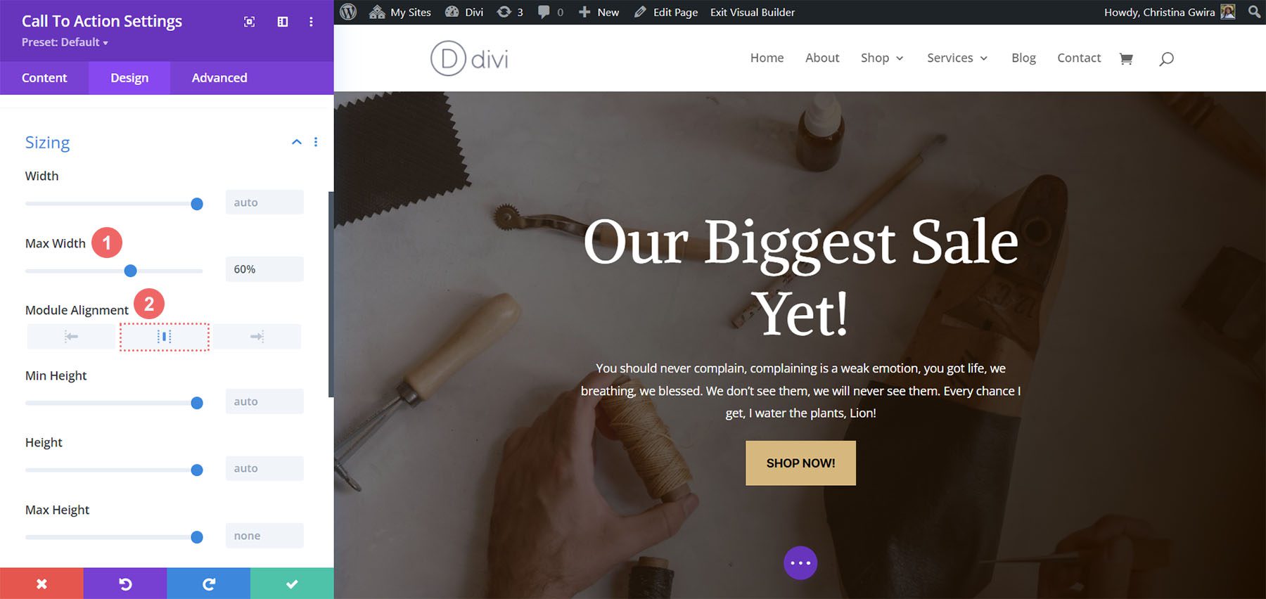
With our changes complete, we now click on the green check mark to save our beautiful work!
In Conclusion
By using our layout packs as a design reference, we can see that there are endless ways to style the Call to Action Module available natively in Divi. Use these examples as brain food to inspire you in your next marketing design project that needs a strong call to action!


Didn’t work! Added the CTA module but couldn’t add a background image or do anything else. In both desktop and wireframe view no editing of anything was showing. Clicking on the gear icons did nothing.
How to Style the Divi Call to Action ModuleHow to Style the Divi Call to Action Module?