")
When it comes to WordPress form plugins there are quite a few options to choose from. In a previous Elegant Themes tutorial I shared some CSS snippets for styling the Caldera Forms plugin. Caldera is a great free form builder plugin option, but today we’re going to be sharing some styling tips for Gravity Forms. Gravity Forms is one of the (if not the) most popular premium form builder plugins for WordPress websites.
Since this post is really a design tutorial I’m not going to go in-depth about the plugin itself, but there are already several really good posts on our blog that do that:
- Gravity Forms – A Detailed Look at the Personal Edition
- Gravity Forms: A Complete Forms Solution for WordPress
- 15 Best WordPress Contact Forms Plugins Compared
Why Style Your Forms in the First Place?
So you may be wondering why anyone would need or want to style their form from the default look in the first place. Here are just a few reasons:
- Having your forms match the look and feel of your website — While most plugin forms come with a clean look that could really fit into any website well, they tend to be very generic looking. Matching elements of your site to each other show that you are giving attention to detail and care about tying everything together on an aesthetic level.
- To give your form a more custom look — Any time you can customize parts of your website to differentiate yourself and give a bit of uniqueness the better.
- Uniqueness can show authority or skill level — If you are a web design agency or freelancer of course showing your skills on your own site shows your visitors that you are capable of some level of design customization, which in turn can lead to acquiring more clients.
- To learn! — Anytime you use CSS snippets from our blog to style any element of your site you are opening yourself up to a way to learn coding. You may not have a vested interest in that, and that’s fine, but if you do it’s great to read the comments in the CSS and learn which bits of code are controlling which part of the look on the frontend.
On to the Styling!
Subscribe To Our Youtube Channel
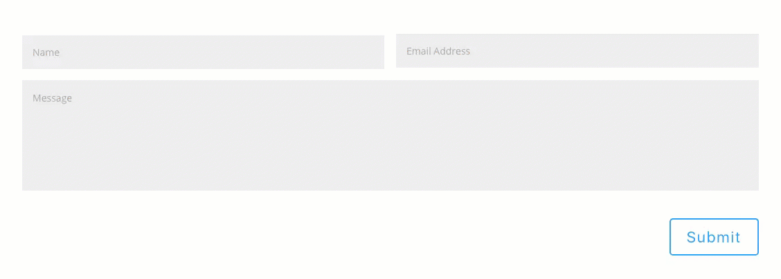
Style 1: The Divi Look
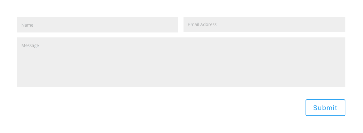
The first style we’ll be implementing is of course the Divi style. Divi has become well known for it’s clean and minimal approach to design and many users would like their forms built using a third-party plugin to look like Divi. Using our first chunk of CSS snippets this is the look you will achieve.
Pre-CSS Setup
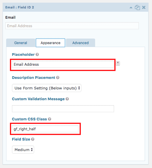
Gravity Forms is a drag-n-drop form builder so you should have your Name, Email, and Message (paragraph text) fields dragged over to the appropriate spots. Your form may look something like this in the backend:
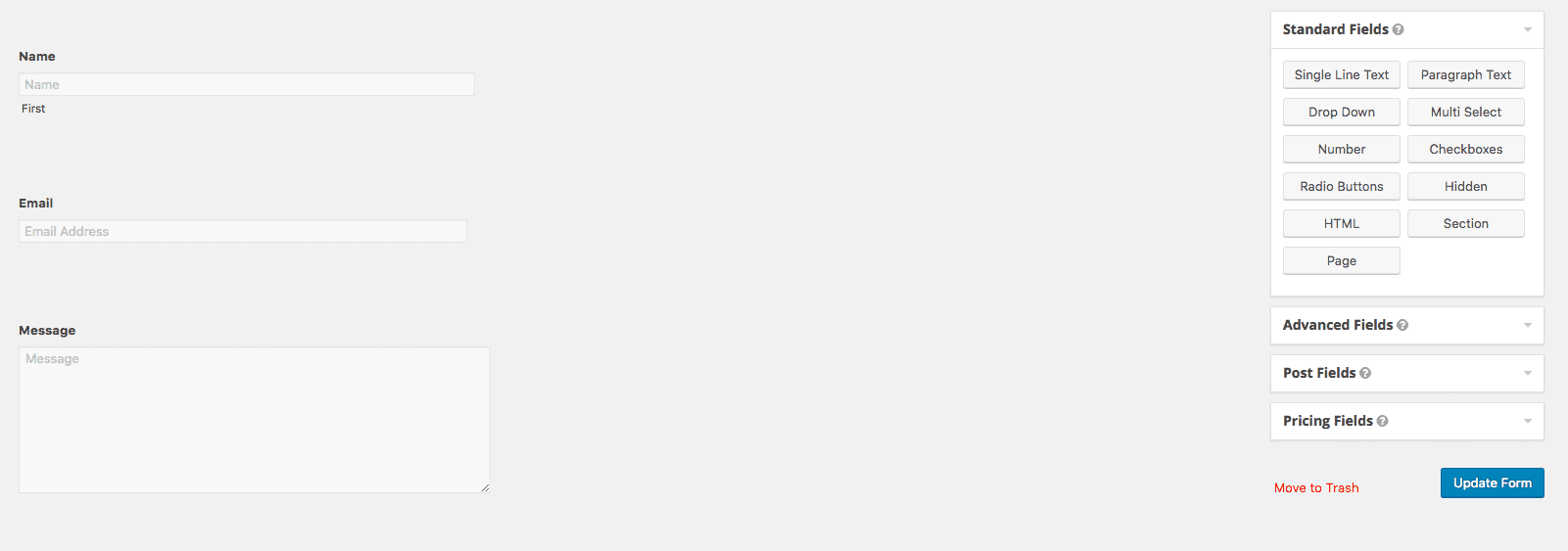
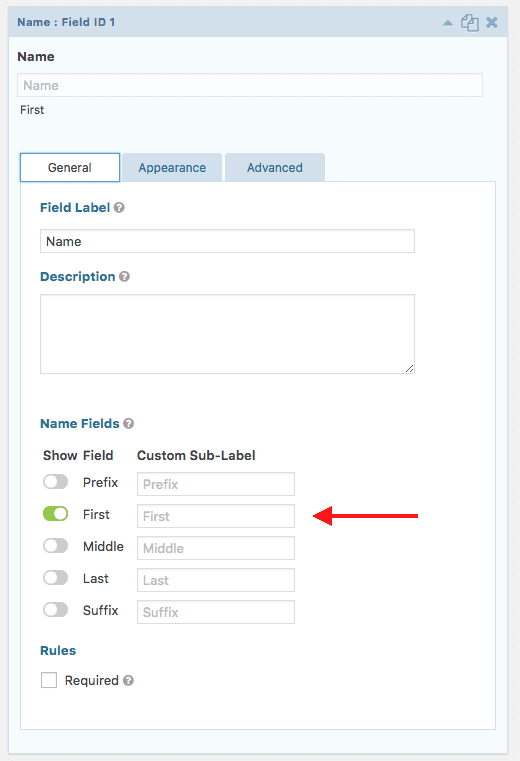
The first step at achieving this look actually comes before adding any CSS. We are going to limit the field to just one name field, so in the General tab select only the First field to show.
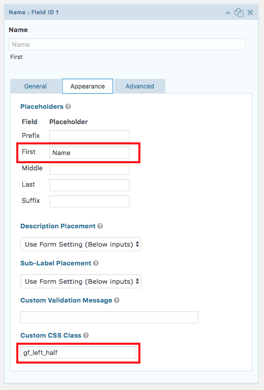
As you saw from our example image above the labels are inside the field, these are referred to as “placeholders.” So next go to the Appearance tab > enter the placeholder text you want to appear.
I’m also going to be using two of Gravity’s ready classes to make columns (by default every field is one column wide). With these I’m telling the form what goes into a left column and what field goes into a right column. Since I want the name on the left I’m entering the class “gf_left_half” into the Custom CSS Class field.
I’m going to do the same with the email field but this time I want it in a right column, so I’ll use the class “gf_right_half”
The CSS Code
The following goes in your Divi Options > Custom CSS box (at the bottom of the page) or your child stylesheet.
/*** REMOVE LABEL ON FIELDS USING PLACEHOLDER ***/
.gform_wrapper .top_label .gfield_label,
.gform_wrapper .field_sublabel_below .ginput_complex.ginput_container label {
 display: none;
}
/*** FIELD STYLING ***/
input[type=text],
textarea {
 background: #eee;
 border: none;
 border-radius: 0;
 color: #999 !important;
 padding: 15px !important;
}
/*** BUTTON STYLING ***/
.gform_wrapper .gform_footer input.button {
 float: right;
 background: transparent;
 border: 2px solid #2ea3f2;
 font-size: 22px;
 color: #2ea3f2;
 padding: 12px 23px;
 border-radius: 5px;
 letter-spacing: 2px;
 cursor: pointer;
}
/*** BUTTON HOVER STYLING ***/
.gform_wrapper .gform_footer input.button:hover {
 background: rgba(0, 0, 0, 0.05);
 border: 2px solid transparent;
}
You should now have a simple contact form (or whatever kind of form you’ve built) that has that memorable Divi look!
Bonus Styles Using the Elegant Themes Icon Font and More!
I’m going to also give some more CSS snippets to achieve two additional looks. The point of these snippets is to have a jumping off point, so even if you only know how to change the color of the font and background color sometimes that’s all you really need.
As with the first example all CSS code can either go inside Divi’s Custom CSS Panel in the Theme Options or in your child theme’s stylesheet.
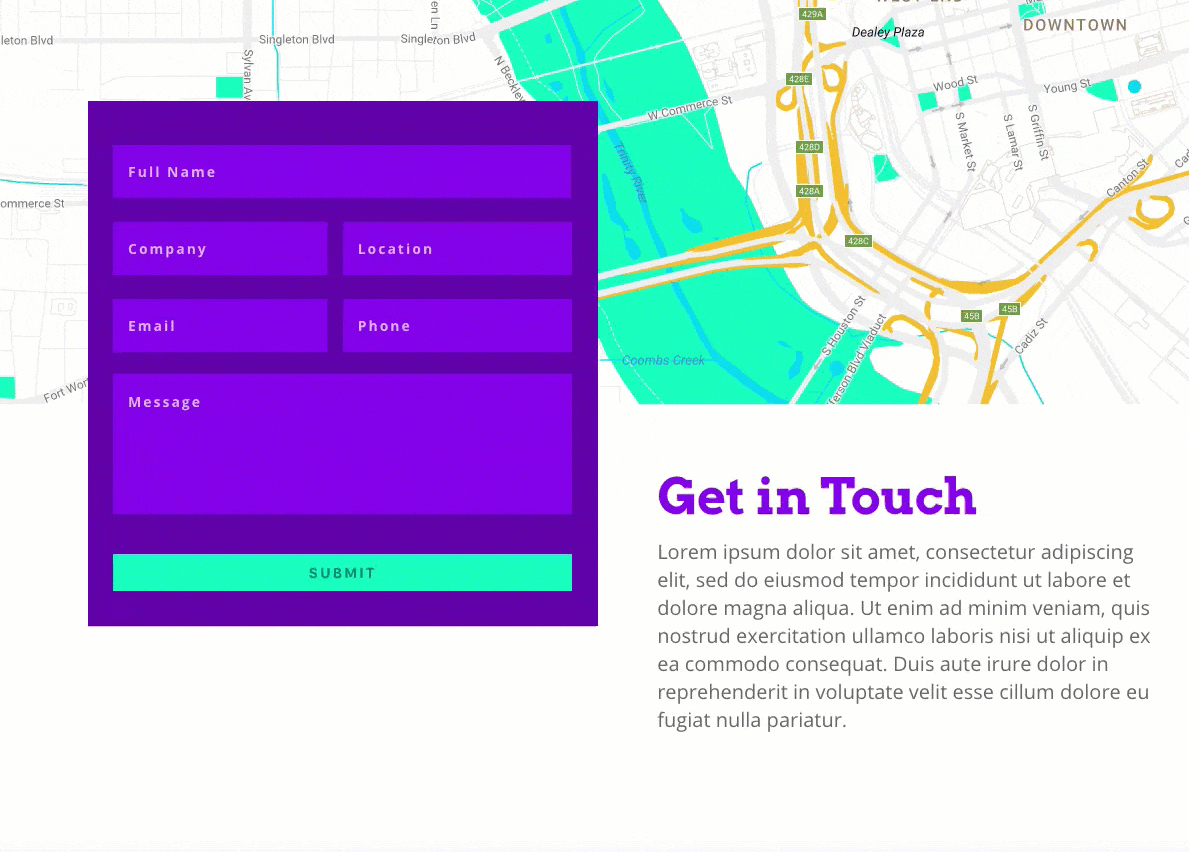
Style 2: Material Design
Material Design is a trend that is here to stay. To be honest it’s more than just a trend, it’s really a set of style guidelines that are being implemented in much more than just web design, but you can find out more about it on one of our recent blog posts here and from the official website here.
I’ve included just the smallest bit of animation in this one as it’s a hallmark characteristic of material design. With material design, though, animation isn’t just used for visual appeal, it tries to serve an extra functional purpose when possible.
So here my message box is only so high, but when the user clicks in it the box automatically expands and allows for more room without having to manually drag the little corner down. Some would argue more room entices a longer and more thought out message, but we’ll leave that to the design psychologists.
Here is the end result we will have with the corresponding CSS:
The CSS Code
/*** MAIN GRAVITY WRAPPER ***/
.gform_wrapper {
    background: #6000AA;
    padding: 5%;
}
/*** REMOVE LABEL ON FIELDS USING PLACEHOLDER ***/
.gform_wrapper .top_label .gfield_label,
.gform_wrapper .field_sublabel_below .ginput_complex.ginput_container label {
    display: none;
}
/*** FIELD STYLING ***/
.gform_wrapper ul.gform_fields li.gfield,
.gform_wrapper .top_label li.gfield.gf_right_half {
    padding-right: 0;
}
input[type=text],
textarea {
    background: #8300E9;
    border: none;
    border-radius: 0;
    color: #fff !important;
    font-weight: 700 !important;
    letter-spacing: 2px !important;
    padding: 17px 15px !important;
}
/*** FIELD FOCUS STYLING ***/
input[type=text]:focus,
input.text:focus,
input.title:focus,
textarea:focus {
    box-shadow: 0 10px 20px 0 rgba(0, 0, 0, .2);
}
/*** MESSAGE BOX TRANSITION ***/
.gform_wrapper textarea.medium {
    margin-top: 6px;
    height: 10em;
    transition: height .3s ease-out;
}
/*** MESSAGE BOX FOCUS HEIGHT ***/
.gform_wrapper textarea.medium:focus {
    height: 25em;
}
/*** BUTTON STYLING ***/
.gform_wrapper .gform_footer input.button,
.gform_wrapper .gform_footer input[type=submit] {
    width: 100%;
}
.gform_wrapper input[type=submit] {
    cursor: pointer;
    text-transform: uppercase;
    font-weight: 700;
    letter-spacing: 2px;
    padding: 10px 12px;
    border-radius: 0;
    background: #19ffc0;
    color: rgba(0, 0, 0, 0.5);
    border: none;
    transition: box-shadow .2s ease-in-out;
}
/*** BUTTON HOVER STYLING ***/
.gform_wrapper input[type=submit]:hover {
    background: #f2bf2f;
    color: #fff;
    box-shadow: 0 10px 20px 0 rgba(0, 0, 0, .2);
}
/*** PLACEHOLDER ***/
::-webkit-input-placeholder {
    /* Chrome */
    color: rgba(255, 255, 255, 0.7) !important;
}
:-ms-input-placeholder {
    /* IE 10+ */
    color: rgba(255, 255, 255, 0.7) !important;
}
::-moz-placeholder {
    /* Firefox 19+ */
    color: rgba(255, 255, 255, 0.7) !important;
}
:-moz-placeholder {
    /* Firefox 4 - 18 */
    color: rgba(255, 255, 255, 0.7) !important;
}
** Note that I’m using those left and right column classes in my form like I did in the first example so you may want to do that as well if you like how my fields are laid out, and don’t forget to change the color hex codes to match your site.
This one actually comes pretty packed with some great extras 😀
So first I have to give credit where credit is due. I found an amazing online tutorial for implementing the Elegant Themes font for use on radio buttons and checkboxes here, and I’m simply tweaking this dude’s awesome code snippets.
This is the form look we will have after we set up our background image and the CSS is added:
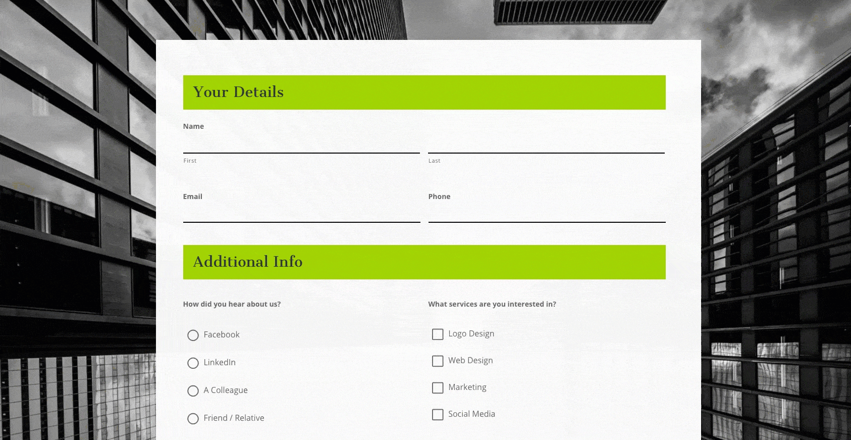
Pre-CSS Setup
So as you can see this form look has a background image, an opaque form background, and is using section headings. Two of those items need to be setup first (the opaque background is handled with CSS so that will happen automagically when you add the code).
In your main section you’ll want to add your background image.
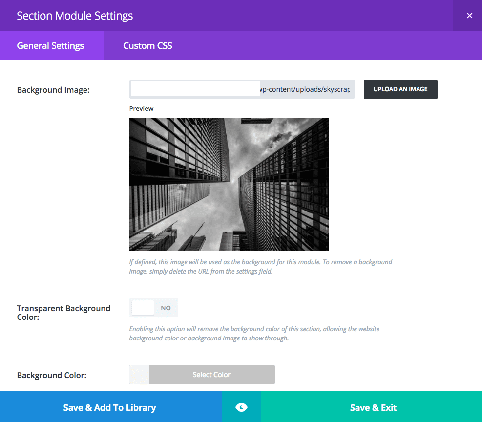
In your form you’ll want to add a section and edit your heading (this is optional by the way).
The CSS Code
/*** MAIN FORM WRAPPER ***/
.gform_wrapper {
 background: rgba(255, 255, 255, 0.95);
 padding: 5%;
}
/*** GRAVITY FIELDS ***/
.gform_wrapper input:not([type=radio]):not([type=checkbox]):not([type=submit]):not([type=button]):not([type=image]):not([type=file]),
.gform_wrapper textarea.medium,
.gform_wrapper textarea.large {
 background: rgba(0, 0, 0, 0);
 border-top: none;
 border-left: none;
 border-right: none;
 border-bottom: 2px solid #000;
 border-radius: 0px !important;
}
.gform_wrapper ul.gform_fields li.gfield {
 margin-bottom: 20px;
}
input[type=text]:focus,
input.text:focus,
input.title:focus,
textarea:focus {
 border-bottom: 2px solid #b5b5b5 !important;
}

/*** BUTTON STYLING ***/
.gform_wrapper .gform_footer input.button,
.gform_wrapper .gform_footer input[type=submit] {
 background: #A2D400;
 text-transform: uppercase;
 border: 2px solid #1d1d1d;
 padding: 7px 12px;
 cursor: pointer;
 font-size: 18px;
 -moz-transition: all 0.2s;
 -webkit-transition: all 0.2s;
 transition: all 0.2s;
 border-radius: 0 !important;
}
/*** BUTTON HOVER STYLING ***/
.gform_wrapper .gform_footer input.button:hover,
.gform_wrapper .gform_footer input[type=submit]:hover {
 background: #1d1d1d;
 color: #fff;
}
/*** SECTION STYLING ***/
.gform_wrapper h2.gsection_title {
 font-weight: normal;
 font-size: 2em;
}
.gform_wrapper .gsection {
 padding: 20px !important;
 border-bottom: none;
 background: #A2D400;
}
/*** GRAVITY RADIO AND CHECKBOXES ***/
.gform_wrapper ul.gfield_checkbox li input[type=checkbox],
.gform_wrapper ul.gfield_radio li input[type=radio] {
 visibility: hidden;
 margin: 0;
 width: 0!important;
}
.gform_wrapper input[type=checkbox] + label,
.gform_wrapper input[type=radio] + label {
 font-size: 16px;
}
input[type=checkbox] + label:hover,
input[type=radio] + label:hover {
 cursor: pointer;
}
input[type=checkbox] + label:before,
input[type=radio] + label:before {
 font-family: "ETmodules" !important;
 font-size: 30px;
 position: relative;
 top: 0.3em;
 margin-right: 0.2em;
}
.gform_wrapper li.gf_list_inline ul.gfield_checkbox li,
.gform_wrapper li.gf_list_inline ul.gfield_radio li {
 display: -moz-inline;
 display: inline;
}
input[type=checkbox] + label:before {
 content: '\056';
}
input[type=checkbox] + label:hover:before {
 content: '\05a';
 filter: alpha(opacity=40);
 opacity: 0.4;
}
input[type=checkbox]:checked + label:before {
 content: '\05a';
 color: #A2D400;
}
input[type=checkbox]:checked + label:hover:before {
 color: #A2D400;
 filter: alpha(opacity=100);
 opacity: 1;
}
input[type=radio] + label:before {
 content: '\05b';
}
input[type=radio] + label:hover:before {
 content: '\05c';
 filter: alpha(opacity=40);
 opacity: 0.4;
}
input[type=radio]:checked + label:before {
 content: '\05c';
 color: #A2D400;
}
input[type=radio]:checked + label:hover:before {
 color: #A2D400;
 filter: alpha(opacity=100);
 opacity: 1;
}
.gform_wrapper ul.gfield_checkbox li input[type=checkbox]:checked+label,
.gform_wrapper ul.gfield_radio li input[type=radio]:checked+label {
 font-weight: normal;
}
/*** SUCCESS MESSAGE ***/
.gform_confirmation_wrapper {
 background: #fff;
 padding: 15px;
}
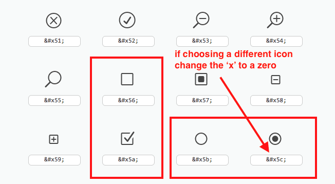
If you want to change the icon check out the Elegant Themes font reference post. Here’s a screenshot of the icons I chose and when you look at the CSS you will see how I entered the correct code.
In Closing
Well that’s all for this tutorial. I hope you now feel empowered to style your own website forms to truly stand out and help reflect the overall aesthetic you are trying to portray. Subscribe so you’re sure not to miss all the great resources we are consistently delivering. And if you have any questions about this tutorial please feel free to ask me in the comments below.


This is fantastic – Ill have to make use of these. Thanks 🙂
Hi this is a great informative article.
It is mentioned to hide the labels in Gravity forms to use CSS.
There is a specific function in Gravity forms to hide labels which is selected from a drop down menu. However to activate this field you are required to add the following code into the functions.php file
add_filter( ‘gform_enable_field_label_visibility_settings’, ‘__return_true’ );
It would be best if Gravity forms had this functionality by defauly
I’ve found that Gravity Forms is conflicting with Bloom somehow … not allowing me to use Appearance > Customize ….
Have you noticed? Or is it just me
I don’t believe that is a Bloom/Gravity issue. I use Bloom myself with Gravity on many sites and not running into that happening.
This is so great! I use gravity forms a lot and love it.
mmogo.com
Awesome! 😀
Thank you very much for this article! I’m the developer of the “Surbma – Divi & Gravity Forms” plugin and I can say, there are a lot of work to make Gravity Forms look as it would be a native Divi form.
So this article is very helpful, but if anybody need a complete solution not only for a simple form, but even for additional fields, it is better to use my plugin.
Thank you for all the commenters, who also referenced this plugin!
https://wordpress.org/plugins/surbma-divi-gravity-forms/
Thank you for your work on your plugin, imo whether “it is better” to use a plugin vs learning at least what CSS can do for you and how empowering it is will really be up to the individual and not anyone else 🙂
What I ever wanted to ask (I did quite a bunch of pages with DIVI in the meantime and have a life-long subscription, so I am a permanent user):
why don’t you do better native form-styling in DIVI?
You write, “Divi has become wellknown for it’s clean and minimal approach to design”, and you are right. Forms in DIVI are so minimal styled / designed that a big part of the users even are unable to identify the input fields ;=(
Input form fields with just very weak colour-contrast and no borders are not really “styled”, they are very often just unusuable, even invisible
Have you ever tested users using native DIVI forms?
Did you notice how they search for the input field and don’t find it, either in front end or in back end?
I get these answers from my clients every day around…
Nearly invisible inputfields with nearly the same colour as the background?
Don’t tell me that I can define the form style myself, I just ask you to deliver clear defined, usable standard, the decoration can be done in the childtheme or custom css, but a minimun standard should be…
Cheers, Connie
Thank you for the feedback Connie! We’re always finding more ways to improve Divi. In some cases that means more features and in some cases that means making what we already have work better. We’ll be sure to look the contact form over again in the near future.
Well done Leslie! Love Gravity Forms but they can look rather drab if you don’t take the time to tweak them. These CSS snippets look great.
Yes very true, hope these come in handy!
How to put the contact form or any other element in the middle like this: https://cdn.elegantthemes.com/blog/wp-content/uploads/2017/02/gravity-material-design.gif. Is this possible in Divi?
Ya, I made that demo in Divi! 😀
So basically the top area is a fullwidth map, the section under that is a regular two column section – the left is a text module with the gravity shortcode, the right is a text module. Then I add a negative top-margin to the text module that has the gravity form so it overlaps the map. You’ll need to play with the numbers to get it how you want but it is a nice look. Also the plugin I’m using to make the map those colors is called Snazzy Maps.
Thanks Leslie just what I was looking for! 🙂
Great, hope it helps! 🙂
This is so great! I use gravity forms a lot and love it. Thank you for this very useful post!
Thanks Sherri-Ann, happy coding 😀
Leslie, well-structured post and tour through the nuances of making forms ‘sing.
You mentioned CSS code for that last example, but I’m not seeing it. Am I missing something?
BTAIM, thanks again for another well-crafted post.
Cheers from 12 West,
– Michael
Hmm that’s strange, thanks for pointing that out. We’ll get it fixed asap!
This has been fixed, thanks for letting us know 🙂
Great post Leslie. Glad my code was helpful for using Divi’s icons (I’m “this dude” mentioned above).
For #1 of your post, I highly recommend the plugin “Surbma – Divi & Gravity Forms” found here: https://wordpress.org/plugins/surbma-divi-gravity-forms/. It’s well maintained by the dev and he’s styled a lot of the advanced fields and such, of Gravity Forms. It just makes things really easy. Plus it uses the button and forms stylings from the theme and module customizers. Great plugin for anyone using GF on Divi.
Thanks for writing that awesome post Tevya!
I love Gravity Forms but it never looked appealint with Divi – thank you for this!
Awesome, hope you can beautify those forms! 😀
There is a great plugin that achieves this called Surbma divi – gravity forms styling. It’s in the WordPress.org repo and I recommend it for a quick solution.
That one is good if you’re in a time pinch, thanks for mentioning!
Other option is to use “Surbma – Divi & Gravity Forms” plugin. It works perfect
Indeed and the developper is very nice and responsive.
The tutorial I’ve been waiting for all my life! LOL!!!! Thank you!
Lol, you’re very welcome!
Is gravity form free or paid?
And any possibility with more design and dropdown, or selection or checkbox selection options within contact form 7 please.
Gravity Forms is a premium plugin. It’s not cheap but, if you do a lot of websites, it will more than pay for itself in all that it can do. I was a fortunate early supporter and got in on a developer’s license for a one-time fee. I can say, without hesitation, that along with my lifetime Elegant Themes subscription, Gravity Forms was the best investment I made for my WordPress business. It has allowed me to come up with so many solutions for clients that would have required multiple plugins or other services with additional costs.
Your blog is incredibly creepy; literally ever time I’m about to go do something for a client or myself, either the day of or the day after I start you blog about that exact same thing.
But don’t worry I’m not mad, I’m very thankful!
Same thing, man. Either they spy on us, or I don’t even know 🙂
Haha!
I’ve been considering different form plugins, as none of them have ever really struck me as fantastic. Gravity seems to be pretty good, and this tutorial definitely makes it more appealing to me. Thank you for this!
Awesome! Gravity Forms is my favorite premium option, hope these snippets come in handy 🙂
Great post! I’ll certainly use this on my forms when needed. Thanks!
Woohoo!
Any chance for a tutorial like this for Contact Form 7?
Thanks, this is helpful. Well done!
Make the switch. You’ll never go back to CF7.
I’m sure we can accommodate that Chris! Not sure how soon but I’ll add it to the request list 🙂
https://www.elegantthemes.com/blog/tips-tricks/how-to-customize-the-style-of-contact-form-7-to-match-your-website
Oh awesome, there you go! ET was already on top of it 😀