Responsive design requires more than scaling layouts, it also requires controlling how content stacks across devices. A design that feels structured on desktop can be a confusing order on mobile, with sidebars or secondary elements pushing key content out of view. Divi 5 addresses this with its new Flexbox system, which introduces prebuilt responsive column structures and precise ordering controls.
In this post, we’ll look at why reordering elements matters, how Divi 5’s flexbox tools make it simple, and walk through the steps to restructure layouts at different breakpoints.
Why You’d Want To Reorder Elements
When a layout shifts from desktop to mobile, the stacking order doesn’t always reflect your intended experience. A balanced three-column desktop design can collapse into a vertical stack where the left column always comes first, pushing a call-to-action, signup form, or contact info far down the page, where users may never see it.
Subscribe To Our Youtube Channel
Divi 5’s Flexbox system fixes this by letting you reorder elements visually at each breakpoint. You can move a CTA directly under the headline on mobile, bring testimonials above a pricing table, or highlight contact info before long content. Instead of being stuck with the browser’s default stacking logic, you decide the hierarchy. This ensures your most important content always appears where it matters most.
How Divi 5’s Flexbox Makes Reordering Easy
Divi 5 gives you direct control over how elements stack across breakpoints. You can use prebuilt flex column structures to set up layouts that adapt naturally, then fine-tune the column structures and column orders at each screen size.
The flexbox acts like a brilliant container that adjusts based on space. Instead of content stacking randomly, you control the order on each device.
Divi 5 also handles nested and complex layouts well. You can change row structures, column sizes, and module order at each breakpoint without copying content or coding.
It also automatically manages vertical alignment and positioning, making your content look purposeful, fully responsive, and not randomly arranged.
A Step-By-Step Guide To Responsive Reordering In Divi 5
Let’s take a look at how exactly you can reorder elements in Divi 5 using its new Flexbox system. The steps below walk you through setting up column structures and adjusting order at different breakpoints so your layouts stay clear and consistent on every device.
1. Set Up Your Seven Custom Breakpoints
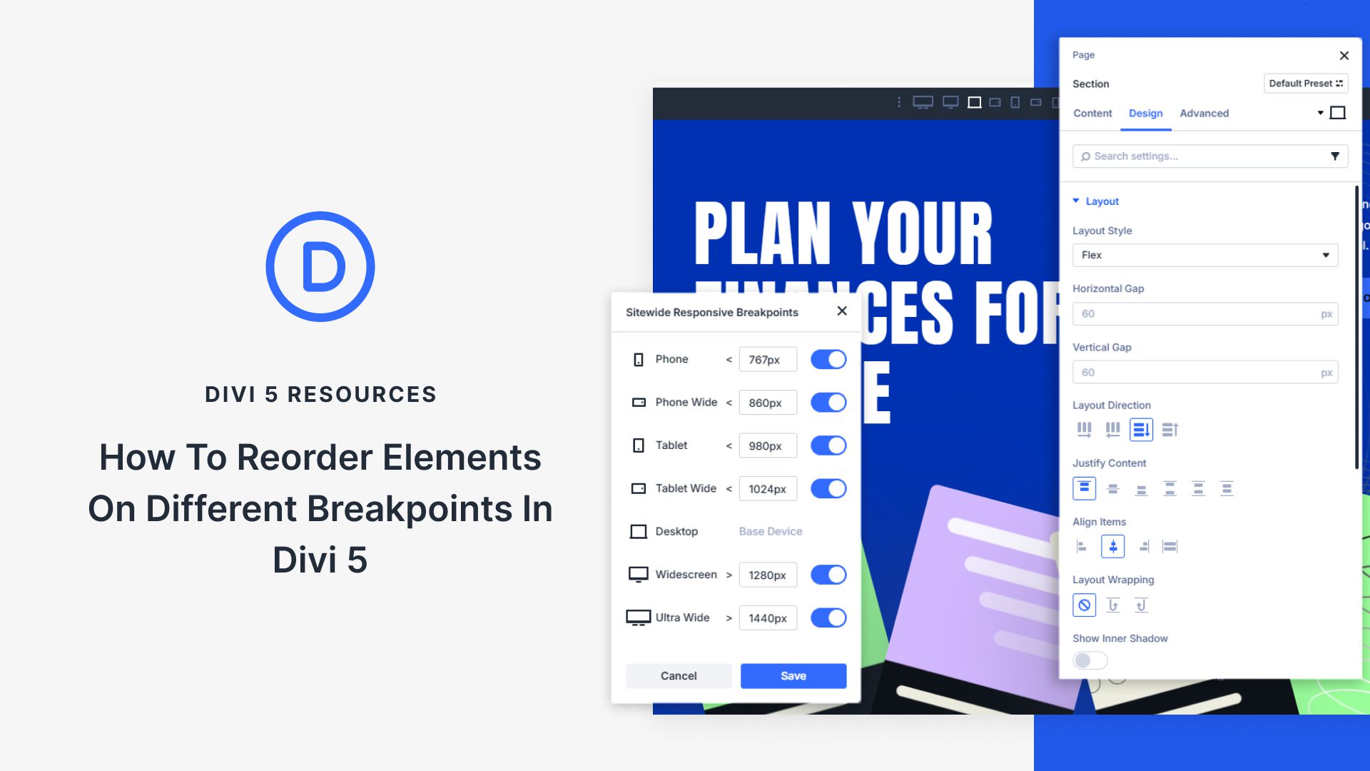
Divi 5 gives you seven breakpoints instead of three. You can change each pixel value so your site looks right on any device.
Click the ellipsis menu in your taskbar and find the breakpoint toggle switches. Each has default ranges, but you can change these numbers to fit your audience better.
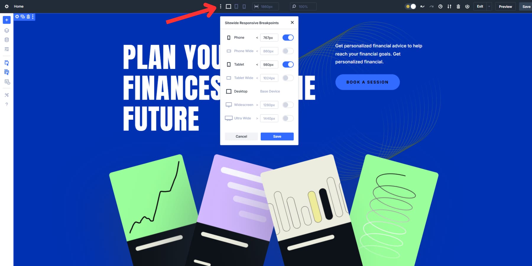
You’ll see Phone (under 767px), Phone Wide (under 860px), Tablet (under 980px), Tablet Wide (under 1024px), Desktop (over 981px), Widescreen (over 1280px), and Ultra Wide (over 1440px).
After you turn them on, little icons appear in your taskbar. Click any icon to see how your site looks at that screen size immediately.
Instead of clicking every icon and being limited in your testing, you can grab the edge of your canvas and drag it left or right. Your design shrinks or expands as you pull, showing how your layout changes at different widths.
Drag the canvas to 300px and watch your three-column desktop layout turn into a single mobile stack. Pull it back to 1200px and see your content spread out again. You don’t need to switch preview modes or resize your browser window.
2. Access The Flex Controls
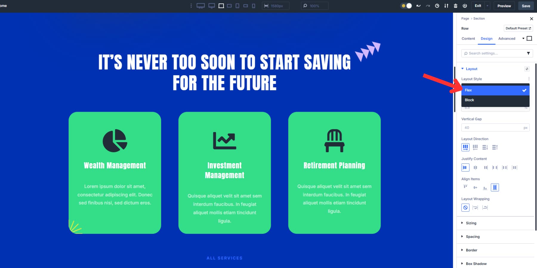
Click the settings icon of any row to open the settings panel on the right side. Navigate to the Design tab at the top of this panel. Under the Layout menu, you’ll find all of Divi 5’s flexbox controls. By default, Flex is selected under Layout Style.
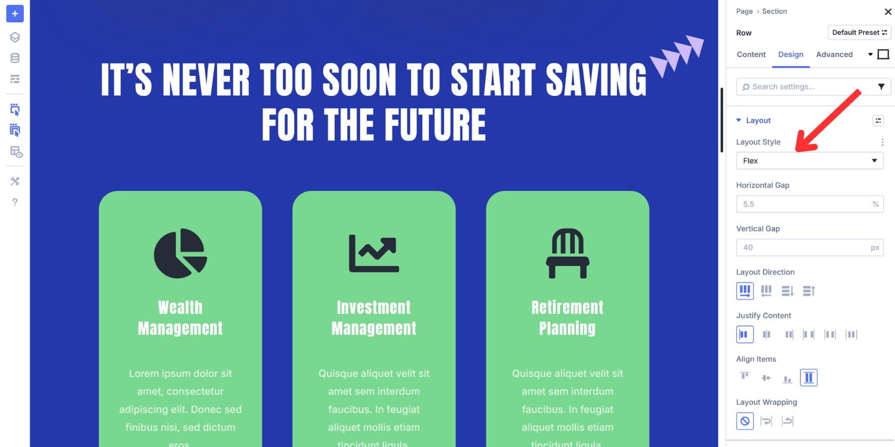
If it isn’t applied to your existing layout, you can change it to Flex with a click.
Scroll down to locate the Layout Direction field. This will determine the order and way in which the columns appear (side by side or above and below each other).
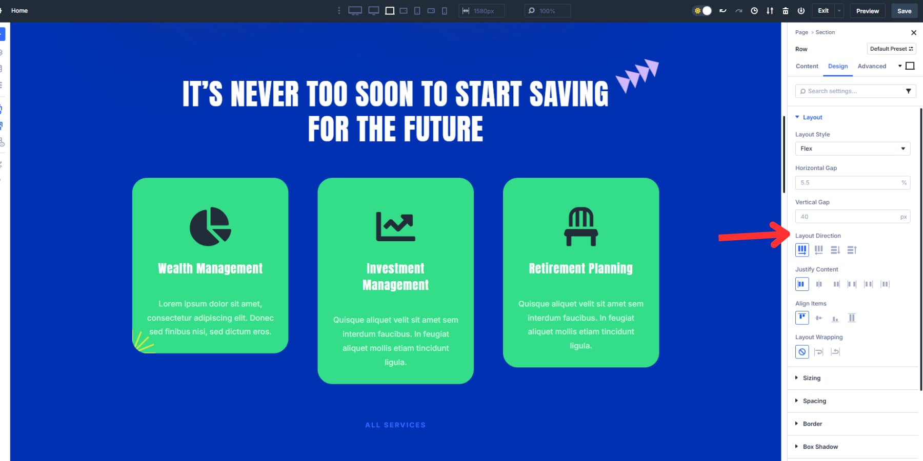
Below are the Justify Content options for controlling alignment and distribution. Meanwhile, the Align Items options appear right underneath the positioning options.
3. Fine-Tune Layout Structure For Each Screen Size
Your flexbox controls are now active, but desktop layouts might need structural adjustments for smaller screens. A three-column layout might work beautifully on a desktop but become overwhelming and crowded on a tablet, requiring a 2×2 grid instead, even more so on a mobile device where there’s only space for one grid.
Fortunately, the device icons at the top right of your controls let you preview your layout on different screens and fine-tune the flexbox settings for each breakpoint. This lets you adjust the design so it looks good and works well on every device.
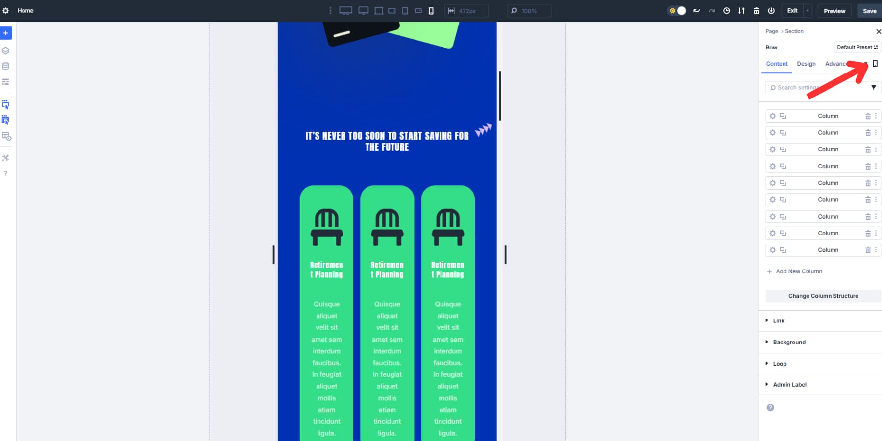
Switch to the tablet breakpoint and click the Change Column Structure button. Instead of the current setup, choose a 2×2 symmetrical layout. This instantly makes the view less overwhelming by showing fewer cards in each row. Adjust the vertical and horizontal gaps as needed for a balanced look. Then select the CTA column, set its column class to Fullwidth under the Sizing settings, and select “Grow To Fill.”
Your tablet version now shows two cards simultaneously, keeping that uniform appearance. The call-to-action button sits nicely in the row at the bottom, making it stand out, similar to your desktop layout. This update helps create a cleaner, more inviting experience that avoids the cluttered feel of too many options crowded together.
For mobile, use the Change Column Structure option to switch to a single-column structure. In the flexbox controls, set the Layout Direction to Column Reverse. Adjust the gap to what looks best for your content.
4. Reorder Columns Across Breakpoints
Using order values is a great way to manually decide the order of your flex containers’ child elements (often columns) across various screen sizes. The Order tab in the row settings gives each column a number that tells the browser, “Show this column in position 1, this one in position 2,” and so on. Lower numbers appear first, and higher numbers appear last. Simple as that.
You can even use Order “0” or negative numbers like “-1” to force specific content to appear first, regardless of other values.
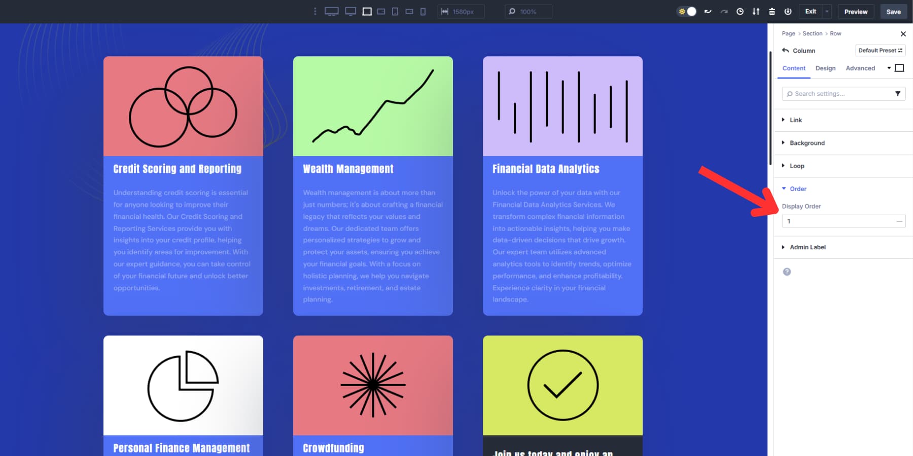
Each breakpoint supports its own ordering system, giving you complete control over element positioning across devices.
Let’s take a look at a practical example: On the desktop, Select Column 1 and set its Order to 1. Select Column 2 and set its Order to “2,” and do the same for the rest of the column(s). Your desktop layout flows naturally from left to right, ending with a call to action.
Customizing Order On Tablets And Mobiles
Now, switch to the tablet breakpoint using the device toggle. And change the column orders:
Set Column 6 (call-to-action) to “3” so it appears in the middle row. Leave Columns 1 and 2 as is, Column 3 as 4, and the rest as desired. Tablet users see your call-to-action immediately after the value proposition, followed by the supporting details.
Then, switch to mobile using the device toggle. Change the CTA column’s Order to “3” and leave the first two columns’ order as is. Make the rest of the column’s order similar to the tablet arrangement.
The underlying source order of your content stays the same, but the CTA moves from the last position to the third without affecting the desktop layout. This way, you can control how sections appear at different breakpoints without duplicating or restructuring your content.
Control How Everything Stacks With Divi 5
Divi 5’s new Flexbox system gives you precise control over how content stacks across devices. With seven customizable breakpoints and live canvas scaling, you can preview and adjust layouts at any screen size in real time.
Instead of relying on the browser’s default stacking order, you decide exactly where sidebars, CTAs, and key content appear. Flexbox allows you to maintain hierarchy and clarity on every device without extra workarounds or code.




Leave A Reply