
Fullscreen headers take the entire screen, regardless of the screen size of the visitor. This is great for grabbing the attention of users. It’s also great for directing them to your call to action. Fortunately, it’s easy to make a fullscreen header with Divi’s Fullwidth Header Module. In this post, we’ll show you how to build a fullwidth header, turn it fullscreen, and style it. You can use this approach to build any fullscreen hero section for your pages!
Let’s get started.
- 1 Previewing the Fullscreen Header
- 2 Why Make a Fullscreen Header with Divi’s Fullwidth Header Module?
- 3 How to Make Your Divi Fullwidth Header a Fullscreen Header
- 4 Enable the Fullscreen Header Scroll Down Icon
- 5 Divi Fullwidth Header Fullscreen Header Example
- 6 Fullscreen Header Results
- 7 Ending Thoughts on Creating a Fullscreen Header with Divi’s Fullwidth Header Module
Previewing the Fullscreen Header
Let’s see a preview of what we’ll build in this tutorial.
Desktop
Tablet
Phone
Why Make a Fullscreen Header with Divi’s Fullwidth Header Module?
Before we discuss how to make a fullscreen header, let’s talk about why Divi users might want one.
A fullscreen header presents specific elements in a contained section. This section presents these elements in a clean layout that draws attention and performs several tasks.
Firstly, this can be used to display a call to action that can lead your visitors into your sales funnel. It’s a great place to mention a specific product or service.
Secondly, it can present the user with an interesting design that keeps them on the website. Websites only have a few seconds to capture the attention of visitors.
There are a few things to keep in mind when creating a fullscreen header:
- Follow common design practices for colors and fonts. Be sure they’re legible and fit with the topic of your website.
- Keep the design simple and clean. Don’t use too many images, links, or buttons. Focus on a few things. Less is more.
- Make sure the fullscreen header is responsive. A fullscreen header must look great and work properly on all screen sizes.
How to Make Your Divi Fullwidth Header a Fullscreen Header
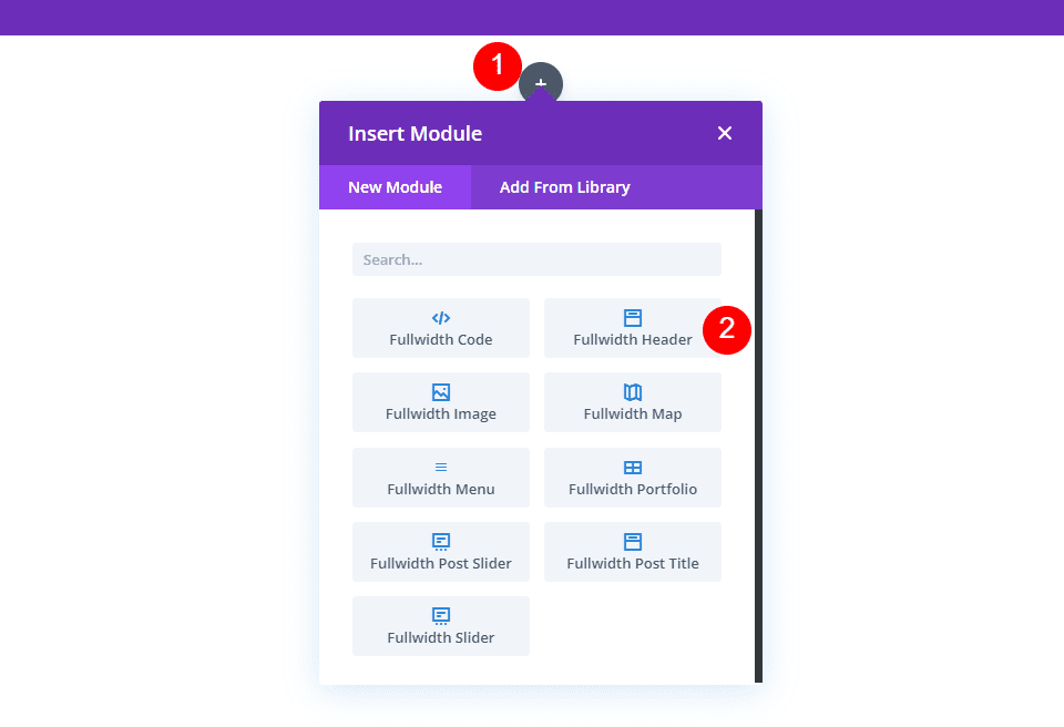
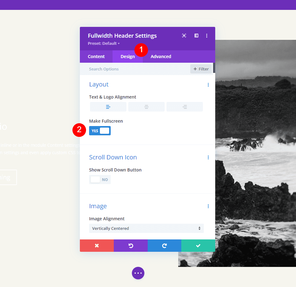
Start by adding a fullwidth section to the page you’re working on. Then, add a Fullwidth Header Module to the fullwidth section.
The module’s settings will open. Select the Design tab. Enable the option called Make Fullscreen.
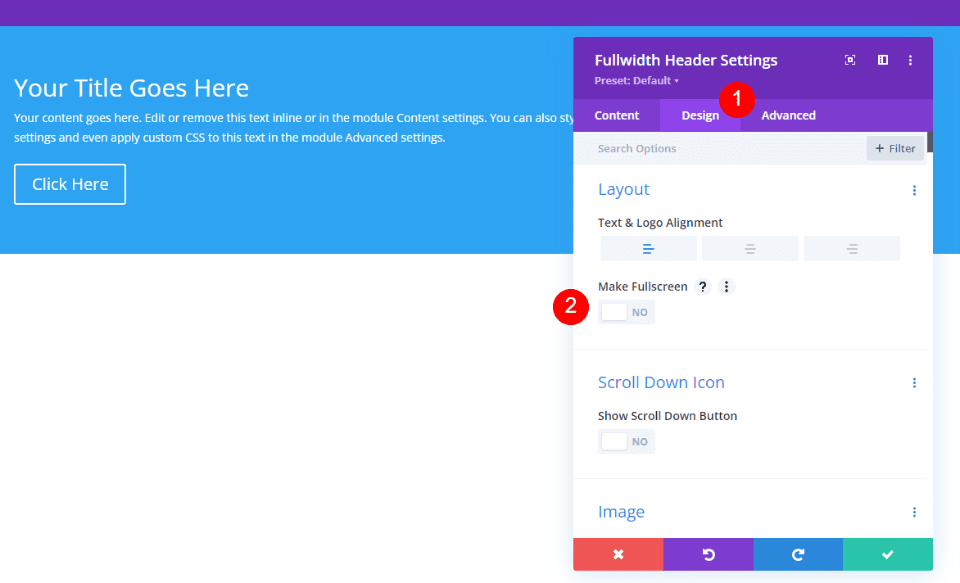
We now have a fullscreen header. It’s that simple.
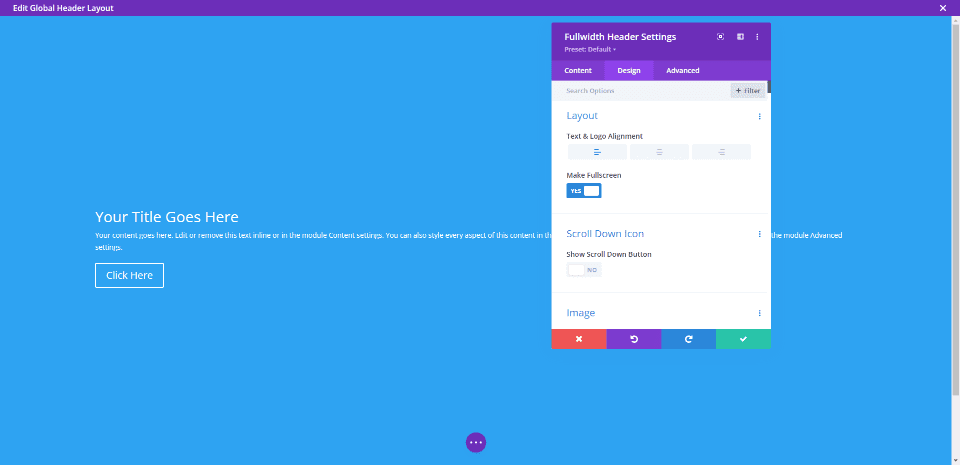
Enable the Fullscreen Header Scroll Down Icon
We can also add a button that indicates for the user to scroll down. However, we do have to enable it. This button is always in view in the fullscreen option. The fullscreen header option always matches the visitor’s screen height.
In the module’s settings, we’ll see a section called Scroll Down Icon under the Layout options. Click the button to enable Show Scroll Down Button.
Divi Fullwidth Header Fullscreen Header Example
Now that we’ve discussed why we’d want to make a Fullwidth Header fullscreen and see how to accomplish the task, let’s look at an example. I’ll create a full-width header using the hero section of a Divi layout.
For this example, I’m using the hero section from the homepage in the free Photography Studio Layout Pack that’s available within Divi. I’ll customize this hero section using the fonts and colors from the layout to create a unique full-width header.
Fullscreen Header Module Settings
Here are the steps for each section of settings in the Fullscreen Header Module.
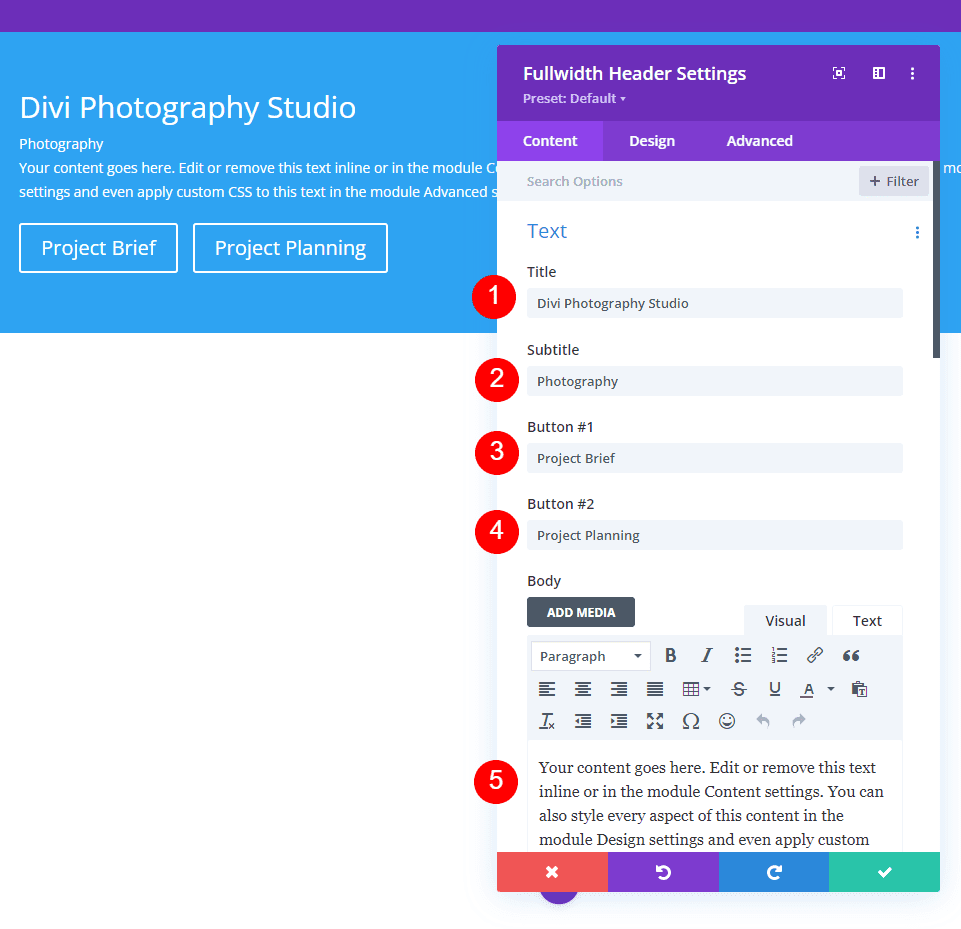
Text
First, add the text that will be visible in the fullwidth header. This includes the title, sub-title, content (I’ll use Divi’s built-in dummy text for this), and the button text.
- Title: Divi Photography Studio
- Subtitle: Photography
- Button 1: Project Brief
- Button 2: Project Planning
- Body: content
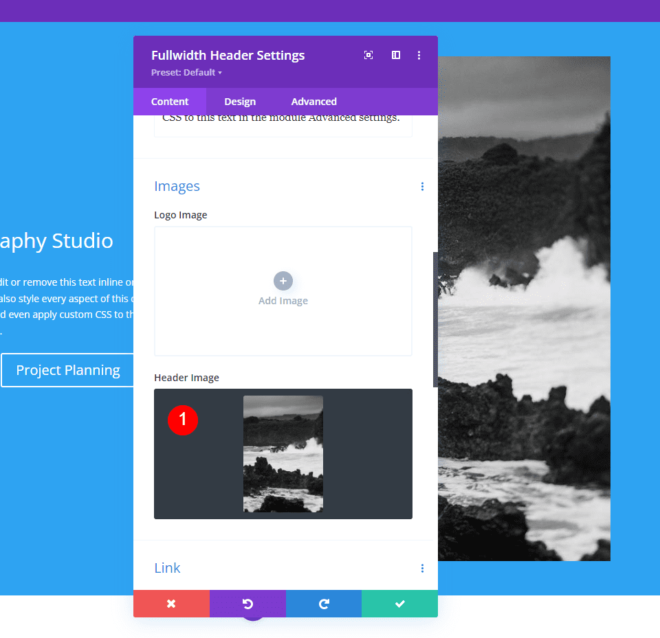
Images
Next, add the image. This displays on the right side of the fullwidth header, moving the text to the left.
- Header Image: your choice
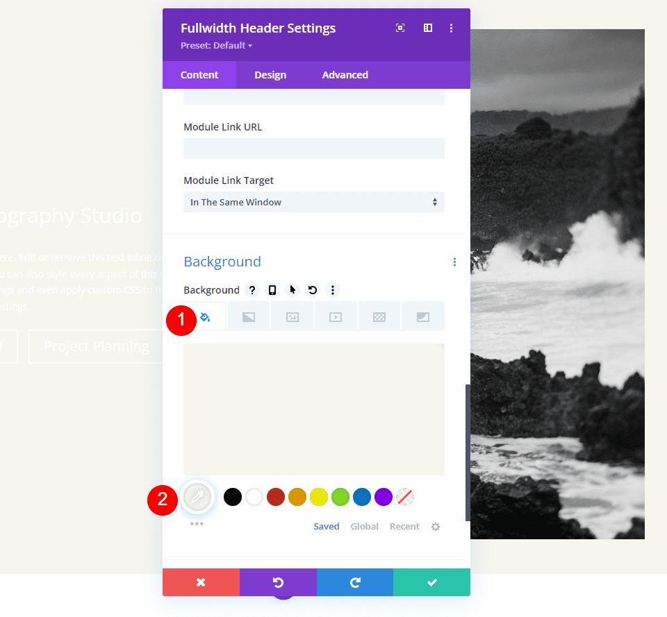
Background
Scroll down to Background and set the Color to #f6f5ee.
- Color: #f6f5ee
Layout
Next, go to the Design tab. Enable Make Fullscreen.
- Make Fullscreen: Yes
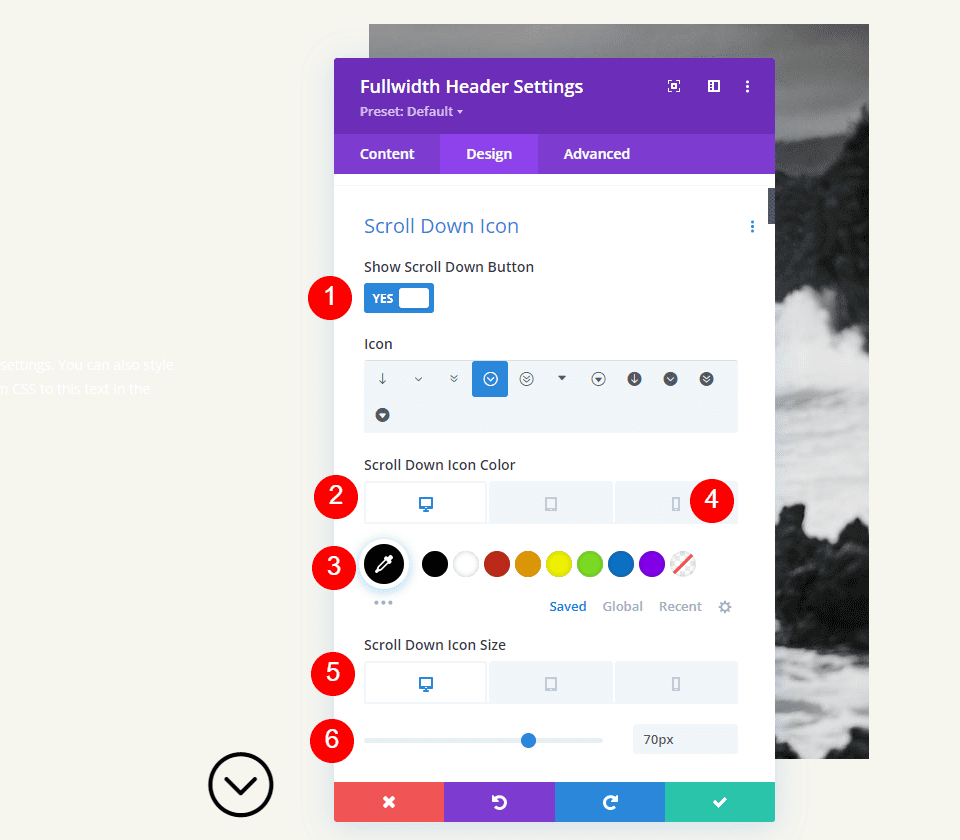
Scroll Down Icon
Next, enable the Scroll Down Icon. Change the Color to black for desktops and tablets and white for phones. With the image I’ve selected, the icon will appear on the image at the bottom for phones and this allows it to be visible with the colors of the image. Change the Icon Size to 70px for desktops, 60px for tablets, and 50px for phones.
- Show Scroll Down Button: Yes
- Icon Color: #000000 Desktop and Tablet, #ffffff Phone
- Size: 70px Desktop, 60px Tablet, 50px Phone
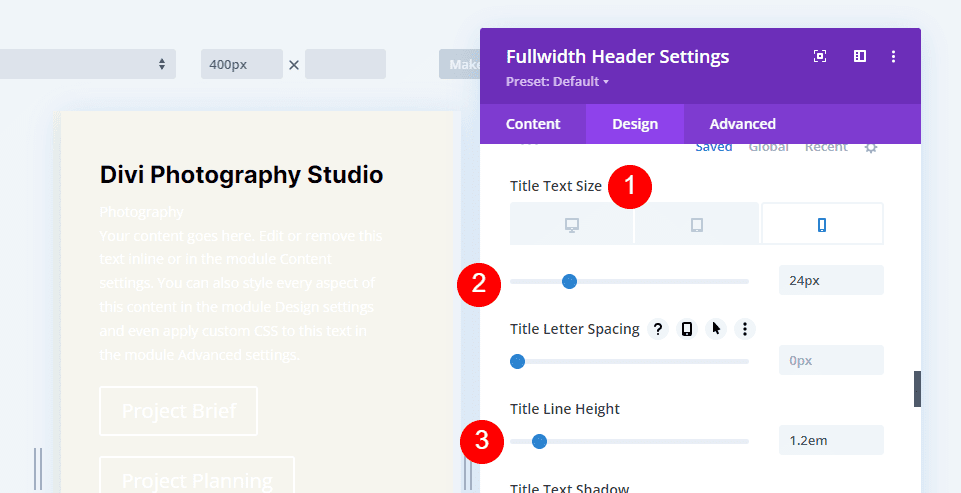
Title Text
Next, we’ll adjust the Title Text. Set the text to H1 and choose Inter for the Font. Set the Weight to bold, the Alignment to center, and the Color to black.
- Heading: H1
- Font: Inter
- Weight: Bold
- Alignment: Center
- Color: #000000
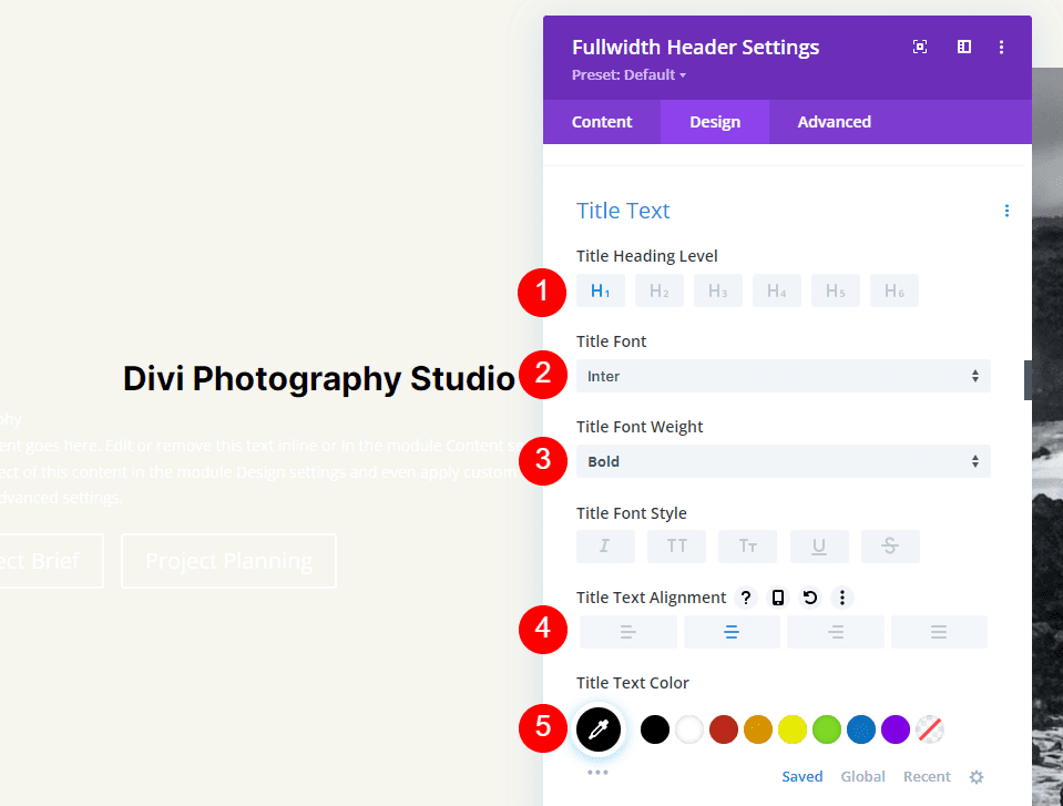
We’ll use three sizes for the Font Size: 75px for desktops, 40ps for tablets, and 24px for phones. Change the Line Height to 1.2em.
- Size: 75px Desktop, 40px Tablet, 24px Phone
- Line Height: 1.2em
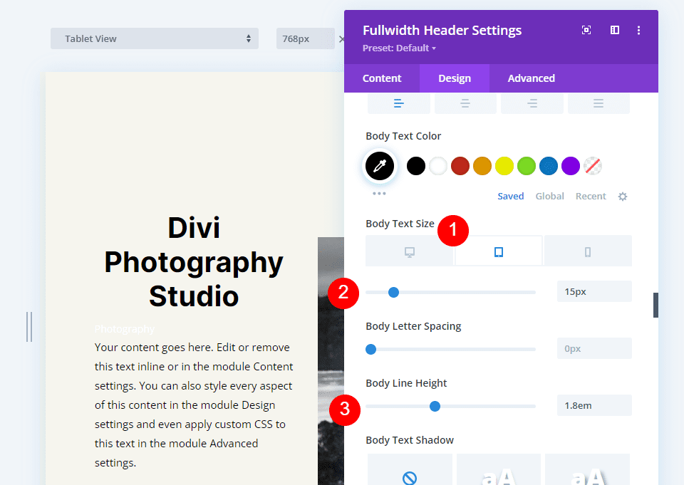
Body Text
Next, scroll down to Body Text. Choose Open Sans for the Font. Set the Alignment to the Left and the Color to black.
- Font: Open Sans
- Alignment: Left
- Color: #000000
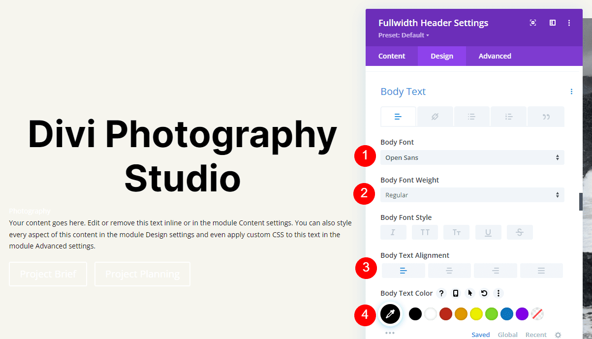
Set the Font Size to 16px for desktops, 15px for tablets, and 14px for phones. Change the Line Height to 1.8em.
- Size: 16px Desktop, 15px Tablet, 14px Phone
- Line Height: 1.8em
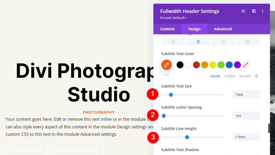
Subtitle Text
Next, scroll down to Subtitle Text. Change the Font to Inter. Set the Weight to bold, the Style to TT, the Alignment to center, and the Color to #ff5a17.
- Font: Inter
- Weight: Bold
- Style: TT
- Alignment: Center
- Color: #ff5a17
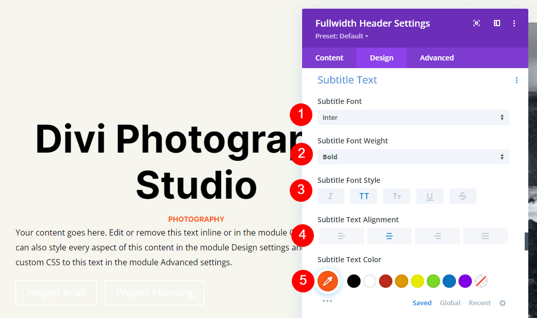
Change the Size to 14px for all three screen sizes. Change the Letter Spacing to 1px and the Line Height to 1.4em.
- Size: 14px
- Letter Spacing 1px
- Line Height: 1.8em
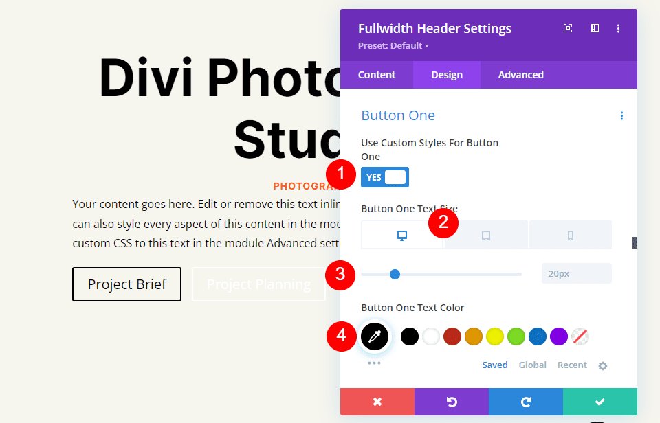
Next, scroll down to Button One and select Use Custom Styles for Button. Change the Text Color to black.
- Use Custom Styles For Button: Yes
- Size: 20px Desktop, 18px Tablet, 16px Phone
- Text Color: #000000
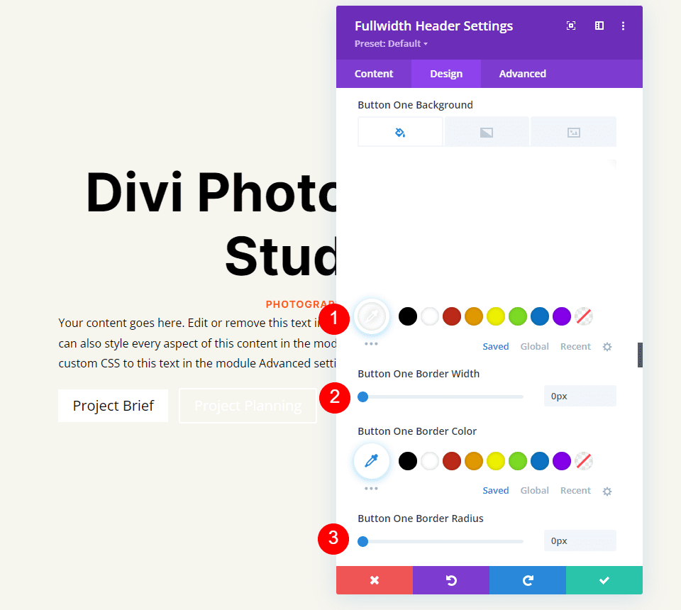
Change the Background Color to white and set the Border Width and Radius to 0px.
- Background Color: #ffffff
- Button One Border Width: 0px
- Button One Border Radius: 0px
Change the Font to Inter and the Weight to Bold.
- Font: Inter
- Weight: Bold
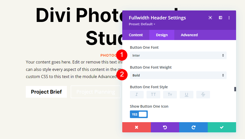
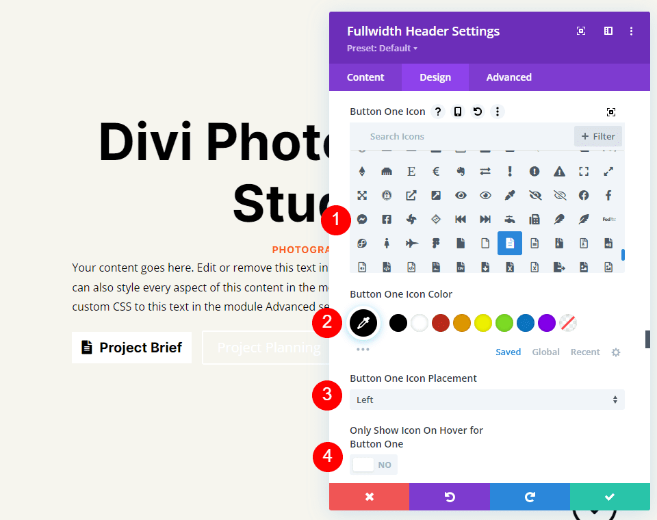
Next, select your preferred icon, change the Color to black, set the Button Placement on the left, and disable Only Show Icon On Hover For Button One.
- Icon: your choice
- Icon Color: #000000
- Button One Icon Placement: Left
- Only Show Icon On Hover For Button One: No
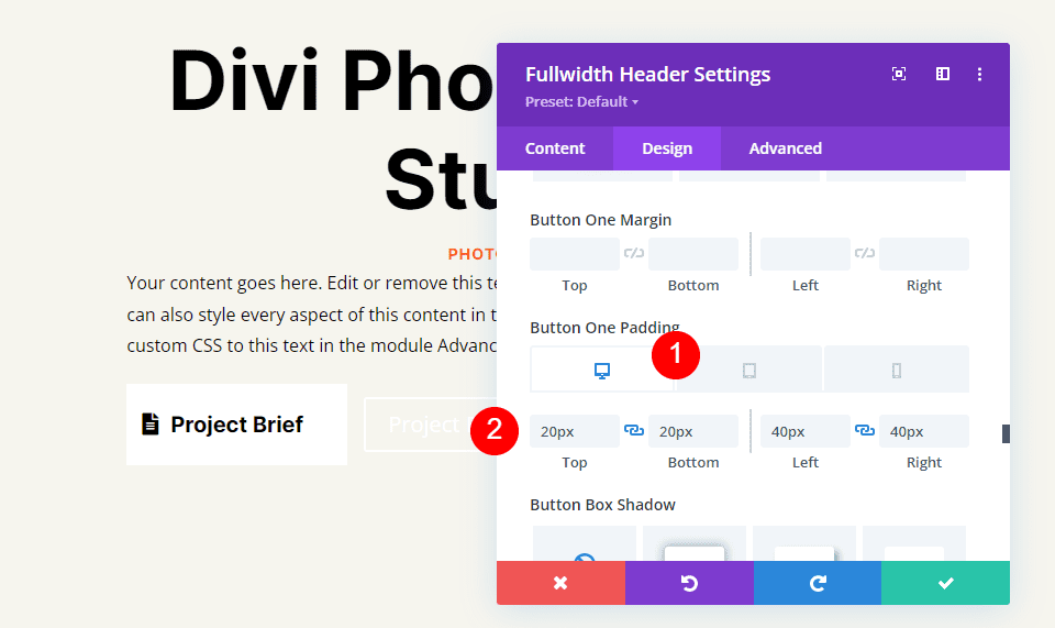
Finally, scroll down to Button One’s Padding options. We’ll use different Padding for each screen size. For desktops, use 20px for Top and Bottom, and 40px for Left and Right. For tablets, change the Top and Bottom Padding to 16px. On phones, change the Top and Bottom Padding to 12px. Leave the Left and Right Padding the same for all three.
- Desktop Padding: 20px Top and Bottom, 40px Left and Right
- Tablet Padding: 16px Top and Bottom, 40px Left and Right
- Phone Padding: 12px Top and Bottom, 40px Left and Right
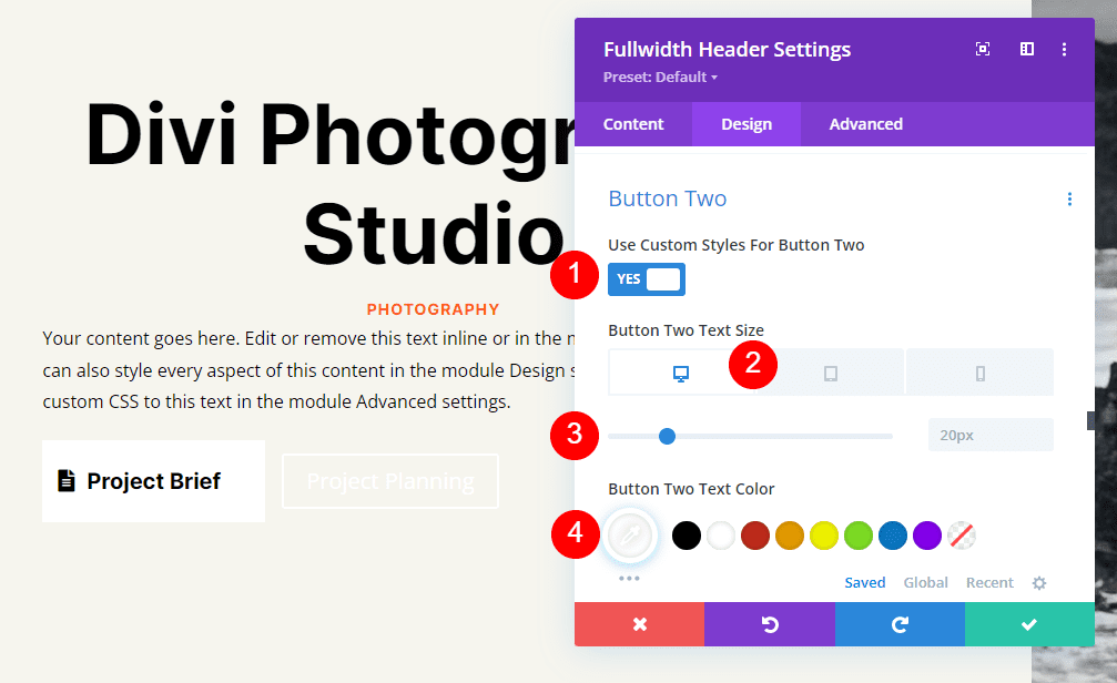
Lastly, scroll down to Button Two. Select Use Custom Styles for Button. Set the Font size to 20px for desktops, 19ps for tablets, and 16px for phones. Change the Text Color to white.
- Use Custom Styles For Button: Yes
- Size: 20px Desktop, 18px Tablet, 16px Phone
- Text Color: #ffffff
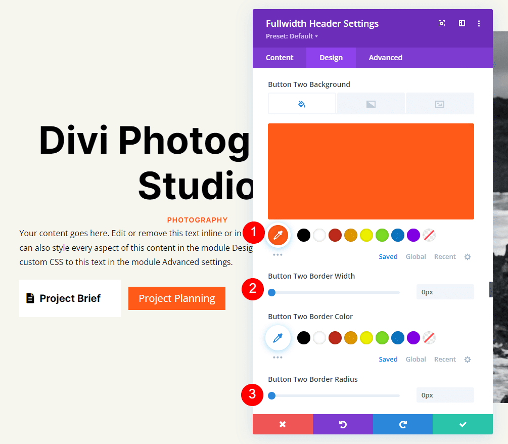
Change the Background Color to #ff5a17. Set the Border Width and Radius to 0px.
- Background Color: #ff5a17
- Button Two Border Width: 0px
- Button Two Border Radius: 0px
Next, change the Font to Inter and the Weight to Bold.
- Font: Inter
- Weight: Bold
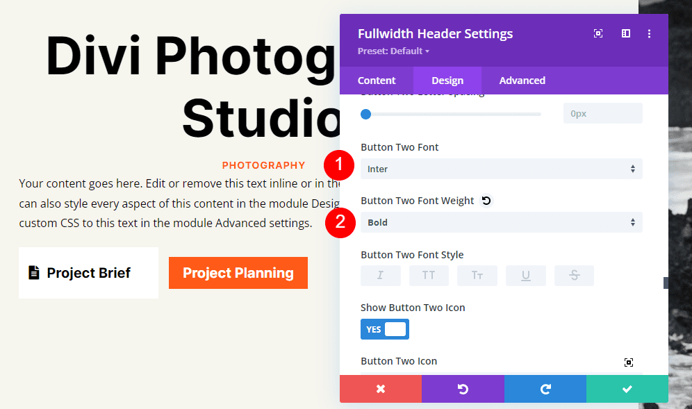
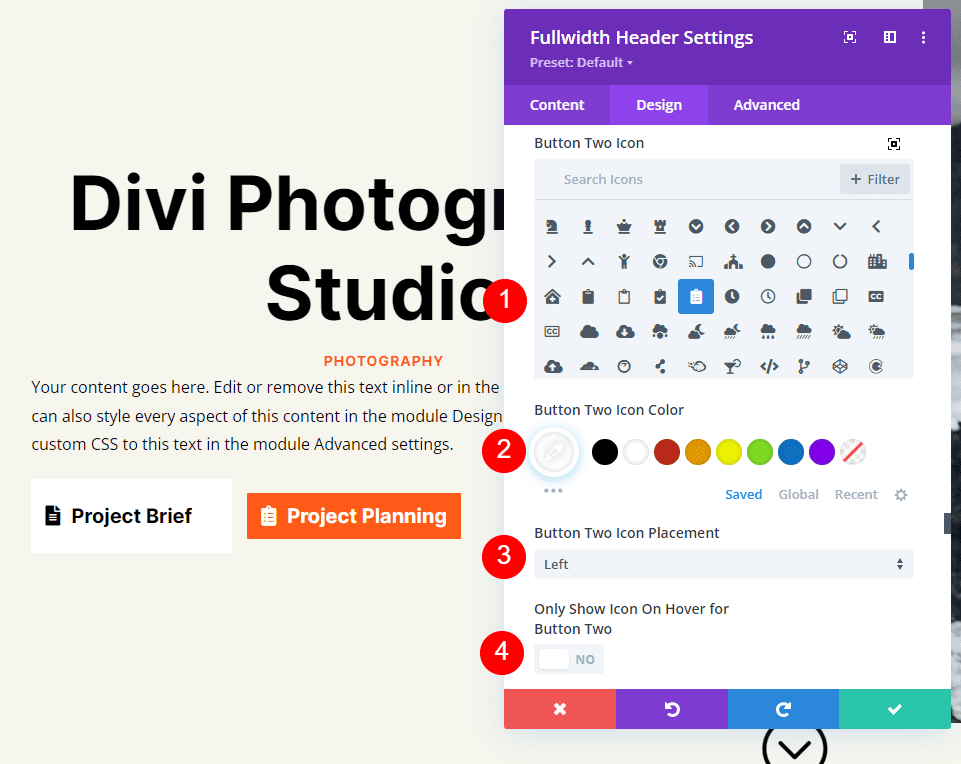
Choose your preferred icon. Change the Color to black, set the Button Placement on the left, and disable Only Show Icon On Hover For Button Two.
- Icon: your choice
- Icon Color: #000000
- Button Two Icon Placement: Left
- Only Show Icon On Hover For Button Two: No
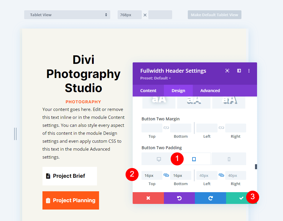
Lastly, scroll down to Button Two’s Padding options. For desktops, use 20px for Top and Bottom, and 40px for Left and Right. On tablets, change the Top and Bottom Padding to 16px. For phones, change the Top and Bottom Padding to 12px. Close the module and save your work.
- Desktop Padding: 20px Top and Bottom, 40px Left and Right
- Tablet Padding: 16px Top and Bottom, 40px Left and Right
- Phone Padding: 12px Top and Bottom, 40px Left and Right
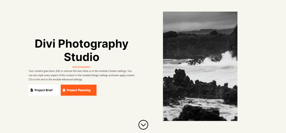
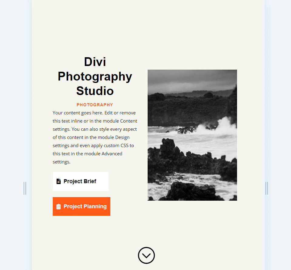
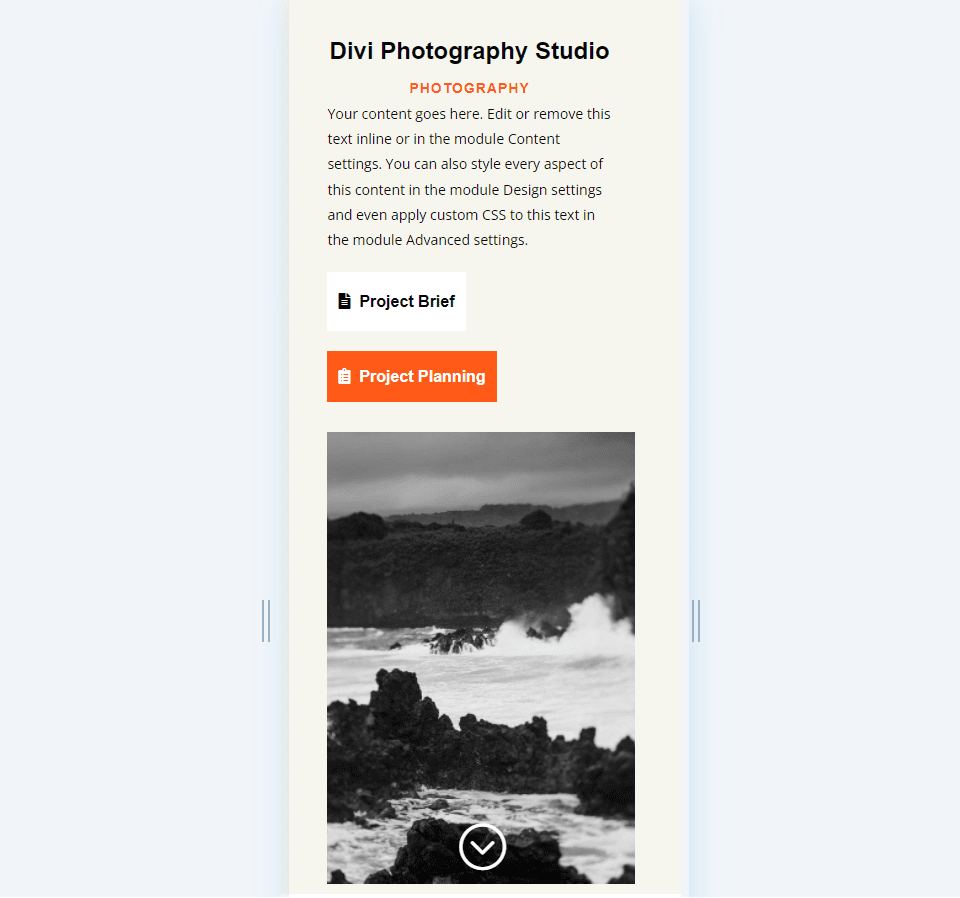
Fullscreen Header Results
Here’s how our fullwidth header looks on desktops, tablets, and phones.
Desktop
Tablet
Phone
Ending Thoughts on Creating a Fullscreen Header with Divi’s Fullwidth Header Module
That’s our look at how to make a fullscreen header with your Divi Fullwidth Header Module. The process is simple, and it looks great on any device. Adding the Scroll Down button is an excellent visual that indicates to users they can scroll. Designing a fullscreen header is similar to designing a hero section. Following a few simple guidelines can help you create amazing fullscreen headers with Divi’s Fullscreen Header Module.
We want to hear from you. Have you made your Divi Fullwidth Header fullscreen? Let us know about it in the comments.


Why can’t we disable the “Make Full Screen” option on mobile/tablet? The responsive setting is not available to this module.
We also use full screen headers on all our landing pages, they are highly conversion optimized, especially if all you want the user to do is to click on the CTA so that he gets to the next page.
Great post, thank you for creating it! Question — when including the top menu, how will this affect full screen sizing of the hero section if we position it directly under?