")
Adding subtle interactions to your website can really boost the overall user experience visitors have. One of the things that’ll make your website look that more fancier, while still respecting user-friendliness, is making row content appear on hover. This is a great approach for showcasing services, products, features and more.
In this tutorial, we’ll show you how to create a specific design from A to Z, but once you get the approach, you can make it work for any kind of website you’re working on. At the end of this blog post, we’ll also share the JSON file of this design that you can download for FREE and use without any restrictions.
Let’s get to it!
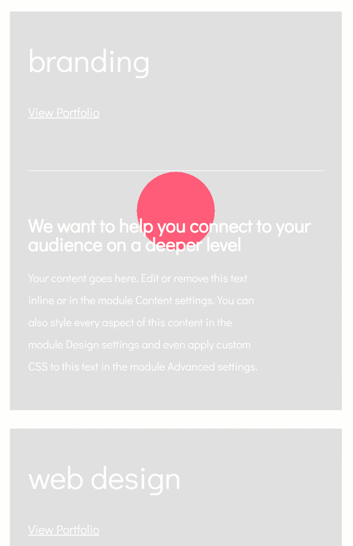
Preview
Before we dive into the tutorial, let’s take a quick look at the outcome on different screen sizes.
Desktop

Mobile
Let’s Start Creating!
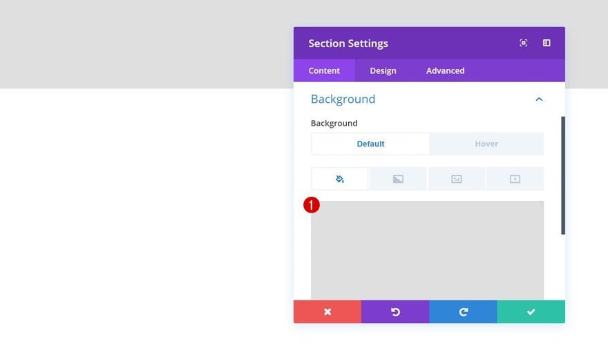
Add New Section
Default Background Color
Start off by adding a new section to a new or existing page and change the section background color.
- Background Color: #e0e0e0
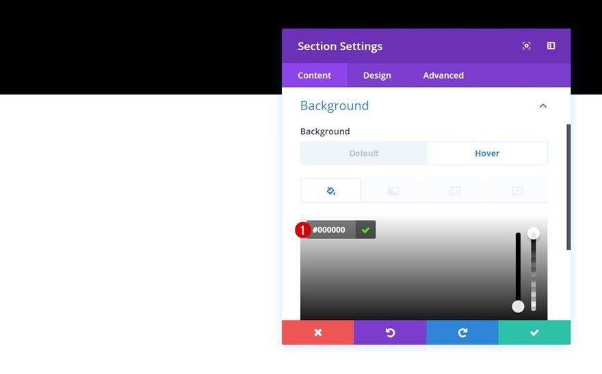
Hover Background Color
Modify this background color on hover.
- Background Color: #000000
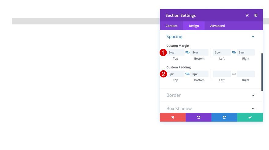
Spacing
Move on to the design tab and add some custom spacing values. To make this tutorial work, we’ll only use viewport units. This will help assure that everything stays in place, no matter the screen size.
- Top Margin: 5vw
- Bottom Margin: 5vw
- Left Margin: 3vw
- Right Margin: 3vw
- Top Padding: 0px
- Bottom Padding: 0px
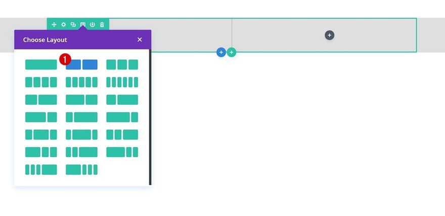
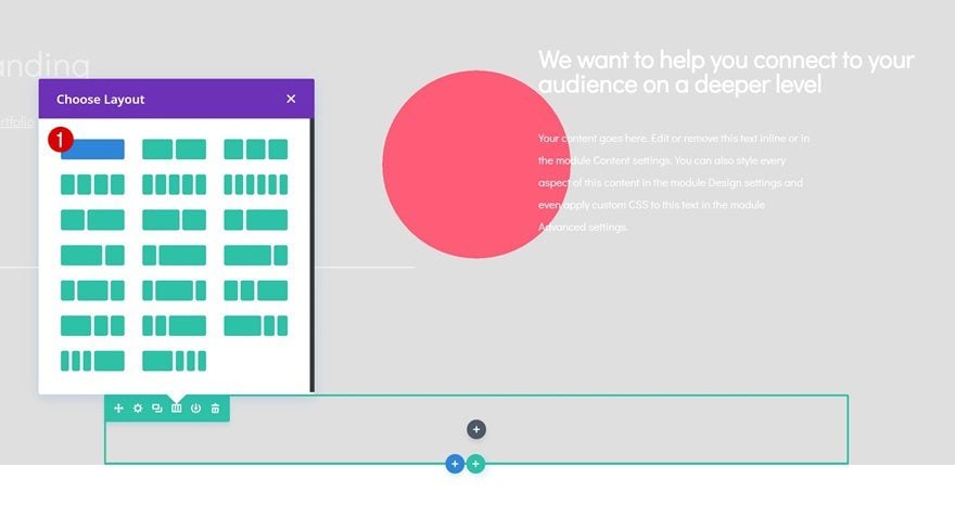
Add Row #1
Column Structure
Continue by adding a new row using the following column structure:
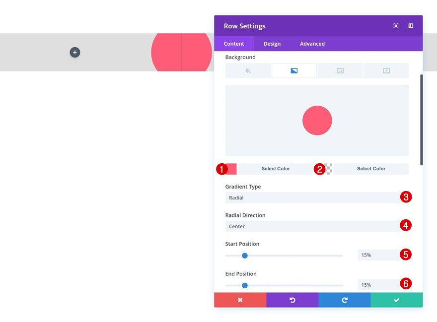
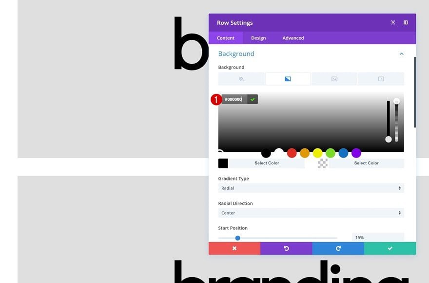
Gradient Background
Without adding any modules yet, open the row settings and add a gradient background.
- Color 1: #ff5b79
- Color 2: rgba(255,255,255,0)
- Gradient Type: Radial
- Radial Direction: Center
- Start Position: 15%
- End Position: 15%
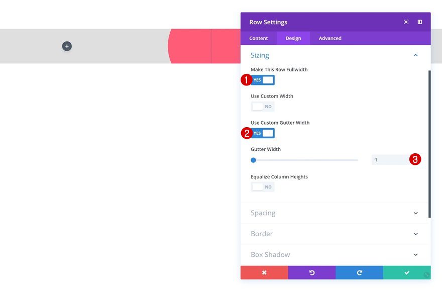
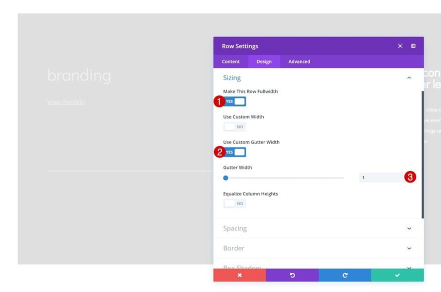
Sizing
Make some changes to the sizing settings of the row as well.
- Make This Row Fullwidth: Yes
- Use Custom Gutter Width: Yes
- Gutter Width: 1
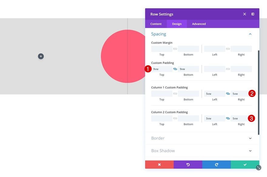
Spacing
And add some custom padding values in the spacing settings.
- Top Padding: 9vw
- Bottom Padding: 9vw
- Column 1 Left Padding: 5vw
- Column 1 Right Padding: 5vw
- Column 2 Left Padding: 5vw
- Column 2 Right Padding: 5vw
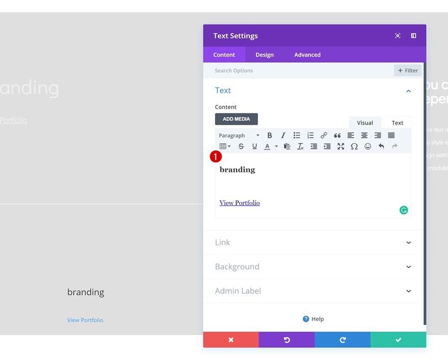
Add Text Module to Column 1
Add Content
Time to start adding the modules! The first module we’ll need is a Text Module in column 1. Add H3 content and a link.
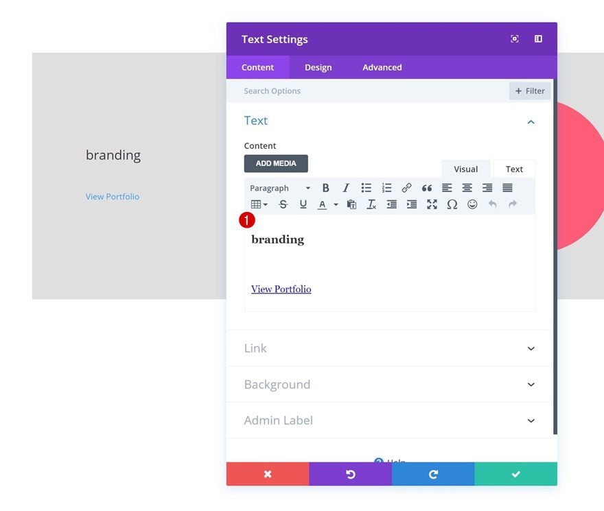
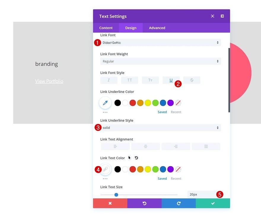
Link Text Settings
Then, go to the link text settings and make some changes to the appearance of the link.
- Link Font: Didact Gothic
- Link Font Style: Underline
- Link Underline Style: Solid
- Link Text Color: #ffffff
- Link Text Size: 20px
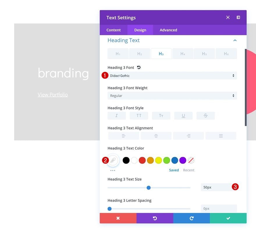
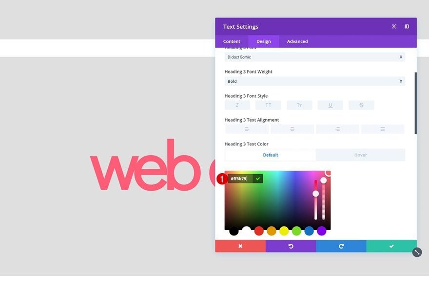
Heading Text Settings
Modify the H3 text settings as well.
- Heading 3 Font: Didact Gothic
- Heading 3 Text Color: #ffffff
- Heading 3 Text Size: 50px
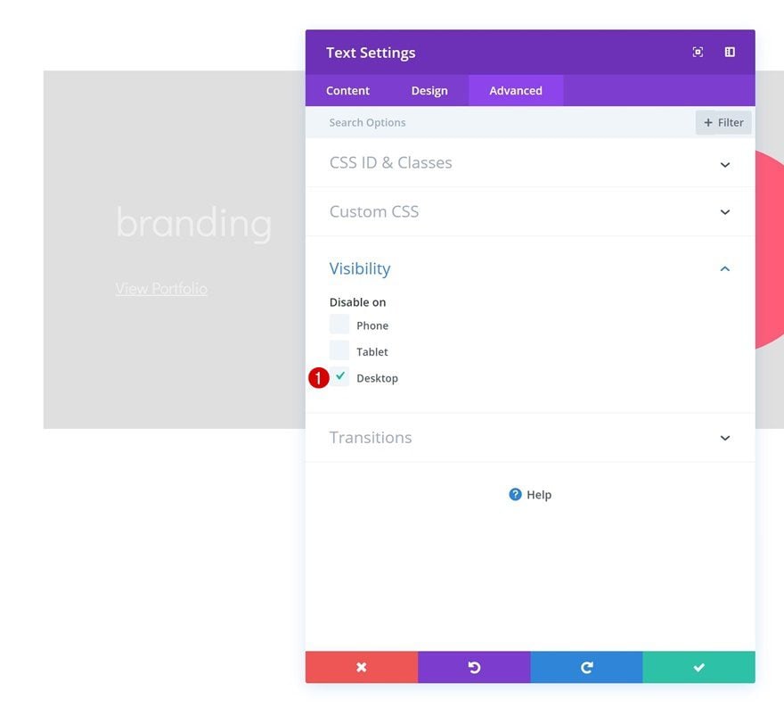
Visibility
Last but not least, disable the module on desktop. We only need this module to show up on smaller screen sizes.
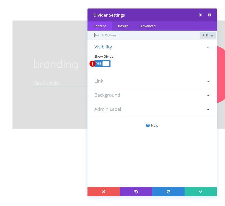
Add Divider Module to Column 2
Visibility
The second and last module needed in column 1 is a Divider Module. Make sure the ‘Show Divider’ option is enabled.
- Show Divider: Yes
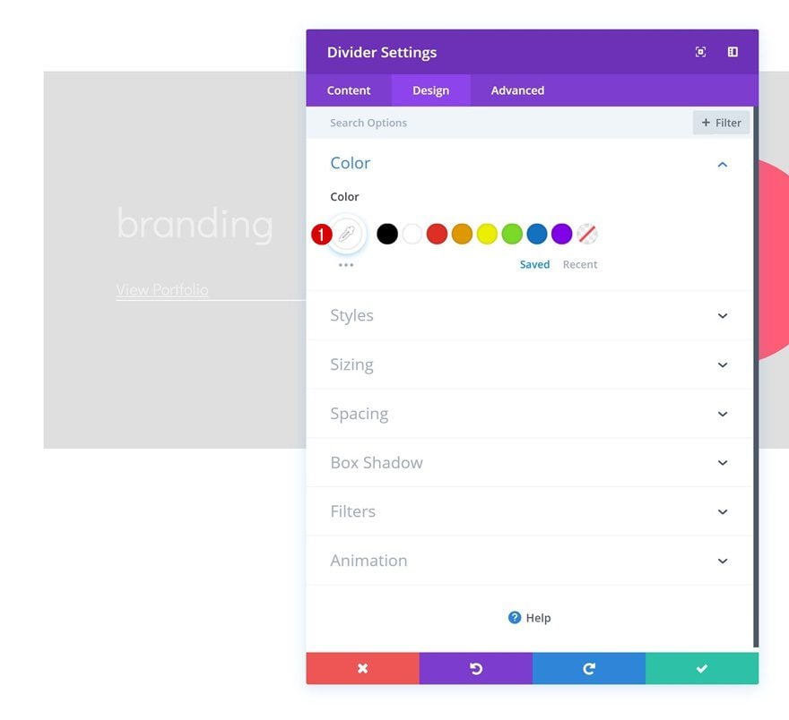
Color
Then, change the divider color.
- Color: #ffffff
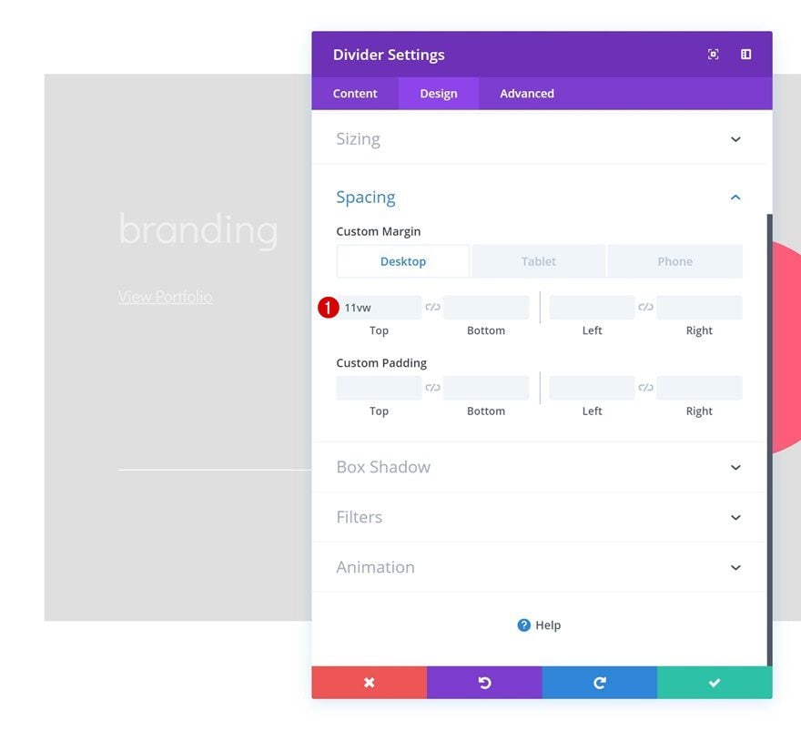
Spacing
Add some custom margin values to the Divider Module as well.
- Top Margin: 11vw (Desktop), 80px (Tablet),
- Bottom Margin: 50px (Tablet & Phone)
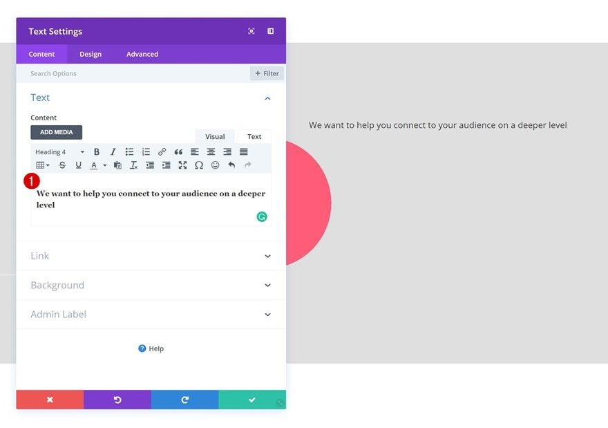
Add Text Module #1 to Column 2
Add Content
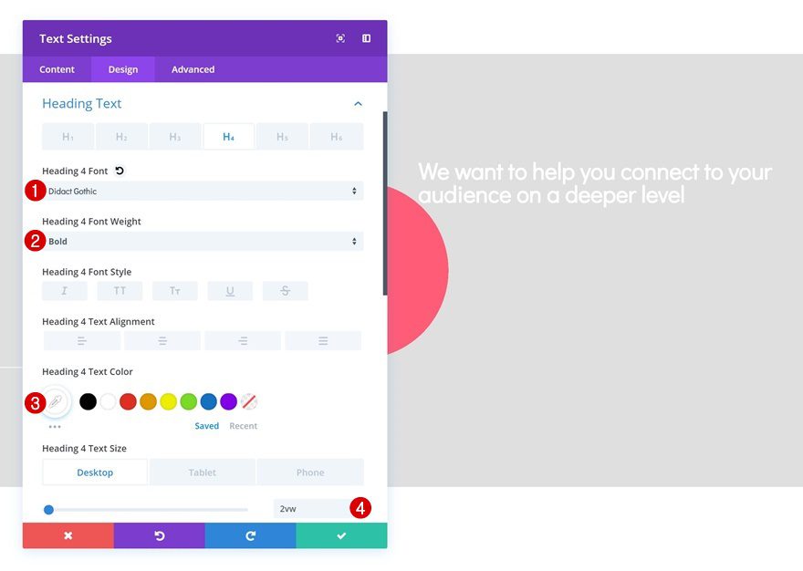
On to the second column! Add a Text Module with some H4 content of choice.
Heading Text Settings
Then, go to the H4 text settings and make some changes.
- Heading 4 Font: Didact Gothic
- Heading 4 Font Weight: Bold
- Heading 4 Text Color: #ffffff
- Heading 4 Text Size: 2vw (Desktop), 40px (Tablet), 30px (Phone)
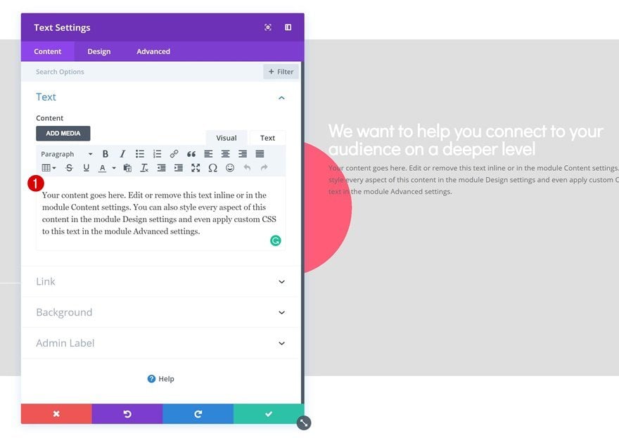
Add Text Module #2 to Column 2
Add Content
Right below the previous Text Module, go ahead and add another one with some paragraph content of choice.
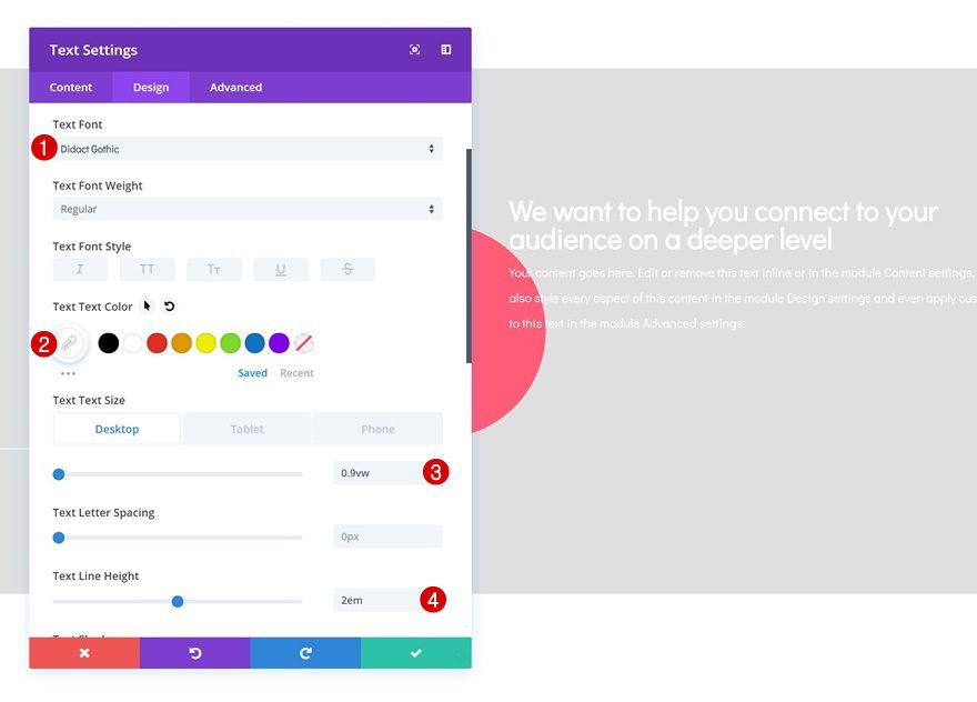
Text Settings
Go to the text settings next and make some changes.
- Text Font: Didact Gothic
- Text Color: #ffffff
- Text Size: 0.9vw (Desktop), 18px (Tablet & Phone)
- Text Line Height: 2em
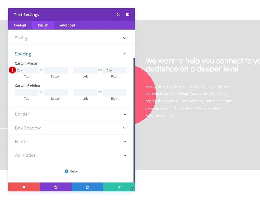
Spacing
Add some custom margin values too.
- Top Margin: 2vw
- Right Margin: 15vw
Add Row #2
Column Structure
Once you’re done modifying the first row and all of its modules, you can go ahead and add a new row using the following column structure:
Sizing
Without adding any modules yet, open the row settings and make some changes to the Sizing settings.
- Make This Row Fullwidth: Yes
- Use Custom Gutter Width: Yes
- Gutter Width: 1
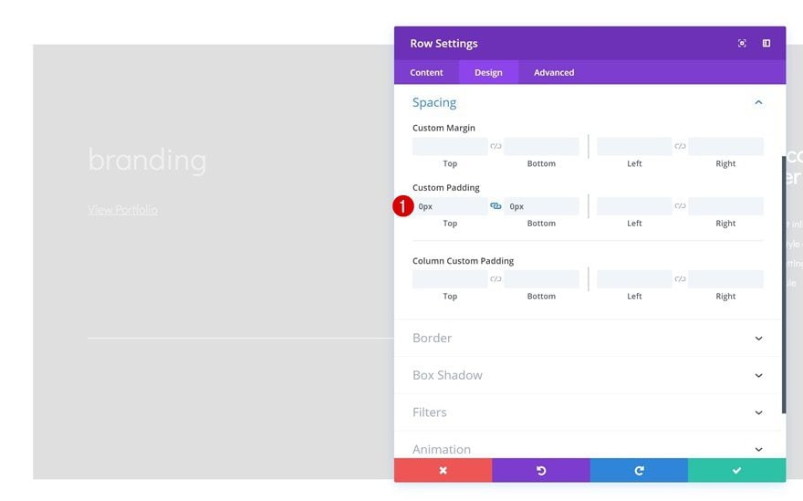
Spacing
Remove all default padding in the row spacing settings as well.
- Top Padding: 0px
- Bottom Padding: 0px
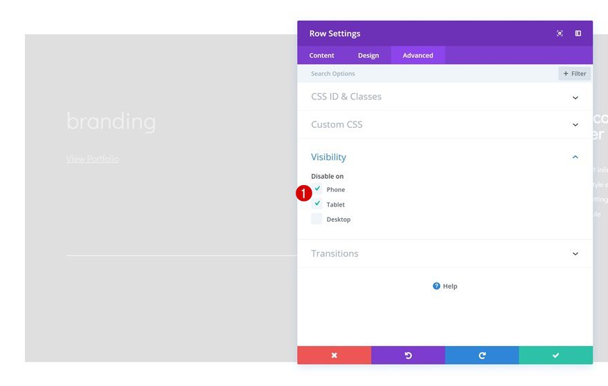
Visibility
Last but not least, hide this row on tablet and phone.
Add Text Module to Column
Add Content
The only module we need in this row is a Text Module. Add some H3 content and a link.
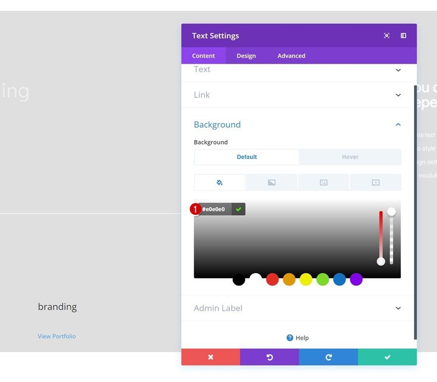
Default Background Color
Then, go to the background settings and add a background color to the Text Module.
- Background Color: #e0e0e0
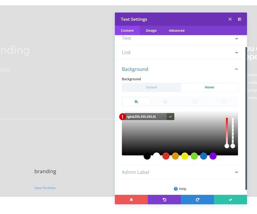
Hover Background Color
Modify this background color on hover.
- Background Color: rgba(255,255,255,0)
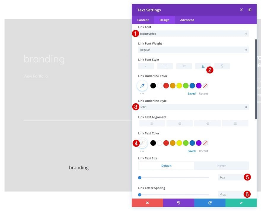
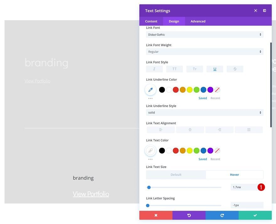
Default Text Settings
Next, go to the text settings and make some changes.
- Link Font: Didact Gothic
- Link Font Style: Underline
- Link Underline Style: Solid
- Link Text Color: #ffffff
- Link Text Size: 0px
- Link Letter Spacing: -1px
Hover Link Text Settings
Modify the link text size on hover as well.
- Link Text Size: 1.7vw
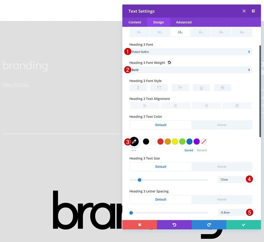
Default Heading Text Settings
Continue by making some changes to the H3 text settings.
- Heading 3 Font: Didact Gothic
- Heading 3 Font Weight: Bold
- Heading 3 Text Color: #000000
- Heading 3 Text Size: 12vw
- Heading 3 Letter Spacing: -0.8vw
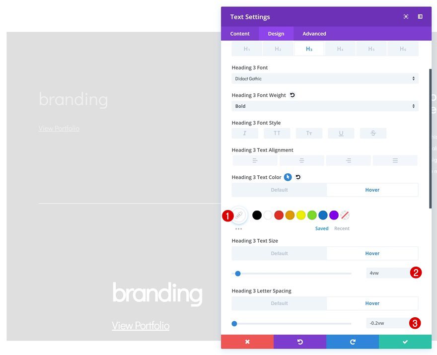
Hover Heading Text Settings
Modify some of the H3 text settings on hover.
- Heading 3 Text Color: #ffffff
- Heading 3 Text Size: 4vw
- Heading 3 Letter Spacing: -0.2vw
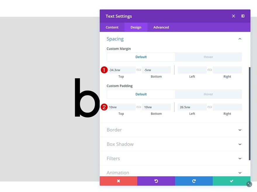
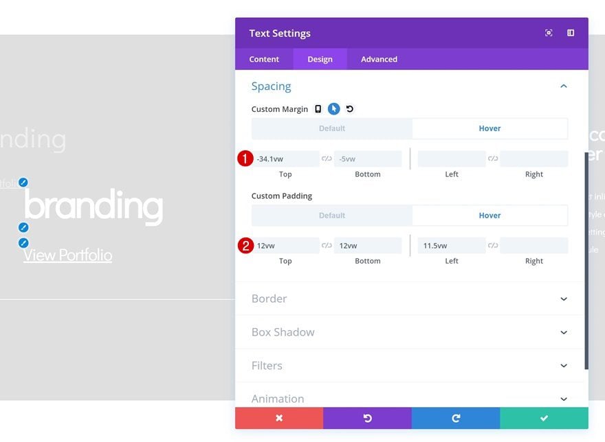
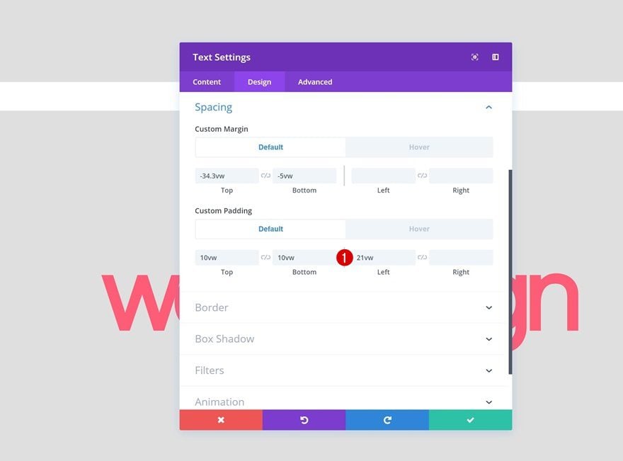
Spacing
Then, go to the spacing settings and add some custom margin and padding values.
- Top Margin: -34.3vw
- Bottom Margin: -5vw
- Top Padding: 10vw
- Bottom Padding: 10vw
- Left Padding: 26.5vw
Hover Spacing
Modify the spacing values on hover.
- Top Margin: -34.1vw
- Bottom Margin: -5vw
- Top Padding: 12vw
- Bottom Padding: 12vw
- Left Padding: 11.5vw
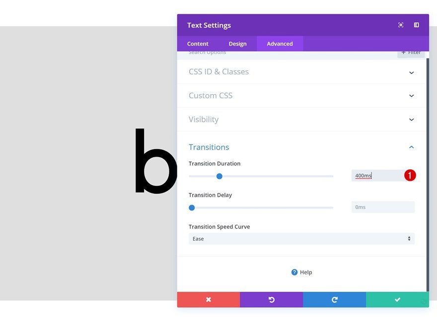
Transitions
Increase the transition duration of the Text Module as well.
- Transition Duration: 400ms
Clone Section
Once your first section is completed, go ahead and clone the entire section up to as many times as you want. In the next part of the tutorial, we’ll show you the changes you need to make to each duplicate.
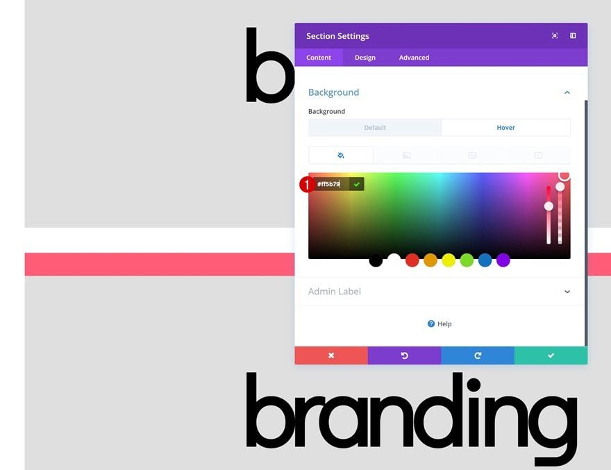
Change Section Hover Background Color
The first thing you’ll need to modify is the section hover background color.
- Background Color: #ff5b79
Change Row #1 Gradient Background
Change the row #1 gradient background as well.
- Color 1: #000000
Change Text Color & Copy
Along with the text color and all the copy.
- Heading 3 Text Color: #ff5b79
Change Text Module Spacing
Last but not least, change the left padding of the Text Module in row #2. The amount of left padding you’ll need to use depends on the length of the content you’re using.
- Left Padding: 21vw
Download The Layout for FREE
To lay your hands on the layout, you will first need to download it using the button below. To gain access to the download you will need to subscribe to our newsletter by using the form below. As a new subscriber, you will receive even more Divi goodness and a free Divi Layout pack every Monday! If you’re already on the list, simply enter your email address below and click download. You will not be “resubscribed” or receive extra emails.

Preview
Now that we’ve gone through all the steps, let’s take a final look at the outcome on different screen sizes.
Desktop
Mobile
Final Thoughts
In this post, we’ve shown you how to reveal hidden row content on hover. The outcome we’ve created is made using Divi’s built-in options only. We’ve also shared the JSON file at the end of the tutorial which will hopefully help you create your own alternative designs as well. If you have any questions or suggestions, make sure you leave a comment in the comment section below!


Hi when I hover in firefox it jumps like crazy if you hold the cursor on it, have I done something wrong? If so do you know a fix?
Thanks, really helpful tutorial
Thank you for the guide. I was struggling with this but didn’t have to go much into searching as found this amazing guide on the first page itself. But I am concerned about the SEO as Google doesn’t like hidden text. What are your views on this?
Love your tutorials, but it would be great if you could skip the tedious text formatting and focus on the functionality in these videos. I feel like I’ve spent hours watching you format text. Not that you’re not a pleasant guy. 🙂
I fully agree with this.
Very instructive and interesting post thanks
It´s a wonderful tutorial – thank you! I am just a bit concerned about SEO as Google does not like hidden text. What do you think?
As far as I can tell, the text isn’t hidden from Google. What they’ve done is created a row with the body text and titles inside which Google can ‘see’, then they’ve created another row (that is only visible on desktop) that covers the first row. When you hover over the second row it becomes transparent, revealing the first row below.
Great effect. If I may suggest something about the tutorial : you spend a lot of content giving us the exact value of each setting, which is great but we can just find them when we download the layout.
Instead, it would be great that you give some “theoretical” content. Like :
– this effect is allowed by a negative margin of row 2 and on hover, heading text get smaller and background color gets transparent and let row 1 appear (silly but I spent time to figure it out)
– also, how can we quickly calculate the good amount of spacing in vw to get everything “fitting” all right
My 2 cents, but thanks for this inspiring article
Can this be done for columns?
I add that it is certainly a good idea downloading the file, thank you
OK, so the grumpy old man says…
I LOVE IT!
This is: Excellent, useful, downloadable, practical, and more! We need more of these kinds of things. Can’t thank you enough. And…NO PLUGIN REQUIRED!
Still a very good tutorial, thank you
Nice work Donjete …this is a very cool use of Divi’s hover styles! Seems to me that you would not want any hover affect on mobile though. Unless I’m missing something, what’s the purpose?
Funny, that was my first thought too. Who has a mouse pointer on mobile? Seems like the tutorial on “flipping cards” is more appropriate for mobile. And a great potential space saver for the end user scrolling thru a mobile page. I haven’t tried it yet but I really need to find a way to create a small module that opens a section of modules if the end user touches “tap for more” or something. Any suggestions on this? Have they done this tutorial and I missed it. What I don’t want is the accordion where adding modules inside is a nightmare task. I’d prefer that a button opens a section that I can build however I want. You seem like someone in the know; that’s why I’m asking.
Nice work, Donjete!
I agree, hover effects don’t make any sense with mobile. I find myself relying less and less on them when I design. However, the desktop reveal is really nice.
So helpfull….make my life easier!! 🙂
Excellent tutorial, thanks!