
Throughout all the design trends, the way you design your hero sections remains extremely important. With Divi, you can take on different approaches and create a hero section that stands out and encourages people to extend their stay on your website. To help you get inspired for your upcoming Divi projects, we’re going to show you how to design unique multi-column hero sections using Divi’s built-in options only. Not only do multi-column hero sections look great, but they also help you strategically place more content in the hero section without overwhelming your visitors.
Let’s get to it!
- 1 Preview
- 2 Download The Multi-Column Hero Section Layout for FREE
- 3 Download For Free
-
4
Let’s Start Recreating!
- 4.1 Add New Specialty Section
- 4.2 Add Row #1
- 4.3 Add Text Module to Column
- 4.4 Add Row #2
- 4.5 Add Text Module #1 to Column 1
- 4.6 Add Divider Module to Column 1
- 4.7 Add Text Module #2 to Column 1
- 4.8 Clone All Modules in Column 1 Twice & Place Duplicates in Remaining Columns
- 4.9 Add Row #3
- 4.10 Add Text Module to Column 1
- 4.11 Clone Text Module & Place Duplicate in Column 2
- 4.12 Add Image Module to Section Column 2
- 4.13 Add Text Module to Section Column 2
- 4.14 Clone Both Modules & Place Duplicates in Section Column 3 (Reversed Order)
- 4.15 Add Divider Module to Section Column 2
- 4.16 Add Divider Module to Section Column 3
- 5 Preview
- 6 Final Thoughts
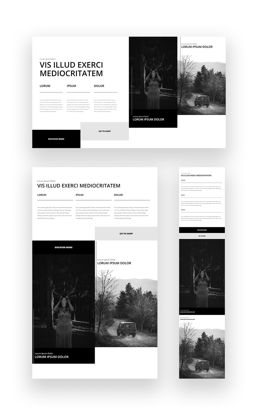
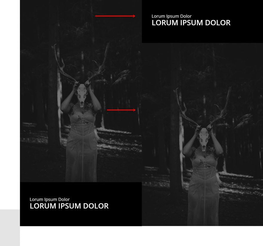
Preview
Before we dive into the tutorial, let’s take a quick look at the outcome across different screen sizes.
Download The Multi-Column Hero Section Layout for FREE
To lay your hands on the multi-column hero section layout, you will first need to download it using the button below. To gain access to the download you will need to subscribe to our newsletter by using the form below. As a new subscriber, you will receive even more Divi goodness and a free Divi Layout pack every Monday! If you’re already on the list, simply enter your email address below and click download. You will not be “resubscribed” or receive extra emails.

Let’s Start Recreating!
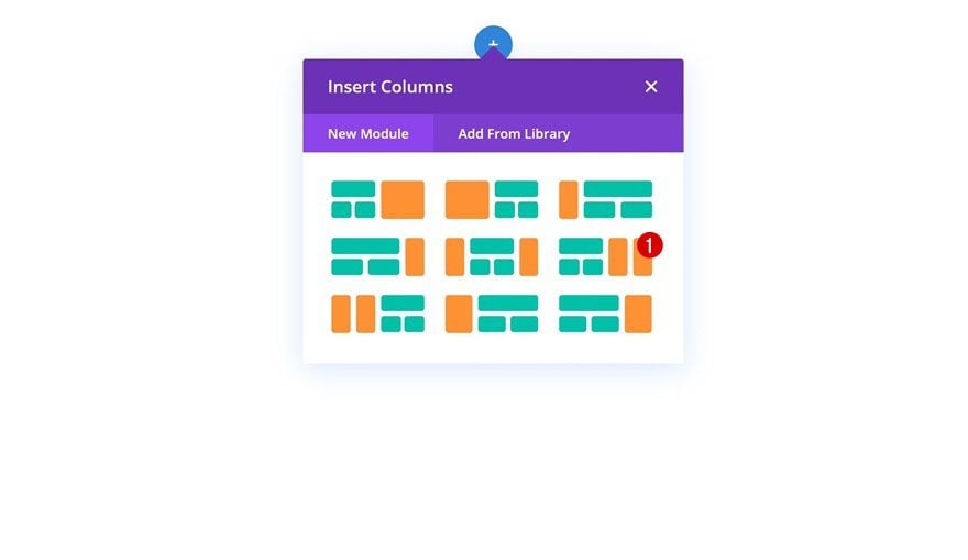
Add New Specialty Section
Column Structure
To create a seamless multi-column hero section, we’re going to use one of the Divi specialty sections that you have access to inside the Visual Builder. Going for a specialty section allows you to have a better grip on the grid structure you go for when you’re designing a multi-column hero section. For this particular example, we’re selecting the following column structure:
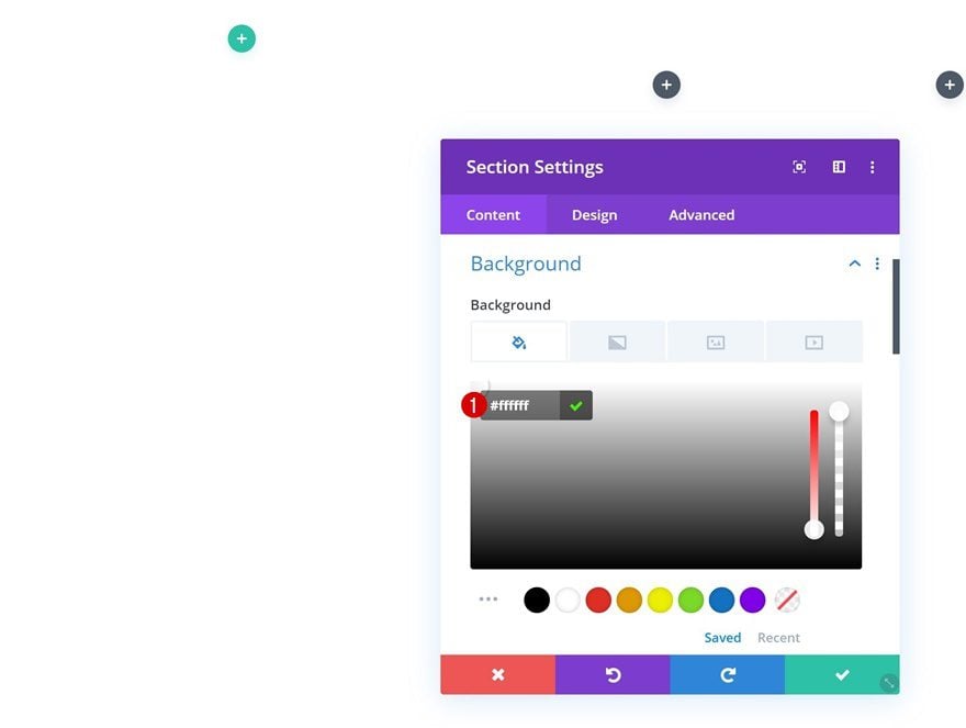
Background Color
Open the section settings and add a white background color.
- Background Color: #ffffff
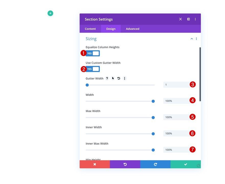
Sizing
We’re making sure that there’s no gap between the section columns by changing the sizing settings.
- Equalize Column Heights: Yes
- Use Custom Gutter Width: Yes
- Gutter Width: 1
- Width: 100%
- Max Width: 100%
- Inner Width: 100%
- Inner Max Width: 100%
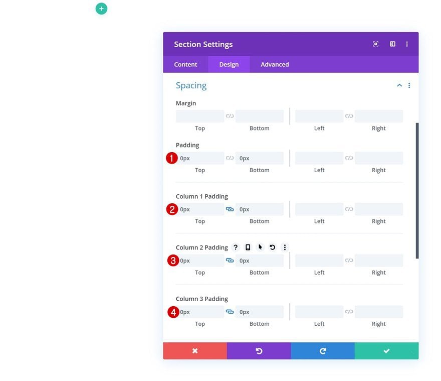
Spacing
We’re also removing all default top and bottom padding of the row and columns.
- Top Padding: 0px
- Bottom Padding: 0px
- Column 1 Top Padding: 0px
- Column 1 Bottom Padding: 0px
- Column 2 Top Padding: 0px
- Column 2 Bottom Padding: 0px
- Column 3 Top Padding: 0px
- Column 3 Bottom Padding: 0px
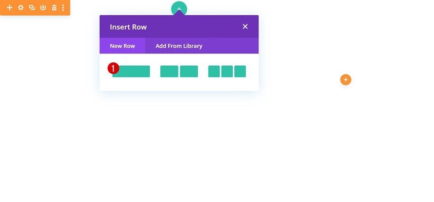
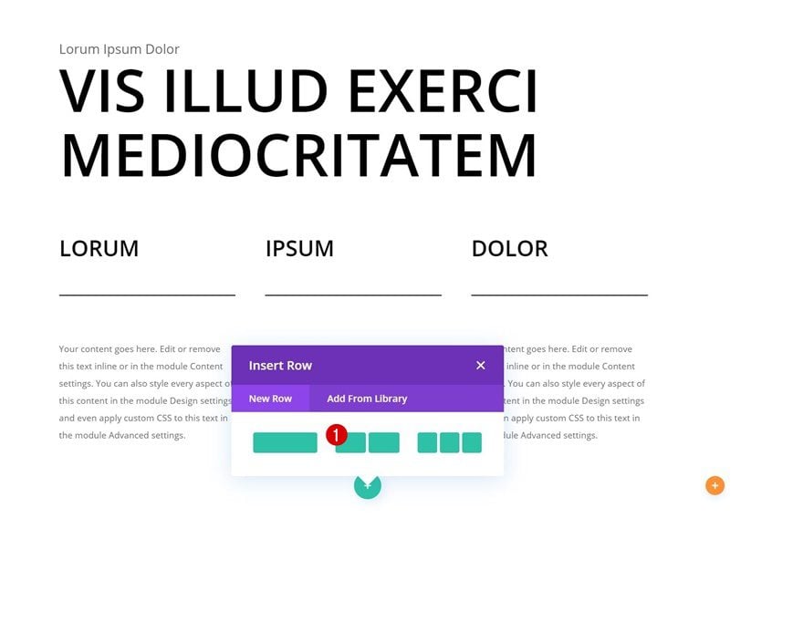
Add Row #1
Column Structure
Continue by adding a new row to the first section column using the following column structure:
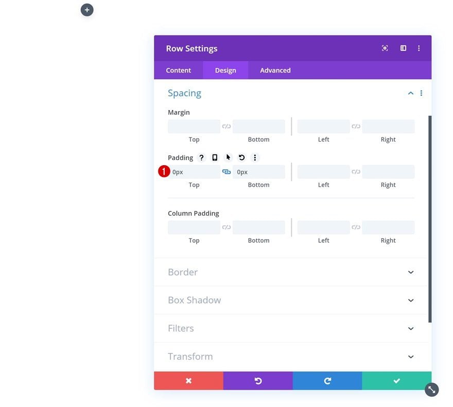
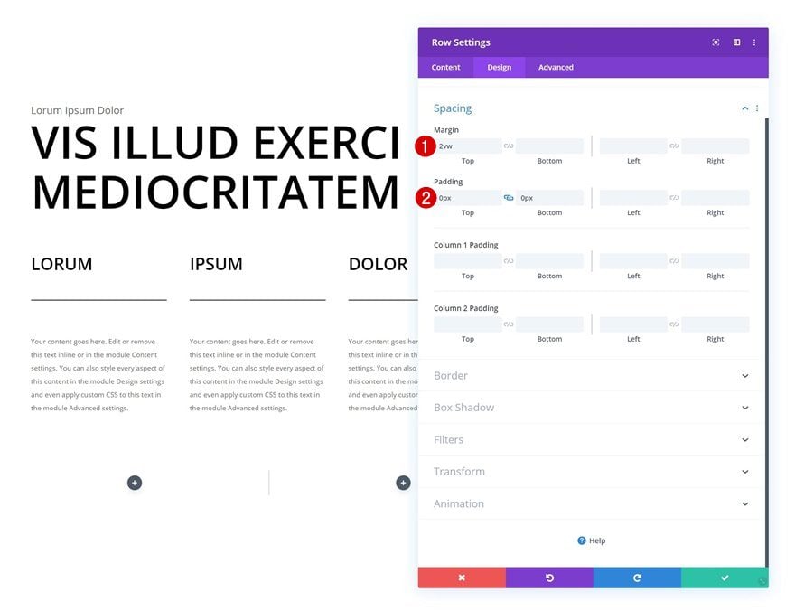
Spacing
Without adding any modules yet, open the row settings and remove all default top and bottom padding.
- Top Padding: 0px
- Bottom Padding: 0px
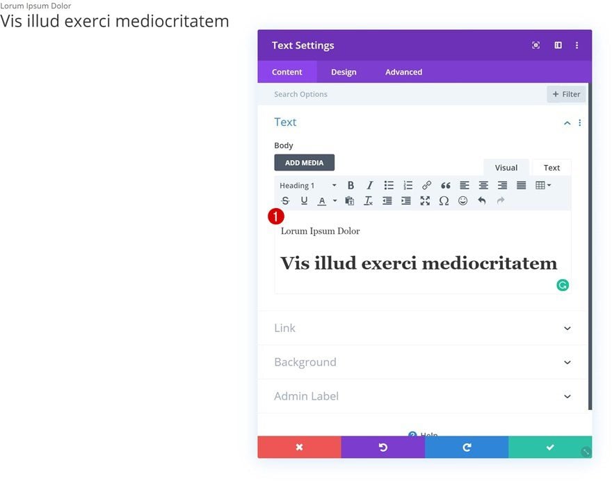
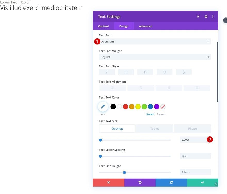
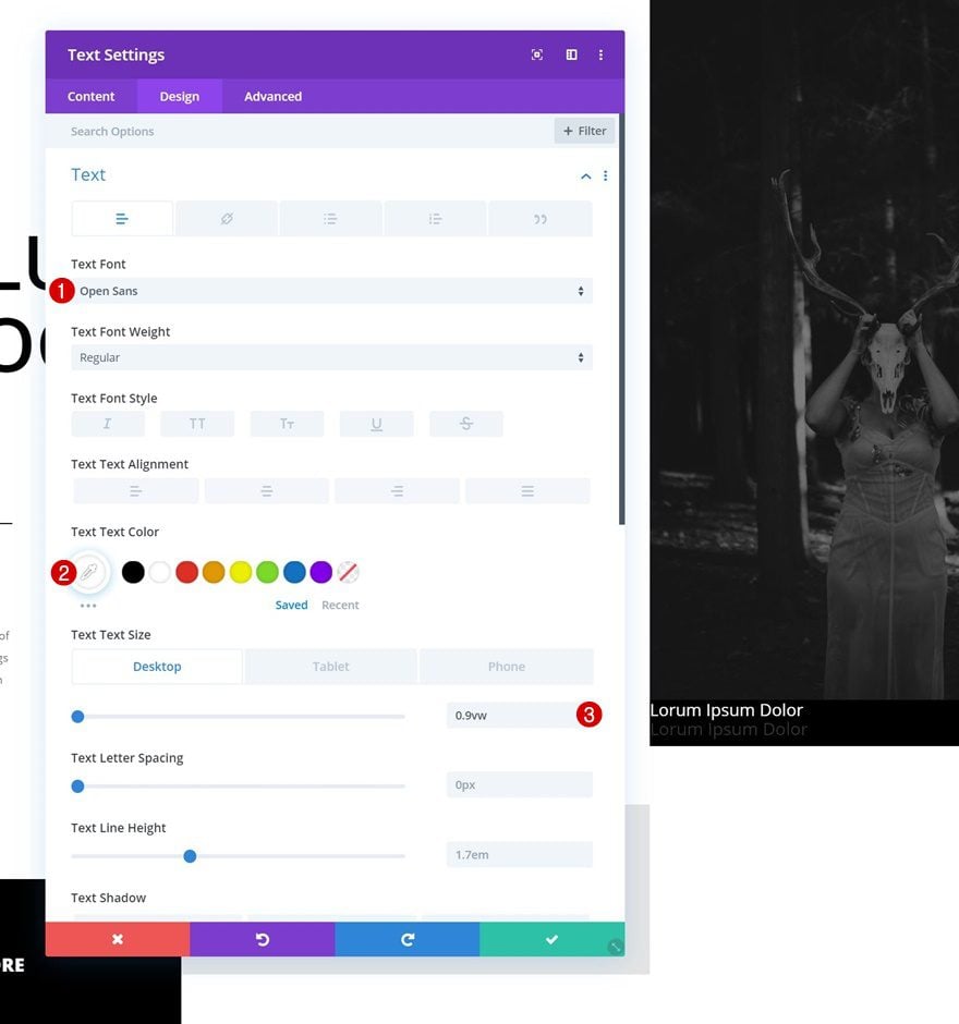
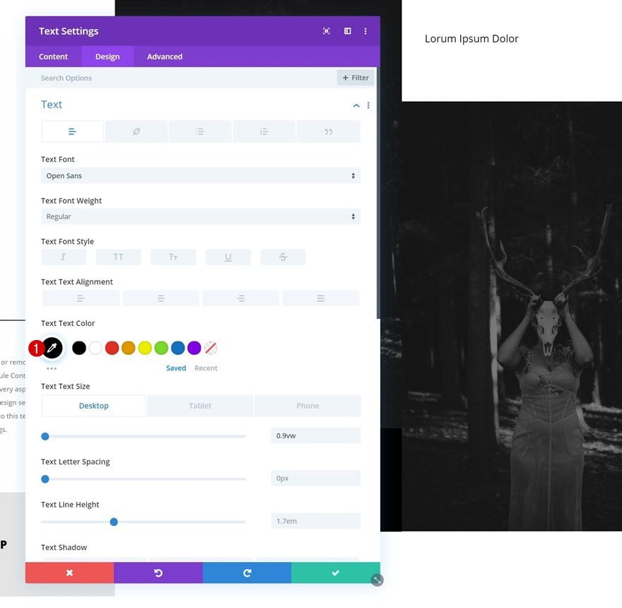
Add Text Module to Column
Add Paragraph & H1 Content
Time to start adding modules! Add a new Text Module with some paragraph and H1 content of your choice.
Text Settings
Move on to the design tab and change the text settings.
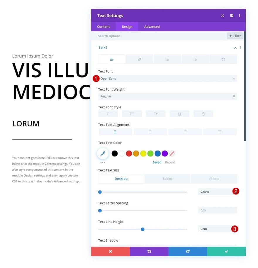
- Text Font: Open Sans
- Text Size: 0.9vw (Desktop), 1.6vw (Tablet), 2.2vw (Phone)
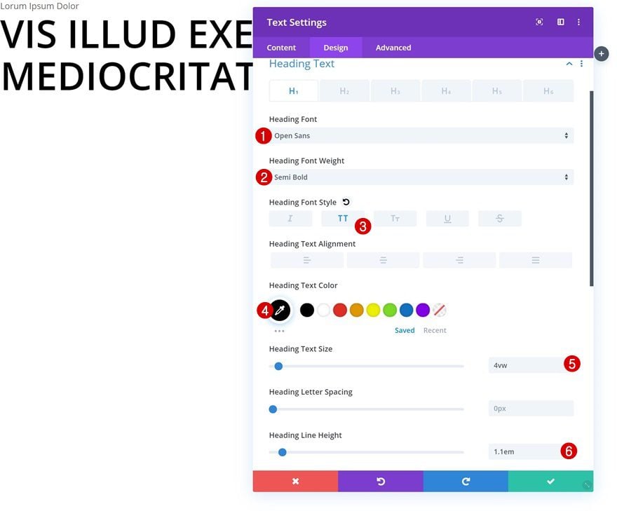
H1 Text Settings
Modify the H1 text settings as well.
- Heading Font: Open Sans
- Heading Font Weight: Semi Bold
- Heading Font Style: Uppercase
- Heading Text Color: #000000
- Heading Text Size: 4vw
- Heading Line Height: 1.1em
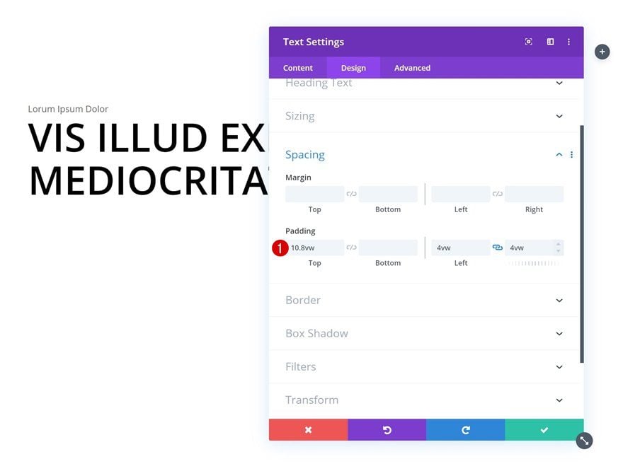
Spacing
Add some custom padding values too.
- Top Padding: 10.8vw
- Left Padding: 4vw
- Right Padding: 4vw
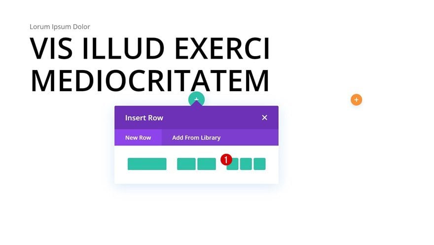
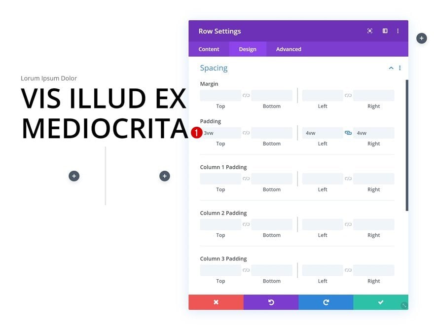
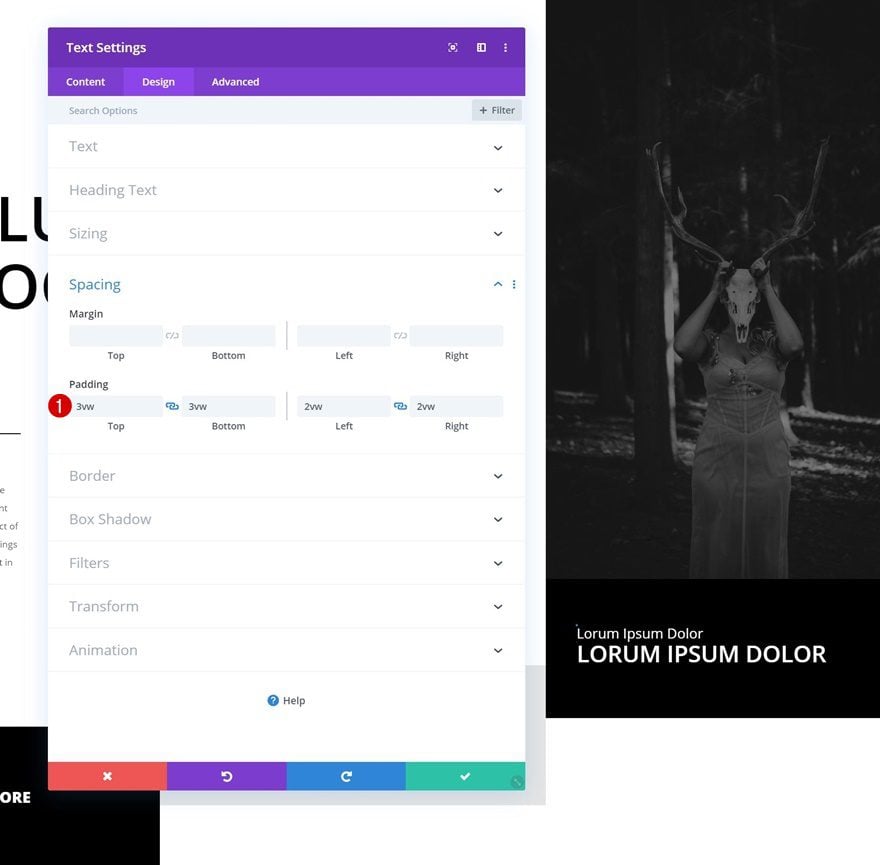
Add Row #2
Column Structure
The second row we need in the first section column uses the following column structure:
Spacing
Without adding any modules yet, open the row settings and modify the padding values.
- Top Padding: 3vw
- Left Padding: 4vw
- Right Padding: 4vw
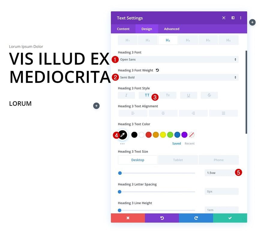
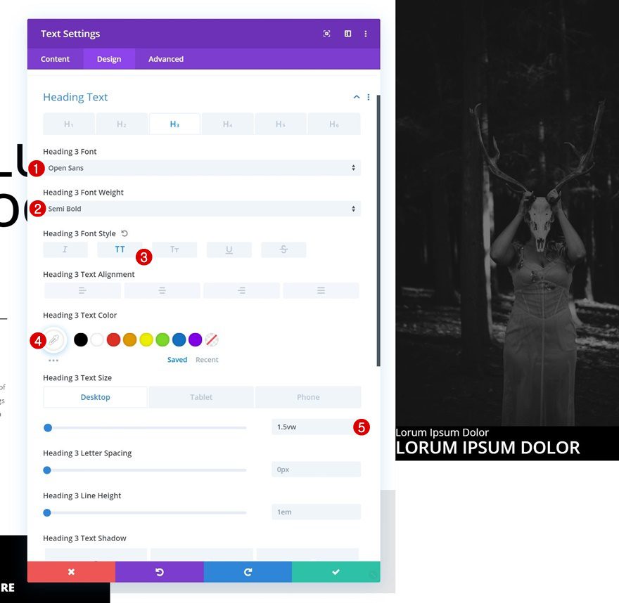
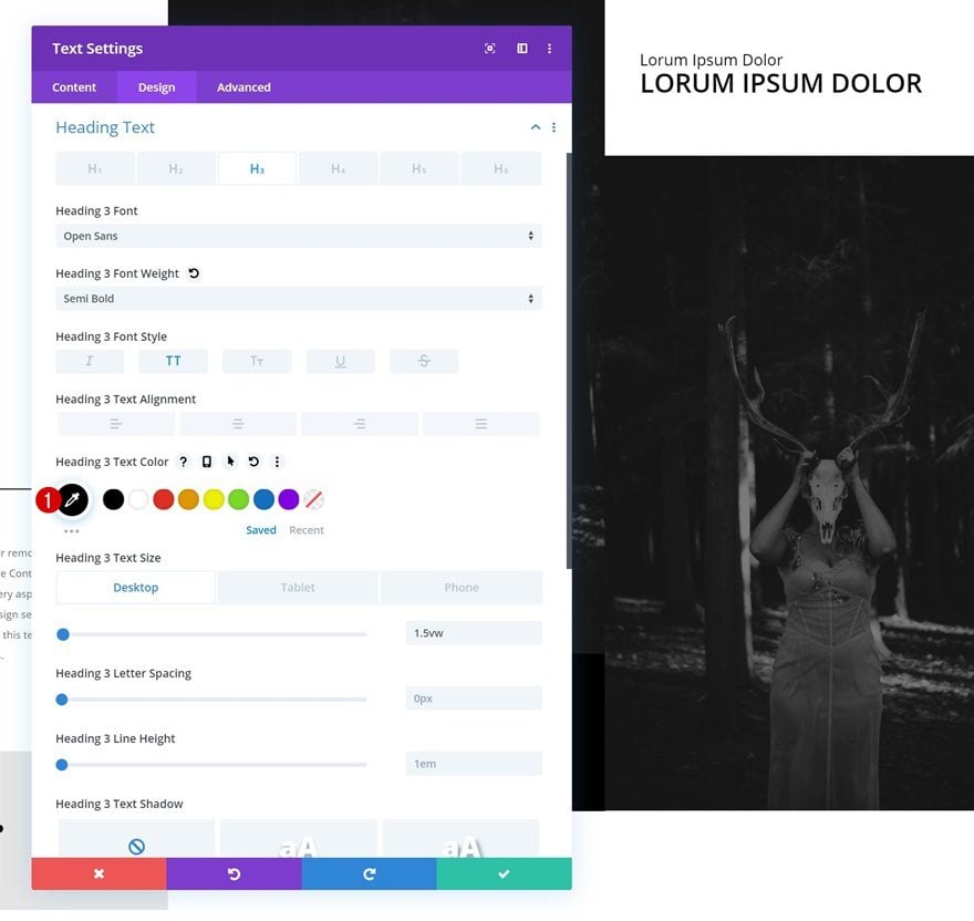
Add Text Module #1 to Column 1
Add H3 Content
Once you’re done with the row settings, you can go ahead and add a new Text Module to the first column. Enter some H3 content of your choice.
H3 Text Settings
Move on to the design tab and change the H3 text settings accordingly:
- Heading 3 Font: Open Sans
- Heading 3 Font Weight: Semi Bold
- Heading 3 Font Style: Uppercase
- Heading 3 Text Color: #000000
- Heading 3 Text Size: 1.5vw (Desktop), 2vw (Tablet), 2.5vw (Phone)
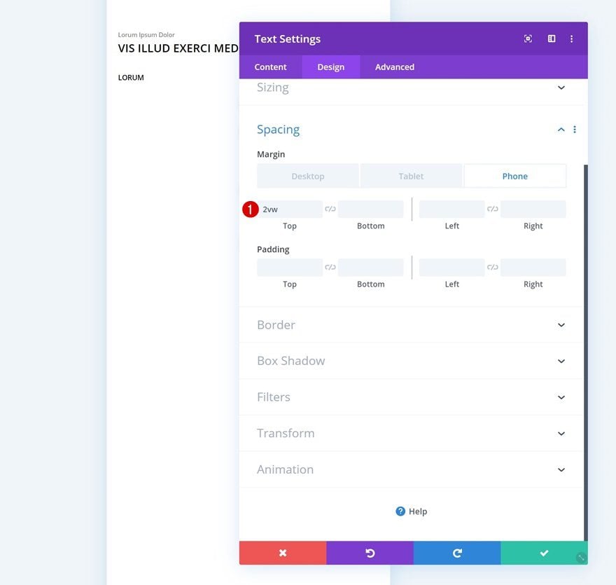
Spacing
Continue by adding some top margin on phone.
- Top Margin: 2vw (Phone Only)
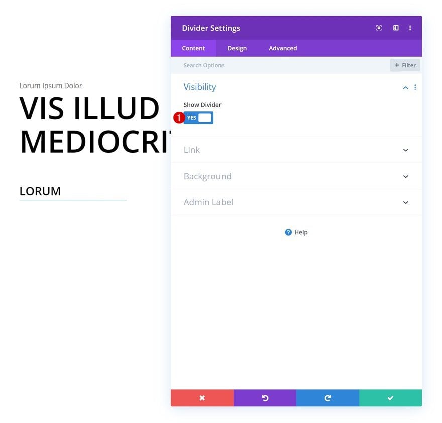
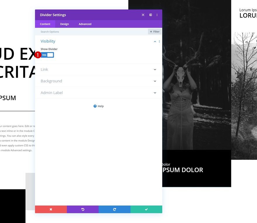
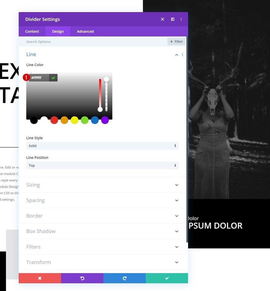
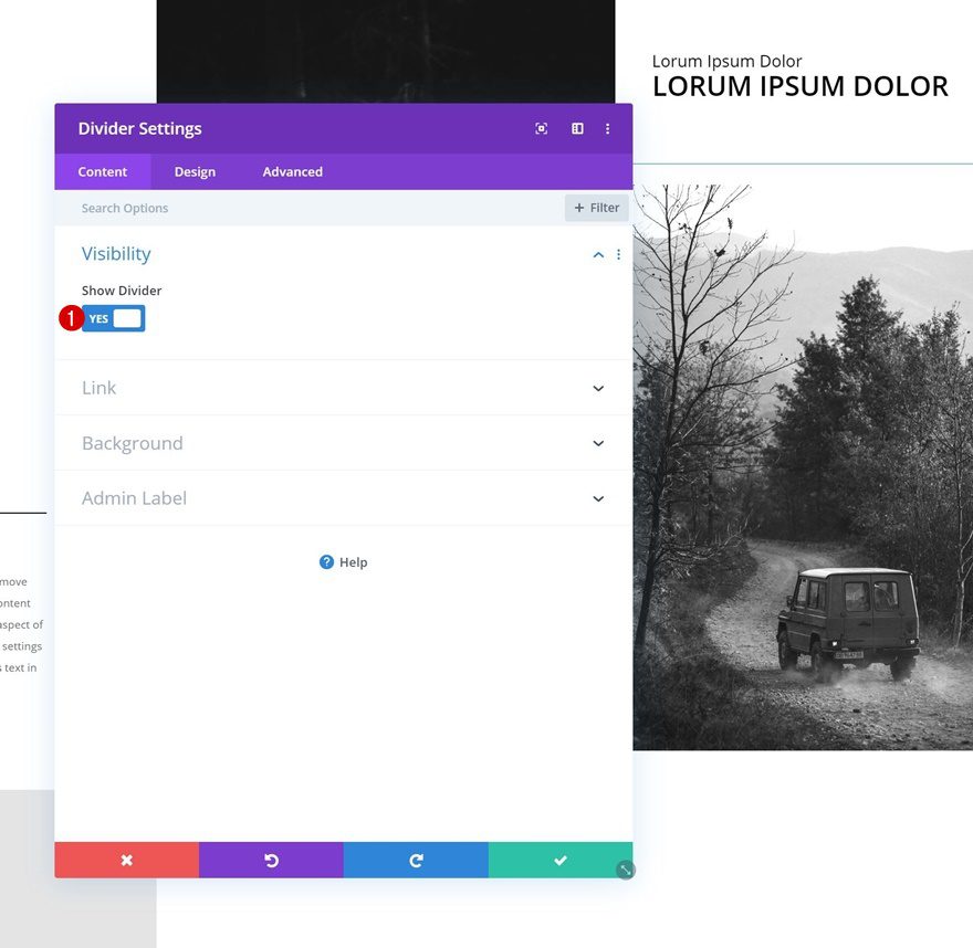
Add Divider Module to Column 1
Visibility
The second module we need in the first column is a Divider Module. Make sure the ‘Show Divider’ option is enabled.
- Show Divider: Yes
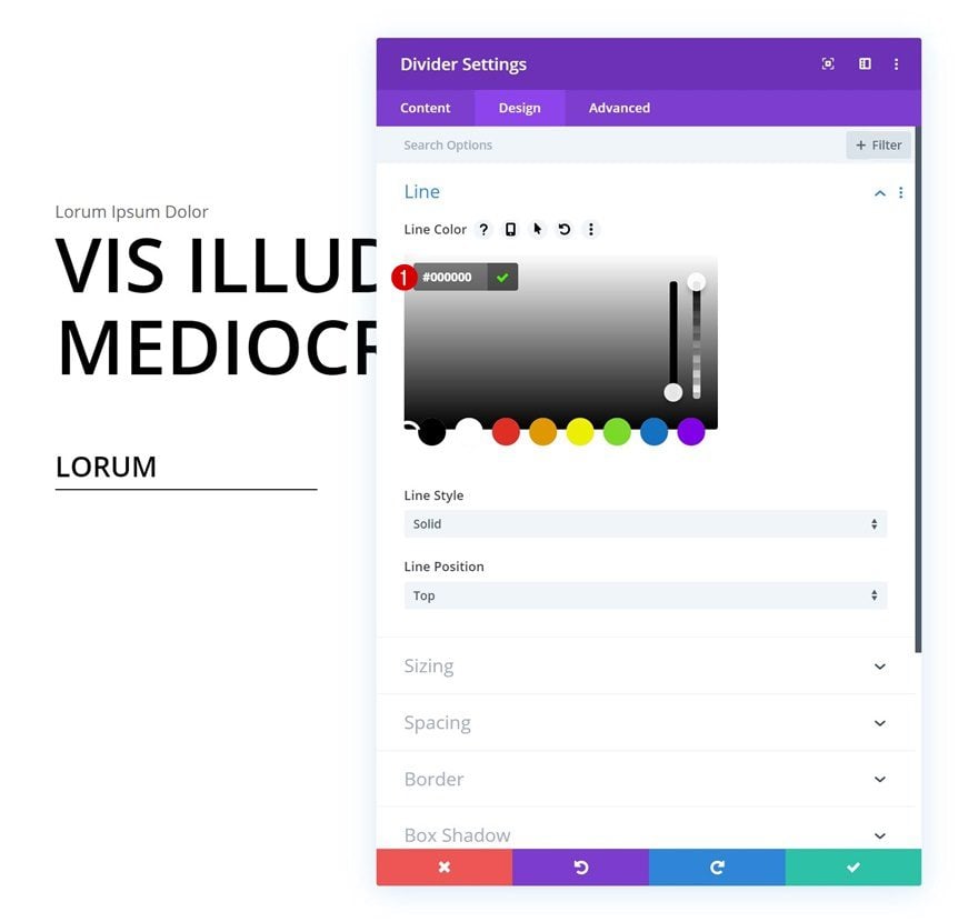
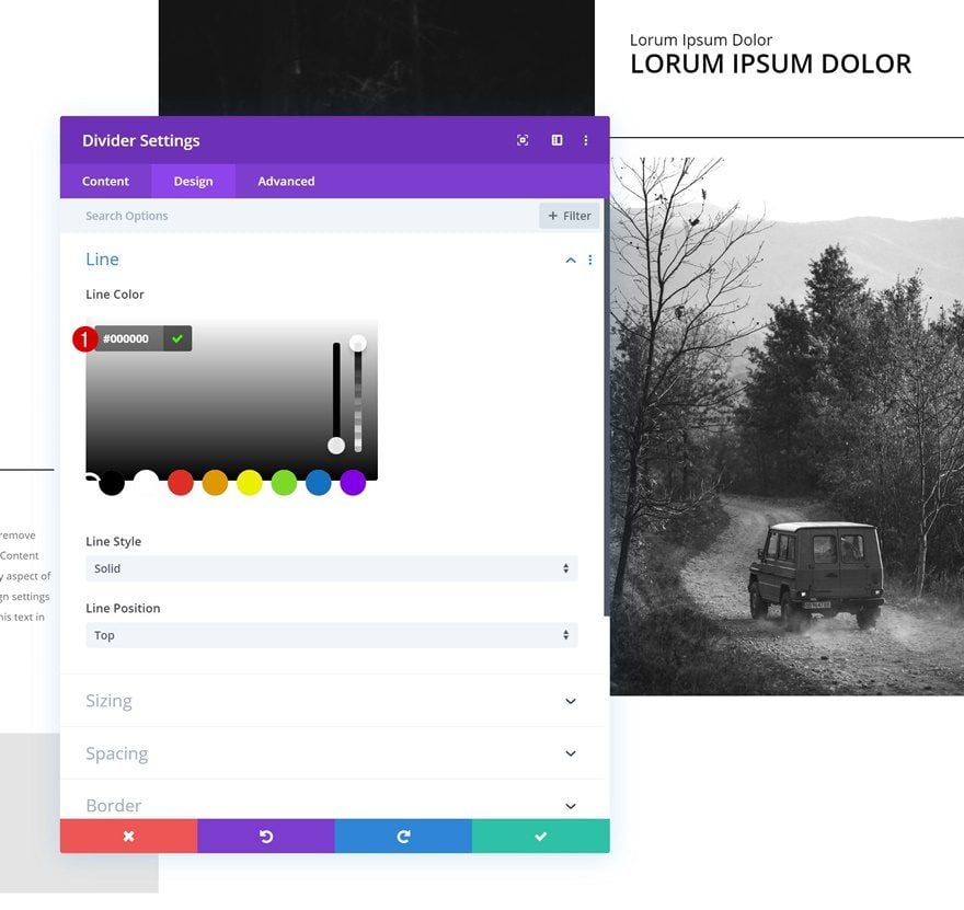
Line
Change the line color next.
- Line Color: #000000
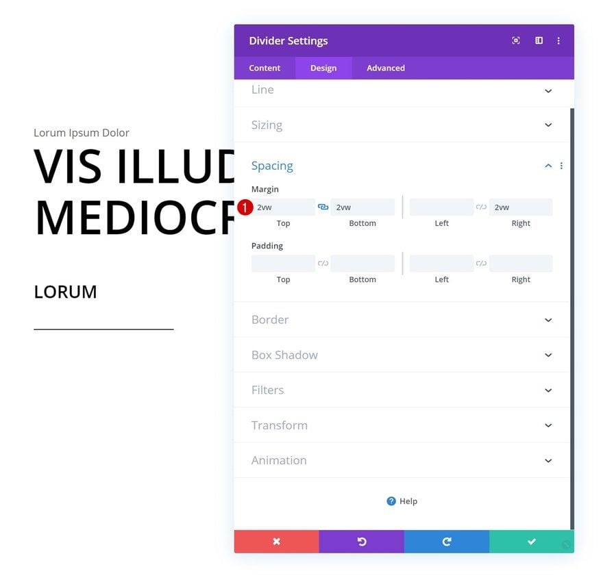
Spacing
Add some custom margin values to create space around the divider.
- Top Margin: 2vw
- Bottom Margin: 2vw
- Right Margin: 2vw
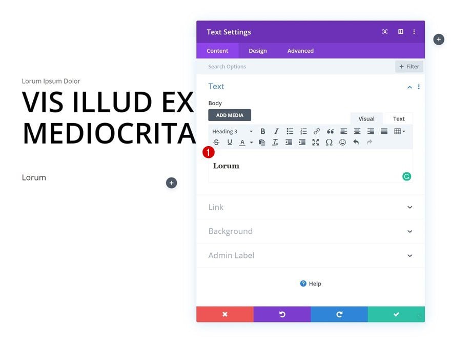
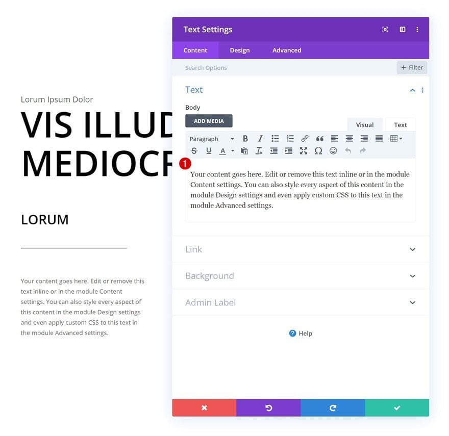
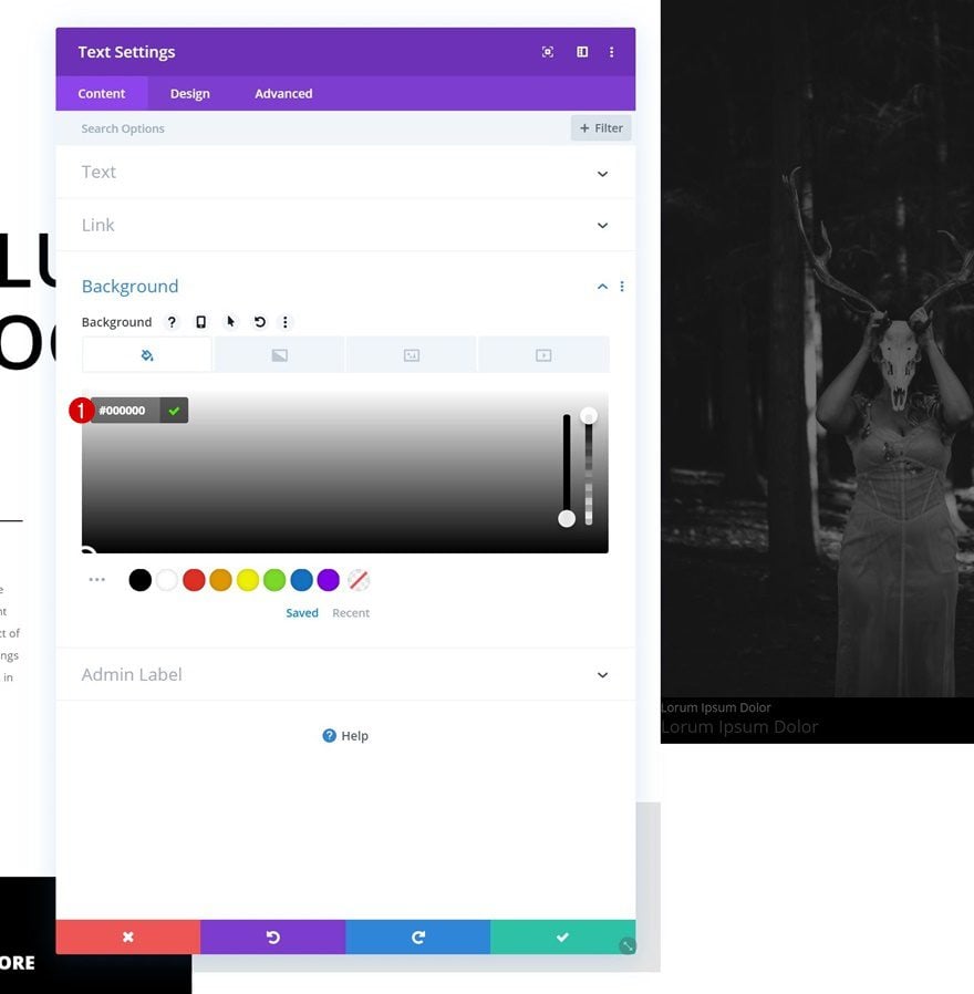
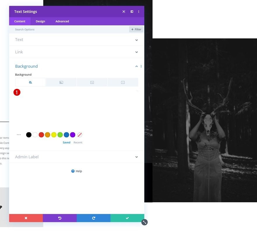
Add Text Module #2 to Column 1
Add Content
The next and last module we need in this column is another Text Module. Enter some paragraph content of your choice.
Text Settings
Move on to the design tab and change the text settings accordingly:
- Text Font: Open Sans
- Text Size: 0.6vw (Desktop), 1.1vw (Tablet), 2vw (Phone)
- Text Line Height: 2em
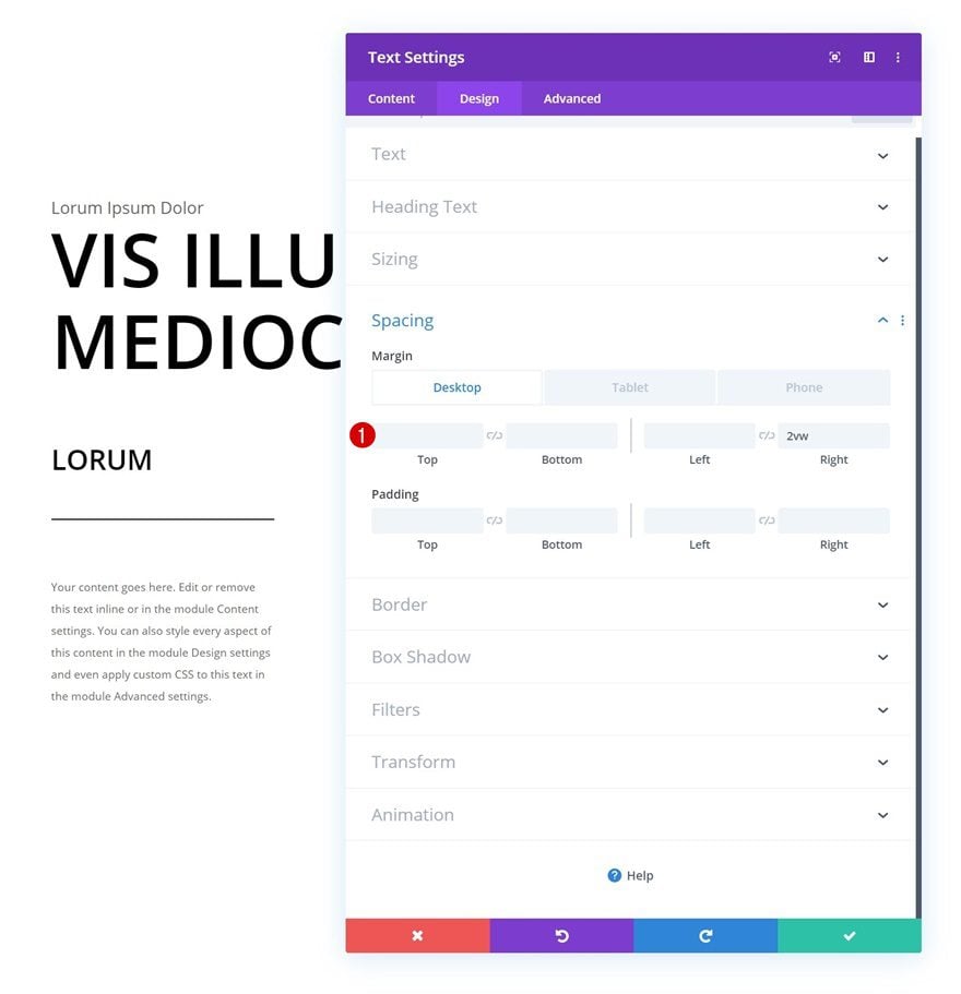
Spacing
Add some bottom and right padding as well.
- Bottom Margin: 5vw (Phone Only)
- Right Margin: 2vw
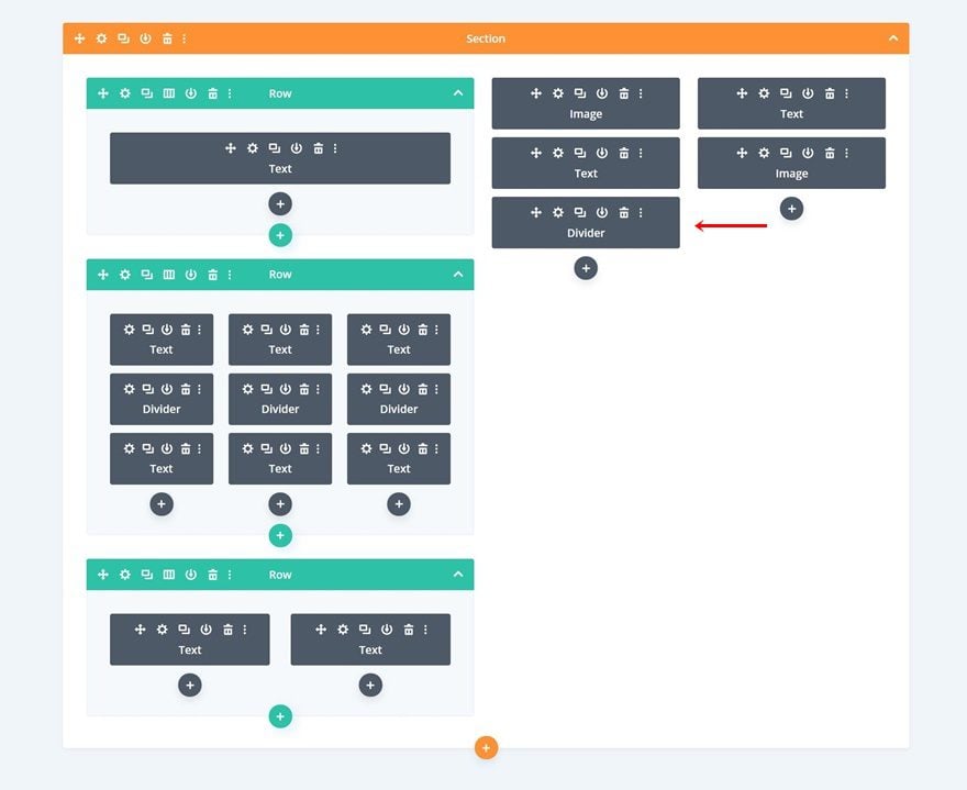
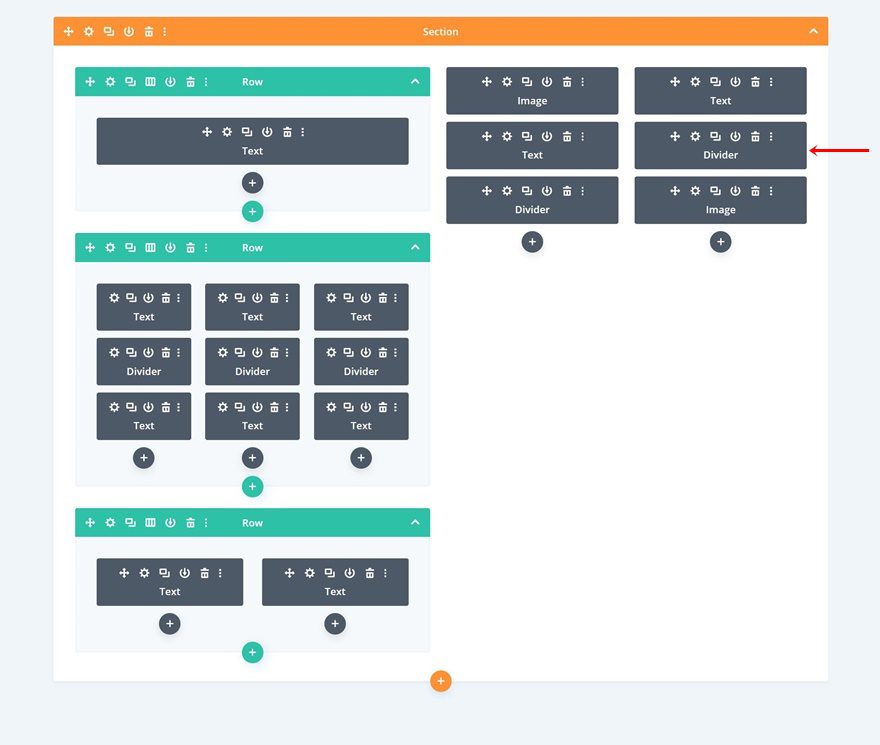
Clone All Modules in Column 1 Twice & Place Duplicates in Remaining Columns
Once you’ve completed all modules in column 1, you can go ahead and clone each one of them twice. Place the duplicates in the two remaining columns of the row.
Change Content
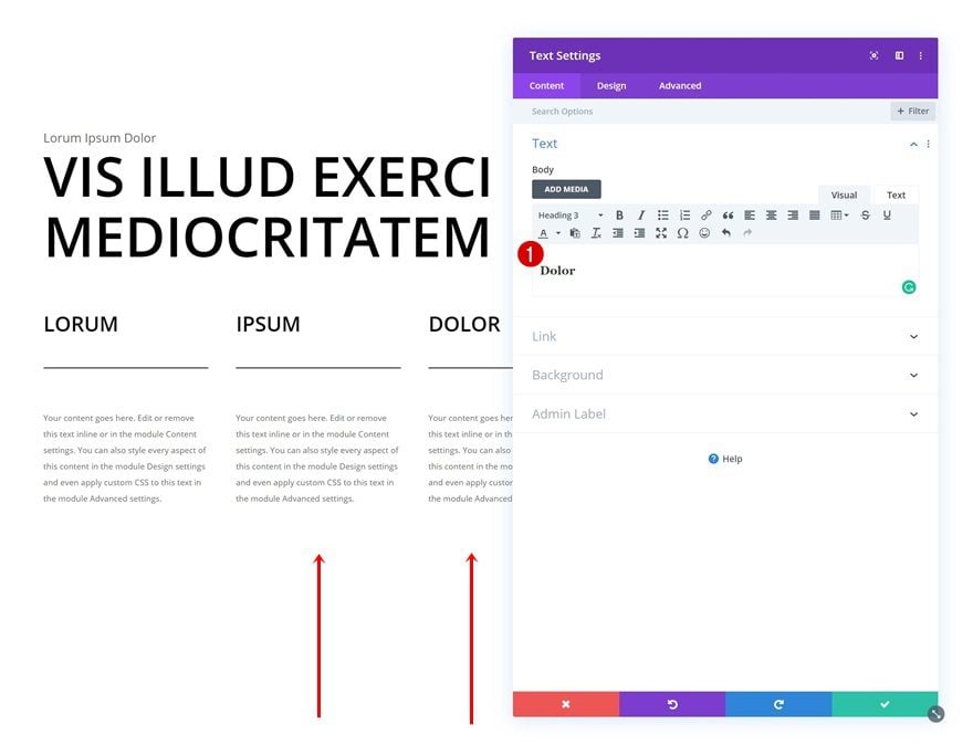
Make sure that you change all the content in the Text Modules.
Add Row #3
Column Structure
The next and last row we need in the first section column uses the following column structure:
Spacing
Open the row settings and modify the spacing values.
- Top Margin: 2vw
- Top Padding: 0px
- Bottom Padding: 0px
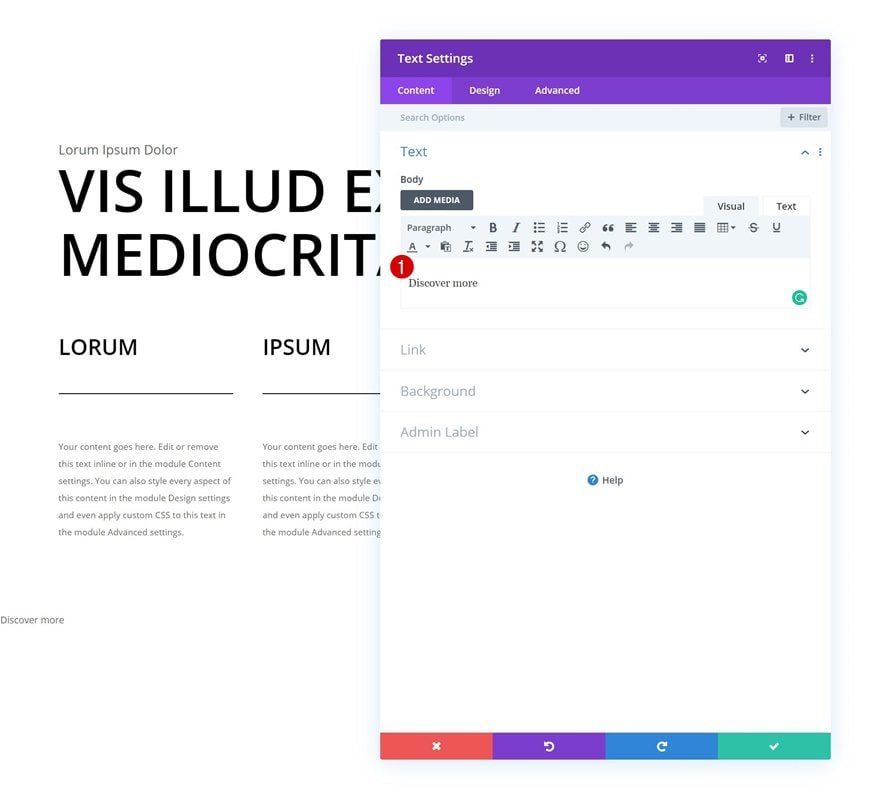
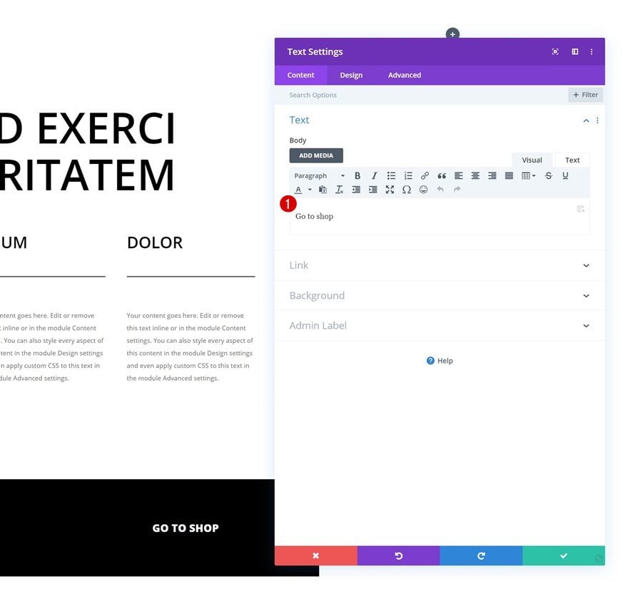
Add Text Module to Column 1
Add Content
Continue by adding a Text Module to the first column with some CTA copy of your choice.
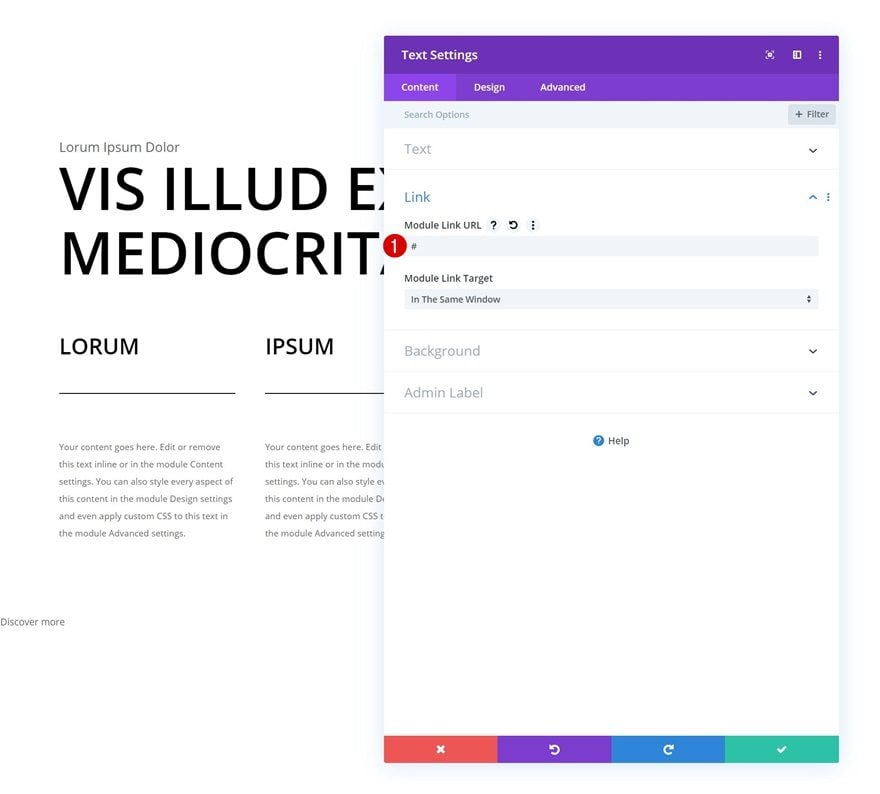
Add Link
Add a link to the entire module as well.
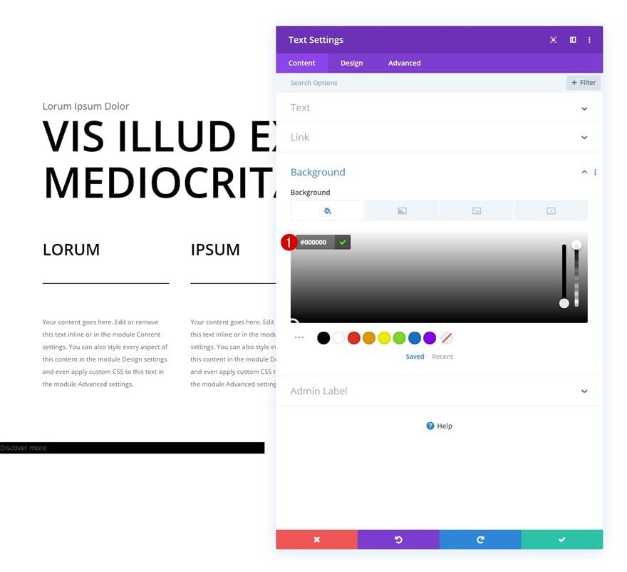
Background Color
We’re also changing the background color of the Text Module.
- Background Color: #000000
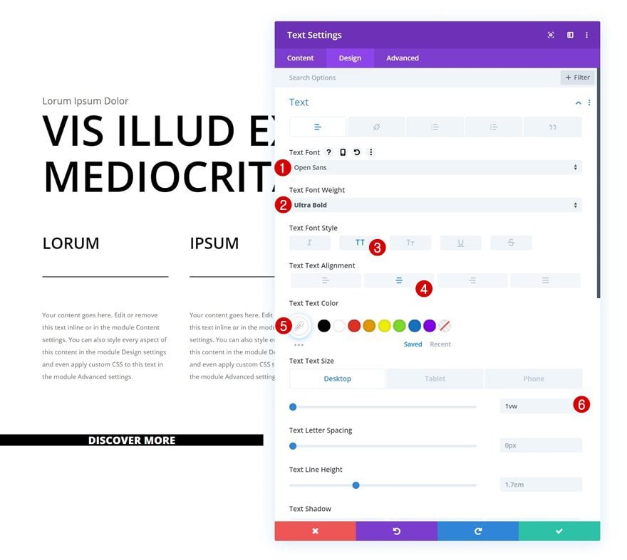
Text Settings
Move on to the design tab and change the text settings accordingly:
- Text Font: Open Sans
- Text Font Weight: Ultra Bold
- Text Font Style: Uppercase
- Text Alignment: Center
- Text Color: #ffffff
- Text Size: 1vw (Desktop), 1.7vw (Tablet), 2.5vw (Phone)
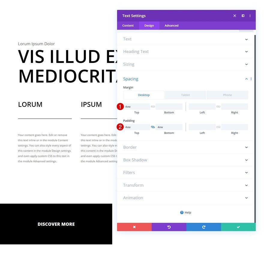
Spacing
And create space around the module using some custom margin and padding values.
- Top Margin: 4vw (Desktop), 11vw (Tablet), 0vw (Phone)
- Top Padding: 4vw
- Bottom Padding: 4vw
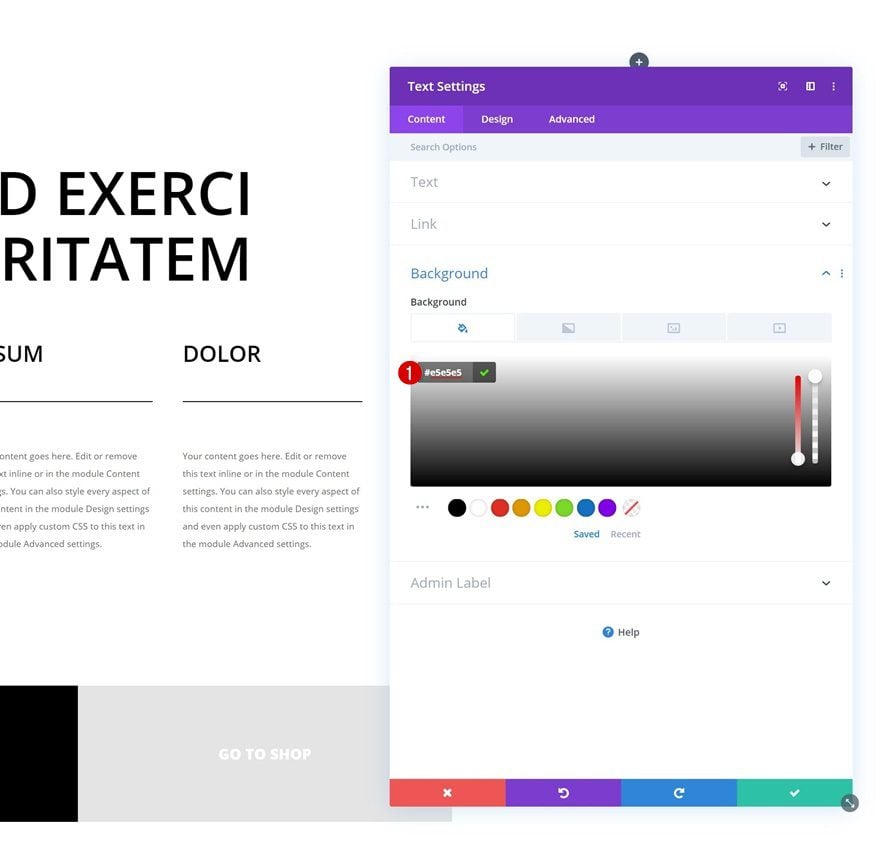
Clone Text Module & Place Duplicate in Column 2
Once you’ve completed the Text Module in column 1, you can clone it and place the duplicate in the second column.
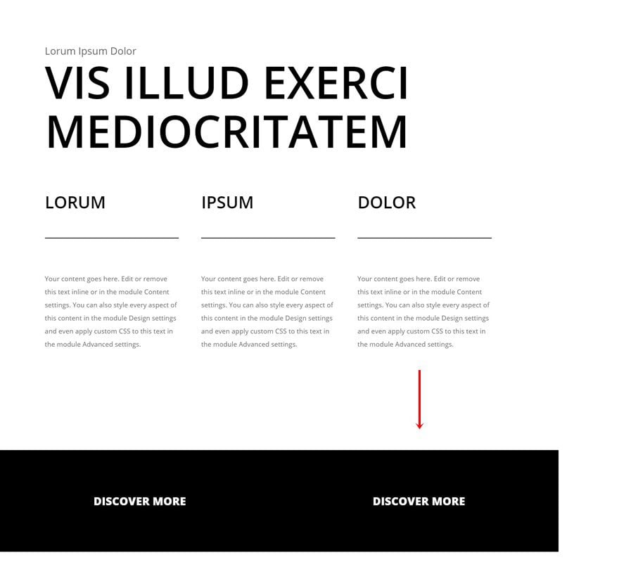
Change Content
Make sure you change the content and the link.
Change Background Color
As well as the background color.
- Background Color: #e5e5e5
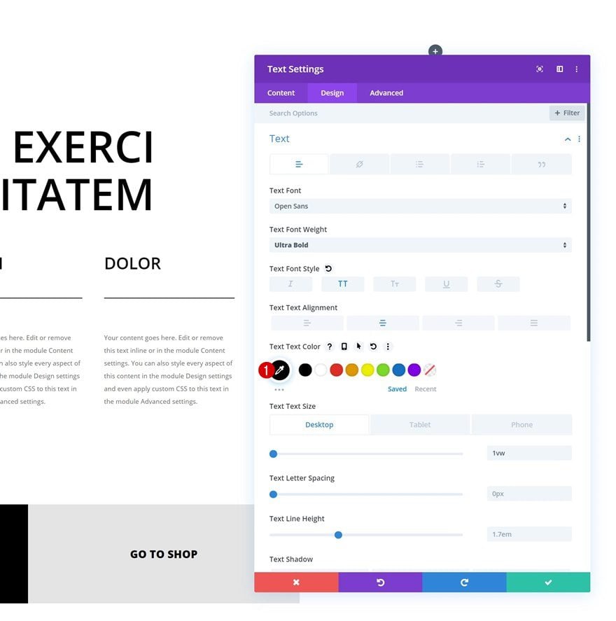
Change Text Color
Then, move on to the design tab and change the text color.
- Text Color: #000000
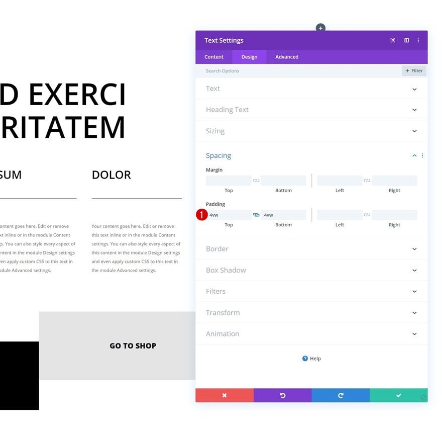
Change Spacing
Last but not least, make sure the spacing settings only contain the following values:
- Top Padding: 4vw
- Bottom Padding: 4vw
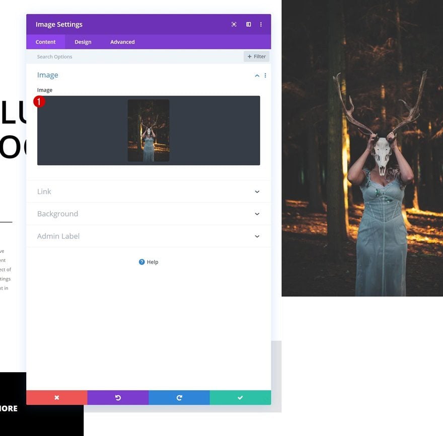
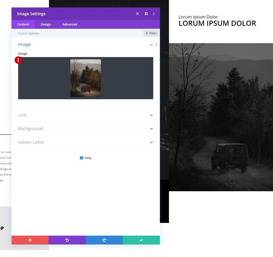
Add Image Module to Section Column 2
Upload Image
On to the next section column! Here, the first module we’ll need is an Image Module. Upload an image of your choice or use one you can find in the zipped folder that was shared at the beginning of this post.
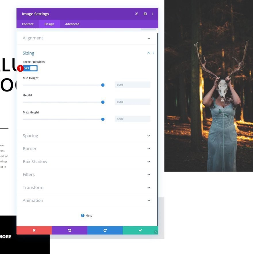
Sizing
Go to the sizing settings and make sure the ‘Force Fullwidth’ option is enabled. This will make sure the image will keep its size across all screen sizes.
- Force Fullwidth: Yes
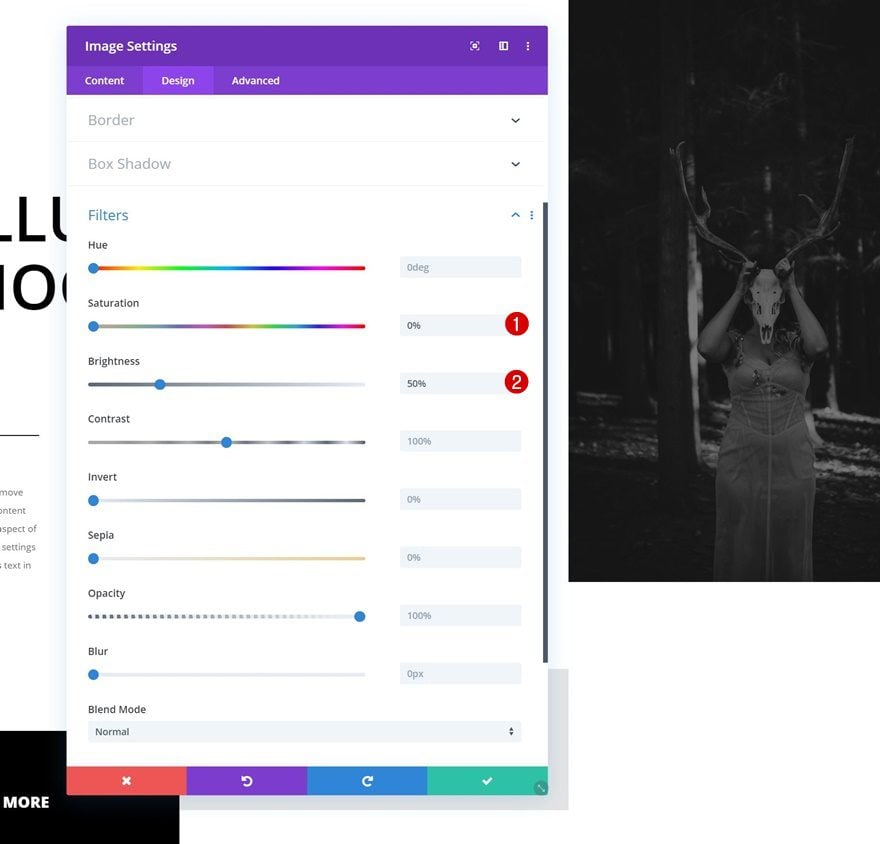
Filters
Modify the filters settings next.
- Saturation: 0%
- Brightness: 50%
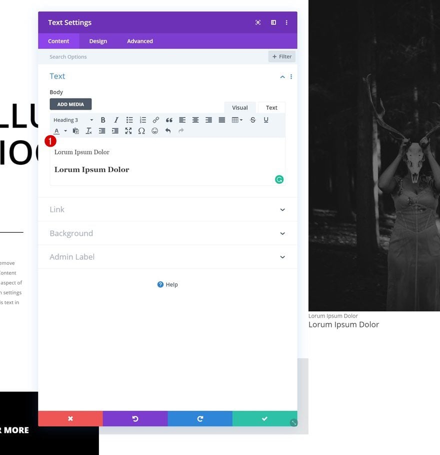
Add Text Module to Section Column 2
Add Paragraph & H3 Content
The second module we need in this column is a Text Module. Enter some paragraph and H3 content of your choice.
Background Color
Add a background color to the module.
- Background Color: #000000
Text Settings
Move on to the design tab and change the text settings accordingly:
- Text Font: Open Sans
- Text Color: #ffffff
- Text Size: 0.9vw (Desktop), 1.6vw (Tablet), 2.2vw (Phone)
H3 Text Settings
Modify the H3 text settings as well.
- Heading 3 Font: Open Sans
- Heading 3 Font Weight: Semi Bold
- Heading 3 Font Style: Uppercase
- Heading 3 Text Color: #ffffff
- Heading 3 Text Size: 1.5vw (Desktop), 2.5vw (Tablet), 3vw (Phone)
Spacing
And add some custom padding values in the spacing settings.
- Top Padding: 3vw
- Bottom Padding: 3vw
- Left Padding: 2vw
- Right Padding: 2vw
Clone Both Modules & Place Duplicates in Section Column 3 (Reversed Order)
Once you’ve completed both modules, you can go ahead and clone them. Place the duplicates in the remaining section column in reversed order.
Change Text Module
Change Background Color
Open the duplicate Text Module in the third section column and change the background color.
- Background Color: #ffffff
Change Text Color
Change the text color next.
- Text Color: #000000
Change H3 Text Color
Along with the H3 text color.
- Heading 3 Text Color: #000000
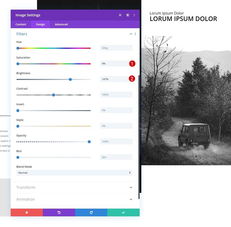
Change Image Module
Change Image
Upload a different image to the duplicate Image Module next.
Change Filters
And change the filters settings.
- Saturation: 0%
- Brightness: 147%
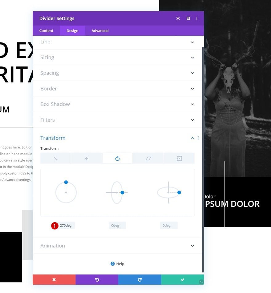
Add Divider Module to Section Column 2
Position
We’re also adding some transformed dividers to add detail to our design. Place the first Divider Module right here:
Visibility
Make sure the ‘Show Divider’ option is enabled.
- Show Divider: Yes
Line
Add a line color next.
- Line Color: #ffffff
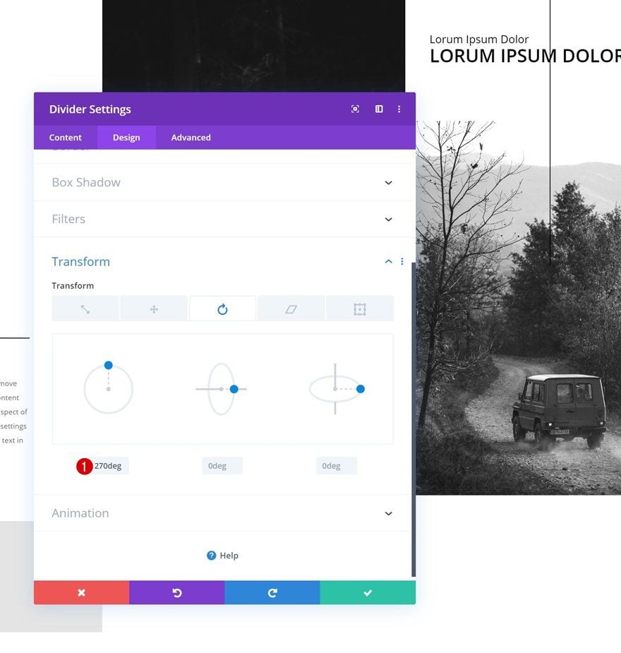
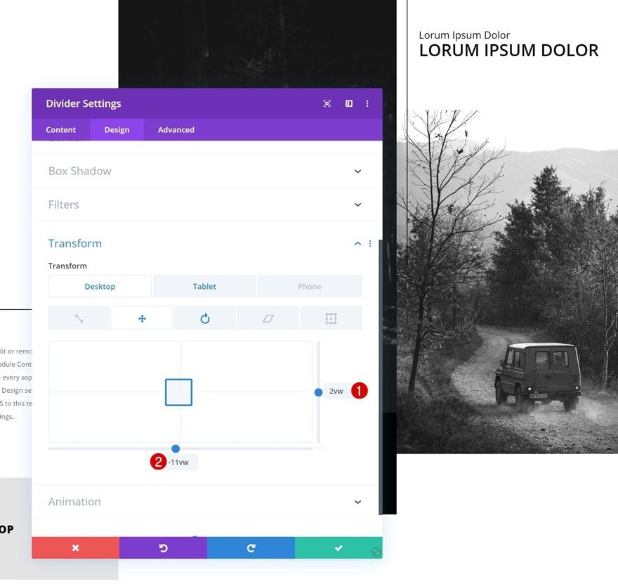
Transform Rotate
And transform the horizontal divider into a vertical one by modifying the left transform rotate value.
- Left: 270deg
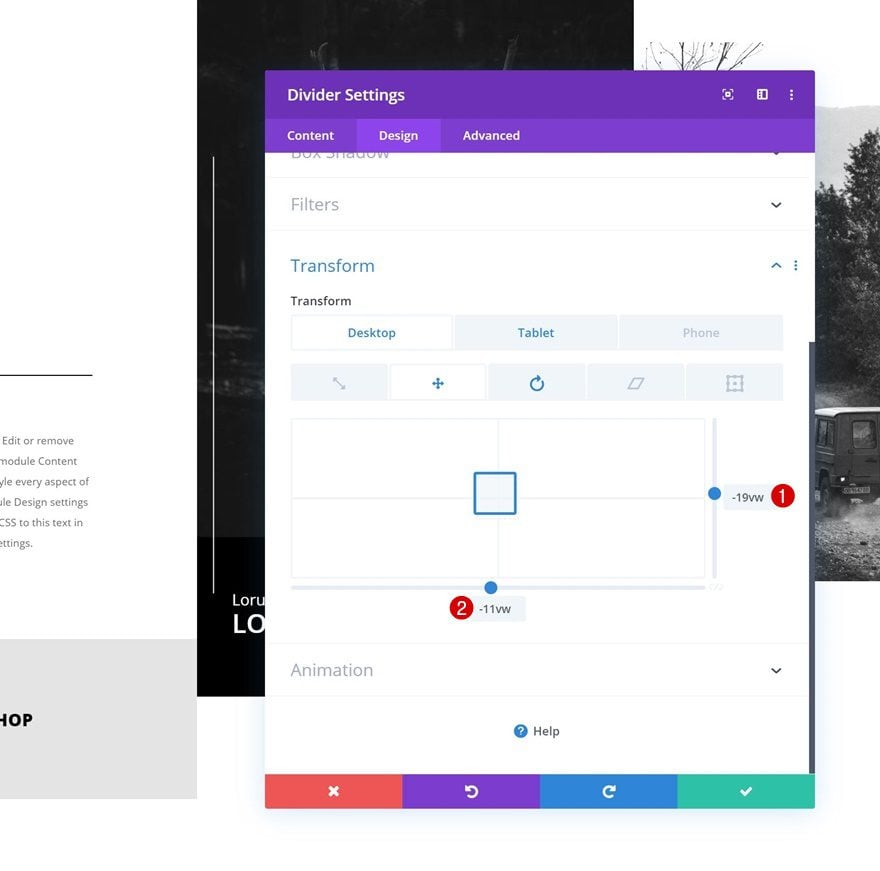
Transform Translate
Reposition the Divider Module using the viewport width unit in the transform translate settings.
- Right: -19vw (Desktop)
- Bottom: -11vw (Desktop), -24vw (Tablet)
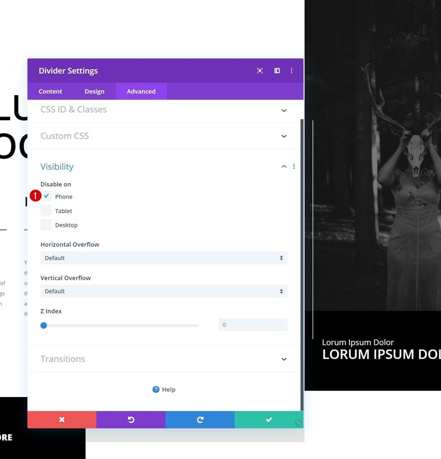
Visibility
And hide the entire module on phone.
Add Divider Module to Section Column 3
Position
The next and last Divider Module needs to be added right here:
Visibility
Make sure the ‘Show Divider’ option is enabled.
- Show Divider: Yes
Line
Move on to the design tab and change the line color.
- Line Color: #000000
Transform Rotate
Transform the horizontal divider into a vertical one next.
- Left: 270deg
Transform Translate
And reposition the divider using the transform translate settings.
- Right: 2vw
- Bottom: -11vw (Desktop), -24vw (Tablet)
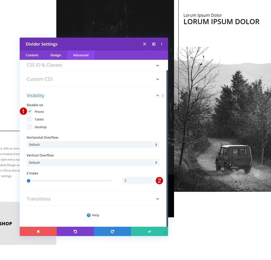
Visibility
To make sure the divider appears on top of the Image Module below it, we’re going to increase the Z Index in the visibility settings. We’ll also hide the entire module on phone.
- Z Index: 2
Preview
Now that we’ve gone through all the steps, let’s take a final look at the outcome across different screen sizes.
Final Thoughts
In this post, we’ve shown you how to create beautiful and unique multi-column hero sections with Divi’s built-in options only. This is a great technique that can be used for different kind of websites. If you have any questions or suggestions, make sure you leave a comment in the comment section below!
If you’re eager to learn more about Divi and get more Divi freebies, make sure you subscribe to our email newsletter and YouTube channel so you’ll always be one of the first people to know and get benefits from this free content.


thank you for your sharing.
These are very popular layouts. I will collect and try to use it in the design.
In addition, this tutorial is indeed very detailed. thank you.
i really thankful to you for this tutorial. Multi section designs are an unquestionable requirement for showing content adequately. thanks you for sharing this great information
Thanks for the tutorial. Multi column layouts are a must for displaying content effectively. I was wondering what is the recommended number of columns?
Awesome layout! Thank you, Donjete!
The rules don’t work well on this layout. I was disappointed after implementing the layout to find that even on the desktop version, these vertical rules move around and really ruin the layout when resizing the window. They could be a nice touch, but are not a practical implementation at all.