
Divi allows you to create abstract lines in many different ways using the Visual Builder. Dividers, Borders, Background Gradients, and Box Shadows all have the options you need. And if you get a little creative with the spacing, you can use a combination of all these elements to frame your content in creative ways.
In this tutorial, I’m going to show you how to easily transform a section of your layout into a unique design using lines.
- 1 Sneak Peak
- 2 Design Inspiration
- 3 All You Need is Divi
- 4 Add Lines with your Section Borders
- 5 Add Lines to Your Row
- 6 Add Borders to the Text Modules
- 7 Add Borders, Background Gradient and Box Shadow to the Button
- 8 Add Lines with Custom Dividers
- 9 Add Vertical Divider Lines
- 10 Not Enough Lines?
- 11 Final Thoughts
Sneak Peak
Here is a sneak peek of the design we will be building.

Design Inspiration
The inspiration behind this design came from Divi’s Cryptocurrency Layout Pack. The About page layout features a unique design with header background image of connecting lines that continues down the page to divide the two column grid layout right down the middle. So I decided to explore the concept of using Divi to add lines that frame the content a bit more and add a little flare to the overall design.
The main highlight of this design is the use of the Divider Module. I discovered the Divider module is not limited to creating horizontal lines with a single color. Actually, with a few tweaks, you can create vertical lines with background gradients as well!
All You Need is Divi
The only thing you will need for this tutorial is Divi. I will be using the Cryptocurrency About Page Layout to provide the base of our design. Then I will be customizing the settings of sections, rows, and modules to complete the design
Add Lines with your Section Borders
First things first. Go ahead and create a new page and import the Cryptocurrency About Page Layout using the Visual Builder.
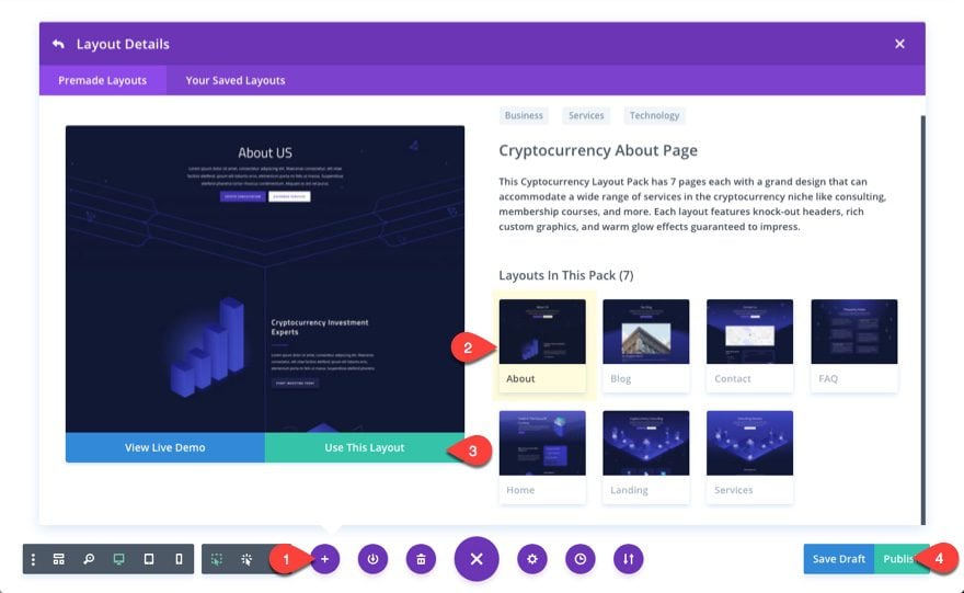
The focus of this tutorial will be on the second second (the one right below the fullwidth header).
Add Section Borders
As you may know already, sections span the full width of your page by default. So, a 2px border on the left and right of a section would be hardly noticable. But if you give you section a custom width, those borders will come into view.
Go to the section settings and update the section section settings as follows:
Width: 90%
Section Alignment: Center
Right Border Width: 4px
Right Border Color: #332faf
Left Border Width: 4px
Left Border Color: rgba(237,240,0,0.51)

Now don’t worry, the custom width of the section will fallback to 100% on mobile.
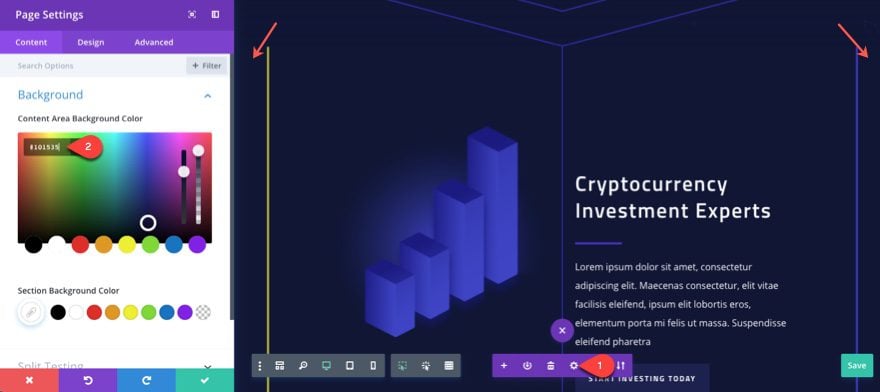
Add Content Area Background Color
Right now, the content area background color is white so you can see it exposed on each side of your section. This can be changed by going to your page settings and assigning the same dark color for the Content Area background to match the section background.
Content Area Background Color: #101535
Add Lines to Your Row
Now let’s update the Row settings to create some additional line designs.
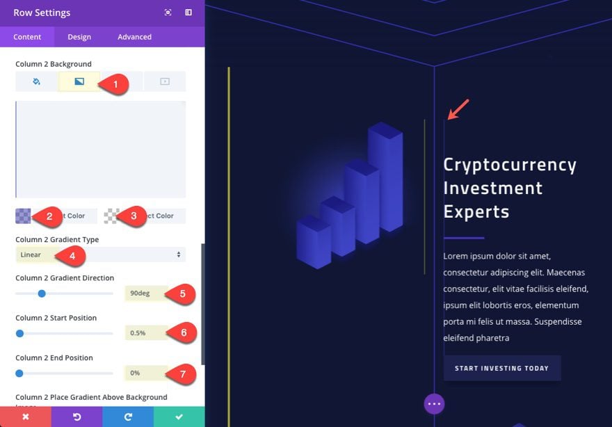
Add Lines Using Column Background Gradients
In order to add a line to our columns, we can use a little trick with our gradient background to add a thin gradient division on the side of each of our columns. To do this update the following:
Column 1 Background Gradient Left Color: rgba(255,255,255,0)
Column 1 Background Gradient Right Color: rgba(237,240,0,0.34)
Column 1 Gradient Direction: 90deg
Column 1 Start Position: 99.5%
Column 1 End Position: 0%

Column 2 Background Gradient Left Color: rgba(51,47,175,0.51)
Column 2 Background Gradient Right Color: rgba(255,255,255,0)
Column 2 Gradient Direction: 90deg
Column 2 Start Position: 99.5%
Column 2 End Position: 0%
Give Row a Custom Width
Since we gave our section a custom width, we need to give our row a custom width to create more room for our design elements. Set the width of the row to 90%.

Add Borders to your Row
To add borders to your row, update the following:
Left Border Width: 2px
Left Border Color: rgba(237,240,0,0.56)
Right Border Width: 2px
Right Border Color: #332faf

Spacing
We also need to adjust the spacing of our row to help break up the alignment of the lines we will be adding with our modules. To do this, update the following:
Custom Padding: 10% Top
Column 1 Custom Padding: 5% Bottom, 3% Left, 3% Right
Column 2 Custom Padding: 3% Right, 3% Left

Add Borders to the Text Modules
Next, we are going to add some borders to our modules for additional line designs.
For the image module in the left column, update the following settings:
Width: 62% (this will give us more spacing and help break up our line alignment)
Left Border Width: 4px
Left Border Color: rgba(67,40,183,0.53)

In the right column, update the top text module with the heading with some spacing and a left border.

Then, add some spacing and a right border to the second text module in the right column (the one with the dummy text) as follows:
Custom Margin: 5% Top, 5% Right
Custom Padding: 5% (top, bottom, left, right)
Right Border Width: 2px
Right Border Color: #332faf

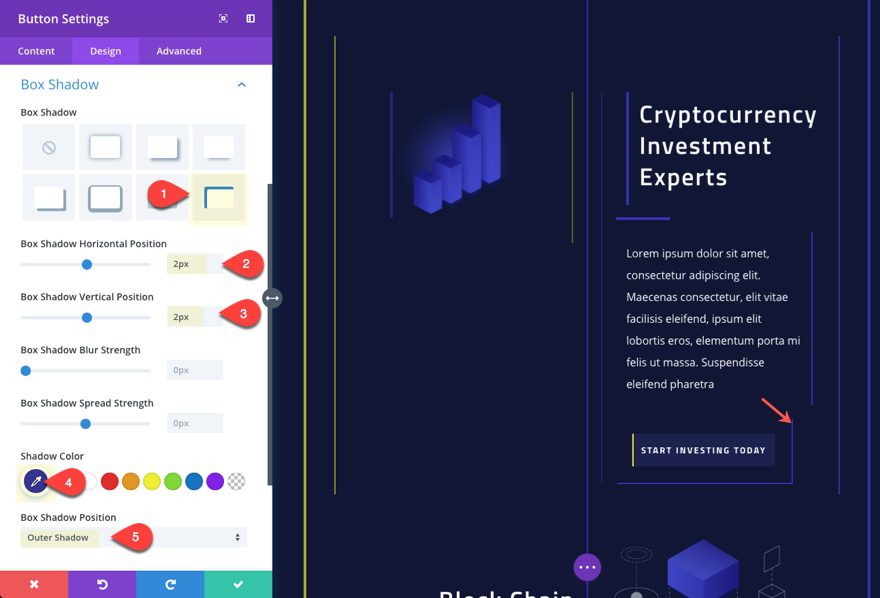
This design element is perhaps my favorite of all. We are going to add line elements to style and frame the button using borders, a background gradient, and a box shadow.
First let’s add a left border to the button using the following background gradient:
Button Background Gradient Left Color: #edf000
Button Background Gradient Right Color: rgba(255,255,255,0)
Gradient Direction: 90deg
Start Position: 1%
End Position: 0%

Now we increase the border size and change the color to match the section background so that it creates some space for our box shadow:
Button Border Width: 24px
Button Border Color: #101535
Add some spacing to give out button text some breathing room:
Custom Padding: 1em Top, 1em Bottom

Now for our box shadow to frame the bottom right corner of the button:
Box Shadow Horizontal Position: 2px
Box Shadow Vertical Position: 2px
Shadow Color: #332faf
Box Shadow Position: Outer Shadow
Add Lines with Custom Dividers
This is where things get a bit interesting. We can add dividers anywhere we want to our page. The trick is to utilize the divider background gradients to create a unique design.
First, let’s add a divider right above the image module in the left column of our row. Then update the following settings:
Button Background Gradient Left Color: #edf000
Button Background Gradient Right Color: rgba(255,255,255,0)
Gradient Direction: 90deg
Start Position: 1%
End Position: 0%
Color: #edf000
Divider Weight: 2px
Height: 2px
Custom Padding: 80% Left
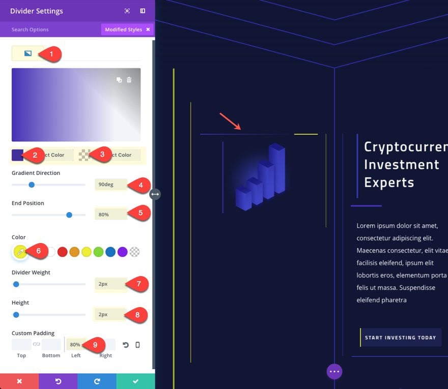
The Custom Padding pushes the border color to the right and exposes the background gradient to create a unique effect.
Now Copy the Module and paste it to the top of the right column and also directly under the text module with the heading (replacing the one currently there).
Here is what it looks like so far.

Add Vertical Divider Lines
This last phase will add the final touches to the design by introducing some extra vertical lines that bleed up into the section.
To do this, we need to create a new row with four columns and update the row settings as follows:
Custom Width: 95%
Custom Padding: 0px Top, 0px Bottom
Then update the Custom Padding for all of the tablet displays…
Column 1 Padding (tablet): 20% Right
Column 2 Padding (tablet): 15% Right
Column 1 Padding (tablet): 30% Right
Column 1 Padding (tablet): 20% Left
This will offset the vertical dividers (not added yet) when the columns stack on mobile displays.

Now we are ready to add our divider modules.
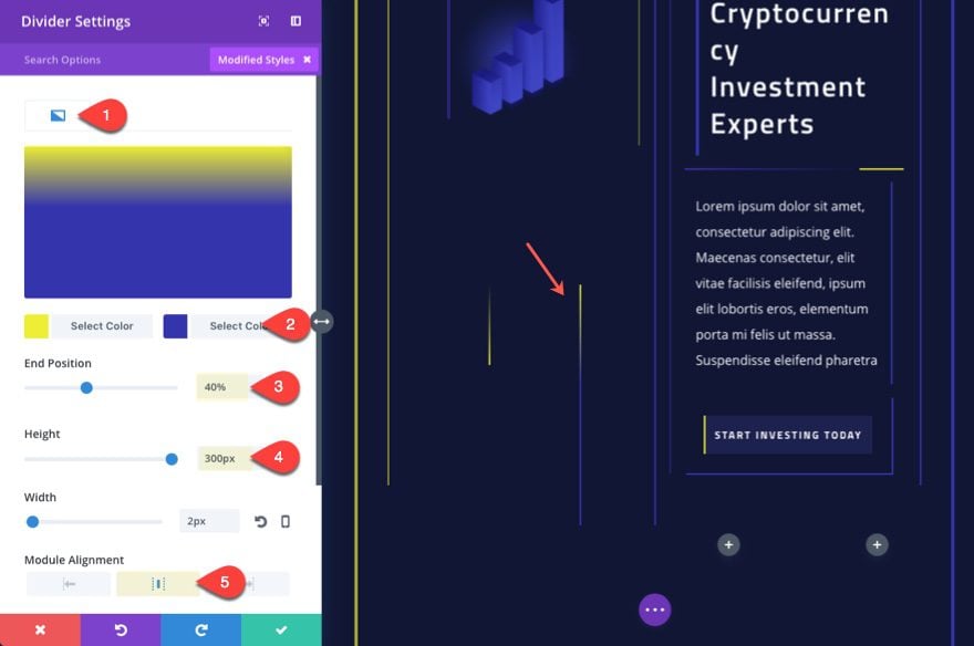
Add a divider module in the first column and update the following settings:
Show Divider: NO
Background Gradient Left Color: rgba(255,255,255,0)
Background Gradient Right Color: #edf000
Height: 100px
Width: 2px
Module Alignment: Right
Custom Margin (desktop): -300px Top, 300px Bottom
Custom Margin (tablet): 0px Top, 0px Bottom

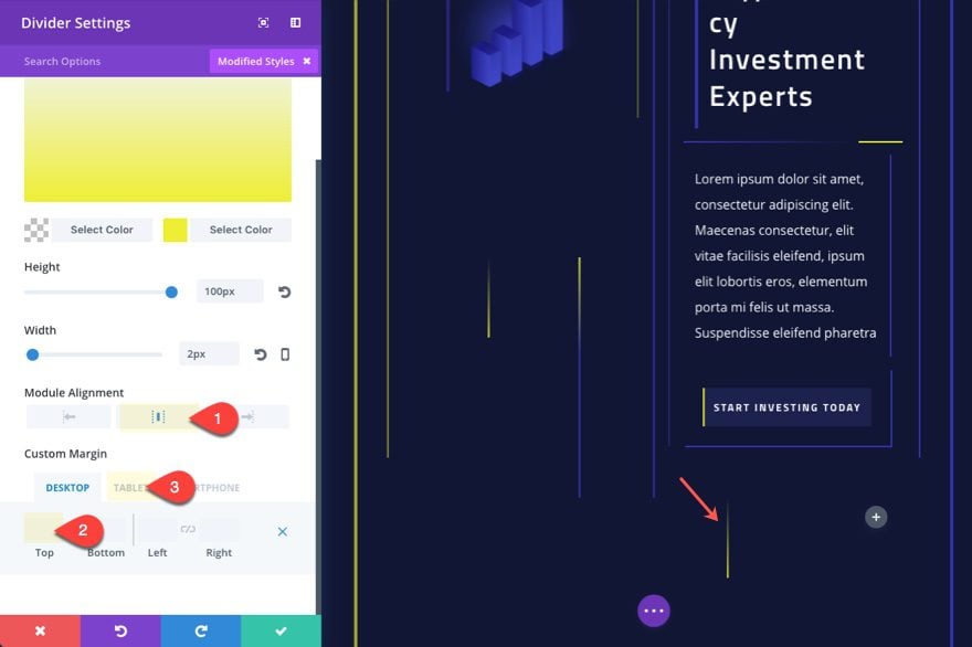
Now copy that module you just created and add it to the second column. Then update the following:
Background Gradient Left Color: #edf000
Background Gradient Right Color: #332faf
End Position: 40%
Height: 300px
Module Alignment: middle
Next, copy and paste the divder in the first column over to the third column and update the following:
Module Alignment: middle
Custom Margin (desktop): 0px
Custom Margin (tablet): -200px Top
Now copy that module in the second column and paste it to the fourth column and update the following:
Background Gradient Left Color: #332faf
Background Gradient Right Color: #edf000
End Position: 100%
Height: 200px
Custom Margin (tablet): -200px Top

That’s it. Check out the final result.
And here is what it looks like on tablet and smartphone…

Not Enough Lines?
You can always add even more lines to your page easily by adding box shadows to each of your divider modules. This will allow you to place lines basically anywhere you want. The trick is to set your box shadow position to outer shadow, pick the color you want and then position it anywhere on the page.
Look what adding a box shadow to the top divider module in the right column would look like…

Final Thoughts
When building out the design, my initial goal was to explore all the possible ways to add lines to a section in one of Divi’s premade layouts. I found out that there are quite a few!
And with the flexible design options offered in the divider module, the possibilities become seemingly endless.
Hopefully, this post gave you a few more tools in your design toolbox to help you maximize Divi in amazing new ways.
I look forward to hearing from you in the comments.


Man awesome theme.
Great work!
Thank you Minh!
Hi. Is there any way to accomplish something like this without a premade layout?
Yes, you can follow the same steps as above but just on a layout that you’ve created.
Thanks so much. 🙂
Not enough lines, hahahaha.
You never know. Haha
This is a very simple, clean, stylish effect. Great job!