

Designing a geometric grid layout for your website can be extraordinarily beautiful. One of my favorite geometric design element is a hexagon. Hexagons can be used to design well-balanced and harmonious grid layouts (think bee hive). But the design can come with challenges. You have create shapes to serve as backgrounds for your content. Then you have to fit your content inside the shape. Then you have to make sure those shapes are spaced correctly on different screen sizes. But don’t worry. It’s not as hard as you think.
As for creating those geometric shapes, there are ways to accomplish this using some advance custom CSS, but I think the simplest way is to create an image. Then you can use the power of Divi for the rest.
In this tutorial, I’m going to show you how easy it is to create a hexagon shape image to design a geometric grid layout with Divi.
Let’s get started!
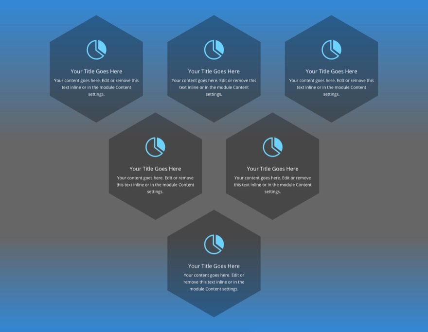
Sneak Peek
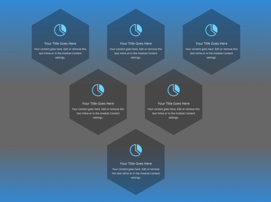
Here is a peek at the geometric grid design we will build in this tutorial.
What You Need
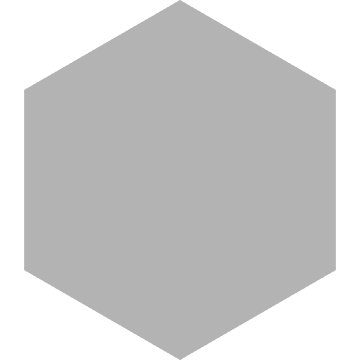
- A Photo Editor (I’ll be using Sketch) to create hexagon image. Or for now, you can just drag this image to your desktop and use it.
- Divi Theme (Installed and Active)
Creating the Hexagon Background Image
To build the hexagon background image, I’ll be using the photo editor Sketch (for Mac only). However, this should be an easy shape to create on any number of photo editors out there (like Photoshop, Illustrator, or Gimp).
If you don’t want to bother with this part of the tutorial, you can always just drag this image to your desktop for now. It is a dark semi-transparent hexagon image that should work with a number of designs considering it will allow the background colors behind it to show through.
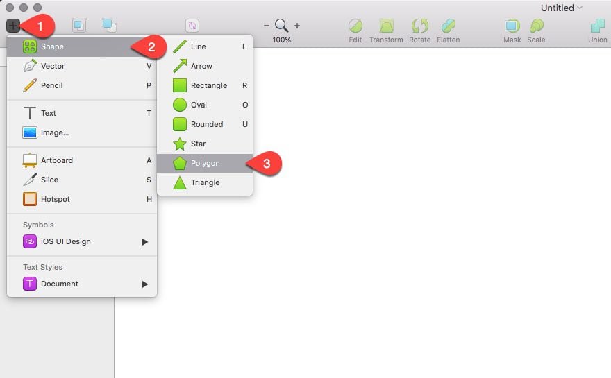
Here is how to create the image in sketch. First, click the insert icon at the top right. Then hover over the shape option and select the hexagon shape.
Now hold down the shift key and click (and hold) on the canvas and drag your mouse to create the shape then let go of your mouse. Holding down shift allows you to create perfectly square dimensions for your shape. Now update the properties of your shape in the right sidebar as follows:
Size: 360 width, 360 height
Sides: 6
Fill color: 000000 hex, 0 R, 0 G, 0 B, 30 A (basically this is a black color with 30% opacity)
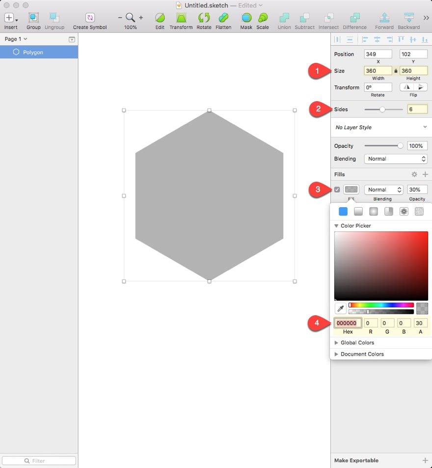
Then export your image as a png and import it to your WordPress Media Library for later.
Creating the First Section with Three Columns
This design will have three sections stack on top of each other, each with a row that holds our differing column structures. The first section will have our three column structure, the second section will have two columns, and the third will have only one column.
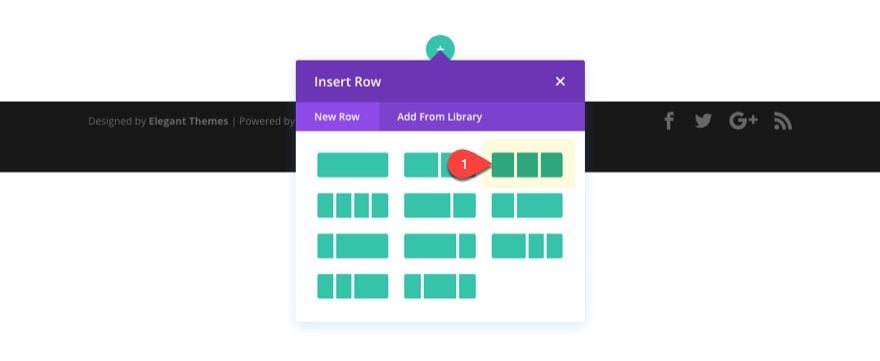
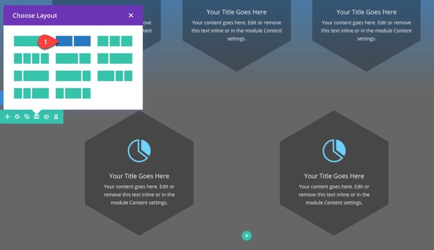
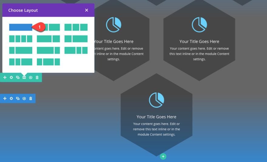
To create the first section, create a new page and deploy the visual builder to build a new layout from scratch. A new regular section will be created for you and the visual builder will prompt you to choose your column structure for your section. Choose the three column structure (one-third one-third one-third).
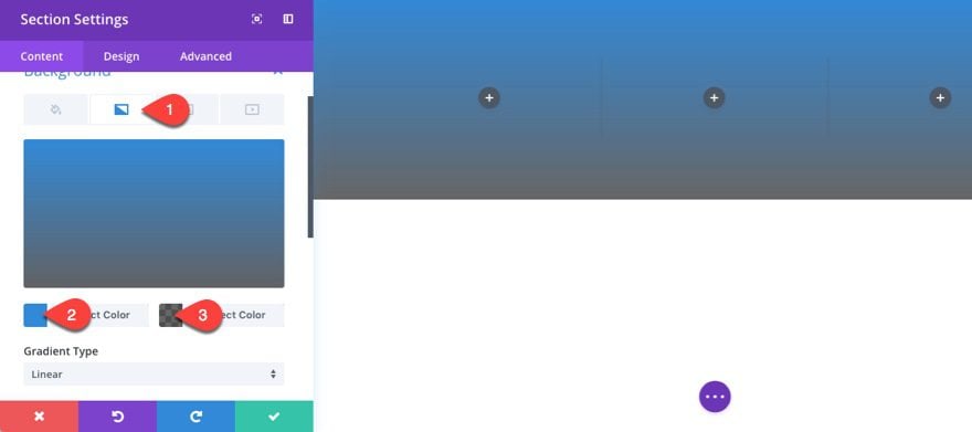
Now before we start editing our row and adding our modules, let’s give our section a background color gradients by updating the section settings with the following:
Background Gradient Left Color: #2b87da
Background Gradient Right Color: rgba(0,0,0,0.6)
Customize the Row Settings and Add Hexagon Images to Your Column Backgrounds
In order to achieve the design we are looking for, we need to add our background image to each column of our three column row. So, for each column, add the hexagon image (should be 360px by 360px) to each column. Then set the background image size to “actual size” and the background image repeat to “no repeat”.
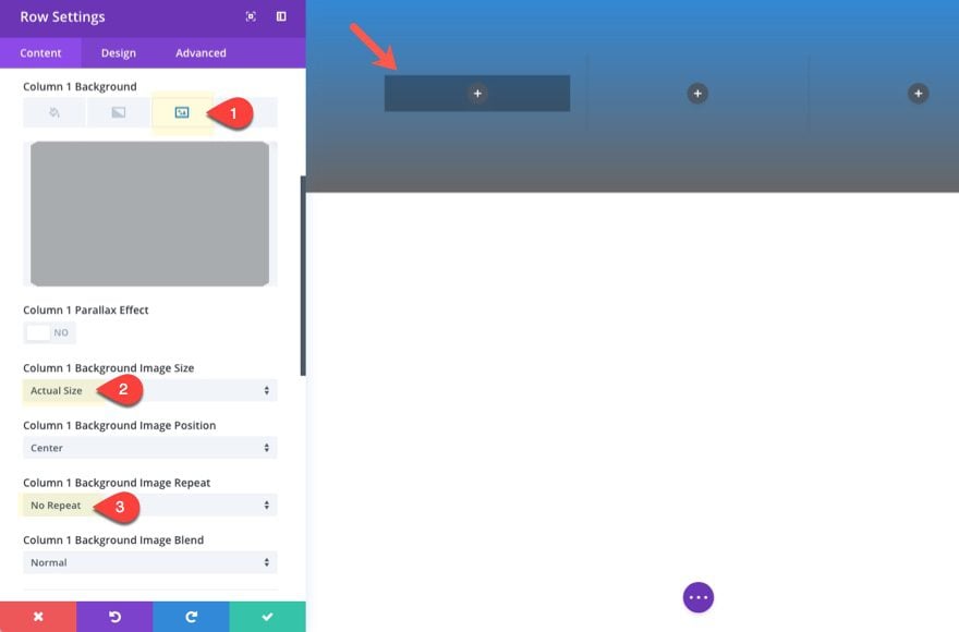
Make sure and do this for column 1, 2, and 3 background images.
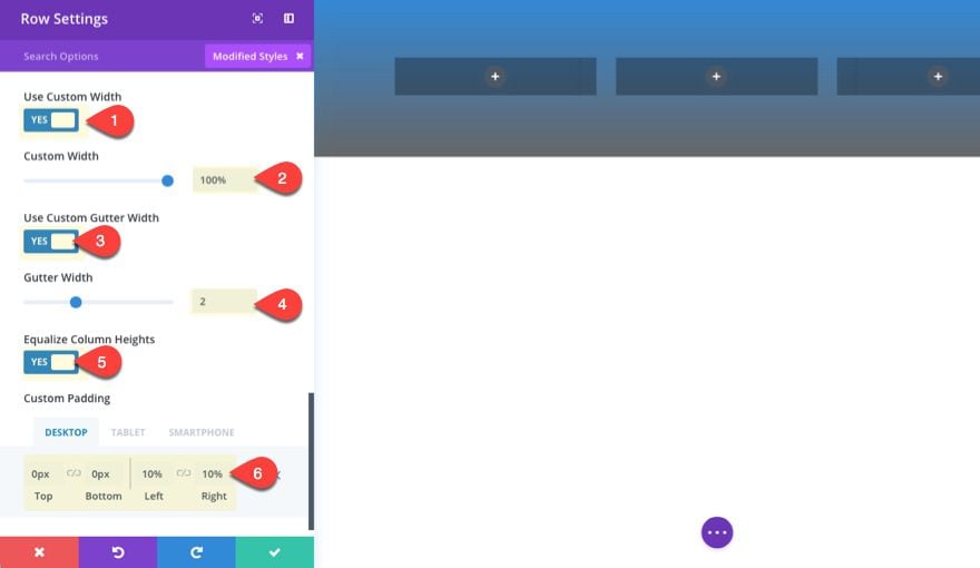
Next we need to customize our row settings to create the spacing we need for our hexagon background images to show correctly in each column. This spacing will also help to keep things responsive and maximize horizontal space on mobile.
Update the row settings as follows:
Use Custom Width: YES
Unit: %
Custom Width: 100%
Use Custom Gutter Width: YES
Gutter Width: 2
Equalize Column Heights: YES
Custom Padding (desktop): 0px Top, 0px Bottom, 10% Left, 10% Right
Custom Padding (tablet): 0% Left, 0% Right
Save your row settings for now.
Adding Your Blurb Modules to Each Column
Add a new blurb module to your first column and update the blurb settings as follows:
Content: “Your content goes here. Edit or remove this text inline or in the module Content settings.” (keep this short because you only have a limited amount of space within your hexagon image)
Use Icon: Yes
Select Icon (anyone you want obviously)
Then update the design settings as follows:
Icon Color: #66d1ff
Icon Font Size: 66px
Text Orientation: Center
Text Color: Light
Width: 360px (the same width of your hexagon background image)
Module Alignment: center
Custom Padding: 85px Top, 85px Bottom, 10% Left, 10% Right
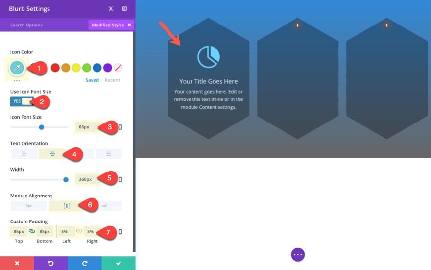
It is important to add the content you want displayed in front of your hexagon first so that you now how to adjust the spacing of your blurb module to reveal the background image fully. Notice I added a top and bottom padding of 85px. This is just enough to expose the hexagon background, even when adjusting the browser to mobile device sizes.
After you save out your blurb module, go ahead a copy and paste it to column 2 and 3 so that all three blurbs are present.
Now we have successfully added hexagon backgrounds to our first row of blurbs.
Creating the Second Section with Two Columns
To create our second section, go ahead and duplicate the first section then update the section settings with the following background color: rgba(0,0,0,0.6) and delete the existing gradient.
Then Change the column structure of your row to two columns and delete the extra module in the bottom right column.
Update the row settings as follows:
Gutter Width: 3
Custom Margin (desktop): -145px Top
Custom Margin (tablet): -70px Top
Custom Padding (desktop): 24% Left, 24% Right
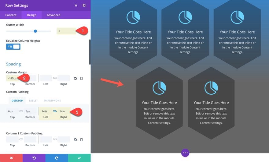
I added more padding to the left and right to position the hexagon backgrounds between the blurbs in the section above (24% padding on each side gets us pretty close). I also changed the gutter width back to 3 to accomodate for the decreased column space due to more row padding. Then I used a -145px margin to pull the row up a bit.
As you can see the grid layout is coming together.
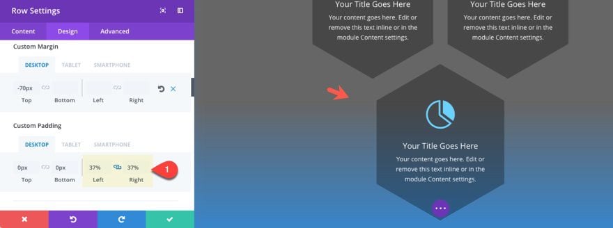
Creating the Third Section with One Column
For the last section, go ahead a duplicate the section section. Then go to the first section and copy the background gradient and paste it to the third section you just created. Then flip the gradients by clicking the “switch” icon when hovering over the gradient color preview. Then delete the background color in the third section.
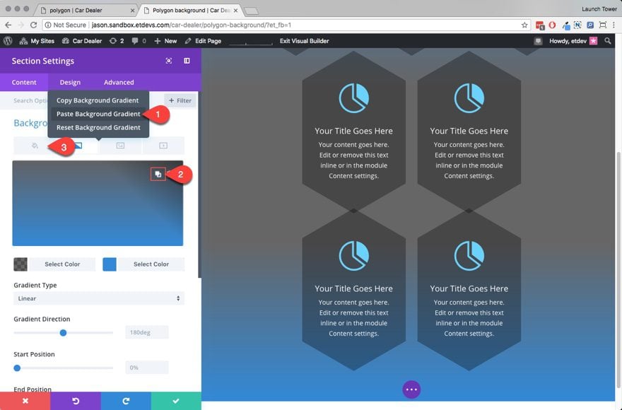
Now update the row column structure to one column and delete the extra blurb module.
In order to get hexagon image background to scale with the other blurbs on smaller browser windows, we need to add more padding to the row. This will make the hexagon image squish together a bit to match the others. This is just a small detail to make the design more consistent.
In the row settings, update the custom padding as follows:
Custom Padding (desktop): 37% Left, 37% Right
Now let’s check out the final result of our geometric grid layout.

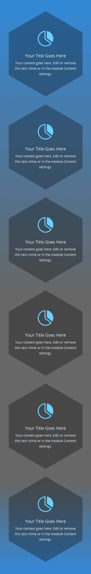
Here is what it looks like on mobile.
Here is how it adjusts to different screen sizes.
Final Thought
This tutorial shows you how to create a geometric grid by adding a hexagon shape background to your columns, but you can easily apply this same technique to add any background image you want. This opens up a lot of doors for designing beautiful layouts to set your website apart.
I hope you find it helpful for your next project, and I look forward to hearing from you in the comments.
Cheers!


Hello Jason,
this is a good idea, thanks for the share.
Cool! Thanks for this idea!
You’re very welcome, Jan. Hope it helps.
Beautiful layout, but how can you insert the shapes on the sides, as in the first picture?
Maga,
Sorry for the confusion. That was something special for the featured image design. However, you can use the same technique to create the hexagon shapes in this post to create a background image similiar to the one you see in the featured image. Then just place that background image in the section containing your content. Hope that points you in the right direction.
Thanks for the question.
Thank you. This is very cool. I hope to see more of this, as well as others, used in future layout packs.
Awesome! So glad you liked it, Richard.
Love creative outside the box design stuff like this.
Cheers, Britt! Thanks for the comment.
Nice one Jason, I really do like the hexagonal shape on a site.
Thanks, Hurri. I really do as well. Especially for tech sites.